http://www.youtube.com/watch?v=eZqI5b5wGA4
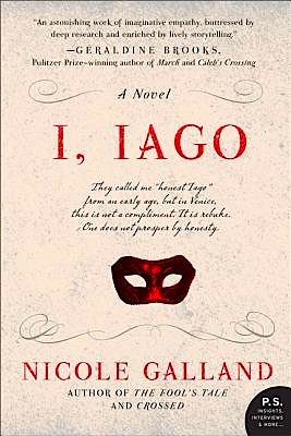
Sorry about the slower-than-expected follow-up post, campers: I honestly did intend to devote this week to structural repetition — because, as we all know, there’s nothing like a sexy topic for drawing in the readers. Our cat began acting strangely, however, so I have been spending an extraordinary amount of time at the vet’s office. Fortunately, I had a good book on me, my buddy Nicole Galland’s new release, I, IAGO, and lordy, is it a great read. I’m seriously tempted to leave my copy in the vet’s waiting room after I’ve finished, to provide a lush mental escape for the worried.
Seriously, how often has a book made you laugh out loud while waiting for blood test results? From the publisher’s blurb:
 From earliest childhood, the precocious boy called Iago had inconvenient tendencies toward honesty — a “failing” that made him an embarrassment to his family and an outcast in the corrupted culture of glittering, Renaissance Venice. Embracing military life as an antidote to the frippery of Venetian society, he won the glowing love of the beautiful Emilia, and the regard of Venice’s revered General Othello. After years of abuse and rejection, Iago was poised to win everything he ever fought for — until a cascade of unexpected betrayals propel him on a catastrophic quest for righteous vengeance, contorting his moral compass until he has betrayed his closest friends and family and sealed his own fate as one of the most notorious villains of all time.
Okay, I’ll admit it: I’m a sucker for any blurb containing the word frippery. One of my failings as a human being, I suppose.
One of my other failings as a human being, but a positive boon for my life as an editor, is a reading eye that leaps instantly to the anomaly on the page. Perhaps that’s not altogether surprising, as a have a doctorate in pattern recognition, but honestly, it does render casual reading a bit of a challenge. A slug line in the wrong place, for instance, will drive me mad, regardless of the quality of the writing lurking beneath it. So will adverbs beginning three out of five sentences in a paragraph: Clearly, there was something wrong here. Obviously, though, your garden-variety reader would not catch it. Bizarrely, any professional reader would.
Fortunately (God, there’s a fourth one!), however, in the publishing world, this sort of eye is not only an advantage — it’s pretty much a requirement for a good editor. Apart from accountancy and computer programming, you’d be hard-pressed to find a job better suited to the obsessive-compulsive. Thus, it follows as night the day, spring winter, and baby ducks their mother that those who cater to the tastes of editors would develop a similar seventh sense for patterns on a page.
Oh, you thought this wasn’t going to lead back to you and your manuscript? You and your manuscript keep me up nights. I worry so that your good writing might not get the fair reading it deserves at the hands of Millicent, the agency screener, if it exhibits too much word, phrase, and/or structural repetition.
Speaking of hands, a third of my audience’s just shot skyward. “Um, Anne?” the more eagle-eyed among you quaver. “I hate to pick nits here, but how precisely do Millicent’s hands read anything? Wouldn’t it be her eyes?”
That question brings a tear to my weary eye, campers. If you caught that logical gaffe, you’re starting to read like a professional. And if you also noticed that in the video above, we never actually get to see our hero’s eyeballs — a trifle disturbing, I think, in a cartoon devoted to developing reading and writing skills — you may be on your way to becoming a Millicent.
Although, admittedly some of us are born that way. I distinctly recall that the first time Conjunction Junction popped onto our small black-and-white TV screen, I tossed my wee braids and shouted, “Mother! How can he read with no eyes?” Fortunately, my mother had been editing for years, so she had been taken aback, too.
In case I’m being too subtle here: those of us that read for a living notice everything in a submission or contest entry. It’s our job, and if nature was kind enough to outfit us with specialized eyes and brains in order to be good at it, well, that has some ramifications for writers.
All of which is a long-winded way of saying that I cannot in good conscience round off my lobbying for reduced repetition in your manuscripts without discussing those most perennially popular transients passing through Conjunction Junction: and, but, and then.
This time, encouraged by positive reinforcement, legions of hands shoot into the air. Yes, newly-minted grammar mavens? “But Anne,” you point out, and rightly so, “then isn’t a conjunction! Why, then, would you include it in your discussion of conjunctions, when there are so many legitimate conjunctions — yet, for instance, or or — deserving of your august scrutiny?”
Quite right, hand-raisers: when used properly, then isn’t a conjunction, strictly speaking. We live, however, in a world overrun by scofflaws. Metaphors are mixed; semicolons are routinely misused. Jaywalkers abound — unwisely, given how many drivers do not come to a full stop at stop signs. Owners of outdoor-ranging cats discover that their pets have discarded their collars, complete with city-issued license, and do not replace the tags immediately, while owners of dogs occasionally take them off-leash even outside the parks designated for such activity.
We may deplore all of this, but we ignore it at our peril. At least, that hefty majority of aspiring writers whose submissions and literary contest entries positively scream, “The leash laws do not apply to my dog!” do so at their own risks — but does that mean that your Auntie Anne, friend of the struggling scribbler, should refuse on general principle to talk about those mutts?
No, I haven’t the heart. Call me a softie, but enough writers are using it these days as if it were a synonym for and in a list of actions (as in The Little Red Hen kneaded the bread, baked it, then fed it to her forty-seven children.) that I feel justified in — nay, compelled to — treat it as such for the purposes of our ongoing discussion of repetitive sentence structures and their predictably negative effect on Millicent’s bloodshot peepers.
Language does grow and change, of course. Back in the bad old days, when dinosaurs roamed the earth Roosevelts were presidents Dorothy Parker was still speaking to Ernest Hemingway editors like Maxwell Perkins called the shots in the publishing world, it was considered hugely improper to begin any sentence with and, but, or then. Amongst the literate, these words were purely intra-sentence phenomena. As my Uncle Alex (a well-known SF short story writer in the 1950s, an editor at the LA Free Press, and a folklorist of great repute) used to scrawl in the margins of letters I wrote him in elementary school, a conjunction, by definition, connects one part of a sentence to another.
“Therefore,” he would ink in large letters, “a conjunction may not begin a sentence, and a crayon is not an appropriate writing implement for correspondence. How’s your mother?”
There are easier things than growing up in a family of writers and editors. I thought until I hit puberty that writing in the first person was a narrative cop-out, embraced by only those authors who could not handle suspense in any other way. (A fairly common editorial opinion well into the early 1980s, incidentally.) Toward the end of his long, colorful, and occasionally scurrilous life, Uncle Alex was even known to shout grammatical advice at the TV screen when newscasters –sacre bleu! — began their sentences with conjunctions.
And really, who could blame him?
Hey, I couldn’t resist. But why shouldn’t we slavishly adhere to his precepts? Well, time and the language have been marching merrily onward, and at this point in North American history, it’s considered quite acceptable to begin the occasional sentence with a conjunction. I do it here all the time. So do most bloggers, journalists, and columnists: it’s a recognized technique for establishing an informal, chatty narrative voice.
That thunder you just heard was Uncle Alex stomping his feet on the floor of heaven, trying to get all of us to cut it out, already, but there can be perfectly legitimate stylistic reasons to open a sentence with a conjunction. They can, for instance, be very valuable for maintaining an ongoing rhythm in a paragraph. Like so:
Ghislaine spotted the train pulling into the station. But would Arbogast be on it? He would — he had to be. And if he wasn’t, well, she was just going to have to call him to find out why. Or not. Anyway, she wasn’t going to waste her energy speculating on what would be a moot point the second Arbogast stepped off that train and caught her in his arms.
As Uncle Alex would undoubtedly have been the first (and last, and middle) to tell you, classic English grammar has an elegant means of preventing those conjunctions from hanging out at the beginnings of those sentences: by eliminating the periods and replacing them with commas. The result would look a little something like this:
Ghislaine spotted the train pulling into the station, but would Arbogast be on it? He would — he had to be, and if he wasn’t, well, she was just going to have to call him to find out why — or not. Anyway, she wasn’t going to waste her energy speculating on what would be a moot point the second he stepped off that train and caught her in his arms.
To old-fashioned eyes, this paragraph’s meaning is identical to the first; it is merely cleaner, grammatically and visually. However, I suspect that most current readers of English prose would recognize a substantial difference in the rhythm.
Why? A period is, as the English like to call it, a full stop; a comma, on the other hand, indicates a pause. A dash indicates a slightly longer and more pointed pause. To this millennium’s sensibilities, the first example has a choppiness, a breathless quality that conveys the subtle impression that Ghislaine’s breathing is shallow, her pulse racing.
The periods my uncle would have forbidden, then, could legitimately be regarded as subtle narrative indicators of protagonist stress — a bit of authorial frippery, rather than a mistake. At least to those in the habit of breaking paragraphs down into their constituent parts to see what their functions are.
Like, say, most of us who read manuscripts for a living. We diagram sentences in our sleep.
Before we leave that last set of examples, did you happen to notice any other editorial pet peeves in that first? No? Okay, let me whip out my machete pen and remove a couple of classic Millicent-irritants. Rather than merely noticing that this third version reads better, I shall challenge your revision skills by asking you to try to figure out why it reads better.
Ghislaine spotted the train pulling into the station, but would Arbogast be on it? He would — he had to be, and if he wasn’t, well, she was just going to have to call him to find out why. Right now, she wasn’t going to waste her energy speculating on what would be a moot point the second he stepped off that train and caught her in his arms.
How did you do? Lift a nice, shiny gold star from the reward cabinet if you immediately cried, “Why, word repetition is word repetition, Anne — which is why you removed the second Arbogast in the paragraph.” Stack another star on top of the first if you added, “Anyway is often how speakers inform hearers that they’ve digressed from their point. Is there a reason the narrative should go out of its way to inform readers that it has digressed?” And award yourself three more stars if you have gotten in touch with your inner Millicent sufficiently to have mused, “You know, to find out why — or not is conceptually unnecessary. Would the paragraph lose any actual meaning if I cut or not?”
I hear those of you who did not shout any of those observations muttering under your collective breath, and you’re quite right: this is incredibly nit -picky stuff. Both good writing and professional presentation are made up of lots and lots of nit-picky stuff. Your point?
While you’re trying to come up with a sufficiently scathing comeback for that one, let’s tie the anyway revelation — perhaps best summed up as that what’s considered acceptable in everyday speech may not work so well in a narrative voice on paper, even if it happens to be in the first person — back to our ongoing discussion of and and but. Since conjunction-opened sentences can sometimes mirror actual speech better than more strictly grammatical ones, the former can be a boon to dialogue. Or to first-person narration, as it creates the illusion of echoing actual speech. That does not mean, however, that peppering third-person narrative prose with it will necessarily produce a flowing effect. Generally speaking, this structure works best in dialogue.
Not sure why? Okay, contrast this sterling exchange:
“And I tell you, Spencer, it was eerie. I’m never going back into that deserted house again. And that’s final.”
“But Yvette, you’re backing recklessly away from the conventions of our chosen genre! You’re a scantily-clad, unattached female who screams easily, often while tossing your dreamy long red (or blonde) hair. You are fleet of foot in the face of danger. And particularly when running (generally while identified only as she through wooded glens at the openings of novels. Yet you are astonishingly prone to tripping over easily-avoidable bits of bracken your surer-footed male counterparts and non-ingenue sidekicks never seem to twist their ankles navigating. And, naturally, you are entirely unarmed at all times. Lest some particularly timid reader find you even remotely threatening for even an instant. Therefore, you must return to face the danger that any sane person would take extreme measures to avoid!”
“Or what? Or you’re going to turn me in to the Stereotype Enforcement Police?”
“Or else, that’s all.”
“Fine. Then give me the key to the tool shed.”
“If you insist. But don’t come crying to me when an axe comes crashing through your door at the closed-for-the-season hotel.”
with the same dialogue after the conjunctions have been tucked into the middle of the sentences:
“I tell you, Spencer, it was eerie. I’m never going back into that deserted house again. That’s final.”
“Yvette, you’re backing recklessly away from the conventions of our chosen genre! You’re a scantily-clad, unattached female who screams easily, often while tossing your dreamy long red (or blonde) hair. You are fleet of foot in the face of danger, particularly when running (generally while identified only as she through wooded glens at the openings of novels, yet surprisingly prone to tripping over easily-avoidable bits of bracken your surer-footed male counterparts and non-ingenue sidekicks never seem to twist their ankles navigating. Naturally, you are entirely unarmed, lest some particularly timid reader find you even remotely threatening for even an instant. Therefore, you must return to face the danger that any sane person would take extreme measures to avoid!”
“Is there some penalty attached to my refusal? Are you going to turn me in to the Stereotype Enforcement Police?”
“You must, that’s all.”
“Fine. Give me the key to the tool shed.”
“If you insist, but don’t come crying to me when an axe comes crashing through your door at the closed-for-the-season hotel.”
The difference is subtle, I’ll admit but to a professional reader, it would be quite evident: the second version sounds more formal. Partially, this is a function of the verbal gymnastics required to avoid the colloquial Or what? Or else.
And, let’s face it, Spencer’s lengthy speech as presented in the second version would be darned hard to say within the space of one breath. Go ahead and try it; I’ll wait.
But these are not the only ways aspiring writers utilize sentence-beginning conjunctions in narrative prose, are they? As anyone who has ever been trapped in a conversation with a non-stop talker can tell you, beginning sentences with conjunctions gives an impression of consecutiveness of logic or storyline. (As was the case with the first sentence of this paragraph, as it happens.) Even when no such link actually exists, the conjunctions give the hearer the impression that there is no polite place to interrupt, to turn the soliloquy-in-progress into a dialogue.
We all encounter this phenomenon so often in everyday life that giving a concrete example seems a tad, well, repetitive. If you feel that your life lacks such monologues, though, try this experiment the next time you’re at a boring cocktail party. (They’re coming back, I hear.)
(1) Walk up to another guest, preferably a stranger or someone you do not like very much. (It will soon become apparent why that last trait is desirable.)
(2) Launch into a lengthy anecdote, preferably one devoid of point, beginning every sentence with either and, but or then. Take as few breaths as possible throughout your speech.
(3) Time how long it takes a reasonably courteous person to get a word in edgewise.
Personally, I’ve kept this game going for over 15 minutes at a stretch. The imminent threat of fainting due to shortness of breath alone stopped me. But then, I’m a professional; you might not want to attempt that high dive your first time out.
The difficulty inherent to interrupting a non-stop speaker, in case you happen to be writing a book about such things, why university professors, panhandlers, and telemarketers so often speak for minutes at a time in what seems to the hearer to be one long sentence. Run-on sentences discourage reply.
Almost invariably, this phenomenon is brought to you by the heavy lifting skills of and, but and then. Perhaps for this reason, aspiring writers just love to tuck conjunctions in all over the place: it can create the impression of swift forward movement in the narrative.
“But I can’t pay the rent!”
“But you must pay the rent!”
Those buts don’t leave much doubt about the source of the disagreement, do they? Those capital Bs are like a beacon to Millicent’ eye. While that can work just fine in dialogue, it’s visually distracting in narration.
But I couldn’t pay the rent, not today, not tomorrow, not even next week. But I must pay the rent! I knew that, both ethically and practically. But that did not mean I had the means to do it. I mean, where was I going to get the rent? I wasn’t naïve enough to believe that a handsome stranger would appear on my dastardly landlord’s doorstep and announce, “I’ll pay the rent.” But that seemed more likely than my coming up with the dosh myself.
Pop quiz: did the word repetition bug you as much as all of those capital Bs? I should hope so, by this late point in the series.
I know, I know: the writer may well have repeated those words deliberately, to make a point. (Indeed, I have it on fairly good authority that the writer in this instance believed it would have some comic value.) Do be aware, though, that this is a strategy is not a particularly unusual one. Virtually any Millicent will see it in at least one submission per day.
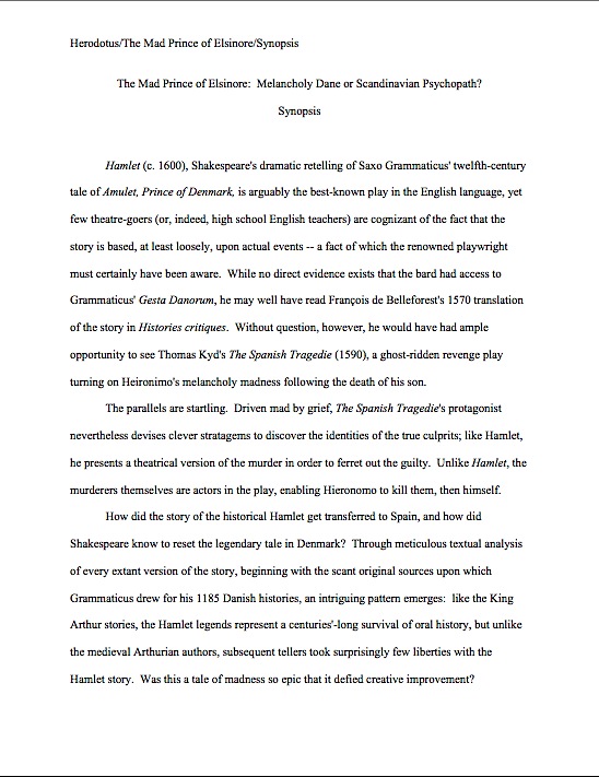
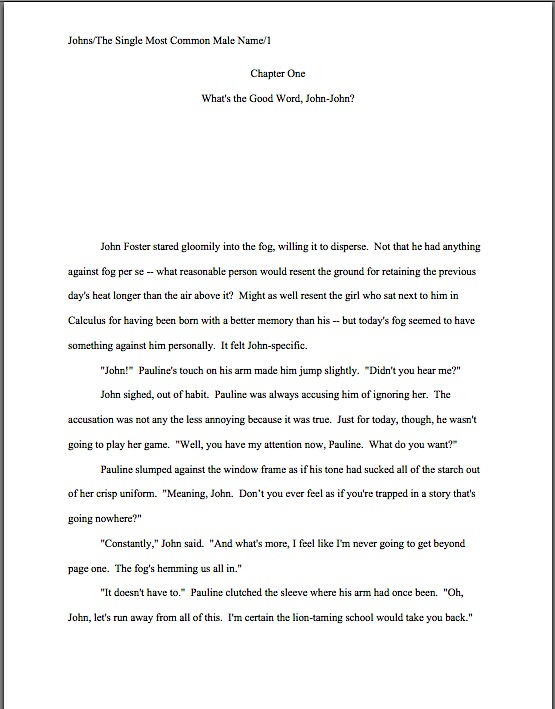
Why? Well, as we have discussed, many aspiring writers just like that repetitive rhythm — but it’s also one of the most popular means of establishing that chatty-sounding first-person narrative voice I mentioned above. Sometimes, this can work beautifully, but as with any repeated stylistic trick, there’s a fine line between effective and over-the-top. A fairly common way to open a manuscript:
And I thought it could never happen to me. I had always thought it was just a cartoon cliché. But here it was, happening: me pinned to the ground, struggling. While a mustache-twirling villain tied me to the railroad tracks. The railroad tracks, no less, as if anyone took trains anymore. And with my luck, I’d end up lying here for days before a locomotive happened by.
“That will teach you,” my captor gloated, “not to pay the rent.”
And had I mentioned that aspiring writers just love to overload their manuscripts with conjunctions? And that they use the device a lot? Or that by the time Millicent picks up your submission, she’s probably already read hundreds of conjunctions that day?
Since false consecutiveness is stylistically ubiquitous, you might want to screen your submission for its frequency. Particularly, if you’ll forgive my being marketing-minded here, in the early pages of your manuscript. And absolutely on the first page.
Why especially there? Long-time readers, chant it with me now: agents, editors, and contest judges tend to assume that the writing on pages 1-5 is an accurate representation of the style throughout the entire manuscript. That presumption enables them to stop reading the instant they decide that the writing is weak.
Was that sudden blinding flash an indication that light bulbs just went off over a thousand heads? That’s right: this often-unwarranted assumption, renders rejection on page 1 not only logically possible, but reasonable. It certainly underlies the average Millicent’s practice of not reading past any problems that might turn up on page 1 of a submission: once you’ve seen a modicum of this author’s writing, she reasons, you’ve seen enough.
Feel free to pause here to punch the nearest pillow, sofa cushion, or other relatively soft object seventeen or eighteen times. Again, I’m happy to wait.
Got all of that frustration out of your system? Excellent. Let’s shift our energies to what a writer can control in this situation. Narrative structure and voice are not merely matters of style; to a market-savvy writer — they are also matters of strategy.
And, frankly, the oh-so-common practice of conjunction overuse is not particularly good strategy at any point in a submission or contest entry. If you lean too hard on any single narrative tool in your writer’s kit in those early pages, Millicent and her ilk are not going to stick around to see whether you’ve mended your ways by page 25, alas. They’re going to stop reading, so they may move on to the next submission.
Do I hear some moaning out there that’s not attributable to any of my late relatives’ editorial rantings? “But Anne!” these disembodied voices moan, bravely beginning their protest with a conjunction, thereby risking a thunderbolt flung by Uncle Alex and whatever minor deities he may have managed to befriend in his time in the choir eternal; he always did throw great parties. “Not every book’s best writing falls on its first page, or even within its first chapter. Many, many writers take a chapter or two to warm up to their topics. So doesn’t this practice give an unfair advantage to those writers who do front-load their work?”
In a word, yes. Next question?
In fact, I would highly recommend front-loading your submission or contest entry with your best writing, because I want your work to succeed. Again, we could waste a lot of energy complaining about the necessity for this (which I’m sure all of us could, at great length), but I would rather we concentrate instead upon heading the problem off at the proverbial pass.
Ready to exercise some authorial autonomy? Excellent. Whip out your trusty highlighter pens, and let’s get to work.
(1) Print out at least the first 5 pages of your submission. If you want to be very thorough, print the entire first chapter, as well a random page from each subsequent chapter.
And before anybody asks: no, reading through those pages on your computer’s screen is not an adequate substitute, for our purposes. Nor is simply doing a Word search for conjunctions. The goal here is not to come up with a simple accounting of how often you are using these words, but to spot patterns in how and where you are habitually including them.
(2) Pick a pen color for and, another for but (go ahead and use it for the howevers and yets as well), and a third for then. If you are prone to equivocation, you might want to designate a fourth for or.
Why these words and no others? Well, these particular ones tend to get a real workout in the average manuscript: when writers are trying to cover material rapidly, for instance, and, but, and then often appear many times per page. Or per paragraph.
Or even per sentence. Yes, really.
(3) Mark every single time each of those words appears on your pages.
Not just where these words open a sentence, mind you, but every instance. Don’t fudge — the experiment will not be nearly so useful.
(4) After you have finished inking, go back and re-examine every use of then, asking yourself: could I revise that sentence to cut the word entirely? If it begins a sentence, is that the most effective opening?
(5) If you were even tempted to skip Step 4, does then appear more than once within those first 5 pages? More than once on page 1?
At the risk of seeming draconian, you should seriously consider excising every single use of then in those opening pages — and at least toy with getting rid of most thereafter. Sound drastic? Believe me, I have an excellent reason for suggesting it: some professional readers’ visceral negative reaction to repetitive use of then borders on the physically painful.
Why? Well, it’s one of the first words any professional editor would cut from a text — and with good reason. In written English, pretty much any event that is described after any other event is assumed to have happened later than the first described, unless the text specifies otherwise. For instance:
Jean-Marc poached the eggs in a little butter, then slid them onto the plate, and then served them.
Ostensibly, there’s nothing wrong with this sentence, right? Perhaps not, but given the average reader’s belief that time is linear, it is logically identical to:
Jean-Marc poached the eggs in a little butter, slid them onto the plate, and served them.
Technically, then is entirely unnecessary here. In not entirely unrelated news, then is almost always omittable as a purely temporal marker.
“Pardon my asking,” Millicent says, wondering why I have a latté at my elbow and she doesn’t, “but why is do submissions so often include it repeatedly, as if it were stylish? Or, if appears frequently enough, as a characteristic of authorial voice? It’s seldom necessary, and it’s hardly original.”
That would be hard for anyone who has read more than a handful of manuscripts or contest entries to dispute, Millie. To professional eyes, the percussive use of then is logically redundant, at best. At worst, it’s a sign that the writer is getting a bit tired of writing interestingly about a series of events and so crammed them all into a list.
Is this really the reaction you want to elicit to your narrative voice within the first few pages of your book?
Actually, it’s not a bad idea to omit temporal thens altogether in your writing unless the event described after them is a genuine surprise or occurred so abruptly that it would have been so to onlookers. Here’s an instance where the use is undoubtedly justified:
Jean-Marc poached the eggs in a little butter, slid them onto the plate — then flung their steaming runniness into Anselmo’s astonished face, scarring him for life.
Now that’s a then that signals a change in sentence direction, isn’t it? Reserving the device for this use will render your thens substantially more powerful.
(6) Turn your attention now to the buts, howevers, and yets on your marked-up pages. Each time they appear, ask yourself: is the clause that immediately follows the word ACTUALLY a shift in meaning from what has come immediately before it? If not, consider excising the words altogether.
I hear more squawking from the non-celestial peanut gallery. “But Anne,” they cry, bravely persisting in their long-term habit of opening every protest hurled my way with a conjunction, “you can’t seriously mean that! Don’t you mean that I should carefully rewrite the sentence, substituting another word that means precisely the same as but, however, or yet? The whole point of my introducing however and yet was to give my but a periodic rest!”
Good question, but-resters, but I did mean what I said. But, however and yet logically imply contradiction to what has already been stated. Yet many aspiring writers use these words simply as transitions, a way to make the sentence before seem to flow naturally — that is, in a way that sounds like conversation — into the next.
What I’m suggesting here is not that you remove every legitimate negation, but rather that you should remove the negative conjunctions that are misused. Let’s take a gander at what a savvy reviser might spare.
Bartholomew wanted to answer, but his tongue seemed to be swelling in his mouth. Was it an allergic reaction, stress, or had Josette poisoned him? He felt panic rising within him. However, his epi pen, bottle of antihistamines, and seventeen homeopathic remedies were in the pocket of his fetching dressing gown, so he need not panic. Yet now that he began to search for it, his personal first-aid kit seemed to have vanished from its usual resting-place.
“Cat got your tongue?” Josette asked sweetly, adding another lump of strangely-colored sugar to his tea.
I would vote for keeping all of buts, howevers, and yets in this passage. Each is serving its proper function: they are introducing new facts that are genuinely opposed to those that came just before the conjunction.
That is not always the case, alas. Take a look at a version of the same scene where none of these words is ushering in a twist related to the last information before it:
Bartholomew settled his fetching dressing gown around him irritably, but his tongue seemed to be swelling in his mouth. Was it an allergic reaction, stress, or had Josette poisoned him? He felt panic rising within him. However, he could not breathe. Yet his asthma seemed to be kicking in full force.
“Cat got your tongue?” Josette asked sweetly, adding another lump of strangely-colored sugar to his tea.
See the difference? By including conjunctions that imply an opposition is to follow, but not delivering upon it, the transitional buts, howevers, and yets ring false.
Yes, this level of textual analysis is a heck of a lot of work, now that you mention it. Strategically, it’s worth it, though: this device is so popular amongst aspiring writers that the transitional but has become, you guessed it, a common screeners’ pet peeve.
Harrumphs all round from my interlocutors, earth-bound and otherwise. “No big surprise there,” they huff. “To hear you tell it, it doesn’t take much for a writerly preference to graduate to industry pet peeve.”
Actually, it does take much — much repetition. It just doesn’t take very long manning the screening desk to discover that out of any 100 submissions, a good 92 will all share this narrative device. Trust me, agents and editors alike will bless you if your manuscript is relatively light on these overworked conjunctions.
Or if you don’t overuse favorite words in general. Honestly, those of us that write for the American market have no excuse. English is a marvelous language for prose because contains so very many different words; it enables great precision of description.
“So why on earth,” Millicent wonders, rejoining us after a coffee run, “do these submissions keep leaning so heavily on to be, to have, to think, to walk, to see, to say, and to take? If it happened in, say, one submission out of fifty, I could cope with it, but every other one?”
Good question, Millie. Varying word choice almost always makes a better impression upon professional readers than leaning too heavily on the basics.
I wish more first-time submitters knew that, but usually, US writers have been taught just the opposite: throughout their school years, teachers kept quoting either Mark Twain or Somerset Maugham’s (depending upon how old the teachers were, and what examples their teachers had used) overworked axioms about never using a complex word when a simple word would do.
The reason that your teachers told you this is not that simple, straightforward words are inherently better than polysyllabic ones, but because they were trying to prevent you from making the opposite mistake: a narrative that sounds as if it has swallowed a thesaurus whole, dragging in pretentious or obsolete words inappropriate to the book category or target market.
For most manuscripts, this is still pretty good advice. To see why, we have only to glance at a genre- and character-inappropriate vocabulary shoved into the mouth of a protagonist — particularly common in memoir and autobiographical fiction, incidentally, in which the writer wishes to indicate, however subtly, that Our Hero is much, much smarter than everybody else in the story. To pile the pet peeves even higher, let’s make it a child that talks like an adult.
“Hey,” Mom shouted. “Did someone take the pie?”
“In the entirety of my five and a half years’ subsistence, situated upon this terrestrial sphere,” Babette murmured, “I have seldom been so incensed. Nay, apoplectic. That you, Mater, would indict me of having pilfered, purloined, and/or absconded with your irreplaceable peach pie, in lieu of interrogating my shifty-eyed sibling, flabbergasts me. I mandate an instantaneous act of contrition.”
“Yeah, you and what army?” Benjy sneered, kicking his high chair.
“Now, now,” Mom said. “Stop squabbling, children.”
Even if young Babette’s speaking like an 18th-century clergyman were somehow in character, it’s distracting that the text suddenly breaks out in SAT words. That’s not necessarily a deal-breaker for Millie, but there are few book categories in which the vocabulary level displayed above would be audience-appropriate.
Remember, the standard vocabulary expectation for adult fiction is a 10th-grade reading level; in many genres, it’s even lower. Doing a bit of reading in your chosen category can help you figure out where to pitch your word choices — and how broad a vocabulary Millicent is likely to expect in your manuscript.
Why is this a good idea? Not only is the gratuitous induction of polysyllabic terminology into a tome formulated for a less erudite audience not liable to galvanize a professional reader into spontaneous cries of “Huzzah!” (see how silly it looks on the page?) — it can also stick out like the proverbial sore thumb, knocking the reader out of the story.
The much-hyped 2007 movie JUNO contained such an excellent example of this that you might want to consider renting it just to see this phenomenon in action. After spending fully two-thirds of the film establishing the protagonist’s father as a Working Man with a Heart of Gold, living in a house that apparently contains no books, repeatedly telling better-heeled folk that he’s just a plain man, and who never once mentions to his pregnant 16-year-old daughter that her condition might conceivably (so to speak) affect any future college plans she might have, he says to his daughter, “You look morose.”
At which, naturally, half of my fellow theatergoers laughed, believing this line to be a joke. Morose didn’t seem to be a word that this particular character would ever use — or that his otherwise estimable daughter could spell. Yet from context, it wasn’t intended humorously: evidently, the screenwriter simply liked the word.
Nothing wrong with that, of course — but as I may have mentioned earlier in this series, authorial affection is not always sufficient justification to include a pet word or phrase. If a word is not book-category appropriate, think seriously about finding a substitute. That’s not compromising your artistic vision; that’s gearing your voice to your audience.
It’s also a necessary step towards individualizing your authorial voice. Just as a matter of practicality, if Millicent has already seen several conjunction-heavy narratives within the last hour, it’s going to be significantly more difficult to impress her with the originality of a manuscript that’s embraced a similar narrative strategy.
Speaking of developing a sensitivity to repetition across manuscripts, as well as within them, did anyone happen to catch the too-close similarity of Yvette, Josette, and Babette in today’s examples? “What’s going on?” Millicent shouts immediately after burning her lip on her too-hot latte. “A plague of -ettes? Did a bestseller from a year ago feature a heroine with an -ette name, and are the writers of these passages copying that?”
Well caught, Millicent: writers often harbor affection for similar names. But just as a skimming reader is likely to mix up those whose names begin with the same first letter — a real pity, as Joan, Jane, Joanne have virtually nothing in common otherwise — names with similar characteristics, or even ones that sound similar, may cause unnecessary confusion. Or don’t you believe that, Jon, Von, Van, and Alan?
Wow, we’ve covered a lot of ground today, have we not? But don’t toss out those marked-up pages, please: we shall be talking more about overused conjunctions in the days to come. Next time, it’s on to the ands.
Keep up the good work!


