Formatpalooza, part VIII: but I see it done constantly in published books!

Seattle mossgin and tonic
oxidized polebeach rock2

As those of you who have been perusing the sage advice underneath the pictures here at Author! Author! for some time may have noticed, I’m a big fan of artists’ looking at ordinary, everyday things and showing us the beauty inherent in them. The coy models in the shots above could not have been more prosaic if they had tried: clockwise from top left, that’s perfectly ordinary moss on a perfectly ordinary concrete wall, photographed during a perfectly ordinary Seattle rainstorm, a genuinely mundane gin-and-tonic (commonplace Bombay Sapphire, instead of my preferred Hendrick’s), a salt-of-the-earth beach rock nice enough to hold still and pose for me, and a regular old municipal light pole attacked by regular old municipal rust.

And while I was clicking away to capture that first shot, a perfectly run-of-the-mill artist-meets-dubious-public moment: while crunching my body sideways in order to get that first shot, a Central Casting mother told her standard-issue wee daughter to veer away from the you-meet-‘em-every-day crazy lady. Yet another case of a misunderstood artist — and another a child being warned that if she tries to look at something from an unusual perspective, people are bound to think she’s strange.

And that, my friends, is how budding artists are discouraged from potentially glorious careers: being told that normalcy requires seeing things just like everybody else does.

Perhaps not astonishingly, writers tend to find beauty in found words. An overhead scrap of conversation, perhaps, or a favorite phrase in a book. And often — far too often, from Millicent the agency screener’s perspective — aspiring writers celebrate these words lifted from other places by quoting them at the beginning of their manuscripts.

That’s right, campers: today, I’m going to be talking about proper formatting for that extremely popular opening-of-text decoration, the epigraph. You know, those nifty little quotes from other sources that we writers adore enough to want to reproduce in our own books.

And who can blame us? It’s not as though the publishing industry doesn’t encourage us to think of them this way: in a published book, the epigraph, if any, is almost always presented in a place of honor, either at the top of each chapter or by itself on the page before the text proper starts.

Take, for example, the placement of the well-known epigraph to Alice Walker’s THE COLOR PURPLE, an excerpt from Stevie Wonder’s DO LIKE YOU. Even in my cheap, well-worn paperback edition, it scores a page all to itself, right between the copyright information on the flip side of the title page and the opening of Chapter One.
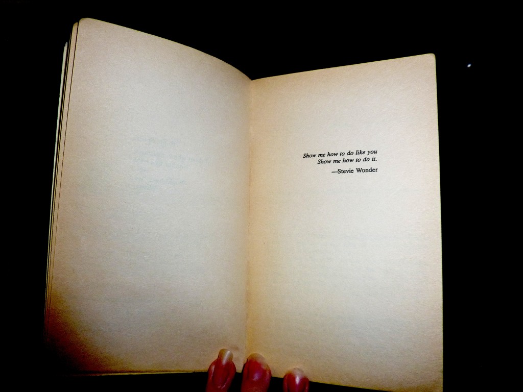
The color purple's epigraph

Okay, so that picture didn’t really do the words justice; not all of my photos can be winners, you know. Let’s try a tighter shot:

epigraph2

Not only is it allocated space; it’s allocated white space, to set it off from the other text. That is quite an honor, in an age when acknowledgments pages are routinely omitted, along with the second spaces after periods and colons, in order to save paper.

Especially since nobody but writers like epigraphs much — but I’m getting ahead of myself, amn’t I?

We writers-who-read think they’re great, don’t we? Particularly if those pithy little quotes come from obscure sources; they feel so literary. Or deep-in-the-national-psyche, know-your-Everyman populist, if they’re culled from songs. By evoking the echo of another writer’s words, be it an author’s or a songwriter’s, we use them to set the tone for the story to come.

I don’t think conceptual aptness is all there is to the appeal, though. There is something powerfully ritualistic about typing the words of a favorite author at the beginning of our manuscripts; it’s a way that we can not only show that we are literate folk — as opposed to the (ugh!) other kind — but that by writing a book, we are joining some pretty exalted company.

Feeling that way about the little dears, I truly hate to mention this, but here goes: it’s a waste of ink to include them in a manuscript intended for submission to an agency. 99.9998% of the time, they will not be read at all.

Stop glaring at me; it’s not my fault. I don’t stand over Millicent with a bullhorn, admonishing her to treat every syllable of every submission with respect. (Although admittedly, that’s an interesting idea.)

The sad fact is, most Millicents are specifically trained not to read epigraphs in manuscripts; it’s widely considered a waste of time. I’ve literally never met a professional reader who doesn’t simply skip epigraphs in a first read — or (brace yourselves, italics-lovers) any other italicized paragraph or two at the very beginning of a manuscript, even if it was actually part of the text.

Oh, dear — I told you to brace yourselves. “Why on earth,” italics-lovers the world over gasp in aghast unison, “would any literature-loving human do such a thing? Published books open all the time with italicized bits!”

A fair question, but actually, there’s a pretty fair answer. Most Millicents just assume, often not entirely without justification, that if opening is in italics, it doesn’t really have much to do with the story at hand, which (they conclude, not always wrongly) begins with the first line of plain text.

In other words, our Millie treats any slanted text at the beginning of a manuscript as if it were an epigraph. It’s kind of hard to blame her, really: she’s there to read your writing, not somebody else’s.

Of course, there’s another, less ego-flattering reason that Millicents tend to skip ‘em: at the submission stage of the game, no one cares who a writer’s favorite authors are. A writer’s reading habits, while undoubtedly influential in developing her personal voice, are properly the subject of post-publication interviews, not manuscript pre-screening considerations.

After all, it’s not as though Millicent can walk into her boss’ office and say, “Look, I think you should read this submission, rather than that one, because the first’s writer has really terrific literary taste — it opens with a quote from William Godwin’s CALEB WILLIAMS, OR THINGS AS THEY ARE,” can she?

For those of you who didn’t howl with laughter at that little history-of-publishing joke, novelist William Godwin was political theorist and novelist Mary Wollstonecraft’s editor around the time of the French Revolution. They also produced another literary marvel together: Mary Wollstonecraft Shelley, the author of Frankenstein, was their daughter. Isn’t it fun being hyper-literate?

Still not rolling in the aisles, are you? That’s how Millicent feels when confronted with a genuinely esoteric quote at the top of a manuscript.

Whichever reason to skip the darned thing most appeals to the Millicent who happens to have your submission lingering on her desk (right next to that too-hot latte she’s always sipping, no doubt), it’s a safe bet that she’s not going to be reading your carefully-chosen epigraph. She feels pretty good about this choice, too.

Why? Well, the official justification for this practice — yes, there is one to which Millicents will admit in public — is not only reasonable, but even noble-sounding. See if it sounds at all familiar: even the busiest person at an agency or publishing house picks up a submission in order to read its author’s writing, not somebody else’s.

Kind of hard to fault them for feeling that way, isn’t it? Given our druthers, I suspect it would be hard to find an aspiring writer who wouldn’t prefer that the pros notice the individual brilliance of her respective styles than marvel over her esoteric reading habits.

Some of you are still clutching your quote books to your heaving chests, aren’t you? Okay, sentiment aside, let’s look at what including an epigraph in a book achieves on a practical level, as well as its strategic liabilities.

Let’s assume for a moment that you have selected the perfect quotation to open your story. Even better than that, it’s gleaned from an author that readers in your chosen book category already know and respect. By picking that quote, you’re announcing from page 1 — or before page 1, if you allocate it its own page in your manuscript — you’re telling Millicent that not only are you well-read in your book category, but you’re ready and able to take your place amongst its best authors.

Sounds plausible from a writerly perspective, doesn’t it? That’s one hard-working little quote.

But what happens when Millicent first claps eyes on your startlingly apt epigraph? Instead of impressing her with your erudition, the epigraph will to prompt her to start skimming before she gets to the first line of your text — and you will have made her wonder if you realized that manuscript format and book format are not the same.

So you tell me: was including it a good idea? Or the worst marketing notion since New Coke?

If that all that hasn’t convinced you, try this on for size: while individual readers are free to transcribe extracts to their hearts’ contents, the issue of reproducing words published elsewhere is significantly more problematic for a publishing house. While imitation may be the sincerest form of flattery, reproduction of published text without the author’s permission is known in the biz by another, less flattering name: copyright infringement.

What does that mean in practice? Well, if the epigraph is from a book that is not in the public domain, the publisher will need to obtain explicit permission to use any quote longer than fifty words. Ditto for any quote from a song that isn’t in the public domain, even if it is just a line or two.

So effectively, most epigraphs in manuscripts might as well be signposts shouting to an editor: “Here is extra work for you, buddy, if you buy this book! You’re welcome!”

I’m sensing some disgruntlement out there, amn’t I? “But Anne,” I hear some epigraph-huggers cry,
“the material I’m quoting at the opening of the book is absolutely vital! The book simply isn’t comprehensible without it!”

Before I respond, let me ask a follow-up question: do you mean that it is crucial to the reader’s understanding the story, or that you have your heart set on that particular quote’s opening this book when it’s published?

If it’s the latter, including the epigraph in your manuscript is absolutely the wrong way to go about making that dream come true. Like any other book formatting issue, whether to include an epigraph — or acknowledgements, or a dedication — is up to the editor, not the author.

And besides — chant it with me now, ‘Palooza faithful — a manuscript should not look like a published book.

Consequently, the right time to place your desired epigraph under professional eyes is after the publisher has acquired the book, not before. You may well be able to argue successfully for including that magically appropriate quote, if you broach the subject at the right time. Politely.

Just to set my trouble-borrowing mind at ease: you do know better than to include either acknowledgements or a dedication in your manuscripts at submission time, right? It’s for precisely the same reason: whether they’ll end up in the published book is the editor’s call. (I wouldn’t advise getting your hopes up, though: in these paper-conserving days, the answer is usually no on both counts, at least for a first book.)

Quite a few of you were beaming virtuously throughout those last three paragraphs, though, weren’t you? “I know better than to second-guess an editor,” stalwart souls everywhere announce proudly. “I honestly meant what I said: my opening quote is 100% essential to any reader, including Millicent and her cohorts, understanding my work.”

Okay, if you insist, I’ll run through the right and wrong ways to slip an epigraph into a manuscript — but bear in mind that I can’t promise that even the snazziest presentation will cajole Millicent into doing anything but skipping that quote you love so much.

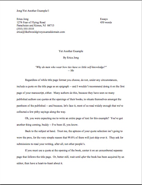
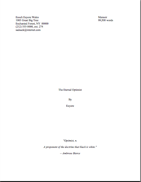
For starters, do not, under any circumstances, include a quote on the title page as an epigraph. Which is, alas, what submitters are most likely to do. Let’s take a gander at what their title pages tend to look like:

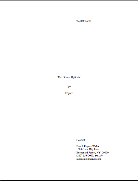
Does that leave you wondering whether Millicent will notice the quote at all, much less find it obnoxious? She will, because this is was what she was expecting to see:

Actually, that was sort of a red herring — that page wasn’t precisely what she expected. Did you catch the vital piece of information Eeyore left off his title page?

If you said that he neglected to include the book category on the second example, award yourself a pile of thistles. (Hey, that’s what he would have given you.) His title page should have looked like this:
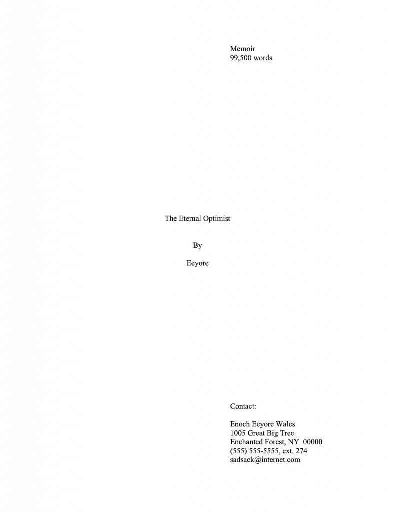
Eeyore good title

And yes, I am going to keep showing you properly-formatted title pages until you start seeing them in your sleep; why do you ask? Take a moment to compare the third example with the first: the quote in the first example is going to stand out to Millicent like the nail in a certain critter’s tail, isn’t it?

Other submitters choose to eschew the title page route in order to place an epigraph on the first page of text. The result is immensely cluttered, by anyone’s standards — especially if the submitter has made the very common mistake I mentioned in my discussion of title pages last time, omitting the title page altogether and cramming all of its information onto page 1:

Where did all of our lovely white space go? Into quoting Ambrose Bierce, partially.

Not that I’m against anyone doing that, ever. Except — wait for it — on the top of a manuscript submission.

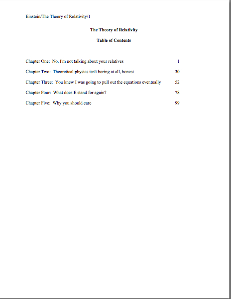
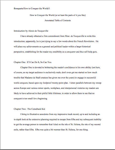
The third popular but ill-advised way to include an introductory epigraph is to place it on a page all by itself in the manuscript, between the title page and the first page of text. In other words, as it might appear in a published book:

What’s wrong with this, other than the fact that Poe died before our boy D.H. wrote Sons and Lovers? At the risk of repeating myself, a manuscript is not supposed to look just like a published book; it has its own proper format.

At best, Millicent is likely to huffily turn past this page unread. At worst, she’s going to think, “Oh, no, not another writer who doesn’t know how to format a manuscript properly. I’ll bet that when I turn to page one, it’s going to be rife with terrible errors.”

Does either outcome sound especially desirable to you? I thought not.

So what should an epigraph-insistent submitter do? Leave it out of the submission, of course — weren’t you listening before?

But if it is absolutely artistically necessary to include it, Mssr. Poe actually wasn’t all that far off: all he really did wrong here was include a slug line. The best way to include an introductory epigraph is on an unnumbered page PRIOR to page 1. On that unnumbered page, it should begin 12 lines down and be centered. But I’m not going to show you an example of that.

Why? Because I really, truly would advise against including an epigraph at all at the submission stage.

Just in case I hadn’t made that clear. And had I mentioned that manuscripts specifically should not resemble published books?

That doesn’t mean you should abandon your cherished epigraph altogether, however. Squirrel all of those marvelous quotes away until after you’ve sold the book — then wow your editor with your erudition and taste.

“My,” the editor will say, “this writer has spent a whole lot of time scribbling down other authors’ words. He must read quite a bit.”

Or, if you can’t wait that long, land an agent first and wow her with your erudition and taste. But don’t be surprised if she strongly advises you to keep those quotation marks to yourself for the time being. After all, she will want the editor of her dreams to be reading your writing, not anyone else’s, right?

Wait — where have I heard that before?

If you are submitting directly to a small press, do be aware that most publishing houses now place the responsibility for obtaining the necessary rights squarely upon the author. If you include epigraphs, editors at these houses will simply assume that you have already obtained permission to use them. Ditto with self-publishing presses.

This expectation covers, incidentally, quotes from song lyrics, regardless of length.

Yes, really. If you want to use a lyric from a song that is not yet in the public domain, it is generally the author’s responsibility to get permission to use it — and while for other writing, a quote of less than 50 consecutive words is considered fair use, ANY excerpt from an owned song usually requires specific permission, at least in North America. Contact the American Society of Composers, Authors, and Publishers (ASCAP) for assistance in making such requests. (For a very funny first-hand view of just what a nightmare this process can be, please see FAAB Joel Derfner’s guest post on the subject.)

Have I talked you out of including an epigraph yet — particularly an excerpt from a copyrighted song, like Alice Walker’s? How about holding off for the creative reason: Millicent sees the same quotes over and over again?

Oh, you were positive that nobody else was a William Godwin fan?

I know that it hurts to cut your favorite quote from your manuscript, but take comfort in the fact that at the submission stage, no cut is permanent. Just because you do not include your beloved quote in your submission does not mean that it cannot be in the published book.

Contrary to what 99% of aspiring writers believe, at the submission stage, even the most polished manuscript is a draft, not a finished work. In actuality, nothing in a manuscript is exempt from alteration until the book is actually printed — and folks in the industry make editing requests accordingly.

That’s going to help all of you sleep better tonight, isn’t it? Actually, it should: just as tight copyright restrictions prevent your favorite authors from having long chunks of their texts excerpted without their permission — or, sacre bleu! entire paragraphs from CALEB WILLIAMS being passed off as somebody else’s work — so will it protect your writing from predatory borrowers.

Just a bit of proverbial food for thought. Keep noticing the beauty in the everyday, everybody, and as always, keep up the good work!
Formatpalooza, part II: not all truths are self-evident

gumballs

Hard to believe anyone would actually need to be told that those are gumballs, isn’t it? They are the epitome of the breed: large, spherical, colorful, and — dare I say it? — potentially jawbreaking. Yet clearly, at some point in the probably not-too-distant past, some passing myopic soul must have asked the proprietor, “So are those gumballs?”

I suspect that s/he just got tired of answering the same question 4200 times per week. Those of us who work with manuscripts for a living can sympathize.

Just to breathe the word editor (or my preferred title, book doctor) anywhere near the pronoun I and the verb am is to invite an avalanche of questions about manuscripts: how to get them published, how to get them under the eyes of an agent, how to keep them from getting rejected, and, surprisingly often, what they should look like.

Frankly, there seems to be a lot of confusion out there on that last subject — and that puzzles the pros, because standard format for manuscripts actually hasn’t changed all that much over the last 50 years. Oh, underlining is out and italics are in to designate words in foreign languages (currently, one should never underline anything in a book manuscript; I’ll be getting to that), and how one does indentation has altered a bit with the adoption of Microsoft Word as the industry standard for electronic submission (Word measures its tabs in fractions of an inch, not character spaces), but overall, the professionally-formatted manuscripts of today quite closely resemble the professionally-formatted manuscripts of, say, 1958.

That’s not to say, of course — or is it really that self-evident? — that all writing should be, or ever was, formatted in this manner. Short story format is different from standard format for books and book proposals, and has been for quite some time. So are essay format, academic format, journalistic format, and even how a published book will look on a page.

Which is, I suspect, the source of most of the confusion amongst aspiring writers of books. A tremendous amount of the formatting advice out there doesn’t seem to make the distinction between submitting writing to an agent or editor at a publishing house and submitting it to a magazine that prints short stories — or, indeed, presenting it in any context. That small omission leads many, many aspiring writers down the proverbial primrose path, because the fact is, the rules are different for different types of writing.

Do all of those eyebrows currently slapping into hairlines mean that this comes as a surprise to some of you? Were you under the impression that all writing should be formatted identically for submission anywhere, anytime?

If so, you are most emphatically not alone, especially since the rise of Google. Now, it’s far from uncommon for aspiring writers to plug manuscript page, submission format, or some similarly descriptive term into a search engine and come up with 25,000 pages, 65% of which will claim (or at least imply by omission) that they are stating the presentation rules for all professional writing.

Except they’re not. How do I know? Because it’s empirically impossible.

“But Anne,” some of you ask, cradling your sore brows, “why should that be the case? There are plenty of authors who write both short stories and novels, or essays and nonfiction books. Wouldn’t it just make sense that everybody would use the same format for writing?”

That would make sense, if (a) the overall system had been set up by writers, not publishers, (b) there had ever been an overall system governing all kinds of writing, and/or (c) the various species of writing were not published by completely distinct sets of people, each of whom have established norms for their own particular branches. Obviously — or is it so obvious? — the people outside an industry do not have the right to set submission standards for the people within it.

Or, to put it another way: just as all writing is not identical, neither is all publishing.

That very notion is making some of you squirm, isn’t it? I’m not entirely surprised: every time I have broached the subject formally, those who have heard rumors elsewhere that something has changed leap upon my well-intentioned little gazelles of advice with the ferocity of hungry lions, demanding that I either recant my not at all heretical beliefs or, as I mentioned last time, to compel literally every other writing advice-giver in North America to agree to abide by precisely the same rules.

To dispel any illusions up front: neither of those things is going to happen during Formatpalooza. In my professional experience, the formatting I’m discussing here is indeed important, and not just in theory. I have sold books adhering to these rules; my editing clients have sold books using them; agents, editors, and contest judges regularly complain about writers who don’t adhere to them — or even know such rules exist. So I feel entirely comfortable in saying early and often that manuscripts presented in standard format look professional to people who handle manuscripts for a living.

Does that mean every professional reader, everywhere, every time, will want to see your work formatted this way? No, of course not: as I also say early and often, should you happen to be submitting to an agent, editor, or contest that specifically asks you to do something other than I advise here, obviously, you should give him, her, or it what he or his stated guidelines request.

That’s just common sense, right? Not to mention basic courtesy. Yet judging by the plethora of questions I’m constantly getting on the subject, it’s not self-evident.

To make this last point pellucidly clear for those of you who have not been hanging around Author! Author! throughout our long autumn of ‘Paloozas: I would actively encourage you not only to check the standard agency guides for expressions of alternate preferences, but also to run an Internet search on any individual agent to whom you were planning to submit, to double-check that s/he hasn’t stated in some public forum that, for instance, s/he prefers only a single space after a period or a colon or can’t stand the sight of Times New Roman instead of Courier. Admittedly, it requires a bit more effort on the submitter’s part, but hey, it’s worth it.

Why? Chant it with me now, ‘Palooza devotees: if an agent or editor has been kind enough to take the time to tell aspiring writers precisely what s/he wants to see, be it in a query letter, storyline, or manuscript submission, a savvy writer should pay attention.

Again, that’s just being both smart and polite, isn’t it? If an agency has been considerate enough of its future clients to post submission guidelines, it’s only courteous to acknowledge their efforts.

I spot some timid hands raised out there. “But Anne,” point out some confused by conflicting advice — and who could blame them, given the multiplicity of it? “I’ve been doing my homework, and the overwhelming majority of the guide listings and agency websites I’ve found don’t talk about manuscript format at all. Does that mean that these fine folks just don’t care about how I present my writing?”

The short answer is no. The long answer is that standard format is just that: standard. So much so that to many folks who read and sell manuscripts for a living, it’s patently self-evident that they expect to see submissions in standard format.

So here is the mid-length answer: in the absence of specific alternate directions, the best course is always to adhere to the rules of standard format.

That’s why I revisit this topic regularly. To repeat the disclaimer I’ve run every single time I’ve run a series on formatting: these are the rules that I use myself, the ones that my lengthy experience tells me work. There are, however, other rules out there, presented by some very credible sources. If you find other guidelines that make sense to you, use them with my good wishes.

Seriously: as far as I’m concerned, what you do with your manuscript up to you. I’m only trying to be helpful here. Personally, I would strenuously advise against implementing any piece of formatting advice that deviates from the strictures of standard format unless you are positive that the specific agent or contest to whom you are planning to submit it wants to see your work that way — all too often, individual agents’ preferences fly around the rumor mill billed as the new universal expectation — but hey, I’m a realist: I’m aware that many, if not most, aspiring writers find it magnificently annoying to learn that they might have to produce more than one version of their manuscripts to submit to agents (or, even more common, writing contests) with different guidelines. They want to format their work once and be done with it, and who can blame them?

While I’m strenuously advising things, I would also urge you never to implement a rule you do not understand. That’s why I provide such extensive explanations for each of my suggested guidelines — so my readers may consider the various recommendations out there and form their own opinions.

You’re smart people; I know you’re up to the challenge.

I’m also confident that my readers are savvy enough to understand that paying attention to how a manuscript looks does not imply that how it is written doesn’t make a difference. Of course, writing talent, style, and originality count. Yet in order to notice any of those, a reader has to approach the page with a willingness to be wowed.

That willingness can wilt rapidly in the face of incorrect formatting — which isn’t, in response to what half of you just thought, necessarily the result of mere market-mindedness on the part of the reader. After you’ve read a few thousand manuscripts, deviations from standard format leap out at you. As will spelling and grammatical errors, phrase repetition, clichés, telling rather than showing, and all of the writing problems we’ve all heard so much.

They’re distractions from your good writing. My goal here is to help you minimize the distractions that would catch Millicent the agency screener’s eye first.

I hear those of you who have spent years slaving over your craft groaning out — believe me, I sympathize. For those of you who have not already started composing your first drafts in standard format (which will save you a lot of time in the long run, incidentally), many of the tiny-but-pervasive changes I am about to suggest that you make to your manuscript are going to be irksome to implement. Reformatting a manuscript is time-consuming and tedious, and I would be the first to admit that at first, some of these rules can seem arbitrary.

At least on their faces. Quite a few of these restrictions remain beloved even in the age of electronic submissions because they render a manuscript a heck of a lot easier to edit — and to read, in either hard or soft copy. As I will demonstrate with abundant examples later in this series, a lot of these rules exist for completely practical purposes — designed, for instance, to maximize white space in which the editor may scrawl trenchant comments like, “Wait, wasn’t the protagonist’s brother named James in the last chapter? Why is he Aloysius here?”

Perhaps this is self-evident from what I have already said, but here’s one last, quick caveat before I launch back into the list: the standard format restrictions I’m listing here are not intended to be applied to short stories, poetry, journalistic articles, academic articles, or indeed any other form of writing. The guidelines in this series are for BOOK manuscripts and proposals, and thus should not be applied to other kinds of writing. Similarly, the standards applicable to magazine articles, short stories, dissertations, etc. should not be applied to book proposals or manuscripts.

For the guidelines for these, you may — and should — seek elsewhere. (See my earlier rejection of universality.)

Everyone clear on that and ready to dive back into the matter at hand? Excellent; help yourself to a gumball. Let’s recap the rules we covered last time:

(1) All manuscripts should be printed or typed in black ink and double-spaced, with one-inch margins around all edges of the page, on 20-lb or better white paper.

(2) All manuscripts should be printed on ONE side of the page and unbound in any way.

(3) The text should be left-justified, NOT block-justified. By definition, manuscripts should NOT resemble published books in this respect.

(4) The preferred typefaces are 12-point Times, Times New Roman, Courier, or Courier New — unless you’re writing screenplays, in which case you may only use Courier. For book manuscripts, pick one (and ONLY one) and use it consistently throughout your entire submission packet.

Is everyone happy with those? PLEASE pipe up with questions, if not. In the meantime, let’s move on.

(5) The ENTIRE manuscript should be in the same font and size. Industry standard is 12-point.

No exceptions, please. No matter how cool your desired typeface looks, or how great the title page looks with 14-point type.

Yes, even on the title page, where almost everyone gets a little wacky the first time out. No pictures or symbols here, either, please. Just the facts. (If you don’t know how to format a title page professionally — and yes, Virginia, there is a professional format for it — please see the TITLE PAGE category on the list at right.)

I hate to be the one to break it to you, but there’s a term for title pages with 24-point fonts, fancy typefaces, and illustrations.

It’s high school book report. Need I say more?

(6) Do not use boldface anywhere in the manuscript BUT on the title page — and not even there, it’s not mandatory.

This seems like an odd one, right? Actually, the no-bolding rule is a throwback to the old typewriter days, where only very fancy machines indeed could darken selected type. So historically, using bold in-text is considered a bit tacky for the same reason that wearing white shoes before Memorial Day is in certain circles: it’s a subtle display of wealth.

You didn’t think all of those white shoes the Victorians wore cleaned themselves, did you? Shiny white shoes equaled scads of busily-polishing servants.

You may place your title in boldface on the title page, if you like, but that’s it. Nothing else in the manuscript should be bolded. (Unless it’s a section heading in a nonfiction proposal or manuscript — but don’t worry about that for now; I’ll be showing you how to format both a book proposal and a section break later on in this series, I promise.)

(7) Every page in the manuscript should be numbered — except the title page.

I’m quite serious about this: even if you take no other advice from Formatpalooza, please remember to number your pages.

This may seem like a little thing, but you’d be surprised how often violating this rule results in instantaneous rejection. Few non-felonious offenses irk the professional manuscript reader (including yours truly, if I’m honest about it) more than an unnumbered submission or contest entry. It ranks right up there on their rudeness scale with assault, arson, and beginning a query letter with, Dear Agent.

Why? Gravity, my friends, gravity. What goes up tends to come down — and if the object in question happens to be an unbound stack of paper…

Did that seem like an abstract metaphor? Not at all. Picture, if you will, two manuscript-bearing interns walking toward each other in an agency hallway. Between them, a banana peel. What is going to happen when the first slips, and the second tumbles on top of him, screaming?

You may giggle, but anyone who has ever worked with submissions has first-hand experience of this (okay, perhaps not the part about the banana peel, as well as what comes next: after the blizzard of flying papers dies down, and the two combatants rehash that old Reese’s Peanut Butter Cup commercial’s dialogue (“You got romance novel in my literary fiction!” “You got literary fiction in my romance novel!”), what needs to happen?

Yup. Some luckless soul has to put all of those pages back in the proper order. Put yourself in Millicent’s moccasins for a moment: just how much more irksome is that task going to be if the pages are not numbered?

Number your pages. Trust me, it is far, far, FAR easier for Millicent to toss the entire thing into the reject pile than to spend the hours required to guess which bite-sized piece of storyline belongs before which in an unnumbered manuscript.

FYI, the first page of the text proper is page 1 of the text, not the title page, and should be numbered as such. If your opus has an introduction or preface, the first page of that is page 1, not the first page of chapter 1.

Why, you ask? Long-time readers, pull out your hymnals and sing along: BECAUSE A MANUSCRIPT SHOULD NOT LOOK IDENTICAL TO A PUBLISHED BOOK.

The title page is not the only one commonly mislabeled as page one, by the way: epigraphs — those quotations from other authors’ books so dear to the hearts of writers everywhere — should not appear on their own page in a manuscript, as they sometimes do in published books. If you feel you must include one (considering that 99.9999% of the time, Millicent will just skip over it), include it between the chapter title and text on page 1.

If that last paragraph left your head in a whirl, don’t worry — I’ll show you how to format epigraphs properly later in this series. (Yes, including some discussion of that cryptic comment about Millicent. All in the fullness of time, my friends.)

(8) Each page of the manuscript (other than the title page) should have a standard slug line in the header. The page number should appear in the slug line, not anywhere else on the page.

Including the slug line means that every page of the manuscript has the author’s name on it — a great idea, should you, say, want an agent or editor to be able to contact you after s/he’s fallen in love with it. The slug line should appear in the upper left-hand margin (although no one will sue you if you put it in the upper right-hand margin, left is the time-honored location) of every page of the text except the title page (which should have nothing in the header or footer at all).

A trifle confused by all that terminology? I’m not entirely surprised. Most writing handbooks and courses tend to be a trifle vague about this particular requirement, so allow me to define the relevant terms: a well-constructed slug line includes the author’s last name, book title, and page number, to deal with that intern-collision problem I mentioned earlier. (The slug line allows the aforementioned luckless individual to tell the romance novel from the literary fiction.) And the header, for those of you who have not yet surrendered to Microsoft Word’s lexicon, is the 1-inch margin at the top of each page.

Traditionally, the slug line appears all in capital letters, but it’s not strictly necessary; if the agent of your dreams has a preference on the matter, trust me, you’ll be the first to hear about it after she signs you. Personally, I find the all-caps format visually distracting, so the third page of my memoir has a slug line that looks like this:

Mini/A Family Darkly/3

Since the only place a page number should appear on a page of text is in the slug line, if you are in the habit of placing numbers wacky places like the middle of the footer, do be aware that it does not look strictly professional to, well, professionals. Double-check that your word processing program is not automatically adding extraneous page markers.

Do not, I beg of you, yield like so many aspiring writers to the insidious temptation add little stylistic bells and whistles to the slug line, to tart it up. Page numbers should not have dashes on either side of them, be in italics or bold, or be preceded by the word page.

If that admonition strikes you as a disappointing barrier to your self-expression, remember, professional readers do not regard formatting choices as conveyers of personal style. The point here is not to make your slug line stand out for its innovative style, but your writing. In order for that to be possible, your manuscript’s pages to look exactly like every other professional writer’s.

And yes, Virginia, I am going to keep making that point over and over until you are murmuring it in your sleep. Why do you ask?

If you have a subtitle, don’t include it in the slug line — and if you have a very long title, feel free to abbreviate, to keep the slug line from running all the way across the top of the page. The goal here is to identify the manuscript at a glance, not to reproduce the entire book jacket.

Why not? Well, technically, a slug line should be 30 spaces or less, but there’s no need to stress about that in the computer age. (A slug, you see, is the old-fashioned printer’s term for a pre-set chunk of, you guessed it, 30 spaces of type. Aren’t you glad you asked?)

Keep it brief. For instance. my agent is currently circulating a novel of mine entitled THE BUDDHA IN THE HOT TUB — 26 characters, counting spaces. Since my last name is quite short, I could get away with putting it all in the slug line, to look like this:

Mini/The Buddha in the Hot Tub/1

If, however, my last name were something more complicated, such as Montenegro-Copperfield — 22 characters all by itself, including dash — I might well feel compelled to abbreviate. Just for the sake of variety, let’s see it in all caps:

MONTENEGRO-COPPERFIELD/BUDDHA/1

Incidentally, should anyone out there come up with a bright idea for a category heading on the archive list for this issue other than SLUG LINE — a category that already exists, but is unlikely to be found by anyone not already familiar with the term — I’d be delighted to hear suggestions. I’ve called it a slug line ever since I first clapped eyes on a professional manuscript (an event that took place so long ago my response to the sight was not, “What’s that at the top of the page, Daddy?” but “Goo!”), so I’m probably not going to be coming up with a good alternative anytime soon. Thanks.

(9) The first page of each chapter should begin a third of the way down the page, with the chapter title appearing on the first line of the page, not on the line immediately above where the text begins.

That’s fourteen single-spaced lines, incidentally. Don’t panic if you’re having trouble visualizing this — I’ll be giving concrete examples of what the first page of a chapter should look like later in this series.

The chapter title (or merely “Chapter One”) may appear on the first line of the first page — not on the last line before the text, as so many writers mistakenly do. The chapter title or number should be centered, and it should neither be in boldface nor underlined.

Why shouldn’t the title appear immediately above the text, as one so often sees — and, frankly, as some other writing sites advise? Because that’s where the title of a short story lives, not a book’s.

Self-evident now that you’ve heard it, isn’t it?

Because confusing the two formats is so common, very frequently, agents, editors and contest judges are presented with improperly-formatted first pages that include the title of the book, by Author’s Name, and/or the writer’s contact information in the space above the text. This is classic rookie mistake.

To professional eyes, a manuscript that includes any of this information on the first page of the manuscript (other than in the slug line, of course) seems like it just ended up in the wrong office. Clearly, the writer wanted not the agency to which she sent it, but the magazine down the street.

So where does all of that necessary contact information go, you ask? Read on.

(10) Contact information for the author belongs on the title page, not on page 1.

This is one of the most obvious visual differences between a short story submission (say, to a literary journal) and a novel submission. To submit a manuscript — or contest entry, for that matter — with this information on page 1 is roughly the equivalent of taking a great big red marker and scrawling, “I don’t know much about the business of publishing,” across it.

Just don’t do it.

“But wait,” I hear some of you out there murmuring, “I need a title page? Since when?”

Funny you should mention that, because…

(11) Every submission for a book-length work should include a title page, even partial manuscripts.

This one seems to come as a surprise to a lot of aspiring writers. You should always include a title page with ANY submission of ANY length, including contest entries and the chapters you send after the agent has fallen in love with your first 50 pages.

Why, you ask? Because it is genuinely unheard-of for a professional manuscript not to have a title page: literally every manuscript that any agent in North America sends to any editor in hard copy will include one, for the exceedingly simple reason that it’s the page that includes the agent’s contact information.

Yet, astonishingly, a good 95% of writers submitting to agencies seem to be unaware that including it is industry standard. To them, the cover letter, address on the SASE, or the e-mail to which the requested materials were attached are identification enough. But in practice, it’s actually none of those things will necessarily still be attached to your pages at the point when the agent of your dreams says, “By jingo, I’ve read enough. This is a writer I must sign, and pronto!”

Oh, you think that the SASE won’t go flying when those interns collide in the hallway? Or that e-mails never get deleted accidentally?

On the bright side, the widespread ignorance that a title page is expected means that if you are industry-savvy enough to include a professionally-formatted title page with your work, your submission automatically looks like a top percentile ranker to professional eyes from the moment it’s pulled out of the envelope. It’s never too early to make a good first impression, right?

If you do not know how to format a proper title page — and yes, Virginia, there is a special format for it, too — please see the TITLE PAGE category at right. Or wait a few days until I cover it later in this series.

Again, it’s entirely up to you. No pressure here. Have a gumball while you wait.

Before anyone who currently has a submission languishing at an agency begins to panic: you’re almost certainly not going to get rejected solely for forgetting to include a title page. Omitting a title page is too common a gaffe to be an automatic deal-breaker for most Millicents. Ditto with improperly-formatted ones. And yes, one does occasionally run into an agent at a conference or one blogging online who says she doesn’t care one way or the other about whether a submission has a title page resting on top at all.

Bully for them for being so open-minded, but as I point out roughly 127,348 times per year in this forum, how can you be sure that the person deciding whether to pass your submission upstairs or reject it isn’t a stickler for professionalism?

I sense some shoulders sagging at the very notion of all the work it’s going to be to alter your pages before you send them out. Please believe me when I tell you that, as tedious as it is to change these things in your manuscript now, by the time you’re on your third or fourth book, it will be second nature to you.

Why, I’ll bet that the next time you sit down to begin a new writing project, you will automatically format it correctly. Think of all of the time that will save you down the line.

Hey, in this business, you learn to take joy in the small victories.

More guidelines follow in the next couple of posts — yes, those of you whose hearts just sank audibly, standard format does indeed have that many rules — and then we shall move on swiftly to concrete examples of what all of this formatting looks like in practice. Why go over this in such detail? Because, again, I’m not asking you to embrace these guidelines just because I say so.

You should never do that, no matter how credible the source urging you to implement a rule that is new to you. I want you to have enough information on the subject to be able to understand why following them might be a good idea.

I’m funny that way. Keep up the good work!

The mysteriously mysterious strictures of standard format, part VIII: but I see it done in published books all the time!

Seattle moss

Okay, I’ll admit it: I’m a big fan of artists’ looking at ordinary, everyday things and showing us the beauty of them. Take the photograph above, for instance: that’s perfectly ordinary moss on a perfectly ordinary concrete wall, photographed during a perfectly ordinary Seattle rainstorm. (And while I was clicking away, crunching my body sideways in order to get this particular shot, a perfectly ordinary mother told her perfectly ordinary wee daughter to veer away from the crazy lady. Yet another case of a misunderstood artist — and another a child being warned that if she tries to look at something from an unusual perspective, people are bound to think she’s strange.)

Perhaps not astonishingly, writers tend to find beauty in found words. An overhead scrap of conversation, perhaps, or a favorite phrase in a book. And often — far too often, from Millicent the agency screener’s perspective — aspiring writers celebrate these words lifted from other places by quoting them at the beginning of their manuscripts.

That’s right, campers: today, I’m going to be talking about proper formatting for that extremely common opening-of-text decoration, the epigraph.

You know, those nifty little quotes from other sources that we writers so adore — and it’s not as though the publishing industry doesn’t encourage us to think of them this way: in a published book, the epigraph, if any, is almost always presented in a place of honor, either at the top of each chapter or by itself on the page before the text proper starts. Take, for example, the placement of the well-known epigraph to Alice Walker’s THE COLOR PURPLE, an excerpt from Stevie Wonder’s DO LIKE YOU:

The color purple's epigraph

Okay, so that picture didn’t really do the words justice; not all of my photos can be winners, you know. (In case you don’t happen to have a copy of the book handy, the epigraph runs thus: Show me how to do like you/Show me how to do it.) It does, however, show the prominent placement the epigraph affords: even in my cheap, well-worn paperback edition, it scores a page all to itself.

In other words, not only is it allocated space; it’s allocated white space, to set it off from the other text. In an age when acknowledgments pages are routinely omitted, along with the second spaces after periods and colons, in order to save paper, that is quite an honor. Especially since nobody but writers like epigraphs much — of that, more later.

But we writers think they’re great, don’t we? Especially if they’re from obscure sources; they feel so literary, don’t they? Or deep-in-the-national-psyche, know-your-Everyman populist, if they’re from songs. By evoking the echo of another writer’s words, be it an author’s or a songwriter’s, we use them to set the tone for the story to come.

I don’t think conceptual aptness is all there is to the appeal, though. There is something powerfully ritualistic about typing the words of a favorite author at the beginning of our manuscripts; it’s a way that we can not only show that we are literate, but that by writing a book, we are joining some pretty exalted company.

Feeling that way about the little dears, I truly hate to mention this, but here goes: it’s a waste of ink to include them in a submission. 99.9998% of the time, they will not be read at all.

Stop glaring at me; it’s not my fault. I don’t stand over Millicent with a bullhorn, admonishing her to treat every syllable of every submission with respect. (Although admittedly, it’s an interesting idea.)

The sad fact is, most Millicents are specifically trained not to read epigraphs in manuscripts; it’s widely considered a waste of time. I’ve literally never met a professional reader who doesn’t simply skip epigraphs in a first read — or (brace yourselves, italics-lovers) any other italicized paragraph or two at the very beginning of a manuscript, even if it was .

Oh, dear — I told you to brace yourselves. “Why on earth,” italics-lovers the world over gasp in aghast unison, “would any literature-loving human do such a thing? Published books open all the time with italicized bits!”

A fair question — but actually, there’s a pretty fair answer. Most Millicents just assume, often not entirely without justification, that if it’s in italics, it doesn’t really have much to do with the story at hand, which (they conclude, not always wrongly) begins with the first line of plain text.

Of course, there’s another reason that they tend to skip ‘em, a lot less fair: at the submission stage of the game, no one cares who a writer’s favorite authors are. A writer’s reading habits, while undoubtedly influential in developing his personal voice, are properly the subject of post-publication interviews, not manuscript pre-screening time. After all, it’s not as though Millicent can walk into her boss’ office and say, “Look, I think you should read this submission, rather than that one, because Writer A has really terrific literary taste,” can she?

Whichever reason most appeals to the Millicent who happens to have your submission lingering on her desk (just under that too-hot latte she’s always sipping, no doubt), she’s just not going to be reading your carefully-chosen epigraph. She feels good about this choice, too.

Why? Well, the official justification for this practice — yes, there is one to which Millicents will admit in public — is not only reasonable, but even noble-sounding: even the busiest person at an agency or publishing house picks up a submission in order to read its author’s writing, not somebody else’s.

Kinda hard to fault them for feeling that way, isn’t it, since we all want them to notice the individual brilliance of our respective work?

Sentiment aside, let’s look at what including an epigraph achieves on a practical level, as well as its strategic liabilities. Assume for a moment that you have selected the perfect quotation to open your story. Even better than that, it’s gleaned from an author that readers in your chosen book category already know and respect. By picking that quote, you’re announcing from page 1 — or before page 1, if you allocate it its own page in your manuscript — you’re telling Millicent that not only are you well-read in your book category, but you’re ready and able to take your place amongst its best authors.

Sounds plausible from a writerly perspective, doesn’t it? That’s one hard-working little quote.

But what happens when Millicent first claps eyes on your epigraph? Instead of startling her with your erudition in picking such a great quote, the epigraph will to prompt her to start skimming before she gets to the first line of your text — AND you will have made her wonder if you realized that manuscript format and book format are not the same.

So you tell me: was including it a good idea? Or the worst marketing notion since New Coke?

If that all that hasn’t convinced you, try this on for size: while individual readers are free to transcribe extracts to their hearts’ contents, the issue of reproducing words published elsewhere is significantly more problematic for a publishing house. While imitation may be the sincerest form of flattery, reproduction of published text without the author’s permission is known in the biz by another, less flattering name: copyright infringement.

What does that mean in practice? Well, if the epigraph is from a book that is not in the public domain, the publisher will need to obtain explicit permission to use any quote longer than fifty words. Ditto for any quote from a song that isn’t in the public domain, even if it is just a line or two.

So effectively, most epigraphs in manuscripts might as well be signposts shouting to an editor: “Here is extra work for you, buddy, if you buy this book! You’re welcome!”

I’m sensing some disgruntlement out there, amn’t I? “But Anne,” I hear some epigraph-huggers cry,
“the material I’m quoting at the opening of the book is absolutely vital! The book simply isn’t comprehensible without it!”

Before I respond, let me ask a follow-up question: do you mean that it is crucial to the reader’s understanding the story, or that you have your heart set on that particular quote’s opening this book when it’s published?

If it’s the latter, including the epigraph in your manuscript is absolutely the wrong way to go about making that dream come true. Like any other book formatting issue, whether to include an epigraph — or acknowledgements, or a dedication — is up to the editor, not the author. And besides, a submission manuscript should not look like a published book.

Consequently, the right time to place your desired epigraph under professional eyes is after the publisher has acquired the book, not before. You may well be able to argue successfully for including that magically appropriate quote, if you broach the subject at the right time.

And just to set my trouble-borrowing mind at ease: you do know better than to include either acknowledgements or a dedication in your manuscript submissions, right? It’s for precisely the same reason: whether they’ll end up in the published book is the editor’s call. (I wouldn’t advise getting your hopes up, though: in these paper-conserving days, the answer is usually no on both counts, at least for a first book.)

Quite a few of you were beaming virtuously throughout those last three paragraphs, though, weren’t you? “I know better than to second-guess an editor,” you stalwart souls announce proudly. “I honestly meant what I said: my opening quote is 100% essential to any reader, including Millicent and her cohorts, understanding my work.”

Okay, if you insist, I’ll run through the right and wrong ways to slip an epigraph into a manuscript — but bear in mind that I can’t promise that even the snazziest presentation will cajole Millicent into doing anything but skipping that quote you love so much. Agreed?

For starters, do not, under any circumstances, include a quote on the title page as an epigraph — which is what submitters are most likely to do, alas. Let’s take a gander at what their title pages tend to look like:

Does that leave you wondering Millicent will notice the quote at all, much less find it obnoxious? I’m guessing she will, because this is was what she was expecting to see:

Actually, that was sort of a red herring — that wasn’t precisely what she expected. Pop quiz: did you catch the vital piece of information he left off his title page?

If you said that Eeyore neglected to include the book category on the second example, award yourself a pile of thistles. (Hey, that’s what he would have given you.) His title page should have looked like this:

Eeyore good title

And yes, I am going to keep showing you properly-formatted title pages until you start seeing them in your sleep; why do you ask? Take a moment to compare the third example with the first: the quote in the first example is going to stand out to Millicent like the nail in a certain critter’s tail, isn’t it?

Other submitters choose to eschew the title page route in order to place an epigraph on the first page of text. The result is immensely cluttered, by anyone’s standards — especially if the submitter has made the very common mistake I mentioned in my discussion of title pages last time, omitting the title page altogether and cramming all of its information onto page 1:

Where did all of our lovely white space go? Into quoting, partially.

The last popular but ill-advised way to include an introductory epigraph is to place it on a page all by itself in the manuscript, between the title page and the first page of text. In other words, as it might appear in a published book:

What’s wrong with this, other than the fact that Poe died before our boy D.H. wrote Sons and Lovers? Chant it with me now, everyone: a manuscript is not supposed to look just like a published book; it has its own proper format.

At best, Millicent is likely to huffily turn past this page unread. At worst, she’s going to think, “Oh, no, not another writer who doesn’t know how to format a manuscript properly. I’ll bet that when I turn to page one, it’s going to be rife with terrible errors.” Does either outcome sound especially desirable to you?

I thought not. So what should an epigraph-insistent submitter do?

Leave it out, of course — weren’t you listening before?

But if it is absolutely artistically necessary to include it, our pal Mssr. Poe actually wasn’t all that far off: all he really did wrong here was include a slug line. The best way to include an introductory epigraph is on an unnumbered page PRIOR to page 1. On that unnumbered page, it should begin 12 lines down and be centered. But I’m not going to show you an example of that.

Why? Because I really, truly would advise against including an epigraph at all at the submission stage. Just in case I hadn’t made that clear.

That doesn’t mean you should abandon the idea of epigraphs altogether, however. Squirrel all of those marvelous quotes away until after you’ve sold the book to a publisher — then wow your editor with your erudition and taste. “My,” the editor will say, “this writer has spent a whole lot of time scribbling down other authors’ words.”

Or, if you can’t wait that long, land an agent first and wow her with your erudition and taste. But don’t be surprised if she strongly advises you to keep those quotation marks to yourself for the time being. After all, she will want the editor of her dreams to be reading your writing, not anyone else’s, right?

If you are submitting directly to a small press, do be aware that most publishing houses now place the responsibility for obtaining the necessary rights squarely upon the author. If you include epigraphs, editors at these houses will simply assume that you have already obtained permission to use them. Ditto with self-publishing presses.

This expectation covers, incidentally, quotes from song lyrics, regardless of length.

I’m quite serious about this. If you want to use a lyric from a song that is not yet in the public domain, it is generally the author’s responsibility to get permission to use it — and while for other writing, a quote of less than 50 consecutive words is considered fair use, ANY excerpt from an owned song usually requires specific permission, at least in North America. Contact the American Society of Composers, Authors, and Publishers (ASCAP) for assistance in making such requests. (For a very funny first-hand view of just what a nightmare this process can be, please see FAAB Joel Derfner’s guest post on the subject.)

Have I talked you out of including an epigraph yet — particularly an excerpt from a copyrighted song, like Alice Walker’s? I hope so.

I know that it hurts to cut your favorite quote from your manuscript, but take comfort in the fact that at the submission stage, no cut is permanent. Just because you do not include your cherished quotes in your submission does not mean that they cannot be in the book as it is ultimately published.

Contrary to what 99% of aspiring writers believe, a manuscript is a draft, not a finished work. In actuality, nothing in a manuscript is unchangeable until the book is actually printed — and folks in the industry make editing requests accordingly.

In other words, you can always negotiate with your editor after the book is sold about including epigraphs. After you have worked out the permissions issue, of course.

There’s nothing like a good practical example to clarify things, is there? More follow next time. Keep noticing the beauty in the everyday, everybody, and keep up the good work!

The mysteriously mysterious strictures of standard format, part II: the eye of the beholder

Lenten roses

See the nice, pretty Lenten roses? Aren’t they soothing to behold? Don’t they help lower the blood pressure of those of you who have been reading this blog for a while, the ones who tensed up at the very notion of going through the rigors of standard format for manuscripts again?

No? Well, how about those of you hearing about it for the first time? Or those — and I know you’re out there; I heard from one only yesterday — whose chest tighten at the very notion of writers talking about manuscript presentation amongst themselves at all?

I’ll admit it: it’s a stressful topic, enough so that each time I go over it (on average, 2-3 times per year), I ask myself at least thrice why I’m putting myself — and the rest of you — through it. Delving into the nitty-gritty of the logic behind those pesky rules is no fun by anyone’s standards. And every time I have broached the subject formally, those who have heard rumors elsewhere that something has changed leap upon my well-intentioned little gazelles of advice with the ferocity of hungry lions, demanding that I either recant my not at all heretical beliefs or, as I mentioned yesterday, to compel literally every other writing advice-giver in North America to agree to abide by precisely the same rules.

To dispel any illusions up front: neither of those things is going to happen. In my professional experience, the formatting I’m discussing here is indeed important, and not just in theory. I have sold books adhering to these rules; my editing clients have sold books using them. So I feel entirely comfortable in saying that manuscripts formatted in this manner tend to look professional to people who handle manuscripts for a living.

Does that mean every professional reader, everywhere, every time, will want to see your work formatted this way? No, of course not: should you happen to be submitting to an agent, editor, or contest that specifically asks you to do something else, obviously, you should give him, her, or it what he wants to see.

That’s just common sense, right? Not to mention basic courtesy.

In fact, I would actively encourage you not only to check the standard agency guides for expressions of these preferences, but to run an internet search on any individual agent to whom you were planning to submit, to double-check that s/he hasn’t stated loud and clear that, for instance, s/he prefers only a single space after a period or a colon. Admittedly, it requires a bit more effort on the submitter’s part, but hey, it’s worth it.

Why? Long-time readers, chant it with me now: if an agent or editor has been kind enough to take the time to tell aspiring writers precisely what s/he wants, a savvy writer should pay attention.

Again, that’s just being both smart and polite, isn’t it?

I spot some timid hands raised out there. “But Anne,” point out some confused by conflicting advice — and who could blame them, given the multiplicity of it? “I’ve been doing my homework, and the vast majority of the guide listings and websites I’m seeing don’t talk about format at all. What should I do then?”

Glad you asked. In my opinion — and it’s just my opinion, mind — the best course is to adhere to the rules of standard format.

That’s why I revisit this topic so often. But to repeat the disclaimer I’ve run every single time I’ve run a series on formatting: these are the rules that I use myself, the ones that my lengthy experience tells me work. There are, however, other rules out there, presented by some very credible sources. If you find other guidelines that make sense to you, use them with my good wishes.

Seriously: as far as I’m concerned, what you do with your manuscript up to you; I’m only trying to be helpful here. That’s why I provide such extensive explanations for each of my suggested guidelines — so my readers may consider the various recommendations out there and form their own opinions.

You’re smart people; I know you’re up to the challenge.

I’m also confident that my readers are savvy enough to understand that paying attention to how a manuscript looks does not imply that how it is written doesn’t make a difference. Of course, writing talent, style, and originality count. Yet in order to notice any of those, a reader has to approach the page with a willingness to be wowed.

That willingness can wilt rapidly in the face of incorrect formatting — which isn’t, in response to what half of you just thought, necessarily the result of mere market-mindedness on the part of the reader. After you’ve read a few hundred or thousand manuscripts, deviations from standard format leap out at you. As do spelling and grammatical errors, phrase repetition, clichés, and all of the writing problems we’ve all heard so much about at writers’ conferences.

They’re distractions from your good writing, in other words. My goal here is to help you minimize the distractions that would catch the eye first.

I hear those of you who have spent years slaving over your craft groaning out there — believe me, I sympathize. For those of you who have not already started composing your first drafts in standard format (which will save you a LOT of time in the long run, incidentally), I fully realize that many of the tiny-but-pervasive changes I am about to suggest that you make to your manuscript are going to be irksome to implement. Reformatting a manuscript is time-consuming and tedious, and I would be the first to admit that at first, some of these rules can seem arbitrary.

At least on their faces. Quite a few of these restrictions remain beloved even in the age of electronic submissions because they render a manuscript a heck of a lot easier to edit — and to read, in either hard or soft copy. As I will show later in this series, a lot of these rules exist for completely practical purposes — designed, for instance, to maximize white space in which the editor may scrawl trenchant comments like, “Wait, wasn’t the protagonist’s sister named Maeve in the last chapter? Why is she Belinda here?”

One last, quick caveat before I launch back into the list: the standard format restrictions I’m listing here are not intended to be applied to short stories, poetry, journalistic articles, academic articles, or indeed any other form of writing. The guidelines in this series are for BOOK manuscripts and proposals, and thus should not be applied to other kinds of writing. Similarly, the standards applicable to magazine articles, short stories, dissertations, etc. should not be applied to book proposals and manuscripts.

For the guidelines for these, you may — and should — seek elsewhere. (See my earlier disclaimer of omniscience.)

Everyone clear on that and ready to dive back into the matter at hand? Excellent. To recap from yesterday:

(1) All manuscripts should be printed or typed in black ink and double-spaced, with one-inch margins around all edges of the page, on 20-lb or better white paper.

(2) All manuscripts should be printed on ONE side of the page and unbound in any way.

(3) The text should be left-justified, NOT block-justified. By definition, manuscripts should NOT resemble published books in this respect.

(4) The preferred typefaces are 12-point Times, Times New Roman, Courier, or Courier New — unless you’re writing screenplays, in which case you may only use Courier. For book manuscripts, pick one (and ONLY one) and use it consistently throughout your entire submission packet.

Is everyone happy with those? PLEASE pipe up with questions, if not. In the meantime, let’s move on.

(5) The ENTIRE manuscript should be in the same font and size. Industry standard is 12-point.

No exceptions, please. No matter how cool your desired typeface looks, or how great the title page looks with 14-point type.

Yes, even on the title page, where almost everyone gets a little wacky the first time out. No pictures or symbols here, either, please. Just the facts. (If you don’t know how to format a title page professionally, please see the TITLE PAGE category on the list at right.)

I hate to be the one to break it to you, but there’s a term for title pages with 24-point fonts, fancy typefaces, and illustrations.

It’s high school book report. Need I say more?

(6) Do not use boldface anywhere in the manuscript BUT on the title page — and not even there, it’s not mandatory.

Yes, you read that correctly: you may place your title in boldface on the title page, if you like, but that’s it. Nothing else in the manuscript should be bolded. (Unless it’s a section heading in a nonfiction proposal or manuscript — but don’t worry about that for now; I’ll be showing you how to format both a book proposal and a section break later on in this series, I promise.)

This seems like an odd one, right? Actually, the no-bolding rule is a throwback to the old typewriter days, where only very fancy machines indeed could darken selected type. So historically, using bold in-text is considered a bit tacky for the same reason that wearing white shoes before Memorial Day is in certain circles: it’s a subtle display of wealth.

You didn’t think all of those white shoes the Victorians wore cleaned themselves, did you? Shiny white shoes equaled scads of busily-polishing staff.

(7) EVERY page in the manuscript should be numbered — EXCEPT the title page.

This may seem like a little thing, but you’d be surprised how often violating this rule results in instantaneous rejection. Even if you take no other advice from this series, please remember to number your pages.

Few non-felonious offenses irk the professional manuscript reader (including yours truly, if I’m honest about it) more than an unnumbered submission or contest entry. It ranks right up there on their rudeness scale with assault, arson, and beginning a query letter with, “Dear Agent.”

Why? Gravity, my friends, gravity. What goes up tends to come down — and if the object in question happens to be an unbound stack of paper…

Did that seem like an abstract metaphor? Not at all. Picture, if you will, two manuscript-bearing interns colliding in an agency hallway.

You may giggle, but anyone who has ever worked with submissions has first-hand experience of this, as well as what comes next: after the blizzard of flying papers dies down, and the two combatants rehash that old Reese’s Peanut Butter Cup commercial’s dialogue (“You got romance novel in my literary fiction!” “You got literary fiction in my romance novel!”), what needs to happen?

Yup. Some luckless soul has to put all of those pages back in the proper order. Put yourself in Millicent’s moccasins for a moment: just how much more irksome is that task going to be if the pages are not numbered?

Number your pages. Trust me, it is far, far, FAR easier for Millicent to toss the entire thing into the reject pile than to spend the hours required to guess which bite-sized piece of storyline belongs before which.

FYI, the first page of the text proper is page 1 of the text, not the title page, and should be numbered as such. If your opus has an introduction or preface, the first page of THAT is page 1, not the first page of chapter 1.

Why, you ask? Long-time readers, pull out your hymnals and sing along: BECAUSE A MANUSCRIPT SHOULD NOT LOOK IDENTICAL TO A PUBLISHED BOOK.

The title page is not the only one commonly mislabeled as page one, by the way: epigraphs — those quotations from other authors’ books so dear to the hearts of writers everywhere — should not appear on their own page in a manuscript, as they sometimes do in published books. If you feel you must include one (considering that 99.9999% of the time, Millicent will just skip over it), include it between the chapter title and text on page 1.

If that last sentence left your head in a whirl, don’t worry — I’ll show you how to format epigraphs properly later in this series. (Yes, including some discussion of that cryptic comment about Millicent. All in the fullness of time, my friends.)

(8) Each page of the manuscript (other than the title page) should have a standard slug line in the header. The page number should appear in the slug line, not anywhere else on the page.

Including the slug line means that every page of the manuscript has the author’s name on it — a great idea, should you, say, want an agent or editor to be able to contact you after s/he’s fallen in love with it. The slug line should appear in the upper left-hand margin (although no one will sue you if you put it in the upper right-hand margin, left is the time-honored location) of every page of the text EXCEPT the title page (which should have nothing in the header or footer at all).

A trifle confused by all that terminology? I’m not entirely surprised. Most writing handbooks and courses tend to be a trifle vague about this particular requirement, so allow me to define the relevant terms: a well-constructed slug line includes the author’s last name, book title, and page number, to deal with that intern-collision problem I mentioned earlier. (The slug line allows the aforementioned luckless individual to tell the romance novel from the literary fiction.) And the header, for those of you who have not yet surrendered to Microsoft Word’s lexicon, is the 1-inch margin at the top of each page.

Traditionally, the slug line appears all in capital letters, but it’s not strictly necessary. Being something of a traditionalist, the third page of my memoir has a slug line that looks like this:

MINI/A FAMILY DARKLY/3

Since the ONLY place a page number should appear on a page of text is in the slug line, if you are in the habit of placing numbers wacky places like the middle of the footer, do be aware that it does not look strictly professional to, well, professionals. Double-check that your word processing program is not automatically adding extraneous page markers.

Do not, I beg of you, yield like so many aspiring writers to the insidious temptation add little stylistic bells and whistles to the slug line, to tart it up. Page numbers should not have dashes on either side of them, be in italics or bold, or be preceded by the word “page.”

If that news strikes you as a disappointing barrier to your self-expression, remember, professional readers do not regard formatting choices as conveyers of personal style. The point here is not to make your slug line stand out for its innovative style, but for your manuscript’s pages to look exactly like every other professional writer’s.

And yes, I AM going to keep making that point over and over until you are murmuring it in your sleep. Why do you ask?

If you have a subtitle, don’t include it in the slug line — and if you have a very long title, feel free to abbreviate, to keep the slug line from running all the way across the top of the page. The goal here is to identify the manuscript at a glance, not to reproduce the entire book jacket.

Why not? Well, technically, a slug line should be 30 spaces or less, but there’s no need to stress about that in the computer age. (A slug, you see, is the old-fashioned printer’s term for a pre-set chunk of, you guessed it, 30 spaces of type. Aren’t you glad you asked?)

Keep it brief. For instance. my agent is currently circulating a novel of mine entitled THE BUDDHA IN THE HOT TUB — 26 characters, counting spaces. Since my last name is quite short, I could get away with putting it all in the slug line, to look like this:

MINI/THE BUDDHA IN THE HOT TUB/1

If, however, my last name were something more complicated, such as Montenegro-Copperfield — 22 characters all by itself, including dash — I might well feel compelled to abbreviate:

MONTENEGRO-COPPERFIELD/BUDDHA/1

Incidentally, should anyone out there come up with a bright idea for a category heading on the archive list for this issue other than slug line — a category that already exists, but is unlikely to be found by anyone not already familiar with the term — I’d be delighted to hear suggestions. I’ve called it a slug line ever since I first clapped eyes on a professional manuscript (an event that took place so long ago my response to the sight was not, “What’s that at the top of the page, Daddy?” but “Goo!”), so I’m not coming up with a good alternative. Thanks.

(9) The first page of each chapter should begin a third of the way down the page, with the chapter title appearing on the FIRST line of the page, NOT on the line immediately above where the text begins.

That’s twelve single-spaced lines, incidentally. Don’t panic if you’re having trouble visualizing this — I’ll be giving concrete examples of what the first page of a chapter should look like later in this series.

The chapter title (or merely “Chapter One”) may appear on the FIRST line of the first page — not on the last line before the text, as so many writers mistakenly do. The chapter title or number should be centered, and it should NOT be in boldface or underlined.

Why shouldn’t the title appear immediately above the text, as one so often sees — and, frankly, as some other writing sites advise? Because that’s where the title of a short story lives, not a book’s.

Very frequently, agents, editors and contest judges are presented with improperly-formatted first pages that include the title of the book, “by Author’s Name,” and/or the writer’s contact information in the space above the text. This is classic rookie mistake. To professional eyes, a manuscript that includes any of this information on the first page of the manuscript (other than in the slug line, of course) seems term paper-ish.

So where does all of that necessary contact information go, you ask? Read on.

(10) Contact information for the author belongs on the title page, NOT on page 1.

This is one of the main differences between a short story submission (say, to a literary journal) and a novel submission. To submit a manuscript — or contest entry, for that matter — with this information on page 1 is roughly the equivalent of taking a great big red marker and scrawling, “I don’t know much about the business of publishing,” across it.

Just don’t do it.

“But wait,” I hear some of you out there murmuring, “I need a title page? Since when?”

Funny you should mention that, because…

(11) Every submission should include a title page, even partial manuscripts.

This one seems to come as a surprise to a lot of aspiring writers. You should ALWAYS include a title page with ANY submission of ANY length, including contest entries and the chapters you send after the agent has fallen in love with your first 50 pages.

Why, you ask? Because it is genuinely unheard-of for a professional manuscript not to have a title page: literally every manuscript that any agent in North America sends to any editor in hard copy will include one, for the exceedingly simple reason that it’s the page that includes the agent’s contact information. Yet, astonishingly, a good 95% of writers submitting to agencies seem to be unaware that including it is industry standard.

On the bright side, this means that if you are industry-savvy enough to include a professionally-formatted title page with your work, your submission automatically looks like a top percentile ranker to professional eyes from the moment it’s pulled out of the envelope. It’s never too early to make a good first impression, right?

If you do not know how to format a proper title page — and yes, Virginia, there IS a special format for it, too — please see the TITLE PAGE category at right. Or wait a few days until I cover it later in this series.

Again, it’s entirely up to you. No pressure here.

Before anyone who currently has a submission languishing at an agency begins to panic: you’re almost certainly not going to get rejected SOLELY for forgetting to include a title page. Omitting a title page is too common a mistake to be an automatic deal-breaker for most Millicents. Ditto with improperly-formatted ones. And yes, one does occasionally run into an agent at a conference or one blogging online who says she doesn’t care one way or the other about whether a submission has a title page resting on top at all.

Bully for them for being so open-minded, but as I point out roughly 127,342 times per year in this forum, how can you be sure that the person deciding whether to pass your submission upstairs or reject it isn’t a stickler for professionalism?

I sense some shoulders sagging at the very notion of all the work it’s going to be to alter your pages before you send them out. Please believe me when I tell you that, as tedious as it is to change these things in your manuscript now, by the time you’re on your third or fourth book, it will be second nature to you. Why, I’ll bet that the next time you sit down to begin a new writing project, you will automatically format it correctly. Think of all of the time THAT will save you down the line.

Hey, in this business, you learn to take joy in the small victories.

Next time, I’m going to finish going through the guidelines, so we may move on swiftly to concrete examples of what all of this formatting looks like in practice — because, again, I’m not asking you to embrace these guidelines just because I say so. I want you to have enough information on the subject to be able to understand why following them might be a good idea.

I’m funny that way. Keep up the good work!

The getting-a-book-published basics, part II: the control conundrum

tug-of-war-photo

My last post was so excessively long that I wore myself out, apparently: I barely had the energy to work my way through the couple of hundred e-mails from well-meaning readers of the Wall Street Journal, asking if (a) I’d seen this article and (b) whether those mentioned within its paragraphs were the same who kept threatening to sue my publishers (although not, perversely, yours truly) over my as-yet-to-be-released memoir, A FAMILY DARKLY: LOVE, LOSS, AND THE FINAL PASSIONS OF PHILIP K. DICK. I appreciate all of you kind souls taking the time to make sure I had (a), but since the answer to (b) is yes (and with arguments similar to those mentioned in the article), it would probably be prudent for me not to comment upon it here. Or, indeed, anywhere.

Except to say: ever get that feeling of déjà vu?

Back to the business at hand. For those of you who happened to miss yesterday’s epic post, I’m going to be devoting the next couple of weeks to explaining briefly how a manuscript moves from the writer’s fingertips to publication. There are several ways that this can happen, of course, and but for starters, let’s concentrate upon what most people mean by a book’s getting published: being brought to press and promoted by a large publisher. In the US, that publisher’s headquarters will probably be located in New York.

Everyone clear on the parameters — and that what I am about to say might not be applicable to a big publishing house in Paris, Johannesburg, or Vladivostok? Or indeed, a small, independent US publisher? Good. Let’s recap a bit from last time — and while we’re at it, let’s get conversant with some of the terms of the trade.

How a manuscript typically comes to publication at a major U.S. publishing house these days (as opposed to way back when)
As we discussed last time, fiction is typically sold as a completed manuscript; nonfiction is usually sold as a book proposal, a packet of marketing materials that includes a sample chapter and a competitive market analysis, showing how the proposed book will offer the target readership something different and better than similar books already on the market. While the proposal will also include a summary of each of the chapters in the book-to-be-written (in a section known as the annotated table of contents; for tips on how to construct this and the other constituent parts of a book proposal, please see the perversely-named HOW TO WRITE A BOOK PROPOSAL category on the archive list located at the lower right-hand side of this page), the editor will often ask the writer to add or subtract chapters or change the book’s running order.

Which underscores a point I made last time: a nonfiction book proposal is essentially a job application wherein the writer is trying to convince the publisher to pay him to write the book being proposed; a novel is a product that the author is trying to sell.

I can already feel some of your eyes glazing over from jargon fatigue, can’t I? Hang in there; I assure you that there are plot twists to come. (Not to mention a self-editing tip for those of you who long for the return of my December series of same!)

A hundred years ago, writers who wished to get their books published went about it in a fairly straightforward manner, by approaching editors at major publishing houses directly. If the editor liked the book, he would take it to what was (and still is) known as an editorial committee, a group of editors and higher-ups who collectively decided what books the house would bring out in the months and years to come. If the editorial committee decided to go ahead with the project, the publisher would typically pay the author an advance against projected royalties, edit the manuscript, and have it typeset (by hand, no less).

Today, a writer who intends to approach a large U.S. publisher generally must do so through an agent. The agent’s job is to ferret out which editors might be interested in her clients’ books and pitch to them. Unless an editor happens to be exceptionally well-established at his or her house, however, s/he is not the only one who needs to approve a book’s acquisition: typically, the book will still go before an editorial committee.

At that point, back in the day as well as now, it’s the editor’s turn to be the advocate for the book s/he wants to publish — and that’s not always an easy task, because other editors will be fighting for their pet projects at the meeting as well. Since a publishing house can only afford to bring out a very small number of books in any given marketing season, the battle for whose project will see print can become quite intense, and not only amongst the editors around the table. At a large publishing house, the marketing and legal departments might weigh in as well.

If a manuscript makes it through the hurly-burly of editorial committee debate, the editor will offer the writer a publication contract. (Actually, s/he will offer it to the writer’s agent, but it amounts to the same thing.) Contractual terms vary widely, but at base, a publishing contract will state that in return for pocketing the lion’s share of the profits, the publisher would bear all of the production and promotional costs, as well as responsibility for getting the book onto bookstore shelves.

In return, the author will agree to provide the manuscript for by a particular date (usually quite soon for a novel — which, as you will recall, is already written before the agent takes it to the editor) or as much as a year and a half later for a book proposal. After the author delivers the completed manuscript (usually in both hard copy and as a Word document), if the editor wants changes, s/he will issue an editorial memo requesting them.

If your heart rate went up by more than a third at the very suggestion of being asked to alter your manuscript, you might want to sit down, put your feet up, and sip a soothing beverage whilst perusing the next section. (Chamomile tea might be a good choice.)

Why? Because when an author signs a book contract, she’s agreeing to more than allowing the publisher to print the book.

Control over the text itself
The author gets to decide what her own book does and doesn’t say, right? Not to mention how it’s expressed.

Actually, no, if she sells the rights to a publisher. While the author may negotiate over contested points, the editor will have final say over what will appear on the pages of the finished book. The contract will say so.

And no, in response to what you’re probably thinking: you’re almost certainly not going to be able to win an argument over whether something your editor wants changed will harm the artistic merit of the book. (Sorry about that, but it’s better that you’re aware of this fact going in.)

How do I know? Experience, mostly. After all, pretty much every first-time author faced with editorial demands has attempted to declare something along the lines of, “Hey, buddy, I’m the author of this work, and what you see on the page represents my artistic vision. Therefore, I refuse to revise in accordance with your (boneheaded) suggestion. Oh, well, that’s that.” Or at least thought it very loudly indeed.

That’s an argument that might conceivably work for a well-established, hugely marketable author, but as virtually all of those aforementioned first-time authors could tell you, no one, but no one, at a publishing house is going to find the “My art — my way!” argument particularly compelling.

Or even original.

Why? Well, remember my earlier quip about how publishing houses can only bring out a few titles in any book category per year, far, far more than their editors would like to bring to press?

Uh-huh. It’s never wise to issue a take-it-or-leave-it ultimatum to people so well equipped with alternatives that they can easily afford to leave it. Especially if the issue in question is something as small as cutting your favorite paragraph.

I’m telling you all this not to depress you — although it’s not all that difficult to imagine what I just typed having that effect, admittedly — but so that you will not waste your energy and reputation on battling over every single requested change with your editor. If you bring a book to successful publication, I can virtually guarantee that you will have to compromise on something; editorial control is built into the publishing process. Learning to pick your battles, figuring out when give in gracefully and when to go to the mat, will serve both your interests and your book’s best in the long run.

May I hear an amen? No? How about a few begrudging grunts of acknowledgment? Well, suit yourself, but if you found that last argument trying, you might want to find something to bite down upon before you read on.

Why, you ask with trembling voice? Well, final say over the actual text and the ability to determine the timing of publication are not generally the only authorial rights one signs over via a publishing contract.

Other matters that aspiring writers generally assume that they will control after they sign a book contract, but usually don’t
Just a few of the tidbits that most first-time authors are stunned to learn that they cannot dictate for their own books: the typeface, the type of binding, the use of italics or special fonts, the number of illustrations, if any, when it will come out, and what the cover will look like.

Also almost always beyond a first-time author’s ability to do anything about: the book’s title (that’s generally the marketing department’s call, believe it or not) and whether there is an acknowledgments page (the reason that they have become rarer in recent years is not that authors as a group have magically become less grateful, but that, like the dedication and epigraphs — those nifty quotes from other authors that often appear in published works — they take up extra page space, and thus render publishing a book more expensive).

I feel you glowering, but don’t blame me — I’m just the messenger here. As a memoirist whose title was summarily changed by her publisher from something she expected to be changed (Is That You, Pumpkin?) to one that was bizarrely ungrammatical (A Family Darkly), believe me, my sympathies are mostly on the writers’ side here. (And no, no publishing house employee was ever able to explain to me with any degree of precision what they thought their preferred title meant. The marketing department just thought it would be a good idea for the cover to make a vague reference to A SCANNER DARKLY, because the movie would be coming out around the same time.)

My point is, while landing a publication contract for a first book is certainly a coup, you’ll have a much, much happier life as a professional writer if you don’t expect it all to be one big literary luncheon where the glitterati congratulate you warmly on the beauty of your prose and the insight of your book’s worldview. It’s going to be hard work — for a crash course in just how hard many first-time authors find it, please see the GETTING GOOD AT INCORPORATING FEEDBACK category on the list at right — and if you’re going to be successful at it, you’re going to need to come to terms with what you can and cannot control.

Speaking of which…

The hows and whens of book publishing
Another matter that the publication contract will specify is the format in which the publisher will release the book. Translation: it won’t be up to you whether your book will be released in hardcover or not. That may not distress you now, but it may well come the release date: historically, the author’s percentage of the cover price (a.k.a. the royalty) has been higher for a hardcover book than for a paperback.

One reason for that: hardcover books were considered more serious, literarily speaking, than a volume a reader could fold and stuff into a back pocket. In fact, until fairly recently, newspapers and magazines habitually reviewed only hardcovers for most novel categories, since that was the standard for high-quality fiction releases.

In the last 15-20 years, however, fiction (and quite a bit of nonfiction, too) has been released in trade paper, those high-quality softcovers that so conveniently may be rolled and stuffed into a purse or backpack, so the earlier review restriction has softened. That’s definitely good news for first-time novelists, as well as those of us who like to lug around several different books when we travel. Typically, the author’s royalty on a trade paper release is lower than for a hardback, but higher than for paper.

Everyone with me so far, or are you mentally calculating how much you will end up making per hour for writing your novel. Don’t even go there; that way lies madness.

Once an editor has acquired a manuscript, it is assigned a place in the publisher’s print queue. In other words, the publisher will tell the author when the book will actually be printed. Since much must happen between the time the editor receives a finished manuscript and when it goes to press, the contracted date by which the author must provide the book is generally months prior to the print date.

This, too, often comes as a surprise to a first-time author. If you wish to see your books published, though, you will have to come to terms with the fact that an author’s life is a hurry up/wait/hurry up/wait existence.

Its main manifestation: how long it takes for a major publisher to bring out a book. Although they sometimes will do a rush job to meet the demands of a current fad, the typical minimum time between an author’s signing a book contract and the volume’s appearance in bookstores is at least a year.

And that’s for fiction — which, as you will no doubt recall, is already written before the publisher has any contact with the book at all. For nonfiction, the time lapse is often substantially longer, in order to permit the author to write the book in question.

The moral: although one does indeed see books on current news stories hitting the shelves within a matter of weeks (the OJ Simpson trial, anyone?), that is most emphatically not the norm. A savvy writer takes this into account when constructing a narrative, avoiding references that might seem absolutely up-to-the-minute when he first types them, but will be as stale as last year’s fashions a year or two hence, when the book is finally available for readers to buy.

The publishing world’s term for a book that contains references likely to spoil over time is easily dated. Unless you are trying to tie your characters to a very specific time and place (as most contemporary fiction doesn’t), excising such references prior to submission usually increases its marketability.

A market-savvy self-editing tip for novelists and memoir-writers: go through your manuscript, highlighting any cultural reference that might not make sense to a reader five years hence. When in doubt, whip out your highlighting pen. Mention of a character on a TV show? Mark it. Complaint about a politician currently in office? Mark it? Any reference at all to Paris Hilton? Perez Hilton?

You get the idea. This is not a moral judgment you’re making, but a calculation about pop culture longevity.

While you’re reading, take the time to note what the reference is and the manuscript page on which it appears. After you finish, go back and read through the list: would your target reader have recognized each of these five years ago? If you’re writing for adults, would a reader in high school now know what you’re talking about? Are you really willing to bank on whether Arby’s latest moniker for a sandwich is here to stay — or that your target reader will even know about it?

If you aren’t sure about the long-term cultural resonance of, say, the McRib, walk into your local community library, find the person reading the 19th-century novel (if you can’t find one in the stacks, try behind the check-out desk), and offer to buy that kind soul a nice cup of coffee if s/he will be nice enough to take a gander at your list. If the lady with her nose in a minor Charlotte Brontë novel doesn’t recognize a cultural reference, chances are that it’s not as pervasive a phenomenon as you may have thought.

After you have figured out which references need to be changed or omitted, go back and examine the ones you decided could stay. Is that reference actually necessary to the paragraph in which it appears? Is there another way that you could make the same point without, for instance, using a brand name?

Meanwhile, back at the ranch…
As I was walking you through that last exercise, I spotted some raised hands out there. “Um, Anne?” the folks attached to those hands inquire timidly. “I don’t mean to seem shallow about my writing, but I notice that you haven’t said much about how and when an author actually gets paid for her work. Since I will have invested years of unpaid effort in writing a novel or perhaps months in constructing a marketable book proposal, is it unreasonable for me to wonder when I might start to see some sort of a tangible return on that investment?”

Of course it isn’t shallow. Let’s take a closer look at how and when a writer might conceivably start cashing in for those manuscripts and/or book proposals she’s written on spec.

How authors get paid for their books
As I mentioned in passing above, an author who publishes through a large publisher is paid a pre-agreed proportion of the book’s sale price, known as a royalty. An advance against royalties (known colloquially just as an advance) is an up-front payment of a proportion of what the publisher expects the author’s percentage of the jacket price for the initial print run (i.e., the total number of books in the first edition).

Generally speaking, the more spectacularly the publisher expects the book to sell, the larger the advance. That’s a calculation based upon a lot of factors: how much it will cost to print the book (anything over 500 pages requires more expensive binding, for instance, and color photos are expensive to reproduce), how large the already-existing market is for similar books, how difficult the marketing department thinks it will be to reach those readers, whether Barnes and Noble is having a bad year, and so forth.

It is, in fact, a guesstimate — and as such, tends to be low, especially for first-time authors.

Why not aim high, let the author quit her day job, and hope for the best? Because the advance is by definition an estimate of a number that no human being could predict with absolute accuracy, if the publisher’s estimate was too high, and thus the advance too large for the royalties to exceed, the author is seldom expected to pay back the advance if the book doesn’t sell well. However, once the book is released, the author does not receive further royalty payments until after her agreed-upon share of the books sold exceeds the amount of the advance.

Since approximately 2/3rds of you just gasped audibly, let me repeat that last bit: the advance is not in addition to royalties, but a prepaid portion of them. An advance is not a signing bonus, as most people think, but a down payment toward what a publisher believes it will eventually owe the author.

While your jaw is already dropped, let me hasten to add that royalties over and above the advance amount are usually not paid on an as-the-books-sell basis, which could entail the publisher’s cutting a check every other day, but at regularly-scheduled intervals. Once every three or six months is fairly standard.

The moral: read your publication contract carefully. If you don’t understand what it says, ask your agent to explain it to you; it’s her job.

Those hands just shot up again, didn’t they? “I’m glad you brought that up, Anne. You’ve made it clear why I would need an agent to help me though this process, which sounds like a drawn-out and somewhat unpredictable one. So how do I go about finding the paragon who will protect me and my work?”

I’m glad you asked, hand-raisers — but I’m afraid agent-seeking is a topic for another day.

Before I signed off, allow me to add: don’t feel bad if you were previously unaware of how writers get paid; half the published authors I know were completely in the dark about that last point until their first books had been out for five months or so. It’s not something that we talk about much in the writing community, perversely. And that’s a shame, because In the current market, when advances for new are often reflective of the gloomiest projections, while those for bestselling authors keep rising, I suspect that a significant percentage of the authors who sign their first publication contracts in the months to come are going to be mystified at being offered an honorarium when they expected enough dosh, if not to allow them to retire to write full-time, at least to permit cut back their hours.

Don’t panic; conditions change. One thing you may rely upon to remain the same, however: the writer who is in it for the love of literature probably going to be happier enduring the ups and downs of getting published than the one who walks into it with dollar signs in his eyes. Good writing is a gift to humanity, after all, every bit as much as it is a commodity for its author to sell.

Keep up the good work!

How to format a book manuscript properly, part VI: quotation is not necessarily the sincerest form of flattery

daffodils-and-rose-thorns
For the last week or so I’ve been talking about how to format a manuscript professionally, and I’m beginning to fear that in my eagerness and vim, I may have scared some of you a little. Or a whole lot.

My vehemence is kindly-motivated, I assure you: contrary to popular opinion amongst aspiring writers, how a submission is presented can indeed make a very great difference in how it’s received.

Yes, yes, I hear you, those of you who have been running around to writers’ conferences in recent years: you can hardly throw a piece of bread at an agent or editor’s forum without hitting a pro saying, “It all depends upon the writing.” They tend to spout this aphorism for a very good reason — it is in fact true.

But as we discussed last time, that doesn’t mean that the quality of the writing is the ONLY criterion agents, editors, contest judges, or any of the rest of us who read manuscripts for a living use when deciding whether to read beyond the first page of a submission. Professional presentation weighs in, as do marketability, a story’s probability of appealing to its target audience (not exactly the same thing), what happens to be the surprise bestseller of the moment — and yes, that whole slew of intangibles that make up personal taste.

There is, in short, no such thing as a foolproof formula for producing the perfect manuscript for submission.

As I’ve been arguing throughout this series on formatting, however, agents, editors, contest judges, screeners, and other professional readers develop an almost visceral sense of when a manuscript is properly formatted. So rather than screening submissions with a list of don’t by their sides, they more or less automatically discount pages that are cosmetically incorrect.

This is most emphatically not the same thing, though, as rejecting such pages on the spot because, say, an aspiring writer underlined a foreign-language word on page 1 instead of italicizing it. (Sacre bleu!)

Much as a reader with impeccable grammar will not necessarily throw down a book that misuses semicolons, most professional readers will not instantly reject an improperly-formatted submission without SOME further provocation. But believe me, the writer in both cases is going to have to work a whole lot harder to impress the reader as literate.

Unfortunately, the prevailing standards for printed books — which, as we have seen, differ in many significant respects from manuscripts — often lead innocent writers astray. Case in point: including a table of contents in a manuscript.

That seems as if it would be helpful, doesn’t it? In fiction, including it would enable an agent to go back and re-read the submission easily; in nonfiction, it would permit an editor to skip ahead to a chapter of particular interest.

And heck, if the manuscript fell upon the floor in the kind of you got chocolate in my peanut butter!/you got peanut butter in my chocolate! we witnessed with horror last week, a well-organized table of contents might render it a trifle easier to reassemble, right?

Wrong: this is a notorious rookie mistake. In a published book, a table of contents, like an index, is a courtesy to bookstore browsers trying to get a feel for the contents and buyers who do not necessarily want to read the entire book. Why, runs the industry’s logic, would an agent or editor be interested in acquiring a book if he doesn’t like it well enough to read it in its entirety?

So really, a table of contents in a manuscript is just a wasted page. Do not include it in a manuscript submission, any more than you would include an index or those boxes around text that magazines are so fond of printing. To professional eyes, it looks unprofessional, especially in fiction.

It’s also an inconvenience — and it’s never a good idea to fritter away the energies of people you want to do you great big favors like offering to represent your book, is it?

Why inconvenient? Well, think about our time-strapped friend Millicent the agency screener for a moment: when she turns over the title page, she expects to find the first page of text there waiting for her, all ready to be judged in a flash. If instead she finds a table of contents, something she would only find helpful if she were to read the entire manuscript, she may well be a trifle miffed. Given that she tends to reject submissions somewhere between paragraph 1 and page 5, the information that Chapter 8 begins on page 112 will most likely strike her as at best gratuitous — and at worst presumptuous.

“What gives?” she’ll say, taking an extra sip of her too-hot latte as she impatiently gets the table of contents out of her way. “Doesn’t this writer know the difference between a manuscript and a book?”

‘Nuff said, I think.

Or maybe not — do I hear some aspiring nonfiction writers clamoring for my attention? “But Anne,” these excellent souls point out, “a book proposal is supposed to include a table of contents for the planned book!”

Ah, I’m glad that you brought this up, because this is a very common misconception amongst first-time proposers, who tend to cram precisely the table of contents they expect to see in their eventually-published books into their proposals. They look a little something like this:

See any problems with this as a marketing document?

Actually, I’m sure that some of your hands shot into the air even before I showed this example, in your eagerness to take issue with the notion that a submission should resemble a published book in the first place — and thus that the kind of table of contents one might expect to see in a nonfiction book would clearly be out of place in a submission. Well caught, eager wavers.

Spot any other problems?

If you said that the example above doesn’t include information that could possibly be either accurate or useful, give yourself a gold star for the day. Obviously, it would be impossible for a proposer to state with certainty where the chapter breaks would fall in the proposed book when published; all the information s/he could reasonably offer in this sort of table of contents, then, would be educated guesses about how long each chapter might be. Or perhaps a list of where those breaks fall in the draft manuscript.

But that’s not the information nonfiction agents and editors want to see in the book proposal. The information they do want to see in the annotated table of contents is a brief description of the CONTENTS of each chapter.

The word annotated should have been a clue, I guess.

And like so many other differences between professional formatting and, well, everything else they see in submissions, it’s really, really obvious at first glance to someone who has seen a book proposal before whether the submitter du jour has followed the rules. Compare what the first page of a correctly put-together annotated table of contents looks like with the truncated version above:

See the difference? I assure you, Millicent will. From ten paces away.

I don’t feel I may leave this topic without addressing the other EXTREMELY common opening-of-text decoration: epigraphs, those nifty little quotes from other sources that we writers so adore.

Nobody else likes them much, but we writers think they’re great, don’t we? There is something powerfully ritualistic about typing the words of a favorite author at the beginning of our manuscripts; it’s a way that we can not only show that we are literate, but that by writing a book, we are joining some pretty exalted company.

Feeling that way about the little dears, I truly hate to mention this, but here goes: it’s a waste of ink to include them in a submission. 99.9998% of the time, they will not be read at all.

Stop glaring at me that way; it’s not my fault. I don’t stand over Millicent with a riding crop, forcing her to treat each submission with respect (although admittedly, it’s an interesting idea).

It’s true, alas: I’ve literally never met a professional reader who doesn’t just skip epigraphs in a first read — or (brace yourselves, italics-lovers) any other italicized paragraph or two at the very beginning of a manuscript.

They just assume, often not entirely without justification, that if it’s in italics, it doesn’t really have much to do with the story at hand, which (they conclude, not always wrongly) begins with the first line of plain text. And there’s another reason that they tend to skip ‘em: the sad fact is, at the submission stage of the game, no one cares who a writer’s favorite authors are.

The official justification for this — yes, there is one — is quite interesting: even the busiest person at an agency or publishing house picks up a manuscript in order to read ITS author’s writing, not someone else’s.

Kinda hard to fault them for feeling that way, isn’t it, since we all want them to notice the individual brilliance of our respective work?

Sentiment aside, let’s look at what including an epigraph achieves on a practical level. Instead of startling Millicent with your erudition in picking such a great quote, the epigraph will to prompt her to start skimming BEFORE she gets to the first line of your text — AND you will have made her wonder if you realized that manuscript format and book format are not the same.

Good idea? Or the worst marketing idea since New Coke?

If that all that hasn’t convinced you, try this on for size: while individual readers are free to transcribe extracts to their hearts’ contents, the issue of reproducing words published elsewhere is significantly more problematic for a publishing house. While imitation may be the sincerest form of flattery, reproduction of published text without the author’s permission is known in the biz by another, less flattering name: copyright infringement.

If the quote is from a book that is not in the public domain, the publisher will need to obtain explicit permission to use any quote longer than fifty words. Ditto for ANY quote from a song that isn’t in the public domain, even if it is just a line or two.

So effectively, most epigraphs in manuscripts are signposts shouting to an editor: “Here is extra work for you, buddy, if you buy this book! You’re welcome!”

I’m sensing some disgruntlement out there, amn’t I? “But Anne,” I hear some epigraph-huggers cry,
“the material I’m quoting at the opening of the book is absolutely vital to include! The book simply isn’t comprehensible without it!”

Okay, if you insist, I’ll run through the right and wrong ways to slip an epigraph into a manuscript — but bear in mind that I can’t promise that even the snazziest presentation will cajole Millicent into doing anything but skipping that quote you love so much. Agreed?

Regardless of while title page format you choose, do not, under any circumstances, include a quote on the title page as an epigraph — which is what submitters are most likely to do, alas. Let’s take a gander at what their title pages tend to look like:

How likely is Millicent to notice the quote at all? Well, this was what she was expecting to see:

Actually, that wasn’t precisely what she expected — did you catch the vital piece of information he left off his title page?

If you said that Eeyore neglected to include the book category on the second example, give yourself a pile of thistles. (Hey, that’s what he would have given you.) My point is, the quote in the first example is going to stand out to Millicent like the nail in a certain critter’s tail.

Other submitters choose to eschew the title page route in order to place an epigraph on the first page of text. The result is immensely cluttered, by anyone’s standards — especially if the submitter has made the very common mistake I mentioned in my discussion of title pages last time, omitting the title page altogether and cramming all of its information onto page 1:

Where did all of our lovely white space from yesterday and the day before go? Into quoting, partially.

The last popular but ill-advised way to include an introductory epigraph is to place it on a page all by itself, as it might appear in a published book:

What’s wrong with this, other than the fact that Poe died before our author wrote Sons and Lovers? Chant it with me now, everyone: A MANUSCRIPT IS NOT SUPPOSED TO RESEMBLE A PUBLISHED BOOK.

At best, Millicent is likely to huffily turn past this page unread. At worst, she’s going to think, “Oh, no, not another writer who doesn’t know how to format a manuscript properly. I’ll bet that when I turn to page one, it’s going to be rife with terrible errors.”

Does either outcome sound desirable to you? I thought not.

So what SHOULD an epigraph-insistent submitter do? Leave it out, of course — weren’t you listening before?

But if it is absolutely artistically necessary to include it, our pal Mssr. Poe actually wasn’t all that far off: all he really did wrong here was include a slug line. The best way to include an introductory epigraph is on an unnumbered page PRIOR to page 1. On that unnumbered page, it should begin 12 lines down and be centered.

But I’m not going to show you an example of that. Why? Because I really, truly don’t think you should be including an epigraph at all at the submission stage.

Just in case I hadn’t made that clear.

That doesn’t mean you should abandon the idea of epigraphs altogether, however. Squirrel all of those marvelous quotes away until after you’ve sold the book to a publisher — then wow your editor with your erudition and taste. “My,” the editor will say, “this writer has spent a whole lot of time scribbling down other authors’ words.”

Or, if you can’t wait that long, land an agent first and wow her with your erudition and taste. But don’t be surprised if she strongly advises you to keep those quotation marks to yourself for the time being.

If you are submitting directly to a publisher, do be aware that most publishing houses now place the responsibility for obtaining the necessary rights squarely upon the author. If you include epigraphs, many editors at these houses will simply assume that you have ALREADY obtained permission to use them. Ditto with self-publishing presses.

This expectation covers, incidentally, quotes from song lyrics, regardless of length.

I’m quite serious about this. If you want to use a lyric from a song that is not yet in the public domain, it is generally the author’s responsibility to get permission to use it — and while for other writing, a quote of less than 50 consecutive words is considered fair use, ANY excerpt from an owned song usually requires specific permission, at least in North America. Contact the American Society of Composers, Authors, and Publishers (ASCAP) for assistance in making such requests. (For a very funny first-hand view of just what a nightmare this process can be, please see FAAB Joel Derfner’s guest post on the subject.)

Have I talked you out of including an epigraph yet? I hope so.

Remember, just because you do not include your cherished quotes in your submission does not mean that they cannot be in the book as it is ultimately published. Contrary to what 99% of aspiring writers believe, a manuscript is a DRAFT, not a finished work. In actuality, nothing in a manuscript is unchangeable until the book is actually printed — and folks in the industry make editing requests accordingly.

In other words, you can always negotiate with your editor after the book is sold about including epigraphs. After you have worked out the permissions issue, of course.

There’s nothing like a good practical example to clarify things, is there? More follow next time. Keep up the good work!

How to format a book manuscript properly, part II: you got chocolate in Millicent’s peanut butter!

peanut-butter-cups
Welcome back to my refresher course on standard format for manuscripts — or, to put it another way, the basic how-to for anyone planning to submit an entry to the First Periodic Author! Author! Awards for Expressive Excellence. That’s right, folks: I’m so serious about my readers knowing how to present their work professionally that I’m now actually offering prizes for it.

That, and for writing something fabulously insightful on the subject of our periodic series, subtle censorship. (To take a gander at the rules — and the prizes — click here.)

Of course, the information in this series might also prove rather useful to those of you who are scrambling like crazy after yesterday’s post because you hadn’t realized until then that there WAS a standard format for book manuscript submissions. Even those of you who are already confident in your manuscript formatting might want to sit in on this series, just to be sure.

If you’re not willing to do it for your own sake, do it for mine. It breaks my heart to see good writers, even great ones, making the same formatting mistakes year in and year out, getting rejected for reasons that are apparent to professional readers from halfway across the room.

And no, Virginia, I’m not kidding about the halfway across the room part.

Although it pains me to have to point it out (on average, 2-3 times per year), how a manuscript looks can have an IMMENSE impact upon how an agent, editor, contest judge, or even a book doctor like me will respond to it. Writing talent, style, and originality count, of course, but in order to notice any of those, a reader has to approach the page with a willingness to be wowed.

That willingness can wilt rapidly in the face of incorrect formatting — which isn’t, in response to what half of you just thought, the result of mere market-minded shallowness on the part of the reader. Reading manuscripts for a living makes deviations from standard format leap out at one. As do spelling and grammatical errors, phrase repetition, clichés, and all of the many notorious agents’ pet peeves. (If you think I’m exaggerating, check out some of the lulus under the FIRST PAGES AGENTS DISLIKE and AGENCY SCREENERS’ PET PEEVES OF THE NOTORIOUS VARIETY categories on the list at right.)

The sheer repetition of mistakes across manuscripts means that professional readers tend to focus on technical details when scanning the work of a new writer; don’t fall prey to the fallacy that the little details just don’t matter. In practice, the little things I’m talking about in this series matter for a very solid reason: because all professional manuscripts are formatted identically, it’s INCREDIBLY obvious when one isn’t.

This is a really, really good thing to know BEFORE you submit to an agent or editor: even if 99.9% of the format is right, that .1% deviation actually will distract a professional reader from even the most beautiful writing.

And that’s not merely a matter of being obsessive-compulsive (although truth compels me to say that in this line of work, OCD is hardly an occupational drawback; for editing, it’s a positive boon) — as I shall be showing you later on in this series, to someone who reads manuscripts for a living, deviations from standard format might as well be printed in blood-red ink.

So while it may seem tedious, annoying, or just a whole lot of work to go through your submissions with the proverbial fine-toothed comb in order to weed out this kind of distraction.

I hear those of you who have spent years slaving over your craft groaning out there — believe me, I sympathize. For those of you who have not already started composing your first drafts in standard format (which will save you a LOT of time in the long run), I fully realize that many of the tiny-but-pervasive changes I am about to suggest that you make to your manuscript are going to be irksome to implement. Reformatting a manuscript is time-consuming and tedious, and I would be the first to admit that at first, some of these rules can seem arbitrary.

At least on their faces, that is.

Speaking as someone who reads manuscripts for a living, I can let you in on a little secret: quite a few of these restrictions remain beloved of the industry even in the age of electronic submissions because they render a manuscript a heck of a lot easier to edit in hard copy — still the norm, incidentally. As I will show later in this series, a lot of these rules exist for completely practical purposes — designed, for instance, to maximize white space in which the editor may scrawl trenchant comments like, “Wait, wasn’t the protagonist’s sister named Maeve in the last chapter? Why is she Belinda here?”

Again, this is one line of work where a touch of compulsiveness is extremely helpful. Treat this brain pattern with the respect it deserves — and treat your own writing with the respect it deserves by taking the time to present it professionally.

Obviously, competition to land an agent and get published is very intense, but if you’re going to get rejected, wouldn’t you rather it be because an agent or editor legitimately disagreed with your writing choices, instead of because you didn’t follow the rules? Or, as is more often the case, because you weren’t aware of them?

Frankly, it’s bad for writers everywhere that these rules are not more widely known. Okay, so it keeps freelance editors like me in business, but it has created a submission environment where poor formatting is generally considered a warning sign of poor WRITING to come.

By Millicent the agency screener, her cousin Maury the editorial assistant, and their aunt Mehitabel the contest judge, in any case.

And that drives conscientious aspiring writers, the ones who — like you, perhaps — have invested considerable time and sweat in learning something about the trade, completely batty. Because, like so much generalized criticism, the fine folks who take the advice most seriously tend to be the ones who need it least, I know that there are thousands of you out there who stay up nights, compulsively going over their manuscripts for the 147th time, trying to ferret out that one last bit of less-than-professional presentation.

Bless your heart, if you’re one of those. You’re helping raise aspiring writers’ collective reputation within the industry. On behalf of all of us who know enough agents, editors, and contest judges to be just a little tired of hearing them complain about how few writers seem to do their homework, I thank you.

One quick caveat before we get started today: the standard format restrictions I’m listing here are for BOOK submissions, not for short stories, poetry, journalistic articles, academic articles, or indeed any other form of writing. For the guidelines for these, you may — and should — seek elsewhere.

Allow me repeat that, because it’s important: the guidelines in this series are for BOOK manuscripts and proposals, and thus should not be applied to other kinds of writing. Similarly, the standards applicable to magazine articles, short stories, dissertations, etc. should not be applied to book proposals and manuscripts.

Which is a gentle way of saying that the formatting and grammatical choices you see in newspapers will not necessarily work in manuscripts. AP style is different from standard format in several important respects, not the least being that in standard format (as in other formal presentations in the English language), the first letter of the first word after a colon should NOT be capitalized, since technically, it’s not the beginning of a new sentence.

I don’t know who introduced the convention of post-colon capitalization, but believe me, those of us who read the submissions of aspiring book writers for a living have mentally consigned that language subversive to a pit of hell that would make even Dante avert his eyes in horror.

Everyone clear on that? Good, because — are you sitting down, lovers of newspapers? — embracing journalistic conventions like the post-colon capital and writing out only numbers under ten (see below) will just look like mistakes to Millicent and her ilk on the submission page.

And no, there is no court of appeal for such decisions. So if you were planning to cry out, “But that’s the way USA TODAY does it!” save your breath.

Unfortunately, although my aforementioned heart aches for those of you who intended to protest, “But how on earth is an aspiring writer to KNOW that the standards are different?” this is a cry that is going to fall on deaf ears as well.

Which annoys me, frankly. The sad fact is, submitters rejected for purely technical reasons are almost never aware of it. With few exceptions, the rejecters will not even take the time to scrawl, “Take a formatting class!” or “Next time, spell-check!” on the returned manuscript. If a writer is truly talented, they figure, she’ll mend her ways and try again.

Perhaps I’m a bleeding-heart editor, but I’d like to speed up that learning curve. I think that the way-mending might go a TRIFLE faster if the writer knew that the manuscript was broken

It’s not as though the strictures of standard format are state secrets, after all. To recap from yesterday:

(1) All manuscripts should be printed or typed in black ink and double-spaced, with one-inch margins around all edges of the page, on 20-lb or better white paper.

(2) All manuscripts should be printed on ONE side of the page and unbound in any way.

(3) The text should be left-justified, NOT block-justified. By definition, manuscripts should NOT resemble published books in this respect.

(4) The preferred typefaces are 12-point Times, Times New Roman, Courier, or Courier New — unless you’re writing screenplays, in which case you may only use Courier. For book manuscripts, pick one (and ONLY one) and use it consistently throughout your entire submission packet.

Everyone clear on those? PLEASE pipe up with questions, if not. In the meantime, let’s move on.

(5) The ENTIRE manuscript should be in the same font and size. Industry standard is 12-point.

No exceptions. I hate to be the one to break it to you, but there’s a term in the industry for title pages with 24-point fonts, fancy typefaces, and illustrations.

It’s high school book report. Need I say more?

The font rule also applies to your title page, incidentally, where almost everyone gets a little wacky the first time out. No matter how cool your desired typeface looks, or how great the title page looks with 14-point type.

No pictures or symbols here, either, please. Just the facts. (If you don’t know how to format a title page professionally, please see the TITLE PAGE category on the list at right.)

(6) Do NOT use boldface anywhere in the manuscript BUT on the title page — and not even there, necessarily.

Yes, you read that correctly: you may place your title in boldface on the title page, if you like, but that’s it. Nothing else in the manuscript should be bolded. (Unless it’s a section heading in a nonfiction proposal or manuscript — but don’t worry about that for now; I’ll be showing you how to format a section break later on in this series, I promise.)

The no-bolding rule is a throwback to the old typewriter days, where only very fancy machines indeed could darken selected type. Historically, using bold in-text is considered a bit tacky for the same reason that wearing white shoes before Memorial Day is in certain circles: it’s a subtle display of wealth.

You didn’t think all of those white shoes the Victorians wore cleaned themselves, did you? Shiny white shoes equaled scads of busily-polishing staff.

(7) EVERY page in the manuscript should be numbered EXCEPT the title page.

Violating this rule will result in instantaneous rejection virtually everywhere. Number those pages if it’s the last thing you do.

Few non-felonious offenses irk the professional manuscript reader (including yours truly, if I’m honest about it) more than an unnumbered submission — it ranks right up there on their rudeness scale with assault, arson, and beginning a query letter with, “Dear Agent.”

Why? Gravity, my friends, gravity. What goes up tends to come down — and if the object in question happens to be an unbound stack of paper…

Did that seem like an abstract metaphor? Not at all. Picture, if you will, two manuscript-bearing interns colliding in an agency hallway.

You may giggle, but anyone who has ever worked with submissions has first-hand experience of this, as well as what comes next: after the blizzard of flying papers dies down, and the two combatants rehash that old Reese’s Peanut Butter Cup commercial’s dialogue (“You got romance novel in my literary fiction!” “You got literary fiction in my romance novel!”), what needs to happen?

Yup. Some luckless soul has to put all of those pages back in the proper order. Put yourself in Millicent’s moccasins for a moment: just how much more irksome is that task going to be if the pages are not numbered?

Number your pages. Trust me, it is far, far, FAR easier for Millicent to toss the entire thing into the reject pile than to spend the hours required to guess which bite-sized piece of storyline belongs before which.

FYI, the first page of the text proper is page 1 of the text, not the title page, and should be numbered as such. If your opus has an introduction or preface, the first page of THAT is page 1, not the first page of chapter 1.

Why, you ask? Long-time readers, pull out your hymnals: BECAUSE A MANUSCRIPT SHOULD NOT LOOK IDENTICAL TO A PUBLISHED BOOK.

To run over the other most popular choices for pages to mislabel as page 1: manuscripts do not contain tables of contents, so there should be no question of pagination for that. Also, epigraphs — those quotations from other authors’ books so dear to the hearts of writers everywhere — should not appear on their own page in a manuscript, as they sometimes do in published books; if you feel you must include one (considering that 99.9999% of the time, Millicent will just skip over it), include it between the chapter title and text on page 1.

If that last sentence left your head in a whirl, don’t worry — I’ll show you how to format epigraphs properly later in this series. (Yes, including some discussion of that cryptic comment about Millicent. All in the fullness of time, my friends.)

(8) Each page of the manuscript (other than the title page) should have a standard slug line in the header. The page number should appear in the slug line, not anywhere else on the page.

Most writing handbooks and courses tend to be a trifle vague about this particular requirement, so allow me to define the relevant terms: a well-constructed slug line includes the author’s last name, book title, and page number, to deal with that intern-collision problem I mentioned earlier. (The slug line allows the aforementioned luckless individual to tell the romance novel from the literary fiction.) And the header, for those of you who have not yet surrendered to Microsoft Word’s lexicon, is the 1-inch margin at the top of each page.

Including the slug line means that every page of the manuscript has the author’s name on it — a great idea, should you, say, want an agent or editor to be able to contact you after s/he’s fallen in love with it.

The slug line should appear in the upper left-hand margin (although no one will sue you if you put it in the upper right-hand margin, left is the time-honored location) of every page of the text EXCEPT the title page (which should have nothing in the header or footer at all).

Traditionally, the slug line appears all in capital letters, but it’s not strictly necessary. Being something of a traditionalist, the third page of my memoir has a slug line that looks like this:

MINI/A FAMILY DARKLY/3

Since the ONLY place a page number should appear on a page of text is in the slug line, if you are in the habit of placing numbers wacky places like the middle of the footer, do be aware that it does not look strictly professional to, well, professionals. Double-check that your word processing program is not automatically adding extraneous page markers.

Do not, I beg of you, yield like so many aspiring writers to the insidious temptation add little stylistic bells and whistles to the slug line, to tart it up. Page numbers should not have dashes on either side of them, be in italics or bold, or be preceded by the word “page.”

If that news strikes you as a disappointing barrier to your self-expression, remember, professional readers do not regard formatting choices as conveyers of personal style. The point here is not to make your slug line stand out for its innovative style, but for your manuscript’s pages to look exactly like every other professional writer’s.

And yes, I AM going to keep making that point over and over until you are murmuring it in your sleep. Why do you ask?

If you have a subtitle, don’t include it in the slug line — and if you have a very long title, feel free to abbreviate, to keep the slug line from running all the way across the top of the page. The goal here is to identify the manuscript at a glance, not to reproduce the entire book jacket.

Why not? Well, technically, a slug line should be 30 spaces or less, but there’s no need to stress about that in the computer age. A slug, you see, is the old-fashioned printer’s term for a pre-set chunk of, you guessed it, 30 spaces of type.)

Keep it brief. For instance. my agent is currently circulating a novel of mine entitled THE BUDDHA IN THE HOT TUB — 26 characters, counting spaces. Since my last name is quite short, I could get away with putting it all in the slug line, to look like this:

MINI/THE BUDDHA IN THE HOT TUB/1

If, however, my last name were something more complicated, such as Montenegro-Copperfield — 22 characters all by itself, including dash — I might well feel compelled to abbreviate:

MONTENEGRO-COPPERFIELD/BUDDHA/1

Incidentally, should anyone out there come up with a bright idea for a category heading on the archive list for this issue other than slug line — a category that already exists, but is unlikely to be found by anyone not already familiar with the term — I’m open to suggestions. I’ve called it a slug line ever since I first clapped eyes on a professional manuscript (an event that took place so long ago my response to the sight was not, “What’s that at the top of the page, Daddy?” but “Goo!”), so I’m not coming up with a good alternative. Thanks.

(9) The first page of each chapter should begin a third of the way down the page, with the chapter title appearing on the FIRST line of the page, NOT on the line immediately above where the text begins.

That’s twelve single-spaced lines, incidentally. The chapter name (or merely “Chapter One”) may appear on the FIRST line of the first page — not on the last line before the text, as so many writers mistakenly do. The chapter title or number should be centered, and it should NOT be in boldface or underlined.

Don’t panic if you’re having trouble visualizing this — I’ll be giving concrete examples of what the first page of a chapter should look like later in this series.

Why shouldn’t the title appear immediately above the text, as one so often sees? Because that’s where the title of a SHORT STORY lives, not a book’s.

Very frequently, agents, editors and contest judges are presented with improperly-formatted first pages that include the title of the book, “by Author’s Name,” and/or the writer’s contact information in the space above the text. This is classic rookie mistake. To professional eyes, a manuscript that includes any of this information on the first page of the manuscript (other than in the slug line, of course) seems term paper-ish.

So where does all of that necessary contact information go, you ask? Read on.

(10) Contact information for the author belongs on the title page, NOT on page 1.

This is one of the main differences between a short story submission (say, to a literary journal) and a novel submission. To submit a manuscript — or contest entry, for that matter — with this information on page 1 is roughly the equivalent of taking a great big red marker and scrawling, “I don’t know much about the business of publishing,” across it.

Just don’t do it.

“But wait,” I hear some of you out there murmuring, “I need a title page? Since when?”

Funny you should mention that, because…

(11) Every submission should include a title page, even partial manuscripts.

This one seems to come as a surprise to a LOT of aspiring writers. You should ALWAYS include a title page with ANY submission of ANY length, including contest entries and the chapters you send after the agent has fallen in love with your first 50 pages.

Why, you ask? Because it is genuinely unheard-of for a professional manuscript not to have a title page: literally every manuscript that any agent in North America sends to any editor will include one. Yet, astonishingly, 95% of writers submitting to agencies seem to be unaware that including it is industry standard.

On the bright side, this means that if you are industry-savvy enough to include a professionally-formatted title page with your work, your submission automatically looks like a top percentile ranker to professional eyes from the moment it’s pulled out of the envelope. It’s never too early to make a good first impression, right?

If you do not know how to format a proper title page — and yes, Virginia, there IS a special format for it, too — please see the TITLE PAGE category at right. Or wait a few days until I cover it later in this series. It’s entirely up to you.

Before anyone who currently has a submission languishing at an agency begins to panic: omitting a title page is too common a mistake to be an automatic deal-breaker for most Millicents; she’s almost certainly not going to toss out a submission ONLY because it has a properly-formatted title page or none at all. And yes, one does occasionally run into an agent at a conference or one blogging online who says she doesn’t care one way or the other about whether a submission has a title page resting on top at all.

Bully for them for being so open-minded, but as I point out roughly 127,342 times per year in this forum, how can you be sure that the person deciding whether to pass your submission upstairs or reject it ISN’T a stickler for professionalism?

I sense some shoulders sagging at the very notion of all the work it’s going to be to alter your pages before you send them out. Please believe me when I tell you that, as tedious as it is to change these things in your manuscript now, by the time you’re on your third or fourth book, it will be second nature to you.

Why, I’ll bet that the next time you sit down to begin a new writing project, you will automatically format it correctly. Think of all of the time THAT will save you down the line. (Hey, in this business, you learn to take joy in the small victories.)

More importantly, if you embrace these standards, any submissions you might happen to send out in the near future will look like the work of a pro. Again, call me zany, but I would rather see an agent or editor evaluate your book on the basis of your writing and your story, not your formatting knowledge.

I’m funny that way.

Next time, I’m going to finish going through the rules, so we may move on swiftly to concrete examples of what all of this formatting looks like in practice. Start working on those contest entries, everybody, and keep up the good work!

So how does a book go from manuscript to published volume, anyway? Part II: show me the money!

pile-of-money

My last post was so excessively long that I wore myself out, apparently: thus the skipped day between posts. I honestly hadn’t planned it that way. Let’s see if I learned my lesson sufficiently to keep today’s within a more reasonable range.

Stop your chortling, long-time readers. Perhaps it’s unlikely that I’ll be terse, given my track record, but I’ll give it the proverbial old college try.

For those of you who happened to miss Tuesday’s epic, I’m devoting a few days this week to explaining briefly how a manuscript moves from the writer’s fingertips to publication. There are several ways that this can happen, of course, and but for now, I’m concentrating upon what most people mean by a book’s getting published: being brought to press and promoted by a large publisher. In the US, that publisher’s headquarters will probably be located in New York.

Everyone clear on the parameters — and that what I am about to say might not be applicable to a big publishing house in Paris, Johannesburg, or Vladivostok? Good. Let’s recap a bit from last time — and while we’re at it, let’s get conversant with some of the terms of the trade.

How a manuscript typically comes to publication at a major U.S. publishing house these days (as opposed to way back when)
As we discussed yesterday, fiction is typically sold as a completed manuscript; nonfiction is usually sold as a book proposal, a packet of marketing materials that includes a sample chapter and a competitive market analysis, showing how the proposed book will offer the target readership something different and better than similar books already on the market. While the proposal will also include a summary of each of the chapters in the book-to-be-written (in a section known as the annotated table of contents; for tips on how to construct this and the other constituent parts of a book proposal, please see the HOW TO WRITE A BOOK PROPOSAL category on the archive list at right), the editor will often ask the writer to add or subtract chapters or change the book’s running order.

Which underscores a point I made last time: a nonfiction book proposal is essentially a job application wherein the writer is trying to convince the publisher to pay him to write the book being proposed; a novel is a product that the author is trying to sell.

I can already feel some of your eyes glazing over from jargon fatigue, can’t I? Hang in there; I assure you that there are plot twists to come.

A hundred years ago, writers who wished to get their books published went about it in a fairly straightforward manner, by approaching editors at major publishing houses directly. If the editor the author approached liked the book, he would take it to what was (and still is) known as an editorial committee, a group of editors and higher-ups who collectively decided what books the house would bring out in the months and years to come. If the editorial committee decided to go ahead with the project, the publisher would typically pay the author an advance against projected royalties, edit the manuscript, and have it typeset (by hand, no less).

Today, a writer who intends to approach a large U.S. publisher must do so through an agent. The agent’s job is to ferret out which editors might be interested in her clients’ books and pitch to them. Unless an editor happens to be exceptionally well-established at his or her house, however, s/he is not the only one who needs to approve a book’s acquisition: typically, the book will still go before an editorial committee.

At that point, back in the day as well as now, it’s the editor’s turn to be the advocate for the book s/he wants to publish — and that’s not always an easy task, because other editors will be fighting for their pet projects at the meeting as well. Since a publishing house can only afford to bring out a very small number of books in any given marketing season, the battle for whose project will see print can become quite intense, and not only amongst the editors around the table. At a large publishing house, the marketing and legal departments might weigh in as well.

If a manuscript makes it through the hurly-burly of the editorial committee, the editor will offer the writer a publication contract. (Actually, s/he will offer it to the writer’s agent, but it amounts to the same thing.) Contractual terms vary widely, but at base, they will stipulate that in return for pocketing the lion’s share of the profits, the publisher would bear all of the production and promotional costs, as well as responsibility for getting the book onto bookstore shelves.

In return, the author will agree to provide the manuscript for by a particular date (usually quite soon for a novel — which, as you will recall, is already written before the agent takes it to the editor) or as much as a year and a half later for a book proposal. If the editor wants changes, s/he will issue an editorial memo requesting them.

Some of you just had a strong visceral reaction to the idea of being asked to alter your manuscript, didn’t you? If your heart rate went up by more than a third at the very suggestion, you might want to sit down, put your feet up, and sip a soothing beverage whilst perusing the next section. (Camomile tea might be a good choice.)

Why? Because when an author signs a book contract, she’s agreeing to more than allowing the publisher to print the book.

Control over the text itself
While the author may negotiate over contested points, the editor will have final say over what will go into the finished book. The contract will say so. And no, in response to what you’re probably thinking: you’re almost certainly not going to be able to win an argument over whether something your editor wants changed will harm the artistic merit of the book. (Sorry about that, but it’s better that you’re aware of this fact going in.)

How do I know? Experience, mostly. After all, pretty much every first-time author faced with editorial demands has attempted to declare something along the lines of, “Hey, buddy, I’m the author of this work, and what you see on the page represents my artistic vision. Therefore, I refuse to revise in accordance with your (boneheaded) suggestion. Oh, well, that’s that.” Or at least thought it very loudly indeed.

That’s an argument that might conceivably work for a well-established, hugely marketable author, but as virtually all of those aforementioned first-time authors could tell you, no one, but no one, at a publishing house is going to find the “My art — my way!” argument particularly compelling.

Or even original.

Why? Well, remember my earlier quip about how publishing houses can only bring out a few titles in any book category per year, far, far more than their editors would like to bring to press?

Uh-huh. It’s never wise to issue a take-it-or-leave-it ultimatum to people so well equipped with alternatives that they can easily afford to leave it. Especially if the issue in question is something as small as cutting your favorite paragraph.

I’m telling you all this not to depress you — although it’s not all that difficult to imagine its having that effect, admittedly — but so that you will not waste your energy and reputation on battling over every single requested change with your editor. If you bring a book to successful publication, I can virtually guarantee that you will have to compromise on something; editorial control is built into the publishing process. Learning to pick your battles, figuring out when give in gracefully and when to go to the mat, will serve both your interests and your book’s best in the long run.

May I hear an amen? No? How about a few begrudging grunts of acknowledgment? Well, suit yourself, but if you found that last argument trying, you might want to find something to bite down upon before you read on.

Why, you ask with trembling voice? Well, final say over the actual text and the ability to determine the timing of publication are not generally the only authorial rights one signs over via a publishing contract.

A few little matters that most first-time authors are stunned to learn that they cannot dictate for their own books: the typeface, the type of binding, the use of italics or special fonts, the number of illustrations, if any, when it will come out, and what the cover will look like. Also almost always beyond a first-time author’s ability to do anything about: the book’s title (that’s generally the marketing department’s call, believe it or not) and whether there is an acknowledgments page (the reason that they have become rarer in recent years is not that authors as a group have magically become less grateful, but that, like the dedication and epigraphs — those nifty quotes from other authors that often appear in published works — they take up extra page space, and thus render publishing a book more expensive).

Hey, don’t blame me — I’m just the messenger here. As a memoirist whose title was summarily changed by her publisher from something she expected to be changed (Is That You, Pumpkin?) to one that was bizarrely ungrammatical (A Family Darkly), believe me, my sympathies are mostly on the writers’ side here. (And no, no employee of my former publishing house was ever able to explain to me with any degree of precision what they thought their preferred title meant.)

My point is, while landing a publication contract for a first book is certainly a coup, you’ll have a much, much happier life as a professional writer if you don’t expect it all to be one big literary luncheon where the glitterati congratulate you warmly on the beauty of your prose and the insight of your book’s worldview. It’s going to be hard work — for a crash course in just how hard many first-time authors find it, please see the GETTING GOOD AT INCORPORATING FEEDBACK category on the list at right — and if you’re going to be successful at it, you’re going to need to come to terms with what you can and cannot control.

Speaking of which…

The hows and whens of book publishing
Another matter that the publication contract will specify is the format in which the publisher will release the book — and no, it won’t be up to you whether your book will be released in hardcover or not. Historically, the author’s percentage has been higher for a hardcover book than for a paperback; until fairly recently, newspapers and magazines habitually reviewed only hardcovers for most novel categories, since that was the standard for high-quality fiction releases.

In the last 15-20 years, however, fiction (and quite a bit of nonfiction, too) has increasingly been released in trade paper, those high-quality softcovers that so conveniently may be rolled and stuffed into a pocket or backpack, so the earlier review restriction has softened. That’s definitely good news for first-time novelists, as well as those of us who like to lug around several different books when we travel.

Once an editor has acquired a manuscript, it is assigned a place in the publisher’s print queue. In other words, they will tell the author when the book will actually be printed. Since much must happen between the time the editor receives a finished manuscript and when it goes to press, the contracted date by which the author must provide the book is typically months prior to the print date. This often comes as a surprise to a first-time author.

If you wish to see your books published, though, you will have to come to terms with the fact that an author’s life is a hurry up/wait/hurry up/wait existence. The main manifestation of this: how long it takes for a major publisher to bring out a book. Although they sometimes will do a rush job to meet the demands of a current fad, the typical minimum time between an author’s signing a book contract and the volume’s appearance in bookstores is at least a year.

And that’s for fiction — which, as you will no doubt recall, is already written before the publisher has any contact with the book at all. For nonfiction, the time lapse is often substantially longer, in order to permit the author to write the book in question.

The moral: although one does indeed see books on current news stories hitting the shelves within a matter of weeks (the OJ Simpson trial, anyone?), that is most emphatically not the norm. A savvy writer takes this into account when constructing a narrative, avoiding references that might seem absolutely up-to-the-minute when he first types them, but will be as stale as last year’s fashions a year or two hence, when the book is finally available for readers to buy.

I could go on and on about timing and control issues, but I’m seeing some raised hands out there. “Um, Anne?” the folks attached to those hands ask timidly. “I don’t mean to seem shallow about my writing, but I notice that you haven’t said much about how and when an author actually gets paid for her work. Since I will have invested years of unpaid effort in writing a novel or perhaps months in constructing a marketable book proposal, is it unreasonable for me to wonder when I might start to see some tangible return on that investment?”

Of course it isn’t. Let’s take a closer look at how and when a writer might conceivably start cashing in for those manuscripts and/or book proposals she’s written on spec.

How authors get paid for their books
An author who publishes through a large publisher is paid a pre-agreed proportion of the book’s sale price, known as a royalty. An advance against royalties (known colloquially just as an advance) is an up-front payment of a proportion of what the publisher expects the author’s percentage of the jacket price for the initial print run (i.e., the total number of books in the first edition).

Thus, the more spectacularly the publisher expects the book to sell, the larger the advance. And because the advance is by definition an estimate of a number that no human being could predict with absolute accuracy, if the publisher’s estimate was too high, and thus the advance too large for the royalties to exceed, the author is seldom expected to pay back the advance if the book doesn’t sell well. However, once the book is released, the author does not receive further royalty payments until after her agreed-upon share of the books sold exceeds the amount of the advance.

Since approximately 2/3rds of you just gasped audibly, let me repeat that last bit: the advance is not in addition to royalties, but a prepaid portion of them. An advance is not a signing bonus, as most people think, but a down payment toward what a publisher believes it will eventually owe the author.

While your jaw is already dropped, let me hasten to add that royalties over and above the advance amount are usually not paid on an as-the-books-sell basis, which could entail the publisher’s cutting a check every other day, but at regularly-scheduled intervals. Once every six months is fairly standard.

Don’t feel bad if you were previously unaware of how writers get paid; half the published authors I know were completely in the dark about that last point until their first books had been out for five months or so.

The moral: read your publication contract carefully. If you don’t understand what it says, ask your agent to explain it to you; it’s her job.

Those hands just shot up again, didn’t they? “I’m glad you brought that up, Anne. You’ve made it clear why I would need an agent to help me though this process, which sounds like a drawn-out and somewhat unpredictable one. So how do I go about finding the paragon who will protect me and my work?”

I’m glad you asked, hand-raisers — but I’m afraid agent-seeking is a topic for another day. In the meantime, keep up the good work!

Manuscript formatting 101, part VI: but published authors do it all the time, or, taking the time to keep those fingers intact

Did everyone have a jolly, merry, or otherwise acceptable Thanksgiving? I ended up cooking two dinners for different sets of people (don’t ask), so I’m not sure that I ever actually managed to eat anything.

I was thinking of you, though, during the extended prep process. My SO and I both came from families that cooked a good deal, so naturally, we were each taught wildly different knife techniques. A couple chopping under entirely disparate philosophies seems completely normal to me, because while my father favored the French cordon bleu technique, my mother was equally adamant about a method she had picked up from an issue of Gourmet sometime in the mid-1950s. Depending upon which parent happened to be supervising, then, I was expected to produce one of two techniques perfectly.

They had different philosophies about how best to hand-wash wine glasses, too. My childhood was an exercise in adaptation to rules, as those of you following the standard format series may have figured out by now. However, my parents did teach me well, and after all, a big part of the point of learning to chop properly is to keep one’s fingers intact, right?

Come to think of it, that’s a big part of the point of learning to hand-wash stemware correctly, too. A soapy glass can be very slippery.

Evidently, preserving one’s offspring’s fingers from harm is not a universal motivation amongst knife-technique teachers of the parental variety. Or so I gather from the results of the method my SO appears to have been instructed was the ONLY way to chop.

Let’s put it this way: after two days of prep work, my fingers remain pristine. His, on the other hand (other two hands, actually) are missing half a fingernail, gashed deeply on another finger, and generally covered with Band-Aids.

I don’t mention this to gloat, or to praise my parents’ techniques over his — although admittedly, since the folks who taught him theirs were sitting at our table yesterday, it was most tempting to ask what on earth they had been thinking. No, I bring this up because knowing how to chop vegetables without cutting one’s fingers, even if one is in a terrible hurry, is not all that conceptually dissimilar to learning to format a manuscript correctly, even when one is writing or revising on a deadline.

Yes, it’s a nit-picky pain to learn how to do it right — but your precious parts are more likely to be in one piece at the end of it. With a submission, the piece in question is the writerly ego.

I just mention.

For the last week or so I’ve been talking about how to format a manuscript professionally, and I’m beginning to fear that in my eagerness and vim, I may have scared some of you a little. My vehemence is kindly-motivated, I assure you: contrary to popular opinion amongst aspiring writers, how a submission is presented can indeed make a very great difference in how it’s received.

Yes, yes, I hear you, those of you who have been running around to writers’ conferences this season: you can hardly throw a piece of bread at an agent or editor’s forum without hitting a pro saying, “It all depends upon the writing.” They do indeed tend to spout this aphorism for a reason — it is in fact true.

But that doesn’t mean that the quality of the writing is the ONLY criterion agents, editors, contest judges, or any of the rest of us who read manuscripts for a living use when deciding whether to read beyond the first page of a submission. Professional presentation weighs in, as do marketability, a story’s probability of appealing to its target audience (not exactly the same thing), what happens to be the surprise bestseller of the moment — and yes, that whole slew of intangibles that make up personal taste.

There is, in short, no such thing as a foolproof formula for producing the perfect manuscript for submission.

As I’ve been arguing throughout this series on formatting, however, agents, editors, contest judges, screeners, and other professional readers develop an almost visceral sense of when a manuscript is properly formatted. So rather than screening submissions with a list of don’t by their sides, they more or less automatically discount pages that are cosmetically incorrect.

This is most emphatically not the same thing, though, as rejecting such pages on the spot because, say, an aspiring writer underlined a foreign-language word on page 1 instead of italicizing it.

Much as a reader with impeccable grammar will not necessarily throw down a book that misuses semicolons, most professional readers will not instantly reject an improperly-formatted submission without SOME further provocation. But believe me, the writer in both cases is going to have to work a whole lot harder to impress the reader as literate.

Unfortunately, the prevailing standards for printed books – which, as we have seen, differ in many significant respects from standard format for manuscripts – often lead innocent writers astray. Case in point: including a table of contents in a manuscript.

That seems as if it would be helpful, doesn’t it? In fiction, including it would enable an agent to go back and re-read the submission easily; in nonfiction, it would permit an editor to skip ahead to a chapter of particular interest.

And heck, if the manuscript fell upon the floor, a well-organized table of contents might make it a trifle easier to reassemble, right?

Wrong. In a published book, a table of contents, like an index, is a courtesy to bookstore browsers trying to get a feel for the contents and buyers who do not necessarily want to read the entire book. Why, runs the industry’s logic, would an agent or editor be interested in acquiring a book if he doesn’t like it well enough to read it all?

So really, a table of contents in a manuscript is just a wasted page. Do not include it in a submission, any more than you would include an index or those boxes around text that magazines are so fond of printing. To professional eyes, it looks unprofessional, especially in fiction.

It’s also an inconvenience – and it’s never a good idea to fritter away the energies of people you want to do you great big favors like representing your book, is it?

Why inconvenient? Well, think about our time-strapped friend Millicent the agency screener for a moment: when she turns over the title page, she expects to find the first page of text there waiting for her, all ready to be judged in a flash. Instead, she finds a table of contents, something she would only find helpful if she were to read the entire manuscript. Given that she tends to reject submissions somewhere between paragraph 1 and page 5, the information that Chapter 8 begins on page 112 will most likely strike her as at best gratuitous – and at worst presumptuous.

“What gives?” she’ll say, taking an extra sip of her too-hot latte as she impatiently gets the table of contents out of her way. “Doesn’t this writer know the difference between a manuscript and a book?”

‘Nuff said, I think.

Or maybe not — do I hear some aspiring nonfiction writers out there? “But Anne,” these excellent souls point out, “a book proposal is supposed to include a table of contents for the planned book!”

Ah, I’m glad that you brought this up, because this is a very common misconception amongst first-time proposers, who tend to cram precisely the table of contents they expect to see in their eventually-published books into their proposals. They look a little something like this:

Anyone out there see problems with this as a marketing document?

Actually, I’m sure that some of your hands shot into the air even before I showed this example, in your eagerness to take issue with the notion that a submission should resemble a published book in the first place. Well caught, eager wavers. Spot any other problems?

If you said that the example above doesn’t include information that could possibly be either accurate or useful, give yourself a gold star for the day. Obviously, it would be impossible for a proposer to state with certainty where the chapter breaks would fall in the proposed book when published; all the information s/he could reasonably offer in this sort of table of contents, then, would be educated guesses about how long each chapter might be. Or perhaps a list of where those breaks fall in the draft manuscript.

But that’s not the information nonfiction agents and editors want to see in the book proposal. The information they do want to see in the annotated table of contents is a brief description of the CONTENTS of each chapter.

The word annotated should have been a clue, I guess.

And like so many other differences between professional formatting and, well, everything else they see in submissions, it’s really, really obvious at first glance to someone who has seen a book proposal before whether the submitter du jour has followed the rules. Compare what the first page of a correctly put-together annotated table of contents looks like with the truncated version above:

See the difference? I assure you, Millicent will. From ten paces away.

I don’t feel I may leave this topic without addressing the other EXTREMELY common opening-of-text decoration: epigraphs, those nifty little quotes from other sources that we writers so adore.

Nobody else likes them much, but we writers think they’re great, don’t we? There is something powerfully ritualistic about typing the words of a favorite author at the beginning of our manuscripts; it’s a way that we can not only show that we are literate, but that by writing a book, we are joining some pretty exalted company.

Feeling that way about the little dears, I truly hate to mention this, but here goes: it’s a waste of ink to include them in a submission. 99.9998% of the time, they will not be read at all.

Stop glaring at me that way; it’s not my fault.

It’s true, alas: I’ve literally never met a professional reader who doesn’t just skip ‘em in a first read — or (brace yourselves, italics-lovers) any other italicized paragraph or two at the very beginning of a manuscript. They just assume, often not entirely without justification, that if it’s in italics, it doesn’t really have much to do with the story at hand, which (they conclude, not always wrongly) begins with the first line of plain text.

There’s another reason that they tend to skip ‘em: the sad fact is, at the submission stage of the game, no one cares who a writer’s favorite authors are.

The official justification for this — yes, there is one — is quite interesting: even the busiest person at an agency or publishing house picks up a manuscript in order to read ITS author’s writing, not someone else’s.

Kinda hard to fault them for feeling that way, isn’t it, since we all want them to notice the individual brilliance of our respective work?

Sentiment aside, let’s look at what including an epigraph achieves on a practical level. Instead of startling Millicent with your erudition in picking such a great quote, the epigraph will to prompt her to start skimming BEFORE she gets to the first line of your text – AND you will have made her wonder agaub if you realized that manuscript format and book format are not the same.

Good idea? Or the worst marketing idea since New Coke?

If that all that hasn’t convinced you, try this on for size: while individual readers are free to transcribe extracts to their hearts’ contents, the issue of reproducing words published elsewhere is significantly more problematic for a publishing house. While imitation may be the sincerest form of flattery, reproduction of published text without the author’s permission is known in the biz by another, less flattering name: copyright infringement.

If the quote is from a book that is not in the public domain, the publisher will need to obtain explicit permission to use any quote longer than fifty words. Ditto for ANY quote from a song that isn’t in the public domain, even if it is just a line or two.

So effectively, most epigraphs in manuscripts are signposts shouting to an editor: “Here is extra work for you, buddy, if you buy this book! You’re welcome!”

I’m sensing some disgruntlement out there, amn’t I? “But Anne,” I hear some epigraph-huggers cry,
“the material I’m quoting at the opening of the book is absolutely vital to include! The book simply isn’t comprehensible without it!”

Okay, if you insist, I’ll run through the right and wrong ways to slip an epigraph into a manuscript — but bear in mind that I can’t promise that even the snazziest presentation will cajole Millicent into doing anything but skipping that quote you love so much. Agreed?

Regardless of while title page format you choose, do not, under any circumstances, include a quote on the title page as an epigraph — which is what submitters are most likely to do, alas. Let’s take a gander at what their title pages tend to look like:

How likely is Millicent to notice the quote at all? Well, this was what she was expecting to see:

Actually, that wasn’t precisely what she expected — did you catch the vital piece of information he left off his title page?

If you said that Eeyore neglected to include the book category on the second example, give yourself a pile of thistles. (Hey, that’s what he would have given you.) My point is, the quote in the first example is going to stand out to Millicent like the nail in a certain critter’s tail.

Other submitters choose to eschew the title page route in order to place an epigraph on the first page of text. The result is immensely cluttered, by anyone’s standards — especially if the submitter has made the very common mistake I mentioned in my discussion of title pages last time, omitting the title page altogether and cramming all of its information onto page 1:

Where did all of our lovely white space from yesterday and the day before go? Into quoting, partially.

The last popular but ill-advised way to include an introductory epigraph is to place it on a page all by itself, as it might appear in a published book:

What’s wrong with this, other than the fact that Poe died before our author wrote Sons and Lovers? Chant it with me now, everyone: A MANUSCRIPT IS NOT SUPPOSED TO RESEMBLE A PUBLISHED BOOK.

At best, Millicent is likely to huffily turn past this page unread. At worst, she’s going to think, “Oh, no, not another writer who doesn’t know how to format a manuscript properly. I’ll bet that when I turn to page one, it’s going to be rife with terrible errors.”

Does either outcome sound desirable to you? I thought not.

So what SHOULD an epigraph-insistent submitter do? Leave it out, of course — weren’t you listening before?

But if it must be there, our pal Mssr. Poe actually wasn’t all that far off: all he really did wrong here was include a slug line. The best way to include an introductory epigraph is on an unnumbered page PRIOR to page 1. On that unnumbered page, it should begin 12 lines down and be centered.

But I’m not going to show you an example of that. Why? Because I really, truly don’t think you should be including an epigraph at all at the submission stage.

Just in case I hadn’t made that clear.

That doesn’t mean you should abandon the idea of epigraphs altogether, however. Squirrel all of those marvelous quotes away until after you’ve sold the book to a publisher — then wow your editor with your erudition and taste.

Or, if you can’t wait that long, land an agent first and wow her with your erudition and taste. But don’t be surprised if she strongly advises you to keep those quotation marks to yourself for the time being.

If you are submitting directly to a publisher, do be aware that most publishing houses now place the responsibility for obtaining the necessary rights squarely upon the author. If you include epigraphs, many editors at these houses will simply assume that you have ALREADY obtained permission to use them. Ditto with self-publishing presses.

This expectation covers, incidentally, quotes from song lyrics, regardless of length.

I’m quite serious about this. If you want to use a lyric from a song that is not yet in the public domain, it is generally the author’s responsibility to get permission to use it — and while for other writing, a quote of less than 50 consecutive words is considered fair use, ANY excerpt from an owned song usually requires specific permission, at least in North America. Contact the American Society of Composers, Authors, and Publishers (ASCAP) for assistance in making such requests. (For a very funny first-hand view of just what a nightmare this process can be, please see FAAB Joel Derfner’s guest post on the subject.)

Have I talked you out of including an epigraph yet? I hope so.

Remember, just because you do not include your cherished quotes in your submission does not mean that they cannot be in the book as it is ultimately published. Contrary to what 99% of aspiring writers believe, a manuscript is a DRAFT, not a finished work. In actuality, nothing in a manuscript is unchangeable until the book is actually printed — and folks in the industry make editing requests accordingly.

In other words, you can always negotiate with your editor after the book is sold about including epigraphs. After you have worked out the permissions issue, of course.

Keep up the good work!

What standard format looks like, part IV: but published authors do it all the time!

For the last couple of weeks — all month, if I’m honest about it — I’ve been talking about how to format a manuscript professionally, and I’m beginning to fear that in my eagerness and vim, I may have scared some of you a little. My vehemence is kindly-motivated, I assure you: contrary to popular opinion amongst aspiring writers, how a submission is presented can indeed make a very great difference in how it’s received.

Yes, yes, I hear you, those of you who have been running around to writers’ conferences this season: you can hardly throw a piece of bread at an agent or editor’s forum without hitting a pro saying, “It all depends upon the writing.” They do indeed tend to spout this aphorism for a reason — it is in fact true.

But that doesn’t mean that the quality of the writing is the ONLY criterion agents, editors, contest judges, or any of the rest of us who read manuscripts for a living use when deciding whether to read beyond the first page of a submission. Professional presentation weighs in, as do marketability, a story’s probability of appealing to its target audience (not exactly the same thing), what happens to be the surprise bestseller of the moment — and yes, that whole slew of intangibles that make up personal taste.

There is, in short, no such thing as a foolproof formula for producing the perfect manuscript for submission.

As I’ve been arguing throughout this series on formatting, however, agents, editors, contest judges, screeners, and other professional readers develop an almost visceral sense of when a manuscript is properly formatted. So rather than screening submissions with a list of don’t by their sides, they more or less automatically discount pages that are cosmetically incorrect.

This is most emphatically not the same thing, though, as rejecting such pages on the spot because, say, an aspiring writer underlined a foreign-language word on page 1 instead of italicizing it.

Much as a reader with impeccable grammar will not necessarily throw down a book that misuses semicolons, most professional readers will not instantly reject an improperly-formatted submission without SOME further provocation. But believe me, the writer in both cases is going to have to work a whole lot harder to impress the reader as literate.

Unfortunately, the prevailing standards for printed books – which, as we have seen, differ in many significant respects from standard format for manuscripts – often lead innocent writers astray. Case in point: including a table of contents in a manuscript.

That seems as if it would be helpful, doesn’t it? In fiction, including it would enable an agent to go back and re-read the submission easily; in nonfiction, it would permit an editor to skip ahead to a chapter of particular interest.

And heck, if the manuscript fell upon the floor, a well-organized table of contents might make it a trifle easier to reassemble, right?

Wrong. To the pros, a table of contents, like an index, is a courtesy to bookstore browsers trying to get a feel for the contents and buyers who do not necessarily want to read the entire book. Why, runs the industry’s logic, would an agent or editor be interested in acquiring a book if he doesn’t like it well enough to read it all?

So really, a table of contents in a manuscript is just a wasted page. Do not include it in a submission, any more than you would include an index or those boxes around text that magazines are so fond of printing. To professional eyes, it looks unprofessional, especially in fiction.

It’s also an inconvenience – and it’s never a good idea to fritter away the energies of people you want to do you great big favors like representing your book, is it?

Why inconvenient? Well, think about our time-strapped friend Millicent the agency screener for a moment: when she turns over the title page, she expects to find the first page of text there waiting for her, all ready to be judged in a flash. Instead, she finds a table of contents, something she would only find helpful if she were to read the entire manuscript. Given that she tends to reject submissions somewhere between paragraph 1 and page 5, the information that Chapter 8 begins on page 112 will most likely strike her as at best gratuitous – and at worst presumptuous.

“What gives?” she’ll say, taking an extra sip of her too-hot latte as she impatiently gets the table of contents out of her way. “Doesn’t this writer know the difference between a manuscript and a book?”

‘Nuff said, I think.

Or maybe not — do I hear some aspiring nonfiction writers out there? “But Anne,” these excellent souls point out, “a book proposal is supposed to include a table of contents for the planned book!”

Ah, I’m glad that you brought this up, because this is a very common misconception amongst first-time proposers, who tend to cram precisely the table of contents they expect to see in their eventually-published books into their proposals. They look a little something like this:

Anyone out there see problems with this as a marketing document?

Actually, I’m sure that some of your hands shot into the air even before I showed this example, in your eagerness to take issue with the notion that a submission should resemble a published book in the first place. Well caught, eager wavers. Spot any other problems?

If you said that the example above doesn’t include information that could possibly be either accurate or useful, give yourself a gold star for the day. Obviously, it would be impossible for a proposer to state with certainty where the chapter breaks would fall in the proposed book when published; all the information s/he could reasonably offer in this sort of table of contents, then, would be educated guesses about how long each chapter might be. Or perhaps a list of where those breaks fall in the draft manuscript.

But that’s not the information nonfiction agents and editors want to see in the book proposal. The information they do want to see in the annotated table of contents is a brief description of the CONTENTS of each chapter.

The word annotated should have been a clue, I guess.

And like so many other differences between professional formating and, well, everything else they see in submissions, it’s really, really obvious at first glance to someone who has seen a book proposal before whether the submitter du jour has followed the rules. Compare what the first page of a correctly put-together annotated table of contents looks like with the truncated version above:

See the difference? I assure you, Millicent will. From ten paces away.

I don’t feel I may leave this topic without addressing the other EXTREMELY common opening-of-text decoration: epigraphs, those nifty little quotes from other sources that we writers so adore.

Nobody else likes them much, but we writers think they’re great, don’t we? There is something powerfully ritualistic about typing the words of a favorite author at the beginning of our manuscripts; it’s a way that we can not only show that we are literate, but that by writing a book, we are joining some pretty exalted company.

Feeling that way about the little dears, I truly hate to mention this, but here goes: it’s a waste of ink to include them in a submission. 99.9998% of the time, they will not be read at all.

Stop glaring at me that way; it’s not my fault.

It’s true, alas: I’ve literally never met a professional reader who doesn’t just skip ‘em in a first read — or (brace yourselves, italics-lovers) any other italicized paragraph or two at the very beginning of a manuscript. They just assume, often not entirely without justification, that if it’s in italics, it doesn’t really have much to do with the story at hand, which (they conclude, not always wrongly) begins with the first line of plain text.

There’s another reason that they tend to skip ‘em: the sad fact is, at the submission stage of the game, no one cares who a writer’s favorite authors are.

The official justification for this — yes, there is one — is quite interesting: even the busiest person at an agency or publishing house picks up a manuscript in order to read ITS author’s writing, not someone else’s.

Kinda hard to fault them for feeling that way, isn’t it, since we all want them to notice the individual brilliance of our respective work?

Sentiment aside, let’s look at what including an epigraph achieves on a practical level. Instead of startling Millicent with your erudition in picking such a great quote, the epigraph will to prompt her to start skimming BEFORE she gets to the first line of your text – AND you will have made her wonder agaub if you realized that manuscript format and book format are not the same.

Good idea? Or the worst marketing idea since New Coke?

If that all that hasn’t convinced you, try this on for size: while individual readers are free to transcribe extracts to their hearts’ contents, the issue of reproducing words published elsewhere is significantly more problematic for a publishing house. While imitation may be the sincerest form of flattery, reproduction of published text without the author’s permission is known in the biz by another, less flattering name: copyright infringement.

If the quote is from a book that is not in the public domain, the publisher will need to obtain explicit permission to use any quote longer than fifty words. Ditto for ANY quote from a song that isn’t in the public domain, even if it is just a line or two.

So effectively, most epigraphs in manuscripts are signposts shouting to an editor: “Here is extra work for you, buddy, if you buy this book! You’re welcome!”

I’m sensing some disgruntlement out there, amn’t I? “But Anne,” I hear some epigraph-huggers cry,
“the material I’m quoting at the opening of the book is absolutely vital to include! The book simply isn’t comprehensible without it!”

Okay, if you insist, I’ll run through the right and wrong ways to slip an epigraph into a manuscript — but bear in mind that I can’t promise that even the snazziest presentation will cajole Millicent into doing anything but skipping that quote you love so much. Agreed?

Regardless of while title page format you choose, do not, under any circumstances, include a quote on the title page as an epigraph — which is what submitters are most likely to do, alas. Let’s take a gander at what their title pages tend to look like:

How likely is Millicent to notice the quote at all? Well, this was what she was expecting to see:

Actually, that wasn’t precisely what she expected — did you catch the vital piece of information he left off his title page?

If you said that Eeyore neglected to include the book category on the second example, give yourself a pile of thistles. (Hey, that’s what he would have given you.) My point is, the quote in the first example is going to stand out to Millicent like the nail in a certain critter’s tail.

Other submitters choose to eschew the title page route in order to place an epigraph on the first page of text. The result is immensely cluttered, by anyone’s standards — especially if the submitter has made the very common mistake I mentioned in my discussion of title pages last time, omitting the title page altogether and cramming all of its information onto page 1:

Where did all of our lovely white space from yesterday and the day before go? Into quoting, partially.

The last popular but ill-advised way to include an introductory epigraph is to place it on a page all by itself, as it might appear in a published book:

What’s wrong with this, other than the fact that Poe died before our author wrote Sons and Lovers? Chant it with me now, everyone: A MANUSCRIPT IS NOT SUPPOSED TO RESEMBLE A PUBLISHED BOOK.

At best, Millicent is going to huffily turn past this page unread. At worst, she’s going to think, “Oh, no, not another writer who doesn’t know how to format a manuscript properly. I’ll bet that when I turn to page one, it’s going to be rife with terrible errors.”

Does either outcome sound desirable to you? I thought not.

So what SHOULD an epigraph-insistent submitter do? Leave it out, of course — weren’t you listening before?

But if it must be there, our pal Mssr. Poe actually wasn’t all that far off: all he really did wrong here was include a slug line. The best way to include an introductory epigraph is on an unnumbered page PRIOR to page 1. On that unnumbered page, it should begin 12 lines down and be centered.

But I’m not going to show you an example of that. Why? Because I really, truly don’t think you should be including an epigraph at all at the submission stage.

Just in case I hadn’t made that clear.

That doesn’t mean you should abandon the idea of epigraphs altogether, however. Squirrel all of those marvelous quotes away until after you’ve sold the book to a publisher — then wow your editor with your erudition and taste.

Or, if you can’t wait that long, land an agent first and wow her with your erudition and taste. But don’t be surprised if she strongly advises you to keep those quotation marks to yourself for the time being.

If you are submitting directly to a publisher, do be aware that most publishing houses now place the responsibility for obtaining the necessary rights squarely upon the author. If you include epigraphs, many editors at these houses will simply assume that you have ALREADY obtained permission to use them. Ditto with self-publishing presses.

This expectation covers, incidentally, quotes from song lyrics, regardless of length.

I’m quite serious about this. If you want to use a lyric from a song that is not yet in the public domain, it is generally the author’s responsibility to get permission to use it — and while for other writing, a quote of less than 50 consecutive words is considered fair use, ANY excerpt from an owned song usually requires specific permission, at least in North America. Contact the American Society of Composers, Authors, and Publishers (ASCAP) for assistance in making such requests. (For a very funny first-hand view of just what a nightmare this process can be, please see FAAB Joel Derfner’s guest post on the subject.)

Have I talked you out of including an epigraph yet? I hope so.

Remember, just because you do not include your cherished quotes in your submission does not mean that they cannot be in the book as it is ultimately published. Contrary to what 99% of aspiring writers believe, a manuscript is a DRAFT, not a finished work. In actuality, nothing in a manuscript is unchangeable until the book is actually printed — and folks in the industry make editing requests accordingly.

In other words, you can always negotiate with your editor after the book is sold about including epigraphs. After you have worked out the permissions issue, of course.

Keep up the good work!

The single most important thing you can do to get your manuscript taken seriously, part II, or, do I have your attention yet?

Hello again, campers –

Welcome back to my series on standard format for manuscripts. If you were previously unaware that there IS a professional standard for presenting a book, well. now you know. Kindly raise your right hand (if you have one) and repeat after me: from this day forth, as long as I shall live, I will submit my writing ONLY in standard format.

Yes, it really is that important — and that simple. If you want your submission treated professionally, it needs to look like the manuscripts already-published authors produce.

And yes, yes, I know: I harp on this quite a lot on Author! Author!, but honestly, it breaks my heart to see good writers, even great ones, making the same formatting mistakes year in and year out, getting rejected for reasons that are apparent to professional readers from halfway across the room. Obviously, competition to land an agent and get published is very intense, but I say, if you’re going to get rejected, let it be because an agent or editor legitimately disagreed with your writing choices, not because you didn’t follow the rules.

So there.

Frankly, it’s bad for writers everywhere that these rules are not more widely known. Okay, so it keeps freelance editors like me in business, but it has created a submission environment where poor formatting is generally considered a warning sign of poor WRITING to come.

By Millicent and her ilk, in any case.

And that drives conscientious aspiring writers, the ones who — like you, perhaps — have invested considerable time and sweat in learning something about the trade, completely batty. Because, like so much generalized criticism, the fine folks who take the advice most seriously tend to be the ones who need it least, I know that there are thousands of you out there who stay up nights, compulsively going over their manuscripts for the 147th time, trying to ferret out that one last bit of less-than-professional presentation.

Bless your heart, if you’re one of those. You’re helping raise aspiring writers’ collective reputation within the industry.

One quick caveat before we get started today: the standard format restrictions I’m listing here are for BOOK submissions, not for short stories, poetry, journalistic articles, academic articles, or indeed any other form of writing. For the guidelines for these, you may — and should — seek elsewhere.

Which is a gentle way of saying that the formatting and grammatical choices you see in newspapers will not necessarily work in manuscripts. AP style is different from standard format in several important respects, not the least being that in standard format (as in other formal presentations in the English language), the first letter of the first word after a colon should NOT be capitalized, since technically, it’s not the beginning of a new sentence.

I don’t know who introduced the convention of post-colon capitalization, but believe me, those of us who read the submissions of aspiring book writers for a living have mentally consigned that language subversive to a pit of hell that would make even Dante avert his eyes.

But enough about my fevered fantasies. Let’s get down to the proverbial brass tacks, shall we?

Yesterday, while scores of my long-time readers flung their hands over their eyes and screamed, “No! Not again!”, I started going over the rigors of standard formatting for manuscripts again. Please, even if you are morally certain that you know what you’re doing, take a few minutes for a refresher course.

Why? Because while submitting pages that deviate from standard format MIGHT not result in automatic rejection of otherwise fine writing, it does indeed happen – and often. And not just because our old friend Millicent the agency screener is having a bad day.

Professional-level critique is HARSH; it’s like having your unmade-up face examined under a very, very bright light by someone who isn’t afraid to hurt your feelings by pointing out flaws. In the industry, this level of scrutiny is not considered even remotely mean.

Actually, if your work generates tell-it-like-it-is feedback from a pro, you should be a bit flattered – it’s how they habitually treat professional authors.

Yet the vast majority of submitting writers seem to assume that agents and their staffs will be hugely sympathetic readers of their submissions, willing to overlook technical problems because of the quality of the writing or the strength of the story. Every so often, there is the odd exception that justifies this belief. If the writing is absolutely beautiful, or the story is drool-worthy, but the formatting is all akimbo and the spelling is lousy, there’s an outside chance that someone at an agency might be in a saintly enough mood to overlook the problems and take a chance on the writer.

You could also have a Horatio Alger moment where you find a billionaire’s wallet, return it to him still stuffed with thousand-dollar bills, and he adopts you as his new-found son or daughter.

Anything is possible, of course. But it’s probably prudent to assume, when your writing’s at stake, that yours is not going to be the one in 10,000,000 exception.

Virtually all of the time, an agent, editor, contest judge, or screener’s first reaction to an improperly-formatted manuscript is the same as to one that is dull but technically perfect: speedy rejection.

The trouble is, submitters rejected for this reason are almost never aware of it. With few exceptions, the rejecters will not even take the time to scrawl, “Take a formatting class!” or “Next time, spell-check!” on the returned manuscript. If a writer is truly talented, they figure, she’ll mend her ways and try again.

Call me zany, but I think that the way-mending might go a TRIFLE faster if the writer knew that the manuscript was broken.

I’d like to speed up that learning curve. It’s not as though the strictures of standard format are state secrets, after all. To recap from yesterday:

(1) All manuscripts should be printed or typed in black ink and double-spaced, with one-inch margins around all edges of the page, on 20-lb or better white paper.

(2) All manuscripts should be printed on ONE side of the page and unbound in any way.

(3) The text should be left-justified, NOT block-justified. By definition, manuscripts should NOT resemble published books in this respect.

(4) The preferred typefaces are 12-point Times, Times New Roman, Courier, or Courier New — unless you’re writing screenplays, in which case you may only use Courier.

One last word on point #4 before I move on: if you want a specific font for your finished book that ISN’T one of these, you should NOT use it in your manuscript. No, not even if you found a very cool way to make your Elvin characters’ dialogue show up in Runic.

Like choices about italicization, bolding, and whether to use a medieval-style fancy first letter at the beginning of each chapter, the typeface ultimately used in the published book is a matter of discussion between you and your future editor — or, even more frequently, a decision made by the publishing house without any authorial input at all.

Oops, I guess I didn’t need to leap on this point yesterday. Oh, well, it bears repeating, since so few aspiring writers seem to be aware of it.

If you try to illustrate the fabulousness of your desired typeface now, you run the risk of your manuscript being dismissed as unprofessional. Don’t. Save it for later discussion.

(5) No matter how cool your desired typeface looks, or how great the title page looks with 14-point type, keep the ENTIRE manuscript in the same font and size.

Industry standard is 12-point. Again, no exceptions, INCLUDING YOUR TITLE PAGE, where almost everyone gets a little wacky the first time out. No pictures or symbols here, either, please. Just the facts.

I hate to be the one to break it to you, but there’s a term in the industry for title pages with 24-point fonts, fancy typefaces, and illustrations.

It’s “high school book report.”

(6) Do NOT use boldface anywhere in the manuscript BUT on the title page — and not even there, necessarily.

Yes, you read that correctly: you may place your title in boldface on the title page, if you like, but that’s it. Nothing else in the manuscript should be in bold.

This is a throwback to the old typewriter days, where only very fancy machines indeed could darken selected type. Historically, using bold in-text is considered a bit tacky for the same reason that wearing white shoes before Memorial Day is in certain circles: it’s a subtle display of wealth.

(You didn’t think all of those white shoes the Victorians wore cleaned themselves, did you? Shiny white shoes equaled scads of busily-polishing staff.)

(7) EVERY page in the manuscript should be numbered EXCEPT the title page.

Violating of this rule will result in instantaneous rejection virtually everywhere. Number those pages if it’s the last thing you do.

Few non-felonious offenses irk the professional manuscript reader (including yours truly, if I’m honest about it) more than an unnumbered submission — it ranks right up there on their rudeness scale with assault, arson, and beginning a query letter with, “Dear Agent.”

Why? Gravity, my friends, gravity. What goes up tends to come down — and if the object in question happens to be an unbound stack of paper…

Picture, if you will, two manuscript-bearing interns colliding in an agency hallway. (You may giggle, but anyone who has ever worked with submissions has first-hand experience of this.) After the blizzard of flying papers dies down, and the two combatants rehash that old Reese’s Peanut Butter Cup commercial’s dialogue (“You got romance novel in my literary fiction!” “You got literary fiction in my romance novel!”), what needs to happen?

Yup. Some luckless soul has to put all of those pages back in the proper order. Just how much more irksome is that task going to be if the pages are not numbered?

Trust me, it is far, far, FAR easier to toss the entire thing into the reject pile than to spend the hours required to guess which bite-sized piece of storyline belongs before which. Number your pages.

The first page of the text proper, incidentally, is page 1 of the text, not the title page, and should be numbered as such. If your opus has an introduction or preface, the first page of THAT is page 1, not the first page of chapter 1.

Why, you ask? Long-time readers, chant it with me now, please: BECAUSE A MANUSCRIPT SHOULD NOT LOOK IDENTICAL TO A PUBLISHED BOOK.

To run over the other most popular choices for pages to mislabel as page 1: manuscripts do not contain tables of contents, so there should be no question of pagination for that. Also, epigraphs — those quotations from other authors’ books so dear to the hearts of writers everywhere — should not appear on their own page in a manuscript, as they sometimes do in published books; if you feel you must include one (considering that 99.9999% of the time, Millicent will just skip over it), include it between the chapter title and text on page 1.

If that last sentence left your head in a whirl, don’t worry — I’ll show you how to format epigraphs properly later in this series. Yes, including some discussion of that cryptic comment about Millicent.

(8) Each page of the manuscript (other than the title page) should have a standard slug line in the header. The page number should appear in the slug line, not anywhere else on the page.

Most writing handbooks and courses tend to be a trifle vague about this particular requirement, so allow me to clarify: a well-constructed slug line includes the author’s last name, book title, and page number, to deal with that intern-collision problem I mentioned earlier. And the header, for those of you who have not yet surrendered to Microsoft Word’s lexicon, is the 1-inch margin at the top of each page.

This means, in effect, that every page of the manuscript has the author’s name on it — a great idea, should you, say, want an agent or editor to be able to contact you after s/he’s fallen in love with it.

The slug line should appear in the upper left-hand margin (although no one will sue you if you put it in the upper right-hand margin, left is the time-honored location) of every page of the text EXCEPT the title page (which should have nothing in the header or footer at all).

Traditionally, the slug line appears all in capital letters, but it’s not strictly necessary. Being something of a traditionalist, the third page of my memoir has a slug line that looks like this:

MINI/A FAMILY DARKLY/3

Since the ONLY place a page number should appear on a page of text is in the slug line, if you are in the habit of placing numbers wacky places like the middle of the footer, do be aware that it does not look strictly professional to, well, professionals. Double-check that your word processing program is not automatically adding extraneous page markers.

Do not, I beg of you, yield like so many aspiring writers to the insidious temptation add little stylistic bells and whistles to the slug line, to tart it up. Page numbers should not have dashes on either side of them, be in italics or bold, or be preceded by the word “page.” The point here is not to make your slug line stand out for its innovative style, but for your manuscript’s pages to look exactly like every other professional writer’s.

If you have a very long title, feel free to abbreviate, to keep the slug line from running all the way across the top of the page. (Technically, a slug line should be 30 spaces or less, but there’s no need to stress about that in the computer age. A slug, you see, is the old-fashioned printer’s term for a pre-set chunk of, you guessed it, 30 spaces of type.) For example, my agent is currently circulating a novel of mine entitled THE BUDDHA IN THE HOT TUB — 26 characters, counting spaces. Since my last name is quite short, I could get away with putting it all in the slug line, to look like this:

MINI/THE BUDDHA IN THE HOT TUB/1

If, however, my last name were something more complicated, such as Montenegro-Copperfield — 22 characters all by itself, including dash — I might well feel compelled to abbreviate:

MONTENEGRO-COPPERFIELD/BUDDHA/1

(9) The first page of each chapter should begin a third of the way down the page, with the chapter title appearing on the FIRST line of the page, NOT on the line immediately above where the text begins.

That’s twelve single-spaced lines, incidentally. The chapter name (or merely “Chapter One”) may appear on the FIRST line of the first page — not on the last line before the text, as so many writers mistakenly do. The chapter title or number should be centered, and it should NOT be in boldface or underlined. Don’t panic if you’re having trouble visualizing this — I’ll be giving concrete examples of what the first page of a chapter should look like later in this series.

Why shouldn’t the title appear immediately above the text, as one so often sees? Because that’s where the title of a SHORT STORY lives. I’ve literally never seen a professional book manuscript formatted this way.

Very frequently, agents, editors and contest judges are presented with improperly-formatted first pages that include the title of the book, “by Author’s Name,” and/or the writer’s contact information in the space above the text. This is classic rookie mistake. To professional eyes, a manuscript that includes any of this information on the first page of the manuscript (other than in the slug line, of course) seems term paper-is.

So where does all of that necessary contact information go, you ask? Read on.

(10) Contact information for the author belongs on the title page, NOT on page 1.

This is one of the main differences between a short story submission (say, to a literary journal) and a novel submission. To submit a manuscript — or contest entry, for that matter — with this information on page 1 is roughly the equivalent of taking a great big red marker and scrawling, “I don’t know much about the business of publishing,” across it. Just don’t do it.

“But wait,” I hear some of you out there murmuring, “I need a title page? Since when?”

Funny you should mention that, because…

(11) Every submission should include a title page, even partial manuscripts.

This one seems to come as a surprise to a LOT of aspiring writers. You should ALWAYS include a title page with ANY submission of ANY length, including contest entries and the chapters you send after the agent has fallen in love with your first 50 pages.

It is genuinely unheard-of for a professional manuscript not to have a title page: literally every manuscript that any agent in North America sends to any editor will include one. Yet, astonishingly, 95% of writers submitting to agencies seem to be unaware that including it is industry standard.

On the bright side, this means that if you are industry-savvy enough to include a professionally-formatted title page with your work, your submission automatically looks like a top percentile ranker to professional eyes from the moment it’s pulled out of the envelope. It’s never too early to make a good first impression, right?

If you do not know how to format a proper title page (and yes, Virginia, there IS a special format for it, too), please see the Your Title Page category at right. Or wait a few days until I cover it later in this series. Up to you.

Before anyone says it: omitting a title page is too common a mistake to be an automatic deal-breaker — and yes, one does occasionally meet an agent at a conference or one blogging online who says she doesn’t care one way or the other about whether a submission has a title page resting on top. Bully for them for being so open-minded, but even these are not going to toss out a submission BECAUSE it has a properly-formatted title page.

As I point out roughly 127,342 times per year in this forum, how can you be sure that the person deciding whether to pass your submission upstairs or reject it ISN’T a stickler for professionalism?

I’m going to sign off for today, but I hope to finish up the rules of standard format next time, so we may move on to practical examples of what a professional manuscript looks like. Believe me, as tedious as it is to change these things in your manuscript now, by the time you’re on your third or fourth book, it will be second nature to you.

Why, I’ll bet that the next time you sit down to begin a new project, you will automatically format it correctly.

And, more importantly, any submissions you might happen to send out in the near future will look like the work of a pro. Again, call me zany, but I would rather see an agent or editor evaluate your book on the basis of your writing and your story, not your formatting knowledge.

I’m funny that way. Keep up the good work!

Guest blogger Joel Derfner: I need permission to what?

Hello, gang –

Anne here. In writing yesterday’s post, I think I strained something while stretching to make yesterday’s analogies work. My credulity perhaps, or yours. That will teach me not to rush off and write a post the instant after I receive bad news, eh?

The timing couldn’t be better for me to take a day off, though — FAAB (Friend of Author! Author! Blog) Joel Derfner, better known to us here as witty commenter and fabulous blogger Faustus, MD has graciously written us a guest post for today.

And on a lulu of a topic I seldom address, too: getting permission to quote songs in your book.

Was that giant sucking nose I just heard your collective gasp at the realization that you might conceivably need such permission — and that obtaining it might be the author’s responsibility? Read on, MacDuff.

But first, for those of you who missed my crows of joy last week, Joel’s second book, Swish: My Quest to Became the Gayest Person Ever has just been released by Broadway Books, a division of Random House. And hoo boy, has it been garnering some enviable reviews. Lookee:

“Whether recounting his stint at New York’s cheerleading squad or the eye-opening week he spent undercover at a North Carolina “ex-gay” ministry, his inner terrain of hope and devastation is recognizable to anyone who has felt the scrutiny of peers. In one typically sidesplitting passage Derfner leads his step aerobics class, seemingly with unflappable confidence, while harboring private fantasies of boosting student morale with a tray of homemade brownies.

“‘I have these moments of insecurity quite often,’ Derfner admits. ‘If you can point to your flaws in a way that reveals them to be universal, then your flaws are not unattractive — just human.’ Whether he’s the next Noël Coward or a male Bridget Jones, one thing is clear: Queer America needs Derfner. In a culture where we disguise vulnerability with physical perfection and material success, Derfner skewers heartache with Wildean wit.” — Out.com

“These witty, fun and poignant essays knocked me on my ass more than once. I desperately want to hang out with him.” — Booksplosion!

“The ultimate swish-quest, indeed, though it makes for more than a delightfully breezy, campy read, for the humorous anecdotes morph into movingly evocative memoirs when, for instance, he recalls his liberal, civil-rights-activist parents’ response to his teenage coming out: Not At All Good. His mother never accepted it, and he and she never achieved more than an uneasy détente. Thus this superficially facile book becomes more than the sum of its parts, as Derfner indicates when he observes, ‘Writing about my quest to become the gayest person ever led me to realize I was actually on a quest to become myself.’” — Booklist

May all of our books be greeted with such delighted enthusiasm. (And make sure to let me know when they do — I love gloating over readers’ successes.) Both Swish and Joel’s hilarious first book, Gay Haiku are available on Amazon, or for those of you who prefer to deal with independent bookstores, Powell’s.

Take it away, Joel!


You know how you open a book and there are quotes from song lyrics all over the place? And how you figure the author just sent the manuscript in and somebody at the publishing company took care of getting permission to quote those lyrics?

You’re wrong.

I mean, you may not be wrong as far as, say, Stephen King is concerned. I don’t know. But excepting extraordinary cases the author is usually contractually obligated to get licenses for anything s/he quotes. (S/he is also contractually obligated, by the way, to pay for licenses for anything he quotes.)

Okay, I thought when I discovered this as I was finishing my book, that’s a hideous miscarriage of justice, but worse things have happened in the world. I mean, it’s not like I have to go camping or anything. It was in this frame of mind that I submitted my manuscript, which quoted lyrics from nine songs. I’d even taken the time to footnote songwriters and publication dates, just so Random House would see how diligent I was being.

But when my editor gave me his feedback, one of the things he said was, “Getting permissions can sometimes be tricky, so you might want to cut some of these. Actually, you might want to cut all of them.”

To appease him I went through the manuscript and cut as many of the lyrics as I could, replacing them with non-copyright-infringing prose references to the songs in question. Of course I knew he was worrying needlessly, but I am nothing if not accommodating (okay that’s totally a lie I’m not accommodating at all but I worry that if I don’t obey him he’ll stop giving me chocolate every time I show up at his office), so I didn’t have a problem doing this. In the end there was only one lyric I felt couldn’t be cut without doing real damage, “Without You” on pages 115-6.

THANK ^%$*ING GOD.

I tell you, I might as well have been trying to get my hands on the Hope Diamond.

At first it wasn’t so difficult. After a half hour or so with the Internet I figured out that the copyright was owned by a company (we’ll call it Company A) in Britain. My editor’s assistant called them (because I live in the ghetto and have a ghetto phone plan that would sooner let me destroy its headquarters in a rain of fire than allow me to call a country in Europe) and got the name of the guy I needed to talk to about permissions.

So far, so good.

I e-mailed the guy— I’ll call him Guy A, though over the course of time I would find many more names for him—asking him what I needed to do. He e-mailed back the next day and said I needed to get in touch with Company B, which managed Company A’s licensing in the U.S. I went to Company B’s website and put in a licensing request on their convenient licensing request page.

A week later I’d heard nothing. I was not particularly concerned; I assumed that the workings of Company B, like the workings of most companies, functioned at the speed of stalactite creation. But since I hadn’t even gotten an automated response I figured I might as well check in. “Oh, you’ll hear back a week or two from now,” said Guy B when I called.

Three weeks later I’d heard nothing. “You’ll hear back soon,” said Guy B. When I asked whether I could speak to the person in charge of licensing just in case, he said, “Okay, I’ll transfer you to Gal C.” I ended up leaving a very friendly message on Gal C’s voice mail asking her to call or e-mail me.

Two weeks later, no word.

I e-mailed Gal C again.

Nothing.

I cced Guy A at Company A asking him whether he had any suggestions. His response was, “I’m sorry, I have no ideas for you.”

Guy A can go jump in a lake, I thought.

Finally I e-mailed Gal C and cced Guy A, hoping that he was in some nebulous position of authority over her and that this move would inspire her to action. Whether because of my e-mail or not, she wrote back and asked for a few pieces of information, which I sent immediately.

I e-mailed again a month later.

And again a week and a half later.

I called again a week after that but when Guy B answered the phone he said, “We’re moving offices, so she doesn’t have a phone now.”

“Well,” I said, “can I just leave her a voice mail?”

“She doesn’t have voice mail either. Can I take a message for her?”

I left one, not believing for a moment it would do any good.

A few weeks later, I was visiting friends in Los Angeles and had the brilliant idea of actually going to the physical headquarters of Company B and asking to speak with Gal C. She wouldn’t be able to ignore me if I was standing in front of her.

So of course the office was closed. Nobody was there. At 11:00 a.m. on a Tuesday.

I e-mailed Gal C again a week later (ccing Guy A again)—oh, God, you know what? This is so incredibly tedious I can’t even bring myself to go on. Suffice it to say that I finally got permission from Gal C at Company B to use the lyrics (for $300).

Then like two months before publication I got an e-mail from my editor’s assistant saying that so-and-so in the legal department wanted to know whether this permission applied to Canada as well or just the United States. Company B said no, it was just for the U.S., and they had no idea who I should talk to for Canada. Company A said the same thing.

In the end I had to call Guy D and Gal E at Companies C and D in the U.S. (neither of them knew the answer to my question, and Gal E actually began explaining the basics of copyright law to me as if I were twelve, except she kept getting things wrong). Then I called Guys F, G, and H at Companies E, F, and G in Canada.

By this point it was too late to make any changes to the book, so all I could do was show that I was making a good-faith effort to secure permission, so I asked Gal I from Company G to have Gal J e-mail me saying that they’d received my request. Gal J did so and I forwarded the e-mail to my editor’s assistant.

To get permission to quote twelve lines of one lyric has taken me six months, countless phone calls, and probably two years of my lifespan. And $300 plus whatever Company G says I owe them.

I am never, ever, ever going to quote any copyrighted material in anything I write ever, ever again.

Addendum:

I just got an e-mail from Gal J at Company G. I have permission to use the lyrics in Canada.

Once I send them $755.

Remember that I had to pay Company B $300.

Right now I have $34.62 in my bank account.

On the one hand, I believe that Company G is much, much better at its job than Company B.

On the other hand, Company G’s superiority obviously consists not only in communicating much more responsibly but also in getting its clients much more money.

I am never, ever, ever going to quote any copyrighted material in anything I write ever, ever again.


Swish: My Quest to Become the Gayest Person Ever and Gay Haiku author Joel Derfner is from South Carolina, where his great-grandmother had an affair with George Gershwin. After fleeing the south as soon as he possibly could, he got a B.A. in linguistics from Harvard. A year after he graduated, his thesis on the Abkhaz language was shown to be completely wrong, as the word he had been translating as “who” turned out to be not a noun but a verb. Realizing that linguistics was not his métier, he moved to New York to get an M.F.A. in musical theater writing from the Tisch School of the Arts.

Musicals for which he has written the scores have been produced in London, New York, and various cities in between (going counterclockwise). In an attempt to become the gayest person ever, he joined Cheer New York, New York’s gay and lesbian cheerleading squad, but eventually he had to leave because he was too depressed. In desperation, he started knitting and teaching aerobics, though not at the same time. He hopes to come to a bad end.


When what you see ISN’T what you get

images.jpeg

Hey, guess what I realized during my couple of days off? You know how I’ve been yammering for weeks — nay, years — about the advisability of reading every syllable of a contest entry or submission IN HARD COPY and OUT LOUD to catch various textual problems that would be extremely difficult to spot on a computer screen?

(Don’t tell me that you have a screen the size of Montana, so this axiom does not apply to you: I could bed down a litter of puppies very happily on my monitor, and I STILL read everything in hard copy before a stamp gets anywhere near it. So there.)

Well, after all that hypnotic advice-repetition, I sat down with a prospective client’s manuscript the other day — and saw instantly that I had over the last two and a half years neglected to mention the single most important reason to scan your work in hard copy, rather than trusting that what appears on the screen is going to be what the page will look like.

Stand back, please. This is so important that it deserves a paragraph of its own:

Because that way, you notice when your word processing program has lied to you about something as fundamental as whether your bottom margin is at least an inch, or whether page 62 is one-and-a-half spaced when you thought the entire document was double-spaced.

The shock of this particular electronic betrayal is probably more familiar to those of you who have a long history of Word for the PC than those who either work on a Mac or favor WordPerfect. That’s no reflection upon the computer-savvy of the average PC user, either: until the makers of Word self-consciously tried to make the PC and Mac versions similar, to ease the transition between them for users, the PC version was not designed to be WYSIWYG.

No, I didn’t suddenly start speaking Urdu: it’s a legitimate acronym. Living in Seattle, in the environs and long political shadow of Microsoft, even the common folk speak this mystic word, programmer-speak for What You See Is What You Get.

As in how a document appears on the computer screen being a reliable guide to what will appear on the printed page.

I’ve always rather liked the term WYSIWYG (pronounced whizzy-wig, in case you’re curious), not only because it’s a downright useful trait for a word processing program to have, but because it reminds me of the catchphrase of one of my favorite TV characters from my toddlerhood, the brazenly marvelous Geraldine on the late lamented Flip Wilson’s variety show.

Hands up, everyone who remembers her. Oh, she was a wonder to behold: perfect hair, perfect outfits, moving through life with verve and grace, so sure of herself in the face of (constant) opposition that when she drew a line in the sand, the waves would be afraid to wash it away.

Not ringing a bell? Would it help jog your memory if I mentioned that she was played by a man, by the great Mssr. Wilson himself, in fact?

This last fact renders Geraldine a trifle hard to explain to those who were never lucky enough to experience her directly — and, as with that pink brontosaurus I was convinced lived in my back yard when I was a tot, I have occasionally found myself wondering in the intervening decades if she wasn’t a figment of my preschool imagination. In retrospect, how was it even possible that an African-American drag queen (whose never-seen boyfriend was named Killer, no less) was accepted on network television in the early 70s — on the second most popular show of 1972, believe it or not — and still less likely, was genuinely funny?

Her secret was, I suspect, that Geraldine honestly believed that she was, as they say, all that and a bag of chips. Several bags of chips, in fact. But what elevated her beyond a stereotype is that she didn’t question her self-worth, ever. She also absolutely demanded that everyone she met treat her with respect — unusual enough behavior at the time (or now, for that matter) that hilarity generally ensued.

Her self-confidence was so immense that when she triumphed (as she invariably did), she would engage in a movement that we would all later see echoed in Nelson Mandela’s fall-of-apartheid victory jig and announce to anyone who happened to be listening, “What you see is what you get!”

You had to be there, I guess. (And isn’t THAT a beautiful illustration of why references to long-gone pop icons tend not to work in print?)

But I digress. We were talking about word processing programs, weren’t we?

Macs have from their inception been WYSIWYG, which has historically made it easier for those of us who use them to adhere to standard format. And WordPerfect has tended to make it clearer to its users what was and was not WYSIWYG. The result is that there’s just less guesswork involved in the transition from document to page.

PCs, however, are not really designed to be WYSIWYG, so unless a user is unusually committed to checking the Print Preview option for every single page, there can be surprises at printing time. If the user happens to be a writer frantically trying to get requested materials out the door, or to meet a deadline, or to get a contest entry postmarked on time, these surprises often go overlooked.

Now you might expect, if you happened to be aware that most US-based agencies and publishing houses have used some version of Word for the PC for years, and, like the rest of us, usually don’t have in-house tech support to walk them through its mysteries, that your garden-variety agency screener and editorial assistant might be somewhat sympathetic to the resulting problems on the printed page.

An innocent soul might, for instance, assume that they would look at a fluke such as a line of text’s abruptly having decided to be in 11-point type as the kind of insignificant glitch that might happen to anyone. Don’t give it another thought; it can easily be fixed before the book goes to print.

Yet, amazingly, that is not the most common response. What is, you ask? Some stripe of, “Oh, darn, this writer didn’t bother to proofread.”

Give or take an adjective or two that an awareness that underage writers do frequent this site prevents me from sharing.

Literally the only way to catch problems on the printed page that did not turn up on the computer screen is to read the ENTIRE thing in hard copy. (If only someone would nag writers about doing that, eh?)

And I do mean EVERY page; it’s not all that unusual for a glitch to occur mid-manuscript. Or for a printer (or photocopier) to misprint a page, skip it, or add a blank piece of paper for the heck of it.

Yes, it’s annoying to have to do, but not doing it implies a faith — not always justified — that just because a machine is designed to perform a function that it will always perform it correctly.

Or that it will understand that when you told it to place the entire manuscript in 12-point Times New Roman, you actually meant it AND expected that order to apply to the slug line, too.

But let’s be honest here, long-time computer users: has it really been your experience that they always function perfectly? Or that when you first figure out how to use a function — like, say, inserting pagination and a slug line in the header of a document — the results are always what you expected, given what turned up on the screen.

And who would you rather have discover that an experiment in formatting went awry, Millicent or yourself?

Hint: which of you is more likely to forgive a worthy writer an inadvertent mistake, and which of you sees so many manuscripts in any given workday that even the smallest deviation from standard format leaps off the page as if a bobcat were chasing it?

There’s a moral to be derived from all of this, of course: any writer who plans on submitting her work for professional scrutiny needs to be aware of precisely which functions in her word processing program are and are not WYSIWYG. And guess how most of us end up figuring it out?

Uh-huh. In hard copy. Preferably out loud.

I think you can extrapolate a larger principle here, too: what you see is what you get is not at all a bad motto for any submitting writer to embrace. If it’s NOT on the page — be it necessary punctuation, gorgeous verbiage, or character development thought through but never actually worked into the manuscript — it just doesn’t count, from a professional reader’s point of view.

All too often, submitters to agencies, publishing houses, and contests seem to forget this salient fact, or perhaps have never been aware of it. Their pages — in odd typefaces, with non-indented paragraphs, opened with large blocks of italicized text or epigraphs that most Millicents will simply skip — seem to cry out: read me with a generous eye. Don’t pay attention to the typos here; you can always correct them later. Concentrate instead upon the story I’m telling, the way I use words, the talent that’s lurking under the surface of a pond clouded by handfuls or even bucketfuls of technical problems.

I’m here to tell you: this is not a situation where it pays to rely upon the kindness of strangers.

I know that it seems unfair, but a new writer’s work is judged on its appearance — and virtually never read charitably by the pros. To get the kind of respectful, I’m-ready-to-be-wowed reading that all of us long for our work to receive, a manuscript needs to be impeccably put together, just like Geraldine.

Its hair needs to be perfectly coiffed, its nails done, its wardrobe, if not currently in fashion, at least tailored so that those who appreciate trendiness can see that it is stylish — and all of that talent displayed in a way that showcases it. Not just on the screen, but on the printed page as well.

That, my friends, is a manuscript that demands respect.

If you can scan your manuscript or contest submission from top to toe and say with Geraldine-like confidence, “What you see is what you get — my unique voice and my best writing,” you will not necessarily win over every professional reader, naturally — but your submission will have a fighting chance to be judged on its literary merits, not on its word processor’s technical flukes.

Incidentally, remember that pink brontosaurus I had imagined living in my back yard in the days when I spent a lot of time in the sandbox under its massive noggin? A few years ago, going through some family photos, I found a picture of it. A sculptor friend of my parents’ stored it at our house until the children’s zoo for which he had created it was ready for it to be installed near the slide.

Sometimes, what you see really is what you get. Keep up the good work!

Conference-gleaned wisdom, Part VIII: those pesky talking corpses

The more I go through the Idol list of rejection reasons (if you do not know what I am talking about, please see my post of October 31), the more it strikes me: yes, agency screeners read a lot of submissions in a day, but how hard would it be to scrawl a single sentence fragment in the margins at the point where they stopped reading, so the submitting writer would know why it was rejected? Or even just make a mark on the page, so the writer would know where the screener stopped reading? Heck, since most of the reasons are very common, they could just place the appropriate sticker on each page, or invest in a few rubber stamps: “Show, don’t tell,” or “Where’s the conflict?” At least then we’d know.

But, hard as it may be to believe, not everyone in the industry follows my advice… So the best I can do is to try to help you insulate your submissions against the most frequent complaints. Back to the Idol list. Today, I want to concentrate on the rejection reasons that would make the most sense for agency screeners to rubber-stamp upon submissions: these are the common technical problems that are relatively easy for the writer to fix.

If she knows about them, that is.

My favorite easy-fix on the list is #50, an adult book that has a teenage protagonist in the opening scene is often mistakenly assumed to be YA; this is funny, of course, because even a cursory walk though the fiction section of any major bookstore would reveal that a hefty percentage of adult fiction IS about teenage protagonists.

Why is this a problem at the submission stage? Well, in an agency that does not represent YA, the book is likely to be shunted quickly to the reject pile; there is no quicker rejection than the one reserved for types of books an agency does not handle. (That’s one reason that they prefer query letters to contain the book category in the first paragraph, FYI: it enables agency screeners to reject queries about types of books they do not represent without reading the rest of the letter.) And in an agency that represents both, the submission would be read with a different target market in mind, and thus judged by the wrong rules.

“Wait just a cotton-picking minute!” I here some of you out there murmuring. “This isn’t my fault; it’s the screener’s. All anyone at an agency would have to do to tell the difference is to take a look at the synopsis they asked me to include, and…”

Stop right there, oh murmurers, because you’re about to go down a logical wrong path. If you heed nothing else from today’s lesson, my friends, hark ye to this: NO ONE AT AN AGENCY OR PUBLISHING HOUSE EVER READS THE SYNOPSIS PRIOR TO READING THE SUBMISSION, at least not at the same sitting. So it is NEVER safe to assume that the screener deciding whether your first page works or not is already familiar with your premise.

Why is this the case? Well, for the same reason that many aspects of the submission process work against the writer: limited time. That screener needs to figure out whether the submission in front of her is a compelling story, true, but she also needs to be able to determine whether the writing is good AND the style appropriate to the subject matter. An adult style and vocabulary in a book pitched at 13-year-olds, obviously, would send up some red flags in her mind.

So, given that she has 50 submissions in front of her, and she needs to get through them all before lunch, is she more likely to (a) devote two minutes to reading the enclosed synopsis before she turns her attention to the writing itself, or (b) only read the synopses for the submissions she reads to the end?

If you didn’t pick (b), I would really urge you to sign up for a good, practical writing class or attend a market-minded conference as soon as humanly possible. A crash course in just how competitive the writing game is would be really helpful. From the point of view of a screener at a major agency, two minutes is a mighty long time to devote to a brand-new author.

I know; it’s sickening, and it’s disrespectful to us. But knowing the conditions under which your baby is likely to be read is crucial to understanding how to make it as rejection-proof as possible. For those of you who write about teenagers for the adult market, I have a bold suggestion: make sure that your title and style in the opening reflect a sensibility that is unquestionably adult, so your work is judged by the right rules.

This can be genuinely difficult if your narrator is a teenager — which brings me to #49 on the Idol list, narration in a kid’s voice that does not come across as age-appropriate. (For the record, both an agent who represents solely adult fiction and one who represents primarily YA noted this as a problem.) This issue crops up ALL the time in books aimed at adults that are about children; as a general rule of thumb, if your protagonist is a pre-Civil War teenaged farmhand, he should not speak as if he graduated from Dartmouth in 1992. Nor should a narrator who is a 6-year-old girl sport the vocabulary of an English Literature professor.

Usually, though, the problem is subtler. Often, teenage protagonists are portrayed from an adult’s, or even a parent’s, point of view, creating narrators who are hyper-aware that hormones are causing their mood swings or character behavior that is apparently motivated (from the reader’s point of view, anyway) solely by age. But teenagers, by and large, do not think of themselves as moody, impossible, or even resentful; most of them, when asked, will report that they are just trying to get along in situations where they have responsibilities but few rights and little say over what they do with their time and energy.

And yet screeners are constantly seeing openings where teenage girls practice bulimia simply because they want to fit in, where teenage boys act like James Dean in REBEL WITHOUT A CAUSE, where teenage characters flounce off to their rooms to sulk. Yes, teenagers do these things, undoubtedly, but in novels, these things have been reported so often that they come across as clichés. And teenage characters and narrators who diagnose these behaviors as an adult would are accordingly rife.

Also, agency screeners and editorial assistants tend to be really young: they weren’t teenagers all that long ago. Sometimes, they are still young enough to resent having been pigeonholed, and if your manuscript is sitting in front of them, what better opportunity to express that resentment than rejecting it is likely to present itself?

So do be careful, and make sure you are showing the screener something she won’t have seen before. Not to give away the candy store, but the best opening with a teenage protagonist I ever saw specifically had the girl snap out of an agony of self-doubt (which could easily have degenerated into cliché) into responsible behavior in the face of a crisis on page 1. To submission-wearied professional eyes, reading a manuscript where the teenaged protagonist had that kind of emotional range was like jumping into a swimming pool on a hot day: most refreshing.

One of the most common ways to set up a teenage scene in the past brings us to reason #63, the opening includes quotes from song lyrics. Yes, this can be an effective way to establish a timeframe without coming out and saying,
“It’s 1982,” but it is also very, very overused. I blame this tactic’s use in movies and TV: in the old days, soundtracks used to contain emotionally evocative incidental music, but in recent years, the soundtrack for any movie set in the 20th-century past is a virtual replica of the K-Tel greatest hits of (fill in timeframe), as if no one in any historical period ever listed to anything but top 40.

I’m fairly confident, for instance, that there was no period in American history where dance bands played only the Charleston, where every radio played nothing but AMERICAN PIE, or every television was tuned to THE ED SULLIVAN SHOW. Yes, even when Elvis or the Beatles appeared on it. We’re creative people — can’t we mix it up a bit more?

Other than ubiquity, there are other reasons that agents and their screeners tend to frown upon the inclusion of song lyrics in the opening pages of a book. Unless the song is within the public domain — and the last time I checked, HAPPY BIRTHDAY still wasn’t, so we are talking about a long lead time here — the publisher will need to get permission from whoever owns the rights to the song in order to reproduce it. So song lyrics on page one automatically mean more work for the editor.

Also, one of the benefits of setting a sentiment to music is that it is easier to sound profound in song than on the printed page. No disrespect to song stylists, but if you or I penned some of those lines, we would be laughed out of our writers’ groups. For this reason, song lyrics taken out of context and plopped onto the page often fall utterly flat — especially if the screener is too young to have any personal associations with that song.

#45, it is unclear whether the narrator is alive or dead, started cropping up on a lot of agents’ pet peeve lists immediately after THE LOVELY BONES came out. Ghostly narrators began wandering into agencies with a frequency unseen since the old TWILIGHT ZONE series was influencing how fantasy was written in North America on a weekly basis. And wouldn’t you know it, the twist in many of these submissions turns out to be that the reader doesn’t learn that the narrator is an unusually chatty corpse until late in the book, or at any rate after the first paragraph of the first page.

Remember what I was saying the other day about agents not liking to feel tricked by a book? Well…

I need to sign off for today — I’m off to have dinner with a sulky teenager who prattles on about peer pressure, a child who speaks as though she is about to start collecting Social Security any day now, and a fellow who may or may not have kicked the bucket half a decade ago. Honestly, if agents and editors would only recognize that we writers are merely holding, as ’twere, the mirror up to nature, all of our lives would be so much easier, wouldn’t it?

Keep up the good work!

Writing standards III: dueling italics, and some information for those of you who attended the Surrey writers’ conference

Before I launch into specifics about italics today, I want to flag down those of you who attended the Surrey International Writers’ Conference last weekend — in particular, those of you who pitched to Cricket Pechstein or Jeffery McGraw, agents from the August Agency. A reader of this blog, experiencing post-conference difficulties in tracking down the agency’s website (www.augustagency.com), had asked me to find out what was going on. I made an inquiry or two, and YES, my friends, they DO want to hear from you. Here’s what Cricket had to say:

“While Jeffery and I were in Surrey at the conference something right out of a technothriller was playing itself out. Our webhost called me to say he was battling cyber pirates who were trying to highjack our server in an attempt to access some of his other clients, banks! He was slamming doors shut as fast he could, so I told him to bolt ours, too. It worked. The cyber pirates were left to search elsewhere for a website to highjack to either raid information or funds, or as part of a convoluted trail around the world to hide their tracks.

“We’re pleased to say our website is back up and running smoothly today, open for business, with only a hint of smoke from shots fired across our bow…

“See everyone again next year at Surrey — the world’s BEST writers conference.

Cricket Pechstein”
The August Agency LLC

So all’s well that ends well, to coin a phrase. Just another piece of evidence, I guess, that online searches alone are not necessarily the best way to check on the credibility of an agency.

Back to the italics issue. Rejoining our story in progress, excellent question-asker Claire had written in to observe: “I’ve heard it preached that… only an amateur would use italics because manuscripts are not formatted like books, and that we still need to pretend we’re indicating to the typesetter that certain words need to be italicized.”

I have to say, I am inherently wary of any advice that begins, “Only an amateur would…” I don’t think it’s supportive of writers just starting out, but hey, that’s my own personal style of advice-giving. To be blunt about it, every writer is an amateur until after the first book contract, right? So that critique could be leveled at everyone who hasn’t worked with an editor.

So there.

I also know many published authors who would be mighty surprised to hear that the italics they have been using in their manuscripts for years were a sure sign of amateurism.

Italics ARE the industry standard for emphasis and foreign words (replacing the underlining that used to be the norm for typewriter-produced material for both these usages), so taken out of context, I cannot tell why anyone would have made such a sweeping statement against them as a species. But I’ve noticed in the last year or so that there are apparently still some sources out there that are telling submitters to underline, instead of italicize, such words.

Considering how tradition-bound standard format is, it seems a little funny to have to say this, but: this advice is outdated. In the old days, authors were asked to underline words that either needed to be checked for foreign-language accuracy or were to be italicized in the manuscript. Why weren’t the words to be italicized on the final printed page italicized in the old typed manuscripts, you ask? Simple: you needed a special typewriter for it. Every typewriter, however, was capable of underlining.

Now, however, NOTHING IN A MANUSCRIPT SHOULD BE UNDERLINED, and for one very good reason: to an editor’s eye, underlined words equal more ink; italicized words do not.

While this might not seem like a big deal in a 300-page manuscript, try multiplying those 300 pages by 3000 copies, and then figure the cost of the extra ink. (Actually, to be technically accurate, multiply those 300 pages by 2/3, because books shrink between manuscript and printed page, then figure out the ink consumption. But you get the general idea, right?) It’s like that story one heard about Northwest Airlines’ cost-cutting efforts in the early 1990s: they removed one olive from each of the salads they served in first class.

Not a big change, right? Net savings in the first year: over $100,000.

Since now italics are within the price range of every computer user, obviously it’s more straightforward for the author just to italicize the words she wants italicized. So go ahead and do it — but do be aware that this is a stylistic choice, not a technical one, and thus a decision that you will need to defend to an agent or editor. (And, just so you know: long italicized sections in printed books are generally there by the editor’s choice, not the author’s.) .

One caveat, however: I do know many agents, editors, and screeners who routinely skip over entire italicized paragraphs at the beginning of submissions, as well as over long, all-italics sections and opening epigraphs. Their assumption, accurate or not, is that such sections are italicized specifically because they are not integral to the plot, and thus may safely be ignored.

I just mention. You might want to stick your long clumps of italicized text after, say, page 15. Or rethink whether those big bits need to be italicized at all.

It IS still expected that writers will italicize foreign words, for the benefit of the line editor and proofreader — who, incidentally, do both still exist in the industry, unlike the vanished typesetter. You’re free not to do it, of course, just as you are free to ignore any of the other rules of standard format, but it will just look to professional eyes as though you misspelled an English word.

Usually, the discussion on the net about italics is NOT about their limited technical use, but about the stylistic choice whether to use them as automatic indicators of character thought OR the popular use of them mentioned above, to offset entire chunks of text. Opinion is sharply divided on this subject — with one side typically using the “only an amateur would do THAT” argument.

Since, as I mentioned yesterday, I blogged about the character thought side of this very issue for three days straight at the end of August, I’m not going to recap the arguments on the various sides here. Suffice it to say, the people who feel strongly anti-italic like to go out to lunch with the Point-of-View Nazis and bitch about the rest of us and our slovenly ways.

I tend to discourage the use of block italicization of entire sections, for the same reason that I frown upon writers whose work is from several points of view using different typefaces, italics, or boldface to indicate a point-of-view switch: to professional eyes, these tactics can look like an admission on the part of the author that she lacks the writing skill to make voice or venue changes clear any other way. Also, long blocks of italics are simply harder to read on a manuscript page than regular print.

So should you do it? It’s up to you. As with all matters of style, there are agents who hate italicized thought and agents who love it. Ditto, as Claire points out, with writing gurus.

The problem, as I pointed out a couple of days ago, is that many of the people out there writing about writing don’t seem to make much of a distinction between legitimate style issues, which are up to the author, and formatting issues, which are not. Since the industry itself does not take the logical step of simply posting lists of standard format requirements, it is hard to find a final authority on matters of format. To complicate matters, the widely-taught AP format is incorrect for manuscripts, so there is a tremendous amount of conflicting information out there.

Which means, I suppose, that you could just surf the net until you found advice you like. Personally, I wouldn’t do this, but that’s because I’ve seen how information tends to travel on the rumor circuit.

Here’s how it typically goes: a single agent on a single conference panel expresses a personal opinion — and the next day, it turns up on a half a dozen writers’ fora as THE ONLY way something can be done. Writers tell other writers about it, and so on, until it becomes well known as a rule. But the fact is, a lot of these so-called rules are actually just personal taste taken out of context.

Which isn’t to say that if your manuscript violated the quasi-rule AND fell under the eyes of that particular agent who lambasted it, it wouldn’t be rejected. But generalizing from a single case to an entire industry is not the best way to obtain accurate results.

Again, I am not setting myself up as the sole authority on the matter — I am only sharing my experience about what does and doesn’t tend to get a manuscript rejected. The formatting rules I have been posting here are pretty much what every major agent in the country has clients use. However, if you’re happier sticking to Courier and eschewing italics altogether, or following whatever over-and-above-standard-format restrictions you’ve heard advised, by all means do it.

For the record, I routinely use italics for emphasis, and I italicize all foreign words. I also add the trademark symbol to every word for which it is appropriate (another one that a lot of authors would like to see go) — and I have NEVER had anyone in the industry suggest that any of these things were even vaguely problematic. Neither have any of my clients, friend… again, you get the picture.

Thanks for raising these issues, Claire, and everybody, keep up the good work!