Let’s talk about this: non-indented chapter openings, authors-that-blog, and other things we don’t often see in the natural world

I had planned to write more about comedy writing in contest entries today, campers, but a question from a reader gave me pause. Yes, I get questions from readers all the time (although, strangely, not on the current series on how to avoid common pitfalls in contest entries; I realize that many of you read Author! Author! on handheld devices, rendering posting a comment more difficult, but please remember, this is a blog, not a column; audience participation is an integral part of this community) without hitting the pause button on our ongoing discussions, but this one struck me as important to talk about as a community, for a couple of reasons.

I could just tell you what those reasons are, I suppose, but since publishers now routinely tell first-time authors they have just acquired to establish their own blogs, in order to ramp up their web presences, I thought it might be fun to give those of you planning on hitting the big time a little practice in comment-assessment. And, if you’re up for it, an unfettered discussion amongst ourselves about how writers — published, pre-published, and aspiring alike — feel about the relatively recent expectation that authors will invest significant amounts of time not only in writing their books, but in maintaining blogs, guest-blogging, social media-wrangling, and other online endeavors to promote their work.

Here’s the comment in question, posted today by repeat commenter Tony. If you, Famous Author of the Future, received this question from a reader — and you might: it’s not at all uncommon for fans to post writing questions on their favorite authors’ blogs — how would you respond?

RE: INDENTING THE PARAGRAPH’S FIRST CHAPTER.

Hi Anne.

Someone from the UK raised the point that indenting the first paragraph of a chapter is improper. She said “look at any published book you have–you’ll see.”

I looked. I was surprised to discover she appeared to be right. However, as I examined more books in my (quite extensive) collection, I see inconsistency.

Perhaps you could specifically address this issue in a future post?

Cheers,?

Tony

And no, in answer to what many of you just thought very loudly: Tony did not include a link to the discussion to which he was referring, probably (and politely) because he was aware that I ask commenters not to ask me to adjudicate disputes occurring on other writing blogs. (Thanks for that, Tony!) Nor did he indicate who the she is here, or what the significance of the geographical location is to this issue.

In short, Famous Author of the Future, you will have to assess this comment as any blogger would: based solely upon what it says and the relationship you hope to establish and maintain with your fans. How would you respond? Would you

(a) ignore it, since you were not writing an informational blog for writers?

(b) write a comment thanking Tony for posting, but also pointing out that you do not habitually give out advice about manuscript formatting?

(c) develop a one-size-fits-all response to copy and paste each time a reader asks a question like this, saying that you don’t have the time to answer this type of question?

(d) invest the time in doing a little research in where an aspiring writer might find the answer to a practical question about standard format, then post a link in the comment replying to Tony’s question?

(e) invest the research time, then e-mail Tony the link, so you will not encourage other readers to ask similar questions in your comments?

(f) pursue (e), then delete Tony’s comment, so other readers won’t think you pursued course (a)?

(g) bite the bullet and write the requested post? Or,

(h) write back immediately, “You know who answers arcane, practical questions like this all the time? Anne Mini — go ask her.”

There’s no right or wrong answer here, of course; I honestly want to know what you would do. Bloggers face this kind of dilemma every day — and the more successful a blogging author is, the more often she is likely to have to muddle through it. Responding to readers’ commentary is an essential part of blogging; it is — and stop me if this sounds familiar — the difference between writing a column and writing a blog.

For those of you whose answer was a shrug, I would urge you to reconsider. How to handle this is not an unimportant question, from a promotional perspective. Yes, Tony might be just one of your 21,362 adoring fans, but that doesn’t mean that you don’t need to be nice to him. If you’re not, he not only might not buy your next book — everyone he tells about your exchange might not buy it. And since the Internet offers so many opportunities for disgruntled fans to express their displeasure, even people neither you nor he know personally might well be influenced by what you do next.

Ah, now you are pale. That shows you are understanding the situation. Your future agent and editor will be so pleased that they will not have to explain it to you.

Now that we all understand how high the stakes are (and can be properly grateful to Tony for giving us the excuse to talk about those stakes), let’s consider the ramifications of each possible course of action. There’s no such thing as a completely safe choice here, after all. If you pursue…

(a) and ignore the question, well, you will be like a surprisingly high percentage of author-bloggers: they post what they have to say without glancing at the comments. That undoubtedly saves time, but you also run the risk of making a loyal blog reader and fan of your books feel as though you don’t care about your readers.

(b) and tell the commenter he has asked the question on the wrong kind of blog, you will be like many bloggers that habitually receive such questions. You also stand a very good chance of making someone who loves your writing and respects your opinion feel silly — and, if you don’t phrase it kindly, you could end up looking like kind of a jerk.

(c) and develop a one-size-fits-all response, you’ll be like many author-bloggers that have been at it for a while — and will almost certainly end up looking like a jerk who did not bother to read the question. Readers are smart; they know a canned reply when they see one.

(d) and invest the time in doing the research that, let’s face it, the commenter could have done himself, your fan will probably appreciate it, but you will have just done something that’s not your job for free — and demonstrated to other fans that you are willing to do it. Given that most Famous Authors of the Future will also have day jobs (you’d be astonished how often that’s the case now), is that a precedent you want to establish?

(e) and e-mail the commenter the link, you will still have donated your time to his learning curve, but you won’t get public credit for it. In fact, you will look to everyone else as though you pursued option (a). Your other readers will not enjoy the benefit of your efforts, so you may well end up answering the same questions this way over and over again.

Oh, and congratulations: you’ve just given a fan your e-mail address. Now that you two are on a friendly basis, there’s a better than even chance that the next time he has a question, he’ll just e-mail it to you, placing you in an even more intense version of the original dilemma.

(f) and be nice while deleting the original comment, you’ll get even less credit — and you’re even more likely to give the commenter the impression that you’ve formed a personal bond,

(g) and write the requested post, I can tell you now that other fans will see it and clamor for you to ask their questions. How do you think I got started writing an informational blog for writers?

Which is why I can point out the other risks here: in addition to being time-consuming (remember, you still have books to write), since so much of the formatting advice floating around out there for writers is just plain wrong, even if you post absolutely correct advice on your blog, some commenters will tell you that you are mistaken. That’s just the nature of blogging — and of being well-informed on a subject about which there is rampant speculation.

(h) and write back immediately, “You know who answers questions like this all the time? Anne Mini — go ask her,” well, you’ll be like a hefty percentage of writing conference presenters in this country. Commenters tell me all the time that other experts have sent them my way. And I appreciate that, especially when the suggestion comes with a link here.

As you may see, no option is cost-free — and all can potentially have ripple effects on your reputation. So again: what would you do?

While that intriguing question is rolling around in your brainpan, and before I move on to answering Tony’s question (I’m getting there, honest! I’m just trying to render the reply helpful to the broadest swathe of my readership), let me complicate our scenario. Let’s say that out of respect and love for your readership, you have fallen into the habit of giving authorial advice to those new to the game, at least in the comments section of your blog. Let’s further assume that you have answered the commenter’s specific question before.

Is your plan to respond to Tony’s question any different now? For most author-bloggers, it would be: it’s not at all unheard-of to see the same questions pop up in a blog’s comments month after month, or even year after year. (Oh, you thought your agent and editor wouldn’t want you to keep on blogging after your book had been out for a year or two?) And with a question like this, one that’s based on factual misinformation (sorry, Tony) posted by other authors, the more meticulously accurate the advice you post is, the more likely you are to receive comments that begin, Well, Other Famous Author of the Future says you’re wrong from fans who seem to be urging you and someone you have ever met to get into an entertaining brawl for their benefit. (Thanks again, Tony, for not including the link to the incorrect statement.)

So what are your options this time around? Off the top of my head, I would say that you could

(1) ignore the question, risking all of the negative outcomes of (a), above),

(2) write a comment peevishly telling the questioner that you’ve answered this question repeatedly, as a simple search of the site will demonstrate, despite the fact that this course exposes you to the risks of (b).

(3) if you formerly answered the question in a post, you could perform the requisite search of your blog, track down the link to that post, and include it in a comment, sucking quite a bit of time from your writing day,

(4) if you earlier answered the question in a comment (because, let’s face it, that’s what most commenters prefer; it’s typically speedier) and your comments section is not searchable (and most are not from the reader’s side of the blog), you could devote even more time to trying to track down that earlier response, then either post a link to the post on which it appeared or copy and paste what you said before. (Do I really need to point out how time-consuming that would be?)

(5) do the necessary research about where you now feel you should have sent everyone who has asked the question before — a site that specializes in such questions,

(6) Write a new response from scratch for the 15th time while you feel your blood pressure rise to the boiling point, or

(6) write back immediately, “I’d love to answer this, but you know whose website is stuffed to the gills with answers to questions like this, organized by topic? Anne Mini — go ask her.”

Again, no easy answers here. So what would you do?

I’m not saying that you should follow my example, but here’s what I did and the logic behind it. Tony asked the question in the comments of what I suspect was a post that he had bookmarked — and a good choice, too; it was an analysis of a former contest winner’s first page — rather than on the current post or in a post primarily about formatting. Why is that relevant? Well, while the post in question did discuss some standard format issues, it’s not a post that would turn up early in a site search (everybody sees that nifty little search engine in the upper right-hand corner of the blog, right?), so if I answered his question in the comments where he asked it, my reply would help only him. It’s a better use of my blogging time — and my readers’ reading time — to respond in a new post.

Why not just say, in the nicest way possible, that this is an issue I have addressed many times before, and he will find the answer in the posts under the HOW TO FORMAT A BOOK MANUSCRIPT heading in the extensive archive list located on the right-hand side of this page? For the same reason that I didn’t search the archives myself and post a link to a relevant post: one of the ways I learn how readers in a rush read the archive list, and thus how I figure out how to improve the category listings on it, is through questions like this.

How so? Because the first thing I did was check to see if there was already a category on the list addressing Tony’s question. And there was, generally. But I have learned from previous exchanges with commenters that not everyone has the time or the patience to run through a logically-applicable-but conceptually-larger group of posts in order to find the answer to a specific question. That’s why, in case you had been wondering, so many of the categories in my archives are expressed as questions: search engines have taught people to expect that answers to specific questions will be instantly accessible.

But Tony, charmingly, did not operate on that assumption, and I appreciate that. Apparently, he presumed that if the answer was not expressed as a question on the archive list, I had not ever blogged on the subject.

Actually, that’s not true, but I can see why he would think so. I can also see how any number of other readers searching for direct advice on this often-misreported issue might not have known which category would give them the answer in the quickest manner. Here, then, is the post he asked me to write — and I have created a new category on the archive list, so the Tonys of the future will be able to pull it up instantly.

That’s entirely appropriate, because it’s actually a very easy question to answer: published books and book manuscripts are not supposed to look alike. Traditional publishers do not print books directly from Word files; print files are quite different. Also, authors have virtually no say over how text appears in a published book; that is the publisher’s decision, just as the typeface is, and no formatting decision the writer makes in the manuscript will necessarily be reflected in its published version.

Therefore, just look at any published book cannot logically be a legitimate reply to ANY question about manuscript formatting.

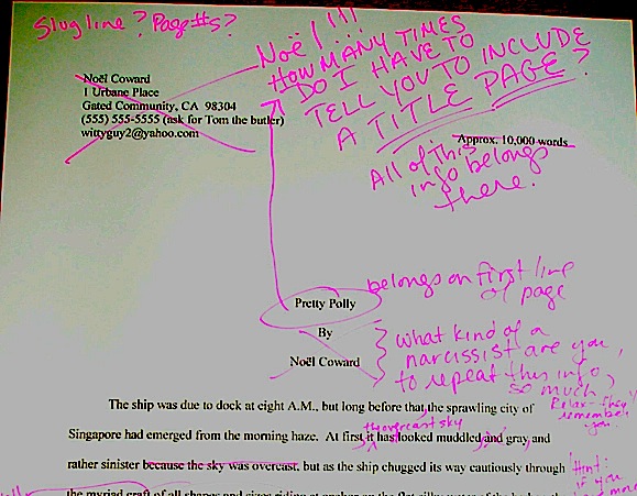
So the problem here, Tony, was not that published books are inconsistent about this — and you’re right; they are — but that the person expressing the opinion was evidently unfamiliar with how standard format for books actually works. Manuscripts differ in many, many ways from published versions of the same text: they are double-spaced, for instance, contain doubled dashes, have one-inch margins, feature uniformly indented paragraphs, contain a slug line, are numbered in the slug line and not elsewhere on the page, and so forth. You’ll find a complete list of the rules here.

If any of that is news to anyone that pulled up this response while trying to answer the indentation question, I would urge you to consult the HOW TO FORMAT A BOOK MANUSCRIPT category on the archive list. You’ll find full explanations of the rules of standard format there. Honest.

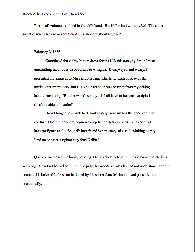
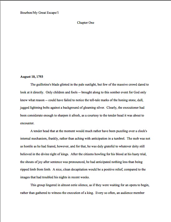
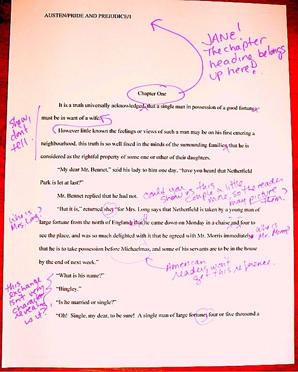
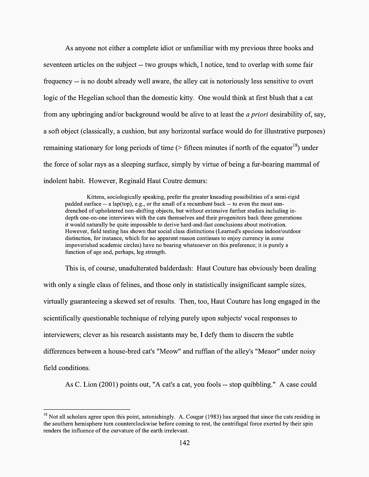
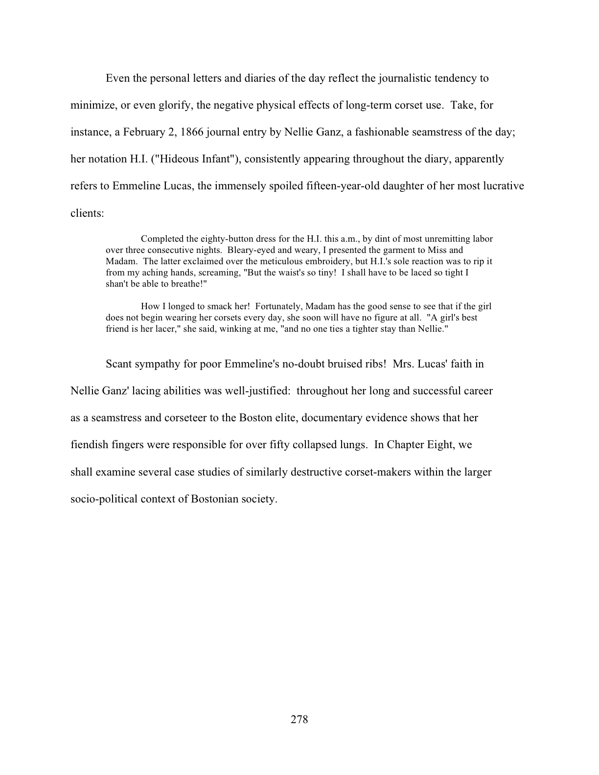
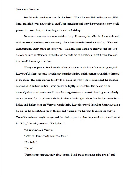
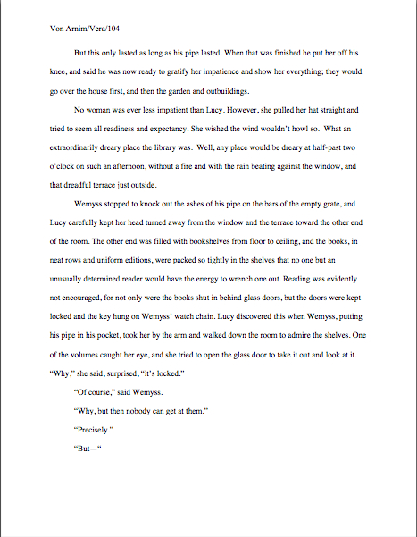
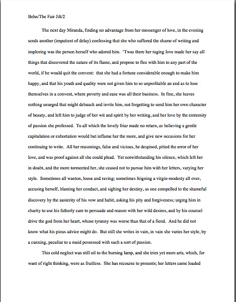
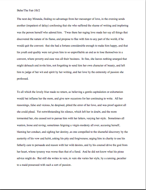
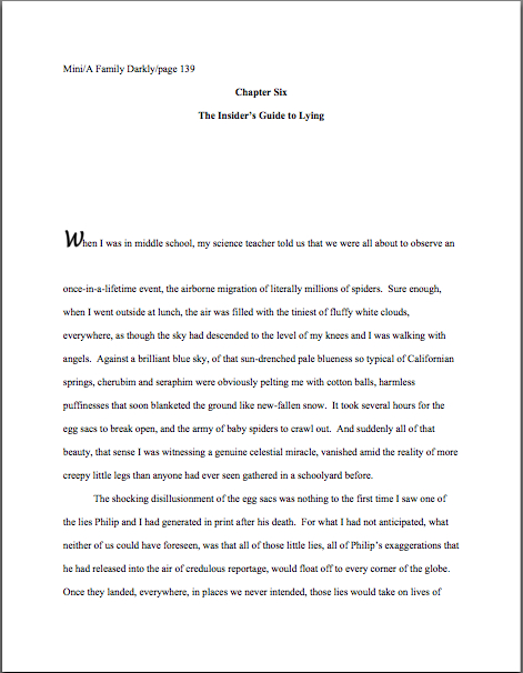
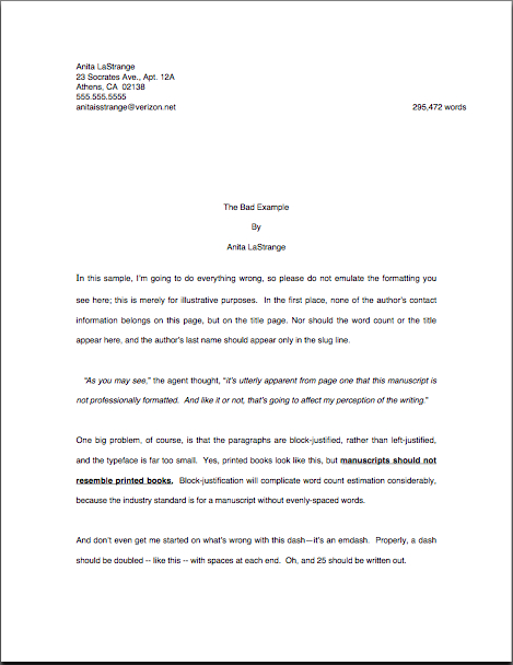
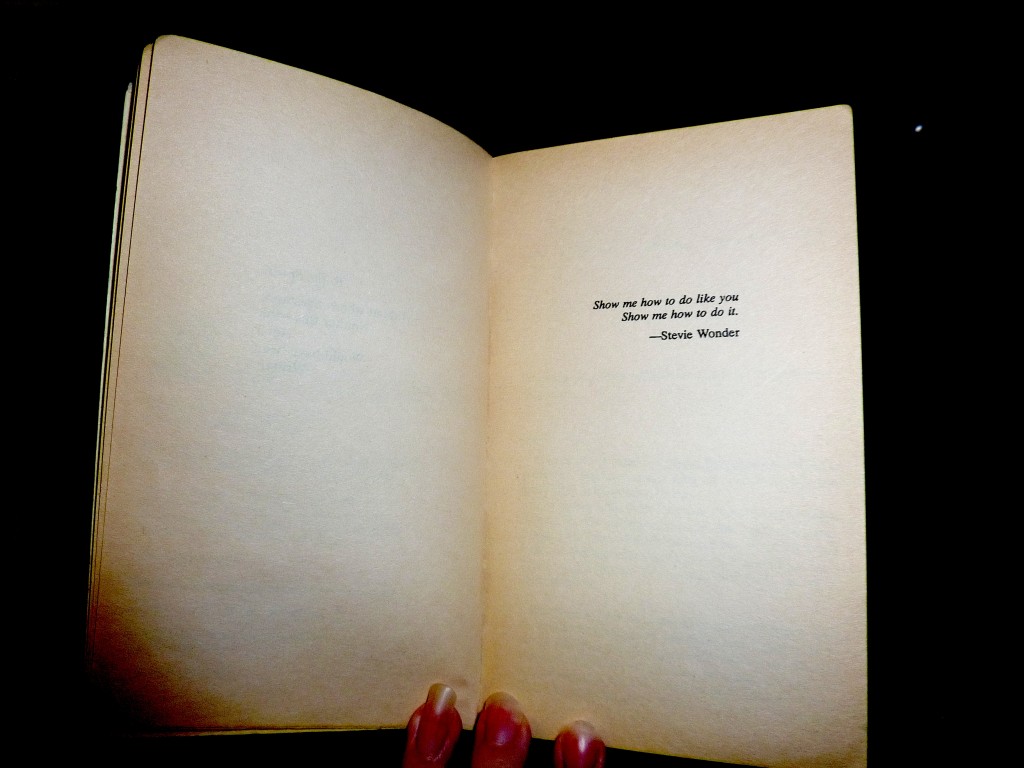
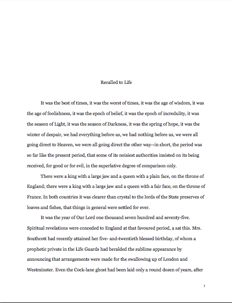
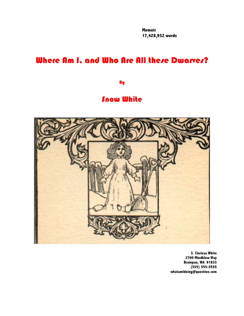
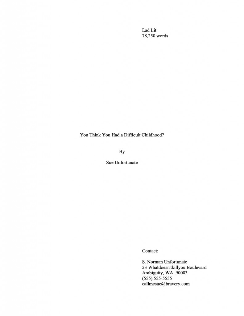
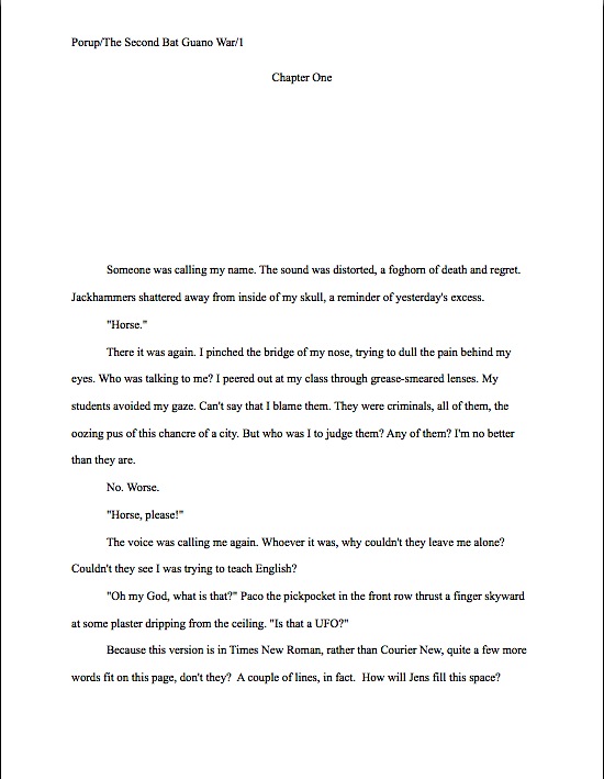
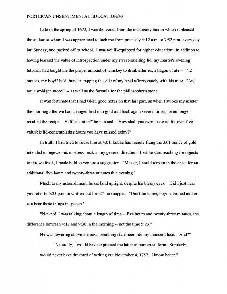
Contrary to surprisingly pervasive belief in recent years, standard format — and, indeed, any formal writing in American English — requires that every paragraph be indented .5 inch. So why do we occasionally see published books in which the first paragraph of a chapter is not indented? Because that was a publisher’s decision to ape the style common in medieval manuscripts. You know:

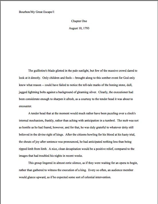
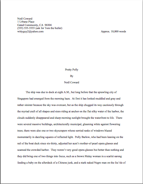
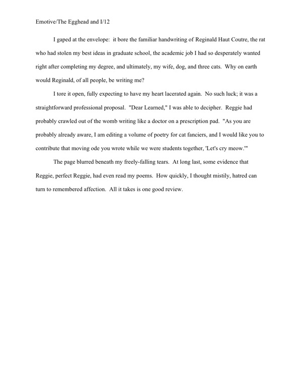
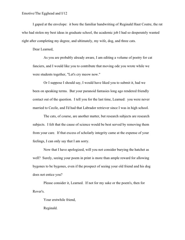
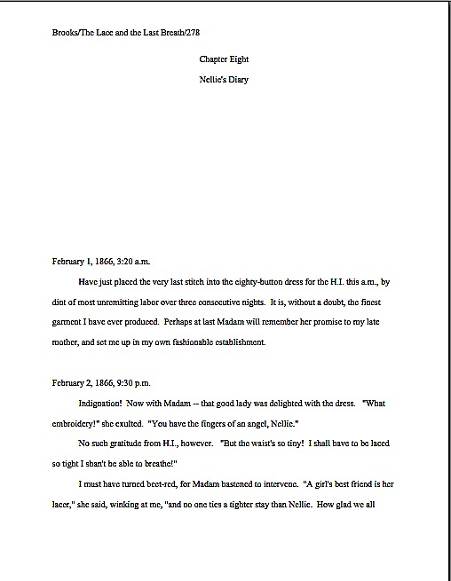
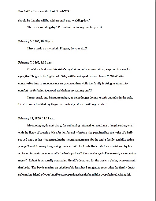
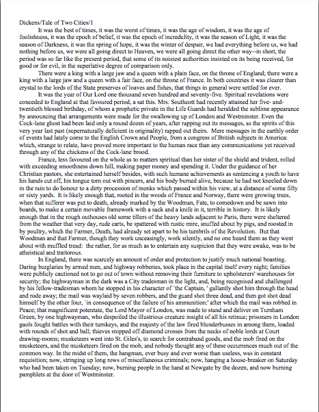
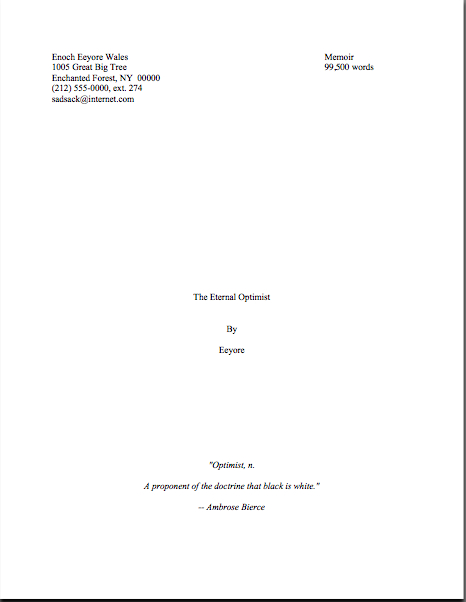
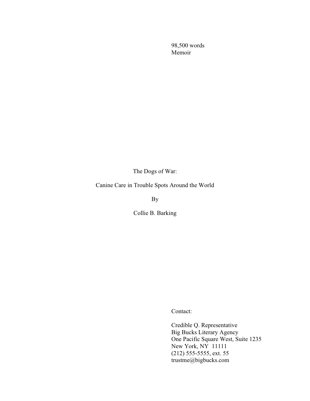
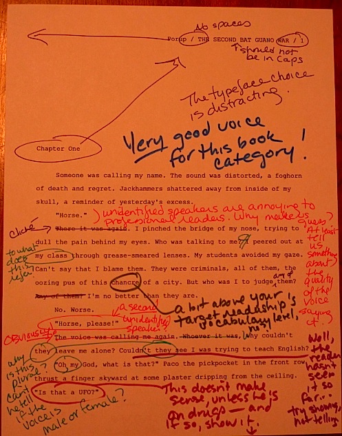
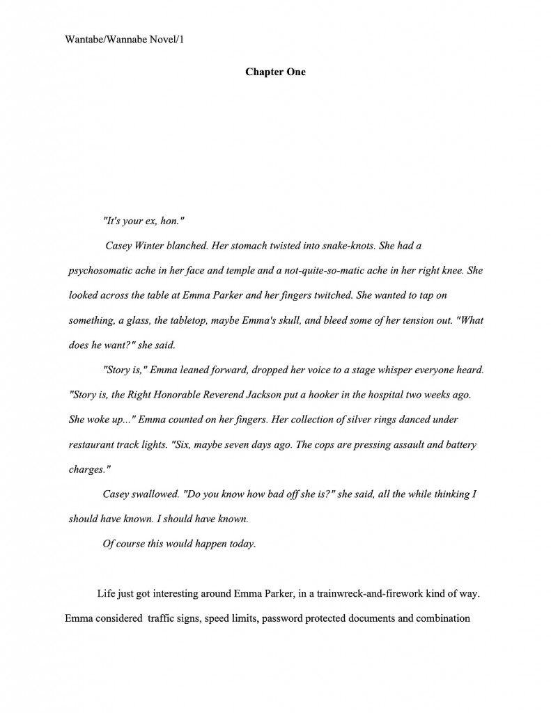
Obviously, that’s not what agents and editors expect to see these days — and you wouldn’t believe any self-styled expert who claimed it was, right? Any publishing professional would reject this on sight: it’s hand-written. How they expect to see a chapter open is like this:

Does that clear things up, Tony? If not, please feel free to ask follow-up questions in the comments. This is now where future readers who share your concerns will look first for answers. They — and I — thank you for prompting me to make that happen.

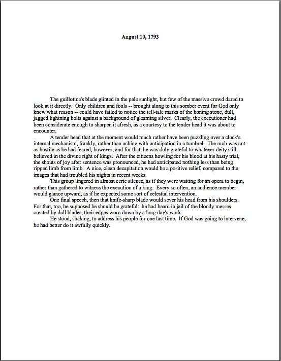
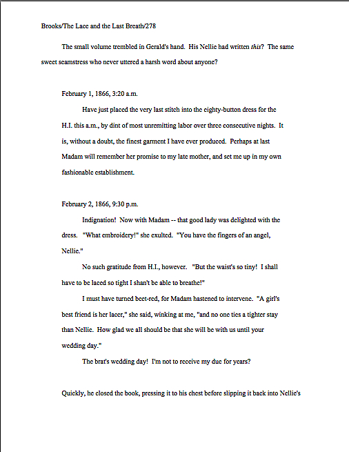
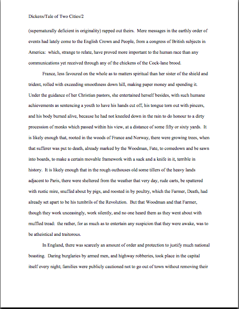
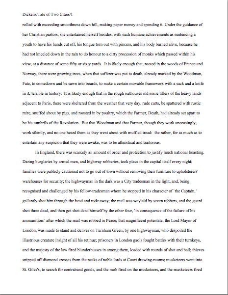
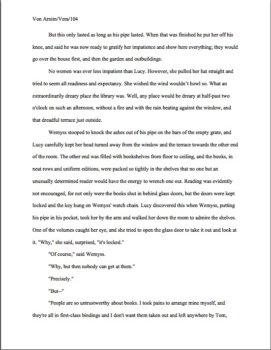
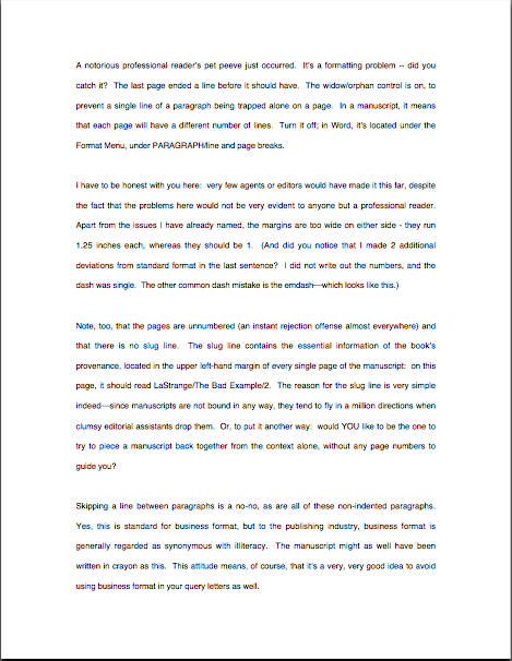
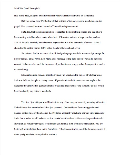
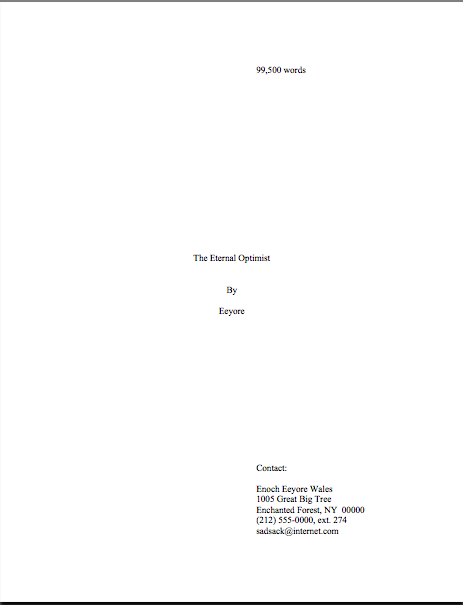
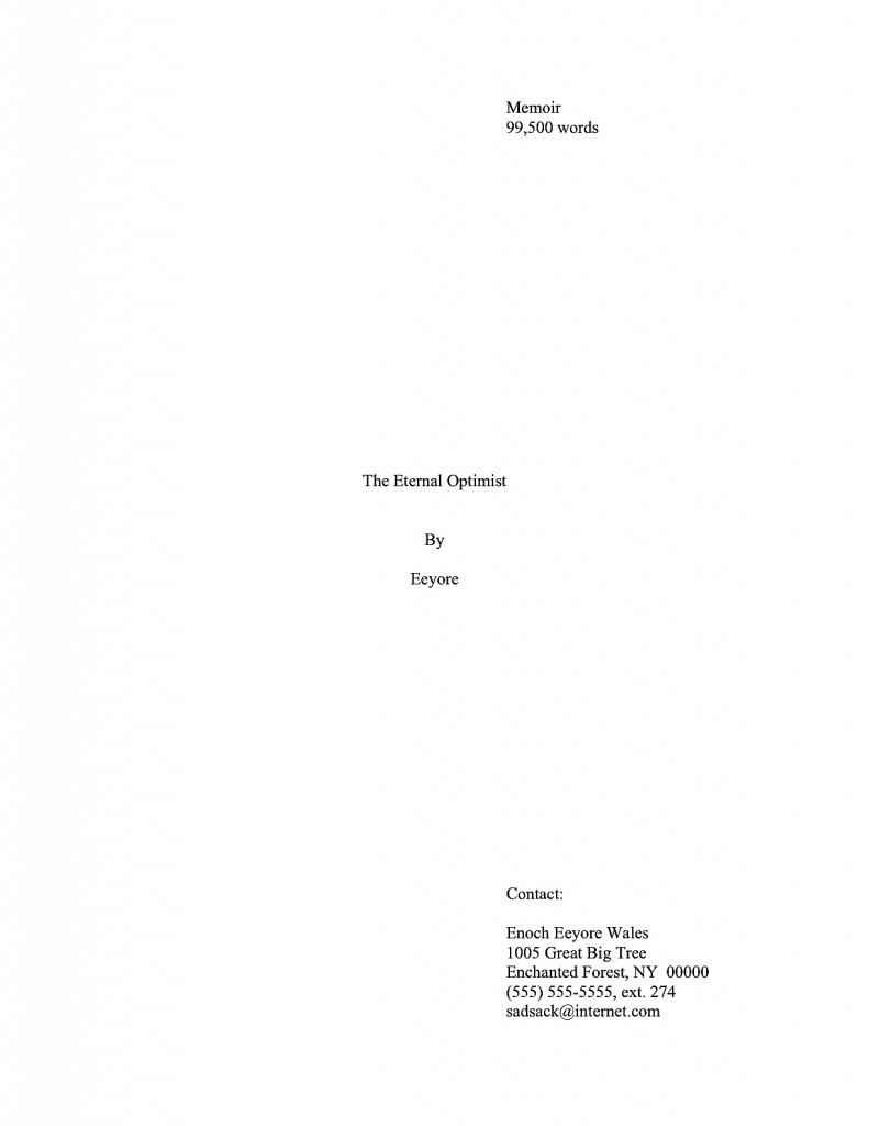
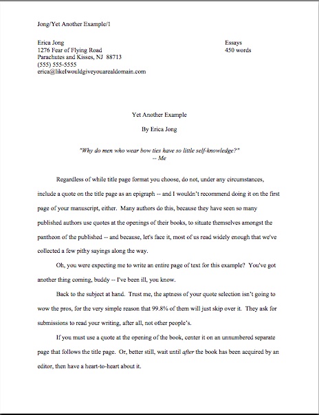
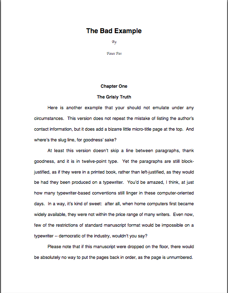
What’s that those voices wafting back from the future are saying? They would like to see page 2, to compare it with a properly-formatted page 1? Happy to oblige.

That looks familiar, I hope. If you’re having trouble seeing the individual words of that thrilling saga, try holding down the COMMAND key and pressing + to enlarge the image.

Okay, now it’s your turn, Future Famous Authors. To be clear, I’m not inviting critique of how I handled Tony’s question: I want to know what your policy would be. Or is, if you’re already an author-blogger.

And, of course, if you want to sound off on the necessity of having to write material over and above your book in order to promote it, I’d like to hear your thoughts on the subject, too. Please don’t treat this post as a column, everyone, and keep up the good work!

A trip to the Formatpalooza annex: the stylish section break — the inculcation of some good writing habits

“If only I hadn’t been so polite.” — S.T.C.

Long time no see, eh, campers? Honestly, I’m as surprised as you are: I keep arising each morning fully intending to post. The noon hour sees me already mentally composing practical examples. Hardly an afternoon goes by when I do not glance over at my computer nestled somewhere in the sub-basement of the muses’ palace of fine arts and think, “Okay, just a few minutiae to get through first, my pet, and we’ll be hard at work on that stirring entry on book promotion.” Or querying. Or Frankenstein manuscript-revising.

Then suddenly, it’s late evening, and the clever arguments and cunning demonstrations of applied craft I have been constructing in my head all day come tumbling to the ground. “Oh, that will take me hours to write up properly,” I murmur into my welcoming pillow. “Rather than write something hasty tonight, I’ll take it up tomorrow and zzzzzzz…”

At least, I think that’s what I’ve been murmuring. It’s kind of hard to remember the particulars in the morning.

“My God, Anne,” my learned mother says. “Who raised you? I certainly did not bring you up to go to sleep without jotting writing ideas on the notepad that’s never more than eight inches from your pillow.”

She has a point: she didn’t raise me to set at naught one of the cardinal rules of professional writing. One of the great tangible benefits of growing up in a family of writers and editors is knowing not to fall into the unfortunately common Oh, I’m sure I’ll remember the marvelous idea I have right now in the morning/when I get home/after I dash off this e-mail syndrome: I was trained from the cradle to have a writing implement and paper within tiny arms’ reach at all times, so I could jot down a few notes on that unforgettable idea just in case I forgot it.

Why sew extra pockets into a kid’s clothes for toting around wee notebooks and golf pencils? Because my hyper-literary parents wanted me to have a long and happy creative life, that’s why. As every professional writer in the world can attest to his or her sorrow, it’s never safe to assume that marvelous writing idea that the muses just dropped fully formed into your brainpan will not vanish into the ether within the next fifteen minutes.

Fortunately for the happiness of writers everywhere, few problems inherent to the life literary are as simple to solve as the lost great idea.

Step 1: write it down. Immediately.

Step 2: make sure you always have the means to carry out Step 1.

You needn’t buy a special notebook for the purpose — just get into the habit of carrying some paper and a writing implement in your pocket, purse, backpack, and/or pocket. Install same on your bedside table, in your car, in the pocket of that nasty uniform your inflexible and unimaginative boss makes you wear. (Honestly, does he think that patrons at his bar won’t at least suspect that the person mixing drinks is the bartender if she is not sporting a cheesy uniform?) From this moment forth, you should never be without it.

And I do mean never. If you are about to climb Mount Everest and do not have an extra few square inches for a pen, ask an experienced sherpa to help you repack. Clutch the lapels of the firefighter toting you off to safety until you are actually out of the building, but as soon as you are on non-smoking ground, grab the nearest envelope so you can scrawl a few notes on the back. Your deathbed should have pen and paper within easy reach.

And don’t tell me that you’ll get to it eventually — slip that notebook into your pocket now. Don’t make me bore you with that ghastly tale about Samuel Taylor Coleridge’s being interrupted by “a person on business from Porlock” while he was frantically trying to write Kubla Khan. While Coleridge apparently dined out on the story of how that untimely visitor made him forget the rest of the poem he’d already written in his mind, in my family, there was only one verdict about whose fault the loss was.

“He never should have answered the door,” my father would say.

“Not before jotting down a few notes,” my mother would agree.

Small comfort to Coleridge and every other writer who seen a good idea vanish in the face of the demands of quotidian life, naturally, but you’d be surprised at how little sympathy the lost great idea garners among professionals. “Well, why didn’t you write it down?” they will ask the writer, apparently oblivious to the fact she is valiantly choking back tears. “Didn’t you ever hear the story about Coleridge and Kubla Khan?”

Even if you have to grab a passing waiter’s pen from his apron to scrawl a few pertinent words on your hand or shirtsleeve, it honestly is in your best interest — and your next book’s — to get into the salutary habit of writing every fresh idea down right away. Which leads me to the lesser-known third portion of the cardinal rule:

Step 3: accept that performing (1) as often as you should will occasionally bring unfortunate social consequences.

You didn’t think that write down good ideas the instant they occur to you applied only to moments when you happened to be alone, did you? One never knows where inspiration will strike: amazing book ideas have been known to manifest in locales as inconvenient for note-taking as the shower, in the basket of a hot air balloon, on a Tilt-a-Whirl, and at dinners at the White House.

The muses can be most demanding mistresses. Heck, the premise of my last novel came to me while I was floating in an open-air hot tub nestled into the side of a mountain in the Oregon Cascades. I had to hop barefoot past a patch of poison oak to get to my ever-present pen and paper, and you don’t see me complaining.

Actually, once a writer becomes accustomed to noting every good idea for future use, she’s less likely to complain about it than those with whom she elects to spend her time. To that end, you also might want to train your kith and kin to hold their thoughts (and tongues) if — make that when — a brilliant idea strikes you.

Oh, you want, “Just hold off on carving that Thanksgiving turkey for a moment, Uncle Walter, while I write myself some notes,” to be the first your loved ones hear of your new-found good habit? Do you have any idea how many references to Kubla Khan it’s going to take to render that little surprise socially acceptable?

I sense half of you cringing at the very idea of stopping a conversation, dinner, or other things I will leave to your imagination if you are over the age of consent (you’ll understand when you’re older, Timmy) with a blithe, “Oh, excuse me, but Anne Mini says that if I intend to write for a living, I need to get this idea down at least in note form right away. Please feel free to continue without me.” I can understand where it might seem a trifle rude to the uninitiated.

But that’s precisely the point: it comes across as far more impolite to someone who doesn’t already know that serious writers do this. Frequently. It’s how the creative brain works: bursts of inspiration are part of our standard equipment. And the more seriously you take those inspirations, the more active your idea-generator will become.

It’s far, far better if you explain this to your kith and kin before the muses bop you over the head in the middle of that Broadway musical your partner has been dying to see for six months. Trust me on this one; it may seem counterintuitive, but it’s actually kinder that way. The sooner they get used to the idea that befriending a serious writer necessarily entails waiting in more or less supportive silence while you furiously scribble notes on the paper tablecloth in a crowded restaurant, the happier you — and they — will be once you are writing professionally.

Think of it as training for working with an agent or publishing house. Honestly — and I speak from experience here — “Hey, honey, the brand-new editor my publisher has just hired has asked me to come up with a new ending for my novel, pronto, so I’m not going to be able to pay the slightest attention for the next three weeks, okay?” will go over much better if Honey has already accustomed him- or herself to the reality that creativity is often rather inconsiderate about when it strikes.

So, as it happens, are deadlines. Just as there is no convenient time to sprain one’s ankle — again, I speak from experience — there is no really terrific time for a last-minute or rush revision request. Sorry about that.

I’m also sorry about this: no matter when it happens, it’s going to be hard on your loved ones, necessarily. But being the writer too nice to say to those loved ones now, “Look, I cherish our time together, but my writing is important enough that occasionally I will stop dead in the middle of an anecdote to make a note about a scene I want to write later,” is almost invariably equally reluctant to say in a nice, reasonable tone, “Remember how happy you were when I landed that agent? Well, this is the direct result: I need to spend this weekend making the revisions she’s requested,” or even, “Here, take twenty bucks from my rather paltry advance and go to a movie so I may honor the acquiring editor’s demand that I change my protagonist’s best friend’s name from Jolene to Joanne all 300 times it appears in my novel.”

Whenever you do it, it’s going to take some guts. I’m merely suggesting that if your kith and kin are already acclimated to your taking ten minutes out of lunch to scribble feverishly on the back of a menu, they’re less likely to find it unacceptable when you whip out a notebook in the third hour of Cousin Marvin’s testimonial dinner or in the course of the eighth inning of a particularly eventful baseball game. And at least they’ll have some inkling of why your work is important enough to you to cancel that long-planned trip to Disneyland because your editor abruptly got laid off and the new one just hates the chapter about the trip to Disneyland in your book.

Darn. It was going to be tax-deductible as a research expense, too.

Yes, yes, I know: writers tend to be conflict-avoiders. Try to think of getting them used to your ignoring them for two minutes in the middle of a movie as an inoculation — if they have already been exposed to the minor inconvenience, they won’t be made as sick at the onslaught of the major one. Don’t expect them to be thrilled about it, however; just expect them to cope. They’re never going to be thrilled if you spend most of your family reunion in the hotel room, fleshing out that fascinating conflict you’ve just dreamed up between your antagonist and the love interest’s second cousin, but at least it won’t seem out of character.

“Oh, that’s just Mavis,” your significant other/children/long-suffering parent will sigh. “We never know when the muses are going to kidnap her next.”

I would also recommend getting into the excellent habit of keeping a pad of paper by your computer while you are writing and revising, to jot down any inspirations that, while they might not be applicable to the page on your screen, might provide a piquant addition or necessary change to another part of the book. Taking the time to scrawl Did Arlo have a cocker spaniel prior to Chapter 4? on a scrap of paper now can save you the acute embarrassment of realizing that you’ve just sent the agent of your dreams a manuscript in which the dog’s breed is different in Chapters 2, 8, and 17 than it is in Chapter 1.

That’s particularly important if there happens to be more than one dog in the book, of course. “Wait,” Millicent the agency screener exclaims over page 47. “Is Marley the great Dane from page 2, or the Pekinese from Chapter 3? Or is it not a dog at all, but merely a reference to Ebenezer Scrooge’s late partner?”

Yes, readers who have been giggling for the past couple of paragraphs? “Oh, dear Anne,” the gigglers sigh. “You are such a Luddite. In the situation you just described, I would be working on my computer. Surely, that would obviate the need for rifling through the nearest wastepaper basket for a stray envelope. If I want to take notes, I’ll just open a new document and type them.”

I believe that you will, oh gigglers, but frankly, most writers caught up in the throes of one scene wouldn’t pause that long to type up an idea about another while it’s fresh in their minds. They would — sacre bleu! — just assume that they’d still remember that great notion by the time they had finished the current scene.

Think they will? Why take the chance? Jotting a quick note on a stray scrap of paper will take only a few seconds.

The other advantage of recording that idea on paper, rather than on one’s computer, Blackberry, or even in a recording device is that one can leave it sitting next to one’s computer, Blackberry, or recording device, all ready to remind one about that great notion. If you’re like me — and I suspect most writers are, at least in this respect — the very laws of inertia dictate that note written today will still be lying there a month hence, when you have time to get back to the scene you intended to write.

Oh, you tidy up your writing space every day? My good pile is almost as tall as the container holding the pens I used to write them.

If that same idea is memorialized electronically, by contrast, you have to remember to reopen that file or listen to that recording. Unless you are in the habit of regularly reviewing your computer files, that may not happen before you finish your current draft. You might not even stumble across it again — avert your eyes, children; this is going to be ugly — before you pop the completed draft in the mail to the agent of your dreams.

Isn’t taking a minute to write a note now preferable to bearding the heavens with your bootless cries of, “But I meant to go back and change the dog’s name from Marley to Charley prior to page 150!” later on?

The same principle applies, as I hope all of my regular readers are aware, to remembering technical questions that might arise during the writing or revision processes. Although a few intrepid souls might instantly close their Word programs and fly to this site (or a similar one, or ask a trusted writer friend) within a few seconds after running into an intractable problem, my impression is that most don’t.

And finally, I have managed to build a segue to the topic I had planned to discuss today! I wasn’t kidding about how easy it is to get sidetracked.

One of the many stacks currently threatening to topple over onto my mousing hand holds my To Blog Upon list. While the inspirations there range from the hyper-serious (one note reads blog about the desirability of an unpublished writer’s designating a literary executor in her will) to the practical (how long has it been since I discussed juggling offers from multiple agents?) to the completely frivolous (been overusing dog examples lately — switch to wombats?), many of the most intriguing ideas in this stack are print-outs (on the back sides of already-revised early drafts of my work, of course; reusing is as valuable as recycling) of questions readers have the comments.

(Note to self: all of those parentheses and italics are eye-distracting on the screen. Also, isn’t 93 words too long for a single sentence?)

I reserve a special stack — yes, my desk is precisely as cluttered as you are picturing it to be — for questions that are perfectly logical as follow-ups to formatting or craft issues, but wouldn’t necessarily occur to a professional reader as something that might be puzzling to those who have never seen a professional manuscript in person. When one stares at those pages for a living, one develops an almost visceral sense of what does and does not belong on the page. But how is someone new to the game to develop that sense?

Incisive and thoughtful reader Karin, for instance, raised a marvelous issue that I had overlooked in my Formatpalooza posts on section breaks. (Which were three: a post on the rules governing them, a post containing visual examples, and a post showing section breaks in a book proposal.) Even better, she was polite and charming as she brought it up.

I’ve been reading your blog for quite some time now and find your advice very clear and extremely thorough; thank you for the hours of work you put in trying to help us blind writers see the light of proper formatting and querying.

I have to admit, combing through pages of formatting advice, I may have missed the answer to my question, which, while small, addresses a concern I have on the fifth page of my manuscript, having to do with section breaks. Having turned off widow/orphan control and inserted a space between sections, I find that one section ends on the bottom of a page, which means the beginning of the next section starts after a blank line on the next page. Will professional eyes notice the blank line as a section break, or will it appear sloppy?

As you know, we all get very insecure wondering if these things spell doom for our publishing chances. If you have time, could you please put my fears to rest? Thank you very much!

As my To Blog Upon stack can attest, I get a lot of questions about section breaks. Partially, that seems to be due to the surprisingly pervasive practice among self-styled experts not to differentiate between what is proper to indicate a section break in a book manuscript or proposal (a skipped double-spaced line) and what is appropriate for a short story or article (#).

So before I address Karin’s specific concern, let’s see a properly-formatted section break in action in mid-page. A transition between two scenes in one of H.G. Wells’ social novels will do the trick nicely:

The image came out a trifle on the blurry side — my apologies about that — but the section break is quite clear, is it not? No bells, no whistles: just a skipped line between scenes.

While you have that fuzzy image firmly in mind, let’s take a gander at another rule of standard format that often puzzles those new to the game. Had ol’ H.G. (or whoever is doing his word processing these days) not followed Karin’s example and turned off the widow/orphan control in Word, this page would have had a too-large bottom margin. Like so:

See the problem? This page has fewer lines on it than the previous example, because Word did not want to leave the first line of the final paragraph behind on page 158 when the rest of the paragraph was on page 159.

Millicent, however, like the rest of us who read manuscripts for a living, prefers each page to feature the same number of lines of text. Otherwise, it would be impossible to estimate word count, right?

Including a section break does not run afoul of that preference: in theory, there are the same number of lines per page; the empty space is holding the place of a line of text. Because our Millie knows that a skipped line of text means a section break, she understands that.

But what if the last line of a scene ended on the next-to-last line of the page? The result would be the same number of lines on page 158 as if the widow/orphan control had axed the last line. The next section would begin on the first line of page 159.

Clear enough what’s going on, is it not? Since the subsequent scene would follow on the top line of the next page, Millicent would know that what she has just seen is not a formatting gaffe, but a transition between two separate sections of text.

But what if, as Karin feared, the first scene had ended on the last line of page 158? Should we take her suggestion of pushing the section-differentiating skipped line to the top of page 159? Let’s see what that would look like in practice, shall we?

Looks a trifle silly, doesn’t it? To Millicent’s eyes, it would look like something else: a manuscript that the writer had not bothered to check in hard copy to see how it would print out. “And if the writer didn’t read his work in hard copy before sending it to my boss,” she reasons, “he probably didn’t bother to proofread it, either.”

Not an instant-rejection offense, certainly, but not the impression of how serious you are about your writing that you would prefer she harbor, is it? H.G. has two options here: tinker with the first scene so that it does not end on the last line of the page — or take the chance that Millie will understand that when the first line on the top of page 159 is about a different time, place, and person than the last line on page 158, she might be dealing with a change of scene.

I would opt for trusting her: she’s smart. And honestly, on the page, the situation isn’t all that confusing. Take a gander:

Sometimes, a writer just has to have faith in his readers’ intelligence. Millicents read a heck of a lot of manuscripts, after all: they understand the limitations of standard format.

And if they don’t, they can always write themselves a note as a reminder to find out. Keep up the good work!

Entr’acte: what we have here is a failure to communicate — in a business that’s all about communication

What do you mean, most manuscrips get rejected on page 1? That’s ridiculus.

I can’t believe you’re telling us that presentation can count as much as writing style. Agents know to look past any minor problems to the actual writing.

I hate Millicent. She must hate literature, or else how could she possibly reject subission so quickly?

The publish industry has become completely shallow. They only care about what sells, so it’s impossible for a genuiney talented new voice to get heard. Why even bother?

You got me, commenters on my series on professional readers’ pet peeves: the publishing industry doesn’t care whether books sell or not; it’s a non-profit enterprise devoted to the promotion of literary art. Nor are agencies at all market-oriented: while they don’t actually object if one of their pet authors happens to have a book that sells well, they can all afford to take on every project that appeals to them, regardless of whether they think they can sell it or not. Agents have limitless time to proofread — or even copyedit — their clients’ work before submitting it to editors, so it doesn’t matter what shape a manuscript is in when they take it on, and since they never specialize in a particular kind of book, they take chances on writing they just like all the time. In fact, they have so much time on their hands in any given workday that Millicent the agency screener doesn’t actually exist: she’s a figment of my imagination, intended to fill you with fear. In practice, every agent in the United States sits down to read every single query submitted, as well as every syllable of every requested manuscript, before making up her mind whether to reject it or not. Since only bad writing gets rejected, this of course an easy task.

In short, there’s no need for a naturally talented writer to take the time to learn how to format a manuscript, much less proofread it. Or, heaven forfend, find out how the publishing industry actually works.

Do I even need to shout, “April Fool,” campers?

I sincerely hope not. I’m writing about real-world phenomena here, not my opinion about how promising new talent ought to be discovered. I’m only telling you about the norms; I didn’t invent them. But now that some of you have brought your concerns about how difficult it is to get published to my attention, I’ll just wave my magic wand, and…

Oh, wait a minute: not being the Literature Fairy, I can’t change the publishing world upon request. No matter how often aspiring writers plead with me to say I didn’t really mean it when I said that there are practical things they can do to maximize the probability of their work making it past Millicent, I’m simply not in a position to alter reality in this respect. Sorry.

Which is why, in case any of you had been wondering, I’ve chosen to take the hard path here at Author! Author!, concentrating on craft and marketing issues, rather than just being a cheerleader for writers in general. I don’t believe (as some writing gurus out there apparently do) that it helps aspiring writers much to view the submission process through a rosy, hazy glow: as both a lover of literature and a great believer in the intelligence of writers, I would rather show you the actual conditions under which your work is going to be evaluated, encourage you not to worry about the factors that are outside your control, and, yes, to urge you to consider altering your texts to improve your chances of impressing Millicent.

Rather than, say, investing your energies in resenting Millicent for existing at all. It’s not her fault that the competition to grab an agent’s attention is so very fierce.

Surprised to see me defending her? Don’t be: I’m rather fond of our Millie. Without her, it simply would not be possible for agents to give even a passing glance to the avalanche of queries that constantly arrive in their offices. Then, too, it’s hard not to feel protective toward someone writers routinely blame for a system she did not create.

Heck, blame is putting it nicely: because most aspiring writers understandably don’t tend to think of their own queries or submissions as just one amongst the thousands an agency receives, many just assume that if they are rejected, the problem must lie in the obtuseness of the reader, rather than in any problems in the manuscript.

From Millicent’s perspective, this doesn’t make sense: there is quite a bit of truth to the industry aphorism that most manuscripts reject themselves. Not merely via the kind of opinion-influencing pet peeves we’ve been talking about throughout this series, but through plain old weak writing. Or a story that’s just not very interesting, or one that’s not original. Or — and this often comes as a gigantic surprise to those new to the process — because it’s not the kind of book that her boss habitually sells.

And frankly, in most cases, it genuinely is possible for a sharp reader to spot these problems within the first page. Sometimes with in the first couple of lines. Most of the time, it’s not a particularly hard decision, or one that ties her up in agonies of indecisiveness. To put it bluntly, from where Millicent is sitting, the vast majority of submissions deserve to be rejected.

To most aspiring writers, this attitude would come as a surprise, and with good reason: all they believe is being judged in a submission is the writing style and the overall story. The former is either good or bad, their logic tends to run, with few possibilities in between: if the writer is genuinely talented, it will be instantly obvious to an agent or editor.

If the prose needs work, well, that can always be fixed down the line: it’s the voice that counts. Regardless of how hard the text may be to read due to typos, skipped words, light gray type because the printer cartridge was running on empty, etc., an agent who truly loves literature is going to read the entire submission, because, after all, why would she ask for 50 pages if she didn’t intend to read every word? Nor will she worry about niggling marketing issues like who the target audience is for the book: good writing sells itself. And even if it didn’t, that would be the publishing house’s problem, not the author’s.

Is here where I get to shout, “April Fool!” again?

Unfortunately, no: while not all aspiring writers draw out the logic to this extent, this is the basic mindset reflected in the comments at the top of this post. These sentiments — including, heaven help us, the spelling — are not exaggerations to make a point: they are honestly representative of the feedback I have gotten from aspiring writers over the years whenever I have gotten specific about red flags in manuscripts.

Oh, not all of the feedback takes this tone, of course; this is merely a vocal minority. The Author! Author! community is rife with urbane, sensible aspiring writers who honestly do want to find out why some manuscripts get rejected and others do not. Which is why most of the protests that inevitably arise whenever I start going through common reasons that submissions get rejected on page 1 — as the vast majority of them do, much to the chagrin of aspiring writers all across the English-speaking world — tend to take a much more dignified, thoughtful tone.

Not to mention being spelled better. Why, just today, incisive reader Nancy posted this well-argued comment on yesterday’s celebration of pet peevery:

Thanks for the post. I’ve been giving some thought to page one & chapter one revisions. But one thing bothers me about this post & how you present it. It seems like we should be tailoring our early content for the sole benefit of an over-worked, bleary-eyed, impatient Millicent so that she doesn’t hurl our beloved pages into the trash. It doesn’t seem right to fashion our stories in this manner. It feels much like pandering to me. I’d like to believe that Millicent doesn’t need the blockbuster explosions in line five of chapter one just to pull her into the story. Surely she is more sophisticated than that.

I love this kind of comment, because it both reflects a very natural resentment common amongst aspiring writers and an understanding rare amongst submitters that Millicent actually has an incredibly difficult job — much, much harder than it used to be before the advent of the home computer permitted the number of queries and submissions she has to get through in any given week to skyrocket. I’m not convinced that there are more people who want to get books published now than ever before, but technology has certainly made it significantly easier for the aspiring writer to get her work in front of Millicent’s aforementioned bleary eyes.

Oh, you had thought that she uses form-letter rejections — or, increasingly, no rejection letter at all — because she likes them? Au contraire, mon frère: it’s a matter of available time. Think about it: it’s her job to narrow the tens of thousands of queries and hundreds of requested materials packets down to the couple of dozen of manuscripts her boss, the agent of your dreams, could possibly read himself for consideration for the four or five (at most) new client slots he has this year.

Which is to say: our Millie doesn’t magically get more hours in the day if the current flock of submissions happens to be especially good. Talk to the Literature Fairy about that.

But that’s not how aspiring writers think about the submission process, is it? To the garden-variety hopeful querier or submitter, it’s practically unthinkable that the other writing projects the agency receives would have any effect on how an agent might view her book.

All that ever matters are the story and the writing style, right? Right?

From Millicent’s point of view, no. She is in charge of mediating the competition for those few client spots, not rewarding every prettily-worded submission that she sees. If her agency hasn’t been able to sell a story like the one in front of her for the last couple of years, she’s going to lean toward rejecting it. Furthermore, she reads too many manuscripts to believe that the way the text appears on the page is not reflective of how serious a writer is about his craft; she has observed too many book sales to regard whether an editor is likely to find the opening pages too slow as irrelevant to whether the manuscript would appeal to her boss.

What we have here, in short, is a failure to communicate, exacerbated by form-letter rejections that don’t let the writer know whether Millicent rejected a manuscript on page 1 or page 25. Or if abundant typos prompted her to stop reading, or if the story just didn’t interest her. Or — and this is positively mind-boggling, from a writerly perspective — whether she loved everything about the manuscript, but her boss just didn’t think it would sell in the current literary market.

Don’t think that’s a legitimate concern? Okay, let me ask you: why are you seeking an agent for your manuscript? Do you not hope and expect that agent to sell your book to a publisher?

Interesting to think of it in those terms, isn’t it?

Now that we are in a marketing mindset, let’s return to Nancy’s central question about yesterday’s post: if a writer bases a decision about what scene should open a manuscript upon what she thinks will appeal most to Millicent — or even gives some serious thought to how her book might appear to someone who read only the first page — is she pandering to the agency and, by implication, compromising her art? Or is she merely being market-savvy, and are the two mutually exclusive?

A perfectly legitimate set of questions from a writer’s point of view, right? To Millicent, they wouldn’t even make sense.

Why? Well, for the same reason that the question of selling out vs. artistic integrity has traditionally been much more of a concern for aspiring writers than ones who already do it for a living. From a professional point of view, there is not a necessary trade-off between good art and good marketing. If there were, getting published would be solely the province of those who don’t care about literary style, right?

“If an aspiring writer believes that,” Millicent says, scratching her head, “wouldn’t my being interested in his book be an insult? And how could a writer justify admiring an established author, who by definition writes for a specific market? This sounds like a Catch-22 to me — an unusually-structured novel that became a major bestseller, by the way — if playing to an audience necessarily means throwing one’s artistic values out the window, why would anyone who liked good writing ever read a successful author’s work?”

Allow me to translate, Millicent: aspiring writers sometimes assume that there’s only one right way to tell the story they have in mind — and that the author is only person who can determine what that running order is. From this point of view, it’s equally harmful to artistic freedom of expression for an editor to ask a writer to change the opening scene as for the writer to feel compelled to rearrange the text to begin with action, because someone giving advice on the Internet said — accurately, as it happens — that you tend to reject slow openings. In essence, both imperatives are based upon the assumption that it’s sometimes necessary to sacrifice the most effective way of telling a story in order to sell a book.

“Please tell me,” Millicent replies, “that you’re about to shout, ‘April Fool!’ Are you seriously suggesting that it’s artistically inappropriate for an agent to say, ‘Okay, new client, I like your book, but it would resemble other books in your chosen category — and thus be easier to sell to the editors who acquired those books — if you rearrange the running order?’ Most published novels get revised fairly heavily between when an agent picks them up and publication, and while new authors tend to kick up a fuss about it, most ultimately agree in the long run that the requested revisions actually improved their books. So I think you’d be pretty hard-pressed to find anyone on my side of the submission packet who would say with a straight face that the author’s original version is the best or only way to structure a book.”

If you listen closely to both sides of this argument, you can hear how it comes back to that perennial difference of opinion about how and why books should get published. On the one hand, many aspiring writers would like to believe that it’s Millicent’s job — and the publishing industry’s duty — to base decisions upon what to accept and what to reject solely upon writing talent (defined by potential, rather than what’s actually on the page) and the inherent interest of the story (defined in artistic terms, and not by what readers might actually buy). On the other hand, many agents and editors — and their Millicents — proceed on the assumption that it’s the writer’s job to create interesting, marketable manuscripts written in a strong, unique authorial voice appropriate to the target audience’s already-established likes and dislikes.

A good writer, in their opinion, is one who can pull off this high-wire act without compromising the book’s artistic value.

Which is in fact possible, as the work of all of our favorite authors attest. But if a writer trying to break into the biz chooses to think of the demands of art and the market as necessarily mutually exclusive, it’s a significantly more difficult high-wire act to complete without tumbling to the ground.

And honestly, in my experience, speeding up an opening scene or making it read more like a story in its chosen book category seldom involves doing great violence the text. It’s often as simple as moving that great exchange on page 4 up to page 1, or drafting a conflict-ridden scene from later in the book to use as a prologue.

Or — brace yourselves, purists, because this one is going to sting a little — going into the composition process realizing that it would be desirable to open the book with conflict, rather than a scene where very little happens or one loaded with constant digressions for backstory. While you’re at it, including a strong, sensual opening image would be nice.

That’s not a matter of the market dictating content. That’s a matter of understanding how readers decide whether to get invested in a story or not.

I’m not just talking about Millicent, either. Plenty of readers habitually grab volumes off bookstore shelves and scan the first page or two before buying a book, after all. While readers’ pacing expectations vary widely by book category (and sometimes by country: even literary fiction published in the U.S. tends to start much faster than similar books published in the U.K.), you must admit that it’s rare to find a reader who says, “You know what I like? A story that doesn’t appear to be going anywhere until page 148.”

Is that blinding glare spreading across the horizon an indication that a whole lot of light bulbs just went off over a whole lot of writers’ heads? You performed the translation for yourself this time: the publishing industry — and its first reader, Millicent — believes it is doing right by its customers by habitually rejecting slow-opening books or those with plots that don’t seem to be going anywhere for the first 200 pages. It’s protecting them from — well, perhaps boredom is a harsh term, but certainly disappointment.

What makes publishing types think that they know what readers want? They have the sales statistics for what readers are already buying sitting in front of them.

Instead of debating whether past sales are necessarily indicative of the kind of book that will strike readers’ fancies a few years hence, let’s take a moment to consider from what Millicent is protecting the reading public. Generally speaking, it’s not vividly rendered, fascinatingly written exemplars of cutting-edge prose that send her groping for the form-letter rejection pile. A startlingly high percentage of what any screener or contest judge sees reads like this:

It was a dark and stormy night. It was cold in the castle. Myra shook her long, red hair down her back, shivering. She was tall, but not too tall, a medium height just perfect for melting into Byron’s arms. She walked from one side of the room to the other, pacing and thinking, thinking and pacing. The walls of the room were covered in tapestries needled by her mother who spent years bent over them. Myra barely glanced at them now.

Come on, admit it — you wouldn’t really blame Millicent if she rejected this, would you? The writing’s not interesting, the sentence structure is far too repetitive, and nothing’s really happening. About all it has going for it, from a professional perspective, is that all the words are spelled right.

Oh, you may laugh, but part of Millie’s job consists of saving the literary world from the rampant misspellings that characterize the average submission — and an astonishingly high proportion of otherwise rather well-written ones. Let’s don her super heroine’s cloak for a moment, to see just how difficult the decision to reject such a manuscript would be.

If you opened the day’s submissions and saw this novel’s opening, how likely would you be to recommend that your boss read it? Or even to turn to page 2 yourself?

This is not a particularly egregious example of the type of manuscript problem Millicent sees on a daily basis. If the formatting, spelling, grammar, and capitalization issues bugged you, you were reading like a professional: when a pro looks at a page like this, what she sees is how it could be improved. In this case, so much improvement is needed that she would automatically reject this submission. Better luck next time.

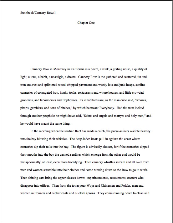
But if you were reading this page as most aspiring writers read their own work, you probably saw something different: the charm of the story, the rhythm of the writing, the great use of specifics. You would have reacted, in short, rather like Millicent would have had the page above been presented like this.

Now that the distractions are cleared away, it’s rather nice writing, isn’t it? It ought to be: it’s the opening of Nobel laureate in literature John Steinbeck’s Cannery Row.

As those of you prone to thinking cynically about how hard it is to get published nowadays may be pleased to note, it would be nearly impossible for an aspiring writer to get this first page past Millicent today, even in the second format. Actually, even a very well established author might have difficulty getting this published now: that many ands in a row would put many a professional reader off. Essentially, this is a long list, rather than a fully fleshed-out description.

It’s also, by current standards, a rather slow opening. “Who is the protagonist?” Millicent cries. “And what is this book about?”

Based upon this page alone, it appears to be primarily about the writing — and that renders the peculiar sentence structure and choice to open with this material even more pertinent. John Steinbeck, no doubt, considered those run-ons artistically necessary; presumably, he also had a reason for electing to begin his story with this series of lists. When you have a Nobel Prize in literature, your readers may well be tolerant of this kind of thing. Even as a reader quite fond of the book that follows, though, I can’t concur in his choices: this page 1 does not even remotely do justice to the fabulously quirky characters and hilarious plot twists to come.

“This book is funny?” Millicent asks incredulously. “Could have fooled me.”

Actually, the opening page fooled you, Millie, and it’s hard to hold anyone but the author responsible for that. In Uncle John’s defense, though, his target readership would have grown up on Victorian novels, books where the early pages were often devoted to establishing time and setting through generalities. (And in the passive voice: It was the best of times, it was the worst of times, etc.) It just goes to show you, the standards of what constitutes good writing are constantly evolving.

“Aha!” Millicent shouts triumphantly. “So much for the notion that good writing is always good writing. Take that, writers who want to blame me for readers’ ever-changing tastes! If I advised my boss to snap up every manuscript that would have sold readily 10, 20, or 150 years ago, I would not only be ignoring current literary tastes, but doing a disservice to those old-fashioned writers. It breaks everyone’s heart when we can’t place a book we love.”

That doesn’t require translation, I hope. Part of my goal in presenting Millicent’s pet peeves is not only to help aspiring writers realize that there is a human being, not a literature-evaluating machine, reading their submissions, but that since professional readers honestly do tend to like good writing, it genuinely annoys them to see a nicely-written opening marred by technical problems. Or a story with a lot of potential squandering the reader’s attention with too much backstory up front. Or — you were anticipating this one, weren’t you? — a beautifully worded first page making itself hard to market by eschewing conflict.

Is that the same thing as requiring a writer to compromise his artistic integrity or harm the story he is trying to tell? She doesn’t think so, nor, I suspect, would anyone else who reads manuscripts for a living. They have faith, even if aspiring writers don’t, that a genuinely talented storyteller will possesses the skills and creativity to structure her tale to grab the reader from the top of page 1.

Which most emphatically does not mean, as today’s commenter suggested, that every opening needs to read like the first scene of a thriller: “I’d like to believe that Millicent doesn’t need the blockbuster explosions in line five of chapter one just to pull her into the story. Surely she is more sophisticated than that.”

Yes, she is — and so was the argument in yesterday’s post. If I may take the liberty of quoting myself, I specifically urged everyone not to begin page 1 with explosions or other genre-inappropriate activity:

Not enough happens on page 1 is often heard in its alternative incarnation, the story took too long to start. . On behalf of agency screeners, sleep-deprived and otherwise, all over Manhattan: please, for the sake of their aching heads and bloodshot eyes, get to the action quickly.

And not merely, as so many writing gurus recommend, just any action: toss the reader directly into conflict, by all means, but let that conflict be directly relevant to the story you’re about to tell. Remember, the goal here is to surprise and delight Millicent, after all, not to trick her into thinking that the story that follows is more plot-heavy than it actually is.

Many, many aspiring writers misunderstand this point, so I am glad that Nancy brought it up. Allow me to restate it in clearer terms: no one is seriously suggesting that it would be desirable, or even appropriate, for a good writer to shoehorn conflict onto page 1 that doesn’t arise from legitimate plot elements and/or character development. Nor is anyone telling you that action-movie pyrotechnics are necessary to attract Millicent’s positive attention. To conclude that the publishing industry insists upon this kind of action at the opening of every book it decides to publish is to ignore what has actually appeared on page 1 of the vast majority of novels published in the United States this year — or, indeed, any year.

To professional readers, then, it’s downright puzzling to hear aspiring writers complain that the publishing industry has turned its back on non-sensational writing. Once again, we run into a translation problem.

This one arises, I suspect, from responding too literally to the words action and conflict. Although countless aspiring writers misinterpret marketing admonitions like open with action, throw the reader right into the book’s central conflict, and make sure there is action on page 1 to mean we’re not interested in any stories that could not be made into action films, that’s simply not what the advice means. (That’s why, in case anybody had been wondering, I was careful to phrase the rejection reason yesterday as not enough happens on page 1 and the story takes to long to get started, not as the more commonly-heard open the book with action.)

In literary circles, action and conflict can refer to relatively quiet activities. Yes, nearby objects blowing up are one kind of action, but so is the protagonist taking steps to try to challenge a situation she finds onerous, even in a very small way. Conflict can involve a Bruce Lee-style kung fu brawl, but it can also be a character silently disagreeing with the speech his boss is making, his subtle body movements demonstrating his ire. Neither term could be fruitfully applied, however, to the protagonist’s sitting around and thinking, multiple characters complacently agreeing with one another, or paragraph upon paragraph of backstory distracting from the current scene.

Even as feedback on a specific text, the advice open with action seldom means supply all of the ladies in the opening quilting scene with switchblades, and make sure that quilt is bloody by the bottom of page 1! Typically, when a professional reader suggests rearranging the running order or revising the scene to add action, it’s as an antidote to a scene that drags. Adding interpersonal conflict, placing a barrier in the protagonist’s path, or just plain having something exciting happen (“Look, there’s an albatross flying by, Grandma!”) are all standard ways to speed up a slow scene.

Again, none of these tactics would necessarily involve compromising the artistic integrity of the manuscript, interfering with the basic storyline, or tossing a Molotov cocktail into the middle of a sedate tea party. Implementing them successfully may, however, require some good, old-fashioned creative thinking to come up with a means of introducing believable conflict onto page 1 — and, indeed, onto every page of the text.

Why? Because conflict is interesting; readers like it. Do you need a better reason than that? Keep up the good work!

Pet peeves on parade, part X: and the screen goes wavy — or is it the type?

My, the metaphorical halls of Author! Author! grew quiet while we were considering the winning entries in the Author! Author! Rings True literary competition. Was that because everyone was so impressed by the high quality of the writing — or so astonished to see what I looked like on film? Or did those of you who stop by regularly for self-editing and marketing tips merely take a pass on checking out posts about other readers’ work?

I hope not, because actually, quite a bit of my commentary on the winning entries concerned precisely the sort of professional readers’ pet peeve that we have been discussing throughout this series. No matter how creative my examples are (and I do try to make them a tad unexpected, as a door prize for those of you dedicated enough to read through my page shots), there’s no better way to see what kinds of gaffes make our old pal, Millicent the agency screener, sigh over submissions than to take a gander at good writing that’s not perfectly presented.

I think we can glean three overarching lessons from this. First, no matter how beautifully-written or genre-appropriate a text may be, professional readers will respond to it better if it adheres to the rules of standard format for book manuscripts. There’s a reason I go over standard format a couple of times per year on the blog, people: to Millicent, anything else simply looks wrong. Formatting is not a matter of style, at least at the submission stage; any effort a creative-minded aspiring writer puts into making his manuscript resemble a published book is not only wasted, but a signpost to Millie that he hasn’t done his homework about how the publishing industry works.

Harsh? Perhaps? True? Undoubtedly.

So if you are not familiar with the rigors of standard format, please invest an hour or two in going over the posts in the aptly-named HOW TO FORMAT A BOOK MANUSCRIPT category on the archive list at right. Even if you think you know the rules, but have never actually beheld a professionally-formatted manuscript, please consider a quick review. And if you still have questions about what your work should look like on the page, please ask.

Yes, it honestly is that important. As we saw in the winning entries, even a small formatting problem can prove very distracting from good writing. I would much, much rather that you post a question in the comments than for you to risk annoying Millicent in a submission.

Second, and closely associated to the first lesson, no matter how lovely the turn of phrase, typos, punctuation problems, and the missing words that so often result from multiple revisions will render prose less effective. It’s significantly harder to catch such faux pas on a computer screen than on the page. There’s just no substitute for proofreading before submission, preferably — feel free to shout it along with me, long-term readers — IN THE TEXT’S ENTIRETY, IN HARD COPY, and OUT LOUD.

Third, since formatting and proofreading oversights are the norm, not the exception, in even very good submissions, producing a clean manuscript will give an aspiring writer the advantage of novelty at submission or contest entry time. Believe me, after seeing the same gaffes over and over again, in page 1 after page 1, a properly-formatted manuscript devoid of typos is a genuine relief. The old screeners’ adage that most manuscripts reject themselves honestly is true — and the sad part is that most of those mistakes are 100% avoidable.

Hey, there’s a reason that the pros don’t have qualms about rejecting a manuscript that’s only a quick polish away from being marketable. They assume that aspiring writers capable of creating such pages will be serious enough about their craft to revise, reformat, and try again.

Seriously, it often comes as a surprise to them to hear that a talented writer they’ve rejected has given up — or even moved on to working on her next book. To a professional reader, a rejected project is not dead; it may merely be not ready for the big time yet.

A surprisingly common indicator that a submitter still has a bit to learn: a manuscript that’s formatted like a published book. I’m not just talking about deviations from the norms of standard format or selecting a funky typeface, either — I’m talking about a style choice so common in published fiction that it never occurs to most of the aspiring writers who copy it that it might be problematic in a submission.

I’m talking, in short, of opening a manuscript with a short section in italics.

Was that giant “Huh?” that just shook the trees outside my studio window an indication of surprise or disbelief? “But Anne,” italics-lovers all over the English-speaking world protest, “I see this done in published books all the time.”

Precisely: you also see published books that are single-spaced, printed in wacky typefaces, and have bindings. None of these things are true of properly-formatted manuscripts, for the exceedingly simple reason that professionally-formatted book manuscripts do not resemble published books in many important respects. That’s why, in case you had been wondering, people who deal with manuscripts for a living tend to start yawning when aspiring writers try to drag them into the pseudo-debate about whether it’s obsolete to hit the space bar twice after a period or colon when typing a manuscript. Invariably, the primary piece of evidence offered is that many published books now omit the second space.

At the risk of being overly prolix in my response, so what?

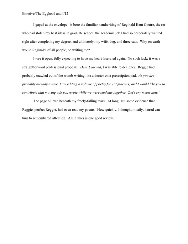
I can sense that some of you still cling to the belief that what appears in print will necessarily fly in a submission. Okay, let’s take a gander at a representative sample of the kind of italicized opening that lands on Millicent’s desk two or three times per day: italics intended to alert the reader to the fact that the paragraphs in the funny type aren’t in the time, place, and/or mindset of the actual opening scene that follows immediately thereafter.

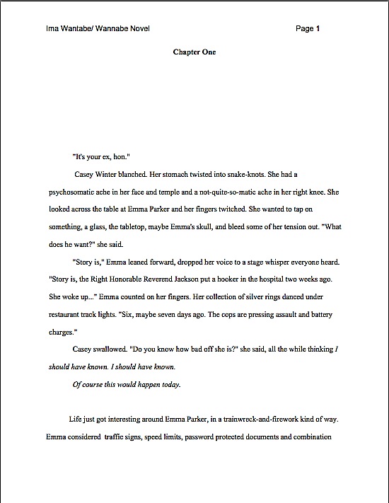
I didn’t fool you that time, did I? “Okay, Anne,” those of you who followed both this series and the recent prize posts chortle, “I know how this game is played. You’ve been trying to train us to catch Millicent’s pet peeves, so I kept my eye peeled not only for how italics are used here, but for other presentation problems that might have irked her.”

Well reasoned, chortlers. How many of them did you catch? For those of you who did not notice all 10 gaffes, here is the same page with all of the purely formatting problems corrected. (For your comparing-and-contrasting pleasure, I’ve touched nothing else.)

Seeing more of them now? If some of these differences jumped out at you, considering that Millicent stares at manuscript pages all day, every day, how many of them do you think she would spot within the first couple of seconds?

Just to make sure that we’re all on the same page with her, so to speak, let’s go over the purely cosmetic problems FIRST. In the order they appear on the page:

1. The slug line is in different typeface than the text. The slug line is in Arial, the body in Times New Roman.

2. The incorrectly formatted slug line includes author’s first name and middle initial, instead of just the last.

3. The incorrectly formatted slug line has a space between the forward slash and the title. The spacing in a slug line should be continuous: Name/Title/#

4. The incorrectly formatted slug line does not include the page number.

5. The page number is in wrong place on the page. It belongs in the slug line, not on the other side of the page.

6. The page number includes the word page. Although many aspiring writers think this looks nifty, a professionally-formatted manuscript would never include the word.

7. There’s an extra space before first word of paragraph 2. Yes, Virginia, most Millicents would catch that in either a hard or soft copy submission.

8. There’s only a single space between each period and beginning of the next sentence, while there are two after every other period. This kind of inconsistency is a common result of confusion over the great one space/two space debate. There is no single right answer here: some agents prefer a single space, although the industry standard is still two; check each agency’s submission guidelines before you submit. If they do not mention preferring the single space, use two. Whichever you pick, however, be 100% consistent about spacing throughout the manuscript.

9. At the beginning of the last paragraph, a number under 100 is expressed as a numeral, rather than being written out as a word.

10. In the final line of the page, there are two spaces between thrown and herself. To a professional reader, this is a dead giveaway that the submitter did not proofread in hard copy.

Quite a lot of eyebrow-raisers for such an innocent-looking page of text, isn’t it? That’s how closely agency screeners read — and we haven’t even begun to talk about the writing itself, you will notice. Take heart, though: unless Millicent is having a spectacularly bad day, none of these problems by itself, or even all of them together, will necessarily result in an on-the-spot cry of “Next!”

Why not? Well, believe it or not, the first version might be one of the more professional-looking first pages Millicent sees today. Most of the elements of standard format are in fact done correctly here, and it’s relatively free of misspellings and grammatical problems. So an optimistic aspiring writer often can — and does — get away with submitting a first page like the former.

Most professional readers, including agents, contest judges, and Millicents, are willing to overlook a small cosmetic error or two, just as they tend to discount the occasional typo, provided that it is not repeated in the manuscript. (The prevailing logic: the first misspelling of a word might legitimately be a slip of a finger; the second indicates that the writer just doesn’t know how to spell the word in question.)

It doesn’t take too many tiny problems, however, to render a pro much less sympathetic than she might otherwise have been to a larger problem like an awkward sentence or the appearance of a cliché. And that’s on a good day — do you really want to take the chance that Millicent won’t just have burned her lip on a too-hot latte just before turning to your first page?

I see a forest of hands waving in my general direction. “But Anne,” some of you point out, and rightly, “I’m finding this rather depressing. Taken individually, the deviations from standard format we’re talking about are all quite small; I just don’t want to believe that good writing could ever fall prey to what, frankly, looks at first glance like a pretty respectable formatting job. I’m not discounting Millicent’s ability to reject the submission that happens to be in front of her when she scalds herself, but surely nobody concerned really wants aspiring writers to believe that their work could be rejected based on anything but the writing.”

It depends upon whom you ask, actually. I’ve met plenty of screeners — as well as agents, editors, and contest judges, come to think of it — who regard writers that, as they tend to put it, “haven’t taken the time to learn the business,” just aren’t as ready to be published as those who have. (Hmm, haven’t I heard that someplace?) Part of working with an agent involves learning how to follow certain rules. It’s not as though any agent worth his salt would submit the first version above to an editor at a publishing house, after all; that would just be self-defeating.

Besides, these days, most good agents see so many cosmetically perfect submissions that they don’t lose too much sleep over rejecting those that are not. Or over Millicent’s having been more critical in the hour after she scalded her lip than on a normal day. They just figure that if a writer has real talent, s/he’ll go away, get better at presentation, and get picked up somewhere else.

That’s why, in case you’d been wondering, there’s no appeal for Millicent’s decisions: it’s not as though most agencies will run submissions past a second screener if the first did not like it, after all. Good writers are expected to be tenacious — and to take the time to learn how the publishing industry expects manuscripts to be presented.

So instead of regarding presentation as a secondary issue, try to think of paying attention to the cosmetic details as being polite to the person conducting the interview for a job you really, really want. Even if you have good reason to believe that some of the other interviewees are getting away with taking a few liberties, it honestly is in your best interest to be polite enough to show her your writing in the manner that Millicent is accustomed to seeing the best work in your chosen book category presented.

All that being said, did you spot the non-superficial reason this page might engender a knee-jerk rejection, even after just a superficial first glance?

If you flung your hand into the air and cried, “The second line of dialogue merely repeats the first, and thus adds nothing new to the scene,” good guess. This would indeed annoy most Millicents, particularly if this oh-so-common piece of redundancy appeared on page 1. Yes, people repeat what’s just been said to them all the time, usually as a means to indicate that they don’t understand the previous speaker’s last statement, but that doesn’t mean the repetition isn’t dull on the page.

But that’s a style issue. Any other guesses?

I can see the smoke rising from your thinking caps. “Well, what about the fact that the first line of dialogue is spoken by an unidentified speaker? There’s no legitimate reason to withhold that information from the reader, either at the outset or in this scene in general.”

Another excellent suggestion — the unidentified opening speech is indeed a very common professional readers’ pet peeve. However, the red flag I have in mind is a marketing issue. Hint: those of you who followed the contest winners’ posts carefully should already know what it is.

Need another hint? Okay, let me ask you the deceptively simple question that’s never far from Millicent’s thoughts while she is screening: based on this first page alone, in what book category does this manuscript belong?

It’s not readily apparent, is it? Depending upon the intended category, that could or could not be a problem. If this manuscript were, say, women’s fiction, this first page might not raise Millicent’s overactive eyebrows, but were it a mystery, the lack of species markings might well make her wonder when the mystery’s going to start. If it’s a paranormal, where are the supernatural creepy-crawlies? And don’t even get me started on what is missing if this were Action/Adventure, Western, any stripe of romance…

Well, you get the picture. Millicent needs to be able to tell if a submission falls into a category that her boss represents — and she likes to be able to tell by the bottom of page 1.

Seem strange that she would want to make up her mind on the subject so quickly? Her reason is very practical, I assure you: since every book category has its own particular style — language choices, conventions, stock characters, etc. — and no agent represents every book category, it can save Millie’s boss a heck of a lot of time in the long run if her loyal assistant weeds out manuscripts that don’t fit comfortably into the category. While many writers legitimately find this professional desire to place their work in a box a trifle maddening, it must be admitted that it’s usually far, far easier for an agent to sell a book if he knows which shelf it might occupy at Barnes & Noble. If any.

Why not wait until, say, page 50 before making that determination? Do you have any idea how many submissions Millicent has to get through this month? This week? Today?

It’s her job to narrow the field as quickly as possible. With that in mind, which Millicent do you think is most likely to reject the example above: one whose boss represents mainstream fiction, or one who represents primarily science fiction? Or, to put it another way, would you or would you not be surprised to learn that the page above is the opening to a fantasy novel?

Oh, you thought that Carla was going to be operating on humans, rather than refugees from the civil war on Planet Targ? Millicent would have leapt to the same conclusion. So wouldn’t Fledgling A. Writer have been better off, if not flinging the reader directly into an operating room stuffed to the gills with alien body parts, at least including a few recognizably fantastic elements on page 1?

Let’s go ahead and state the answer to that question as a general rule for revision: if a reader who knows nothing about your book cannot tell by the bottom of page 1 what type of manuscript it is, it’s very much in your interest to revise with an eye toward making the category more obvious from the get-go.

Don’t those of you who write exciting stories that begin in the everyday, mundane world, then leap into fast-paced action, wish you had heard that salient little piece of advice before you submitted for the first time? Yet I’m not sure how you would have known it — while it’s something that any agented writer could probably have told you, it’s one of those things that it’s just assumed every serious writer already knows.

“But Anne,” those of you not depressed into a stupor by that last statement point out, and rightly, “since we began this little foray into the joys of intensive nit-picking with a brief reference to italicized text, am I correct in assuming that even if ol’ Fledgling corrected every single problem we have discussed so far, and made it apparent from the first paragraph that this is a fantasy, the italicized part would still raise most Millicents’ eyebrows, if not red flags over the manuscript?”

In a word, yes — but perhaps not for the reasons you might expect.

Let’s face it: many aspiring writers radically overuse italics in their texts: emphasizing every word in dialogue that might conceivably deserve vocal stress, for instance, or using it to indicate irony, foreign words, and song titles. Each of these uses is fine on its own, but cumulatively, it can add up to quite a lot of squiggly text. And chant it with me now, campers: like any other writing device, the more italics are used for emphasis in a manuscript, the less effective each use will be.

So unless it’s absolutely necessary, a big block of italicized text tends to look out of place in a manuscript — and that’s potentially a problem. Why? Well, as I may have mentioned at some point in the dim, unrecorded past, manuscripts are not supposed to look like published books; they differ in many significant respects. Unfortunately, many, if not most, aspiring writers are not aware of those differences when they submit. Because of the sheer volume of incorrectly-formatted submissions, instead of treating deviations from expected formatting as an intriguing authorial choice, Millicent usually just regards it as (a) a mistake, (b) an indicator of the submitter’s lack of familiarity with the publication process, (c) carte blanche to take the submission less seriously, or (d) all of the above.

So when Millie spots an italicized opening paragraph or two, she tends not to exclaim, “Oh, here is a suggestion to the editor about what the formatting of the published book should look like,” as italics-loving submitters expect. Instead, she says, “Oh, here’s another one who doesn’t know that italicization choices are the province of a book’s editor, not the author.”

Besides, in many instances — as in, not entirely coincidentally, today’s example — the italics don’t actually change the meaning, or even the implication, of the opening. Italicized or not, this opening simply a fragment of a scene that is not directly connected to the section that follows — a differentiation made abundantly clear by the section break. The italics are not actually necessary.

So why not just take them out, since they might irritate Millicent? Here’s that same page again, with the squiggly type gone.

Come on, admit it — it doesn’t make much of a difference in meaning. It simply looks more like a normal manuscript page. That’s not a very high price to pay for removing the implication that Fledgling has not done his homework well enough to be aware that the decision to italicize an opening would ultimately be the acquiring editor’s call, not the author’s.

But did you notice that in fleeing from one pet peeve, poor Fledgling stumbled right into another? Technically,

But she thought: this can’t be happening, not today.

is redundant. Why? Well, while indicating thought by either using italics or saying she thought is acceptable in many book categories (but not all; taking the time to learn the conventions of your chosen book type will serve you well at submission time), it’s never considered right to use both simultaneously.

In other words, while Millicent would never consider the version above correct, depending upon the book category, she would be perfectly happy with either:

“She’s in the hospital?” she repeated. But she thought: this can’t be happening, not today.

or:

“She’s in the hospital?” she repeated. This can’t be happening, not today.

As we saw above with spaces after periods and colons, the trick is to pick one method of indicating thought and stick to it consistently throughout the manuscript — ideally, the method utilized in the current bestsellers in your chosen book category. If a conscientious flip through recent releases of your type of book does not reveal a category convention, don’t stress out about it; just use the method that appeals most to you.

When in doubt, I would lean toward losing the italics. There are quite a few professional readers out there — including a hefty minority of Millicents — who simply don’t like italicized thought on general principle. “Humph!” they say, wrinkling their noses over type dancing across the page. “Is this honestly necessary? Shouldn’t a good writer be able to make it clear that a character is thinking something, or indicate inflection, without resorting to funny type?”

I have to admit, as a reader, I’m seldom inclined to argue with them on this point, particularly if the manuscript in question also uses italics (correctly) for emphasis (“I’m talking to you, Bertrand!”), to indicate foreign words (“You left off the requisite accent grave, Marie.”), or includes a lot of song or book titles (“I know — let’s play Rubber Band Man while reading My Life as a Contortionist by I.M. Bendy!”). Used rarely, there’s nothing inherently wrong with italics, but in a manuscript with a lot of italicized words, the skimming eye can easily become confused, even to the point of skipping lines.

I just heard you italics-huggers gulping. “Um, Anne,” lovers of italicized openings whisper fearfully. “You’re not about to tell me that a Millicent in a hurry — and when is she not, given how much she has to read in a day? — might simply skip that nice italicized opening, are you? Please tell me that I’ve simply grown paranoid from too much close textual analysis in a single sitting.”

Oh, dear. Are you sitting down?

If Millicent happens to work for an agent who has a pet peeve against this type of opening — as many, many agents do, I tremble to report — she will simply glide over it, treating the first normal line after it as the opening sentence of the manuscript. So she would see Fledgling’s page 1 like this:

“Why on earth,” italics-lovers the world over croak in aghast unison, “would any literature-loving human do such a thing? At the risk of getting redundant with my outrage, published books open all the time with italicized bits!”

A fair question — but actually, there’s a pretty fair answer. Most Millicents just assume, often not entirely without justification, that if it’s in italics, it doesn’t really have much to do with the story at hand, which, they conclude (and not always wrongly), begins with the first line of plain text. In their experience, that’s where the action usually begins.

In other words, they’re apt to skip the italicized bits to save themselves some time.

Which is, as some of you may have noticed, the justification for many, many of the instant rejection norms that plague the nightmares of submitters. Millicent’s workday moves along at quite a clip, after all.

To distract you from any well-justified artistic seething you might be tempted to do over that last observation, take another look at that formerly-italicized section. Can you spot any other problems our pal Millie might have with it?

Any luck? Would it help if I mentioned that the remaining red flag has historically been a deus ex machina favored by everyone from Victorian novelists to middle school short story writers?

That’s right: and then she woke up. The problem here isn’t merely because in narrative prose, if Sentence B follows Sentence A in the text, the action in Sentence B is assumed to have come after the action in Sentence A; therefore, and then is actually redundant in this instance. No, it’s that so darned many exciting openings have tricked Millicent into being drawn into what she thought was the story — but later turns out to be just another dream.

Do literally thousands of interesting novels open this way? You bet. Does it mean that Millicent won’t feel duped when it happens in Novel #10,001? Do you really want to take that chance?

If you’d had your heart set on a bait-and-switch opening that ended with your hero/ine waking up, do not despair. It’s possible to pull off this device well — as long as you are aware that (a) it’s a very, very time-worn device, (b) Millicent sees hundreds of such openings every year, so (c) you’d better do something with it that she’s never seen before.

And if that’s not a creative challenge, I should like to know what is. Keep up the good work!

Formatpalooza, part XXIII: taking the guesswork out of the equation — or are we?

Once again, I had to laugh, campers: just as we were winding up this series on standard format for manuscripts — that’s book manuscripts and book proposals, mind you; if you are writing short stories, magazine articles, or for an academic journal, please seek out their specific requirements elsewhere — news sources all over North America suddenly began shouting that astronomers had determined that the astrological zodiac was off by about thirty degrees. That meant that instead of twelve signs, there were now thirteen, and most people were forcibly dragged into the sign before the one they had been used to reading in the newspaper.

I assume you heard all of the noise about it. The only problem: it wasn’t true.

Now, this outcome probably was not all that surprising to those whose first response to the breaking story was, “Gee, isn’t astronomers declaring that the basic principles of astrology have changed rather like orthodontists deciding that everything we have previously known about lipstick application is misguided?” but unfortunately, in the rumor-based news market, under-researched reporting is not particularly rare. Even more unfortunately, the time-honored and honorable newspaper practice of printing retractions is not especially common in television media — and virtually unheard-of in Internet declarations.

As those of you who have ever tried to look up information about submission format online are undoubtedly already aware, the result is a lingering mish-mash of the true, the partially true, and the blatantly false, mostly declared in identical tones of certainty, and all equally prone to generating a, “But I heard…” response. The underlying assumption is, and not entirely unreasonably, that each individual is now responsible for doing the necessary background research that reporters used routinely to provide.

Hands up, everybody whose last ten Google searches involved any research whatsoever beyond typing in a keyword or two, hitting RETURN, and scrolling through the top ten or twenty hits. Realistically, although most surfers know that not everything posted online is true, busy lives dictate that they act as though it were.

Case in point: the dizzying array of formatting, submission, and even grammatical advice floating around out there. I have nothing but sympathy for any poor aspiring writer whose first — or only — attempt to understand how new writing gets published in this fine country is gleaned from typing how to get published, literary agents, or even manuscript format into a search engine. Although I am fully aware that’s how some of you might have stumbled upon Author! Author!, the fact that I’m barraged on a daily basis by pleas from confused writers, begging me to reconcile what they read somewhere with what I’m suggesting, leads me to believe that while the Internet has in some ways made obtaining credible guidance for professional submission easier, in many respects, it’s harder than it was ten years ago.

And that is indeed unfortunate, because, let’s face it, it’s also significantly harder for a new writer to land an agent than ten years ago. Not only is the competition greater, but the economic downturn and resulting contraction of the publishing industry has meant that at most agencies, more aspiring writers are competing for far fewer client slots.

In a banner year, an agent might take on three or four new clients. In a lean year — or in what is expected to be a lean year — it might be even fewer.

Let’s pause a moment, to allow the implications of that last statement to sink in fully. Although the overwhelming majority of submitters to agencies simply assume that the average agent will simply pick up any good writing that arrives on her doorstep, that’s always been a logistical impossibility; there are far, far too many good writers out there. Even the more sophisticated submitters, the ones who have done their homework sufficiently to understand that there is no such thing as a generalist agent, often operate on the assumption that the only factors playing into whether the agent of their dreams decides to offer to represent them or not are the quality of the writing in the manuscripts and their respective fit into their authors’ chosen book categories.

In practice, that’s always been far from true. Ostensibly, it’s the agent’s job to be able to tell the difference between good writing in general, good writing in a selected book category, and good writing in a selected book category that could potentially interest an editor in the current book market. Any well-respected agent will receive literally thousands of queries and submission per year that fall into the first two groups — and hundreds that fall into the last.

And if that doesn’t strike you as potentially problematic for even the best new writers in your chosen book category, I can only suggest that you go back and re-read the last three paragraphs. You might have missed something.

As we discussed throughout the autumn of ‘Paloozas — don’t worry; we’ll be moving away from submission matters and back to craft next week — an agent has to consider many, many factors in deciding which dish out of the rich buffet of offerings to embrace as his next project. Quite a few of those factors are entirely outside the writer’s control: publishing trends, social movements, what’s being whispered around editorial water coolers these days, what any particular agent has just heard pitched recently at a literary conference. If your book category doesn’t happen to be hot right now, it is necessarily going to be harder to interest an agent in selling your book than if your category is rumored to be the next big thing.

Some factors, however, lie completely within the writer’s hands. Whether the manuscript is presented in standard format, for instance, and whether the formatting is consistent. The typeface and size the writer chooses. The percentage of backstory included on page 1. Whether the story opens with conflict or with ordinary interaction. Whether all the phrasing on page 1 is original, or whether it is peppered with catchphrases.

And so forth. Despite the consistent writers’ conference complaint, we writers honestly do make most of the decisions about our own manuscripts. That comes at a cost: agents, editors, and contest judges therefore have a right to assess our work not only on the writing, but also upon how well we adhere to the rules of standard format, grammar, punctuation, and the like.

Was that giant sucking sound that just rocked the universe the sharp collective intake of breath by aspiring writers everywhere who hadn’t realized before that any or all of those matters could be rejection triggers all by themselves? Or was it merely the audible dismay of those of you who did not proofread your last e-mailed submission IN ITS ENTIRETY, IN HARD COPY, and OUT LOUD before sending it off?

I mention e-mailed queries and submissions advisedly, because their steep rise in popularity has presented its own problem. Whereas in years passed, agents, editors, and contest judges were only able to judge submission only upon what appeared on the printed page, now, they can see not only the presentation polish of a submission, but also how the writer got it to look that way.

It is only reasonable, then, to expect Millicent the agency screener — who, after all, is employed specifically to reject the overwhelming majority of both queries and submissions before they get anywhere near the agent’s desk or computer screen — to take these matters seriously. While it has always been true that publishing types have associated incorrect grammar, punctuation, and even deviations from standard format with poor writing (an unfair correlation, perhaps, but a practically universal one), now that spell- and grammar-checkers are built into word processing programs and people like me yammer endlessly about proper manuscript format online, the tolerance for these gaffes has gone down, not up.

Anyone see the problem with that happening while we’re all constantly being exposed to the effects of the Internet’s unique combination of widespread disregard of the rules of grammar and punctuation, most e-mail and blogging programs’ outright hostility to proper indentation (oh, you thought I LIKED writing this in business format?), and the tendency of online advice-givers to contradict one another? Anyone?

Where these forces collide most harmfully for the aspiring writer is in the e-mailed or online submission. While a decade ago, an aspiring author who didn’t know to put the slug line in the header, but typed it at the top of each page of text, might have gotten past Millicent, in today’s online submission environment, his manuscript would be rejected by the top of page 2. Similarly, a writer could have gotten away with indenting each paragraph by hitting the space bar a certain number of times, as one would on a typewriter, whereas now, it’s immediately apparent to anyone looking at a soft copy submission that such a writer simply doesn’t know how to set tabs in Word.

Already, I’m sensing hands shooting into the air out there, but hold your proverbial horses, please: not everyone may have gotten why precisely Millicent might conclude that a writer who made these mistakes might be a harder client for her boss to represent, and thus one to reject right off the bat. Consider, please, these two submission openings — and, as always, if you are having trouble seeing the particulars, try holding down the COMMAND key and hitting + to enlarge the image:

Quick, tell me: what are the three major formatting differences between these two page 1s?

Oh, you didn’t spot them? That’s not too terribly surprising — in a paper submission, Millicent probably would not have caught them, either. They look more or less identical, right?

Had either you or Millicent been able to open the relevant Word file, however — as our Millie would have had to do in order to consider an e-mailed submission — you would instantly have noticed several serious problems. First, the slug line (Mini/The Good Example/1) is not located in the header, but typed laboriously at the top of each page. That would mean, in practice, that after virtually any revision, the slug lines would shift either lower on the page or backward onto the previous page, rendering the pagination useless.

Second, and as a direct result, the chapter designation is on the third line of page 1, not line 1, where it should be. Third, both the chapter designation and the chapter title were hand-centered by the simple expedient of hitting the space bar repeatedly until the text was in the right place, as one would on a typewriter. Third, all of the indentation was done not by setting a tab, but by hitting the space bar 9 times at the beginning of each paragraph.

“But Anne,” many of you cry out in protest, “why would it matter? Isn’t all that counts for standard format how the page looks?”

Yes and no, dismayed protesters. Yes, for a hard-copy manuscript, looking right is sufficient. No, for a soft-copy manuscript, the words being in the right positions on the page is not enough to look professional.

Why not? Well, ease of subsequent revision, mostly. Just as the page numbers would have to be changed by hand in the second version, using the typewriter-style centering would mean that if the title changed, the writer would have to refigure how many spaces to insert, rather than using the Center function (found on the FORMATTING PALETTE under the VIEW menu in Word) to recenter it automatically. And even on a typewriter, not setting a tab (easily done using the RULER function under the VIEW menu) for something that needs to be done at the beginning of each and every paragraph in the manuscript is, well, a trifle strange.

If you found that last paragraph mystifying, may I make a simple suggestion that will make your life as a submitting writer far, far easier in the long run? Invest a few hours in taking a basic class on the functions of Word, because any agent or editor currently working in the United States will expect a new writer to be familiar with how it works.

Unfortunately, this is not information you’re likely to be able to find in a 2-minute Google search. You’re going to want to take an actual class, so you can ask as many questions as you need in order to get comfortable with all the bells and whistles.

Call your local computer store and ask; if you use a Mac, most Apple stores offer these tutorials for free. If you can’t find a class near you, try calling the local community college, asking to be directed to the Computer Science or English departments, and inquiring whether there is an advanced student who might like to make a few bucks by spending an hour or two showing you how to set up a document according to the rules of standard format.

I would repeat the same advice, with different emphasis, to any aspiring writer unsure of the rules of punctuation and/or grammar. In the long run, one of the best things an aspiring writer can do to improve his chances of getting professional recognition is to invest the time in a good, basic grammar course. Heck, I’m a big fan of every writer taking a refresher course every five or ten years.

I realize that this flies in the face of the web-based expectation of instant answers, and yes, I am always delighted to answer such questions here, especially as they relate to page formatting (the Formatpalooza post on punctuation in dialogue was in response to a reader’s question, for instance). But at least for as long as my agent keeps insisting that now is not the right time to bring out Author! Author! in book form (a now that has extended for a good five years, only six months less than I’ve been blogging), I can’t be standing next to you while you are composing, can I?

Trust me, both the writing and submission processes are significantly easier for an aspiring writer with a firm grasp of the rules of the language. If for no other reason than that those who are already conversant with how to use a semicolon correctly don’t have to waste hours upon hours wading through the widely divergent advice on the subject currently to be found online.

This is, after all, a business in which both spelling and grammar count. Very much. I would even go so far as to say that being good at both are a job requirement for a professional writer.

Like the strictures of standard format, however, grammar is not something that anyone is born knowing. The rules need to be learned, and applying them is a learned skill. Just as no aspiring baseball player would expect to hit a home run the first time she steps up to bat, neither should an aspiring writer cling to a misguided belief that if her writing is good enough, Millicent will overlook spelling, grammar, or punctuation problems.

She won’t. Period. Less so now than ever, because these days, it’s widely believed in publishing circles that there is more than adequate training in such matters readily available on the web.

Tell me, those of you who have gone looking for it, is that true? And if it is, how easy is it to tell a credible source from one that’s just winging it?

The same perception dominates the publishing world about standard format for manuscripts, by the way. The last time I announced I was going to run through the rules of standard format again, an agent of my acquaintance, a tireless advocate for my giving up this blog in order to rechannel the considerable time and energy I devote to it into my other writing, even bet me a nickel that no one would even comment, much less ask questions, throughout my next foray into the subject. Despite my readers’ consistent devotion to improving both their writing skills and ability to present them professionally, he wagered that you would be so tired of formatting after my revisiting repeatedly it for five years that the posts that time around would pass relatively uncommented-upon.

Actually, he didn’t suggest betting on it until after I stopped laughing at his contention. “What’s so funny?” he demanded. “It’s not as though your past posts on the subject aren’t well-marked, or as if there aren’t a million other sites on the web devoted to the subject. Why can’t readers just go there to find out what to do?”

Because I like the guy and I’m not in the habit of lecturing agents, I restrained myself from suggesting that he just didn’t understand how a blog works. “Some will, but many of my readers don’t have the time to comb the archives.” (See? I honestly am aware of that.) “And the writers brand-new to the game may not yet know that there is a standard format at all. By going over it two or three times a year, I’m doing my part to make sure that everyone’s writing can look its best for you. You should be grateful.”

He was, in a word, not. “Did you spend your last three lifetimes blithely violating the rules of grammar and structure, condemning yourself to the Sisyphean task of explaining them over and over again this time around? You’re dreaming, my friend — your readership doesn’t need this. I’ll bet you twenty bucks that you get fewer comments this time than last.”

Well, great as my faith in my readers undoubtedly is, I seldom bet more than a nickel (although I did win a quarter off my mother during the last campaign season for accurately predicting the outcome of the Nevada senate race), so he had to settle for that. “You’ll see,” I told him. “Not only will readers comment more than usual, but they’ll come up with questions neither you nor I would have thought of addressing.”

He handed over the nickel after Part III. One of you lovely people asked a perfectly reasonable about indentation he’d never heard before. Better yet, one that had never occurred to him before.

Now he is yet another convert to what I have long held is the truth about aspiring writers: contrary to practically universal opinion amongst professional readers, deviations from standard format are not usually the result of writers’ being too lazy to find out how to present a manuscript. Most of the aspiring writers I encounter are downright starved for accurate information on the subject; the underlying problem is that there isn’t enough authoritative information out there to combat all of the inaccurate rumors.

I’ve always been a big proponent of agency websites simply posting a page with the formatting rules, if only so I could devote our shared time here to craft. Some do, but most don’t; virtually all that do simply assume that any aspiring writer serious about getting published will already be familiar with standard format.

And that, in case those of you who have been hanging around Author! Author! for years have been wondering, is why I revisit the strictures of standard format at least twice per year. Call it my charitable contribution to the writing community.

If you feel it has been helpful and you are reading this before 10 p.m. on Sunday, January 16, 2011, may I suggest that a delightful means of expressing that would be to take a couple of minutes to nominate Author! Author! for a Bloggie Award? The more nominations, the more likely the blog is to make it to the finalist round, and thus be read by judges.

Again, I just mention. No pressure, of course. But I’d really like to see the stars line up right this year.

Next time, we shall plunge head-first back into the rigors of craft. Keep up the good work!

Formatpalooza, part XXII: dates, places, and the passage of time


Before we launch into today’s festivities, a couple of quick announcements. First, all of us here at Author! Author! are wafting good wishes toward science fiction author Orson Scott Card, who suffered a mild stroke last Saturday. Here’s to a speedy recovery, OSC!

Second, a heads-up for Seattle residents and those lucky enough to live in her relatively snow-free environs: Heidi Durrow, author of The Girl Who Fell from the Sky, will be giving a reading tonight at the Northwest African-American Museum (2300 S. Massachusetts St.), as well as signing her book at Costco (4401 4th Avenue S.) on Friday at 12:30 p.m. and reading at Third Place Books (17171 Bothell Way NE, Lake Forest Park) on Saturday at 6:30 p.m. I shall be at the Saturday night event, so please do come up and introduce yourself!

In other news, nominations for the Bloggies — which celebrate precisely what you think they do — are now open, and shall remain open through this coming Sunday, January 16th. So if anybody out there should happen to admire any particular blog, this would be a lovely time to express that sentiment through a nomination, if you catch my drift. Only the most-nominated blogs in any category (say, art/craft or topical) will proceed to the judging round, so if you have an opinion on the subject, now would be the time to weigh in about any blog you’d found particularly helpful within the last year.

I just mention. Back to the business at hand.

Earlier in this series, incisive reader Bruce (seconded by sharp-eyed reader Elizabeth) pointed out an issue that had somehow so far slipped between the cracks of Formatpalooza. Ahem:

The first page of my novel begins with a dateline. How would you treat it? As a typical dateline, as in a mag or newspaper? As a header?

or as something in-between?

At first, I must admit, I was a trifle nonplused by this question. Had we not discussed the issue of inserting articles, letters, and journal entries earlier in this series and did not that jolly little monologue include discussion of how to include a dateline?

Well, it did and it didn’t, as I learned upon going back and doing a spot of re-reading. That earlier post did indeed show a couple of options for including a dateline for an article, letter, or diary entry imbedded within a non-academic manuscript. (For guidelines covering this kind of long quote in academic work, please see that previous post.) One could introduce the relevant date in the text just before the excerpted bit:

That would work in either a fiction or nonfiction manuscript. Nonfiction writers, however, also enjoy the option of using a boldfaced subheading. This format is especially popular for excerpting newspaper articles, as it would more closely resemble the way a reader might find it in a published book. Take a gander:

Doesn’t leave much doubt about when ol’ Nellie wrote that journal entry, does it? If this same entry were to appear in a novel manuscript, however, the boldfacing would not be appropriate.

Why the dichotomy? Pull out your hymnals and sing along now: in a novel manuscript, nothing whatsoever should be in boldface or underlined. In a nonfiction manuscript, only subheadings may be in boldface.

Thus, in a novel, Nellie’s diary entry would look like this on the page:

Everybody clear on that? I want to make certain, because as we saw in our last Formatpalooza post, in the welter of manuscript-formatting information out there, it’s very, very easy for an aspiring writer to conflate what would be appropriate for a dateline in one context — in this case, mid-chapter in a fiction or nonfiction manuscript — with what is called for in another.

Say, if the date, time, and/or place designation were opening a chapter, or even, as Bruce and Elizabeth would like to do, the book.

I have good reason to be cautious: if an unwary writer were simply to type dateline + manuscript format into Google, much of what would pop up in the first page would be either inapplicable or wrong. Actually, I just did it, and Result #6 was a link to Bruce’s question on this site. It also turned up a self-styled expert ordering an eager questioner to use underlining instead of italics, which is flatly incorrect for a book manuscript. Not entirely surprisingly, the expert didn’t bother to mention — and perhaps was unaware — that standard format for short stories, articles, and books is different, and thus it’s absurd to pretend that all writing, anywhere, anytime should be formatted identically for submission.

The moral here: before you accept ANY formatting advice, make sure it is specifically aimed at your type of writing. If a list of guidelines claims, either by positive assertion or omission, to be universally applicable for all manuscripts, run, don’t walk, in the opposite direction. And perhaps this goes without saying, but if you don’t know what precisely makes the person giving the advice an expert, ask follow-up questions, rather than believing — as an astonishingly high percentage of aspiring writers seeking advice online seem to do — that all online sources are equally credible.

It’s just not true, and trying to follow all of that wildly disparate advice simultaneously will only drive you nuts. Seriously, it’s a waste of your valuable time and energy. Find a credible source for your particular type of writing, cross-check what that source says with agency and publishing house submission guidelines before you even consider following the source’s advice, and don’t allow yourself to be distracted by every new suggestion you see online.

Especially if the source leaves you guessing whether the rule being touted is intended to apply to short story submissions (as, say, underlining to indicate italics would be) or book-length works (as in the imperative never to underline anything at all, under any circumstances). Just because the words manuscript, submission, and writing may be applied to both of these wildly different venues does not mean that the expectations are identical in each.

This is not a guessing game, after all. Actual standards do exist — they are merely industry-specific.

My point is — I honestly have had one lurking in the background throughout those last few paragraphs — one of the perennial problems faced by any aspiring writer trying to glean information online is the necessity for boiling complex concepts down to super-simple search terms. It’s led, unfortunately, to a tendency for definitional creepage.

You know what I’m talking about, right? It’s when a key word or phrase is ripped out of context often enough and used to mean other things in other venues that it comes to lose its specificity — and, eventually, its utility as a search term. Unfortunately, on the writing grapevine, definitional creepage is practically as common as complaints about how hard it is to land an agent in these trying times.

We saw a great example in our last post: a questioner used the term teaser to refer to a brief scene placed at the beginning of a novel, even though it would fall temporally later in the plot, in order to draw the reader into the book’s central conflict and open with action. It’s a comprehensible use of the word, but more specific uses, a teaser is everything from a promotional offer used in advertising to a rhetorical question used at the beginning of a newspaper or magazine article to tempt the reader into reading on to a theatrical curtain draped across the top of the proscenium arch to mask the flies and, along with the tormentors, provide a fabric frame for a stage.

And that’s not even counting the (avert your eyes, children) sexual definitions. The mind positively reels at the number of websites a curious writer might turn up by trying to find a little basic guidance on how to write one.

Think I’m digressing again? Au contraire, mon frère, because definitional creepage has almost certainly rendered it significantly more difficult for today’s brave questioners to find credible answers to this legitimate and serious formatting question.

Why? Well, primarily because not every date designation in writing is a dateline (or, in its more common usage, date line). In journalism, a dateline is the bit at the beginning of the article that tells the reader the date and place from which the news within the article was reported, usually presented in all capital letters: SEATTLE, JANUARY 12. Its purpose is not merely to indicate where the reporter was within the space-time continuum when she filed the story, but to enable readers to tell yesterday’s news from an article filed three weeks ago.

But that’s not its old definition, is it? Those of you addicted to looking things up will also be delighted to know that a date line is also how some earth scientists refer to the 180th meridian of longitude, better known to the rest of us as the International Date Line.

Now, clearly, Bruce wasn’t inquiring about the hypothetical dividing point where, by international agreement, a traveler moves from one day to the next. As a reasonable, sane human being, this definition did not even occur to me when I first read his question. Search engines, however, are not human beings, capable of considering the larger context, but must instead rely solely upon the search terms fed into them.

Yes, even extremely well-designed search engines. See the potential problem?

Why bring all of this up, rather than simply answering the original question? Two reasons. First, as an explanation and apology to all of the future web searchers who will undoubtedly end up on this page after having fed the term dateline or date line into their preferred search engines. Next time, you might want to add an extra term or to, to provide specific context.

Second, I’m REALLY glad that this term showed up in today’s question, because definitional creepage appears to be a factor in approximately 1 out of every 10 questions the Author! Author! comments. A lot of good writers out there seem to be frustrated by the results of insufficiently specific search terminology — and downright annoyed by the plethora of advice about ostensibly the same subject, when so many of the advice-givers are actually talking about different matters.

Didn’t think I could bring that diatribe full circle, did you? I’m a professional; don’t try this at home.

Let’s make things easy on the next aspiring writer looking for an answer to the question that Bruce and Elizabeth were kind and brave enough to bring forward for discussion by labeling the answer as clearly as humanly possible. Please, if you can think of other ways you might conceivably search for this information, mention it in the comments, so it can turn up in future web searches.

How to present a date and/or time at the beginning of a chapter or manuscript
As is often the case, the lucky writer has a couple of formatting options, both with concomitant advantages and disadvantages. One could, as we saw in our last post, simply use the date and/or time as the subtitle on page 1:

Or even as the title:

There is, however, a third and quite popular option: insert something that does in fact resemble a dateline in a newspaper article. Obviously, though, one would not want to format it exactly like a dateline — one should not, for instance, present it in all capital letters or substitute it for the necessary indentation at the beginning of the first paragraph of text.

And why wouldn’t we want to do either of those things, campers? Shout it out with me now: because a book manuscript should look like a book manuscript, not like any other kind of manuscript — or like any species of published writing. It is governed by its own rules.

Everybody got that, or should I attempt to wake up that deceased equine for another pummeling?

So how might a savvy writer of books format such a thing? By treating it like any other subheading in a manuscript, placing it where the first line of text would be if the date/time/place designation were not there.

In other words, the space format restrictions at the top of the chapter should not change at all. For fiction, it should look like this:

And for nonfiction, it should look like this:

Do I spot some raised hands waving at me from the ether? “But Anne,” a few thousand sharp-eyed readers point out, “that’s a less efficient use of page space! By adding the date as a subheading, we’ve lost a line of text!”

Quite true, date-lovers: there’s no such thing as a cost-free formatting alteration. While you gain in resemblance to an article’s dateline, you get fewer words per page. For those of you bumping up against that 400-page ceiling, the exchange might not be worth it. However, it’s up to you.

Thanks, Bruce and Elizabeth, for bringing this one up; I think the result has been a valuable addition to Formatpalooza. Thanks, too, to the many, many entrants to our recent Rings True competition whose first pages featured such date, time, and/or place designations; I honestly hadn’t realized that opening a book this way was enjoying a renaissance right now, at least amongst aspiring writers.

Keep those great questions rolling in, everybody. I’m planning to wrap up this series tomorrow, so we can launch back into nice, juicy craft questions over the weekend, but hey, I’m always delighted to clarify a formatting issue.

Keep up the good work!

Formatpalooza, part XXI: the past is prologue. But is that hook at the beginning of your manuscript?

It’s going to be a quick one this evening, I’m afraid, campers. Yes, yes, I know that I often say that, and then writing 14 pages because I discover that I have a lot to say on the topic at hand, but this time, I honestly am going to try to keep it short and sweet, in honor of my early day tomorrow.

Which may well be rescheduled, due to what looks to be about six inches of snow on the tree outside my studio window. Seattle does have a tendency to shut down on the first day of a snowstorm — and I tend to stay off the road running alongside my house when kids are sledding upon it. Call me zany.

What I am not calling zany is an interesting recent question from thoughtful reader Jen, zeroing in on a topic that even I can’t believe I’ve never addressed as a formatting issue before:

As you’re winding up Formatpalooza, I was wishing you would cover the question of how to format a teaser (as opposed to a prologue) at the beginning of a manuscript. Perhaps you have covered this in the past, but I can’t seem to find it. Thank you for your valuable help!

I’m delighted to help, Jen — but before I do, truth compels me to point out that the term teaser can refer to quite a few different things. Like so many writing terms, it can answer to one of several definitions with relation to novels, a couple of others with respect to nonfiction, a third set of things in journalism, and so forth. From the comparison to a prologue (as well as from some enlightening follow-up banter of the type that regularly goes on in the comments, thank goodness), the meaning in this case is a few pages — or even paragraphs — in the front of the manuscript that stand alone, rather than being related to the action on the first page of chapter 1.

In a published book, such an opening might appear like this, with Chapter One beginning on the next page:

Technically, an opening teaser like this is a prologue, whether or not it is labeled as such. In a published novel, it is virtually always treated like one: instead of being paginated with Roman numerals, as introductions in nonfiction books often are, an opening like this is almost invariably page 1 of a novel. The first page of Chapter One is simply numbered as the next page after the prologue.

The same logic prevails in a book manuscript intended for professional submission, whether it is fiction or nonfiction. (Academic texts work by different rules, though.) In standard format, the first page of text is page 1, always, regardless of how it would be numbered in a published book.

And why is that last caveat important to bear in mind, campers? Feel free to shout it along with me: professionally-formatted manuscripts differ in many respects from formatting in published books.

So how should the example above appear in a manuscript? It should be formatted precisely like a chapter opening — and like the first page of any manuscript. It should, in short, look like this:

But that doesn’t completely answer Jen’s question, does it? What should the first page of Chapter One look like, coming after such an opening? Glad you asked.

Is that a forest of hands that just sprouted out there, or is the snow doing something funny to my long-range vision? “But Anne,” some prologue-lovers shout, “isn’t that kind of opening likely to confuse Millicent the agency screener? I mean, isn’t she expecting the top of page 1 to be labeled Chapter One — and isn’t she likely to respond negatively if it isn’t? Shouldn’t I respond to my overpowering fear of her rejecting my manuscript on superficial grounds by labeling that opening as a prologue, so there is absolutely no chance of her being confused for so much as a nanosecond?”

Well, you certainly could do that, fearful tremblers, but it’s not strictly necessary. If you did, though, page 1 of your submission would look like this:

That makes abundant sense, right? Just as a chapter title would appear as a subtitle under the chapter designation, the prologue label would appear on the first line of the page, with the title of the prologue on the next double-spaced line. Everything else remains the same.

In a book category where such brief prologues are common openings, however, you don’t need to worry too much about Millicent’s not understanding what those first couple of pages are: trust me, she’ll recognize them. At least well enough not to be startled or confused when Chapter One opens in another time and place entirely — in this case, much earlier in poor Louis’ story.

Unless, of course, the writer chose to submit those pages like our next set of examples; see if you can spot the problem. Hint: if you jumped up from your desk chair, ran to the other side of the room, and squinted in the general direction of your computer screen, it would probably still be visible.

Did you catch the not-particularly-subtle problem here? Millicent might indeed find this opening confusing, because there’s nothing to indicate a time and place switch in the story. (Particularly unfortunate in this case, as the chapter is in a different voice than the prologue, and a rambling one at that.) Heck, there’s now nothing in the prologue section to indicate that it isn’t taking place in the present, rather than a couple of hundred years ago.

Chant it with me now, campers: when in doubt in a submission, opt for clarity, clarity, clarity.

Clarity, clarity, clarity is also why the prologue and/or introduction of a nonfiction manuscript (at least one not intended for an academic press) should follow the first page of text = page 1 rule. Yes, even if published books in your chosen book category always employ Roman numerals for prologues and introductions: trust me, if Millicent’s boss, the agent of your dreams, handles those sorts of books for a living, Millie will be able to figure out that the prologue that begins on page 1 of the manuscript will need to be repaginated by the editor.

Why am I so sure about that? Could it be because pagination decisions, like any other formatting calls in a published book, are the editor’s call, not the author’s?

Is everyone comfortable with all that? Please pipe up with questions, if not. And best of luck with the teasing, Jen!

Hmm, I could get used to writing posts this length. Or perhaps my will to communicate is just too strong. Keep up the good work!

Formatpalooza XVI, in which we get downright chatty

partial pink roses

I ask you: how did it get to be Wednesday already? Clearly, some mad scientist has been sneaking into my life, boxing up hours at a time, and hauling them away to another dimension.

Or so I surmise, from the fact that I began this post yesterday morning, yet don’t seem to have posted it until this afternoon. Let’s get right down to business, before another fifteen-minute chunk just vanishes before my very eyes.

Manuscript submissions, like any other form of human communication, are subject to fashion. Nine months to a year after a surprise major bestseller hits the bookstores, for instance, agencies start seeing scads of queries for books with remarkably similar premises. About the same amount of time after a multiple-perspective novel hits it big, their inboxes are suddenly stuffed to bursting with multiple POV submissions. Even matters as small as semicolon use often, after a suitable lag for composition, enjoy the occasional renaissance.

It’s as predictable as the flowers in May — and just as likely to induce an allergic reaction in Millicent the agency screener, at least when the day’s submissions heavily à la mode. While a manuscript’s fitting neatly into an already well-established book can be a good thing, the fourth DA VINCI CODE knock-off of the morning can easily start to seem a little old.

Other trends, I must confess, catch professional readers by surprise. A few years back, about a tenth of the manuscript submissions appearing on agency doorsteps abruptly lost the second space after a period: one day, the second space was virtually universal; the next, it was as if a pair of giant hands had slapped the left and right margins of America, forcing all of those poor sentences into closer proximity with one another.

“What happened?” the pros demanded of one another, mystified. “Did I miss an industry-wide memo that the standards have just changed?”

In a manner of speaking, the people who ostensibly set those standards had. Miss Snark, a well-known agent-who-blogs of the time, had declared from behind her wall of anonymity that anyone who was anyone simply despised the second space after the period. Within a couple of weeks after she declared it verboten, agencies felt the effects, despite the fact that the standard within the industry had not actually changed.

Now, it wasn’t as though there hadn’t been banshees declaring the demise of the second period for a good decade before Miss Snark’s pronouncement: it had, in fact, been a fairly common writing-class admonition ever since some publishers started cutting it from published books in order to save paper. Surprisingly often, it was presented in precisely the same terms: the double-space convention is old-fashioned, and using it would instantly brand a writer as someone to ignore. That’s never actually been true — unless an agency or publishing house actually states a preference in its guidelines for only a single space after a period, using two is virtually unheard-of as a rejection-worthy offense all on its own — but it certainly sounds convincing, doesn’t it?

Since I already dealt with the one-space-two-space (red space, blue space?) debate in an earlier post, I shan’t go into its pros and cons again here. I merely bring it up to illustrate that although people outside of agencies and publishing houses periodically decide that this or that is the new normal for submissions, those decrees usually come as news to the fine folks on the receiving end of submissions.

You know, the individuals with actual power to change the rules in question. Imagine their surprise.

In a not entirely coincidental development, when one of these sea changes begins to take effect, Millicent’s response is just as likely to be annoyance as approval for those who have leapt on the bandwagon. In fact, the former is more likely. “Why are half the manuscripts I’ve seen today in blue ink?” she wonders. “Did someone at a writers’ conference make a joke that got misunderstood?”

Oh, it happens. And now, thanks to the Internet, such a misunderstanding can make it three times around the world before breakfast.

So when about a year ago, submissions suddenly began appearing in agencies with more than one speaker per paragraph in dialogue scenes, professional readers drew the obvious inference: either some soi-disant writing guru had declared the paragraph break between speakers so old-fashioned, or a recent bestseller had been composed by someone with a broken RETURN key, a broken right pinkie to hit it, or a deep-seated psychological aversion to clarity in dialogue.

“Why else,” Millicent has been heard to mutter, “would anyone deliberately chose a dialogue format that will confuse readers?”

You know what I’m talking about, right? Whereas traditional and — dare I say it? — old-fashioned dialogue is formatted like this:

Polly Purebred clutched a lace-napped handkerchief to her pale pink lips. “But I can’t pay the rent!”

“But you must pay the rent,” Dastardly Duke replied, twirling his mustache. “Or I shall tie you to that railroad track conveniently located just outside your front door.”

“But I can’t pay the rent!”

“But you must pay the rent, or I shall deal with you as I mentioned above.”

“But I can’t pay the rent!”

“What are you, a tape recorder? You gotta pay your rent, lady.”

A handsome stranger appeared in the doorway, slightly out of breath from having missed his cue. “I’ll pay the rent.”

Polly tapped on her watch meaningfully. “My hero.”

“Curses,” Duke remarked, yawning, “foiled again.”

On the manuscript page, that exchange (and possibly a little more) would be formatted as you see below. As always, if you’re having trouble reading the type, try holding down the COMMAND key and pressing + to enlarge the image.

dialogue format

That should look at least a trifle familiar to you: the indented paragraphs, one speaker per paragraph convention, and properly-placed quotation marks are all just what you would see in a published book, right? Obviously, though, because this page appears in a manuscript, these dialogue paragraphs are presented in standard format, just as narrative paragraphs would be.

Really, there’s only one unusual element here: did you catch the quote within the quote in paragraph 10? Because Handsome Stranger is reproducing verbiage from Dastardly’s rental ad, rustic charmer with view of railroad track appears within single quotation marks (‘), rather than doubled (“); doubled quotation marks appear around the entire speech.

Everybody’s clear on that, right? If not, now would be a delightful time to speak up.

Clear being the operative word here: while clarity is always required for professional writing, lack of clarity in dialogue is especially likely to be fatal to a submission. If the punctuation had not made it plain that Handsome was in fact quoting something, that paragraph would have made less sense. See for yourself:

“I do believe I will.” The stranger removed his fetching Mountie hat before stepping into the cabin. “I’ve been traveling all morning. The rental ad didn’t mention just how far out of town rustic charmer with view of railroad track actually was.”

Yes, Millicent might have been able to figure out from context (a) that Handsome was indeed quoting and (b) which words in the sentence were being quoted, but you have to admit, it’s not completely obvious at first glance. And one of the practices to which most overworked Millicents are allergic is reading a sentence in a submission twice, because they did not understand it completely the first time around.

The form that allergic reaction typically takes? You’ve probably already guessed: “Next!”

Seem harsh? Actually, it isn’t: conceptual clarity is the minimum expectation for professional writing, not a feature for which a submitter will receive extra credit. By definition, if a reader has to go back over a sentence a couple of times in order to figure out what’s going on in it, it’s not particularly clear.

Fortunately, even though there are three characters talking on the page above, it’s always perfectly clear who is speaking when, isn’t it? That’s because the real hero of this scene is the humble RETURN key: each speaker has his or her own paragraph.

Again, this should not come as too much of a surprise to readers familiar with how dialogue is typically presented in books. Recently, however, Millicent has found herself scratching her pretty head over exchanges like these:

“But I can’t pay the rent!” Polly Purebred clutched a lace-napped handkerchief to her pale pink lips, but her obvious distress had no effect on Dastardly Duke. He twirled his mustache. “But you must pay the rent, or I shall tie you to that railroad track conveniently located just outside your front door.

See the problem? A skimmer might well assume that everything within quotation marks was Polly’s speech, and thus become — sacre bleu! — confused.

Why might a swiftly-reading observer leap to that conclusion? For one very good reason: in English prose, the character who gives the first speech in a dialogue paragraph is assumed to be the speaker for every speech within that paragraph, unless there is specific indication otherwise. If there is no tag line (he said, she said), the speaker is presumed to be the first character named in the narrative part of that paragraph.

So technically, Polly is the only speaker here. Even though there are two actors within this paragraph, there’s literally nothing in it to indicate a change of speaker. How could there be, when this paragraph violates the one speaker per paragraph rule of dialogue?

Not seeing it? Okay, let’s break down what the actual text is telling us is going on:

Polly: But I can’t pay the rent!

Polly: But you must pay the rent, or I shall tie you to that railroad track conveniently located just outside your front door.

Doesn’t make much sense, right? And to a professional reader, neither does cramming two characters’ speeches into the same dialogue paragraph. Not only is it improper, but it leads to needless confusion.

Frankly, this kind of formatting is likely to send Millicent into a sneezing fit if it happens even once in a submission; if it occurs early enough in the text, it’s likely to trigger instant rejection. If she’s in an unusually tolerant mood that day, she might continue reading, but if she spots it again, she will sneeze herself into a whirl of philosophical confusion: why, such paragraphs leave her wondering, would a writer want not to follow the one speaker per paragraph rule of dialogue? Not only is it the norm for dialogue, but it fends off that bugbear of submissions everywhere, conceptual confusion.

If the practice appears to be habitual, she is forced to come to one of only two possible conclusions: either the writer was trying to save a line by not hitting the RETURN key (a sneaky practice which, over the course of an entire manuscript, might actually trim quite a few pages from an over-long dialogue-heavy submission), or he was simply unaware that — wait for it — the character who gives the first speech in a dialogue paragraph is assumed to be the speaker for every speech within that paragraph.

Neither conclusion is, I’m afraid, going to make her think particularly highly of the manuscript in question; either would be ample justification for rejection. Think about it: both a writer unfamiliar with the rules of dialogue nor one who believes that Millicent won’t notice or care if he bends them are likely to be rather time-consuming to represent; their learning curves will need to be pretty sharp in order to work successfully with an editor at a publishing house. Or, indeed, with an agent in preparing a submission to said editor.

But that’s not why misformatting dialogue is potentially fatal to a submission, at least not all by itself. Like not indenting one’s paragraphs, not adhering to the one speaker/one paragraph rule implies, among other things, that one does not read a great deal of English prose containing dialogue. And that’s an extremely dangerous impression to create with a submission, as the publishing industry has long favored writers it perceives as unusually literate.

It’s hard to blame them for that preference, considering that the people who harbor it tend to be the ones correcting any deviations from standard punctuation and grammar. Agents and editors know from experience that a writer who doesn’t pay attention to — or doesn’t know — how to format or punctuate dialogue is simply more time-consuming to guide down the curvy path to publication.

Indeed, many agents feel — and rightly — that it isn’t really their job to play the grammar police. One of the basic requirements of being a professional writer is knowing the rules governing English prose, after all.

You would think this tenet would send aspiring writers everywhere stampeding toward community colleges to enroll in basic composition classes, wouldn’t you? As Millicent’s inbox abundantly demonstrates these days, that’s one trend that doesn’t seem to be sweeping the nation.

Did a dragon just fly by, or are some of you hyperventilating? “But Anne,” the puzzled gasp, “isn’t it just a tad unreasonable to draw sweeping conclusions about someone’s literacy based upon just a couple of paragraphs of dialogue? I mean, take another look at that last example: it’s pretty obvious from context that Dastardly is saying the second speech, isn’t it? Would it kill Millicent to extrapolate? Or even just to read it twice, if she’s gotten confused?”

Not kill her, perhaps, but definitely irk her: remember, many screeners will not re-read, on general principle. Bear in mind, too, that Millicent is often reading very, very quickly — she has a lot of submissions to get through in a day, recall, and it’s her job to reject most of what she reads. If she finds a dialogue scene when she skims, she’s likely to reject the manuscript, even if someone reading at a normal pace might be able to follow the passage in question.

Fortunately, there’s a magic fix: hit the RETURN key between speakers. Look at how few keystrokes remove any potential for confusion from our last example.

“But I can’t pay the rent!” Polly Purebred clutched a lace-napped handkerchief to her pale pink lips.

Her obvious distress had no effect on Dastardly Duke. He twirled his mustache. “But you must pay the rent, or I shall tie you to that railroad track conveniently located just outside your front door.

Problem solved — and at no cost to the meaning of the original exchange. To reiterate Millicent’s earlier question, why wouldn’t a writer want to do it this way?

She also is left to wonder far more often than strikes her as reasonable why so many submissions of late have taken to violating the one speaker/actor per paragraph rule. All too often, she finds herself confronted with dialogue formatted like this:

“But I can’t pay the rent!” Polly reiterated.

“So you’ve said. Forty-seven times now.” She quailed before the rope he brandished. “Care to make it forty-eight, and take your chances with a locomotive?”

If we apply the principle that the first character named in a dialogue paragraph (in this case, she) is the presumed speaker, confusion once again reigns. Not sure why? When in doubt, break the exchange down into a play.

Polly: But I can’t pay the rent! So you’ve said. Forty-seven times now. “Care to make it forty-eight, and take your chances with a locomotive?”

Again, it doesn’t make much logical sense — and it’s not Millicent’s job to re-read it until it does. She’s likely to shout, “Next!” before she even notices that second paragraph presents effect (quailing) before it shows cause (brandishing).

Far, far easier simply to observe the rule that dictates in a dialogue paragraph, the speaker and the primary actor should be the same. If they are not, add a tag line to render who is speaking completely clear to the reader.

Let’s take a gander at both of those principles in practice, shall we? If we separate each speaker/actor by simply hitting the return key as needed, the confusion vanishes.

“But I can’t pay the rent!” Polly reiterated.

“So you’ve said. Forty-seven times now.”

She quailed silently before the rope he brandished.

“Care to make it forty-eight, and take your chances with a locomotive?”

This isn’t an especially stylish solution, is it? The cause-effect reversal is still there — and technically, it takes at least two sentences to make up a narrative paragraph. Let’s experiment with adding a tag line, so see if we can’t clear up matters:

“But I can’t pay the rent!” Polly reiterated.

“So you’ve said. Forty-seven times now,” he said wearily, brandishing the rope at her. She quailed before it. “Care to make it forty-eight, and take your chances with a locomotive?”

Perfectly clear who is doing what now, is it not? While adult fiction tends to minimize tag lines in two-person dialogue, where simple alternation of paragraphs will let the reader know who is speaking when, there is nothing wrong with this last example. Indeed, were this a three-person dialogue, the tag line would be actually necessary, since paragraph alternation works only with two speakers.

Not sure why? Let’s take another peek at that three-person exchange, this time with the speaker identification removed:

dialogue 3 speakers no IDs

Rather difficult to follow the players without a program, isn’t it? In multiple-speaker dialogue, frequent reminders of who is speaking when are downright necessary.

Remember: clarity, clarity, clarity.

In two-person dialogue that adheres to the one speaker/actor per paragraph rule, though, frequent reminders of who is speaking, especially in the form of tag lines, are seldom required, or even helpful. Obviously, the narrative must establish who the speakers are, but once they fall into an alternating rhythm of exchange, most readers will be able to follow who is speaking when — provided that the exchange does not go on for too long, of course, and the two speakers have distinct points of view.

There’s another reason to minimize tag lines in adult fiction. To a professional’s eye, too many he said/she cried reminders can come across as a bit storybookish, as if the narrative were going to be read aloud. A higher level of speaker identification is required in dialogue that’s heard, rather than read: since the hearer cannot see those nifty paragraph breaks that differentiate speakers on the page, she would have a hard time telling the players apart without the narrative’s actually stating who is speaking when.

As much as I would like to sign off and leave you to ponder these weighty issues, I cannot in good conscience leave the issue of dialogue behind without bringing up yet another of Millicent’s tag line-related pet peeves. See if you can diagnose it in the following example — or rather, them. Only one of the three tag lines below is correct.

“I told you so,” Polly pointed to the oncoming train. “That’s the five-ten.”

Dastardly fumbled with the ropes, “But it’s only 4:45! I have should have twenty-five minutes to tie you to the tracks!”

“You’d better hurry up, then,” she said, inspecting her manicure.

If you spotted the third paragraph as the correct one, award yourself a gold star and a pat on the back. “You’d better hurry up, then,” she said, inspecting her manicure.
is a properly-formatted tag line, properly punctuated.

So what’s the problem with the first two dialogue paragraphs?

If you immediately cried out, “By gum, Anne, neither pointed nor fumbled are verbs related to speech,” take yourself out to dinner. A verb in a tag line — and thus form a continuation of the sentence containing the quote, rather than a separate sentence — must at least imply the act of comprehensible noise coming out of a mouth: said, asked, whispered, shouted, exclaimed, asserted, etc.

Since neither pointed nor fumbled are speaking verbs, they cannot take the place of said in a tag line. Thus, the commas are incorrect: Polly pointed to the oncoming train and Dastardly fumbled with the ropes are not continuations of the dialogue sentences in their respective paragraphs, but separate sentences. They should have been punctuated accordingly.

“I told you so.” Polly pointed to the oncoming train. “That’s the five-ten.”

Dastardly fumbled with the ropes. “But it’s only 4:45! I have should have twenty-five minutes to tie you to the tracks!”

Admittedly, that last one is a matter of punctuation, rather than formatting, but as I believe I have mentioned approximately 1,500 times throughout the last few months of ‘Paloozas, writing problems tend to flock together. Especially these days, when the length restrictions of Twitter and Facebook status updates have accustomed so many of us to seeing writing without punctuation.

As any professional reader could tell you to her chagrin, the more one sees incorrect punctuation, spelling, grammar, and formatting, the greater the danger that it will start looking right to one on the page, even if one is aware of the rule dictating its wrongness. So in moving swiftly to reject incorrectly put-together dialogue, Millicent is not only out to protect the language — she’s practicing self-defense.

At the risk of sounding like an editor (funny how that happens from time to time), if you find that you’re starting to become fuzzy about what looks right and what wrong, consult an authoritative source; just assuming that what you see in print must be right is no longer necessarily a good rule of thumb. And if, to the everlasting shame of the educational system that nurtured you, no one ever taught you the rules in the first place, or if they have faded in your recollection, consider investing a couple of months in a basic composition class; most community colleges in the U.S. offer solid refreshers at a very reasonable price.

Seriously, it’s not a bad idea to go in for a grammar tune-up once or twice a decade. Millicent’s not the only one barraged with omitted punctuation, misspelled words, and overlooked grammar rules, after all.

Just something to ponder. Next time, I shall be moving back to pure formatting issues. In the meantime, keep up the good work!

Formatpalooza, part XV: contested territory in this season of concord, or, the surprisingly contentious issue of chapter title placement

peace y'all and angels

I begin today’s post in this season of concord with a commentary on disunity: “In all matters of opinion,” Mark Twain told us many, many years ago, “our adversaries are insane.”

Nowhere in modern life is this axiom more apt than in the vicious battleground that is airline seating. In recent years, most airlines have opted to make the space between rows of passengers smaller; in order to cram more seats per plane, many have also quietly made the window seats and even the seatbelts on window seats slightly smaller as well. (Try comparing sometime with the belt in the middle seat.)

The result for anyone who, like your humble correspondent, enjoys glancing out a window from time to time, is a seat tray rammed directly into one’s solar plexus if one happens to be trying to, say, use a laptop in flight. And that’s if the window-lover in the row ahead of me decides not to recline his seat.

On the last airline flight during which I tried to compose a blog in mid-air, the last condition did not, alas, apply. A honeymoon couple — he awash in some pepper-based cologne, she beamingly bouncing her ring upon every row she passed, so all might see it glimmer in the light — evidently mistook their seats for two single beds. Not only were their activities in them not, as my grandmother would have said, appropriate for every audience, but they seemed disappointed — nay, convinced — that their seats would not recline into a completely flat position, presumably so they could (ahem) elevate their performance art piece to the next level.

After the first time the lady in question caused my laptop to emit a loud crack of protest, I politely explained through the crack in the seats (now about five inches from my face) that the nearness of the rows rendered their desired level of reclining impossible. Even if I had not needed to be working on my computer throughout the flight — an absolute necessity, I assured them, due to the standard formatting educational needs of all of you fine people waiting who were at that very moment waiting impatiently for me to land — the only way I could possibly accommodate the angle they desired would involve my balancing my in-flight meal on the bride’s forehead as it hovered a few inches above my lap.

Apart from the meal part, the honeymoon couple thought that would be just fine. How nice of me to suggest it.

The hard-argued subsequent compromise involved my turning sideways, twisting one of my legs underneath me while resting, if it could be called that, my back against the window-side armrest. If I gingerly balanced my laptop on the tray table of the seat to my left, I could barely manage to type. My left hip and elbow swiftly fell asleep, and the position required my staring fixedly at the profile of the guy in 23C (whose wife, you will be astonished to hear, apparently doesn’t understand him), but that was a small price to pay for the approximately 19 degree incline my gymnastics permitted the honeymooners.

At least for the first twenty minutes or so. After that, they kept trying to recline their seats farther. Apparently, I was being unreasonable to expect enough personal space to keep my laptop open the 90 degrees recommended by the manufacturer for optimal screen visibility. I can now tell you from personal experience that while it’s still possible to read the screen down to roughly 49 degrees, the lower the lid, the less accurate the typing.

Also, the lower the lid, the more one is tempted to draw conclusions about the fundamental difference between content producers and content consumers. To the recliners, the notion that I would so need to express myself on any subject that it could not wait until after we had landed was, I gathered, completely incomprehensible.

Oh, wasn’t I done yet? They’d like to lean back and enjoy themselves properly.

As much as I would like to blame the honeymooners’ frankly not-very-neighborly attitude upon either a poor set of upbringings (raised by airline-phobic wolves, perhaps?) or some bizarre wedding-induced solipsism that made them sincerely believe that no other human happiness was important compared to theirs, I suspect something very simple was happening here: all three of us were basing our expectations of personal space not upon the current lay-out of the airplane, but our sense memories of what air travel had been in the past.

My body remembers fondly being able to operate a laptop in comfort on an airplane, and not all that long ago. And I can only assume that somewhere deep in the honeymooners’ musculature, their forms remembered equally well being able to flop backward with impunity, without violating anyone else’s space bubble.

Either that, or they were appallingly brought up. Either way, nobody was happy with the outcome.

A similar failure to communicate often characterizes the initial interactions between an aspiring writer and those he hopes will help his work get into print: agents, editors, contest judges, freelance editors, and of course, our old pal, Millicent the agency screener. From the new writer’s point of view, many of the hoops through which she’s expected to jump seem arbitrary, if not actively hostile to his progress. Yet from the other side of the divide, it’s practically incomprehensible that any serious writer would not be aware of prevailing standards.

Each side, in short, typically expects something different from the other than what the other believes he is expected to provide. If the communication gap is severe enough, each may even begin to suspect the other of violating expectations on purpose, just to be annoying.

But that’s very seldom the case, on either end. The expectations are simply different, as often as not because each side has in mind some mythical period when perfect communication was the norm, rather than the exception. Millicent sighs for the mythical days when the truly gifted tumbled out of the womb with a complete understanding of both standard format and changing market conditions; the aspiring writer longs for the fantastic era when every submission was read in its entirety, every time, and editors took the time to work with promising new authors on every promising sentence.

Both sides are perfectly at liberty to sigh nostalgically, of course. But the fact is, none of these conditions ever prevailed on a large scale.

Oh, well-advertised submission standards used to render looking professional a trifle easier, admittedly; back when the slush pile still existed at major publishers, a new author could occasionally leap-frog over a few levels of testing. And undoubtedly, editors formerly had more time to work with writers. Things change. But contrary to what many an aspiring writer would like to think, there’s never been a point in publishing history when mainstream publishers were purely non-profit enterprises, devoted solely to bringing new voices to the admiring masses, nor have the bulk of submissions ever been completely professional and market-oriented.

Those seats never reclined as fully as you remember them doing, either. Those tray tables have never been particularly spacious. And those minuscule bags of nuts and/or pretzels? Always chintzy.

All of which, I devoutly hope, will place you in the right frame of mind for confronting what seems to be a perennial controversy amongst aspiring writers: whether to place a chapter title (or just “Chapter One”) on the first line of a page or twelve lines below that, on the line just above where the text proper starts.

Don’t laugh, those of you who are new to this particular debate: this one has generated quite a body count over the years. Former comrades in arms, veterans of the writing trenches, have ceased speaking altogether over this issue; even judges within the same literary contest have been known to differ sharply on the subject.

Which is a trifle puzzling to those of us who deal with professional manuscripts for a living, frankly, because there actually isn’t a debate on our end. Nor do the Millicents gather over steaming lattes to debate the niceties of labeling a chapter. One way looks right to us for a book manuscript, period: the first page of a chapter should be formatted precisely the same way as the first page of a manuscript.

What does that mean in practice? Glad you asked.

The chapter title belongs at the top of the page (centered) if the manuscript is a book; as with the first page of a manuscript, the title appears at the top, with the text beginning twelve lines below. In a short story or article, by contrast, the title belongs twelve lines from the top of the page, on the double-spaced line above the text.

So yes, the spacing honestly does matter to the pros. As always, it’s to an aspiring writer’s advantage to use the format appropriate to the type of writing, if only because it will look right to the Millicent screening it.

The answer really is as simple as that. Why, then, the rampant confusion? And why, given that the difference is a relatively small one not necessarily reflective of the quality of the writing involved, might a professional reader like Millicent or Mehitabel the contest judge particularly care if a talented aspiring writer chose the wrong version?

As is my wont, I shall let you see for yourselves. To place the two vitriol-stained possibilities before you in all of their lush magnificence, the question here is should the first page of a book chapter look like this:

P&P opener right

Or like this:

P&P opener wrong

Quite a visceral difference, no? The first version is in standard format for a book manuscript; the second is for a short story or article. Although, as we have discussed earlier in this series, the first page of a short story, it would also include contact information for the author. Which means, in essence, that aspiring book writers who place the chapter heading immediately above the text are formatting it incorrectly for either a manuscript or a short story.

But let’s set that aside for the moment. The fact is, every week, Millicent sees huge numbers of submissions with chapter headings like the second example — and that makes her sigh. “Do they do this on purpose?” she mutters. “Just to annoy me?”

Seem like an overreaction? Not really: Millicents, the agents who employ them, and contest judges see far, far more examples of version #2 than #1 in book submissions. Many, many times more. So much so that — prepare to rejoice, because I haven’t said this very often throughout this series — although an agent would almost certainly make you move a low chapter title aloft, at this point in publishing history, you could probably get away with either chapter heading in a book submission.

If, of course, you didn’t care about making Millicent sigh.

I hasten to add, though, that I would be reluctant to buy into the astonishingly pervasive theory that if masses and masses of people do something, it automatically becomes correct. No matter how many times all of us see apostrophe + s used to make a noun plural, it’s just not proper — unless, of course, we’re talking about the Oakland A’s, where the erroneous apostrophe is actually part of the proper name.

Ditto with manuscript submissions: as anyone who screens manuscripts for a living would tell you (probably accompanied by a gigantic sigh), a much higher percentage of them are incorrectly formatted than presented properly. But that doesn’t make improper formatting right, does it? Nor does it render it reasonable to expect that Millicent will be pleased to see a chapter title lolling about just above the text.

As everyone’s mother was wont to say (at least on the West Coast), if everybody else jumped off the Golden Gate Bridge, would you, too?

I was delighted to discover when I moved to the East Coast for college that the moms out there were prone to asking the same question with reference to the Empire State Building. There must be something about that particular period of architecture (the GGB was built in 1933-37, the ESB in 1930-31) that promotes suicidal ideation.

Speaking of body counts. Back to the matter at hand.

The weird thing about this particular formatting oddity — I’m back to talking about chapter titles now, not suicide attempts, in case you found that last segue a mite confusing — is how often the incorrect version appears in otherwise perfectly presented manuscripts. That fact sets Millicent’s little head in a spin. As, I must admit, it does mine, as well as the brainpan of virtually every other professional reader I know.

Why is it so very puzzling to us, you ask? Because at least in my case — and I don’t think I’m revealing a trade secret here — although I have literally never seen an agent submit a manuscript to a publishing house with format #2, I’m constantly meeting aspiring writers who insist that writing teachers and even contest judges have told them that #2 is the only acceptable version. That’s just weird to me, as I have never even heard of an agent, editor, or anyone else in the publishing industry’s asking for a chapter heading to be moved from the top of the page to just above the text. Although as I said, I do know agents who routinely ask for the shift in the other direction; mine, to name but one.

And believe me, I’ve heard some pretty strange requests from agents and editors in my time; I’m not easily shocked anymore. At this point in publishing history, to hear a professional reader insist upon placing the chapter heading where you have to skip down a third of a page to read it would have me reaching for my smelling salts.

(Do they even make smelling salts anymore? And if everyone else jumped off the Golden Gate Bridge clutching them, would I?)

Clearly, somebody out there is preaching the place-it-just-above-the-text gospel, because agents, editors, and contest judges are simply inundated with examples of this formatting anomaly. We see bushels of ‘em. Hordes of aspiring writers are absolutely convinced that the sky will fall in if that chapter heading is located anywhere but immediately above the text. Sometimes, when those die-hard advocates become contest judges, they even dock correctly-formatted first pages for having the title in the right place.

In fact, many aspiring writers are so convinced of the rightness of the drooping title heading that it’s not all that uncommon for an editor to find that after she has left a couple of subtle hints like this that the writer should change the formatting…

…the subsequent drafts remain unchanged. The writer will have simply ignored the advice.

(A word to the wise: editors universally hate it when their advice is ignored. So do agents. Contest judges probably wouldn’t be all that fond of it, either, but blind submissions mean that in order to get dunned for brushing off a judge’s feedback, a writer would have to submit the same chapter two years running to the same contest, have the entry land in the same judge’s pile — in itself rather rare — and the judge would have to remember having given that feedback. Oh, and for the entrant to hear about it, the contest would have to be one of the few that gives editorial feedback.)

The up v. down debate may seem like a rather silly controversy — after all, in the cosmic scheme of things, why should it matter if the white space is above or below the title? — but sheer repetition and writerly tenacity in clinging to version #2 have turned it from a difference of opinion into a vitriol-stained professional reader pet peeve.

See earlier comment about how we tend to react to our advice being ignored; it’s seldom pretty.

Which, unfortunately, tends to mean that in discussions of the issue at conferences degenerate into writing-teacher-says-X, editor-at-Random-House-says-Y: lots of passion demonstrated, but very little rationale produced, beyond each side’s insisting that the other’s way just looks wrong.

However, there is a pretty good reason that moving the chapter heading information to just above the text looks wrong to someone who edits book manuscripts for a living: short stories’ first pages are supposedto look quite, quite different from those belonging to book manuscripts or proposals. Take a gander:

As you may see, for a short story like this one, there’s a mighty fine reason to list the title just above the text: a heck of a lot of information has to come first on the page, because short stories, unlike book manuscripts, are not submitted with a title page.

But that would not be proper in a book-length manuscript, would it? Let’s see what Noël’s editor might have said upon viewing this as the first page of a book:

Ouch. (That last bit would have been funnier if the entire page were readable, by the way, but my camera batteries were running low. Sorry about that.) Yet you must admit that at some level, the editor’s ire would have been justified: as Millicent and that angry mob of pitchfork-wielding ignored editors would be only too happy to tell you, short stories don’t HAVE chapters, so who on earth are they to be telling those of us in the book world how to format our manuscripts?

So I say it again: for a book manuscript, stick with version #1.

Which is not to say, of course, that this particular small deviation will automatically and invariably result in instantaneous rejection. It won’t, even in the latté-stained hands of the most format-sensitive Millicent. (See, she spilled coffee on her hands after she took a sip while it was still too hot — and if you didn’t get that joke, you probably haven’t been reading this blog for very long.) If a submission is beautifully written and technically correct in every other respect, she might only shake her head over the location of the chapter heading, making a mental note to tell you to change it between when her boss, the agent, signs the writer and when they will be submitting the manuscript to editors at publishing houses.

But if you don’t mind my saying so, that’s a mighty hefty set of ifs.

While I’m on the topic of common submitters’ misconceptions, this would probably be a good time to illustrate another ubiquitous agent and editor pet peeve, the bound manuscript — and you’re going to want to pay very close attention to this one, as it is almost universally an automatic-rejection offense.

Manuscript submissions, and I don’t care who hears me say it, should not be bound in any way. Ditto with book proposals. There’s an exceedingly simple reason for this: binding renders it impossible (or at least a major pain in the fingertips) to pull out a chapter, stuff it in one’s bag, and read it on the subway.

Hey, paper is heavy. Would you want to lug home ten manuscripts every night on the off chance you’ll read them? (And now that you’re pondering that one, are you still surprised at how many agents now routinely screen submissions on their Kindles?)

As with other ploys to make a manuscript appear identical to a published book, binding the loose pages of a manuscript for submission will not win you friends in the publishing world. Not only does this not look right (I spared you the chanting this time), but it seems so wrong that Millicent will be positively flabbergasted to see a submitter to do it.

She might, for instance, forget that her latte is still too hot to drink, take a sip, and scald her tongue. It’s been known to happen.

Seriously, the unbound manuscript is one of those rules so engrained in the professional reader’s mind that it seldom even occurs to authors, agents, or editors to mention it as a no-no at writers’ conferences. Heck, I’m not sure that I’ve mentioned it once within the first two years I was writing this blog — and by anyone’s standards, I’m unusually communicative about how manuscripts should be presented.

Talk about it all day, I will.

So I’m going to repeat myself, because you’re not going to hear this very often: by definition, book manuscripts should NEVER be bound in any way. Not staples, not spiral binding, not perfect binding. If you take nothing else away from this series, binding-lovers, I implore you to remember this.

Why am I making you swear to follow my advice this time around? Well, in practice, I’m sorry to report, a bound manuscript will seldom survive long enough in the screening process for the chapter-separation dilemma to arise, because — and it pains me to be the one to break this to those of you who’ve been submitting bound manuscripts, but if I don’t tell you, who will? — those pretty covers tend never to be opened at all.

Did you just exclaim, “Ye gods, WHY?” again? I can’t say as I blame you, but try for a moment to envision what a bound manuscript might look like from Millicent’s perspective.

To ramp up your stress levels to the proper level to understand her, envision a desk simply smothered with an immense pile of submissions to screen before going home for the day. Envision further that it’s already 6:30 PM, and eyeballs already dry as dust from a long, hard day of rejecting query letters.

Just lost your sympathy, didn’t she? Try, try again to place yourself in her desk chair.

Picturing that immense pile of envelopes clearly again? Okay, now slit open an envelope that reads REQUESTED MATERIALS on the outside. (You do know that you should always scrawl that in two-inch letters in the lower left-hand corner of a submission envelope, don’t you, so your requested materials don’t get buried in the slush pile?)

If you’re Millicent — and right now, you are, singed tongue and all — you fully expect to see something like this lurking between the cover letter and the SASE tucked underneath:

P&P title right

But in the case of the bound manuscript, you would instead encounter something like this:

Kind of hard to miss the difference, isn’t it? Unfortunately, 999 times out of 1000, the next sound a bystander would hear would be all of that nice, expensive binding grating against the inside of the SASE, just before Millicent tucks a photocopied form rejection letter on top of it.

Honestly, it’s not that she is too lazy to flip open the cover; she just doesn’t see why she should. Clearly, this submitter has not done his homework.

That last phrase should sound familiar to those of you who have been following this autumn’s run of ‘Paloozas: it’s a standard euphemism for this writer would be difficult to work with, because he hasn’t bothered to learn what professional expectations for manuscripts/query letters/synopses/author bios are. Sigh…

This logic may not seen particularly open-minded, from a writerly perspective, but it’s a fairly common argument throughout the industry: if this binding-happy submitter does not know this very basic rule of manuscripts, how likely is he to know the rules of standard format? And if he does not know either, how likely is he to be producing polished prose? If he hasn’t taken the time to polish his prose, is this manuscript really finished?

And if it isn’t finished, why should I (you’re still Millicent, remember?) bother to invest my time in reading it before it is? (Again: sigh.)

I know, I know — this might not be a fair assessment in any individual case. Despite my best efforts over the last few years, there are plenty of good writers out there who happen to be clueless about the rules of standard format.

But even if they all jump off the Golden Gate Bridge, you shouldn’t.

This is yet another expectation-differential problem. From Millicent’s perspective, the fact that good writers aren’t necessarily born aware of the norms of the industry matters less than we writers would like — because, as unpleasant as it is for aspiring writers to realize, her agency is going to see enough technically perfect submissions this week to afford to be able to leap to unwarranted conclusions about this one.

The moral: don’t waste your money on binding.

Seem arbitrary? From a professional reader’s point of view, it isn’t — the enforcement of standard formatting isn’t actually any more complicated than the simple axiom that any game has rules, and you will play better if you take the time to learn them.

Think about it: if you saw a batter smack a baseball, then dash for third base instead of first on his way around the diamond, would you expect his home run to count? Would an archer who hit the bulls-eye in her neighbor’s target instead of her own win the grand prize? If you refused to pay the rent on Park Place because you didn’t like the color on the board, would you win the Monopoly game?

I can go on like this for days, you know. Please, I beg you, say that you are getting the parallels, so I may move on.

Submitting art to the marketplace has rules, too, and while your fourth-grade teacher probably did not impart them to you (as, if I ran the universe, s/he would have), you’re still going to be a whole lot better at playing the game if you embrace those rules, rather than fight them.

You’ll also, in the long run, enjoy playing the game more. It may not seem that way the first time one is struggling to change an already-written manuscript into standard format, but trust me, it will be much more fun when you finish your next manuscript and realize that there’s nothing that needs to be changed.

Let all of those other folks jump off the Golden Gate Bridge without you, I say. Remember, you’re playing this game by choice: you could, after all, make your own rules and publish your book yourself. If you want to play with the big kids, you’re going to need to abide by their rules.

At least at the submission stage.

Until you know the expectations of the lovely folks seated in the row behind you, don’t assume you can recline all the way back into their laps. Everyone on the plane is trying to get to the same place, after all. By following the rules, you can make it a more enjoyable trip for all concerned.

Next time, I shall tackle a less-common but still virulent misconception. Keep up the good work!

Formatpalooza XIII: I’m gonna sit right down and write myself a letter…and then insert it properly into a manuscript

Mail slot2Mail slotMail slot3

Yes, the photos are unusually small today, but if it’s any consolation, it’s because this post is going to be an unusually long one, even by my hyper-communicative standards. So fasten your seatbelts and extinguish all smoking materials, everybody — it’s going to be a bumpy ride.

Oh, you thought I was going to post fluff pieces for Christmas week? Au contraire, mon frère: I’m hoping to wrap up Formatpalooza by the end of the year, so we have a lot of ground to cover. Besides, you asked for it.

You in the collective sense, of course: ever since I first started Author! Author! readers have been asking in the comments how to format letters, diary entries, newspaper articles, and other text-within-text opportunities within manuscripts. Today, I’m going to be answering that perpetual item on Literary Santa’s gift list.

Who do you thinks gives the good children books?

I begin today’s lesson with a parable. As someone who travels a lot (I teach all over the place, should anyone be interested in flying me someplace to hear me talk about, say, querying or pitching), I’ve become accustomed, if not precisely resigned, to the fact that pretty much every airport in the country has slightly different security regulations. Even within any given airport, enforcement is variable. What is required in, say, Los Angeles will sometimes get you scolded in Duluth — and sometimes even in Los Angeles, if a new manager happens to come on shift between the time you place your items on the conveyor belt and when they emerge on the other side.

Seriously, I’ve seen lipstick confiscated as a potential liquid in Seattle (yes, really), but been chided in Newark for cluttering my requisite 1-quart bag of carried-on liquids with Perky Passion. New Orleans seems to harbor an antipathy against pointy tweezers, a fear apparently reserved in Boston for the smallest gauge of knitting needles. In Chicago, I heard a lady screamed at because it hadn’t occurred to her to place her asthma inhaler in the plastic bag with her carried-on liquids; in Newark, the same poor woman was permitted to retain her inhaler, but was grilled mercilessly about the glass jar of seasoned salt that she was taking to her sister.

If there is any sort of national standard about whether shoes should be placed in a box or directly upon the conveyor belt, it must change at least twice weekly. And don’t even get me started on how a security guard reacted when I was reading Reza Aslan‘s fabulous new compilation of Middle Eastern writing, Tablet and Pen, in the Houston airport last month. Silly me, I thought, “Ma’am, what are you reading?” was an invitation to a literary discussion.

Like all of us, I try to be flexible, open-minded, and cooperative, reminding myself that the person chiding me for doing precisely what the official in the last airport told me to do four hours ago is merely enforcing the rules as she understands them, and that alerting her to the fact that she is apparently the only security officer in the continental U.S. that genuinely believes that socks, hats, and scarves, as well as shoes, need to be removed and run through the scanner is unlikely to improve the situation. Chances are, she’ll only get miffed, and I’ll still end up strolling through the metal detector barefooted except for the Perky Passion gracing my toes.

Coming home from a southern city that shall remain nameless earlier this year, however, I received an instruction that left me dumbfounded. After I scurried, shoeless, through the metal detector, the security officer made a grab at my skirt. “I have to pat it down,” she told me when I snatched it back. “New regulation.”

New, as in it had apparently been made up on the spot; this was a good six months before the new scan-or-pat rules were publicly announced. It also appeared to be rather sporadically enforced: even as she articulated it, beskirted women were passing unmolested through the three other security stations. As were men in baggy pants, priests in vestments, and bagpipers in kilts.

“I flew wearing this skirt two days ago,” I told her politely, “and nobody ran his hands over it. Is the regulation new as of today?”

She looked at me blankly. “I suppose,” she said after a moment’s thought, “I could have you turn around while I did it, to make it less embarrassing.”

A brief, enlightening chat with her very apologetic supervisor later, she still apparently didn’t understand just how she had misinterpreted the latest instructions. “But the skirt’s below her knee,” she kept saying, as if a strumpet in a miniskirt on that particular snowy 27° day would have been substantially less suspect than a lady dressed for the weather. “I have to pat her down, don’t I?”

As I reclaimed my hem from her grasp, I thought of you, my friends. Honestly, I did. There’s a moral here, one’s that’s highly applicable to any aspiring writer’s attempt to navigate all of the many conflicting pieces of formatting advice out there: while the rules themselves may be constant, interpretations do vary. In situations where the deciding party holds all the power, it’s best not to quibble over even the wackiest interpretations.

Or, to put it in the terms we use here at Author! Author!: if the agent of your dreams has just tweeted angrily that she hates seeing a second space after a period with a venom that less stalwart souls reserve for the sound of nails scratching a blackboard, being cut off in traffic, and nuclear war, it’s simply not worth your time or energy to pointing out that those spaces are in fact proper in typed documents in English. You’d be right, of course, but if she’s sure enough of her interpretation to devote 127 words to it, I can tell you now that you’re not going to win the fight.

Trust me, I’m not saying this because I am too lily-livered to take a stand on principle. Ask the security guard I gave a ten-minute lecture on the importance of a diversity of literary voices in a free society.

Give that agent PRECISELY what she says she wants — yes, even if finding out what she wants involves checking her agency’s website, guide listing, and her Twitter account. (I know, I know — that’s pretty time-consuming, but remember, it has probably never occurred to her that the good writers querying her are probably also trying to discover similar information for twenty or thirty other agents. She’s just trying to come up with something interesting to tweet.)

But don’t, whatever you do, assume that particular agent’s pet peeve is shared by everyone else in the industry, any more than one security guard’s antipathy to women carrying — gasp! — lipstick onto airplanes is a universal standard. As we’ve seen earlier in this series, not only are some of the newer standards far from standard; adhering to some of them might actually alienate more traditional agents and editors.

In fact, when trying to decide whether to follow any new guideline you’re hearing for the first time, it’s always prudent to consider the source. Someone new to the rules — who, for instance, is simply passing along a list he discovered somewhere — is far more likely to apply offbeat interpretations than someone who has had a great deal of practical experience with professional manuscripts. Advice heard first-hand from an agent or editor at a conference can (and often does) alter considerably by the time it becomes fourth- or fifth-hand news. All it takes to skew the message is one link in the chain to get a tiny detail wrong in the retelling, after all.

Or, as with my would-be groper, to misunderstand a key word or phrase in the original instructions. One person’s suspiciously abundant fabric below the waistband is another person’s lyrically flowing skirt.

Unfortunately, offbeat interpretations of the rules of standard format are not the exclusive province of fourth-hand advice-givers. Sometimes, newly-minted contest judges and even freshly-trained Millicents can give a tried-and-true rules a mighty original twist. In a contest that gives entrants critique or an agency that permits its screeners to scrawl individual observations in the margins of its form-letter rejections (as some do), even a small misunderstanding on the reader’s end has resulted in perplexing feedback for many an aspiring writer.

Even more unfortunately, the Mehitabels and Millicents producing this feedback seldom think to phrase their understanding of the relevant rule tactfully. To them, the rule’s the rule, just as calf-length skirts were security threats to my airport guard; why not just bark it as though it was true everywhere in the known universe?

The cumulative result of all of that barking of all of those interpretations of all of those rules: writers often end up feeling scolded, if not actually yelled at and shamed. Hands up, if this has ever happened to you.

My hand is raised, by the way. Back in my querying days, a West Coast Millicent once huffily informed me that he’d hated my premise when he’d first read my query three months before at his previous job in an East Coast agency — and he still hated it now. So much so that he took the time to write me a personalized rejection letter: a good two-thirds of a page of snarling admonition about doing my homework before querying. Evidently, I should have been following his professional movements closely enough to have taken wincing pains to avoid running my query under the same screener’s eye twice.

Shame on me for not having read his mind correctly. The next thing you know, I’ll be reading or wearing a skirt in an airport, scofflaw that I am.

Realistically, though, what good would it have done my submission to argue with him? It was indeed absurd of a faceless, anonymous Millicent to expect any aspiring writer to know anything about who is working behind the scenes at any agency, much less who is moving from one agency to another and when.

But do you know what would have been even more absurd and misguided? My automatically assuming that barker was right, simply because he was speaking from an apparent position of authority and with vehemence. Contrary to popular opinion, being right and sounding insistent have no necessary relationship to each other.

I’m bringing this up not because it is integral to understanding today’s foray into the complexities of formatting — it isn’t, especially — but to reiterate the importance of not simply adopting every formatting and writing tip you hear. Look those gift horses very closely in the mouth before you ride any of ‘em home.

Yes, even the ones grazing in my pasture. Many a soi-disant writing guru has ultimately proven to be factually wrong, and when that happens, it’s not the guru that gets hurt; it’s the aspiring writers who blithely follow his advice because it sounds authoritative. Ditto, unfortunately, when aspiring writers misinterpret agents’ pronouncements of their personal preferences as iron-clad rules of the industry.

Remember: when in doubt, the smart thing to do is ask follow-up questions; many an aspiring writer has run afoul of Millicent simply because he didn’t fully understand Rule #10 on an under-explained list of 27. Isn’t that a better use of your energies than fighting with an agent who cares enough about her personal hatred of italics to tweet about it every other month?

Another smart thing to do is to put in the necessary research time to track down a reasonable answer from a credible source. And yes, Virginia, that often means doing more than just Googling the question and averaging the answers on the first ten sites that pop up.

Since there actually isn’t all that much out there on today’s topic, I’m going to state it in nice, easily-searchable terms: today, we’re going to be talking about how to format a letter, diary entry, or long quote in a manuscript.

Or, to be more precise, the many different ways in which one could format them. The short answer to “How do I do that?” is, as it so often is in this game, it depends.

Upon what, you ask? Well, upon the length of the letter one wants to include, for one thing. Also, if we want to get technical about it (and the masses cry, We do! We do!), it depends upon whether the manuscript in question is an academic work or not — or is a nonfiction work of the type often produced by academics.

That last declaration left some of you scratching your heads, didn’t it? And like sensible writers, you formulate a follow-up question: “Why on earth would it make a difference whether a professor — or someone else who aspired to that level of expertise — wrote the darned thing? Standard format is standard format, isn’t it?”

Well, it is and it isn’t. Long-time readers, chant it with me now: what is proper in a book manuscript is not necessarily what’s proper in a short story manuscript; what’s expected in a book proposal is not precisely what’s expected in a novel submission; contests often have specific rules that run contrary to the prevailing rules of standard format. And as we have so often discussed, if an individual agent or editor publicly expresses a personal preference, anyone who submits to him should honor it. It’s the writer’s responsibility to check what’s appropriate for the submission at hand.

In other words, sometimes a skirt is just a skirt. Exceptions do exist.

As much as aspiring writers would love it if all written materials were subject to the same standards, assuming that any writing, anywhere, anytime should be formatted identically, or that any stack of papers called a manuscript will look the same, is simply wishful thinking. True, life would be a whole lot easier for writers everywhere if that particular wish came true, but in case you hadn’t yet noticed, the publishing world isn’t really set up with an eye to making things more convenient for those just breaking into the biz.

So how might a scholar handle this problem? A university press — or college professor reading a thesis, for that matter — would expect any quotation longer than 3 lines of text to be offset, devoid of quotation marks, and single-spaced, provided that the quote in question is not longer than a page; quotes less than three full lines long are simply placed within quotation marks. Offsetting, for the benefit of those intrepid readers who did not automatically skip the rest of this paragraph immediately after the words university press, is achieved by skipping a line, then indenting the quoted material five spaces (or half an inch, using Word’s standard tabs) on both the left and right margins. After the quote comes another blank line, then the text resumes normally.

In practice, then, a page featuring quotations in an academic manuscript might look a little something like this:

academic example

Why do scholars mark quotes from other works so VERY well? That way, there can be absolutely no question about when a professor is borrowing material from somebody else’s published or unpublished work. (There tends to be a lot of unpublished work floating around the average university at any given time, after all.)

In a book proposal or nonfiction manuscript that isn’t a memoir, it’s perfectly permissible to present long quotes in this manner — although in non-academic nonfiction, the offset quote would be double-spaced. It’s clear, it’s direct, and most important of all, Millicents who work for NF-representing agents will get it. (Although most ultimately published memoirs begin life as book proposals, at least in the U.S., memoir manuscripts follow the formatting conventions of novels. Hey, I don’t make the rules; I just tell you about ‘em.)

“That’s all very well and good,” enough of you to get together and raise a barn are probably muttering, “but this doesn’t really address Dave’s question, does it? You’ve told us that a letter in a novel or memoir manuscript should not be treated like a quote one academic lifted from another and stuffed wholesale into her dissertation, but you don’t tell us how it should be handled. And how about showing us a practical example of that double-spaced offset quote you mentioned above?”

Don’t worry: a concrete example follows below. (Hey, I wasn’t kidding about the length of this post!) On the other front, patience, my friends, patience — because, again, it depends.

If the letter in question is short (or the excerpt being reproduced in the narrative is), there’s no need to treat it as anything but a regular old quote, like any other in the novel:

novel-letter-example1

Perfectly obvious what’s going on here, isn’t it? It doesn’t require special formatting for the reader to understand that this is an excerpt from a letter.

For short letters — say, under a page — some writers prefer to use italics (probably because, as Dave pointed out, they’ve seen them used that way in published books), but frankly, I wouldn’t recommend it in a novel or a memoir manuscript. It implies an ignorance of the fact that the editor, not the author, is always the one who makes decisions about how text will appear in a published version.

However, since some of you are undoubtedly not going to listen to me on this one, here is how to use italics properly in this context:

novel-letter-example2

I sense some of you shaking your heads. “But Anne,” epistle-lovers everywhere cry in protest, “that doesn’t LOOK like a letter. I like a letter to look like a letter on the page; that’s part of its charm. So how do I convey that without seeming as though I’m usurping editorial authority?”

I had a feeling I would be hearing from you literalists: there’s no shortage of writers who feel very strongly that every single syllable of every note passed between characters must be reproduced faithfully and its entirety in the text, as if the average reader had never seen a letter before and thus could not even begin to imagine what one might look like.

Frankly, it’s seldom actually necessary to a plot to include the parts of a letter that would be hard to squeeze within the strictures of standard format: the letterhead, if any; the date; the salutation; the signature. Within the context of a novel (or memoir), some or all of these are often self-evident: honestly, if the heroine is addressing her long-lost lover by, say, his given name and signs with her own, what additional insight could even the most imaginative reader derive from reproducing those salutations and signatures for each and every letter they right? Or even just one?

Even if she habitually opened with, “Dear Snotnose,” and signed off with, “Your affectionate bedbug,” that would only be character-revealing the first time she did it, right?

But you head-shakers are not convinced by that, are you? I sense that I’m not going to be able to blandish you into believing that the 15-page letter starting on pg. 82 might work better simply broken off into its own chapter entitled The Letter, am I? (A fabulous solution with very long letters, by the way.)

Rather than fight you, I’m simply going to show you the two acceptable ways of formatting a letter like a letter in a manuscript — which, not entirely coincidentally, will also work beautifully for letters that go on for pages and pages. First, unsurprisingly, it may be presented like dialogue, within quotes:

novel-letter-example-long

As with any other multi-paragraph quote, quotation marks do not appear at the end of a paragraph if the opening of the next paragraph is still part of the letter. They do, however, show up at the beginning of each paragraph within the letter, to alert the reader that this is not normal text.

The other option — and this will work with long quotes in nonfiction as well — is to offset the letter text, as one would with a long quote in an academic work. In a non-academic manuscript, however, the offset quote should be double-spaced, like the rest of the text:

novel-letter-example-long2

Although this format does work well for long quotes, I’m not a huge fan of it for letters in fiction or memoir. To my eye, it’s not as distinctive as the first option, and there’s always the off chance that a rapidly-skimming reader (like, say, Millicent) might not realize that the salutation is the opening of an offset section.

Don’t laugh; it happens, and not for reasons that necessarily reflect negatively upon the average Millicent’s intelligence. She’s got hundreds of pages to get through in any given day, and skimming eyes can miss details.

Or, to put it a bit more bluntly: don’t fall into the extremely common aspiring writer’s trap of believing that every reader will read — and more importantly, absorb — every single syllable on every page of your entire manuscript.

Sometimes, being obvious is a really, really good idea, especially in a situation where a part of the text is deliberately in a different voice than the rest of the narrative, as is almost always the case with a letter. Bear in mind that because manuscripts do not resemble published books, the goal here is not to reproduce the letter as you would like to see it in the book or as the protagonist saw it — it’s to make it absolutely clear when the text is an excerpt from a letter and when it is not.

Like academic publishers, Millicents don’t like to leave such things open for interpretation; it tends to make her bark-prone. Don’t make her guess where a letter — or any other long quote — begins or ends. The format should make it clear — but never, under any circumstances, use a different typeface to differentiate a letter from the rest of the text.

That last format would work beautifully for an article or diary entry. Again, though, if all the reader needs to know could be summed up in a few short sentences, why not quote the diary entry within the regular text, just as you would an excerpt from a letter?

“But Anne!” diary-lovers exclaim. “I like to see entire diary entries in novels or memoirs! Even if some of the material in the entry is off-topic or even a trifle dull, that just adds to the sense of realism!”

Okay, okay — I know an idée fixe when I hear one; I’m not even going to try to talk you out of that one. (Except to remind you: Millicent’s threshold of boredom is quite a bit lower than the average reader’s. So’s Mehitabel’s; edit accordingly.) Let’s take a gander at all four types of diary entry format on the manuscript page.

Yes, I did indeed say four — because, again, it depends on the type of manuscript in which the diary entry appears. In a scholarly work, it would look like this:

academic diary entry

That’s not a tremendous surprise, right? In a nonfiction book on the subject not aimed at the academic market, however, Nellie’s diary would look like this on the page:

NF diary entry 1

No chance of Millicent’s not spotting the difference between the academic version and the standard format version, is there? To her eye, only the latter is formatted for professional consideration.

If the nonfiction writer preferred not to introduce the date of the entry in the paragraph preceding the diary entry, she could use a NF convention we discussed last week, the subheading. For many writers, there’s a distinct advantage to presenting a diary entry this way: a subheading, the entry would more closely resemble the way a reader might find it in a published book — although, again, that’s not really the goal here.

NF diary entry b

As you may see, this format takes up more room on the page — not always a minor consideration to a writer who is trying to edit for length. As with a letter, the more of the formal elements the writer chooses to include, the more space it will take. Which begs the question: is verisimilitude it worth taking up an extra few lines of text in a manuscript that’s already a bit on the long side? If so, a less literal rendering of frequent letters and diary entries can be a quick, easy way to reclaim a page or two of lines over the course of an entire manuscript.

For fiction or memoir, a similar format should be used for diary entries longer than a few lines but less than a couple of pages long — unless several diary entries appear back-to-back. (But of that, more below.)

A novelist or memoirist faces a structural problem, though: it can be considerably harder in fiction to work the entry’s date into the preceding text (although many a fine writer has managed it with such sterling phrases as The minute volume trembled in Gerald’s hand. On May 24, 1910, his mother had written:), so the subheading is a popular choice for indicating the date.

As with other subheadings in fiction, the date should not be in boldface. Let’s take a peek at what the resultant short diary entry would look like on the page.

diary fiction 1

Still quite clear what is and is not diary entry, isn’t it? By offsetting the text, even a swiftly-skimming Millicent would find it easy to figure out where Nellie’s words end and Gerald’s thoughts begin.

But how, you may well be wondering, would a writer present several short diary entries in a row? If the diary did not go on for more than a couple of pages, all that would be necessary would be to insert a section break between each.

In other words, by skipping a line between ‘em. Like so:

diary fiction 2

If a series of diary entries goes on for pages at a time, however, offsetting them makes less sense; the point of offsetting is, after all, to make a clear distinction between the special text and the regular text. After the third or fourth page of offsetting in a row, a skimming Millicent (or, more disastrous, an agent flipping forward in the manuscript) might leap to the incorrect conclusion that the margins just aren’t consistent in this manuscript.

May I suggest an elegant alternative, one that would side-step the possibility of this type of misinterpretation entirely? Consider devoting an entire chapter to them, titling that chapter something descriptive and unprovocative like Nellie’s Diary, and formatting all of the entries as regular text with subheadings.

Curious about what that might look like? You’re in luck; here are the first two pages of Chapter Eight:

diary chapter 1

diary chapter 2

Lovely and clear, isn’t it? It’s also, in case those of you who are trying to shorten your manuscripts happen to be interested, the most space-efficient means of presenting these diary entries on the page. What a difference a half an inch of margin on either side makes, eh?

If working through this often-misunderstood formatting issue doesn’t get me on Santa’s good list, what possibly would? Tomorrow’s foray into more formatting mysteries, perhaps. Keep up the good work!

Formatpalooza XII: it may be possible to see a world in a grain of sand and eternity in an hour, but that doesn’t mean a submitter should play tricks with the space-time continuum

green anemone

For the past few posts in this series, we’ve been comparing manuscripts in standard format with improperly-formatted ones — on their title pages, their first pages, and their mid-text pages — to see the rules in action, as well as how your submission’s chances could be hurt if you deviate from them. I hope you’ve been finding this more useful than a simple list of submission guidelines; in my experience, most rookie submitter mistakes arise not merely from simple ignorance of the strictures of standard format, but from the low-level panic that comes from having to guess whether one is performing the secret handshake correctly.

The better an aspiring writer understands the rules, the less guesswork is involved. It may not eliminate the stress of submission entirely, but it does at least remove one of the most common stressors from the mix.

Heck, you might even become relaxed enough about the process to feel a few glimmerings of sympathy for Millicent the agency screener. Each and every week, she has to read thousands upon thousands of pages just like the ones we’ve been considering.

Does the very idea of empathizing with her seem strange to those of you new to the querying and submission process? Admittedly, she is also the person who rejects the vast majority of queries and submissions sent to her agency — remember, at a US agency of any size, a manuscript typically has to make it past one or two Millicents before getting anywhere near an agent’s desk; that’s one reason average turn-around times have risen in recent years from weeks to months. (Another reason: a lot of agencies have had to lay off Millicents and administrative assistants, meaning that fewer eyes are scanning more pages.)

Yet given what a small percentage of these documents are properly formatted and spell-checked and original andbook category-appropriate, much less well-written, it’s hard to blame her eye for becoming a trifle jaded over time. As enviable as her job sounds (Reading for a living! Sign me up! many writers think), reading for errors is actually not very pleasurable, usually.

And make no mistake: it’s a screener’s job to read for technical errors, with an eye to weeding out the aforementioned vast majority of submissions. Unfortunately, as a group, aspiring writers make it easier than it should be to reject a promising voice. Technical mistakes are so common that the lack of them is sometimes the difference between a well-written manuscript that strikes Millicent as well-written enough to keep reading beyond the first page or two and one that makes her exclaim, “Oh, too bad — this writer isn’t ready yet. Next!”

Way back in the dim days of yesteryear, before you had been initiated into the mysteries of standard format, the fact that the writing was not the only factor considered in rejection decisions probably annoyed you just a trifle, didn’t it? Now that you’ve passed the Rubicon and are formatting your manuscripts like a pro, you can afford to smile compassionately at both Millicent and the literally millions of queriers and submitters who ply her with unprofessional-looking pieces of paper.

Or does that smirk off your face mean that I’m once again overestimating my readers’ saintly willingness to walk a mile in the moccasins that routinely kick aspiring writers’ dreams into the rejection pile?

Okay, let me speak to the more practical side of your collective psyche: even if you aren’t in the habit of empathizing with people who reject writers for a living, there’s a good self-interested reason you should care about her state of mind — or an agent, editor, or contest judge’s, for that matter. Simply put, Even with the best will in the world, grumpy, over-burdened, and/or rushed readers tend to be harder to please than cheerful, well-treated, well-rested ones.

And she does tend, alas, to fall in the former categories on more days than the latter. Millicent is the Tiny Tim of the literary world, you know; at least the Bob Cratchits a little higher up on the office totem pole uniformly get paid, but our Millie often gets a paycheck that’s more an honorarium than a living wage. Heck, some Millicents are not paid at all. Some do it for college credit — or just the experience.

Phenomena that one might reasonably expect to become increasingly common, by the way: the worse a bad economy gets, the better an unpaid intern is going to look to a cash-conscious agency. Or, heaven help us, a worried publishing house that’s been laying off editors. (And editorial assistants, increasing turn-around times at publishing houses, too.)

Fortunately, literary contests in the U.S. are almost exclusively judged by volunteer Mehitabels, at least prior to the finalist round, so writing competitions continue to be judged very much as they ever were. The Hitties of the world tend to be public-spirited authors, freelance editors, writing teachers, etc. who honestly are in it to help discover exciting new voices. If anything, however, that let’s-improve-the-literary-world orientation usually renders them less tolerant of technical errors in entries than Millicent is, not more.

Hard to imagine, isn’t it? Which is why — you ‘Palooza followers can hear this coming, can’t you? — a savvy submitter always reads her ENTIRE manuscript IN HARD COPY and OUT LOUD before sending it to anyone even vaguely affiliated with a literary contest or the publishing industry. It’s much, much easier to catch formatting issues, typos, and logic problems that way.

Even if Millie’s not an intern, she’s still unlikely to be paid very much, at least relative to the costs of living in the cities where the major publishers dwell. Her hours are typically long, and quite a lot of what she reads in the course of her day is, let’s face it, God-awful. Not to mention poorly formatted.

Oh, wait; I have mentioned it. Repeatedly.

“So why are you bringing it up yet again?” the masses shout indignantly.

On the outside chance that I’m being too subtle here: it’s vital to any aspiring writer’s happiness to be aware that while God-awful manuscripts and book proposals are, naturally, self-rejecting, every year, thousands upon thousands of otherwise well-written manuscripts get rejected on purely technical grounds.

Millicent’s job, in short, is not the glamorous, power-wielding potentate position that those who have not yet passed the Rubicon of signing with an agency often assume it to be. Nor, ideally, will she be occupying the position of first screener long: rejecting queries and manuscripts by the score on-the-job training for a fledgling agent, in much the same way as an editorial assistant’s screening manuscripts at a publishing houses is the stepping-stone to becoming an editor.

You didn’t think determining a manuscript’s literary merits after just a few lines of text was a skill that came naturally to those who lead their lives right and got As in English, did you? To be good an their jobs, agents and editors have to learn to spot professional writing in the wild — which means, in part (out comes the broken record again) having to recognize what a properly-formatted manuscript should and should not look like.

Actually, the aspiring writer’s learning curve is often not dissimilar to Millicent’s: no one tumbles out of the womb already familiar with the rules of manuscript formatting. (Okay, so I practically was, growing up around so many authors, but I’m a rare exception.) Like Millicent, most of us learn the ropes only through reading a great deal.

She has the advantage over us, though: she gets to read books in manuscript form, and most aspiring writers, especially at the beginning of their journeys to publication, read only books. So what writers tend to produce in their early submissions are essentially imitations of books.

The problem is, the format of the two is, as I believe that I have pointed out, oh, several hundred times throughout this ‘Palooza, quite different — and not, as some of you may have been muttering in the darkness of your solitary studios throughout this series, merely because esoteric rules render it more difficult for new writers to break into the biz.

Just a few of the many, many things an aspiring writer often does not know before submitting for the first time: manuscripts should be typed (don’t laugh; it’s not unheard-of for diagrams to be hand-drawn, hand-number, or for late-caught typos to be corrected in pen), double-spaced, and have 1-inch margins all the way around.

Let’s see why all of those things are necessary, from a professional point of view. Speaking of Tiny Tim, let’s call upon our old friend Charles Dickens again to see what a page of a manuscript should look like,

Nice and easy to read, isn’t it? (Assuming that you find it so, of course. If it’s too small to read easily on your browser, try holding down the COMMAND key and hitting + until the type is large enough to read comfortably.)

To give you some idea of just how difficult it would be to read, much less hand-edit, a manuscript that was not double-spaced or had smaller margins, take a gander at this little monstrosity:

I believe the proper term for this is reader-hostile. Even an unusually patient and literature-loving Millicent would reject a submission like this immediately, without reading so much as a word. As would, more often than not, Mehitabel.

Did I hear a few spit-takes during that last paragraph? “My goodness, Anne,” those of you who are wiping coffee, tea, or the beverage of your choice off your incredulous faces sputter, “why would any sane person consider presentation violations that serious an offense? It is, after all, precisely the same writing.”

Well, think about it: even with nice, empty page backs upon which to scrawl copy edits, trying to cram spelling or grammatical changes between those lines would be well-nigh impossible. Knowing that, Millicent would never dream of passing such a manuscript along to the agent who employs her; to do so would be to invite a stern and probably lengthy lecture on the vicissitudes of the life editorial — and that fact that, despite impressive innovations in technology, most line editing a single-spaced document in either hard or soft copy is well-nigh impossible.

Too hard on the eyes — and where on earth would the comments go on the hard copy?

Don’t tempt her to reject your submission unread — and don’t even consider, I beg of you, providing the same temptation to a contest judge. Given the sheer volume of submissions Millicent reads, she’s not all that likely to resist. The contest judge, on the other hand, will be specifically instructed not to resist at all.

Yes, really. Even if the sum total of the provocation consists of a manuscript that’s shrunk to, say, 95% of the usual size, Mehitabel is likely to knock it out of the running on sight.

Some of you are blushing, aren’t you? Perhaps some past contest entrants and submitters who wanted to squeeze in a particularly exciting scene before the end of those requested 50 pages?

No? Let me fill you in on a much-deplored practice, then: faced with a hard-and-fast page limit, some wily writers will shrink the font or the margins, to shoehorn a few more words onto each page. After all, the logic runs, who is going to notice a tenth of an inch sliced off a left or right margin, or notice that the typeface is a trifle smaller than usual?

Millicent will notice, that’s who, and practically instantly. As will any reasonably experienced contest judge; after hours on end of reading 12-point type within 1-inch margins, a reader develops a visceral sense of roughly how many characters fit on a properly-formatted page.

Don’t believe me? Go back and study today’s first example, the correctly formatted page. Then take a gander at this wee gem of tricky intent:

I shaved only one-tenth of an inch off each margin and shrunk the text by 5% — far, far less of a reduction than most fudgers attempt. Admit it: you can tell it’s different, can’t you, even without whipping out a ruler?

So could a professional reader. And let me tell you, neither the Millicents of this world nor the contest judges appreciate attempts to trick them into extraneous reading. Next!

The same principle applies, incidentally, to query letters: often, aspiring writers, despairing of fitting a coherent summary of their books within the standard single page, will shrink the margins or typeface on a query. Trust me, someone who reads queries all day, every day, will be able to tell.

The other commonly-fudged spacing technique involves skipping only one space after periods and colons, rather than the grammatically-requisite two spaces. Frequently, writers won’t even realize that this is fudging: as we’ve discussed, and recently, ever since published books began omitting these spaces in order to save paper, there are plenty of folks out there who insist that skipping the extra space in manuscripts is obsolete.

Including, as we have also discussed, some agents — and yes, Virginia, it is the submitter’s responsibility to check agency websites to make sure whether the particular agent to whom he is submitting happens to harbor that particular preference. If you encounter an agent who does, your path is clear — and feel free to shout this one out along with me, conscientious ‘Palooza-followers: if an agency’s guidelines ask for something specific in a submission, for heaven’s sake, give it to them. Just don’t generalize individual preferences to the entire industry.

If they don’t express a preference for single-spacing, stick to standard format, regardless of what you may have heard online about how nobody is using double-spacing after periods and colons anymore. It’s simply not true.

But that’s not what you’d think from the vehemence of the single-space faithful, is it? Frequently, the proponents will insist that manuscripts that include the space look hopelessly old-fashioned to agents and editors.

Well, guess what, cookie — standard manuscript format is old-fashioned, by definition; that fact doesn’t seem to stop most of the currently-published authors of the English-speaking world from using it. In fact, in all of my years writing and editing, I have never — not once — seen an already agented manuscript rejected or even criticized for including the two spaces that English prose requires after a period or colon.

I have, however, heard endless complaint from professional readers — myself included — about those second spaces being omitted. Care to guess why?

Reward yourself with a virtual partridge in a pear tree if you said that cutting those spaces throws off word count estimation; the industry estimates assume those doubled spaces. (If you don’t know how and why word count is tallied, please see the HOW TO ESTIMATE WORD COUNT — AND WHY category on the archive list at right.)

And give yourself five golden rings if you also suggested that omitting them renders a manuscript harder to hand-edit. We all know the lecture Millicent is likely to get if she forgets about that, right?

Again, a pro isn’t going to have to look very hard at a space-deprived page to catch on that there’s something fishy going on — and again, we’re going to take a gander at why. Since Dickens was so fond of half-page sentences, the examples I’ve been using above won’t illustrate this point very well, so (reaching blindly into the depths of the bookshelf next to my computer), let’s take a random page out of Elizabeth Von Arnim’s wonderful take on the Bluebeard myth, VERA:

Vera correctly

There are 310 words on this page; I wasn’t kidding the other day about how far off the standard word count estimations were. Now cast your eye over the same text improperly formatted:

Doesn’t look significantly different to the naked eye, does it? The word count is only slightly lower on this version of this page — 295 words — but enough to make quite a difference over the course of an entire manuscript.

Do I see some hands shooting up out there? “But Anne,” I hear some sharp-eyed readers exclaim, “wasn’t the word count lower because there was an entire line missing from the second version?”?

Well spotted, criers-out: the natural tendency of omitting the second spaces would be to include more words per page, not less. But not spacing properly between sentences was not the only deviation from standard format here; Millicent, I assure you, would have caught two others.

I tossed a curve ball in here, to make sure you were reading as closely as she was. Wild guesses? Anyone? Anyone?

The error that chopped the word count was a pretty innocent one, almost always done unconsciously: the writer did not turn off the widow/orphan control, found in Word under FORMAT/PARAGRAPH/LINE AND PAGE BREAKS. As we discussed only the other day, this insidious little function, the default unless one changes it, prevents single lines of multi-line paragraphs from getting stranded on either the bottom of one page of the top of the next.

As you may see, keeping this function operational results in an uneven number of lines per page. Which, over the course of an entire manuscript, is going to do some serious damage to the word count.

As would tinkering with the bottom margin to allow an extra line on the page. Here it is with only a minor change, a .9 inch bottom margin instead of 1 inch, a modification so minute that a non-professional reader would probably not notice that it was non-standard. To compress a bit more, let’s have only one space after each period.

Vera with extra line

A bit claustrophobic, is it not? If you don’t find it so, consider it as Millicent would: not as an individual page, isolated in space and time, but as one of the several thousand she has read that week. Lest we forget, most of the ones she will have been taking seriously will have looked like this:

Vera correctly

See it now? While Millicent is highly unlikely to have either the time or the inclination to whip out a ruler to check whether that bottom margin is really a full inch (although Mehitabel might), she will be able to tell that this page has more words on the page than the others she has seen that day. She might not be able to tell instantly precisely how this page has been modified, but she will be able to tell that something’s off.

“But Anne,” clever rule-manipulators all over North America shout, “I’ve been modifying my submissions this way for years, and nobody has ever called me out on it. Therefore, I do not believe it’s ever been a factor in my work being rejected — and it does allow me to stay under that all-important 400-page limit.”

Perhaps, rules-lawyers, but let me ask you a question: have you ever had such a manuscript accepted?

It’s an extremely common submitter’s misconception, especially amongst those brand-new to the game or who have only submitted pages as part of a query packet, rather than as requested materials, that if they were really doing something wrong, the rejecter would tell them so. In these days of form-letter rejections — and even no-reply rejections — this is simply an unrealistic expectation.

Especially for a formatting error. Since most submissions contain at least one — and remember, formatting problems, like spelling and grammar gaffes, tend to travel in packs — and since non-adherence to standard format is so universally regarded as symptomatic of a lack of professional knowledge, it would be prohibitively time-consuming for Millicent to scrawl try learning how to format a manuscript, then resubmit.

No, regardless of whether the ultimate rejection trigger was that extra line per page, the second misspelling in paragraph 2, or a premise that Millicent has seen seventeen times that week, the reasons given for sending back the submission will probably run like this: I’m sorry, but this manuscript does not fit our needs at this time. I just didn’t fall in love with this story, and I don’t feel that I can sell this in the current tough market. Best of luck placing it elsewhere.

The moral of this sad, sad story: it seldom pays to assume that you’re doing it right just because you haven’t been told you are doing it wrong. And it pays even less often to conclude from the generalities of a boilerplate rejection that there can’t have been any specific technical problem that caused Millicent, if not to reject it outright, then at least to take the submission less seriously.

Besides, there was another notorious agents’ pet peeve in an earlier example — although, frankly, it would have irritated a contest judge far more than Millicent. Here’s the page again; see if you can spot it this time. (Hint: it was not in the properly-formatted version.)

Take ten lords a-leaping out of petty cash if you ran your eyes thoughtfully over this example and became riveted to the next-to-last line of the page: an emdash (“But—“) instead of a doubled dash. Here again, we see that the standards that apply to printed books are not proper for manuscripts.

Which brings me to yet another moral for the day: just because a particular piece of formatting looks right to those of us who have been reading books since we were three doesn’t mean that it is correct in a manuscript.

Or book proposal. Or contest entry.

Remember, Millicent reads manuscripts all day; contest judges read entries for hours at a time. After a while, a formatting issue that might well not even catch a lay reader’s attention can begin to seem gargantuan.

Please don’t dismiss this as unimportant to your success as a writer. If writing is solid, it deserves to be free of distracting formatting choices. You want agents, editors, and contest judges to be muttering, “Wow, this is good,” over your manuscript, not “Oh, God, he doesn’t know the rules about dashes,” do you not?

Spare Tiny Tim the chagrin, please; both you and she will be the happier for it. Believe me, she could use a brilliantly-written, impeccably-formatted submission to brighten her possibly Dickensian day. Be compassionate toward her plight — and your submission’s, proposal’s, and/or contest entry’s. Pay close enough attention to the technical details that yours the submission that makes her say, “Oh, here is good writing, well presented.”

Do you feel your self-editorial eyes sharpening? Excellent. Next time, I’ll bring more practical examples as whetting stones. And if you can manage to wipe that completely distasteful metaphor from your mind until tomorrow, keep up the good work!
Formatpalooza, part XI: setting some boundaries, or, wait, Millicent — why have you stopped reading?

Carcassone outer wall

Have you been enjoying our in-depth guided tour of the manuscript from the top down? Not gone tumbling down any parapets, have we>

No, that’s not just some clumsy publishing-world metaphor. So far, we’ve talked about the piece of paper on top of the submission stack, the title page; we’ve talked about the next sheet of paper, the first page of text and how it differs from both the title page and the pages that come after it; we’ve extrapolated from that first page to standards for the first page of each chapter and any titled section breaks.

Now, it’s time to talk about all of those pages in the middle Perhaps, while we’re at it, we could engage in some more of those nifty compare-and-contrast exercises we engaged in so fruitfully last time.

Hard to contain your enthusiasm within reasonable boundaries, isn’t it?

Okay, so it’s not a particularly sexy topic, but it’s a really, really good idea for an aspiring writer to devote some serious time to comparing properly and improperly formatted manuscripts. Writing time is precious for all of us — and scarce for most of us — and school compare-and-contrast exercises left most graduates with but think of it as an investment in your writing career: once you’re learned to spot formatting problems easily, you’ll be a much, much more effective proofreader. Not to mention being able to format your manuscripts correctly from the get-go.

Oh, that doesn’t sound like much of a door prize to you? Just wait until you’re trying madly to pull a submission packet together overnight in response to a request for materials, or frantically constructing a contest entry four hours before it needs to be postmarked. Or, even more stressfully marvelous, responding to a last-minute revision request from the editor who had originally told you that manuscript had been accepted as complete.

Believe me, when any of those stressful-but-happy days come, you’ll be very grateful then for every nanosecond that you don’t have to squander on wondering if your margins are consistent.

Because they had better be: believe me, our old pal, Millicent the agency screener, is very quick to discern the difference between a professionally-formatted manuscript and, well, everything else. At the end of a long day’s reading, they definitely jump out at her, and with good reason: once a professional reader gets used to seeing the similarities that pretty much all professional manuscripts share, submissions formatted in other ways might as well have UNPROFESSIONAL stamped on them in bright red ink.

And while Millicent, bless her literature-loving soul. may strive valiantly not to allow that impression to color her reading of the submission itself, it’s just not a good idea to assume that it won’t. She’s only human, after all.

It’s an even worse idea to assume a charitable reading for a contest entry, by the way. If anything, contest judges tend to be even more sensitive to the beauty of standard format than Millicent, for the simple reason that they’ve usually been reading a whole lot longer. The agency gig may well be Millie’s first job out of college, but the judge handed your entry may well have just retired from a long and fruitful career teaching English composition.

I don’t want to frighten any of you out of entering literary contests, but her fingers positively ache for the red pen of correction.

This is not entirely accidental — most well-respected contests require some professional credentials from their judges, either as writers, editors, or teachers. Which means, in practice, that judges have often been writing in standard format themselves for years or bludgeoning other writers into compliance with its requirements.

Translation: non-standard formatting won’t look right to them, either. By now, you’re having a similar reaction, aren’t you?

Don’t think you’ve been developing professional eyes throughout this autumn of ‘Paloozas? Or don’t want to believe you could conceivably share any traits with Millicent? Let’s test the proposition by trying a little Aphra Behn on for size.

If you don’t know her work, you should, at least historically: as far as we know, she was the first woman paid for writing in English — which, as Virginia Woolf pointed out, means that every female writer who earns so much as a sou from it now should be laying wreaths on her grave in gratitude.

Our girl Aphra’s also hilarious — and if you think it’s easy for a joke written in 1688 to remain funny today, well, I look forward to reading your comedic stylings in the year 2332.

Don’t believe me? Slip your tootsies into Millicent’s moccasins and consider the following page from THE FAIR JILT. (As always, if you’re having trouble reading the small writing, enlarge the image by holding down the COMMAND key and pressing +.) I defy you not to be too distracted by the story to notice how the page is put together.

Seriously, try not to think at all about the fact that Millicent probably would not even start to read this version. Don’t worry your pretty little head over why.

the fair jilt wrong

You clever souls could tell instantly that there was something wrong here, couldn’t you, and not just because Miranda’s trying to seduce her priest? (For convent, read monastery.) Set aside Aphra’s practically Dickensian affection for semicolons for the moment — which would tend to turn off a modern Millicent pretty quickly — and let’s ponder why this page almost certainly would not get a fair reading in a present-day agency.

Before you commit yourself irrevocably, here’s what it should have looked like in standard format:

Aphra Behn right

Quick, tell me: what’s the reason our Millie would not bother to start reading the first page 10, but would read the second?

If you flung your hand into the air and shouted, “The 10-point type, Anne! It will strain her already overworked eyes,” pat yourself on the back 47 times. If you also added, “And the Ariel typeface probably didn’t help here, either,” make that 48.

Why is the first in particular almost always a deal-breaker? She’s used to seeing every manuscript heading out of the agency to publishing houses in 12-point Times New Roman, so that first example — feel free to chant it with me here, ‘Palooza followers — it just doesn’t look right.

And why should she waste her time with that tiny type? She absolutely could not forward it to her boss that way; agents are susceptible to eye strain, too.

But those unfortunate cosmetic choices are not the only problems with the first version, are they? Let’s turn our magnifying glasses to the top of the page: the incorrect version does not have a proper slug line. Seeing this lone page out of context, it’s quite obvious why a slug line is a dandy idea, isn’t it? Without it, how would it be even remotely possible to return this wandering page back into the manuscript from whence it came.

“Who wrote this?” Millicent cries in ire, glaring around her cubicle at the 47 manuscripts lying there. “This stray piece of paper could be from any of these!”

At least Ms. Behn thought to number the pages of Example #1 — but did you catch the problem with how she did it? The page number is in the bottom right-hand margin, rather than in the slug line, where it belongs. And it’s so far down in the footer that the number got caught off halfway during printing.

Did you catch any other problems that might register on Millicent’s umbrage meter? What about that right margin? Mighty straight, isn’t it? That look proper to you?

What’s going on here is called block-justification, another problem that can be laid squarely at the feet of those who insist that a manuscript and a published book should be identical. The text in many published books, and certainly in many magazines and newspapers, is spaced so that each line begins at exactly the same distance from the left-hand edge of the page and ends (unless it’s the last line of a paragraph) at exactly the same distance from the right-hand edge of the page.

Why would this species of neatness bug the heck out of professional readers? A very practical reason indeed: it renders skimming quite a bit more difficult.

Why? Well, block formatting provides fewer landmarks, as it were, to the glancing eye, As you may see for yourself, Practically every line of narrative text resembles every other. To those of us used to the ragged right margins and even letter spacing of standard format, it’s actually kind of hard to read.

So there’s quite a bit in Example #1 that’s distracting from the actual writing, isn’t there? Doesn’t help sell the text, does it?

Okay, all of these rhetorical questions in a row are beginning to make me dizzy, so let’s move on to Example #2, the one Millicent and a contest judge would like. To save your weary fingertips a modicum of scrolling (hey, I do what I can), here it is again:

Aphra Behn right

Now, let’s take a gander at the same page in — ugh — business format; if you don’t know why it’s ugh-worthy, you might want to revisit my earlier post on the immense value of indentation.

Startlingly different, isn’t it, considering that I made a grand total of two formatting changes?

You did catch both of them on your skim through, right? All I did was I eliminate the indentations at the beginning of each paragraph and skipped a line between paragraphs to produce the norm for business correspondence, as well as for most of the text currently posted on the Internet. (Including this blog, unfortunately. As a professional writer and reader of manuscripts, it drives me nuts that my blogging program won’t allow me to indent paragraphs like a literate human being.)

Again, why is Millicent unlikely even to start reading that last rendition of page 10? Because — wait for it — it just doesn’t look right.

In fact, in both submissions and contest entries, business format is often grounds all by itself for knocking a manuscript out of finalist consideration. Finding yourself asking why again? Well, technically, indented paragraphs are grammatically requisite, so to a judge, non-indented paragraphs may well seem as great a violation of everything we hold dear as frequent misspellings or use of the wrong form of there, their, and they’re.

(Since not all of you laughed, allow me to beg you nervously: please tell me that some English teacher took the time to teach you the rules governing there, their, and they’re. We all see them used incorrectly so often nowadays that I shall not rest easy until I am positive that each and every one of you is aware that there refers to a place, their means belonging to them, and they’re is a contraction for they are. While I’m at it, I’d also like to point out that that it’s is a contraction for it is, whereas its means belonging to it. Thank you for humoring me; time to get back to the post already in progress.)

Fortunately for judges and Millicents who care deeply about the health of the language, errors seldom come singly in entries and submissions. Like spelling errors, formatting mistakes are apparently social: they like to travel in packs, roving all over a manuscript like Visigoths sacking Rome.

As a result of this convenient submission phenomenon, a manuscript that contains errors within the first few lines (or on the first page) is easy for a professional reader to dismiss; statistically speaking, it’s a pretty good bet that if Millicent kept reading the pages following a technically flawed opening, she would find more causes for umbrage.

Given how many submissions she has to screen between now and lunch, do you think she is going to (a) press on in the hope that the first error was a fluke, or (b) leap to the (perhaps unwarranted) assumption that there is more of the same to come and reject it right away?

I leave that one to your fine critical faculties to answer. Let’s just say that her umbrage-taking threshold tends to be on the low side, especially immediately after she has taken a sip from that too-hot latte that always seems to be by her side when we are watching her in action. (Let it cool next time, okay, Millie?)

Why am I bringing this up in the middle of a discussion of the perils of business format? Well, for starters, an ever-increasing number of agents are not only accepting e-mailed queries (a genuine rarity until quite recently), including some who ask queriers to include the opening pages, a synopsis, and/or other writing samples with their queries. Since few agents open attachments from writers with whom they’ve had no previous contact, many request that those opening pages be included in the body of the e-mail, pasted just below the letter.

Sense a potential problem barreling in our general direction? That’s right: most e-mail programs are not set up for easy tabbing; consequently, business format is the norm for e-mail communications. But that doesn’t mean that the Millicent assigned to screen those queries won’t turn up her nose at non-indented paragraphs in those pages.

Again, why? Are you sitting down, dislikers of indentation?

I hate to be the one to break this to you, but there are Millicents out there — and agents, editors, contest judges, and literate people everywhere — who will leap directly from noting a lack of indentation and unwarranted spaces between paragraphs to our old friend, option (b): if the submitter is not aware of how to format a paragraph of English prose properly, she reasons, aren’t there inevitably more snafus to come?

Now, not every Millicent — or agent, judge, etc. — will have this knee-jerk reaction, of course. But do you really want to take the chance that she’s not going to seize the opportunity to save herself a little time?

The specter of illiteracy is not the only reason using business format is likely to cost you, either. To a professional reader, the differences between the last two examples would be more than visually jarring — they’d be downright confusing. In standard format, the only reason for a skipped line between paragraphs would be a section break, so Millicent would be expecting the second paragraph to be about something new.

Okay, so a misconception like that might distract her attention for only few consecutive seconds, but let’s not kid ourselves: your garden-variety Millicent is spending less than a minute on most of the submissions she rejects — it’s actually not all that uncommon for her not to make into the second or third paragraph before reaching for the SASE and a copy of that annoying form rejection letter.

Take a moment for the implications to sink fully into your overtaxed brainpan. Don’t worry; I’ll wait.

While those of you new to the speed with which rejection typically occurs are already in shock, let me add for the sake of anyone who doesn’t already know: those who regard business format as a symptom of creeping illiteracy — hey, I just report the news; I don’t dictate it — are every bit as likely to frown upon it just as much in a query letter or synopsis as in a manuscript submission.

Time loss is not the only reason she might take umbrage at momentary confusion. Let me let you in on a little secret: professional readers, especially those who inhabit agencies and publishing houses, tend not to be overly fond of having their mental image of the story they are reading at the moment jarred.

How do I know this? Well, for one thing, they commonly refer to it as being tricked. As in, “I hate being tricked by a first paragraph that is about someone other than the protagonist.”

There’s a practical basis to this dislike, but it’s kind of complicated. I wrote a couple of fairly extensive posts on the subject a while back (here’s a link to the first, and here’s a link to the second, in case you’re interested), but I’ll run over the thumbnail version now.

Is everybody comfortably seated? My thumbnails are a tad long. (Just try to get THAT image out of your head anytime soon.)

To get through all of the submissions she’s assigned to screen each week, Millicent has to read quite quickly, right? If she doesn’t, she’ll get buried in paper, as basically, she’s got to make it through WAR AND PEACE several times over before she toddles wearily homeward on Friday afternoon.

That’s a whole lot of material to remember, by anyone’s standards — and remembering actually is important here. If she decides to allow a manuscript to make it to the next level of consideration, she is going to need to be able to tell her boss what the book is about: who the protagonist is, what the conflict is, why that conflict is important enough to the protagonist for the reader to be drawn into it, and so forth.

In essence, she’s going to need to be able to pitch it to the higher-ups at the agency, just as the agent is going to have to do in order to sell the book to an editor, and an editor is going to have to do in order to convince his higher-ups that the publishing house should acquire the book.

And, often, as first-round contest judges will need to do on an evaluation form in order to pass an entry onto the next round.

Okay, brace yourself, because explaining what comes next involves delving into one of the great cosmic mysteries that has long perplexed aspiring writers the world over. It’s not for the faint of heart.

Remember earlier in thus series, when I mentioned that agents and editors don’t read like other people? Well, one of the primary differences is that from line one of page one, they’re already imagining how they’re going to pitch this book. So if paragraph 2 or 3 (or page 2 or 3) suddenly informs them that their mental patter has been about the wrong character, they feel as if they’ve been backing the wrong horse.

And while there may have been any number of perfectly reasonable narrative reasons for the text to concentrate upon an alternate character for the opening, unless the writing and the story have already really wowed Millicent, her resentment about being tricked actively misled mistaken about the identity of the protagonist is often sufficient to make her reach for that SASE and form letter.

Feel free to go scream into the nearest pillow over that last piece of convoluted logic; you don’t want to keep that kind of existential cri de coeur pent up inside. I’ll wait until it’s out of your system.

Feel better? Good.

Before you go rushing off to see if your opening paragraphs might possibly be laying you open to a charge of trickery — because, for instance, you might have taken the bold authorial step of noticing that there is more than one human being in the world, and written about an interpersonal relationship accordingly — let’s return to the formatting issue that prompted my little segue into the psychology of resentment. Can we extrapolate any practical lesson about business format from it?

You bet your boots we can: it’s not a good idea to give the impression of a section break where there isn’t one. And when producing pages for people who read all day, you might want to stick to the rules governing written English and indent your paragraphs.

Starting to feel more at home with standard format? Excellent; my evil plan plot for world domination teaching strategy is working. Keep up the good work!
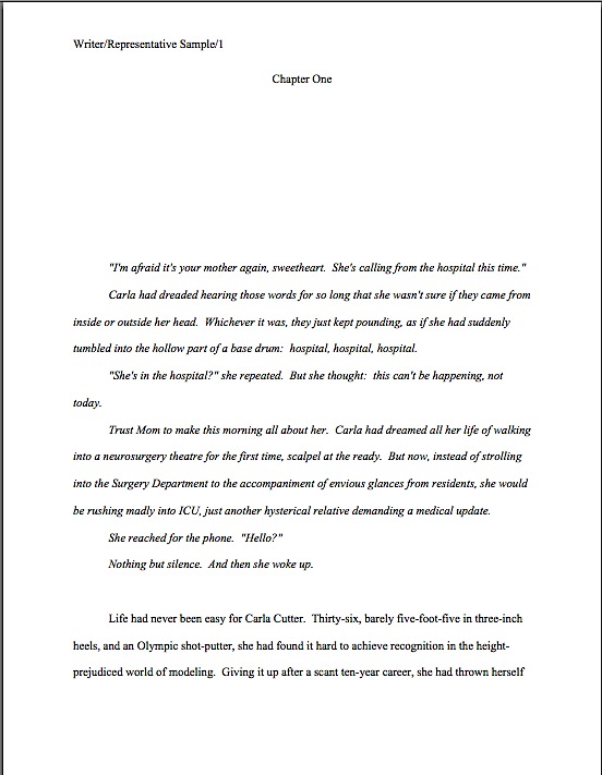
Formatpalooza, part X: look, darling! The majestic manuscript slug, running free in its natural habitat!

flooded ditch

No, Virginia, that squiggly brown thing near the bottom edge of the photo is not in fact a slug, literary or otherwise: I think it’s merely a well-camouflaged stick. Because I love you people — and because so many of you have told me that you tune into Author! Author! first thing in the morning, perhaps so you may peruse it while sipping your favorite caffeinated morning beverage — I would not present you with a close-up of a slug, stealthily or otherwise.

Hey, Millicent the agency screener’s not the only one susceptible to performing a spit-take with a too-hot latte.

Have we been talking so intensely about the first couple of pages of your manuscript — the title page, the first page of text — that standard format has invaded your dreams yet? I wouldn’t be entirely surprised if it had: this series on what professional manuscripts look like has been both example-ridden and extraordinarily nit-picky, even by my standards of detail-orientation. So you probably won’t be altogether astonished to learn that before we move on from the first page of the text (and of each chapter) to considering an ordinary page, I want to devote today to pagination.

And slug-lovers everywhere rise up to dance in the rain-slick streets!

Seriously, don’t groan; it’s an important issue. Not numbering your manuscript, book proposal, or contest entry’s pages an almost universal instant rejection offense; trust me, Millicent is going to notice how and if you do it. In fact, as cosmetic issues go, how and where an aspiring writer chooses to place the page number on the page can tell our Millie a tremendous amount about him.

Specifically, whether he has done his homework about submission, because there is only one place on a manuscript page that it is permissible to place a page number: in the slug line.

Is everybody quite sure where that is on the page? Just to be on the safe side, let’s take another gander at an example from last time.

memoir w ch title

See the slug frolicking in the upper left-hand margin? How happy it looks in its natural habitat.

The top margin is the page number’s natural habitat as well — which seems to come as a surprise to many aspiring writers. Let’s go ahead and forge a new axiom about it: the page number belongs within the slug line, rather than anywhere else on the page.

This is as proper on page 139 of a book manuscript as on page one. While we’re noticing such things, I would also like to call your attention to the fact that in each of these examples, the page’s only reference to the author’s name or the title of the book appears in the slug line.

That, too, would work equally well on p. 139 as on page 1. Sensing a pattern here?

I sincerely hope so, because the slug line confuses a lot of aspiring writers; until you have seen piles and piles of professional manuscripts, it looks kind of funny. So much so that to some would-be submitters, heads swimming from having been told over and over again that a manuscript should have a 1-inch margin on all sides, find it counterintuitive to add a line of text, even such a short one, within that margin.

But I assure you, it’s traditionally done that way. And why? Intrepid ‘Palooza followers everywhere, chant it with me now: because like every other aspect of standard format for manuscripts, placing the slug line there just looks right to professional readers.

Yes, that logic is a trifle tautological, now that you mention it. If you have a problem with that, I would suggest taking it up with the powers that rule the universe. As I believe I may have pointed out once or twice earlier in this autumn of ‘Paloozas, I do not count myself amongst those powers.

If I did, Microsoft Word would be set up to create documents in standard format automatically, Word for Mac and Word for Windows would be set up so those using one could easily give formatting advice to those using the other, air pollution would be merely a thing of distant memory, and ice cream cones would be free on Fridays. Oh, and the little girl across the street who believes slugs are her totem animal would come to liberate her little friends from my garden on a daily basis, rather than on a monthly one.

As none of these things seems to be true, let’s get back to business: how does one create that pesky slug line, anyway?

Back in the days when typewriters roamed the earth, it was perfectly easy to add a slug line to every page: all a writer had to do was insert it a half-inch down from the top of the page, left-justified, floating within the 1-inch-deep top margin. For word-processed documents, it’s a trifle more complicated.

The slug line still belongs in the same place, .5 inches from the top of the paper, suspended in the middle of the requisite 1-inch top margin. But instead of laboriously typing it on each page individually as writers did in the bad old days, one simply inserts it in the header. In most versions of Word (I can’t speak for all of them), the header may be found under the VIEW menu.

Before the Luddites out there trot out their usual grumble about the bother of tracking down the bells and whistles in Word, think about this: placing the slug line in the header also enables the writer to take advantage of one of the true boons of the advent of word processing, pages that number themselves.

As opposed to having to do it manually, laboriously retyping the slug line in its entirety on each and every page of the manuscript.

Oh, you may laugh, but several times each year, I receive a manuscripts constructed by a writer who was not aware that Word would do this for her. Instead of utilizing the header function, the poor writer will have elected to include the necessary information on the first line of text on the page.

Not only does this unfortunate misconception involve an absolutely monumental and ultimately unnecessary effort, but the result doesn’t pass the all-important does it look right? test. Take a peek for yourself:

See how pulling the slug line down into the text messes with the spacing of the page? Here, an entire line of text is sacrificed to it — and let me tell you, that line is not going to go quietly.

How so, you ask? Well, think about it: what’s inevitably going to happen if the author decides to insert a new sentence or two on a page formatted this way? That’s right: the writer is going to have to go back and move each and every one of those slug lines to match the NEW pagination.

I’d show you a practical example of this, but it’s just too tragic to contemplate. Trust me, it would be a heck of a lot of work, and writers who do it are likely to end up beating their heads against their studio walls.

Take a moment to peruse that last example again. See any other problems with the slug line? How about the fact that it includes the word page? Shouldn’t be there; just the numbers will suffice.

Did I just hear some huffs of indignation out there? “But Anne,” the formatting-ambitious cry, “I think it looks kind of classy to include page before the page number? It’s kinda stylish. If it’s just a matter of personal style, who could possibly be hurt by including it, if I like the way it looks?”

Well, you, for starters. And why? (Chanters, ready your lungs.) Because it just would not look right to someone who reads manuscripts, book proposals, or contest entries on a regular basis.

No kidding — I’ve seen screeners get quite indignant about this one. “Does this writer think I’m stupid?” Millicent is prone to huff. (Don’t bother to answer that question; it’s rhetorical.) “Does she think I don’t know that the numeral that appears on every page refers to the number of pages? Does she think I’m going to go nuts and suddenly decide that it is a statistic, or part of the title? Or maybe a wayward date that’s wandered off to the wrong part of the page?”

Don’t bait her; the lady has a hard life, even when she doesn’t accidentally burn her lip on a too-hot latte. Make her happy: do it the approved way.

Okay, did you spot any other problems? What about the fact that the first character is in a different typeface from the rest of the text? Or the equally disturbing fact that the first paragraph of the chapter is not indented?

Again, the writer may consider this nifty, but I can assure you, Millicent won’t. Fortunately for her blood pressure, the odd typeface for the first letter, in imitation of the illuminated texts hand-written by monks in the Middle Ages, doesn’t turn up all that often in manuscripts other than fantasy and YA, for one simple reason: books in that category are more likely to feature this it’s-a-new-chapter signal than others. But once again, what an editor may decide, rightly or wrongly, is appropriate for a published book has no bearing upon what Millicent expects to see in a manuscript.

Save the manuscript illumination for someone who will appreciate it. Hop in your time machine and track down a medieval monk to admire your handiwork, if you like, but in this timeframe, keep the entire manuscript in the same typeface and size.

The non-indented first paragraph of a chapter is fairly common in mystery submissions, I have noticed, and starting to become more prevalent in other kinds of fiction as well of late. (For an interesting discussion about why, please see the comments on this post and this one.) In fact, I’ve been told by many mystery writers — and rather tersely, too — that eschewing indentation in this context is an homage to the great early writers in the genre, an echo of their style, so who is yours truly to try to talk them out of that gesture of respect?

Well, since you asked, I’m someone familiar with what Millicent expects to see on a page — as well as someone who is aware that almost without exception, in Edgar Allan Poe’s time all the way down to our own, the editor has determined the formatting that appeared on any given printed page, not the author. To professional eyes, especially professionally peevish ones like Millicent’s, a manuscript that implicitly appropriates this sort of decision as authorial might as well be the first step to the writer’s marching into Random House, yanking off a well-worn riding glove, and striking the editor-in-chief with it.

It’s just not a good idea for someone brand-new to the biz to do.

Yes, you read that correctly: non-standard formatting choices are occasionally interpreted as a challenge to editorial authority. And while we could speculate for the next week about the level of insecurity that would prompt regarding a minor formatting choice as a harbinger of incipient insurrection, is the manuscript of your first book really the right place to engender that discussion amongst Millicent and her cronies?

Exactly. Save the formatting suggestions for a long, intimate discussion over coffee with your editor after she acquires the book. You’ll probably lose any disagreement on the subject, but at least you will have made your preferences known. Until that happy, caffeine-enhanced day, just accept that the industry prefers to see every paragraph in a manuscript indented the regulation half-inch.

It just looks right that way.

While we’re at it, how about the bolded chapter number and title in that last example? Nothing in a manuscript should be in boldface. Nothing, I tell you. Uh-uh. Not ever. (Except for that nonfiction exception we talked about last time. And I have seen authors get away with bolding the title on the tile page, but frankly, I wouldn’t chance it in a first book submission.)

Nor should anything be underlined — not even names of books, magazines, or song titles. Instead, they should be italicized, as should words in foreign tongues that are not proper nouns.

Yes, Virginia, back in the day when typewriters roamed the earth, underlining was the norm, for the simple reason that most typewriters did not have italic keys. So if you consult an older list of formatting restrictions or one intended solely for short story formatting — both of which seem to be circulating at an unprecedented rate on the web of late, pretty much always billed as universally-applicable rules for any type of writing, anywhere, anyhow, a phenomenon which simply does not exist — you might conceivably be told that publications, song titles, and/or foreign words (sacre bleu!) should be underlined. But trust me on this one: any agent is going to tell you to get rid of the underlining, pronto.

And why? All together now: because it just doesn’t look right that way.

All right, campers, do you feel ready to fly solo into a critique of a first page? Here are two pages of text, studded with standard format violations for your ferreting-out pleasure:

How did you do? Are those problems just leaping off the page at you now? If not, ask yourself: does that first page contain information that ought to be on the title page instead? Are the margins even? Are the paragraphs formatted correctly? And so forth.

In fact, it’s a terrific idea for any aspiring writer to get into the habit of asking those types of questions immediately after clapping eyes upon any manuscript, his own or anybody else’s. Why? Because that’s Millicent’s first instinct. However literature-loving a she may be, she sees so many incorrectly-formatted submissions that a properly-formatted one automatically looks at first glance like more professional writing to her.

As, with practice, it will to you. I promise. To get that ball rolling, as well as to reward you for so much hard work — or to provide you with some helpful comparison, depending upon how you did on that last little test — here are a couple of correctly-formatted pages, to soothe your tired eyes:

good example page 1

good example page 2

Whenever you start finding yourself chafing at the rules of standard format, come back and take a side-by-side gander at these last sets of examples, to regain perspective on what standard format is and why it’s important in a submission, proposal, or contest entry. I assure you, after a professional reader like Millicent has been screening manuscripts all day, every day for even a couple of months, every time she sees the bad example, mentally, she’s picturing the good example right next to it.

Small wonder, then, that — wait for it — manuscripts that look right get taken more seriously than those that don’t. Regardless of how you may feel about Millicent’s literary tastes, isn’t a serious read from her what you want for your book? Or your book proposal? Or your contest entry?

Did you notice that I snuck us from the first page of the text into the second in my last example? Next time, we’ll continue delving into the mysteries of the mid-manuscript page. On Friday, I’ll be offering a little reward for all of your virtue.

Hey, if treading the path of virtue is rewarded nowhere else on earth, it is here at Author! Author! Keep up the good work!
Formatpalooza, part VIII: but I see it done constantly in published books!

Seattle mossgin and tonic
oxidized polebeach rock2

As those of you who have been perusing the sage advice underneath the pictures here at Author! Author! for some time may have noticed, I’m a big fan of artists’ looking at ordinary, everyday things and showing us the beauty inherent in them. The coy models in the shots above could not have been more prosaic if they had tried: clockwise from top left, that’s perfectly ordinary moss on a perfectly ordinary concrete wall, photographed during a perfectly ordinary Seattle rainstorm, a genuinely mundane gin-and-tonic (commonplace Bombay Sapphire, instead of my preferred Hendrick’s), a salt-of-the-earth beach rock nice enough to hold still and pose for me, and a regular old municipal light pole attacked by regular old municipal rust.

And while I was clicking away to capture that first shot, a perfectly run-of-the-mill artist-meets-dubious-public moment: while crunching my body sideways in order to get that first shot, a Central Casting mother told her standard-issue wee daughter to veer away from the you-meet-‘em-every-day crazy lady. Yet another case of a misunderstood artist — and another a child being warned that if she tries to look at something from an unusual perspective, people are bound to think she’s strange.

And that, my friends, is how budding artists are discouraged from potentially glorious careers: being told that normalcy requires seeing things just like everybody else does.

Perhaps not astonishingly, writers tend to find beauty in found words. An overhead scrap of conversation, perhaps, or a favorite phrase in a book. And often — far too often, from Millicent the agency screener’s perspective — aspiring writers celebrate these words lifted from other places by quoting them at the beginning of their manuscripts.

That’s right, campers: today, I’m going to be talking about proper formatting for that extremely popular opening-of-text decoration, the epigraph. You know, those nifty little quotes from other sources that we writers adore enough to want to reproduce in our own books.

And who can blame us? It’s not as though the publishing industry doesn’t encourage us to think of them this way: in a published book, the epigraph, if any, is almost always presented in a place of honor, either at the top of each chapter or by itself on the page before the text proper starts.

Take, for example, the placement of the well-known epigraph to Alice Walker’s THE COLOR PURPLE, an excerpt from Stevie Wonder’s DO LIKE YOU. Even in my cheap, well-worn paperback edition, it scores a page all to itself, right between the copyright information on the flip side of the title page and the opening of Chapter One.

The color purple's epigraph

Okay, so that picture didn’t really do the words justice; not all of my photos can be winners, you know. Let’s try a tighter shot:

epigraph2

Not only is it allocated space; it’s allocated white space, to set it off from the other text. That is quite an honor, in an age when acknowledgments pages are routinely omitted, along with the second spaces after periods and colons, in order to save paper.

Especially since nobody but writers like epigraphs much — but I’m getting ahead of myself, amn’t I?

We writers-who-read think they’re great, don’t we? Particularly if those pithy little quotes come from obscure sources; they feel so literary. Or deep-in-the-national-psyche, know-your-Everyman populist, if they’re culled from songs. By evoking the echo of another writer’s words, be it an author’s or a songwriter’s, we use them to set the tone for the story to come.

I don’t think conceptual aptness is all there is to the appeal, though. There is something powerfully ritualistic about typing the words of a favorite author at the beginning of our manuscripts; it’s a way that we can not only show that we are literate folk — as opposed to the (ugh!) other kind — but that by writing a book, we are joining some pretty exalted company.

Feeling that way about the little dears, I truly hate to mention this, but here goes: it’s a waste of ink to include them in a manuscript intended for submission to an agency. 99.9998% of the time, they will not be read at all.

Stop glaring at me; it’s not my fault. I don’t stand over Millicent with a bullhorn, admonishing her to treat every syllable of every submission with respect. (Although admittedly, that’s an interesting idea.)

The sad fact is, most Millicents are specifically trained not to read epigraphs in manuscripts; it’s widely considered a waste of time. I’ve literally never met a professional reader who doesn’t simply skip epigraphs in a first read — or (brace yourselves, italics-lovers) any other italicized paragraph or two at the very beginning of a manuscript, even if it was actually part of the text.

Oh, dear — I told you to brace yourselves. “Why on earth,” italics-lovers the world over gasp in aghast unison, “would any literature-loving human do such a thing? Published books open all the time with italicized bits!”

A fair question, but actually, there’s a pretty fair answer. Most Millicents just assume, often not entirely without justification, that if opening is in italics, it doesn’t really have much to do with the story at hand, which (they conclude, not always wrongly) begins with the first line of plain text.

In other words, our Millie treats any slanted text at the beginning of a manuscript as if it were an epigraph. It’s kind of hard to blame her, really: she’s there to read your writing, not somebody else’s.

Of course, there’s another, less ego-flattering reason that Millicents tend to skip ‘em: at the submission stage of the game, no one cares who a writer’s favorite authors are. A writer’s reading habits, while undoubtedly influential in developing her personal voice, are properly the subject of post-publication interviews, not manuscript pre-screening considerations.

After all, it’s not as though Millicent can walk into her boss’ office and say, “Look, I think you should read this submission, rather than that one, because the first’s writer has really terrific literary taste — it opens with a quote from William Godwin’s CALEB WILLIAMS, OR THINGS AS THEY ARE,” can she?

For those of you who didn’t howl with laughter at that little history-of-publishing joke, novelist William Godwin was political theorist and novelist Mary Wollstonecraft’s editor around the time of the French Revolution. They also produced another literary marvel together: Mary Wollstonecraft Shelley, the author of Frankenstein, was their daughter. Isn’t it fun being hyper-literate?

Still not rolling in the aisles, are you? That’s how Millicent feels when confronted with a genuinely esoteric quote at the top of a manuscript.

Whichever reason to skip the darned thing most appeals to the Millicent who happens to have your submission lingering on her desk (right next to that too-hot latte she’s always sipping, no doubt), it’s a safe bet that she’s not going to be reading your carefully-chosen epigraph. She feels pretty good about this choice, too.

Why? Well, the official justification for this practice — yes, there is one to which Millicents will admit in public — is not only reasonable, but even noble-sounding. See if it sounds at all familiar: even the busiest person at an agency or publishing house picks up a submission in order to read its author’s writing, not somebody else’s.

Kind of hard to fault them for feeling that way, isn’t it? Given our druthers, I suspect it would be hard to find an aspiring writer who wouldn’t prefer that the pros notice the individual brilliance of her respective styles than marvel over her esoteric reading habits.

Some of you are still clutching your quote books to your heaving chests, aren’t you? Okay, sentiment aside, let’s look at what including an epigraph in a book achieves on a practical level, as well as its strategic liabilities.

Let’s assume for a moment that you have selected the perfect quotation to open your story. Even better than that, it’s gleaned from an author that readers in your chosen book category already know and respect. By picking that quote, you’re announcing from page 1 — or before page 1, if you allocate it its own page in your manuscript — you’re telling Millicent that not only are you well-read in your book category, but you’re ready and able to take your place amongst its best authors.

Sounds plausible from a writerly perspective, doesn’t it? That’s one hard-working little quote.

But what happens when Millicent first claps eyes on your startlingly apt epigraph? Instead of impressing her with your erudition, the epigraph will to prompt her to start skimming before she gets to the first line of your text — and you will have made her wonder if you realized that manuscript format and book format are not the same.

So you tell me: was including it a good idea? Or the worst marketing notion since New Coke?

If that all that hasn’t convinced you, try this on for size: while individual readers are free to transcribe extracts to their hearts’ contents, the issue of reproducing words published elsewhere is significantly more problematic for a publishing house. While imitation may be the sincerest form of flattery, reproduction of published text without the author’s permission is known in the biz by another, less flattering name: copyright infringement.

What does that mean in practice? Well, if the epigraph is from a book that is not in the public domain, the publisher will need to obtain explicit permission to use any quote longer than fifty words. Ditto for any quote from a song that isn’t in the public domain, even if it is just a line or two.

So effectively, most epigraphs in manuscripts might as well be signposts shouting to an editor: “Here is extra work for you, buddy, if you buy this book! You’re welcome!”

I’m sensing some disgruntlement out there, amn’t I? “But Anne,” I hear some epigraph-huggers cry,
“the material I’m quoting at the opening of the book is absolutely vital! The book simply isn’t comprehensible without it!”

Before I respond, let me ask a follow-up question: do you mean that it is crucial to the reader’s understanding the story, or that you have your heart set on that particular quote’s opening this book when it’s published?

If it’s the latter, including the epigraph in your manuscript is absolutely the wrong way to go about making that dream come true. Like any other book formatting issue, whether to include an epigraph — or acknowledgements, or a dedication — is up to the editor, not the author.

And besides — chant it with me now, ‘Palooza faithful — a manuscript should not look like a published book.

Consequently, the right time to place your desired epigraph under professional eyes is after the publisher has acquired the book, not before. You may well be able to argue successfully for including that magically appropriate quote, if you broach the subject at the right time. Politely.

Just to set my trouble-borrowing mind at ease: you do know better than to include either acknowledgements or a dedication in your manuscripts at submission time, right? It’s for precisely the same reason: whether they’ll end up in the published book is the editor’s call. (I wouldn’t advise getting your hopes up, though: in these paper-conserving days, the answer is usually no on both counts, at least for a first book.)

Quite a few of you were beaming virtuously throughout those last three paragraphs, though, weren’t you? “I know better than to second-guess an editor,” stalwart souls everywhere announce proudly. “I honestly meant what I said: my opening quote is 100% essential to any reader, including Millicent and her cohorts, understanding my work.”

Okay, if you insist, I’ll run through the right and wrong ways to slip an epigraph into a manuscript — but bear in mind that I can’t promise that even the snazziest presentation will cajole Millicent into doing anything but skipping that quote you love so much.

For starters, do not, under any circumstances, include a quote on the title page as an epigraph. Which is, alas, what submitters are most likely to do. Let’s take a gander at what their title pages tend to look like:

Does that leave you wondering whether Millicent will notice the quote at all, much less find it obnoxious? She will, because this is was what she was expecting to see:

Actually, that was sort of a red herring — that page wasn’t precisely what she expected. Did you catch the vital piece of information Eeyore left off his title page?

If you said that he neglected to include the book category on the second example, award yourself a pile of thistles. (Hey, that’s what he would have given you.) His title page should have looked like this:

Eeyore good title

And yes, I am going to keep showing you properly-formatted title pages until you start seeing them in your sleep; why do you ask? Take a moment to compare the third example with the first: the quote in the first example is going to stand out to Millicent like the nail in a certain critter’s tail, isn’t it?

Other submitters choose to eschew the title page route in order to place an epigraph on the first page of text. The result is immensely cluttered, by anyone’s standards — especially if the submitter has made the very common mistake I mentioned in my discussion of title pages last time, omitting the title page altogether and cramming all of its information onto page 1:

Where did all of our lovely white space go? Into quoting Ambrose Bierce, partially.

Not that I’m against anyone doing that, ever. Except — wait for it — on the top of a manuscript submission.

The third popular but ill-advised way to include an introductory epigraph is to place it on a page all by itself in the manuscript, between the title page and the first page of text. In other words, as it might appear in a published book:

What’s wrong with this, other than the fact that Poe died before our boy D.H. wrote Sons and Lovers? At the risk of repeating myself, a manuscript is not supposed to look just like a published book; it has its own proper format.

At best, Millicent is likely to huffily turn past this page unread. At worst, she’s going to think, “Oh, no, not another writer who doesn’t know how to format a manuscript properly. I’ll bet that when I turn to page one, it’s going to be rife with terrible errors.”

Does either outcome sound especially desirable to you? I thought not.

So what should an epigraph-insistent submitter do? Leave it out of the submission, of course — weren’t you listening before?

But if it is absolutely artistically necessary to include it, Mssr. Poe actually wasn’t all that far off: all he really did wrong here was include a slug line. The best way to include an introductory epigraph is on an unnumbered page PRIOR to page 1. On that unnumbered page, it should begin 12 lines down and be centered. But I’m not going to show you an example of that.

Why? Because I really, truly would advise against including an epigraph at all at the submission stage.

Just in case I hadn’t made that clear. And had I mentioned that manuscripts specifically should not resemble published books?

That doesn’t mean you should abandon your cherished epigraph altogether, however. Squirrel all of those marvelous quotes away until after you’ve sold the book — then wow your editor with your erudition and taste.

“My,” the editor will say, “this writer has spent a whole lot of time scribbling down other authors’ words. He must read quite a bit.”

Or, if you can’t wait that long, land an agent first and wow her with your erudition and taste. But don’t be surprised if she strongly advises you to keep those quotation marks to yourself for the time being. After all, she will want the editor of her dreams to be reading your writing, not anyone else’s, right?

Wait — where have I heard that before?

If you are submitting directly to a small press, do be aware that most publishing houses now place the responsibility for obtaining the necessary rights squarely upon the author. If you include epigraphs, editors at these houses will simply assume that you have already obtained permission to use them. Ditto with self-publishing presses.

This expectation covers, incidentally, quotes from song lyrics, regardless of length.

Yes, really. If you want to use a lyric from a song that is not yet in the public domain, it is generally the author’s responsibility to get permission to use it — and while for other writing, a quote of less than 50 consecutive words is considered fair use, ANY excerpt from an owned song usually requires specific permission, at least in North America. Contact the American Society of Composers, Authors, and Publishers (ASCAP) for assistance in making such requests. (For a very funny first-hand view of just what a nightmare this process can be, please see FAAB Joel Derfner’s guest post on the subject.)

Have I talked you out of including an epigraph yet — particularly an excerpt from a copyrighted song, like Alice Walker’s? How about holding off for the creative reason: Millicent sees the same quotes over and over again?

Oh, you were positive that nobody else was a William Godwin fan?

I know that it hurts to cut your favorite quote from your manuscript, but take comfort in the fact that at the submission stage, no cut is permanent. Just because you do not include your beloved quote in your submission does not mean that it cannot be in the published book.

Contrary to what 99% of aspiring writers believe, at the submission stage, even the most polished manuscript is a draft, not a finished work. In actuality, nothing in a manuscript is exempt from alteration until the book is actually printed — and folks in the industry make editing requests accordingly.

That’s going to help all of you sleep better tonight, isn’t it? Actually, it should: just as tight copyright restrictions prevent your favorite authors from having long chunks of their texts excerpted without their permission — or, sacre bleu! entire paragraphs from CALEB WILLIAMS being passed off as somebody else’s work — so will it protect your writing from predatory borrowers.

Just a bit of proverbial food for thought. Keep noticing the beauty in the everyday, everybody, and as always, keep up the good work!
Formatpalooza, part VII: it’s all a matter of perspective, or, let’s move the piano over here. Wait — how would it look over there? And other tales of title page formatting

sagrada familia ceiling3

Ever since I launched on this last ‘Palooza of autumn, I’ve been hearing some discontented murmuring amongst aesthetes out there in the ether. “But Anne,” visually-oriented aspiring writers murmur under their breath, so as not to attract the wrath of their nemesis, Millicent the agency screener, “I feel that the rules of standard format for book manuscripts and proposals — not to be confused with the formatting norms for short stories, magazine articles, screenplays, or any other kind of writing intended for professional submission — are stepping all over my right to creative expression. If I believe my writing looks best in a special font like Abadi MT Condensed Extra Bold, why shouldn’t I run with it? It’s how I want my words to look in the published book, so why shouldn’t I present my manuscript that way?”

Do you want the short answers or the long ones, murmuring aesthetes? The short are actually the same for both questions: because Millicent will take your writing more seriously if you format it as she expects to see it.

And why might that be, devoted ‘Palooza followers? Pull out your hymnals and sing along: a manuscript should not resemble a published book in many important respects. Therefore, formatting a submission to reflect one’s publication preferences on matters like font (which is the publishing house’s decision, anyway, not the author’s) will not appear to be a creative choice, but a reflection of a misunderstanding of how publishing works — and an indication that the writer has not taken the time to learn the rules of submission.

A trifle broad-ranging a conclusion to draw from something as simple as font choice or a title page graced with a photograph? Perhaps, but to someone who deals with manuscripts and/or book proposals all day, every day, it’s not all that far-fetched.

Let me try to put all of this into perspective for you. Quick, tell me: did I take the photograph above while looking down into an abyss, sideways into an alcove, or up at an impossibly high ceiling?

Hard to tell which way is up, isn’t it? (But here’s a hint: the purple stuff is flying dust.) Without some orienting landmarks, it’s difficult even to know for sure what you’re looking at, or from what direction.

That’s more or less the same problem the average aspiring writer faces when looking at her own first manuscript or book proposal with an eye to figuring out whether it is formatted correctly. (Oh, you thought that analogy wasn’t going to pay off right away? Au contraire, mon fr?re.)

Let’s face it, very, very few as-yet-to-be-published writers have ever seen a professional manuscript up close and personal; still fewer have had the opportunity to glance through a professional book proposal. Oh, there’s plenty of advice out there on how it should be done, of course, but as many of you have no doubt noted with chagrin, sources differ.

So how on earth is someone new to the game supposed to figure out which end of the manuscript is up, figuratively speaking? The trick lies in remembering that the principles governing manuscript formatting are practical and historical, not purely aesthetic.

Thus, while two-inch margins and a cursive typeface may strike a writer as the perfect expressive extension of the spirit of his novel, to someone who reads manuscripts for a living, they’re just puzzling. And, frankly, distracting from the writing.

Where you stand, in other words, depends on where you sit. From where Millicent is sitting, deviation from standard format demonstrates a lack of knowledge about how the industry works, not creativity. She has good reason to feel that way: because professional manuscripts and book proposals are formatted in a particular way, she knows that her boss, the agent of your dreams, would have a hard time convincing an editor at a major publishing house to read even the first page of an unprofessional formatted manuscript.

Which brings be back to where we left off last time, right? For the past couple of posts, we’ve been engaging in compare-and-contrast exercises, showing common examples of title pages and fine-tuning your binoculars so you might see how our old friend Millie — or her boss, or an editor, or a contest judge — might view them. As I sincerely hope those of you who read yesterday’s post can attest, it was pretty obvious that the professionally-formatted title page won the beauty contest hands-down — and took top honors in the practicality category, too.

Yes, Virginia, a choice as small as a typeface can make an astonishingly great difference to how professional your work looks to the pros. That comes as something of a surprise to most aspiring writers — who, not entirely surprisingly, tend to regard that particular decision as a purely aesthetic one. “Why,” they ask, and not unreasonably, “should it matter? Good writing’s good writing, isn’t it?”

Well, yes and no. Yes, good writing is a thing of beauty and a joy forever. No, insofar as good writing tends to have less impact on the average Millicent when it’s presented in an unusual typeface.

Yes, really. To see why, let’s once again start at the top of the submission packet, taking a gander at the same title page in three different typefaces. Here it is in 12-point Times New Roman, one of the two preferred typefaces:

Austen title good

That’s what anyone sitting in Millicent’s seat would expect to see. Now let’s look at exactly the same information, assuming that Aunt Jane had favored 12-point Helvetica so strongly that she just couldn’t resist submitting in it:

Austen title helvetica

The letters are quite a bit bigger, don’t they? Not enough so to appear to be, say, 14-point font, but large enough to make Millicent wonder whether the word count is accurate. (Estimated word count does, after all, vary by typeface: Times New Roman is estimated at 250 words/page, Courier at 200. More on that below.)

And do you really want her speculating about your credibility before the first page of your manuscript? Now that we have seated ourselves firmly in Millicent’s office chair, we can see that Aunt Jane’s choice of Helvetica, while not a deal-breaker, does not necessarily present her manuscript to its best advantage.

Does the increased volume of disgruntled ethereal muttering mean some of you want to see a typeface that might be a deal-breaker? Happy to oblige.

Austen title brushscript

Can’t really blame Millicent for not wanting to turn the page on that one, can we? Despite containing all of the information that a title page should include, in the right places and in the right order, it’s unprofessional-looking. Not to mention hard to read.

Got Millicent’s perspective firmly imbedded in your mind? Excellent. If you want to switch back to the writer’s point of view, all you have to do is remember that the manuscript that follows even this last title page is SENSE AND SENSIBILITY.

The moral: even the best writing may be placed at a competitive disadvantage by unprofessional presentation. Standard format is the good writer’s friend, not her enemy.

Shall I assume that all of that clanking is a thousand writers’ hackles being raised? “But Anne,” outraged voices thunder, “aren’t you making Millicent out to be pretty shallow? Whenever I’ve heard agents and editors asked at conferences or on their websites about whether cosmetic issues can get a manuscript rejected, they often disclaim the notion with scorn. I’ve even heard a few of them say that they don’t care about issues like typeface, spaces after periods and colons, or where the chapter title lies — and that strikes me as significant, as I’ve never, ever heard one say it was okay to let a query letter run longer than a single page. Isn’t it the writing that matters in a submission, ultimately?”

Again, yes and no, hackle-raisers. Yes, the writing matters — but it’s not all that matters.

Naturally, the writing matters most in a submission, with freshness, audience-appropriateness, marketability, and fit with the agent or editor reading it jostling for second place. Equally naturally, and something that I often point out here, individual agents, editors, and even contest judges harbor individual preferences as well and have been known to express them at conferences. Or on their blogs, Twitter feeds, and over drinks at that bar that’s never more than 100 yards from any literary conference in North America.

One person’s pet peeve, however, may not be another’s. Since few aspiring writers have access to the industry-specific information required to find out the preferences of every agent to whom they are submitting, adhering to standard format minimizes the probability of running afoul of unknown annoyance-triggers.

Adopting the norms of standard format and clinging to them like an unusually tenacious leech will also help you preserve your sanity throughout the often-protracted submission process. — because, honestly, trying to apply every single one of the expressed opinions floating around out there to your manuscript will drive you 100% nuts. The pet peeves one hears about are too often mutually contradictory, for one thing.

Chant it with me now, ‘Palooza followers: if an agent to whom you are submitting asks for something different, for heaven’s sake, give it to her. If, as is almost always the case, you just don’t know, keep the presentation unprovocative and professional so that your writing may shine.

In other words, adhere to the strictures of standard format, rather than assuming, as so many aspiring writers do to their cost, that the writing is the only thing that matters.

Remember, where you stand depends on where you sit. It’s a matter of perspective. And from both Millicent and the aspiring writer’s perspective, taking the time to present writing professionally is honestly worth it.

Admittedly, one does hear of cases where a kind, literature-loving agent has looked past bizarre formatting in order to see a potential client’s, well, potential, one also hears of isolated cases where a manuscript rife with spelling and grammatical errors gets picked up, or one that has relatively little chance of selling well in the current market. The age of miracles has not entirely passed, apparently.

But — and this is a BIG but — these cases get talked about because they are exceptions, and rare ones at that. 9,999 times out of 10,000, any of these problems will result in, if not instantaneous rejection, then rejection upon Millicent’s lighting upon the next problem in the manuscript.

Those pesky hackles are clacking again, aren’t they? “Okay,” the hackled concede, “I can understand how Millicent would be tempted to skip reading a submission like #3 above, where she’s likely to strain her eyes. I can seen see why she might leap to some negative conclusions about #2, since, as you have mentioned before, she knows that it’s going to be more time-consuming, and thus more costly, to take on a client who needs to be trained how to present her work professionally. But if presentation is so darned important, why don’t aspiring writers hear about it more often at conferences, in articles about submission, or even just in discussions amongst ourselves?”

Excellent question, h-raisers. I can’t say for sure, but I suspect that’s not just because a sane, sensible individual with a reputation to protect is unlikely to stand up in front of 500 eager potential submitters and say, “Look, if you’re planning to submit a grimy photocopy of your book, or insist upon presenting it in 10-point type, or not indenting your paragraphs, just don’t bother to query me.”

Having actually seen a well-meaning agent tell an indignant crowd that he really only took seriously query letters from writers he met at conferences (yes, really; there were many, many witnesses), I can tell you precisely what would happen if some honest soul did take this astounding step: instantly, 500 pens would scrawl on 500 programs, DO NOT QUERY THIS ONE; HE’S MEAN.

Which would rather defeat the agent’s purpose in coming to the conference to recruit new clients, wouldn’t it?

As someone who frequently teaches writing and formatting classes, I can think of another reason that a speaker might want to be careful about such pronouncements: an agent or editor doesn’t have to speak at many conferences (or blog for very long) before recognizing that anything she says about submissions is likely to be repeated with the ?clat of a proverb, to borrow a phrase from Aunt Jane, for years to come amongst the writing community.

Seriously, it’s true. I’ve heard offhand comments made from the dais, or even jokes, being debated for hours in conference hallways, particularly if those comments happen to relate to the cosmetic aspects of querying and submission. 5-4 Supreme Court decisions are routinely discussed with less vim and vitriol. Some of Miss Snark’s pronouncements have been more commented upon than St. Paul’s second letter to the Corinthians.

Okay, so that last is a slight exaggeration. My point is, the very notion of from-the-horse’s-mouth rightness carries such a luster that such speakers are constantly in extreme danger of having everything they say quoted back to them as an inflexible rule.

Which is why, I must admit, I occasionally experience qualms about presenting the rules of standard format as inflexible rules. On the pro-regulation side, we are talking, after all, about an industry that both values creativity and considers submitting a book proposal in anything but a black folder dangerously radical. (Yes, really.) On the con side, literally nothing else I talk about here consistently raises as much writerly ire.

The very topic of presentation seems to be emotionally trying for a lot of writers — disproportionately so, from where Millicent is sitting. Tell an aspiring writer that his dialogue is turgid, or his pacing drags, or that he’s left a necessary section out of his book proposal, and most of the time, he’ll be at least curious about why you think so. (If a bit defensive.) Yet suggest to the same writer that he might be better off reformatting his manuscript to include such niceties as paragraph indentation or moving his page number to the slug line, and a good quarter of the time, he’ll look at you as though you’d just kicked his grandmother. Thrice.

Go figure, eh?

Presentation issues definitely do matter — which is, again, not to say that the quality of the writing doesn’t. But — and again, this is a BIG but — as we’ve discussed, rejection decisions are more often than not made on page 1 of a manuscript. Sometimes even within the course of the first paragraph. If a manuscript is hard to read due to a funky typeface or odd spacing or just plain poor print quality, Millicent may just pass on reading it at all.

While these phenomena are, in fact, quite widely recognized as true, the person who announced them this baldly from the dais at a literary conference would be covered head to foot with flung tomatoes in twenty seconds flat. Metaphorically, at least.

Which is why I’m going to keep saying it until I’m blue in the face and you die of boredom: from the perspective of someone who reads manuscripts for a living, professional formatting is simply the least distracting way a book can possibly be presented. Adhering to the industry’s cosmetic expectations renders it more likely that an agent or editor will concentrate upon the beauty of the writing, not less.

Think about it: they can’t fall in love with your good writing until they read it, can they? So don’t you want to do everything within your power to convince them that your manuscript is the one that deserves more than a cursory glance?

Of course you do; if you didn’t, you would have given up on ‘Paloozaing a paragraph into the fall’s first series, right? Instead of thinking of the rigors of standard format as a series of unimportant (or even silly) superficial choices, try regarding them as translating your calling card, a means of catching Millicent’s tired eye and informing her that this is a manuscript that should be taken seriously.

Have I got you sufficiently fired up about superficial manuscript prettiness yet? Grand; let’s get back to the incredibly nit-picky issue of typeface.

As I mentioned earlier in this series, I would highly recommend using either Times, Times New Roman, or Courier typefaces, both on the title page and in the manuscript as well. These are the standards of the industry, and thus the least likely to raise Millicent’s ever-knitted eyebrows. But like some of the other strictures of standard format, there’s a pretty good reason for this one: from where she is sitting, word count estimation is always predicated upon one of these typefaces.

Why is the question of estimating relevant on a title page? Again, we must look to Millicent’s perspective: word counts in book manuscripts are generally estimated, not the actual count; for short stories and articles, use the actual count.

Was that giant gust of wind that just knocked my desk over your collective gasp of astonishment? I’m not entirely surprised; a lot of aspiring writers are confused on this point. “But Anne,” they protest, and who can blame them? “My Word program will simply tell me how many words there are in the document. Since it’s so easy to be entirely accurate, why shouldn’t I be as specific as possible? Or, to put it another way, why would an agent or editor ask for the word count, then expect me to guess?”

Would you fling something at me if I said once again that this is a matter of perspective? From Millicent’s seat, the answer is pretty obvious: industry practices dictate how manuscripts are handled, not the whims of the fine folks at Microsoft.

That makes perfect sense, does it not? The Microsofties I know are sterling human beings to a man, but they’re hardly experts on the publishing industry’s requirements. And really, why should they be?

Contrary to popular opinion amongst aspiring writers, just because Word is set up to allow certain things — giving you an exact word count, for instance, or access to 200 typefaces — doesn’t mean that the publishing industry wants writers to do things that way. (And if you doubt that, consider the doubled dash vs. the automatic emdash Word favors.) Word processing programs came into use long, long after standard format for manuscripts, after all; why should agents, editors, and Millicents allow computer programmers to dictate what strikes them as professional?

Perspective, people: which makes more sense, assuming that the word count on your title page will be read by Millicent, or Bill Gates?

I cannot, naturally, speak to Mssr. Gates’ point of view on the subject, but here is why Millicent would care on the estimation front. The Times family is estimated at 250 words/page; Courier at 200. So a 400-page manuscript in Times New Roman is estimated to be roughly 100,000 words if it’s in Times — something Millicent should be able to tell as soon as she claps eyes on the submission’s title page, right? — and 80,000 if it’s in Courier.

Finding the logic behind that is at all confusing? Book manuscripts are typically discussed in estimated word count, not actual; since word length vary, and because manuscripts shrink around 2/3rds in the transition to published book, the number of pages is actually a better measure of how much it will cost to print and bound the thing. So if your title page says that your baby is 86,250 words and it’s in Times New Roman, a pro will just assume that it’s 345 pages (345 x 250= 86,250) rather than flipping to the bottom of the stack of papers to check. If it’s in Courier, she would conclude that it is 431 pages — and that your math skills are not particularly good.

Now, in actual fact, a 400-page manuscript in TNR is usually closer to 115,000 words than 100,000; as any writer who has compared the estimated word count for her book with the total her word processing program so kindly provides, they tend to differ wildly. But word count, like beauty, is in the eye of the beholder: a novelist whose title page reported, accurately, that her 400-page novel was 115,000 words might well see it rejected out of hand on the grounds that it was too long.

Why? Well, math may not have been Millicent’s best subject, either (as one might expect, the inmates of agencies tend overwhelmingly English majors), but she can do third-grade multiplication in her head: 115,000 words at 250 words/page would equal a 460-page manuscript. That’s quite a bit longer than editors tend to expect first novels in most genres to be these days; at around 450 pages, binding costs rise significantly.

In other words, next!

Boy, those hackles are getting a workout today, aren’t they? “But Anne, why is Millicent estimating at all? If she wants to know how long it is, why doesn’t she just flip to the last page and check the page number, for heaven’s sake?”

I could give you a long song and dance about how much her wrists hurt from opening all those query envelopes all day, or how her secret midnight e-mail orgies have rendered pinching a torture, but in practice, the answer is far less personal than practical: because the word count is right there on the title page.

Tell me, oh submitters: why on earth should she doubt its accuracy? Unless, say, the title page were in a non-standard typeface like Helvetica, she’s going to assume that an aspiring writer familiar enough with standard format to include the word count on the title page would also know how to estimate it accurately.

I know, I know: from a writerly perspective, that’s kind of a wacky assumption. But her chair boasts a different view than ours.

Besides, how exactly could she manage to turn to page 400 of a manuscript, when her boss requested that the writer send only the first 50, without resorting to some pretty impressive maneuvering through time and space?

I’m aware that I’m running quite long today, but in the interest of clarity, let’s invest another few minutes in turning to the first page of the submission, to see how much of a difference font and typeface make at first glance. Here’s a correctly-formatted page 1 in Times New Roman. Just for giggles, I’m going to use that notorious editor’s nightmare, the opening paragraphs of A TALE OF TWO CITIES:

2 cities page 1 proper

Pretty spiffy, eh? And definitely not how this opening would appear in a published book, right?

Now let’s take a peek at the same page, also correctly formatted, in Courier. Note how many fewer words per page it allows:

2 cities proper Courier

Got both of those firmly imbedded in your brainpan? Good. Now format your first pages that way for the rest of your natural life.

Well, my work here is obviously done. I’m off to do a spot of Christmas shopping.

Just kidding — you want to see why it’s a good idea, don’t you? Okay, take a gander at the same first page, not in standard manuscript format. See how many differences you can spot:

Fascinating how just a few small formatting changes can alter the presentation, isn’t it? It’s exactly the same writing, but it just doesn’t look as professional. To Millicent, who reads hundreds of pages per day, the differences between the last three examples could not be clearer.

And yet, if we’re going to be honest about it, there were really very few deviations from standard format in the last example. For those of you playing at home, the typeface is Georgia; the chapter title is in the wrong place, and there isn’t a slug line. Also, the page is numbered in the wrong place — the default setting, incidentally, in many word processing programs.

In all probability, none of these infractions against the rules of standard format are serious enough to cause Millicent to toss a submission aside as soon as she notices them. But when poor formatting is combined with literary experimentation — like, say, that paragraph-long opening sentence ol’ Charles managed to cough up — which do you think she is going to conclude, that Dickens is a writer who took the time to polish his craft, or that he just doesn’t know what he’s doing?

Don’t tempt a professional reader to draw the wrong conclusion about your devotion to your craft. Remember, where a manuscript stands depends upon where the reader sits.

Before any hackles start rocketing skyward again, I hasten to add: where the submitting writer sits often makes a difference to Millicent’s perception, too. Her reception of that last example is very likely to be different before Dickens became a household name or after, although once he was established.

Unless you happen to be famous, I wouldn’t advise taking the risk. And if you do happen to be famous, could I interest you in writing a back jacket blurb?

In fairness to Millicent, though, it’s highly unlikely that it would even occur to our Charles to deviate this markedly from standard format, if he already had experience working with an agent or editor. The longer you remain in the business, the more those little things will strike you as just, well, matters of right and wrong. As, fortunately or not, they do Millicent and her ilk.

Come to think of it, that sense of fitness may well be the reason that discussions of formatting tend to become so vitriol-stained: we all like to be right, and after all, propriety is in the eye of the beholder. After all, each of us is most familiar with the view from her own chair.

Pulling back from one’s own perspective can be most helpful. There’s a reason that it’s called the bigger picture, people.

In that spirit, let’s take a longer view of the photo above, to situate ourselves:

sagrada familia ceiling

Easier to tell up from down now, isn’t it? Taking a broader perspective, you can see that the green light on the left is coming from a stained-glass window; on the left, there’s a decorative support beam. From the myopic tight shot, it was far less obvious that this was a cathedral.

Making sure your writing is framed properly can have a similar effect. More show-and-tell follows next time, of course. Keep up the good work!
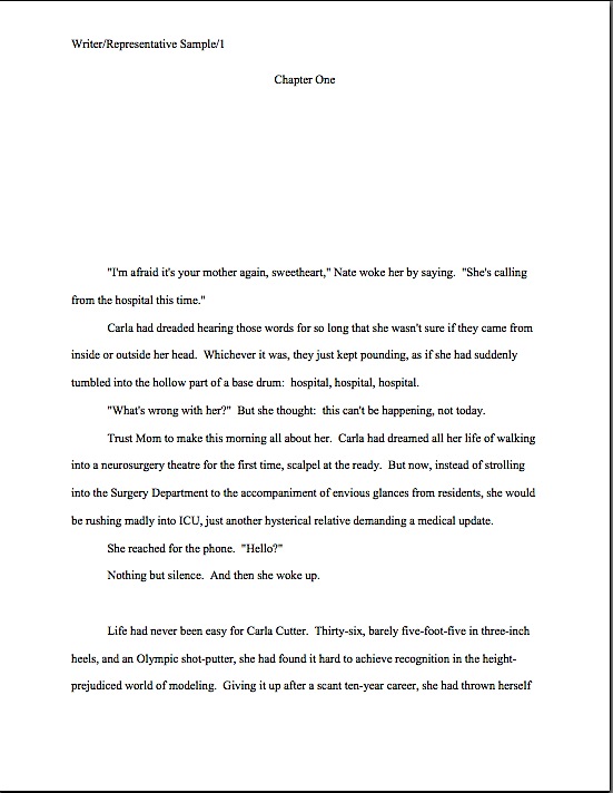
Formatpalooza, part VI: me and you and a boy? girl? dog? named Snafu

Johnny_Cash_-_A_Boy_Named_SueJohnny_Cash_-_A_Boy_Named_SueJohnny_Cash_-_A_Boy_Named_Sue

Still hanging in there, ‘Palooza followers? Excellent. Last time, I showed how the first page of text does not, from a professional perspective, make an adequate substitute for a title page. Instead of being a replica of a hoped-for book cover, as many submitters produce, or a shouted-out declaration of the book’s title and who wrote it, the properly-formatted title page is a quiet, practical piece of paper, containing a specific set of marketing information.

That is not always the purpose a title page serves in a submission, alas — if, indeed, the submitter is professional enough to include a title page at all. As I pointed out yesterday, some aspiring writers attempt to consolidate the proper functions of the title page and page 1 of the text onto a single piece of paper, as would be appropriate for a short story submission. To someone who reads book manuscripts for a living — like our good friend Millicent the agency screener, first line of literary defense — this is simply going to look, well, wrong. It’s so presumed to be part of a properly-formatted manuscript that her agency’s submission guidelines might not bother to mention title pages at all.

Which may be why, in practice, submitting without a title page is far more common than including one, especially for electronic submissions. This presentation choice is particularly common for contest entries, perhaps because contest rules do not always say, “Hey, buddy, include a title page, why doncha?” — and they virtually never say, “Hey, buddy, don’t bother with a title page, because we don’t need it.” Instead, they usually just ask entrants to include certain information with their entries: the category the writer is entering, perhaps, with contact information on a separate sheet of paper.

And already, I see a forest of hands in the air. “But Anne,” murmur those of you who currently have submissions floating around out there without your contact information attached, “I’d like to go back to that part about the expectation that a manuscript should include a title page being so widespread that a pro putting together submission guidelines might not even think to bring it up. Assuming that pretty much everyone else whose submission will land on Millicent’s desk on the same day as mine was in the dark about this as I was until yesterday (thanks to your fine-yet-sleep-disturbing post), should I even worry about not having included a title page? I mean, if Millie were going to reject manuscripts on this basis alone, she’d be a non-stop rejection machine.”

Of course, she isn’t a non-stop rejection machine. She’s a virtually non-stop rejection machine; she approves some submissions.

But let’s delve into the crux of your question, worried submitters: you’re quite right that this omission is too common to be an instant-rejection offense at most agencies, despite the fact that including it renders it far, far easier for the agent of your dreams to contact you after he has fallen in love with your writing.

However, as we discussed yesterday, any deviation from standard format on page 1 — or, in the case of the title page, before page 1 — will make a manuscript look less professional to someone who reads submissions day in, day out. It lowers expectations about what is to follow.

To gain a better a sense of why, let’s take another look at R.Q. Snafu and Faux Pas’ submissions from last time:

While such a top page does indeed include the requisite information Millicent or her boss would need to contact the author (although Faux Pas’ does it better, by including more means of contact), cramming it onto the first page of text doesn’t really achieve anything but saving a piece of paper. It doesn’t even shorten the manuscript or contest entry, technically speaking: the title page is never included in a page count; that’s why pagination begins on the first page of text.

So what should a proper title page for a book manuscript or proposal look like? Glad you asked:

Got all three of those images indelibly burned into your cranium? Good. Now weigh the probability that someone who reads as many manuscripts per day as Millicent — or her boss, or the editor to whom her boss likes to sell books — would not notice a fairly substantial difference in the presentation. Assess the likelihood of that perception’s coloring any subsequent reading of the manuscript in question.

The answer’s kind of obvious once you know the difference, isn’t it?

No? Okay, take a gander at another type of title page Millicent sees with great frequency — one that contains all of the right information, but is so unprofessionally formatted that the care with which the writer followed the content rules gets entirely lost:

title picture

Where should I even begin with this one? It’s pretty, undoubtedly, but would anyone care to start listing any of the five things wrong with it?

If you immediately zeroed in on the picture, give yourself a gold star for the day; there is literally no chance that any image a writer chooses to place on a manuscript or proposal’s title page will end up on the published book’s cover — the usual rationale for including them at this stage, by the way. So decorating your submission’s title page with photos or drawings will just seem bizarre to Millicent. (And that goes double for Mehitabel, the veteran literary contest judge. She is likely to emit a well-bred little scream when she opens the envelope.)

Award yourself two gold stars if you said Ms. White should nix the red lettering — or any lettering that isn’t black, for that matter — or that her contact information should not have been centered. Pin a great big blue ribbon on yourself, too, if you also pointed out that Ms. White used two different typefaces here, a classic standard format no-no. Not to mention the fact — although I do seem to be mentioning it, don’t I? — that the type size varies.

I feel an axiom coming on: like everything else in the manuscript, the title page should be entirely in 12-point type. It should also be in the same font as the rest of the manuscript.

With the usual caveat: unless an agent specifically requests otherwise, of course. Or contest’s rules; double-check for title page restrictions, which are quite common.

You may place the title in boldface if you like, but that’s it on the funkiness scale. No matter how cool your title page looks with 24-point type or the picture you would like to see on the book jacket, resist the urge, because Millicent will be able to tell from across the room if you didn’t.

Don’t believe that size matters? See for yourself:

Quite a difference, isn’t it? Apart from Mssr. Smith’s tragic font choice and his not having countermanded Word’s annoying propensity to reproduce e-mail addresses in blue ink, did you notice any potentially-distracting problems with this title page?

If you said that it included both a slug line (the author’s name and title in the upper right margin of the page) and a page number in the bottom right corner, snag yourself yet another gold star from petty cash. Add whipped cream and walnut clusters if you mentally added the reason that those additions are incorrect: because the title page is not the first page of text, and thus should not be formatted as if it were.

While I’m on a boldface kick, nor should title pages be numbered. This means, incidentally, that the title page should not be counted as one of the 50 pages in those 50 pages the agent of your dreams asked you to submit. Nor would it count toward the total number of pages for a contest entry.

That loud whoop you just heard was contest-entering writers everywhere realizing that they could squeeze another page of text into their entries.

While you’ve got those title pages firmly imprinted upon your brainpan — let me briefly address incisive reader Lucy’s observation on today’s first example. Specifically, here’s what she had to say when I originally introduced it:

You mention initials being a gender-less faux-pas… what if you have a weird name which is gender confusing? Say a boy named Sue? Should he put Mr. Sue Unfortunate on his title page? Or just Sue Unfortunate?

Lucy’s responding, of course, to the fine print on R.Q.’s first page. Here it is again, to save you some scrolling:

I was having a little fun in that last paragraph with the still surprisingly common writerly belief that the agents and editors will automatically take a submission by a woman more seriously if the author submits it under her initials, rather than under her given first name. J.K. Rowling aside, this just isn’t true, at least in fiction circles.

In fact, in North America, women buy the overwhelming majority of novels — and not just women’s fiction, either. A good 90% of literary fiction readers (and agents, and editors) have two X chromosomes — and some of them have been known to prefer reading books by Susans rather than Roberts.

So unless you have always hated your parents for christening you Susan, you won’t really gain anything professionally by using initials in your nom de plume instead. Go ahead and state your name boldly.

unfortunate2

Even better, why not publish under a name you actually like instead? That’ll show your Susan-loving parents.

I just ruffled a few feathers out there, didn’t I? “But Anne,” I hear many an initialed purist exclaim, “I don’t want to be judged as a female writer; I want to be judged as a writer. What’s wrong with removing gender markers altogether from my title page — or my query letter, for that matter?”

Well, there’s nothing wrong with it per se, Susan, except that people are probably going to leap to a conclusion about your sex regardless. These days, Millicent’s first response upon seeing initials on a title page — especially if neither the By part and the contact information contain a first name, is usually, “Oh, this is a female writer who doesn’t want to be identified as one,” rather than “Gee, I wonder who this mystery person without a first name is. I’m just going to leap right into this manuscript with no gender-based expectations at all.”

Why might young Millie have this reaction — and her older boss be even more likely to respond this way? Because female writers — and with a few notable exceptions, almost exclusively female writers — have been submitting this way for a couple of hundred years now. It’s not all that hard a code to crack.

Historically, the hide-my-sex-for-success strategy has been used far, far less by male authors — except, of course, that hugely prolific and apparently immortal author, Anonymous, and the reputedly male writers of such ostensibly female-penned first-person classics of estrogen-fueled wantonness (avert your eyes, children) as THE HAPPY HOOKER, COFFEE, TEA, OR ME? and MEMOIRS OF A GEISHA. Even during periods when the most popular and respected novelists have been women (and there have been quite a few in the history of English and American prose, contrary to what your high school English textbook probably implied), when someone named Stanley Smith wrote a novel, the title page has generally said so.

Because, you see, even back in the 19th century, many readers would have assumed S. Smith the novelist was a nice lady named Susan. It’s probably where your parents got the idea to christen you that. (Or those readers would have assumed that you were an Oxford don writing fiction on the side, but that avocation has historically resulted in fewer book readers naming their children Susan.)

That being said, the choice to identify yourself with initials or not is entirely up to you — or, more accurately, to you and your agent, you and your editor, and you and your future publisher’s marketing department. Some sets of initials look cool in print, just as some names look better than others on book jackets.

Or so claimed my father, the intrepid fellow who demanded that the maternity ward nurse convey him to a typewriter to see how my name looked in print before committing to filling out my birth certificate. You know, to see how if it would look good on a book jacket. So for those of you who have wondered: however improbable it sounds, Anne Mini is in fact my given name; it just happens to look great in print, thanks to a little paternal forethought.

All of that, of course, is preliminary to answering Lucy’s trenchant question, which is: how on earth does a writer with a gender-ambiguous name delicately convey whether s/he would prefer to be addressed as Ms. or Mr.? Actually, s/he doesn’t, at least on the title page, or indeed in the query letter; that’s a matter for subsequent conversation with the agent. At worst, the agent will call and ask for Ms. Unfortunate; you can live with that, can’t you, Susan?

Besides, unless a writer’s gender (or sex, for that matter) is crucial to the story being told, why should it come up before then?

See earlier commentary about being judged by one’s writing, not one’s sex. But if a writer is genuinely worried about it, s/he could always embrace Sue’s strategy above, and use a more gender-definite middle name in the contact information.

Keep your chins up, Susans everywhere — you may have little control over what literary critics will say about your work, but you do have control over what name they call you. That’s worth something, isn’t it?

More concrete examples of properly and improperly formatted manuscripts follow next time, of course. Keep up the good work!

Formatpalooza, part V: the first thing Millicent the agency screener spots in a submission — and no, it’s not writing talent

Percival Grail Dove psychadelic

How well have your delicate writerly sensibilities been absorbing from the last few posts’ worth of inoculation with professional formatting know-how? Yes, Virginia, it has been a whole lot of information to take in all at once, now that you mention it. It may have left a bit of a sore place, but much better a one-time quick sting than engendering years of rejection without knowing why, I always say. Once you’ve gotten exposed to the correct way to format a book manuscript, chances are that you’ll be immune to formatting problems in the future.

Why, yes, I have run that metaphor right into the ground. How kind of you to notice.

There’s a reason I’m hammering on it so hard, however: one of the great fringe benefits of inoculation is that, as unpleasant as it may have been at the sticking-point, so to speak, the stuck usually doesn’t have to think all that much about smallpox or whooping cough for quite a long time afterward.

So too with standard format for book manuscripts — once a writer gets used to how a professional submission is supposed to look, everything else is going to look wacky. As I have been threatening imploring you to believe promising you repeatedly every few minutes while running through the standard format strictures, once you get used to how a professional manuscript is put together, any other formatting is going to feel downright uncomfortable.

And to prove it to you, I’m going to spend the rest of this series let you see precisely how different standard format and non-standard format appears to the pros. In the spirit of that old chestnut, SHOW, DON’T TELL, I shall be sliding in front of your astonished eyes pages that follow the rules right next to ones that don’t, for side-by-side comparison purposes.

That way, you’ll learn to tell which is which on those numerous future occasions when I don’t happen to be standing next to you, whispering in your ear. (I find that writers on a deadline tend to work better with minimal nearby murmurings.)

But before I launch into it, the usual caveats: what I’m about to show you relates to books, book proposals, and other occupants of query or submission packets only, folks. At the risk of repeating myself (and repeating myself and repeating myself), standard format for manuscripts is just that, a set of guidelines for how book submissions should be formatted, not short stories, screenplays, poetry, magazine and newspaper articles, or anything else.

If you’re looking for formatting tips for any of the latter, run, don’t walk, to consult with those knowledgeable souls who deal with that kind of writing on a day-to-day basis. By the same token, it would be a trifle silly to look to those who deal exclusively with other types of formatting for guidance on constructing a book manuscript, wouldn’t it?

Yes, Virginia, I have mentioned this before, and recently. I shall no doubt mention it again: I’m constantly meeting aspiring writers who believe, mistakenly, that writing is writing, and thus all of it should be formatted identically.

That’s just not the case. Out comes the broken record:

broken-record5 Please recognize that not everything that falls under the general rubric writing should be formatted identically. Book manuscripts should be formatted one way, short stories (to use the most commonly-encountered other set of rules) another.

So if your favorite source — other than yours truly, of course — tells you to do something diametrically opposed to what I’m showing you here, may I suggest double-checking that the other source is indeed talking about book manuscripts and not, say, submissions to a magazine that accepts short stories?

I hate to burst anyone’s bubble, but contrary to popular belief, submission standards differ by type of publication. Yet surprisingly often, those giving practical to aspiring writers will conflate the format for, say, short stories, one with that for book manuscripts, resulting in a first page that will look incorrect to either. (Although, generally speaking, such guidelines tend to stick closer to the short story format than to the book.)

A word to the wise: if you have encountered conflicting bit of advice on the Internet — and if you’ve done even the most minimal search on the subject, I’m sure you have — consider the source. If that source does not make a distinction between book and short story format, or doesn’t seem to be aware that all professional manuscripts are not the same, be wary.

Everyone clear on that? Good, because I wouldn’t want any of you to be submitting articles to magazines using the format we’ve been discussing with such vim.

Caveat #2: as is always an excellent idea before you even consider submitting to any given agent, editor, or contest, check the individual agency’s, small publisher’s, or contest submission guidelines before you send anything. I’ve been presenting standard format here, but if the agent of your dreams (or the agent with whom you are currently signed, if they don’t happen to be the same person) has expressed a strong preference for his clients formatting in a manner opposed to what you see here, for heaven’s sake, run with that.

But only for submission to that particular agent, not to every single one currently dancing a jig on the earth’s crust. Contrary to what a good 95% of the generic submission advice out there maintains (or implies by omission), individual preferences do vary. Long-time members of the Author! Author! community, chant it with me now: not every piece of formatting advice writers hear at conferences or online refers to a hard-and-fast industry-wide expectation. Sometimes, an expressed preference is merely personal.

Admittedly, major deviations from standard format are genuinely uncommon — among manuscripts that agents are currently submitting to editors at major US publishing houses, at least — but let’s face it, you’re not going to get anywhere telling an established agent that no one else’s clients are using 18-point Copperplate Gothic Bold if he happens to have an unnatural affection for it. Part of working with an agent entails trusting that he knows more about marketing books than you do. If he doesn’t, you wouldn’t want to be working with him, right?

I must have misheard all of the query-weary submitters out there. The answer you meant to give is a resounding yes.

Before my last statement sends anyone out there into that time-honored writerly I’ve just signed with an agency but what if I chose the wrong one? panic, remember this: if you’ve done your homework before you signed, and thus are certain that he has a solid recent track record selling books in your category, you have every reason to have faith in your representative.

Or so I keep telling myself when I can’t sleep at night. Hey, handing one’s hopes and dreams to someone else to market is no emotional picnic.

On to the practical examples. Please study both the good and bad examples very, very carefully if you are planning to submit book-length work to a North American agent or editor anytime soon: writers often overlook non-standard formatting as a possible reason that an otherwise well-written manuscript might have been rejected.

Oh, not all by itself, generally speaking, unless the violation was truly egregious by industry standards, something along the lines of submitting unnumbered pages or not indenting paragraphs, for instance, the kind of faux pas that might actually cause Millicent to cast the entire submission aside, unread. But in a garden-variety well-written manuscript that combines non-standard format with even just a couple of the common agents’ pet peeves — a cliché on page 1, for instance, or several misspellings in the first paragraph — the result is generally fatal.

Certainly, other rejection reasons get a lot more airplay, particularly at writers’ conferences. If you want to take a long, hard look at some of the better-discussed reasons, I would urge you to gird your loins and plunge into the REJECTION ON PAGE ONE category at right. (Not for the faint of heart: in it, I go over a list of instant-response rejection reasons given by a group of agents going over a stack of actual submissions at a conference, one by painful one.)

Yet surprisingly little conference time seems to be devoted to deviations from standard format for manuscripts. Why shouldn’t conference speakers take thirty seconds of their speaking gigs to pointing out, for instance, that the ways in which a professional manuscript does not resemble a published book — ways that are unfortunately quite obvious to an agent, editor, contest judge, etc., from practically the moment their eyes light upon a submission?

Why is it so very apparent, you ask? Because much of the time, submitting writers will work overtime to make it apparent.

Seriously, many aspiring writers clearly go out of their way to format their submissions to resemble published books, in the mistaken belief that this will make their work seem more professional. As we’ve already discussed in this series, the opposite is generally true — and often, it’s apparent in a professional reader’s first glance at the first page of a submission.

If the implications of that last assertion made you dizzy — if, for instance, you found yourself picturing our old pal Millicent pulling a submitted manuscript out of its envelope, casting a critical eye over the first page, hooting, and stuffing the whole thing into the handy SASE along with a photocopied rejection letter — try placing your head between your knees and breathing slowly.

Go ahead. I’ll wait until you recover.

And then follow up with a hard truth that may get those of you new to the game hyperventilating again: the VAST majority of submissions are rejected not only on page 1, but within the first few lines of page 1. Heck, a harried Millicent will derive a negative impression of a manuscript even prior to page 1.

Keep taking those nice, deep breaths. That dizziness will pass shortly.

Ah, some of you have found your wind again, have you? “Oh, come on, Anne,” I hear some hard-boiled submission veterans scoff, “she makes up her mind that this isn’t a submission to take seriously before to page 1? How is that even possible?”

Well, the most common don’t-take-this-one-seriously trigger is the absence of any title page whatsoever. Many submitters, for reasons best known to themselves, omit the title page altogether from their submissions — often, I suspect, because they are unaware that a professional book-length manuscript always has a title page.

Why? Long-time readers (or even those who have been paying attention over the last couple of posts, pull out your hymnals and sing along with me now: a properly-formatted title page tells an agent precisely how to contact the brilliant author who wrote it — and tells an editor precisely how to contact the agent who represents her.

Was that gargantuan gasp a signal that those of you who have title page-free submissions circulating at the moment are just a teeny bit worried? If so, relax: forgetting to include a title page almost certainly won’t prevent Millicent from reading your submission at all.

She tends to read even the most bizarrely-formatted submissions for at least a line or two (although often no more than that). But that initial impression of an author’s lack of professionalism — or, to call it by a kinder name, of having a lot to learn about how the publishing industry works — does often translate into a rather jaundiced reading eye for what comes next.

Why? Well, let’s take a peek through her reading glasses, shall we? The first thing Millicent sees when she opens the average requested materials package is something like this:

If you’re having trouble reading the fine print, try double-clicking on the image.

Have it in sharp focus now? Good. Our Millie might also encounter a first page like this:

Or, heaven help us, like this:

Taken a good gander? Excellent. Now tell me: why might Millicent take one look at these and conclude that the respective submitters of these three first pages could use a good class on manuscript formatting — and thus would be time-consuming clients for her boss to sign?

I see all of you ‘Palooza followers out there with your hands in the air, jumping up and down, eager to tell everyone what’s wrong with this as a first page of text — and you’re absolutely right, of course. We’re going to be talking about precisely those points in the days to come.

For now, however, I want you to concentrate upon how this example has failed as both a title page and a first page of text: by not including the information that Millicent would expect to see on either.

What makes me so sure she would find this discovery disappointing, at best? Because what she (or her boss agent, or an editor, or a contest judge) would have expected to see on top of that pile of paper was this:

good title

This is a standard manuscript title page for the same book — rather different, isn’t it? Visibly different, in fact, from several paces away, even if Millicent isn’t wearing her reading glasses.

Again, submitting the earlier examples rather than that last would not necessarily be instantly and automatically fatal to a manuscript’s chances, of course. Most of the time, Millicent will go ahead and plunge into that first paragraph of text anyway.

However, human nature and her blistering reading schedule being what they are, she may not. And not necessarily just because she’s impatient with your formatting; she genuinely has only a minute or so to decide whether to read beyond page 1. For those of you new to this screener’s always-rushed days, she has a stack of manuscripts up to her chin to screen — and that’s at the end of a long day of screening queries; screening manuscript submissions is in addition to that.

Given the stack of submissions threatening to topple over onto her poor, aching head, if she has already decided that a submission is flawed, just how charitable an eye do you think she is likely to cast upon that typo in line 13? To use her favorite word: next!

To be fair to Millicent, while it may well be uncharitable of her to leap to the conclusion that Faux Pas’ or Ridiculous’ manuscripts are likely to be unpolished because they did not include a proper title page, agencies do have a vested interest in signing writers who present themselves professionally. For one thing, they’re cheaper to represent, in practical terms: the agent doesn’t have to spend as much time working with them, getting their manuscripts ready to submit to editors.

Let’s face it, no agent in his right mind would send out a manuscript that didn’t include a standard title page. It serves a number of important — nay, vital — marketing functions.

To understand why, let’s take another peek at the professional version. So you don’t have to keep scrolling up and down the page, here it is again:

good title

Did you take a nice, long look? Good. While we’re at it, let’s also take a gander at a proper title page for a book with a subtitle):

Those formats firmly in your mind? Excellent. Now for a pop quiz: how precisely do Rightly and Collie’s first sheets of paper promote their respective books than Faux Pas or Ridiculous’ first pages?

Well, right off the bat, a good title page tells a prospective agent or editor what kind of book it is, as well as its approximate length. (If you do not know how to estimate the number of words in a manuscript, or why you should use an estimate rather than relying upon your word processor’s count, please see the WORD COUNT category at right.) Both of these are pieces of information that will tell Millicent instantly whether the submission in her hand would meet the requirements of the editors to whom her agency tends to sell.

Oh, yes, that’s important in a submission, whether to an agency or a publishing house. Really, really important.

Why? Well, think about it: if Millicent’s boss had decided not to represent Action/Adventure anymore, or if editors at the major houses had started saying that they were only interested in seeing Action/Adventure books longer than 90,000 words, Rightly Stepped would be out of luck.

But then, being a savvy submitter, ol’ Rightly would also want his work to be represented by an agent who just adores very long Action/Adventure novels — and regularly goes to lunch with scads and scads of editors who feel precisely the same way, right?

As I may have mentioned seven or eight hundred times before (in this post, it feels like), the standard title page also tells Millicent precisely how to contact the author to offer representation — and that’s a very, very good thing for everyone concerned. If I’ve said it once, I’ve said it a thousand times: it is always in a writer’s best interest to make it easy for an agent to help him.

I might be wrong, of course, but I suspect that not forcing Millicent to forage through the mountain of paper on her desk to find a misplaced cover letter with your phone number on it might be a good start toward being easily to assist. Like bothering to number your pages, identifying yourself clearly on your title page and providing contact information up front is a small way that you can make her life — and her boss’ — just a little less hectic.

By contrast, Faux Pas’ first page doesn’t really do anything but announce the title of the book and leap right into the story. That’s one underachieving piece of paper, isn’t it?

Starting to get a feel for how a title page is supposed to look — and how it isn’t? Don’t fret all night, if not: more concrete examples follow next time. Keep up the good work!
First pages that grab: Author! Author! Great First Page Made Even Better first-place winners in adult fiction, Curtis Moser’s Perdition and Jens Porup’s The Second Bat Guano War

Curtis Moser author photoJens_Porup_photo

Welcome back to our ongoing salute to the winners of the Author! Author! Great First Page Made Even Better Contest in Category I: Adult Fiction. I am genuinely thrilled, not only to be able to bring you tantalizing tastes of some very talented writers’ prose, but also by the extraordinarily rich fund of discussion points these page 1s have been providing. Honestly, even though I’ve been chattering on here at Author! Author! for over five years about craft, presentation, voice, submission, and manuscript formatting, I keep finding myself thinking while I am typing, is it possible I’ve never blogged about this before?

Today’s exemplars are particularly fine ones, Adult Fiction first-place winners Jens Porup (the dapper fellow on the right, above) and Curtis Moser (the gentleman on the left with the two wee friends). The judges felt, and I concur, that both of their first pages were remarkable examples of strong authorial voice precisely suited to their target audiences.

They also felt, as do I, that there were some presentation issues that might prevent either of these exciting, fresh voices from getting a sympathetic reading from our old pal Millicent, the caffeine-quaffing agency screener. And since I know from long, long experience working with first-time authors that these specific presentation problems dog many, many otherwise well-done first pages, I am delighted to have the excuse to talk about them at length today.

First, though, to the voices. As we’ve discussed in the last couple of posts, the match between narrative voice and chosen book category can be vital to the success of a submission, particularly for genre fiction and YA: ideally, a great first page should cause Millicent to sigh pleasurably and murmur, “Ah, this is a fresh take on a story my boss can sell to this market, appropriate in voice, vocabulary, and tone for the intended readership, that also displays a fluency in the conventions of the genre.”

Okay, so that’s quite a bit to murmur over the first paragraph of a submission, but since it is safe to assume that a Millicent employed by an agency that represents a lot of, say, thrillers will be staring at queries and submissions for thrillers for a hefty chunk of any given workday, the last response a thriller-mongering querier or submitter should want to elicit is a spit-take of too-hot latte and a cry of, “Wait — hasn’t this writer ever read a book in this category?” or “What’s that kind of word choice doing in a manuscript intended for this market?”

Or even, saddest of all, “Wow, this is a fresh, exciting new voice. What a shame that it’s not appropriate for the book category in which this talented person has chosen to write.”

Unfortunately for both literature and the health of Millicent’s throat, all three of these reactions to well-written first pages are a part of her normal workday. Often, in the joy of creation, aspiring writers lose sight of the fact that no novel is intended for a general audience. Even bestsellers that turn out to appeal to wide swathes of the reading public begin their publishing lives as books aimed at a specific part of that audience.

And frankly, the reading public expects that. Even the most eclectic of readers understands that a YA novel is not going to read like a romance novel, science fiction, or Western, even if the book contains elements of any or all of those genres, and that an adult genre novel will adhere, at least roughly, to the conventions, tone, and general reading level of its book category.

Were that not the case, brick-and-mortar bookstores would not organize their offerings by category, right? Oh, they usually have a generalized fiction or literature section, but if you’re looking for fantasy, it’s probably going to have a bookshelf of its own, crammed to the gills with novels that share, if not subject matter, at least a species resemblance of storytelling structure and voice.

So while naturally, an aspiring writer should not strive to produce a carbon-copy voice — why should Millicent recommend that her boss pick up a book that sounds precisely like another that’s already on the market? — it’s an excellent idea to re-read one’s submission with an eye to genre-appropriateness. Especially the opening pages, since, as I hope we all know by now, most submissions are rejected on page 1.

Thus it follows as dawn the night that the book description and the first page are not too early to establish that your book fits comfortably into the category you have chosen for it — and thus into Millicent’s boss’ client list. Remember, just as no novel is actually intended for every conceivable reader, no agent represents every type of book. They specialize, and so should you.

Why, yes, now that you mention it, gearing your voice to your chosen book category would be a heck of a lot easier if you invested some time in reading what’s come out recently in it. How savvy of you to realize that what might have struck Millicent as a fresh take fifteen years ago would probably not elicit the same pleased murmuring today.

As fate would have it, both of today’s winning entries fall into the same general book category: thrillers. However, these books are aimed at different readerships within the thriller genre. Curtis’ PERDITION is a paranormal thriller:

Colt Miller has driven by the cemetery house for years. When the owner died, he watched the shingles curl and the porch sag, and in his mind he nurtured the fantasy of restoring it to its former beauty. So when the bank finally brings it up for auction and there are no bidders, Colt is thrilled to purchase it cheap. After he finds the body of a little girl in the basement, however, the thrill ebbs along with his enthusiasm, and the memory of the loss of his own daughter threatens to swallow up what remains of his business, his life, and his sanity.

Sounds like a story about an interesting person in an interesting situation, right? Yet the potential for paranormal activity didn’t jump out until that last sentence, did it? If I were editing this paragraph in a query, I would bump some of the skin-crawling feeling up to the first sentence, on the general principle that a Millicent who read queries for paranormal thrillers all day might not be automatically creeped out by the word cemetery.

But it does read as genre-appropriate, and that’s the most important thing. So does Jens’ brief description for THE SECOND BAT GUANO WAR (the judges’ favorite title in the competition, by the way):

This hard-boiled spy thriller set in Peru and Bolivia is an unflinching look at vice and corruption among expatriate Americans living in South America. When the hero’s best friend and CIA handler goes missing, he must risk everything to find him.

While this is a perfectly fine description, as those of you who followed the recent Querypalooza series are no doubt already aware, I prefer even the briefest novel description to give more of an indication of the book’s storytelling style and voice. Unlike Millicent, though, I did not need to judge the style on this terse paragraph: I asked Jens for a more extensive description.

Rats ate his baby daughter while he partied in a disco. Now Horace “Horse” Mann is a drugged-out expat teaching English to criminals in Lima, Peru. Oh, and doing the odd favor for the CIA.

When his drinking buddy and CIA contact, Pitt Watters, goes missing, Horse’s efforts to find him hit a snag. He comes home to find his lover, Lynn — Pitt’s mother — strangled in his apartment. Arrested and charged with murder, Horse escapes Lima and follows his only lead to a Buddhist ashram on the shores of Lake Titicaca.

There, Horse uncovers his friend’s involvement with a group of Gaia-worshipping terrorists who want to kill off the human “disease” infecting the earth.

The group’s leader, a world-famous vulcanologist, explains that only a new generation of lithium-ion batteries can replace the dwindling supply of fossil fuels. The group plans to set off a volcanic chain reaction that would destroy the world’s most promising lithium fields, and thus ensure that man pays for his polluting sins.

Horse finally finds Pitt on top of a volcano, his thumb on the detonator. Pitt confesses to killing Lynn, begs Horse to join him in the purification of Gaia. Horse must choose: end the world, himself, his guilt? Or forgive himself the death of his daughter, and find a way to live again?

Complete at 80,000 words, THE SECOND BAT GUANO WAR is a hard-boiled thriller set in South America, with an environmental twist.

Sounds like precisely what the first description promised: a hard-boiled spy thriller. But this description shows these qualities, in a voice that’s book category-appropriate; the first just asserts them.

And if you found yourself murmuring, “Show, don’t tell,” congratulations: you’re starting to think like Millicent.

I love this description for another reason, though — it’s a glorious illustration my earlier point about Millicents working in agencies that represent different kinds of books looking for different things at the querying and submission stage. A Millicent habituated to screening thrillers would glance at that first sentence and murmur, “Wow, that’s a graphic but fascinating detail; I don’t see that every day,” whereas a literary fiction-reading Millicent have quite the opposite response: “Wait, didn’t rats eat a protagonist’s baby sister in Mario Vargas Llosa’s AUNT JULIA AND THE SCRIPTWRITER?”

The moral, in case I’m being too subtle here: what’s fresh in one book category will not necessarily be in another. If Cormac McCarthy’s beautifully-written THE ROAD had shown up as a first novel in a science fiction/fantasy-representing agency, its Millicent would have rolled her eyes and muttered, “Not this old premise again!”

Happily, the target audience for hard-boiled spy thrillers tends not to have much overlap with that for literary fiction. For one thing, about 90% of habitual literary fiction buyers are female, whereas the overwhelming majority of spy thriller readers are male. So not only does Jens not need to worry too much about perusers of the Nobel Prize in Literature short list catching the similarity; they probably won’t even be browsing in the same part of the bookstore.

Before I move on to what really makes these two entries remarkable, the strong voices in their openings, I can’t resist pointing out a common synopsis and book description faux pas in that last example. Take another peek at its last paragraph: can anyone tell me why it might be problematic at query or submission time?

Award yourself a gold star if you instantly cried out, “A synopsis or book description for a novel should concentrate on the plot!” (And take two more gold stars out of petty cash if you thought that the first time you read that description.) When an agency’s guidelines ask for a synopsis, they expect an overview of the plot: basic introductions to the main characters and their conflicts. Mentions of technical matters like the length or book category do not belong here.

But that’s not actually the reason I flagged this paragraph. Any other guesses? (Hint: a LOT of queriers include this faux pas in their letters, too.)

Give up? The phrase Complete at 80,000 words actually doesn’t make sense in a novel query. Novels are ASSUMED to be complete before the writer begins to query them — so why mention it? All bringing it up achieves is to make Millicent wonder if the querier is also sending out letters for other novels that are not yet complete.

Also, the mention of the word count, while well within the standard range for thrillers, is not particularly helpful information to include. It’s not a usual element in a synopsis or book description, but even in a query, it can only hurt you.

Why? Well, as I argued at the beginning of Querypalooza, the only use Millicent can make of word count in a query is if it is higher or lower than expected for that book category. And that use is, “Next!”

“130,000 words!” she exclaims, reaching for the form-letter rejections. “Far too long for my boss to be able to submit to editors in this book category. Too bad, because the book description sounded interesting until that last bit about the word count. And why on earth would she be wasting my time with a manuscript that wasn’t complete?”

That’s why, in case you had been wondering, some agency guidelines (but not many; check) do specify that they would like to see word count mentioned in queries: speed of rejection. Think about it: if Millicent does not realize until she has opened the requested materials submission packet that the manuscript is longer than her agency wishes, she will usually read at least the first page anyway. And if she is taken by that first page, she might well read on.

So by the time she realizes that there are 120 more pages in that manuscript than her boss would like, she might already have fallen in love with it. The agent might have, too. In the worst-case scenario, their only course might be to sign the writer and ask her to trim the manuscript.

So including the word count is to the querier’s advantage how, precisely?

Speaking of falling in love with a new writer’s voice, I imagine that you’re getting impatient to read those aptly-voiced first pages I’ve been going on and on about. Let’s begin with Curtis Moser’s:

Curtis Moser page 1

And here is Jens Porup’s:

Jens Porup p1

Original, assured authorial voices, right? Fresh without sending up red flags that the book to follow might not fit comfortably into the stated book category (although personally, I found the Colt 45 joke in the first a bit obvious: wouldn’t it be funnier to let the reader figure out later in the story that the guy named Colt was indeed 45?), these opening pages both announce where these books will sit in a bookstore and promise good, genre-appropriate writing to come.

Not only that, but both protagonists come across as interesting, quirky people faced with interesting, unexpected challenges. We as readers might be quite happy to follow these guys around for a few hundred pages.

But did something seem slightly off on both of those page 1s? Something, perhaps, in the formatting department?

Hint: they should look quite a bit more alike than they currently do. An even bigger hint: in one major respect, they have opposite problems.

Still not seeing it? Okay, let’s take a gander at both first pages with the formatting irregularities fixed. Again, Curtis first, then Jens:

Curtis reformatted

Jens page 1 reformatted

They look much more alike this way, don’t they? That’s not entirely coincidental: the point of standard format is that all manuscripts should look alike. That way, the formatting does not distract from professional readers’ evaluation of the writing.

Award yourself one of those gold stars I’ve been tossing about so freely if you cried upon comparing the original versions to the revisions, “By Jove, margins were quite off the first time around. Curtis’ left and right margins are too big; Jens’ left, right, and bottom are too small. And is the slug line in the second in a rather unusual place in the header?”

Exactly so — and as Goldilocks would say, the margins in the revised versions are just right. Nice point about the slug line, too. As small as these deviations from standard format may seem, to someone accustomed to reading professionally-formatted manuscripts, they would be indicative of a certain lack of familiarity with submission norms. At minimum, a pro’s first glance at these pages would tend to lead to reading the actual text with a jaundiced eye: remember, new clients who need to be coached in how the biz works are significantly more time-consuming for an agent to sign than those who already know the ropes.

Even if that were not a consideration, these formatting problems would be a significant distraction from the good writing on these pages. In fact (avert your eyes, children; this sight is going to be almost as distressing to the average aspiring writer as a baby gobbled up by rats), there’s a better than even chance that the formatting would have prompted Millicent not to read these pages at all.

Okay, so it’s not up to baby-consumption levels of horror, but it’s still a pretty grim prospect, right? See why I was so thrilled to have the opportunity to comment upon these pages? A few small formatting changes will render them much, much more appealing to Millicent.

Bonus: all of the formatting gaffes you see above are very, very common in submissions. In fact, they were extremely common in the entries to this contest — which is why, in case any of you had been wondering for the last few paragraphs, deviations from standard format, although explicitly forbidden in the contest’s rules, did not disqualify anybody.

Hey, there’s a reason that I run my HOW TO FORMAT A MANUSCRIPT series a couple of times per year. (Conveniently gathered for your reading pleasure under the category of the same name on the archive list at right, by the way.) The overwhelming majority of aspiring writers believe, wrongly, that formatting is a matter of style, rather than simply the way the pros expect writing to be presented.

Let’s take these pages one at a time. Curtis’ left and right margins are set at 1.25″, rather than the expected 1″. While this formatting choice was actually rather nice for me as an editor (don’t worry, the marked-up versions are following below), it would necessarily throw the estimated word count for a loop: as you may see from the before and after versions, 1″ margins allow for quite a few more words on the page. So does turning off the widow/orphan control (which you will find under the FORMAT/PARAGRAPH/LINE AND PAGE BREAKS section in Word), so that every page has the same number of lines of text.

Now let’s talk slug line, that bit in the header containing the author’s last name, book title, and page number. Or rather, it should contain the page number: on this page, the number is off on its own, on the far side of the page. So the slug line looks like this:

Moser / Perdition

Rather than the expected:

Moser/Perdition/1

As you have no doubt already noticed, the expected version does not feature spaces before and after the slashes. What you may not have noticed, however, was that in the original, the slug line was in 10-point type, rather than the 12-point that should characterize every word in a manuscript. Also, the chapter title is in 14-point type AND in boldface, both standard format no-nos.

I’d actually be astonished if you spotted the other font-based problem, because the key to diagnosing it lies in being able to see it in soft copy: the skipped double-spaced lines between the chapter title and the first line of text are in 14-point, too. The difference on the printed page is miniscule, admittedly, but while we’re revising, we might as well go the whole hog, eh?

Jens’ page 1 is even more likely to be rejected on sight, due to his margins: 1.17″ at the top, .79 inch along the other three sides, and as the exclaimers above pointed out, the slug line is at the bottom of the header, rather than at the usual .5 from the top of the paper. In most literary contests, shrinking the margins to this extent would result in instant disqualification, but hey, we do things a little bit differently here at Author! Author!.

The funny thing is, shrinking the margins actually didn’t get much more material on this page. As some of you compare-and-contrasters may already have noticed, were the chapter title and space between the top of the page and the beginning of the text shrunk to standard format for a chapter opening, only a line and a half would be pushed to page 2.

Actually, if Jens were willing to change the font to Times New Roman, he’d actually gain space. To tell you the truth, I always discourage my editing clients from submitting work in Courier, anyway (or, in this case, Courier New): yes, it’s technically acceptable (and required for screenplays), but Times New Roman is the industry standard for novels.

Besides, it’s spiffy. Take a gander:

Jens page 1 TNR

Looks quite a bit sharper, doesn’t it? True, part of that increased neatness comes from bringing the page more in line with what Millicent would expect cosmetically: starting the text 1/3 of the way down the page, moving the Chapter One up to the top, not left-justifying anything but the slug line, and removing both the extra spaces and selective capitalization from that.

Hey, every little bit helps, right?

Now that we’ve gotten all of that distracting formatting out of the way, let’s see how Millicent responds to Jens’ first page now that she is reading it:

Jens edit2

Pretty positively, by professional readers’ standards, right? The judges felt the same way — but believed, as I do, that a couple of minor text changes would make Millicent like it even more. The first suggestion, however, would require substantial rearrangement of this opening scene.

Why? Well, in a novel’s opening, speech without a speaker identified – or, in this case, without the narrative’s even specifying whether the voice was male or female — is a notorious agents’ pet peeve. It’s not on every pet peeve list, but it’s on most. Guessing really drives ‘em nuts.

“It’s the writer’s job to show me what’s going on,” Millicent mutters, jabbing her pen at the dialogue, “not my job to fill in the logical holes. Next!”

On Jens’ page 1, having the action of the scene turn on a disembodied voice is even more dangerous, because it raises the possibility that perhaps this book should have been categorized on the other side of the thriller spectrum: as a paranormal thriller like Curtis’, rather than a spy thriller. Oh, it didn’t occur to you that the voice might have been of supernatural origin? It would to a Millicent whose boss represents both types of thriller.

The other avoidable potential red flag here is the word choice chancre. It’s a great word, but let’s face it, thriller-readers tend not to be the types to drop a book on page 1 in order to seek out a dictionary’s assistance. Even if Millicent happened to be unusually familiar with social disease-related terminology, she would probably feel, and rightly so, that this word is aimed above the day-to-day vocabulary level of this book’s target audience.

And no, I’m not going to define it for you. Despite all of this talk of baby-eating, this is a family-friendly website.

Dismissing the manuscript on these grounds would be a genuine shame — this is one of the most promising thriller voices I’ve seen in a long time. This jewel deserves the best setting possible to show off its scintillations.

And once again, isn’t it remarkable just how much more closely professional readers examine even very good text than the average reader? Here, Curtis’ first page gets the Millicent treatment:

Curtis edit

Again, a great opening, exciting new voice, and genre-appropriate, with the fringe benefit of a real grabber of an opening sentence. (That, ladies and gentleman, is how one constructs a hook.) The character-revealing specifics in the second paragraph are also eye-catching: considering that all of these telling details are external characteristics, they certainly give a compelling first glimpse of the man.

I see that Millicent agrees with me that that drawing the reader’s attention to the Colt 45 analogy twice on a single page might be overkill, though. Funny how that worked out, eh? She left it in the title — as, remarkably, would I — but advised cutting the unnecessary explanation at the beginning of paragraph 2.

The other easily-fixable element is an old favorite from this summer’s first page revision series: all of those ands. As we discussed in Juniper Ekman’s grand prize-winning entry last time, the frequent use of and is common in both YA and first-person narratives, as an echo of everyday speech.

On the printed page, especially if that printed page happens to be page 1 of an adult narrative, all of those ands can become wearying to the eye. As, indeed, does any word or phrase repetition: they tempt the weary skimmer to skip lines. Take a gander at how the word and phrase repetition here might jump out at Millicent:

Curtis page 1 ands

See how that percussive repetition conveys the impression that the sentence structure is far less varied than it actually is? Yet as individual sentences, most of this is nicely written — and despite all of the ands, there is only one honest-to-goodness run-on here.

The good news is that, like most word repetition, this is going to be quite simple to fix. It merely requires taking a step back from the text to see it as a pro would: not merely as one nice sentence following another to make up a compelling story and fascinating character development, but as a set of patterns on a page.

Wow, that was a productive little discussion, wasn’t it? Many thanks to Jens and Curtis for prompting it.

Oh, and once again, congratulations!

Next time — which may well follow late tonight, post-PT energies permitting; we’ve got a lot of contest winners to get through between now and the grand opening of Synopsispalooza on Saturday — I shall present you with another set of first-place-winning entries, this time in YA. Keep up the good work!
Improving those opening pages, part II: preparing your manuscript for its first target reader

public market sign

Last time, I posted an honest-to-goodness reader’s honest-to-goodness page one and began to examine it as any professional reader — an agent, say, or editor, or contest judge — might. As those of you who joined me in that endeavor no doubt recall with a shudder, what a pro would consider a fairly cursory examination of presentation issues would strike most aspiring writers as a no-holds-barred critique.

Why would I do such a thing to a perfectly nice manuscript, other than to drum up enthusiasm for the Author! Author!/WHISPER Great First Page Made Even Better Contest (entry deadline next Monday, in case anybody’s forgotten)? For starters, to encourage all of you self-editors out there to start to look at your work not like a writer, or even like your ideal reader, but like an agency screener.

You know, the person who culls the hundreds of queries and dozens of submissions the average agent receives in any given week down to the happy few that the agent actually has time to read. Here at Author! Author!, that dreaded first line of defense and most critical first reader is known as Millicent.

Learning to read through Millicent’s eyes is an exceedingly useful skill for an aspiring writer to develop; in fact, for a writer intent upon landing an agent in North America, it’s a necessary skill. No matter how delightfully apt a manuscript may be for its intended ultimate readership — you know, the fine folks who are going to buy your book in a brick-and-mortar bookstore, take it home, and cherish it for the rest of their reading lives — if a submission can’t please the Millicent screening for the agent of your dreams, you’re bound to be out of luck.

With that dire warning ringing in our collective ears, let’s take another gander at yesterday’s example, shall we?

page 1 example wrong

Last time, I mentioned in passing that the italicized part would raise most Millicents’ eyebrows, if not red flags over the manuscript. While indicating thought by either using italics or saying she thought is acceptable in many book categories (but not all; taking the time to learn the conventions of your chosen book type will serve you well at submission time), it’s never considered right to use both simultaneously.

In other words, while Millicent would never consider this correct:

Casey swallowed. “Do you know how bad off she is?” she said, all the while thinking I should have known. I should have known.

Of course this would happen today.

depending upon the book category, she would be perfectly happy with either:

Casey swallowed. “Do you know how bad off she is?” she said, all the while thinking: I should have known. I should have known. Of course this would happen today.

or:

Casey swallowed. “Do you know how bad off she is?” I should have known. I should have known. Of course this would happen today.

The trick is to pick one method of indicating thought and stick to it consistently throughout the manuscript — ideally, the method utilized in the current bestsellers in your chosen book category. If a conscientious flip through recent releases of your type of book does not reveal a category convention, don’t stress out about it; just use the method that appeals most to you.

Bearing in mind, of course, that there are quite a few professional readers out there — yes, including a hefty minority of Millicents — who simply don’t like italicized thought on general principle. “Humph!” they say, wrinkling their noses over type dancing across the page. “Is this honestly necessary? Shouldn’t a good writer be able to make it clear that a character is thinking something, or indicate inflection, without resorting to funny type?”

I have to admit, as a reader, I’m seldom inclined to argue with them on this point, particularly if the manuscript in question also uses italics (correctly) for emphasis (“I’m talking to you, Reginald!”), to indicate foreign words (“You left off the requisite accent grave, Marie.”), or includes a lot of song or book titles (“I know — let’s play Rubber Band Man while reading My Life as a Contortionist by I.M. Bendy!”). Used rarely, there’s nothing wrong with italics, but in a manuscript with a lot of italicized words, the skimming eye can easily become confused, even to the point of skipping lines.

There’s another reason an aspiring writer might want to be sparing in his use of italics, especially on page one. It’s very, very popular to use italics on an opening page to highlight a brief opening scene or image.

Everybody knows what I’m talking about, right? In theory, the italics are intended to alert the reader to the fact that the paragraphs in the funny type aren’t in the time, place, and/or mindset of the ACTUAL opening scene that follows immediately thereafter. On the manuscript page, it usually looks a little something like this:

Ima's italics

One often sees this done in published books, right? Unfortunately — feel free to chant along with me now, long-time Author! Author! readers — manuscripts are not supposed to look like published books; they differ in many significant respects. Still more unfortunately, many, if not most, aspiring writers are not aware of those differences when they submit.

The usual result? Well, we saw a bit of it yesterday, didn’t we? Instead of treating the deviation from expected formatting as an intriguing authorial choice, Millicent usually just regards it as (a) a mistake, (b) an indicator of the submitter’s lack of familiarity with the publication process, (c) carte blanche to take the submission less seriously, or (d) all of the above.

So when Millie spots an italicized opening paragraph or two, she tends not to exclaim, “Oh, here is a suggestion to the editor about what the formatting of the published book should look like,” as italics-loving submitters hope. Instead, she says, “Oh, here’s another one who doesn’t know that italicization choices are the province of a book’s editor, not the author.”

In other words, she tends to regard block italicization in much the same way as she would any other deviation from standard format — if she doesn’t happen to work for an agent who has a pet peeve against this type of opening. As many, many agents do, I’m afraid.

How would that affect how Millicent would read such an opening? 99% of the time, like so:

italicized opening

In response to that vast collective gasp: yes. The vast majority of Millicents will simply skip over italicized opening text, treating the first normal line after it as the opening sentence of the manuscript.

My, the group’s gasping a lot today. “Why on earth,” italics-lovers the world over croak in aghast unison, “would any literature-loving human do such a thing? Published books open all the time with italicized bits!”

A fair question — but actually, there’s a pretty fair answer. Most Millicents just assume, often not entirely without justification, that if it’s in italics, it doesn’t really have much to do with the story at hand, which, they conclude (and not always wrongly), begins with the first line of plain text. In their experience, that’s where the action usually begins.

In other words, they’re apt to skip the italicized bits to save themselves some time.

Which is, as some of you may have noticed, the justification for many, many of the instant rejection norms that plague the nightmares of submitters. Millicent’s workday moves along at quite a clip, after all.

To distract you from any well-justified artistic seething you might be tempted to do over that last observation, take another look at that italicized section. Can you spot any other problems our pal Millie might have with it?

page 1 example wrong

Any luck? Actually, to Millicent’s eye, the problem is pervasive throughout the entire page. Here it is again, with the words that would jump out at her highlighted.

Ima's first with reps

Easier to see the word and phrase repetition now, isn’t it? (Although the slug line seems to have vanished mysteriously in the transition, I notice.) Trust me, Millicent would swoop down on each and every one of ‘em like a bird of prey.

Why is she so much more likely than the average reader to notice word and phrase repetition and be bugged by it? Like most professional readers, Millicent’s eye for redundancy has been sharpened not only by years and years of reading manuscripts, but also by training: textual repetition is one of the first things fledgling editors are taught to spot.

Why might a savvy submitter want to avoid tripping her delicate redundancy sensors on page one? Because of an underlying assumption necessary to justify quick rejections: almost universally, professional readers will assume that the writing on page 1 is a representative sample of the writing throughout the entire book.

Which it usually isn’t, in practice. Most first-time writers improve as they work their way from Chapter One to The End, so it’s not all that unusual for the sentence style and word choice to be quite different in Chapter 2 than in Chapter 18. It’s also quite common for writers to revise sporadically, resulting in a highly polished Chapter 6 followed by a virtually first-draft Chapter 7. And don’t even get me started on the number of submissions in which the first ten pages are impeccable (possibly because their writers had heard someone like me point out that unless the opening pages are buffed to a high shine, Millicent is unlikely to read past them), while the rest of the text remains largely unrevised.

Be that as it may, Millicent has a LOT of submissions to get through in any given day — and it’s her job to narrow the field of applicants for the post of agency client, isn’t it? So while she may decide to keep reading past the bottom of page 1 to see if the writing becomes less repetitious, or more exciting, or more genre-appropriate, or more anything else she knows that her boss is looking for in a new client’s work, structurally, there isn’t a great deal of incentive for her to invest the extra minute or two.

In case I’m being too subtle here: it’s in your best interest to revise the opening pages so that they reflect your most polished writing style. If page 1 doesn’t wow Millicent, page 2 may not get a chance to impress her.

Fortunately, redundancy can usually be removed at little or no cost to the meaning of a paragraph, and without even much effort. Take a peek at our example after roughly 43 seconds of revision:

example no reps

Do I spot a few eagerly-raised hands out there in the ether? “But Anne,” a few sharp-eyed souls point out, “that’s not the same text as before — it’s a few lines longer.”

Well spotted, sharp-eyed ones. More space on page 1 to show off your good writing is a dandy fringe benefit that often results from minimizing repetition. Don’t say I never gave you a present.

I have quite a bit more to say about this first page as a submission, believe it or not, but let’s save it for next time. Then, if we’re very brave indeed, we may take the plunge into page 2!

Clearly, we like to live dangerously here at Author! Author! Keep up the good work!
The objectively subjective question of subjective objectivity, and other issues our teachers raised that may have left us wanting to ask follow-up questions

nike in my yard

Another snapshot directly attributable to my having played hooky in my yard last weekend, observing Nike, the winged goddess of victory, overseeing the annual triumph of the narcissus over the early tulip. The more of these I post here, the less those few hours seem retrospectively like a holiday. Which means, I suppose, that I’ve been blogging long enough that devoting time to you fine people, however frivolously, has become a sort of guilt-deductible activity: the more I do it, the less time devoted to my other vices cost, ethically speaking.

Don’t get me wrong — I don’t actually see blogging as a vice. That’s my agent’s job. He would prefer that I devote roughly, oh, 100% of my waking hours to remunerative writing. And he’s not all that happy about having to limit that preference to my waking hours, either.

So in order to render today’s post at least potentially a money-making proposition, I open today with a question for all of you Pacific Northwest-based writers: if I added some extra sessions to my already-booked April and May classes — this year, one on book proposal crafting, one on query and submission packet troubleshooting, and one on crafting and perfecting a killer pitch — would any of you be interested in attending?

I don’t normally advertise my classes here at Author! Author! (mostly because they tend to fill up pretty quickly), but this year, I have received so many requests from my excellent readers to cast my eye over their proposals, queries, synopses, and opening pages that it occurred to me that some of you might potentially be interested in spending a day in a seminar where — wait for it — I guide a few writers (8-15, usually; I prefer small classes) through their proposals, queries, synopses, and/or opening pages. In the pitching class, we begin from scratch, but the proposal and query/submission classes, we will be working with already-written text. Typically, students arrive with proposals at least roughed out and/or query letters and opening pages in hand, so that we may have at ‘em.
It’s a great way to spend half a weekend, as well as a fabulous way to double-check your submissions before sending them out. Over and above reading them IN THEIR ENTIRETY, IN HARD COPY, and OUT LOUD, of course.

Oh, you thought I was going to stop harping on that advice, now that we have finished going over standard format? My friends, if the Millicents of the world had any say in the matter, I would never cease shouting out that particular set of bon mots.

If spending a day engaged in in-depth face-to-face discussion of any of these subjects sounds like just your cup of tea, please drop me a note in the comments or drop me an e-mail, and I’ll send you more information. (If you prefer the comments route, don’t post your contact info for all to see; the blogging program stores commenters’ e-mail addresses.) Make sure to let me know which class interests you most — or heck, put your bid in for all three. Oh, and don’t forget to mention whether Seattle or Portland would be more convenient for you; I’m planning to teach in both this spring.

There’s the day’s non-blog business out of the way. On to the goal of today’s post: a graceful segue between the formatting issues of recent weeks and our long-anticipated foray into craft.

Fortunately for all of us, sharp-eyed reader EuroPorter recently asked the perfect question to propel us from one to the other. Although thanks largely to readers’ questions, I had devoted quite a bit more of our latest foray into the mysteries of standard format to dealing with numbers in the text, EP’s aforementioned perceptive peepers noticed an oversight in my overview:

Hey, Anne, great post, as ever. And while I’m reading my material here IN ITS ENTIRETY, IN HARD COPY, and OUT LOUD to myself, I’ve handled my numbers per your and Les Millicents’ rules, but ran into a question. Let’s say a character is speaking about some very large sums of money. Because the numbers appear in dialogue, is it still correct to express them in numerals (100 and above), rather than writing them out? An English teacher of mine back in the 17th Century told me that spoken numbers needed to be written out because “people do not speak numerals, young man.”

By what divine inspiration she knew this, I have no idea, but she seemed dreadfully sure of herself on the point. What say you? In dialogue — still numerals for 100 and higher? Or write them out? THANKS!

Before I answer EP’s intriguing question (and believe me, I’m looking forward to tangling with that 17th-century schoolmarm) let me first pause to thank all of you who have written in to ask probing questions about numbers in manuscripts. I’d honestly had no inkling that aspiring writers might have been experiencing some confusion on this point, or that the rules required more examples for clarification; one of the mixed blessing of working for so many years in standard format is that I’ve developed an almost visceral sense of what’s proper on the page.

So if you intrepid souls had not brought numeral-wrangling to my attention, I might never have thought to clarify the issue. In your honor, I’m inaugurating a new category on the archive list today, so future readers may benefit from your bravery: NUMBERS IN MANUSCRIPTS.

The moral, as always: keep asking those good questions!

Back to the emphatic assertion of EP’s 17th-century schoolmarm. Before we weigh it in the scale of probability, let’s first recap what we already know about how numbers should appear in standard format. so far, we know both the basic rule:

All numbers under 100 should be written out in full: twenty-five, not 25. But numbers over 100 should be written as numbers: 1,243, not one thousand, two hundred and forty-three.

and the date caveat:

Full dates, as well as specific times, are rendered in numeric form in manuscripts. Thus, 12:45 a.m. on November 3, 1842 is correct; twelve forty-five a.m. on November three, eighteen hundred and forty-two is not. (It would, however, be perfectly permissible to include quarter to one in the afternoon on November third.)

EP, however, enraged his schoolmarm by calling upon the currency conundrum:

Since specific amounts of currency over a dollar are expressed a three-character combination ($2.34), accompanied by symbols ($, £, etc.), they are usually treated as a number over a hundred and written as numerals: $2.34 would be correct in a manuscript. Two dollars and thirty-four cents, however, would be questionable, but technically permissible. However, the former is the typical form.

If, however, a general number or one with only one or two elements may properly be written out: a million dollars is correct, but so is five dollars or a buck fifty.

In other words, the question of whether the number in question was arithmetically greater than 100 is not the only issue here; decimal places may factor into the decision as well. The same logic holds true for non-monetary amounts expressed in decimals, by the way: it’s proper to speak of one-tenth of an inch in standard format, but if we’re talking about .1098 inch, that level of specificity is best expressed in numerals.

Everyone happy with that? Apparently, EP’s schoolmarm was not.

Let’s take a gander at why she might have blown her top. If EP was referring in his dialogue to an uneven amount — for the sake of argument, let’s assume it was $12,456,981.01 — he was perfectly correct in presenting it in numerals in the text. And if you’ll have the goodness to imagine how much room twelve million, four hundred and fifty-six thousand, nine hundred and eighty-one and one cent would have taken up on the manuscript page, it’s not hard to see why Millicent would side with him on this one: it looks darned odd in print.

But if his protagonist was talking about three million dollars, was Dame Pickypants right, or was she merely expressing a personal preference? (Perhaps belonging to a former teacher of hers, since she presented it as a Law Inviolable; have you noticed how often teachers new to the game will not make that particular distinction?)

Actually, she was half-right. On a manuscript’s page, it would have been permissible to write either three million dollars or $3,000,000, but a case certainly could be made that the former is the more elegant expression of the amount. My guess would be that her headmaster (born in the late 16th century, no doubt, when men were men and rules were rules) rapped her on her noggin for inelegance at some crucial point in her development, and voilà! His preference is magically transformed into a hard-and-fast rule.

Thank goodness that never happens these days, right?

But what of her claim that the rules for numbers in dialogue are inherently different than numbers in narrative text, because dialogue should be a reflection of the spoken word? Purest poppycock, as far as standard format for book manuscripts is concerned.

Numbers are numbers in a manuscript — but as we have seen, not all numbers are treated equally. Take a gander, for instance, at all of the different numbers that appear on this page of text, every single one of them correctly.

numbers in MS

Everybody clear on why each of these numbers is presented the way it is? As always, if not, please speak up.

Speaking of dialogue — and of graceful segues — our approaching foray into craft issues reminded me of a screenwriting seminar I took a few years ago from an estimable playwright and screenwriter, Mark Troy. Not that I harbor any particular aspirations to writing for the screen myself, per se; I just like to hear what folks in other parts of the writing biz are up to from time to time.

Halfway through the day-long seminar — we’re just bursting with connections to earlier parts of this post now, aren’t we? — Mssr. Troy asked a question bound to startled a novelist.

“What is the most important line of dialogue in a movie?” he asked rhetorically, as if everyone in the room should already know the answer. I racked my brains, anticipating a trick, but his answer was perfectly straightforward: “The first line the audience hears the main character say, of course.”

Well, apparently, everyone who has ever given passing consideration to writing a screenplay already knew this, but in a writer’s typical conference state — sleep-disenabled, moisture-deprived, and highly caffeinated — this struck me as a pretty profound question to ask about a novel.

Oh, I’ve been in (and taught) more craft classes than I can shake the proverbial stick at where we all obsessed about how important the first sentence is to the success of a novel. In a particularly memorable one, the seminar leader gushed for twenty minutes about the first sentence of ONE HUNDRED YEARS OF SOLITUDE, in her opinion the greatest first line — nay, first several lines — ever:

Many years later, as he faced the firing squad, Colonel Aureliano Buendia was to remember that distant afternoon when his father took him to discover ice. At that time Macondo was a village of twenty adobe houses, built on the bank of a river of clear water that ran along a bed of polished stones, which were white and enormous, like prehistoric eggs. The world was so recent that many things lacked names, and in order to indicate them it was necessary to point.

A grabber of an opening for a novel, you must admit, although not my absolute favorite by a long shot. (Yes, yes, we’ll get to that.) When a few of us in the audience attempted to suggest a few other great openings, the seminar leader crushed our hopes of fruitful discussion flat: no, the opening to ONE HUNDRED YEARS OF SOLITUDE was the best opening, ever, period. As an editor at a fashion magazine whose most creative work was a positively fawning biography of the then-governor of New Jersey, she let us know in no uncertain terms, we were not to dispute her opinion on this point — or any other, evidently.

Now, I’d be the last to deny that it is indeed a remarkably evocative opening sentence, but the third time that she referred to that particular sentence as “the greatest opening sentence in the history of the English language,” I felt compelled to speak up.

“You ARE aware that it was originally written in Spanish, right?” I offered in as neutral a tone as I could manage. “So you’re actually showing it to us in translation.”

She did not speak to me, or call on me, for the rest of the conference; she must have been descended from EP’s 17th-century schoolmarm. My right arm turned positively blue from waving about in the air, trying to reintroduce myself into the conversation.

My original point (and I’m relatively sure I have one, over and above the suggestion that an inflexible teacher wrong about something can make a perfectly marvelous foil for a spunky protagonist) was that I have literally never heard any discussion in a writerly context about the importance of the first sentence that a novel’s protagonist says OUT LOUD, as opposed to the first line of narration.

Perhaps it’s because we only hear our protagonists speak in our minds — unless, of course, we are conscientious enough to read every draft of our manuscripts IN THEIR ENTIRETY, IN HARD COPY, and OUT LOUD. (Didn’t see that one coming, did you?)

The more I thought about Mssr. Troy’s question as it applied to novels — or memoirs, for that matter — the more intrigued I became. It’s pretty easy to see why the first line a character speaks in a movie would set the tone for the character, but often, the protagonist of a novel is introduced lines, paragraphs, or even pages before she speaks. She often thinks before she speaks, in fact, or feels sensations, or even narrates.

But actually, the first words a protagonist speaks are often the way she is introduced to the other characters to her fictional world, isn’t it? It honestly an important moment, dramatically speaking, and I think it’s worth taking a few minutes to making those first words count.

Here’s a modest proposal: why not use the opportunity for character development?

Naturally, as soon as the class ended, I rushed to my laptop, to see whether the first thing the protagonist of the novel I was revising at the time was, you know, catchy. Much to my surprise, what she says first is not only character-revealing, but positively integral to her character: the very first words within quotation marks are, “What can I do to help?”

I patted myself on the back so hard that I started to cough. My protagonist in that novel was a pediatrician who specialized in treating abused and neglected children — and who had spent her entire life bailing various members of her extended commune-dwelling family out of their various self-induced messes.

I felt awfully darned clever, let me tell you.

But then I started to wonder: perhaps we all know subconsciously that the first line a character speaks is important; maybe most of our first lines of dialogue are pretty apt. Perhaps — hard as this is to believe — many of us have been making those first few words count without (gasp!) being told to do it by some writing guru.

At least, I would like to think so. Which is why I am going to turn the question over to you, both for your commentary and your composition consideration: what is the first line of dialogue YOUR protagonist speaks in your novel? And is it character-revealing?

If not, how could you change it to make it so? Could it show who your protagonist is, just a little, rather than just saying it? Could it, like the opening to ONE HUNDRED YEARS OF SOLITUDE, include telling details that Millicent is unlikely to see in any other piece of character-revealing dialogue this month?

If beginning this discussion with an incisive question from a reader to me and ending it with a series of probing questions from me to you isn’t the most graceful of symmetry, it is, in my experience, a lot more likely to get good writers thinking than simply barking a set of rules in their general direction. Particularly if those rules happen to be, as so many so-called firm rules of writing turn out to be, personal preferences all dressed up in the robes of authority.

Did that get you all revved up to start talking objectively about topics that are inherently subjective? I know I am.

Next time, we leap into craft with both feet, flying arms, and, we hope, the blessings of Nike, goddess of victory. Feel the excitement building, campers, and keep up the good work!