It may be possible to see a world in a grain of sand and eternity in an hour, but that doesn’t mean a submitter should play fast and loose with the space-time continuum

green anemone

Happy Memorial Day weekend, U.S.-based readers! Since one of the many, many sacrifices those of us devoted to the difficult task of self-expression routinely make is to trade what other folks might do with their long weekends for gloriously uninterrupted hours of writing — or, better yet, revising! — I thought you might appreciate a glimpse of the world outside your writing studios. Now get back to work!

Actually, I have an ulterior motive for opening with that photo: as I’m certainly not going to be the first to point out, those of us who read manuscripts for a living are noted for looking not just at the big picture — is this an interesting story? Does it grab the reader from the get-go? And the question dear to writers everywhere, is it well-written? — but also at the granular level. It also probably won’t stop the presses to point out that the notoriously close reading any given manuscript has to survive in order to be seriously considered for publication tends to come as a great, big, or even nasty surprise to a lot of first-time submitters. And don’t even get me started on how many literary contest entrants seem to operate on the assumption that contest judges are specifically selected for their propensity to read with a charitable eye.

Does that giant gasp I just heard indicate that some of you fine people have been laboring under one or both of those impressions, or is somebody about to go for a nice, leisurely swim? If it’s the former, you’re definitely not alone: all too often, talented writers new to the game rush their manuscripts out the door the instant after they’ve typed the last page, presumably in the fond hope that all agents, editors, and contest judges are such lovers of literature that they will judge the book by nothing but how well it’s written. And possibly, to a lesser extent, by the inherent interest of the story.

Or so Millicent the agency screener must surmise from how many of those submissions apparently have not been spell-checked. Or grammar-checked. Or even read through since the last revision, because how else could the writer not have noticed that several words seem to have dropped out of that sentence on page 33?

Oh, stop groaning. Don’t you want your future agent and acquiring editor to fall so in love with your writing that they examine it from every angle, down to the last grain of sand?

Before I take that resounding, “Heavens, no!” for an unqualified yes, let me hasten to remind you that in the long run, it truly is better for your book if the agent of your dreams (and Millicent, the stalwart soul s/he has entrusted to narrowing the thousands of queries and hundreds of submissions a good agent receives to the handful that s/he would actually have time to read without sacrificing the book-selling side of the job entirely) pays attention to the little stuff. Why? Well, let me put it this way: if Millicent’s eye may legitimately be called nit-picky, a good acquiring editor’s peepers should be regarded as microscopic.

Oh, you thought it was easy to read closely enough to catch that the narrative has used the same image on page 12 and page 315? Or that the writer fell so in love with the word verdant that it appears every time that anything vaguely green flashes by the reader’s consciousness? In a book about lawn care?

So if this series’ focus upon the little visual details has occasionally seemed a trifle, well, obsessive, congratulations — you’re gaining real insight into what professional readers are trained to do. And think about it: if Millicent and her ilk must pay such close attention to the text, how likely are they to catch any formatting glitches?

Uh-huh. Hard to miss that sea anemone lying on the sand, isn’t it?

In order to give you a Millicent’s-eye view of your manuscript, for the past few posts in this series, we’ve been comparing manuscripts in standard format with improperly-formatted ones. Yes, it’s been a lengthy slog, but hands up, those of you who have never had the opportunity to see a manuscript that actually got picked up by an agent and published by a traditional house up close and personal.

See, I told you that you were not alone. Quite the forest of hands, isn’t it?

In my experience, most rookie submitter mistakes arise not merely from simple ignorance of the strictures of standard format, but from the low-level panic that comes from having to guess whether one is performing the secret handshake correctly. The better an aspiring writer understands the rules, the less guesswork is involved. It may not eliminate the stress of submission entirely, but it does at least remove one of the most common stressors from the mix.

Okay, so it’s not what the average would think of as a little light weekend recreational stress release. Were you under the impression that being a brilliantly incisive observer and chronicler of the human condition was ordinary?

Which is why I’m completely confident that you’re up to the challenge of thinking of your writing on several levels simultaneously. Particularly when, like the savvy submitter that you are, you are reading your ENTIRE manuscript IN HARD COPY and OUT LOUD before sending it to anyone even vaguely affiliated with a literary contest or the publishing industry. Lest we forget, it’s much, much easier to catch formatting issues, typos, and logic problems that way.

Do I sense that simmering resentment at how hard it is for a new writer to break into print beginning to bubble up to the surface? “But Anne!” I hear aspiring writers everywhere shout, and who could blame you? “I don’t have a problem with making my manuscript ship-shape on a writing level before passing it under Millicent’s critical spectacles. Granted, revision can be a trifle irritating, but what really irks me is that after I’ve done it, that lovingly worked and reworked prose could be knocked out of consideration because of some arbitrary expectations about how professional book manuscripts should look on the page. Isn’t that just an annoying additional hoop through which I’m expected to leap, and don’t I have every right to resent it?”

Well, not exactly, bubblers-up. As we’ve been discussing, the rules of standard format actually are not arbitrary; most of them have a strong practical basis that might not be readily apparent from the writer’s side of the submission desk. Let’s take, for instance, the relatively straightforward requirements that manuscripts should be entirely typed, double-spaced, and have 1-inch margins all the way around.

I hear some of you snickering, but Millicent regularly reads submissions that do not conform to standard format in one or even all of these respects. It’s not unheard-of for diagrams to be hand-drawn, pages hand-numbered, or for late-caught typos to be corrected in pen. Or for an e-mailed query to an agency that asks to see the first few pages to be single-spaced — because that’s the norm for an e-mail, right?

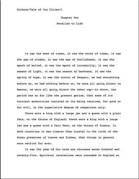
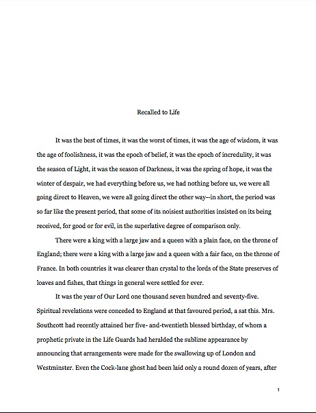
Let’s take a peek at why all of those rules necessary, from a professional point of view. For continuity’s sake, let’s once again call upon our old friend Charles Dickens again to see what a page of a manuscript should look like — actually, since we’ve been looking at so many first pages lately, let’s live dangerously, shall we? Here are pages 1 and two.

2 cities good
2 CIties right page 2

Relatively easy to read, isn’t it? (Assuming that you find it so, of course. If it’s too small to read easily on your browser, try holding down the COMMAND key and hitting + until the type is large enough to read comfortably.)

To give you some idea of just how difficult it would be to screen, much less hand-edit, a manuscript that was not double-spaced or had smaller margins, take a gander at this little monstrosity. To render it an even better example of what makes Millicent’s optician rend his garments in despair, I’ve gone ahead and submitted a fuzzy photocopy, rather than a freshly-printed original.

I believe the proper term for this is reader-hostile. Even an unusually patient and literature-loving Millicent would reject a submission like this immediately, without reading so much as a word. As would, more often than not, Mehitabel.

And honestly, can you blame them?

Did I hear a few spit-takes after that last set of assertions from those of you joining us in mid-argument? “My goodness, Anne,” sputter those of you wiping coffee, tea, or other beverage of your choice off your incredulous faces, “why would any sane person consider presentation violations that serious an offense? It is, after all, precisely the same writing. Sure, it’s a little harder to read, but if it’s an e-mailed submission, Millicent could just expand the image. And it’s not as though Millicent’s boss, the agent of Charles’ dreams, couldn’t just ask him to reformat it.”

Yes on both counts, but surely you can appreciate why the Charles who submitted that last page would strike anyone accustomed to handling manuscripts as a much, much more difficult writer to work with than the Charles behind our first set of examples. The latter displays a fairly significant disregard for not only the norms of standard format, but also the optical comfort of the reader. Not to mention just shouting, “Hey, I don’t expect any feedback on this, ever!”

Oh, you didn’t spot that? Anyone who handles manuscripts for a living would. Even with nice, empty page backs upon which to scrawl copy edits, trying to cram spelling or grammatical changes between those lines would be well-nigh impossible. Knowing that, Millicent would never dream of passing such a manuscript along to the agent who employs her; to do so would be to invite a stern and probably lengthy lecture on the vicissitudes of the life editorial — and that fact that, despite impressive innovations in technology, intensive line editing a single-spaced document in either hard or soft copy is well-nigh impossible.

Too hard on the eyes — and where on earth would the comments go on the hard copy?

Don’t tempt her to reject your submission unread — and don’t even consider, I beg of you, providing a similar temptation to a contest judge. Given the sheer volume of submissions Millicent reads, she’s not all that likely to resist. The contest judge, on the other hand, will be specifically instructed not to resist at all.

Yes, really. Even if the sum total of the provocation consists of a manuscript that’s shrunk to, say, 95% of the usual size, Mehitabel is likely to knock it out of the running on sight.

Are some of you are blushing? Perhaps some past contest entrants and submitters who wanted to squeeze in a particularly exciting scene before the end of those requested 50 pages?

No? Let me fill you in on a much-deplored practice, then: faced with a hard-and-fast page limit, some wily writers will shrink the font or the margins, to shoehorn a few more words onto each page. After all, the logic runs, who is going to notice a tenth of an inch sliced off a left or right margin, or notice that the typeface is a trifle smaller than usual?

Millicent will, that’s who, and practically instantly. As will any reasonably experienced contest judge; after hours on end of reading 12-point type within 1-inch margins, a reader develops a visceral sense of roughly how many characters fit on a properly-formatted page.

Don’t believe me? Go back and study the correctly formatted page 2 in our first example. Then take a gander at this wee gem of tricky intent:

2 Cities cheating page 2

Admit it: you can tell it’s different, can’t you, even without whipping out a ruler? Yet I shaved only one-tenth of an inch off each margin and shrunk the text by 5% — far, far less of a reduction than most fudgers attempt when, say, they’re trying to fit 26 pages of manuscript into a contest entry with a 25-page limit. So how likely is this little gambit to pay off for the submitter?

Exactly. Amazingly enough, people who read for a living very seldom appreciate attempts to trick them into extraneous reading. No matter how much Charles felt that last example added life to his opening — or how right he was about that — Millicent will simply notice that he tried to cheat in order to get more of his words in front of her eyeballs than writers conscientious enough to follow the rules. Next!

The same principle applies, incidentally, to query letters: Alarmingly often, aspiring writers, despairing of fitting a coherent summary of their books within the standard single page, will shrink the margins or typeface on a query. “What’s two tenths of an inch?” they reassure themselves. “And honestly, who is going to be able to tell the difference between 12-point type at 99%, rather than 100%?”

Help yourself to a gold star for the day if you immediately answered: “Someone who reads queries all day, every day. And two-tenths of an inch all around can, as Uncle Charles has just demonstrated, add up to a great deal more text on a page.”

Another common means of fudging spacing: incomplete adherence to the rules bout skipping spaces after periods and colons. Specifically, skipping two spaces (as tradition requires) in most instances, but omitting the second space when doing so would make the difference between a paragraph’s ending with a single word on the last line and being able to use that line to begin a new paragraph.

Shame on you, those who just bellowed, “Wow, that’s a great idea — over the course of an entire chapter, that might free up a page of text for my nefarious purposes!” Don’t you think inconsistent spacing is the kind of thing a reader trained to spot textual oddities might conceivably notice?

And for good reason: waffling about how often to hit the space bar can be a tell-tale sign that a writer isn’t altogether comfortable with writing in standard format. Such a writer’s work would, presumably, need to be proofread for formatting more closely than other agency clients’ work, would it not? And that in turn would mean that signing such a writer would inevitably means devoting either unanticipated staff time to double-checking his manuscripts or training in the delights of consistent rule application, right?

Those rhetorical questions would be equally applicable whether the agency in question happened to favor either the two-space or one-space convention, incidentally. Consistency is the key to proper manuscript formatting, after all, and all the more likely to be valued if an agency’s guidelines ask for something specific in a submission.

Why? Well, think about it: when you first thought about querying and submitting, would it have occurred to you to check each and every agency’s website (if it has one; not all do, even at this late date) for submission guidelines? So if you were the Millicent screening manuscripts for an agent with a desperate aversion to that second space after the comma (she had a nasty run-in with a journalist on a cross-country flight , perhaps; he may have menaced her with a copy of the AP’s formatting guidelines), and your boss had been considerate enough to post a reference to that aversion on the agency’s website, on her blog, and in 47 online interviews, wouldn’t that be one of the first things you looked for in a submission?

Let’s all chant it together, shall we? If an agency or publishing house’s submission guidelines ask for something specific, for heaven’s sake, give it to them. But don’t generalize that individual preferences to the entire industry, okay? And if they don’t express a preference, stick to standard format.

Yes, regardless of what you may have heard online about how nobody is using double-spacing after periods and colons in book manuscripts anymore. It’s simply not true that it’s generally an instant-rejection offense, on the grounds that manuscripts including the second space look hopelessly old-fashioned to agents and editors.

Well, guess what, cookie — standard manuscript format is old-fashioned, by definition. That doesn’t seem to stop most of the currently-published authors of the English-speaking world from using it. In fact, in all of my years writing and editing, I have never — not once — seen an already agented manuscript rejected or even criticized for including the two spaces that English prose requires after a period or colon. Possibly because those that feel strongly about the single-space convention tend to be up front about not being likely to fall in love with submissions featuring what they perceive to be extra spaces.

I have, however, heard endless complaint from professional readers about those second spaces being omitted. Care to guess why?

If you said that cutting those spaces throws off word count estimation, clap yourself heartily on the back: standard estimates assume those doubled spaces. (If you don’t know how and why word count is tallied, please see the HOW TO ESTIMATE WORD COUNT — AND WHY category on the archive list at right.) Give yourself a nice, warm hug if you also suggested that omitting them renders a manuscript harder to hand-edit. Because we all know about the lecture Millicent is likely to get if she forgets about that, right?

I can sense blood pressure rising over this issue, but honestly, inconsistent application of either rule is far more likely to raise red flags with Millicent than clinging like an unusually tenacious leech to either the one- or two-space convention. Particularly if that inconsistency — or slightly off sizing — seems to allow more words per page than is usual.

My point, should you care to know it, is that a pro isn’t going to have to look very hard at a space-deprived page to catch on that there’s something fishy going on, so let’s work a bit more to increase your visceral sense that something is wrong. Since Dickens was so fond of half-page sentences, the examples I’ve been using above won’t illustrate my next common gaffe very well.

Reaching blindly into the depths of the bookshelf next to my computer, I seem to have grabbed Elizabeth Von Arnim’s wonderful take on the Bluebeard myth, VERA. Taking a page at random, let’s take a look at it properly formatted in manuscript form.

Vera correctly

There are 310 words on this page; I wasn’t kidding the other day about how far off the standard word count estimations could be. Now cast your eye over the same text with a couple of very minor formatting alterations.

Doesn’t look significantly different to the naked eye, does it? Yet the word count is slightly lower on this version of this page — 295 words. That may not seem like a big difference, but it’s enough to make quite a difference over the course of an entire manuscript.

“But Anne,” I hear some sharp-eyed readers exclaim, “wasn’t the word count lower because there was an entire line missing from the second version?”?

Well spotted, criers-out: the natural tendency of omitting the second spaces would indeed be to allow more words per page, not less. But the scanter space between sentences was not the only deviation from standard format here; Millicent, I assure you, would have caught two others.

I tossed a curve ball in here, to make sure you were reading as closely as she was. Wild guesses? Anyone? Anyone?

The error that chopped the word count was a pretty innocent one, almost always done unconsciously: the writer apparently did not turn off the widow/orphan control, found in Word under FORMAT/PARAGRAPH/LINE AND PAGE BREAKS. As we were discussing only the other day, this insidious little function, the default unless one changes it, prevents single lines of multi-line paragraphs from getting stranded on either the bottom of one page of the top of the next.

As you may see, keeping this function operational results in an uneven number of lines per page. Which, over the course of an entire manuscript, is going to do some serious damage to the word count.

As would tinkering with the bottom margin to allow an extra line on the page. Here it is with only a minor change, a .9 inch bottom margin instead of 1 inch, a modification so minute that a non-professional reader would probably not notice that it was non-standard. To compress a bit more, let’s have only one space after each period.

Vera with extra line

A bit claustrophobic, is it not? If you don’t find it so, consider it as Millicent would: not as an individual page, isolated in space and time, but as one of the several thousand she has read that week. Lest we forget, most of the ones she will have been taking seriously will have looked like this:

Vera correctly

See it now? While Millicent is highly unlikely to have either the time or the inclination to whip out a ruler to check whether that bottom margin is really a full inch (although Mehitabel might), she will be able to tell that this page has more words on the page than the others she has seen that day. She might not be able to tell instantly precisely how this page has been modified, but she will be able to tell that something’s off.

“But Anne,” clever rule-manipulators all over North America shout, “I’ve been modifying my submissions this way for years, and nobody has ever called me out on it. Therefore, I do not believe it’s ever been a factor in my work being rejected — and it does allow me to stay under that all-important 400-page limit.”

Perhaps, rules-lawyers, but let me ask you a question: have you ever had such a manuscript accepted?

Well might some jaws drop. It’s an extremely common submitter’s misconception, especially amongst those brand-new to the game or who have only submitted pages as part of a query packet, rather than as requested materials, that if they were really doing something wrong, the rejecter would tell them so. And tell them what it is, naturally, so they could do better next time.

In these days of form-letter rejections — and even no-reply rejections — this is simply an unrealistic expectation. Unless an agent or editor is asking for the writer to revise and resubmit the manuscript (in itself something of a rarity these days), why would they take the time?

Well, yes, to be nice would be a perfectly acceptable response, from a writer’s perspective. If a well-established agent received only a hundred queries per month and asked for one manuscript — not all that uncommon a ratio thirty years ago — writing personalized rejections would be both kind and not unduly time-consuming. Presuming, of course, that the rejected writer of the month did not consider a detailed rejection an invitation to argue about the manuscripts merits.

Consider for a moment, though, the agent that receives hundreds of queries per day. See why kindly advice-giving rejection letters might have become something of a rarity?

Especially if the rejection reason had to do with a formatting error. Honestly, it would eat up half of Millicent’s screening day. Why? Well, most submissions contain at least one — formatting problems, like typos, grammar gaffes, and wolves, tend to travel in packs. Even with the best of wills, it would be prohibitively time-consuming for Millicent to scrawl try learning how to format a manuscript, honey.

No, regardless of whether the ultimate rejection trigger for VERA was that extra line per page, the second misspelling in paragraph 2, or a premise that Millicent has seen seventeen times that week, the reasons given for sending back the submission would probably run like this: I’m sorry, but this manuscript does not fit our needs at this time. I just didn’t fall in love with this story, and I don’t feel that I can sell this in the current tough market. Best of luck placing it elsewhere.

The moral of this sad, sad story: it seldom pays to assume that you’re doing it right just because you haven’t been told you are doing it wrong. It pays even less often to conclude from the generalities of a boilerplate rejection that there can’t have been any specific technical problem that caused Millicent, if not to reject it outright, then at least to take the submission less seriously.

Besides, another notorious agents’ pet peeve was lurking in the background — although in all probability, it would have irritated a contest judge far more than Millicent. Here’s the page again; see if you can spot it this time. Hint: it was not in the properly-formatted version.

Crown yourself with a laurel wreath if, while running your eyes thoughtfully over that last example, your peepers became riveted to the next-to-last line of the page: an emdash (–, one long line) instead of a doubled dash with spaces on either end. Here again, we see that the standards that apply to printed books are not applicable to manuscripts.

Which brings me to yet another moral for the day: just because a particular piece of formatting looks right to those of us who have been reading books since we were three doesn’t mean that it is correct in a manuscript. Or book proposal. Or contest entry.

Or a professional reader wouldn’t instantly spot a trifle imported from the wonderful world of published books. Remember, Millicent scans manuscripts all day; contest judges read entries for hours at a time. After a surprisingly short while, a formatting issue that might well not even catch a lay reader’s attention can begin to seem gargantuan.

Please don’t dismiss this as unimportant to your success as a writer. If writing is solid, it deserves to be free of distracting formatting choices. You want agents, editors, and contest judges to be muttering, “Wow, this is good,” over your manuscript, not “Oh, God, he doesn’t know the rules about dashes,” do you not?

Spare Millie the chagrin, please; both you and she will be the happier for it. Believe me, she could use a brilliantly-written, impeccably-formatted submission to brighten her possibly Dickensian day. Be compassionate toward her plight — and your submission’s, proposal’s, and/or contest entry’s. Pay close enough attention to the technical details that yours the submission that makes her say, “Oh, here is good writing, well presented.”

My, all of those individual grains of sand are attractive, aren’t they? Keep up the good work!

It’s all a matter of perspective, or, let’s move the piano over here. Wait — how would it look over there? And other tales of title page formatting.

sagrada familia ceiling3

If you’ve been hearing the Muses tap-dancing on the floor of heaven today, I think I know why: at long last, Author! Author!’s epic behind-the-scenes site upgrade has officially drawn to a close. It’s still going to take me a while to go back through the literally thousands of pages of archival posts, making sure that they’re taking kindly to all of the new bells and whistles, but in theory, the bulk of my blogging time will no longer be sacrificed on the altar of the Internet Deity.

Who, I gather, does not hobnob much with the Muses. If s/he did — hey, who am I to impose gender norms on higher beings? — all of the formerly fuzzy page shots would have magically clarified themselves in the course of this upgrade. Please bear with me while I painstakingly go back and refocus ‘em.

In the meantime, let’s get back to the matter at hand: the proper formatting of book manuscripts. As Odysseus no doubt said to his sailors and soldiers on the way home from the Trojan War, I know that it feels as though we’ve been on this journey forever, but it can’t be much farther now.

But hark! Do I hear some discontented murmuring amongst aesthetes out there in the ether? “But Anne,” visually-oriented aspiring writers murmur under their breath, so as not to attract the wrath of their nemesis, Millicent the agency screener, “my objection is not so much to the sheer length of time we’ve spent going over the strictures of standard format for book manuscripts — not to be confused with the formatting norms for short stories, magazine articles, screenplays, or any other kind of writing intended for professional submission — but to what I feel these rules are doing to my personal style. The pages look so plain! These rules are stepping all over my right to creative expression.

“So I’m asking you as a friend, Anne: if I believe my writing looks best in a special font like Abadi MT Condensed Extra Bold, and it’s how I want my words to look in the published book, why shouldn’t I run with it in a submission? Surely, Millicent can look past a little originality of presentation while she is seeking originality in writing.”

That’s a good question, murmuring aesthetes. The short answer: because Millicent will take your writing more seriously if you format it as she expects to see it — that is, the way that professional book manuscripts are formatted.

And why might she respond better to that than a more creatively-presented set of pages, murmurers? Is it time to trot out the broken record again?

broken-record3 A manuscript should not resemble a published book in many important respects. Therefore, formatting a submission to reflect one’s publication preferences on matters like font (which is the publishing house’s decision, anyway, not the author’s) will not strike the pros as a creative choice, but a reflection of a misunderstanding of how publishing works — and an indication that the writer has not yet taken the time to learn the rules of submission.

What’s that you’re murmuring now? That this is a pretty sweeping set of conclusions to draw from something as simple as font choice or a title page graced with a photograph? Perhaps, but to someone who deals with manuscripts and/or book proposals all day, every day, for years on end, it’s not all that far-fetched. After all, it’s not as though Millicent’s boss, the agent of your dreams, would ever consider submitting your manuscript to an editor at a publishing house in anything but standard format; it wouldn’t be taken seriously.

An editor would be too busy staring at that remarkable font choice or non-standard indentation to pay close attention to what’s dearest to any writer’s heart, the actual writing. So in practice, discontented murmurers, presenting your original writing in standard format is more conducive to getting your creative expression into print, not less.

Counterintuitive, isn’t it? That’s because you’ve been looking at the page like a writer, rather than an agent, editor, contest judge, or the Millicent lucky enough to screen submissions for any of the above. It’s all a matter of perspective. As international relations professors like to say early and often, where you stand depends upon where you sit.

Don’t see why perception of writing talent, like beauty, might lie partially in the eye of the beholder? Okay, tell me: did I take the photograph gracing the top of this post while looking down into an abyss, sideways into an alcove, or up at an impossibly high ceiling?

Out of context, it’s hard to tell which way is up, isn’t it? (But here’s a hint: the purple stuff is flying dust.) Without some orienting landmarks, it’s difficult even to know for sure what you’re looking at, or from what direction.

That’s more or less the same problem the average aspiring writer faces when looking at her own first manuscript or book proposal with an eye to figuring out whether it is formatted correctly. Let’s face it, very, very few as-yet-to-be-published writers have ever seen a professional manuscript up close and personal; still fewer have had the opportunity to glance through a professional book proposal.

Oh, there’s plenty of advice out there on how it should be done, of course, but as many of you have no doubt noted with chagrin, sources differ. And surprisingly often, the sources most inclined to tell aspiring writers that they have no hope in Hades of landing an agent if their manuscripts don’t contain Feature X (because Millicents have, presumably, been trained to reject X-less manuscripts on sight, then rush to a national blackballing database, to urge every other agency in the country not even to open that writer’s queries) or if they do contain Feature Y (because not only is Y hopelessly old-fashioned, but spotting even a single instance of it will provoke gales of laughter from Millicent) do not pause in their warning spates long enough to explain why X is desirable in a submission or Y is not.

Heck, most sets of rules don’t even specify to which kind of manuscript they’re supposed to be applied. No wonder so many aspiring writers labor under the false impression that all writing, anywhere, anytime, should be formatted identically, upon pain of instant rejection. Or, like our murmurers above, just assume that the welter of conflicting guidelines must indicate that Millicent is serious about only the elements common to most sets of rules. Like our murmurers above, they presume that as long as a manuscript is double-spaced and in 12-point type, anything goes.

As you may perhaps have gathered from my many years of revisiting this topic, I have nothing but sympathy for writers at both ends of the spectrum. How on earth is someone new to the game supposed to figure out which end of the manuscript is up, figuratively speaking?

The trick lies in remembering that the principles governing manuscript formatting are based upon practical and historical considerations, not purely aesthetic ones. Shall we wind up that Victrola again?

broken-recordA manuscript is designed to be easy for the intended audience to read, not for the writer to produce. Thus, while two-inch margins and a cursive typeface may strike a writer as the perfect expressive extension of the spirit of his novel, to someone who reads manuscripts for a living, they’re just puzzling. And, frankly, distracting from the writing.

What looks right in a manuscript, in other words, depends upon the perspective of the person reading it. From where Millicent is sitting, non-standard formatting makes it harder for her to pay attention to the writing. Obviously, she reasons, a writer who presents his work in 14-point type or with half-inch margins, is either unaware that these choices are eye-distracting. So rather than impressing her with his creativity, he simply seems out of touch with how publishing works.

And why might Millicent’s drawing that conclusion from her first glance at page 1 prove problematic for the submission, campers? Out comes the broken record:

broken-record4 Because professional manuscripts and book proposals are always present in the same way, Millicent knows that her boss, the agent of your dreams, would have a hard time convincing an editor at a major publishing house to read even the first page of an unprofessionally-formatted manuscript. She also knows that taking on a manuscript by a writer unaware of that will be more time-consuming to represent than one already familiar with how submissions to publishers work.

That means, unfortunately for lovers of wacky typefaces everywhere, that a choice as small as a typeface can make an astonishingly great difference to how professional your work looks to the pros. That comes as something of a surprise to most aspiring writers — who, not entirely surprisingly, tend to regard that particular decision as a purely aesthetic one. “Why,” they ask, and not unreasonably, “should it matter? Good writing’s good writing, isn’t it?”

Well, yes and no. Yes, good writing is a thing of beauty and a joy forever. No, insofar as good writing tends to have less impact on the average Millicent when it’s presented in an unusual typeface.

To see why, let’s once again start at the top of the submission packet, taking a gander at the same title page in three different typefaces. Here it is in 12-point Times New Roman, one of the two preferred typefaces:

Title page 1

That’s what anyone sitting in Millicent’s seat would expect to see — and before we move on, would you join me in tap-dancing with the Muses over how much crisper that image is than any of the page shots I’ve been able to post within recent memory? Nearly brings a tear to the eye, that does. Should your emotional intensity be interfering with your ability to spot the small details, try holding down the Command key and pressing + to enlarge the image.

Now that we have it in focus, let’s look at precisely the same information, presented in another font. Let’s assuming that Aunt Jane had favored 12-point Helvetica so strongly that she just couldn’t resist submitting in it:

Title page 2

The letters in this version are quite a bit bigger than in the first, aren’t they? Not enough so to appear to be rendered in, say, 14-point font, but large enough to make Millicent wonder whether the word count is accurate. (Estimated word count does, after all, vary by typeface: Times New Roman is estimated at 250 words/page, Courier at 200. More on that below.)

Honestly, do you want her speculating about your credibility before reading the first page of your manuscript? Now that we have seated ourselves firmly in Millicent’s office chair, we can see that Aunt Jane’s choice of Helvetica, while not a deal-breaker, does not necessarily present her manuscript to its best advantage. Even before the text starts, it’s distracting.

Does that increased volume of disgruntled ethereal muttering mean some of you are longing to see a typeface that would be a deal-breaker for Millicent? Happy to oblige. Very few of us who read for a living would be even vaguely tempted to turn the page and start reading this one.

Title page 3

Can’t really blame Millicent for regarding the entire manuscript with a jaundiced eye, can we? Despite containing all of the information that a title page should include — in the right places and in the right order, no less — this page simply screams that Aunt Jane has not thought about her future agent’s ease or comfort in reading. Clearly, she was so intent upon expressing herself via font that she neglected to consider the preferences of someone who might conceivably want to judge her writing.

Still resisting the concept? Okay, slip back into Millicent’s moccasins for a second, pretend you’ve been screening submissions for the last seven hours, and feast your eyes on this:

Title page 4

Ah, that one caught some of you originality-huggers by surprise, didn’t it? “But Anne,” those who want to stand out from the crowd protest, “I’ve been submitting my writing on slightly tinted paper for years. White is just so boring, and besides, everybody uses it. I’m merely being strategic: if every other submission Millie sees today is white, mine will automatically catch her eye, right?”

Well, yes, but not for the right reasons — and not in a manner even remotely likely to convince her that this submission, out of the hundreds she will be perusing this week, is the one that will wow her boss. Yes, regardless of how good the writing might be.

Why? Look for yourself: could the agent possibly submit this manuscript to a publishing house in this typeface and on this oddly-colored paper? Would it stand a fighting chance if she did?

And if it doesn’t, does presenting the manuscript in this manner make sense at any stage of submission?

The answers to all three of those questions is a resounding “By Jove, no!” And that’s sad, considering that the book this title page covers is, lest we forget, SENSE AND SENSIBILITY. The moral, should you care to know it:

broken-record7Even the best writing can be placed at a competitive disadvantage by unprofessional presentation. Standard format is the good writer’s friend, not her enemy.

Is all of that ambient clanking is a thousand writers’ hackles being raised? “But Anne,” outraged voices thunder, “aren’t you making Millicent out to be pretty darned shallow? Whenever I’ve heard agents and editors asked at conferences or on their blogs about whether cosmetic issues can get a manuscript rejected, they often disclaim the notion with scorn. I’ve even heard a few of them say that they don’t care about issues like typeface, spaces after periods and colons, or where the chapter title lies — and that strikes me as significant, as I’ve never, ever heard one say it was okay to let a query letter run longer than a single page. Isn’t it the writing all that matters in a submission, ultimately?”?

Again, yes and no, hackle-raisers. Yes, the writing matters — and no, it’s not all that matters.

Naturally, the writing matters most in a submission, with freshness, audience-appropriateness, marketability, and fit with the agent or editor reading it jostling for second place. Equally naturally, and something that I often point out, individual agents, editors, and even contest judges harbor individual preferences as well and have been known to express them at conferences. Or on their blogs, Twitter feeds, and over drinks at that bar that’s never more than a hundred yards from any literary conference in North America.

One person’s pet peeve, however, may not be another’s. Since few aspiring writers have access to the industry-specific information required to find out the preferences of every agent to whom they are submitting, adhering to standard format minimizes the probability of running afoul of unknown annoyance-triggers.

Then, too, adopting the norms of standard format and clinging to them like an unusually tenacious leech will also help you preserve your sanity throughout the often-protracted submission process, for the reason I mentioned in passing above — have you seen how many conflicting sets of ostensibly authoritative manuscript formatting rules are floating around out there?

Honestly, trying to apply every single one of the expressed opinions to your manuscript will drive you 100% nuts. Don’t even try. However, because personal (and genre) preferences do exist, it’s always worth a submitter’s time to double-check an agency or small publishing house’s submission guidelines, just in case they call for something wacky. That’s worth throwing another record on the machine, surely.

broken-record2If an agent or editor to whom you are submitting asks for something different, for heaven’s sake, give it to her. If, as is almost always the case, the guidelines don’t specify, keep the presentation unprovocative and professional so that your writing may shine without visual competition.

In other words, it’s only prudent to adhere to the strictures of standard format, rather than assuming, as so many aspiring writers do to their cost, that the writing is the only thing that matters.

Remember, where you stand depends on where you sit. It’s a matter of perspective. And from both Millicent and the aspiring writer’s perspective, taking the time to present writing professionally is genuinely worth it.

Admittedly, one does hear of the mythical isolated case of a kind, literature-loving agent has looked past bizarre formatting in order to see a potential client’s, well, potential. One also hears of isolated cases where a manuscript rife with spelling and grammatical errors gets picked up, or one that has relatively little chance of selling well in the current market being recognized for the work of genius it is and swept to bestsellerdom. The age of miracles has not entirely passed, apparently.

Have you ever noticed, though, how seldom a specific book title comes attached to those stories? Or, when they do, it turns out on closer examination that the writer in question roomed in college with a major agent, or is married to a senior editor at a large publishing house, or used to be a Monkee? If one happens to fall into such a category, one might well encounter an unusual leniency. Ditto if one happens already to be a household name.

Before anyone raises his hand, though, we’ve all heard offbeat How I Got Discovered Stories at conferences. But — and this is a BIG but — these cases get talked about because they are exceptions, and rare ones at that. (They also tend to have happened before the mid-1980s; agents used to take chances on long shots more often.) 9,999 times out of 10,000, though, a submission’s tumbling into any of the pitfalls we’ve been discussing will result in, if not instantaneous rejection, then rejection upon Millicent’s lighting upon the next problem in the manuscript.

Those pesky hackles are clacking again, aren’t they? “Okay,” the hackled concede, “I can understand how Millicent would be tempted to skip reading submissions presented like the last two examples, where she’s likely to strain her eyes. But if presentation is so darned important, why don’t aspiring writers hear about it more often at conferences, in articles about submission, or even just in discussions amongst ourselves?”

Excellent question, h-raisers. I can’t say for sure, of course, but it wouldn’t be going out too far on an interpretive limb to speculate that a sane, sensible individual with a reputation to protect might be slightly reluctant to stand up in front of 500 eager potential submitters and say, “Look, if you’re planning to submit a grimy photocopy of your book, or insist upon presenting it in 10-point type, or not indenting your paragraphs, just don’t bother to query me, okay?” Having once seen a well-meaning agent tell an indignant crowd that he only took query letters seriously if they came from writers he met at conferences (yes, really; there were many, many witnesses), I can tell you precisely what would happen if some honest soul did take this astounding step: instantly, 500 pens would scrawl on 500 programs, DO NOT QUERY THIS ONE; HE’S MEAN.

Which would rather defeat the agent’s purpose in coming to the conference to recruit new clients, would it not?

As a veteran teaches of writing and formatting classes, I can think of another reason that a speaker might want to be careful about such pronouncements: an agent or editor doesn’t have to speak at many conferences (or blog for very long) before recognizing that anything she says about submissions is likely to be repeated with the ?clat of a proverb, to borrow a phrase from Aunt Jane, for years to come amongst the writing community.

You might be surprised how often it happens. I’ve heard offhand comments made from the dais, or even jokes, being debated for hours in conference hallways, particularly if those comments happen to relate to the cosmetic aspects of querying and submission. 5-4 Supreme Court decisions are routinely discussed with less vim and vitriol. Some particularly vehement agents’ pronouncements have been more commented upon than St. Paul’s second letter to the Corinthians.

Okay, so that last is a slight exaggeration. My point, should you be interested, is that the very notion of from-the-horse’s-mouth rightness carries such a luster that such speakers are constantly in extreme danger of having everything they say quoted back to them as an inflexible rule.

Which is why, I must admit, I occasionally experience qualms about presenting the rules of standard format here at all. On the pro-regulation side, we are talking, after all, about an industry that both values creativity and considers submitting a book proposal in anything but a black folder dangerously radical. (Yes, really.) On the con side, literally nothing else I talk about here consistently raises as much writerly ire.

The very topic of manuscript presentation seems to be emotionally trying for a lot of writers — disproportionately so, from where Millicent is sitting. Tell an aspiring writer that his dialogue is turgid, or his pacing drags, or he’s left a necessary section out of his book proposal, and most of the time, he’ll be at least curious about why you think so. (If a bit defensive.) If you tell him that his protagonist’s sister is Ruth for the first 72 pages, and Ren?e thereafter, he might actually thank you.

Yet suggest to the same writer that he might be better off reformatting his manuscript to include such niceties as paragraph indentation or moving his page number to the slug line, and a good quarter of the time, he’ll look at you as though you’d just kicked his grandmother. Thrice.

Go figure, eh?

Presentation issues definitely do matter. Which is, again, not to say that the quality of the writing doesn’t. But — and again, this is a BIG but — as we’ve discussed, rejection decisions are more often than not made on page 1 of a submission. Sometimes even within the course of the first paragraph. If a manuscript is hard to read due to a funky typeface or odd spacing or just plain poor print quality, Millicent may just pass on reading it at all.

While these phenomena are, in fact, quite widely recognized as true, the person who announced them this baldly from the dais at a literary conference would swiftly find herself covered head to foot with flung tomatoes in twenty seconds flat. Metaphorically, at least. Which is why I’m going to keep saying it until I’m blue in the face and you die of boredom:

broken-record-150x150From the perspective of someone who reads manuscripts for a living, professional formatting is simply the least distracting way a book can possibly be presented. Adhering to the industry’s cosmetic expectations renders it more likely that an agent or editor will concentrate upon the beauty of the writing, not less.

They can’t fall in love with your good writing until they read it, can they? So don’t you want to do everything within your power to convince them that your manuscript is the one that deserves more than a cursory glance?

Of course you do. Instead of thinking of the rigors of standard format as a series of unimportant (or even silly) superficial choices, try regarding them as translating your calling card, a means of catching Millicent’s tired eye and informing her that this is a manuscript that should be taken seriously.

“Okay, Anne,” lovers of Bauhaus 93 sigh. “What fonts would be the least, you know, Millicent-provoking for me to use?”

I would highly recommend using either Times, Times New Roman, or Courier, both on the title page and in the manuscript. These are the standards of the industry, and thus the least likely to raise Millicent’s ever-knitted eyebrows. Like other strictures of standard format, there’s a pretty good reason for this one: from where she is sitting, word count estimation is always predicated upon one of these typefaces.

Why is the question of estimating relevant on a title page? Again, we must look to Millicent’s perspective: unlike word counts in articles or short stories, word counts in book manuscripts are generally estimated, not based upon the actual number of words. For short stories and articles, use the actual total.

Was that giant gust of wind that just knocked my desk over your collective gasp of astonishment? I’m not entirely surprised; a lot of aspiring writers are confused on this point. “But Anne,” they shout, and who can blame them? “My Word program will simply tell me how many words there are in the document. Since it’s so easy to be entirely accurate, why shouldn’t I be as specific as possible? Or, to put it another way, why would an agent or editor ask for the word count, then expect me to guess?”

Would you fling something at me if I said once again that this is a matter of perspective? From Millicent’s seat, the answer is pretty obvious: industry practices dictate how manuscripts are handled, not the whims of the fine folks at Microsoft. The Microsofties I know are sterling human beings to a man, but they’re hardly experts on the publishing industry’s requirements.

And really, why should they be? Contrary to popular opinion amongst aspiring writers, just because Word is set up to allow certain things — giving you an exact word count, for instance, or access to 147 different fonts — doesn’t mean that the publishing industry wants writers to do things that way. (And if you doubt that, consider the doubled dash vs. the automatic emdash Word favors.) Word processing programs came into use long, long after standard format for manuscripts, after all; why should agents, editors, and Millicents allow computer programmers to dictate what strikes them as professional?

Perspective, people: which makes more sense, assuming that the word count on your title page will be read by Millicent — or Bill Gates?

I cannot, naturally, speak to Mssr. Gates’ views on the subject, but here is why Millicent would care on the estimation front. The Times family is estimated at 250 words/page; Courier at 200. So a 400-page manuscript in Times New Roman is estimated to be roughly 100,000 words if it’s in Times — something Millicent should be able to tell as soon as she claps eyes on the submission’s title page, right? — and 80,000 if it’s in Courier.

Wondering why anyone would estimate at all? Since word length vary, and because manuscripts shrink around 2/3rds in the transition to published book, the number of pages is actually a better measure of how much it will cost to print and bound the thing. So if your title page says that your baby is 86,250 words and it’s in Times New Roman, a pro will just assume that it’s 345 pages (345 x 250= 86,250) rather than flipping to the bottom of the stack of papers to check. If it’s in Courier, she would conclude that it is 431 pages — and that your math skills are not particularly good.

Now, in the world as we know it, a 400-page manuscript in TNR is usually closer to 115,000 words than 100,000; as any writer who has compared the estimated word count for her book with the total her word processing program so kindly provides, they tend to differ wildly. But word count, like beauty, is in the eye of the beholder: a novelist whose title page reported, accurately, that her 400-page novel was 115,000 words might well see it rejected out of hand on the grounds that it was too long.

Why? Well, math may not have been Millicent’s best subject, either (as one might expect, the inmates of agencies tend overwhelmingly to have been English majors), but she can do third-grade multiplication in her head: 115,000 words at 250 words/page would equal a 460-page manuscript. That’s quite a bit longer than editors tend to expect first novels in most genres to be these days; at around 450 pages, binding costs rise significantly.

In other words: next!

Boy, those hackles are getting a workout today. “But Anne, why would Millicent want to estimate at all when she has a submission in front of her? If she wants to know how long it is, why doesn’t she just flip to the last page and check the page number?”

I could give you a long song and dance about how much her wrists hurt from opening all those query envelopes all day, or how her secret midnight e-mail orgies have rendered pinching a torture. She has a hard job, truly. In practice, the answer is far less personal than practical: because the word count is right there on the title page.

Tell me, hackle-raisers: why should she doubt its accuracy? Unless, say, the title page were in a non-standard typeface like Helvetica, she’s going to assume that an aspiring writer familiar enough with standard format to include the word count on the title page would also know how to estimate it accurately.

I know, I know: from a writer’s perspective, that’s kind of a wacky assumption. But her chair boasts a different view than ours. Besides, how exactly could she manage to turn to page 400 of a manuscript, when her boss requested that the writer send only the first 50, without resorting to some pretty impressive maneuvering through time and space?

I’m aware that I’m running long today, but in the interest of clarity, let’s invest another few minutes in turning to the first page of the submission, to see how much of a difference font and typeface make at first glance. Here’s a correctly-formatted page 1 in Times New Roman. Just for giggles, I’m going to use that notorious editorial nightmare, the opening paragraphs of A TALE OF TWO CITIES:

2 cities good

Now let’s take a peek at the same page, also correctly formatted, in Courier. Note how many fewer words per page it allows:

2 courier

Got both of those firmly imbedded in your brainpan? Good. Now format your first pages that way for the rest of your natural life.

Just kidding — you want to see why it’s a good idea, don’t you? Okay, take a gander at the same first page, not in standard manuscript format. See how many differences you can spot:

example for spotting

Fascinating how just a few small formatting changes can alter the presentation, isn’t it? As with our earlier title page examples, it’s exactly the same writing, but it just doesn’t look as professional. To Millicent, who reads hundreds of pages per day, the differences between the last three examples could not be clearer.

And yet, if we’re going to be honest about it, there were really very few deviations from standard format in the last example. For those of you playing at home, the typeface is Georgia; the chapter title is in the wrong place, and there isn’t a slug line. Also, the page is numbered in the wrong place — the default setting, incidentally, in many word processing programs.

In all probability, none of these infractions against the rules of standard format would strike our Millie as serious enough to cause her to toss a submission aside as soon as she noticed them. But when poor formatting is combined with literary experimentation — like, say, that paragraph-long opening sentence ol’ Charles managed to cough up — which do you think she is going to conclude, that Dickens is a writer who took the time to polish his craft, or that he just doesn’t know what he’s doing?

broken-record-150x150It’s never in your best interest as a writer to tempt a professional reader to draw the wrong conclusion about your devotion to your craft. Remember, where a manuscript stands depends upon where the reader sits.

Before any hackles start racing skyward again, I hasten to add: where the submitting writer sits often makes a difference to a reader’s perception, too. Her reception of that last example is very likely to be different before Dickens became a household name or after. Once he was established, he could get away with more.

Unless you happen already to be famous, though, I wouldn’t advise taking the risk. (And if you do happen to be famous, could I interest you in writing a back jacket blurb?)

In fairness to Millicent, it’s highly unlikely that it would even occur to an established Charles to deviate this markedly from standard format. Experience working with an agent or editor would discourage it. The longer you remain in the business, the more those little things will strike you as just, well, matters of right and wrong. As, fortunately or not, they do Millicent and her ilk.

Come to think of it, that sense of fitness may well be the reason that discussions of formatting tend to become so vitriol-stained. We all like to be right, and propriety is in the eye of the beholder. After all, each of us is most familiar with the view from her own chair.

Pulling back from one’s own perspective can be most helpful. There’s a reason that it’s called the bigger picture, people.

In that spirit, let’s take a longer view of our original photo, to situate ourselves:

sagrada familia ceiling

Substantially simpler to tell up from down now, isn’t it? Taking a broader perspective, you can see that the green light on the left is coming from a stained-glass window; on the left, there’s a decorative support beam. From the myopic tight shot, it was far less obvious that this was a cathedral.

Making sure your writing is framed properly can have a similar effect. Keep up the good work!

Me and you and a boy? girl? dog? named Snafu

Johnny_Cash_-_A_Boy_Named_SueJohnny_Cash_-_A_Boy_Named_SueJohnny_Cash_-_A_Boy_Named_Sue

Sorry about my recent slow rate of posting, campers; as the sharper-eyed among you may have noticed, we here at Author! Author! have been experiencing what the old television shows used to call euphemistically technical difficulties. Quite a bit of progress can be seen behind the scenes, I assure you, but it will be a little while before the full benefits will be visible from your side of the page. Mea culpa, and thanks for hanging in there.

I’ve been hesitant to keep pressing forward with our series-in-progress on manuscript formatting while the visual examples are still acting a bit squirrelly. Writers’ conference season is almost upon us, however, and proper formatting can make the difference between an enthusiastically-read post-pitch submission and one that our old pal, Millicent the agency screener, picks up with trepidation, so I’d like to smuggle the standard format basics into everyone’s writing tool kit sooner rather than later. Let us press on unabashed, therefore.

When last we broached the subject, I showed how the first page of text does not, from a professional perspective, make an adequate substitute for a title page in a book manuscript — a demonstration that, if past is any prologue, may well have left some of you scraping your jaws off the floor. Don’t be too hard on yourself, if so: most first-time submitters simply assume that if a manuscript does include a title page — and a hefty majority of submissions arrive without one — it should be a replica of a hoped-for book cover. That’s what they’ve seen in bookstores (ask your grandparents, children), so that must be what looks professional to the professionals, right?

As I hope those of you who have been following his series have already shouted: heavens, no. Standard format for manuscripts does not resemble what’s on the printed page of a published book in many respects.

You’d be surprised at how many aspiring writers are not aware of that, judging by how many single-spaced, non-indented, photo-heavy submissions turn up at agencies. Even the more industry-savvy rookies — the ones who have taken the time to learn that book manuscripts must be double spaced, contain indented paragraphs, be printed on one side of the page, etc. — are frequently unaware that that in traditional publishing circles, the author typically has very little say over what does and does not grace the cover.

Millicent is quite cognizant of that fact, however; experience watching books travel the often bumpy road from initial concept to publication have shown her that cover art is almost invariably the publishing house’s choice. So is pretty much everything on the dust jacket, including the back jacket copy, the book’s typeface, and every other cosmetic consideration. So when she opens requested materials to find something like this:

she sees not a manuscript perfectly ready for publication — that’s what some of you, thought, right? — but evidence that the sender does not understand the difference between a published book and a manuscript. At minimum, this admittedly rather pretty top page demonstrates that the writer does not understand that throughout the publication process, the title page of a manuscript is not just its top cover.

Nor is it merely the shouted-out declaration of the book’s title and who wrote it, another popular choice in submissions. What possible practical purpose could a title page like this serve at the submission stage?

Not much doubt about what it’s called or who wrote it, true, and the typeface certainly blares those two facts with gratifying gusto, but how precisely does this (unusually small, for some reason best known to the writer) sheet of paper fulfill any of the functions the agent or small publisher to whom it was submitted might need it to serve? How, in fact, is it a better title page than the most common of all, the following?

No, your eyes are not deceiving you: the single most popular title page option in manuscript submissions is none. It’s an especially common omission in e-mailed submissions. Half the time, e-mail submitters don’t even include a cover letter; they just attach the requested number of pages. “I’ve been asked to send this,” title page-eschewers murmur, doubtless to convince themselves, “so the agency has to know who I am. Besides, my name and the title are in the slug line — that’s the writer’s name and title in the upper right margin of the page, should anyone have been wondering. Surely, that’s enough to identify the manuscript.”

Well, it might be, if Millicent were fond of guessing games, but hands up, anyone who seriously believes that agents ask to see so few manuscripts in any given year based upon the tens of thousands of queries they receive that any requested materials must be instantly recognizable not only to their weary peepers, but to the entire staffs of their agencies. Keep those hands up if you also cling to the writer-flattering notion that agents and editors hearing pitches at conference find so few of them convincing that they could easily identify both book and writer by the storyline alone.

Found better uses for your hands, did you? Glad to hear it. But if presenting a fantasy book cover isn’t the point of including a title page, and if its main goal is not to shout that you — yes, YOU — managed to pull off the quite impressive achievement of writing an entire book or book proposal, what meaning is this poor, misunderstood page supposed to convey to Millicent?

Its mission is not particularly romantic, I’m afraid: a properly-formatted title page is simply a quiet, practical piece of paper, containing a specific set of marketing information any agent or editor would need in order to bring your book to publication. If Millicent doesn’t spot that information as soon as she claps eyes on the pages her boss, the agent of your dreams, asked you to send, her first impression of your submission will be that you’ve made her life a little harder.

Call me zany, but I doubt that was Ann Gardiner’s goal when she put all of that effort into designing that pretty faux book cover and popped it into the envelope with her first 50 pages. I would be surprised if Ama Narcissist actively desired to make it difficult for an agent who fell in love with her writing to contact her. And I would be downright flabbergasted if the e-mailing submitter that just didn’t think to include a title page with his Word document hadn’t just assumed that Millicent keeps every single one of the thousands of e-mails her agency receives in any given week in a special file, all ready to be leafed through so if her boss wants to see more of the manuscript, she can waste 17 hours trying to track down the sender’s original e-mailed query. Because all that’s required to respond to an e-mailed submission is to hit REPLY, right?

Again: heavens, no. Any reasonably established agency may be relied upon to be juggling far, far too many submissions at any given time.

Do those inarticulate gasps of frustration mean that some of you have under-labeled manuscripts in circulation at this very moment, or merely that you have questions? “But Anne,” hyperventilating writers the English-speaking world over gasp, “I’m an inveterate reader of agency and small publishing houses’ submission guidelines, and they rarely state a preference for including a title page. What gives?”

What gives, my air-deprived friends, is that it’s actually pretty uncommon for submission guidelines to get down to the nitty-gritty of page formatting. As much as the strictures of standard format may seem new and strange to an aspiring writer confronting them for the first time, it’s just how the publishing industry expects professional book writing to be presented. A title page is so presumed to be part of a properly-formatted manuscript that many submission guidelines might not bother to mention it at all.

Which may be why, in practice, submitting without a title page is far more common than including one, especially for electronic submissions. This presentation choice is particularly common for contest entries, perhaps because contest rules seldom come right out and say, “Hey, buddy, include a title page, why doncha?” — and they virtually never say, “Hey, buddy, don’t bother with a title page, because we don’t need it.” Instead, they usually just ask entrants to include certain information with their entries: the category the writer is entering, perhaps, with contact information on a separate sheet of paper.

Which has, you may be interested to hear, a name amongst those who handle manuscripts for a living. It’s called, if memory serves, a title page.

Ah, a forest of hands has sprouted in the air. “But Anne,” murmur those of you who currently have submissions floating around out there without your contact information attached, “I’d like to go back to that part about the expectation that a manuscript should include a title page being so widespread that a pro putting together submission guidelines might not even think to bring it up. Assuming that pretty much everyone else whose submission will land on Millicent’s desk on the same day as mine was in the dark about this as I was until I read your recent fine-yet-sleep-disturbing post, should I even worry about not having included a title page? I mean, if Millie were going to reject manuscripts on this basis alone, she’d be a non-stop rejection machine.”

Of course, she isn’t a non-stop rejection machine. She’s a virtually non-stop rejection machine. She genuinely gets excited about quite a few submissions.

But that wasn’t really the crux of your question, was it, worried submitters? You’re quite right that this omission is too common to be an instant-rejection offense at most agencies, despite the fact that including it renders it far, far easier for the agent of your dreams to contact you after he has fallen in love with your writing. However, any deviation from standard format on page 1 — or, in the case of the title page, before page 1 — will make a manuscript look less professional to someone who reads submissions day in, day out. It lowers expectations about what is to follow.

To gain a better a sense of why, let’s revisit a couple of our examples from earlier in this series. Welcome back, R.Q. Snafu and Faux Pas. See if you can spot where they went astray.

While opening pages like these do indeed include the requisite information Millicent or her boss would need to contact the author (although Faux Pas’ pulls it off it better, by including more means of contact), cramming all of it onto the first page of text doesn’t really achieve anything but saving a piece of paper, does it? What precisely would be the point of that? This tactic wouldn’t even shorten the manuscript or contest entry, technically speaking: the title page is never included in a page count. That’s why pagination begins on the first page of text.

So what should a proper title page for a book manuscript or proposal look like? Glad you asked:

Got all three of those last three images indelibly burned into your cranium? Excellent. Now weigh the probability that someone who reads as many manuscripts per day as Millicent — or her boss, or the editor to whom her boss likes to sell books — would not notice a fairly substantial difference in the presentation.

Exactly. Now assess the likelihood of that perception’s coloring any subsequent reading of the manuscript in question.

The answers are kind of obvious once you’ve seen the difference, are they not? Trust me, Millicent will have seen the difference thousands of times.

Again, I see many raised hands out there in the ether. “But Anne,” upright individuals the globe over protest, “I get that including all of the information in that last example would render it simpler for a Millicent who fell in love with the first three chapters of MADAME BOVARY to contact Mssr. Flaubert to ask for the rest of the manuscript. I’m not averse to making that part of her job as easy as humanly possible. However, I don’t quite understand why my presentation of that array of facts need be quite so visually boring. Wouldn’t my manuscript be more memorable — and thus enjoy a competitive advantage — if the title page were unique?”

At the risk of damaging your tender eardrums, HEAVENS, no! To folks who handle book manuscripts for a living, a title page is most emphatically not the proper place for individual artistic expression; it’s the place to — stop me if you’ve heard this before — provide them with specific information necessary for dealing with a submission.

Anything else is, in a word, distracting. To gain a sense of why, let’s take a gander at another type of title page Millicent sees with great frequency — one that contains all of the right information, but is so unprofessionally formatted that the care with which the writer followed the content rules gets entirely subsumed in the visuals.

title picture

Where should I even begin with this one? It’s pretty, undoubtedly, but would anyone care to start listing any of the five things wrong with it?

If you immediately zeroed in on the picture, give yourself a gold star for the day. Since there is literally no chance that any image a writer chooses to place on a manuscript or proposal’s title page will end up on the published book’s cover, what’s the point of placing it here? Decorating your submission’s title page with photos or drawings will just seem bizarre to Millicent. (And that goes double for Mehitabel, the veteran literary contest judge. She is likely to emit a well-bred little scream when she opens the entry envelope.)

Award yourself two gold stars if you said Ms. White should nix the red lettering — or any lettering that isn’t black, for that matter. Like every other page in the manuscript, the title page should be printed in black ink on white paper. No exceptions.

Help yourself to a third gold star out of petty cash if you also caught that her contact information should not have been centered. Pin a great big blue ribbon on yourself, too, if you pointed out that Ms. White used two different typefaces here, a classic standard format no-no. Not to mention the fact — although I do seem to be mentioning it, don’t I? — that the type size varies.

Feel free to chant it with me, axiom-lovers: like everything else in the manuscript, the title page should be entirely in 12-point type. It should also be in the same font as the rest of the manuscript.

With the usual caveat: unless an agent specifically requests otherwise, of course. Or contest’s rules; double-check for title page restrictions. (Why? Well, since the title page is generally the first part of an entry Mehitabel sees, not adhering to the rules there can knock an otherwise promising submission out of finalist consideration before she has a chance to read the first line of text. Contest rules exist for a reason, you know.)

You may place the title — and only the title — in boldface if you like, but that’s about as far as it’s safe to venture on the funkiness scale. Do not, I beg you, give in to the temptation of playing with the typeface. No matter how cool your title page looks with 24-point type, resist the urge, because Millicent will be able to tell from across the room if you didn’t.

Don’t believe that size matters? See for yourself:

Quite a difference, isn’t it? Apart from Mssr. Smith’s tragic font choice and his not having countermanded Word’s annoying propensity to reproduce e-mail addresses in blue ink, did you notice any potentially-distracting problems with this title page?

If you said that the last example included both a slug line and a page number in the bottom right corner, snag yourself yet another gold star. Add whipped cream and walnut clusters if you mentally added the reason that those additions are incorrect: because the title page is not the first page of text, and should not be formatted as if it were.

While I’m on a boldface kick, title pages should not be numbered. This means, incidentally, that the title page should not be counted as one of the 50 pages in those 50 pages the agent of your dreams asked you to submit. Nor would it count toward the total number of pages for a contest entry.

That loud whoop you just heard was contest-entering writers everywhere realizing that they could squeeze another page of text into their entries. Who knew so many of them could tap-dance?

While you’ve got those title pages firmly imprinted upon your brainpan, let me briefly address a question from incisive reader Lucy, one of many aspiring writers enamored of the clean, classic look of initials on a book cover. As you may have noticed, our pall Snafu shares the same preference. Lucy wondered if other naming choices might raise other distracting thoughts.

What if you have a weird name which is gender confusing? Say a boy named Sue? Should he put Mr. Sue Unfortunate on his title page? Or just Sue Unfortunate?

Lucy’s responding, of course, to the fine print on R.Q.’s first page. Here it is again, to save you some scrolling:

I was having a little fun in that last paragraph with the still surprisingly common writerly belief that the agents and editors will automatically take a submission by a woman more seriously if the author submits it under her initials, rather than under her given first name. J.K. Rowling aside, this just isn’t true, at least in fiction circles.

In fact, in North America, women buy the overwhelming majority of novels — and not just women’s fiction, either. A good 90% of literary fiction readers (and agents, and editors) have two X chromosomes — and some of them have been known to prefer reading books by Susans rather than Roberts.

So unless you have always hated your parents for christening you Susan, you won’t really gain anything professionally by using initials in your nom de plume instead. Go ahead and state your name boldly, Sue.

unfortunate2

Even better, why not publish under a name you actually like instead? That’ll show your Susan-loving parents, Norm.

I just ruffled a few feathers out there, didn’t I? “But Anne,” I hear many an initialed purist exclaim, “I don’t want to be judged as a female writer; I want to be judged as a writer. What’s wrong with removing gender markers altogether from my title page — or my query letter, for that matter?”

Well, there’s nothing wrong with it per se, Susan, except that people are probably going to leap to a conclusion about your sex regardless, at least if you happen to be writing in a book category that tends to be marketed more to one sex than another. In most fiction and pretty much all nonfiction categories, Millicent’s first response upon seeing initials on a title page, especially if neither the By part and the contact information contain a first name, will often be, “Oh, this is a female writer who doesn’t want to be identified as one,” rather than “Gee, I wonder who this intriguing person without a first name is. I’m just going to leap right into this manuscript with no gender-based expectations at all.”

Why might young Millie have this reaction — and her older boss be even more likely to respond this way? Because female writers (and with a few notable exceptions, almost exclusively female writers) have been submitting this way for a couple of hundred years now. It’s not all that hard a code to crack.

Historically, the hide-my-sex-for-success strategy has been used far, far less by male authors — except, of course, that hugely prolific and apparently immortal author, Anonymous, and the reputedly male writers of such ostensibly female-penned first-person classics of estrogen-fueled wantonness (avert your eyes, children) as THE HAPPY HOOKER, COFFEE, TEA, OR ME? and MEMOIRS OF A GEISHA. Even during periods when some of the most popular and respected novelists have been women (and there have been quite a few such periods in the history of English and American prose, contrary to what your high school English textbook probably implied), when someone named Stanley Smith wrote a novel, the title page has generally said so.

Because, you see, even back in the 19th century, many readers would have just assumed S. Smith the novelist was a nice lady named Susan. (It’s probably where your parents got the idea to christen you that, Norman.) Or those readers would have assumed that you were an Oxford don writing scurrilous fiction that might have shocked your colleagues on the side. That avocation has historically resulted in fewer book readers naming their children Susan, though.

That being said, an author’s pen name is ultimately up to the author. The choice to identify yourself with initials or not is entirely up to you — or, more accurately, to you and your agent, you and your editor, and you and your future publisher’s marketing department. Some sets of initials look cooler than others in print, just as some names look better than others on book jackets.

Or so claimed my father, the intrepid fellow who demanded that the maternity ward nurse convey him to a typewriter to see how my name looked in print before committing to filling out my birth certificate. The better to check if it would look good on a book jacket, my dear. So for those of you who have wondered: however improbable it sounds, Anne Mini is in fact my given name; it just happens to look great in print, thanks to a little paternal forethought.

If I had preferred to publish under A. Mini, though, I doubt anyone but my father would have strenuously objected. Certainly not at the submission stage — when, for some reason that mystifies Millicents, many aspiring writers seem to believe that the question of pen name must be settled for good. It doesn’t. Should you already be absolutely certain that you would prefer to go by your initials, rather than your given name, feel free to identify yourself that way on your title page.

For convenience’s sake, however, it’s customary for the contact information to list the name one prefers an agent to ask to speak to on the telephone.

Which brings us back to Lucy’s trenchant question: how on earth does a writer with a gender-ambiguous name delicately convey whether s/he would prefer to be addressed as Ms. or Mr.? S/he doesn’t, at least on the title page, or indeed in the query letter: that’s a matter for subsequent conversation with one’s agent. These days, though, it’s unlikely that the agent who has just fallen in love with the writer of our last example would address a potential client so formally: the e-mail or phone call offering representation would probably begin Dear Norman.

At worst, an agent reading in a hurry might call and ask for Ms. Unfortunate. But you can live with that, can’t you, Susan?

Besides, unless a writer’s gender (or sex, for that matter) is crucial to the story being told, why should it come up before then?

See earlier commentary about being judged by one’s writing, not one’s sex. If a writer is genuinely worried about it, s/he could always embrace Norman’s strategy above, and use a more gender-definite middle name in the contact information.

Keep your chins up, Susans everywhere — you may have little control over what literary critics will say about your work, but you do have control over what name they call will you while they’re doing it. That’s worth something, isn’t it?

More concrete examples of properly and improperly formatted manuscripts follow next time. Keep those questions coming, and as always, keep up the good work!

The very first thing Millicent the agency screener spots in a manuscript — and no, it’s not writing talent

Okay, I’ll cop to it: I get carried away sometimes by good questions from readers. Clearly, those of you who have been hanging out here at Author! Author! for a good, long while have gotten used to that, for not a single one of you raised your paws into the air to point out, “Excuse me, Anne, but is was there some clever explanatory strategy behind your doubtless well-justified decision to devoting a post to how to handle subtitles on title and manuscript pages before we revisited the logic behind including a title page in a submission at all?”

I appreciate your delicacy, but honestly, I had completely forgotten that I had not yet covered title pages in our most recent foray into standard format for book manuscripts. I’m going to be devoting the next couple of days to rectifying that oversight.

I hear the ether resounding with moans of frustration at how much there is to learn about presenting your work as our old pal and nemesis, Millicent the agency screener, expects writing ready to hit the big time to appear on the page, but honestly, I don’t make the rules; I only explain them for the benefit of those new to the game. Try to think of it as inoculation with professional formatting know-how. It may have left a bit of a sore place, but much better a one-time sting than engendering years of rejection without knowing why, I always say. Once you’ve gotten exposed to the correct way to format a book manuscript, chances are that you’ll be immune to formatting problems in the future.

Why, yes, I have run that metaphor right into the ground. How kind of you to notice.

I have an excellent reason for hammering on it so hard, however: one of the great fringe benefits of inoculation is that, as unpleasant as it may have been at the sticking-point, so to speak, the stuck usually doesn’t have to think all that much about smallpox or whooping cough for quite a long time afterward.

So too with standard format for book manuscripts — once a writer gets used to how a professional submission is supposed to look, everything else is going to look wacky. Seriously, it’s true. As I have been threatening imploring you to believe promising you repeatedly every few minutes while running through the standard format strictures, once you get used to how a professional manuscript is put together, any other formatting is going to feel downright…odd.

Which is, in case you were wondering, why any Millicent worth her salt can distinguish between a professionally-formatted manuscript and one that shouts from the rooftops that the writer has not yet invested the time to familiarize himself with how the publishing industry works. She can spot a deviation from standard format from seven feet away.

Why? Feel free to chant it with me now, those of you who have been following this series — because every single manuscript her boss, the agent of your dreams, sends out to editors at publishing houses looks the same. By an elegant extension of logic, she could reasonably conclude that taking on a new writer clearly unaware of the demands of standard format would require more work for the agency than one who has been savvy enough to learn the ropes . Or, as agents like to put it, a writer serious enough about getting published that she’s bothered to do her homework.

It really does behoove an ambitious aspiring writer, then, to learn to look at a manuscript as a literature-loving but time-strapped Millie with 52 submissions to screen between now and lunchtime would. To that end, I shall be sliding in front of your astonished eyes pages that follow the rules right next to ones that don’t, for side-by-side comparison purposes.

That way, you’ll learn to tell which is which on those numerous future occasions when I don’t happen to be standing next to you, whispering in your ear. (In my editorial experience, writers on a deadline tend to work better with minimal disembodied murmurings. You’re funny that way.)

But before I launch into it, let’s hear it for the usual caveats: what I’m about to show you relates to books, book proposals, and other occupants of query or submission packets only, folks. At the risk of repeating myself (and repeating myself and repeating myself), standard format for manuscripts is just that, a set of guidelines for how book submissions should be formatted, not short stories, screenplays, poetry, magazine and newspaper articles, or anything else. If you’re looking for formatting tips for any of the latter, run, don’t walk, to consult with those knowledgeable souls who deal with that kind of writing on a day-to-day basis.

Yes, Virginia, I have mentioned this before, and recently. I shall no doubt mention it again: I’m constantly meeting aspiring writers who believe, mistakenly, that writing is writing, and thus all of it should be formatted identically.

That’s just not the case — and no, arguing with me about it will not change that fact. Out comes the broken record:

broken-record5 Please recognize that not everything that falls under the general rubric writing should be formatted identically. Book manuscripts should be formatted one way, short stories (to use the most commonly-encountered other set of rules) another.

So if your favorite source — other than yours truly, of course — tells you to do something diametrically opposed to what I’m showing you here, may I suggest double-checking that the other source is indeed talking about book manuscripts and not, say, submissions to a magazine that accepts short stories?

I hate to burst anyone’s bubble, but contrary to popular belief, submission standards differ by type of publication. Yet surprisingly often, those giving practical to aspiring writers will conflate the format for, say, short stories, one with that for book manuscripts, resulting in a first page that will look incorrect to either. (Although, generally speaking, such guidelines tend to stick closer to the short story format than to the book.)

A word to the wise: if you have encountered conflicting bit of advice on the Internet — and if you’ve done even the most minimal search on the subject, I’m sure you have — consider the source. If that source does not make a distinction between book and short story format, or doesn’t seem to be aware that all professional manuscripts are not the same, be wary.

Everyone clear on that? Good, because I wouldn’t want any of you to be submitting articles to magazines using the format we’ve been discussing with such vim.

Caveat #2: as is always an excellent idea before you even consider submitting to any given agent, editor, or contest, check the individual agency’s, small publisher’s, or contest submission guidelines before you send anything. I’ve been presenting standard format here, but if the agent of your dreams (or the agent with whom you are currently signed, if they don’t happen to be the same person) has expressed a strong preference for his clients formatting in a manner opposed to what you see here, for heaven’s sake, run with that.

But only for submission to that particular agent, not to every single one currently dancing a jig on the earth’s crust. Contrary to what a good 95% of the generic submission advice out there maintains (or implies by omission), individual preferences do vary. Long-time members of the Author! Author! community, pull out your hymnals and sing along with me now: not every piece of formatting advice writers hear at conferences or online refers to a hard-and-fast industry-wide expectation. Sometimes, an expressed preference is merely personal.

Admittedly, major deviations from standard format are genuinely uncommon — among manuscripts that agents are currently submitting to editors at major US publishing houses, at least — but let’s face it, you’re not going to get anywhere telling an established agent that no one else’s clients are using 18-point Copperplate Gothic Bold if he happens to have an unnatural affection for it. Part of working with an agent entails trusting that he knows more about marketing books than you do. If he doesn’t, you wouldn’t want to be working with him, right?

I must have misheard all of the query-weary submitters out there. The answer you meant to give is a resounding by gum, yes!

Before my last statement sends anyone out there spinning into that far-more-common-than-anyone-wants-to-admit I want to sign with an agency, but what if I chose the wrong one? panic, remember this: if you’ve done your homework before you signed, and thus are certain that he has a solid recent track record selling books in your category, you have every reason to have faith in your representative.

Or so I keep telling myself when I can’t sleep at night. Hey, handing one’s hopes and dreams to someone else to market is no emotional picnic.

On to the practical examples. Please study both the good and bad examples very, very carefully if you are planning to submit book-length work to a North American agent or editor anytime soon. Why? Well, not to put too fine a point on it, but writers often overlook non-standard formatting as a possible reason that an otherwise well-written manuscript might have been rejected.

Oh, not all by itself, generally speaking, unless the violation was truly egregious by industry standards, something along the lines of submitting unnumbered pages or not indenting paragraphs, for instance, the kind of faux pas that might actually cause Millicent to cast the entire submission aside, unread. But in a garden-variety well-written manuscript that combines non-standard format with even just a couple of the common agents’ pet peeves — a clich? on page 1, for instance, or several misspellings in the first paragraph — the result is generally fatal.

Certainly, other rejection reasons get a lot more airplay, particularly at writers’ conferences. If you want to take a long, hard look at some of the better-discussed reasons, I would urge you to gird your loins and plunge into the REJECTION ON PAGE ONE category at right. (Not for the faint of heart: in it, I go over a list of instant-response rejection reasons given by a group of agents going over a stack of actual submissions at a conference, one by painful one.)

Yet surprisingly little conference time seems to be devoted to deviations from standard format for manuscripts. Why shouldn’t conference speakers take thirty seconds of their speaking gigs to pointing out, for instance, that the ways in which a professional manuscript does not resemble a published book — ways that are unfortunately quite obvious to an agent, editor, contest judge, etc., from practically the moment their eyes light upon a submission?

Why is it so very apparent, you ask? Because much of the time, submitting writers will work overtime to make it apparent.

I kid you not: Many aspiring writers clearly go out of their way to format their submissions to resemble published books, in the mistaken belief that this will make their work seem more professional. As we’ve already discussed in this series, the opposite is generally true — and often, it’s discernible in a professional reader’s first glance at the first page of a submission.

If the implications of that last assertion made you dizzy — if, for instance, you found yourself picturing Millicent pulling a submitted manuscript out of its envelope, casting a critical eye over the first page, hooting, and stuffing the whole thing into the handy SASE along with a photocopied rejection letter — try placing your head between your knees and breathing slowly.

Go ahead. I’ll wait until you recover.

And then follow up with a hard truth that may get those of you new to the game hyperventilating again: the vast majority of submissions are rejected not only on page 1, but within the first few lines on page 1. Heck, a harried Millicent will derive a negative impression of a manuscript even prior to page 1.

Keep taking those nice, deep breaths. That dizziness will pass shortly.

Ah, some of you have found your wind again, have you? “Oh, come on, Anne,” I hear some hard-boiled submission veterans scoff, “she makes up her mind that this isn’t a submission to take seriously before to page 1? How is that even possible?”

Well, the most common don’t-take-this-one-seriously trigger is the absence of any title page whatsoever. Many submitters, for reasons best known to themselves, omit the title page altogether from their submissions — often, I suspect, because they are unaware that a professional book-length manuscript always has a title page.

Why? Practicality, mostly. A properly-formatted title page tells an agent precisely how to contact the brilliant author who wrote it — and tells an editor precisely how to contact the agent who represents her.

Was that gargantuan gasp out there in the ether a signal that those of you who have title page-free submissions circulating at the moment are just a teeny bit worried? If so, relax: forgetting to include a title page almost certainly won’t prevent Millicent from reading your submission at all.

She tends to read even the most bizarrely-formatted submissions for at least a line or two (although often no more than that). But that initial impression of an author’s lack of professionalism — or, to call it by a kinder name, of having a lot to learn about how the publishing industry works — does often translate into a rather jaundiced reading eye for what comes next.

Why? Well, let’s take a peek through her reading glasses, shall we? The first thing Millicent sees when she opens the average requested materials package is something like this:

If you’re having trouble reading the fine print, try holding down the COMMAND key and pressing + to enlarge the image.

Have it in sharper focus now? Good. Our Millie might also encounter a first page like this:

Or, heaven help us, like this:

Taken a good gander? Excellent. Now tell me: why might Millicent take one look at these and conclude that the respective submitters of these three first pages could use a good class on manuscript formatting — and thus would be time-consuming clients for her boss to sign?

I see some eager beavers out there with your hands in the air, jumping up and down, eager to tell everyone what’s wrong with each of these as a first page of text — and you’re absolutely right, of course. These examples have failed as both a title page and a first page of text by not including the information that Millicent would expect to see on either.

What makes me so sure she would find this discovery disappointing, at best? Because what she (or her boss agent, or an editor, or a contest judge) would have expected to see on top of that pile of paper was this:

good title

Rather different, isn’t it? Visibly different, in fact, from several paces away, even if Millicent isn’t wearing her reading glasses.

Again, submitting the earlier examples rather than that last would not necessarily be instantly and automatically fatal to a manuscript’s chances, of course. Most of the time, Millicent will go ahead and plunge into that first paragraph of text anyway.

However, human nature and her blistering reading schedule being what they are, she may not. And not necessarily just because she’s impatient with your formatting; she genuinely has only a minute or so to decide whether to read beyond page 1. For those of you new to this screener’s always-rushed days, she has a stack of manuscripts up to her chin to screen — and that’s at the end of a long day of screening queries; screening manuscript submissions is in addition to that.

Given the stack of submissions threatening to topple over onto her poor, aching head, if she has already decided that a submission is flawed, just how charitable an eye do you think she is likely to cast upon that typo in line 13? To use her favorite word: next!

To be fair to Millicent, while it may well be uncharitable of her to leap to the conclusion that Faux Pas’or Ridiculous’ manuscripts are likely to be unpolished because they did not include a proper title page, agencies do have a vested interest in signing writers who present themselves professionally. For one thing, they’re cheaper to represent, in practical terms: the agent doesn’t have to spend as much time working with them, getting their manuscripts ready to submit to editors.

At the risk of seeming blunt, no agent in his right mind would send out a manuscript that didn’t include a standard title page. It serves a number of important — nay, vital — marketing functions. To understand why, let’s take another peek at the professional version. So you don’t have to keep scrolling up and down the page, here it is again:

good title

Did you take a nice, long look? Good. While we’re at it, let’s refresh our memories of our last post’s discussion of subtitle-wrangling by taking a gander at a second proper title page:

Now for a pop quiz: how precisely do Rightly and Collie’s first sheets of paper promote their respective books than Faux Pas or Ridiculous’ first pages?

Well, right off the bat, a good title page tells a prospective agent or editor what kind of book it is, as well as its approximate length. (If you do not know how to estimate the number of words in a manuscript, or why you should use an estimate rather than relying upon your word processor’s count, please see the WORD COUNT category at right.) Both of these are pieces of information that will tell Millicent instantly whether the submission in her hand would meet the requirements of the editors to whom her agency tends to sell.

Oh, yes, that’s important in a submission, whether to an agency or a publishing house. Really, really important.

Why? Well, think about it: if Millicent’s boss had decided not to represent Action/Adventure anymore, or if editors at the major houses had started saying that they were only interested in seeing Action/Adventure books longer than 90,000 words, Rightly Stepped would be out of luck.

But then, being a savvy submitter, ol’ Rightly would also want his work to be represented by an agent who just adores very long Action/Adventure novels — and regularly goes to lunch with scads and scads of editors who feel precisely the same way, right?

As I may have mentioned seven or eight hundred times before (in this post, it feels like), the standard title page also tells Millicent precisely how to contact the author to offer representation — and that’s a very, very good thing for everyone concerned. If I’ve said it once, I’ve said it a thousand times: it is always in a writer’s best interest to make it easy for an agent to help him.

I might be wrong, of course, but I suspect that not forcing Millicent to forage through the mountain of paper on her desk to find a misplaced cover letter with your phone number on it might be a good start toward being a snap to assist. Like bothering to number your pages, identifying yourself clearly on your title page and providing contact information up front is a small way that you can make her life — and her boss’ — just a little less hectic.

By contrast, Faux Pas’ first page doesn’t really do anything but announce the title of the book and leap right into the story. That’s one underachieving piece of paper, isn’t it?

Starting to seem less astonishing that Millicent might pick up each of these manuscripts with rather different expectations about what she’ll find within? It’s not only surprising; it’s inevitable, given how often misformatted submissions also are evidently not spell-checked, proofread for grammar, or — and this does amaze most professional readers — not written in a voice or vocabulary appropriate for the story’s target audience.

Before you go ahead and resent that, bear in mind that the fact that any screener would also have seen many incorrectly formatted manuscripts that do not share these faults is why a well-intentioned Millie would seldom reject a manuscript purely for that reason. The very fact that any well-established agency receives so many non-standard manuscripts means, in practice, that a professionally-formatted manuscript will generally enjoy a competitive advantage.

Think of it this way: Millicent likes to reward writers who do their homework. So why not have your manuscript shout that you have beginning on its top page?

Keep up the good work!

Pursuing complexity in a “Get to the point, will ya?” world, or, what on earth (or off it) am I going to do with my subtitle?

We have ample cause for public rejoicing at Author! Author! today, gentlefolk: for the first time in several nerve-wracking weeks, most of my site’s images appear to be visible to the naked eye of a casual bystander. And that’s good news, I suspect, both for your humble correspondent, the toiling soul generating most of the aforementioned imagery, and those of you kind enough to take more than a casual interest in my mid-blog examples.

To celebrate (and, if I’m being honest about it, to double-check that page-shot images are once again loading correctly), I shall be using this post to dunk a cautious toe back into the warm waters of explanatory illustration. While I’m at it, I’m going to seize the opportunity to answer a question a reader posted during our picture-free hiatus, a question that has been popping up in various forms and guises in the comments since I started the blog.

The purport of those questions, if you’ll permit me to paraphrase: “Gee, Anne, it’s terrific that you’ve recently walked us through the rules of standard format for book manuscripts — not to be confused, naturally, with the proper format for short stories, magazine articles, or the like, as not all writing should be formatted identically. I especially appreciated your having at long last given in to tumultuous popular demand and offered us a one-post visual tour of the constituent parts of a well-formatted manuscript. However, as a devotee of writing in increments, whether it be in complex titling (Puppy Love in Giant Squid: Why Land-lubbers Should Care) or in movie-style series titles (Jason and the Argonauts, Part II: The Harpy-repelling Years), I found myself glancing at your title page and slug line examples and wondering, ‘Hey, what does all of this mean for my beloved colons?’”

Okay, okay, so that’s not the most graceful of paraphrases, but you try summing up 7 1/2 years of writers’ angst in a single paragraph. You get why colon-lovers and subtitle-huggers have been stressing out about this, though, right? Authors tend to become pretty darned attached to their titles — a pity, really, as it’s so very common for publishers’ marketing departments to remark cheerfully to first-time authors, “We love everything about your book, so we’re going to change the title, okay?”

Until an aspiring writer finds herself in that jaw-dropping position (said the lady who murmured in response, “Okay, go ahead and change the title, but would you mind telling me what A Family Darkly means? It’s not a use of an adverb that’s common in English as it is actually spoken.”), however, she can cling to the blissful faith that the author, and the author alone, gets to dictate what verbiage goes on her own book’s cover. The first places that she typically gets to share that usually quite strong preference with the publishing world are the query (even if queriers leave out other necessary elements — and they frequently do — they virtually never forget to include the book’s title), the synopsis, and the manuscript itself.

Specifically, on the manuscript’s title page. Let’s take a peek — at the general shapes of a properly-formatted manuscript, that is. My apologies in advance for variation in distinction across the examples that follow. For some reason that remains as unclear as the lettering here, the site’s begrudging acceptance of imagery does not seem to be extending either to photographs (how I originally attempted to show you these pages) or sharp images in saved jpegs. I’m going to press on, nevertheless, and I hope you will join me.

And in the slug line at the top of every page of text:

Wow, page 1 was pretty light, wasn’t it? Let’s try our luck with page 2.

Even at those odd dark/light levels, that format looks familiar, I hope. With a book with a short title like this and no subtitle, the formatting is perfectly straightforward.

How, though, would the writer of Born Free: Why I Burned My Bra (Although We All Know That Movement Started Because Folks in the Media Mixed Up a War Protest in which Draft Cards Were Burned with a Beauty Contest Protest at which Bras Were Thrown into Trash Cans, Right?) arrange her rather cumbersome title?

In the query, the answer is simple: reproduce the title in its entirety. The only possibly counterintuitive formatting in that context would be to remember that in a query, as in a manuscript, it’s proper to skip two spaces after a colon, not one. But since that’s how civilized people treat colons in every context except newspapers, magazines, and some published books — decisions in every case determined by the editors of those publications, not the authors — that shouldn’t present too much of a problem, should it?

In the synopsis, too, there’s no real problem: the title and subtitle should both appear at the top of the first page. Easy as the proverbial pie.

For the manuscript itself, however, the issue is more complex — or is it? After all, one does not include subtitles in the slug line. So why would one do it here?

Actually, one does not include particularly long titles in the slug line, either; there isn’t room. If a title runs longer than about 40 characters, it’s fine to use a truncated version. In this, our subtitle-embracing writer can simply use the main title:

I hear long title enthusiasts everywhere gasp, but remember, the point of including the title in the slug line is to identify a stray page if it wanders from the manuscript, not to reproduce the entire title as the author would prefer it to appear on the book cover. It merely needs to be recognizably referring to the title.

On the title page, naturally, there’s no reason not to display the subtitle in all of its glory. It’s traditional, however, to allow the main title to occupy its own line, then begin the subtitle on the next double-spaced line. With a subtitle this long, it’s considered unstylish to let it run the entire breadth of the page. Bringing in the left and right margins by an inch and a half each will make it clear that this is all intended as subtitle, rather than misformatted text.

With a shorter subtitle, of course, this would not be necessary.

Everybody clear on that — or, at any rate, as clear as the fuzzy pages will permit? Now would be an excellent time to speak up, if not.

Ah, I see some hands waving out there in the ether. Yes? “But Anne, my book doesn’t have a subtitle per se — it’s the first/third/107th volume in a series that has its own title. So how would I format a title page and slug line for Shooting Arrows in All Directions, the first book in my Running Amok series? I would presume that I would do it as it is formatted in the following examples that I’m mentally beaming to you, but is that correct?”

That’s a good question, series writers. Let’s show your fellow writers what you were imagining, and see how they think Millicent the agency screener will respond.

Is this page 1 correctly formatted or not? To help make that question easier to answer, let’s take a nice, close look.

If you leapt to your dainty feet, shouting, “By Jove, Anne, that’s not right! How can it be, when it violates the slug line length restriction we were discussing mere moments ago,” congratulations. Even if it were completely legitimate to embrace the recent movie title practice of slapping the title of the series at the front of the individual book’s title — hint, hint — it would never be acceptable to include a subtitle in a slug line.

You can see why our friend Sens opted to do it that way, though, right? As he pictured the book covers in his series, he naturally envisioned the series title emblazoned above the titles of each individual volume; in his mind, both were legitimately part of the title. And if that’s the case, just showing the main title — in this case, the series title — in the slug line would mean that every book in the series would sport an identical slug line.

Not all that helpful if the Millicent carrying the manuscript of Shooting Arrows in All Directions happens to collide with the intern toting Volume 3 of the same series, is it? It’s not hard to picture the aftermath: “You got Shooting Arrows in my Hatchet Wielding for Fun and Profit!” “Yeah, well, you got Hatchet Wielding for Fun and Profit in my Shooting Arrows!” “Darn, there’s no way to figure out from which manuscript page 37 floated!”

Not a pretty scene, is it? And it definitely would defeat the purpose of the slug line.

So what should Sens have done instead? Treat the title of the book the slug line is marking as — wait for it — the title of the book. Actually, since the first book’s title is rather lengthy, let’s go with a shortened version.

Still perfectly easy to identify on a dark and stormy night, is it not? By contrast, let’s take a peek at how Sens was planning to format his title page.

At initial submission time, it doesn’t matter to Millicent that this book is the first in a series — her boss, the agent of Sens’ dreams, is going to have to fall in love with Volume I on its own merits. So why weigh down the slug line with unnecessary information?

And immediately, other series writers leap to Sens’ defense. “Unnecessary!” they huff. “I see this done with movie titles all the time!”

Precisely — but that doesn’t mean that the publishing industry has embraced the convention. Technically, series titles are not part of the title. Unless, of course, the series in question happens to follow the most common pattern of series naming, using the title of the first book in the series as the basis for the series’ title.

That’s an issue upon which that I’m sure Sens’ future publisher’s marketing department will hold strong opinions. For the nonce, however, all that concerns us is how his title page should appear in his manuscript submissions, right? Here you go.

I can sense some hackles rising out there, can I not? “But Anne,” some of you moan, and who could blame you? “What about individual expression, for goodness sake! These title pages all look the same!”

Exactly. Professionally-formatted book manuscripts differ in the writing, not in their formatting. Not to knock anybody’s right to individual expression, but as a writer, wouldn’t you rather be judged on the text you submit, rather than how you chose to slap it on a page?

Let me guess: quite a few of you had been thinking of it the other way around, hadn’t you? Completely understandable: when first facing the daunting prospect of learning to apply the rules of standard format, most aspiring writers regard its rigors as restricting what they can do. It takes time and experience to recognize that for good writing, anything that distracts Millicent, the agent for whom she toils, or the acquiring editor the agent will be trying to interest in the book from the words on the page and how prettily the narrative flows is both superfluous and poor submission strategy.

Let your writing speak for itself, friends. Series or not, subtitle-bearing or no, that’s how a talented writer should want to be judged.

Speaking of your fine writing, do drop me a note in the comments if the images did not come through properly this time around. I’m a glass-half-full sort of person, so I shall keep visualizing clear visuals while we celebrate having any visuals at all. Keep up the good work!

The rules, part IV: so that’s how a book manuscript should appear on the page!

Sorry about the unexpected hiatus between my last formatting post and this one, campers; I honestly did mean to follow up within two or three days. My blogging time has been a trifle more difficult to schedule since my car crash, however — I never know when someone is going to decide to pop me into an MRI machine. Or decide to cut my computer use in half.

I’m back on the job this evening, however, and raring to polish off our list of requirements for a professionally-formatted book manuscript. At the risk of repeating myself, allow me to underscore book manuscript: if you are planning to write anything else (say, a short story, article, or a tasty little tidbit for an academic journal), I would strongly urge you to look elsewhere. Different venues for publishing writing have different standards. So while I would always encourage even those writing books to check agency and small publishing house’s submission guidelines — like literary contests, the individuals who evaluate submissions sometimes harbor personal preferences — a writer’s best bet is always to find out how professionals submit their work to that particular venue and emulate it.

Rather than, say, do what most first-time submitters do: simply assume that presentation doesn’t matter if the writing is good. In any writing venue, adhering to its expected presentation will make your work look more professional to the pros, for the exceedingly simple reason that all professional manuscripts circulated by agencies in the United States conform to standard format.

Or, to put it another way, everything that editors at major publishing houses are used to reading, will look like the pages we saw in the first post in this series’ brief visual tour of a properly-formatted manuscript. So does our old pal, Millicent the agency screener.

Why are these expectations important for a writer to bear in mind while preparing a submission? Well, think about it: if editors want manuscripts in standard format (they’re easier to edit that way, incidentally), a savvy agent would make sure that all of her clients’ work adhered to that norm, right? It follows as night the day, then, that taking on a writer fond of formatting his work in any other manner will necessitate training him in professional formatting.

Which — are you sitting down? — pretty much everyone in publishing circles expects a writer serious about seeing his work in print to have invested the time and energy in learning before approaching an agency or publishing house. Knowing how to format a book manuscript properly is a basic professional skill for an author, after all. And arguably, it’s never been easier to pick up that skill.

Of course, those who argue that typically don’t spend much time trawling the Internet for tips. As I’m morally certain won’t come as even a vague surprise to those of you who have discovered this post — and only this post — in the course of an web-wide search on how to format manuscripts, there’s a heck of a lot of conflicting advice out there. Not all of it is equally well-informed, and an astoundingly high proportion fails to mention — as I may have pointed out fifteen or sixteen times throughout the course of this short series — that the rules the site in question is touting should not be applied to all writing, anywhere, anytime.

Why is that supposition problematic? Shall we chant our mantra, writers who have been following this series? Standard format for book manuscripts is not proper for every form of writing known to humanity, anywhere, anytime. It’s for — wait for it — books.

No one is born knowing that, however, nor with the publishing experience to tell good advice from, well, the other kind. I think a excellent case could be made that since the rise of the Internet — and the concomitant rise of the expectation that everything someone new to the publishing world needs to know should be possible to locate in, if not a bullet-pointed list, then at least in a 500-word post appearing on the first page of a Google search of the phrase manuscript format — it’s actually become quite a bit harder for those new to the game to learn the rules.

Understandably, then, many aspiring writers’ response to the plethora of advice floating around out there has been not to seek out the most credible, or even the one that appears to be speaking to the type of books they might happen to be writing, but rather to pick and choose elements from a buffet of options. The inevitable result: Millicent’s inbox has been awash in some rather odd admixtures in recent years. Mixing and matching standard format for book manuscripts, short stories, magazine articles, etc., perhaps with the piquant addition of an element or two from a published book, has become the norm in recent years, not the exception.

Am I correct in concluding that audible intake of collective breath indicates some personal experience with this phenomenon? “But Anne,” buffet-lovers across the world protest, and who could blame them? “I tried to find out how to do it, but there were so many different sets of rules — and virtually all of them barked as orders, instead of explained nicely, as I notice you have tried to do in this series — I just assumed that there wasn’t really a single standard. I can’t be the only one who’s felt this way. If so many of us are submitting our work in ways other than standard format would dictate, why doesn’t Millicent just, you know, lighten up and not pay attention to anything but the writing?”

Oh, you’d like that, wouldn’t you? So would the overwhelming majority of writers trying to break into print. And if the publishing industry were run to please aspiring writers, Millicent might embrace your suggestion with vigor. Ditto if there were not hundreds of thousands of talented writers competing for the limited publication slots in any given book category in any given year.

Which is to say — and you might want to sit down for this one — it’s very helpful to Millicent that so many submissions arrive on her desk incorrectly formatted. Trust me, if she works for a well-established agent, she already receives a few hundred well-written, perfectly-formatted submissions for every opening her boss has for a new client. So if other manuscripts’ formatting allow her to draw the conclusion that their writers would be more time-consuming to represent than those who have made the effort to learn the ropes, well, can you really blame her for regarding them as less professional writing?

I sense some of you grumbling, and with some reason. “What about individual expression?” nonconformists everywhere cry, bless their ornery hearts. “How my writing appears on the page is part of my vision for my book. Why shouldn’t my manuscript reflect that?”

A fine question, and one that richly deserves a direct answer: because non-standard presentation will distract Millicent. In publishing circles, formatting matters like font size, margin width, and whether a new chapter begins on a fresh page are not matters of individual preference; standard format is just that, standard. That means, in practice, that when anything else appears on a submission’s pages, a professional reader’s eye is going to zoom right to it.

So I ask you: which would you rather have Millicent focus upon, your unique formatting vision — or your writing?

Remember, too, that neither Millicent, her boss, the agent of your dreams, nor your future lucky acquiring editor will expect your manuscript to resemble a published book. Standard format differs in many significant respects, from being double-spaced and printed on only one side of the page to how a dash appears on the page.

That comes as a surprise to many aspiring writers: all too often, they assume that deviating from standard format in order to, say, place the first letter of a chapter in a larger font size, or to remove the indentation from its first paragraph, will make sense to Millicent, because it’s sometimes done in published books. The way the manuscript is formatted for submission, they reason, will be their best chance to show their future acquiring editors how they would like to see their books appear in print.

How that reasoning plays out on the page will send a different message to Millicent, unfortunately. To her, as to anyone who reads manuscripts for a living, all such a page conveys is that the writer is not very familiar with the book publishing process. Specifically, the part in which the publishing house, not the author, gets to make the decisions about what the book looks like.

Does that glum silence mean that I’ve convinced you, or merely depressed you into a stupor? Both are quite normal reactions for writers hearing about all of this for the first time, or even the second or third. (Hey, there’s a reason I go over this every year.)

While you’re absorbing it all, let’s go over the rules we’ve discussed so far:

(1) All manuscripts should be printed or typed in black ink and double-spaced, with one-inch margins around all edges of the page, on 20-lb or better white paper.

(2) All manuscripts should be printed on only one side of the page and unbound in any way. For submission to US-based agencies, publishing houses, and contests, the pages in question should be US-standard 8.5″ x 11″ paper.

(3) The text should be left-justified, not block-justified. By definition, manuscripts should not resemble published books in this respect.

(4) The preferred typefaces are 12-point Times, Times New Roman, Courier, or Courier New — unless you’re writing screenplays, in which case you may only use Courier. For book manuscripts, pick one (and ONLY one) and use it consistently throughout your entire submission packet.

(5) The entire manuscript should be in the same font and size — no switching typefaces for any reason. Industry standard is 12-point.

(6) Do not use boldface anywhere in the manuscript but on the title page — and not even there, necessarily.

(7) Every page in the manuscript should be numbered — except the title page. The first page of text is page 1, not the title page.

(8) Each page of the manuscript (other than the title page) should have a standard slug line in the header. The page number should appear in the slug line, not anywhere else on the page.

(9) The first page of each chapter should begin a third of the way down the page. The chapter title should appear on the first line of the page, not on the line immediately above where the text begins.

(10) Contact information for the author belongs on the title page, not on page 1.

(11) Every submission should include a title page, even partial manuscripts.

(12) The beginning of every paragraph of text should be indented .5 inch. No exceptions, ever.

(13) Don’t skip an extra line between paragraphs, except to indicate a section break

(14) Nothing in a book manuscript should be underlined. Titles of songs and publications, as well as words in foreign languages and those you wish to emphasize, should be italicized.

Before we move on, allow me to revisit #14, as it’s one that’s often misinterpreted. There are in fact forms of writing in which it is still quite proper to underline certain words under certain conditions. In a book manuscript (or a book proposal, as it happens), however, this is not acceptable.

No, no matter how much you want to emphasize a word or phrase; italics should be used for that. Ditto for any phrases you might choose to import from a foreign language — you wouldn’t want the agent of your dreams to think you had misspelled a word in English, would you? — and titles of books, songs, newspapers, and magazines. If you should desire to refer to an article, a poem, or a short story, however, those titles should appear within quotation marks.

You’ll find list of the rules for italics use in my last post, but as I’m a great fan of visual examples, here are those principles in action.

Minette waved the paper at him. “Honestly, Patrice, it’s all here in The Anytown, U.S.A. Gazette.”

He shrugged. “Chacun ? son go?t. I prefer to get my news from the moon, the stars, Bridget Jones’ Diary, and ‘The Road Not Taken,” my sweet.”

A less-than-convincing argument from a man whose idea of a first date flick had been Gore on Parade and whose most-quoted rhyme was “There Once Was a Man From Nantucket.” “Oh, look, honey. The article’s even called ‘Stuff Patrice McStubbornhead Habitually Gets Wrong.’ I think it might conceivably speak to you.”

He reached for his guitar. When she was in a mood like this, nothing soothed her so fast as a quick rendition of Greensleeves.

God, how I hate that song,” she muttered.

Everyone happy with that, at least provisionally? If not, this would be a dandy time to post questions in the comments. Please don’t be shy: believe me, if you have been wondering about any aspect of italics use, so have a quarter of a million of your fellow aspiring writers too shy to speak up.

Do ‘em a favor: ask. While you’re formulating your questions, let’s move on.

(15) Numbers over 100 and those containing decimal points (like currency) or colons (like specific times) should be written as numerals. Numbers under 100 should be written out in word form. Thus, twenty-five is correct; so are 1,473, 2:47 p.m., and $15.90. Page numbers, of course, should appear as numerals.

The instinct to correct this particular set of mistakes when they appear on the submission page is universal in professional readers. That’s potentially problematic for a submission. Why? Well, from that impulse to rejection is often a fairly short journey, because once the notion gee, this writer hasn’t taken the time to how book writing should be presented has occurred to a professional reader, it’s hard to unthink. After that, anything from a major clich? to a minor typo would just seem like corroboration of this uncharitable — and in some cases unfair — conclusion.

Translation: not presenting your numbers correctly will not help you win friends and influence people at agencies and publishing houses. Don’t say I didn’t warn you. This one makes our teeth grind.

It also ties in with the publishing industry’s always-strong sense of its own history. Like pointing out foreign-language words with special formatting, this formatting rule was originally for the benefit of the manual typesetters. When numbers are entered as numbers, a single slip of a finger can result in an error, whereas when numbers are written out, the error has to be in the inputer’s mind.

And honestly, what could a manuscript possibly gain artistically by violating this particular rule? If Millicent will be happier to read text like this:

Abbott/The Great Voyage/82

The sandwich cost $3.76.

On November 11, 1492, fifty-three scholars divided into eighteen parties in preparation for sailing to Antarctica. It took 157 rowboats ten trips apiece to load all of their books, papers, and personal effects onboard.

Rather than (stop it, teeth!) like this:

Abbott/The Great Voyage/Eighty-two

The sandwich cost three dollars and seventy-six cents, cash American.

On November eleventh, fourteen hundred and ninety-two, fifty-three scholars divided into eighteen parties in preparation for sailing to Antarctica. It took a hundred and fifty-seven rowboats ten trips apiece to load all of their books, papers, and personal effects onboard.

Why not humor her? She puts in a long day at a hard job; she doesn’t have time for extra trips to the dentist.

Do I spot some hands waving in the air? “But Anne,” inveterate readers of newspapers protest, “I’m accustomed to seeing numbers like 11, 53, 18, and 72 written as numerals. Does that mean that when I read, say, a magazine article with numbers under 100 depicted this way, that some industrious editor manually changed all of those numbers after the manuscript was submitted?”

No, it doesn’t — although I must say, the mental picture of that poor, unfortunate soul assigned to years of searching tirelessly for those numbers and making such a nit-picky change saddens me. (Hang in there, brother!)

What we have here is yet another difference between book manuscript format and, well, every other kind of formatting out there: in journalism, they write out only numbers under 10. Yet — stop me when the song begins to sound familiar — there are many, many sources out there insisting that the over-10 rule should be applied to all forms of writing, anywhere, anytime. Yes, this is true for newspaper articles, where space is at a premium, but in a book manuscript, it is WRONG, WRONG, WRONG.

Did I mention it was wrong? And that my aged eyes have actually seen contest entries knocked out of finalist consideration over this issue? More than once? And within the last year?

AP style differs from standard format in several important respects, not the least being that in standard format (as in other formal presentations in the English language), the first letter of the first word after a colon should not be capitalized, since technically, it’s not the beginning of a new sentence. I don’t know who introduced the convention of post-colon capitalization, but believe me, I’m not the only one who read the submissions of aspiring book writers for a living that’s mentally consigned that language subversive to a pit of hell that would make even Dante avert his eyes in horror.

That’s the way we nit-pickers roll. We like our formatting and grammatical boundaries firm.

Heck, compared to most professional readers, my feelings on the subject are downright non-confrontational. I’ve been in more than one contest judging conference where tables were actually banged, modern societies deplored, and the rise of the personal computer berated to the skies.

Again, I ask you: do you really want your contest entry to be the one that engenders this reaction?

So let’s all shout it together, shall we? The formatting and grammatical choices you see in newspapers will not necessarily work in manuscripts or literary contest entries.

Everyone clear on that? Good, because — are you sitting down, newspaper enthusiasts? — embracing journalistic conventions like the post-colon capital and writing out only numbers under ten will just look like mistakes to Millicent and her ilk in a book manuscript.

And no, there is no court of appeal for such decisions; proper format, like beauty, is very much in the eye of the beholder. So if you were planning to cry out, “But that’s the way The New Moreford Journal-Sentinel does it!” save your breath.

Although my aforementioned heart aches for those of you who intended to protest, “But how on earth is an aspiring writer to know that the standards are different?” this is a cry that is going to fall on deaf ears as well. The sad fact is, submitters rejected for purely technical reasons are almost never aware of it. With few exceptions, the rejecters will not even take the time to scrawl, “Take a formatting class!” or “Next time, spell-check!” on the returned manuscript. If a writer is truly talented, they figure, she’ll mend her ways and try again.

And that, in case any of you lovely people had been wondering, is why I revisit the topic of standard format so darned often. How can the talented mend their ways if they don’t know how — or even if — their ways are broken?

(16) Dashes should be doubled — rather than using an emdash, as my blogging program forces me to do — with a space at either end. Hyphens are single and are not given extra spaces at either end, as in self-congratulatory.

Yes, yes, I know: you’ve probably heard that this rule is obsolete, too, gone the way of underlining, large advances for novelists, and the dodo. The usual argument for the doubled dash’s demise: books no longer preserve these spaces, for reasons of printing economy, so many writing teachers tell their students just to go ahead and eliminate them. An AP-trained teacher will tell you to use the longer emdash, as will the Chicago Manual of Style.

In this, however, they are wrong, at least as far as manuscripts are concerned. But you’re starting to get used to that, right?

Your word-processing program probably changes a double dash to an emdash automatically, but CHANGE IT BACK. If only as a time-saver: any agent would make you do this before agreeing to submit your manuscript to an editor, so you might as well get into this salutary habit as soon as possible.

Don’t stand there and tell me that you’ve seen the long dash in countless published books, or that those self-same volumes have not placed a space between the dashes in question and the words on either side. None of that is relevant. Standard format is invariable upon this point: a doubled dash with a space on either end is correct; anything else is not.

And whatever you do, don’t fall into the trap of doing it properly only when you think about it, or not doing a search for it before you submit your manuscript. It may seem like a minor, easily-fixable phenomenon from the writer’s side of the submission envelope, but believe me, inconsistency drives people trained to spot minor errors nuts. Seriously, the pros bemoan how often they see manuscripts in which this rule is applied inconsistently: two-thirds of the dashes doubled, perhaps, sometimes with a space at either end and sometimes not, with the odd emdash and single dash dotting the text as well.

Remember, consistency is not only a hallmark of a well-developed authorial voice; it’s a sign of professionalism in formatting, too. Or did you expect your future agent to invest the time in cleaning up your formatting and/or punctuation before submitting your work to editors? Even in the unlikely event that he would be willing to do it — good agents are very busy people — wouldn’t that expectation mean that he could never send out any of your writing without proofreading it?

As opposed to, say, a writer who had already gotten into the professional habits of consistent dash formatting and proofreading?

I’m going to leave the consistency-haters among you — oh, I know you’re out there — to ponder that one while the rest of us move on. Those who have spent the last few paragraphs resenting the necessity of going over your manuscript in this detail prior to submission will be pleased to hear that the next rule is one that will eat up very little of your time.

(17) Turn off the widow/orphan control in your Word program; leaving it on can result in pages containing varying numbers of lines.

Told you so: this is something that can be accomplished by highlighting your entire text (the shortcut for that in Word is COMMAND + A), then pulling down the FORMAT menu. Select PARAGRAPH…, then LINE AND PAGE BREAKS. Un-check the Widow/Orphan control box.

Voil? ! Every full page of text will have the same number of lines!

Oh, those of you new to the term would like to know why you did that, would you? Fair enough: as some of you clever souls may have already surmised, the widow/orphan control dictates how many lines appear on any given page. The default setting prevents the first line of a new paragraph from being left alone on a page if the rest of the paragraph is on the next (a line so left behind is called an orphan) or the last line of a paragraph begun on a previous page from appearing at the top of the next page all by itself (and that’s called a widow). Thus, if the widow/orphan control is left on, lines will be stolen from one page and added to the ones before and after.

Result: some of your pages will have more lines of text on them than others. Why might that be problematic? Well, unless your pages are standardized, you can’t justify estimating your word count (at # of pages x 250 in Times New Roman). Since word counts for book-length projects are expected to be estimated (you’ll need to use the actual count for short stories or articles), and actual count can be as much as 20% higher than estimated, it’s certainly in the best interest of anyone who tends to run a little long to estimate.

And even if your manuscript isn’t over 400 pages (100,000 words, estimated) — the time-honored dividing line for Millicent to cry, “Oh, too bad; it’s too long for a first novel in this book category. Next!” — she’s going to dislike seeing an extra inch of white space on the bottom of some of your pages. Not necessarily enough to shout, “Next!” all by itself, but need I ask you again if this is the response you want your writing to evoke?

I thought not. Let’s tackle the last rule.

(18) Adhere to the standard rules of punctuation and grammar, not what it being done on the moment in newspapers, magazines, books, or on the Internet.

In other words, “But I’ve seen other writers violate that rule!” is not going to fly here. Assume that Millicent graduated with honors from the best undergraduate English department in the country (or at least the fifteenth-best), taught by the grumpiest, meanest, least tolerant stickler for grammar that ever snarled at a student unfortunate enough to have made a typo, and you’ll be you’ll have set the level of proofreading concern just about right.

Why? Well, if you can bear yet another rhetorical question, do you really want to encourage Millicent to wonder whether you broke a rule on purpose — or if you simply were not aware of it?

Grammar aside, there’s been a tendency in recent years for submissions to ape the trend of paper-saving publishers across writing types to leave only one space, rather than the standard two, after a period or colon. The rationale runs thus: printed books often do this now: the fewer the spaces on a page, the more words can be crammed onto it. Since we’ve all seen it done in recently-released books, some argue — and vehemently — it would be ludicrous to format a manuscript any other way.

Indeed, some insist that the single-space convention is the ONLY way to format a manuscript. A number of writing-advice websites, I notice, and even some writing teachers have been telling people that this is the wave of, if not the present, then at least the future. They aver that adhering to the two-space norm makes a manuscript look old-fashioned. Some even claim that retaining the second space is a universal instant-rejection offense.

At the risk of sounding like the harsh grammar-mongers of my youth, poppycock. Agents, very good ones, routinely submit manuscripts with doubled spaces to editors, also very good ones, all the time. Successfully. That might be due to the fact that most editors who deal with manuscripts in hard copy actively prefer it.

Truth compels me to point out, though, that there are also agents, good ones, who have embraced the single-space convention, and quite adamantly. It’s become a less common preference over the last few years, but those who feel strongly about it tend to — you can see it coming, right? — feel strongly about it. In practice, the doubled space is still the norm — except amongst the minority who insist that it is not. In either case, though, it’s not a common rejection criterion.

Clear as pea soup, right?

So which convention should you embrace? The answer, as it so often is, involves doing your homework about the specific agent or publisher you are planning to approach, rather than treating submissions, as so many aspiring writers do, as generic. It’s always a good idea to check each and every agency’s submission guidelines before tossing that manuscript in the mail, anyway .

Fortunately for aspiring writers everywhere, agents with a strong preference for the single space tend not to keep mum about it. If they actually do tell their Millicents to regard a second space as a sign of creeping obsolescence, chances are very, very good that they’ll mention that fact on their websites. If you happen to be submitting to folks who specifically asks for single spaces, by all means, bow to their expressed preferences.

Sensing a pattern here?

Spoiler alert: once you get in the habit of doing that research, I suspect those of you who have heard horror stories about how everybody now positively hates the second space convention will be astonished to see how few agencies even mention it in their submission guidelines. If they don’t, it’s usually safe to assume that they adhere to the older convention — or don’t care.

Why should that be the default option, since proponents of eliminating the second space tend to be so very vocal? Those who cling to the older tradition tend to be, if anything, a shade more vehement.

Why, you ask? Editing experience, usually. Preserving that extra space after each sentence in a manuscript makes for greater ease of reading, and thus of editing. As anyone who has ever edited a long piece of writing can tell you, the white space on the page is where the comments — grammatical changes, pointing out flow problems, asking, “Does Ambrose the Bold really need to die so peacefully?” — go.

Less white space equals less room to comment. It honestly is that simple.

And just between us, it drives traditional-minded grammar-hounds nuts to hear that time-honored standards must necessarily be jettisoned in the name of progress. “What sane human being,” they ask through gritted teeth (I wasn’t kidding about those trips to the dentist), “seriously believes that replacing tonight with tonite, or all right with alright constitutes betterment of the human condition? Does any literate person genuinely believe that a colon means a new sentence has begun? Dropping those letters and spaces doesn’t even save significant page space!”

They have a point, you must admit. Yet as rule-seeking web-crawlers have no doubt discovered, traditionalists tend not to be nearly so well-represented online — nor so vitriolic in their condemnations — as advocates of the new. I don’t think that’s merely because proper grammar and spelling do not really require defense; to literate people, they just look right. I suspect that it’s for the same reason that agents and editors don’t habitually go online to check out what people are logging into any particular writers’ forum to suggest is the current rage in formatting: if you already know the rules, why would you be looking online for them?

Then, too, there’s a practical reason: until everyone in the industry makes the transition to editing in soft copy — which many of us find significantly harder and less efficient than scanning a printed page — the two-space rule is highly unlikely to change universally. Just ask a new agent immediately after the first time she’s submitted to an old-school senior editor: if she lets her clients deviate from the norms, she’s likely to be lectured for fifteen minutes on the great beauty of the English language and the imperative to protect its graceful strictures from the invading Goths, Visigoths, and journalists.

I sense that some of you are beginning to wring your hands and rend your garments in frustration. “I just can’t win here! Most want it one way, a few another. I’m so confused about what’s required that I keep switching back and forth between two spaces and one while I’m typing.”

Again, you might want to sit down for this one: inconsistent formatting is likely to annoy both sides of the aisle. Whichever choice you embrace, be consistent about it throughout your manuscript; don’t kid yourself that an experienced professional reader isn’t going to notice if you sometimes use one format, sometimes the other.

He will. So will a veteran contest judge. Pick a convention and stick with it.

But I wouldn’t fret over it too much. This honestly isn’t as burning a debate amongst agents and editors as many aspiring writers seem to think — and definitely nowhere near the snarling division so many online sources were claiming it was ten yeas ago. But as always: check before you submit.

And be open to the possibility — remember, I already advised you to sit down — that you may need to submit your manuscript formatted one way for a single agent on your list, and another for the other nineteen. That needn’t worry you at the querying stage, of course, but it might affect the order in which you will want to submit your work if, say, four of them ask to see your manuscript.

Hey, you’re busy, too, right? And it’s not as though what I’ve been suggesting throughout this series isn’t going to require setting aside some time to tinker with your manuscript. I realize that if you already have a full manuscript formatted in any other way, the very notion of applying all of these rules may seem intimidating.

Which is, if you will excuse my saying so, an awfully good reason to get into the laudable habit of writing your manuscripts in standard format from the get-go — in the long run, it will save you time to be consistent about applying the rules. It’s a very sensible long-term investment in your writing career, after all. Literally every page you will be showing to your future agent or editor will need to look like this; why not use the opportunity to practice the rules until they are imbedded into your very bones?

That, too, I shall leave you to ponder; I recognize that it’s a commitment. But doesn’t your good writing deserve the best possible presentation you can give it? Keep up the good work!

The rules, part III: the bare necessities

restrooms & cemeteries

The wee tourist trap where I took this is stuffed to the gills with practical people, evidently. If you look closely in the background, you’ll see that there’s also a liquor-and-sundries store. In retrospect, I wish I’d documented what the locals considered sundry, as opposed to requisite.

Beginning to sense a theme here? Excellent. Today, I would like us to focus our collective minds firmly on the practical while we continue our chat about how to present a book manuscript in a professional manner.

I would hate, after all, for any of you lovely people to fall into the oh-so-common pre-submission trap of believing that because implementing one or more of these rules will take some time (and thus slow the egress of your manuscript from your writing digs), any of them may be treated as optional. Oh, our old pal Millicent the agency screener isn’t going to burst into your studio, wrest the keyboard from your trembling hands, and forcibly insert indentation into your paragraphs. She’s not going to take a ruler to your margins, either, in all probability, or call you on the phone to yell at you because Chapter 2 began on the same page as the end of Chapter 1, any more than she’s likely to tell everyone in the literary world that for some reason best known to yourself, you’ve evidently decided that Microsoft’s defaults have come to dictate formatting in the entirely unrelated publishing industry.

She simply doesn’t have the time to do any of that. She’s got hundreds of submissions to read.

That doesn’t mean, however, that a screener or contest judge might not get the urge to indulge in a little educational mayhem. Like anyone else in a position to read an average day’s complement of submissions, our Millicent sees an incredible amount of good writing presented as though presentation couldn’t possibly matter.

As I’m hoping today’s grim opening image will remind you, that’s just not true. Inevitably, the cosmetic aspects of a submission affect how someone who works with professionally-formatted manuscripts will respond to what’s on the page.

Don’t believe me? Perhaps you missed our recent brief visual tour of a properly-formatted manuscript. If so, slip your tootsies into Millicent’s moccasins and compare what you would have expected a page 1 to look like:

With the following page 1, riddled with fairly common deviations from standard format. If you’re having trouble seeing the details, try holding down the COMMAND key and pressing + to enlarge the image.

Visibly different from across the room, isn’t it? As we’ve been discussing, since U.S.-based agencies send out their clients’ manuscripts in a specific format, a submission presented in any other manner just doesn’t look right to those of us who read for a living. Once you know how a page is supposed to look, even minor deviations distract the eye.

Since that generally comes as a big, ugly surprise to writers who have never had the opportunity to see a professionally-formatted manuscript, the temptation to fudge is quite understandable. Especially in a contest entry, in order to fit desired text into a limited number of pages, something that has occurred to so many entrants for so many years that many literary contests simply disqualify any entry that doesn’t follow its formatting rules.

Sadly, the writers pulling off this sort of trick often believe they’re being subtle — or don’t know that fudging in order to include more words per page than other entrants is a knock-you-out-of-finalist-consideration offense. But how could it not be, when the results are so obviously different from a manuscript adhering to standard format? Compare this page 2:

With this:

Really no chance of Millicent’s missing the spacing tricks here, is there? See what I mean about those familiar with standard format’s enjoying a distinct advantage at submission time?

While I’m horrifying you, guess what she’s trained to do with a partial manuscript in which the writer has messed with the margins, font size, or new chapter formatting in order to have a favorite scene fall within the requested page limit? Or, even more commonly, to prevent the break at the bottom of page 50 (or whatever is the last of the requested pages) from occurring in mid-scene, if not mid-sentence?

Uh-huh: “Next!”

Don’t see why? Well, in the first place, it never fails to astonish, amuse, and/or perplex those of us who read for a living that any aspiring writer, no matter how inexperienced, would presume that an agent or editor would ask for a set number of pages, expecting a scene, section, chapter, or even sentence to end precisely at the bottom of it. That virtually never happens naturally.

You’d never know that, though, from how often an agency’s request for the first 50 pages yields either the type of compressed text we saw above or this type of chapter break:

I’d show you a counterexample of a chapter break correctly formatted, but you’ve already seen it, in essence: the opening of Chapter Two should begin on a fresh page — and look precisely like the first page of Chapter One.

Hard to get more practical than that, eh?

Whether you are being surprised and stunned by the rigors of standard format for the first time or working your way though this series as a veteran, it is very much to your advantage to learn these rules, then apply them consistently throughout your manuscript. While it is undoubtedly time-consuming, investing a few days in formatting your manuscript properly will in the long term save you a whole heck of a lot of time.

It’s true, honest. While the applying these rules to a manuscript already in progress may seem like a pain, practice makes habit. After a while, the impulse to conform to the rules of standard format becomes second nature for working writers. The manuscript came into the world correct — which, in turn, saves the writer revision time. On a deadline, those conserved minutes and hours can save the writer’s backside as well.

Oh, you may laugh, but the more successful you are as a writer, the more likely the day will come when you’re not going to have the half an hour it would take to reformat a inconsistent manuscript before your editor calls to demand why you didn’t e-mail those revisions yesterday. Writing a requested new chapter (yes, it happens) in standard format may make the difference between getting it under your agent’s nose before she leaves for the day/weekend/her honeymoon/to deliver that baby and missing the boat. And hands up, every contest entrant who has dashed panting into a post office 32 seconds before it closed, to get that entry postmarked on the last possible day.

Seriously, committing to formatting your pages correctly from the get-go will render you a better professional writer — and definitely a better agency client. Think about it: if you were Millicent’s boss, the agent of your dreams, would you rather be drumming your fingers on her desk for the extra hour it will take your client who prefers to write in some other format to whip the new version of Chapter 7 that editor interested in acquiring the book requested, or would you prefer to receive it as soon as the writer polishes it off?

And if you were lucky enough to be the writer in this situation — hey, acquiring editors don’t ask for changes in manuscripts they don’t like — would you be happier performing that lighthearted little revision changing the protagonist’s sister Wendy into her brother Ted if you did not also have to make the time to alter the formatting, or if you did? You’re going to have enough on your plate, rushing to work those revisions into the plot: s/he is no longer a corporate lawyer, but a longshoreman, and Uncle George dies not of a heart attack, but of 12,000 pounds of under-ripe bananas falling on him from a great height when he goes to the docks to tell Ted that Great-Aunt Mandy is now Great-Uncle Armand. (If only Ted had kept a better eye on that load-bearing winch!)

Stop looking so smug, nonfiction writers: you’re even more likely to end up wanting those saved minutes. Nonfiction contracts often specify delivering the finished manuscript rather quickly, and it’s far from unusual for the acquiring editor to ask for a different running order, or even different chapters, than a proposal laid out. Trust me, at that junctures, the last thing you’ll want to have to worry about is whether your margins are consistent.

And all of that’s the good news, what happens if everything goes right. The more successful you are as a writer — any kind of writer — the more often you will be churning out pages in a hurry. Just ask any author whose agent is breathing down her neck after a deadline has passed. Especially if the writer didn’t know about the deadline until it had already come and gone.

Oh, how I wish I were kidding about that. And don’t even get me started on the phenomenon of one’s agent calling the day after Thanksgiving to announce, “I told the editor that you could have the last third of the book completely reworked by Christmas — that’s not going to be a problem, is it?”

Think you’re going to want to be worrying about your formatting then? Believe me, you’re going to be kissing yourself in retrospect for learning how to handle the rote matters right the first time, so you can concentrate on the hard stuff. (What would many tons of bananas dropped from that height look like in transit, anyway?)

Fortunately, standard format sinks into one’s very bones with use; in practical terms, it honestly is easier than what many aspiring writers are already doing to their pages. I’m constantly encountering writers who tinker endlessly with the settings on their Word programs because they heard somewhere (in the finest tradition of rumor, they are often unsure precisely where) that the default setting for double-spacing is not the precise size agents really want, or hand-constructing quotation marks out of pixels so they will look like the ones in a favorite published book, or painstakingly typing the slug line onto the top of each and every page of a word-processed document, rather than typing the darned thing into the header once and being done with it.

All of these are bits of writerly obsession I’ve seen in person, by the way. I wasn’t kidding about these rules saving you time in the long run.

Still don’t believe that it’s worth your time to learn the rules — and to apply them consistently every single time you sit down to write any prose that might conceivably end up in a book manuscript? Okay, here’s an even stronger motivation: virtually always, an agent, editor, contest judge, or screener’s first reaction to an improperly-formatted manuscript is not to take the writing it contains very seriously.

Why should they? Obviously, this writer is still learning how to play the game; if she’s truly talented and determined, the logic runs, she’ll respond to the bone-crushing depressive effect of rejection by realizing she needs to learn the rules. In the long run, that will make her a better, more productive professional writer. And if by some mysterious chance she does not respond to being told her book isn’t agency-ready by giving up on it, or if she does not possess the psychic skills to derive you should find out what professional manuscripts look like from a form letter blandly stating, this manuscript does not meet our needs at this time, well, Millicent sees too many perfectly-formatted submissions in any given week of screening to fill her boss’ new client spots several times over.

I know: trying. Yet as I believe I may have mentioned once or twice before, I do not run the universe, and thus do not make the rules. Sorry. No matter how much I would like to absolve you from some of them, it is outside my power. Take it up with the fairy godmother who neglected to endow me with that gift at birth, okay?

Until you have successfully made your case with her, I’m going to stick to wielding the skills that she did grant me, acquired through a childhood surrounded by professional writers and editors who made me learn to format pages the right way the first time. Oh, you may chuckle, but my fifth-grade history paper was in standard format; I can still hear my mother blithely dismissing my poor, befuddled teacher’s protests that none of the other kids in the class were typing their papers with, “Well, honestly, if Annie doesn’t get into the habit of including slug lines now, where will she be in twenty years?”

Where, indeed? The strictures of standard format are hardly something that she would have wanted me to pick up on the street, after all.

So let’s start inculcating some lifetime habits, shall we? To recap the rules we’ve studied so far:

(1) All manuscripts should be printed or typed in black ink and double-spaced, with one-inch margins around all edges of the page, on 20-lb or better white paper.

(2) All manuscripts should be printed on only one side of the page and unbound in any way. For submission to US-based agencies, publishing houses, and contests, the pages in question should be US-standard 8.5″ x 11″ paper.

(3) The text should be left-justified, not block-justified. By definition, manuscripts should not resemble published books in this respect.

(4) The preferred typefaces are 12-point Times, Times New Roman, Courier, or Courier New — unless you’re writing screenplays, in which case you may only use Courier. For book manuscripts, pick one (and ONLY one) and use it consistently throughout your entire submission packet.

(5) The entire manuscript should be in the same font and size — no switching typefaces for any reason. Industry standard is 12-point.

(6) Do not use boldface anywhere in the manuscript but on the title page — and not even there, necessarily.

(7) Every page in the manuscript should be numbered — except the title page. The first page of text is page 1, not the title page.

(8) Each page of the manuscript (other than the title page) should have a standard slug line in the header. The page number should appear in the slug line, not anywhere else on the page.

(9) The first page of each chapter should begin a third of the way down the page. The chapter title should appear on the first line of the page, not on the line immediately above where the text begins.

(10) Contact information for the author belongs on the title page, not on page 1.

(11) Every submission should include a title page, even partial manuscripts.

Everyone ready to devote the rest of his or her long, productive creative life doing all of that? If not, this would be a dandy time to pipe up with questions, concerns, and fruitless protests. While you’re formulating ‘em, let’s move on.

(12) The beginning of every paragraph of text should be indented .5 inch. No exceptions, ever.

Right off the bat, here is a way to save some of you conscientious rule-followers some time. Most word-processing programs (Including Word, if left to its own devices) automatically indent .5 inch (12.7 mm, if my junior high school conversion formula is still correct), but as you’ve probably noticed in practice, that’s more than five spaces.

Such is the way of the world. If you set your tabs to .5 inch, you’ll be set.

Why is the number of spaces relevant here? Well, the usual way this rule is expressed is indent every paragraph 5 spaces, a quaint hangover from the days when typewriters reigned supreme. As you may have heard somewhere, however, MS Word, the standard word processing program of the U.S. publishing industry, automatically sets its default first tab at .5 inch. Yet unless you happen to be using an unusually large typeface like Courier, you’ve probably noticed that hitting the space bar five times will not take you to .5 inches away from the left margin; in Times New Roman, it’s more like 8 spaces.

Does this mean all of us should be whipping out our measuring tapes, painstakingly hand-crafting a specialized tab that’s the exact equivalent of five actual characters, down to the last micron? Of course not — but would you be surprised to hear how many aspiring writers do just that?

Their confusion is understandable: this is genuinely one of those things that actually has changed in theory, if not visibly on the page, since the advent of the personal computer. To set the nervous at ease, let’s take a moment to talk about why is standard indentation at .5 inch now, rather than at five characters.

History, my dears, history: back in the days when return bars roamed the earth instead of ENTER keys, there were only two typefaces commonly found on typewriters, Pica and Elite. They yielded different sizes of type (Pica roughly the equivalent of Courier, Elite more or less the size of Times New Roman), but as long as writers set a tab five spaces in, and just kept hitting the tab key, manuscripts were at least internally consistent.

With the advent of the home computer, however, word-processed manuscripts became the norm. The array of possible typefaces exploded. Rather than simply accepting that every font would yield slightly different indentation sizes, the publishing industry (and the manufacturers of Word) simply came to expect that writers everywhere would keep hitting the tab key, rather than hand-spacing five times at the beginning of each paragraph. The result: the amount of space from the left margin became standardized, so that every manuscript, regardless of font choice, would be indented the same amount.

So why pick .5 inch as the standard indentation? Well, Elite was roughly the size of Times New Roman, 12 characters per inch. Pica was about the size of Courier, 10 characters per inch. The automatic tab at .5 inch, therefore, is as close as even the most historical-minded editor could desire to five spaces from the left margin in Pica.

All of which is a long-winded way of saying that in this instance, at least, Word’s default settings are the writer’s friend. Keep on hitting that tab key.

Again, no exceptions. If I had my way, no aspiring writer would ever send so much as a Christmas card in block-style business format to anyone working in the publishing industry. It’s fine in an e-mail (and thus an e-mailed query, although not in any pages an agency’s submission guidelines might permit a querier to include in the body of the e-mail), but on the page, it just looks as though the sender is unfamiliar with how words appear in print in American English. Take a gander, if you can bear it:

Wildly different from standard format, isn’t it? And, to those who work with manuscripts and/or published books, it does not look particularly literate.

Why should a savvy writer care about that perception, so long as the writing is good? Well, although literacy has become decreasingly valued in the world at large — picture me weeping copiously — the people who have devoted themselves to bringing excellent writing to publication still tend to take it awfully darned seriously. To folks like your humble correspondent, any document with no indentations, skipping a line between paragraphs, and the whole shebang left-justified carries the stigma of (ugh) business correspondence, not high literature or even stylish letter-writing.

Think of it this way: do you really want the person you’re trying to impress with your literary genius to wonder whether you’ve ever read a published book?

I thought not. And which do you think is going to strike format-minded industry professionals as more literate, a query letter in business format or one in correspondence format (indented paragraphs, date and signature halfway across the page, no skipped line between paragraphs)?

Uh-huh. And don’t you wish that someone had told you that before you sent out your first query letter?

That clattering sound you just heard was the more nervous type of aspiring writer reaching frantically for his mouse, to open up all of his writing files and change them instantly. And frankly, he should: despite the fact that everyone from CEOs to the proverbial little old lady from Pasadena has been known to use block format from time to time (blogs are set up to use nothing else, right?), technically, non-indented paragraphs are not proper for English prose.

Period. That being the case, what do you think Millicent’s first reaction to a non-indented page 1 like our last example is likely to be? Given how many submissions she needs to get through before she can break for lunch, how tempted do you think she would be not to read it at all?

Trust me on this one: indent your paragraphs in any document that’s ever going to pass under the nose of anyone even remotely affiliated with the publishing industry. Make my fairy godmother happy.

Not a good enough reason? Okay, here’s another: adhering to rule #12 carries a fringe benefit — it renders running afoul of rule #13 much less likely, for the exceedingly simple reason that it’s not necessary to keep your paragraphs from running together. Let’s make it official:

(13) Don’t skip an extra line between paragraphs, except to indicate a section break.

That makes sense, right? Since the entire manuscript should be double-spaced with indented paragraphs, there is no need to skip a line to indicate a paragraph break. Which is, in case you were not aware of it, what a skipped line between paragraph means in a single-spaced or non-indented document.

That couldn’t possibly apply to a book manuscript, by definition. There’s a practical reason for that: it’s a comparative pain to edit a single-spaced document, either in hard copy or on a computer screen. The eye skips between lines too easily, and in hard copy, there’s nowhere to scrawl comments like Mr. Dickens, was it the best of times or was it the worst of times? It could hardly have been both!

That being the case, why do aspiring writers so often blithely send off manuscripts with skipped lines, single-spaced or otherwise? My guess would be for one of two reasons: either they think business format is proper English formatting (which it isn’t) or they’re used to seeing skipped lines in print. Magazine articles, mostly. Or blogs. (The blogging program makes me do it, Millicent, I swear.)

Just don’t do it. Reserve the skipped line for section breaks.

A few hands have been waving urgently in the air since I started this section. “But Anne!” those of you who have seen conflicting advice point out, “I’ve always heard that there are specific markers for section breaks! Shouldn’t I, you know, use them?”

You mean the * * * or # to indicate a section break, right? That’s a throwback to the age of typewriters. Their original purpose was to alert the typesetter that the missing line of text was intentional, the author honestly did mean for the chapter to end there, and the narrative ceased because the story was over, not because the writer had passed out from the effort of banging for years on a keyboard that required considerable force to operate.

These days, though, it’s customary to presume that not only will an agent or editor be swift enough on the uptake to understand that the end of the text means the end of the manuscript, but also that the end of one section and the beginning of another is comprehensible without the addition of hieroglyphics. For book manuscripts and proposals, at least; remember, the rules for short stories are different.

If you are writing a book-length work, unless you’re entering a contest that specifically calls for them, or the agency to which you’re planning to submit mentions a preference for them in its submission requirements, don’t distract Millicent by including these extras. Do check contest rules carefully, though; you’d be amazed at how seldom some long-running literary contests update their rules.

And while we’re speaking of rules that have undergone some transformation over time…

(14) Nothing in a book manuscript should be underlined. Titles of songs and publications mentioned in the text, as well as words in foreign languages and those you wish to emphasize, should be italicized. Titles of poems, however, belong within quotation marks.

That’s fairly straightforward, right? Italics are one of the few concessions manuscript format has made to the computer age — again, for practical reasons: underlining uses more ink than italics in the book production process. Thus, italics are cheaper in than underlining.

So if a character feels really strongly that “The Raven” is a much better example of Edgar Allan Poe’s sensibilities than his first published book of poetry, Tamerlane and Other Poems, all Millicent can say is, “Mon ami, I cannot say I agree. Back then, the poor man was still singing Aura Lee with the other cadets.”

In which, of course, she would not be entirely correct. Oh, the formatting’s right — Aura Lee‘s a Civil War song, and Poe left West Point long before that.

Fair warning, though: if you consult an old style manual (or a website that is relying upon an old style manual), you may be urged to underline some or all of the words and phrases mentioned above. As will anyone who learned how to format a manuscript before the home computer became common, for the exceedingly simple reason that the average typewriter doesn’t feature italic keys as well as regular type; underlining used to be the only option. Although I remain fond of typewriters — growing up in a house filled with writers, the sound used to lull me to sleep as a child — the fact is, the publishing industry now assumes that all manuscripts are produced on computers. In Word, even.

I suspect outdated manuals are not the only reason Millicent and her ilk so often receive manuscripts containing underlining, though: as I may have mentioned a few (or a few hundred) times on this site, different fields have different standards. There are some areas of writing endeavor in which underlining is still de rigueur. Unfortunately, it’s really, really common for writing guidelines from all over the place to be posted online as though they are applicable to all writing, anytime, anywhere.

If you are writing a book manuscript or proposal, the only formatting guidelines that should concern you are those specifically applicable to books. Don’t even consider importing rules from, say, short story format; your manuscript will merely come across as confused.

And no wonder, with so much misinformation about italics use floating around the web. To minimize the possibility of any member of the Author! Author! community’s falling prey to this misguided miasma, let’s swiftly review the proper use of italics in a book manuscript.

(a) For foreign-language words appearing in an English-language manuscript, unless the words in question are proper names: people, places. The logic behind this part of the rule is very straightforward: you don’t want the agent of your dreams to think you’ve made a typo, do you?

(b) To emphasize particular words or phrases, as a speaker might do out loud. Since we’ve all seen a million times in print, I shan’t belabor the logic, except to say that typewriter-bound authors used to use underlining for this. So did hand-writers.

(c) Some authors like to use italics to indicate thought, but there is no hard-and-fast rule on this. Remember, though, if thought is italicized in a text, the narrative must be consistent about it. This would be logically redundant such a manuscript:

I’m so cold, Musette thought.

Before you decide whether to italicize thought at all, it’s a good idea to check recently-published books in your chosen book category — not new releases in general, as the practice varies across genres — to see how common it is. Do be aware, too, that many agents and editors actively dislike this style choice. They feel, and with some justification, that a good writer should be able to make it clear that a character is thinking something, or indicate inflection, without resorting to funny type.

I have to confess, as a reader, I’m with them on that last one, but that’s just my personal preference. I find it distracting, especially if a narrative leans to hard upon it: many aspiring writers seem to labor under the impression that dialogue readers will want to know every single time a character applies more breath to one word than another. Like any literary trick, the more often it appears over a short run of text, the more likely the reader is to tire of it — and thus the less efficacious it is as a device.

There are, however, many agents and editors who don’t have a problem with italics at all. Which means, I’m afraid, there is no fail-safe option here. Sorry. You submit your work, you take your chances.

Whichever route you take, however, do make certain to adhere to it throughout your manuscript — you would be astounded at how many submissions will italicize words in foreign languages for ten pages, then underline them for the next sixty. Or simply don’t appear to have been subject to any overarching guidelines at all.

To a professional reader, an uneven application of the rules of standard format can be a red flag, again for practical reasons. Consistency is the hallmark of a strong authorial voice, after all, and professional writers are expected to read and re-read their own work to refine it. If a manuscript simply bellows that its writer has not only never sat down and read the current draft beginning to end — the only way to catch certain types of plot inconsistencies, by the way — it’s usually a pretty good indication that it could benefit from further revision.

And it’s not as though an agent could submit an inconsistently-formatted manuscript to an editor at a publishing house; it wouldn’t show off the writing to its best advantage. Which is, of course, true when the writer submits the manuscript to an agency or literary contest as well.

As I said, the goal here is practical: you want your writing to shine. At minimum, you’re going to want to rid your manuscript of anything that distracts from it.

Next time, we’ll polish off the rest of the rules, and perhaps talk a little about presentation finesse. Keep up the good work!

Continuing our discussion of standard format for book manuscripts: not all truths are self-evident

gumballs

Hard to believe anyone in his right mind would actually need to be told that those are gumballs, isn’t it? They strike me as the epitome of the breed: large, spherical, colorful, and — dare I say it? — potentially jaw-breaking. Yet clearly, at some point in the probably not-too-distant past, some passing myopic presumably asked the proprietor, “What are those, gumballs?”

Or maybe it was not a solitary forgetter of much-needed spectacles, or even a half-dozen passers-by with a shared clawing, pathological need to have even their most mundane personal observations confirmed by external sources. Perhaps the poor proprietor simply got tired of answering the same question 4,217 times per week and slapped up a sign.

Those of us who work with manuscripts for a living can sympathize. Merely breathing an editor (or my preferred title, a book doctor), preceded by the pronoun I and the verb to be in quick succession, anywhere in the vicinity of someone harboring even the slightest urge to pen the Great American Novel is to invite an avalanche of questions about manuscripts: how to get them published, how to position them under the eyes of an agent, how to keep them from getting rejected, and, surprisingly often, what they should look like.

Perfectly reasonable questions all, of course: no writer, regardless of how many times the Muses may have whacked her with their talent wands, is born knowing all about the practical aspects of manuscript production. As Plato suggests in his Theaetetus (oh, you thought I was just a pretty face?), in order to recognize something for what it truly is, one first must have a mental image of that thing with which to match it.

To put it a trifle less esoterically: it’s much, much harder to make your pages look right if you’ve never seen a professionally-formatted book manuscript. Call me zany, but in my experience, the best remedy for that is to show aspiring writers — wait for it — a few dozen examples of professionally-formatted book manuscript pages, rather than making them guess.

In close-up, even, as in the first post in this series. I like to think of this endeavor as both pleasing to ol’ Plato and a serious contribution to, if not the future of literature, at least to human happiness. Too many good writers have gotten rejected over the years for not being aware of the rules, or even that rules exist.

Look, kid, here’s a gumball. Study it well, so you may recognize it in the wild.

I know: how nice would it have been had some kind soul discreetly pulled you aside 35 seconds after you first decided to write a book and explained that to you, right? If you’re like most writers, it would have saved you a tremendous amount of time and chagrin to have known before you sat down to compose page 1 that since (a) all professional book manuscripts in the U.S. look more or less alike and (b) any writer who has worked with an agent or publisher would presumably be aware of that, (c) those of us who read for a living can often tell just how long an aspiring writer has been at it by the briefest glance at the page. Thus, contrary to what virtually every aspiring writer completely reasonably presumes at first, (d) one of the best things you can do to get your writing taken seriously by the pros is to format it according to their expectations.

Let me guess, though: you did not tumble squalling into this world knowing any of that, did you? The weird thing is that neither were agents, editors, contest judges, or screeners. Once you’ve had the benefit of seeing a few hundred thousand correctly-formatted manuscript pages, however, you don’t even have to look very hard to notice the difference between a page 1 like this:

And one that looked like this:

You can see the difference from halfway across the room, can you not? So, as it happens, can Millicent the agency screener, her boss, the agent of your dreams, and the editor who will someday, the Muses willing, acquire your book. That’s the inevitable result of experience. Year in, year out, come rain, shine, or hailing wildcats, we cast our eyes over book manuscripts done right and, well, the other kind.

And that, in case any of you perplexed by how much of the information about manuscript formatting floating around out there seems to come from somewhere in the ether, rather than directly from, say, an agency or a publishing house, is why professional readers don’t spend much time doing what I’m sure a lot of aspiring writers positively long for us do, policing the Internet for rogue advice on manuscript formatting. Why would someone who already familiar with the rigors and beauties of standard format bother to look it up online, much less fact-check?

We already know a properly-formatted page when we see it — and when we don’t. “What do you mean — are those gumballs?” we mutter, incredulous. “Isn’t it self-evident?”

So strongly do some of us have the Platonic standard manuscript page in mind that it might not even occur to us that, say, there exist writers in the English-speaking world not aware of what a slug line is. It astounds us to hear that indented paragraphs are not the automatic choice of every literate person. It makes sense to us that, as much as anyone might want to conserve paper, submitting a manuscript printed on both the front and back sides and/or — sacre bleu! — spiral- or perfect-bound would generally result in its being rejected unread.

Because we are so steeped in the standard format tradition, even the smallest deviation from it draws our attention like the lone zebra in a crowd of centaurs. How could it not affect our perception of a writer’s eye for detail to discover that s/he apparently thought her page 2 would look better like this:

Than like this:

Less obvious that time, wasn’t it? Still, I suspect you were unlikely to confuse the bona fide gumball with the stick of spearmint. Unless, of course, you’d heard someplace that the last thing Millicent ever want to see in gum is a spherical shape.

Oh, don’t bother to deny it — most aspiring writers glean at least a bit of misinformation while constructing their first book-length manuscripts. How do I know? Those of us who spend any time at all around aspiring writers find ourselves constantly in the position of being asked to confirm what to us has become through long experience self-evident. Even more often, we’re called upon to defend the shape of the Platonic gumball to those who have heard somewhere that even so much as a curled-up edge will result in instant and contemptuous rejection.

“What do you mean, paragraphs have to be indented?” writers who have entertained alternate theories often snap at us, flabbergasted. “I’ve heard that’s considered old-fashioned now. And are you mad, recommending doubled dashes?”

Since either of those formatting innovations would be news to folks who read manuscripts for a living, it can be a bit trying to be told otherwise, sometimes at ear-splitting volumes, early and often. Even as a great proponent of explanations as yours truly tends to find it wearying the 87th time in any given month that a total stranger burning for publication accosts me like the Ancient Mariner, wanting to spend two hours arguing about the latest rumor flying around the web about how standard format has abruptly altered in some fundamental-yet-mysteriously-secret manner rightly understood by only whatever generous soul chose to promulgate the change.

No one knows who this public benefactor is, of course; aspiring writers seeking confirmation of such rumors name their sources so seldom that by the turn of the century, I had begun to think of them collectively as He Who Must Not Be Named. (Take that, Voldemort!) In recent years, however, I have rechristened this shadowy figure by the name his proponents must often cite: But I heard…

But I Heard is an insidious opponent, believe you me, as only a faceless entity can be — he seems to be everywhere. His power, as nearly as I can tell, stems almost entirely from his amorphousness. Because it’s impossible to find out where he’s getting his ostensibly inside information, no amount of proof can refute his arguments to his adherents’ satisfaction; because he so seldom explains himself, logic has been known to bounce right off him and hit innocent bystanders. And that’s kind of annoying to those of us who juggle manuscripts on a daily basis, because But I Heard seems to be retailing some pretty wacky notions these days.

That puzzles the pros: standard format for manuscripts actually hasn’t changed all that much since Saul Bellow was a callow youth, much less since he shuffled off this mortal coil. Once typed manuscripts became the norm, standard format pulled up a chair and stayed for a while. And contrary to astoundingly popular opinion, it has shifted in its seat relatively little since Truman Capote joined the choir invisible.

But that’s not what you’ve heard, is it? The rise of the personal computer has made less of a difference than But I Heard would have you believe. Oh, underlining is out and italics are in to designate words in foreign languages (in the post-Capote universe, one should never underline anything in a book manuscript; I’ll be getting to that), and how one actually figures out how much to indent a paragraph has altered a bit with the adoption of Microsoft Word as the industry standard for electronic submission (unlike a typewriter, Word measures its tabs in fractions of an inch, not character spaces). Overall, though, the professionally-formatted book manuscript of today quite closely resembles the professionally-formatted book manuscript of, say, 1958.

Which is to say: not very much like the short stories of that very good year for short stories. The gumball’s shape has not altered much over that period, either.

The relative lack of change, But I Heard tells me, is far from self-evident. He would prefer to believe that all writing should be formatted identically, regardless of type. In that, alas, he is misinformed: short story format is different from standard format for books and book proposals, and has been for quite some time. So are essay format, academic format, journalistic format, and even how a published book will look on a page.

That very notion makes But I Heard squirm. But that’s not going to stop me from saying what I know from experience to be true: book manuscripts presented in standard format look professional to people who handle book manuscripts for a living. If those are the people a writer is trying to please, does it really matter what anybody else thinks writing should look like on the page?

Does that mean every professional reader, everywhere, every time, will want to see your work formatted as we have been discussing? No, of course not: should you happen to be submitting to an agent, editor, or contest that specifically asks you to do something other than I advise here, obviously, you should give him, her, or it what he or his stated guidelines request.

That’s just common sense, right? Not to mention basic courtesy. Yet judging by the plethora of ambient speculation on the subject, it’s not self-evident.

Yet if an agent or agency has been considerate enough of its future clients to post submission guidelines, it just makes sense to acknowledge their efforts. I would actively encourage every writer currently milling about the earth’s crust not only to check every agency’s website, every time, to make sure that any individual agent to whom you were planning to submit does not harbor alternate preferences — some do — but also to Google him, to double-check that he hasn’t stated in some public forum that, for instance, he is so deeply devoted to paper conservation that he actively prefers only a single space after a period or a colon. Or that due to a childhood trauma involving a newspaper (she doesn’t like to talk about it), she positively twitches at the sight of Times New Roman instead of Courier. Or that a particular agency’s staff believes that a doubled dash is the secret symbol of the kind of murderous cult that used to populate 1970s horror movies.

Really, though, if the agent of your dreams says he wants to see your submission formatted a particular way, can you think of any particular reason you wouldn’t want to honor that preference?

“I can think of one!” But I Heard shouts. “It would be considerably less work to format my manuscript once and submit it that way to every agent currently drawing breath, rather than taking the time to hunt down a specific agent’s expressed preferences, saving a separate copy of one’s manuscript, applying those preferences to it (and only it), and sending a personalized version to that agent. Why, think of how time-consuming to go through those same steps for every agent, every time!”

It might be, if alternate preferences were either widespread (they’re not, particularly) or often posted on agency websites (see previous parenthesis). At the risk of repeating myself, standard format is called that for a reason.

But I Heard certainly has a point, though. He also has, as you may have noticed over the years, an exceedingly simple means of promoting that point and ones just like it: by leaping to the conclusion that because one has a strong preference for a non-standard format element, every agent or agency must necessarily have tossed all previous norms to the winds in order to embrace that preference. And, for reasons best known to themselves, they’ve elected not to notify any working author you might care to mention about this monumental collective decision, preferring instead to disseminate the information via the much more reliable and trustworthy game of Telephone.

You remember that game, right? The first kid whispers a secret to the person next to her; #2 repeats what he heard to #3, and so on around the circle. By the time the news has passed through a dozen pairs of lips, the original content has become so transfigured in transit that it’s hardly recognizable.

I hate to spoil But I Heard’s good time — there’s little he likes better than inflating something someone said someone else overhead an agent said say at a conference once upon a time into the new trend sweeping the nation — but personal preferences do in fact exist. And contrary to what you might have heard, agents and agencies that favor specific deviations from standard format tend not to be all that shy about mentioning them.

In case I’m being too subtle here: check their websites. Or their listings in one of the major guides to literary agents.

Do I spot some timid hands raised out there in the ether? “But Anne,” point out some confused by conflicting advice — and who could blame them, given how busy But I Heard has been in recent years? “I’ve been checking websites, and the overwhelming majority of agency websites I’ve found don’t talk about manuscript format at all. Does that mean that they don’t care about how I present my writing?”

Of course, they care, but standard format is just that: standard. If what they want is a gumball, why should they take the time to explain that they don’t desire a bar of chocolate?

Yes, But I Heard? You would like to add something? “I get it,” he moans, rattling the Jacob Marley chains appropriate to his disembodied state. “All my long-time nemesis, Millicent the agency screener, cares about in a submission is how it looks, not how it is written. How literature has tumbled from its pedestal! No one cares about good writing anymore!”

Did you see what that dastardly wraith just did to my non-threatening piece of sugar-laden analysis? But I Heard is a past master at ripping statements out of context, blowing them out of proportion, and whisking them off to parts unknown to their original utterers. But you’re too savvy, I’m sure, to join him in the wild surmise that Millicent’s paying attention to how a manuscript looks means, or even implies, that how a submission is written doesn’t make a difference. Of course, writing talent, style, and originality count. Yet in order to be able to appreciate any of those properly, a reader has to approach the page with a willingness to be wowed.

That willingness can wilt rapidly in the face of incorrect formatting — which isn’t, in response to what But I Heard just shouted in your ears, necessarily the result of mere market-mindedness on Millie’s part. After you’ve read a few thousand manuscripts, deviations from standard format leap out at you. As will spelling and grammatical errors, phrase repetition, clich?s, telling rather than showing, and all of the tried-and-true submission red flags about which But I Heard has been kind enough to keep us informed over the years.

Again, he has a legitimate point: all of these are distractions from your good writing. So, as it happens, are deviations from standard format, to a reader used to seeing writing presented that way. That means, in practice, that presenting your manuscript as Millie expects to see it is the way that she is least likely to find distracting.

What does she see if you present your manuscript as she expects to see it? Your writing.

I hear those of you who have spent years slaving over your craft groaning — believe me, I sympathize. For those of you who have not already started composing your first drafts in standard format (which will save you a lot of time in the long run, incidentally), many of the tiny-but-pervasive changes I am about to suggest that you make to your manuscript are going to be irksome to implement. Reformatting a manuscript is time-consuming and tedious, and I would be the first to admit that at first, some of these rules can seem arbitrary.

At least on their faces. Quite a few of these restrictions remain beloved even in the age of electronic submissions because they render a manuscript a heck of a lot easier to edit — and to read, in either hard or soft copy. As I will demonstrate with abundant examples later in this series, a lot of these rules have survived for completely practical purposes — designed, for instance, to maximize white space in which the editor may scrawl trenchant comments like, “Wait, wasn’t the protagonist’s brother named James in the last chapter? Why is he Aloysius here?”

Ready to take my word for that in the meantime? Excellent; help yourself to a gumball. Let’s recap the rules we covered last time:

(1) All manuscripts should be printed or typed in black ink and double-spaced, with one-inch margins around all edges of the page, on 20-lb or better white paper.

(2) All manuscripts should be printed on ONE side of the page and unbound in any way. For submission to US-based agencies, publishing houses, and contests, the pages in question should be US-standard 8.5″ x 11″ paper.

(3) The text should be left-justified, NOT block-justified. By definition, manuscripts should NOT resemble published books in this respect.

(4) The preferred typefaces are 12-point Times, Times New Roman, Courier, or Courier New — unless you’re writing screenplays, in which case you may only use Courier. For book manuscripts, pick one (and ONLY one) and use it consistently throughout your entire submission packet.

Is everyone happy with those? If not, I await your questions. While I’m waiting, however, I’m going to move on.

(5) The entire manuscript should be in the same font and size — no switching typefaces for any reason. Industry standard is 12-point font.

No exceptions, please. No matter how cool your favored typeface looks, be consistent. Yes, even on the title page, where almost everyone gets a little wacky the first time out.

No pictures or symbols here, either, please. Just the facts. I hate to be the one to break it to you, but there’s a term for title pages with 24-point fonts, fancy typefaces, and illustrations.

It’s high school book report. Need I say more?

(6) Do not use boldface anywhere in the manuscript but on the title page — and not even there, it’s not a particularly good idea.

This seems like an odd one, right, since word processing programs render including boldface so easy? Actually, the no-bolding rule is a throwback to the old typewriter days, where only very fancy machines indeed could darken selected type. Historically, then using bold was considered a bit tacky for the same reason that wearing white shoes before Memorial Day is in certain circles: it’s a subtle display of wealth.

You didn’t think all of those white shoes the Victorians wore cleaned themselves, did you? Shiny white shoes denoted scads of busily-polishing servants.

You may place your title in boldface on the title page, if you like, but that’s it. Nothing else in the manuscript should be in boldface. (Unless it’s a section heading in a nonfiction proposal or manuscript — but don’t worry about that for now; I’ll be showing you how to format both a book proposal and a section break later on in this series, I promise. I shall also be tossing many, many examples of properly-formatted title pages your way, never fear.)

(7) Every page in the manuscript should be numbered, except the title page. The first page of text is page 1, not the title page.

Even if you choose to disregard literally everything else I’ve said here, please remember to number your pages. Millicent’s usual response to the sight of an unnumbered manuscript is to reject it unread.

Yes, really; this omission is considered genuinely rude. Few non-felonious offenses irk the professional reader (including yours truly, if I’m honest about it) more than an unnumbered submission or contest entry. It ranks right up there with assault, arson, and beginning a query letter with, Dear Agent instead of Dear Ms. Smith.

Why? Gravity, my friends, gravity. What goes up tends to come down. If the object in question happens to be an unbound stack of paper, and the writer who sent it did not bother to number those pages…well, picture it for yourself: two manuscript-bearing interns walking toward each other in an agency hallway, each whistling a jaunty tune. Between them, a banana peel, a forgotten skateboard, and a pair of blindfolded participants in a three-legged race clutching a basket stuffed to the brim with ping-pong balls between them.

You may giggle, but anyone who has ever worked with submissions has first-hand experience of what would happen should any two of those elements come into direct contact. After the blizzard of flying papers has subsided, and the interns rehash that old Reese’s Peanut Butter Cup commercial’s dialogue (“You got romance novel in my literary fiction!” “You got literary fiction in my romance novel!”), guess what needs to happen?

Some luckless soul has to put all of those pages back in proper order, that’s what. Just how much more irksome is that task going to be if the pages are not numbered?

Obey Rule #7. Trust me, it is far, far easier for Millicent to toss the entire thing into the reject pile than to spend the hours required to guess which bite-sized piece of storyline belongs before which in an unnumbered manuscript.

Wondering why the first page of the text proper is page 1 of the text, not the title page, and should be numbered as such? Or why, if your opus has an introduction or preface, the first page of that is page 1, not the first page of chapter 1?

Long-time readers, pull out your hymnals and sing along: because gumballs are round, and books manuscripts do not resemble published books.

The title page is not the only one commonly mislabeled as 1, by the way: epigraphs — those quotations from other authors’ books so dear to the hearts of writers everywhere — should not appear on their own page in a manuscript, as they sometimes do in published books. If you feel you must include one (which you might want to reconsider at the submission stage: 99.9999% of the time, Millicent will just skip over it), include it between the chapter title and text on page 1.

If that last paragraph left your head in a whirl, don’t worry — I’ll show you how to format epigraphs properly later in this series. (Yes, including some discussion of that cryptic comment about Millicent’s wandering peepers. All in the fullness of time, my friends.)

(8) Each page of the manuscript (other than the title page) should have a standard slug line in the header. The page number should appear in the slug line, not anywhere else on the page.

Including the slug line means that every page of the manuscript has the author’s name on it — a great idea, should you, say, want an agent or editor to be able to contact you after s/he’s fallen in love with it. Or be able to tell your submission from the other one that ran afoul of the banana peel in our earlier example.

The slug line should appear in the upper left-hand margin (although no one will sue you if you put it in the upper right-hand margin, left is the time-honored location) of every page of the text except the title page (which should have nothing in the header or footer at all).

A trifle confused by all that terminology? I’m not entirely surprised. Most writing handbooks and courses tend to be a trifle vague about this particular requirement, so allow me to define the relevant terms: a well-constructed slug line includes the author’s last name, book title, and page number, to deal with that intern-collision problem I mentioned earlier. (The slug line allows the aforementioned luckless individual to tell the romance novel from the literary fiction.) And the header, for those of you who have not yet surrendered to Microsoft Word’s lexicon, is the 1-inch margin at the top of each page.

Having trouble finding it in our page examples above? Here’s a subtle hint:

Since the only place a page number should appear on a page of text is in the slug line, if you are in the habit of placing numbers wacky places like the middle of the footer, do be aware that it does not look strictly professional to, well, professionals. Double-check that your word processing program is not automatically adding extraneous page numbers elsewhere on the page.

Do not, I beg of you, yield like so many aspiring writers to the insidious temptation add little stylistic bells and whistles to the slug line, to tart it up. Page numbers should not have dashes on either side of them, be in italics or bold, or be preceded by the word page. Trust me, Millicent will know what that number is, provided that it appears here — and only here:

Sensing just a bit of urgency on this one? Good. Those of us predisposed to regard gumballs as inherently spherical are always surprised to see how many aspiring writers regard page numbering as a tempting forum for self-expression. Remember, professional readers do not regard formatting choices as matters of personal style. The point here is not to make your slug line stand out for its innovative visual impact, but to provide practical guidance in reestablishing sequence should those ping-pong balls start bouncing about underfoot.

If your book has a subtitle, don’t include it in the slug line — and if it boasts a very long title, feel free to abbreviate, to keep the slug line from running all the way across the top of the page. Millicent needs to be able to identify the manuscript at a glance, not to reproduce the entire book jacket.

Why not? Well, technically, a slug line should be 30 spaces or less, but there’s no need to stress about that in the computer age. (A slug, you see, is the old-fashioned printer’s term for a pre-set chunk of, you guessed it, 30 spaces of type. Aren’t you glad you asked?) Let’s assume for the sake of example that I’ve written a novel entitled THE SMILING FROWNER BEMUSED– 26 characters, counting spaces. Since my last name is quite short, I could get away with putting it all in the slug line, to look like this:

Mini/The Smiling Frowner Bemused/1

If, however, my last name were something more complicated, such as Montenegro-Copperfield — 22 characters all by itself, including dash — I might well feel compelled to abbreviate.

Montenegro-Copperfield/Smiling Frowner/1

Incidentally, should anyone out there come up with a bright idea for a category heading on the archive list for this issue other than SLUG LINE — a category that already exists, but is unlikely to be found by anyone not already familiar with the term — I’d be delighted to hear suggestions. I’ve called it a slug line ever since I first clapped eyes on a professional manuscript (an event that took place so long ago my response to the sight was not, “What’s that at the top of the page, Daddy?” but “Goo!”), so I’m probably not going to be coming up with a good alternative anytime soon. Thanks.

(9) The first page of each chapter should begin a third of the way down the page. The chapter title should appear on the first line of the page, not on the line immediately above where the text begins.

That’s fourteen single-spaced lines down, incidentally. The chapter title (or merely “Chapter One”) should be centered, and it should neither be in boldface nor underlined. To revisit today’s first example:

“But Anne,” But I Heard protests, “why shouldn’t the title appear immediately above the text? I’ve often seen that suggested — and illustrated online. What gives?”

Would any of you care to field that one? Perhaps someone who took the time to read the text of today’s positive and negative examples? Feel free to chant the answer with me, sharp-eyed perusers: “Because that’s where the title of a short story lives, not a book’s.”

Self-evident once you’ve heard it, isn’t it?

Because confusing the two formats is so common, very frequently, agents, editors and contest judges are presented with improperly-formatted first pages that have the title of the book, by Author’s Name, and/or the writer’s contact information floating in the space above the text. To professional eyes, a manuscript that includes any of this information on the first page of the manuscript (other than in the slug line, of course) seems like it just ended up in the wrong office. Clearly, the writer wanted not the agency to which she sent it, but the magazine down the street.

So where does all of that necessary contact information go, you ask? Read on.

(10) Contact information for the author belongs on the title page, not on page 1.

This is one of the most obvious visual differences between a short story submission (say, to a literary journal) and a book-length manuscript. To submit a manuscript — or contest entry, for that matter — with this information on page 1 is roughly the equivalent of taking a great big red marker and scrawling, “I don’t know much about the business of publishing,” across it.

Just don’t do it. Millicent likes her gumballs.

“But wait,” I hear some of you out there murmuring, “My gumball — I mean, my manuscript — needs a title page? Since when?”

What a timely question.

(11) Every submission should include a title page, even partial manuscripts.

This one seems to come as a surprise to a lot of aspiring writers. You should include a title page with ANY submission of ANY length, including contest entries and the chapters you send after the agent has fallen in love with your first 50 pages.

And again, But I Heard expresses disgruntlement. “More work!” he cries. “If you’d only let us shoehorn our contact information onto page 1 (as I notice you have artfully resisted showing as a counterexample, lest some reader mistake it for acceptable book format), this would not be at all necessary!”

At the risk of sounding callous, so what? You want to make it as easy as humanly possible for the agent of your dreams to let you know that she wants to represent this book, don’t you? And it’s not as though she would ever dream of sending anything you wrote to an editor at a publishing house without a title page.

Yes, really. Literally every manuscript that any agent in North America submits to any editor in hard copy will include one, for the exceedingly simple reason that it’s the page that includes the agent’s contact information.

Yet, astonishingly, a good 95% of writers submitting to agencies seem to be unaware that including it is standard. I blame But I Heard: to him, the cover letter, address on the SASE, or the e-mail to which the requested materials were attached are identification enough. But in practice, it’s none of those things will necessarily still be attached to your pages at the point when your ideal agent says, “By jingo, I’m thoroughly wowed. This is a writer I must sign, and pronto!”

Oh, you thought that your SASE won’t go flying when those interns collide in the hallway? Or that e-mails never get deleted accidentally? Once those ping-pong balls get rolling, they end up everywhere; the damage they do is incalculable.

On the plus side, the broad reach of But I Heard’s pernicious influence — coupled, I suspect, with the fact that including a title page just never occurs to a lot of first-time submitters — means that if you are industry-savvy enough to include a professionally-formatted title page, your submission automatically looks like a top percentile ranker to professional eyes from the moment it’s pulled out of the envelope. It’s never too early to make a good first impression, right?

If you do not know how to format a proper title page — and yes, Virginia, there is a special format for it, too — please see the aptly-named HOW TO FORMAT TITLE PAGE category on the archive list at right. Or wait a few days until I cover it later in this series.

It’s entirely up to you. No pressure here. Have a gumball while you wait.

Before anyone who currently has a submission languishing at an agency begins to panic: you’re almost certainly not going to get rejected solely for forgetting to include a title page. It’s too common a gaffe to be an automatic deal-breaker for most Millicents. Ditto with improperly-formatted ones. And yes, one does occasionally run into an agent at a conference or one blogging online who says she doesn’t care one way or the other about whether a submission has a title page resting on top at all.

Bully for them for being so open-minded, but as I have pointed out to relative strangers roughly 147,329 times in the past year, how can you be sure that the person deciding whether to pass your submission upstairs or reject it isn’t a stickler for professionalism?

I sense some shoulders sagging at the very notion of all the work it’s going to be to alter your pages before you send them out. Please believe me when I tell you that, as tedious as it is to change these things in your manuscript now, by the time you’re on your third or fourth book, it will be second nature to you. Why, I’ll bet that the next time you sit down to begin a new writing project, you will automatically format it correctly.

Think of all of the time that will save you down the line. Goody, goody gumdrops.

More guidelines follow in the next couple of posts — yes, those of you whose hearts just sank audibly, standard format does indeed have that many rules — and then we shall move on swiftly to concrete examples of what all of this formatting looks like in practice. I want you to have enough information on the subject to be able to understand why following them might be a good idea.

Rather than, say, walking away with the vague feeling that you heard about these rules somewhere. Keep up the good work!

Once more, with feeling! (And color, apparently.)

Has everyone had time to absorb this week’s earlier post on what a professionally-formatted book manuscript looks like? I realize that for those of you brand-new to presenting your writing to agents, editors, and contest judges, that single-post overview might have run a bit quickly. In the interests of clarity, I’m going to be devoting the next few posts to going over each rule in some detail, for the explanation-oriented.

And yes, you’re quite correct: I’m doing this a bit late this year. In the past, I have devoted the first weeks of each new year to regaling the members of the Author! Author! community with an in-depth look at how professionally-formatted book manuscripts and proposals are put together. Why make this an annual event, you ask? Why, because I’m fond of writers — and I’m constantly meeting good writers new to the biz who haven’t the vaguest idea about what a professional manuscript looks like, for the exceedingly simple reason that they’ve never seen one.

Or, in many cases, ever thought about presentation at all. The vast majority of submitters seem to believe either that how writing looks on a page lies purely within the author’s discretion or that manuscripts and published books should be formatted identically, and these beliefs make their writing look less professional to people who read book manuscripts for a living.

Which, if you think about it, isn’t all that astonishing: hands up, those of you who got into the writing habit because you were just dying to learn all about margins or page spacing. When the Muses sneak up upon us, sprinkle us with inspiration, and send us scurrying toward our writing desks, the consideration of what typefaces an agent might prefer tends not to be uppermost in our thoughts, does it?

You’d never know that, though, from hearing folks who read manuscripts for a living talk about how often they see whimsically-presented writing. “Half of ‘em don’t even bother to spell- or grammar-check,” Millicent the agency screener, Maury the editorial assistant, and Mehitabel the contest judge have all been heard to moan, “let alone proofread. And then they don’t indent their paragraphs, or assume that I’m going to be willing to strain my eyes over 10-point type? Or one that’s single-spaced? There’s no way my boss the agent/the editor for whom I work/the celebrity judge in the finalist round is going to be willing to put up with any of that.”

As professional readers like to say, if a writer’s serious about getting published, she’ll take the time to learn what the formatting norms are. So pervasive is this saying that even amongst the open-minded, there is a deep, pervasive prejudice against manuscripts that don’t look right cosmetically. Millicent, Maury, and Mehitabel are so conditioned to expect professional formatting that when they see a submission that deviates from the rules in any significant respect, they tend to assume, as did the hypothetical tableful of editors above, that the writer is falling down on the job in other respects.

What does that mean in practical terms? Often, that incorrectly-formatted manuscripts and contest entries get rejected on sight — and, in many cases, unread. Why, you ask, aghast? Actually, there’s a pretty good reason: writers unfamiliar with how publishing works tend to be both more time-consuming to work with and more energy-consuming to represent than those who have done their homework. Most agencies, after all, do not sponsor a crash course in professional presentation for new clients (although that’s a darned good idea). Since that’s the case, the simplest way for our old pal, Millicent the agency screener, to tell if a new writer has learned much about the industry s/he aspires to enter is a quick glance at page 1.

Oh, you thought some agencies allowed aspiring writer to include the first few pages of text with their queries just so Millicent could get a sense of their writing style? At minimum, presentation problems will render it more difficult for a good writer to get the aforementioned agents, editors, and contest judges take his work seriously.

Why? Well, think about it: it’s one of the easiest ways conceivable to narrow the submission pool — which is job #1 for Millicent, Maury, and Mehitabel, right? Do the math: if the average agent receives 800-1500 queries per week and agrees to read even five percent of the manuscripts (high for most agents, by the way), that’s 40-60 manuscripts per week, and thus somewhere in the neighborhood of 2,000-3,000 per year.

Since even a very successful agent could take on, at most, 4-5 new clients per year, Millicent had better narrow down that applicant pool, pronto, hadn’t she? So had Maury. So had Mehitabel, since no matter how good a crop of contest entries is, there are generally only a fixed, small number of finalist slots. They’ve got to rule manuscripts out.

Isn’t it fortunate for them, then, that the overwhelming majority of submitters present their writing unprofessionally? They either resemble published books (which is not correct for a manuscript submission), are submitted in short story format (ditto), or look like whatever the submitter happens to think looks nice on the page (extrapolate the answer from the previous two).

All of which makes Millicent, Maury, and Mehitabel shout, “Hallelujah,” especially over the last few years, when both query and submission rates have been skyrocketing. Writing a book has always been plan B for a lot of people — with the economy in its current state, many folks seem to be pulling partially-finished manuscripts out of desk drawers these days. (Okay, off their hard disks, but it amounts to the same thing.) The timing’s a tad unfortunate, since this is also a period where publishing houses have been laying off editors and other staff in droves.

Translation: you know how fierce the competition to get picked up by an agent already was before the economy went south? It’s become even tougher. So I would encourage those of you who are right now muttering angrily that if the world were organized correctly, only the quality of the writing would matter in a submission or contest entry to ask yourselves: even if you’re right, does it really make sense not to give Millicent, Maury, and Mehitabel what they expect to see?

Or, to put it another way: if your goal is to impress these people with your writing, why distract them from it with non-standard formatting?

Then, too, because so many aspiring writers go a bit random with their pages, submitting a properly-formatted manuscript tends to give an aspiring writer a competitive advantage — and that’s equally true, incidentally, whether that writer sends off her baby in hard copy or attaches it to an e-mail. When agencies, publishing houses, and even literary contests request full or partial manuscripts to be sent via e-mail, what they’re almost always expecting is a Word document (in .doc format, by the way, not .docx); unless they specifically say otherwise, few professional readers would be willing to peruse more than a few pages imbedded in an e-mail.

I sense some of you scratching your heads. “Whoa there, Anne!” shout those of you whose minds have been reeling at the very thought of how much time it might take you to reformat your entire book when you already have a request from an agent in hand — as opposed to, say, just hitting SEND as soon as you finish reading this post. “Before I resign myself to sacrificing some of my very scant writing and querying time to rearranging my words on the page, I want to hear more about that competitive advantage you mentioned. What is it exactly that my fellow submitters and/or writing contest entrants might not know, and how precisely may I take full advantage of the fact that you are evidently determined to force this knowledge upon me?”

Excellent questions both, head-scratchers, and ones that richly deserve extensive answers. Here are the hard facts, some of which I hope will sound familiar by now.

(a) There is a an expected standard format to which US-based agents and editors expect book-length submissions and book proposals to adhere, regardless of whether those manuscripts are produced by seasoned pros with many book sales under their belts or those brand-new to the biz, and thus

(b) while deviating from standard format in a small way (or, more commonly, in a multiplicity of small ways) will not necessarily result in knee-jerk rejection, it does tend to prompt those who read manuscripts for a living to take the manuscript less seriously, on the assumption that an aspiring writer who has not taken the time to learn about standard format probably has not honed her craft much yet, either. Given the pervasiveness of this attitude,

(c) using fancy typefaces, including cover artwork, printing manuscript pages on colored paper, and/or any other deviations from standard format in one’s submission is most emphatically not regarded as interesting expressions of the author’s individual point of view, but rather as evidence that the author doesn’t know about (a). On the bright side,

(d) manuscripts submitted in standard format tend to be treated with substantially more respect by agency screeners, editorial assistants, contest judges, and pretty much everyone who happens to read unpublished prose for a living. Despite this fact,

(e) one does occasionally hear agents and editors ask for deviations from standard format; in these cases, an aspiring writer should definitely give them precisely what they ask to see. However,

(f) it’s never advisable to generalize from what one individual says s/he wants into a brand-new trend sweeping the industry. Nor is it a good idea to ape the formatting choices one sees in a published book, because

(g) book manuscripts do not resemble published books in many important respects, for many excellent, practical reasons that I shall be explaining at length throughout this series. That being the case, professional tend to draw unfavorable conclusions about submissions that do aspire to book formatting, much as they do when aspiring writers are not aware that

(h) standard format for book-length manuscripts is not business format — and just using what you learned about short stories won’t do, either. Nor is it necessarily identical to what your word processor’s grammar checker will ask you to do, or even the AP style one sees in newspapers and magazines. None of these will look correct to an agent or editor who deals with book manuscripts; the norms there are very specific.

This may seem nit-picky and irrelevant to the quality of the writing in question, but think about it: if a host asks you to a formal dinner, it’s only polite to wear formal attire; a guest who shows up in flip-flops and a Hawaiian shirt is going to stand out like the proverbial sore thumb. (If it’s not clear to you why that might be problematic, review point b.) Similarly,

(i) when placed side-by-side with professional manuscripts, as a successful submission inevitably will be, an oddly or inconsistently put-together manuscript will stand out as unprofessional, a phenomenon that all too often leads to

(j) most manuscript submissions getting rejected on page 1. Not always because they deviates from standard format — although, had I not yet made this point sufficiently, the vast majority of submissions do — but because an unprofessionally-formatted manuscript already has one strike against it, and who needs that? Ultimately,

(k) it’s just not worth your while to try to fudge your way out of these standards, since the price of a submission’s annoying a professional reader can be so high. And no matter how many times my readers, students, and editing clients ask me if agents, editors, and contest judges are REALLY serious about them, I’m not going to give you permission to ignore any single one of the standard format strictures.

No way. Stop asking, already. I have your best interests at heart, honestly: the aspiring writer who acts upon this information conscientiously is probably producing submissions within the top 2% of what crosses Millicent’s desk on any given day.

Yes, really. I wasn’t kidding last time about how confused aspiring writers can become by the welter of advice swirling about online — or when I mentioned this time that many writers looking to break into the biz simply don’t think about presentation at all.

Why should they? The writing is all that counts, right?

And a forest of hands has spouted out there in the ether. Yes? “But Anne, I heard from a friend who heard from someone in a writers’ chat room that someone heard at a conference that {fill in preferred deviation from standard format here} is THE new thing. Rumor has it that any manuscript that doesn’t adhere to {see previous bracket-filler} will automatically get rejected as old-fashioned. So there.”

One hears this argument quite a lot on line. Which is surprising, really, because almost no matter what rumored change gets fitted into those brackets, I can tell you now that Millicent didn’t get the memo about it

Why would she, unless she happens to work for the agent-who-blogs or editor-who-is-trying-to-be-helpful that promulgated the new advice? Indeed, why would anyone who works with manuscripts for a living go out looking to see what folks outside the industry — or, at minimum, outside her agency — are demanding of writers these days, when the basics of standard format have actually changed very little for decades?

Oh, should I have numbered that one?

Actually, it would be very much against her self-interest to go trolling for such information, because — chant it with me now, veterans of my annual forays into standard format’s underlying logic — it’s so much easier just to assume that submissions that don’t adhere to standard format are inherently unprofessional, and thus (by implication) less likely to contain writing destined to take the publishing world by storm.

To put it bluntly, not relying upon this convenient assumption would slow her per-submission rejection time. That’s well worth considering, as the fine folks who read submissions (and queries) in order to decide who gets a break and who doesn’t are in typically a great big hurry.

These people have a heck of a lot of reading to do on any given day, after all. In the face of that many pieces of paper to plow through, even the reading of eagerly-solicited submissions tends to be awfully rushed: the goal becomes to weed out as many as possible as quickly as possible, rather than seeking out gems. Once a professional reader like Millicent has been at it for a while, s/he will usually develop a knack for coming to a conclusion about a piece of writing within the first paragraph or two.

Sometimes even within the first line or two. (For a fairly frightening run-down of the common first-page rejection reasons, you might want to check out the HOW NOT TO WRITE A FIRST PAGE category on the archive list conveniently located on the lower right-hand side of this page.)

Unfortunately for writers unaware of the rules, a non-standard manuscript is child’s play to spot from the moment a professional reader claps eyes upon it. That can be an extremely serious problem for a submission, because — wait for it — agencies and publishing houses get so many submissions that a screener’s primary goal is to weed out the one she is reading at the moment.

The faster she can do that, the better, to move through that mountain of paper on her desk. So a first page that cries out, “This writer is brand-new to the game and will require quite a bit of your boss’ time to coach into being able to produce a manuscript that an agent would be comfortable submitting to an editor!” is an outright gift to her: she can feel completely comfortable rejecting it at the very first typo, clich?, or word choice she doesn’t happen to like.

Heck, she might not even wait to spot any of the above. She might just say, “Oh, look — non-indented paragraphs. Next!”

Right now, Harry Houdini himself would have extreme difficulty sneaking a non-standard manuscript past an agency screener. Yes, even though he undoubtedly has the world’s best platform to write a book on extricating oneself from tight situations. (And if that last quip didn’t make you groan, if not chuckle, it’s time to brush up on your industry-speak.)

So here, after that long preamble, are the rules of standard format — and no, Virginia, none of them are negotiable. (Really. Stop asking.) If you would like to see what these look like in action, you’ll find abundant visual examples here.

(1) All manuscripts should be printed or typed in black ink and double-spaced, with one-inch margins around all edges of the page, on 20-lb or better white paper.

No exceptions, unless an agent or editor (or a contest’s rules) specifically asks you to do otherwise. And I’m dead serious about using only white paper: ecru paper, no off-white, no Dr. Seuss-type stripes. The example at the top of this post was intended to frighten you.

Yes, buff or parchment can look very nice, now that you happen to mention it, Virginia, but there’s a strategic reason to use bright white paper. Very sharp black-white contrast is strongly preferred by virtually every professional reader out there, probably as a legacy of having read so many dim photocopies over the course of their lifetimes.

The only colored paper that should ever go anywhere near a manuscript is the single sheet that separates one copy of a submission or book proposal from the next, so it is easy for an agent to see where to break the stack. (But you don’t need to know about that until your agent asks you to send 15 copies of your book for submitting to editors. Put it out of your mind for now.)

Nice, clear, dark print is optimal here, so do spring for a new printer cartridge, if you can. You’d be amazed (at least, I hope you would) at how poor the printing quality is on some submissions; I’ve seem pages that looked as though the writer dunked them in a swiftly-flowing river several times before popping them in the mail.

Which is sad, because submissions with poor print quality are — you’re ahead of me on this one, aren’t you? — almost never read. Millie’s already suffering from eye strain.

Speaking of never, never, ever, ever submit a dim photocopy; print out an original every time. Oh, you may chuckle at the notion of sending out a grainy copy, but believe me, any contest judge has seen many, many entries submitted that way.

Mehitabel likes them, actually: for every one that pops up, her reading time is shortened. Any guesses why?

(2) All manuscripts should be printed on ONE side of the page and unbound in any way. For submission to US-based agencies, publishing houses, and contests, the pages in question should be US-standard 8.5″ x 11″ paper.

Yes, this is criminally wasteful of paper, especially when you consider the literally millions of pages of submissions that go flying into the agencies and publishing houses every month. I assure you, if I ran the universe, paper conservation would be the norm, and recycling mandatory.

Last time I checked, though, I was not yet running the universe. If I were, pandas would be plentiful and come in giant, fairly large, and pocket sizes. Ice cream sundaes would have the same nutritional value as platters full of broccoli, and crowds of public-spirited citizens would rush up and kiss purchasers of first-time authors’ books on each cheek.

Also, writers would all be granted an extra month a year in which to write, excellent and inexpensive child care while writing, a cedar-lined cabin on the shores of Lake Michigan in which to do it, and a pineapple upside-down cake on Ray Bradbury’s birthday. Perhaps some hard candies on Truman Capote’s birthday as well, in affluent years, and dancing on Mme. de Sta?l’s.

But since the unhappy reality is that I do not run the universe, we shall all have to live with the status quo.

Unbound means precisely what it says: no binding of any kind. You’d be surprised at how often writers violate the thou-shalt-not-bind rule, including paper clips, rubber bands, or even binders with their submissions. Since agents always circulate manuscripts without any sort of binding, these doohickeys just scream, “I’m unfamiliar with the industry.”

SASE, open wide: here comes a returned manuscript.

The only exception to this rule is a nonfiction book proposal — not the manuscript, mind you, just the proposal. Proposals are typically presented unbound in a black folder, the kind with horizontal pockets. (For tips, please see the aptly-titled HOW TO FORMAT A BOOK PROPOSAL category at right.)

Which doesn’t mean that you aren’t perfectly welcome to print double-sided or bind copies for your own purposes; just don’t show your work to the pros that way. As Author! Author!’s very first commenter Dave tends to chime in — and helpfully — whenever I bring this up, if you wish to make double-sided, 3-hole-punched, be-bindered drafts for circulating to your first readers for ease of toting around, that’s a dandy idea.

But never submit in that manner to a professional reader unless s/he has asked you to do so. Trust me on this one.

(3) The text should be left-justified, not block-justified, as published books, e-mails, business letters, and online writing tend to be.

Many fledgling writers find (3) nearly impossible to accept, as it is one of the most visually obvious ways in which a professional manuscript differs from a printed book. They believe, wrongly, that anything that makes their submission look more like what’s on the shelves at their local library is inherently professional.

In practice, quite the opposite is true. Yes, books feature text that runs in straight vertical lines along both side margins, and yes, your word processing program can replicate that practically effortlessly, if you ask it nicely to do so. Bully for it.

But don’t take advantage of that pleasing capacity, I beg you: the straight margin should be the left one; the right should be ragged, as if you had produced the manuscript on a typewriter.

Translation: the left margin should be straight; the right margin should not. In practice, that means that the left margin will be exactly 1 inch, while the right margin will be no less than an inch on any given line of text. Similarly, while the top margin should be exactly 1 inch, the bottom margin will typically be slightly more, because the spacing between lines of text needs to be constant.

You actually don’t need to fret over measuring any of this out, if you are using MS Word: just set the margins all around to 1″ and the spacing to double, and you will end up with a standard 23-line manuscript page. Don’t worry if the bottom margin is not precisely 1″; remember, the fine folks at Microsoft are not employees of the publishing industry.

(4) The preferred typefaces are 12-point Times, Times New Roman, Courier, or Courier New — unless you’re writing screenplays, in which case you may only use Courier. For book manuscripts, pick one (and ONLY one) and use it consistently throughout your entire submission packet.

Yes, Virginia, even if you have a strong preference for the lettering in your book when it is published. Why? Shout it with me now: MANUSCRIPTS AND PUBLISHED BOOKS AREN’T SUPPOSED TO LOOK THE SAME.

Select one of the fonts above for submission purposes — unless, of course, an agency’s submission guidelines specifically ask for something different. There are a few agents out there who have their own font preferences (usually Courier, and usually because they also represent screenplays), so do check their websites and/or listings in the standard agency guides. As ever, the golden rule of dealing with an agent you want to represent you is give them precisely what they ask to see, not what you would like them to see.

Personally, I would never dream of allowing an editing client of mine to submit a manuscript in anything but Times New Roman, nor would I ever submit any of my work in anything else. It is the standard typeface of the publishing industry, just as Courier is the norm of screenwriting.

A tad silly, you say? Perhaps, but it’s one of the bizarre facts of publishing life that manuscripts in these fonts tend to be taken far more seriously, and with good reason: these are the typefaces upon which the most commonly-used word count estimations are based. (Psst: if you don’t know why you should be estimating the length of your manuscript rather than using actual word count, please see the WORD COUNT category at right.)

I hear you grumbling, lovers of interesting typefaces. Yes, most published books are in typefaces other than Times or Courier — but typeface decisions for published books are made by the publishing house, not the author. Submission time is not the appropriate period for making your preferences known.

For that excellent reason, the chances of Millicent, her boss, or the editor to whom the agent of your dreams will eventually sell your manuscript taking one look at your offbeat typeface choice and exclaiming, “Well, normally, I would find this completely distracting from the writing, but obviously, this gifted writer is using the only chance s/he’ll ever have to discuss the published version with us to make his/her preferences clear. I guess we’d better honor them!” are so close to zero that you’d have to fly in Zeno via a time machine to measure any difference.

Relax, in other words. If you’ll have a chance to talk about what your book will look like in print after a publisher acquires it. Chances are, the people who actually make these decisions will ignore you — typically, only self-publishing authors who get to select their books’ typefaces — but you’re perfectly welcome to air your preferences at the appropriate juncture. They may giggle a little, true, but they might listen. Ditto with the cover and the title, which are — brace yourselves — almost never under the author’s control.

Why? Because these are matters of packaging and marketing, not content.

All of which begs the question, of course: why do word processing programs tempt us so many typefaces from which to choose, if we’re not supposed to use them? Because the people who make word processing programs are not the same people who decide what books get published in North America. Which is why, in case you’re wondering, what Microsoft Word means by word count and what the average agent or editor does are not typically the same thing.

Fair warning: if you are a writer who likes to have different voices presented in different typefaces, or who chooses boldface for emphasis, a submission is not a forum where you can express those preferences freely. Yes, one sees this in a published book occasionally, but I assure you, the choice to indulge in these formatting differences was the editor’s, not the author’s.

Sorry. See my earlier disclaimer about proprietorship of the universe.

I’m sensing a bit of dissention out there, but I can’t say I’m surprised. Almost invariably, around the time that I bring up Rule #4, someone posts a comment informing me huffily that website X advises something different, that this agent said at a conference she doesn’t care what typeface you use, that a certain manual said that standards have changed from the traditional guidelines I set out here, or some other observation presumably intended to make me rend my garments and cry, “Finally, I see the error of my ways! I guess I’ll disregard the fact that I’ve never seen the change you mention actually in use in a professional manuscript and declare it to be the new norm!”

To save you the trouble: it’s not gonna happen. Arrange for me to get my way about the pandas, and we’ll talk.

More of the rules of standard format follow next time, of course, as well as acres more explanation. Until we meet again, keep up the good work!

You asked for it: a one-post overview of the rules of standard format for manuscripts. With pretty pictures!

As I don’t see how anyone prone to hanging out here at Author! Author! could fail to be aware, I’m not a big fan of making aspiring writers guess what they’re supposed to do; writing and submitting a first book is stressful enough without having to wonder what page 37 should look like or what query with synopsis means in practical terms. That’s why once a year, whether anyone likes it or not, I devote at least a couple of weeks to going over how professional book manuscripts should be formatted.

And yes, new readers, I do it in my trademarked level of detail. Nary a period, dash, or margin width shall go unexplained, if I can help it.

I didn’t incorporate illustrations into these explanations when I first began blogging, but after the first couple of years, I started including page shots. Why? Well, I kept hearing that many, many submissions and contest entries were striking Millicent the agency screener and her aunt, Mehitabel the veteran contest judge, as unprofessional. That’s usually not an instant-rejection offense, but it does tend to mean that even if the writing on a wackily-presented page is very good, the pros begin reading it with a slightly jaundiced eye.

The logic runs thus: if a writer is really serious about getting published, s/he will take the time to learn how professional book manuscripts are formatted; if the manuscript/contest entry in front of them deviates from standard format in one or more significant respects, the writer must not have done that homework. From there, it’s not a very great conceptual leap to concluding that the writer has not taken the time to learn much about his or her chosen book category, writing craft, or other matters essential to becoming a successful author.

Personally, I don’t think a lack of authorial seriousness the usual reason manuscripts and contest entries so often show up looking like the writer isn’t aware of professional standards. I think it’s almost always because the writer has only a vague notion of what a book manuscript should look like — or simply does not know that a standard format exists. Most of the time, rookies simply assume that a manuscript and a published book should be, if not identical, at least close.

Adding to the ambient confusion: a staggeringly high proportion of the formatting information floating around out there does not draw a distinction between what’s proper for a book manuscript and how, say, a short story or magazine article should be formatted for submission. Contrary to popular belief, not all writing should be presented identically. Indeed, the first page of a short story and the first page of a book manuscript look so different that Millicent can tell at first glance whether the submitter knows the difference.

Yes, really — and yes, the difference honestly is that stark to those of us who deal with manuscripts for a living. Unfortunately, though, some of the particulars can be awfully hard to spot for someone who has never seen a professionally-formatted manuscript before.

Which is to say: virtually everyone submitting a manuscript to an agency for the first time.

Today, I’m going to attempt to remedy that. In this post, I shall be going over the rules of standard format very briefly — and, for the benefit of those of you brand-new to considering how words should look on a page, I shall be sharing snapshots of what your baby should look like on the page.

Never fear, extensive explanation-lovers: in the days to come, I shall revisit these rules, explaining them in greater detail. I just wanted to define our terms visually, since so many writers have difficulty picturing what they’ve never seen in person.

Which is, of course, completely understandable. But just try telling that to Millicent and Mehitabel.

Actually, I don’t only want to define the terms — although if you would like me to clarify anything below, please feel free to drop a question in the comments section at the end of this post. Many of you have asked over the years for a single-post rendition of the formatting rules, and frankly, I’ve resisted. I don’t like to lay down the law without telling you why adhering to a particular standard is necessary; I think barking unexplained orders is an insult to a writer’s intelligence.

Let’s face it, though: the Internet is a haven for one-stop information dumps. I hear all the time from writers new to this site that they would love to see here what they’ve found elsewhere, a bullet-pointed list of rules that they can scan in a few minutes. To which my response has, I’m afraid, habitually been: arf, arf.

I’ve been listening for years, however, to how members of the Author! Author! community talk about how talk about how they did — or didn’t — find out about the industry’s standards, and I have to say I’ve been hearing that most writers start out looking for one-stop answers. I’ve also noticed that the more visual examples I’ve worked into earlier posts on the subject, the better folks seem to like it. And, frankly, I’ve been wondering what someone for whom English was, say, a fourth or fifth language would make of the plethora of manuscript formatting out there.

Here, then, are the rules of standard format, suitably illustrated and with all of the relevant terms defined. I would encourage each and every one of you to learn more about how book manuscripts are put together, but hey, it’s a start.

No, wait: before we start, let’s take a quick look at the first couple of pages of a professionally-formatted manuscript. Page 1 or a book manuscript (remember, other types of writing adhere to other standards) should look like this in person:

If you’re having trouble seeing the individual words, don’t worry — for now, I just want to concentrate on the general shape of words on the page. If you prefer, though, you can either double-click on the image or hold down the COMMAND key and press + to enlarge the image. Here’s page 2, under a slightly brighter light:

Yes, yes, I know: full-spectrum light bulbs might have been a great choice for my studio in most respects, but untinted photography was not one of them. Ignore the golden tint, then, please: we’re looking for overall shapes and placement here. With them firmly in mind, let’s launch into the rules.

(1) All manuscripts should be printed or typed in black ink and double-spaced, with one-inch margins around all edges of the page, on 20-lb. or better white paper.

Let’s unpack all of that terminology, shall we? Handwritten manuscripts are not acceptable for books these days, but it is in fact possible to produce an acceptable manuscript on a typewriter. Eventually, your future agent and editor are going to expect you to be able to produce a copy of your book in MS Word, but unless an agency, publishing house, or contest’s rules specifically state that pages must be produced on a computer, submitting a typed version will seldom result in rejection. It will save you time in the long run, however, if you just write your book in Word.

Double-spacing is, I hope, fairly self-explanatory: unlike published books, manuscripts are not printed on every available line on the page. The margins are the spaces left blank on the left and right sides of the page, as well as the bottom and the top.

Okay, so I probably didn’t need to show you a picture of the margins. I invite you to notice, however, the impressive proof that I spent kindergarten reading while other children were acquiring much better arrow-cutting skills; the only scissors editors find themselves called upon to use regularly are metaphorical.

Am I correct in assuming, though, that some of you would enjoy seeing some clarification of what’s meant by 20-lb. or better white paper? Paper quality is measured by how much a certain number of pages weigh; as you’ve probably noticed in office supply stores, the heavier the paper, the more expensive it is. You’ll usually find the weight printed on the end of the ream:

As you may see, I generally use 24-lb. paper: it holds up better on repeated readings. That can be important in a submission, as more than one person at an agency, publishing house, and contest judging environment typically reads a page. 20-lb. paper is just fine for most submissions, though — it’s heavy enough that the type on the second page in a stack is not visible through the first.

Generally speaking, the greater the contrast between the whiteness of the paper and the darkness of the ink, the sharper your manuscript will look on the page, so this is no time to be trotting out the buff or ecru. Yes, choosing an off-white would make your pages stand out from the crowd, but believe me, it would not be in a good way.

Doubt that? Okay, compare the page 1 image above with page 2. If you were a Millicent expecting pages to be white, which would strike you as easier to read?

Stick with a bright white. Brightness levels can usually be found on the side of the ream, too.

All of that is clear, I hope? Excellent. Let’s move on to the second rule.

(2) All manuscripts should be printed on one side of the page and unbound in any way. For submission to US-based agencies, publishing houses, and contests, the pages in question should be US-standard 8.5″ x 11″ paper.

Again, much of this is probably self-explanatory, but since aspiring writers sometimes read the rules quite differently from those of us who work with manuscripts every day, I don’t want to take any definitions for granted. In that spirit, then, allow me to point out that the back of every page of your manuscript should look like this:

There’s a full page of text on the reverse side of that sheet, by the way, and your humble servant’s shadow cast near the bottom. See what I mean about the benefits of higher-quality paper? If an agent or editor wanted to write notes on it, there would be no visual distraction from bled-through ink.

Like many of us who handle manuscripts professionally, I’m always astonished if they show up bound, but spiral-binding does seem to be popular with a heck of a lot of aspiring writers. That’s fine for circulating your manuscript to your kith, kin, and writers’ group, but an agent or editor is going to want to be able to separate those pages. Your manuscript should pop out of its shipping container looking like this:

You will want to form it into a nice, neat stack, of course, but beyond that, it’s on its own. In order to help it navigate a long journey more happily, writers submitting to US-based agencies and publishing houses do need to be aware that regardless of whether requested materials arrive by mail or via e-mail, the expectation will be that the manuscript will be formatted for US business-size paper, not A4. (Don’t worry — I shall be tackling this sometimes thorny problem later in this series.)

Where might one find paper size, you ask? How about on the end of the ream, with the other relevant information?

Any questions so far? Lay ‘em on me. In the meantime, let’s move on to another rule.

(3) The text should be left-justified, NOT block-justified. By definition, manuscripts should not resemble published books in this respect.

This one seems to puzzle quite a few submitters — and even more literary contest entrants — I suspect because of the wording. It’s really not all that complicated: block-justified text produces a page on which the beginnings of the first word of each line form a straight line down the page on the left, while the end of each line on the right also ends at the same place.

We see this in magazines and newspapers all the time, right? I’m reluctant to show an example of block-justification, lest I throw anyone off. It’s easy, though, to get the basic idea from what the left margin is doing here.

As we can see in that example, though, a book manuscript is not block-justified, but left-justified. That means it boasts a straight margin on the left-hand side of the page, but an uneven right margin. Washing out the image a little makes the pattern down the page a bit easier to notice.

What Millicent will be expecting to see, in other words, are left and right margins that don’t look the same, like this:

All of which is, naturally, just another way of saying: just because you’ve seen formatting in print does not mean that it’s acceptable in a manuscript submission. It may look cool on the page, but remember, Millicent is not looking for cool. She’s looking for strong stories and good writing; non-standard format is only going to distract her from what the text is actually saying.

That’s also likely to be the case if the font is funky, by the way. Let’s talk about that next.

(4) The preferred typefaces are 12-point Times, Times New Roman, Courier, or Courier New — unless you’re writing screenplays, in which case you may only use Courier. For book manuscripts, pick one (and only one) and use it consistently throughout your entire submission packet.

Aspiring writers often believe, wrongly, that if MS Word offers a font, it should be fair game to use in a manuscript. To be quite candid, this pervasive belief drives professional readers nuts, for precisely the reason we just saw: since professionally-formatted manuscripts utilize only a couple of font options, anything else just looks odd to Millicent.

Let’s see why. Here is a properly-formatted page of dialogue in 12-point Times New Roman, the industry standard:

Now here’s that same run of dialogue in Courier. Notice how many fewer words fit on the page.

Perfectly readable, right? Now take a gander at our interaction in one of the more fanciful fonts offered by Word:

Hard to read, isn’t it? It also comes across as unprofessional: clearly, the writer who sent this Millicent’s way did not understand that presentation mattered. That means, unfortunately, that this page would simply scream at her that this writer would require an unusual amount of work to represent. Someone would need to sit down with the person that considered this font nifty and explain what standard format is: the least distracting way possible to show one’s writing to an agent or editor.

Did you catch the extremely common gaffe in those last two examples? No? Okay, here’s a close-up:

Catch it that time? The slug line — that concise run of information in the header — was in Times New Roman, while the text below was in Courier. Sort of looks like our writer wasn’t paying very close attention, doesn’t it? It also violates our next rule.

(5) The entire manuscript should be in the same font and size — no switching typefaces for any reason. Industry standard is 12-point.

No exceptions, I’m afraid, no matter what you have seen in published books. Any funky font choices in print are the publisher’s call, not the author’s.

The same principle applies, incidentally, to the title page; as we shall discuss later in this series, aspiring writers tend to go a little nuts there. Remember, though, the goal is not to grab Millicent’s eye with graphics, but with your writing. With that in mind, compare a properly-formatted title page in 12-point Times New Roman:

With the same title page with an array of fonts, some larger than 12 point:

The overwhelming majority of submitters would not see a great difference between the two — or, if they did, most would consider the second more visually appealing. As you may recall my having mentioned about thirty seconds ago, however, a savvy submitter does not lobby for an agent’s attention with anything other than the high quality of the writing and the strength of the story being told.

Trust me, you’re better off with something less flashy. Let’s move on.

(6) Do not use boldface anywhere in the manuscript but on the title page — and I would advise against it even there.

Again, just because Word provides a formatting option does not necessarily mean it is proper to include in a manuscript. If you want to emphasize words or phrases, use italics.

And on the title page, stick to the basics: remember, it’s the first part of your manuscript Millicent will see; it’s a great time to impress her with your professionalism. That being the case, I’m afraid the following is as dressed-up as a properly-formatted title page can manage:

Not much more exciting than the non-bold version above, is it? So it is really worth the trouble?

(7) Every page in the manuscript should be numbered — except the title page. The first page of text is page 1, not the title page.

For some reason that absolutely no one who habitually works with manuscripts can understand, aspiring writers often don’t number their pages. It’s rude to the reader, period. It also makes it perfectly obvious that the writer has never read his own manuscript in hard copy; it’s very, very easy to mix up unnumbered pages.

Fortunately, standard format provides a number on every page. It belongs in the header.

A title page, though, is neither numbered nor included in the page count. As, indeed, our exuberant arrow indicates:

But what else is going on in that header, you ask? Good question.

(8) Each page of the manuscript (other than the title page) should have a standard slug line in the header. The page number should appear in the slug line, not anywhere else on the page.

Don’t let the slimy name intimidate you: a slug line is simply the author’s last name/book’s title/page #, included so that if a page accidentally falls out of the manuscript, someone at the agency will be able to figure out from which manuscript it tumbled. Let’s take another look at it on the page:

This is the only exception to the one-inch margin on all sides of the page, right? The slug line sits in the middle of the header, and the page number rests within it. If you have been working with a version of Word that automatically places the page number somewhere else, it’s your responsibility to change it.

Yes, it matters that much. Millicent won’t look for the page number anywhere else.

Speaking of elements of standard format that don’t always mesh seamlessly with Word’s defaults, here comes our next rule.

(9) The first page of each chapter should begin a third of the way down the page. The chapter title should appear on the first line of the page, not on the line immediately above where the text begins.

This is another one of the areas in which published books, short story format, and standard format for book manuscripts differ: a new chapter begins on a fresh page, 1/3 of the way down. And no, just because an agency’s submission guidelines ask queriers to send the first five pages with the query does not mean that it’s permissible to ignore the opening space requirement. Millicent is expecting page 1 to look like this:

And while we’re on the subject of how little standard format for book manuscripts and short story format look alike…

(10) Contact information for the writer belongs on the title page, not on page 1.

A surprisingly number of online sources seem not to make this distinction clear (or at all), but in a manuscript for a book-length work, the writer’s information should not be crammed onto page 1. That’s proper for a short story or article. It just goes to show you: not everything called a manuscript is identical — or aimed at the same group of professional readers.

Still, you will want to make it as simple as humanly possible for an agent who falls in love with your work to tell you so, right? We’ve already seen where it will be best appreciated — and where Millicent will be looking for it.

And yes, in response to what the overwhelming majority of writers who have been asked to submit partial manuscripts, just thought very loudly indeed, Millicent will be looking for that information if her boss requested only the first 50 pages as well. Which brings us to our next rule:

(11) Every submission should include a title page, even partial manuscripts.

Again, omitting a title page is seldom an instant-rejection offense, but honestly, it looks more professional than simply stacking a cover letter on top of page 1 — and much, much more professional than just shoving the manuscript into an envelope with no toppers at all. Yet Millicent and I are perpetually gob smacked by how many requested partial manuscripts show up without any authorial identification at all. At least if the submitter has adhered to short story format, his contact information will be on the first page, but astonishingly often, the writer’s last name and title in the slug line constitute the only clues to the sender’s identity.

Don’t see why that would be a problem? Okay, pretend that you’re Millicent, and you’ve just opened a box containing a requested manuscript. This would be what you would see:

See the problem? If Millicent or her boss, the agent of this submitter’s dreams, fall in love with those opening pages, the agency’s staff will have to dig up the query letter or leaf through a few thousand e-mails to find the writer’s contact information. Millie thinks this is just inconsiderate, but I suspect something else is going on here: the writer who sent the title page-free manuscript simply doesn’t understand how many submissions a well-established agency receives in any given week.

By contrast, look how simple it is for Millicent to figure out who sent this little number:

Make it easy for them to ask for the rest of your manuscript. Include a title page with your contact information on it with any requested pages, no matter how few.

(12) The beginning of every paragraph of text should be indented .5 inch. No exceptions, ever.

This would not have been a topic of discussion even thirty years ago, and frankly, most of us who read for a living don’t really accept that this would require explanation at all. The rise of both e-mail and business correspondence style has misled some aspiring writers into believing, wrongly, that it’s perfectly acceptable to omit indentation. Instead, they separate paragraphs by a skipped line.

That’s not how Millicent will expect a manuscript to be presented — or how her boss, the agent, would even consider submitting it to an editor at a publishing house. Everyone concerned will want your paragraphs to commence like this:

In other words, just the way paragraphs would be indented in a published book. Which means, of course, that those skipped lines that would have been necessary to keep paragraphs from running into one another have no place here. With one exception.

(13) Don’t skip an extra line between paragraphs, except to indicate a section break.

Contrary to popular opinion, it’s not necessary to do anything fancy to demonstrate in a book manuscript that one section of text has ended and the next has begun, as it is in a short story. (And in some contests for book-length works — check the rules.) For a book, all a writer has to do is hit the SPACE bar once. The result:

It resembles a section break in most published books, doesn’t it? Our next rule also adheres to that principle.

(14) Nothing in a book manuscript should be underlined. Titles of songs and publications, as well as words in foreign languages and phrases you wish to emphasize, should be italicized.

Actually, we’ve just seen this one in action in our previous example. As our attention was focused elsewhere, let’s take another peek.

I sense those of you fond of using italics to denote thought or find the common publishing practice of including an italicized opening champing at the bit, but hold those horses: I shall be devoting an entire post later in this series to the burning issue of when italics use is and is not acceptable. For now, let’s just assume that you’re going to be dotting your manuscript with ‘em, so we can move on to another peculiarity of book manuscripts.

(15) Numbers over 100 and those containing decimal points (like currency) or colons (like specific times) should be written as numerals. Numbers under 100 should be written out in word form.

So twenty-four should be written that way, but 1,557, 12:32 p.m., and $68.34 would be expressed numerically. Let’s see these principles in action on a page of text.

That’s fairly clear, I hope. One last rule that could bear a visual example, then we shall be done for the day.

(16) Dashes should be doubled — rather than using an emdash like this — with a space at either end. Hyphens are single and are not given extra spaces at either end, as in self-congratulatory.

My blogging program does not permit me to include manuscript-style dashes, I’m sorry to report — it automatically replaces them with that long line between words gracing this very sentence. I am forced, then, to resort to a page shot to provide you with the gratifying sight of proper dash use on a manuscript page.

See how the doubled dash and the spaces between the dashes and the words that surround them render it impossible to mistake the intended dash for a hyphen? Sometimes, aspiring writers mistakenly use this format for a hyphen, but that would be incorrect in any context. Why? Well, a hyphen joins parts of a single word — counter-intuitive, ten-foot pole, a three-year-old child — while a dash sets off a part of a compound sentence. As, indeed, two of them did in that last sentence.

You want to see a few more dashes and commas in their natural habitat, don’t you? Perfectly reasonable. Here are a few dancing across a manuscript page, suitably marked.

And those, my friends, are the basic contours of a book manuscript in standard format. If all of these images went by too fast, don’t worry: my next few posts will be going over the rules at a more leisurely pace, for the benefit of those who enjoy extensive explanations. After that, I shall be delving into some of the more common formatting faux pas. Sounds like fun, eh?

Well, maybe not, but would you rather guess how to do it? Or have me bark at you? Keep up the good work!

There’s more to writing a memoir than sitting down and telling the truth?

Surprised not to see a post on formatting occupying this space, campers? You should be: for the past seven years, I have embraced the decline of the old year and the advent of the new as an opportunity to provide the members of the Author! Author! community with a solid explanation of something that new writers are simply expected to know how to do before they even consider approaching an agent. For some reason that defies human understanding, formatting a book manuscript or proposal as the pros do is implicitly regarded as piece of practical know-how the Literature Fairy bestows on talented writers at birth.

Perhaps my decades of experience as a writer and editor have skewed my sample, but in my experience, approximately no one is born with that knowledge. Innate literary talent has nothing to do with the learned skill of presenting one’s writing professionally, any more than having a naturally good ear for dialogue correlates with the ability to place a comma in the right place or wield a semicolon correctly.

Contrary to popular belief, quite a lot goes into writing a book other than inspiration, patience, and the willingness to sit in one place, typing your little heart out, for a year or two. So don’t panic, rookies: I shall be reviving my annual explanatory tradition next week.

For the next few days, though, I’d like to talk with those of you writing about reality — as memoir, as narrative nonfiction, as everyday life interpreted on the pages of a novel. It’s some of the most difficult writing to do well, yet strangely, we writers tend to discuss walking the truth tightrope far less amongst ourselves than the more fanciful aspects of craft.

Why? Well, fact-based fiction is considerably in less popular than it used to be, for one thing. While 30 or 40 years ago, someone who burned to write would have tended to churn out a slice-of-life piece the first time out — and, in all likelihood, seen it treated as a more serious literary production than a nonfiction piece covering precisely the same subject matter — new writers in recent years have been turning in greater numbers to genre fiction. It’s not that Millicent the agency screener no longer sees the vividly-rendered descriptions of living room slipcovers, meaningful glances, and tense non-verbal exchanges over WASPy Thanksgiving dinners of yesteryear cross her desk; it’s that realism in fiction has very largely been supplanted by fast-paced street fighting, a little light bondage, and sparkling vampires who, in defiance of tradition, wander about freely in daylight.

Nothing wrong with that, of course: publishing has always been a trend-oriented business. The explosion of YA, paranormal, and fantasy in recent years has brought incredible richness to all of those categories, partially through definitional expansion — YA in particular now regularly takes up subject matter that would have made even the most hardened high school librarian blush in the 1970s — and partially, let’s face it, through good writers rushing toward those readerships. Since the economic downturn began, even quite well-established mainstream and adult fiction authors have found themselves gravitating toward these categories — and if they haven’t of their own accords, their agents may well have suggested it. Trends, you see.

Memoir, too, has seen quite a sea change in recent years — and that has generated some immensely positive effects for memoir aficionados and writers alike. My personal favorite: like genre fiction, good memoir writing has very largely lost the stigma it once carried.

Does that sharp collective intake of breath indicate that those of you new to the joys and challenges of memoir were not aware that for many years, it was not considered high literary writing? While there have always been wonderfully-written memoirs, it used to be routine for fiction-lovers to sniff at them as literary efforts — and not only in private. It was an accepted species of snobbery. Blame Hemingway, Fitzgerald, Parker, and their ilk: for a good century or more, even the most beautifully-composed first-hand nonfiction account was generally dismissed in literary circles as a less serious endeavor — or at least one that deserved to be taken less seriously — than garden-variety slice-of-life fiction. Even, interestingly enough, if they covered essentially the same subject matter at a similar level of characterization.

Oh, you may laugh, but writers of promise (what ever happened to that lovely phrase?) were often actively discouraged from writing nonfiction accounts. “That’s journalism,” the literati would say. “You would have to approach your subject matter with absolute objectivity. If you wrote it as fiction, you could be as subjective as you liked! Not to mention using nicer language.”

Today, however, if a novelist snorts derisively at the very notion of telling some aspect of his life story in nonfiction form — or, to put it a bit more bluntly, by being up front about his being a character in his own book — readers and interviewers alike tend to respond in much the same way they would if he said that genre fiction contains no legitimate character development. They’d just assume that he doesn’t read very widely.

Because, let’s face it, there is great writing in every book category. Being a well-read person no longer means reading only certain types of books; the average reader’s tastes are now recognized as being fairly eclectic.

And hallelujah for that, I say. Pretending that consumers of literary fiction never cracked a graphic novel or fantasy was a strain on everybody, was it not? Although watching a literary snob swiftly shove the paperback he was avidly reading into a copy of PORTNOY’S COMPLAINT did constitute one of the great amusements of modern life, it’s one that I readily gave up in the service of an expansion of what counts as good writing.

The rehabilitation of the memoir also owes a debt to the narrative nonfiction revolution. Largely the brainchild of novelists, narrative nonfiction brought fiction techniques to real-world subject matter, presenting actual events accurately (ideally, verifiably so) while casting the storyline as a novel would, with a distinct narrative arc, intensive character development, and fleshed-out scenes. Like literary fiction, narrative nonfiction’s language not only conveys the facts; it evokes a mood. And, unlike objective journalism, narrative nonfiction voice often contains a distinct authorial point of view.

Admittedly, as is so often the case in the literary world, definitions of narrative (also known as creative or literary) nonfiction vary. There is a certain amount of debate, for instance, about how much factual research must go into narrative nonfiction: need it be sourced as exhaustively as a journalistic treatment of the same story? If the writer was not physically present for certain scenes, how much can she legitimately make up? How extensively can she embellish a scene? If the storyline includes dull or dramatically unsatisfying sections, may they ethically be glossed over?

A question that does not crop up much in the publishing world, however, but one often hears aspiring writers of the real asking at literary conferences: should a first-person narrative dealing primarily with events in the author’s own life should be categorized as narrative nonfiction or memoir? The confusion is understandable, of course — while a cookbook containing travelogue or extensive personal stories is fairly obviously a cookbook (the recipes are a dead giveaway), where the precise line falls between a personal essay (a distinct sub-category of narrative nonfiction) and memoir can be less clear-cut.

So why don’t the pros get thrown by the question? While a narrative nonfiction book and a memoir might well share a distinct story arc, a strong authorial voice and point of view, and pretty writing, narrative nonfiction tends to be more concept-oriented than memoir. While a personal essay might bring in scenes, events, and characters from the author’s life to speak to an overall philosophical, analytical, or even political point, a memoir would concentrate primarily upon telling the story.

Still confused, writers of the real? Let me put it another way: while the writer can be a character in both memoir and narrative nonfiction, a memoir is first and foremost that character’s tale. A narrative nonfiction treatment of the same set of events might well include the author’s activities, but it’s often as an observer of larger events. Think MIDNIGHT IN THE GARDEN OF GOOD AND EVIL or IN COLD BLOOD, or, better still, if you happen to be a Capote fan, HANDCARVED COFFINS: while the reader does learn quite a bit about the writer over the course of those narratives, the narrator is an observer of a larger play.

In a good memoir, however, the reader gets not only to see through the narrator’s eyes, but live through her flesh — not only for individual scenes tucked within a mostly descriptive narrative, but throughout the entire storyline. Indeed, a memoir can hardly be said to be successful on a writing level if the reader isn’t drawn into the action sufficiently to feel and think along with the protagonist.

Some eyebrows just hit some hairlines, I’m guessing. “But Anne,” sputter flabbergasted memoirists the English-speaking world over, “I hadn’t been thinking of myself as the protagonist of my story, as if I were writing a novel. I’m the narrator in a nonfiction book — naturally, I’m bound by the truth, but I’m telling the reader what happened, the way I would recount my adventures to a friend. Or to someone I met at a party. Or, ideally, to the agent of my dreams, shortly after she claps eyes on my query letter.”

That may well be your intent, memoirists, but to an editorial eye, those three audiences would call for three completely different levels of narrative intimacy. You would almost certainly include more personal details in regaling your friend with your adventures, would you not, than a total stranger at some dubious social gathering? And wouldn’t you be more inclined to make yourself look good as a character if you were trying to impress the hearer?

I get what you’re saying, though: aiming for a chatty, anecdotal-style voice is a fairly common memoir tactic. Common enough, unfortunately, that it can be a problematic narrative choice at submission time. I’ve said it before and shall no doubt say it again: just as real-life dialogue is often stultifying if transcribed directly to the printed page, the storytelling norms of everyday speech tend to be rather boring to read.

For starters, spoken sentence structure and word choice typically fall far below the standards of good memoir writing. Everyday speech also leans pretty heavily on stock phrases. New writers often don’t think about this, but using the same words, phrases, and kinds of sentences over and over again, as most of us routinely do when chatting with our friends, is rather tiring for the reader. Take, for instance, how I might legitimately describe something that happened to me recently should you be unfortunate enough to allow me to buttonholed you at a cocktail party whilst I was still miffed:

I’m starting to think my UPS man can’t read. Since getting to my front door from my studio means climbing down a couple of flights of stairs, I put a great big sign over my doorbell reading: PLEASE LEAVE PACKAGES ON RIGHT SIDE PORCH. Every time I have a package delivered, I put it in the address line. My side door has a sign reading: THANK YOU FOR DELIVERING PACKAGES HERE. Yet on each of the last three business days before Christmas, there he was, standing at my front door, ringing the doorbell over and over again, whistling, expecting me to climb down all of those stairs to give him a signature. No amount of shouting down from second-floor windows can make him budge.

Not precisely Dickens, is it? Or perhaps it is, if we consider the notoriously word-repetitious opening sentence of A TALE OF TWO CITIES:

It was the best of times, it was the worst of times, it was the age of wisdom, it was the age of foolishness, it was the epoch of belief, it was the epoch of incredulity, it was the season of Light, it was the season of Darkness, it was the spring of hope, it was the winter of despair, we had everything before us, we had nothing before us, we were all going direct to heaven, we were all going direct the other way — the period was so far like the present period, that some of its noisiest authorities insisted upon its being received, for good or for evil, in the superlative degree of comparison only.

Funny, certainly, but equally certainly stuffed with sweeping generalizations and eye-distracting word, phrase, and structural repetition. Not to mention being one lulu of a run-on sentence. Poor old Charles would have a heck of a time getting this opening past Millicent today — and not only because anything that read remotely like this would now be immediately dismissed as derivative of Dickens. That’s the trouble with those much-vaunted experiments in which disgruntled writers submit the opening pages of something like PRIDE AND PREJUDICE to agencies in an attempt to prove that good, solid writing no longer stands a chance, by the way: any Millicent who has been at it a while would recognize, if not the first few lines of P&P itself, then at least a manuscript attempting to copy Austen’s well-known satirical voice.

What was fresh in 1813 can hardly be called the cutting edge of literary style today. Had I mentioned that this has always been a trend-driven business?

My point, should we all care to veer back to it, is that while some stalwart soul with magnificent lungs might conceivably be able to utter Dickens’ epic opening sentence within a single breath to a crowd of hearers who would not necessarily wince at all of that textual repetition, it would be significantly harder for a reader to plow through a similar speech on the page. (As perhaps you recall from sophomore English class.) People in publishing would find it even more difficult: because most adult readers become bored and/or distracted by repetitious prose — if you don’t believe that, consider how annoying it’s been that I’ve kept using various forms of repetition throughout the last few paragraphs — agents and editors develop a sharp eye for it.

So, as it happens, do experienced Millicents. Now that Uncle Charles has been kind enough to irritate you into noticing repetition (there’s that darned word again!), let’s take a peek at how our favorite screener would read our earlier example of ordinary-voiced memoir writing:

I’m starting to think my UPS man can’t read. Since getting to my front door from my studio means climbing down a couple of flights of stairs, I put a great big sign over my doorbell reading: PLEASE LEAVE PACKAGES ON RIGHT SIDE PORCH. Every time I have a package delivered, I put it in the address line. My side door has a sign reading : THANK YOU FOR DELIVERING PACKAGES HERE. Yet on each of the last three business days before Christmas, there he was, standing at my front door, ringing the doorbell over and over again, whistling, expecting me to climb down all of those stairs to give him a signature. No amount of shouting down from second-floor windows can make him budge.

Awfully hard to follow what’s going on in the face of all of that visual noise, isn’t it? And that’s not even factoring in how high the generalization to detail ratio is here: as is so often the case with verbal storytelling, this paragraph is a festival of telling, not showing. That’s entirely appropriate for interpersonal communication, but not necessarily the best tactic for sharing a real-world story in print.

Why? Well, verbal anecdotes tend to be light on specifics, relying on swiftness of telling and sudden reversals to maintain momentum. As a result, they often don’t work well when translated directly to the page, which cries out for detail and fully fleshed-out interactions.

That often comes as a gigantic surprise to first-time memoirists — especially if they happen to be funny people. They expect, and with good reason, that the same story told in the same words will evoke the same reaction in any context. Yet as Millicent knows to her sorrow, many an anecdote that’s been slaying ‘em at parties for decades falls completely flat on the printed page.

A spoken anecdote’s success with hearers is frequently dependent upon the teller’s storytelling skills — a different set of skills than a writer wields, and requiring a significantly different sense of timing. That’s why, in case any of you had been wondering, a reader with a personal relationship with a writer of memoir (or personal essay, for that matter) will often have a significantly more positive response to reading that memoir or essay than a stranger would. The writer’s kith and/or kin will be mentally hearing the prose on the page in the writer’s spoken voice.

That’s impossible, obviously, for readers who don’t already know the author — a group which for your garden-variety aspiring writer includes Millicent, the agent of his dreams, his future acquiring editor, and, if we’re being honest, virtually everybody who will ever buy his book. I wish more aspiring memoirists thought about that; I can’t even begin to count how often I’ve seen great personal stories not be able to fly as memoir, simply because the narratives relied upon the reader to imagine tone and delivery style that just didn’t show up on the page.

Celebrity memoirs, particularly those written by comedians, are notoriously susceptible to this pitfall: if the reader can imagine the text read in the celebrity’s voice, it’s funny, but otherwise, the prose just sits on the page, unremarkable, crying out for a dramatic reading. These literary efforts represent, I think, a fundamental pessimism about the possibilities of readership. Presumably, the celebrity, the acquiring editor, and any ghost who might happen to have contributed some text to the festivities (allegedly) all believe in their heart of hearts that absolutely no one who has not heard the author’s speaking voice often enough to be able to produce a spontaneous and reasonably accurate impression would ever consider picking up his book. Were I a celebrity with something to say, I might find that a trifle depressing.

While stand-up comics and their ilk can indeed sell books that suffer under this presumption, it’s not the best strategic move for writers trying to make a name for themselves. Millicent does not use a smile for her umbrella, typically; she’s seen too many attempts at humor die a miserable death on the submission page. Unless you are absolutely positive that something is funny — and would be funny to a complete stranger who had never heard you utter a syllable out loud — you might want to consider punching it up. If you’re not sure, track down some objective feedback.

And don’t try to wiggle out of it by saying that your witticisms left your kith and kin rolling in the aisles. “But my mother thought it was hilarious!” has literally never convinced an agent or editor — or anyone else, for that matter — that an anecdote was funny if it didn’t elicit a chuckle on a first read. If there’s any rule to which those who work with writers cling tenaciously, it’s that the person who gave a writer birth — or shares his bed, or has been her best friend since the second grade — is not the ideal first reader for a memoirist. They’re simply too likely to read something into the text that isn’t actually on the page.

That’s true to a lesser extent of any form of writing, of course, but for memoir, the response of someone who knows the writer is likely to deviate even more wildly from the average reader’s. Even if your chum/relative/guy unwise enough to say, “Oh, you write? I’d love to read something of yours sometime,” isn’t actually a character in your memoir, s/he will already have formed opinions about you as a person, right? That relieves the narrative of the burden of character development for you, at least for that particular reader. Ongoing relationships also, more often than not, cause too-close first readers to peruse the text with a too-indulgent eye — or a too-critical one.

And although your kith and kin are no doubt delightful people, charming to know in any other context, when they are reading your memoir, they will probably also fill in necessary logic, should your narrative have happened to omit it. Indeed, many first-time memoirists so firmly picture their kith and kin’s past reactions to their verbal anecdotes that they elect to leave out connective logic, description, and character development requisite for an impartial reader to follow what’s happening.

Much to Millicent’s chagrin, many of these well-meaning writers — who, after all, are quite sensibly, they think, relying upon their past storytelling experience in constructing their memoir voices — will believe that telling their tales in a conversational manner will be an asset to the story. You wouldn’t believe how many memoir submissions open something like this, as if the narrator were addressing a close friend:

You’re not going to believe this, but that crazy UPS man appeared on my doorstep again. You know, the one who believes that the only physical space in the universe where it’s possible for a human being to sign for a package is the front doorstep?

I could go on, but why? There’s nothing wrong with the phrasing here, but already, the anecdote is predicated on the assumption that the reader will be willing to accept this rushed, limited back-story as a legitimate means of setting up what’s about to happen. Instead of showing us precisely how and why the guy’s nutty — or giving us enough insight into the narrator’s character to be able to discern whether we should take her word for this casual diagnosis — the text just expects us to try to picture what’s already happened before the story began, even though we don’t have access to enough information to be able to guess.

But that’s not the usual narrative presumption in a verbal anecdote, is it? We seldom assume that total strangers will already know what’s been going on in our lives, but fortunately for speed in storytelling, we’re often in the comparatively easy narrative position of relating our anecdotes to people who have already heard about our earlier interactions with the same characters. In this case, if I were actually telling this story to a friend (let’s call her Antoinette) I would have already regaled with my earlier interactions with the UPS man (which were positively hair-raising, incidentally). She also might have seen first-hand that since I’ve been walking with a cane since a car crash, hobbling down a flight of stairs, much less two, might be a trifle dangerous.

Oh, hadn’t I mentioned that any of the three times I shared this anecdote as memoir text? Changes your mental image of what’s going on, doesn’t it? An objective first reader might have caught that, but Antoinette probably wouldn’t.

That expectation of familiarity frequently haunts the anecdote-teller committing her tales to the page: the verbal anecdotalist can legitimately construct a tale under the assumption that the hearer will remember past accounts. Had Antoinette chatted with me on any day since midsummer, she might well have stood, glassy-eyed, while I treated her to a vivid account of how this sterling deliveryman raised my hair, as well as my hackles.

In essence, I am expecting Antoinette to follow a serial already in progress; woe to her if she had not paid attention to the earlier installments. She might have, but I can tell you now that Millicent hasn’t.

Yet you’d be astonished at how many memoir submissions toss poor Millie into the middle of an ongoing series of anecdotes. Perhaps not as obviously as Antoinette was, but honestly, would a screener not need to have pre-knowledge of the writer’s life to be able to make sense of a first paragraph like this?

I walked into my usual bar, ordered my usual drink, smiled at the lady who’s always sitting on that stool where the bar bends. So far, a completely ordinary day.

“I have no doubt of that,” Millicent sighs, “but since neither the reader nor I have any idea what your ordinary days are like, you’re leaving us in the dark here, narratively speaking. I suppose I could make the effort of conjuring up what the bar looked like, smelled like, and felt like underfoot, but that’s not the reader’s job, is it? Nor does my job description compel me to guess what you like to drink, the lady’s back-story, or even what time it is when you walked into the bar, so I can form no opinion about whether I should draw any conclusion whatsoever from your day’s including this activity. Next!”

Why, yes, that’s quite a bit of reaction to only two sentences of text, now that you mention it. But tell me truthfully: if you were Millicent, would you keep reading?

Yes, yes, I know: that’s an extremely difficult question for a memoirist to answer, and probably one that calls up an emotional response. Not only does it require an objective assessment of how the story’s being told here — an objective assessment which, by definition, no memoirist can possibly derive from her kith and kin, who will automatically bring their knowledge of you to the text — but it implies a critique of the events described, too, doesn’t it?

“How dare you?” the memoirist shouts. “Are you calling my story too boring to maintain anyone’s interest? Or are you saying that it’s badly written?”

Neither, necessarily. From Millicent’s perspective — which, lest we forget, will be shared by her boss, an acquiring editor, and the future readers of your book — the question of whether to read on past this paragraph has nothing to do with what’s actually going on in the scene. So far, all that’s happened is that the narrator has walked into a bar and ordered a drink: not a lot to judge there. The narrative style is plain, but perhaps that’s appropriate for the book’s subject matter and target audience.

“Wait a sec,” our beleaguered memoirist interrupts. “Target audience? What does that even mean for a memoir?”

Glad you asked. Most first-time memoirists don’t give any thought at all to who will want to read their books, much less who will be willing to shell out cash to read them. Or, if they do ponder it, the audience they have in mind consists largely of, you guessed it, the array of kith and kin who have already heard at least some of the memoir’s storyline in anecdotal form.

Now, I’m not saying that your Aunt Sadie, your best friend from work, and your significant other won’t be delighted enough to see you in print at last to rush out and buy your book. They probably will — especially if you’re clever enough to explain to them now that published authors get very few free copies; any you distribute to your loved ones gratis will not count toward your sales totals, and you may actually have to purchase them yourself. The sooner the fine folks who love you come to accept that the best way to support an author one happens to know personally is to buy their work, the happier you will be as a working writer.

But as your literary cheerleader and friend in the biz, is it wrong of me to hope that the people who already know you will not make up the entirety of the readership for your memoir? You want complete strangers to be enchanted with your prose, right? Presumably, if you didn’t want to reach readers outside your doubtless warm intimate circle, you would not be going to the effort and taking the considerable emotional risk of sending your work out to agents.

Especially because that risk is quite a bit higher when it’s your own story told as nonfiction, isn’t it, memoirists? I’m inclined to think, then, that you’re pretty committed to reaching some sympathetic strangers.

I applaud your bravery, but that means, in practice, that objective readers’ opinions of your memoir matter. Inevitably, like any book, your memoir will appeal to some readers and not others.

And before you get your mouth fully open to retort, let me stop you from asserting that anyone interested in good writing will like your book because it is a good story well written. I can tell you now that your future agent and editor will be amused, not convinced, by that argument.

Why? Well, from a publishing perspective, there is no such thing as a universally-appealing piece of writing. Some readers are drawn to one type of story, others another. That’s just a fact of pushing books. Even if you happen to have produced a memoir that both taps into an under-mined literary niche and catches the public imagination at just the right time (like, say, ANGELA’S ASHES), your future agent and editor will not think of it as just good writing about your life.

How will they think of it? As a memoir about a specific place and time, told in a specific voice — and as a book that will need to be sold to readers already in the habit of reading similar books.

“Similar books!” memoirists everywhere shout, insulted. “But my story’s unique! So is my narrative voice. How could any reader possibly form a sense of whether he will like it without reading it?”

Yes, yes, you’re a snowflake, but think about it: don’t you decide whether to pick up a book in a bookstore or search for it online without having read it? Don’t you as a reader gravitate toward certain types of narrative, particular varieties of story, a specific species of tone? Don’t you in fact do it all the time?

So does everybody else — including agents, editors, and anyone in a position to help you get your book published traditionally. No agent or editor, even those who handle nothing but memoir, will be attracted to every conceivable personal story that’s written well. Like every other individual reader currently milling about the earth’s crust, they have individual preferences.

And — brace yourselves; this next bit often comes as a shock to first-time memoirists — not all of those preferences concern writing style, or even having a compelling story to tell. Agents, editors, and memoir readers in general also tend to gravitate toward stories about specific types of experiences. From the publisher’s point of view — and thus an agent’s — memoirs are always about something other than the author’s life.

Mostly, I suspect, because to anyone familiar with the concept of a memoir, the statement “What’s the book about? Why, it’s about the author’s life!” is self-evident. It’s also self-evident to Millicent that not every interesting life translates easily into a page-turning memoir.

All of that can be difficult for writers fond of slice-of-life fiction to accept. “Isn’t the point of memoir,” they demand, and who could blame them? “to hold, as ’twere, the mirror up to nature? Good books about ordinary life are valuable. If a well-written story happens to be true, it’s automatically going to appeal to memoir readers, right?

Actually, no: thousands of memoirs come out every year, and by definition, all are about real events, yet only a few capture large readerships. Partially, that’s a matter of scarce marketing resources; it’s also often a matter of luck. Sometimes, it’s a function of the writing, but again, no publisher with her head screwed on straight would dream of promoting a memoir by saying, “Oh, it’s really well written. And had I mentioned that it was about the author’s life?”

Of course it is, but at the risk of repeating myself (oh, you thought I’d dropped my earlier point about textual repetition?), not every true story is equally appealing to every reader. Truth is a necessary attribute of memoir, not an optional extra. So are solid, clear writing and a dramatically-satisfying story arc.

If that last paragraph left you grumbling, well, you’re not alone. Most aspiring memoirists think of their books primarily as opportunities to share their life stories with a potentially admiring world. To them, the fact that they are telling their truth couldn’t possibly be more important: who in her right mind would put herself through the genuinely emotion-wracking process of reliving her ups and downs vividly enough to write about them well unless she felt her story burning inside her?

I’m entirely sympathetic to that yearning to shout the truth to the skies. However, as a memoirist myself — and as an author who has written a minor political celebrity’s memoir as well, a fascinating exercise in mind-melding — I know that there’s considerably more to constructing an emotionally and factually truthful memoir than simply telling the reader what happened. It’s not as though one can simply provide a list of events and expect the reader to extrapolate human feeling. A memoirist has to dig deep, be profoundly honest with himself — and then figure out what does and does not belong in the book.

Didn’t see that last bit coming, did you? As much as we memoirists like to claim the mantle of truth, not everything that occurs in even the most fascinating person’s life will be gripping on the page. Part of the art of memoir lies in selectivity — a good memoir tells the story of a particular part of a particular life, not everything that happened. That means, at both the book structuring and writing stages, you will need to weed out actual events that undoubtedly happened, ones that may in themselves be interesting, but do not advance the story arc of the book.

Let’s pause for a moment to consider that; it’s is an aspect of memoir-writing that often confuses those new to the game. Telling the truth, the whole truth, and nothing but the truth may work admirably on the witness stand, but the goal of a memoir is not simply to provide the reader with either a complete transcript or general summary of the author’s life. It’s to recount a specific set of connected events in a truthful, well-written, and entertaining manner, in a narrative voice likable enough that the reader will want to accompany the narrator on that absorbing journey.

That’s necessarily the case, because, let’s face it, the alternative would not be much fun for the reader. In fact, it could be a heck of a lot of work: in an indiscriminate, sprawling memoir, the reader must try to determine which of many protagonist-centered activities are important to the central storyline. Indeed, it’s not at all uncommon for a loosely-organized memoir manuscript not to have a clearly-defined central storyline at all, for the exceedingly simple reason that most new memoirists don’t think of their lives that way.

But if you, the narrator, don’t know what the core story arc of your memoir is, how can a reader possibly figure it out? And is it really the reader’s job?

So I ask you again: what is your memoir about?

While you’re pondering that gargantuan and quite possibly terrifying question, let me share my favorite analogy for creative selectivity in nonfiction: throwing a stone into an otherwise still pond. That will cause a series of concentric ripples, right, altering the surface of the pond over time? A well thought-out memoir will depict the pond, as well as the thrower and the flinging process, following those many small waves as they change everything in their path.

How might that translate into a story arc derived from a rich and diverse life story? Think of the pond and its environs as your day-to-day life prior to a defining moment or decision. In order to gain a clear sense of just how much throwing that stone disturbed the pond, the reader is going to need to experience it as you did: the sights, the sounds, the smells, the feelings, what you loved and wanted, what you feared and avoided.

You could simply summarize all of that, I suppose, but wouldn’t the reader gain a stronger impression of what it was like to be you standing on the shore, weighing whether to toss that rock, if you conveyed your experiences via small, evocative details and fully fleshed-out scenes? With all of those sensations filtered through your psyche and perceptions, wouldn’t the reader get to know you pretty well as the protagonist of your own story?

Once you’ve established yourself as an interesting person in an interesting situation, and an intriguingly observant one at that, the reader is going to care about where and whether you cast that rock — or, in a story about being overwhelmed by larger events, about how you were flung bodily into the middle of that pond. How did your life change as a result? What did you do in response? What did you want to have happen, and what barriers did you face?

Starting to sound much more like a cohesive storyline, isn’t it? Much as in fiction, figuring out what is and isn’t central to the overall story you’re telling is not merely a matter of explaining what happened: it’s a matter of identifying the most important conflict the protagonist faces, what obstacles she must overcome, and showing the reader how that conflict played out.

That conflict, my friend, is what your memoir is about. It’s every bit as unique as you had originally thought; it’s merely structured in a manner that’s easier for a reader who doesn’t already know you to follow.

Does it make more sense now that “What is your memoir about?” would be the first thing Millicent, her boss, your acquiring editor, and the reader who will ultimately buy your book would want to know? At least, unless you have had the foresight to have established yourself as a celebrity, giving rise to a reasonable expectation that the very sight of your name on a book jacket will make your target reader gasp with incredulous pleasure and reach for the volume. Barring that kind of extremely helpful platform, it honestly does make sense that your future publisher will want to aim your book at readers most likely to respond positively to it.

Which is why, in the extremely likely event that those of you grumbling your way through writing a book proposal had been wondering, agents and editors expect memoirists, like all hopeful nonfiction writers, to give some serious advance thought to who is likely to buy the book and why. It’s also part of the reason memoirs — again, like other nonfiction — are typically sold in the U.S. not based upon a full manuscript, but merely upon a book proposal and a sample chapter. In all likelihood, your acquiring editor will want to have some input into the selection process, to help define your story arc in the manner most likely to capture the interest of readers already buying similar stories.

But let me guess: you’d been thinking of the proposal as just an annoying hoop through which you would have to leap in order to land an agent for your story, right? Believe it or not, the proposal’s requirements genuinely are intended to help nonfiction writers think about their books — and for memoirists to think of their life stories — not merely as writing about facts, but as gripping stories aimed at a specific readership predisposed to like ‘em.

I wouldn’t lie to you about that; I’m a memoirist, selectively drawing from the world as I find it to create a narrative true on a wide variety of levels. Keep up the good work!

With sympathy to everyone in the path of the storm

No pretty picture today, I’m afraid, in honor of all of the victims of Hurricane Sandy. Those are the proper images for the day. If you would like to help, here’s a link to the Red Cross’ fund drive for disaster relief.

My thoughts are with everyone in the affected areas, of course, but I’d like to extend special sympathies to all of the writers who, in addition to having to leave behind other cherished possessions, lost computers, backups, typewriters, manuscripts, and yes, manuscripts-in-progress. This is a frequent and unanticipated outcome of natural disasters, and it’s heartbreaking. Writers sometimes lose days, months, or even years of work. Sometimes, they don’t have the time or opportunity to rescue their computers; sometimes, they have been editing in hard copy, and paper is allergic to large amounts of water; sometimes, the place where they stored their backups gets caught in the flood, fire, earthquake…

Well, I shan’t depress you by continuing the list. All you have to do is turn on the news to see horrifying examples.

If a lifetime spent wandering around the literary world has taught me anything, it is to begin worrying about writers the instant such footage begins crossing my television screen; I’ve known far too many writers who have lost work, and non-writers don’t always understand completely how painful it can be. Please, any members of the Author! Author! community, feel free to share here: no one is going to understand the anguish of having that most recent revision vanish better than a fellow writer.

And please, writers living outside of the affected areas, think very hard about whether any of your writing friends has ever sent you any of their work with you. That manuscript waiting on a bookshelf for you to find time to finish reading it might now be the only remaining copy — imagine the writer’s relief when you announce that to her.

That scene your friend e-mailed to you just after he completed it because he was so proud of it — he might be overjoyed to learn that you never got around to deleting that e-mail. Critique group members have fallen into one another’s arms, sobbing with joy, because one of their number turned out to be habitually slow at recycling earlier drafts of shared work.

If I may be permitted another community-minded suggestion, if you were planning to query or submitting to NYC-area agencies anytime soon, please consider holding off. The people who work in agencies are just that, people; they are having a hard time right now.

I know, I know: you probably had already thought about this. It might seem self-evident that screening would not be Millicent’s first priority at the moment, but sometimes, queriers and submitters forget that regular mail and e-mail gets disrupted at times like this. Or that a nice, literature-loving agency denizen might get discouraged when, after days of not being able to get to her desk, a backlog of hundreds of queries stuffs her inbox. It would be kind to give these good people a breather.

But now, let’s talk about you, writer living outside the disaster zone. When is the last time you backed up your writing files? Was it since your most recent revision? If the answer to that last question was yes — and, if you’re like the overwhelming majority of writers, it won’t be — in a disaster, could you put your hand upon that backup in under a minute? If you were not in your home, would you have access to it?

Well might you turn pale. May I ask you to act upon that feeling before it fades, and, in honor of those poor souls currently wondering how on earth they are going to reconstruct Chapter 8 from memory, make a backup of your writing files right now?

This might also be a good time to consider carefully whether your current backup system is sufficient. Many writers opt for external hard drives equipped with programs like Time Machine that automatically back up everything on their hard disks, but by definition, such backups are attached to computers — and thus might not be accessible if the computer is not. I sincerely hope the day will never come when that’s problematic, but it’s sensible to take a few simple steps, just in case.

And yes, Virginia, I would advise this even if you are fortunate enough to have a copy of your most recent manuscript or book proposal currently resting comfortably at an agency or publishing house. That is an external storage site, but hard disks do occasionally fail. And if yours does (heaven forbid!), trust me, you’ll be much, much happier at revision-reconstruction time if the copy you have on hand is the version you polished off last week, rather than the hard copy you printed up six months ago.

What kind of steps, you ask? Keeping a backup somewhere outside your home is an excellent idea — and if it’s automatic, all the better. You might want to consider an Internet-based backup service: they generally provide the advantage of allowing access to your files from anywhere on earth, though. Their servers may also be located in another state, or even another part of the world, from where you live. (If that last point doesn’t seem like a significant plus, I would encourage you to turn on the news right now, and keep watching until a map of the storm-affect areas pops onto the screen.)

There are certainly lower-tech — and lower-cost — options, though. Regularly storing a CD backup of your home-based writing files in your desk at work would be a prudent precaution. So would tucking an inexpensive flash drive into that purse, backpack, or satchel you carry everywhere. Heck, handing a hard copy of your most recent chapter to your Aunt Wanda when you visit her every other Sunday could conceivably do the trick.

The trick depends, though, upon your remembering to update that traveling backup regularly. Believe me, it will be substantially easier to reconstruct the Great American Novel from last month’s backup than from last year’s.

Oh, you may laugh, but let me ask you: was your most recent backup made within the last month? How about the most recent version that’s currently residing somewhere other than your home?

Don’t roll your eyes at me. Use your words. “But Anne,” some of you complain, glancing at your watches, “I don’t have time to back up my writing files once per week! I barely have time to write as it is!”

Believe me, I sympathize. But honestly, turn on the news.

I say that knowing precisely how much time savvy backup maintenance takes. I never leave my house without a flash drive containing all of my current writing files in their most recent versions. My computer is also set up to make automatic backups. I never again want to be in the position in which I found myself in graduate school, when a mugger tried to wrench away the backpack containing the hard copy of the second draft of my master’s thesis, pages upon which I had been hand-writing additional material for a week and a half.

Call me zany, but I think one shouted argument about whether wielding a knife entitles one to snatch half a ream of paper is quite sufficient for a single lifetime. Even though I won the debate. (And, I suspect, convinced that mugger that he never wanted to go to graduate school.)

That enervating little exchange occurred, incidentally, after I had already gotten into the laudable habit of backing up my writing in soft copy on a regular basis — and storing the backups somewhere other than my apartment. I have my undergraduate thesis advisor to thank for that: he was so afraid of losing even a few days’ worth of his dissertation work that every time we met, he would hand me a floppy disk (remember those?) containing its most recent incarnation. He asked me to store it in my dorm refrigerator. Just in case some natural disaster hit both my university and his home, thirty miles apart.

Doesn’t seem like an unreasonable level of precaution, considering recent events, does it?

Even if you cannot find time to do anything else to protect your work, can I convince you to take a few moments to e-mail your writing files to yourself as Word attachment? As long as you do not delete them, you should be able to retrieve the files from a remote computer.

Repeat regularly. And if scary footage begins popping up on the news, do it again. But I would strongly encourage you not to wait to do it for the first time until a natural disaster is on its way. Give yourself one less thing to worry about then.

Please, those of you who are safe, dry, and have access to electricity, waft some good thoughts to the poor souls so deeply affected by the storm and its aftermath. Consider donating to the immense relief challenges at hand. And please, if you do find that you have copies of recent unpublished writing by writers living in the storm zone, let them know as soon as electricity is restored and the lines of communication are humming again.

If even one writer is spared the anguish of losing all or part of a manuscript, all of us should be delighted. Be safe, everybody, and of course, keep up the good work.

So you’ve pitched or queried successfully — now what? Part XI: threats one can and cannot see coming, or, resisting the urge to call wolf

I had to laugh yesterday, campers: as so often happens here at Author! Author!, everyday life rushed to provide a perfect metaphor for something we had been discussing here on this very forum. Or, more accurately in this case, something about which I had been blogging extensively, while scores of aspiring writers read silently — and a tiny minority buttonholed me privately to try to discuss offline. Take a gander at what popped into my inbox:

I have parts of your blog and am thankful for your July 25, 2012 post regarding proper ms format. I just have a couple other questions that I didn’t see addressed in your post. If you could help me on this I would be greatly appreciated.

1. I have a finished memoir, just doing editing now from my printed copy. I am not sure how to deal with dialogue. I know obviously it is in quotes, me talking to someone or someone telling me something, but what I am not sure about is the format this dialogue should be in the ms itself. ie: is each speaking part on a separate line? or just within the paragraphs and continued on with the rest of the story afterwards?

2. And I know you mention this a little in your post, but I have a lot of areas in my ms where I mention where I thought something, or one of my other “characters” used to say something, etc. How do I format? You mention when a character has a thought to either put it in single quotes OR say I thought. But not sure if this pertains to my situation with my memoir. Also, do I do a separate line for these instances as well?

3. for my chapters, they are a little different than a normal book, each one is going to note the year, age, etc that that particular part of the story is referring to, is it ok to have the chapter title be 2 lines, and does it need to be in all caps?

Thanks so much for any help you can provide.

Why, since I receive artless little missives like this about once per week, did this one strike me as such an apt exemplar for our ongoing series on common post-pitching and post-querying faux pas? Well, several reasons. First, I was supposed to cover every aspect of professional manuscript formatting in a single post? Admittedly, the post in question did provide a visual overview of what standard format looks like, but in it, I urged readers new to the rules to consult the HOW TO FORMAT A BOOK MANUSCRIPT category on the archive list at right for fuller explanations. In addition, the aptly-named MANUSCRIPTS AND HOW TO FORMAT THEM PROPERLY category contains a heading for DIALOGUE FORMATTING, and there was this particularly handy post on dialogue formatting? Because third, and most to the point of this series, obviously, the proper place to ask this set of questions would have been — wait for it — in the comments section of my July 25th post, would it not?

Yet this puzzled writer, like so many others, saw fit to contact me privately about it. And that, frankly, would have mystified not only most bloggers, but anyone with significant experience with the publishing industry.

Let’s take the blog-related perplexity first. Even a couple of years ago, virtually no regular blog reader would have dreamt of asking questions anyplace but the comments. Oh, some of you might have chosen to inquire in the comments section of my most recent post — also a good option, by the way — in order to engender comment amongst regular readers, rather than tying your comments to the post in question, but logically, most readers understood that if they had a beef with a publicly-displayed post, the blog format featured a comments section for a reason.

And that reason was ease of discussion. The difference between a blog and a column, after all, lies largely in formatting — in a blog, readers have ready access to a forum in which to express their opinions, gratitude, and/or criticism of a post. While in the past, readers who wanted to chime would have had to sit down and write a letter to the editor of a publication, wait to see if the editor thought that letter worthy of publication, and then wait again to see if any other reader decided to write a letter in response to that letter, all a blog reader has to do to share his thoughts publicly is to — again, wait for it — click on COMMENTS and share his thoughts publicly.

Emphasis upon publicly: before the rise of hand-held devices, few readers would have considered it either acceptable or desirable to shatter the well-established wall between public and private by e-mailing a blogger to discuss the subject matter of a post. Not only does it defeat the purpose of a blog — which is, correct me if I am wrong, to discuss issues of mutual interest in a public forum — but in a blog devoted to helping the literally millions of aspiring writers deal with the thorny and often perplexing issues of manuscript submission, it’s inefficient.

Why? Well, if a question is asked and answered in the comments, there’s a reasonable hope that someone else will benefit from the answer, right? If, by contrast, I invited (or even permitted) every single one of you to contact me offline to ask (forgive me for putting it this way, but it’s true) the same fifteen or twenty questions over and over again, I wouldn’t be a blogger — I would be a secret question-answering service.

That’s why, in case any of you had been wondering, my archive list (conveniently located on the lower right-hand side of this page) is so extensive and contains so many specific questions: since I have been at this for more than seven years, I have addressed a plethora of common concerns. Rather than reinventing the wheel, as the saying goes, for each curious reader, I have chosen in the spirit of public discussion to make those previous posts easy to find.

And just a few years ago, that would have been considered going above and beyond the obligations of a blogger. These days, however, the individual’s ability to whip out her iPhone, perform a 15-second search, and come up with at least a superficial answer to most common questions has, rather surprisingly to many of us that provide online content, has lead to a pervasive expectation that any question, regardless of complexity, should be answerable and should already have been directly answered somewhere online.

How else, after all, would one find it in a 15-second search?

Actually, I don’t have a problem with that: one of the advantages of living in the current age is ease of information access; I would not have made thousands of pages of professional insight available had I not wished to — are you tired yet of being told to wait for it? — make them available to millions of struggling writers.

That does not mean, however, that I don’t find it surprising when a reader who does not instantly find what he wants on my site — and, as in this instance, apparently does not check the archive list to see if I’ve ever dealt with the issue before — leaps to the twin conclusions that (a) I must have fallen down on the job by not having anticipated the specific question he had in mind and (b) I must therefore be willing to donate my time for a private tutorial on the subject.

Instead of, say, donating my time to the writing community at large by blogging about it in public, where not only one, but millions of aspiring writers had access to the answer.

I’m bringing this up not because I’m peevish — although you might be surprised at how often those of us that blog for aspiring writers talk among ourselves about the startling recent rise in offline demands like this. I’m aware that sometimes, readers may feel a bit awkward about posting questions on months-old posts. (To set your minds at ease on this point: my blogging program informs me whenever any reader comments on any post, no matter how old. People post questions on old posts all the time.)

Throughout this series, we have been discussing the sometimes broad, wide, and deep gap between what aspiring writers can consider acceptable in approaching agents and editors and what the pros do. And, frankly, agents and editors who blog are not the only ones who have been receiving missives like this lately. Which, to someone familiar with how the publishing industry works, is genuinely shocking.

It’s become astonishingly common for aspiring writers to send long, chatty questions to agents to whom they have pitched at conferences, for instance — or even those they have merely heard speak at one. You’d be amazed at how many queries read like demands to drop everything and pay attention to the sender. And just the other day, an aspiring writer e-mailed me triumphantly to announce that, contrary to what I have always strenuously recommended on this blog, he had picked up the phone, called the agent that represented TUESDAYS WITH MORRIE, and not immediately been rejected.

In fact, the nice person on the other end of the phone line answered his question: yes, cold-calling an agent to pitch is completely unacceptable. Who knew?

If you’ll pardon my saying so, anyone who reads this blog regularly would have. So would anyone who had taken the time to check the aforementioned extensively indexed archive list at right. Yet, like the formatting enthusiast above, the cold-caller not only did not check what I have written publicly to see if I had addressed the issue — he went out of his way to e-mail me to tell me so.

Privately. Where no other aspiring writer could possibly learn anything from the communication.

I tremble to add this, but it’s also become amazingly common for successful queriers and pitchers — you know, the ones who did take the time to learn how agencies work, made a polite approach to an agent or editor, and garnered a request for the opening pages — to expect to hear back from the requesting pros within a week or two. Or even just a few days.

That’s an unreasonable set of expectations, from a professional perspective: it’s not as though these writers’ manuscripts are the only ones that the agent or editor has requested in the last few months, right? It’s only fair that the pros would read what’s already on their desks before they turned to a newly-arrived submission. And savvy submitters know that, because — feel free to chant it with me now, campers — an agent or editor’s request for manuscript pages does not constitute a promise to drop everything and read your work.

Aspiring writers often believe otherwise, of course, but until fairly recently, norms of social behavior and high long-distance telephone rates rendered follow-up calling blessedly uncommon. In years past, these justifiably anxious submitters might have been forced to stew in their own impatience until they received either a thin letter asking for the rest of the manuscript or the return of their pages in a postally-battered SASE.

Admit it: even those of you who know better have been tempted to nag, right? That’s natural, but it’s also problematic, given the current state of technology: today, the ease of e-mail permits, if not downright encourages, gun-jumping. Many an excitable submitter has been known to stand it as long as she can, then shoot off an ill-advised message in the wee hours, demanding to know what on earth could possibly be taking so long.

And because many agents are darned nice people, she might actually receive a soothing, I’ll-get-to-it-soon reply. But fair warning, gun-jumpers: this is a response that a submitter is likely to get only once, if at all. Which is unfortunate, as many aspiring writers apparently find the ability to generate those soothing replies rather addictive. Or so I surmise, for I hear all time about — and from; had I mentioned that boundaries regarding e-mailing online advice-givers have become rather porous? — submitters who just can’t stand to wait another month. Or week. Or day.

In case I’m being too subtle here: whatever you do during what can be an extended wait to hear back about your manuscript, repress the urge to demand constant status updates. Trust me, it will not get your submission read faster — in fact, it might get your manuscript rejected on the spot.

Being pushy is not — how shall I put this? — likely to make you any friends at the agency. It’s considered quite rude for a writer to try to rush a decision, in fact. (Interesting, considering that writers often have only a week or two to decide whether to accept a publishing offer, and most agents will expect a yes or no on a representation offer right away.) It’s also not a good way to convince an agent that you’ll be a dream client: why would anyone at an agency believe that a writer that e-mails four times in a two-month period to try to find out if the agent has decided whether to represent a manuscript won’t do precisely the same thing if and when that agent is circulating that manuscript to publishing houses — a process that often takes months, if not years?

Oh, should I have warned you that one was coming? Crunching a dry cracker should help with the nausea.

I bring this up advisedly, because the often vast differential between writers’ expectations and publishing realities can, and increasingly frequently does, lead inexperienced pitchers, queriers, and submitters to believe, wrongly, that directly and forcefully contacting an agent or editor is not only acceptable, but appropriate. And as those of you who attend writers’ conferences or read agents’ blogs are probably already aware, people who handle manuscripts for a living tend not to be all that fond of being hounded, nagged, or otherwise blamed for — were you already waiting for it — not dropping everything to pay attention to any particular aspiring writer.

Fortunately, the genuinely rude are relatively rare; as those of us that work with aspiring writers like to say, 99.99% of the pros’ perennial complaints about how pushy writers are actually refer not to the ten thousand who approach respectfully, but the one who does not.

And that one, in my experience, tends to be brand-new to the game — and harboring the astoundingly popular misconception that a really good manuscript from a first-time writer is uncommon enough that the pros will want to be disturbed at work to hear about it. Or, now that e-mail makes disturbing total strangers so darned convenient, rousted in the dead of night to read a pitch.

Or — you saw this coming, right? — to answer a question from a writer they’ve never met, one who evidently doesn’t realize that there are literally millions of aspiring writers who want to get published every bit as much as she does. From a professional perspective, then, this type of approach is simply queue-jumping: rather than doing what pretty much every successful author has had to do, learn how the publishing industry actually works and abide by its quite strict rules of conduct, the dead-of-night e-mailer or spur-of-the-moment caller believes, wrongly, that those rules don’t apply to him.

He has talent, so how could they? And had he mentioned how much he wants to get his manuscript published?

Which, admittedly, is not a new thing for first-time writers to think — I can’t think of a time in modern publishing history when agents and editors did not complain of constantly receiving pay attention to me now! missives — but the technology that enables them to act upon these beliefs is. What’s interesting about the rise of e-mailed pushiness, I think, is not that there are so many impatient aspiring writers, or that a hefty swathe of them should have come to believe that it’s the pros’ job to drop everything to hear pitches or answer questions but how often these attempts appear to be the sender’s first attempt to track down the information.

How can we tell? Well, let’s take another peek at the undoubtedly well-intentioned questions my dead-of-night e-mailer sent me.

1. I have a finished memoir, just doing editing now from my printed copy. I am not sure how to deal with dialogue. I know obviously it is in quotes, me talking to someone or someone telling me something, but what I am not sure about is the format this dialogue should be in the ms itself. ie: is each speaking part on a separate line? or just within the paragraphs and continued on with the rest of the story afterwards?

2. And I know you mention this a little in your post, but I have a lot of areas in my ms where I mention where I thought something, or one of my other “characters” used to say something, etc. How do I format? You mention when a character has a thought to either put it in single quotes OR say I thought. But not sure if this pertains to my situation with my memoir. Also, do I do a separate line for these instances as well?

3. for my chapters, they are a little different than a normal book, each one is going to note the year, age, etc that that particular part of the story is referring to, is it ok to have the chapter title be 2 lines, and does it need to be in all caps?

From a professional perspective, these are rather revealing questions. First, my nocturnal e-mailer must be brand-new to submitting memoir, at least to US-based agencies: not only does she refer to the characters in her memoir as “characters,” as if characters existed only in fiction, but in this country, the overwhelming majority of memoir is not sold on a finished manuscript, but upon a book proposal. While some agencies do ask first-time memoirists to see a full manuscript first, that’s because it’s often emotionally very difficult to complete a memoir; the human psyche, after all, does not make a huge distinction between reliving an experience vividly enough to write about it well and living through it directly. The pros want to make sure someone new to the game is already dealing with that.

Then, too, questions (1) and (2) might have been answered by opening not only virtually any published memoir, but most published books. My guess here, then, is that what the sender was actually asking here is not a question about dialogue formatting per se. I think she really wanted to know is whether there is a special dialogue format for memoirs, or perhaps for first-person narratives in general.

The answer to that one is short, sweet, and could easily have been answered in the comments on that post: no. Dialogue is dialogue, period.

The question about thought would also raise eyebrows for another couple of reasons: in a first-person narrative, the narrator’s thought is generally presented as just part of the narrative; if everything in the book is from the memoirist’s perspective, it’s hardly necessary to keep informing the reader of the fact. And in a first-person narrative, of course, it’s impossible to cite the thought of any character other than the narrator, right? If the narrative is quoting somebody else’s speech, that’s dialogue, not thought.

And, while we’re being technical, would I be too editorial-minded of me to point out that I have literally never advised any aspiring writer formatting a work for the U.S. market to use single quotation marks for thought? Or, indeed, for anything purpose other than designating a quote within a quote, for the exceedingly simple reason that it’s incorrect in American English?

Before we go into the horrifying possibility that my e-mailer contacted me about some other writing guru’s advice, let’s once again go over this often-misunderstood piece of punctuation. Contrary to popular belief amongst aspiring writers, single quotation marks (‘) do not carry a special meaning in American English, nor is using them instead of italics to emphasize a word or phrase proper. Nor is the decision to use single quotation marks (‘) or the American standard double (“) a stylistic one, ever. So how may a single quotation mark be used in American English? In only one manner: when a character quotes something someone else has said. In that instance, the overall quote falls within doubled quotation marks, and with the single quotes designating what the speaker is saying someone else has said. As in:

“Well, then Antonio saw me and yelled, ‘Hey, get out of here,’ and I ran away,” Ellen explained. “But not before I shouted over my shoulder, ‘Watch out for the rampaging tiger behind you!’”

My point about the two — and only two — means of correctly formatting thought in a text has absolutely nothing to do with this. As, indeed, one might surmise from the fact that in the post in question, I specifically said not to place thought within quotation marks, as Jane Austen did; it’s exceedingly old-fashioned, and it obviates the point of quotation marks, which is to indicate to the reader that something was uttered out loud.

Or, to put it another way, thought is not dialogue. Easy to remember, isn’t it?

What I did say, as it happens, is that it drives Millicent the agency screener — and, indeed, any classically-trained professional reader — completely nuts when she sees thought designated redundantly on the page. It’s always proper to designate thought with — five, six, seven, eight — the phrase I thought, of course. However, in some book categories (not all; check recent releases in yours), it is also considered acceptable to use italics to show what is being thought, as opposed to said. Thus, both of these would be correct in standard format:

I’ll never come here again, Hermione thought, slamming the door behind her.

I’ll never come here again. Hermione slammed the door behind her.

Makes sense, right? Since Hermione thought and the italics are intended to convey precisely the same thing to the reader, this formulation would be redundant:

I’ll never come here again, Hermione thought, slamming the door behind her.

Everybody clear on that? Excellent. Now let’s return to the question that’s probably been burning in my mind far more than in yours: did my e-mail correspondent mix my advice up with somebody else’s — and is that what she actually meant when she mentioned that I have parts of your blog? Did some well-meaning but organizationally challenged third party copy excerpts of my formatting run-downs without my permission (a copyright violation, by the way), throw them into a bowl with bits of other online advice, stir, and hand it to our question-asking friend?

Or — and this seems to happen quite often to writers who glean most of their writing guidelines online — has simply read so many different and probably mutually contradictory sources that she has concluded that I was advising something quite far removed from what I actually recommended?

Either way, no wonder she was confused. Again, I could simply refer her to the extensive explanations and many visual aids under the HOW TO FORMAT A BOOK MANUSCRIPT category, but I honestly would like to figure out what happened here. Here’s the example I used in the post she cites, a page in standard format, with all of its constituent parts labeled:

And here is her question:

3. for my chapters, they are a little different than a normal book, each one is going to note the year, age, etc that that particular part of the story is referring to, is it ok to have the chapter title be 2 lines, and does it need to be in all caps?

See the problem? The example shows a two-line chapter heading — and nothing on this page is in all-caps formatting. Nor do any of the other examples I include in that post feature all-caps formatting; conscientiously, I went back and checked, although to the best of my recollection, I have never advised its use for a title.

Why would I? It wouldn’t be proper in standard format. We must reluctantly conclude, then, that my late-night correspondent was in fact asking about somebody else’s advice.

Again, I’m bringing this up not to be peevish, or even to call her out for disturbing my night with a question she fairly clearly should have been aiming at someone else; mixing up online writing advice is much more common than any of us who habitually give such advice might hope. That’s to be expected, given how much self-described expert advice is floating around out there and how many aspiring writers engage in 15-second searches of it. What is surprising is that, being confused, she approached me offline with her questions about it.

Now, we could easily get all Freudian about motivation here — is it possible that she contacted me privately because she was aware that she wasn’t entirely sure of the source of her confusion, and if so, have I completely defeated that purpose by discussing it in public? — but this is a practical blog: I am far more concerned about writers’ actions than their intentions. This e-mail caused me to worry, then, not only about how my correspondent and all of the many, many aspiring writers like her are acquiring and processing formatting and submission information, but what they might do with it.

Specifically, about whether anything about this missive would be likely to get this obviously well-meaning writer in trouble if she sent something similar to an agent. And the answer is yes.

Half of you just rolled your eyes, didn’t you? “Please don’t tell me again to ‘wait for it,’ Anne,” the more experienced submitters among you scoff, “although, naturally, I relish the opportunity to demonstrate that I am adept at using quotes within quotes. You’ve already made the point — and quite forcefully, too — that as charming and addictive as those 15-second searches can be, they might not always be the best means of finding reliable information upon subjects as inherently complex as successful writing, manuscript formatting, querying, and/or submission. You’ve also already explained, albeit indirectly, that just because it’s possible to discover a publishing professional’s e-mail address online doesn’t mean that it’s necessarily a good idea to use it in the dark of night. Or any other time, for that matter. But I can’t help but feel that few of us who have read through this post are likely to succumb to that temptation anytime soon — and that those of us who have been submitting for a good, long while already know better. So what may I, a reader that would never even consider snatching up a phone and calling an agent I have never met or sending repeated, nagging e-mails to one that has my submission, learn here?”

Well, a couple of things — but you’re right that most of this post has been aimed at those that are new to the biz. Frankly, the question of whether it’s okay to approach an agent or editor informally — or to cold-call them at all — is just not one that would occur to someone who has been hanging around publishing for long. Since agents and editors do not pick up new writers that way, to us, it’s a self-evidently self-defeating tactic.

Or, to put it a bit more bluntly, there’s a reason that e-mails like this are seldom answered at all. In a world with rapidly-dissolving boundaries, the sub-world of books remains a place where manners count. Thank goodness.

I do have an ulterior motive for devoting a post within this particular series to the all-too-common problem of writers assuming that any publishing pro that’s nice to them, or even seems from afar to be approachable, is going to be willing to give private advice. In the first place, one does not have to work in publishing very long to be aware that there are literally millions of aspiring writers out there — as queriers and submitters so often lament, sheer volume prevents most agencies from having the time to respond individually to each. Heck, it’s become downright common for agencies not to tell a submitter at all if they’ve rejected a manuscript.

Yes, even if they requested the whole thing. From the writer’s perspective, one of the side effects of the astronomical increase of submission spurred by the wide use of personal computers has been that her submission’s getting rejected and simply having gotten lost, either in the mail or at a paper-laden agency, looks remarkably similar. I’m afraid that there’s little that aspiring writers can do about that, other than to send a single, well-mannered e-mail a few months after the manuscript has arrived at the agency, politely double-checking that it did in fact arrive in one piece.

If that e-mail does not elicit a reply, the only sensible course is to assume that it’s been rejected and move on. Again, as tempting as it may be to presume that having been asked to send pages has given a writer some rights, repeated or nagging e-mails are unlikely to help your case.

Yes, yes, I know: it’s a bitter pill to swallow. Ready for one that might be even harder to choke down?

Brace yourself, please: greater experience submitting — or even attending writers’ conferences, which tends to accelerate a writer’s learning curve about how the industry works — will not necessarily help an aspiring writer avoid the problems of over-familiarity or less-than-reasonable expectations. And that’s unfortunate, because just as the pros assume that any writer serious about getting published will take the time to learn how professional book manuscripts are put together — a presumption so pervasive that few agencies even list the strictures of standard format on their websites, speaking of things that might not pop up in a 15-second search — agents and editors tend to believe that any new writer accomplished enough to write beautiful prose will have learned along the way how submission works.

Find that hard to believe? When’s the last time you heard an agent say at even a very good literary conference, “Look, we have mountains of requested materials to read. If we asked for it, we are interested, but the idea that we would be ready to make an offer of representation on a manuscript we received a week ago is pretty laughable. Unless, of course, the book was written by a celebrity, there’s a clear pop culture demand for a book on that particular subject AND the writer happens to be an expert, or the writer’s just done awfully well in a prestigious writing contest. Or if I happen to be stuck on an airplane with nothing else to read, and you’re my college roommate’s ne’er-do-well younger brother. Otherwise, be prepared to wait.”

That’s all likely to be true, but it would be an extremely unwise speech to give at a writer’s conference, wouldn’t it? The attendees might well rush the stage, perhaps after first snatching up any torches and pitchforks that happened to be handy.

Because good writers so often send off their manuscripts without any clear notion of how long it might be before they are likely to see them again — if, indeed, they will see those pages again at all — and because successful pitchers in particular are prone to tumbling into the trap of believing that a nice conversation with an agent or editor at a conference implies both the beginning of a friendship and an implicit promise to toss aside whether happens to be on the pro’s desk to read their submissions the instant they arrive, I’m going to share one more case study before I sign off for the day. To be candid, the writer in this situation is someone of whom you have probably heard; he’s now a pretty well-established author. He finally gave in to my two years of blandishments to allow me to use his story here on the blog only if I changed enough details to render him unrecognizable.

So don’t even try. Just keep his fame in the back of your mind as you read his tale of woe and uproar, to remind you that no matter how talented a writer might happen to be, it’s easy to get sucked into unreasonable expectations. Not to mention unreasonable hopes.

And his story, too, begins with an e-mail I received in the dead of night. I had known Teddy — not his real name, naturally; nice try, guessers — for years before he got his first break; it’s actually not all that uncommon for writers that end up getting published to have met on the writers’ conference circuit. (Yet another reason that it’s a good idea to attend them: no one, but no one, will understand your joy at finally landing an agent or selling your first book than a fellow writer who has been rooting for you since you shared the last bagel on a conference breakfast buffet.) Yet this was the first time he had ever e-mailed me in a panic.

Bear with me here, because I have something to confess. Remember those agents you suggested I query if my pitches didn’t work out? Well, I have not yet contacted them because Respected P. Editorvich from Arewe, Literate, & How had asked me to send my book directly to him. Dream agency, dream connection, right?

I sent him the manuscript last September. I gritted my teeth until May of this year, then I e-mailed him. He said that he loved what he had read thus far, but had misplaced the book during a move! Okay, it happens. I resubmitted, telling him that I wanted my book in his hands.

That was five weeks ago. Last week, I sent him an e-mail asking about the book, but I haven’t heard back from him. At this point, I don’t know how to handle the situation. I’m a newbie in the confusing world of publication.

Do you mind if I ask for your advice? When Respected initially asked to see the book, he had told me I didn’t need an agent at that point. In my shoes, would you wait to hear from him or would you seek representation? Let the agent make the next move?

Finally, do you still think those agents are the best for my book? You keep a much closer eye on acquisitions than I do.

Okay, what did Teddy do wrong here? Or are those of you new to submitting reeling too much from the notion of not hearing back from September to May of the following year — or, indeed, for five weeks?

Or do all of those huffing sounds mean that some of you have taken umbrage at the very question of wrongdoing? “But Teddy did nothing wrong here!” some of you cry, demonstrating admirable loyalty to a fellow writer whom you have probably never met. “All he did was do what Respected asked!”

True enough, but he also did something Respected didn’t ask him to do — and something that placed himself at a genuine disadvantage. Any guesses?

Award yourself a gold star for the day if you immediately leapt to your feet and shouted, “He gave the editor an unrequested exclusive!” Unless Respected had already offered to acquire the manuscript (extraordinarily unlikely, considering that he had not yet read it) or stated point-blank that he would not look at it unless Teddy promised not to seek representation (which would have been ethically questionable), Teddy was under no obligation not to seek out an agent while Arewe, Literate, & How was considering the manuscript. He would certainly have been in a better position when the manuscript got lost if he had: while it’s always a trifle dicey for a writer to prod an editor politely to try to speed up reading times, it’s an integral part of an agent’s job. Everyone expects it, and rightly so.

Oh, dear, more huffing? Has my site been invaded by the Big, Bad Wolf? “But Anne, Respected said that he didn’t need an agent, under the circumstances! And Teddy waited a whole eight months before contacting the editor — far, far longer than I could have stood the suspense. So now, not only do I not think he did anything wrong; I think he’s a saint.”

Actually, his saintliness in this situation harmed him, too: he would have been well within his rights to send that polite follow-up e-mail within 6 months, if not 4. And while I’m sure that every aspiring writer currently treading the earth’s surface can sympathize with Teddy’s not wanting to put in the energy, effort, and emotional strain of querying agents while his dream publisher was mulling over the book, is he really better off now because he waited? Or merely going into the querying process more frustrated?

I get the appeal, of course: if Respected had snapped up the book right away, he probably would have referred Teddy to a good agent. But there was no guarantee of that — or, indeed, of Arewe, Literate, & How’s picking up the book. So, again, what did Teddy gain by holding off on seeking out an agent he might eventually have to find, anyway?

By the dark night Teddy sent me this e-mail, however, all of this was water under the bridge, spilled milk, and in all other ways beyond his power to change, short of constructing a time machine and returning to the day before the conference at which he met Respected. As he asked me at the time, what should he do now?

The short answer is no, I would not advise waiting until he hear from the editor. I would advise him to do now what he should have done the previous September: queried widely. Then, as now, his position with Arewe, Literate, & How’s could only have been strengthened by landing an agent.

Why? Well, a couple of reasons. As is common for major American publishers, ALH does have a policy against considering work by unrepresented authors. However, like some others, they do occasionally set that rule aside if they believe that they can pick up a book at a conference cheaper than they would be able to if an agent was involved. So it might well have made a great deal of sense to Respected to try to get in on the ground floor of Teddy’s book, so to speak, by trying to nab him before he signed with someone that would try to drive up the price.

Which is, incidentally, a good agent’s job, too. It’s expected — and the fact that Respected knew that there was not an agent involved might well have affected the timeline here. If Teddy had submitted his work through an agent, that agent could legitimately have been calling or e-mailing Respected every couple of weeks, to follow up. But since the editor was dealing with Teddy directly, he could rely upon aspiring writers’ well-founded fear of being pushy.

Because Teddy was one of the conscientious ones that worries about treading on professional toes, he knew better than to ask for updates too early and too often. Indeed, he erred on the side of caution: following up in 4-6 months, and then very politely, is what’s considered acceptable for a writer dealing with an editor directly.

Given this set of ambient expectations, then, it was not all that surprising that Respected did not respond to Teddy’s second e-mail; he had jumped the gun. It’s not as though the submission clock doesn’t start afresh with a requested resubmission, and five weeks is not a particularly long time, in publishing circles.

Especially for an unagented manuscript. Let’s face it, Teddy had already made it fairly plain that he’s not planning to introduce an agent into this situation: when he sent the second submission, told Respected that he would already agree to any terms ALH might want to set for publication. (How an editor would hear “I want my book in your hands,” in all probability.) Respected could also surmise from it that Teddy had not submitted it to other editors, either, so he has no reason to fear that another publishing house will buy it out from under him. Why, then, should he hurry?

See why placing all of your eggs in this one basket might not have been in Teddy’s best interest? Even though he did legitimately misinterpret Respected statement about not needing an agent — elicited, I later found out, in response to Teddy’s asking in the pitch meeting whether he would need to find an agent before sending the pages Respected requested — there is no such thing as a tacit request for an exclusive read.

Chant it with me now, campers: if an agent or editor wants to be the only one reading something, she will make a writer promise that will be the case.

But aspiring writers often walk away from pitch meetings with the opposite impression, don’t they? They believe, and with some reason, that if an editor is enthusiastic about a manuscript, she has made a provisional commitment to publishing it. And, let’s face it, it would be a lot easier on the writer if that were the case.. But a nice conversation at a conference is just a nice conversation at a conference.

I know, I know: it doesn’t feel that way, but as Teddy’s case shows, what the writer feels a post-pitch conversation might have meant over and above what was actually said is not binding on anyone. He took a gamble that Respected would like the book enough that he could bypass the usual steps by which manuscripts get published. Even if everything had worked out perfectly, though, he would still have needed to get an agent eventually — it would have merely meant that he would have been doing so with a book contract in hand.

And then his agent would have spent the next two years telling Teddy that he should have brought to her before you signed it. Because that, too, is her job.

I can sense some cringing those of you terrified of offending the prose (bless your hearts), but honestly, Teddy would have not run any more risk of affronting Respected by pursuing representation five weeks into the second submission than if he’d floated fifty queries before he submitted at all. In fact, he needn’t even have told the editor he was doing it.

Why should he? The worst that could have happened if both Respected and an agent fell in love with it simultaneously is that Teddy would have told the agent that he wanted to go with ALH. His new agent would have been thrilled to be spared the work of pitching the manuscript to at least one likely prospect, and Respected would have had someone calling all the time to speed up him reading process — and to tell him if another editor was also reading it.

My advice to Teddy, then, was that he should query 5 or 10 agents right away (I cranked out a few more recommendations), and keep that many queries in circulation until he attracted a firm offer from somebody. I also cautioned him, though, not to contact Respected again until either he had some concrete news to report — that Teddy had landed an agent, that another editor was reading the book — or until Respected has had the new version for 4-6 months.

That’s not at all an unusual turn-around time these days, after all. And then, I would simply e-mail to ask if he is still interested.

Politely. Once. If Respected does not respond at that point, Teddy should move on.

Regardless of what happened next, however, under NO circumstances would it have ever been in Teddy’s best interest to contact Respected and say any version of, “Hey, what gives? You have not has not done as I expected!” Respected already knows how he has handled the manuscript; no good can come from reminding him.

So what, you may be wondering, was the overall moral here? Respect professional limits. Be polite. Resist the urge to hit SEND.

And no matter how many times you have queried or submitted, don’t assume that the pro asking to see your pages is saying anything more than that she wants to see your pages. If you’re in doubt whether you are being asked to submit exclusively, chances are that you’re not.

But, as always, if you’re not sure about what an agent or editor requesting your manuscript wants you to do, ask. Once. Politely. And in the proper forum. But do bear in mind that once you cry wolf, you can’t take it back.

Wow, this was a long one, even by my standards, wasn’t it? Well, when I disillusion people, I like to do it thoroughly. Keep posting those good questions in the comments, everyone, and keep up the good work!

So you’ve pitched successfully — now what? Part III: let’s take it from the topper

I have to admit, campers, that after my last post’s almost purely visual foray into the specifics of professional formatting for book manuscripts and proposals, a single-post summary for which many just-the-facts-ma’am-oriented writers have been clamoring for quite some time, I quite wilted. Not so much from exhaustion (although that was an immense amount of practical how-to to cram into such a short space) as from the sense that, having at long last accomplished something that will please the folks that want to believe that no human enterprise cannot be successfully explained to everyone’s satisfaction in a single post — the searchers, in other words, rather than the habitual blog readers — I may return in good conscience to what I believe this blog does best, demonstrating thoughtfully how to avoid the many complex pitfalls that await the talented writer on the notoriously curvy road to publication.

Why, yes, that it a rather long sentence, now that you mention it. The late Henry James would be so proud.

Given how detail-oriented he was — his characters can scarcely feel an emotion without the reader’s being treated to it from fourteen different levels of analysis — I’m sure he would also be proud that I am once again reverting to lengthy explanation mode about something as seemingly simple as a professionally-formatted title page. Since it’s the first thing an agent, editor, or our old pal and nemesis, Millicent the agency screener, will see in your manuscript, it’s important to get it right. As the clich?goes — and you’re keeping an eye out for those while you’re reading those pages the pro requested you send IN THEIR ENTIRETY, IN HARD COPY, and preferably OUT LOUD, right? Almost everyone that reads for a living twitches at the sight of a clich?– you get only one chance to make a first impression.

Yet, surprisingly often, aspiring writers overlook odd formatting as a possible reason that an otherwise well-written manuscript might have been rejected. Oh, not all by itself, generally speaking, unless the violation was truly egregious by industry standards, something along the lines of submitting unnumbered pages or not indenting paragraphs, for instance, the kind of faux pas that might actually cause Millicent to cast the entire submission aside unread.

Like, say, the kind of major formatting snafu that a quick glance at that handy reference guide in my last post would lead a savvy submitter to avoid.

Yet surprisingly little conference time seems to be devoted to deviations from standard format for manuscripts. Why shouldn’t conference speakers take thirty seconds of their speaking gigs to pointing out, for instance, that the ways in which a professional manuscript does not resemble a published book — ways that are unfortunately quite obvious to an agent, editor, contest judge, etc., from practically the moment their bloodshot eyes light upon a submission?

Why is it so very apparent, you ask? Because much of the time, submitting writers will work overtime to make it apparent.

Seriously, many aspiring writers clearly go out of their way to format their submissions to resemble published books, in the mistaken belief that this will make their work seem more professional. As we’ve already discussed in this series, this effort generally causes Millicent readers to regard a submission as less professional — and often, it’s apparent in her first glance at the first page of a submission.

Yes, really, the vast majority of submissions are rejected not only on page 1, but within the first few lines of page 1. Heck, a harried Millicent may even derive a negative impression of a manuscript even prior to page 1.

Keep taking nice, deep breaths. That dizziness will pass shortly.

Ah, some of you have found your breaths again, haven’t you? “Oh, come on, Anne,” I hear some hard-boiled submission veterans scoff, “she makes up her mind that this isn’t a submission to take seriously before to page 1? How is that even possible?”

Well, the most common trigger is the absence of any title page whatsoever. Many submitters, for reasons best known to themselves, omit the title page altogether — often, I suspect, because they are unaware that a professional manuscript always features a title page.

Why? Long-time readers (or even those that simply paid attention to my last post), pull out your hymnals and sing along with me now: a properly-formatted title page tells an agent precisely how to contact the brilliant author who wrote it — and tells an editor precisely how to contact the agent who represents her.

Was that gargantuan gasp a signal that those of you who have title page-free submissions circulating at the moment are just the teensiest bit worried? If so, relax: forgetting to include a title page almost certainly won’t prevent Millicent from reading your submission at all. She generally reads even the most bizarrely-formatted submissions for at least a line or two (although frequently no more than that). But that initial impression of an author’s lack of professionalism — or, to call it by a kinder name, of a writer’s having a lot to learn about how the publishing industry does and doesn’t work — often translates into a rather jaundiced reading of what comes next.

Are you once again barking, “Ye gods, why?” Well, let’s take a peek through her reading glasses, The first thing Millicent’s work-wearied peepers fall upon when she opens the average requested materials packet is something like this:

As always, I apologize for the fuzziness with which my blogging program reproduces page shots. If you’re having trouble making out the details with Henry James-level specificity, try holding down the COMMAND key and pressing + to enlarge the image.

Have it in focus now? Good. Our Millie might also encounter a first page like this:

Or, heaven help us, like this:

Why might Millicent take one look at these and conclude that the respective submitters of these three first pages could use a good class on manuscript formatting — and thus would be time-consuming clients for her boss to sign? Because, dear friends, both of these examples have failed as both title pages and first page of text.

How? By not including the information that a pro would expect to see on either.

What makes me so sure she would find this discovery disappointing, at best? Because what she — or her boss, the agent to whom you successfully pitched — would have expected to see on top of that pile of paper was this:

good title

This is a standard professional title page for the same book — strikingly different, is it not? Visibly different, in fact, from several paces away, even if Millicent isn’t wearing her reading glasses.

Again, though, submitting the earlier examples rather than that last would not necessarily be instantly and automatically fatal to a manuscript’s chances. However, human nature and agency denizens’ punishing reading schedule being what they are, if Millie has already decided that a submission is flawed, just how charitable an eye do you think she is likely to cast upon that typo in line 13?

To use every screener’s favorite word: next!

To be fair to Millicent, while it may well be uncharitable of her to leap to the conclusion that Faux Pas’ or Ridiculous’ manuscripts are likely to be unpolished because they did not include a proper title page, agencies do have a vested interest in signing writers who present themselves professionally. For one thing, they’re cheaper to represent, in practical terms: the agent doesn’t have to spend as much time working with them, getting their manuscripts ready to submit to editors.

Among other things, then, including a properly-formatted title page tells him right off the bat that — wait for it — he won’t have to teach the writer how to produce a title page. That’s important, as no agent in his right mind would send out a manuscript that didn’t include a standard title page. It serves a number of important — nay, vital — marketing functions.

To understand why, let’s take another look at the professional version. So you don’t have to keep scrolling up and down the page, here it is again:

good title

Did you take a nice, long look? Good. While we’re at it, let’s also take a gander at a proper title page for a book with a subtitle:

Pop quiz: how precisely do Rightly and Collie’s first sheets of paper promote their respective books than Faux Pas or Ridiculous’ first pages?

Well, right off the bat, a good title page tells a prospective agent or editor what kind of book it is, as well as its approximate length. Both of these are pieces of information that will tell Millicent instantly whether the submission in her hand would meet the requirements of the editors to whom her agency tends to sell.

How so? Well, think about it: if Millicent’s boss had decided not to represent Action/Adventure anymore, or if editors at the major houses had started saying that they were only interested in seeing Action/Adventure books longer than 90,000 words, Rightly Stepped would be out of luck.

But then, being a savvy submitter, ol’ Rightly would also want his work to be represented by an agent who just adores very long Action/Adventure novels — and regularly goes to lunch with scads and scads of editors who feel precisely the same way, right?

I sense some raised hands out there. “Um, Anne? I notice you mentioned approximate length. Since my word processing program will tell me precisely how many words are in my manuscript, why should I pretend I’m guessing?”

Your logic would be quite sound, estimate-eschewers, if we were talking about a magazine article or a short story. There, you should use actual word count.

For a book manuscript, however, the convention is to estimate word count. Since manuscripts shrink around 2/3rds in the transition to published book, the number of pages is actually a better measure of how much it will cost to print and bind the thing. A page in standard format in 12-point Times New Roman is assumed to run about 250 words, a page in Courier 200. So the conversion formulae run like this:

# of pages in Times New Roman x 250 words/page = estimated word count

# of pages in Courier x 200 = word count

Fair warning: the result will bear virtually no resemblance to your actual word count; it will usually be far lower. But that’s okay, because when Millie spots a title page indicating that the manuscript it covers is 100,000 words, she’ll instantly think, “Oh, that’s 400 pages.” In other words, well under the 125,000-word threshold at which printing and binding the book abruptly becomes quite a bit more expensive.

So if you are one of the many, many literal-minded writers that believe being absolutely factual will win Brownie points with Millicent — and I constantly meet writers that insist that because Word will provide an exact word count, providing anything else on the title page is tantamount to lying — I invite you to consider this: given that she has experience making this conversion, what do you think her first reaction will be to encountering a title page that proclaims up front that it’s a cool 112,452 words?

That’s right: “Oh, that’s too long for our agency.” Which is a pity, really, as it’s not beyond the bounds of belief that a 400-page manuscript’s actual word count would be 112,452.

Did that just make those of you that grew up on the classic 19th-century novels do a double-take? “Whoa, there!” length-lovers everywhere cry. “I’ve heard all over the place that the maximum word count most agents will consider is between 100,000 and 125,000 words, depending upon the book category, far shorter than many of the great works of literature. This is the first time I’ve ever heard that the actual cost of producing the physical books played a role in coming up with those figures. I just thought that in recent years, agents and editors had just made a collective decision — due, perhaps, to the hugely increased volume of submissions since the advent of the personal computer — not to read as much.”

That’s an interesting theory, length-lovers, and one that might make abundant sense if requested manuscripts were invariably read from beginning to end before being accepted or rejected. As we have discussed, however, the average submission gets rejected on page 1.

The disinclination for the long has much more to do with fact that paper is far more expensive than it was a hundred years ago — and at 500 pages, the binding costs take a remarkable leap. Now, we’ve all seen books that long for sale, but in recent years, they’re usually by already-established authors — i.e., ones with a track record of selling books to readers that might be willing to cough up a slightly higher amount of money for a new book by a favorite author.

But if a manuscript by a first-time author begins to bump up against that limit, publishers know from experience that the extra cost will be a harder sell to readers. Which means, in turn, that a manuscript much over 400 pages will be more difficult for an agent to sell to an editor. And that’s why, in case any of you had been wondering, aspiring writers so often hear the pros say at conferences that they’re not looking for anything over 100,000 words.

“Wait just a nit-picking minute!” those of you clutching lengthy manuscripts cry. “A couple of paragraphs ago, we were talking about 125,000 words (500 pages in Times New Roman x 250 words/page) as the reject-on-sight limit. So where does the 100,000-word (400 pages in Times New Roman x 250 words/page) barrier come from?”

Theories vary on this one, actually. A rather pervasive explanation claims that a prudent agent will want to leave room for revision; a second, almost as common, holds that since writers new to the craft usually have minimal experience in editing their own work, accepting a longer manuscript effectively means signing on to edit extraneous text, redundancy, and the like.

A third theory — and I don’t think you’re going to like it much — is that aspiring writers’ reportage of word count is too often off by quite a bit. Possibly because they’ve heard that old saw about how any submission over 100,000 words is toast. You must admit, that kind of rumor does provide a certain amount of incentive for inaccuracy.

In my experience, though, most first-time submitters are simply unaware of the estimation rules — or that they should estimate. Even with the best intentions, it’s not hard to see how Millicent might have derived this impression: it’s not all that uncommon for submitters to take an actual word count, round it to the nearest big number, and hope for the best.

How might that work in practice? Let’s say for the sake of argument that Bunny McNewatit’s novel was actually 85,487 words the last time she checked, but she’s tinkered with it a bit since. Now, she’s just given a successful pitch, and she’s too eager to get those requested first 50 pages out the door to redo the word count. But it doesn’t matter, she figures: she’s planning on working on the rest of the book while the agent of her dreams is reading the opening.

So, completely innocently, she adds a bit of a cushion to the estimate on the title page: there, she reports that her baby is 86,250 words. Since professional readers expect the font on the title page to be the same as the font in the text, and the title page is in Times New Roman, Millicent just assumes that the manuscript that follow is 345 pages (345 x 250 = 86,250), rather than flipping to the bottom of the stack of papers to check.

That’s fine — but if the title page is in Courier, Bunny’s in a spot of trouble. Doing the mental math, Millie would conclude that the book is 431 pages — and that Bunny’s math skills are not particularly good. In fact, because 86,250 does not divide evenly by 200, she’s going to wonder how our friend Bun came up with that word count. She may even — brace yourself — speculate that Bunny has not yet finished writing the book.

Now, in actual fact, a 400-page manuscript in TNR is usually closer to 115,000 words than 100,000; as any writer who has compared the estimated word count for her book with the total her word processing program so kindly provides, they tend to differ wildly. But word count, like beauty, is in the eye of the beholder: a novelist whose title page reported, accurately, that her 400-page novel was 115,000 words might well see it rejected out of hand on the grounds that it was too long.

Why? Well, math may not have been Millicent’s best subject, either (as one might expect, the inmates of agencies tend overwhelmingly to have been English majors), but she can do third-grade multiplication in her head: 115,000 words at 250 words/page would equal a 460-page manuscript. Next!

Boy, those hackles are getting a workout today, aren’t they? “But Anne, why is Millicent estimating at all? If she wants to know how long it is, why doesn’t she just flip to the last page and check the last page number, for heaven’s sake?”?

I could give you a long song and dance about how much her wrists hurt from opening all those query envelopes all day, or how her secret midnight e-mail orgies have rendered pinching a torture, but in practice, the answer is far less personal than practical: because the word count is right there on the title page.

Tell me, oh submitters: why on earth should she doubt its accuracy? Unless, say, the title page were in a non-standard typeface like Helvetica, she’s going to assume that an aspiring writer familiar enough with standard format to include the word count on the title page would also know how to estimate it accurately.

I know, I know: from a writerly perspective, that’s kind of a wacky assumption. But her chair boasts a different view than ours.

Besides, how exactly could she manage to turn to page 400 of a manuscript, when her boss requested that the writer send only the first 50, without resorting to some pretty impressive maneuvering through time and space?

Swiftly averting our eyes from the depressing fact that a number on the title page (or in a query) could potentially harm the manuscript that much, let’s consider how the other information on the page can boost that same manuscript’s chances of getting picked up. How about the undeniable fact that a standard title page also tells Millicent precisely how to contact the author to offer representation?

If I’ve said it once, I’ve said it a thousand times: it’s always in an aspiring writer’s interest to make it easy for the fine folks that work at the agency of her dreams to help her. I might be wrong, of course, but I suspect that not forcing Millicent to forage through the mountain of paper on her desk to find a misplaced cover letter with your phone number on it might be a good start toward being easily helpable.

Which is yet another way in which Faux Pas’ first page falls short, professionally speaking. It doesn’t really do anything but announce the title of the book and leap right into the story. That’s one underachieving piece of paper.

But that’s not the only way a title page can fall down on the job. Let’s take a gander at another type of title page Millicent often sees — one that contains the right information, but is so unprofessionally formatted that the care with which the writer followed the content rules gets entirely lost:

title picture

Where should I even begin with this one? It’s pretty, undoubtedly, but would anyone care to start listing any of the five things wrong with it?

If you immediately zeroed in on the picture, give yourself a gold star for the day; since there is literally no chance that any image a writer chooses to place on a manuscript or proposal’s title page will end up on the published book’s cover (the usual rationale for including them at this stage), decorating your submission’s title page with photos or drawings will just seem bizarre to Millicent. And that goes double for Mehitabel, the veteran literary contest judge.

Award yourself two gold stars if you said Ms. White should nix the red lettering — or any lettering that isn’t black, for that matter — or that her contact information should not have been centered. Pin a great big blue ribbon on yourself, too, if you also pointed out that Ms. White used two different typefaces here, a classic standard format no-no. Not to mention the fact — although I do seem to be mentioning it, don’t I? — that the type size varies.

I feel a rule coming on: like everything else in the manuscript, the title page should be entirely in 12-point type. It should also be in the same font as the rest of the manuscript. With the usual caveat: unless an agent specifically requests otherwise, of course.

Otherwise, you may place the title in boldface if you like, but that’s it on the funkiness scale. No matter how cool your title page looks with 24-point type or the picture you would like to see on the book jacket, resist the urge, because Millicent will be able to tell from across the room if you didn’t.

Don’t believe me that size matters? See for yourself:

Quite a difference, isn’t it? Apart from Mssr. Smith’s tragic font choice and his not having countermanded Word’s annoying propensity to reproduce e-mail addresses in blue ink, did you notice any potentially eye-distracting problems with this title page?

If you said that it included both a slug line (the author’s name and title in the upper right margin of the page) and a page number in the bottom right corner, snag yourself yet another gold star from petty cash. Add whipped cream and walnut clusters if you mentally added the reason that those additions are incorrect: because the title page is not the first page of text, and thus should not be formatted as if it were. Nor should title pages be numbered.

This means, incidentally, that the title page should not be counted as one of the 50 pages in those 50 pages the agent of your dreams asked you to submit, either. Nor would it count toward the total number of pages for a contest entry.

That loud whoop you just heard was contest-entering writers everywhere realizing that they could squeeze another page of text into their entries. Perhaps seconded by the many, many pitchers asked to send the standard first 50 pages that just realized my insistence upon professional presentation was not going to cost them a page of text.

I’m hearing some discontented murmuring amongst aesthetes out there in the ether. “But Anne,” visually-oriented aspiring writers murmur under their breath, so as not to attract the wrath of Millicent, “I feel that the rules of standard format for books and book proposals– not to be confused with the formatting norms for short stories, magazine articles, screenplays, or any other kind of writing intended for professional submission — are stepping all over my right to creative expression. If I believe my writing looks best in a special font like Abadi MT Condensed Extra Bold, why shouldn’t I run with it? It’s how I want my words to look in the published book, so why shouldn’t I present my manuscript that way?”

Because, murmuring aesthetes, Millicent will take your writing more seriously if you format it as she expects to see it. While two-inch margins and a cursive typeface may strike a writer as the perfect expressive extension of the spirit of his novel, to someone who reads manuscripts for a living, they’re just puzzling. And, frankly, distracting from the writing.

So yes, Virginia, a choice as small as a typeface honestly can make an astonishingly great difference to how professional your work looks to the pros, even on the title page. That comes as something of a surprise to most aspiring writers — who, it should astonish no one to learn, tend to regard that particular decision as a purely aesthetic one. “Why,” they ask, and not unreasonably, “should it matter? Good writing’s good writing, isn’t it?”

Well, yes and no. Yes, good writing is a thing of beauty and a joy forever. No, insofar as good writing tends to have less impact on the average Millicent when it’s presented in an unusual font.

Yes, really. To see why, let’s take a peek at the same title page in three different typefaces. Here it is in 12-point Times New Roman:

Austen title good

That’s what anyone sitting in Millicent’s seat would expect to see. Now let’s look at exactly the same information, assuming that Aunt Jane had favored 12-point Helvetica so strongly that she just couldn’t resist submitting in it:

Austen title helvetica

The letters are quite a bit bigger, aren’t they? Not enough so to appear to be, say, 14-point font, but large enough to make Millicent wonder whether the word count is accurate. (Lest we forget, word count does vary by typeface: Times New Roman is estimated at 250 words/page, Courier at 200.) And do you really want her speculating about your credibility before she reaches the first page of your manuscript?

Now that we have seated ourselves firmly in Millicent’s office chair, we can see that Aunt Jane’s choice of Helvetica, while not a deal-breaker, does not necessarily present her manuscript to its best advantage. But does the increased volume of disgruntled ethereal muttering mean some of you want to see a typeface that might be a deal-breaker? Happy to oblige.

Austen title brushscript

Can’t really blame Millicent for not wanting to turn the page on that one, can we? Despite containing all of the information that a title page should include, in the right places and in the right order, it’s unprofessional-looking. Not to mention hard to read.

Got Millicent’s perspective firmly imbedded in your mind? Excellent. If you want to switch back to the writer’s point of view, all you have to do is remember that the manuscript that follows even this last title page is SENSE AND SENSIBILITY.

The moral: even the best writing may be placed at a competitive disadvantage by unprofessional presentation. Yes, it’s a pain to implement at first, but in the long run, standard format is the good writer’s friend, not her enemy.

Adopting the norms of standard format and clinging to them like an unusually tenacious leech carries a fringe benefit, too: it will also help you preserve your sanity throughout the often-protracted submission process. Honestly, trying to apply every single one of the expressed (and not always well-informed) opinions floating around out there to your manuscript will drive you 100% nuts. The anecdotal agents’ pet peeves one hears bouncing around the Internet are too often mutually contradictory, for one thing.

But, naturally, if an agent to whom you are submitting asks for something different, for heaven’s sake, give it to her. If, as is almost always the case, you just don’t know, keep the presentation unprovocative and professional so that your writing may shine.

In other words, adhere to the strictures of standard format, rather than assuming, as so many aspiring writers do to their cost, that the writing is the only thing that matters.

Is that deafening clank the sound of a thousand writers’ hackles being raised? I can’t say I’m surprised; the very topic of presentation seems to be emotionally trying for a lot of writers — disproportionately so, from where Millicent is sitting. Tell an aspiring writer that his dialogue is turgid, or his pacing drags, or that he’s left a necessary section out of his book proposal, and most of the time, he’ll be at least curious about why you think so. (If a bit defensive.)

Yet suggest to the same writer that he might be better off reformatting his manuscript to include such niceties as paragraph indentation or moving his page number to the slug line, and a good quarter of the time, he’ll look at you as though you’d just kicked his grandmother. Thrice.

So pardon me if I duck behind a handy large piece of furniture while I reiterate: from the perspective of someone who reads manuscripts for a living, standard format is simply the least distracting way a book can possibly be presented.

Which is, of course, the primary reason to rely upon either Times, Times New Roman, or Courier typefaces, both on the title page and in the manuscript. These are the standards of the industry, and thus the least likely to raise Millicent’s ever-knitted eyebrows.

And that’s going to be true regardless of the quality of the writing. First impressions count.

To see how much of a difference font and typeface can make at first glance, here’s a correctly-formatted page 1 in Times New Roman. Just for giggles, I’m going to use that notorious editor’s nightmare, the opening paragraphs of A TALE OF TWO CITIES:

2 cities page 1 proper

Pretty spiffy, eh? And definitely not how this opening would appear in a published book, right?

Now let’s take a peek at the same page, also correctly formatted, in Courier. Note how many fewer words per page it allows:

2 cities proper Courier

Got both of those firmly imbedded in your brainpan? Good. Now format your first pages that way for the rest of your natural life. My work here is obviously done.

Just kidding — you want to see why it’s a good idea, don’t you? Okay, take a gander at the same first page, not in standard manuscript format. See how many differences you can spot:

Fascinating how just a few small formatting changes can alter the presentation, isn’t it? It’s exactly the same writing, but it just doesn’t look as professional. To Millicent, who reads hundreds of pages per day, the differences between the last three examples could not be clearer.

And yet, if we’re going to be honest about it, there were really very few deviations from standard format in the last example. For those of you playing at home, the typeface is Georgia; the chapter title is in the wrong place, and there isn’t a slug line. Also, the page is numbered in the wrong place — the default setting, incidentally, in many word processing programs.

In all probability, none of these infractions against the rules of standard format are serious enough to cause Millicent to toss a submission aside as soon as she notices them. But when poor formatting is combined with literary experimentation — like, say, that paragraph-long opening sentence ol’ Charles managed to cough up — which do you think she is going to conclude, that Dickens is a writer who took the time to polish his craft, or that he just doesn’t know what he’s doing?

Don’t tempt a professional reader to draw the wrong conclusion about your devotion to your craft. Remember, where a manuscript stands depends upon where the reader sits.

Before any hackles start rocketing skyward again, I hasten to add: where the submitting writer sits often makes a difference to Millicent’s perception, too. Her reception of that last example is very likely to be different before Dickens became a household name or after, although once he was established.

Unless you happen to be famous, I wouldn’t advise taking the risk. And if you do happen to be famous, could I interest you in writing a back jacket blurb?

In fairness to Millicent, though, it’s highly unlikely that it would even occur to our Charles to deviate this markedly from standard format, if he already had experience working with an agent or editor. The longer you remain in the business, the more those little things will strike you as just, well, matters of right and wrong. As, fortunately or not, they do Millicent and her ilk.

Come to think of it, that sense of fitness may well be the reason that discussions of formatting tend to become so vitriol-stained: we all like to be right, and after all, propriety is in the eye of the beholder. After all, each of us is most familiar with the view from her own chair.

Which is why, I suspect, so many aspiring writers become enraged at the very notion that something — anything — but the style of the writing could possibly play a role in a professional assessment of a manuscript’s potential. As Millicent is only too painfully aware, there’s more to working well with an agent or editor than writing like a muse-inspired bard.

There’s being willing and able to take direction, for instance, because working authors often do need to make revisions on very short notice. There’s being willing and able to take criticism without flying into a passion — because, believe me, the pros don’t pull their punches; when everyone’s trying to meet a deadline, it’s a waste of valuable time. And there’s being willing and able to adhere to the standards of the industry one is lobbying so hard to join.

Make it easy to help you do that. And make it apparent that you will be easy to help from the very top of your manuscript.

I can sense some of you recent pitchers getting antsy about sending out those requested materials, so that’s it on the formatting front for the nonce. Next time, I shall be talking about how to construct a professional-sounding cover letter to accompany your submission — and over the weekend, we shall be discussing how to pack up your work and send it off with style.

Keep up the good work!

So you’ve pitched successfully — now what? Part II: what does a professionally-formatted book manuscript look like, anyway?

Hint: not like this

I’m going to try something a little different today, campers. This post is for all of you strong, silent types: instead of explaining at my usual great length how to put together a manuscript for submission to the agent of your dreams, I’m going to show you.

What brought on this change in tactic? Well, last time, I gave those of you that had just pitched your work successfully to an agent — which, contrary to astoundingly pervasive opinion amongst conference-goers, means that the agent asked to see all or part of your manuscript or book proposal, not offered on the spot to represent you — a brief overview of what that agent would expect to see in a submission. I did that not only to aid writers in a whirl about how to get their work out the door, but also to provide advance knowledge to those of you planning upon pitching at a writers’ conference in the months to come and those of you planning to send out queries. In fact, I shall be devoting the rest of the week to this worthy endeavor.

Why devote so much energy to talking about something as seemingly simply straightforward as packing up a manuscript and sending it to someone that has asked to see it? Because knowing what’s expected can both streamline the submission process and render the preparation stage substantially less stressful. Because there’s more to it than meets the eye. And, frankly, because most submitters do some part of it wrong.

How? Oh, in a broad array of ways. Some manuscripts are formatted as if they were published books. Others are mostly correct, but do not apply the rules consistently or present the text in a wacky font. Still others cherry-pick which rules to follow, or combine the rules for short stories and those for book-length works into an unholy mish-mash of styles.

And those are just the manuscripts put together by writers that are aware that some standards for professional presentation exist. Agents see plenty of submissions from those that evidently believe that everything from margin width to typeface is purely an expression of individual style.

Back in the decadent days when being asked to submit a manuscript meant, if not an offer of representation, then at least an explanation of why the agent was passing on the project, rejected writers were often firmly but kindly told to learn the ropes before submitting again. And today, many agencies have been considerate enough to post some indication of their formatting requirements on their websites. But more often than not, submitters whose manuscripts deviated from expectations never find out that unprofessional presentation played any role at all in their rejection.

So how are they to learn how to improve their writing’s chances of pleasing the pros?

This evening, I’m going to be concentrating on the cosmetic expectations for a manuscript. But before my long-term readers roll their eyes — yes, yes, I know, I do talk about standard format quite a bit — let me hasten to add that in this post, I am going to present manuscript pages in a different manner than I ever have before.

You see, I’ve been talking about standard format for manuscripts for almost seven years now at Author! Author!, long enough to notice some trends. First trend: this is one of the few writer-oriented online sources for in-depth explanations of how and why professional manuscripts are formatted in a very specific manner — and are formatted differently than short stories, magazine articles, or published books. As the sharper-eyed among you may have gleaned from the fact that I devote several weeks of every year to discussing standard format and providing visual examples (the latest rendition begins here), I take that responsibility very seriously.

Which is why the second trend troubles me a little: whenever a sponsor a writing contest — and I am offering two this summer, one aimed at adult writers writing for the adult market and a second for writers under voting age and adult YA writers — a good two-thirds of the entries are improperly formatted. Not just in one or two minor respects, either. I’m talking about infractions serious enough that, even if they would not necessarily prompt our old pal, Millicent the agency screener, to reject those pages on the spot, they would at least encourage her to take the writing less seriously.

Why might someone that reads submissions for a living respond that drastically? Chant it with me now, long-time readers: because all professional book-length manuscripts handled by US-based agencies and publishing houses look essentially the same, writing presented in any other manner distracts Millicent. So if you want your work to claim her full attention, it’s very much to your advantage to present it as the pros do.

I could encourage you to embrace this excellent strategy in a number of ways. I could, for instance, keep inventing reasons to shoehorn the link to the rules for standard format for book manuscripts. I could also make adhering to the strictures of standard format a requirement for entering a writing contest, and then construct a post in which I list the rules one by one, showing how incorporating each would change how a manuscript aimed at an adult audience appeared on the page. I could even, I suppose, take a theoretical entry to a young writers’ contest, apply the rules to it, and post the results.

All of that would be helpful, I suspect, to the many, many aspiring writers who have never seen a professionally-formatted manuscript in person. Yet I must confess, I worry about writers that learn more easily from visual examples than extensive explanation. Not to mention those that are in just too much of a hurry to read through post after post of careful demonstration of the rules in practice.

Today, then, I am going to present standard format for book manuscripts in the quickest, visually clearest way that I can: I’m going to draw you a map.

Or, to be a trifle more precise about it, this post will provide a guide to the professional manuscript page that will allow those new to it to navigate around it with ease. Let’s start by taking a peek at the first three pages an agent would expect to see in a manuscript, as the agent would expect to see it: the title page, page 1, and page 2.


Pretty innocuous presentation, isn’t it? (If you’re experiencing difficulty seeing the details, try holding down the COMMAND key and pressing + repeatedly to enlarge the images.) As we may see, book manuscripts differ from published books in many important respects. Some respects that might not be obvious above:

Book manuscripts should be typed or printed in black ink on 20-lb or heavier white paper.

I encourage my clients to use bright white 24-lb paper; it doesn’t wilt.

Manuscripts are printed or typed on one side of the page and are unbound in any way.

The preferred typefaces for manuscripts are 12-point Times New Roman or Courier.

No matter how cool your desired typeface looks, or how great the title page looks with 14-point type, keep the entire manuscript in the same font and typeface.

Due to the limitations of blog format, you’re just going to have to take my word for it that all of these things were true of the manuscript pages I am about to show you. I printed them out and labeled their constituent parts, so we could talk about them more easily. Then I slapped the result onto the nearest table, and snapped some glamour shots. The lighting could have been better, but here they are, in all their glory.

I’ll go into the reasoning behind including a title page in a submission (it’s a good idea, even if you’ve been asked to send only the first few pages) in tomorrow’s post, so for now, let’s just note what information it contains and where it appears on the page. A professionally-formatted title page presents:

A professionally-formatted title page should include all of the following: the manuscript’s book category (c), word count (d), author’s intended publication name (e), author’s real name (f), and author’s contact information (b).

Don’t worry; I shall be defining all of these terms in my next post.

The title and author’s pen name should be centered on the page. (h)

The book category, word count, and contact information should all be lined up vertically on the page. (g)

The easiest way to pull this off is to set a tab at 4″ or 4.5″.

Do not use boldface anywhere in the manuscript but on the title page — and even there, it’s optional.

As you may see here, I have elected not to use it. If I did, the only place where it would be appropriate is at (aa), the title.

Contact information for the author belongs on the title page, not page 1. (b)

Which is, of course, a nicety that would escape the notice of a submitter that believed that short story format (in which the word count and contact information are presented on page 1) and book manuscript format were identical. By including a title page, you relieve yourself of the necessity to cram all of that information onto the first page of a chapter. As you may see, the result is visually much less cluttered.

Every page in the manuscript should be numbered except the title page. The first page of text is page 1. (5)

In other words, do not include the title page in a page count.

Everyone finding everything with relative ease so far? Excellent. In order to zoom in on (5), let’s take a closer look at the first page of Chapter 1.

Got that firmly in your mind? Now let’s connect the dots.

All manuscripts are double-spaced, with 1-inch margins on all four edges. (1)

Do not even consider trying to fudge either the line spacing or the margin width. Trust me, any Millicent that’s been at it a while will instantly spot any shrinkage or expansion in either. The same holds true of using any font size other than 12 point, by the way.

The text should be left-justified, not block-justified.

This one often confuses writers, because text in newspapers, magazines, and some published books is block-justified: the text is spaced so that every line in the same length. The result is a left margin and a right margin that visually form straight lines running down the page.

But that’s not proper in a book manuscript. As we see here, the left margin should be straight (2), while the right is uneven (3).

Every page of text should feature a standard slug line in the header (4), preferably left-justified.

That’s the bit in the top margin of each page containing the Author’s Last Name/Title/#. As you can see here, the slug line should be in the header — in other words, in the middle of the one-inch top margin — not on the first line of text.

The slug line should appear in the same plain 12-point type as the rest of the manuscript, by the way. No need to shrink it to 10 point or smaller; Millicent’s too used to seeing it to find it visually distracting.

The page number (5) should appear in the slug line and nowhere else on the page.

Another one that often confuses writers new to the biz: word processing programs are not, after all, set up with this format in mind. Remember, though, that the fine people at Microsoft do not work in the publishing industry, and every industry has the right to establish its own standards.

Every page in the manuscript should be numbered. The first page of text is page 1.

Do not scuttle your chances submitting an unpaginated manuscript; 99% of the time, it will be rejected unread. Yes, even if you are submitting it via e-mail. People who read for a living consider unnumbered pages rude.

The first page of a chapter should begin a third of the way down the page (6), with the chapter number (7) and/or title (8) centered at the top.

If the chapter does not have a title, just skip line (8).

Is everyone comfortable with what we have covered so far? If not, please ask. While I’m waiting for trenchant questions, I’m going to repost page 2, so we may contemplate its majesty.

Awesomely bland, is it not? Let’s check out the rest of the rules.

The beginning of each paragraph should be indented .5 inch. (9)

Yes, including the first paragraph of each chapter, no matter what you have seen in a published book. The decision not to indent the first paragraph of the chapter rests with the publisher, not the writer; if you have strong preferences on the subject, take it up with the editor after you have sold the book.

It may seem counterintuitive, but the manuscript is not the right place to express those preferences. No formatting choice in the manuscript will necessarily end up in the published book.

That includes, by the way, an authorial preference for business format. If you happen to prefer non-indented paragraphs that force a skipped line between paragraphs, too bad. Which leads us to…

Don’t skip an extra line between paragraphs (10), except to indicate a section break. (11)

As we see here, section breaks are formed by skipping one double-spaced line. Do not indicate a section break by # # # or any other marker UNLESS you are writing a short story, article, or entering a contest that requires the inclusion of a specific symbol. (Check the rules.)

Words in foreign languages should be italicized (12), as should emphasized words (13) and titles of copyrighted works like songs (14). Nothing in the text should be underlined.

This one’s pretty self-explanatory, I think, except for the always-burning question of whether to italicize thought (as I’ve done here at a) or not. There is no hard-and-fast rule on this one: some agents like it, some consider it a narrative cop-out. Because its acceptability varies wildly between book categories, your best bet is to check five or ten recent releases similar to yours to see if italicized thought appears there.

If you ultimately decide to embrace the italicized thought convention, you must be 100% consistent in applying it throughout the text. What you should never do, however, is make the common mistake of both saying that a character is thinking something and italicizing it. To an agent or editor, this

I’m so frightened! Irma thought.

is redundant. Pick one means of indicating thought and stick to it.

All numbers under 100 should be written out in full: twenty-five, not 25. (15)

This one is not quite as straightforward as it sounds. As we can see in the text, dates, times, and currency is sometimes expressed as numbers. When a time is specific (16), it is written in number form, but a general time (17) is written out in full. September 4, 1832 is fine, but without the year, the fourth of September is correct. By the same token, a specific amount of money (18) is in numeral form, but a round number (19) is conveyed in words.

Dashes should be doubled (20), with spaces at either end, but hyphens are single, with no spaces. (21)

Why? So a typesetter can tell them apart. (Okay, so that made more sense when manuscripts were produced on typewriters. Humor Millie on this one.)

#22 is not precisely a formatting matter, but manuscript submissions so often misuse them that I wanted to flag it here. In American English (and thus when submitting to a US-based agency), ellipses contain only three periods UNLESS they come at the end of a quote that ends in a period. When an ellipsis indicates a pause in speech, as it does here at (22), there should not be a space between it and the words around it.

And that’s it! Unless an agency’s submission guidelines specify some other formatting preferences, you will not go wrong with these.

I shall now tiptoe quietly away, so you may study them in peace. Tune in tomorrow for more discussion of title pages, and, as always, keep up the good work!

P.S.: there’s a good discussion in the Comments section about formatting quotes and citations in manuscripts and book proposals.

Great! I’ve just gotten what I wanted. So what do I do now?

I could begin today’s post with my usual humorous take on the topic at hand, but if my inbox is any indication, quite a few local writers pitched their books at a conference near the airport, and did it well. And, if the past couple of posts are to be believed — and they are! They are! — I had suggested to the lucky folks that received requests for pages hold off on sending off any or all of a manuscript to an agent or editor that requested it. Why would I advise such a thing? To allow time to read it through IN ITS ENTIRETY, IN HARD COPY, and preferably OUT LOUD. That way, I opined, my readers could avoid the sinking feeling so common amongst successful pitchers a month or two after the conference, stemming from the realization that they’ve mailed or e-mailed a manuscript with a big, glaring, and easily-fixable error on page 1. Or 2. Or 58.

Oh, it happens. More often than writers would like to admit, as a group, we tend to become hugely excited by positive reinforcement from agents or editors. Rushing a manuscript out the door before it’s completely polished is perhaps an inevitable result.

Or is it? I hope not. Let’s face it, though, it is stressful to have a pro say yes to a pitch or query.

Oh, stop rolling your eyes, writers who have yet to pitch or query. Okay, so it’s not as stressful as when an agent says, “No, thank you,” but you would be astonished at how many pitchers and queriers work tremendously hard to cajole a “Yes, I would like to read your work” — and then realize with a shock that they have very little idea how to comply with that delightful request.

To help last weekend’s successful pitcher over that particular hurdle, as well as to arm the rest of you with the practical know-how you will need when your turn comes, I am devoting this post to a bread-and-butter discussion of what a request for pages actually entails. We shall be discussing the niceties of submission later in the week, but for now, let’s just concentrate on the basic question: what does an agent or editor actually expect?

What a writer should do if an agent requests pages
If a query or pitch operates as you hope it will, an agent will typically ask the writer to send either the entire manuscript (rare), a specified number of pages from the beginning of the book (substantially more common), or, for nonfiction, the book proposal. Unless the agent specifically tells you otherwise, this means that he is expecting to receive it as hard copy, sent by regular mail.

Yes, even if you queried the agent via e-mail or through the agency’s website. Publishing is still largely a paper-based enterprise, after all.

If an agent prefers e-mailed submissions, she will tell you point-blank, asking you to send it as an attachment to an e-mail. (Under no circumstances should you ever send a computer disk or CD-R with your book on it — it will be returned or tossed in the trash without being opened.) Occasionally, an agent will request a PDF, but again, unless the agent specifically tells you otherwise, send any requested electronic materials in Microsoft Word.

What’s that you say? You prefer another word processing program? Too bad. A US-based agent will be expecting to see a document in Word. Sending it in any other format will generally get a submission rejected unread.

Why? Word is what the major publishing houses use, so if the agent of your dreams is going to submit electronically to a publishing house, that’s how the editor would expect to receive it. It’s also the format a publishing contract will specify for the soft copy Author X must deliver to the publisher by Date Y.

I hear the Word-averse groaning, but submitting in another format — or sending a document the agent cannot open — is widely considered unprofessional. Try to think about the necessary conversion in terms of all the time it will save you in the long run. If the agent of your dreams likes to submit to editors electronically, you would have to present her with a Word file for your work, anyway. You’re just jumping the gun a little.

Speaking of the horrific possibility that the agent or editor will not be able to open your attachment, be sure to send it as a .doc file, not .docx, so even an agent operating on a very old computer will be able to read it. If you work on a Mac, make sure to send it as a Windows-friendly document — and do be aware that older versions of Windows prefer shorter document names than any version of Word for the Mac.

Make sure, too, to title the file with your last name and the title of the work (abbreviated, if necessary); you wouldn’t believe how many files agencies receive entitled first chapter for {agent’s name} or something similar. Mighty hard to tell ‘em apart.

Sometimes, an agent will ask for attachments as rtf (rich text format), a version without the formatting bells and whistles that render documents hard to translate across word processing systems; if you don’t habitually work in Word, but send your document in rtf, any Word user should be able to open it. As I mentioned above, some agents request submissions in PDF format — especially those who choose to read submissions on a Kindle, rather than on a computer screen, as is becoming increasingly common — but it’s seldom preferred, as it’s hard to edit.

Other than that, an electronically-submitted manuscript should be identical to one to be submitted in hard copy: in standard format for book manuscripts (don’t worry; I’ll be showing you what that looks like on the page later this week) and containing a title page, so the agent of your dreams may contact you to tell you how much she loved it. Include the title page as the first page of the manuscript document, not as a separate file. The title page should not be numbered; the first page of text is page 1.

If the prospect of figuring out how to make any page other than the first page 1 induced a swoon, never fear: it’s actually quite easy in Word. Under the FORMAT menu, select DOCUMENT, then LAYOUT. You will find an option for DIFFERENT FIRST PAGE. Once you click that, you can go into the header and remove the slug line for the first page of your document, and thus the page number.

I see some raised hands waving frantically out there in the ether. “But Anne,” disembodied voices everywhere cry, “that would only get rid of the page number as it appears on the first page. If I copy-and-paste my title page into my text document, wouldn’t the first page of text end up being labeled page 2?”

Why yes, it would, disembodied questioners — unless you were clever enough to have set the pagination to begin at zero. To accomplish that, while you are tinkering with the header, choose the FORMATTING PALETTE from under the VIEW menu, then select HEADER AND FOOTER. The FORMAT PAGE NUMBER option will offer you the opportunity to select what number the pagination will START AT… Type in 0, and you’re home free.

Sound like a lot of work? It can be. Yet another reason that, given the choice, a savvy writer might want to opt to submit in hard copy.

If the agency accepts submissions in both hard or soft copy, which should I choose?
Given my druthers, I would always opt for hard copy. Why? Because the human eye reads much more quickly on a backlit screen than on a printed page. It’s more conducing to skimming than hard copy, even for professional readers. (Perhaps especially for professional readers, who have a lot of submissions to get through in a day.)

It’s also more work for an agent to reject a paper copy, as opposed to the single action of hitting the DELETE key required to remove an e-submission from her life forever. Don’t believe me? Okay, think about it: to reject a hard-copy manuscript, Millicent has to pull the SASE out of the submission packet, grab a form letter off the top of the stack on her desk, fold it, and stuff it into the SASE. Rejecting an electronic query, on the other hand, requires at most pasting form-letter rejection into a return e-mail — or, again, simply hitting the DELETE key. Much less work.

“But Anne,” some of you shout, and who could blame you? “I could understand just hitting the DELETE key for a query, but surely, if an agent or editor has requested a manuscript, she would take the time to inform the writer if she’s rejected it, right?”

Actually, not always. An increasing number of agencies get back to submitters, as well as queriers, only if the answer is yes. Checking submission guidelines carefully can save a writer months of nail-biting worry.

And yes, you might end up biting your nails endlessly even if you have had a face-to-face meeting with an agent or editor. While a successful pitch usually means being able to skip the query stage, it does not always mean that those requested materials will be handled any differently than any other submission. If the agency in question generally relies upon form-letter rejections or does not contact the submitter unless the answer is yes, chances are good that these policies will apply to a rejected post-pitch manuscript as well.

However an agent has asked you to submit, though, do as he asks. If there is one inviolable rule to bear in mind while preparing a submission packet, it is surely send the agent precisely what he has asked you to send.

Not following this basic precept can — and usually does — result in instant rejection. That deserves its own heading, does it not?

How do I know what to put in my submission packet?
Chant along with me, campers: send precisely what the agent asked to see — no more, no less. Plus a SASE, if you’re submitting by mail.

Being hyper-literal often doesn’t serve an aspiring very well along the frequently perilous road to publication, but submission is one instance where it’s a positive boon. If the agent asked to see the first 50 pages, send the first 50 pages — not the first 49, if a chapter happens to end there, or 55 if there’s a really exciting scene after page 50.

And if page 50 ends mid-sentence, so be it. Trust the agent or editor that asked you to send 50 pages to be familiar enough with how manuscripts work to understand that very few of them feature scenes or chapters that end precisely at the bottom of page 50.

Why is it so very important to follow submission instructions exactly? Because the quality of the writing is not necessarily the only factor an agent weighs in deciding whether to represent a client. The ability to follow directions tends to be a quality that agents LOVE to see in writers, since it implies the writers in question possess two skills absolutely essential to working well with an editor — no, make that three: an ability to listen or read well, a capacity for setting goals and meeting them, and a professional attitude.

That’s right, those of you who did a double-take at that first one: the reading comprehension problems on the SAT actually did relate to something practical in adult life. A writer who has a hard time reading an e-mail from her agent and doing what she’s been asked to do is — wait for it — inherently more time-consuming to represent than a writer with good reading comprehension skills.

It’s just that simple. As your first opportunity for demonstrating your sterling reading comprehension skills to the agent of your dreams, getting the contents of the submission packet right is monumentally important.

Yes, even if you receive the request for materials verbally, at the end of your pitch meeting. No matter how you receive your instructions, however, here are a few tips for making sure you’ve got them all handy for the moment when you actually begin assembling your submission packet.

If an agent asks you for pages in the course of a pitch meeting, take the time to write down a list of what the he is asking you to send. Read it back to him, to make sure you caught everything. (Trust me, if you’re face-to-face with an agent who has just said yes to you, you won’t be thinking with your usual clarity.)

If an agent has already asked you for pages in the course of a pitch meeting, but you did not think to write down specifics in the moment, try doing it now. Then track down the agency’s website and compare your list with its submission guidelines, if any are listed.

If the agent makes the request in writing, read the missive through several times, then sit down and make a list of what he’s asked you to send. Wait at least 24 hours before re-reading the communication to double-check that every requested item made it onto the list. THEN assemble your submission packet, checking off each element as you place it into the envelope or box.

Clever longtime reader Tad came up with a brilliant extra level of fail-safe reading comprehension security: after you have assembled the submission packet, hand it, your list, and a copy of the letter from the agent to someone you trust — a parent, a significant other, a best friend, or any other friendly, detail-oriented person you’re relatively certain isn’t harboring a secret desire to see you miserable — and ask that person to check that (a) the letter and the list correspond exactly and (b) you’ve included every necessary element in the packet.

Yes, it’s that vital to get it right. (And yes, I’m aware that I’m using the yes device quite a lot in this post. Just trying to keep things positive.)

I’m sensing some confusion out there in the ether. “But Anne,” a few timid souls pipe up, “am I missing something here? How difficult could it possibly be to print up the number of pages the agent requests, place them in an envelope, and pop it in the mail? Are you saying that she might ask to see something other than the manuscript?”

Often, yes. There are also a couple of elements that virtually any US-based agent will expect to see in a submission packet, whether or not she asks you to include them. To understand why, let’s go through the possibilities of what you might be asked to send.

What might an agent ask to be sent — and what should you always send anyway?
Since there is no industry-wide standardization of what precisely belongs in a submission packet, any given agent may ask for a different array — and you already know to send precisely what each asks you to send, right? However, the most commonly-requested elements are:

The requested pages in standard manuscript format, unbound.
The most popular lengths to ask for are the first chapter, the first three chapters, the first 50 pages, the first 100 pages, and the entire manuscript. Every page should be in standard format for manuscripts. In other words, it should not resemble a published book, nor should it be identical to a short story submission. (Again, we’ll be talking about this at greater length later in the week.)

A few cautionary notes, for the benefit of those of you new to formatting books or book proposals: manuscripts absolutely must be double-spaced, in 12-point type (preferably Times, Times New Roman, or Courier), printed on only one side of the page with one-inch margins, and feature indented paragraphs. (No, business format is not proper here — for a full explanation, please see the BUSINESS FORMAT VS. INDENTED PARAGRAPHS category at right.)

A synopsis.
For fiction, this is a description of the major twists and turns of the plot, told as vividly as possible. (And don’t kid yourself that the writing doesn’t count here: every syllable you submit to an agent being a writing sample,) For nonfiction, it’s a summary of the central question the book will address, why the question is important to answer, and a brief indication of what evidence you will use to bolster your arguments. (For tips on how to pull this off in what is often an intimidatingly small number of pages, please see the HOW TO WRITE A SYNOPSIS FROM SCRATCH and/or HOW TO WRITE A NONFICTION SYNOPSIS categories at right.)

An author bio.
This is an extended version of the query letter’s 1-paragraph description of your life, with emphasis upon your writing credentials, your education, and any experience that would lead an observer to regard you as an expert on the subject matter of your book. For a crash course on how to write one, please see the HOW TO WRITE AN AUTHOR BIO category.

The book proposal.
Book proposals are marketing packets used to sell nonfiction. For an explanation of what should go into it and how to put it together, please see the HOW TO WRITE A BOOK PROPOSAL category. (This is starting to read like the back of a greatest hits album, isn’t it?)

A marketing plan.
This request was unheard-of for novels until just a couple of years ago, but beginning five years ago or so, the marketing plan enjoyed a vogue as a submission packet addendum for fiction. Essentially, it’s a toned-down version of the marketing plan in a nonfiction book proposal (and thus a description of how to write one may be found under the HOW TO WRITE A BOOK PROPOSAL category): a description the target audience for the book and how to reach them. Bear in mind that what anyone who asks to see a marketing plan has in mind is what the author will be doing to promote the book, not the publishing house’s efforts, so just saying, “I will make myself available to go on a book tour,” probably isn’t going to impress anybody.

Think creatively: who is your target reader, and where do folks like that congregate, physically or virtually?

Those are what an agent will probably ask to see. For tips on how to present these professionally, how to box them up, in what order they should be stacked, etc., please tune in later in the weeks. (Oh, you thought I would send you into that minefield without any guidance?)

Here is a list of what he will almost certainly not mention in his request, but your submission will appear substantially more professional if you also include:

A cover letter thanking the agent for asking to see the requested materials and repeating the writer’s contact information.
I’m always astonished at how many aspiring writers just throw a manuscript into an envelope without even attempting any polite preliminaries. It’s rude — and, given how many queries an agency processes in any given week, it’s not a grand idea to assume that the person who opens your submission envelope — almost certainly Millicent, not the agent herself — will instantly recall who you are. We’ll be talking about how to construct this important missive later in the week.

A title page for your manuscript or partial.
Again, most submitters omit this, but an already-established writer would never dream of submitting a manuscript anywhere without a title page, since a professional title page includes information absolutely vital to marketing the book: the book category, the word count, the title (of course), the author’s contact information. (For an explanation of all of these elements, how to put them together on a page, and illustrations of what a professionally-formatted title page looks like, see me later in the week.)

If you are submitting via mail, a stamped, self-addressed envelope (SASE) large enough to send the entire submission packet back to you.
As with queries, not including a SASE is generally considered an instant-rejection offense. While it’s classy to include a letter-sized SASE in case the agent wants to respond in writing, the SASE in a submission is an envelope or box labeled with your address and enough postage (stamps, not metered) to get it back to you in one piece. (If that sounds complicated, don’t fret: we’ll be talking about how to handle the many permutations of SASE soon.)

Some indication on the outside of the envelope that the agent or editor asked to see what is within.
Since agencies receive many, many submissions, both requested and not, with every single mail delivery, it’s an excellent idea to write REQUESTED MATERIALS in great, big letters on the top of the envelope or box containing your submission packet. This will help ensure that your package ends up in the right pile on the right desk. As unsolicited manuscripts are almost universally rejected unread, the last thing in the world you want is for your requested materials to be mistaken for them, right?

For the same reason, if an agent has asked you to submit pages via e-mail, it’s prudent to include the words REQUESTED MATERIALS in the subject line of the e-mail. Better safe than sorry, I always say.

Oh, and never, ever send an agent — or anybody else, for that matter — your only copy of anything. To that, allow me to add Anne’s Axiom of Submission: never spend the money to ship anything to an agent overnight unless they specifically ask you to do so.

Contrary to popular opinion amongst aspiring writers, overnight shipping will not get your packet read any quicker, so it’s just a waste of money. Within the US, the significantly less expensive USPS Priority Mail will get it there within 2-3 business days, and at a fraction of the cost. That is quite fast enough.

Assuming that at least some of you are still with me, I shall now move on to the single most-asked question amongst submitters everywhere:

Okay, now I’ve sent my submission packet. How soon will I hear back?
Well, let me put it this way: I wouldn’t advise holding your breath. Even if you submit a partial and an agent decides that she’d like to see the rest of the book, you’re probably not going to hear about that exciting development right away.

Stop glaring at me like that. You’ll save yourself a lot of heartache if you understand this: as I explained over the weekend, no matter how enthusiastically an agent solicited a manuscript, trust me, she will neither have cleared her schedule in anticipation of receiving your materials nor will drop everything to read it the instant it arrives. Agents are extremely busy people, after all.

So expecting to hear back within a few days or weeks is not particularly realistic. As with query letters, the length of time an agency takes to make a decision on a manuscript varies wildly, but in these days of shrinking agency staffs — are you sitting down? — it’s typically measured in months.

And not necessarily one or two, either. It’s not unusual for a writer not to hear back for 3-6 months on a submission. Heck, I know writers who have been startled by representation offers after more than a year.

There is one grand exception to this general rule, however: if an agent knows that there are other agents actively competing to represent you, he — or, more likely, his assistant — will sometimes bump your manuscript up in the reading queue. If you can legitimately tell him that another agent has already made an offer, you will be astonished at how quick a turn-around time can be.

Otherwise, expect your packet to have to do some serious time in a pile, along with all of the other submissions awaiting review. Most agencies list their average turn-around times on their websites or in their agency guide listings, to alert aspiring writers to what can be an extended wait.

Why does it take so long, you wail? Well, as I said, there will probably be quite a few manuscripts that arrived before yours. If waiting in a queue seems unfair now, think about it again after an agent has had a manuscript for a month: how would you feel if one that arrived the next day were read before yours?

Another reason that turn-around times tend to be slow is — again, you might want to brace yourself against a large, supportive piece of furniture– the agent who requested the materials is not usually the only, or even the first, person to read a submission. Remember our pal Millicent the agency screener? Guess what her job entails after she finishes screening all of those query letters?

That’s right: she’s usually the one deciding whether a submission makes the first cut; at some agencies, two Millicents have to agree that a manuscript is of publishable quality and a good fit for the agency before the agent sees it.

Hey, I told you to brace yourself.

Unfortunately, as long-time readers of this blog are already glumly aware, Millicents are trained to find reasons to reject manuscripts first and foremost, rather than reasons to accept them: since her job is to thin the number of submissions her boss will have to read (often in the agent’s spare time, rather than at work, incidentally: yet another reason that turn-around times tend to be slow), a good Millicent may reject as many as 90% of submissions before they get anywhere near the agent. (For a truly frightening look at some of the most common criteria she uses to thin the herd, you might want to check out the FIRST PAGES AGENTS DISLIKE or AGENCY SCREENERS’ PET PEEVES OF THE NOTORIOUS VARIETY categories at right. I warn you, however, these posts are not for the faint of heart.)

Even more unfortunately, submitters are seldom given concrete reasons for rejection any more. (For a thoroughly depressing explanation why, please see the FORM-LETTER REJECTIONS category at right.) This means, in practice, that an aspiring writer may not gain any useable revision information from the submission process at all.

I know; it’s awful. If I ran the universe, or even just the publishing industry, it would not be this way. Queriers and submitters alike would receive meticulous kindly-worded explanations of why Millicent or her boss had decided to reject them, so it would be easier to learn something from the process. Public libraries would also be open 24 hours per day, staffed by magnificently well-read and well-paid staff more than willing to stock good self-published and print-on-demand books (as most US libraries currently will not, as a matter of policy), and hand out ice cream to every child departing with a checked-out book, in order to instill in wee ones the idea that the library is the best place ever.

Under my benevolent régime, schoolteachers would also be paid exceptionally well, every citizen could afford to buy a few books by promising new authors every week, and municipal fountains would flow freely with chocolate milk for all to enjoy. Oh, and Truman Capote, Dorothy Parker, and Madame de Staël’s birthdays would be international holidays.

In case you may not have noticed, none of these delightful things is yet true — I share a birthday with ol’ Truman, and I have yet to observe any significant public rejoicing. So I think it’s safe to assume that I don’t yet run the universe. Sorry about that.

Despite deviating sharply from what I personally would like to see happen, the submission process is far from impossible to navigate: every year, hundreds of first-time authors impress agents enough to land representation contracts. But there is a reason that acquiring an agent is so often described in fishing terms: she landed a great agent, his agent is a great catch.

Sometimes they’re biting; sometimes they aren’t.

Being aware of that going into the process can help a writer keep pushing forward. Which is precisely what you need to keep doing while that pro is pondering your manuscript: keep your chin up, keep writing on your next book — and keep querying and submitting to other agents.

That’s the sane and sensible way for a savvy writer to make her way through this often intimidating and mysterious process — don’t put all of your proverbial eggs into a single basket, especially not one being toted by someone as professionally touchy as Millicent. That way lies despair.

Feeling slightly overwhelmed? That’s understandable: there’s a great deal more to responding professionally to a request for pages than most aspiring writers realize. Don’t worry, though — by the end of the week, you’ll understand the process so well that you’ll be able to do it in your sleep.

Now may I suggest that all of us get some? Keep up the good work!