As the screen goes wavy again, or, what had already begun to bore Millicent by the time talkies rolled around

Orphans_of_the_Storm_(1921)_2

No time for a long-winded missive today, campers, but I could not let the occasion pass without posting a few words. What occasion rises to the mandatory observation level, you may well ask, eyeing both the lapse between this and my last post and the undeniable fact that Author! Author!’s older posts are still, alas, unhappily plagued with extraneous symbols? Participating in a species of conversation all too common behind the scenes in publishing circles.

It tends to run something like this: someone whose job it is to read submissions, all day, every day (except, of course, on those days she invests in skimming a few hundred queries at a sitting) quietly goes nuts while reading the 531rst submission of the month. Grounding her no doubt expensively straightened teeth to an extent that her former orthodontist would deplore, our Millicent — for yes, it is she, everybody’s favorite agency screener — she vents her frustration upon a sympathetic friend while she is waiting in line for her latté.

“It’s happened again,” she murmurs into her phone. “Three submissions in a row in which the text asserted that what was going on was…wait for it…just like something in a movie!”

Having been savvy enough to call a fellow professional reader, she’s sure to meet with sympathy. Calling me, however, might not have been the best choice. “I know, I know: it’s maddening to see writers rush to use the same metaphor, over and over again. But you must admit, it isn’t those three writers’ fault that you happened to read their submissions back to back.”

“Not their fault!” Predictably, Millicent burns her lip on her too-hot latt?. “Everybody knows that saying something happening on the page was just like a movie is bad writing.”

I can’t resist teasing her; we’ve had this discussion too many times. “It depends upon how the sentence using that tired old concept is constructed, doesn’t it? I could imagine it being expressed very prettily.”

“Fine. I’ll send the next fifteen manuscripts that use it to you, so you can compare their delightful sentence structure.”

She’s laughing by the time we hang up, but I must admit, she has a point. As anyone who reads for a living could tell you — particularly agents, editors, and the screeners they employ, all of whom by necessity must read manuscripts one after another, due to sheer volume — nothing quite makes the mind scream like spotting the same phrase, concept, or metaphor crop up repeatedly, page after page. When those pages happen to belong to different manuscripts, the frustration can be even greater: after the fourth or fifth time in a week, even the most literature-loving Millicent can start to wonder if half of the writers in the English-speaking world gathered someplace secret five months ago, to agree upon what the clich? of the season will be.

Hey, there are fashions in writing, just as in anything else that requires taste to appreciate. And, just as in runway fashion, once an innovative author hits the big time with a unique offering, the pros are used to seeing dozens — nay, hundreds — of copycat submissions flooding their inboxes shortly thereafter.

At first, that can be exciting: it’s no secret that publishers often attempt to capitalize upon the success of a bestseller by bringing out similar books in short order. Which makes sense, right? A certain group of readers have already demonstrated that they like that kind of book; why not offer them similar titles?

Actually, there’s a pretty good answer to that: after what can be an astonishingly short time, however, the readership for a particular type of story can, well, get tired of it. Perhaps more to the point for those trying to break into print, the Millicents tasked with screening all of those remarkably similar stories can begin to find them a bit predictable.

And those Millies are not the only ones. “Another Twilight knock-off?” their bosses exclaim. “This one had better have an awfully different spin.”

The rapid rise and fall of bestsellers and their followers is too well known in literary circles to raise many aspiring writers’ eyebrows these days. Come closer, though, and I’ll let you in on a little professional secret: that’s not the kind of repetition that causes Millicent to fling aside a submission, rend her garments, and rush out the door for a coffee refill. It’s seeing how many otherwise original, well-written manuscripts utilize precisely the same standard comparisons and hackneyed phrases as those that are neither prettily constructed nor particularly unique.

Seriously, it’s kind of startling to spot on the page. A pro will be reading along, enjoying a good story well told, when she’s abruptly confronted with a paragraph like this:

Ambrose staggered, stunned by the force of the blow. The world wavered before his eyes, as if he were watching an old movie and a flashback was just about to begin.

Nothing wrong with the writing there — so why might that last clause send Millicent’s hand automatically reaching for a form letter beginning Thank you so much for your submission, but I’m afraid it does not meet our needs at this time? Could it have anything to do with the fact that an hour ago, she had just rejected a manuscript containing this gem?

Mignonette clutched her head, trying to make sense of it all. It was surreal. She felt as if she was in a movie.

Leaving aside the relatively rare editorial pet peeve regarding how often narratives describe perfectly comprehensible scenes as surreal — not nearly so often as they label a situation utterly devoid of irony as ironic, admittedly, but still, frequently enough to become annoying — is it really so hard to understand why the lingering memory of Mignonette’s affection for film might color Millicent’s perception of the freshness of Ambrose’s reaction to the blow?

And a thousand writers’ hands shoot into the air. Yes? “This is ridiculous, Anne,” film aficionados everywhere grumble. “Why shouldn’t two writers embrace the same comparison, if they write about it differently? Feeling like you’re in a movie is a fairly common experience, after all; eschewing writing about it would be akin to declaring that depicting a character drinking milk an instant-rejection offense.”

An excellent argument, grumblers, but part of the problem is that so many manuscripts don’t write about it differently. Even in conversation, it was just like a movie is a clich? for a reason, after all: in everyday life, people tend to describe what you rightly point out is a common feeling in the modern world in a common way.

Correct me if I’m wrong, but isn’t one of the primary goals of developing an individual authorial voice not to express things precisely like everybody else does? And don’t we writers pride ourselves upon presenting our readers not merely with a mirror held up to their own lives, accompanied by a transcript of what they already hear, but our own personal take on reality, phrased in a way that is like no one else’s prose?

Do I sense writers of third-person fiction leaping to their collective feet, shouting, “Yes, by gum! Down with hackneyed phrases and concepts!” while those of you who spend your time crafting first-person narratives sat on your hands? I’m not entirely astonished: writers of first-person fiction and memoir frequently work under the principle that if good first-person narration reads as though an actual human being might conceivably have said it out loud, and if most people incorporate clich?s into their everyday speech, then loading a first-person narrative with clich?s is only being true to life, right?

Well, arguably. It can — and all too often does — result in a narrative voice that sounds not like a specific individual, but just anybody. Millicent is also confronted with this kind of opening many times a day:

Oh, my God, I can’t believe it. I’m sick of this. The gall of some people! I’m so over it. I’m out of here.

Believable verbal expression? Oh, yes. But I ask you: what do those stock phrases actually tell you about this narrator? Or about the situation, for that matter?

Hackneyed phrases and concepts are, after all, generic. That’s why polite exchanges so often bore readers: by definition, those phrases that everybody says in particular situations convey no individualized meaning.

Did I just hear some eyebrows hitting the ceiling? I kid you not: as delightful as courtesy is to encounter in real life, it can be stultifying on the page. Take a gander:

Kendrick held out his right hand. “Nice to meet you.”

“Pleased to meet you, too,” Ghislaine said. “Beautiful day, isn’t it?”

“Yes, the weather is nice. Oh, here’s Maurice. How are you, Maurice?”

They shook hands like old friends, as indeed they were. “Fine,” Maurice said. “How are you?”

“Oh, fine. Ghislaine, this is Maurice.”

Maurice shook her hand. “How are you?”

“Fine. How are you?”

Longing yet for death’s sweet embrace? What if you had read similar personality-free conversations eight or nine times today?

Does that prospect appall you? Or have you caught up pitchforks and torches for some other reason?

“Oh, come on, Anne,” polite people everywhere scoff, genteelly brandishing weaponry. “Everyone understands that these are stock phrases — but that’s the point, isn’t it? By having the characters spout courteous clich?s, the narrative is letting the reader know that these are nice people.”

Perhaps, but surely, that’s not the only way to demonstrate their many sterling qualities. If Kendrick complimented Ghislaine on her fetching frock, would he not come across as a pretty nice guy? If she were rushing back from her volunteer work with homeless children, pausing only briefly to exchange pleasantries before her shift at the leper colony began, might the reader not gain an inkling of her other-orientation? If Maurice had just experienced the loss of his beloved pet ocelot, would you consider her rude if he mentioned it?

Actually, that last one’s not the best example, as Millicent would hasten to tell you. She could not even begin to estimate how many times in any given week of screening her tired peepers fall on a scene like this:

“How are you?” Kendrick asked.

“Fine.” Maurice drew his sleeve across his eyes. “Except my beloved pet ocelot, Coriolanus, has just passed away.”

“I’m sorry for your loss,” Kendrick said. “Oh, here comes Ghislaine. Ghislaine, Coriolanus died!”

“Oh, Maurice!” she exclaimed. “I’m so sorry for your loss.”

I could go on and show what the policeman on the corner, all seventeen of Maurice’s coworkers, and his great-aunt said upon hearing the news, but you’re sensing a pattern, right? I’ve said it before, and I shall no doubt say it again: just because people say something in real life doesn’t mean that it will make good reading on the page.

Or, to put it another way: strong dialogue doesn’t need to sound like everyday speech to work in print. It’s needs to be more interesting than everyday speech.

If it’s to impress Millicent with its originality and beauty, that is. After hours of too-polite dialogue, imagine what a relief it could be to read an exchange like this:

Ghislaine realized that she knew the man tugging on her arm. “Why, Kendrick, you look just awful!”

“I feel as if my guts have been ripped out.” He managed a brave smile. “Haven’t you heard about Maurice’s ocelot?”

Her intestines squirmed with anticipated horror. “What’s happened to Coriolanus?”

“Killed in a freak basketball accident. He was prowling along the top of the backboard, and a rogue shot knocked him to the ground.”

“Oh, my God!” Ghislaine cried. “It’s just like something in a movie!”

Oh, so close! Millicent was just settling in for a nice, interesting read, and the manuscript had to throw up a red flag. It might not be the final red flag for this submission — you would want to find out why there’s an ocelot in this story, right? — but in most professional readers, Ghislaine’s cri de coeur would at least elicit a roll of the eyes.

Were there other problems on the page, though, it might well prompt a cry of “Next!” Remember, it’s Millicent’s job to thin the submission pile. Her boss, the agent of your dreams, can only take on a few new clients per year; naturally, there’s a heck of a lot of competition for those spots.

That being the case, is it truly sensible submission strategy to decorate your manuscript with that observation about how the ongoing situation resembles what one might expect to encounter on the big screen?

Do I hear some cries of despair out there in the ether? “There you go again,” frustrated writers complain, and who could blame you? “You’re just accepting Millicent’s claim that everybody knows that the movie comparison is bad writing. At the risk of repeating the grumble from earlier in this post, doesn’t it all depend upon the writing?”

Yes, of course — and no. You see, good writing doesn’t exist in a vacuum; readers of every stripe tend to read more than one author in their lifetimes. They have come to expect the work of one author to differ from every other’s.

And they’re right to expect that: imagine how boring life would be if all well-written books sounded as though they had all been written by the same person!

In an agency, publishing house, or even within the context of a writing competition, good writing doesn’t magically rise to the top of the submission or entry pile. To get to it, Millicent and her ilk read through everything else. Since a submitter cannot control the order in which his work is read, it really doesn’t make strategic sense to rely upon the hope that his use of the movie trope — or any other commonly-employed comparison or phrase — will not pass under a screener’s eyes immediately after somebody else’s attempt to do the same thing.

Even the best of literary devices can start to seem overused with repetition after all. Think about Millie’s screening day for a moment. What kind of pretty prose do you suppose greeted her over the morning’s first latté?

She ran through the bleak forest, her long, red hair streaming behind her. Were those dogs she heard in the distance? Why had Fidelio placed her in this horrible position?

No time to wonder — those villagers with torches would catch up with her any minute now. If she’d been the monster in a Frankenstein movie, she couldn’t have been in more danger.

Come on, admit it — you’re starting to tire of the film references. And although I’m certain it doesn’t feel that way, so far, only four of the examples in this post have contained it.

Yes, really. This comparison gets old fast.

Picture, then, how Millicent’s weary eye must twitch upon catching sight of yet another iteration of the same concept. Especially if the next manuscript in the pile read like this:

Silvia couldn’t believe it — this was all so surreal. She didn’t even feel like herself: it was like she was watching herself on television.

In response to what fully a quarter of you just thought: no, Virginia, referring to television instead of a movie wouldn’t lessen the negativity of Millicent’s reaction. She would merely think that the writer of that last one didn’t get out as often as the writer of the one before it.

She would have a hard time justifying sliding either page under her boss’ nose, and not just because, like any experienced professional reader, the agent for whom Millie works may safely be assumed to have seen the movie/television/music video comparison thousands of times already. Like many publishing professionals, that agent may also feel a certain resentment towards movies, television, music videos, and new media for taking up time that right-minded people used to devote to reading.

But it didn’t occur to our submitter to say that Silvia’s surreal experience was like something in a novel, did it?

Still not convinced? Okay, I’m dropping all pretense: there’s one other reason that Millicent might hesitate to overlook this particular red flag on the page. This next example is infected with a mild case of the phenomenon; see if you can spot it.

Ricardo ducked behind the nearest desk, gasping as if he were about to have a heart attack. What a great movie this chase would make! Except that no one would believe it.

Yes, this passage contains the dreaded movie comparison, but did you catch the secondary problem? Essentially, what a great movie this chase would make! is a review of the scene currently in progress: not only is the narrator telling the reader that this chase would be exciting on the big screen — the text goes so far as to say that the result would be great.

If Millicent and her kind cringe when they spot a hackneyed phrase or concept in a submission, they see red when they think a manuscript is indulging in self-review. “It’s not your job to tell me how great you are,” she’s likely to snap at the manuscript. “It’s your job to show me. And it’s my job to decide whether you’re great, good, or so-so.”

The moral here, should you care to know it: it’s a heck of a lot easier to impress a professional reader with good writing that’s original than good writing that strays into overused territory, either in terms of wording or concept. Stock phrases and comparisons might sound right in the privacy of your writing studio — as well they should: people actually do talk in clich?s. But by definition, clich?s are not fresh; clichés are not original.

And trust me on this one: that clich? about how the current scene is like a movie ceased causing agents and editors to exclaim, “Wow, I’ve never seen that on the page before!” approximately two and a half years into the silent era.

Maybe it’s time to give it a rest. Instead, why not startle and delight Millicent with an insight and phrasing only you could have produced?

It’s worth a try, anyway. Keep up the good work!

Do you mind if we talk about something else? Like, say, the times that try editors’ souls?

redundant sign 2

Or, to put it in more practical terms, if I promise to show you more properly-formatted pages while I’m at it, will you forgive my devoting tonight’s post to a foray into a notorious editorial pet peeve? What about if I talk about several?

It’s not as though there aren’t dozens from which to choose: as I may have horrified you with depressed you into a stupor by bringing up mentioned in passing last time, those of us fortunate enough to read for a living are expected — and often rigorously trained — to notice patterns in writing. How often a manuscript uses the word blanched, for instance, or describes anything as being mauve.

Not that there’s anything inherently wrong with either word choice, mind you, when used sparingly. Surely I will astonish no one, however, if I suggest that your garden-variety reader might prefer not to see characters blanching at the sight of mauve objects on every other page. Adult readers, if you must know, tend to become bored by word and phrase repetition every bit as quickly as they lose interest in a slow-moving plot, dull explanation, or unsympathetic protagonist’s plight. In order to spare the reading public that pain, editors strive to catch not only larger narrative issues, but also redundancies, whether they be of concept, image, or phrase.

And, bless our hearts, we are seldom shy about pointing them out, sometimes as early as the second or third time an author uses a pet word or action. “For heaven’s sake, Mavis,” we have been known to scrawl in manuscript margins, “Jeremy has blanched, went pale, and felt the blood drain from his face already in a 4-page scene — need he also waste the reader’s time noticing his ashen face in the nearest mirror? What’s a mirror doing in the middle of a forest, anyway? And while we’re talking plausibility,” Mavis would be expected to turn the page over here, to read the editorial scribblings on the back of the page, “are you planning at some point to provide the reader with some explanation for all of the mauve leaves on the purple trees? Is the water supply in this forest somehow tainted? Are the trees subject to some sort of lavender mite infestation? Or have you perhaps forgotten that the trees on the other side of the world you’re describing were also on the mauve side?”

Given so much provocation on the page, it is perhaps not altogether surprising that one of the great long-term liabilities of reading for a living — or one of the great advantages, depending upon how one chooses to look at it — is that over time, the dedicated pro becomes decreasingly able to read anything without scrawling corrections in the margins. I’m not merely talking about manuscripts, synopses, and queries here, mind you, but all typed words on a page. The New York Times, for instance, once the standard of American prose, now seldom passes under my long-lashed eyes without picking up some entirely justified marginalia. Nor do magazines go unscathed: I’m looking at you, Radcliffe Quarterly.

Heck, I routinely take a corrective pen to menus, fliers, and wedding programs. One recent November, I had to be restrained bodily from correcting a grievous misprint on my ballot for a county election; the proper spelling would have confused the counting machine, I’m told.

But would that not have been preferable to asking the citizenry to select a superior court joge? Possibly to serve in mauve robes?

While in some walks of life, this level of habitual scrutiny might prove somewhat problematic, for professional readers like agents, editors, and contest judges (or, in this county, joges), it’s a positive boon. So what if in some benighted professions, it is neither expected nor considered particularly sane to look one’s coworker in the eye and say, “I like the content of you’re saying, Ziggy, but the fact that you uttered the word exciting fourteen times over the course of a six-minute speech, insisted upon using impact as a verb, and failed to define a good third of your basic terms detracted from your presentation’s effectiveness,” without finding oneself cordially disinvited from all future meetings? Someone has to defend the language. And by gum, if that means rending our garments and wailing to the heavens, “You’ve used this metaphor twice in 137 pages! And phrased it almost identically each time, you…you?torturer,” well, we’re up to the task.

I see some of you blanching, doubtless at the thought of that manuscript you recently sent out to the agent of your dreams. Well might you turn pale, ashen-faced ones. If the same metaphor graced page 1 and page 241, a good editor would catch it. So is it really so much of a surprise that an even ordinarily conscientious agent — or, for that matter, Millicent, the agency screener — felt all of the blood draining from her face when that metaphor cropped up on pp. 1 and 5? Or — sacre bleu! — twice on page 1?

Half the good professional readers I know would not only have become impatient at any of these levels of metaphor repetition — they would have leapt to the conclusion that the writer was repeating himself so much on purpose. Clearly, this is an authorial plot to get away with lazy writing. As opposed to, say, an authorial failure to recognize that his pet phrase of today was also the pet phrase of three months, eight days, and sixteen hours ago.

How could you? You know how much such things upset Millicent.

Actually, you probably didn’t, at least when you first began to write. Until a writer has enjoyed the incomparable pleasure of having her work dissected disemboweled subjected to professional critique, she tends not to have any idea of how closely an agent or editor is likely to read, much less a Millicent. As we discussed yesterday, the overwhelming majority of first-time queriers and submitters fully expect their pages to be read with, if not a completely charitable eye, than at least a willingness to look past little things like conceptual redundancy and an over-reliance upon a select group of particularly nice words. It’s the overall writing that counts, right?

Can you hear Millicent giggling? From a professional reader’s perspective, the very notion that repetitious word choice, recycled notions, or even frequent typos would not be considered part of the authorial voice being offered in a submission is pretty funny. A screener can judge writing only by what’s on the manuscript page, after all. And is Millicent really so wrong to believe that a manuscript in which every inanimate object is apparently mauve-tinted might be indicative of a slight compositional problem?

Then, too, most writers radically underestimate how good a well-trained professional reader’s memory for text will be. Remember, Millicent is usually in training to become either an agent, who would be expected to read a client’s fourth revision and be able to tell how it had changed from the three previous drafts, or an editor, who might conceivably find himself telling a bestselling author, “By jingo, Maurice, I’m not going to let you do it! You used precisely that simile in Book I of this five-part series; you can’t reuse it in Book V!”

Oh, you think I’m exaggerating, do you? Earlier today, I found my text-addled mind drifting back to a novel-cum-memoir I had read, I kid you not, in junior high school. And not merely because Memorial Day is a natural time to consider the noble calling of memoir-writing. A pivotal scene in that book, I felt, would provide such a glorious illustration of a common narrative mistake — both in manuscripts and in queries, as it happens — that I just had to drop our series-in-progress and track down the book.

Yes, yes, I know: sometimes, even other editors are surprised at how well I remember text. A few years ago, when my own memoir was lumbering its way through the publication process, my acquiring editor scrawled in my margins, “Oh, yeah, right — you remember a biography of the Wright Brothers that you read in the third grade? Prove it!” I was able not only to give him a chapter breakdown of the book, but tell him the publisher and correctly identify the typeface.

That’s how little girls with braids grow up to be editors, in case you had been wondering. If anyone wants to talk about the estimable Katharine Wright Haskell, apparently the only member of the Wright family bright enough to realize that heaving the first airplane off the ground might be of more significance if somebody bothered to alert the media, I’m still prepared and raring to go.

So I had good reason to believe that my recollection of a fictionalized memoir ostensibly written by a childhood friend of Joan of Arc was reasonably accurate. A lighthearted burrow through the roughly two thousand volumes I carted up from California after my mother moved from my childhood home, so she would have to tote only the remaining eight thousand with her (long story), and voil?! The very pages I had in mind.

Care to guess whether I’d remembered the font correctly?

I’m delighted that I did, as this excerpt provides excellent examples of the kind of narrative missteps that Millicent thinks so many of you do on purpose, just to annoy her. For starters, it exhibits the all-too-common narrative trick of echoing the verbal habit of using and as a substitute for a period in first-person narration, in a misguided attempt to make the narrative voice sound more like everyday speech. It can work, but let’s face it, quite a bit of everyday speech is so repetitious that it would be stultifying if transcribed directly to the printed page.

It also, you will be pleased to hear, beautifully demonstrates another classic memoir bugbear: telling an anecdote on the page as one might do out loud at a cocktail party, with practically every sentence a summary statement. (Hey, there’s a reason that show, don’t tell is such a pervasive piece of editorial feedback.) And, most common of all in both memoir and fictional first-person narratives, the pages in question much character development for anyone but the protagonist.

All sounds pretty terrible, doesn’t it? Actually, the scene isn’t badly written; the aforementioned garden-variety reader might not even have noticed some of these problems. Nor, unfortunately, would most aspiring writers prior to submission, for the exceedingly simple reason that far too few of them ever actually sit down and read their work beginning to end, as any other reader would. The writer already knows what’s on the page, right?

Or does he? My guess is that in this instance, the writer had very little idea that what he was slapping on the page was even vaguely problematic.

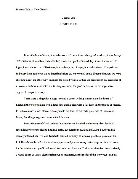
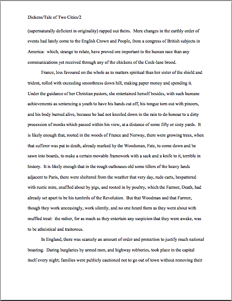
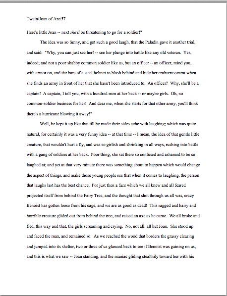
But you shall judge for yourself. To render the parallels to what Millicent sees on a daily basis more obvious, as well as to continue our exercises in learning to know properly-formatted manuscript pages when we see ‘em, I’m presenting that memorable scene here in standard format. As always, my blogging program is for some reasons best known to itself a trifle hostile to page shots, so if you are having trouble reading individual words, try holding down the COMMAND key and pressing + to enlarge the images.

Twain page 1

Twain page 2

Twain page 3

Come on, admit it — while you might have excused all of those ands if you had heard this tale told out loud, they’re a trifle eye-distracting on the page, are they not? Ditto with the word repetition — could this author possibly have crammed any more uses of to be, to get, or to see into these three pages? And don’t even get me started on concept repetition.

I sense those of you committed to the noble path of writing memoir — or writing reality-based fiction — shifting uncomfortably in your chairs. “But Anne,” you protest, averting your eyes, “this isn’t the powerful negative example you led us to expect. I get what you mean about the sheer volume of ands, but other than that, there’s nothing wrong with the narrative voice here, given that this is a memoir. Isn’t part of the point of any memoir that the voice does sound like someone might speak? Is that not, in fact, one of the charms of first-person narration in general?”

Well, yes, but just as an event’s having actually occurred in real life (and it’s true, too!) does not necessarily mean that it will inevitably strike the reader as plausible on the page, first-person narration’s reading like everyday speech does not guarantee readability. In print, narrative chattiness may work against the reader’s enjoyment, because chatty people, like the rest of us, reuse words and phrases so darned much. Even talented verbal anecdotalists seldom embellish their tales with the level of detail that the most threadbare of written accounts would require. And funny out loud, let’s face it, does not always equal funny on the page.

Which is to say: as delightful as our example above might have been tumbling out of the mouth of a gifted storyteller, as a story on a page, it’s lacking quite a few elements. A sense of place, for one — is there a reason, the reader must wonder, not to give us some sense of what either the woods or the village were like? If both are left so completely to the reader’s imagination, is there not some danger that a Millicent fresh from polishing off the manuscript before this one might automatically assume that those trees were mauve, and those villages occupied by the wan?

Oh, you thought I’d dropped that running joke? In a blog, I can get away with going back to that same well this often. How many times, though, do you think I could revisit the joke in a book before the reader got bored? Or Millicent became irritated?

While you’re pondering those troubling questions, let’s return to our example. How else does it fall short?

Well, as so often happens in memoir, we’re just told that the action is happening here or there, rather than shown what those places were like. And lest anyone be tempted to shout out that old writing truism, “But it’s stylish to leave something to the reader’s imagination!, let me ask you: based upon the pages above, could you tell me where these people are with enough specificity that a reader would be able to feel like she’s there?

“But that’s not fair!” I would not blame you for shouting indignantly. “It’s the writer’s job to establish a sense of place, not the reader’s job to guess.”

Precisely what Millicent would say. She would object, and rightly, to this scene’s providing her with too little description to enable her to picture Joan and her young friends operating within an environment. Nor are those friends fleshed out much, either in character or physical trait.

Heck, poor Millie doesn’t even get to see the frightening Benoist: instead, the memoirist merely asserts repeatedly that he and Joan were getting closer, without showing us what that have looked like to a bystander. Like, say, the narrator of the scene.

Speaking of the narrator, were you able to glean much of a sense of who he is as a person? How about what his relationship is to Joan? Are you even sure of their respective ages? Any idea what year it is? Heck, if you did not already know that the girl would grow up to be the patron saint of France — actually, one of four, but Joan of Arc is certainly the best known in this country — would anything but the children’s names tip you off about what part of the world these characters inhabit?

While I’m asking so many rhetorical questions in a row — another occupational hazard, I’m afraid; margins absorb them like a sponge does water — let me ask a more fundamental one: did you notice that although this excerpt is apparently about how the village’s children reacted to Joan, there’s practically no character development for her at all?

That’s at least marginally problematic, in a book entitled — wait for it — PERSONAL RECOLLECTIONS OF JOAN OF ARC. What, we are left to wonder, does she look like? Why doesn’t she stand up to her playmates (beyond, of course, the justification of being “so girlish and shrinking in all ways”) or, failing that, why doesn’t she simply walk away from the nasty little beasts?

And don’t stand there telling me that the narrator had no choice in the matter, because that’s how it really happened. Yes, a memoir or fact-based fictional story should be true, but it also has to be both interesting in the page and plausible. Reality, unfortunately, is not always plausible; it’s the writer’s job to make it so on the page.

Which begs another editorial question: why can’t a kid brave enough to face down the village madman’s axe (or ax, depending upon where it falls in this passage; the error is in the book in front of me), a rather interesting thing for a person to do, come up with more revealing answers to questions than a simple yes? This is another notorious editorial pet peeve: almost without exception, the least character-revealing way for anyone to answer a yes-or-no question is with — again, wait for it — a simple yes or no.

Are some of you writers of the real blanching now? “But Anne,” you gasp, clutching your ashen cheeks so heavily drained of blood, “people actually do answer questions that way! And isn’t the point of written dialogue to reproduce the feel of actual speech?”

Well, that’s one of the points of dialogue. Another is not to bore the reader to death, isn’t it? And, if at all possible, it should be entertaining.

Just holding a tape recorder up to nature tends not to be the surest means of hitting any of those excellent goals. Why? Chant it with me now: most everyday speech is repetitious.

I can stand here and keep saying that as long as necessary, people. Again and again and again.

As we may see in the scene above, a character that keeps saying nothing but “Yes” isn’t exactly thrilling the reader with deep insight into her thought processes. Or even into the scene itself: little Joan is not, after all, a hostile witness in a murder trial, but a child talking with her playmates. Wouldn’t it ultimately be more realistic, then, if she sounded like the latter?

Speaking of realism, would it be too much to ask the narrator to explain why the villagers left an axe lying anywhere near the madman’s cage in the first place? Might not the locals’ efforts have been more productively expended making sure he can’t get out than chopping off his fingers?

And yes, in response to what half of you just thought: this is precisely the kind of thing an editor would have gripped her pen angrily and inked into the margins of a manuscript. Not because she’s mean, but because she’s trying to help the writer give the reader a more enjoyable reader experience.

That’s a noble calling, too, you know. But in the unlikely event that some writer out there might care less about the moral beauty of Millicent and her ilk’s devotion to textual excellence than how to worm his way past it in order improve his submission’s chances of getting picked up by an agency, let me hasten to add that the sooner a writer learns to read his own manuscript the way a professional reader would, the easier he will find self-editing. Not to mention being able to catch the Millicent-irritants that can prompt a screener or contest judge to stop reading.

In the interest of helping you fine people develop that ability, let me ask you another question about today’s example: if you had previously known absolutely nothing about what the what the real-life Jeanne d’Arc achieved, wouldn’t you find it at least a trifle too pat that her playmates choose to picture her doing more or less what she grew up to do — and to laugh at her about it? If the girl had suggested this role herself, it might merely have been not-particularly-subtle foreshadowing, but honestly, can you think of any reason to include this at all except to make the reader feel cleverer than St. Joan’s playmates?

Millicent wouldn’t be able to think of one. Neither would most professional readers; it’s our job to deplore this sort of narrative ham-handedness.

“Just how ill-informed would a reader have to be not to find that first bit clumsy?” we mutter into our much-beloved coffee mugs. “Isn’t it safe to assume that anyone who would pick up a book about Joan of Arc would know that she lead an army and was burned at the stake, even if that reader knew nothing else about her? And if your garden-variety reader knows that much, isn’t it an insult to his intelligence to drop a giant sign reading Hey, dummy, this is foreshadowing?”

Was that mighty gust of wind that just whipped the cosmos the sound of half of the memoirists out there huffing with annoyance, or was it merely the first-person novelists sighing gustily? “But Anne,” both groups think loudly in unison, rather like the remarkably collective-minded children in the anecdote above, “this is how I was taught to write first-person narration. It’s supposed to sound exactly like a real person’s speech. So why shouldn’t St. Joan’s unnamed childhood buddy sound like anybody else telling anecdotes out loud?”

A couple of reasons, actually. Yes, good first-person narration takes into account the narrator’s individual speech patterns; no dialogue should sound like just anybody. Which is precisely the problem with all of those yeses, right? All by themselves, yes and no are generally presumed to mean the same thing, regardless of who is saying them. So, like polite spoken clich?s of the “Excuse me” and “I’m so sorry for your loss” ilk, they are too generic to convey personalized content.

Strong dialogue also typically reflects the narrator’s social status and education, personal prejudices, and what s/he could conceivably know in the situation at hand. And then there are those pesky individual quirks and, yes, the century in which s/he lived.

So I ask you, first-person writers: just how does the narrative voice in this passage indicate that this particular anecdote took place not too long after the Battle of Agincourt in 1415? As opposed to, say, the 1890s, when this account was first published?

And if you were tempted even for a nanosecond to mutter in response, “Well, if the 1980s is when readers would have been seeing this dialogue, sounding like that just would have seemed normal,” let me ask a follow-up question: if this scene were narrated in the voice of a pre-teen texting this to a friend today, would that make this scene ring truer to today’s readers? Or would it merely read as though the writer either hadn’t thought much about how Joan and her friends might have communicated with one another — or was presuming that today’s readers were not capable of following any type of dialogue than their own?

Those of us who read for a living have a term for that kind of assumption: insulting the reader’s intelligence. We often find ourselves scrawling it in margins.

How often, you ask, your faces a mask of pallid horror? Well, operating on the assumption that internal monologues have both always sounded pretty much like modern speech and don’t vary much from individual to individual is as common a mistake in first-person narratives as having all teenage characters sigh and roll their eyes is in YA submissions. Yes, some people do think and talk that way, but must everybody? Should Helen of Troy formulate her innermost thoughts in the same way as, say, Eleanor Roosevelt, Louisa May Alcott, or Confucius?

There’s a dinner party, eh? I’ll bring the stuffed grape leaves.

Doesn’t it make for more interesting narration if your narrator’s speech bears at least some marks of time? And if she has some individual quirks of thought and expression?

Besides, if we are going to be true to the rules of first-person narration, shouldn’t we be objecting to how often our narrator here professes to read the other children’s minds — although, notably, not Joan’s? I don’t know about you, but I find that most of the time, my thoughts are located in my own head, not floating somewhere in the middle of a group of bystanders. Millicent, too, tends to regard her own thoughts as separate from other people’s. The inevitable consequence: characters who think together tend to annoy her, unless their shared brains crop up within science fiction or fantasy context, where they can be plausible.

That cast a different light upon the narrative choice here, doesn’t it? As an editor might well scrawl in the margin, are we supposed to believe that our narrator in this instance is a mind-reader, or that the local children were too simple-minded to be able to form individual opinions about what is going on in front of them? Is the narrator just not familiar enough with the individual characters to be able to guess how their thoughts might have differed, or, (turn page over here) since he’s of a different social class than they are — not abundantly apparent in this scene, is it? — does his reporting that they all thought the same way a function of his views of their training in rational thinking? Or does it indicate the opposite, that he feels so close to them that he presumes that his beloved friends and he could only have thought and felt identically?

“Or, Mark,” the editor might conclude, “did you originally write this scene in the third person, with an omniscient narrator that could plausibly read everyone’s thoughts? If so, you can’t legitimately endow your first-person narrator with that ability. Pick a narrative perspective and stick to it!”

In fairness to Mark, as well as all of the blanching first-person narrative writers out there, plenty of writers actually were taught to write first-person narration this way — in short stories in their high school English classes. And with good faith, too: in short bursts, run-on sentences do indeed come across as ordinary speech-like. In the published examples of this type of narration that tend to turn up in class, it’s not all that unusual for the author’s voice and the first-person narrator’s voice to merge into colloquial harmony.

Or, to put it another way, Mark Twain tends to sound like Mark Twain, for instance, no matter whose perspective is dominating a particular story. That’s part of his branding as an author, right, his distinctive narrative voice and humorous worldview?

Admittedly, adopting a chatty voice makes quite a bit of sense for narrative voice in memoir. The reader is going to have to like how the narrator/protagonist talks about her life well enough to want to follow the story for a few hundred pages, after all; we might as well get friendly. Yet in practice, the primary danger of relying on the repetitive phrasing, clich?s, and percussive and use to achieve realistic-sounding narrative cadence is precisely that it will put off the reader because as the pages pass, it can become, at the risk of repeating myself, rather boring.

Think about it: even if a memoir were being told as a collection of verbal anecdotes, wouldn’t you rather listen to a storyteller with some individual flair for phrasing, instead of someone who just sounded like everyone else? No matter how inherently exciting a personal story is, a great telling can make it better reading. So can a narrative voice reflective of the time, place, and society in which that tale takes place.

But just try telling that to Mark Twain — who, as the sharper-eyed among you may already have noticed, wrote the scene above, in what he considered his best book. Although that retrospective assessment is a trifle hard to take seriously, in light of the fact that he published the book both under a pen name and in serial form. Actually, he took it to even one more remove: he wrote a preface under a nom de plume, presenting himself as the translator of a memoir written by one of young Joan’s contemporaries.

Why go to all that trouble? Because by all accounts, he felt that the poor sales of THE PRINCE AND THE PAUPER were largely attributable to his established audience’s expecting anything published under the name of Mark Twain to be a comedy. Good branding has its drawbacks for a creative artist.

Take that, purists who would like to believe that writing with an eye toward market concerns is a product of an increasingly cynical publishing industry over the last twenty or thirty years. Twain and his publisher worked out that tactic in the 1890s.

But I digress. As a reader, how well do you think his narrative choices worked here, either as fiction narration or as the memoir narration it originally professed to be? In your opinion as a writer, how do you feel about those slips into the first person plural — is the reader carried along with the we perspective as a narrative choice, as we were in Jeffrey Eugenides’ THE VIRGIN SUICIDES, or does it read like a perspective slip?

In today’s example, do you feel that the mostly distinctly modern narrative voice, coupled with the almost entirely uncritical view of Joan, was the best way to tell this tale? Reviewers in Twain’s time did not think so — they believed (and I must say I agreed with them back in junior high school) that a protagonist who never does anything wrong is a trifle on the dull side, as far as the reader is concerned. Twain’s Joan never sets a wee foot wrong; even in her earliest youth, he tells us, she raised her voice in anger only once, and even then it was to voice a patriotic thought.

A taciturnity unusual in a rabble-rouser, you must admit. Also an unusual characteristic for someone who challenged social norms enough for anyone to want to burn her at the stake: Twain’s narrator presents her as a quiet, universally beloved little girl. Butter, as folks used to say, would not melt in her mouth.

But is that how little girls with braids grow up to lead armies?

Twain evidently thought so. No matter how outside-the-box her observations or actions are shown to be (or, as we saw above, summarized to be), in this narrative, nothing she did or said from birth to the age of fourteen so much as ruffled the composure of the inhabitants of a querulous small village in wartime. Surprising, to say the least, in a young lady who by her own account had been engaging in frequent heart-to-heart chats with a couple of your more illustrious virgin martyrs since the age of twelve.

Perhaps the querulous small village where I spent my formative years was atypical, but I’m inclined to think that had I gone around snatching murder weapons from the clutches of local lunatics or holding confabs with deceased ancient Roman maidens, the locals might have had a thing or two to say about it. I’m also inclined to think that their observations would not have been entirely favorable, regardless of how winsome and girlish I might have been while disarming the maniac in question. It doesn’t strike me as the type of endeavor best undertaken in a party dress.

I’m not saying that Twain is necessarily factually incorrect about any of this; naturally, his best guess is as good as ours on a lot of these points. The little lady lived rather a long time ago, so the issue here is less historical accuracy than dramatic plausibility. Still, just because something really happened does not mean it will necessarily come across as plausible on the page; as agents like to say, it all depends on the writing.

As an editor, though, I think it was Uncle Mark’s job as a writer’s to make me believe his take on this. Presuming you agree with me — speak now or forever hold your peace — I ask you: was this narrative choice the best fit for the story he wanted to tell? And if not, should Millicent accept this manuscript?

Does the fact that a good third of you just began hyperventilating mean that it had not occurred to you that whether a story is not only well-written, but attacked from an appropriate narrative angle is a potential rejection trigger? It is, inevitably. Wouldn’t it have been nice if your last rejection letter had told you that, if Millicent or her boss thought that your first-person story would have worked better as a third-person narrative, or vice-versa?

Literary taste is, of course, to a very great extent individual, so only you can answer my question about Uncle Mark’s narrative choices to your own satisfaction. Am I correct in presuming, though, that you are at least a tiny bit curious about how an editor currently holding down the literary fort in the U.S. publishing world might respond to the choices he did make? Glad you asked. Let the scrawling begin!


What am I hoping you will take from this, you ask, eyes wide with horror and previously rosy cheeks drained of blood? Not merely that being a brilliant writer does not necessarily preclude turning out a clunker of a first draft from time to time — although that’s not a bad thing for aspiring writers to bear in mind. The popular conception of true literary talent’s consisting of letter-perfect creative phrasing dripping from one’s fingertips directly onto the page, with no further polishing necessary, each and every time, does not match up particularly well with reality. As any experienced editor could tell you, most of the books people regard as semi-miraculous productions of pure inspiration have actually been worked, reworked, and run past half a dozen critical readers.

And I mean critical readers. The kind who will remember what the author did in the same scene in each previous draft.

Remember that, please, the next time you’re struggling with a scene that just doesn’t seem to want to hit the page gracefully — or with much specificity. In moments like that, it can be very tempting to embrace the tack Twain did above, writing up the scene in summary form, with few vivid details, just to get the darned thing committed to paper as rapidly as humanly possible.

What makes me think that this was written quickly? Editorial instinct, mostly: I find it hard to believe that a humorist as gifted at reading out loud as I know Twain to have been would have killed the comedy — or bored the reader — with this much word repetition unless he was writing on a pretty tight deadline. Serialization tended to be submitted that way back then, you know, as Dickens would have been only too glad to tell you. Had Uncle Mark taken the time to revisit this scene and iron out its wrinkles, I don’t think there would have been quite so many references to eyes — and, frankly, I don’t think that he would have had his narrator faint at the climax of the scene. He was too good a storyteller.

But that choice certainly saved the author the trouble of having to figure out how the girl convinced the wild man to give up the axe, though, didn’t it? Trust me on this one: experienced editors — and Millicents — see this type of narrative shortcut often enough to recognize it for what it is.

So what should a savvy writer do when faced with this sort of first-draft dilemma? Go ahead, give in to temptation; there is value in getting a full scene on paper. Just make sure to set aside time later in the writing process to return to that scene and flesh it out.

Unless you would prefer to have your future editor bark at you, “This is lazy writing, Ambrose. Didn’t anybody ever tell you to show, don’t tell?”

Just in case nobody has yet snarled that in the general direction of your manuscript: show, don’t tell. Immerse your reader in sufficient details for her to be able to feel as though she is part of the scene, rather than leaving her to fill in the specifics for herself.

Oh, you don’t think that’s what Twain is doing here? Okay, rise from your chair, grab the nearest willing partner, and try to act out this interaction between young Joan and Benoist, based solely upon the choreography the narrator above chose to provide us:

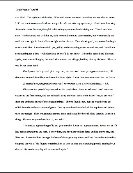
She stood up and faced the man, and remained so. As we reached the wood that borders the grassy clearing and jumped into its shelter, two or three of us glanced back to see if Benoist was gaining on us, and this is what we saw — Joan standing, and the maniac gliding stealthily toward her with his axe lifted. The sight was sickening. We stood where we were, trembling and not able to move. I did not want to see murder done, and yet I could not take my eyes away. Now I saw Joan step forward to meet the man, though I believed my eyes must be deceiving me. Then I saw him stop. He threatened her with his ax, as if to warn her not to come further, but went steadily on, until she was right in front of him — right under his axe. Then she stopped, and seemed to begin to talk with him. It made me sick, yes, giddy, and everything swam around me, and I could not see anything for a time — whether long or brief I do not know. When this passed and I looked again, Joan was walking by the man’s side toward the village, holding him by his hand. The axe was in her other hand.

Not much practical guidance for the actors there, eh? Other than all of that seeing (a word most writers tend to overuse in early drafts, incidentally), the actual movements mentioned here are pretty routine: one party standing still, the other moving toward her. The mover threatens, but we are not told how. Admittedly, a lifted axe doesn’t have to move much to seem threatening, but did you notice how pretty much all of the sense of danger is conveyed via the narrator’s dread, rather than through showing the reader vivid, terrifying specifics? And how virtually all of that dread is summarized, rather than shown in any detail?

From an editorial perspective, that lack of specificity distances the reader from what should have been a thrilling scene: by leaving us to fill in the details, the narrator abdicates his proper role here. It’s his job to make us feel that we were there, or at least to show us the scene engagingly enough that we have that illusion.

Yes, he grounds us in his experience by telling us repeatedly that he is seeing this or that, and that these sights made him feel sick (and ultimately pass out). But great heavens, man, if you’re going to narrate a story like this, isn’t it your job to at least ask a bystander what happened, so you could share that information with the reader?

Don’t tell me that once you’ve seen one axe-wielding madman, you’ve seen ‘em all. As both a reader and an editor, I want to know what this particular madman looked, sounded, moved, smelled, and felt like. I want to know precisely what our heroine did that gave Benoist pause; I want to be shown how he crept up on her stealthily while apparently walking straight into her line of vision. And gosh darn it, I want to know how an axe of 1415 differed from one I might buy at the corner hardware store today.

Without those details, and phrased in fairly ordinary terms, this excerpt is indeed like everyday speech, in the negative sense, despite the inherently exciting subject matter. Substitute a memo-wielding boss for the axe-bearing madman, and this could have been an anecdote overheard in a coffee house after work, couldn’t it?

Please don’t limit your answer to a simple yes or no. I was hoping to learn something about you.

Distancing the reader from the action in this manner is an unfortunately common tactic in memoirs and first-person fictional narratives alike. Instead of showing the reader what happened through a fully realized scene, the narrator simply summarizes; rather than demonstrating relationship dynamics through dialogue or action, the narrator just sums up what was said. And by describing subsequent actions in the same words or in hackneyed terms (I believed my eyes must be deceiving me? Really, Mark?), the action may move forward, but the reader’s understanding of what’s going on does not.

Joan stood; Benoist glided. Then Joan stood while Benoist glided. Then she stopped — odd as the narrative had not shown her going forward. Then the narrator conveniently blacks out so we cannot see what is going on. Then the problem is solved. The end.

A bit mauve, isn’t it? Well might you turn pale.

Seldom is this the most interesting way to convey a story, in my experience. Like having characters answer yes-or-no questions with yes or no, as opposed to more detailed (and thus more character-revealing) responses, the summary route closes off story possibilities. And by definition, repeated phrasing adds nothing new to the scene.

Neither, incidentally, do all of those thens: logically, they are unnecessary. Why? Well, in a story in which events are being presented in chronological order, the occurrences in Sentence 1 are presumed to have happened before those in Sentence 2, which in turn came before what’s described in Sentence 3.

Thens, then, as we have seen them used in that last example, are logically redundant; most editors would advise you to reserve them for moments when what happens next is genuinely unexpected. Take a gander:

Joan stood; Benoist glided toward her with an axe. Then the Wright Brothers and their sister, Katherine, swooped through an opening in the forest canopy in a motorized glider to snatch the weapon away.

Admit it — you didn’t see that last twist coming, did you? As a reader, didn’t you get a kick out of that?

Remember, there’s more to telling a story than simply listing its events in the order they occurred. Racing from its beginning to its end may not be the best way to engage the reader. You want the journey to be both memorable and enjoyable, right? And if the narrative can manage either to surprise the reader with an unanticipated turn of events, delight her with astonishing imagery, or intrigue her with beautiful phrasing — ideally, all three — all the better.

Before I release you to ponder the challenges of expanding a first-person narrative from the anecdotal level into a completely inhabited scene, I want to talk about another common faux pas: the further distancing effect of the narrative’s reminding us repeatedly that the narrator is seeing, hearing, or observing this or that. Obviously — at least from a professional reader’s perspective — if an action or object is depicted in a first-person narrative, the narrator perceived it; otherwise, she could not legitimately bring it up, right?

So when Twain’s narrator tells us repeatedly that he saw Joan do this or Benoist do that, it’s logically redundant. Of course, he saw it: he was standing right there. Why bother to remind the reader of that self-evident fact? Or, to put it as a garment-rending professional reader might, does the author think the reader is too brain-dead to remember who the narrator is and that he is present?

Oh, you don’t want the pros to take every word you commit to the page that seriously? But it’s how they show their respect for your eventual readers!

And for your literary gifts. Again: if it’s on the page and the writer appears to possess even the slightest vestige of talent, Millicent is going to assume that you put it there on purpose. She’s also going to believe, with good reason, that if a writer has set up rules for how the story is to be told — in this case, from the point of view of a childhood friend of Joan’s, and only from his perspective — the narrative will follow those rules consistently.

This, too, trips up quite a lot of memoirists and other first-person narrator-wranglers. Once a narrative is committed to a single perspective, it cannot report anything outside of it without shattering the illusion of a limited point of view. Thus, when the narrator slips into the first person plural, informing us that we saw this or thought that, it’s jarring to the reader’s sensibilities.

And when, like Twain’s narrator, he professes to know what we all are thinking…well, let’s just say that maybe Joan isn’t the only one who needs to be worrying about going on trial for dabbling in the supernatural. Unless the narrative establishes some means by which a first-person narrator could possibly have reliable insight into other characters’ thoughts and feelings, he should really stick to his own.

If his thoughts and feelings are somehow different from every Tom, Dick, and Benoist who might be hanging around in the same place at the same time, great. If he can manage to express them in language evocative, memorable, and tailored to his individual worldview, though, even better. And if he can work in a little character development, perhaps through revealing dialogue, terrific.

Which is not a bad definition of memoir voice, if you think about it: a narrator with a strong personality and specific worldview recounting situations of significance to an overall dramatic story arc in language and from a perspective unique to the teller. If every sentence of your memoir — and, to bring this back to our series-in-progress, every sentence of your query’s book description — does not rise to that level, you might want to think about revising it.

Millicent will thank you. So will your readers.

So Mark, darling, as much as I admire your writing in general and short stories in particular, if I were your editor — oh, you thought that editors don’t live in the hope that this type of activity would be the first, best use of a time machine? — I would insist that you sat down and revised these three pages. Actually, I would do it because I admire your writing: your narrative voice, even in this rather serious book, is better than what we’re seeing here.

And that axe you keep telling us you’re seeing, narrator? Try to think of it as your editor, chopping away all of that phrasing and conceptual redundancy. Trust your reader’s intelligence a bit more, please.

Do bear in mind, too, that while reality itself can be convoluted and devoid of point, readers have a right to expect a book based upon real events to be a good story possessed of an identifiable story arc. It should be dramatically satisfying. And if the real-life version is not, believe me, Millicent isn’t going to be inclined to take that as an excuse.

No need to go pale about this. You can do it. But in order to pull it off successfully, you’re going to have to be able to read your work not only like a writer, but also like a reader.

Oh, it feels good to be delving back into craft. Would anyone mind if I continued to keep standard format illustration on the back burner for a bit and made narrative voice my topic of the week?

Actually, that’s a rhetorical question, come to think of it. Keep up the good work!

It may be possible to see a world in a grain of sand and eternity in an hour, but that doesn’t mean a submitter should play fast and loose with the space-time continuum

green anemone

Happy Memorial Day weekend, U.S.-based readers! Since one of the many, many sacrifices those of us devoted to the difficult task of self-expression routinely make is to trade what other folks might do with their long weekends for gloriously uninterrupted hours of writing — or, better yet, revising! — I thought you might appreciate a glimpse of the world outside your writing studios. Now get back to work!

Actually, I have an ulterior motive for opening with that photo: as I’m certainly not going to be the first to point out, those of us who read manuscripts for a living are noted for looking not just at the big picture — is this an interesting story? Does it grab the reader from the get-go? And the question dear to writers everywhere, is it well-written? — but also at the granular level. It also probably won’t stop the presses to point out that the notoriously close reading any given manuscript has to survive in order to be seriously considered for publication tends to come as a great, big, or even nasty surprise to a lot of first-time submitters. And don’t even get me started on how many literary contest entrants seem to operate on the assumption that contest judges are specifically selected for their propensity to read with a charitable eye.

Does that giant gasp I just heard indicate that some of you fine people have been laboring under one or both of those impressions, or is somebody about to go for a nice, leisurely swim? If it’s the former, you’re definitely not alone: all too often, talented writers new to the game rush their manuscripts out the door the instant after they’ve typed the last page, presumably in the fond hope that all agents, editors, and contest judges are such lovers of literature that they will judge the book by nothing but how well it’s written. And possibly, to a lesser extent, by the inherent interest of the story.

Or so Millicent the agency screener must surmise from how many of those submissions apparently have not been spell-checked. Or grammar-checked. Or even read through since the last revision, because how else could the writer not have noticed that several words seem to have dropped out of that sentence on page 33?

Oh, stop groaning. Don’t you want your future agent and acquiring editor to fall so in love with your writing that they examine it from every angle, down to the last grain of sand?

Before I take that resounding, “Heavens, no!” for an unqualified yes, let me hasten to remind you that in the long run, it truly is better for your book if the agent of your dreams (and Millicent, the stalwart soul s/he has entrusted to narrowing the thousands of queries and hundreds of submissions a good agent receives to the handful that s/he would actually have time to read without sacrificing the book-selling side of the job entirely) pays attention to the little stuff. Why? Well, let me put it this way: if Millicent’s eye may legitimately be called nit-picky, a good acquiring editor’s peepers should be regarded as microscopic.

Oh, you thought it was easy to read closely enough to catch that the narrative has used the same image on page 12 and page 315? Or that the writer fell so in love with the word verdant that it appears every time that anything vaguely green flashes by the reader’s consciousness? In a book about lawn care?

So if this series’ focus upon the little visual details has occasionally seemed a trifle, well, obsessive, congratulations — you’re gaining real insight into what professional readers are trained to do. And think about it: if Millicent and her ilk must pay such close attention to the text, how likely are they to catch any formatting glitches?

Uh-huh. Hard to miss that sea anemone lying on the sand, isn’t it?

In order to give you a Millicent’s-eye view of your manuscript, for the past few posts in this series, we’ve been comparing manuscripts in standard format with improperly-formatted ones. Yes, it’s been a lengthy slog, but hands up, those of you who have never had the opportunity to see a manuscript that actually got picked up by an agent and published by a traditional house up close and personal.

See, I told you that you were not alone. Quite the forest of hands, isn’t it?

In my experience, most rookie submitter mistakes arise not merely from simple ignorance of the strictures of standard format, but from the low-level panic that comes from having to guess whether one is performing the secret handshake correctly. The better an aspiring writer understands the rules, the less guesswork is involved. It may not eliminate the stress of submission entirely, but it does at least remove one of the most common stressors from the mix.

Okay, so it’s not what the average would think of as a little light weekend recreational stress release. Were you under the impression that being a brilliantly incisive observer and chronicler of the human condition was ordinary?

Which is why I’m completely confident that you’re up to the challenge of thinking of your writing on several levels simultaneously. Particularly when, like the savvy submitter that you are, you are reading your ENTIRE manuscript IN HARD COPY and OUT LOUD before sending it to anyone even vaguely affiliated with a literary contest or the publishing industry. Lest we forget, it’s much, much easier to catch formatting issues, typos, and logic problems that way.

Do I sense that simmering resentment at how hard it is for a new writer to break into print beginning to bubble up to the surface? “But Anne!” I hear aspiring writers everywhere shout, and who could blame you? “I don’t have a problem with making my manuscript ship-shape on a writing level before passing it under Millicent’s critical spectacles. Granted, revision can be a trifle irritating, but what really irks me is that after I’ve done it, that lovingly worked and reworked prose could be knocked out of consideration because of some arbitrary expectations about how professional book manuscripts should look on the page. Isn’t that just an annoying additional hoop through which I’m expected to leap, and don’t I have every right to resent it?”

Well, not exactly, bubblers-up. As we’ve been discussing, the rules of standard format actually are not arbitrary; most of them have a strong practical basis that might not be readily apparent from the writer’s side of the submission desk. Let’s take, for instance, the relatively straightforward requirements that manuscripts should be entirely typed, double-spaced, and have 1-inch margins all the way around.

I hear some of you snickering, but Millicent regularly reads submissions that do not conform to standard format in one or even all of these respects. It’s not unheard-of for diagrams to be hand-drawn, pages hand-numbered, or for late-caught typos to be corrected in pen. Or for an e-mailed query to an agency that asks to see the first few pages to be single-spaced — because that’s the norm for an e-mail, right?

Let’s take a peek at why all of those rules necessary, from a professional point of view. For continuity’s sake, let’s once again call upon our old friend Charles Dickens again to see what a page of a manuscript should look like — actually, since we’ve been looking at so many first pages lately, let’s live dangerously, shall we? Here are pages 1 and two.

2 cities good
2 CIties right page 2

Relatively easy to read, isn’t it? (Assuming that you find it so, of course. If it’s too small to read easily on your browser, try holding down the COMMAND key and hitting + until the type is large enough to read comfortably.)

To give you some idea of just how difficult it would be to screen, much less hand-edit, a manuscript that was not double-spaced or had smaller margins, take a gander at this little monstrosity. To render it an even better example of what makes Millicent’s optician rend his garments in despair, I’ve gone ahead and submitted a fuzzy photocopy, rather than a freshly-printed original.

I believe the proper term for this is reader-hostile. Even an unusually patient and literature-loving Millicent would reject a submission like this immediately, without reading so much as a word. As would, more often than not, Mehitabel.

And honestly, can you blame them?

Did I hear a few spit-takes after that last set of assertions from those of you joining us in mid-argument? “My goodness, Anne,” sputter those of you wiping coffee, tea, or other beverage of your choice off your incredulous faces, “why would any sane person consider presentation violations that serious an offense? It is, after all, precisely the same writing. Sure, it’s a little harder to read, but if it’s an e-mailed submission, Millicent could just expand the image. And it’s not as though Millicent’s boss, the agent of Charles’ dreams, couldn’t just ask him to reformat it.”

Yes on both counts, but surely you can appreciate why the Charles who submitted that last page would strike anyone accustomed to handling manuscripts as a much, much more difficult writer to work with than the Charles behind our first set of examples. The latter displays a fairly significant disregard for not only the norms of standard format, but also the optical comfort of the reader. Not to mention just shouting, “Hey, I don’t expect any feedback on this, ever!”

Oh, you didn’t spot that? Anyone who handles manuscripts for a living would. Even with nice, empty page backs upon which to scrawl copy edits, trying to cram spelling or grammatical changes between those lines would be well-nigh impossible. Knowing that, Millicent would never dream of passing such a manuscript along to the agent who employs her; to do so would be to invite a stern and probably lengthy lecture on the vicissitudes of the life editorial — and that fact that, despite impressive innovations in technology, intensive line editing a single-spaced document in either hard or soft copy is well-nigh impossible.

Too hard on the eyes — and where on earth would the comments go on the hard copy?

Don’t tempt her to reject your submission unread — and don’t even consider, I beg of you, providing a similar temptation to a contest judge. Given the sheer volume of submissions Millicent reads, she’s not all that likely to resist. The contest judge, on the other hand, will be specifically instructed not to resist at all.

Yes, really. Even if the sum total of the provocation consists of a manuscript that’s shrunk to, say, 95% of the usual size, Mehitabel is likely to knock it out of the running on sight.

Are some of you are blushing? Perhaps some past contest entrants and submitters who wanted to squeeze in a particularly exciting scene before the end of those requested 50 pages?

No? Let me fill you in on a much-deplored practice, then: faced with a hard-and-fast page limit, some wily writers will shrink the font or the margins, to shoehorn a few more words onto each page. After all, the logic runs, who is going to notice a tenth of an inch sliced off a left or right margin, or notice that the typeface is a trifle smaller than usual?

Millicent will, that’s who, and practically instantly. As will any reasonably experienced contest judge; after hours on end of reading 12-point type within 1-inch margins, a reader develops a visceral sense of roughly how many characters fit on a properly-formatted page.

Don’t believe me? Go back and study the correctly formatted page 2 in our first example. Then take a gander at this wee gem of tricky intent:

2 Cities cheating page 2

Admit it: you can tell it’s different, can’t you, even without whipping out a ruler? Yet I shaved only one-tenth of an inch off each margin and shrunk the text by 5% — far, far less of a reduction than most fudgers attempt when, say, they’re trying to fit 26 pages of manuscript into a contest entry with a 25-page limit. So how likely is this little gambit to pay off for the submitter?

Exactly. Amazingly enough, people who read for a living very seldom appreciate attempts to trick them into extraneous reading. No matter how much Charles felt that last example added life to his opening — or how right he was about that — Millicent will simply notice that he tried to cheat in order to get more of his words in front of her eyeballs than writers conscientious enough to follow the rules. Next!

The same principle applies, incidentally, to query letters: Alarmingly often, aspiring writers, despairing of fitting a coherent summary of their books within the standard single page, will shrink the margins or typeface on a query. “What’s two tenths of an inch?” they reassure themselves. “And honestly, who is going to be able to tell the difference between 12-point type at 99%, rather than 100%?”

Help yourself to a gold star for the day if you immediately answered: “Someone who reads queries all day, every day. And two-tenths of an inch all around can, as Uncle Charles has just demonstrated, add up to a great deal more text on a page.”

Another common means of fudging spacing: incomplete adherence to the rules bout skipping spaces after periods and colons. Specifically, skipping two spaces (as tradition requires) in most instances, but omitting the second space when doing so would make the difference between a paragraph’s ending with a single word on the last line and being able to use that line to begin a new paragraph.

Shame on you, those who just bellowed, “Wow, that’s a great idea — over the course of an entire chapter, that might free up a page of text for my nefarious purposes!” Don’t you think inconsistent spacing is the kind of thing a reader trained to spot textual oddities might conceivably notice?

And for good reason: waffling about how often to hit the space bar can be a tell-tale sign that a writer isn’t altogether comfortable with writing in standard format. Such a writer’s work would, presumably, need to be proofread for formatting more closely than other agency clients’ work, would it not? And that in turn would mean that signing such a writer would inevitably means devoting either unanticipated staff time to double-checking his manuscripts or training in the delights of consistent rule application, right?

Those rhetorical questions would be equally applicable whether the agency in question happened to favor either the two-space or one-space convention, incidentally. Consistency is the key to proper manuscript formatting, after all, and all the more likely to be valued if an agency’s guidelines ask for something specific in a submission.

Why? Well, think about it: when you first thought about querying and submitting, would it have occurred to you to check each and every agency’s website (if it has one; not all do, even at this late date) for submission guidelines? So if you were the Millicent screening manuscripts for an agent with a desperate aversion to that second space after the comma (she had a nasty run-in with a journalist on a cross-country flight , perhaps; he may have menaced her with a copy of the AP’s formatting guidelines), and your boss had been considerate enough to post a reference to that aversion on the agency’s website, on her blog, and in 47 online interviews, wouldn’t that be one of the first things you looked for in a submission?

Let’s all chant it together, shall we? If an agency or publishing house’s submission guidelines ask for something specific, for heaven’s sake, give it to them. But don’t generalize that individual preferences to the entire industry, okay? And if they don’t express a preference, stick to standard format.

Yes, regardless of what you may have heard online about how nobody is using double-spacing after periods and colons in book manuscripts anymore. It’s simply not true that it’s generally an instant-rejection offense, on the grounds that manuscripts including the second space look hopelessly old-fashioned to agents and editors.

Well, guess what, cookie — standard manuscript format is old-fashioned, by definition. That doesn’t seem to stop most of the currently-published authors of the English-speaking world from using it. In fact, in all of my years writing and editing, I have never — not once — seen an already agented manuscript rejected or even criticized for including the two spaces that English prose requires after a period or colon. Possibly because those that feel strongly about the single-space convention tend to be up front about not being likely to fall in love with submissions featuring what they perceive to be extra spaces.

I have, however, heard endless complaint from professional readers about those second spaces being omitted. Care to guess why?

If you said that cutting those spaces throws off word count estimation, clap yourself heartily on the back: standard estimates assume those doubled spaces. (If you don’t know how and why word count is tallied, please see the HOW TO ESTIMATE WORD COUNT — AND WHY category on the archive list at right.) Give yourself a nice, warm hug if you also suggested that omitting them renders a manuscript harder to hand-edit. Because we all know about the lecture Millicent is likely to get if she forgets about that, right?

I can sense blood pressure rising over this issue, but honestly, inconsistent application of either rule is far more likely to raise red flags with Millicent than clinging like an unusually tenacious leech to either the one- or two-space convention. Particularly if that inconsistency — or slightly off sizing — seems to allow more words per page than is usual.

My point, should you care to know it, is that a pro isn’t going to have to look very hard at a space-deprived page to catch on that there’s something fishy going on, so let’s work a bit more to increase your visceral sense that something is wrong. Since Dickens was so fond of half-page sentences, the examples I’ve been using above won’t illustrate my next common gaffe very well.

Reaching blindly into the depths of the bookshelf next to my computer, I seem to have grabbed Elizabeth Von Arnim’s wonderful take on the Bluebeard myth, VERA. Taking a page at random, let’s take a look at it properly formatted in manuscript form.

Vera correctly

There are 310 words on this page; I wasn’t kidding the other day about how far off the standard word count estimations could be. Now cast your eye over the same text with a couple of very minor formatting alterations.

Doesn’t look significantly different to the naked eye, does it? Yet the word count is slightly lower on this version of this page — 295 words. That may not seem like a big difference, but it’s enough to make quite a difference over the course of an entire manuscript.

“But Anne,” I hear some sharp-eyed readers exclaim, “wasn’t the word count lower because there was an entire line missing from the second version?”?

Well spotted, criers-out: the natural tendency of omitting the second spaces would indeed be to allow more words per page, not less. But the scanter space between sentences was not the only deviation from standard format here; Millicent, I assure you, would have caught two others.

I tossed a curve ball in here, to make sure you were reading as closely as she was. Wild guesses? Anyone? Anyone?

The error that chopped the word count was a pretty innocent one, almost always done unconsciously: the writer apparently did not turn off the widow/orphan control, found in Word under FORMAT/PARAGRAPH/LINE AND PAGE BREAKS. As we were discussing only the other day, this insidious little function, the default unless one changes it, prevents single lines of multi-line paragraphs from getting stranded on either the bottom of one page of the top of the next.

As you may see, keeping this function operational results in an uneven number of lines per page. Which, over the course of an entire manuscript, is going to do some serious damage to the word count.

As would tinkering with the bottom margin to allow an extra line on the page. Here it is with only a minor change, a .9 inch bottom margin instead of 1 inch, a modification so minute that a non-professional reader would probably not notice that it was non-standard. To compress a bit more, let’s have only one space after each period.

Vera with extra line

A bit claustrophobic, is it not? If you don’t find it so, consider it as Millicent would: not as an individual page, isolated in space and time, but as one of the several thousand she has read that week. Lest we forget, most of the ones she will have been taking seriously will have looked like this:

Vera correctly

See it now? While Millicent is highly unlikely to have either the time or the inclination to whip out a ruler to check whether that bottom margin is really a full inch (although Mehitabel might), she will be able to tell that this page has more words on the page than the others she has seen that day. She might not be able to tell instantly precisely how this page has been modified, but she will be able to tell that something’s off.

“But Anne,” clever rule-manipulators all over North America shout, “I’ve been modifying my submissions this way for years, and nobody has ever called me out on it. Therefore, I do not believe it’s ever been a factor in my work being rejected — and it does allow me to stay under that all-important 400-page limit.”

Perhaps, rules-lawyers, but let me ask you a question: have you ever had such a manuscript accepted?

Well might some jaws drop. It’s an extremely common submitter’s misconception, especially amongst those brand-new to the game or who have only submitted pages as part of a query packet, rather than as requested materials, that if they were really doing something wrong, the rejecter would tell them so. And tell them what it is, naturally, so they could do better next time.

In these days of form-letter rejections — and even no-reply rejections — this is simply an unrealistic expectation. Unless an agent or editor is asking for the writer to revise and resubmit the manuscript (in itself something of a rarity these days), why would they take the time?

Well, yes, to be nice would be a perfectly acceptable response, from a writer’s perspective. If a well-established agent received only a hundred queries per month and asked for one manuscript — not all that uncommon a ratio thirty years ago — writing personalized rejections would be both kind and not unduly time-consuming. Presuming, of course, that the rejected writer of the month did not consider a detailed rejection an invitation to argue about the manuscripts merits.

Consider for a moment, though, the agent that receives hundreds of queries per day. See why kindly advice-giving rejection letters might have become something of a rarity?

Especially if the rejection reason had to do with a formatting error. Honestly, it would eat up half of Millicent’s screening day. Why? Well, most submissions contain at least one — formatting problems, like typos, grammar gaffes, and wolves, tend to travel in packs. Even with the best of wills, it would be prohibitively time-consuming for Millicent to scrawl try learning how to format a manuscript, honey.

No, regardless of whether the ultimate rejection trigger for VERA was that extra line per page, the second misspelling in paragraph 2, or a premise that Millicent has seen seventeen times that week, the reasons given for sending back the submission would probably run like this: I’m sorry, but this manuscript does not fit our needs at this time. I just didn’t fall in love with this story, and I don’t feel that I can sell this in the current tough market. Best of luck placing it elsewhere.

The moral of this sad, sad story: it seldom pays to assume that you’re doing it right just because you haven’t been told you are doing it wrong. It pays even less often to conclude from the generalities of a boilerplate rejection that there can’t have been any specific technical problem that caused Millicent, if not to reject it outright, then at least to take the submission less seriously.

Besides, another notorious agents’ pet peeve was lurking in the background — although in all probability, it would have irritated a contest judge far more than Millicent. Here’s the page again; see if you can spot it this time. Hint: it was not in the properly-formatted version.

Crown yourself with a laurel wreath if, while running your eyes thoughtfully over that last example, your peepers became riveted to the next-to-last line of the page: an emdash (–, one long line) instead of a doubled dash with spaces on either end. Here again, we see that the standards that apply to printed books are not applicable to manuscripts.

Which brings me to yet another moral for the day: just because a particular piece of formatting looks right to those of us who have been reading books since we were three doesn’t mean that it is correct in a manuscript. Or book proposal. Or contest entry.

Or a professional reader wouldn’t instantly spot a trifle imported from the wonderful world of published books. Remember, Millicent scans manuscripts all day; contest judges read entries for hours at a time. After a surprisingly short while, a formatting issue that might well not even catch a lay reader’s attention can begin to seem gargantuan.

Please don’t dismiss this as unimportant to your success as a writer. If writing is solid, it deserves to be free of distracting formatting choices. You want agents, editors, and contest judges to be muttering, “Wow, this is good,” over your manuscript, not “Oh, God, he doesn’t know the rules about dashes,” do you not?

Spare Millie the chagrin, please; both you and she will be the happier for it. Believe me, she could use a brilliantly-written, impeccably-formatted submission to brighten her possibly Dickensian day. Be compassionate toward her plight — and your submission’s, proposal’s, and/or contest entry’s. Pay close enough attention to the technical details that yours the submission that makes her say, “Oh, here is good writing, well presented.”

My, all of those individual grains of sand are attractive, aren’t they? Keep up the good work!

It’s all a matter of perspective, or, let’s move the piano over here. Wait — how would it look over there? And other tales of title page formatting.

sagrada familia ceiling3

If you’ve been hearing the Muses tap-dancing on the floor of heaven today, I think I know why: at long last, Author! Author!’s epic behind-the-scenes site upgrade has officially drawn to a close. It’s still going to take me a while to go back through the literally thousands of pages of archival posts, making sure that they’re taking kindly to all of the new bells and whistles, but in theory, the bulk of my blogging time will no longer be sacrificed on the altar of the Internet Deity.

Who, I gather, does not hobnob much with the Muses. If s/he did — hey, who am I to impose gender norms on higher beings? — all of the formerly fuzzy page shots would have magically clarified themselves in the course of this upgrade. Please bear with me while I painstakingly go back and refocus ‘em.

In the meantime, let’s get back to the matter at hand: the proper formatting of book manuscripts. As Odysseus no doubt said to his sailors and soldiers on the way home from the Trojan War, I know that it feels as though we’ve been on this journey forever, but it can’t be much farther now.

But hark! Do I hear some discontented murmuring amongst aesthetes out there in the ether? “But Anne,” visually-oriented aspiring writers murmur under their breath, so as not to attract the wrath of their nemesis, Millicent the agency screener, “my objection is not so much to the sheer length of time we’ve spent going over the strictures of standard format for book manuscripts — not to be confused with the formatting norms for short stories, magazine articles, screenplays, or any other kind of writing intended for professional submission — but to what I feel these rules are doing to my personal style. The pages look so plain! These rules are stepping all over my right to creative expression.

“So I’m asking you as a friend, Anne: if I believe my writing looks best in a special font like Abadi MT Condensed Extra Bold, and it’s how I want my words to look in the published book, why shouldn’t I run with it in a submission? Surely, Millicent can look past a little originality of presentation while she is seeking originality in writing.”

That’s a good question, murmuring aesthetes. The short answer: because Millicent will take your writing more seriously if you format it as she expects to see it — that is, the way that professional book manuscripts are formatted.

And why might she respond better to that than a more creatively-presented set of pages, murmurers? Is it time to trot out the broken record again?

broken-record3 A manuscript should not resemble a published book in many important respects. Therefore, formatting a submission to reflect one’s publication preferences on matters like font (which is the publishing house’s decision, anyway, not the author’s) will not strike the pros as a creative choice, but a reflection of a misunderstanding of how publishing works — and an indication that the writer has not yet taken the time to learn the rules of submission.

What’s that you’re murmuring now? That this is a pretty sweeping set of conclusions to draw from something as simple as font choice or a title page graced with a photograph? Perhaps, but to someone who deals with manuscripts and/or book proposals all day, every day, for years on end, it’s not all that far-fetched. After all, it’s not as though Millicent’s boss, the agent of your dreams, would ever consider submitting your manuscript to an editor at a publishing house in anything but standard format; it wouldn’t be taken seriously.

An editor would be too busy staring at that remarkable font choice or non-standard indentation to pay close attention to what’s dearest to any writer’s heart, the actual writing. So in practice, discontented murmurers, presenting your original writing in standard format is more conducive to getting your creative expression into print, not less.

Counterintuitive, isn’t it? That’s because you’ve been looking at the page like a writer, rather than an agent, editor, contest judge, or the Millicent lucky enough to screen submissions for any of the above. It’s all a matter of perspective. As international relations professors like to say early and often, where you stand depends upon where you sit.

Don’t see why perception of writing talent, like beauty, might lie partially in the eye of the beholder? Okay, tell me: did I take the photograph gracing the top of this post while looking down into an abyss, sideways into an alcove, or up at an impossibly high ceiling?

Out of context, it’s hard to tell which way is up, isn’t it? (But here’s a hint: the purple stuff is flying dust.) Without some orienting landmarks, it’s difficult even to know for sure what you’re looking at, or from what direction.

That’s more or less the same problem the average aspiring writer faces when looking at her own first manuscript or book proposal with an eye to figuring out whether it is formatted correctly. Let’s face it, very, very few as-yet-to-be-published writers have ever seen a professional manuscript up close and personal; still fewer have had the opportunity to glance through a professional book proposal.

Oh, there’s plenty of advice out there on how it should be done, of course, but as many of you have no doubt noted with chagrin, sources differ. And surprisingly often, the sources most inclined to tell aspiring writers that they have no hope in Hades of landing an agent if their manuscripts don’t contain Feature X (because Millicents have, presumably, been trained to reject X-less manuscripts on sight, then rush to a national blackballing database, to urge every other agency in the country not even to open that writer’s queries) or if they do contain Feature Y (because not only is Y hopelessly old-fashioned, but spotting even a single instance of it will provoke gales of laughter from Millicent) do not pause in their warning spates long enough to explain why X is desirable in a submission or Y is not.

Heck, most sets of rules don’t even specify to which kind of manuscript they’re supposed to be applied. No wonder so many aspiring writers labor under the false impression that all writing, anywhere, anytime, should be formatted identically, upon pain of instant rejection. Or, like our murmurers above, just assume that the welter of conflicting guidelines must indicate that Millicent is serious about only the elements common to most sets of rules. Like our murmurers above, they presume that as long as a manuscript is double-spaced and in 12-point type, anything goes.

As you may perhaps have gathered from my many years of revisiting this topic, I have nothing but sympathy for writers at both ends of the spectrum. How on earth is someone new to the game supposed to figure out which end of the manuscript is up, figuratively speaking?

The trick lies in remembering that the principles governing manuscript formatting are based upon practical and historical considerations, not purely aesthetic ones. Shall we wind up that Victrola again?

broken-recordA manuscript is designed to be easy for the intended audience to read, not for the writer to produce. Thus, while two-inch margins and a cursive typeface may strike a writer as the perfect expressive extension of the spirit of his novel, to someone who reads manuscripts for a living, they’re just puzzling. And, frankly, distracting from the writing.

What looks right in a manuscript, in other words, depends upon the perspective of the person reading it. From where Millicent is sitting, non-standard formatting makes it harder for her to pay attention to the writing. Obviously, she reasons, a writer who presents his work in 14-point type or with half-inch margins, is either unaware that these choices are eye-distracting. So rather than impressing her with his creativity, he simply seems out of touch with how publishing works.

And why might Millicent’s drawing that conclusion from her first glance at page 1 prove problematic for the submission, campers? Out comes the broken record:

broken-record4 Because professional manuscripts and book proposals are always present in the same way, Millicent knows that her boss, the agent of your dreams, would have a hard time convincing an editor at a major publishing house to read even the first page of an unprofessionally-formatted manuscript. She also knows that taking on a manuscript by a writer unaware of that will be more time-consuming to represent than one already familiar with how submissions to publishers work.

That means, unfortunately for lovers of wacky typefaces everywhere, that a choice as small as a typeface can make an astonishingly great difference to how professional your work looks to the pros. That comes as something of a surprise to most aspiring writers — who, not entirely surprisingly, tend to regard that particular decision as a purely aesthetic one. “Why,” they ask, and not unreasonably, “should it matter? Good writing’s good writing, isn’t it?”

Well, yes and no. Yes, good writing is a thing of beauty and a joy forever. No, insofar as good writing tends to have less impact on the average Millicent when it’s presented in an unusual typeface.

To see why, let’s once again start at the top of the submission packet, taking a gander at the same title page in three different typefaces. Here it is in 12-point Times New Roman, one of the two preferred typefaces:

Title page 1

That’s what anyone sitting in Millicent’s seat would expect to see — and before we move on, would you join me in tap-dancing with the Muses over how much crisper that image is than any of the page shots I’ve been able to post within recent memory? Nearly brings a tear to the eye, that does. Should your emotional intensity be interfering with your ability to spot the small details, try holding down the Command key and pressing + to enlarge the image.

Now that we have it in focus, let’s look at precisely the same information, presented in another font. Let’s assuming that Aunt Jane had favored 12-point Helvetica so strongly that she just couldn’t resist submitting in it:

Title page 2

The letters in this version are quite a bit bigger than in the first, aren’t they? Not enough so to appear to be rendered in, say, 14-point font, but large enough to make Millicent wonder whether the word count is accurate. (Estimated word count does, after all, vary by typeface: Times New Roman is estimated at 250 words/page, Courier at 200. More on that below.)

Honestly, do you want her speculating about your credibility before reading the first page of your manuscript? Now that we have seated ourselves firmly in Millicent’s office chair, we can see that Aunt Jane’s choice of Helvetica, while not a deal-breaker, does not necessarily present her manuscript to its best advantage. Even before the text starts, it’s distracting.

Does that increased volume of disgruntled ethereal muttering mean some of you are longing to see a typeface that would be a deal-breaker for Millicent? Happy to oblige. Very few of us who read for a living would be even vaguely tempted to turn the page and start reading this one.

Title page 3

Can’t really blame Millicent for regarding the entire manuscript with a jaundiced eye, can we? Despite containing all of the information that a title page should include — in the right places and in the right order, no less — this page simply screams that Aunt Jane has not thought about her future agent’s ease or comfort in reading. Clearly, she was so intent upon expressing herself via font that she neglected to consider the preferences of someone who might conceivably want to judge her writing.

Still resisting the concept? Okay, slip back into Millicent’s moccasins for a second, pretend you’ve been screening submissions for the last seven hours, and feast your eyes on this:

Title page 4

Ah, that one caught some of you originality-huggers by surprise, didn’t it? “But Anne,” those who want to stand out from the crowd protest, “I’ve been submitting my writing on slightly tinted paper for years. White is just so boring, and besides, everybody uses it. I’m merely being strategic: if every other submission Millie sees today is white, mine will automatically catch her eye, right?”

Well, yes, but not for the right reasons — and not in a manner even remotely likely to convince her that this submission, out of the hundreds she will be perusing this week, is the one that will wow her boss. Yes, regardless of how good the writing might be.

Why? Look for yourself: could the agent possibly submit this manuscript to a publishing house in this typeface and on this oddly-colored paper? Would it stand a fighting chance if she did?

And if it doesn’t, does presenting the manuscript in this manner make sense at any stage of submission?

The answers to all three of those questions is a resounding “By Jove, no!” And that’s sad, considering that the book this title page covers is, lest we forget, SENSE AND SENSIBILITY. The moral, should you care to know it:

broken-record7Even the best writing can be placed at a competitive disadvantage by unprofessional presentation. Standard format is the good writer’s friend, not her enemy.

Is all of that ambient clanking is a thousand writers’ hackles being raised? “But Anne,” outraged voices thunder, “aren’t you making Millicent out to be pretty darned shallow? Whenever I’ve heard agents and editors asked at conferences or on their blogs about whether cosmetic issues can get a manuscript rejected, they often disclaim the notion with scorn. I’ve even heard a few of them say that they don’t care about issues like typeface, spaces after periods and colons, or where the chapter title lies — and that strikes me as significant, as I’ve never, ever heard one say it was okay to let a query letter run longer than a single page. Isn’t it the writing all that matters in a submission, ultimately?”?

Again, yes and no, hackle-raisers. Yes, the writing matters — and no, it’s not all that matters.

Naturally, the writing matters most in a submission, with freshness, audience-appropriateness, marketability, and fit with the agent or editor reading it jostling for second place. Equally naturally, and something that I often point out, individual agents, editors, and even contest judges harbor individual preferences as well and have been known to express them at conferences. Or on their blogs, Twitter feeds, and over drinks at that bar that’s never more than a hundred yards from any literary conference in North America.

One person’s pet peeve, however, may not be another’s. Since few aspiring writers have access to the industry-specific information required to find out the preferences of every agent to whom they are submitting, adhering to standard format minimizes the probability of running afoul of unknown annoyance-triggers.

Then, too, adopting the norms of standard format and clinging to them like an unusually tenacious leech will also help you preserve your sanity throughout the often-protracted submission process, for the reason I mentioned in passing above — have you seen how many conflicting sets of ostensibly authoritative manuscript formatting rules are floating around out there?

Honestly, trying to apply every single one of the expressed opinions to your manuscript will drive you 100% nuts. Don’t even try. However, because personal (and genre) preferences do exist, it’s always worth a submitter’s time to double-check an agency or small publishing house’s submission guidelines, just in case they call for something wacky. That’s worth throwing another record on the machine, surely.

broken-record2If an agent or editor to whom you are submitting asks for something different, for heaven’s sake, give it to her. If, as is almost always the case, the guidelines don’t specify, keep the presentation unprovocative and professional so that your writing may shine without visual competition.

In other words, it’s only prudent to adhere to the strictures of standard format, rather than assuming, as so many aspiring writers do to their cost, that the writing is the only thing that matters.

Remember, where you stand depends on where you sit. It’s a matter of perspective. And from both Millicent and the aspiring writer’s perspective, taking the time to present writing professionally is genuinely worth it.

Admittedly, one does hear of the mythical isolated case of a kind, literature-loving agent has looked past bizarre formatting in order to see a potential client’s, well, potential. One also hears of isolated cases where a manuscript rife with spelling and grammatical errors gets picked up, or one that has relatively little chance of selling well in the current market being recognized for the work of genius it is and swept to bestsellerdom. The age of miracles has not entirely passed, apparently.

Have you ever noticed, though, how seldom a specific book title comes attached to those stories? Or, when they do, it turns out on closer examination that the writer in question roomed in college with a major agent, or is married to a senior editor at a large publishing house, or used to be a Monkee? If one happens to fall into such a category, one might well encounter an unusual leniency. Ditto if one happens already to be a household name.

Before anyone raises his hand, though, we’ve all heard offbeat How I Got Discovered Stories at conferences. But — and this is a BIG but — these cases get talked about because they are exceptions, and rare ones at that. (They also tend to have happened before the mid-1980s; agents used to take chances on long shots more often.) 9,999 times out of 10,000, though, a submission’s tumbling into any of the pitfalls we’ve been discussing will result in, if not instantaneous rejection, then rejection upon Millicent’s lighting upon the next problem in the manuscript.

Those pesky hackles are clacking again, aren’t they? “Okay,” the hackled concede, “I can understand how Millicent would be tempted to skip reading submissions presented like the last two examples, where she’s likely to strain her eyes. But if presentation is so darned important, why don’t aspiring writers hear about it more often at conferences, in articles about submission, or even just in discussions amongst ourselves?”

Excellent question, h-raisers. I can’t say for sure, of course, but it wouldn’t be going out too far on an interpretive limb to speculate that a sane, sensible individual with a reputation to protect might be slightly reluctant to stand up in front of 500 eager potential submitters and say, “Look, if you’re planning to submit a grimy photocopy of your book, or insist upon presenting it in 10-point type, or not indenting your paragraphs, just don’t bother to query me, okay?” Having once seen a well-meaning agent tell an indignant crowd that he only took query letters seriously if they came from writers he met at conferences (yes, really; there were many, many witnesses), I can tell you precisely what would happen if some honest soul did take this astounding step: instantly, 500 pens would scrawl on 500 programs, DO NOT QUERY THIS ONE; HE’S MEAN.

Which would rather defeat the agent’s purpose in coming to the conference to recruit new clients, would it not?

As a veteran teaches of writing and formatting classes, I can think of another reason that a speaker might want to be careful about such pronouncements: an agent or editor doesn’t have to speak at many conferences (or blog for very long) before recognizing that anything she says about submissions is likely to be repeated with the ?clat of a proverb, to borrow a phrase from Aunt Jane, for years to come amongst the writing community.

You might be surprised how often it happens. I’ve heard offhand comments made from the dais, or even jokes, being debated for hours in conference hallways, particularly if those comments happen to relate to the cosmetic aspects of querying and submission. 5-4 Supreme Court decisions are routinely discussed with less vim and vitriol. Some particularly vehement agents’ pronouncements have been more commented upon than St. Paul’s second letter to the Corinthians.

Okay, so that last is a slight exaggeration. My point, should you be interested, is that the very notion of from-the-horse’s-mouth rightness carries such a luster that such speakers are constantly in extreme danger of having everything they say quoted back to them as an inflexible rule.

Which is why, I must admit, I occasionally experience qualms about presenting the rules of standard format here at all. On the pro-regulation side, we are talking, after all, about an industry that both values creativity and considers submitting a book proposal in anything but a black folder dangerously radical. (Yes, really.) On the con side, literally nothing else I talk about here consistently raises as much writerly ire.

The very topic of manuscript presentation seems to be emotionally trying for a lot of writers — disproportionately so, from where Millicent is sitting. Tell an aspiring writer that his dialogue is turgid, or his pacing drags, or he’s left a necessary section out of his book proposal, and most of the time, he’ll be at least curious about why you think so. (If a bit defensive.) If you tell him that his protagonist’s sister is Ruth for the first 72 pages, and Ren?e thereafter, he might actually thank you.

Yet suggest to the same writer that he might be better off reformatting his manuscript to include such niceties as paragraph indentation or moving his page number to the slug line, and a good quarter of the time, he’ll look at you as though you’d just kicked his grandmother. Thrice.

Go figure, eh?

Presentation issues definitely do matter. Which is, again, not to say that the quality of the writing doesn’t. But — and again, this is a BIG but — as we’ve discussed, rejection decisions are more often than not made on page 1 of a submission. Sometimes even within the course of the first paragraph. If a manuscript is hard to read due to a funky typeface or odd spacing or just plain poor print quality, Millicent may just pass on reading it at all.

While these phenomena are, in fact, quite widely recognized as true, the person who announced them this baldly from the dais at a literary conference would swiftly find herself covered head to foot with flung tomatoes in twenty seconds flat. Metaphorically, at least. Which is why I’m going to keep saying it until I’m blue in the face and you die of boredom:

broken-record-150x150From the perspective of someone who reads manuscripts for a living, professional formatting is simply the least distracting way a book can possibly be presented. Adhering to the industry’s cosmetic expectations renders it more likely that an agent or editor will concentrate upon the beauty of the writing, not less.

They can’t fall in love with your good writing until they read it, can they? So don’t you want to do everything within your power to convince them that your manuscript is the one that deserves more than a cursory glance?

Of course you do. Instead of thinking of the rigors of standard format as a series of unimportant (or even silly) superficial choices, try regarding them as translating your calling card, a means of catching Millicent’s tired eye and informing her that this is a manuscript that should be taken seriously.

“Okay, Anne,” lovers of Bauhaus 93 sigh. “What fonts would be the least, you know, Millicent-provoking for me to use?”

I would highly recommend using either Times, Times New Roman, or Courier, both on the title page and in the manuscript. These are the standards of the industry, and thus the least likely to raise Millicent’s ever-knitted eyebrows. Like other strictures of standard format, there’s a pretty good reason for this one: from where she is sitting, word count estimation is always predicated upon one of these typefaces.

Why is the question of estimating relevant on a title page? Again, we must look to Millicent’s perspective: unlike word counts in articles or short stories, word counts in book manuscripts are generally estimated, not based upon the actual number of words. For short stories and articles, use the actual total.

Was that giant gust of wind that just knocked my desk over your collective gasp of astonishment? I’m not entirely surprised; a lot of aspiring writers are confused on this point. “But Anne,” they shout, and who can blame them? “My Word program will simply tell me how many words there are in the document. Since it’s so easy to be entirely accurate, why shouldn’t I be as specific as possible? Or, to put it another way, why would an agent or editor ask for the word count, then expect me to guess?”

Would you fling something at me if I said once again that this is a matter of perspective? From Millicent’s seat, the answer is pretty obvious: industry practices dictate how manuscripts are handled, not the whims of the fine folks at Microsoft. The Microsofties I know are sterling human beings to a man, but they’re hardly experts on the publishing industry’s requirements.

And really, why should they be? Contrary to popular opinion amongst aspiring writers, just because Word is set up to allow certain things — giving you an exact word count, for instance, or access to 147 different fonts — doesn’t mean that the publishing industry wants writers to do things that way. (And if you doubt that, consider the doubled dash vs. the automatic emdash Word favors.) Word processing programs came into use long, long after standard format for manuscripts, after all; why should agents, editors, and Millicents allow computer programmers to dictate what strikes them as professional?

Perspective, people: which makes more sense, assuming that the word count on your title page will be read by Millicent — or Bill Gates?

I cannot, naturally, speak to Mssr. Gates’ views on the subject, but here is why Millicent would care on the estimation front. The Times family is estimated at 250 words/page; Courier at 200. So a 400-page manuscript in Times New Roman is estimated to be roughly 100,000 words if it’s in Times — something Millicent should be able to tell as soon as she claps eyes on the submission’s title page, right? — and 80,000 if it’s in Courier.

Wondering why anyone would estimate at all? Since word length vary, and because manuscripts shrink around 2/3rds in the transition to published book, the number of pages is actually a better measure of how much it will cost to print and bound the thing. So if your title page says that your baby is 86,250 words and it’s in Times New Roman, a pro will just assume that it’s 345 pages (345 x 250= 86,250) rather than flipping to the bottom of the stack of papers to check. If it’s in Courier, she would conclude that it is 431 pages — and that your math skills are not particularly good.

Now, in the world as we know it, a 400-page manuscript in TNR is usually closer to 115,000 words than 100,000; as any writer who has compared the estimated word count for her book with the total her word processing program so kindly provides, they tend to differ wildly. But word count, like beauty, is in the eye of the beholder: a novelist whose title page reported, accurately, that her 400-page novel was 115,000 words might well see it rejected out of hand on the grounds that it was too long.

Why? Well, math may not have been Millicent’s best subject, either (as one might expect, the inmates of agencies tend overwhelmingly to have been English majors), but she can do third-grade multiplication in her head: 115,000 words at 250 words/page would equal a 460-page manuscript. That’s quite a bit longer than editors tend to expect first novels in most genres to be these days; at around 450 pages, binding costs rise significantly.

In other words: next!

Boy, those hackles are getting a workout today. “But Anne, why would Millicent want to estimate at all when she has a submission in front of her? If she wants to know how long it is, why doesn’t she just flip to the last page and check the page number?”

I could give you a long song and dance about how much her wrists hurt from opening all those query envelopes all day, or how her secret midnight e-mail orgies have rendered pinching a torture. She has a hard job, truly. In practice, the answer is far less personal than practical: because the word count is right there on the title page.

Tell me, hackle-raisers: why should she doubt its accuracy? Unless, say, the title page were in a non-standard typeface like Helvetica, she’s going to assume that an aspiring writer familiar enough with standard format to include the word count on the title page would also know how to estimate it accurately.

I know, I know: from a writer’s perspective, that’s kind of a wacky assumption. But her chair boasts a different view than ours. Besides, how exactly could she manage to turn to page 400 of a manuscript, when her boss requested that the writer send only the first 50, without resorting to some pretty impressive maneuvering through time and space?

I’m aware that I’m running long today, but in the interest of clarity, let’s invest another few minutes in turning to the first page of the submission, to see how much of a difference font and typeface make at first glance. Here’s a correctly-formatted page 1 in Times New Roman. Just for giggles, I’m going to use that notorious editorial nightmare, the opening paragraphs of A TALE OF TWO CITIES:

2 cities good

Now let’s take a peek at the same page, also correctly formatted, in Courier. Note how many fewer words per page it allows:

2 courier

Got both of those firmly imbedded in your brainpan? Good. Now format your first pages that way for the rest of your natural life.

Just kidding — you want to see why it’s a good idea, don’t you? Okay, take a gander at the same first page, not in standard manuscript format. See how many differences you can spot:

example for spotting

Fascinating how just a few small formatting changes can alter the presentation, isn’t it? As with our earlier title page examples, it’s exactly the same writing, but it just doesn’t look as professional. To Millicent, who reads hundreds of pages per day, the differences between the last three examples could not be clearer.

And yet, if we’re going to be honest about it, there were really very few deviations from standard format in the last example. For those of you playing at home, the typeface is Georgia; the chapter title is in the wrong place, and there isn’t a slug line. Also, the page is numbered in the wrong place — the default setting, incidentally, in many word processing programs.

In all probability, none of these infractions against the rules of standard format would strike our Millie as serious enough to cause her to toss a submission aside as soon as she noticed them. But when poor formatting is combined with literary experimentation — like, say, that paragraph-long opening sentence ol’ Charles managed to cough up — which do you think she is going to conclude, that Dickens is a writer who took the time to polish his craft, or that he just doesn’t know what he’s doing?

broken-record-150x150It’s never in your best interest as a writer to tempt a professional reader to draw the wrong conclusion about your devotion to your craft. Remember, where a manuscript stands depends upon where the reader sits.

Before any hackles start racing skyward again, I hasten to add: where the submitting writer sits often makes a difference to a reader’s perception, too. Her reception of that last example is very likely to be different before Dickens became a household name or after. Once he was established, he could get away with more.

Unless you happen already to be famous, though, I wouldn’t advise taking the risk. (And if you do happen to be famous, could I interest you in writing a back jacket blurb?)

In fairness to Millicent, it’s highly unlikely that it would even occur to an established Charles to deviate this markedly from standard format. Experience working with an agent or editor would discourage it. The longer you remain in the business, the more those little things will strike you as just, well, matters of right and wrong. As, fortunately or not, they do Millicent and her ilk.

Come to think of it, that sense of fitness may well be the reason that discussions of formatting tend to become so vitriol-stained. We all like to be right, and propriety is in the eye of the beholder. After all, each of us is most familiar with the view from her own chair.

Pulling back from one’s own perspective can be most helpful. There’s a reason that it’s called the bigger picture, people.

In that spirit, let’s take a longer view of our original photo, to situate ourselves:

sagrada familia ceiling

Substantially simpler to tell up from down now, isn’t it? Taking a broader perspective, you can see that the green light on the left is coming from a stained-glass window; on the left, there’s a decorative support beam. From the myopic tight shot, it was far less obvious that this was a cathedral.

Making sure your writing is framed properly can have a similar effect. Keep up the good work!

Me and you and a boy? girl? dog? named Snafu

Johnny_Cash_-_A_Boy_Named_SueJohnny_Cash_-_A_Boy_Named_SueJohnny_Cash_-_A_Boy_Named_Sue

Sorry about my recent slow rate of posting, campers; as the sharper-eyed among you may have noticed, we here at Author! Author! have been experiencing what the old television shows used to call euphemistically technical difficulties. Quite a bit of progress can be seen behind the scenes, I assure you, but it will be a little while before the full benefits will be visible from your side of the page. Mea culpa, and thanks for hanging in there.

I’ve been hesitant to keep pressing forward with our series-in-progress on manuscript formatting while the visual examples are still acting a bit squirrelly. Writers’ conference season is almost upon us, however, and proper formatting can make the difference between an enthusiastically-read post-pitch submission and one that our old pal, Millicent the agency screener, picks up with trepidation, so I’d like to smuggle the standard format basics into everyone’s writing tool kit sooner rather than later. Let us press on unabashed, therefore.

When last we broached the subject, I showed how the first page of text does not, from a professional perspective, make an adequate substitute for a title page in a book manuscript — a demonstration that, if past is any prologue, may well have left some of you scraping your jaws off the floor. Don’t be too hard on yourself, if so: most first-time submitters simply assume that if a manuscript does include a title page — and a hefty majority of submissions arrive without one — it should be a replica of a hoped-for book cover. That’s what they’ve seen in bookstores (ask your grandparents, children), so that must be what looks professional to the professionals, right?

As I hope those of you who have been following his series have already shouted: heavens, no. Standard format for manuscripts does not resemble what’s on the printed page of a published book in many respects.

You’d be surprised at how many aspiring writers are not aware of that, judging by how many single-spaced, non-indented, photo-heavy submissions turn up at agencies. Even the more industry-savvy rookies — the ones who have taken the time to learn that book manuscripts must be double spaced, contain indented paragraphs, be printed on one side of the page, etc. — are frequently unaware that that in traditional publishing circles, the author typically has very little say over what does and does not grace the cover.

Millicent is quite cognizant of that fact, however; experience watching books travel the often bumpy road from initial concept to publication have shown her that cover art is almost invariably the publishing house’s choice. So is pretty much everything on the dust jacket, including the back jacket copy, the book’s typeface, and every other cosmetic consideration. So when she opens requested materials to find something like this:

she sees not a manuscript perfectly ready for publication — that’s what some of you, thought, right? — but evidence that the sender does not understand the difference between a published book and a manuscript. At minimum, this admittedly rather pretty top page demonstrates that the writer does not understand that throughout the publication process, the title page of a manuscript is not just its top cover.

Nor is it merely the shouted-out declaration of the book’s title and who wrote it, another popular choice in submissions. What possible practical purpose could a title page like this serve at the submission stage?

Not much doubt about what it’s called or who wrote it, true, and the typeface certainly blares those two facts with gratifying gusto, but how precisely does this (unusually small, for some reason best known to the writer) sheet of paper fulfill any of the functions the agent or small publisher to whom it was submitted might need it to serve? How, in fact, is it a better title page than the most common of all, the following?

No, your eyes are not deceiving you: the single most popular title page option in manuscript submissions is none. It’s an especially common omission in e-mailed submissions. Half the time, e-mail submitters don’t even include a cover letter; they just attach the requested number of pages. “I’ve been asked to send this,” title page-eschewers murmur, doubtless to convince themselves, “so the agency has to know who I am. Besides, my name and the title are in the slug line — that’s the writer’s name and title in the upper right margin of the page, should anyone have been wondering. Surely, that’s enough to identify the manuscript.”

Well, it might be, if Millicent were fond of guessing games, but hands up, anyone who seriously believes that agents ask to see so few manuscripts in any given year based upon the tens of thousands of queries they receive that any requested materials must be instantly recognizable not only to their weary peepers, but to the entire staffs of their agencies. Keep those hands up if you also cling to the writer-flattering notion that agents and editors hearing pitches at conference find so few of them convincing that they could easily identify both book and writer by the storyline alone.

Found better uses for your hands, did you? Glad to hear it. But if presenting a fantasy book cover isn’t the point of including a title page, and if its main goal is not to shout that you — yes, YOU — managed to pull off the quite impressive achievement of writing an entire book or book proposal, what meaning is this poor, misunderstood page supposed to convey to Millicent?

Its mission is not particularly romantic, I’m afraid: a properly-formatted title page is simply a quiet, practical piece of paper, containing a specific set of marketing information any agent or editor would need in order to bring your book to publication. If Millicent doesn’t spot that information as soon as she claps eyes on the pages her boss, the agent of your dreams, asked you to send, her first impression of your submission will be that you’ve made her life a little harder.

Call me zany, but I doubt that was Ann Gardiner’s goal when she put all of that effort into designing that pretty faux book cover and popped it into the envelope with her first 50 pages. I would be surprised if Ama Narcissist actively desired to make it difficult for an agent who fell in love with her writing to contact her. And I would be downright flabbergasted if the e-mailing submitter that just didn’t think to include a title page with his Word document hadn’t just assumed that Millicent keeps every single one of the thousands of e-mails her agency receives in any given week in a special file, all ready to be leafed through so if her boss wants to see more of the manuscript, she can waste 17 hours trying to track down the sender’s original e-mailed query. Because all that’s required to respond to an e-mailed submission is to hit REPLY, right?

Again: heavens, no. Any reasonably established agency may be relied upon to be juggling far, far too many submissions at any given time.

Do those inarticulate gasps of frustration mean that some of you have under-labeled manuscripts in circulation at this very moment, or merely that you have questions? “But Anne,” hyperventilating writers the English-speaking world over gasp, “I’m an inveterate reader of agency and small publishing houses’ submission guidelines, and they rarely state a preference for including a title page. What gives?”

What gives, my air-deprived friends, is that it’s actually pretty uncommon for submission guidelines to get down to the nitty-gritty of page formatting. As much as the strictures of standard format may seem new and strange to an aspiring writer confronting them for the first time, it’s just how the publishing industry expects professional book writing to be presented. A title page is so presumed to be part of a properly-formatted manuscript that many submission guidelines might not bother to mention it at all.

Which may be why, in practice, submitting without a title page is far more common than including one, especially for electronic submissions. This presentation choice is particularly common for contest entries, perhaps because contest rules seldom come right out and say, “Hey, buddy, include a title page, why doncha?” — and they virtually never say, “Hey, buddy, don’t bother with a title page, because we don’t need it.” Instead, they usually just ask entrants to include certain information with their entries: the category the writer is entering, perhaps, with contact information on a separate sheet of paper.

Which has, you may be interested to hear, a name amongst those who handle manuscripts for a living. It’s called, if memory serves, a title page.

Ah, a forest of hands has sprouted in the air. “But Anne,” murmur those of you who currently have submissions floating around out there without your contact information attached, “I’d like to go back to that part about the expectation that a manuscript should include a title page being so widespread that a pro putting together submission guidelines might not even think to bring it up. Assuming that pretty much everyone else whose submission will land on Millicent’s desk on the same day as mine was in the dark about this as I was until I read your recent fine-yet-sleep-disturbing post, should I even worry about not having included a title page? I mean, if Millie were going to reject manuscripts on this basis alone, she’d be a non-stop rejection machine.”

Of course, she isn’t a non-stop rejection machine. She’s a virtually non-stop rejection machine. She genuinely gets excited about quite a few submissions.

But that wasn’t really the crux of your question, was it, worried submitters? You’re quite right that this omission is too common to be an instant-rejection offense at most agencies, despite the fact that including it renders it far, far easier for the agent of your dreams to contact you after he has fallen in love with your writing. However, any deviation from standard format on page 1 — or, in the case of the title page, before page 1 — will make a manuscript look less professional to someone who reads submissions day in, day out. It lowers expectations about what is to follow.

To gain a better a sense of why, let’s revisit a couple of our examples from earlier in this series. Welcome back, R.Q. Snafu and Faux Pas. See if you can spot where they went astray.

While opening pages like these do indeed include the requisite information Millicent or her boss would need to contact the author (although Faux Pas’ pulls it off it better, by including more means of contact), cramming all of it onto the first page of text doesn’t really achieve anything but saving a piece of paper, does it? What precisely would be the point of that? This tactic wouldn’t even shorten the manuscript or contest entry, technically speaking: the title page is never included in a page count. That’s why pagination begins on the first page of text.

So what should a proper title page for a book manuscript or proposal look like? Glad you asked:

Got all three of those last three images indelibly burned into your cranium? Excellent. Now weigh the probability that someone who reads as many manuscripts per day as Millicent — or her boss, or the editor to whom her boss likes to sell books — would not notice a fairly substantial difference in the presentation.

Exactly. Now assess the likelihood of that perception’s coloring any subsequent reading of the manuscript in question.

The answers are kind of obvious once you’ve seen the difference, are they not? Trust me, Millicent will have seen the difference thousands of times.

Again, I see many raised hands out there in the ether. “But Anne,” upright individuals the globe over protest, “I get that including all of the information in that last example would render it simpler for a Millicent who fell in love with the first three chapters of MADAME BOVARY to contact Mssr. Flaubert to ask for the rest of the manuscript. I’m not averse to making that part of her job as easy as humanly possible. However, I don’t quite understand why my presentation of that array of facts need be quite so visually boring. Wouldn’t my manuscript be more memorable — and thus enjoy a competitive advantage — if the title page were unique?”

At the risk of damaging your tender eardrums, HEAVENS, no! To folks who handle book manuscripts for a living, a title page is most emphatically not the proper place for individual artistic expression; it’s the place to — stop me if you’ve heard this before — provide them with specific information necessary for dealing with a submission.

Anything else is, in a word, distracting. To gain a sense of why, let’s take a gander at another type of title page Millicent sees with great frequency — one that contains all of the right information, but is so unprofessionally formatted that the care with which the writer followed the content rules gets entirely subsumed in the visuals.

title picture

Where should I even begin with this one? It’s pretty, undoubtedly, but would anyone care to start listing any of the five things wrong with it?

If you immediately zeroed in on the picture, give yourself a gold star for the day. Since there is literally no chance that any image a writer chooses to place on a manuscript or proposal’s title page will end up on the published book’s cover, what’s the point of placing it here? Decorating your submission’s title page with photos or drawings will just seem bizarre to Millicent. (And that goes double for Mehitabel, the veteran literary contest judge. She is likely to emit a well-bred little scream when she opens the entry envelope.)

Award yourself two gold stars if you said Ms. White should nix the red lettering — or any lettering that isn’t black, for that matter. Like every other page in the manuscript, the title page should be printed in black ink on white paper. No exceptions.

Help yourself to a third gold star out of petty cash if you also caught that her contact information should not have been centered. Pin a great big blue ribbon on yourself, too, if you pointed out that Ms. White used two different typefaces here, a classic standard format no-no. Not to mention the fact — although I do seem to be mentioning it, don’t I? — that the type size varies.

Feel free to chant it with me, axiom-lovers: like everything else in the manuscript, the title page should be entirely in 12-point type. It should also be in the same font as the rest of the manuscript.

With the usual caveat: unless an agent specifically requests otherwise, of course. Or contest’s rules; double-check for title page restrictions. (Why? Well, since the title page is generally the first part of an entry Mehitabel sees, not adhering to the rules there can knock an otherwise promising submission out of finalist consideration before she has a chance to read the first line of text. Contest rules exist for a reason, you know.)

You may place the title — and only the title — in boldface if you like, but that’s about as far as it’s safe to venture on the funkiness scale. Do not, I beg you, give in to the temptation of playing with the typeface. No matter how cool your title page looks with 24-point type, resist the urge, because Millicent will be able to tell from across the room if you didn’t.

Don’t believe that size matters? See for yourself:

Quite a difference, isn’t it? Apart from Mssr. Smith’s tragic font choice and his not having countermanded Word’s annoying propensity to reproduce e-mail addresses in blue ink, did you notice any potentially-distracting problems with this title page?

If you said that the last example included both a slug line and a page number in the bottom right corner, snag yourself yet another gold star. Add whipped cream and walnut clusters if you mentally added the reason that those additions are incorrect: because the title page is not the first page of text, and should not be formatted as if it were.

While I’m on a boldface kick, title pages should not be numbered. This means, incidentally, that the title page should not be counted as one of the 50 pages in those 50 pages the agent of your dreams asked you to submit. Nor would it count toward the total number of pages for a contest entry.

That loud whoop you just heard was contest-entering writers everywhere realizing that they could squeeze another page of text into their entries. Who knew so many of them could tap-dance?

While you’ve got those title pages firmly imprinted upon your brainpan, let me briefly address a question from incisive reader Lucy, one of many aspiring writers enamored of the clean, classic look of initials on a book cover. As you may have noticed, our pall Snafu shares the same preference. Lucy wondered if other naming choices might raise other distracting thoughts.

What if you have a weird name which is gender confusing? Say a boy named Sue? Should he put Mr. Sue Unfortunate on his title page? Or just Sue Unfortunate?

Lucy’s responding, of course, to the fine print on R.Q.’s first page. Here it is again, to save you some scrolling:

I was having a little fun in that last paragraph with the still surprisingly common writerly belief that the agents and editors will automatically take a submission by a woman more seriously if the author submits it under her initials, rather than under her given first name. J.K. Rowling aside, this just isn’t true, at least in fiction circles.

In fact, in North America, women buy the overwhelming majority of novels — and not just women’s fiction, either. A good 90% of literary fiction readers (and agents, and editors) have two X chromosomes — and some of them have been known to prefer reading books by Susans rather than Roberts.

So unless you have always hated your parents for christening you Susan, you won’t really gain anything professionally by using initials in your nom de plume instead. Go ahead and state your name boldly, Sue.

unfortunate2

Even better, why not publish under a name you actually like instead? That’ll show your Susan-loving parents, Norm.

I just ruffled a few feathers out there, didn’t I? “But Anne,” I hear many an initialed purist exclaim, “I don’t want to be judged as a female writer; I want to be judged as a writer. What’s wrong with removing gender markers altogether from my title page — or my query letter, for that matter?”

Well, there’s nothing wrong with it per se, Susan, except that people are probably going to leap to a conclusion about your sex regardless, at least if you happen to be writing in a book category that tends to be marketed more to one sex than another. In most fiction and pretty much all nonfiction categories, Millicent’s first response upon seeing initials on a title page, especially if neither the By part and the contact information contain a first name, will often be, “Oh, this is a female writer who doesn’t want to be identified as one,” rather than “Gee, I wonder who this intriguing person without a first name is. I’m just going to leap right into this manuscript with no gender-based expectations at all.”

Why might young Millie have this reaction — and her older boss be even more likely to respond this way? Because female writers (and with a few notable exceptions, almost exclusively female writers) have been submitting this way for a couple of hundred years now. It’s not all that hard a code to crack.

Historically, the hide-my-sex-for-success strategy has been used far, far less by male authors — except, of course, that hugely prolific and apparently immortal author, Anonymous, and the reputedly male writers of such ostensibly female-penned first-person classics of estrogen-fueled wantonness (avert your eyes, children) as THE HAPPY HOOKER, COFFEE, TEA, OR ME? and MEMOIRS OF A GEISHA. Even during periods when some of the most popular and respected novelists have been women (and there have been quite a few such periods in the history of English and American prose, contrary to what your high school English textbook probably implied), when someone named Stanley Smith wrote a novel, the title page has generally said so.

Because, you see, even back in the 19th century, many readers would have just assumed S. Smith the novelist was a nice lady named Susan. (It’s probably where your parents got the idea to christen you that, Norman.) Or those readers would have assumed that you were an Oxford don writing scurrilous fiction that might have shocked your colleagues on the side. That avocation has historically resulted in fewer book readers naming their children Susan, though.

That being said, an author’s pen name is ultimately up to the author. The choice to identify yourself with initials or not is entirely up to you — or, more accurately, to you and your agent, you and your editor, and you and your future publisher’s marketing department. Some sets of initials look cooler than others in print, just as some names look better than others on book jackets.

Or so claimed my father, the intrepid fellow who demanded that the maternity ward nurse convey him to a typewriter to see how my name looked in print before committing to filling out my birth certificate. The better to check if it would look good on a book jacket, my dear. So for those of you who have wondered: however improbable it sounds, Anne Mini is in fact my given name; it just happens to look great in print, thanks to a little paternal forethought.

If I had preferred to publish under A. Mini, though, I doubt anyone but my father would have strenuously objected. Certainly not at the submission stage — when, for some reason that mystifies Millicents, many aspiring writers seem to believe that the question of pen name must be settled for good. It doesn’t. Should you already be absolutely certain that you would prefer to go by your initials, rather than your given name, feel free to identify yourself that way on your title page.

For convenience’s sake, however, it’s customary for the contact information to list the name one prefers an agent to ask to speak to on the telephone.

Which brings us back to Lucy’s trenchant question: how on earth does a writer with a gender-ambiguous name delicately convey whether s/he would prefer to be addressed as Ms. or Mr.? S/he doesn’t, at least on the title page, or indeed in the query letter: that’s a matter for subsequent conversation with one’s agent. These days, though, it’s unlikely that the agent who has just fallen in love with the writer of our last example would address a potential client so formally: the e-mail or phone call offering representation would probably begin Dear Norman.

At worst, an agent reading in a hurry might call and ask for Ms. Unfortunate. But you can live with that, can’t you, Susan?

Besides, unless a writer’s gender (or sex, for that matter) is crucial to the story being told, why should it come up before then?

See earlier commentary about being judged by one’s writing, not one’s sex. If a writer is genuinely worried about it, s/he could always embrace Norman’s strategy above, and use a more gender-definite middle name in the contact information.

Keep your chins up, Susans everywhere — you may have little control over what literary critics will say about your work, but you do have control over what name they call will you while they’re doing it. That’s worth something, isn’t it?

More concrete examples of properly and improperly formatted manuscripts follow next time. Keep those questions coming, and as always, keep up the good work!

Handwritten manuscripts, profanity in queries, and other phenomena that give Millicent pause

I had meant to devote my next post to showing you fine people more examples of title pages done right — and done wrong, so we could discuss the difference. Why invest the time and energy in generating both, you ask? Clearer understanding, mostly. Oh, I know that I could just slap up a single properly-formatted title page and walk away, pleased with myself for having provided guidance to writers submitting to agencies and small publishing houses; I could also, as some other blogs devoted to helping aspiring writers do, post readers’ own pages and critique them. In my long experience working with writers, established and aspiring both, however, I’ve found that talking through an array of positive and negative examples yields better results.

In no area of advice is this more strongly the case than in manuscript formatting. Since very few aspiring writers have had the opportunity to see a manuscript in circulation by a major agency close up, it can be quite difficult to tell whether one is following the rules — if, indeed, the submitter is aware that there are rules. Many are not. By presenting my readers with a plethora of practical examples and ample discussion, I hope to help writers new to the game avoid falling into pitfalls they might not otherwise know exist. It also enables those who have never enjoyed the inestimable advantage of having read manuscripts or contest entries on a daily basis to see first-hand just how much submission quality varies, even amongst the best-written specimens.

I sense some finely-tuned authorial antennae waving out there. Yes, novelists and other aficionados of character development?

“Is there a reason that you’re explaining this to us, Anne? Surely, by the middle of a series devoted to explaining the requirements of standard format for book manuscripts, any reader paying even the vaguest attention could be safely relied upon to have picked up on your fondness for compare-and-contrast exercises aimed at helping us develop our collective sense of what will and will not strike our old pal and nemesis, Millicent the agency screener, as professional means of presenting good writing. Heck, that would be obvious to anyone taking a casual scroll through your blog. So am I correct in picking up a subtext here?”

Well spotted, close observers of human nature: I am in fact leading up to something. And while anyone who works with manuscripts for a living could tell you that what I shall be spending the rest of this post discussing is a pitfall into which eager aspiring writers stumble all the time, sometimes at serious cost to themselves, I’m afraid that explaining what that common trap is and how to negotiate one’s way around it will require sharing an example or two that are far from pretty.

It’s been quite a while since I’ve written an industry etiquette post. I normally would not interrupt a series in progress in order to introduce one, but for the last six months or so, I, others who write online advice for writers, and even the excellent individuals toiling away in agencies have been seeing an uptick in a particular type of approach from aspiring writers. Admittedly, it’s always been common enough to drive the burn-out rate for writing gurus sky-high — in this line of endeavor, 7 1/2 years makes me a great-grandmother — yet anytime those of us still cranking out the posts start complaining about the same thing at the same time, it’s worth noting.

What’s the phenomenon? you ask with bated breath. Ah, I could tell you, but it would be easier to get why those of us behind the book scenes have been buzzing about it if I showed you. Fortunately — for discussion purposes, if not for me personally — yesterday, I received a sterling example of the breed of missives those of us in the profession often receive from total strangers, demanding attention and assistance for their writing endeavors.

Before I reveal yesterday’s communiqué in all of its glory, let’s take a moment to talk about how a savvy writer might want to go about alerting a publishing professional to the existence and many strong points of his or her book. It’s not an especially well-kept secret that, in this business, there are not all that many polite ways to go about it. If one is seeking to get a book published with a traditional large or mid-sized publishing house, one can only do so through an agency. If one is seeking an agent for that purpose, one either writes a 1-page query letter containing a specific set of information about the book or registers for a writers’ conference featuring formal pitching sessions to give at most a 2-minute description. If one wishes to work with a small publisher, one takes the time to find out what that particular publisher’s submission requirements are, then adheres to them through storm and tempest.

That’s it. Any other form of approach virtually always results in rejection. on general principle.

Why? Well, think about it: if you were an agent or editor, with which kind of writer would you prefer to work — one who has made the effort to learn the rules and follow them courteously, or one whose blustering demand for attention informs you right off the bat that, at minimum, you’re going to have to sit this writer down and explain that this is a business in which politeness counts?

Aspiring writers, especially those faced with the daunting task of contacting one of us for the first time, often find these simple strictures monumentally frustrating, if not downright perplexing. Many more regard industry etiquette as counterintuitive — or so we much surmise from the fact that the pros constantly find themselves on the receiving end of telephone calls from writers of whom they have never heard. Both agencies and publishing houses with well-advertised no unsolicited manuscripts, please policies get thousands every year. Although all of the major U.S. publishing houses have only accepted agented manuscripts for quite some time, the virtually complete disappearance of the slush pile seems not to have made the national news, if you catch my drift.

Some of you are shifting uncomfortably in your chairs, I notice. “But Anne,” a few of you on the cusp of approaching the pros for the first time murmur, “I understand that the rules of querying and submission might make life easier for agents and editors, but I’m excited about my book! I’ve worked really hard on it, and I’m impatient to see it in print. If it’s the next bestseller, I would think they would want to snap it up as quickly as possible. If it’s well-written, why would anyone in a position to publish it care how I manage to get the manuscript under their noses?”

Several reasons, actually, and very practical ones. First — and the one that most astonishes the pros that anxious aspiring writers so often don’t seem to take into consideration — literally millions of people write books every year. Many, if not most, are pretty excited when they finish them. So from the publishing world’s perspective, while it’s completely understandable, charming, and even potentially a marketing plus that a particular writer is full of vim about placing his book in front of an admiring public, it’s not a rare enough recommendation to justify tossing the rules out the window.

Second, while it pains me to say this, a writer is not always the best judge of her own book’s market-readiness; even if she were, as the industry truism goes, an author’s always the least credible reviewer of her own book. You would never know that, though, from how frequently Millicent hears from writers absolutely convinced that their efforts are uniquely qualified to grace the bestseller lists. Although the once-ubiquitous it’s a natural for Oprah! has mostly fallen out of currency, this kind of hard sell remains a not-uncommon opening for a query:

My novel, Premise Lifted from a Recent Movie, is sure to be as popular as The Da Vinci Code. Beautifully written and gripping, it will bowl readers over. You’ll be sorry if you miss this one!

While it’s not completely beyond belief that this writer’s self-assessment is correct, agents and editors tend to prefer to judge manuscripts themselves. Why? Well, since so many aspiring writers begin approaching agents and publishing houses practically the instant they polish off a first draft, it’s actually pretty common for even quite well-written manuscripts with terrific premises to arrive still needing quite a bit of revision. Millicent remains perpetually astonished, for instance, at how few submitters seem to take the time to spell- and/or grammar-check their work, much less to proofread it for flow and clarity.

Oh, stop rolling your eyes: any reputable agency, much less good small publishing house or well-known literary competition, will receive enough well-written, perfectly clean manuscripts — the industry’s term for pages free of typos, dropped words, protagonists’ sisters named Audrey for three the first three chapters and Andrea thereafter, etc. — not to have to worry about rejecting those that are not quite up to that level of sheen. From an aspiring writer’s perspective, it’s an unfortunate fact of recent literary history that the rise of the personal computer has caused the sheer number of queries and submissions to increase astronomically, rendering it impossible for even the most sleep-sacrificing professional reader to read more than a small fraction of the manuscripts eagerly thrust in his general direction.

That’s why, in case you’d been wondering, any pro with more than a few months’ worth of screening experience or writing contest judging will be aware that a super-confident writer does not necessarily come bearing a manuscript that will take the literary world by storm. Indeed, one of the reasons that the query above would be rejected on sight is that supreme confidence can be an indicator that the writer in question simply isn’t all that familiar with the current book market or how books are sold. That reference to The Da Vinci Code all by itself would automatically raise Millicent’s delicate eyebrows: in publishing circles, only books released within the past five years are considered part of the current market.

Then, too, since the kind of hard sell we saw above has been a notorious agents’ pet peeve for a couple of decades now, the very fact that an aspiring writer would use it could be construed — and generally is — as evidence that she’s not done much homework on how books actually get published. The popular notion that a good book will automatically and more or less instantly attract agents’ and editors’ attention is not an accurate reflection of current publishing realities, after all. (If that comes as a surprise to you, you might want to invest a little time in reading through the posts under the aptly-named START WITH THESE POSTS IF YOU ARE BRAND-NEW TO PUBLISHING category at the top of the archive list at right.)

Why might giving the impression that one isn’t overly familiar with the proverbial ropes prove a disadvantage in a first approach to a pro? Those of you who have been following my recent series on manuscript formatting already know the answer, right? It’s less time-consuming to work with a writer to whom the ropes are already a friendly medium. And honestly, it’s not that unreasonable for Millicent to presume that if our querier above does not know that boasting about a book is not what a query is for, she might also be unaware that, say, a book manuscript should be formatted in a particular way. Or that it’s now routinely expected that since submissions must arrive at publishing houses completely clean, savvy writers will submit them to agencies already scanned for errors.

It’s not as though a busy agent would have time to reformat or proofread a new client’s work before submitting it to an editor, right? Right? Do those glazed eyes mean some of you are in shock?

I can’t say as I blame you — when the first few agencies began recommending in their submission guidelines the now rather common advice that potential clients not only proofread their manuscripts carefully, but run them by a freelance editor before even considering approaching an agent, the collective moan that rose from the admirable, hard-working aspiring writers who routinely check each and every agency’s website before submitting positively rent the cosmos in twain. It can be a big shock to a writer new to querying and submission just how fierce the competition is to land one of the very scarce new client spots on a well-established agent’s client list.

“But I wrote a good book!” they wail, and with reason. “Why does landing an agent and getting published have to be so hard?”

The aforementioned competition, mostly: it gives agencies, publishing houses, literary contests, and even good freelance editors quite a bit of incentive to read as critically as possible. Lest we forget, most queries and requested materials are not read in their entirety — as we’ve discussed, most submissions get rejected on page 1, and most queries get slipped into the no, thank you pile before the end of their opening paragraphs.

Which makes sense, right? If the opening lines contain typos, clich?s, or any of the other unfortunately common first-approach faux pas, Millicent generally just stops reading. She assumes, rightly or wrongly, that what hits her eyes initially is an accurate representation of what is to follow. That’s the norm for agents, editors, and contest judges, too: if the third paragraph of page 1 is grammatically shaky, or if the writing is unclear, it’s taken for granted that Paragraph #3 will not be the only one that could use some additional work.

That tends to come as a surprise to many, if not most, aspiring writers. The rather endearing expectation that good writing will be read with a charitable eye often crashes straight into the reality of how many queries, submissions, and/or contest entries a pro has to read in a day. Millicent can only judge writing by what’s in front of her, after all. No matter how lovely the prose may be on page 56, or how stunning the imagery on page 312, if page 1 isn’t sufficiently polished, she’s going to make up her mind before she has a chance to admire what may come later in the book.

The same logic applies to the tone and consideration of the initial approach. If a writer observes the prevailing norms of publishing world etiquette — by, say, e-mailing a query rather than cold-calling the agent or adhering to a small publisher’s posted requirements to send a query containing specific pieces of information about the book instead of just popping an unsolicited book proposal into the mail and hoping for the best — then it’s reasonable to project that level of consideration onto any subsequent relationship, right? If, on the other hand, a writer first contacts the pro by non-standard means or, sacre bleu!, impolitely, it wouldn’t really make sense to expect rigorous rule-adherence or courtesy down the road, would it?

Oh, should I have warned you to sit down before I sprung that one?

Like most people, I suspect, agents, editors, and the people who work with them tend to prefer to devote their efforts to those who will be treat them with respect. This is a business positively stuffed to the gills with nice people. Although it may be difficult to discern from the perspective of a writer trying to break into print, most professional readers are quite aware that they are dealing with writers’ dreams — and do their best to handle them gently.

That’s why, incidentally, so many agencies and publishing houses employ kindly-worded form-letter rejections. More often than not, those sets of vague platitudes like I’m sorry, but I just didn’t fall in love with this, we regret to say that this book doesn’t meet our needs at this time, or I don’t think I can sell this in the current market are less attempts at explanation than efforts to spare feelings.

I know, I know: that’s not what it feels like to be on the receiving end of such a communication. It can be maddening not to know for sure why a query didn’t wow Millicent, or whether a submission stumbled on page 1 or page 221; being given a specific rejection reason could help one improve one’s efforts next time.

What the pros know from long, hard experience, though, and what aspiring writers may not consider, is that some rejection recipients will regard any explicitly-cited reason to turn down the book as an invitation to argue the matter further. This is an especially common reaction for conference pitchers, alas: first-time successful pitchers sometimes mistake polite professional friendliness and enthusiasm for a promising book concept for the beginning of a friendship. Or confuse “Gee, I’d like to read that — why don’t you send me the first 50 pages?” with an implicit promise of representation and/or publication.

From an agent or editor’s point of view, issuing a rejection, however regretfully, is intended to end the conversation about the book, not to prolong it. If they want you to revise and resubmit, trust me, they won’t be shy about telling you.

You may also take my word for it that no matter how excellent your case may be that s/he is in fact the perfect person to handle your book, how completely viable your plan may be to tweak the manuscript so s/he will fall in love with your protagonist, or how otherwise estimable your argument that this is indeed the next The Da Vinci Code may be, trying to talk your book into acceptance will strike the rejecter as rude. It’s just not done.

And in all probability, it won’t even be read. The agency may even have established a policy against it.

Don’t want to believe that? Completely understandable, from a writer’s point of view. An agent or editor wouldn’t have to engage in many correspondences like the following, however, to embrace such a policy with vim.

Dear Tyrone,
Thanks so much for letting me read your book proposal for a Western how-to, Log Cabin Beautiful: Arranging a Home on the Range. I’m afraid, however, that as intriguing as this book concept is, I would have a hard time convincing editors that there’s a large audience waiting for it. At best, this book would likely appeal only to a niche market.

Best of luck placing it elsewhere.

Hawkeye McBestsellerspotter
Picky and Pickier Literary Management

Dear Hawkeye,
I’ve received your rejection for Log Cabin Beautiful, and I must say, I’m astonished. Perhaps living in New York has blunted your sense of just how many log cabin dwellers there actually are? It’s hardly an urban phenomenon.

Please find enclosed 27 pages of statistics on the new log cabin movement. I’m returning my proposal to you, so you may have it handy if you reconsider.

Please do. I really did pour my heart into this book.

Sincerely,
Tyrone T. Umbleweeds

Tyrone —

I’m returning both your proposal and the accompanying startling array of supporting documentation with this letter. I’m sorry, but your book just doesn’t meet our needs at this time.

Hawkeye McBestsellerspotter
Picky and Pickier Literary Management

Dear Hawkeye,
Perhaps you didn’t really get my book’s concept. You see…
{Five pages of impassioned explanation and pleading.}
Won’t you give it a chance? Please?

Sincerely,
Tyrone T. Umbleweeds

{No response}

Dear Hawkeye,
Sorry for contacting you via e-mail, but my last letter to you seems to have gone astray. To continue our discussion of my book…

Time-consuming, isn’t it? Not to mention frustrating for poor Hawkeye. And in all probability, this is one of the nicer post-rejection arguments she’s had this month.

Just don’t do it. Quibbling won’t change a no into a yes, and believe me, the last thing any querier wants to be is the hero of the cautionary tale Hawkeye tells at writers’ conferences.

Should I be alarmed by how pleased some of you look? “But this is wonderful, Anne,” a tenacious few murmur. “Hawkeye answered. That must mean that she read Tyrone’s pleas, doesn’t it? And if she read them, there must have been some chance that she could have been convinced by them, right?”

Not necessarily, on that first point — and no on the second. Before any of you who happen to be particularly gifted at debate get your hopes up, it’s exceedingly rare that an agent would even glance at a follow-up letter or e-mail. They wouldn’t want to be confronted by the much more usual post-rejection response, which tends to open something like this:

Dear Idiot —
What the {profanity deleted} do you mean, you just didn’t fall in love with my book? Did you even bother to read it, you {profanity deleted} literature-hater? I’ll bet you wouldn’t know a good book if it bit you on the {profanity deleted}

I’ll spare you the rest, but you get the picture, right? For every 1, 100, or 10,000 writers that take rejection in respectful silence, there are at least a couple who feel the need to vent their spleen. And, amazingly enough, they almost always sign their flame-mails.

Yes, really. I guess it doesn’t occur to them that people move around a lot in publishing circles. Today’s rejecting Millicent might well be tomorrow’s agent — or sitting in an editorial meeting next to an editor who wants to acquire their books the year after that.

The sad thing is, the very notion that manners might count doesn’t seem to occur to quite a few people. Perhaps that’s not entirely astonishing, given how firmly many aspiring writers reject the notion that, as I like to point out early and often, every single syllable a writer sends to anyone even vaguely affiliated with publishing will be considered a writing sample. Those who express their desires and requests in polite, conventional terms tend to get much better responses than those who do, well, anything else.

Even sadder: as anyone in the habit of receiving requests from aspiring writers could tell you, the senders sometimes don’t seem to understand that just because a certain type of phrasing or vocabulary is acceptable in social circles or on television doesn’t necessarily mean that it would be appropriate when trying to interest a publishing professional in one’s book. You wouldn’t believe how often the Millicent working for Hawkeye opens queries like this:

Hey, Hawkeye —

Since you claim on your website to be looking for literary-voiced women’s fiction focusing on strong protagonists facing offbeat challenges, why don’t you do yourself a favor and read my book, A Forceful Female Confronts Wackiness? It’s really cool, and I know you and your buddies at the agency will like it.

Millicent stopped reading just after that startlingly informal salutation, by the way. You can see that the tone is also askew thereafter, though, right? It’s the way someone might address a longtime friend, not a total stranger. And not a friend one particularly liked, apparently: what’s up with that snide since you claim… part? What could the querier possibly hope to gain by implying that Ms. McBestsellerspotter is being insincere in expressing her literary preferences?

Why, yes, it’s possible that the querier didn’t mean to imply any such thing, now that you mention it. Had I mentioned that Millicent can only judge a writer by what’s actually on the page in front of her, and that every single syllable a writer passes under a professional reader’s nose will be read as a writing sample?

What do I need to do, embroider it on a pillow?

I sense a certain amount of bemused disbelief out there. “Oh, come on, Anne,” those that pride themselves on the graceful phrasing of even their most hastily tossed-off e-mails observe. “Surely, addressing someone in a position to help get one’s book published this informally is practically unheard-of. I could see it — maybe — if the book in question was written in the same chatty voice as that query, but even then, I would assume that most writers would be too fearful of offending an agent like Hawkeye to approach her like this.”

Oh, you’d be surprised. Agents and editors who are habitually nice to writers at conferences routinely receive e-mails just like this. So do most of us who offer online advice, as it happens, particularly if we blog in a friendly, writer-sympathetic, and/or funny voices.

It is precisely because I am friendly and sympathetic to the struggles of aspiring writers that I am reproducing yesterday’s e-mail: I could give you made-up examples until the proverbial cows came home, but until one has actually seen a real, live specimen of this exceedingly common type of ill-considered approach, it can be rather hard to understand why someone who receives a lot of them might stop reading them after just a couple of lines. Or — I told you this wasn’t going to be pretty — why so many literature-loving, writer-empathizing folks in the biz eventually just give up on being nice about sharing their professional insights at all.

Naturally, I’ve changed name, title, and everything else that might allow anyone who might conceivably help the sender of this astonishing letter get published, but otherwise, our correspondence remains exactly as I first saw it. To maximize its usefulness as an example, though, I shall stop periodically to comment on where the sender’s message seems to have gone awry and how the same information could have been presented in a more publishing world-appropriate manner.

Heya Anne;

Okay, let’s stop here, and not merely because a semicolon is an odd choice in a salutation (the usual options are a comma, colon, or dash). It would have given most professional readers pause, too, not to see the necessary direct address comma: were heya actually a word, Heya, Anne would have been the correct punctuation.

Can you imagine Hawkeye or Millicent’s facial expressions, though, upon catching sight of a query opening this informally? True, I write a chatty blog, and the disembodied voices I choose to attribute to my readers do routinely address me in posts as Anne, but honestly, I’ve never met the sender before. A more conventional — and polite — salutation would have been nice.

This early in the e-mail, though, I’m willing to assume what Hawkeye or Millicent would not: “Frank” is trying to be funny. I read on.

I’ve drafted a 30,000 word treatise on {currently highly controversial political topic}. I call it Main Title-Reference to Similarly Themed Bestseller from the Late 1980s.

I’m going to stop us again. Treatise is an strange word in this context, but that’s not what would give a professional reader pause here. 30,000 words is quite a bit shorter than most political books; it’s really closer to a pamphlet. It’s also about a quarter of the length of the bestseller referenced here — which was written by a former professor of mine, as it happens, just before I took a couple of seminars with him in graduate school. So, unfortunately for Frank, he’s making this argument to someone who heard over a year’s worth of complaints by the author of the other work about how often his title got recycled.

Surprised at the coincidence? Don’t be. For decades, going into publishing has been a well-trodden path for those with graduate degrees (or partially-completed graduate degrees) who decide not to become professors. Or when professor jobs become scarce. Or when universities decide that it’s cheaper to replace retiring faculty with poorly-paid lecturers, rather than with, say, faculty.

But I digress. More to our current point, this section contains a formatting problem: the hyphen used as a dash in the title would be incorrect in standard format for manuscripts, would it not? What was I saying about Millicent’s tendency to extrapolate an entire manuscript’s formatting faux pas from a slight stumble like this?

If you’ve been murmuring, “My, that’s a lot of reaction to just a few lines of an e-mail,” congratulations. You’re gaining a sense of just how closely professional readers observe every single syllable of every single piece of writing you send them. Speaking of which, let’s move on with our missive-in-progress.

It is not a rant or a historical narrative but a polemic attempt to change the rhetoric.

Sorry to have to stop us again so soon, but just so everyone knows, telling a professional reader that a manuscript is not a rant will automatically raise the suspicion that it is a rant. That’s pretty much the reaction that non-professional readers have to statements like this, too, come to think of it. Just human nature, I’m afraid.

Also, note the non-standard use of polemic. Usually, it means an aggressive attack upon somebody else’s theories. It would have been helpful if Frank had mentioned whose. Pressing on…

Scholarly in tone and temper is how it is presented but metaphors, similes, enthymemes, as well as personal observation and experiences are liberally used.

I’m rather glad that Frank decided to tell, rather than show, the “tone and temper” of his book, because talking about the language in which a manuscript is written is an exceedingly common querying mistake. A book description should aim at informing the professional reader what the book is about, not the kind of linguistic tricks the author has used to tell the tale. Think about it: why should Millicent (or I, for that matter) care that Frank is fond of metaphors, similes, or aphorisms, except insofar as they work in the manuscript itself? Wouldn’t the best — indeed, only — way to demonstrate that they do work be to show them in the writing?

Speaking of demonstrating authorial intentions, as a group, professional readers tend to be suspicious when a book description says the manuscript is written in a style not reflected in the writing of the description itself. Since this letter has not so far been written in scholarly language, the assertion that the book is carries less weight than it otherwise would.

And now that we’re at the end of Frank’s first paragraph, should we not know why he decided to contact me at all? So far, it reads like a query, but why on earth send a blogger a query? He doesn’t seem to have a blog-related question (which should have been posted as a comment on the blog, anyway, right?), nor does he appear to be seeking editorial services. Has he perhaps made the rather ubiquitous mistake of believing that anyone called an editor works at a publishing house?

No, seriously, I hear from aspiring writers laboring under this misconception all the time. Let’s read on to see if that’s what’s on Frank’s mind.

Anyway, I’ve two publishers who want me to send them my manuscript. {He names them here.} They’ve sent me forms to fill out.

Okay, so he’s sent queries to publishers, but I recognize that both of the publishers he names are self-publishing houses. Curious about whether either has recently opened a traditional publishing imprint, I checked both websites. Both offer downloadable forms, asking writers to fill them out and send them along with a manuscript or proposal.

Now I’m even more confused. Both of these printers offer editing services for self-publishing writers. So again, how would he like me to help him? Reading on…

One of the things they want is an annotated table of contents. I googled {sic} it and saw your blog.

Not entirely surprising news, as that’s a standard part of a nonfiction book proposal. As I hope every nonfiction writer reading this is aware, the archive list conveniently located at the lower right-hand corner of this page includes categories specifically aimed at assisting you in pulling together a book proposal. (You’re welcome.)

If he’s having trouble with his annotated ToC, however — which, to be fair, isn’t always easy to write — why not tell me how? Or, better still, ask a question in the comments on the relevant posts?

Or is he seeking my assistance with something else? The next couple of sentences raise a possibility that rather astonished me.

Man you write up a storm-must be one hellava typer. I can’t type worth a {profanity deleted} -my manuscript was hand written-then hunted and pecked.

More hyphens employed as dashes and other offbeat punctuation — and excuse me, but is he asking me to type his manuscript for him? Because I’m such a good little typer?

Jaw firmly dropped, I read on. The rest of the e-mail will have greater impact, I suspect, if I show it in its entirety. Or as much as I can legitimately reproduce on a family-friendly blog.

Anyway, for {profanity deleted} and giggles I just thought you might give me something to work with and/or recommend. Although they haven’t given a deadline I’ve set mine for early next month-this things {sic} been three years in the making and its {sic} time to fish or cut bait.
Thanks for your time and attention-good luck to you.
Sincerely,
Frank Lee Wantstogetpublished

I’m at a loss for words. I also still don’t know for certain why Frank contacted me in the first place — to what, I wondered, could I just thought you might give me something to work with and/or recommend possibly refer? Advice doesn’t make sense — presumably, he turned up what I had to say about annotated ToCs when he Googled the term. Or at any rate would have, had he checked out the posts under the cryptically-named ANNOTATED TABLE OF CONTENTS category on the archive list.

Here, though, is where I part company with most other professional readers. Millicent, for instance, probably would not have taken the time to ask follow-up questions if a query was unclear — or if it swore at her, for that matter. I did consider not answering it for that reason. Still, if Frank was harboring some question that he was too shy to post on the blog, I was reluctant to leave him hanging. Ditto if he just didn’t understand the difference between a freelance editor and the services for which he would be paying at either of the presses he cited.

While I was at it, I thought it might be a good idea to nudge him back toward a professional tone. As I said, it’s surprising how often writers contacting the pros don’t seem to regard it as an occasion for formal courtesy.

Hello, Mr. Wantstogetpublished —

Congratulations upon completing your book, but I’m afraid that your e-mail was a trifle unclear. Are you asking me to recommend a book on how to write a book proposal? Are you asking to book some consultation time with me on the telephone to go over the forms and how to write the annotated table of contents? Or are you looking for someone to hire to computerize your manuscript for you, since no publishing house would accept a handwritten manuscript?

If you are looking for a word processing professional, I have to say, paying a editor with a Ph.D. to do it is probably not the best use of your resources. To find someone in your area with the skills and expertise to present your manuscript professionally, you might want to call the English department at your local community college; students often are eager for this sort of work. Anyone you hire could find both the rules of manuscript formatting and visual examples on my blog.

If, on the other hand, you were asking for a book recommendation, would you mind posting that request on the blog itself? That way, my answer could be of benefit to other writers. I understand the impulse for personal behind-the-scenes contact, but part of the point of blogging is that it permits me not to have to address thousands of readers’ individual concerns one at a time.

Just so you know, though, many, many writers have used my blog’s directions on how to write a book proposal to write a successful annotated table of contents. Check the Nonfiction heading on my archive list. Should you have questions on what I recommend in those posts, please feel free to ask questions in the comments section.

That seemed to cover the bases — but see why Hawkeye and her ilk have fallen out of the habit of responding to vague e-mails like this? If the writer isn’t clear about what he wants, it takes quite a bit of time and effort to spin out a guessing-game’s worth of logical possibilities.

Another reason the pros tend to burn out on following up on these types of missives: about half the time, a thoughtful response like this will go unanswered. Then the writing guru ends up feeling a bit silly for having been nice enough to try to answer a question that was both asked in the wrong place (if the guru happens to blog, that is) and in an indistinct manner.

While I had Frank’s attention, though, there was no reason I shouldn’t try to help him become a better member of the online writing community. After politely expressing the hope that he would find the guidance he was seeking on my blog, I added:

To assist you in your publication efforts, do you mind a little free advice? People in publishing tend to judge writing quality by every single thing a writer sends them. Your e-mail contained two clich?s, something to which editors are specifically trained to respond negatively, regardless of context. You might want to choose your words with a bit more care.

Also, publishing is a formal business; manners count. It would never be appropriate to use even minor profanity in a communication with a publishing professional a writer had never met — and even if we had, it would not be advisable in an initial approach. A word to the wise.

Best of luck with your book!

Not out of line with the advice he might already have seen on the blog, right? Now, if Frank was like most aspiring writers, he would be glad of some feedback from a professional. He would also, I hoped, be pleased that I had told him where to look on my blog for writing tips. As Hawkeye and Millicent would be only too eager to tell you, however, not all aspiring writers who ask for help are particularly overjoyed to receive it.

You can see it coming, can’t you? Very well: here is Frank’s reply in its entirety. Please be kind enough to read it all the way to the end before shouting, “I told you so,” Millie.

Anne-
Your blog is-well a BLOG-its {sic} really hard to navigate and way to {sic} pedantic-as are you. Anyway my proposal letter worked! My manuscript is processed-it was drafted by hand. Oh fyi-Tolstoy re-wrote War and Peace 10 times before he submitted to the printer. Bye, Bye Ms. PHD
Well isn’t that special!
Frank Lee Wantstogetpublished

One hardly knows where to begin, does one? Leaving aside the obvious questions about why somebody who hates blogs would turn to one for advice and why one would go to the trouble of tracking down a blogger whose advice one found pedantic, I can only assume that my subtle hints about formality of tone were lost on poor Frank. And while clearly, he continues to operate under the assumption that a print-for-pay press is the same thing as a traditional publisher, he’s certainly not the only aspiring writer confused by ambiguous wording on a self-publishing site. The best of luck to him, I say.

But if typing was not what he was seeking, why did he contact me in the first place?

We shall never know. I shall limit myself, then, to observations that might help other writers. First, even if Frank found my response unhelpful, a reply that merely vented spleen served no purpose other than to burn a bridge. That made me feel sorry for him, but that would not be most pros’ reaction.

Second, if one feels compelled to cite pop culture references, do try to keep them within the current decade. Better still, avoid them entirely; by definition, quotes are not original writing, and thus not the best way to show off your unique literary voice or analytical acumen.

Third, as hard as I laughed at his evidently not having been able to come up with a stronger zinger than a reference to my degree (“You…you…educated person, you!”), it bears contemplation that the professor he admired enough to cite in his own book’s title graded me in graduate school. As I mentioned above, publishing is stuffed to bursting with former academics; an aspiring writer can never be sure on a first approach if, where, or with whom the publishing professional he’s asking to help him went to grad school. So if one’s tastes run to credential-bashing, a letter to someone in a position to help get a book published might not be the best venue for it.

Oh, and to address an amazingly common misconception about formal salutations: femaleness is not a universal solvent of credentials. If one wishes to address any holder of an earned doctorate formally, the letter should open Dear Dr. X, regardless of whether the recipient is a man or a woman.

Above all, though, if you decide to make direct contact with anyone who works in publishing, do be polite — and do be clear about what kind of favor you’re asking, if you’re writing anything but what Millicent would expect to see in a garden-variety query. Remember, answering aspiring writers’ questions is not part of most professional readers’ job descriptions: agents make their living representing their already-signed writers, just as editors make theirs handling manuscripts and guiding them to publication. Most of the time, it’s entirely up to the recipient whether to respond to such non-standard approaches or not.

Your mother was right, you know. People really will like you better if you use your manners.

Next time, we shall be delving back into the wonderful world of title page examples. Why? Because we like you. Keep up the good work!

The rules, part IV: so that’s how a book manuscript should appear on the page!

Sorry about the unexpected hiatus between my last formatting post and this one, campers; I honestly did mean to follow up within two or three days. My blogging time has been a trifle more difficult to schedule since my car crash, however — I never know when someone is going to decide to pop me into an MRI machine. Or decide to cut my computer use in half.

I’m back on the job this evening, however, and raring to polish off our list of requirements for a professionally-formatted book manuscript. At the risk of repeating myself, allow me to underscore book manuscript: if you are planning to write anything else (say, a short story, article, or a tasty little tidbit for an academic journal), I would strongly urge you to look elsewhere. Different venues for publishing writing have different standards. So while I would always encourage even those writing books to check agency and small publishing house’s submission guidelines — like literary contests, the individuals who evaluate submissions sometimes harbor personal preferences — a writer’s best bet is always to find out how professionals submit their work to that particular venue and emulate it.

Rather than, say, do what most first-time submitters do: simply assume that presentation doesn’t matter if the writing is good. In any writing venue, adhering to its expected presentation will make your work look more professional to the pros, for the exceedingly simple reason that all professional manuscripts circulated by agencies in the United States conform to standard format.

Or, to put it another way, everything that editors at major publishing houses are used to reading, will look like the pages we saw in the first post in this series’ brief visual tour of a properly-formatted manuscript. So does our old pal, Millicent the agency screener.

Why are these expectations important for a writer to bear in mind while preparing a submission? Well, think about it: if editors want manuscripts in standard format (they’re easier to edit that way, incidentally), a savvy agent would make sure that all of her clients’ work adhered to that norm, right? It follows as night the day, then, that taking on a writer fond of formatting his work in any other manner will necessitate training him in professional formatting.

Which — are you sitting down? — pretty much everyone in publishing circles expects a writer serious about seeing his work in print to have invested the time and energy in learning before approaching an agency or publishing house. Knowing how to format a book manuscript properly is a basic professional skill for an author, after all. And arguably, it’s never been easier to pick up that skill.

Of course, those who argue that typically don’t spend much time trawling the Internet for tips. As I’m morally certain won’t come as even a vague surprise to those of you who have discovered this post — and only this post — in the course of an web-wide search on how to format manuscripts, there’s a heck of a lot of conflicting advice out there. Not all of it is equally well-informed, and an astoundingly high proportion fails to mention — as I may have pointed out fifteen or sixteen times throughout the course of this short series — that the rules the site in question is touting should not be applied to all writing, anywhere, anytime.

Why is that supposition problematic? Shall we chant our mantra, writers who have been following this series? Standard format for book manuscripts is not proper for every form of writing known to humanity, anywhere, anytime. It’s for — wait for it — books.

No one is born knowing that, however, nor with the publishing experience to tell good advice from, well, the other kind. I think a excellent case could be made that since the rise of the Internet — and the concomitant rise of the expectation that everything someone new to the publishing world needs to know should be possible to locate in, if not a bullet-pointed list, then at least in a 500-word post appearing on the first page of a Google search of the phrase manuscript format — it’s actually become quite a bit harder for those new to the game to learn the rules.

Understandably, then, many aspiring writers’ response to the plethora of advice floating around out there has been not to seek out the most credible, or even the one that appears to be speaking to the type of books they might happen to be writing, but rather to pick and choose elements from a buffet of options. The inevitable result: Millicent’s inbox has been awash in some rather odd admixtures in recent years. Mixing and matching standard format for book manuscripts, short stories, magazine articles, etc., perhaps with the piquant addition of an element or two from a published book, has become the norm in recent years, not the exception.

Am I correct in concluding that audible intake of collective breath indicates some personal experience with this phenomenon? “But Anne,” buffet-lovers across the world protest, and who could blame them? “I tried to find out how to do it, but there were so many different sets of rules — and virtually all of them barked as orders, instead of explained nicely, as I notice you have tried to do in this series — I just assumed that there wasn’t really a single standard. I can’t be the only one who’s felt this way. If so many of us are submitting our work in ways other than standard format would dictate, why doesn’t Millicent just, you know, lighten up and not pay attention to anything but the writing?”

Oh, you’d like that, wouldn’t you? So would the overwhelming majority of writers trying to break into print. And if the publishing industry were run to please aspiring writers, Millicent might embrace your suggestion with vigor. Ditto if there were not hundreds of thousands of talented writers competing for the limited publication slots in any given book category in any given year.

Which is to say — and you might want to sit down for this one — it’s very helpful to Millicent that so many submissions arrive on her desk incorrectly formatted. Trust me, if she works for a well-established agent, she already receives a few hundred well-written, perfectly-formatted submissions for every opening her boss has for a new client. So if other manuscripts’ formatting allow her to draw the conclusion that their writers would be more time-consuming to represent than those who have made the effort to learn the ropes, well, can you really blame her for regarding them as less professional writing?

I sense some of you grumbling, and with some reason. “What about individual expression?” nonconformists everywhere cry, bless their ornery hearts. “How my writing appears on the page is part of my vision for my book. Why shouldn’t my manuscript reflect that?”

A fine question, and one that richly deserves a direct answer: because non-standard presentation will distract Millicent. In publishing circles, formatting matters like font size, margin width, and whether a new chapter begins on a fresh page are not matters of individual preference; standard format is just that, standard. That means, in practice, that when anything else appears on a submission’s pages, a professional reader’s eye is going to zoom right to it.

So I ask you: which would you rather have Millicent focus upon, your unique formatting vision — or your writing?

Remember, too, that neither Millicent, her boss, the agent of your dreams, nor your future lucky acquiring editor will expect your manuscript to resemble a published book. Standard format differs in many significant respects, from being double-spaced and printed on only one side of the page to how a dash appears on the page.

That comes as a surprise to many aspiring writers: all too often, they assume that deviating from standard format in order to, say, place the first letter of a chapter in a larger font size, or to remove the indentation from its first paragraph, will make sense to Millicent, because it’s sometimes done in published books. The way the manuscript is formatted for submission, they reason, will be their best chance to show their future acquiring editors how they would like to see their books appear in print.

How that reasoning plays out on the page will send a different message to Millicent, unfortunately. To her, as to anyone who reads manuscripts for a living, all such a page conveys is that the writer is not very familiar with the book publishing process. Specifically, the part in which the publishing house, not the author, gets to make the decisions about what the book looks like.

Does that glum silence mean that I’ve convinced you, or merely depressed you into a stupor? Both are quite normal reactions for writers hearing about all of this for the first time, or even the second or third. (Hey, there’s a reason I go over this every year.)

While you’re absorbing it all, let’s go over the rules we’ve discussed so far:

(1) All manuscripts should be printed or typed in black ink and double-spaced, with one-inch margins around all edges of the page, on 20-lb or better white paper.

(2) All manuscripts should be printed on only one side of the page and unbound in any way. For submission to US-based agencies, publishing houses, and contests, the pages in question should be US-standard 8.5″ x 11″ paper.

(3) The text should be left-justified, not block-justified. By definition, manuscripts should not resemble published books in this respect.

(4) The preferred typefaces are 12-point Times, Times New Roman, Courier, or Courier New — unless you’re writing screenplays, in which case you may only use Courier. For book manuscripts, pick one (and ONLY one) and use it consistently throughout your entire submission packet.

(5) The entire manuscript should be in the same font and size — no switching typefaces for any reason. Industry standard is 12-point.

(6) Do not use boldface anywhere in the manuscript but on the title page — and not even there, necessarily.

(7) Every page in the manuscript should be numbered — except the title page. The first page of text is page 1, not the title page.

(8) Each page of the manuscript (other than the title page) should have a standard slug line in the header. The page number should appear in the slug line, not anywhere else on the page.

(9) The first page of each chapter should begin a third of the way down the page. The chapter title should appear on the first line of the page, not on the line immediately above where the text begins.

(10) Contact information for the author belongs on the title page, not on page 1.

(11) Every submission should include a title page, even partial manuscripts.

(12) The beginning of every paragraph of text should be indented .5 inch. No exceptions, ever.

(13) Don’t skip an extra line between paragraphs, except to indicate a section break

(14) Nothing in a book manuscript should be underlined. Titles of songs and publications, as well as words in foreign languages and those you wish to emphasize, should be italicized.

Before we move on, allow me to revisit #14, as it’s one that’s often misinterpreted. There are in fact forms of writing in which it is still quite proper to underline certain words under certain conditions. In a book manuscript (or a book proposal, as it happens), however, this is not acceptable.

No, no matter how much you want to emphasize a word or phrase; italics should be used for that. Ditto for any phrases you might choose to import from a foreign language — you wouldn’t want the agent of your dreams to think you had misspelled a word in English, would you? — and titles of books, songs, newspapers, and magazines. If you should desire to refer to an article, a poem, or a short story, however, those titles should appear within quotation marks.

You’ll find list of the rules for italics use in my last post, but as I’m a great fan of visual examples, here are those principles in action.

Minette waved the paper at him. “Honestly, Patrice, it’s all here in The Anytown, U.S.A. Gazette.”

He shrugged. “Chacun ? son go?t. I prefer to get my news from the moon, the stars, Bridget Jones’ Diary, and ‘The Road Not Taken,” my sweet.”

A less-than-convincing argument from a man whose idea of a first date flick had been Gore on Parade and whose most-quoted rhyme was “There Once Was a Man From Nantucket.” “Oh, look, honey. The article’s even called ‘Stuff Patrice McStubbornhead Habitually Gets Wrong.’ I think it might conceivably speak to you.”

He reached for his guitar. When she was in a mood like this, nothing soothed her so fast as a quick rendition of Greensleeves.

God, how I hate that song,” she muttered.

Everyone happy with that, at least provisionally? If not, this would be a dandy time to post questions in the comments. Please don’t be shy: believe me, if you have been wondering about any aspect of italics use, so have a quarter of a million of your fellow aspiring writers too shy to speak up.

Do ‘em a favor: ask. While you’re formulating your questions, let’s move on.

(15) Numbers over 100 and those containing decimal points (like currency) or colons (like specific times) should be written as numerals. Numbers under 100 should be written out in word form. Thus, twenty-five is correct; so are 1,473, 2:47 p.m., and $15.90. Page numbers, of course, should appear as numerals.

The instinct to correct this particular set of mistakes when they appear on the submission page is universal in professional readers. That’s potentially problematic for a submission. Why? Well, from that impulse to rejection is often a fairly short journey, because once the notion gee, this writer hasn’t taken the time to how book writing should be presented has occurred to a professional reader, it’s hard to unthink. After that, anything from a major clich? to a minor typo would just seem like corroboration of this uncharitable — and in some cases unfair — conclusion.

Translation: not presenting your numbers correctly will not help you win friends and influence people at agencies and publishing houses. Don’t say I didn’t warn you. This one makes our teeth grind.

It also ties in with the publishing industry’s always-strong sense of its own history. Like pointing out foreign-language words with special formatting, this formatting rule was originally for the benefit of the manual typesetters. When numbers are entered as numbers, a single slip of a finger can result in an error, whereas when numbers are written out, the error has to be in the inputer’s mind.

And honestly, what could a manuscript possibly gain artistically by violating this particular rule? If Millicent will be happier to read text like this:

Abbott/The Great Voyage/82

The sandwich cost $3.76.

On November 11, 1492, fifty-three scholars divided into eighteen parties in preparation for sailing to Antarctica. It took 157 rowboats ten trips apiece to load all of their books, papers, and personal effects onboard.

Rather than (stop it, teeth!) like this:

Abbott/The Great Voyage/Eighty-two

The sandwich cost three dollars and seventy-six cents, cash American.

On November eleventh, fourteen hundred and ninety-two, fifty-three scholars divided into eighteen parties in preparation for sailing to Antarctica. It took a hundred and fifty-seven rowboats ten trips apiece to load all of their books, papers, and personal effects onboard.

Why not humor her? She puts in a long day at a hard job; she doesn’t have time for extra trips to the dentist.

Do I spot some hands waving in the air? “But Anne,” inveterate readers of newspapers protest, “I’m accustomed to seeing numbers like 11, 53, 18, and 72 written as numerals. Does that mean that when I read, say, a magazine article with numbers under 100 depicted this way, that some industrious editor manually changed all of those numbers after the manuscript was submitted?”

No, it doesn’t — although I must say, the mental picture of that poor, unfortunate soul assigned to years of searching tirelessly for those numbers and making such a nit-picky change saddens me. (Hang in there, brother!)

What we have here is yet another difference between book manuscript format and, well, every other kind of formatting out there: in journalism, they write out only numbers under 10. Yet — stop me when the song begins to sound familiar — there are many, many sources out there insisting that the over-10 rule should be applied to all forms of writing, anywhere, anytime. Yes, this is true for newspaper articles, where space is at a premium, but in a book manuscript, it is WRONG, WRONG, WRONG.

Did I mention it was wrong? And that my aged eyes have actually seen contest entries knocked out of finalist consideration over this issue? More than once? And within the last year?

AP style differs from standard format in several important respects, not the least being that in standard format (as in other formal presentations in the English language), the first letter of the first word after a colon should not be capitalized, since technically, it’s not the beginning of a new sentence. I don’t know who introduced the convention of post-colon capitalization, but believe me, I’m not the only one who read the submissions of aspiring book writers for a living that’s mentally consigned that language subversive to a pit of hell that would make even Dante avert his eyes in horror.

That’s the way we nit-pickers roll. We like our formatting and grammatical boundaries firm.

Heck, compared to most professional readers, my feelings on the subject are downright non-confrontational. I’ve been in more than one contest judging conference where tables were actually banged, modern societies deplored, and the rise of the personal computer berated to the skies.

Again, I ask you: do you really want your contest entry to be the one that engenders this reaction?

So let’s all shout it together, shall we? The formatting and grammatical choices you see in newspapers will not necessarily work in manuscripts or literary contest entries.

Everyone clear on that? Good, because — are you sitting down, newspaper enthusiasts? — embracing journalistic conventions like the post-colon capital and writing out only numbers under ten will just look like mistakes to Millicent and her ilk in a book manuscript.

And no, there is no court of appeal for such decisions; proper format, like beauty, is very much in the eye of the beholder. So if you were planning to cry out, “But that’s the way The New Moreford Journal-Sentinel does it!” save your breath.

Although my aforementioned heart aches for those of you who intended to protest, “But how on earth is an aspiring writer to know that the standards are different?” this is a cry that is going to fall on deaf ears as well. The sad fact is, submitters rejected for purely technical reasons are almost never aware of it. With few exceptions, the rejecters will not even take the time to scrawl, “Take a formatting class!” or “Next time, spell-check!” on the returned manuscript. If a writer is truly talented, they figure, she’ll mend her ways and try again.

And that, in case any of you lovely people had been wondering, is why I revisit the topic of standard format so darned often. How can the talented mend their ways if they don’t know how — or even if — their ways are broken?

(16) Dashes should be doubled — rather than using an emdash, as my blogging program forces me to do — with a space at either end. Hyphens are single and are not given extra spaces at either end, as in self-congratulatory.

Yes, yes, I know: you’ve probably heard that this rule is obsolete, too, gone the way of underlining, large advances for novelists, and the dodo. The usual argument for the doubled dash’s demise: books no longer preserve these spaces, for reasons of printing economy, so many writing teachers tell their students just to go ahead and eliminate them. An AP-trained teacher will tell you to use the longer emdash, as will the Chicago Manual of Style.

In this, however, they are wrong, at least as far as manuscripts are concerned. But you’re starting to get used to that, right?

Your word-processing program probably changes a double dash to an emdash automatically, but CHANGE IT BACK. If only as a time-saver: any agent would make you do this before agreeing to submit your manuscript to an editor, so you might as well get into this salutary habit as soon as possible.

Don’t stand there and tell me that you’ve seen the long dash in countless published books, or that those self-same volumes have not placed a space between the dashes in question and the words on either side. None of that is relevant. Standard format is invariable upon this point: a doubled dash with a space on either end is correct; anything else is not.

And whatever you do, don’t fall into the trap of doing it properly only when you think about it, or not doing a search for it before you submit your manuscript. It may seem like a minor, easily-fixable phenomenon from the writer’s side of the submission envelope, but believe me, inconsistency drives people trained to spot minor errors nuts. Seriously, the pros bemoan how often they see manuscripts in which this rule is applied inconsistently: two-thirds of the dashes doubled, perhaps, sometimes with a space at either end and sometimes not, with the odd emdash and single dash dotting the text as well.

Remember, consistency is not only a hallmark of a well-developed authorial voice; it’s a sign of professionalism in formatting, too. Or did you expect your future agent to invest the time in cleaning up your formatting and/or punctuation before submitting your work to editors? Even in the unlikely event that he would be willing to do it — good agents are very busy people — wouldn’t that expectation mean that he could never send out any of your writing without proofreading it?

As opposed to, say, a writer who had already gotten into the professional habits of consistent dash formatting and proofreading?

I’m going to leave the consistency-haters among you — oh, I know you’re out there — to ponder that one while the rest of us move on. Those who have spent the last few paragraphs resenting the necessity of going over your manuscript in this detail prior to submission will be pleased to hear that the next rule is one that will eat up very little of your time.

(17) Turn off the widow/orphan control in your Word program; leaving it on can result in pages containing varying numbers of lines.

Told you so: this is something that can be accomplished by highlighting your entire text (the shortcut for that in Word is COMMAND + A), then pulling down the FORMAT menu. Select PARAGRAPH…, then LINE AND PAGE BREAKS. Un-check the Widow/Orphan control box.

Voil? ! Every full page of text will have the same number of lines!

Oh, those of you new to the term would like to know why you did that, would you? Fair enough: as some of you clever souls may have already surmised, the widow/orphan control dictates how many lines appear on any given page. The default setting prevents the first line of a new paragraph from being left alone on a page if the rest of the paragraph is on the next (a line so left behind is called an orphan) or the last line of a paragraph begun on a previous page from appearing at the top of the next page all by itself (and that’s called a widow). Thus, if the widow/orphan control is left on, lines will be stolen from one page and added to the ones before and after.

Result: some of your pages will have more lines of text on them than others. Why might that be problematic? Well, unless your pages are standardized, you can’t justify estimating your word count (at # of pages x 250 in Times New Roman). Since word counts for book-length projects are expected to be estimated (you’ll need to use the actual count for short stories or articles), and actual count can be as much as 20% higher than estimated, it’s certainly in the best interest of anyone who tends to run a little long to estimate.

And even if your manuscript isn’t over 400 pages (100,000 words, estimated) — the time-honored dividing line for Millicent to cry, “Oh, too bad; it’s too long for a first novel in this book category. Next!” — she’s going to dislike seeing an extra inch of white space on the bottom of some of your pages. Not necessarily enough to shout, “Next!” all by itself, but need I ask you again if this is the response you want your writing to evoke?

I thought not. Let’s tackle the last rule.

(18) Adhere to the standard rules of punctuation and grammar, not what it being done on the moment in newspapers, magazines, books, or on the Internet.

In other words, “But I’ve seen other writers violate that rule!” is not going to fly here. Assume that Millicent graduated with honors from the best undergraduate English department in the country (or at least the fifteenth-best), taught by the grumpiest, meanest, least tolerant stickler for grammar that ever snarled at a student unfortunate enough to have made a typo, and you’ll be you’ll have set the level of proofreading concern just about right.

Why? Well, if you can bear yet another rhetorical question, do you really want to encourage Millicent to wonder whether you broke a rule on purpose — or if you simply were not aware of it?

Grammar aside, there’s been a tendency in recent years for submissions to ape the trend of paper-saving publishers across writing types to leave only one space, rather than the standard two, after a period or colon. The rationale runs thus: printed books often do this now: the fewer the spaces on a page, the more words can be crammed onto it. Since we’ve all seen it done in recently-released books, some argue — and vehemently — it would be ludicrous to format a manuscript any other way.

Indeed, some insist that the single-space convention is the ONLY way to format a manuscript. A number of writing-advice websites, I notice, and even some writing teachers have been telling people that this is the wave of, if not the present, then at least the future. They aver that adhering to the two-space norm makes a manuscript look old-fashioned. Some even claim that retaining the second space is a universal instant-rejection offense.

At the risk of sounding like the harsh grammar-mongers of my youth, poppycock. Agents, very good ones, routinely submit manuscripts with doubled spaces to editors, also very good ones, all the time. Successfully. That might be due to the fact that most editors who deal with manuscripts in hard copy actively prefer it.

Truth compels me to point out, though, that there are also agents, good ones, who have embraced the single-space convention, and quite adamantly. It’s become a less common preference over the last few years, but those who feel strongly about it tend to — you can see it coming, right? — feel strongly about it. In practice, the doubled space is still the norm — except amongst the minority who insist that it is not. In either case, though, it’s not a common rejection criterion.

Clear as pea soup, right?

So which convention should you embrace? The answer, as it so often is, involves doing your homework about the specific agent or publisher you are planning to approach, rather than treating submissions, as so many aspiring writers do, as generic. It’s always a good idea to check each and every agency’s submission guidelines before tossing that manuscript in the mail, anyway .

Fortunately for aspiring writers everywhere, agents with a strong preference for the single space tend not to keep mum about it. If they actually do tell their Millicents to regard a second space as a sign of creeping obsolescence, chances are very, very good that they’ll mention that fact on their websites. If you happen to be submitting to folks who specifically asks for single spaces, by all means, bow to their expressed preferences.

Sensing a pattern here?

Spoiler alert: once you get in the habit of doing that research, I suspect those of you who have heard horror stories about how everybody now positively hates the second space convention will be astonished to see how few agencies even mention it in their submission guidelines. If they don’t, it’s usually safe to assume that they adhere to the older convention — or don’t care.

Why should that be the default option, since proponents of eliminating the second space tend to be so very vocal? Those who cling to the older tradition tend to be, if anything, a shade more vehement.

Why, you ask? Editing experience, usually. Preserving that extra space after each sentence in a manuscript makes for greater ease of reading, and thus of editing. As anyone who has ever edited a long piece of writing can tell you, the white space on the page is where the comments — grammatical changes, pointing out flow problems, asking, “Does Ambrose the Bold really need to die so peacefully?” — go.

Less white space equals less room to comment. It honestly is that simple.

And just between us, it drives traditional-minded grammar-hounds nuts to hear that time-honored standards must necessarily be jettisoned in the name of progress. “What sane human being,” they ask through gritted teeth (I wasn’t kidding about those trips to the dentist), “seriously believes that replacing tonight with tonite, or all right with alright constitutes betterment of the human condition? Does any literate person genuinely believe that a colon means a new sentence has begun? Dropping those letters and spaces doesn’t even save significant page space!”

They have a point, you must admit. Yet as rule-seeking web-crawlers have no doubt discovered, traditionalists tend not to be nearly so well-represented online — nor so vitriolic in their condemnations — as advocates of the new. I don’t think that’s merely because proper grammar and spelling do not really require defense; to literate people, they just look right. I suspect that it’s for the same reason that agents and editors don’t habitually go online to check out what people are logging into any particular writers’ forum to suggest is the current rage in formatting: if you already know the rules, why would you be looking online for them?

Then, too, there’s a practical reason: until everyone in the industry makes the transition to editing in soft copy — which many of us find significantly harder and less efficient than scanning a printed page — the two-space rule is highly unlikely to change universally. Just ask a new agent immediately after the first time she’s submitted to an old-school senior editor: if she lets her clients deviate from the norms, she’s likely to be lectured for fifteen minutes on the great beauty of the English language and the imperative to protect its graceful strictures from the invading Goths, Visigoths, and journalists.

I sense that some of you are beginning to wring your hands and rend your garments in frustration. “I just can’t win here! Most want it one way, a few another. I’m so confused about what’s required that I keep switching back and forth between two spaces and one while I’m typing.”

Again, you might want to sit down for this one: inconsistent formatting is likely to annoy both sides of the aisle. Whichever choice you embrace, be consistent about it throughout your manuscript; don’t kid yourself that an experienced professional reader isn’t going to notice if you sometimes use one format, sometimes the other.

He will. So will a veteran contest judge. Pick a convention and stick with it.

But I wouldn’t fret over it too much. This honestly isn’t as burning a debate amongst agents and editors as many aspiring writers seem to think — and definitely nowhere near the snarling division so many online sources were claiming it was ten yeas ago. But as always: check before you submit.

And be open to the possibility — remember, I already advised you to sit down — that you may need to submit your manuscript formatted one way for a single agent on your list, and another for the other nineteen. That needn’t worry you at the querying stage, of course, but it might affect the order in which you will want to submit your work if, say, four of them ask to see your manuscript.

Hey, you’re busy, too, right? And it’s not as though what I’ve been suggesting throughout this series isn’t going to require setting aside some time to tinker with your manuscript. I realize that if you already have a full manuscript formatted in any other way, the very notion of applying all of these rules may seem intimidating.

Which is, if you will excuse my saying so, an awfully good reason to get into the laudable habit of writing your manuscripts in standard format from the get-go — in the long run, it will save you time to be consistent about applying the rules. It’s a very sensible long-term investment in your writing career, after all. Literally every page you will be showing to your future agent or editor will need to look like this; why not use the opportunity to practice the rules until they are imbedded into your very bones?

That, too, I shall leave you to ponder; I recognize that it’s a commitment. But doesn’t your good writing deserve the best possible presentation you can give it? Keep up the good work!

The rules, part III: the bare necessities

restrooms & cemeteries

The wee tourist trap where I took this is stuffed to the gills with practical people, evidently. If you look closely in the background, you’ll see that there’s also a liquor-and-sundries store. In retrospect, I wish I’d documented what the locals considered sundry, as opposed to requisite.

Beginning to sense a theme here? Excellent. Today, I would like us to focus our collective minds firmly on the practical while we continue our chat about how to present a book manuscript in a professional manner.

I would hate, after all, for any of you lovely people to fall into the oh-so-common pre-submission trap of believing that because implementing one or more of these rules will take some time (and thus slow the egress of your manuscript from your writing digs), any of them may be treated as optional. Oh, our old pal Millicent the agency screener isn’t going to burst into your studio, wrest the keyboard from your trembling hands, and forcibly insert indentation into your paragraphs. She’s not going to take a ruler to your margins, either, in all probability, or call you on the phone to yell at you because Chapter 2 began on the same page as the end of Chapter 1, any more than she’s likely to tell everyone in the literary world that for some reason best known to yourself, you’ve evidently decided that Microsoft’s defaults have come to dictate formatting in the entirely unrelated publishing industry.

She simply doesn’t have the time to do any of that. She’s got hundreds of submissions to read.

That doesn’t mean, however, that a screener or contest judge might not get the urge to indulge in a little educational mayhem. Like anyone else in a position to read an average day’s complement of submissions, our Millicent sees an incredible amount of good writing presented as though presentation couldn’t possibly matter.

As I’m hoping today’s grim opening image will remind you, that’s just not true. Inevitably, the cosmetic aspects of a submission affect how someone who works with professionally-formatted manuscripts will respond to what’s on the page.

Don’t believe me? Perhaps you missed our recent brief visual tour of a properly-formatted manuscript. If so, slip your tootsies into Millicent’s moccasins and compare what you would have expected a page 1 to look like:

With the following page 1, riddled with fairly common deviations from standard format. If you’re having trouble seeing the details, try holding down the COMMAND key and pressing + to enlarge the image.

Visibly different from across the room, isn’t it? As we’ve been discussing, since U.S.-based agencies send out their clients’ manuscripts in a specific format, a submission presented in any other manner just doesn’t look right to those of us who read for a living. Once you know how a page is supposed to look, even minor deviations distract the eye.

Since that generally comes as a big, ugly surprise to writers who have never had the opportunity to see a professionally-formatted manuscript, the temptation to fudge is quite understandable. Especially in a contest entry, in order to fit desired text into a limited number of pages, something that has occurred to so many entrants for so many years that many literary contests simply disqualify any entry that doesn’t follow its formatting rules.

Sadly, the writers pulling off this sort of trick often believe they’re being subtle — or don’t know that fudging in order to include more words per page than other entrants is a knock-you-out-of-finalist-consideration offense. But how could it not be, when the results are so obviously different from a manuscript adhering to standard format? Compare this page 2:

With this:

Really no chance of Millicent’s missing the spacing tricks here, is there? See what I mean about those familiar with standard format’s enjoying a distinct advantage at submission time?

While I’m horrifying you, guess what she’s trained to do with a partial manuscript in which the writer has messed with the margins, font size, or new chapter formatting in order to have a favorite scene fall within the requested page limit? Or, even more commonly, to prevent the break at the bottom of page 50 (or whatever is the last of the requested pages) from occurring in mid-scene, if not mid-sentence?

Uh-huh: “Next!”

Don’t see why? Well, in the first place, it never fails to astonish, amuse, and/or perplex those of us who read for a living that any aspiring writer, no matter how inexperienced, would presume that an agent or editor would ask for a set number of pages, expecting a scene, section, chapter, or even sentence to end precisely at the bottom of it. That virtually never happens naturally.

You’d never know that, though, from how often an agency’s request for the first 50 pages yields either the type of compressed text we saw above or this type of chapter break:

I’d show you a counterexample of a chapter break correctly formatted, but you’ve already seen it, in essence: the opening of Chapter Two should begin on a fresh page — and look precisely like the first page of Chapter One.

Hard to get more practical than that, eh?

Whether you are being surprised and stunned by the rigors of standard format for the first time or working your way though this series as a veteran, it is very much to your advantage to learn these rules, then apply them consistently throughout your manuscript. While it is undoubtedly time-consuming, investing a few days in formatting your manuscript properly will in the long term save you a whole heck of a lot of time.

It’s true, honest. While the applying these rules to a manuscript already in progress may seem like a pain, practice makes habit. After a while, the impulse to conform to the rules of standard format becomes second nature for working writers. The manuscript came into the world correct — which, in turn, saves the writer revision time. On a deadline, those conserved minutes and hours can save the writer’s backside as well.

Oh, you may laugh, but the more successful you are as a writer, the more likely the day will come when you’re not going to have the half an hour it would take to reformat a inconsistent manuscript before your editor calls to demand why you didn’t e-mail those revisions yesterday. Writing a requested new chapter (yes, it happens) in standard format may make the difference between getting it under your agent’s nose before she leaves for the day/weekend/her honeymoon/to deliver that baby and missing the boat. And hands up, every contest entrant who has dashed panting into a post office 32 seconds before it closed, to get that entry postmarked on the last possible day.

Seriously, committing to formatting your pages correctly from the get-go will render you a better professional writer — and definitely a better agency client. Think about it: if you were Millicent’s boss, the agent of your dreams, would you rather be drumming your fingers on her desk for the extra hour it will take your client who prefers to write in some other format to whip the new version of Chapter 7 that editor interested in acquiring the book requested, or would you prefer to receive it as soon as the writer polishes it off?

And if you were lucky enough to be the writer in this situation — hey, acquiring editors don’t ask for changes in manuscripts they don’t like — would you be happier performing that lighthearted little revision changing the protagonist’s sister Wendy into her brother Ted if you did not also have to make the time to alter the formatting, or if you did? You’re going to have enough on your plate, rushing to work those revisions into the plot: s/he is no longer a corporate lawyer, but a longshoreman, and Uncle George dies not of a heart attack, but of 12,000 pounds of under-ripe bananas falling on him from a great height when he goes to the docks to tell Ted that Great-Aunt Mandy is now Great-Uncle Armand. (If only Ted had kept a better eye on that load-bearing winch!)

Stop looking so smug, nonfiction writers: you’re even more likely to end up wanting those saved minutes. Nonfiction contracts often specify delivering the finished manuscript rather quickly, and it’s far from unusual for the acquiring editor to ask for a different running order, or even different chapters, than a proposal laid out. Trust me, at that junctures, the last thing you’ll want to have to worry about is whether your margins are consistent.

And all of that’s the good news, what happens if everything goes right. The more successful you are as a writer — any kind of writer — the more often you will be churning out pages in a hurry. Just ask any author whose agent is breathing down her neck after a deadline has passed. Especially if the writer didn’t know about the deadline until it had already come and gone.

Oh, how I wish I were kidding about that. And don’t even get me started on the phenomenon of one’s agent calling the day after Thanksgiving to announce, “I told the editor that you could have the last third of the book completely reworked by Christmas — that’s not going to be a problem, is it?”

Think you’re going to want to be worrying about your formatting then? Believe me, you’re going to be kissing yourself in retrospect for learning how to handle the rote matters right the first time, so you can concentrate on the hard stuff. (What would many tons of bananas dropped from that height look like in transit, anyway?)

Fortunately, standard format sinks into one’s very bones with use; in practical terms, it honestly is easier than what many aspiring writers are already doing to their pages. I’m constantly encountering writers who tinker endlessly with the settings on their Word programs because they heard somewhere (in the finest tradition of rumor, they are often unsure precisely where) that the default setting for double-spacing is not the precise size agents really want, or hand-constructing quotation marks out of pixels so they will look like the ones in a favorite published book, or painstakingly typing the slug line onto the top of each and every page of a word-processed document, rather than typing the darned thing into the header once and being done with it.

All of these are bits of writerly obsession I’ve seen in person, by the way. I wasn’t kidding about these rules saving you time in the long run.

Still don’t believe that it’s worth your time to learn the rules — and to apply them consistently every single time you sit down to write any prose that might conceivably end up in a book manuscript? Okay, here’s an even stronger motivation: virtually always, an agent, editor, contest judge, or screener’s first reaction to an improperly-formatted manuscript is not to take the writing it contains very seriously.

Why should they? Obviously, this writer is still learning how to play the game; if she’s truly talented and determined, the logic runs, she’ll respond to the bone-crushing depressive effect of rejection by realizing she needs to learn the rules. In the long run, that will make her a better, more productive professional writer. And if by some mysterious chance she does not respond to being told her book isn’t agency-ready by giving up on it, or if she does not possess the psychic skills to derive you should find out what professional manuscripts look like from a form letter blandly stating, this manuscript does not meet our needs at this time, well, Millicent sees too many perfectly-formatted submissions in any given week of screening to fill her boss’ new client spots several times over.

I know: trying. Yet as I believe I may have mentioned once or twice before, I do not run the universe, and thus do not make the rules. Sorry. No matter how much I would like to absolve you from some of them, it is outside my power. Take it up with the fairy godmother who neglected to endow me with that gift at birth, okay?

Until you have successfully made your case with her, I’m going to stick to wielding the skills that she did grant me, acquired through a childhood surrounded by professional writers and editors who made me learn to format pages the right way the first time. Oh, you may chuckle, but my fifth-grade history paper was in standard format; I can still hear my mother blithely dismissing my poor, befuddled teacher’s protests that none of the other kids in the class were typing their papers with, “Well, honestly, if Annie doesn’t get into the habit of including slug lines now, where will she be in twenty years?”

Where, indeed? The strictures of standard format are hardly something that she would have wanted me to pick up on the street, after all.

So let’s start inculcating some lifetime habits, shall we? To recap the rules we’ve studied so far:

(1) All manuscripts should be printed or typed in black ink and double-spaced, with one-inch margins around all edges of the page, on 20-lb or better white paper.

(2) All manuscripts should be printed on only one side of the page and unbound in any way. For submission to US-based agencies, publishing houses, and contests, the pages in question should be US-standard 8.5″ x 11″ paper.

(3) The text should be left-justified, not block-justified. By definition, manuscripts should not resemble published books in this respect.

(4) The preferred typefaces are 12-point Times, Times New Roman, Courier, or Courier New — unless you’re writing screenplays, in which case you may only use Courier. For book manuscripts, pick one (and ONLY one) and use it consistently throughout your entire submission packet.

(5) The entire manuscript should be in the same font and size — no switching typefaces for any reason. Industry standard is 12-point.

(6) Do not use boldface anywhere in the manuscript but on the title page — and not even there, necessarily.

(7) Every page in the manuscript should be numbered — except the title page. The first page of text is page 1, not the title page.

(8) Each page of the manuscript (other than the title page) should have a standard slug line in the header. The page number should appear in the slug line, not anywhere else on the page.

(9) The first page of each chapter should begin a third of the way down the page. The chapter title should appear on the first line of the page, not on the line immediately above where the text begins.

(10) Contact information for the author belongs on the title page, not on page 1.

(11) Every submission should include a title page, even partial manuscripts.

Everyone ready to devote the rest of his or her long, productive creative life doing all of that? If not, this would be a dandy time to pipe up with questions, concerns, and fruitless protests. While you’re formulating ‘em, let’s move on.

(12) The beginning of every paragraph of text should be indented .5 inch. No exceptions, ever.

Right off the bat, here is a way to save some of you conscientious rule-followers some time. Most word-processing programs (Including Word, if left to its own devices) automatically indent .5 inch (12.7 mm, if my junior high school conversion formula is still correct), but as you’ve probably noticed in practice, that’s more than five spaces.

Such is the way of the world. If you set your tabs to .5 inch, you’ll be set.

Why is the number of spaces relevant here? Well, the usual way this rule is expressed is indent every paragraph 5 spaces, a quaint hangover from the days when typewriters reigned supreme. As you may have heard somewhere, however, MS Word, the standard word processing program of the U.S. publishing industry, automatically sets its default first tab at .5 inch. Yet unless you happen to be using an unusually large typeface like Courier, you’ve probably noticed that hitting the space bar five times will not take you to .5 inches away from the left margin; in Times New Roman, it’s more like 8 spaces.

Does this mean all of us should be whipping out our measuring tapes, painstakingly hand-crafting a specialized tab that’s the exact equivalent of five actual characters, down to the last micron? Of course not — but would you be surprised to hear how many aspiring writers do just that?

Their confusion is understandable: this is genuinely one of those things that actually has changed in theory, if not visibly on the page, since the advent of the personal computer. To set the nervous at ease, let’s take a moment to talk about why is standard indentation at .5 inch now, rather than at five characters.

History, my dears, history: back in the days when return bars roamed the earth instead of ENTER keys, there were only two typefaces commonly found on typewriters, Pica and Elite. They yielded different sizes of type (Pica roughly the equivalent of Courier, Elite more or less the size of Times New Roman), but as long as writers set a tab five spaces in, and just kept hitting the tab key, manuscripts were at least internally consistent.

With the advent of the home computer, however, word-processed manuscripts became the norm. The array of possible typefaces exploded. Rather than simply accepting that every font would yield slightly different indentation sizes, the publishing industry (and the manufacturers of Word) simply came to expect that writers everywhere would keep hitting the tab key, rather than hand-spacing five times at the beginning of each paragraph. The result: the amount of space from the left margin became standardized, so that every manuscript, regardless of font choice, would be indented the same amount.

So why pick .5 inch as the standard indentation? Well, Elite was roughly the size of Times New Roman, 12 characters per inch. Pica was about the size of Courier, 10 characters per inch. The automatic tab at .5 inch, therefore, is as close as even the most historical-minded editor could desire to five spaces from the left margin in Pica.

All of which is a long-winded way of saying that in this instance, at least, Word’s default settings are the writer’s friend. Keep on hitting that tab key.

Again, no exceptions. If I had my way, no aspiring writer would ever send so much as a Christmas card in block-style business format to anyone working in the publishing industry. It’s fine in an e-mail (and thus an e-mailed query, although not in any pages an agency’s submission guidelines might permit a querier to include in the body of the e-mail), but on the page, it just looks as though the sender is unfamiliar with how words appear in print in American English. Take a gander, if you can bear it:

Wildly different from standard format, isn’t it? And, to those who work with manuscripts and/or published books, it does not look particularly literate.

Why should a savvy writer care about that perception, so long as the writing is good? Well, although literacy has become decreasingly valued in the world at large — picture me weeping copiously — the people who have devoted themselves to bringing excellent writing to publication still tend to take it awfully darned seriously. To folks like your humble correspondent, any document with no indentations, skipping a line between paragraphs, and the whole shebang left-justified carries the stigma of (ugh) business correspondence, not high literature or even stylish letter-writing.

Think of it this way: do you really want the person you’re trying to impress with your literary genius to wonder whether you’ve ever read a published book?

I thought not. And which do you think is going to strike format-minded industry professionals as more literate, a query letter in business format or one in correspondence format (indented paragraphs, date and signature halfway across the page, no skipped line between paragraphs)?

Uh-huh. And don’t you wish that someone had told you that before you sent out your first query letter?

That clattering sound you just heard was the more nervous type of aspiring writer reaching frantically for his mouse, to open up all of his writing files and change them instantly. And frankly, he should: despite the fact that everyone from CEOs to the proverbial little old lady from Pasadena has been known to use block format from time to time (blogs are set up to use nothing else, right?), technically, non-indented paragraphs are not proper for English prose.

Period. That being the case, what do you think Millicent’s first reaction to a non-indented page 1 like our last example is likely to be? Given how many submissions she needs to get through before she can break for lunch, how tempted do you think she would be not to read it at all?

Trust me on this one: indent your paragraphs in any document that’s ever going to pass under the nose of anyone even remotely affiliated with the publishing industry. Make my fairy godmother happy.

Not a good enough reason? Okay, here’s another: adhering to rule #12 carries a fringe benefit — it renders running afoul of rule #13 much less likely, for the exceedingly simple reason that it’s not necessary to keep your paragraphs from running together. Let’s make it official:

(13) Don’t skip an extra line between paragraphs, except to indicate a section break.

That makes sense, right? Since the entire manuscript should be double-spaced with indented paragraphs, there is no need to skip a line to indicate a paragraph break. Which is, in case you were not aware of it, what a skipped line between paragraph means in a single-spaced or non-indented document.

That couldn’t possibly apply to a book manuscript, by definition. There’s a practical reason for that: it’s a comparative pain to edit a single-spaced document, either in hard copy or on a computer screen. The eye skips between lines too easily, and in hard copy, there’s nowhere to scrawl comments like Mr. Dickens, was it the best of times or was it the worst of times? It could hardly have been both!

That being the case, why do aspiring writers so often blithely send off manuscripts with skipped lines, single-spaced or otherwise? My guess would be for one of two reasons: either they think business format is proper English formatting (which it isn’t) or they’re used to seeing skipped lines in print. Magazine articles, mostly. Or blogs. (The blogging program makes me do it, Millicent, I swear.)

Just don’t do it. Reserve the skipped line for section breaks.

A few hands have been waving urgently in the air since I started this section. “But Anne!” those of you who have seen conflicting advice point out, “I’ve always heard that there are specific markers for section breaks! Shouldn’t I, you know, use them?”

You mean the * * * or # to indicate a section break, right? That’s a throwback to the age of typewriters. Their original purpose was to alert the typesetter that the missing line of text was intentional, the author honestly did mean for the chapter to end there, and the narrative ceased because the story was over, not because the writer had passed out from the effort of banging for years on a keyboard that required considerable force to operate.

These days, though, it’s customary to presume that not only will an agent or editor be swift enough on the uptake to understand that the end of the text means the end of the manuscript, but also that the end of one section and the beginning of another is comprehensible without the addition of hieroglyphics. For book manuscripts and proposals, at least; remember, the rules for short stories are different.

If you are writing a book-length work, unless you’re entering a contest that specifically calls for them, or the agency to which you’re planning to submit mentions a preference for them in its submission requirements, don’t distract Millicent by including these extras. Do check contest rules carefully, though; you’d be amazed at how seldom some long-running literary contests update their rules.

And while we’re speaking of rules that have undergone some transformation over time…

(14) Nothing in a book manuscript should be underlined. Titles of songs and publications mentioned in the text, as well as words in foreign languages and those you wish to emphasize, should be italicized. Titles of poems, however, belong within quotation marks.

That’s fairly straightforward, right? Italics are one of the few concessions manuscript format has made to the computer age — again, for practical reasons: underlining uses more ink than italics in the book production process. Thus, italics are cheaper in than underlining.

So if a character feels really strongly that “The Raven” is a much better example of Edgar Allan Poe’s sensibilities than his first published book of poetry, Tamerlane and Other Poems, all Millicent can say is, “Mon ami, I cannot say I agree. Back then, the poor man was still singing Aura Lee with the other cadets.”

In which, of course, she would not be entirely correct. Oh, the formatting’s right — Aura Lee‘s a Civil War song, and Poe left West Point long before that.

Fair warning, though: if you consult an old style manual (or a website that is relying upon an old style manual), you may be urged to underline some or all of the words and phrases mentioned above. As will anyone who learned how to format a manuscript before the home computer became common, for the exceedingly simple reason that the average typewriter doesn’t feature italic keys as well as regular type; underlining used to be the only option. Although I remain fond of typewriters — growing up in a house filled with writers, the sound used to lull me to sleep as a child — the fact is, the publishing industry now assumes that all manuscripts are produced on computers. In Word, even.

I suspect outdated manuals are not the only reason Millicent and her ilk so often receive manuscripts containing underlining, though: as I may have mentioned a few (or a few hundred) times on this site, different fields have different standards. There are some areas of writing endeavor in which underlining is still de rigueur. Unfortunately, it’s really, really common for writing guidelines from all over the place to be posted online as though they are applicable to all writing, anytime, anywhere.

If you are writing a book manuscript or proposal, the only formatting guidelines that should concern you are those specifically applicable to books. Don’t even consider importing rules from, say, short story format; your manuscript will merely come across as confused.

And no wonder, with so much misinformation about italics use floating around the web. To minimize the possibility of any member of the Author! Author! community’s falling prey to this misguided miasma, let’s swiftly review the proper use of italics in a book manuscript.

(a) For foreign-language words appearing in an English-language manuscript, unless the words in question are proper names: people, places. The logic behind this part of the rule is very straightforward: you don’t want the agent of your dreams to think you’ve made a typo, do you?

(b) To emphasize particular words or phrases, as a speaker might do out loud. Since we’ve all seen a million times in print, I shan’t belabor the logic, except to say that typewriter-bound authors used to use underlining for this. So did hand-writers.

(c) Some authors like to use italics to indicate thought, but there is no hard-and-fast rule on this. Remember, though, if thought is italicized in a text, the narrative must be consistent about it. This would be logically redundant such a manuscript:

I’m so cold, Musette thought.

Before you decide whether to italicize thought at all, it’s a good idea to check recently-published books in your chosen book category — not new releases in general, as the practice varies across genres — to see how common it is. Do be aware, too, that many agents and editors actively dislike this style choice. They feel, and with some justification, that a good writer should be able to make it clear that a character is thinking something, or indicate inflection, without resorting to funny type.

I have to confess, as a reader, I’m with them on that last one, but that’s just my personal preference. I find it distracting, especially if a narrative leans to hard upon it: many aspiring writers seem to labor under the impression that dialogue readers will want to know every single time a character applies more breath to one word than another. Like any literary trick, the more often it appears over a short run of text, the more likely the reader is to tire of it — and thus the less efficacious it is as a device.

There are, however, many agents and editors who don’t have a problem with italics at all. Which means, I’m afraid, there is no fail-safe option here. Sorry. You submit your work, you take your chances.

Whichever route you take, however, do make certain to adhere to it throughout your manuscript — you would be astounded at how many submissions will italicize words in foreign languages for ten pages, then underline them for the next sixty. Or simply don’t appear to have been subject to any overarching guidelines at all.

To a professional reader, an uneven application of the rules of standard format can be a red flag, again for practical reasons. Consistency is the hallmark of a strong authorial voice, after all, and professional writers are expected to read and re-read their own work to refine it. If a manuscript simply bellows that its writer has not only never sat down and read the current draft beginning to end — the only way to catch certain types of plot inconsistencies, by the way — it’s usually a pretty good indication that it could benefit from further revision.

And it’s not as though an agent could submit an inconsistently-formatted manuscript to an editor at a publishing house; it wouldn’t show off the writing to its best advantage. Which is, of course, true when the writer submits the manuscript to an agency or literary contest as well.

As I said, the goal here is practical: you want your writing to shine. At minimum, you’re going to want to rid your manuscript of anything that distracts from it.

Next time, we’ll polish off the rest of the rules, and perhaps talk a little about presentation finesse. Keep up the good work!

Continuing our discussion of standard format for book manuscripts: not all truths are self-evident

gumballs

Hard to believe anyone in his right mind would actually need to be told that those are gumballs, isn’t it? They strike me as the epitome of the breed: large, spherical, colorful, and — dare I say it? — potentially jaw-breaking. Yet clearly, at some point in the probably not-too-distant past, some passing myopic presumably asked the proprietor, “What are those, gumballs?”

Or maybe it was not a solitary forgetter of much-needed spectacles, or even a half-dozen passers-by with a shared clawing, pathological need to have even their most mundane personal observations confirmed by external sources. Perhaps the poor proprietor simply got tired of answering the same question 4,217 times per week and slapped up a sign.

Those of us who work with manuscripts for a living can sympathize. Merely breathing an editor (or my preferred title, a book doctor), preceded by the pronoun I and the verb to be in quick succession, anywhere in the vicinity of someone harboring even the slightest urge to pen the Great American Novel is to invite an avalanche of questions about manuscripts: how to get them published, how to position them under the eyes of an agent, how to keep them from getting rejected, and, surprisingly often, what they should look like.

Perfectly reasonable questions all, of course: no writer, regardless of how many times the Muses may have whacked her with their talent wands, is born knowing all about the practical aspects of manuscript production. As Plato suggests in his Theaetetus (oh, you thought I was just a pretty face?), in order to recognize something for what it truly is, one first must have a mental image of that thing with which to match it.

To put it a trifle less esoterically: it’s much, much harder to make your pages look right if you’ve never seen a professionally-formatted book manuscript. Call me zany, but in my experience, the best remedy for that is to show aspiring writers — wait for it — a few dozen examples of professionally-formatted book manuscript pages, rather than making them guess.

In close-up, even, as in the first post in this series. I like to think of this endeavor as both pleasing to ol’ Plato and a serious contribution to, if not the future of literature, at least to human happiness. Too many good writers have gotten rejected over the years for not being aware of the rules, or even that rules exist.

Look, kid, here’s a gumball. Study it well, so you may recognize it in the wild.

I know: how nice would it have been had some kind soul discreetly pulled you aside 35 seconds after you first decided to write a book and explained that to you, right? If you’re like most writers, it would have saved you a tremendous amount of time and chagrin to have known before you sat down to compose page 1 that since (a) all professional book manuscripts in the U.S. look more or less alike and (b) any writer who has worked with an agent or publisher would presumably be aware of that, (c) those of us who read for a living can often tell just how long an aspiring writer has been at it by the briefest glance at the page. Thus, contrary to what virtually every aspiring writer completely reasonably presumes at first, (d) one of the best things you can do to get your writing taken seriously by the pros is to format it according to their expectations.

Let me guess, though: you did not tumble squalling into this world knowing any of that, did you? The weird thing is that neither were agents, editors, contest judges, or screeners. Once you’ve had the benefit of seeing a few hundred thousand correctly-formatted manuscript pages, however, you don’t even have to look very hard to notice the difference between a page 1 like this:

And one that looked like this:

You can see the difference from halfway across the room, can you not? So, as it happens, can Millicent the agency screener, her boss, the agent of your dreams, and the editor who will someday, the Muses willing, acquire your book. That’s the inevitable result of experience. Year in, year out, come rain, shine, or hailing wildcats, we cast our eyes over book manuscripts done right and, well, the other kind.

And that, in case any of you perplexed by how much of the information about manuscript formatting floating around out there seems to come from somewhere in the ether, rather than directly from, say, an agency or a publishing house, is why professional readers don’t spend much time doing what I’m sure a lot of aspiring writers positively long for us do, policing the Internet for rogue advice on manuscript formatting. Why would someone who already familiar with the rigors and beauties of standard format bother to look it up online, much less fact-check?

We already know a properly-formatted page when we see it — and when we don’t. “What do you mean — are those gumballs?” we mutter, incredulous. “Isn’t it self-evident?”

So strongly do some of us have the Platonic standard manuscript page in mind that it might not even occur to us that, say, there exist writers in the English-speaking world not aware of what a slug line is. It astounds us to hear that indented paragraphs are not the automatic choice of every literate person. It makes sense to us that, as much as anyone might want to conserve paper, submitting a manuscript printed on both the front and back sides and/or — sacre bleu! — spiral- or perfect-bound would generally result in its being rejected unread.

Because we are so steeped in the standard format tradition, even the smallest deviation from it draws our attention like the lone zebra in a crowd of centaurs. How could it not affect our perception of a writer’s eye for detail to discover that s/he apparently thought her page 2 would look better like this:

Than like this:

Less obvious that time, wasn’t it? Still, I suspect you were unlikely to confuse the bona fide gumball with the stick of spearmint. Unless, of course, you’d heard someplace that the last thing Millicent ever want to see in gum is a spherical shape.

Oh, don’t bother to deny it — most aspiring writers glean at least a bit of misinformation while constructing their first book-length manuscripts. How do I know? Those of us who spend any time at all around aspiring writers find ourselves constantly in the position of being asked to confirm what to us has become through long experience self-evident. Even more often, we’re called upon to defend the shape of the Platonic gumball to those who have heard somewhere that even so much as a curled-up edge will result in instant and contemptuous rejection.

“What do you mean, paragraphs have to be indented?” writers who have entertained alternate theories often snap at us, flabbergasted. “I’ve heard that’s considered old-fashioned now. And are you mad, recommending doubled dashes?”

Since either of those formatting innovations would be news to folks who read manuscripts for a living, it can be a bit trying to be told otherwise, sometimes at ear-splitting volumes, early and often. Even as a great proponent of explanations as yours truly tends to find it wearying the 87th time in any given month that a total stranger burning for publication accosts me like the Ancient Mariner, wanting to spend two hours arguing about the latest rumor flying around the web about how standard format has abruptly altered in some fundamental-yet-mysteriously-secret manner rightly understood by only whatever generous soul chose to promulgate the change.

No one knows who this public benefactor is, of course; aspiring writers seeking confirmation of such rumors name their sources so seldom that by the turn of the century, I had begun to think of them collectively as He Who Must Not Be Named. (Take that, Voldemort!) In recent years, however, I have rechristened this shadowy figure by the name his proponents must often cite: But I heard…

But I Heard is an insidious opponent, believe you me, as only a faceless entity can be — he seems to be everywhere. His power, as nearly as I can tell, stems almost entirely from his amorphousness. Because it’s impossible to find out where he’s getting his ostensibly inside information, no amount of proof can refute his arguments to his adherents’ satisfaction; because he so seldom explains himself, logic has been known to bounce right off him and hit innocent bystanders. And that’s kind of annoying to those of us who juggle manuscripts on a daily basis, because But I Heard seems to be retailing some pretty wacky notions these days.

That puzzles the pros: standard format for manuscripts actually hasn’t changed all that much since Saul Bellow was a callow youth, much less since he shuffled off this mortal coil. Once typed manuscripts became the norm, standard format pulled up a chair and stayed for a while. And contrary to astoundingly popular opinion, it has shifted in its seat relatively little since Truman Capote joined the choir invisible.

But that’s not what you’ve heard, is it? The rise of the personal computer has made less of a difference than But I Heard would have you believe. Oh, underlining is out and italics are in to designate words in foreign languages (in the post-Capote universe, one should never underline anything in a book manuscript; I’ll be getting to that), and how one actually figures out how much to indent a paragraph has altered a bit with the adoption of Microsoft Word as the industry standard for electronic submission (unlike a typewriter, Word measures its tabs in fractions of an inch, not character spaces). Overall, though, the professionally-formatted book manuscript of today quite closely resembles the professionally-formatted book manuscript of, say, 1958.

Which is to say: not very much like the short stories of that very good year for short stories. The gumball’s shape has not altered much over that period, either.

The relative lack of change, But I Heard tells me, is far from self-evident. He would prefer to believe that all writing should be formatted identically, regardless of type. In that, alas, he is misinformed: short story format is different from standard format for books and book proposals, and has been for quite some time. So are essay format, academic format, journalistic format, and even how a published book will look on a page.

That very notion makes But I Heard squirm. But that’s not going to stop me from saying what I know from experience to be true: book manuscripts presented in standard format look professional to people who handle book manuscripts for a living. If those are the people a writer is trying to please, does it really matter what anybody else thinks writing should look like on the page?

Does that mean every professional reader, everywhere, every time, will want to see your work formatted as we have been discussing? No, of course not: should you happen to be submitting to an agent, editor, or contest that specifically asks you to do something other than I advise here, obviously, you should give him, her, or it what he or his stated guidelines request.

That’s just common sense, right? Not to mention basic courtesy. Yet judging by the plethora of ambient speculation on the subject, it’s not self-evident.

Yet if an agent or agency has been considerate enough of its future clients to post submission guidelines, it just makes sense to acknowledge their efforts. I would actively encourage every writer currently milling about the earth’s crust not only to check every agency’s website, every time, to make sure that any individual agent to whom you were planning to submit does not harbor alternate preferences — some do — but also to Google him, to double-check that he hasn’t stated in some public forum that, for instance, he is so deeply devoted to paper conservation that he actively prefers only a single space after a period or a colon. Or that due to a childhood trauma involving a newspaper (she doesn’t like to talk about it), she positively twitches at the sight of Times New Roman instead of Courier. Or that a particular agency’s staff believes that a doubled dash is the secret symbol of the kind of murderous cult that used to populate 1970s horror movies.

Really, though, if the agent of your dreams says he wants to see your submission formatted a particular way, can you think of any particular reason you wouldn’t want to honor that preference?

“I can think of one!” But I Heard shouts. “It would be considerably less work to format my manuscript once and submit it that way to every agent currently drawing breath, rather than taking the time to hunt down a specific agent’s expressed preferences, saving a separate copy of one’s manuscript, applying those preferences to it (and only it), and sending a personalized version to that agent. Why, think of how time-consuming to go through those same steps for every agent, every time!”

It might be, if alternate preferences were either widespread (they’re not, particularly) or often posted on agency websites (see previous parenthesis). At the risk of repeating myself, standard format is called that for a reason.

But I Heard certainly has a point, though. He also has, as you may have noticed over the years, an exceedingly simple means of promoting that point and ones just like it: by leaping to the conclusion that because one has a strong preference for a non-standard format element, every agent or agency must necessarily have tossed all previous norms to the winds in order to embrace that preference. And, for reasons best known to themselves, they’ve elected not to notify any working author you might care to mention about this monumental collective decision, preferring instead to disseminate the information via the much more reliable and trustworthy game of Telephone.

You remember that game, right? The first kid whispers a secret to the person next to her; #2 repeats what he heard to #3, and so on around the circle. By the time the news has passed through a dozen pairs of lips, the original content has become so transfigured in transit that it’s hardly recognizable.

I hate to spoil But I Heard’s good time — there’s little he likes better than inflating something someone said someone else overhead an agent said say at a conference once upon a time into the new trend sweeping the nation — but personal preferences do in fact exist. And contrary to what you might have heard, agents and agencies that favor specific deviations from standard format tend not to be all that shy about mentioning them.

In case I’m being too subtle here: check their websites. Or their listings in one of the major guides to literary agents.

Do I spot some timid hands raised out there in the ether? “But Anne,” point out some confused by conflicting advice — and who could blame them, given how busy But I Heard has been in recent years? “I’ve been checking websites, and the overwhelming majority of agency websites I’ve found don’t talk about manuscript format at all. Does that mean that they don’t care about how I present my writing?”

Of course, they care, but standard format is just that: standard. If what they want is a gumball, why should they take the time to explain that they don’t desire a bar of chocolate?

Yes, But I Heard? You would like to add something? “I get it,” he moans, rattling the Jacob Marley chains appropriate to his disembodied state. “All my long-time nemesis, Millicent the agency screener, cares about in a submission is how it looks, not how it is written. How literature has tumbled from its pedestal! No one cares about good writing anymore!”

Did you see what that dastardly wraith just did to my non-threatening piece of sugar-laden analysis? But I Heard is a past master at ripping statements out of context, blowing them out of proportion, and whisking them off to parts unknown to their original utterers. But you’re too savvy, I’m sure, to join him in the wild surmise that Millicent’s paying attention to how a manuscript looks means, or even implies, that how a submission is written doesn’t make a difference. Of course, writing talent, style, and originality count. Yet in order to be able to appreciate any of those properly, a reader has to approach the page with a willingness to be wowed.

That willingness can wilt rapidly in the face of incorrect formatting — which isn’t, in response to what But I Heard just shouted in your ears, necessarily the result of mere market-mindedness on Millie’s part. After you’ve read a few thousand manuscripts, deviations from standard format leap out at you. As will spelling and grammatical errors, phrase repetition, clich?s, telling rather than showing, and all of the tried-and-true submission red flags about which But I Heard has been kind enough to keep us informed over the years.

Again, he has a legitimate point: all of these are distractions from your good writing. So, as it happens, are deviations from standard format, to a reader used to seeing writing presented that way. That means, in practice, that presenting your manuscript as Millie expects to see it is the way that she is least likely to find distracting.

What does she see if you present your manuscript as she expects to see it? Your writing.

I hear those of you who have spent years slaving over your craft groaning — believe me, I sympathize. For those of you who have not already started composing your first drafts in standard format (which will save you a lot of time in the long run, incidentally), many of the tiny-but-pervasive changes I am about to suggest that you make to your manuscript are going to be irksome to implement. Reformatting a manuscript is time-consuming and tedious, and I would be the first to admit that at first, some of these rules can seem arbitrary.

At least on their faces. Quite a few of these restrictions remain beloved even in the age of electronic submissions because they render a manuscript a heck of a lot easier to edit — and to read, in either hard or soft copy. As I will demonstrate with abundant examples later in this series, a lot of these rules have survived for completely practical purposes — designed, for instance, to maximize white space in which the editor may scrawl trenchant comments like, “Wait, wasn’t the protagonist’s brother named James in the last chapter? Why is he Aloysius here?”

Ready to take my word for that in the meantime? Excellent; help yourself to a gumball. Let’s recap the rules we covered last time:

(1) All manuscripts should be printed or typed in black ink and double-spaced, with one-inch margins around all edges of the page, on 20-lb or better white paper.

(2) All manuscripts should be printed on ONE side of the page and unbound in any way. For submission to US-based agencies, publishing houses, and contests, the pages in question should be US-standard 8.5″ x 11″ paper.

(3) The text should be left-justified, NOT block-justified. By definition, manuscripts should NOT resemble published books in this respect.

(4) The preferred typefaces are 12-point Times, Times New Roman, Courier, or Courier New — unless you’re writing screenplays, in which case you may only use Courier. For book manuscripts, pick one (and ONLY one) and use it consistently throughout your entire submission packet.

Is everyone happy with those? If not, I await your questions. While I’m waiting, however, I’m going to move on.

(5) The entire manuscript should be in the same font and size — no switching typefaces for any reason. Industry standard is 12-point font.

No exceptions, please. No matter how cool your favored typeface looks, be consistent. Yes, even on the title page, where almost everyone gets a little wacky the first time out.

No pictures or symbols here, either, please. Just the facts. I hate to be the one to break it to you, but there’s a term for title pages with 24-point fonts, fancy typefaces, and illustrations.

It’s high school book report. Need I say more?

(6) Do not use boldface anywhere in the manuscript but on the title page — and not even there, it’s not a particularly good idea.

This seems like an odd one, right, since word processing programs render including boldface so easy? Actually, the no-bolding rule is a throwback to the old typewriter days, where only very fancy machines indeed could darken selected type. Historically, then using bold was considered a bit tacky for the same reason that wearing white shoes before Memorial Day is in certain circles: it’s a subtle display of wealth.

You didn’t think all of those white shoes the Victorians wore cleaned themselves, did you? Shiny white shoes denoted scads of busily-polishing servants.

You may place your title in boldface on the title page, if you like, but that’s it. Nothing else in the manuscript should be in boldface. (Unless it’s a section heading in a nonfiction proposal or manuscript — but don’t worry about that for now; I’ll be showing you how to format both a book proposal and a section break later on in this series, I promise. I shall also be tossing many, many examples of properly-formatted title pages your way, never fear.)

(7) Every page in the manuscript should be numbered, except the title page. The first page of text is page 1, not the title page.

Even if you choose to disregard literally everything else I’ve said here, please remember to number your pages. Millicent’s usual response to the sight of an unnumbered manuscript is to reject it unread.

Yes, really; this omission is considered genuinely rude. Few non-felonious offenses irk the professional reader (including yours truly, if I’m honest about it) more than an unnumbered submission or contest entry. It ranks right up there with assault, arson, and beginning a query letter with, Dear Agent instead of Dear Ms. Smith.

Why? Gravity, my friends, gravity. What goes up tends to come down. If the object in question happens to be an unbound stack of paper, and the writer who sent it did not bother to number those pages…well, picture it for yourself: two manuscript-bearing interns walking toward each other in an agency hallway, each whistling a jaunty tune. Between them, a banana peel, a forgotten skateboard, and a pair of blindfolded participants in a three-legged race clutching a basket stuffed to the brim with ping-pong balls between them.

You may giggle, but anyone who has ever worked with submissions has first-hand experience of what would happen should any two of those elements come into direct contact. After the blizzard of flying papers has subsided, and the interns rehash that old Reese’s Peanut Butter Cup commercial’s dialogue (“You got romance novel in my literary fiction!” “You got literary fiction in my romance novel!”), guess what needs to happen?

Some luckless soul has to put all of those pages back in proper order, that’s what. Just how much more irksome is that task going to be if the pages are not numbered?

Obey Rule #7. Trust me, it is far, far easier for Millicent to toss the entire thing into the reject pile than to spend the hours required to guess which bite-sized piece of storyline belongs before which in an unnumbered manuscript.

Wondering why the first page of the text proper is page 1 of the text, not the title page, and should be numbered as such? Or why, if your opus has an introduction or preface, the first page of that is page 1, not the first page of chapter 1?

Long-time readers, pull out your hymnals and sing along: because gumballs are round, and books manuscripts do not resemble published books.

The title page is not the only one commonly mislabeled as 1, by the way: epigraphs — those quotations from other authors’ books so dear to the hearts of writers everywhere — should not appear on their own page in a manuscript, as they sometimes do in published books. If you feel you must include one (which you might want to reconsider at the submission stage: 99.9999% of the time, Millicent will just skip over it), include it between the chapter title and text on page 1.

If that last paragraph left your head in a whirl, don’t worry — I’ll show you how to format epigraphs properly later in this series. (Yes, including some discussion of that cryptic comment about Millicent’s wandering peepers. All in the fullness of time, my friends.)

(8) Each page of the manuscript (other than the title page) should have a standard slug line in the header. The page number should appear in the slug line, not anywhere else on the page.

Including the slug line means that every page of the manuscript has the author’s name on it — a great idea, should you, say, want an agent or editor to be able to contact you after s/he’s fallen in love with it. Or be able to tell your submission from the other one that ran afoul of the banana peel in our earlier example.

The slug line should appear in the upper left-hand margin (although no one will sue you if you put it in the upper right-hand margin, left is the time-honored location) of every page of the text except the title page (which should have nothing in the header or footer at all).

A trifle confused by all that terminology? I’m not entirely surprised. Most writing handbooks and courses tend to be a trifle vague about this particular requirement, so allow me to define the relevant terms: a well-constructed slug line includes the author’s last name, book title, and page number, to deal with that intern-collision problem I mentioned earlier. (The slug line allows the aforementioned luckless individual to tell the romance novel from the literary fiction.) And the header, for those of you who have not yet surrendered to Microsoft Word’s lexicon, is the 1-inch margin at the top of each page.

Having trouble finding it in our page examples above? Here’s a subtle hint:

Since the only place a page number should appear on a page of text is in the slug line, if you are in the habit of placing numbers wacky places like the middle of the footer, do be aware that it does not look strictly professional to, well, professionals. Double-check that your word processing program is not automatically adding extraneous page numbers elsewhere on the page.

Do not, I beg of you, yield like so many aspiring writers to the insidious temptation add little stylistic bells and whistles to the slug line, to tart it up. Page numbers should not have dashes on either side of them, be in italics or bold, or be preceded by the word page. Trust me, Millicent will know what that number is, provided that it appears here — and only here:

Sensing just a bit of urgency on this one? Good. Those of us predisposed to regard gumballs as inherently spherical are always surprised to see how many aspiring writers regard page numbering as a tempting forum for self-expression. Remember, professional readers do not regard formatting choices as matters of personal style. The point here is not to make your slug line stand out for its innovative visual impact, but to provide practical guidance in reestablishing sequence should those ping-pong balls start bouncing about underfoot.

If your book has a subtitle, don’t include it in the slug line — and if it boasts a very long title, feel free to abbreviate, to keep the slug line from running all the way across the top of the page. Millicent needs to be able to identify the manuscript at a glance, not to reproduce the entire book jacket.

Why not? Well, technically, a slug line should be 30 spaces or less, but there’s no need to stress about that in the computer age. (A slug, you see, is the old-fashioned printer’s term for a pre-set chunk of, you guessed it, 30 spaces of type. Aren’t you glad you asked?) Let’s assume for the sake of example that I’ve written a novel entitled THE SMILING FROWNER BEMUSED– 26 characters, counting spaces. Since my last name is quite short, I could get away with putting it all in the slug line, to look like this:

Mini/The Smiling Frowner Bemused/1

If, however, my last name were something more complicated, such as Montenegro-Copperfield — 22 characters all by itself, including dash — I might well feel compelled to abbreviate.

Montenegro-Copperfield/Smiling Frowner/1

Incidentally, should anyone out there come up with a bright idea for a category heading on the archive list for this issue other than SLUG LINE — a category that already exists, but is unlikely to be found by anyone not already familiar with the term — I’d be delighted to hear suggestions. I’ve called it a slug line ever since I first clapped eyes on a professional manuscript (an event that took place so long ago my response to the sight was not, “What’s that at the top of the page, Daddy?” but “Goo!”), so I’m probably not going to be coming up with a good alternative anytime soon. Thanks.

(9) The first page of each chapter should begin a third of the way down the page. The chapter title should appear on the first line of the page, not on the line immediately above where the text begins.

That’s fourteen single-spaced lines down, incidentally. The chapter title (or merely “Chapter One”) should be centered, and it should neither be in boldface nor underlined. To revisit today’s first example:

“But Anne,” But I Heard protests, “why shouldn’t the title appear immediately above the text? I’ve often seen that suggested — and illustrated online. What gives?”

Would any of you care to field that one? Perhaps someone who took the time to read the text of today’s positive and negative examples? Feel free to chant the answer with me, sharp-eyed perusers: “Because that’s where the title of a short story lives, not a book’s.”

Self-evident once you’ve heard it, isn’t it?

Because confusing the two formats is so common, very frequently, agents, editors and contest judges are presented with improperly-formatted first pages that have the title of the book, by Author’s Name, and/or the writer’s contact information floating in the space above the text. To professional eyes, a manuscript that includes any of this information on the first page of the manuscript (other than in the slug line, of course) seems like it just ended up in the wrong office. Clearly, the writer wanted not the agency to which she sent it, but the magazine down the street.

So where does all of that necessary contact information go, you ask? Read on.

(10) Contact information for the author belongs on the title page, not on page 1.

This is one of the most obvious visual differences between a short story submission (say, to a literary journal) and a book-length manuscript. To submit a manuscript — or contest entry, for that matter — with this information on page 1 is roughly the equivalent of taking a great big red marker and scrawling, “I don’t know much about the business of publishing,” across it.

Just don’t do it. Millicent likes her gumballs.

“But wait,” I hear some of you out there murmuring, “My gumball — I mean, my manuscript — needs a title page? Since when?”

What a timely question.

(11) Every submission should include a title page, even partial manuscripts.

This one seems to come as a surprise to a lot of aspiring writers. You should include a title page with ANY submission of ANY length, including contest entries and the chapters you send after the agent has fallen in love with your first 50 pages.

And again, But I Heard expresses disgruntlement. “More work!” he cries. “If you’d only let us shoehorn our contact information onto page 1 (as I notice you have artfully resisted showing as a counterexample, lest some reader mistake it for acceptable book format), this would not be at all necessary!”

At the risk of sounding callous, so what? You want to make it as easy as humanly possible for the agent of your dreams to let you know that she wants to represent this book, don’t you? And it’s not as though she would ever dream of sending anything you wrote to an editor at a publishing house without a title page.

Yes, really. Literally every manuscript that any agent in North America submits to any editor in hard copy will include one, for the exceedingly simple reason that it’s the page that includes the agent’s contact information.

Yet, astonishingly, a good 95% of writers submitting to agencies seem to be unaware that including it is standard. I blame But I Heard: to him, the cover letter, address on the SASE, or the e-mail to which the requested materials were attached are identification enough. But in practice, it’s none of those things will necessarily still be attached to your pages at the point when your ideal agent says, “By jingo, I’m thoroughly wowed. This is a writer I must sign, and pronto!”

Oh, you thought that your SASE won’t go flying when those interns collide in the hallway? Or that e-mails never get deleted accidentally? Once those ping-pong balls get rolling, they end up everywhere; the damage they do is incalculable.

On the plus side, the broad reach of But I Heard’s pernicious influence — coupled, I suspect, with the fact that including a title page just never occurs to a lot of first-time submitters — means that if you are industry-savvy enough to include a professionally-formatted title page, your submission automatically looks like a top percentile ranker to professional eyes from the moment it’s pulled out of the envelope. It’s never too early to make a good first impression, right?

If you do not know how to format a proper title page — and yes, Virginia, there is a special format for it, too — please see the aptly-named HOW TO FORMAT TITLE PAGE category on the archive list at right. Or wait a few days until I cover it later in this series.

It’s entirely up to you. No pressure here. Have a gumball while you wait.

Before anyone who currently has a submission languishing at an agency begins to panic: you’re almost certainly not going to get rejected solely for forgetting to include a title page. It’s too common a gaffe to be an automatic deal-breaker for most Millicents. Ditto with improperly-formatted ones. And yes, one does occasionally run into an agent at a conference or one blogging online who says she doesn’t care one way or the other about whether a submission has a title page resting on top at all.

Bully for them for being so open-minded, but as I have pointed out to relative strangers roughly 147,329 times in the past year, how can you be sure that the person deciding whether to pass your submission upstairs or reject it isn’t a stickler for professionalism?

I sense some shoulders sagging at the very notion of all the work it’s going to be to alter your pages before you send them out. Please believe me when I tell you that, as tedious as it is to change these things in your manuscript now, by the time you’re on your third or fourth book, it will be second nature to you. Why, I’ll bet that the next time you sit down to begin a new writing project, you will automatically format it correctly.

Think of all of the time that will save you down the line. Goody, goody gumdrops.

More guidelines follow in the next couple of posts — yes, those of you whose hearts just sank audibly, standard format does indeed have that many rules — and then we shall move on swiftly to concrete examples of what all of this formatting looks like in practice. I want you to have enough information on the subject to be able to understand why following them might be a good idea.

Rather than, say, walking away with the vague feeling that you heard about these rules somewhere. Keep up the good work!

Once more, with feeling! (And color, apparently.)

Has everyone had time to absorb this week’s earlier post on what a professionally-formatted book manuscript looks like? I realize that for those of you brand-new to presenting your writing to agents, editors, and contest judges, that single-post overview might have run a bit quickly. In the interests of clarity, I’m going to be devoting the next few posts to going over each rule in some detail, for the explanation-oriented.

And yes, you’re quite correct: I’m doing this a bit late this year. In the past, I have devoted the first weeks of each new year to regaling the members of the Author! Author! community with an in-depth look at how professionally-formatted book manuscripts and proposals are put together. Why make this an annual event, you ask? Why, because I’m fond of writers — and I’m constantly meeting good writers new to the biz who haven’t the vaguest idea about what a professional manuscript looks like, for the exceedingly simple reason that they’ve never seen one.

Or, in many cases, ever thought about presentation at all. The vast majority of submitters seem to believe either that how writing looks on a page lies purely within the author’s discretion or that manuscripts and published books should be formatted identically, and these beliefs make their writing look less professional to people who read book manuscripts for a living.

Which, if you think about it, isn’t all that astonishing: hands up, those of you who got into the writing habit because you were just dying to learn all about margins or page spacing. When the Muses sneak up upon us, sprinkle us with inspiration, and send us scurrying toward our writing desks, the consideration of what typefaces an agent might prefer tends not to be uppermost in our thoughts, does it?

You’d never know that, though, from hearing folks who read manuscripts for a living talk about how often they see whimsically-presented writing. “Half of ‘em don’t even bother to spell- or grammar-check,” Millicent the agency screener, Maury the editorial assistant, and Mehitabel the contest judge have all been heard to moan, “let alone proofread. And then they don’t indent their paragraphs, or assume that I’m going to be willing to strain my eyes over 10-point type? Or one that’s single-spaced? There’s no way my boss the agent/the editor for whom I work/the celebrity judge in the finalist round is going to be willing to put up with any of that.”

As professional readers like to say, if a writer’s serious about getting published, she’ll take the time to learn what the formatting norms are. So pervasive is this saying that even amongst the open-minded, there is a deep, pervasive prejudice against manuscripts that don’t look right cosmetically. Millicent, Maury, and Mehitabel are so conditioned to expect professional formatting that when they see a submission that deviates from the rules in any significant respect, they tend to assume, as did the hypothetical tableful of editors above, that the writer is falling down on the job in other respects.

What does that mean in practical terms? Often, that incorrectly-formatted manuscripts and contest entries get rejected on sight — and, in many cases, unread. Why, you ask, aghast? Actually, there’s a pretty good reason: writers unfamiliar with how publishing works tend to be both more time-consuming to work with and more energy-consuming to represent than those who have done their homework. Most agencies, after all, do not sponsor a crash course in professional presentation for new clients (although that’s a darned good idea). Since that’s the case, the simplest way for our old pal, Millicent the agency screener, to tell if a new writer has learned much about the industry s/he aspires to enter is a quick glance at page 1.

Oh, you thought some agencies allowed aspiring writer to include the first few pages of text with their queries just so Millicent could get a sense of their writing style? At minimum, presentation problems will render it more difficult for a good writer to get the aforementioned agents, editors, and contest judges take his work seriously.

Why? Well, think about it: it’s one of the easiest ways conceivable to narrow the submission pool — which is job #1 for Millicent, Maury, and Mehitabel, right? Do the math: if the average agent receives 800-1500 queries per week and agrees to read even five percent of the manuscripts (high for most agents, by the way), that’s 40-60 manuscripts per week, and thus somewhere in the neighborhood of 2,000-3,000 per year.

Since even a very successful agent could take on, at most, 4-5 new clients per year, Millicent had better narrow down that applicant pool, pronto, hadn’t she? So had Maury. So had Mehitabel, since no matter how good a crop of contest entries is, there are generally only a fixed, small number of finalist slots. They’ve got to rule manuscripts out.

Isn’t it fortunate for them, then, that the overwhelming majority of submitters present their writing unprofessionally? They either resemble published books (which is not correct for a manuscript submission), are submitted in short story format (ditto), or look like whatever the submitter happens to think looks nice on the page (extrapolate the answer from the previous two).

All of which makes Millicent, Maury, and Mehitabel shout, “Hallelujah,” especially over the last few years, when both query and submission rates have been skyrocketing. Writing a book has always been plan B for a lot of people — with the economy in its current state, many folks seem to be pulling partially-finished manuscripts out of desk drawers these days. (Okay, off their hard disks, but it amounts to the same thing.) The timing’s a tad unfortunate, since this is also a period where publishing houses have been laying off editors and other staff in droves.

Translation: you know how fierce the competition to get picked up by an agent already was before the economy went south? It’s become even tougher. So I would encourage those of you who are right now muttering angrily that if the world were organized correctly, only the quality of the writing would matter in a submission or contest entry to ask yourselves: even if you’re right, does it really make sense not to give Millicent, Maury, and Mehitabel what they expect to see?

Or, to put it another way: if your goal is to impress these people with your writing, why distract them from it with non-standard formatting?

Then, too, because so many aspiring writers go a bit random with their pages, submitting a properly-formatted manuscript tends to give an aspiring writer a competitive advantage — and that’s equally true, incidentally, whether that writer sends off her baby in hard copy or attaches it to an e-mail. When agencies, publishing houses, and even literary contests request full or partial manuscripts to be sent via e-mail, what they’re almost always expecting is a Word document (in .doc format, by the way, not .docx); unless they specifically say otherwise, few professional readers would be willing to peruse more than a few pages imbedded in an e-mail.

I sense some of you scratching your heads. “Whoa there, Anne!” shout those of you whose minds have been reeling at the very thought of how much time it might take you to reformat your entire book when you already have a request from an agent in hand — as opposed to, say, just hitting SEND as soon as you finish reading this post. “Before I resign myself to sacrificing some of my very scant writing and querying time to rearranging my words on the page, I want to hear more about that competitive advantage you mentioned. What is it exactly that my fellow submitters and/or writing contest entrants might not know, and how precisely may I take full advantage of the fact that you are evidently determined to force this knowledge upon me?”

Excellent questions both, head-scratchers, and ones that richly deserve extensive answers. Here are the hard facts, some of which I hope will sound familiar by now.

(a) There is a an expected standard format to which US-based agents and editors expect book-length submissions and book proposals to adhere, regardless of whether those manuscripts are produced by seasoned pros with many book sales under their belts or those brand-new to the biz, and thus

(b) while deviating from standard format in a small way (or, more commonly, in a multiplicity of small ways) will not necessarily result in knee-jerk rejection, it does tend to prompt those who read manuscripts for a living to take the manuscript less seriously, on the assumption that an aspiring writer who has not taken the time to learn about standard format probably has not honed her craft much yet, either. Given the pervasiveness of this attitude,

(c) using fancy typefaces, including cover artwork, printing manuscript pages on colored paper, and/or any other deviations from standard format in one’s submission is most emphatically not regarded as interesting expressions of the author’s individual point of view, but rather as evidence that the author doesn’t know about (a). On the bright side,

(d) manuscripts submitted in standard format tend to be treated with substantially more respect by agency screeners, editorial assistants, contest judges, and pretty much everyone who happens to read unpublished prose for a living. Despite this fact,

(e) one does occasionally hear agents and editors ask for deviations from standard format; in these cases, an aspiring writer should definitely give them precisely what they ask to see. However,

(f) it’s never advisable to generalize from what one individual says s/he wants into a brand-new trend sweeping the industry. Nor is it a good idea to ape the formatting choices one sees in a published book, because

(g) book manuscripts do not resemble published books in many important respects, for many excellent, practical reasons that I shall be explaining at length throughout this series. That being the case, professional tend to draw unfavorable conclusions about submissions that do aspire to book formatting, much as they do when aspiring writers are not aware that

(h) standard format for book-length manuscripts is not business format — and just using what you learned about short stories won’t do, either. Nor is it necessarily identical to what your word processor’s grammar checker will ask you to do, or even the AP style one sees in newspapers and magazines. None of these will look correct to an agent or editor who deals with book manuscripts; the norms there are very specific.

This may seem nit-picky and irrelevant to the quality of the writing in question, but think about it: if a host asks you to a formal dinner, it’s only polite to wear formal attire; a guest who shows up in flip-flops and a Hawaiian shirt is going to stand out like the proverbial sore thumb. (If it’s not clear to you why that might be problematic, review point b.) Similarly,

(i) when placed side-by-side with professional manuscripts, as a successful submission inevitably will be, an oddly or inconsistently put-together manuscript will stand out as unprofessional, a phenomenon that all too often leads to

(j) most manuscript submissions getting rejected on page 1. Not always because they deviates from standard format — although, had I not yet made this point sufficiently, the vast majority of submissions do — but because an unprofessionally-formatted manuscript already has one strike against it, and who needs that? Ultimately,

(k) it’s just not worth your while to try to fudge your way out of these standards, since the price of a submission’s annoying a professional reader can be so high. And no matter how many times my readers, students, and editing clients ask me if agents, editors, and contest judges are REALLY serious about them, I’m not going to give you permission to ignore any single one of the standard format strictures.

No way. Stop asking, already. I have your best interests at heart, honestly: the aspiring writer who acts upon this information conscientiously is probably producing submissions within the top 2% of what crosses Millicent’s desk on any given day.

Yes, really. I wasn’t kidding last time about how confused aspiring writers can become by the welter of advice swirling about online — or when I mentioned this time that many writers looking to break into the biz simply don’t think about presentation at all.

Why should they? The writing is all that counts, right?

And a forest of hands has spouted out there in the ether. Yes? “But Anne, I heard from a friend who heard from someone in a writers’ chat room that someone heard at a conference that {fill in preferred deviation from standard format here} is THE new thing. Rumor has it that any manuscript that doesn’t adhere to {see previous bracket-filler} will automatically get rejected as old-fashioned. So there.”

One hears this argument quite a lot on line. Which is surprising, really, because almost no matter what rumored change gets fitted into those brackets, I can tell you now that Millicent didn’t get the memo about it

Why would she, unless she happens to work for the agent-who-blogs or editor-who-is-trying-to-be-helpful that promulgated the new advice? Indeed, why would anyone who works with manuscripts for a living go out looking to see what folks outside the industry — or, at minimum, outside her agency — are demanding of writers these days, when the basics of standard format have actually changed very little for decades?

Oh, should I have numbered that one?

Actually, it would be very much against her self-interest to go trolling for such information, because — chant it with me now, veterans of my annual forays into standard format’s underlying logic — it’s so much easier just to assume that submissions that don’t adhere to standard format are inherently unprofessional, and thus (by implication) less likely to contain writing destined to take the publishing world by storm.

To put it bluntly, not relying upon this convenient assumption would slow her per-submission rejection time. That’s well worth considering, as the fine folks who read submissions (and queries) in order to decide who gets a break and who doesn’t are in typically a great big hurry.

These people have a heck of a lot of reading to do on any given day, after all. In the face of that many pieces of paper to plow through, even the reading of eagerly-solicited submissions tends to be awfully rushed: the goal becomes to weed out as many as possible as quickly as possible, rather than seeking out gems. Once a professional reader like Millicent has been at it for a while, s/he will usually develop a knack for coming to a conclusion about a piece of writing within the first paragraph or two.

Sometimes even within the first line or two. (For a fairly frightening run-down of the common first-page rejection reasons, you might want to check out the HOW NOT TO WRITE A FIRST PAGE category on the archive list conveniently located on the lower right-hand side of this page.)

Unfortunately for writers unaware of the rules, a non-standard manuscript is child’s play to spot from the moment a professional reader claps eyes upon it. That can be an extremely serious problem for a submission, because — wait for it — agencies and publishing houses get so many submissions that a screener’s primary goal is to weed out the one she is reading at the moment.

The faster she can do that, the better, to move through that mountain of paper on her desk. So a first page that cries out, “This writer is brand-new to the game and will require quite a bit of your boss’ time to coach into being able to produce a manuscript that an agent would be comfortable submitting to an editor!” is an outright gift to her: she can feel completely comfortable rejecting it at the very first typo, clich?, or word choice she doesn’t happen to like.

Heck, she might not even wait to spot any of the above. She might just say, “Oh, look — non-indented paragraphs. Next!”

Right now, Harry Houdini himself would have extreme difficulty sneaking a non-standard manuscript past an agency screener. Yes, even though he undoubtedly has the world’s best platform to write a book on extricating oneself from tight situations. (And if that last quip didn’t make you groan, if not chuckle, it’s time to brush up on your industry-speak.)

So here, after that long preamble, are the rules of standard format — and no, Virginia, none of them are negotiable. (Really. Stop asking.) If you would like to see what these look like in action, you’ll find abundant visual examples here.

(1) All manuscripts should be printed or typed in black ink and double-spaced, with one-inch margins around all edges of the page, on 20-lb or better white paper.

No exceptions, unless an agent or editor (or a contest’s rules) specifically asks you to do otherwise. And I’m dead serious about using only white paper: ecru paper, no off-white, no Dr. Seuss-type stripes. The example at the top of this post was intended to frighten you.

Yes, buff or parchment can look very nice, now that you happen to mention it, Virginia, but there’s a strategic reason to use bright white paper. Very sharp black-white contrast is strongly preferred by virtually every professional reader out there, probably as a legacy of having read so many dim photocopies over the course of their lifetimes.

The only colored paper that should ever go anywhere near a manuscript is the single sheet that separates one copy of a submission or book proposal from the next, so it is easy for an agent to see where to break the stack. (But you don’t need to know about that until your agent asks you to send 15 copies of your book for submitting to editors. Put it out of your mind for now.)

Nice, clear, dark print is optimal here, so do spring for a new printer cartridge, if you can. You’d be amazed (at least, I hope you would) at how poor the printing quality is on some submissions; I’ve seem pages that looked as though the writer dunked them in a swiftly-flowing river several times before popping them in the mail.

Which is sad, because submissions with poor print quality are — you’re ahead of me on this one, aren’t you? — almost never read. Millie’s already suffering from eye strain.

Speaking of never, never, ever, ever submit a dim photocopy; print out an original every time. Oh, you may chuckle at the notion of sending out a grainy copy, but believe me, any contest judge has seen many, many entries submitted that way.

Mehitabel likes them, actually: for every one that pops up, her reading time is shortened. Any guesses why?

(2) All manuscripts should be printed on ONE side of the page and unbound in any way. For submission to US-based agencies, publishing houses, and contests, the pages in question should be US-standard 8.5″ x 11″ paper.

Yes, this is criminally wasteful of paper, especially when you consider the literally millions of pages of submissions that go flying into the agencies and publishing houses every month. I assure you, if I ran the universe, paper conservation would be the norm, and recycling mandatory.

Last time I checked, though, I was not yet running the universe. If I were, pandas would be plentiful and come in giant, fairly large, and pocket sizes. Ice cream sundaes would have the same nutritional value as platters full of broccoli, and crowds of public-spirited citizens would rush up and kiss purchasers of first-time authors’ books on each cheek.

Also, writers would all be granted an extra month a year in which to write, excellent and inexpensive child care while writing, a cedar-lined cabin on the shores of Lake Michigan in which to do it, and a pineapple upside-down cake on Ray Bradbury’s birthday. Perhaps some hard candies on Truman Capote’s birthday as well, in affluent years, and dancing on Mme. de Sta?l’s.

But since the unhappy reality is that I do not run the universe, we shall all have to live with the status quo.

Unbound means precisely what it says: no binding of any kind. You’d be surprised at how often writers violate the thou-shalt-not-bind rule, including paper clips, rubber bands, or even binders with their submissions. Since agents always circulate manuscripts without any sort of binding, these doohickeys just scream, “I’m unfamiliar with the industry.”

SASE, open wide: here comes a returned manuscript.

The only exception to this rule is a nonfiction book proposal — not the manuscript, mind you, just the proposal. Proposals are typically presented unbound in a black folder, the kind with horizontal pockets. (For tips, please see the aptly-titled HOW TO FORMAT A BOOK PROPOSAL category at right.)

Which doesn’t mean that you aren’t perfectly welcome to print double-sided or bind copies for your own purposes; just don’t show your work to the pros that way. As Author! Author!’s very first commenter Dave tends to chime in — and helpfully — whenever I bring this up, if you wish to make double-sided, 3-hole-punched, be-bindered drafts for circulating to your first readers for ease of toting around, that’s a dandy idea.

But never submit in that manner to a professional reader unless s/he has asked you to do so. Trust me on this one.

(3) The text should be left-justified, not block-justified, as published books, e-mails, business letters, and online writing tend to be.

Many fledgling writers find (3) nearly impossible to accept, as it is one of the most visually obvious ways in which a professional manuscript differs from a printed book. They believe, wrongly, that anything that makes their submission look more like what’s on the shelves at their local library is inherently professional.

In practice, quite the opposite is true. Yes, books feature text that runs in straight vertical lines along both side margins, and yes, your word processing program can replicate that practically effortlessly, if you ask it nicely to do so. Bully for it.

But don’t take advantage of that pleasing capacity, I beg you: the straight margin should be the left one; the right should be ragged, as if you had produced the manuscript on a typewriter.

Translation: the left margin should be straight; the right margin should not. In practice, that means that the left margin will be exactly 1 inch, while the right margin will be no less than an inch on any given line of text. Similarly, while the top margin should be exactly 1 inch, the bottom margin will typically be slightly more, because the spacing between lines of text needs to be constant.

You actually don’t need to fret over measuring any of this out, if you are using MS Word: just set the margins all around to 1″ and the spacing to double, and you will end up with a standard 23-line manuscript page. Don’t worry if the bottom margin is not precisely 1″; remember, the fine folks at Microsoft are not employees of the publishing industry.

(4) The preferred typefaces are 12-point Times, Times New Roman, Courier, or Courier New — unless you’re writing screenplays, in which case you may only use Courier. For book manuscripts, pick one (and ONLY one) and use it consistently throughout your entire submission packet.

Yes, Virginia, even if you have a strong preference for the lettering in your book when it is published. Why? Shout it with me now: MANUSCRIPTS AND PUBLISHED BOOKS AREN’T SUPPOSED TO LOOK THE SAME.

Select one of the fonts above for submission purposes — unless, of course, an agency’s submission guidelines specifically ask for something different. There are a few agents out there who have their own font preferences (usually Courier, and usually because they also represent screenplays), so do check their websites and/or listings in the standard agency guides. As ever, the golden rule of dealing with an agent you want to represent you is give them precisely what they ask to see, not what you would like them to see.

Personally, I would never dream of allowing an editing client of mine to submit a manuscript in anything but Times New Roman, nor would I ever submit any of my work in anything else. It is the standard typeface of the publishing industry, just as Courier is the norm of screenwriting.

A tad silly, you say? Perhaps, but it’s one of the bizarre facts of publishing life that manuscripts in these fonts tend to be taken far more seriously, and with good reason: these are the typefaces upon which the most commonly-used word count estimations are based. (Psst: if you don’t know why you should be estimating the length of your manuscript rather than using actual word count, please see the WORD COUNT category at right.)

I hear you grumbling, lovers of interesting typefaces. Yes, most published books are in typefaces other than Times or Courier — but typeface decisions for published books are made by the publishing house, not the author. Submission time is not the appropriate period for making your preferences known.

For that excellent reason, the chances of Millicent, her boss, or the editor to whom the agent of your dreams will eventually sell your manuscript taking one look at your offbeat typeface choice and exclaiming, “Well, normally, I would find this completely distracting from the writing, but obviously, this gifted writer is using the only chance s/he’ll ever have to discuss the published version with us to make his/her preferences clear. I guess we’d better honor them!” are so close to zero that you’d have to fly in Zeno via a time machine to measure any difference.

Relax, in other words. If you’ll have a chance to talk about what your book will look like in print after a publisher acquires it. Chances are, the people who actually make these decisions will ignore you — typically, only self-publishing authors who get to select their books’ typefaces — but you’re perfectly welcome to air your preferences at the appropriate juncture. They may giggle a little, true, but they might listen. Ditto with the cover and the title, which are — brace yourselves — almost never under the author’s control.

Why? Because these are matters of packaging and marketing, not content.

All of which begs the question, of course: why do word processing programs tempt us so many typefaces from which to choose, if we’re not supposed to use them? Because the people who make word processing programs are not the same people who decide what books get published in North America. Which is why, in case you’re wondering, what Microsoft Word means by word count and what the average agent or editor does are not typically the same thing.

Fair warning: if you are a writer who likes to have different voices presented in different typefaces, or who chooses boldface for emphasis, a submission is not a forum where you can express those preferences freely. Yes, one sees this in a published book occasionally, but I assure you, the choice to indulge in these formatting differences was the editor’s, not the author’s.

Sorry. See my earlier disclaimer about proprietorship of the universe.

I’m sensing a bit of dissention out there, but I can’t say I’m surprised. Almost invariably, around the time that I bring up Rule #4, someone posts a comment informing me huffily that website X advises something different, that this agent said at a conference she doesn’t care what typeface you use, that a certain manual said that standards have changed from the traditional guidelines I set out here, or some other observation presumably intended to make me rend my garments and cry, “Finally, I see the error of my ways! I guess I’ll disregard the fact that I’ve never seen the change you mention actually in use in a professional manuscript and declare it to be the new norm!”

To save you the trouble: it’s not gonna happen. Arrange for me to get my way about the pandas, and we’ll talk.

More of the rules of standard format follow next time, of course, as well as acres more explanation. Until we meet again, keep up the good work!

You asked for it: a one-post overview of the rules of standard format for manuscripts. With pretty pictures!

As I don’t see how anyone prone to hanging out here at Author! Author! could fail to be aware, I’m not a big fan of making aspiring writers guess what they’re supposed to do; writing and submitting a first book is stressful enough without having to wonder what page 37 should look like or what query with synopsis means in practical terms. That’s why once a year, whether anyone likes it or not, I devote at least a couple of weeks to going over how professional book manuscripts should be formatted.

And yes, new readers, I do it in my trademarked level of detail. Nary a period, dash, or margin width shall go unexplained, if I can help it.

I didn’t incorporate illustrations into these explanations when I first began blogging, but after the first couple of years, I started including page shots. Why? Well, I kept hearing that many, many submissions and contest entries were striking Millicent the agency screener and her aunt, Mehitabel the veteran contest judge, as unprofessional. That’s usually not an instant-rejection offense, but it does tend to mean that even if the writing on a wackily-presented page is very good, the pros begin reading it with a slightly jaundiced eye.

The logic runs thus: if a writer is really serious about getting published, s/he will take the time to learn how professional book manuscripts are formatted; if the manuscript/contest entry in front of them deviates from standard format in one or more significant respects, the writer must not have done that homework. From there, it’s not a very great conceptual leap to concluding that the writer has not taken the time to learn much about his or her chosen book category, writing craft, or other matters essential to becoming a successful author.

Personally, I don’t think a lack of authorial seriousness the usual reason manuscripts and contest entries so often show up looking like the writer isn’t aware of professional standards. I think it’s almost always because the writer has only a vague notion of what a book manuscript should look like — or simply does not know that a standard format exists. Most of the time, rookies simply assume that a manuscript and a published book should be, if not identical, at least close.

Adding to the ambient confusion: a staggeringly high proportion of the formatting information floating around out there does not draw a distinction between what’s proper for a book manuscript and how, say, a short story or magazine article should be formatted for submission. Contrary to popular belief, not all writing should be presented identically. Indeed, the first page of a short story and the first page of a book manuscript look so different that Millicent can tell at first glance whether the submitter knows the difference.

Yes, really — and yes, the difference honestly is that stark to those of us who deal with manuscripts for a living. Unfortunately, though, some of the particulars can be awfully hard to spot for someone who has never seen a professionally-formatted manuscript before.

Which is to say: virtually everyone submitting a manuscript to an agency for the first time.

Today, I’m going to attempt to remedy that. In this post, I shall be going over the rules of standard format very briefly — and, for the benefit of those of you brand-new to considering how words should look on a page, I shall be sharing snapshots of what your baby should look like on the page.

Never fear, extensive explanation-lovers: in the days to come, I shall revisit these rules, explaining them in greater detail. I just wanted to define our terms visually, since so many writers have difficulty picturing what they’ve never seen in person.

Which is, of course, completely understandable. But just try telling that to Millicent and Mehitabel.

Actually, I don’t only want to define the terms — although if you would like me to clarify anything below, please feel free to drop a question in the comments section at the end of this post. Many of you have asked over the years for a single-post rendition of the formatting rules, and frankly, I’ve resisted. I don’t like to lay down the law without telling you why adhering to a particular standard is necessary; I think barking unexplained orders is an insult to a writer’s intelligence.

Let’s face it, though: the Internet is a haven for one-stop information dumps. I hear all the time from writers new to this site that they would love to see here what they’ve found elsewhere, a bullet-pointed list of rules that they can scan in a few minutes. To which my response has, I’m afraid, habitually been: arf, arf.

I’ve been listening for years, however, to how members of the Author! Author! community talk about how talk about how they did — or didn’t — find out about the industry’s standards, and I have to say I’ve been hearing that most writers start out looking for one-stop answers. I’ve also noticed that the more visual examples I’ve worked into earlier posts on the subject, the better folks seem to like it. And, frankly, I’ve been wondering what someone for whom English was, say, a fourth or fifth language would make of the plethora of manuscript formatting out there.

Here, then, are the rules of standard format, suitably illustrated and with all of the relevant terms defined. I would encourage each and every one of you to learn more about how book manuscripts are put together, but hey, it’s a start.

No, wait: before we start, let’s take a quick look at the first couple of pages of a professionally-formatted manuscript. Page 1 or a book manuscript (remember, other types of writing adhere to other standards) should look like this in person:

If you’re having trouble seeing the individual words, don’t worry — for now, I just want to concentrate on the general shape of words on the page. If you prefer, though, you can either double-click on the image or hold down the COMMAND key and press + to enlarge the image. Here’s page 2, under a slightly brighter light:

Yes, yes, I know: full-spectrum light bulbs might have been a great choice for my studio in most respects, but untinted photography was not one of them. Ignore the golden tint, then, please: we’re looking for overall shapes and placement here. With them firmly in mind, let’s launch into the rules.

(1) All manuscripts should be printed or typed in black ink and double-spaced, with one-inch margins around all edges of the page, on 20-lb. or better white paper.

Let’s unpack all of that terminology, shall we? Handwritten manuscripts are not acceptable for books these days, but it is in fact possible to produce an acceptable manuscript on a typewriter. Eventually, your future agent and editor are going to expect you to be able to produce a copy of your book in MS Word, but unless an agency, publishing house, or contest’s rules specifically state that pages must be produced on a computer, submitting a typed version will seldom result in rejection. It will save you time in the long run, however, if you just write your book in Word.

Double-spacing is, I hope, fairly self-explanatory: unlike published books, manuscripts are not printed on every available line on the page. The margins are the spaces left blank on the left and right sides of the page, as well as the bottom and the top.

Okay, so I probably didn’t need to show you a picture of the margins. I invite you to notice, however, the impressive proof that I spent kindergarten reading while other children were acquiring much better arrow-cutting skills; the only scissors editors find themselves called upon to use regularly are metaphorical.

Am I correct in assuming, though, that some of you would enjoy seeing some clarification of what’s meant by 20-lb. or better white paper? Paper quality is measured by how much a certain number of pages weigh; as you’ve probably noticed in office supply stores, the heavier the paper, the more expensive it is. You’ll usually find the weight printed on the end of the ream:

As you may see, I generally use 24-lb. paper: it holds up better on repeated readings. That can be important in a submission, as more than one person at an agency, publishing house, and contest judging environment typically reads a page. 20-lb. paper is just fine for most submissions, though — it’s heavy enough that the type on the second page in a stack is not visible through the first.

Generally speaking, the greater the contrast between the whiteness of the paper and the darkness of the ink, the sharper your manuscript will look on the page, so this is no time to be trotting out the buff or ecru. Yes, choosing an off-white would make your pages stand out from the crowd, but believe me, it would not be in a good way.

Doubt that? Okay, compare the page 1 image above with page 2. If you were a Millicent expecting pages to be white, which would strike you as easier to read?

Stick with a bright white. Brightness levels can usually be found on the side of the ream, too.

All of that is clear, I hope? Excellent. Let’s move on to the second rule.

(2) All manuscripts should be printed on one side of the page and unbound in any way. For submission to US-based agencies, publishing houses, and contests, the pages in question should be US-standard 8.5″ x 11″ paper.

Again, much of this is probably self-explanatory, but since aspiring writers sometimes read the rules quite differently from those of us who work with manuscripts every day, I don’t want to take any definitions for granted. In that spirit, then, allow me to point out that the back of every page of your manuscript should look like this:

There’s a full page of text on the reverse side of that sheet, by the way, and your humble servant’s shadow cast near the bottom. See what I mean about the benefits of higher-quality paper? If an agent or editor wanted to write notes on it, there would be no visual distraction from bled-through ink.

Like many of us who handle manuscripts professionally, I’m always astonished if they show up bound, but spiral-binding does seem to be popular with a heck of a lot of aspiring writers. That’s fine for circulating your manuscript to your kith, kin, and writers’ group, but an agent or editor is going to want to be able to separate those pages. Your manuscript should pop out of its shipping container looking like this:

You will want to form it into a nice, neat stack, of course, but beyond that, it’s on its own. In order to help it navigate a long journey more happily, writers submitting to US-based agencies and publishing houses do need to be aware that regardless of whether requested materials arrive by mail or via e-mail, the expectation will be that the manuscript will be formatted for US business-size paper, not A4. (Don’t worry — I shall be tackling this sometimes thorny problem later in this series.)

Where might one find paper size, you ask? How about on the end of the ream, with the other relevant information?

Any questions so far? Lay ‘em on me. In the meantime, let’s move on to another rule.

(3) The text should be left-justified, NOT block-justified. By definition, manuscripts should not resemble published books in this respect.

This one seems to puzzle quite a few submitters — and even more literary contest entrants — I suspect because of the wording. It’s really not all that complicated: block-justified text produces a page on which the beginnings of the first word of each line form a straight line down the page on the left, while the end of each line on the right also ends at the same place.

We see this in magazines and newspapers all the time, right? I’m reluctant to show an example of block-justification, lest I throw anyone off. It’s easy, though, to get the basic idea from what the left margin is doing here.

As we can see in that example, though, a book manuscript is not block-justified, but left-justified. That means it boasts a straight margin on the left-hand side of the page, but an uneven right margin. Washing out the image a little makes the pattern down the page a bit easier to notice.

What Millicent will be expecting to see, in other words, are left and right margins that don’t look the same, like this:

All of which is, naturally, just another way of saying: just because you’ve seen formatting in print does not mean that it’s acceptable in a manuscript submission. It may look cool on the page, but remember, Millicent is not looking for cool. She’s looking for strong stories and good writing; non-standard format is only going to distract her from what the text is actually saying.

That’s also likely to be the case if the font is funky, by the way. Let’s talk about that next.

(4) The preferred typefaces are 12-point Times, Times New Roman, Courier, or Courier New — unless you’re writing screenplays, in which case you may only use Courier. For book manuscripts, pick one (and only one) and use it consistently throughout your entire submission packet.

Aspiring writers often believe, wrongly, that if MS Word offers a font, it should be fair game to use in a manuscript. To be quite candid, this pervasive belief drives professional readers nuts, for precisely the reason we just saw: since professionally-formatted manuscripts utilize only a couple of font options, anything else just looks odd to Millicent.

Let’s see why. Here is a properly-formatted page of dialogue in 12-point Times New Roman, the industry standard:

Now here’s that same run of dialogue in Courier. Notice how many fewer words fit on the page.

Perfectly readable, right? Now take a gander at our interaction in one of the more fanciful fonts offered by Word:

Hard to read, isn’t it? It also comes across as unprofessional: clearly, the writer who sent this Millicent’s way did not understand that presentation mattered. That means, unfortunately, that this page would simply scream at her that this writer would require an unusual amount of work to represent. Someone would need to sit down with the person that considered this font nifty and explain what standard format is: the least distracting way possible to show one’s writing to an agent or editor.

Did you catch the extremely common gaffe in those last two examples? No? Okay, here’s a close-up:

Catch it that time? The slug line — that concise run of information in the header — was in Times New Roman, while the text below was in Courier. Sort of looks like our writer wasn’t paying very close attention, doesn’t it? It also violates our next rule.

(5) The entire manuscript should be in the same font and size — no switching typefaces for any reason. Industry standard is 12-point.

No exceptions, I’m afraid, no matter what you have seen in published books. Any funky font choices in print are the publisher’s call, not the author’s.

The same principle applies, incidentally, to the title page; as we shall discuss later in this series, aspiring writers tend to go a little nuts there. Remember, though, the goal is not to grab Millicent’s eye with graphics, but with your writing. With that in mind, compare a properly-formatted title page in 12-point Times New Roman:

With the same title page with an array of fonts, some larger than 12 point:

The overwhelming majority of submitters would not see a great difference between the two — or, if they did, most would consider the second more visually appealing. As you may recall my having mentioned about thirty seconds ago, however, a savvy submitter does not lobby for an agent’s attention with anything other than the high quality of the writing and the strength of the story being told.

Trust me, you’re better off with something less flashy. Let’s move on.

(6) Do not use boldface anywhere in the manuscript but on the title page — and I would advise against it even there.

Again, just because Word provides a formatting option does not necessarily mean it is proper to include in a manuscript. If you want to emphasize words or phrases, use italics.

And on the title page, stick to the basics: remember, it’s the first part of your manuscript Millicent will see; it’s a great time to impress her with your professionalism. That being the case, I’m afraid the following is as dressed-up as a properly-formatted title page can manage:

Not much more exciting than the non-bold version above, is it? So it is really worth the trouble?

(7) Every page in the manuscript should be numbered — except the title page. The first page of text is page 1, not the title page.

For some reason that absolutely no one who habitually works with manuscripts can understand, aspiring writers often don’t number their pages. It’s rude to the reader, period. It also makes it perfectly obvious that the writer has never read his own manuscript in hard copy; it’s very, very easy to mix up unnumbered pages.

Fortunately, standard format provides a number on every page. It belongs in the header.

A title page, though, is neither numbered nor included in the page count. As, indeed, our exuberant arrow indicates:

But what else is going on in that header, you ask? Good question.

(8) Each page of the manuscript (other than the title page) should have a standard slug line in the header. The page number should appear in the slug line, not anywhere else on the page.

Don’t let the slimy name intimidate you: a slug line is simply the author’s last name/book’s title/page #, included so that if a page accidentally falls out of the manuscript, someone at the agency will be able to figure out from which manuscript it tumbled. Let’s take another look at it on the page:

This is the only exception to the one-inch margin on all sides of the page, right? The slug line sits in the middle of the header, and the page number rests within it. If you have been working with a version of Word that automatically places the page number somewhere else, it’s your responsibility to change it.

Yes, it matters that much. Millicent won’t look for the page number anywhere else.

Speaking of elements of standard format that don’t always mesh seamlessly with Word’s defaults, here comes our next rule.

(9) The first page of each chapter should begin a third of the way down the page. The chapter title should appear on the first line of the page, not on the line immediately above where the text begins.

This is another one of the areas in which published books, short story format, and standard format for book manuscripts differ: a new chapter begins on a fresh page, 1/3 of the way down. And no, just because an agency’s submission guidelines ask queriers to send the first five pages with the query does not mean that it’s permissible to ignore the opening space requirement. Millicent is expecting page 1 to look like this:

And while we’re on the subject of how little standard format for book manuscripts and short story format look alike…

(10) Contact information for the writer belongs on the title page, not on page 1.

A surprisingly number of online sources seem not to make this distinction clear (or at all), but in a manuscript for a book-length work, the writer’s information should not be crammed onto page 1. That’s proper for a short story or article. It just goes to show you: not everything called a manuscript is identical — or aimed at the same group of professional readers.

Still, you will want to make it as simple as humanly possible for an agent who falls in love with your work to tell you so, right? We’ve already seen where it will be best appreciated — and where Millicent will be looking for it.

And yes, in response to what the overwhelming majority of writers who have been asked to submit partial manuscripts, just thought very loudly indeed, Millicent will be looking for that information if her boss requested only the first 50 pages as well. Which brings us to our next rule:

(11) Every submission should include a title page, even partial manuscripts.

Again, omitting a title page is seldom an instant-rejection offense, but honestly, it looks more professional than simply stacking a cover letter on top of page 1 — and much, much more professional than just shoving the manuscript into an envelope with no toppers at all. Yet Millicent and I are perpetually gob smacked by how many requested partial manuscripts show up without any authorial identification at all. At least if the submitter has adhered to short story format, his contact information will be on the first page, but astonishingly often, the writer’s last name and title in the slug line constitute the only clues to the sender’s identity.

Don’t see why that would be a problem? Okay, pretend that you’re Millicent, and you’ve just opened a box containing a requested manuscript. This would be what you would see:

See the problem? If Millicent or her boss, the agent of this submitter’s dreams, fall in love with those opening pages, the agency’s staff will have to dig up the query letter or leaf through a few thousand e-mails to find the writer’s contact information. Millie thinks this is just inconsiderate, but I suspect something else is going on here: the writer who sent the title page-free manuscript simply doesn’t understand how many submissions a well-established agency receives in any given week.

By contrast, look how simple it is for Millicent to figure out who sent this little number:

Make it easy for them to ask for the rest of your manuscript. Include a title page with your contact information on it with any requested pages, no matter how few.

(12) The beginning of every paragraph of text should be indented .5 inch. No exceptions, ever.

This would not have been a topic of discussion even thirty years ago, and frankly, most of us who read for a living don’t really accept that this would require explanation at all. The rise of both e-mail and business correspondence style has misled some aspiring writers into believing, wrongly, that it’s perfectly acceptable to omit indentation. Instead, they separate paragraphs by a skipped line.

That’s not how Millicent will expect a manuscript to be presented — or how her boss, the agent, would even consider submitting it to an editor at a publishing house. Everyone concerned will want your paragraphs to commence like this:

In other words, just the way paragraphs would be indented in a published book. Which means, of course, that those skipped lines that would have been necessary to keep paragraphs from running into one another have no place here. With one exception.

(13) Don’t skip an extra line between paragraphs, except to indicate a section break.

Contrary to popular opinion, it’s not necessary to do anything fancy to demonstrate in a book manuscript that one section of text has ended and the next has begun, as it is in a short story. (And in some contests for book-length works — check the rules.) For a book, all a writer has to do is hit the SPACE bar once. The result:

It resembles a section break in most published books, doesn’t it? Our next rule also adheres to that principle.

(14) Nothing in a book manuscript should be underlined. Titles of songs and publications, as well as words in foreign languages and phrases you wish to emphasize, should be italicized.

Actually, we’ve just seen this one in action in our previous example. As our attention was focused elsewhere, let’s take another peek.

I sense those of you fond of using italics to denote thought or find the common publishing practice of including an italicized opening champing at the bit, but hold those horses: I shall be devoting an entire post later in this series to the burning issue of when italics use is and is not acceptable. For now, let’s just assume that you’re going to be dotting your manuscript with ‘em, so we can move on to another peculiarity of book manuscripts.

(15) Numbers over 100 and those containing decimal points (like currency) or colons (like specific times) should be written as numerals. Numbers under 100 should be written out in word form.

So twenty-four should be written that way, but 1,557, 12:32 p.m., and $68.34 would be expressed numerically. Let’s see these principles in action on a page of text.

That’s fairly clear, I hope. One last rule that could bear a visual example, then we shall be done for the day.

(16) Dashes should be doubled — rather than using an emdash like this — with a space at either end. Hyphens are single and are not given extra spaces at either end, as in self-congratulatory.

My blogging program does not permit me to include manuscript-style dashes, I’m sorry to report — it automatically replaces them with that long line between words gracing this very sentence. I am forced, then, to resort to a page shot to provide you with the gratifying sight of proper dash use on a manuscript page.

See how the doubled dash and the spaces between the dashes and the words that surround them render it impossible to mistake the intended dash for a hyphen? Sometimes, aspiring writers mistakenly use this format for a hyphen, but that would be incorrect in any context. Why? Well, a hyphen joins parts of a single word — counter-intuitive, ten-foot pole, a three-year-old child — while a dash sets off a part of a compound sentence. As, indeed, two of them did in that last sentence.

You want to see a few more dashes and commas in their natural habitat, don’t you? Perfectly reasonable. Here are a few dancing across a manuscript page, suitably marked.

And those, my friends, are the basic contours of a book manuscript in standard format. If all of these images went by too fast, don’t worry: my next few posts will be going over the rules at a more leisurely pace, for the benefit of those who enjoy extensive explanations. After that, I shall be delving into some of the more common formatting faux pas. Sounds like fun, eh?

Well, maybe not, but would you rather guess how to do it? Or have me bark at you? Keep up the good work!

Yet another typo prone to distracting the professional reader’s eye just a trifle

Okay, I’ll confess it: I find writing for an audience as diverse as the Author! Author! community more gratifying than I would addressing a readership more uniformly familiar with the ins and outs of the writing world. I particularly like how differently all of you respond to my discussions of fundamentals; it keeps me coming back to the basics with fresh eyes.

I constantly hear from those new to querying and synopsis-writing, for instance, that the challenge of summarizing a 400-page manuscript in a paragraph — or a page, or five — strikes them as almost as difficult as writing the book they’re describing; from the other direction, those of us who read for a living frequently wonder aloud why someone aiming to become a professional writer would complain about being expected to write something. A post on proofreading might as easily draw a behind-the-scenes peek at a published author’s frustration because the changes she made in her galleys did not make it into her book’s first edition as a straightforward request from a writer new to the challenges of dialogue that I devote a few days to explaining how to punctuate it.

And then there are days like today, when my inbox is crammed to overflowing with suggestions from all across the writing spectrum that I blog about a topic I’ve just covered — and approach it in a completely different way, please. All told, within the last week, I’ve been urged to re-tackle the topic in about thirty mutually-exclusive different ways. In response to this barrage of missives, this evening’s post will be devoted to the imperative task of repairing a rent in the fabric of the writing universe that some of you felt I left flapping in the breeze.

In my appropriately peevish post earlier this week about the importance of proofreading your queries — and, indeed, everything in your query packet — down to the last syllable in order to head off, you guessed it, Millicent the agency screener’s pet peeves in the typo department, my list of examples apparently omitted a doozy or two. Fortunately, my acquaintance amongst Millicents, the Mehitabels who judge writing contests, the Maurys that provide such able assistance to editors, and the fine folks employing all three is sufficiently vast that approximately a dozen literature-loving souls introduced my ribcage to their pointy elbows in the interim, gently reminding me to let you know about another common faux pas that routinely makes them stop reading, clutch their respective pearls, and wonder about the literacy of the writer in question.

And if a small army of publishing types and literature aficionados blackened-and-blued my tender sides with additional suggestions for spelling and grammar problems they would like to see me to address in the very near future, well, that’s a matter between me, them, and my chiropractor, is it not? This evening, I shall be concentrating upon a gaffe that confronts Millicent and her cohorts so often in queries, synopses, book proposals, manuscripts, and contest entries that as a group, they have begun to suspect that English teachers just aren’t covering it in class anymore.

Which, I gather, makes it my problem. Since the mantle of analysis is also evidently mine, let me state up front that I think it’s too easy to blame the English department for the popularity of the more pervasive faux pas. Yes, many writers do miss learning many of the rules governing our beloved language, but that’s been the norm for most of my lifetime. Students have often been expected to pick up their grammar at home. Strange to relate, though, houses like the Mini abode, in which children and adults alike were expected to be able to diagram sentences at the dinner table, have evidently never been as common as this teaching philosophy would imply.

Or so I surmise from my friends’ reactions when I would bring them home to Thanksgiving dinner. Imagine my surprise upon learning that households existed in which it was possible for a diner without a working knowledge of the its/it’s distinction to pour gravy over mashed potatoes, or for someone who couldn’t tell a subject from a predicate to ask for — and, I’m incredulous to hear, receive — a second piece of pumpkin pie. Garnished with whipped cream, even.

So where, one might reasonably wonder, were aspiring writers not taught to climb the grammatical ropes either at home or at school supposed to pick them up? In the street? Ah, the argument used to go, that’s easy: they could simply turn to a book to see the language correctly wielded. Or a newspaper. Or the type of magazine known to print the occasional short story.

An aspiring writer could do that, of course — but now that AP standards have changed so newspaper and magazine articles do not resemble what’s considered acceptable writing within the book publishing world (the former, I tremble to report, capitalizes the first letter after a colon, for instance; the latter typically does not), even the most conscientious reader might be hard-pressed to derive the rules by osmosis. Add in the regrettable reality that newspapers, magazines, and even published books now routinely contain typos, toss in a dash of hastily-constructed e-mails and the wildly inconsistent styles of writing floating about the Internet, and stir.

Voil? ! The aspiring writer seeking patterns to emulate finds herself confronted with a welter of options. The only trouble: while we all see the rules applied inconsistently all the time, the rules themselves have not changed very much.

You wouldn’t necessarily know that, though, if your literary intake weren’t fairly selective. Take, for instance, the radically under-discussed societal decision to throw subject-object agreement in everyday conversation out with both the baby and the bathwater — contrary to popular practice, it should be everyone threw his baby out with the bathwater, not everyone threw their baby out with the bathwater, unless everyone shared collective responsibility for a single baby and hoisted it from its moist settee with a joint effort. This has left many otherwise talented writers with the vague sense that neither the correct usage nor the incorrect look right on the page.

It’s also worth noting that as compound sentences the length of this one have become more common in professional writing, particularly in conversational-voiced first person pieces, the frequency with which our old pal, Millicent the agency screener, sees paragraph- or even page-long sentences strung together with seemingly endless series of ands, buts, and/or ors , has skyrocketed, no doubt due to an understandable cognitive dissonance causing some of the aforementioned gifted many to believe, falsely, that the prohibitions against run-on sentences no longer apply — or even, scare bleu, that it’s actually more stylish to cram an entire thought into a single overstuffed sentence than to break it up into a series of shorter sentences that a human gullet might conceivably be able to croak out within a single breath.

May I consider that last point made and move on? Or would you prefer that I continue to ransack my conjunctions closet so I can tack on more clauses? My neighborhood watch group has its shared baby to bathe, people.

It’s my considered opinion that the ubiquity of grammatical errors in queries and submissions to agencies may be attributable to not one cause, but two. Yes, some writers may never have learned the relevant rules, but others’ conceptions of what those rules are may have become blunted by continually seeing them misapplied.

Wait — you’re just going to take my word for that? Really? Have you lovely people become too jaded by the pervasiveness or sweeping generalizations regarding the decline of grammar in English to find damning analysis presented without a shred of corroborative evidence eye-popping? Or to consider lack of adequate explanation of what I’m talking about even a trifle eyebrow-raising?

Welcome to Millicent’s world, my friends. You wouldn’t believe how queries, synopses, and opening pages of manuscripts seem to have been written with the express intention of hiding more information from a screener than they divulge. They also, unfortunately, often contain enough spelling, grammar, and even clarity problems that poor Millie’s left perplexed.

Doubt that? Okay, let’s examine a not-uncommon take on the book description paragraph from a query letter:

OPAQUE is the story of Pandora, a twenty eight year old out of work pop diva turned hash slinger running from her past and, ultimately, herself. Fiercely pursuing her dreams despite a dizzying array of obstacles, she struggles to have it all in a world seemingly determined to take it all away. Can she find her way through her maze of options while still being true to herself?

Excuse me, but if no one minds my asking, what is this book about? You must admit, other than that long string of descriptors in the first sentence, it’s all pretty vague. Where is this story set? What is its central conflict? What is Pandora running from — or towards — and why? And what about this story is better conveyed through hackneyed phrasing — running from her past, true to herself — than could be expressed through original writing?

On the bright side, Millicent might not stick with this query long through enough to identify the clich? use and maddening vagueness as red flags. Chances are, the level of hyphen abuse in that first sentence would cause her to turn pale, draw unflattering conclusions about the punctuation in the manuscript being offered, and murmur, “Next!”

I sense some of you turning pale at the notion that she might read so little of an otherwise well-crafted query, but be honest, please. Are you wondering uneasily how she could possibly make up her mind so fast — or wondering what about that first sentence would strike a professional reader as that off-putting?

If it’s the latter, here’s a hint: she might well have lasted to be irritated by the later ambiguity if the first sentence had been punctuated like this.

OPAQUE is the story of Pandora, a twenty-eight-year-old out-of-work pop-diva-turned-hash-slinger running from her past and, ultimately, herself.

Better, isn’t it? While we’re nit-picking, the TITLE is the story of… is now widely regarded as a rather ungraceful introduction to a query’s descriptive paragraph. Or as an opening for a synopsis, for that matter. Since Millicent and her boss already know that the purpose of both is — wait for it — to describe the book, why waste valuable page space telling them that what is about to appear in the place they expect to see a book description is in fact a book description?

There’s a larger descriptive problem here, though. If the querier had not attempted to shove all of those multi-part descriptive clauses out of the main body of the sentence, the question of whether to add hyphens or not would have been less pressing. Simply moving the title to the query’s opening paragraph, too, would help relieve the opening sentence of its heavy conceptual load. While we’re at it, why not give a stronger indication of the book’s subject matter?

As a great admirer of your client, A. New Author, I am writing in the hope you will be interested in my women’s fiction manuscript, OPAQUE. Like Author’s wonderful debut, ABSTRUSE, my novel follows a powerful, resourceful woman from the public spotlight to obscurity and back again.

By the tender age of twenty-eight, pop sensation Pandora has already become a has-been. Unable to book a single gig, she drives around the back roads of Pennsylvania in disguise until she finds refuge slinging hash in a roadside diner.

Hooray — Millicent’s no longer left to speculate what the book’s about! Now that the generalities and stock phrases have been replaced with specifics and original wording, she can concentrate upon the story being told. Equally important, she can read on without having to wonder uneasily if the manuscript will be stuffed to the proverbial gills with typos, and thus would not be ready for her boss, the agent of your dreams, to circulate to publishing houses.

While I appreciate the refreshing breeze coming from so many heads being shaken simultaneously, I suspect it indicates that not everyone instantly spotted why a professional reader would so vastly prefer the revised versions to the original. “I do like how you’ve unpacked that overburdened first sentence, Anne,” some brave souls volunteer, “but I have to say, the way you have been moving hyphens around puzzles me. Sometimes, I’ve seen similar phrases hyphenated, but sometimes, they’re not. I thought we were striving for consistency here!”

Ah, a common source of confusion: we’re aiming for consistency in applying the rules, not trying, as so many aspiring writers apparently do, to force the same set of words to appear identically on the page every time it is used. The first involves learning the theory so you can use it appropriately across a wide variety of sentences; the second entails an attempt to memorize how certain phrases appear in print, in an attempt to avoid having to learn the theory.

Trust me, learning the rules will be substantially less time-consuming in the long run than guessing. Not to mention more likely to yield consistent results. Oh, and in the case of hyphens, just trying to reproduce how you saw a phrase used elsewhere will often steer you wrong.

Why? Stop me if this sounds familiar: anyone who reads much these days, especially online, routinely sees more than his share of hyphen abuse. Hyphens crop up where they don’t belong; even more frequently, they are omitted where their inclusion would clarify compound phrasing. No wonder writers — who, after all, tend to read quite a bit more than most people, and certainly read with a closer eye for picking up style tips — sometimes become confused.

And frankly, queries, synopses, book proposals, and manuscripts reflect that confusion. You’d be amazed at how often aspiring writers will, on a single page, hyphenate a phrase correctly on line 5, yet neglect to add a hyphen to a similar phrase on line 18. Or even, believe it or not, present the same phrase used in precisely the same manner in two different ways.

Which raises an intriguing question, doesn’t it? Based on that page, how could Millicent tell whether a sentence was improperly punctuated because the writer was in a hurry and just didn’t notice a one-time typo in line 18 — or if the writer didn’t know the rule in the first place, but guessed correctly on line 5? The fact is, she can’t.

That’s a shame, really, as this type of typo/rule wobbling/dizzying confusion can distract the reader from the substance and style of the writing. To see how and why, take a gander at a sterling little passage in which this inadvertent eye-attractor abounds.

“All of this build up we’ve talked-about is starting to bug me,” Tyrone moaned, fruitlessly swiping at the table top buildup of wax at the drive in theatre. He’d been at it ever since he had signed-in on the sign in sheet. “I know she’s stepped-in to step up my game, but I’m tempted to pick-up my back pack and runaway through my backdoor to my backyard. ”

Hortense revved her pick up truck’s engine, the better to drive-through and thence to drive-in to the parking space. “That’s because Anne built-up your hopes in a much talked about run away attempt to backup her argument.”

At her lived in post at the drive through window, Ghislaine rolled her eyes over her game of pick up sticks. “Hey, lay-off. You mean build up; it’s before the argument, not after.”

“I can’t hear you,” Hortense shouted. “Let me head-on into this head in parking space.”

Ghislaine raised her voice before her tuned out coworker could tune-out her words. “I said that Anne’s tactics were built-in good faith. And I suspect that your problem with it isn’t the back door logic — it’s the run away pace.”

“Oh, pickup your spirits.” Hortense slammed the pick up truck’s backdoor behind her — a good trick, as she had previously e sitting in the driver’sseat. “We’re due to do-over a million dollars in business today. It’s time for us to make back up copies of our writing files, as Anne is perpetually urging us to do.”

Tyrone gave up on the tabletop so he could apply paste-on the back of some nearby construction paper. If only he’d known about these onerous duties before he’d signed-up! “Just give me time to back-up out of the room. I have lived-in too many places where people walk-in to built in walk in closets, and wham! The moment they’ve stepped-up, they’re trapped. ”

“Can we have a do over?” Ghislaine begged, glancing at the DO NOT ARGUE ABOUT GRAMMAR sign up above her head-on the ceiling. “None of us have time to wait in-line for in line skates to escape if we run overtime. At this rate, our as-yet-unnamed boss will walk in with that pasted on grin, take one look at the amount of over time we have marked on our time sheets, and we’ll be on the lay off list.”

Hortense walked-in to the aforementioned walk in closet. “If you’re so smart, you cut rate social analyst, is the loungewear where we lounge in our lounge where? I’d hate to cut-right through the rules-and-regulations.”

“Now you’re just being silly.” Tyrone stomped his foot. “I refuse to indulge in any more word misuse, and I ought to report you both for abuse of hyphens. Millicent will have stopped reading by the end of the first paragraph.”

A button down shirt flew out of the closet, landing on his face. “Don’t forget to button down to the very bottom,” Hortense called. “Ghisy, I’ll grabbing you a jacket with a burned out design, but only because you burned-out side all of that paper our boss had been hoarding.”

“I’m beginning to side with Millicent,” Tyrone muttered, buttoning-down his button down.

Okay, okay, so Millicent seldom sees so many birds of a feather flocking together (While I’m at it, you look mahvalous, you wild and crazy guy, and that’s hot. And had I mentioned that Millie, like virtually every professional reader, has come to hate clich?s with a passion most people reserve for rattlesnake bites, waiting in line at the D.M.V., and any form of criticism of their writing skills?) In queries and synopses, our gaffe du jour is be spotted traveling solo, often in summary statements like this:

At eight-years-old, Alphonse had already proven himself the greatest water polo player in Canada.

Or as its evil twin:

Alphonse was an eight year old boy with a passion for playing water polo.

Am I correct in assuming that if either of these sentences appeared before your bloodshot eyes in the course of an ordinary day’s reading, a hefty majority of you would simply shrug and read on? May I further presume that if at least a few of you noticed one or both of these sentences whilst reading your own query IN ITS ENTIRETY, IN HARD COPY, and OUT LOUD, as one does, you might either shrug again or not be certain how to revise it?

Do I hear you laughing, or is Tyrone at it again? “I know what the problem is, Anne!” experienced query- and synopsis-writers everywhere shout, chuckling. “Savvy writers everywhere know that in a query’s book description, it’s perfectly acceptable to introduce a character like this:

Alphonse (8) has harbored a passion for playing water polo since before he could walk.

“As you will notice, it’s also in the present tense, as the norms of query book descriptions dictate. By the same token, the proper way to alert Millicent that a new character has just cropped up in a synopsis involves presenting his or her name in all capital letters the first time it appears, followed by his or her age in parentheses. While I’m sure you’d like to linger to admire our impeccable subject-object agreement in that last sentence, I’m sure readers new to synopsis-writing would like to see what the technique described in the first sentence of this paragraph would look like in print, so here it is:

ALPHONSE (8) has harbored a passion for playing water polo since before he could walk — and now that a tragic Tonka Toy accident has left him temporarily unable to walk or swim, what is he going to do with his time?

I’m impressed at how clearly you’ve managed to indicate what is and is not an example in your verbal statements, experienced ones, but we’re straying from the point a little, are we not? Not using parentheses to show a character’s age in a book description is hardly an instant-rejection offense, and eschewing the ALL CAPS (age) convention is unlikely to derail a well-constructed synopsis at submission time. (Sorry, lovers of absolute pronouncements: both of these are matters of style.)

Those are sophisticated critiques, however; I was hoping you would spot the basic errors here. Basically, the writer immortalizing Alphonse’s triumphs and tribulations has gotten the rule backwards. Those first two examples should have read like this:

At eight years old, Alphonse had already proven himself the greatest water polo player in Canada.

Alphonse was an eight-year-old boy with a passion for playing water polo.

Does that look right to you? If so, can you tell me why it looks right to you?

And no, Virginia, neither “Because you said it was right, Anne!” nor “I just know correct punctuation when I see it!” would constitute useful responses here. To hyphenate or not to hyphenate, that is the question.

The answer, I hope you will not be astonished to hear, depends upon the role the logically-connected words are playing in an individual sentence. The non-hyphenated version is a simple statement of fact: Alphonse is, we are told, eight years old. Or, to put it another way, in neither that last sentence or our first example does eight years old modify a noun.

In our second example, though, eight-year-old is acting as a compound adjective, modifying boy, right? The hyphens tell the reader that the entire phrase should be taken as a conceptual whole, then applied to the noun. If the writer wanted three distinct and unrelated adjectives to be applied to the noun, he should have separated them with commas.

The small, freckle-faced, and tenacious boy flung himself into the pool, eager to join the fray.

Are you wondering why I hyphenated freckle-faced? Glad you asked. The intended meaning arises from the combination of these two words: freckle-faced is describing the boy here. If I had wanted the reader to apply the two words independently to the noun, I could have separated them by commas, but it would be nonsensical to say the freckle, faced boy, right?

Applying the same set of principles to our old friend Pandora, then, we could legitimately say:

Pandora is an out-of-work diva.

The diva is a has-been; she is out of work.

Out-of-work has-been seeks singing opportunity.

Let’s talk about why. In the first sentence, the hyphens tell the reader that Pandora isn’t an out diva and an of diva and a work diva — she’s an out-of-work diva. In the second sentence, though, out of work does not modify diva; it stands alone. Has-been, however, stands together in Sentence #2: the hyphen transforms the two verbs into a single noun. In the third sentence, that same noun is modified by out-of-work.

Getting the hang of it? Okay, let’s gather our proofreading tools and revisit Tyrone, Hortense, and Ghislaine, a couple of paragraphs at a time.

“All of this build up we’ve talked-about is starting to bug me,” Tyrone moaned, fruitlessly swiping at the table top buildup of wax at the drive in theatre. He’d been at it ever since he had signed-in on the sign in sheet. “I know she’s stepped-in to step up my game, but I’m tempted to pick-up my back pack and runaway through my backdoor to my backyard. ”

Hortense revved her pick up truck’s engine, the better to drive-through and thence to drive-in to the parking space. “That’s because Anne built-up your hopes in a much talked about run away attempt to backup her argument.”

Some of that punctuation looked pretty strange to you, I hope. Let’s try applying the rules.

“All of this build-up we’ve talked about is starting to bug me,” Tyrone moaned, fruitlessly swiping at the tabletop build-up of wax at the drive-in theatre. He’d been at it ever since he had signed in on the sign-in sheet. “I know she’s stepped in to step up my game, but I’m tempted to pick up my backpack and run away through my back door to my back yard. ”

Hortense revved her pick-up truck’s engine, the better to drive through and thence to drive into the parking space. “That’s because Anne built up your hopes in a much-talked-about runaway attempt to back up her argument.”

All of those changes made sense, I hope. Since drive-in is used as a noun — twice, even — it takes a hyphen, but when the same words are operating as a verb plus a preposition (Hortense is driving into a parking space), a hyphen would just be confusing. Similarly, when Tyrone signed in, he’s performing the act of signing upon the sign-in sheet. He and his friends talked about the build-up, but Hortense uses much-talked-about to describe my runaway attempt. Here, back is modifying the nouns door and yard, but if we were talking about a backdoor argument or a backyard fence, the words would combine to form an adjective.

And a forest of hands sprouts out there in the ether. “But Anne, I notice that some of the compound adjectives are hyphenated, but some become single words. Why runaway, backpack, and backyard, but pick-up truck and sign-in sheet?”

Because English is a language of exceptions, that’s why. It’s all part of our rich and wonderful linguistic heritage.

Which is why, speaking of matters people standing on either side of the publishing wall often regard differently, it so often comes as a genuine shock to agents and editors when they meet an aspiring writer who says he doesn’t have time to read. To a writer, this may seem like a simple matter of time management — those of us in favor with the Muses don’t magically gain extra hours in the day, alas — but from the editorial side of the conversation, it sounds like a serious drawback to being a working writer. How on earth, the pros wonder, can a writer hope to become conversant with not only the stylistic norms and storytelling conventions of his chosen book category, but the ins and outs of our wildly diverse language, unless he reads a great deal?

While you’re weighing both sides of that potent issue, I’m going to slip the next set of uncorrected text in front of you. Where would you make changes?

At her lived in post at the drive through window, Ghislaine rolled her eyes over her game of pick up sticks. “Hey, lay-off. You mean build up; it’s before the argument, not after.”

“I can’t hear you,” Hortense shouted. “Let me head-on into this head in parking space.”

Ghislaine raised her voice before her tuned out coworker could tune-out her words. “I said that Anne’s tactics were built-in good faith. And I suspect that your problem with it isn’t the back door logic — it’s the run away pace.”

Have your edits firmly in mind? Compare them to this:

At her lived-in post at the drive-through window, Ghislaine rolled her eyes over her game of pick-up sticks. “Hey, lay off. You mean build-up; it’s before the argument, not after.”

“I can’t hear you,” Hortense shouted. “Let me head into this head-in parking space.”

Ghislaine raised her voice before her tuned-out coworker could tune out her words. “I said that Anne’s tactics were built in good faith. And I suspect that your problem with it isn’t the backdoor logic — it’s the runaway pace.”

How did you do? Admittedly, the result is still a bit awkward — and wasn’t it interesting how much more obvious the style shortcomings are now that the punctuation has been cleaned up? That’s the way it is with revision: lift off one layer of the onion, and another waits underneath.

In response to what half of you just thought: yes, polishing all of the relevant layers often does require repeated revision. Contrary to popular myth, most professional writing goes through multiple drafts before it hits print — and professional readers tend to be specifically trained to read for several different types of problem at the same time. So as tempting as it might be to conclude that if Millicent is distracted by offbeat punctuation, she might overlook, say, a characterization issue, it’s unlikely to work out that way in practice.

With that sobering reality in mind, let’s move on to the next section.

“Oh, pickup your spirits.” Hortense slammed the pick up truck’s backdoor behind her — a good trick, as she had previously e sitting in the driver’sseat. “We’re due to do-over a million dollars in business today. It’s time for us to make back up copies of our writing files, as Anne is perpetually urging us to do.”

Tyrone gave up on the tabletop so he could apply paste-on the back of some nearby construction paper. If only he’d known about these onerous duties before he’d signed-up! “Just give me time to back-up out of the room. I have lived-in too many places where people walk-in to built in walk in closets, and wham! The moment they’ve stepped-up, they’re trapped. “

I broke the excerpt there for a reason: did you happen to catch the unwarranted space between the final period and the quotation marks? A trifle hard to spot on a backlit screen, was it not? See why I’m always urging you to read your work IN HARD COPY and IN ITS ENTIRETY before you slip it under Millicent’s notoriously sharp-but-overworked eyes?

And see what I did there? Believe me, once you get into the compound adjectival phrase habit, it’s addictive.

I sense some of you continue to shake off the idea that proofing in hard copy (and preferably by reading your work OUT LOUD) is more productive than scanning it on a computer screen. Okay, doubters: did you notice the partially deleted word in that last excerpt’s second sentence? Did you spot it the first time you went through this scene, when I presented it as an unbroken run of dialogue?

The nit-picky stuff counts, folks. Here’s that passage again, with the small matters resolved. This time, I’m going to tighten the text a bit as well.

“Oh, pick up your spirits.” Hortense slammed the pick-up’s back door behind her — a good trick, as she had previously been sitting in the driver’s seat. “We’re due to do over a million dollars in business today. It’s time for us to make back-up copies of our writing files, as Anne is perpetually urging us to do.”

Tyrone gave up on the tabletop so he could apply paste to the back of some nearby construction paper. If only he’d known about these onerous duties before he’d signed up! “Just give me time to back out of the room. I have lived in too many places where people walk into built-in walk-in closets, and wham! They’re trapped. “

Still not precisely Shakespeare, but at least the punctuation is no longer screaming at Millicent, “Run away! Run away!” (And in case the three times this advice has already floated through the post today didn’t sink in, when was the last time you backed up your writing files? Do you have a recent back-up stored somewhere other than your home?)

The text is also no longer pointing out — and pretty vehemently, too — that if her boss did take on this manuscript, someone at the agency would have to be assigned to proofread every draft of it. That’s time-consuming, and to be blunt about it, not really the agent’s job. And while it is indeed the copyeditor’s job to catch typos before the book goes to press, generally speaking, agents and editors both routinely expect manuscripts to be thoroughly proofread before they first.

Which once again leads us to different expectations prevailing in each of the concentric circles surrounding publishing. To many, if not most, aspiring writers, the notion that they would be responsible for freeing their manuscripts of typos, checking the spelling, and making sure the grammar is impeccable seems, well, just a trifle crazy. Isn’t that what editors do?

From the professional reader’s side of the equation, though, it’s practically incomprehensible that any good writer would be willing to send out pages — or a query — before ascertaining that it was free of typos. Everyone makes ‘em, so why not set aside time to weed ‘em out? You want your writing to appear to its best advantage, right?

Hey, I’m walking you through this long exercise for a reason. Let’s take another stab at developing those proofreading skills.

“Can we have a do over?” Ghislaine begged, glancing at the DO NOT ARGUE ABOUT GRAMMAR sign up above her head-on the ceiling. “None of us have time to wait in-line for in line skates to escape if we run overtime. At this rate, our as-yet-unnamed boss will walk in with that pasted on grin, take one look at the amount of over time we have marked on our time sheets, and we’ll be on the lay off list.”

Did you catch the extra space in the last sentence, after the comma? Wouldn’t that have been easier to spot in hard copy?

Admit it: now that you’re concentrating upon it, the hyphen abuse is beginning to annoy you a bit, isn’t it? Congratulations: that means you are starting to read like a professional. You’ll pardon me, then, if I not only correct the punctuation this time around, but clear out some of the conceptual redundancy as well. While I’m at it, I’ll throw a logical follow-up question into the dialogue.

“Can we have a do-over?” Ghislaine begged, glancing at the DO NOT ARGUE ABOUT GRAMMAR sign on the ceiling. “None of us have time to wait in line for in-line skates.”

“What do skates have to do with anything?” Tyrone snapped.

“To escape if we run into overtime. At this rate, our boss will walk in with that pasted-on grin, take one look at our time sheets, and we’ll be on the lay-off list.”

Hey, just because we’re concentrating on the punctuation layer of the textual onion doesn’t mean we can’t also give a good scrub to some of the lower layers. Let’s keep peeling, shall we?

Hortense walked-in to the aforementioned walk in closet. “If you’re so smart, you cut rate social analyst, is the loungewear where we lounge in our lounge where? I’d hate to cut-right through the rules-and-regulations.”

“Now you’re just being silly.” Tyrone stomped his foot. “I refuse to indulge in any more word misuse, and I ought to report you both for abuse of hyphens. Millicent will have stopped reading by the end of the first paragraph.”

A button down shirt flew out of the closet, landing on his face. “Don’t forget to button down to the very bottom,” Hortense called. “Ghisy, I’ll grabbing you a jacket with a burned out design, but only because you burned-out side all of that paper our boss had been hoarding.”

“I’m beginning to side with Millicent,” Tyrone muttered, buttoning-down his button down.

Quite a bit to trim there, eh? Notice, please, how my initial desire to be cute by maximizing phrase repetition drags down the pace on subsequent readings. It’s quite common for a writer’s goals for a scene to change from draft to draft; to avoid ending up with a Frankenstein manuscript, inconsistently voiced due to multiple partial revisions, it’s a good idea to get in the habit of rereading every scene — chant it with me now, folks — IN ITS ENTIRETY, IN HARD COPY, and, ideally, OUT LOUD after each revision.

Here’s how it might read after a switch in authorial agenda — and an increase of faith in the reader’s intelligence. If Hortense is able to walk into the closet and stay there for paragraphs on end, mightn’t the reader be trusted to pick up that it’s a walk-in closet?

Hortense vanished into the closet. “If you’re so smart, you cut-rate social analyst, is the lounge where we lounge in our loungewear? I’d hate to cut through the rules and regulations.”

“Has she gone nuts?” Tyrone whispered.

“That’s what you get,” Ghislaine muttered under her breath, “for complaining about Anne’s advice. She’s only trying to help writers like us identify patterns in our work, you know.”

A button-down shirt flew out of the closet, landing on his face. “I don’t think the build-up for Anne’s larger point is our greatest problem at the moment. Right now, I’m worried that she’s trapped us in a scene with a maniac.”

“Don’t forget to button your shirt to the very bottom,” Hortense called. “Ghisy, I’ll grab you a jacket.”

“Tremendous,” she called back. Scooting close to Tyrone, she added in an undertone, “If Anne doesn’t end the scene soon, we can always lock Hortense in the closet. That would force an abrupt end to the scene.”

“I vote for a more dramatic resolution.” He caught her in his arms. “Run away with me to Timbuktu.”

She kissed him enthusiastically. “Well, I didn’t see that coming in previous drafts”.

The moral, should you care to know it, is that a writer needn’t think of proofreading, much less revision, as a sterile, boring process in revisiting what’s already completely conceived. Every time you reread your own writing, be it in a manuscript draft or query, contest entry or synopsis, provides you with another opportunity to see what works and what doesn’t. Rather than clinging stubbornly to your initial vision for the scene, why not let the scene evolve, if it likes?

That’s hard for any part of a manuscript to do, though, if its writer tosses off an initial draft without going back to it from time to time. Particularly in a first book, storylines tend to alter as the writing progresses; narrative voices grow and change. Getting into the habit of proofreading can provide not only protection against the ravages of Millicent’s gimlet eye, but also make it easier to notice if one part of the manuscript to reflect different authorial goals and voice choices than other parts.

How’s the writer to know that if he hasn’t read his own book lately? Or, for that matter, his own query?

This is not, I suspect, the conclusion any of the fine people who suggested I examine hyphen abuse presumed my post would have. But that’s what keeps the conversation interesting: continually revisiting the same topics of common interest from fresh angles. Keep up the good work!

Before you send out that query, will you do something for me? Please? Or do I need to call out the kraken?

As those of you who have been hanging out here at Author! Author! for a while are, I hope, already aware, I’m no fan of one-size-fits all querying advice. Or generic writing rules allegedly applicable to all writing everywhere, for that matter. While there are indeed some standard expectations hovering above the querying process — keep it to a single page; be polite; include your contact information; tell the nice agent what kind of book it is, and so forth — I have for seven years now been a tireless advocate of the notion that there’s no such thing as a query that will appeal to every agent, every time.

Certainly not one that will withstand mass mass-mailing to every agent in Christendom with no more fine-tuning between strikings of the SEND key than a change in the salutation from Dear Mr. Representativeson to Dear Ms. Choosemenow. Yet as someone who regularly blogs about querying, teaches classes on it, and offers one-on-one consultation to writers trying to improve their querying chances, I regularly encounter would-be queriers absolutely outraged at the mere suggestion that learning enough about an agent’s sales record and client list to be able to personalize the missive might conceivably be more effective than simply sending the same thing to everyone.

The personalized route is demonstrably more effective, incidentally, but try telling that to an eager would-be author determined to send out 200 queries within the next week and a half. There’s no one so sure of what he is doing than someone that’s learned only the bare minimum requirements for a query and thinks that any old agent will do.

Also not true, by the way: agents specialize by fiction vs. nonfiction, book category, and often by writing style or narrative worldview as well. Narrowing their sales focus enables them to pitch their existing clients’ work more effectively to their already-established network of editorial connections.

But try explaining that to a determined writer who’s promised herself, her kith and kin, and the New Year’s Resolution Fairy that she’s going to land an agent for her novel, darn it, before Easter or perish of exhaustion in the attempt. No matter how gently those of us who handle manuscripts for a living break the news that in practice, there’s no query easier for Millicent to reject than one for even the best-written book in a category her boss simply does not represent, she’ll cling to the belief that while there’s a stone left unturned, she hasn’t yet given it her best shot.

I have also not been particular quiet about my belief that, contrary to online popular opinion, it does not make either creative or strategic sense to approach people looking for original writing and innovative ideas by lifting a prefab query template, plugging your book’s information into it as if it were a Mad Lib, and merrily send the result to the agent of your dreams. Usually, all that achieves is causing Millicent the agency screener’s eyes to glaze over, because, let’s face it, the 712th reading of a stock phrase like my novel is complete at XX,XXX words is no more likely to strike anyone as startlingly beautiful writing than the 12,453rd.

But try explaining that to someone cranking out Query No. 84 out of a projected 217. “But I saw it in an example online!” these well-intentioned souls will shout, wiping the sweat from their eyes as they lick the next envelope — or, even more often, pound the SEND key yet again. “If it didn’t work, why would it be posted to help people like me?”

Oh, where do I even start with that one? Perhaps by keeping it simple: despite the apparently astonishingly pervasive belief that all of the writing/querying/submission advice online is equally credible, it isn’t. Furthermore, there’s no Ambrosia, the Good Agent or Euphemia, the Good Editor floating over the ether, whacking incorrect or, even more common, insufficiently explained online guidance with their magic wands, transforming misguided self-described words of wisdom into something actually useful.

Believe it or not, the ideas put forth in that last paragraph reliably generate controversy in querying classes, in the comment section of post on querying, and, indeed, in pretty much any writers’ conference in North America. Which is funny, because often, the very aspiring writers most vehement about a particular theory on querying success tend to be those most irritated by the diversity of opinion they’ve turned up online. It’s hard to blame them, really: if you want to hear fifteen different views on querying, each presenting itself as the authoritative last word, all you have to do is traipse into a class, conference, or online forum and ask to be told what to do.

I accept all that, after all these years. That’s why I always provide such extensive explanations for any querying — or submission, or writing, or editing — strategy I urge you to embrace: as an established blogger, I’ve learned from experience that savvy writers new to the game are often juggling conflicting advice from multiple sources. I would never dream of asking smart people to take my advice just because I say so.

It may come as a surprise, then, that today, I’m going to give you some querying advice that I do in fact expect everyone within the sound of my fingertips tapping on my keyboard to take as much to heart as if Ambrosia, Euphemia, and the New Year’s Resolution Fairy all appeared above your writing desk, chanting it in three-part harmony: never, under any circumstances, send out a query letter without having both spell-checked and proofread it.

I hear some of you chuckling, thinking it would never occur to you to hit SEND or pop a query in the mail without double-, triple-, and quadruple-checking that it was free of typos and grammatical errors. Would you still think it was safe to shrug off this rule if I added and you should do this every time, even if you’re sending out essentially the same query letter ?

Ah, you’ve stopped laughing now, haven’t you? At some point in his checkered career, virtually every aspiring writer has just churned out two or more query letters that closely resembled each other. With the entirely predictable result that the Millicent working for agent Sharpeye McNitpicker at Literary Giants Literary Management has frequently opened an envelope to find an opening like this:

Selectivity Exclusiveberg
Seldompicksupanewclient & Jones Literary Agency
1234 Fifth Avenue
New York, NY 10000

Dear Mr. Exclusiveberg:

Well might you gasp, but honestly, when you’re mailing off a lot of queries all at once, it’s pretty easy to shove one into the wrong envelope. And, lest those of you planning to query via e-mail be feeling smug, it’s even easier to copy an earlier query and forget to change the salutation. Imagine Sharpeye’s Millicent’s facial expression upon finding this in her inbox:

Dear Mr. Exclusiveberg,

Since you so ably represented Rookie T. Neophyte’s MY FIRST NOVEL, I am hoping you will be interested in my mainstream novel…

It wouldn’t take the proverbial rocket scientist to figure out what happened here — clearly, our querier had just sent off a query to the excellent Mr. Exclusiveberg. Millicent would realize that, of course. Think about it, though: if you were Sharpeye’s loyal screener, wouldn’t you be just a trifle annoyed at this querier’s lack of attention to detail? Wouldn’t you be inclined to leap to the conclusion that a writer this overwhelmed by the querying process, however understandably, would also feel flummoxed by the often-intimidating submission process? Or the sales process, or the publication process? Wouldn’t you be likely to suspect that this querier might be just a trifle more time-consuming for your boss to represent than someone who took the time to make sure the right query went to the right agent?

And while I’m asking rhetorical questions about your feelings about a job you don’t currently have, wouldn’t you also feel the urge to hit DELETE the 926th time you saw a query addressed to your nice female boss like this:

Dear Mr. McNitpicker:

Congratulations on your continued success in representing Bigwig Z. Bestseller’s thrillers. My thriller, DERIVATIVE? YOU BET! is very much in the same tradition.

Here, our querier has correctly identified one of Sharpeye’s clients, but has obviously not bothered to read her bio — which, as any true admirer of Ms. McNitpicker would happily tell you, repeatedly and correctly refers to her agenting triumphs via the feminine pronoun. Because her name might conceivably refer to someone either male or female, her Millicent has also rolled her eyes over many an otherwise well-crafted query that has tried to hedge by using both names:

Dear Sharpeye McNitpicker,

Or by embracing a too-familiar tone in the query overall, presumably to justify dispensing with the honorific altogether in favor of the first name:

Dear Sharpeye,

I love your blog! And while we’re talking about great writing, why not take a look at my memoir, REMINISCENCES OF A NARCISSIST? It’s so fantastic, it’ll blow your mind.

Now that you’ve been toddling along in Millicent’s moccasins for a few examples, it may not completely astonish you to learn that all of these are usually instant-rejection offenses. If a screener saw any of them only once in the proverbial blue moon, she might be amused enough to let it pass, but if she toils at a large agency or screens for an agent that represents a bestselling author, she might well see each of these several faux pas crop up several times per week.

If not per day. But try telling that to a querier who thinks he’s cleverly avoided the Scylla of gender misidentification by steering straight for the Charybdis of unprofessionalism.

Oh, you thought I chose today’s opening illustration at random? Would that be in keeping with my notoriously close attention to detail?

The strong likelihood of misaddressing the agent of your dreams, or at any rate, his hardworking Millicent. is not the only reason that I would urge you to read your queries — feel free to sing along with me here, long-time readers — EACH TIME IN THEIR ENTIRETY, IN HARD COPY, and preferably OUT LOUD, however, even though we all know that’s the best way to catch any mistakes. Beautifully-addressed queries frequently run afoul of yet another beastie haunting agency waterways.

Instead of just warning you of the monster’s existence, let’s see if you can spot it in its natural habitat. To give it a sporting chance of escaping, I’ve allowed it to swim freely around a hard-copy query. If you’re experiencing trouble reading the individual words, try holding down the COMMAND key and pressing + to enlarge the image.

Not the world’s easiest missive to read, is it? But just try explaining that to the lover of fonts who is absolutely convinced that choosing an off-the-wall typeface will make her query stand out from the crowd. And she’s right: it will — for the font and nothing else.

Remember, part of what a writer demonstrates in a query is a reasonable willingness to conform to the expectations of the publishing industry. In that spirit, here’s that query again in 12-point Times New Roman, the industry standard. Notice how much more room Wacky has to make her case with a smaller font.

How gratifying to see so many hands flung skyward. Yes, eagle-eyed readers? “But Anne,” those of you conversant with my HOW TO WRITE A QUERY LETTER FROM SCRATCH series bellow triumphantly, “there are quite a few things wrong with this letter! It doesn’t contain a date, for one thing, and Wacky’s e-mail address appears in blue, a Word AutoFormat correction that’s notoriously annoying to screeners. Nor does it include Wacky’s phone number. Shouldn’t a savvy querier be making it easier, not harder, for an agent to contact him? Her? What kind of a name is Wacky, anyway?”

You’re quite right, bellowers: I had asked you a trick question — this query does contain several red flags, even with the more legible font. Any of you bright people want to tell me why not including a date on a regular mail query might trigger rejection?

Help yourself to a gold star from petty cash if you instantly leapt to your feet, shouting, “Because an undated letter might have been sent anytime! That makes it seem as though — sacre bleu! — Wacky has been reusing the same query for every agent she’s approached, changing only the address, salutation, and work to be praised!” This is a notorious agents’ pet peeve, dating from the pre-personal computer days when aspiring writers would write what were known as Dear Agent letters, photocopy a hundred of them, and mail them to every agency in New York.

Today, the personal computer renders the same tactic much easier to disguise, but still, why advertise it? While writing a basic query letter and personalizing parts of it for each agent is in fact quite a clever strategy, it defeats the purpose if the letter’s lack of a date indicates that it’s a multi-purpose document. Maintain the illusion; even though Millicent knows perfectly well that with the current practice of not answering queries if an agent does not want to request a manuscript, she’ll appreciate the courtesy.

Did you happen to notice, though, the dead giveaway that Wacky had not proofread this query — and thus, Millicent might be within her rights to extrapolate, might not have proofread his manuscript, either? If you didn’t catch the repeated problem, try going back and reading the query out loud.

Did you spot the multiple dropped words that time? Whenever text is composed quickly, there’s a danger of the head’s moving faster than the fingers, resulting in skipped words, punctuation, and even sentences. And perhaps I’ve been misinformed, but when writers are composing something they don’t really want to write — like, say, a query letter or synopsis — they do tend to rush the job.

That’s not the only reason this problem has become ubiquitous in queries in the home computer age, however. As you may perhaps have heard, savvy queriers often compose a basic query letter, then personalize it for each recipient. With every cut, paste, and added word, the chances of cutting a necessary element without noticing it rise.

I sense a few more raised hands out there in the ether. “But Anne, even with the missing elements, it’s perfectly clear what Wacky wanted to say here. His story sounds like an interesting one, although like many readers, I may well be thinking of it rather differently now that I know it to have been written by a man than a woman. That’s a topic for another day, however. At the moment, what I really want to know is if Millicent is reading Wacky’s query very quickly, anyway, isn’t it possible that she might, you know, overlook the missing words?”

It’s possible, I suppose, remotely so. It’s also remotely possible that by the time we wake up tomorrow, the literary world will have decided that sentence fragments are much, much cooler to read than complete sentences.

And then. We’ll all. Be writing. Like this.

Even if the world changes so much that cats develop opposable thumbs and begin turning up as dealers at poker tables, though, the possibility that dropped words, repeated phrases, misspelled words, clich? use, and other line-level red flags will fall off Millicent’s to-scan-for list within our lifetimes remains so remote that we should probably stop speculating about it and start worrying about those kitties.

The publishing world appreciates good writing, and that means preferring clean, polished prose to, well, the other kind. But just try explaining that to a writer that believes, as so many aspiring writers apparently do, that agency denizens will be willing to look past problematic writing in a query. It’s only fair to judge a writer on the writing in the manuscript, right?

I can see why a writer might feel that way: a query, like a synopsis or a book proposal, calls for a different kind of writing than a novel or nonfiction manuscript. But just try explaining that to Millicent, whose job is predicated, at least in part upon the assumption that it is not only possible but probable that someone who can write a book well can also produce a graceful letter. Or synopsis. Or book proposal.

Oh, dear — should I have told you to sit down before I mentioned that?

Writers trying to break into the biz seldom think about it this way, but at the querying stage, the only basis Millicent has to judge writing quality and talent is, you guessed it, the query letter. If that doesn’t strike her as well-written — or if, as we saw in that last example, it doesn’t seem to have been either proofread or put together with the level of care her agency expects from its writing clients — she will reject it.

And no, in response to what many of you just thought very loudly, she’s not allowed to treat a query like our last example as her own Mad Lib, filling in the spaces with words of her own. That would be judging her writing, not yours.

To be fair, though, she might not have noticed all of the dropped words here, for the exceedingly simple reason that she might not have kept reading after the first or second gap. Once she’s noticed a red flag or two, she’ll generally stop reading and move on to the next query. That’s often the case, incidentally, even if the agency in question’s submission requirements allow queriers to include a synopsis, book proposal, or the first few pages of the book in the query packet. Since the query will be the first thing Millicent reads in it– remember how easy it is for her to reject a type of book her boss does not habitually represent? — if its not well-written, she’s unlikely to peruse anything else. Next!

Which comes as almost as great a surprise to most first-time queriers as the majority of manuscripts’ being rejected on page 1 comes to most first-time submitters, I’ve noticed. Why ask for pages, both parties wonder, unless someone’s going to read them?

Good question, and one with a good answer: so they will be handy. If the screener likes the query, why, she can turn immediately to those opening pages; if she finds the first few pages of the manuscript gripping, she doesn’t have to e-mail the writer to get to read the rest of the book.

While that’s sinking in, let me call on the disgruntled souls that have had their hands in the air since I first broached the subject of Millicent’s eye for sentence-level detail. “But Anne,” they mutter, and can we really blame them? “I get why Millie might have taken umbrage at that last example — she would have had to fill in the missing words herself, and that’s not really her job. As you say, she can only judge the writing by what’s in front of her. But you mentioned typos. Surely, we all see enough of those even in published writing these days that she’s going to see them for what they are, slips of fingers in a hurry, not as deliberate mistakes.”

I’d urge you to try to make that case to someone who reads hundreds of queries per day, but frankly, I don’t think you’d have a chance of convincing a professional reader. Agents, editors, contest judges, and Millicents are specifically charged with noticing the small stuff, after all; it’s part of their job not to look past textual errors. And realistically, given only a page of writing, how on earth could a screener tell whether the writer used the wrong form of there, their, and they’re because he was in a hurry, or because hadn’t learned the rules governing their use?

Or, almost as serious from a publishing perspective, if simply thought it didn’t matter, because someone else would be proofreading his work down the line? Wouldn’t that mean that if the agency signed that writer, they could not ever send out so much as a page of his writing without reading it first? Wouldn’t that prove problematic if an editor asked for a quick revision?

Then, too, it doesn’t pay to underestimate how distracting those of us that read for a living find small gaffes. How distracting, you ask? Well, let me put it this way: since I’m fond of you fine people, I’m not willing to run the risk that even a single one of you might not be aware of how to decide when to use some of the more commonly mixed-up words. Just for the record, then:

There = in that place
Their = belonging to them
They’re = they are

It’s = it is
Its = belonging to it

Mom = the name one might conceivably call one’s mother
her mom = the lady in question’s mother
her Mom = an improper use of capitalization. Generally speaking, only proper names should be capitalized — and if you mention a city, country, or named institution in your query, make sure it is spelled correctly.

Speaking of institutions, person graduates from a school, not graduates college.

Whew, I feel better for having gotten all of that off my chest. Oh, what a relief it is. Today is the first day of the rest of my life, and all’s well that end’s well. While we’re at it, where’s the beef?

Sick of it yet? Millicent is — and to be completely honest, she’s puzzled. Why, she finds herself wondering over query after query, would a talented writer waste perfectly good page space by including even a single stock phrase, rather than original phrasing? Isn’t the point of any writing sample — and make no mistake, every syllable a writer sends to an agency is indeed a writing sample — to show how you would phrase things, not how any random person on the street might?

I’m sensing some nervous shifting in chairs, am I not? “Gee, Anne,” those of you gearing up to send out a few queries murmur under your respective breaths, “all of this is making me self-conscious. I feel as though my query is going to be examined under a microscope.”

Not the most original of concepts, murmurers, but I understand the feeling. I have to say, I’m rather pleased to hear that you’re getting antsy — it means you have an accurate understanding of just how important the writing in your query letter is to your chances of interesting an agent in your work.

Had I mentioned that you might want to invest a little time in proofreading?

To give you some practice, and to help convince the few of you out there who I can feel trying to shrug off this advice, here is Wacky’s query again, with the problems we have been discussing cleaned up.

Not a bad little query, is it? Now here it is again, after having come down with a severe case of the typos. Do you find the addition of the gaffes distracting? If you were Millicent, would you read it all the way to the end? (My apologies about the spacing at the bottom; there actually is a margin there, but my pesky finger slipped while I was capturing the image. And yes, I know that excuse wouldn’t fly with a screener.)

Ooh, that was painful to produce. I could have sworn that my fingertips were about to burst into flame when I typed their instead of there. I had meant to use — ow! — an apostrophe + s form a — it burns! It burns! — plural, but my weak frame wasn’t up to it.

Be honest, though: you had only seen that last version, wouldn’t you have assumed that Wacky wasn’t the world’s best writer? And if you’d been sitting in Millicent’s chair, wouldn’t you have been tempted to call, “Next!” even though the book sounded like it might be fun to read?

Or didn’t you notice that the story seemed like a hoot, because your eye kept flying to those typos? And if so, would you like to try explaining that to Wacky, or shall I?

Proofread, people. In your query’s entirety, preferably in hard copy and out loud. And, as always, keep up the good work!

Writing the real — and some delightful news about a longtime member of the Author! Author! community

Before I launch into today’s festivities, please join me in applauding a longtime member of the Author! Author! community, J. A. Turley — better known around here as John — for publishing his gripping narrative nonfiction account of the Gulf oil spill, The Simple Truth: BP’s Macondo Blowout. Congratulations, John!

It’s also, you may be interested to know, available as an e-book. Here’s the blurb:

THE SIMPLE TRUTH: BP’s Macondo Blowout dramatizes through narrative nonfiction the drilling of the 3-1/2-mile-deep exploration well and the evolving decisions and events that led to the disaster. The story is structured around drilling data, federal and corporate investigations, and deposed evidence. Fictional characters are surrogates for surviving offshore personnel and the eleven who died. Readers — regardless of location or vocation — are along for the ride, their learning curves gentle but high. The extensively-referenced nonfiction epilogue documents the human, operating, and engineering causes of the disaster, unique among published books.

If this storyline sounds a bit familiar to those of you who have been hanging out here for a while, well, it should: an excerpt from an earlier draft of John’s book won top honors in the Freestyle Fiction category of Author! Author!’s 2011 Rings True literary competition, then titled MACONDO 20/20. If memory serves, page 1 of his winning entry read something like this:

If you’re having trouble reading that, try holding down the COMMAND key and pressing + to enlarge the image. I would suggest doing the same with his contest synopsis:

As the prize for winning the non-easily categorized-fiction category of the Rings True contest, I both posted feedback on these two pages and sat down with the talented and generous Heidi Durrow, author of my favorite literary fiction debut of the last decade, The Girl Who Fell from the Sky, to talk about what might happen next with this book. At the time, John was presenting the story as fiction; here’s what Heidi and I had to say about that.