Hello again, campers –
After my long, long introduction yesterday on the advisability of writing what you know — or at least the desirability of NOT writing what you DON’T know — I’m going to cut to the chase quickly today.
For those of you joining us mid-series, I’m combining some of my earlier blog posts to create a new series on what precisely a submission packet should look like in order to be treated with the respect accorded professional writing. To that end, I’ve been running through the rigors of standard manuscript format (which does not, contrary to what many aspiring writers seem to have heard, resemble the formatting of a published book much at all) and its invariable first sheet: the title page. Which, again, should not resemble the title page of a published book.
So what SHOULD it look like and why? Read on.
Yesterday, I waxed long, if not precisely eloquent, about what a difference a professional-looking title page can make to a submission or contest entry. I hit this point pretty hard, because I know from experience as both a freelance editor and a contest judge that many, many talented aspiring writers simply assume that they don’t need a title page — a misconception that definitely costs them presentation points.
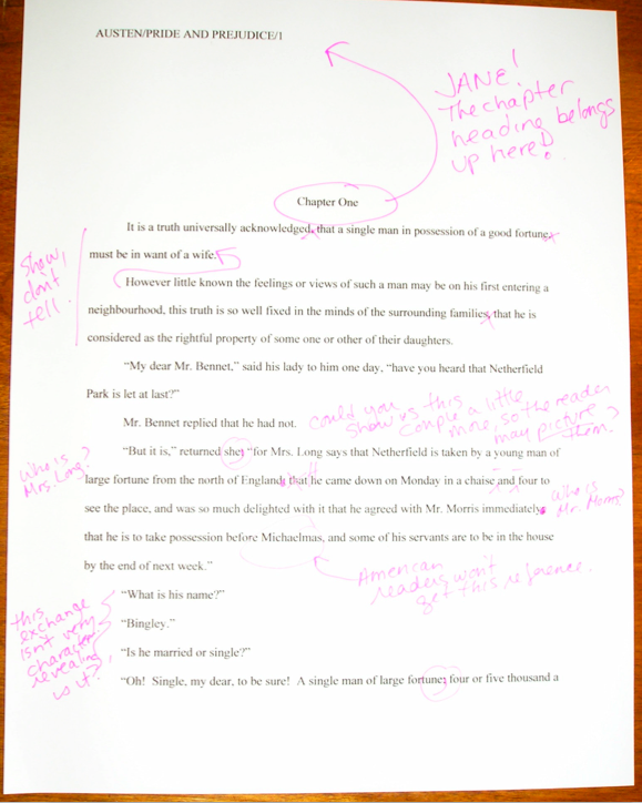
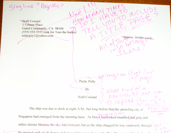
So where do these sterling souls tend to place the title page information, such as contact information and the book’s title? On page 1 of the text, where one might expect to find it in a short story submitted to a literary magazine.
Trust me, this is not where a professional reader is going to expect to find this information in a manuscript — and in many contests, including requested information such as genre and target audience on the first page of the text, rather than on a title page, can actually get an entry disqualified.
(To address the most common reason contest entrants misplace this information: don’t worry about the title page’s adding to your page count; it is not included in the page total. In every type of manuscript, pagination begins on the first page of TEXT, not on the title page.)
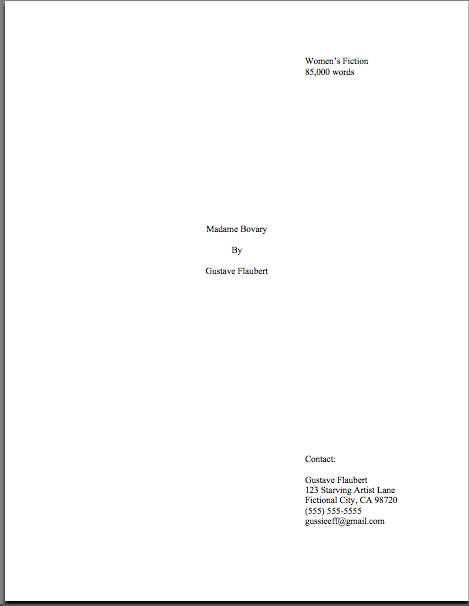
In a submission to an agency or publishing house, a professional reader will expect to see pieces of information on the title page: title, author’s name (and nom de plume, if s/he’s using one), book category, word count (estimated), and contact information. If an author has an agent, the agent’s contact information will appear on the title page, but for your garden-variety submission, the contact info will be the writer’s.
As I mentioned yesterday, it really is to your advantage to arrange your contact information precisely where an agent or editor expects to find it. You want to make it as easy as humanly possible for them to say yes to you, right?
That being said, as in so many aspects of the publishing industry, there is actually more than one way to structure a title page. Two formats are equally acceptable from an unagented writer. (After you sign with an agent, trust me, your agent will tell you which one she prefers.)
I like to call Format #1 the Me First, because it renders it as easy as possible for an agent to contact you after falling in love with your work. It’s the less common of the two at agencies, and it’s a trifle spare, compared to most title pages. Lots and lots of blank page space, which is catnip to writers. We long to fill it.
But resist that urge, because the experienced submitter’s title page is a festival of whiteness. Lookee:

And here are the step-by-step directions. Standard format restrictions apply, so 1-inch margins, please, as well as 12-point type, and do use the same typeface as you used in your manuscript. However, unlike every other page of the text, the title page should neither have a slug line nor be numbered. As I mentioned above, it is not included in either the page or the word count.
In the upper left-hand corner, list:
Your name
Your address
Your phone number
Your e-mail address.
That’s your REAL name, by the way, the one to which you would eventually like to see on royalty checks. If you are using a nom de plume, it should appear elsewhere on the page, not with your contact information.
If the manuscript is represented by an agent, the agent’s information will appear here, rather than the author’s. (However, as most agents prefer the second title page format I’m going to introduce below, one rather seldom sees represented work presented in this manner.)
And that, in case you were wondering, is one reason that it is so very easy for the major US publishing houses to enforce their no-unsolicited-submissions-from-unagented-writers rule: the merest glance at the contact information will tell an editorial assistant instantly whether there is an agent involved.
Back to formatting. Don’t include a slug line (AUTHOR’S LAST NAME/TITLE/#) on the title page, or a page number. Just leave the header and footer blank.
In the upper right-hand corner, list:
The book category (see how important it is to be up front about it? It’s the very top of the title page!)
Estimated word count.
Skip down 10-12 lines (personal preferences differ), then add, centered on the page:
Your title
(Skip a line)
By
(Skip a line)
Your name (here’s where you should put your nom de plume, if you’re using one)
There should be NO other information on the title page in Format #1. Luxuriate in all of that lovely, lovely white space.
Why, you may be wondering, does the author’s name appear twice on the page? For two reasons: first, as I mentioned above, in case you are writing under a name other than your own, as many writers choose to do. It’s quite common for writers to use only their pseudonyms in submissions — which can cause some real confusion when a fictional person’s name appears on under the signature line on a contract.
Standard format eliminates any possible confusion by clearly delineating between the name the writer wishes to use on the title page (which appears, straightforwardly enough, under the title) and the one the writer would like to see on royalty checks (listed under the contact information).
The second reason that the writer’s name appears twice on the title page is to make it as easy as possible for the agent or editor to acquire the book. That should sound familiar by now, right?
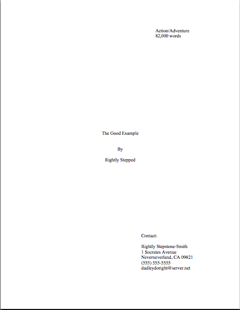
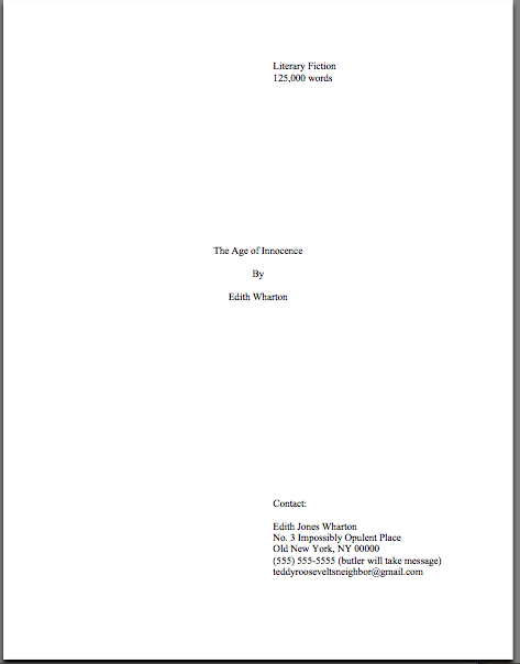
The other title page style, the Ultra-Professional, is my preferred method — a preference shared by most professional authors, in fact. While the Me First format is perfectly fine, the Ultra-professional, more closely replicates what most agents want their authors’ ultimate manuscript title pages to look like. Take a gander:

Elegant, isn’t it? And yet very market-oriented, too, because all of the requisite information is so very easy to find.
I probably don’t need to walk through how to construct this little gem, but as my long-term readers know, I’m a great believer in making directions as straightforward as possible. Or, to put it even more bluntly, I like them to be easy to follow in the ten minutes after an agent has said, “My God, I love your premise! Provide me with the manuscript instantly!”
Call me zany, but on that happy day, I suspect that you’re going to have a lot on your mind.
So here’s how to put this little number together. Set up a page with the usual standard format for manuscripts defaults — 1-inch margins all around, 12-point Times, Times New Roman, or Courier — then type in the upper right-hand corner:
Book category (If you’re unclear on what this is, are tempted to vacillate between several, or resent having to categorize your complex book at all, believe me, I sympathize — but please see the BOOK CATEGORIES category at right with all possible speed.)
Estimated word count (if you’re unclear on the hows and whys of estimation, please see the WORD COUNT category at right.)
Skip down 12 lines, then add, centered on the page:
Your title
(Skip a line)
By
(Skip a line)
Your name (or your nom de plume)
Skip down 12-14 more lines (depending upon typeface; the goal here is to have the last line of what comes next come on the last line of the page), then add in the lower right corner:
Your real name
Line 1 of your address
Line 2 of your address, if any
Your telephone number
Your e-mail address
Again, there should be NO other information on the title page, just lots and lots of pretty, pretty white space. Again, don’t include a slug line or page number.
As you may see from the example, it looks nifty if the information in the top section and the information in the bottom one share the same left margin. That’s not absolutely necessary, though; some agents prefer it to be slightly farther over, like this:

Since some addresses are longer than others, using this format results in that left margin’s being set at different points on the page for different manuscripts. While Flaubert’s address is short, Edith Wharton’s is not, producing a cosmetically altered title page:

That’s it, my friends – the two primary options you have, if you want your title page to look like the bigwigs’ do. And believe me, you do. Try formatting yours accordingly, and see if your work is not treated with greater respect!
I sense some raised hands out there. “But Anne,” I hear some of the more electronically-oriented of you cry, “the agent that I met at a conference last month asked me to send my my first 50 pages as an e-mail attachment. For hard copy submissions, I’ve been just having my title page be a separate document, so I don’t need to worry about a slug line appearing on it. Should I just leave the title page out of my e-submission, or should I send it as a separate attachment?”
It is just as excellent an idea to include a title page with an e-submission as with a hard-copy submission. This may seem counter-intuitive, since an agent who sends you an e-mail to ask for a full or partial manuscript, like one who calls after reading your first 50 pages to ask for the rest of the book, obviously has your contact information already. So why repeat it by sending a title page?
The first reason — and not the least significant, in an industry that values uniformity of format — is that every professional title page includes this information. It’s what agents and editors expect to see, and believe me, any agent who accepts e-queries receives enough e-mail in a day to render the prospect of scrolling through those received a few weeks ago a Herculean task.
Make it easy for her to contact you, and she’s more likely to do it.
Second, even if the agent or screener scrupulously noted all of your contact information from your query AND filed away your e-mail address for future reference, agencies are very busy places. Haven’t you ever accidentally deleted an e-mail you intended to save?
I tremble to mention this, but most of the agents of my acquaintance who’ve been in the game for a while have at least one horror story about reading a terrific piece of writing, jumping up to show it to someone else in the office — and when they’ve returned, not being able to find the mystery author’s contact information.
Don’t let them tell a story like this about you: Millicent is unlikely to scroll through 700 e-mails to track down even the most captivating author’s contact information. And even if an agent asks for an e-mailed submission, he will not necessarily read all of it on screen — once it’s printed out, it’s as far from the e-mail that sent it as if it had come by regular mail.
Besides, do you really want to begin your relationship with the agent of your dreams (or editor of your passions) by deviating from standard format, even virtually? As every successful civil disobedient knows, you are generally better off politely meeting expectations in matters of little moment, so you may save your deviations for the things that really matter.
As Flaubert famously advised writers, “Be regular and orderly in your life, so that you may be violent and original in your work.”
Okay, so he wasn’t talking about title pages, or even standard format, but the same principle applies: a title page — or lack thereof — does make a strong statement about the professionalism of the manuscript, regardless of context.
I wouldn’t advise sending the title page as a separate attachment, though: because viruses can be spread through attachments, folks in the industry tend not to open attachments they did not specifically ask to see. Instead, insert the title page at the beginning of your manuscript file.
Do I see a few more raised hands out there? “But Anne,” I hear some quick-on-the-draw readers cry, “won’t including it in the document make the title page look wrong? Won’t it automatically have a slug line, and won’t including it mess up my pagination?”
Good questions, all, but these outcomes are relatively easy to avoid in Word. To prevent a slug line’s appearing on the title page, insert the title page into the document, then go to the Format menu and select Document, then Layout. There should be an option there called “Different First Page.” If you select that, you can enter a different header and footer for the first page of the document, without disturbing the slug line you will want to appear on every other page.
To ensure that the first page of text (which will be page 2 of the document, right?) is numbered as page 1, you will need to designate the title page as 0. In Word, you do this by going to the View menu, selecting Header and Footer, then Page Number Format.
Regardless of while title page format you choose, do not, under any circumstances, include a quote on the title page as an epigraph. It’s the wrong place for it, as is a page inserted between the title page and the first page of text.
Where SHOULD you put it? Ah, that’s a topic for another day.
Keep up the good work!