See for yourself, part III: God bless the Millicents, every one

For the last couple of days, I’ve been pursuing the dual goals of trying to show you just how obvious it is to a professional reader when a submission ISN’T in standard manuscript format (as opposed to being set up to ape the format of published books) and to drum up a little holiday sympathy for Millicent, everybody’s favorite agency screener.

She’s the Tiny Tim of the literary world, you know; at least the Bob Cratchits a little higher up on the office totem pole get paid, but our Millie often doesn’t. Even if she’s not an intern, she’s still unlikely to be paid very much. Her hours are typically long, and quite a lot of what she reads in the course of her day is, let’s face it, God-awful.

Yes, that thought that suddenly sprang into your mind is precisely right: rejecting queries and manuscripts by the score IS considered on-the-job training for a fledgling agent, in much the same way as an editorial assistant’s screening manuscripts at a publishing houses is the stepping-stone to becoming an editor.

You didn’t think determining a manuscript’s literary merits after just a few lines of text was a skill that came naturally, did you?

The aspiring writer’s learning curve is often not dissimilar to Millicent’s, actually: no one is born knowing the rules of manuscript formatting. (Okay, so I practically was, growing up around so many writers, but that’s a rare exception.) Like Millicent, most of us learn the ropes only through reading a great deal.

She has the advantage over us, though: she gets to read books in manuscript form, and most aspiring writers, especially at the beginning of their journeys to publication, read mostly books. The format is, as I believe that I have pointed out, oh, several hundred times before in this very forum, quite different.

So what writers tend to produce in their early submissions are essentially imitations of books. The problem is, there are many reasons that a manuscript in book format would be hard for an agent or editor to handle — and not merely because the individual pages would appear unprofessional to Millicent.

For starters, published books are printed on both sides of the page, manuscripts on one. Why the difference, in these days of declining tree populations and editors huffily informing writers at conferences that paper is expensive?

Simple: it’s easier to edit that way.

Believe it or not, even in these days of widely available word processors, most professional editing is still done by hand. It’s hard to give trenchant feedback while traveling in a crowded subway car if you have to maneuver a laptop, and many agencies remain far too virus-fearful to allow their employees solicit attachments from writers who aren’t already clients. (Even those who do generally have a policy that forbids the opening of unsolicited attachments.)

But ultimately, most editors edit in hard copy because they prefer it. The human eye is, of course, to blame for this: reading comprehension drops by about 70% when the material is presented on a computer screen; the eye tends to skim.

Which is why — you can hear this coming, can’t you? — a wise writer always reads her ENTIRE manuscript IN HARD COPY before submitting it to anyone even vaguely affiliated with the publishing industry. It’s much, much easier to catch typos and logic problems that way.

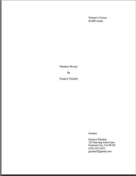
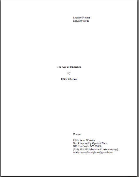
Manuscripts should also be typed (don’t laugh; it’s not unheard-of for diagrams to be hand-drawn in submissions, or for late-caught typos to be corrected in pen), double-spaced, and have 1-inch margins all the way around. To call upon our old friend Dickens again, an average page of a manuscript should look like this:

snapshot-2007-12-13-00-09-57.tiff

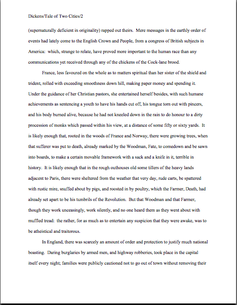
(If you’re having trouble seeing specifics, or just aren’t seeing an image at all, try right-clicking on the image and saving it to your hard disk.)

To give you some idea of just how difficult — or even impossible — it would be to hand-edit a manuscript that was NOT double-spaced or had smaller margins, take a gander at this little monstrosity:

snapshot-2007-12-13-00-11-28.tiff

Reader-hostile, isn’t it? Even with nice, empty back pages upon which to scrawl copy edits, trying to cram spelling or grammatical changes between those lines would be well-nigh impossible. Knowing that, Millicent would never dream of passing such a manuscript along to the agent who employs her; to do so would be to invite a lecture on the vicissitudes of the editorial life.

Don’t tempt her just to reject it unread — and don’t, I beg you, provide the same temptation to a contest judge.

You know what I’m talking about, don’t you, past contest entrants and submitters who wanted to squeeze in a particularly exciting scene before the end of those requested 50 pages? Faced with a hard-and-fast page limit for submission, some wily writers will shrink the font or the margins, to shoehorn a few more words onto each page. After all, who is going to notice a tenth of an inch sliced off a left or right margin, or notice that the typeface is a trifle smaller than usual?

Millicent will notice, that’s who, and practically instantly. As will any reasonably experienced contest judge; after hours on end of reading 12-point type within 1-inch margins, a reader develops a visceral sense of when something is off.

Don’t believe me? Go back and study today’s first example, the correctly formatted average page. Then take a look at this:

snapshot-2007-12-13-00-13-48.tiff

I shaved only one-tenth of an inch off each margin and shrunk the text by 5% — far less than most fudgers attempt. Yet admit it — you can tell it’s different, can’t you, even without whipping out a ruler?

So could a professional reader. And let me tell you, neither the Millicents of this world nor the contest judges tend to appreciate attempts to trick them into extraneous reading. Next!

The same principle applies, incidentally, to query letters: often, aspiring writers, despairing of fitting a coherent summary of their books within the standard single page, will shrink the margins or typeface. Trust me, someone who reads queries all day, every day, will be able to tell.

The other commonly-fudged spacing technique involves skipping only one space after periods and colons, rather than the grammatically-requisite two spaces. Frequently, writers won’t even realize that this IS fudging: ever since published books began omitting these spaces in order to save paper, I’ve seen a theory propounded all over the Internet (and sometimes even in writing classes, where the teachers should know better) claiming that skipping the extra space is obsolete. Frequently, the proponents will insist that manuscripts that include the space look old-fashioned to agents and editors.

Well, guess what: standard manuscript format IS old-fashioned, by definition; that fact doesn’t seem to stop anyone in the industry for using it. In fact, in all of my years writing and editing, I have never — not once — seen a manuscript rejected or even criticized for including the two spaces that English prose requires after a period or colon.

I have, however, heard endless complaint from professional readers — myself included — about those second spaces being omitted. Care to guess why?

Reward yourself with a virtual candy cane if you said that cutting those spaces throws off word count estimation; the industry estimates assume those doubled spaces. And give yourself twelve reindeer if you also suggested that omitting them renders a manuscript harder to hand-edit.

We all know the lecture Millicent is likely to get if she forgets about that, right?

Again, a pro isn’t going to have to look very hard at a space-deprived page to catch on that there’s something fishy going on. Since Dickens was so fond of half-page sentences, the examples I’ve been using above won’t illustrate this point very well, so (reaching blindly into the depths of the bookshelf next to my computer), let’s take a random page out of Elizabeth Von Arnim’s VERA:

snapshot-2007-12-13-00-16-24.tiff

There are 310 words on this page; I wasn’t kidding the other day about how far off the standard word count estimations were, obviously. Now cast your eye over the same text improperly formatted:

snapshot-2007-12-13-00-18-09.tiff

Doesn’t look much different to the naked eye, does it? The word count is only slightly lower on this version of this page — 295 words — but enough to make quite a difference over the course of an entire manuscript.

So I see some hands shooting up out there? “But Anne,” I hear some sharp-eyed readers cry, “wasn’t the word count lower because there was an entire line missing from the second version?”

Well spotted, criers-out: the natural tendency of omitting the second spaces would be to include MORE words per page, not less. But not spacing properly between sentences was not the only deviation from standard format here; Millicent, I assure you, would have caught two others.I tossed a curve ball in here, to make sure you were reading as closely as she was.

Wild guesses? Anyone? Anyone?

The error that chopped the word count was a pretty innocent one, almost always done unconsciously: the writer did not turn off the widow/orphan control, found in Word under FORMAT/PARAGRAPH/LINE AND PAGE BREAKS. This insidious little function, the default unless one changes it, prevents single lines of multi-line paragraphs from getting stranded on either the bottom of one page of the top of the next.

As you may see, keeping this function operational results in an uneven number of lines per page. Which, over the course of an entire manuscript, is going to do some serious damage to the word count.

The other problem — and frankly, the one that would have irritated a contest judge far more, but probably Millicent slightly less — was on the last line of the page: using an emdash (“But—”) instead of a doubled dash. Here again, we see that the standards that apply to printed books are not proper for manuscripts.

Which brings me back to today’s moral: just because a particular piece of formatting looks right to those of us who have been reading books since we were three doesn’t mean that it is correct in a MANUSCRIPT. Millicent reads manuscripts all day; contest judges read entries for hours at a time. After a while, a formatting issue that might well not even catch a lay reader’s attention can begin to seem gargantuan.

As I pointed out yesterday, if the writing is good, it deserves to be free of distracting formatting choices. You want agents, editors, and contest judges to be muttering, “Wow, this is good,” over your manuscript, not “Oh, God, he doesn’t know the rules about dashes,” don’t you?

Spare Millicent the chagrin, please; both you and she will be the happier for it. Keep up the good work!

See for yourself, part II: the little things matter, honest

Yesterday, I began a compare-and-contrast exercise, showing common examples of the first pages of submissions and fine-tuning your binoculars so you might see how our old friend Millicent the Agency Screener might view them. And as those of you who read the post can attest, it was pretty obvious that the professionally-formatted title page won the beauty contest hands-down.

After I posted it late last night, I heard wee pixie voices bearding me. “But Anne,” I heard these winsome creatures pipe, “aren’t you assuming that Millicent’s pretty shallow? Whenever I’ve heard agents and editors asked at conferences or on their websites about whether cosmetic issues can get a manuscript rejected, they always reject the notion with scorn. Isn’t it the writing that matters, ultimately?”

Well, yes and no, querying sprites. Naturally, the writing matters MOST — but it is not, as many aspiring writers assume, the only issue in how a professional reader will perceive the polish of a manuscript.

But that doesn’t stop folks from talking about it as though it were the only issue, does it?

And I suspect that’s not just because a sane, sensible individual with a reputation to protect is unlikely to stand up in front of 500 eager potential submitters and say, “Look, if you’re planning to submit a grimy photocopy of your book, or insist upon presenting it in 10-point type, or not indenting your paragraphs, just don’t bother to query me.” Instantly, 500 pens would scrawl on 500 programs, DO NOT QUERY THIS ONE.

Which would rather defeat the purpose of the agents coming to the conference to recruit new clients, wouldn’t it?

They learn to be careful: an agent or editor doesn’t have to speak at many conferences (or blog for very long) before recognizing that anything they about submissions is likely to be repeated with the éclat of a proverb for years to come amongst the writing community. I’ve heard offhand comments made from the dais, or even jokes, being debated for hours in conference hallways, and some of Miss Snark’s pronouncements have been more commented upon than St. Paul’s second letter to the Corinthians.

Okay, so that’s a slight exaggeration. My point is, such speakers are in extreme danger of having everything they say quoted back to them as an inflexible rule.

Which is why, I have to say, I don’t feel too many qualms about presenting the rules of standard format as inflexible rules. We are talking, after all, about an industry that both values creativity and considers submitting a book proposal in anything but a black folder dangerously radical.

Presentation issues definitely do matter — which is, again, not to say that the quality of the writing doesn’t. But — and this is a BIG but — rejection decisions are often made on page 1 of a manuscript. Sometimes even within the course of the first paragraph. And if the manuscript is hard to read, due to a funky typeface or odd spacing or just plain poor print quality, it may not be read at all.

And the person who announced that from the dais at a literary conference would be covered head to foot with flung tomatoes in twenty seconds flat.

To the eye of someone who reads manuscripts for a living, professional formatting is simply the least distracting way a book can possibly be presented. Perversely, adhering to the industry’s cosmetic expectations renders it MORE likely that an agent or editor will concentrate upon the beauty of the writing, not less.

So instead of thinking of the rigors of standard format as a series of unimportant (or even silly) superficial choices, try regarding them as translating your calling card, a means of catching Millicent’s tired eye and informing her that this is a manuscript that should be taken seriously.

Because she can’t fall in love with your good writing until she reads it, can she?

My, that was a long preamble, wasn’t it? Let’s get back to the nitty-gritty.

Yesterday, I showed how the first page of text does not, from a professional perspective, make an adequate substitute for a title page. Instead of being a replica of a hoped-for book cover, as many submitters produce, or a shouted-out declaration of the book’s title and who wrote it, the properly-formatted title page is a quiet, practical piece of paper, containing a specific set of marketing information. It should look, in case you missed it, like this:

snapshot-of-ultra-pro-title.tiff

Like everything else in the manuscript, the title page should be entirely in 12-point type. No matter how cool your title page looks with 24-point type, resist the urge, because Millicent will be able to tell from across the room if you didn’t:

snapshot-2007-12-11-22-18-42.tiff

Take a look at the first example again, then the second. Notice any other dissimilarities?

If you said that Mssr. Smith’s title page included both a slug line (the author’s name and title in the upper right margin of the page) and a page number in the bottom right corner, give yourself a gold star for the day. Add whipped cream and walnut clusters if you mentally added the reason that those additions are incorrect: because the title page is not the first page of text. Technically, it should not be numbered.

This means, incidentally, that the title page should not be counted as one of the 50 pages in those 50 pages the agent of your dreams asked you to submit, either. Nor would it count toward the total number of pages for a contest entry.

On both the title page and elsewhere, I would highly recommend using either Times, Times New Roman, or Courier typefaces, both here and in the manuscript as well, as these are the standards of the industry.

I know, I know: another cosmetic weirdness. But like some of the other strictures of standard format, there’s a pretty good reason for this one: word count estimation is predicated upon these typefaces. The Times family is estimated at 250 words/page; Courier at 200. So a 400-page manuscript in Times New Roman is assumed to be roughly 100,000 words. (To make the math clear, 400 x 250 = 100,000.)

Now, in actual fact, it’s probably closer to 115,000 words; as any writer who has compared the estimated word count for her book with the total her word processing program provides, they tend to differ wildly. But word count, like beauty, is in the eye of the beholder: a novelist whose title page reported, accurately, that her 400–age novel was 115,000 words might well see it rejected out of hand on the grounds that it was too long.

Why? Well, math may not have been Millicent’s best subject (the inmates of agencies were overwhelmingly English majors), but she can do third-grade math in her head: 115,000 words at 250 words/page would equal a 460-page manuscript. That’s quite a bit longer than editors tend to expect first novels in most genres to be.

In other words, next!

“But Anne,” I hear you cry, “why is Millicent estimating at all? If she wants to know how long it is, why doesn’t she just flip to the last page and check the page number?”

I could give you a long song and dance about how much her wrists hurt from opening all those query envelopes all day, or how her secret midnight e-mail orgies have rendered pinching a torture, but in practice, the answer is far less personal: because the industry doesn’t work that way.

Also, how exactly could she manage to turn to page 400 of a requested 50-page submission?

Let’s turn to the first page of the submission, to see how much of a difference font and typeface make at first glance. Here’s a correctly-formatted page 1 in Times New Roman:

snapshot-2007-12-11-22-20-23.tiff

Pretty spiffy, eh? But definitely not how it would appear in a published book.

Here is the same page, also correctly formatted, in Courier. Note how many fewer words per page it allows:

snapshot-2007-12-11-22-22-42.tiff

Got both of those firmly imbedded in your brainpan? Good. Now format your first pages that way for the rest of your natural life.

Wanna see why it’s a good idea? Take a gander at the SAME first page, but not in standard manuscript format. See how many deviations you can spot:

snapshot-2007-12-11-22-23-50.tiff

Interesting what a difference a few small formatting changes can make, isn’t it? It’s exactly the same WRITING — but it just doesn’t look as professional. To Millicent, who reads hundreds of pages per day, the differences between the three could not be clearer.

And yet there were really very few deviations from standard format here. For those of you playing at home, the typeface is Georgia; the chapter title is in the wrong place, and there isn’t a slug line. Also, the page is numbered in the wrong place — the default setting, incidentally, in many word processing programs.

Again, none of these infractions against the rules of standard format are serious enough to cause Millicent to throw up her hands as soon as she notices them, giving up on the last manuscript. But when poor formatting is combined with literary experimentation — like, say, that paragraph-long first sentence — which do you think she is going to conclude, that Dickens is a writer who took the time to polish his craft, or that he just doesn’t know what he’s doing?

And that, my friends, is why you should pay attention to the little details. The longer you remain in the business, the more those little things will strike you as just, well, matters of right and wrong. As, fortunately or not, they do Millicent and her ilk.

More show-and-tell follows tomorrow. Keep up the good work!

See for yourself, or, Millicent may have a point this time

snapshot-2007-12-11-01-22-46.tiff
First things first: Boston-area readers, mark your calendars, because next month, I’m going to be giving a talk, The Multiple Myths of Philip K. Dick, at Harvard next month. Saturday, January 26th, to be precise, from 10 am to noon. I shall be joined by the excellent David Gill of Total DickHead fame. Advance registration is strongly encouraged, and I would love to see some of you there!

And in answer to that huge question mark hanging in the air above the heads of those of you who have been following my memoir’s saga faithfully for the last 2+ years: yes, I shall be speaking on precisely what you think I couldn’t possibly be. Not all the beans will be spilled, naturally, but I anticipate a fair number escaping the sack.

It’s all part of the festivities at Vericon, the Harvard/Radcliffe Science Fiction Association’s annual convention. I am especially pleased by the invitation to speak, for back in the dim days of antiquity, I was one of the founding members of HRSFA — where, if memory serves, I was known there as “the girl,” to give you a rough indication of how many of us there were. It seems odd in retrospect, but then, nice Ivy Leaguers pretended that they didn’t read SF, by and large; we had a hard time getting Harvard even to recognize the association. Now, it’s one of the largest clubs on campus.

As Kurt Vonnegut would have told us all: and some people say there’s no such thing as progress.

Back to work. As you may have noticed, I’ve been quiet for the last few days, having recently returned from giving a completely different talk: a species of my favorite class to teach to writers, a blow-by-blow on how VERY different a professional manuscript looks from, well, any other stack of paper an agent or editor might receive in the mail. I love teaching it.

Admittedly, it’s a trifle depressing to watch the inevitable cloud of gloom descend upon my students as they begin to realize just how many small mistakes there are that can result in a manuscript’s getting rejected — but it’s a pure joy to watch those brows unfurrow and those shoulders unclench as their owners learn that there is something they can DO about improving their books’ chances of success.

Over the next few days, I am going to attempt a similar trick at a distance and, like the Flying Wallendas, without a safety net. Drum roll, please: in the spirit of that old chestnut, SHOW, DON’T TELL, I shall demonstrate just how different a manuscript that follows the rules looks from one that doesn’t.

Hold on tight.

Writers often overlook odd formatting as a reason that a manuscript might have been rejected. Certainly, other reasons get a lot more airplay, particularly at writers’ conferences.

If you want to take a long, hard look at some of the better-discussed reasons, I would urge you to gird your loins and plunge into the FIRST PAGES AGENTS DISLIKE category at right. For those of you who missed it, last autumn, I went over list of knee-jerk rejection reasons given by a group of agents going over a stack of actual submissions at a conference, one by painful one. Because so many of the reasons caused writerly blood to boil and learned eyebrows to hit ceilings, I was sorely tempted to re-run that series while I was ill this fall, but in 2006, it took up more than three weeks’ worth of posts to cover the topic. Of late, I have had other proverbial fish to fry.

As we are heading into the long, dark days of winter, however, while agents and editors are cuddled up all snug in their offices, reading the manuscripts they hadn’t gotten to over the previous eleven months, it seemed like a good time to revisit the most common mistakes of them all, deviations from standard format for manuscripts.

Not to be confused with what is correct for published books.

In answer to all of the cries of “Huh?” that elicited from readers new to this site, a professional manuscript SHOULD differ from the published version of the same book in a number of subtle but important ways. All too few aspiring writers realize this, a fact that is unfortunately quite obvious to an agent, editor, contest judge, etc., from practically the moment their eyes light upon a submission.

Why is it so very apparent? Because much of the time, writers new to the business clearly go out of their way to format their submissions to resemble published books, in the mistaken belief that this will make their work seem more professional.

The opposite is generally true — and often, it’s apparent as early as the title page.

(If the implications of that last assertion made you dizzy — if, for instance, you found yourself picturing our old pal Millicent the agency screener pulling a submitted manuscript out of its envelope, casting a critical eye over the first page, hooting, and stuffing the whole thing into the handy SASE — try placing your head between your knees and breathing deeply. I’ll wait until you recover.)

The most common initial signal is the absence of any title page whatsoever. Many submitters, for reasons best known to themselves, omit the title page altogether — often, I suspect, because they are unaware that a professional book-length manuscript ALWAYS has a title page.

To set your minds at ease, forgetting to include a title page almost certainly won’t prevent Millicent from reading your manuscript; she tends to read even the most bizarrely-formatted submissions for at least a line or two. But that initial impression of an author’s lack of professionalism — or, to call it by a kinder name, of having a lot to learn about how the publishing industry works — does often translate into a rather jaundiced reading eye for what comes next.

Why? Well, let’s take a peek through her reading glasses, shall we? The first thing Millicent sees when she opens the average requested materials package is something like this:

snapshot-2007-12-11-01-25-34.tiff

(Note to those of you Windows users who have been having problems viewing posted pictures: helpful reader Chris wrote in to say that you can view them in Windows Picture Viewer by right-clicking on the images and saving them to your hard disk. Thanks, Chris!)

I see all of you long-term blog readers out there with your hands in the air, jumping up and down, eager to tell everyone what’s wrong with this as a first page of text — and you’re absolutely right, of course. We’re going to be talking about precisely those points in the days to come.

For now, however, I want you to concentrate upon how this example has failed as both a title page and a first page of text, by not including the information that Millicent would expect to see on either.

What makes me so sure she would find this discovery, at best, disappointing? Because what she (or her boss agent, or an editor, or a contest judge) would have expected to see on top of that pile of paper was this:

snapshot-2007-12-11-01-28-43.tiff

This is a standard manuscript title page for the same book — rather different, isn’t it? Visibly different, in fact, from several paces away, even if Millicent isn’t wearing her reading glasses.

Again, submitting the first example rather than the second would not necessarily be instantly and automatically fatal to a manuscript’s chances, of course. Most of the time, Millicent will go ahead and plunge into that first paragraph of text anyway.

However, human nature and her blistering reading schedule being what they are (for those of you new to this screener’s always-rushed ways, she has a stack of manuscripts up to her chin to screen — and that’s at the end of a long day of screening queries), if she has already decided that a submission is flawed, just how charitable an eye do you think she is likely to cast upon the NEXT problem on the page?

Uh-huh. To use her favorite word: next!

To be fair to Millicent, while it may well be uncharitable of her to leap to the conclusion that Faux Pas’ manuscript is likely to be unpolished because he did not include a proper title page, agencies do have a vested interest in signing writers who present themselves professionally. For one thing, they’re cheaper to represent, in practical terms: the agent doesn’t have to spend as much time working with them, getting their manuscripts ready to submit to editors.

And no agent in his right mind would send out a manuscript that didn’t include a standard title page. It serves a number of important — nay, vital — marketing functions.

Let’s take another look at the professional version, shall we? So you don’t have to keep scrolling up and down the page, here it is again:

snapshot-2007-12-11-01-28-43.tiff

How is this sheet of paper a better piece of marketing material than Faux Pas’ first page?

Well, right off the bat, it tells a prospective agent or editor what kind of book it is, as well as its approximate length. (If you do not know how to estimate the number of words in a manuscript, or why you should use an estimate rather than relying upon your word processor’s count, please see the WORD COUNT category at right.) Both of these are pieces of information that will tell Millicent instantly whether the submission in her hand would meet the requirements of the editors to whom her agency tends to sell.

For instance, if her boss had decided not to represent Action/Adventure anymore, or if editors at the major houses had started saying that they were only interested in seeing Action/Adventure books longer than 90,000 words, Rightly Stepped would be out of luck.

The standard title page also tells Millicent precisely how to contact the author to offer representation — and that’s a very, very good thing for everyone concerned. If I’ve said it once, I’ve said it a thousand times: it’s ALWAYS in an aspiring writer’s interest to make it easy for an agent to help her.

I might be wrong, of course, but I suspect that NOT forcing Millicent to forage through the mountain of paper on her desk to find a misplaced cover letter with your phone number on it MIGHT be a good start.

By contrast, Faux Pas’ first page doesn’t really do anything but announce the title of the book and leap right into the story. That’s one underachieving piece of paper.

Some writers attempt to consolidate the proper functions of the title page and first page of text into a single sheet of paper. This format is particularly common for contest entries, for some reason:

snapshot-2007-12-11-01-32-39.tiff

While such a top page does indeed include the requisite information Millicent or her boss would need to contact the author, cramming it onto the first page of text doesn’t really achieve anything but saving a piece of paper. It doesn’t even shorten the manuscript or contest entry, technically speaking: the title page is never included in a page count; that’s why pagination begins on the first page of text.

I shall go into what DOES belong on the first page of text tomorrow, with accompanying exercises. For today, let’s keep it simple: all I ask is that you would look at the proper title and the unprofessional examples side by side.

Got all of those images firmly in your mind? Good. Now weigh the probability that someone who reads as many manuscripts as Millicent — or her boss, or the editor to whom her boss likes to sell books — would NOT notice a fairly substantial difference in the presentation. And assess the probability of that perception’s coloring any subsequent reading of the manuscript in question.

Kind of obvious, once you know the difference, isn’t it? Keep up the good work!

Book marketing 101: a professional-looking title page, part III

Well, so much for predicting how tired I would be: the very day after I said I didn’t want to abandon you all in mid-title page, I found myself too wiped out to do my promised next post on title pages. Mea culpa — but I think I shall be taking the next few days off from posting, until I figure out how to integrate it with the masses of sleep I seem to need at the moment.

Let me move on to the second style of title page quickly, though, while I am fresh from a nap.

Last time, I mentioned that there were two formats commonly used in professional title pages. The one I showed you last time, what I like to call the Me First, is actually rather more common in submissions to agents than submissions from agents to editors, but it is certainly acceptable.

While the Me First format is perfectly fine, the other standard format, which I like to call the Ultra-professional, more closely replicates what most agents want their authors’ ultimate manuscript title pages to look like. Take a gander:

snapshot-of-ultra-pro-title.tiff

Elegant, isn’t it? And yet very market-oriented, because all of the requisite information is so very easy to find. Here is a downloadable version of the same, for those of you who would prefer to have it on hand.

I probably don’t need to walk through how to construct this little gem, but as my long-term readers know, I’m a great believer in making directions as straightforward as possible. I like them to be easy to follow in the ten minutes after an agent has said, “My God, I love your premise! Provide me with the manuscript instantly!” Call me zany, but on that happy day, I suspect that you’re going to have a lot on your mind.

So here’s how to put this little gem together. Set up a page with the usual standard format for manuscripts defaults — 1-inch margins all around, 12-point Times, Times New Roman, or Courier — then type in the upper right-hand corner:

Book category (If you’re unclear on what this is, are tempted to vacillate between several, or resent having to categorize your complex book at all, believe me, I sympathize — but please see the BOOK CATEGORIES category at right with all possible speed.)

Estimated word count (If you’re unclear on the hows and whys of estimation, please see the WORD COUNT category at right.)

Skip down 12 lines, then add, centered on the page:
Your title
(Skip a line)
By
(Skip a line)
Your name (or your nom de plume)

Skip down 12 more lines, then add in the lower right corner:

Your real name
Line 1 of your address
Line 2 of your address
Your telephone number
Your e-mail address

As you may see from the example, it looks nifty if the information in the top section and the information in the bottom one share the same left margin. Since some addresses are longer than others, using this format results in that left margin’s being set at different points on the page for different manuscripts. While Flaubert’s address is short, Edith Wharton’s is not, producing a cosmetically altered title page:

snapshot-edith-wharton-title.tiff

Again, there should be NO other information on the title page, just lots and lots of pretty, pretty white space. After you sign with an agency, your agent’s contact information will appear where your contact information does.

That’s it, my friends – the two primary options you have, if you want your title page to look like the bigwigs’ do. And believe me, you do. Try formatting yours accordingly, and see if your work is not treated with greater respect!

After my last post, forward-thinking reader Christa anticipated my next point, so I have already covered the issue of whether you should include a title page in an e-mailed submission. Since the comments are less easily searched than the text of my posts, I’m going to go over the logic a bit here as well.

The answer, in case you were wondering, is yes — it is an excellent idea to include a title page with an e-submission. It’s an even better idea to include it as PART of the manuscript attachment, rather than as a separate attachment.

A bit perplexed? You’re not alone. Let me deal with the whys first, then the hows.

As Christa rightly points out, an agent who sends you an e-mail to ask for a full or partial manuscript, like one who calls after reading your first 50 pages to ask for the rest of the book, obviously has your contact information already. So why repeat it by sending a title page?

The first reason — and not the least significant, in an industry that values uniformity of format — is that every professional title page includes this information. It’s what agents and editors expect to see, and believe me, any agent who accepts e-queries receives enough e-mail in a day to render the prospect of scrolling through those received a few weeks ago a Herculean task. Make it easy for her to contact you, and she’s more likely to do it.

Second, even if the agent or screener scrupulously noted all of your contact information from your query AND filed away your e-mail address for future reference, agencies are very busy places. Haven’t you ever accidentally deleted an e-mail you intended to save?

I tremble to mention this, but most of the agents of my acquaintance who’ve been in the game for a while have at least one horror story about reading a terrific piece of writing, jumping up to show it to someone else in the office — and when they’ve returned, not being able to find the mystery author’s contact information.

Don’t let them tell a story like this about you: Millicent is unlikely to scroll through 700 e-mails to track down even the most captivating author’s contact information. And even if an agent asks for an e-mailed submission, he will not necessarily read all of it on screen — once it’s printed out, it’s as far from the e-mail that sent it as if it had come by regular mail.

Besides, do you really want to begin your relationship with the agent of your dreams (or editor of your passions) by deviating from standard format, even virtually? As every successful civil disobedient knows, you are generally better off politely meeting expectations in matters of little moment, so you may save your deviations for the things that really matter.

As Flaubert famously advised writers, “Be regular and orderly in your life, so that you may be violent and original in your work.”

Okay, so he wasn’t talking about title pages. But the same principle applies here: a title page — or lack thereof — does make a strong statement about the professionalism of the manuscript, regardless of context.

I wouldn’t advise sending the title page as a separate attachment, though: because viruses can be spread through attachments, folks in the industry tend not to open attachments they did not specifically ask to see. Instead, insert the title page at the beginning of your manuscript file.

Do I see a raised hand or twelve out there? “But Anne,” I hear some quick-on-the-draw readers cry, “won’t including it in the document make the title page look wrong? Won’t it automatically have a slug line, and won’t including it mess up my pagination?”

Good questions, all, but these outcomes are relatively easy to avoid in Word. To prevent a slug line’s appearing on the title page, insert the title page into the document, then go to the Format menu and select Document, then Layout. There should be an option there called “Different First Page.” If you select that, you can enter a different header and footer for the first page of the document, without disturbing the slug line you will want to appear on every other page.

Don’t include a slug line (AUTHOR’S LAST NAME/TITLE/#) on the title page, or a page number. Just leave the header and footer blank.

To ensure that the first page of text (which will be page 2 of the document, right?) is numbered as page 1, you will need to designate the title page as 0. In Word, you do this by going to the View menu, selecting Header and Footer, then Page Number Format.

While I’m on the subject of formatting, and now that I know how to insert snapshots of pages into this blog, I think that next time, I shall take reader Dave’s excellent suggestion and show you what a page of text in standard format looks like. I have long been yearning to show how to format the first page of a chapter correctly.

And that’s the kind of longing I have when I’m NOT feverish; there’s no accounting for taste, eh? Speaking of which, my couch is calling me again, so I am signing off for today. Keep up the good work!

Book marketing 101: a professional-looking title page, part II, or, lots of lovely, lovely white space

Yesterday, I waxed long, if not precisely eloquent, about what a difference a professional-looking title page can make to a submission or contest entry. I hit this point pretty hard, because I know from experience as both a freelance editor and a contest judge that many, many talented aspiring writers simply assume that they don’t need a title page — a misconception that definitely costs them presentation points.

So where do these sterling souls tend to place the title page information, such as contact information and the book’s title? On page 1 of the text, where one might expect to find it in a short story submitted to a literary magazine.

Trust me, this is not where a professional reader is going to expect to find this information in a manuscript — and in many contests, including requested information such as genre and target audience on the first page of the text, rather than on a title page, can actually get an entry disqualified.

(To address the most common reason contest entrants misplace this information: don’t worry about the title page’s adding to your page count; it is not included in the page total. In every type of manuscript, pagination begins on the first page of TEXT, not on the title page.)

In a submission to an agency or publishing house, a professional reader will expect to see pieces of information on the title page: title, author’s name (or nom de plume), book category, word count (estimated), and contact information. If an author has an agent, the agent’s contact information will appear on the title page, but for your garden-variety submission, the contact info will be the writer’s.

As I mentioned yesterday, it really is to your advantage to arrange your contact information precisely where an agent or editor expects to find it. You want to make it as easy as humanly possible for them to say yes to you, right?

That being said, as in so many aspects of the publishing industry, there is actually more than one way to structure a title page. Two formats are equally acceptable from an unagented writer. (After you sign with an agent, trust me, your agent will tell you which one she prefers.)

I like to call Format #1 the Me First, because it renders it as easy as possible for an agent to contact you after falling in love with your work. It’s the less common of the two at agencies, and it’s a trifle spare, compared to most title pages. Lots and lots of blank page space, which is catnip to writers. We long to fill it. But resist that urge:

snapshot-of-me-first-title.tiff

For those who would like to have their very own copies, to see the formatting up close, here is a downloadable version. (Many thanks to clever reader Chris for suggesting this, and brilliant webmaster Brian for teaching me how.)

And here are the step-by-step directions. Standard format restrictions apply, so 1-inch margins, please, as well as 12-point type, and do use the same typeface as you used in your manuscript. However, unlike every other page of the text, the title page should neither have a slug line nor be numbered. As I mentioned above, it is not included in either the page or the word count.

In the upper left-hand corner, list:

Your name
Your address
Your phone number
Your e-mail address.

In the upper right-hand corner, list:

The book category (see how important it is to be up front about it? It’s the very top of the title page!)
Estimated word count.

Skip down 10 lines, then add, centered on the page:

Your title
(Skip a line)
By
(Skip a line)
Your name (or your nom de plume)

There should be NO other information on the title page in Format #1. Luxuriate in all of that lovely, lovely white space.

Why, you may be wondering, does the author’s name appear twice on the page? For two reasons: first, in case you are writing under a name other than your own, as many writers choose to do. It’s quite common for writers to use only their pseudonyms in submissions — which can cause some real confusion when a fictional person’s name appears on under the signature line on a contract.

Standard format eliminates any possible confusion by clearly delineating between the name the writer wishes to use on the title page (which appears, straightforwardly enough, under the title) and the one the writer would like to see on royalty checks (listed under the contact information).

(And no, for those of you who have been asking about it, Anne Mini is not a nom de plume, but the name on my birth certificate, believe it or not. My parents were so literarily-oriented that my father demanded to be led to a typewriter before they settled on a name, to see how each of the top contenders would look in print. The better to grace future dust jackets, my dear. And yes, there is a nonplused nurse out there somewhere who can swear that this is true.)

The second reason that the writer’s name appears twice on the title page is, as I mentioned above, to make it as easy as possible for the agent or editor to acquire the book. And that, in case you were wondering, is one reason that it is so very easy for the major US publishing houses to enforce their no-unsolicited-submissions-from-unagented-writers rule: the merest glance at the contact information will tell an editorial assistant instantly whether there is an agent involved.

Do not, under any circumstances, include a quote on the title page — and I wouldn’t recommend doing it on the first page of your manuscript, either. Many authors do this, because they have seen so many published authors use quotes at the openings of their books, to situate themselves amongst the pantheon of the published — and because, let’s face it, most of us read widely enough that we’ve collected a few pithy sayings along the way.

Trust me, the aptness of your quote selection isn’t going to wow the pros, for the very simple reason that 99.8% of them will just skip over it. They ask for submissions to read your writing, after all, not other people’s.

If you must use a quote at the opening of the book, center it on an unnumbered separate page that follows the title page. Or, better still, wait until after the book has been acquired by an editor, then have a heart-to-heart about it.

And remember, if you want to use a lyric from a song that is not yet in the public domain, it is generally the author’s responsibility to get permission to use it — and while for other writing, a quote of less than 50 consecutive words is considered fair use, ANY excerpt from an owned song usually requires specific permission, at least in North America. Contact the American Society of Composers, Authors, and Publishers (ASCAP) for assistance in making such requests.

Tomorrow, I shall go through the other title page style, which is my preferred method, the Ultra-Professional.

On a personal note, my posts will probably be shorter than usual in the weeks to come, and I may not be posting as often: I’ve recently found out that I have come down with mono, a rather nasty condition that apparently requires sleeping about twice as much as I usually do. The recovery time is rather lengthy — but I wasn’t about to abandon you all in mid-title page, was I?

So bear with me, please, if my responses are a bit slower than usual in the near future — and keep up the good work!

Book marketing 101: a professional-looking title page

My, this has been a long series, hasn’t it? A lot of ground to cover. Before I move on to topics more closely related to the writing in your book, rather than the writing in your marketing materials — specifically, I would like to spend a substantial chunk of the next couple of months going over the most common writing problems agents and editors see in submissions — I want to spend today talking about the very first thing an agent or editor will see IN your submission: the title page.

And yes, Virginia, EVERY submission needs one, as does every contest entry. Even if you are sending chapters 2-38 after an agent has pronounced herself delighted with chapter 1, you should send a title page with every hunk of writing you submit.

I know, I know: pretty much nobody ASKS you to include one (although contests sometimes require it), but a manuscript, even a partial one, that is not topped by one looks undressed to folks in the publishing industry. So much so that it would be completely out of the question for an agent to submit a book to a publishing house without one.

Why? Because, contrary to popular belief amongst writers, it is not just a billboard for your book’s title and your chosen pen name. It’s the only page of the manuscript that contains your contact information, book category, and word count.

In words, it is both the proper place to announce how you may best be reached and a fairly sure indicator of how much experience you have dealing with the publishing industry. Why the latter? Because aspiring writers so often either omit it entirely or include the wrong information on it.

You, however, are going to do it right — and that is going to make your submission look very good by comparison.

There is information that should be on the title page, and information that shouldn’t; speaking with my professional editing hat on for a moment, virtually every manuscript I see has a non-standard title page, so it is literally the first thing I, or any editor, will correct in a manuscript.

I find this trend sad, because for every ms. I can correct before they are sent to agents and editors, there must be hundreds of thousands that make similar mistakes. Even sadder, the writers who make mistakes are their title pages are very seldom TOLD what those mistakes are. Their manuscripts are merely rejected on the grounds of unprofessionalism, usually without any comment at all.

I do not consider this completely fair to aspiring writers — but once again, I do not, alas, run the universe, nor do I make the rules that I report to you. If I set up the industry’s norms, I would decree that every improperly-formatted title page would be greeted with a very kind letter, explaining precisely what was done wrong, saying that it just doesn’t count this time, and inviting the writer to revise and resubmit.

Perhaps, in the worst cases, the letter could be sent along with a coupon for free ice cream. Chances are, the poor writer is going to be shocked to learn that the title page of which he is so proud is incorrectly formatted.

But I digress.

The single most common mistake: a title page that is not in the same font and point size as the rest of the manuscript.

Since the rise of the personal computer and decent, inexpensive home printers, it has become VERY common for writers to use immense type and fancy typefaces for title pages, or even photographs, designs, or other visually appealing whatsits.

From a creative point of view, the tendency is completely understandable: if you have 50 or 100 fonts at your disposal, why not use the prettiest? And while you’re at it, why not use a typeface that’s visible from five feet away?

For one extremely simple reason: professional title pages are noteworthy for only two things, their visual spareness and the consequent ease of finding information upon them.

It’s rare, in fact, that any major US agency would allow its clients to send out a title page in anything BUT 12-point Times, Times New Roman, or Courier for a submission, since these are the standards for the industry.

Why these fonts? The logic is complicated here, but in essence, it boils down to an affection for the bygone days of the typewriter: Times is the equivalent of the old elite typeface; Courier is pica. (I know, I know: there are other explanations floating around the Internet, but as this is what people in the industry have actually said when asked about it for the last 25 years, I’m going to continue to report it here.)

More to the point, agents and editors are used to estimating word counts as 250 words/page for the Times family and 200/page for the Courier family. When a submitting writer uses other fonts, it throws off calculations considerably.

Mind you, in almost every instance, an actual word count will reveal that these estimates are woefully inadequate, sometimes resulting in discrepancies of tens of thousands of words over the course of a manuscript. But if you check the stated word counts of published books from the major houses, you’ll almost always find that the publisher has relied upon the estimated word count, not the actual.

Unless an agency or publishing house SPECIFICALLY states a preference for actual word count, then, you’re usually better off sticking to estimation.

I wish that this were more often made clear at literary conferences; it would save masses of writerly chagrin. When an agent or editor at conference makes everyone in the room groan by announcing that she would have a hard time selling a novel longer than 100,000 words, she is generally referring not to a book precisely 100,012 words long, but a 400-page manuscript.

Is that hoopla I hear out there the rejoicing of those of you who tend to run a mite long? Or perhaps those who just realized that unless an edit cuts or adds an entire page to the manuscript, it isn’t going to affect the estimated word count? These are not insignificant benefits for following industry norms, are they?

So let’s take it as given that your title page should be in 12-point Times, Times New Roman, or Courier. All of it, even the title. No exceptions — and no pictures, designs, or other bits of whimsy. You may place the title in boldface, if you like, or in all capitals, but that’s as elaborate as it is safe to get.

DEFINITELY do not make the title larger than the rest of the text. It may look cool to you, but to professional eyes — I hate to tell you this, but better you find out from me — it looks rather like a child’s picture book.

Do I hear disgruntled voices out there? “Oh, come on,” I hear some of you saying, “the FONT matters that much? What about the content of the book? What about my platform? What about my brilliant writing? Surely, the typeface choice pales in comparison to these crucial elements?”

You’re right, of course — it does, PROVIDED you can get an agent or editor to sit down and read your entire submission.

Which happens far less often than aspiring writers tend to think. Ask any agent — it’s not at all uncommon for a submission to be rejected on page 1. So isn’t it better if the submission hasn’t already struck the screener as unprofessional prior to page 1?

Unfortunately, this is a business of snap decisions, especially in the early stages of the road to publication, where impressions are often formed, well, within seconds. If the cosmetic elements of your manuscript imply a lack of knowledge of industry norms, your manuscript is entering its first professional once-over with one strike against it.

It seem be silly — in fact, I would go so far as to say that it IS silly — but it’s true, nevertheless.

Even queries in the proper typefaces tend to be better received. If you are feeling adventurous, go ahead and experiment, sending out one set of queries in Times New Roman and one in Helvetica, and see which gets a better response.

As any agency screener will tell you after you have bought him a few drinks (hey, I try to leave no stone left unturned in my quest to find out what these people want to see in submissions, so I may pass it along to you), the Times New Roman queries are more likely to strike agents (and agents’ assistants, once they sober up again) as coming from a well-prepared writer, one who will not need to be walked through every nuance of the publication process to come.

Yes, I know — it seems shallow. But think of conforming to title page requirements in the same light as following a restaurant’s dress code. No one, not even the snottiest maitre d’, seriously believes that forcing a leather-clad punk to don a dinner jacket or a tie will fundamentally alter the disposition of the wearer for the duration of the meal. But it does guarantee a certain visual predictability to the dining room, at least insofar as one overlooks facial piercings, tattoos, and other non-sartorial statements of individuality.

And, frankly, setting such standards gives the maitre d’ an easy excuse to refuse entry on an impartial basis, rather than by such mushy standards as his gut instinct that the lady in the polyester pantsuit may be consorting with demons in her off time. Much less confrontational to ask her to put on a skirt or leave.

Sending your submission into an agency or publishing house properly dressed minimizes the chances of a similar knee-jerk negative reaction. It’s not common that a submission is rejected on its title page alone (although I have heard of its happening), but an unprofessional title page — or none at all — does automatically lower expectations.

Or, to put it another way, Millicent the screener is going to be watching the guy with the tie a whole lot less critically than the guy with the studded leather dog collar and 27 visible piercings, and is far less likely to dun the former for using the wrong fork for his salad.

Tomorrow, I am going to go over the two most common formats for a professional title page — and, if my newly-learned computer trick works, give you some concrete examples. In the meantime, keep up the good work!

The promise of the first 50 pages – and an answer to that pesky poetry question

Hello, readers —

I have a lot to talk about today. First, allow me to respond to a terrific question submitted by sharp-eyed reader, inquiring mind, and poetry aficionado Colleen, who wrote in:

What’s the industry standard format for poetry? I know it’s single-spaced, double-spaced between stanzas, but I’m not sure about the margins. And should it be centered or justified at the left margin? Thanks for all the helpful advice! –Colleen

Well, I did know the answer to this one, but as I have only twice since I graduated from high school written poems that deserved to outlive the day they were written, I thought it would be a good idea to double-check with some of the award-winning poets I know. Perhaps they would have some insight for my readers that I, as a non-poet, would not.

Rising to the challenge was the fabulous Paula Neves, poetess extraordinaire, master of word craft, and web mistress of that wonderful literary site, Itinerant Muse, which features cutting-edge poetry, prose, and news from the world of words. Paula’s rich, lyrical style and delightfully offbeat worldview have led her to one poetry triumph after another, both in print and in performance. Here’s what she had to say to Colleen on the poetry formatting issue:

Mostly everyone that I’m aware of does single-spaced lines, double-spaces between stanzas, left justification, and 1″ margins. When submitting myself, I’ve always just done this or relied on the publication’s particular standards. I’m not aware of a “format guide” for poetry, but I will do a little digging ‘cause I’m curious.

I’m curious, too, Paula, because every published poet I approached with this question appeared puzzled by it. They, too, had merely been adhering to the standards set by the individual publication or contest – but all really liked the idea of a formatting guide for poets. (Several, too, expressed concern that there WERE unspoken standards out there, and that perhaps they had been violating them for years.) So I think it’s high time that some poet just bit the bullet and codified the standards. But that’s a project for another day, and another writer.

Today, I want to talk about an issue dear to the heart of every writer who has honed her skills and burnished her natural talent enough to be receiving “Yes, do send us the first 50 pages/ first three chapters” answers to her queries. For most writers who eventually publish, this is a distinct stage of professional development: first there is the invariable rejection stage (which I hope in your case is/was very short), then the we-might-be-interested-but stage, then the gratifying stage where most of your queries receive some interest. As I have been arguing for months on end now, the difference between stages is very often not the quality of the writing, but its presentation – although most writers do improve their craft as they revise their way through the stages.

The first time a writer receives a request to see part of her manuscript, it is a red-letter day, isn’t it? Finally, after years of struggling, here at last is recognition. And it is indeed recognition: of the fact that the writer has learned the ropes of the industry well enough to write a professional-quality query letter, put together a solid synopsis, and follow the submission directions to a T. This is nothing to sneeze at: the vast majority of submitters have not been able to achieve so much. So be proud of yourself.

So you give one last read-through to those precious pages (and yes, Virginia, if the agent has asked for 50 pages, send ONLY 50 pages, even if that means cutting the reader off in mid-sentence. You want to be asked for more, don’t you?), and send them off with fear and trembling. Or, rather, if you are a regular reader of this column, you will:

*Read the whole thing through IN HARD COPY and OUT LOUD, to catch any last-minute problems

*Make sure that it is in standard format (if you do not know what this is, go back and read my blog of December 28), with all pages numbered and a standard slug line.

*Print it up on bright white paper of high quality (20 lb. or higher) that is a pleasure to handle and won’t tear in transit.

*Included a professional-but-pleasant cover letter that thanks the agent for her interest.

*Included a SASE, and

*Written “REQUESTED MATERIALS” in gigantic letters on the outside of the package.

Because if you do not, you know, I shall be cross – and, more importantly, so will the agent be. Proper presentation renders a fair reading of your work infinitely more likely.

If the agent loves the work, the writer will receive a letter or (more often) a phone call, asking for the rest. So then you repeat all of the steps above, the agent falls in love with the rest of the book, and you move on to the NEXT next stage of your growth as a professional writer. I sincerely hope that this is the way it works out for you.

Except most of the time, this is not what happens.

All too often, good writers’ books are rejected between the “Yes, we like the first 50 pages – send more immediately!” step and the “Yes, I want to sign you!” step. And this is puzzling, because, frankly, if the writer in question hadn’t cleared up most of the normal formatting problems, written a great query letter, and shown quite a lot of talent in those first 50 to boot, she wouldn’t have gotten this far. Is this, the rejected writer wonders, a sign that I’m just not talented enough? Or is this yet another aspect of the publishing world that lies outside my control?

Actually, it’s neither. It’s a phenomenon known in the industry as the book’s “not living up to the promise of the first 50.” And, as nearly as I can tell, it is a problem created almost entirely by the fact that writers spend years toiling their way through the progression I mentioned above.

Let’s face it, a writer could get away for an awfully long time in the query process – or the contest-entering process, for that matter — without having polished much more than the first 50 pp., couldn’t he? True, the expectation is that you will not query an agent, solicit a small publisher, or enter a contest for a finished book without having in fact completed it (for fiction, at least; for NF, you are expected to have a proposal in hand), but in practice, if you had 50 pages and/or three chapters of beautifully polished prose, you could go a long way with it before anyone in the industry would actually ask to see the rest of your book.

Even if you are not quite so strategic, the mere fact that professionals ask to see the first pages (particularly the first chapter) means that you yourself probably end up reading and revising them more than the rest of the book. We have all been told – and with great justification – that if you want to get your work past the initial screeners at an agency, publishing house, or contest, those first pages need to shine. So admonished, most of us polish those early pages to a high gloss. If you ever enter contests, this is almost certainly the case. Which means that the rest of the book may not be buffed quite so well.

Think about the implications of this from an agent’s or editor’s perspective. You have read a glorious first 50 pages and loved them. Consequently, your expectations about the author of them are very high. Since, due to writers’ tendency to want to play with their work a bit more before it is sent, a few weeks may pass before you see the next installment – and a few more may pass, while you are trying to find time to read it (many agents and most editors do their reading at home, rather than at the office), you may have built the book up even higher in your mind in the interim. So if when you finally tackle the rest, it seems like a rougher draft than the earlier work, you are bound to be disappointed, aren’t you?

Disappointed agents and editors, I am sorry to report, seldom sign authors or acquire books. If this sounds as though writers get punished for doing too good a job of self-editing their first few chapters…well, if I ran the universe, it wouldn’t work that way. But sadly, I do not.

This reminds of when I was a graduate student. In my department, doctoral exams were the subject of much puzzled debate, because the results were often the exact opposite of what the professors expected: time and again, the best students would merely pass, whereas the borderline and downright mediocre students would pass with honors. Many possible reasons were advanced; perhaps the hotshot students were given longer or more difficult reading lists to study, or the poor students studied more, so they felt insecure.
But year after year, professors were disappointed by their best students’ performances and charmed by their worst.

When it came time for me to take my doctoral exams, I was determined to break the trend. I prepared as if my life depended upon the outcome. I was a very good student, and like most of the top students before me, I did exceptionally well on the written part of the exam. By the time I reached the final, oral segment, I was dead tired. I had written 160 pages of difficult theoretical analysis over the course of just under two weeks, and the professors on my committee had been fighting one another the whole time. But still, I did not miss a single question throughout my grueling 3-hour oral exam. I was pretty darned proud of myself.

When my committee brought me back into the room to tell me my grade, however, I was shocked to learn that I had not passed with honors. Merely passed. “But I had the longest reading list anyone in the department has ever had,” I protested. “I answered every question, and you said that my writtens were close to perfect.”

The professors glanced at one another, clearly embarrassed. “Well, you did so well on your written exams,” my chair admitted, after a pause, “we expected something really stellar on your orals. We wanted you to impress us more.”

”Also,” another professor added, “you seemed tired.”

If I had enough strength left to lift my arms, I believe I might have thrown my pen at him, but as it was, all I had energy to do was tell them that I had solved the departmental mystery. The poor students were doing badly on their written exams, I explained, so the professors’ expectations of their performances in their orals were very low. Thus, the better you did on the first part, the less likely you were to impress them on the second; an impressive written performance, then, more or less disqualified you from receiving honors.

They were very impressed by my reasoning. They still didn’t give me honors, but at least they were impressed.

I don’t mean to suggest that you should write poorly for your first 50 pp – absolutely not, because then you will not be asked to send more. But do give some serious thought and revision time to the rest of the book, particularly the SECOND 50 pages. Because the better a writer you are, the harder an act you will have to follow.

And in the eyes of the publishing industry, this does not seem as unreasonable as it does from the point of view of a writer. An agent will not pick you up because you can write a good introductory chapter; she will sign you because she believes that you are so talented that you produce great sentences, wonderful paragraphs, stellar pages all the time — and that you will continue to do so for the rest of your life.

THAT’S how much faith an agent who asks to read the rest of the book has in you.

Flattering, really. But it sets an awfully high bar. Make sure that your book is ready to clear it, when the great day comes.

Keep up the good work!

– Anne Mini