Yesterday, I began a compare-and-contrast exercise, showing common examples of the first pages of submissions and fine-tuning your binoculars so you might see how our old friend Millicent the Agency Screener might view them. As I sincerely hope those of you who read the post can attest, it was pretty obvious that the professionally-formatted title page won the beauty contest hands-down.
Or, if the bulk of you aren’t willing to attest to that, may I at least hope that everyone is now at least aware that propriety, like beauty, lies in the eye of the beholder?
Yet after I posted it late last night, I heard wee pixie voices bearding me. “But Anne,” I heard these winsome creatures pipe, “aren’t you assuming that Millicent’s pretty shallow? Whenever I’ve heard agents and editors asked at conferences or on their websites about whether cosmetic issues can get a manuscript rejected, they generally disclaim the notion with scorn. I’ve even heard them say that they don’t care about issues like typeface, spaces after periods and colons, or where the chapter title lies — and that strikes me as significant, as I’ve never, ever heard one say it was okay to let a query letter run longer than a single page. Isn’t it the writing that matters in a submission, ultimately?”
Well, yes and no, querying sprites. Naturally, the writing matters MOST, with freshness, audience-appropriateness, marketability, and fit with the agent or editor reading it jostling for second place. Equally naturally, and something that I often point out here, individual agents, editors, and even contest judges harbor individual preferences as well and have been known to express them at conferences. One person’s pet peeve, however, will not be another’s, and since few aspiring writers of my acquaintance either take the trouble or have the information required to find out the preferences of every agent to whom they are submitting, adhering to standard format minimizes the probability of running afoul of unknown annoyance-triggers.
Yes, yes, I know — I’ve been harping on that last bit during this series, but it honestly is important to remember. If someone to whom you are submitting asks for something different, for heaven’s sake, give it to her; if, as is usually the case, you just don’t know, keep the presentation unprovocative so that your writing may shine.
In other words, don’t assume, as so many aspiring writers do, that the writing is the only thing that matters.
Taking the time to present your work professionally is honestly worth it. Yes, admittedly, one does hear of cases where a kind, literature-loving agent has looked past bizarre formatting in order to see a potential client’s, well, potential, one also hears of isolated cases where a manuscript rife with spelling and grammatical errors gets picked up, or one that has relatively little chance of selling well in the current market. The age of miracles has not entirely passed.
But — and this is a BIG but — these cases get talked about because they are exceptions, and rare ones at that. 9,999 times out of 10,000, any of these problems will result in, if not instantaneous rejection, then rejection upon Millicent’s lighting upon the next manuscript problem.
So why don’t aspiring writers hear that more often at conferences?
I can’t say for sure, but I suspect that’s not just because a sane, sensible individual with a reputation to protect is unlikely to stand up in front of 500 eager potential submitters and say, “Look, if you’re planning to submit a grimy photocopy of your book, or insist upon presenting it in 10-point type, or not indenting your paragraphs, just don’t bother to query me.”
Instantly, 500 pens would scrawl on 500 programs, DO NOT QUERY THIS ONE; SHE’S MEAN. Which would rather defeat the agent’s purpose in coming to the conference to recruit new clients, wouldn’t it?
As someone who teaches writing and formatting classes, I can think of another reason that a speaker might want to be careful about such pronouncements: an agent or editor doesn’t have to speak at many conferences (or blog for very long) before recognizing that anything they about submissions is likely to be repeated with the éclat of a proverb for years to come amongst the writing community.
Seriously, it’s true. I’ve heard offhand comments made from the dais, or even jokes, being debated for hours in conference hallways, particularly if those comments happen to relate to the cosmetic aspects of querying and submission. 5-4 Supreme Court decisions are discussed with less vim. Some of Miss Snark’s pronouncements have been more commented upon than St. Paul’s second letter to the Corinthians.
Okay, so that last is a slight exaggeration. My point is, the very notion of from-the-horse’s-mouth rightness carries such a luster thatsuch speakers are constantly in extreme danger of having everything they say quoted back to them as an inflexible rule.
Which is why, I have to say, I occasionally experience many qualm about presenting the rules of standard format as inflexible rules. On the pro side, we are talking, after all, about an industry that both values creativity and considers submitting a book proposal in anything but a black folder dangerously radical. On the con side, literally nothing else I talk about here consistently raises as much ire — so much so, in fact, that every time I revisit this topic, I find myself wondering by halfway through the series if I should ever return to it again. It’s emotionally trying.
Interestingly, it seems to be emotionally trying for a lot of people. Tell an aspiring writer that his dialogue is turgid, or his pacing drags, or that he’s left a necessary section out of his book proposal, and most of the time, he’ll be at least curious about why you think so. (If a bit defensive.) Yet suggest to the same writer that he might be better off reformatting his manuscript to include such niceties as paragraph indentation or moving his page number to the slug line, and a good quarter of the time, he’ll look at you as though you’d just kicked his grandmother.
Go figure, eh?
Presentation issues definitely do matter — which is, again, not to say that the quality of the writing doesn’t. But — and again, this is a BIG but — rejection decisions are often made on page 1 of a manuscript. Sometimes even within the course of the first paragraph. If the manuscript is hard to read, due to a funky typeface or odd spacing or just plain poor print quality, it may not be be read at all.
While these phenomena are, in fact, quite widely recognized as true, the person who announced them this baldly from the dais at a literary conference would be covered head to foot with flung tomatoes in twenty seconds flat.
Which is why I’m going to keep saying it until I’m blue in the face and you die of boredom: to the eye of someone who reads manuscripts for a living, professional formatting is simply the least distracting way a book can possibly be presented. Perversely, adhering to the industry’s cosmetic expectations renders it MORE likely that an agent or editor will concentrate upon the beauty of the writing, not less.
So instead of thinking of the rigors of standard format as a series of unimportant (or even silly) superficial choices, try regarding them as translating your calling card, a means of catching Millicent’s tired eye and informing her that this is a manuscript that should be taken seriously.
Because she can’t fall in love with your good writing until she reads it, can she?
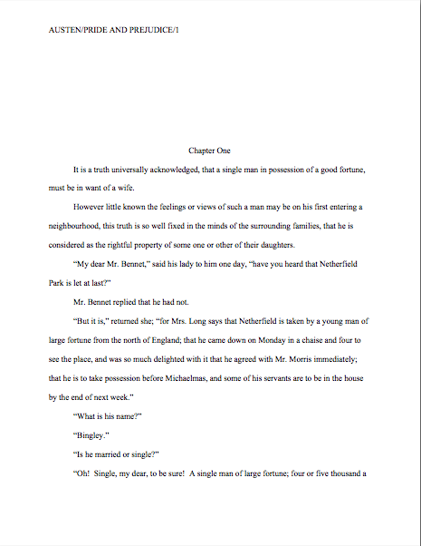
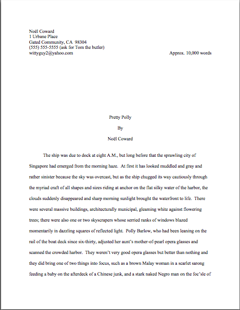
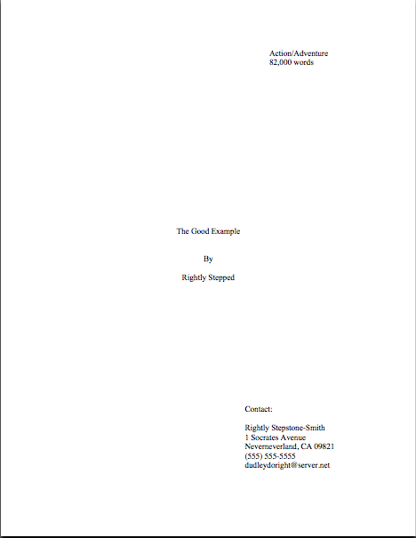
Last time, I showed how the first page of text does not, from a professional perspective, make an adequate substitute for a title page. Instead of being a replica of a hoped-for book cover, as many submitters produce, or a shouted-out declaration of the book’s title and who wrote it, the properly-formatted title page is a quiet, practical piece of paper, containing a specific set of marketing information. It should look, in case you missed it, like this:

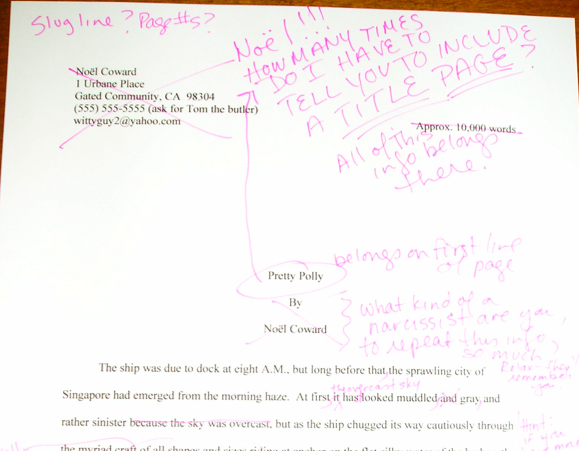
Like everything else in the manuscript, the title page should be entirely in 12-point type, unless an agent SPECIFICALLY requests otherwise. (Or contest’s rules; double-check for title page restrictions, which are quite common.) You may place the title in boldface if you like, but that’s it on the funkiness scale; a title page with photos, drawings, or bizarre fonts is just distracting.
I’m quite serious about this. No matter how cool your title page looks with 24-point type or the picture you would like to see on the book jacket, resist the urge, because Millicent will be able to tell from across the room if you didn’t.
Don’t believe me? See for yourself:

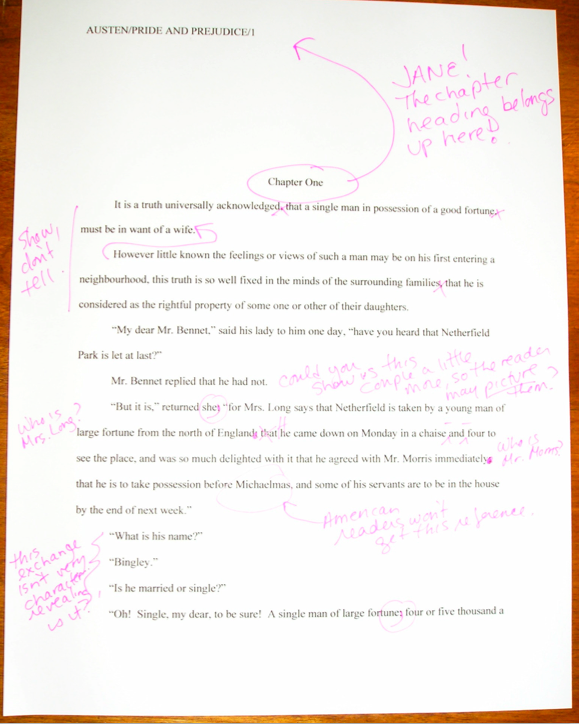
Quite a difference, isn’t it? Apart from the font choice, did you notice any other potentially-distracting dissimilarities between the first example and the second?
If you said that Mssr. Smith’s title page included both a slug line (the author’s name and title in the upper right margin of the page) and a page number in the bottom right corner, give yourself a gold star for the day. Add whipped cream and walnut clusters if you mentally added the reason that those additions are incorrect: because the title page is not the first page of text. Technically, it should not be numbered.
This means, incidentally, that the title page should not be counted as one of the 50 pages in those 50 pages the agent of your dreams asked you to submit, either. Nor would it count toward the total number of pages for a contest entry.
That loud whoop you just heard was contest-entering writers everywhere realizing that they could squeeze another page of text into their entries.
On both the title page and elsewhere, I would highly recommend using either Times, Times New Roman, or Courier typefaces, both here and in the manuscript as well, as these are the standards of the industry.
I know, I know: another cosmetic weirdness. But like some of the other strictures of standard format, there’s a pretty good reason for this one: word count estimation is predicated upon these typefaces. The Times family is estimated at 250 words/page; Courier at 200. So a 400-page manuscript in Times New Roman is estimated to be roughly 100,000 words. (To make the math clear, 400 x 250 = 100,000; for further explanation, please see the WORD COUNT category on this list at right.)
Now, in actual fact, it’s probably closer to 115,000 words; as any writer who has compared the estimated word count for her book with the total her word processing program so kindly provides, they tend to differ wildly. But word count, like beauty, is in the eye of the beholder: a novelist whose title page reported, accurately, that her 400–age novel was 115,000 words might well see it rejected out of hand on the grounds that it was too long.
Why? Well, math may not have been Millicent’s best subject (as one might expect, the inmates of agencies tend overwhelmingly English majors), but she can do third-grade multiplication in her head: 115,000 words at 250 words/page would equal a 460-page manuscript.
That’s quite a bit longer than editors tend to expect first novels in most genres to be. In other words, next!
“But Anne,” I hear you cry, “why is Millicent estimating at all? If she wants to know how long it is, why doesn’t she just flip to the last page and check the page number?”
Arguably, she might, but I wouldn’t bet upon it. I could give you a long song and dance about how much her wrists hurt from opening all those query envelopes all day, or how her secret midnight e-mail orgies have rendered pinching a torture, but in practice, the answer is far less personal: because the word count is right there on the title page. Why should she doubt it?
Also, how exactly could she manage to turn to page 400 of a manuscript, when her boss requested that the writer send only the first 50, without resorting to some pretty impressive maneuvering through time and space?
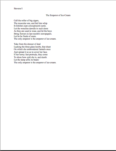
Let’s turn to the first page of the submission, to see how much of a difference font and typeface make at first glance. Here’s a correctly-formatted page 1 in Times New Roman:

Pretty spiffy, eh? And definitely not how this opening would appear in a published book, right?
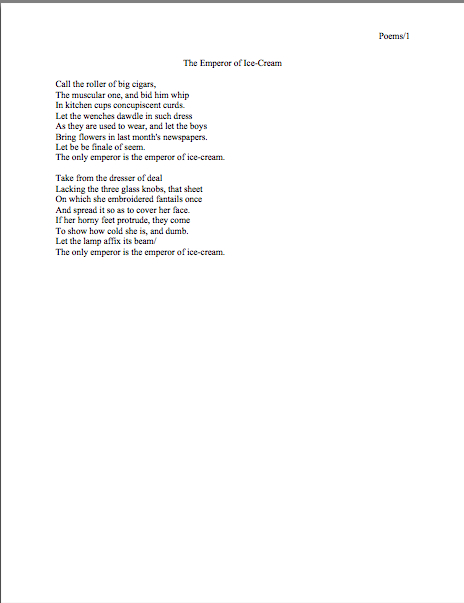
Just for giggles, let’s take a peek at the same page, also correctly formatted, in Courier. Note how many fewer words per page it allows:

Got both of those firmly imbedded in your brainpan? Good. Now format your first pages that way for the rest of your natural life.
Well, my work here is obviously done.
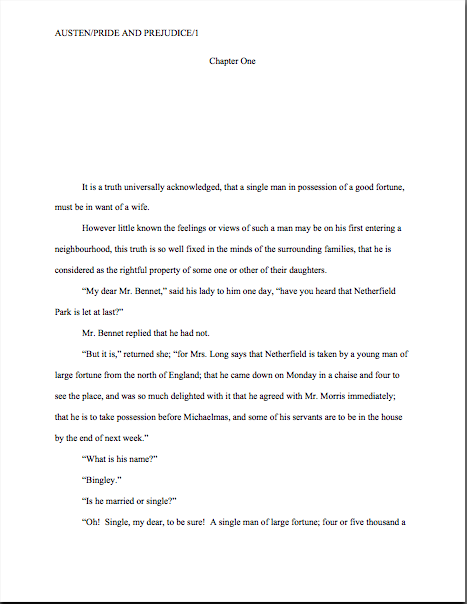
Okay, okay — you want to see why it’s a good idea, don’t you? Take a gander at the SAME first page, not in standard manuscript format. See how many differences you can spot:

Interesting how just a few small formatting changes can alter the presentation, isn’t it? It’s exactly the same WRITING — but it just doesn’t look as professional.
To Millicent, who reads hundreds of pages per day, the differences between the last three examples could not be clearer.
And yet, if we’re going to be honest about it, there were really very few deviations from standard format in the last example. For those of you playing at home, the typeface is Georgia; the chapter title is in the wrong place, and there isn’t a slug line. Also, the page is numbered in the wrong place — the default setting, incidentally, in many word processing programs.
Again, none of these infractions against the rules of standard format are serious enough to cause Millicent to toss a submission aside as soon as she notices them. But when poor formatting is combined with literary experimentation — like, say, that paragraph-long first sentence ol’ Charles managed to cough up — which do you think she is going to conclude, that Dickens is a writer who took the time to polish his craft, or that he just doesn’t know what he’s doing?
Yup. Don’t tempt her to draw the wrong conclusion.
Of course, there is the occasional exception — if you answered that it all depends upon whether Millicent reading it before Dickens is a household name or after, give yourself yet another gold star for the day. Unless you happen to be famous, I wouldn’t advise taking the risk.
And if you do happen to be famous, could I interest you in writing a back jacket blurb?
At the risk of hatching an axiom, it’s worth a writer’s while pay attention to the little details. The longer you remain in the business, the more those little things will strike you as just, well, matters of right and wrong. As, fortunately or not, they do Millicent and her ilk.
Come to think of it, that sense of fitness may well be the reason that discussions of formatting tend to become so vitriol-stained: we all like to be right, and after all, propriety is in the eye of the beholder.
More show-and-tell follows next time. Keep up the good work!