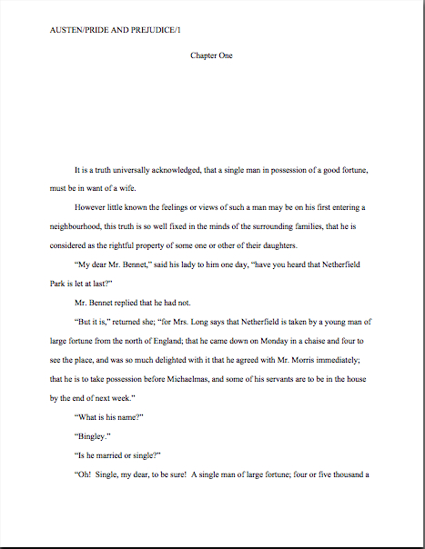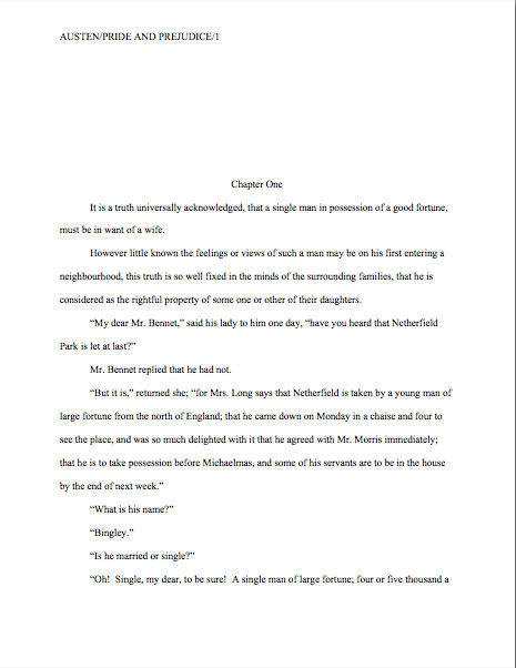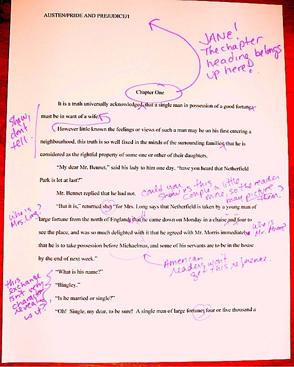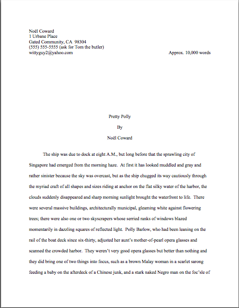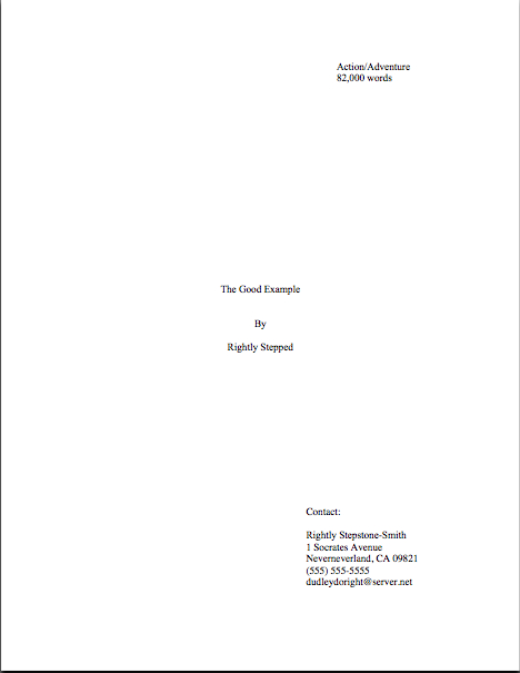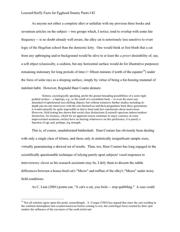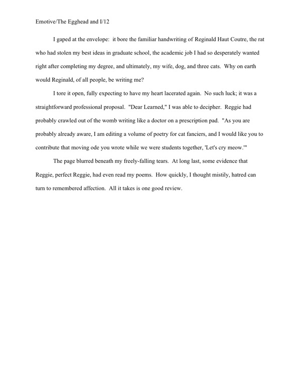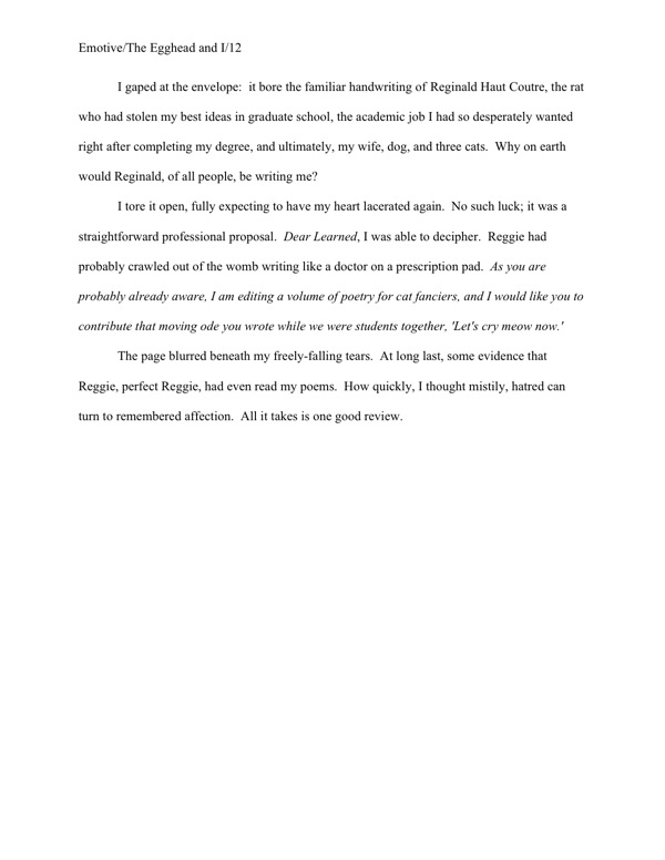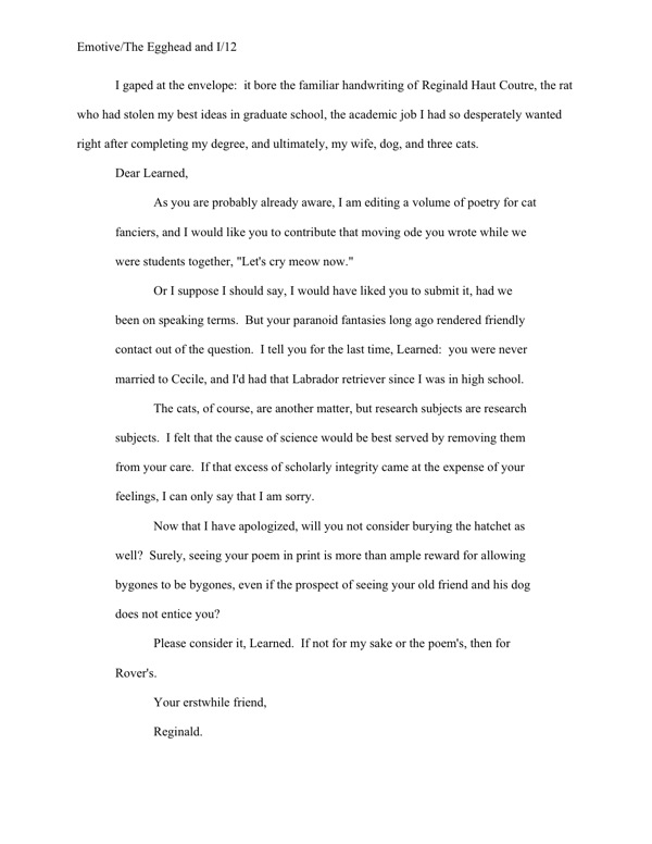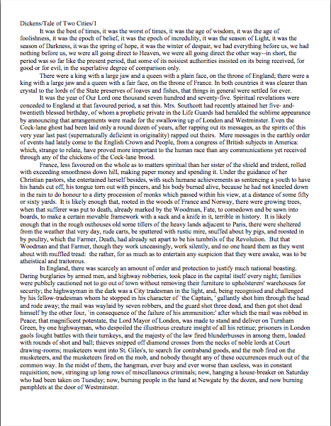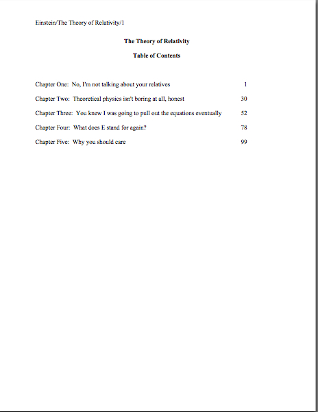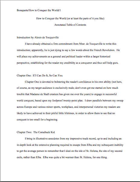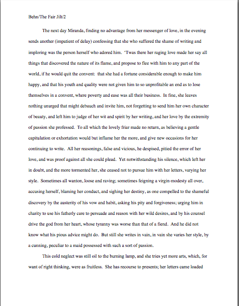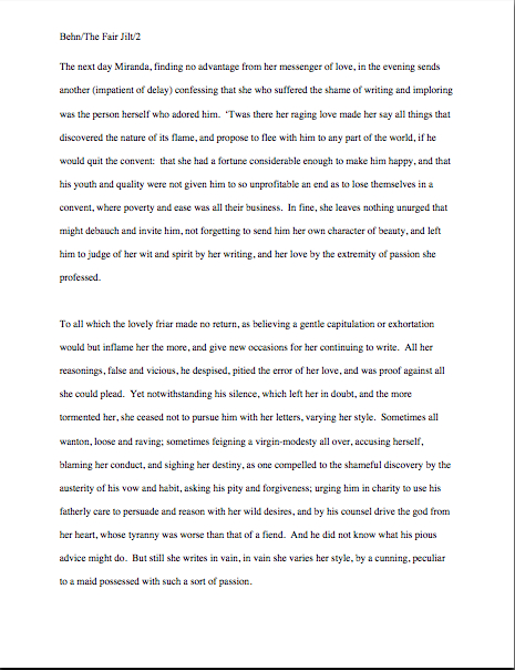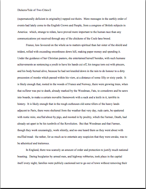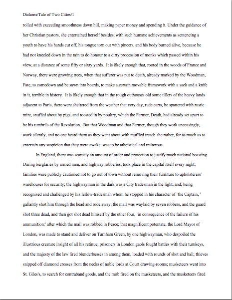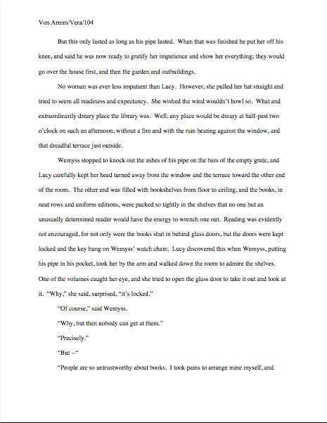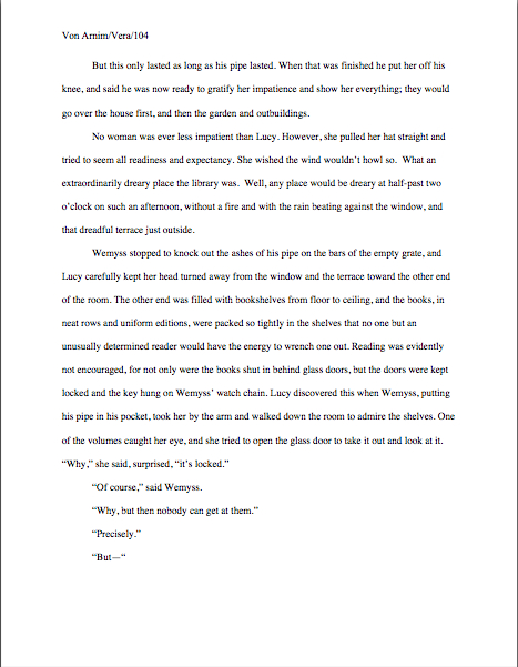
Let’s continue with the basics: how do professional writers format manuscripts, anyway?

Buster Keaton reading

Some of you are already yawning, aren’t you? “Manuscript formatting?” I hear many an aspiring writer grumbling. “What on earth does that have to do with landing an agent and/or getting my book published?”

Plenty, actually; submitting the way professional authors do gives an aspiring writer a competitive advantage in submission. Before I go into why, bear with me for a moment while I share a little editorial anecdote.

Remember how I was telling you that a hefty percentage of the aspiring writers of North America tend to gird their loins, ratchet up their nerves, and send out queries and requested materials in early January of each year, in fulfillment of New Year’s resolutions to get cracking on getting published? These same resolutions lead freelance editors’ desks, or at any rate their e-mail inboxes, to groan under the weight of clients eager to seek their counsel. It’s also the time of year when we can get a preview of what Millicent the agency screener is likely to see for the next eleven months.

I can already tell you this year’s trend, alas: not double-spacing manuscripts. Last year, it was not indenting paragraphs.

A few of my fellow editors laughed at me when I brought it up at lunch last month, deploring that so many aspiring writers had apparently not done their homework on how manuscripts should be formatted. “Oh, come on, Anne,” they scoffed. “The formatting isn’t really the problem for most of those writers. Most of the manuscripts you’re talking about would have gotten rejected by agencies, anyway; the ones who don’t double-space tend not to spell-check, either.”

I sensed a bit of buck-passing. “But what about the ones who do spell-check — and proof-read, and take the time to get feedback on their work before sending it out? Improper formatting can as easily be the result of simple ignorance as of authorial laziness. I’m constantly meeting good writers new to the biz who haven’t the vaguest idea about what a professional manuscript looks like, for the exceedingly simple reason that they’ve never seen one.”

More scoffing. One of the editors even trotted out that old agents’ truism: “If a writer’s serious about getting published, he’ll take the time to learn what the formatting norms are. There are books that explain how to do it.”

“Not to mention your blog, Anne,” another quipped. “How often are you revisiting the rules of standard format these days? Once a year? Twice?”

Actually, it used to be three, but that was before I learned to keep reminding readers to check the archive lists. Still, I wasn’t about to let my friends off that easy. “I’m not denying that it’s possible to learn how to do it right; I’m just pointing out that most of the time, the writers whose manuscripts get rejected unread because of formatting problems have no idea that they’re not getting rejected on the writing itself.” Half the table looked skeptical. “Okay, fine — let’s do a little survey. Hands up: how many of you would read a single-spaced manuscript, if a potential client sent it to you? Or even one-and-a-half spacing? What about non-indented paragraphs?”

Crickets.

And that, my friends, should tell you a lot about just how seriously people who read manuscripts for a living take formatting. Even amongst the open-minded, there is a deep, pervasive prejudice against manuscripts that don’t look right cosmetically. Millicent the agency screener, Maury the editorial assistant, Mehitabel the contest judge: all of these readers whose approval a manuscript must get in order to land an agent, get picked up by a publisher, or make the finals of a contest are so conditioned to expect professional formatting that when they see one that deviates from the rules in any significant respect, they tend to assume, as did the editors above, that the writer is falling down on the job in other respects.

What does that mean in practical terms? Usually, that incorrectly-formatted manuscripts and contest entries are rejected unread.

Why? Well, it’s one of the easiest ways conceivable to narrow the submission pool — which is, if you think about it, job #1 for Millicent, Maury, and Mehitabel. Do the math: if the average agent receives 800-1200 queries per week and agrees to read even five percent of the manuscripts (high for most agents, by the way), that’s 40-60 manuscripts per week, and thus somewhere in the neighborhood of 2,000-3,000 per year. Since even a very successful agent could take on, at most, 4-5 new clients per year, Millicent had better narrow down that applicant pool, pronto, hadn’t she?

So had Maury. So had Mehitabel. Isn’t it fortunate, then, that the vast majority of submitters help these first readers out by presenting their writing unprofessionally?

Yes — really: the majority of submissions are not professionally formatted. They either resemble published books (which is not correct for a manuscript submission), short stories (ditto), or just whatever the submitter happens to think looks nice on the page (extrapolate the answer from the previous two).

All of which makes Millicent, Maury, and Mehitabel shout, “Hallelujah,” especially of late, when both query and submission rates have been skyrocketing. A lot of closet writers for whom writing a book has always been plan B — and with the economy in its current state, many folks seem to be pulling partially-finished manuscripts out of desk drawers these days. (Well, okay, off their hard disks, but it amounts to the same thing.) Because of the aforementioned books coming out of drawers, agencies and small publishing houses are seeing more queries than usual right now. The timing’s a tad unfortunate, since this is also a period where publishing houses have been laying off editors and other staff.

Translation: you know how fierce the competition to get picked up by an agent already was before the economy went south? It’s become even tougher.

While those of you who have been at it awhile are still reeling from the implications of that last statement, let me slip a few hard facts under the noses of those who have yet to submit for the first time:

(1) There exists a standard format for manuscripts to which US-based agents and editors expect submissions to adhere, regardless of whether those manuscripts are produced by seasoned pros with many book sales under their belts or those brand-new to the biz, and thus

(2) using fancy typefaces, including cover artwork, printing manuscript pages on colored paper, and/or any other deviations from standard format in one’s submission will NOT be regarded as interesting expressions of the author’s individual point of view, but rather as evidence that the author doesn’t know about (1). As a result,

(3) manuscripts submitted in standard format tend to be treated with SUBSTANTIALLY more respect by agency screeners, editorial assistants, contest judges, and pretty much everyone who happens to read unpublished prose for a living. Despite this fact,

(4) one does occasionally hear agents and editors ask for deviations from standard format; one should definitely give them precisely what they ask to see. However, it’s never advisable to generalize what one individual says s/he wants into a brand-new trend sweeping the industry. Nor is it a good idea to ape the formatting choices one sees in a published book, because

(5) book manuscripts do not resemble published books in many important respects, and for many excellent, practical reasons. That being the case, those who screen manuscripts for a living tend to draw unfavorable conclusions about submissions that do aspire to book formatting, much as they do when aspiring writers are not aware that

(6) standard format for book-length manuscripts is NOT business format, either, and just using what you learned about short stories won’t do, either. Nor is it necessarily identical to what your word processor’s grammar checker will ask you to do, or even the AP style one sees in newspapers and magazines. None of these will look correct to an agent or editor who deals with book manuscripts, because the norms there are very specific. This may seem nit-picky and irrelevant to the quality of the writing in question, but think about it:

(7) if a host asks you to a formal dinner, it’s only polite to wear formal attire; a guest who shows up in flip-flops and a Hawaiian shirt is going to stand out like the proverbial sore thumb. (If it’s not clear to you why, review point 2.) Similarly, when placed side-by-side with professional manuscripts, as a successful submission inevitably will, a wackily put-together manuscript will stand out as unprofessional, a phenomenon that all too often leads to

(8) most manuscript submissions get rejected on page 1. Not always because it deviates from standard format — although the vast majority of submissions do — but because an unprofessionally-formatted manuscript already has one strike against it, and who needs that? Ultimately,

(9) it’s just not worth your while to try to fudge your way out of these standards, since the price of a submission’s annoying a professional reader can be so high. And as I mentioned above, no matter how many times my readers, students, and editing clients ask me if agents, editors, and contest judges are REALLY serious about them, I’m not going to give you permission to ignore any single one of the standard format strictures. No way. Stop asking, already.

Why might knowing all this — and, more importantly, acting upon this knowledge — translate into higher acceptance rates, typically? Well, the aspiring writer who acts upon this information conscientiously is probably producing submissions within the top 2% of what crosses Millicent the agency screener’s desk on any given day.

Yes, really. So if any of the information on the list above came as a surprise to you in any way, it’s incredibly important that you should join me on a tiptoe through the intricacies of standard format.

I implore those of you who have been through this material with me before: don’t just skip these posts on standard format. I see manuscripts all the time by experienced albeit unpublished writers that contain standard format violations; heck, they occasionally turn up in the work of published writers, if the complaints their agents and editors make in those bars that are never more than a hundred yards from any writers’ conference in North America are to be believed.

Seriously, all of us could use a review from time to time — say, the twice per year I bring the matter up here. Because, you see, I am far from the only professional reader who takes umbrage, when manuscripts deviate from certain time-honored restrictions. Trust me, Millicent started twitching at the very sight of them before she’d had her job three weeks.

Yes, even if the formatting in question would be perfectly legitimate in other writing environments. (See points 2, 3, 5, and 6 above, for instance.) And yes, yes, oh, yes, even if the deviation is precisely what some agent, editor, writing guru, or darned fool writing expert like me has suddenly announced to the world is the new norm.

Millicent didn’t get that memo.

Think about it: why would she, unless she happens to work for the agent-who-blogs or editor-who-is-trying-to-be-helpful who promulgated the new advice? Indeed, why would anyone who works with manuscripts for a living go out looking to see what folks outside the industry — or, at minimum, outside her agency’s office — are demanding of writers these days, when the basics of standard format have actually changed very little for decades?

Actually, it would be very much against her self-interest to go trolling for such information, because –chant it with e now — it’s so much easier just to regard submissions that don’t adhere to standard format as inherently unprofessional, and thus (by implication) less likely to contain writing destined to take the publishing world by storm.

To put it bluntly, it would slow her per-submission rejection time.

I hope no one out there fainted, because this is a vital fact for any submitting writer to understand: the folks who read submissions (and queries) in order to decide who gets a break and who doesn’t are in a HURRY. Remember the stats above; these people have a heck of a lot of reading to do.

As we saw in our series on how manuscripts get published, in the face of that many pieces of paper to plow through, even the reading of submissions tends to be awfully rushed: the goal becomes to weed out as many as possible as quickly as possible, rather than seeking out gems. Once a professional reader like Millicent has been at it for a while, s/he will usually develop a knack for coming to a conclusion about a piece of writing within the first paragraph or two.

Sometimes even within the first line or two. (For a fairly frightening run-down of the common first-page rejection reasons, you might want to check out the HOW NOT TO WRITE A FIRST PAGE category on the list at right.)

What does this trigger-happiness mean for aspiring writers who scoff at standard format, or just don’t know about it? Well, it’s not good: agency screeners, agents, editors, and contest judges tend to regard submissions formatted in any other way as either unpolished (if they’re feeling generous) or unprofessional (if they’re not).

And unfortunately for writers unaware of the rules, a non-standard manuscript is child’s play to spot from the moment a professional reader lays eyes upon it. That can be an extremely serious problem for a submission, because — wait for it — being identified as not professionally formatted renders it FAR more likely to be rejected.

Why? Shout it with me now: agencies and publishing houses get so many submissions that a screener’s primary goal is to weed out the one she is reading at the moment.

The faster she can do that, the better, to move through that mountain of paper on her desk. So a first page that cries out the moment Millicent lays eyes on it, “This writer is brand-new to the game and will require quite a bit of your boss’ time to coach into being able to produce a manuscript that an agent would be comfortable submitting to an editor!” is a downright gift to her: she can feel completely comfortable rejecting it at the very first typo, cliché, or word choice she doesn’t happen to like.

Heck, she might not even wait to spot any of the above. She might just say, “Oh, look — single-spacing. Next!”

This dark, dark cloud is not without its proverbial silver lining, however. By logical extension, the more professional your manuscript looks, the more likely it is to be read with interest by a screener in a hurry.

See now why aspiring writers cognizant of points (1) – (9) enjoy a considerable competitive advantage at submission time?

I don’t know about you, but I’m all for anything that helps a good writer’s work get taken more seriously, especially in the current super-tight submission environment, which is more rejection-happy than I’ve ever seen it — and I’ve been listening to writers, agents, and editors complain about the state of the literary market since I was in my cradle. (Literally. Long story.)

Right now, Harry Houdini himself would have extreme difficulty sneaking a non-standard manuscript past an agency screener, even though he undoubtedly has the world’s best platform to write a book on extricating oneself from tight situations. (And if that last quip didn’t make you groan, if not chuckle, it’s time to brush up on your industry-speak.)

So to help give you that competitive edge, I’m going to start running though the rules of standard format — and no, Virginia, none of them are negotiable.

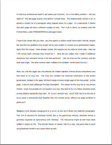
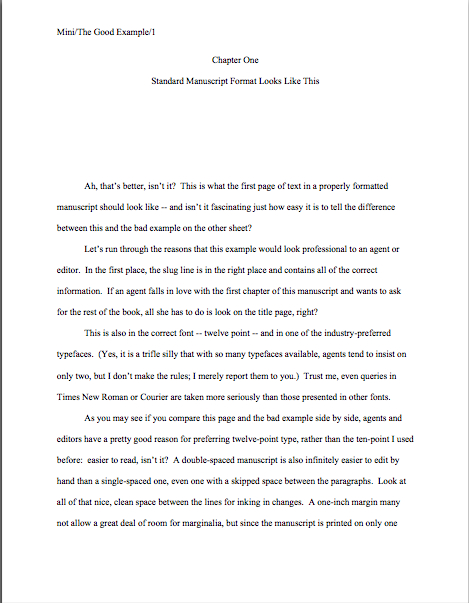
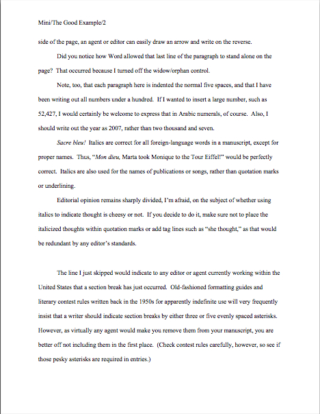
(1) All manuscripts should be printed or typed in black ink and double-spaced, with one-inch margins around all edges of the page, on 20-lb or better white paper.

No exceptions, unless someone in the industry (or a contest’s rules) SPECIFICALLY asks you to do otherwise. And I’m dead serious about using ONLY white paper: ecru paper, no off-white, no Dr. Seuss-type stripes.

Yes, yes, buff or parchment can look very nice, but there’s a strategic reason to use bright white paper: very sharp black-white contrast is strongly preferred by virtually every professional reader out there, probably as a legacy of having read so many dim photocopies over the course of their lifetimes.

The ONLY colored paper that should ever go anywhere near a manuscript is the single sheet that separates one copy of a submission or book proposal from the next, so it is easy for an agent to see where to break the stack. (But you don’t need to know about that until your agent asks you to send 15 copies of your book for submitting to editors. Put it out of your mind for now.)

Nice, clear, dark print is optimal here, so do spring for a new printer cartridge. You’d be amazed (at least, I hope you would) at how poor the printing quality is on some submissions; it’s as though the author dunked in a swiftly-flowing river several times before popping it in the mail.

Which is sad, because submissions with poor print quality are — you’re ahead of me on this one, aren’t you? — almost never read.

Speaking of never, never, ever, eversubmit a dim photocopy; print out an original, every time, You’d be amazed (at least, I hope you would) at how poor the printing quality is on some submissions; it’s as though the author dunked in a swiftly-flowing river several times before popping it in the mail.

Oh, you may chuckle at the notion of sending out a grainy photocopy, but believe me, any contest judge has seen many, many entries submitted that way. Mehitabel likes them, actually: for every one that pops up, her reading time is shortened. Any guesses why?

(2) All manuscripts should be printed on ONE side of the page and unbound in any way (again, unless you are specifically asked to do otherwise)

Yes, this IS criminally wasteful of paper, especially when you consider the literally millions of pages of submissions that go flying into the agencies and publishing houses every month. Most agencies do not even recycle; as I mentioned in my last series, the vast majority of agencies did not even consider accepting e-mailed queries at all until the anthrax-in-envelopes scare.

I assure you, if I ran the universe, paper conservation would be the norm, and recycling mandatory. Also, writers would all be granted an extra month a year in which to write, excellent and inexpensive child care while writing, a cedar-lined cabin on the shores of Lake Michigan in which to do it, and a pineapple upside-down cake on Kurt Vonnegut’s birthday. Perhaps some hard candies on Agatha Christie’s birthday as well, in affluent years, and dancing on Mme. de Staël’s.

But since the unhappy reality is that I do NOT run the universe (see disclaimer above), we shall all have to live with the status quo.

Which is to say: the publishing industry is one vast paper-wasting enterprise. Sorry.

Unbound means precisely what it says: no binding of any kind. You’d be surprised at how often writers violate the thou-shalt-not-bind rule, including paper clips, rubber bands, or even binders with their submissions. Since agents always circulate manuscripts without any sort of binding, these doohickeys just scream, “I’m unfamiliar with the industry.”

SASE, open wide: here comes a returned manuscript.

The ONLY exception to this rule is a nonfiction book proposal — not the manuscript, just the proposal — which is typically presented UNBOUND in a black folder, the kind with horizontal pockets. (For tips on how a book proposal should be presented, please see the aptly-titled BOOK PROPOSALS category on the list at right.)

Which doesn’t mean that you aren’t perfectly welcome to print double-sided or bind copies for your own purposes; just don’t show your work to the pros that way. As Author! Author!’s very first commenter Dave tends to chime in when I bring this up — and helpfully — if you wish to make double-sided, 3-hole-punched, be-bindered drafts for circulating to your first readers for ease of toting around, be my guest.

But NEVER submit in that manner to a professional reader unless s/he has asked you to do so. Trust me on this one.

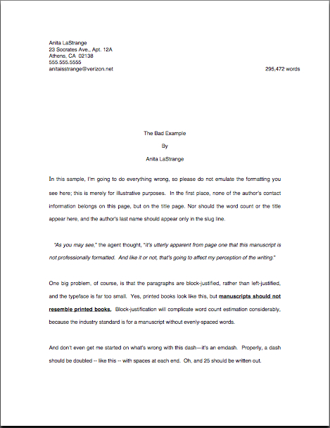
(3) The text should be left-justified, NOT block-justified, as published books, e-mails, business letters, and online writing tend to be.

Translation: the left margin should be straight; the right margin should not.

Many fledgling writers find (3) nearly impossible to accept, because it is one of the most visually obvious ways in which a professional manuscript differs from a printed book. They believe, wrongly, that anything that makes their submission look more like what’s on the shelves at Barnes & Noble is inherently professional. In practice, quite the opposite is true.

Yes, books feature text that runs in straight vertical lines along both side margins, and yes, your word processing program can replicate that practically effortlessly, if you ask it nicely to do so. Bully for it.

But don’t take advantage of that pleasing capacity, I beg you: the straight margin should be the left one; the right should be ragged, as if you had produced the manuscript on a typewriter.

Fear not if you’re having trouble picturing this: I shall be showing you concrete examples later in this series. For now, you’re just going to have to trust me when I tell you that block-justifying your submission is going to appeal to your garden-variety Millicent about as much as a slap in the face.

Speaking of things I’m going to demonstrate in the days to come, NEVER format a query or cover letter to someone in the industry in business format: indent those paragraphs. (And yes, now that you bring it up, I do intend to show you why. Hold your proverbial horses, already.)

(4) The preferred typefaces are 12-point Times, Times New Roman, Courier, or Courier New; pick one and use it consistently throughout your entire submission packet.

Even if you have a strong preference for the lettering in your book when it is published, use one of these typefaces for submission purposes. Personally, I would never dream of allowing a client of mine to submit a manuscript in anything but Times New Roman, nor would I ever submit any of my work in anything else. It is the standard typeface of the publishing industry, just as Courier is the norm of screenwriting.

A tad silly, you say? Perhaps, but it’s one of the bizarre facts of publishing life that manuscripts in these fonts tend to be taken far more seriously, and with good reason: these are the typefaces upon which the most commonly-used word count estimations are based. (Psst: if you don’t know why you should be estimating the length of your manuscript rather than using actual word count, please see the WORD COUNT category at right.)

To forestall the usual question someone brings up at this point: yes, most published books ARE in typefaces other than Times or Courier, but typeface decisions for published books are made by the publishing house, not the author. Submission time is not the appropriate period for making your preferences known.

Why? Shout it with me now, understanders of point (5) at the top of this post — MANUSCRIPTS AND PUBLISHED BOOKS AREN’T SUPPOSED TO LOOK THE SAME.

If you’re very nice down the line, after a publishing house has acquired your book, they may listen to your suggestions. They may giggle a little, true, but they might listen. Ditto with the cover and the title, which are — brace yourselves — almost never under the author’s control.

Why? Because these are considered matters of packaging and marketing, not content.

All of which begs the question, of course: why do word processing programs tempt us so many typefaces from which to choose, if we’re not supposed to use them?

Answer: because the people who make word processing programs are not the same people who decide what books get published in North America. Which is why, in case you’re wondering, what Microsoft Word means by word count and what the average agent or editor does are not typically the same thing.

Again, so there.

There are a few agents out there who have their own font preferences (usually Courier, and usually because they also represent screenplays) so do check their websites and/or listings in the standard agency guides. As ever, the golden rule of dealing with an agent you want to represent you is GIVE ‘EM PRECISELY WHAT THEY ASK TO SEE, not what you would like them to see.

Fair warning: if you are a writer who likes to have different voices presented in different typefaces, or who chooses boldface for emphasis, a submission is not a forum where you can express those preferences freely. Yes, one sees this in a published book occasionally, but I assure you, the choice to indulge in these formatting differences was the editor’s, not the author’s.

Sorry. (See my earlier disclaimer about proprietorship of the universe.)

I’m still sensing some skepticism out there on the font issue, but that may be a hangover from reader reactions to previous series on standard format. Almost invariably, around the time that I bring up Rule #4, someone posts a comment informing me huffily that website X advises something different, that this agent said at a conference she doesn’t care what typeface you use, that a certain manual said that standards have changed from the traditional guidelines I set out here, or some other observation presumably intended to make me rend my garments and cry, “Finally, I see the error of my ways! I guess I’ll disregard the fact that I’ve never seen the change you mention actually in use in a professional manuscript and declare it to be the new norm!”

To save you the trouble and sound like a broken record at the same time: it’s not gonna happen.

I have no doubt that all of these comments are indeed pointing out legitimate differences in advice, but it is not my purpose here to police the net for standardization of advice. If you like guidelines you find elsewhere better, by all means follow them.

All I claim for these rules — and it is not an insubstantial claim — is that nothing I advise here will EVER strike an agent or editor as unprofessional; even if any give agent, editor, or contest judge should happen to harbor personal preferences for other formatting choices, anyone who has been in the biz for a while will recognize pages in standard format as the industry norm.

Why is that important? Adhering to these rules will mean that your writing is going to be judged on your writing, not your formatting. And that, my friends, is nothing at which to sneeze.

Speaking of which: my apologies for being a trifle slow to get to this topic, campers — that flu I had last week has developed into bronchitis, and I try not to post when I’m feverish. Tends to make me a trifle testy. So if I’m a trifle slow in answering questions left in the comments over the next week or so, I’m sure you’ll understand. Rest assured, I’ll get to them just as soon as I stop coughing.

More rules follow next time, of course, as well as buckets more explanation. In the meantime, keep up the good work!

How to write a really good synopsis, part II: getting the facts straight from the get-go

Athene's birth from the head of Zeus

Last time, I launched into a discussion one of the more frustration-generating tasks a writer faces on a routine basis: compressing a deliciously complex, breathtakingly nuanced 400-book into a 5-page summary in standard format. Or whatever length the agent of your dreams or contest of your desires has seen fit to request.

As I pointed out yesterday, it’s well worth double-checking who is requesting what these days, especially if you’re planning on including a synopsis with your query letters. This information that’s usually easily available in the agency’s listing in one of the standard agency guides, on its website (if it has one; a surprisingly hefty percentage still don’t), or even, in the case of a REQUESTED synopsis to be included with a submission, in the communication containing the request for materials.

Yes, I AM saying what you think I’m saying: you wouldn’t believe how often queriers seem to forget to consult either of the former (or both, since sometimes they contain different information) or, in the heat of post-request excitement, simply disregard the instructions about what they’re supposed to send. A good trick to help avoid the first mistake: do your homework.

Seriously, Millicent the agency screener is not going to consider ignorance a legitimate defense. If the agency has made the information publicly available, she will expect any querier or submitter to be familiar with it. As will her boss.

Why might a demonstrated lack of familiarity with an agency’s querying or submission guidelines (which are, lest we forget, likely to differ from other agencies’) raise red flags for Millicent? Readers who made it through my recent Pitching 101 and How to Write a Really Good Query Letter series, feel free to shout out the answer: because a writer who isn’t very good at following directions is inherently more likely to be a time-consuming client than one who shines at producing what s/he is asked to produce.

I hear some annoyed huffing out there, don’t I? “Aren’t you borrowing trouble here, Anne?” some of you ask, arms akimbo. “The first mistake you mentioned could simply be a matter of having found out about an agent from writers’ forum or one of the listing websites, rather than having plunked down the cash for a Herman Guide or tracked down the agency’s website. If agents were REALLY serious about wanting everyone who approaches them to adhere to the guidelines on their sites, wouldn’t they make sure that the same information appears in every conceivable listing, anywhere?”

Well, that might be the case, if agents had infinite time on their hands (they don’t) or if most of the information on fora and secondary sites you mentioned were first-hand (it seldom is). The advantage of relying upon one of the more credible information sources — Jeff Herman’s guide, Guide to Literary Agents, the Publishers’ Marketplace member listings, individual agencies’ websites — is that the information there comes directly from the agencies themselves. Notwithstanding the fact that these sources may occasionally provide mutually contradictory guidelines, you can at least be certain that someone at the agency you are planning to approach has heard of them.

Not so with a writers’ forum or an agency listing site. While writers can glean useful information this way, it’s almost invariably second- or third-hand: it may be accurate, but it’s not necessarily what the agent or agency you’re planning to approach would like potential clients to know about them.

So while searching fora and generalist sites can be a good way to come up with ideas of whom to query, that shouldn’t be a savvy writer’s only stop. Check out what the agency has to say for itself — because I can tell you now, their Millicent will assume that you are intimately familiar with its stated guidelines, and judge your queries and submissions accordingly.

Besides — and I’m kind of surprised that this little tidbit isn’t more widely known — it tends to drive people who have devoted their lives to the production of books NUTS to encounter the increasingly common attitude that to conduct a 20-second web search IS to have done research. Until fairly recently, conducting research meant actually going to a library and looking into a book, a practice that people who sold them for a living really, really condoned. They miss the days when that was common. They pine for those days.

Trust me on this one: aspiring writers who whine, “But how I was I supposed to know that you wanted a 1-page synopsis rather than a 5-page one?” when that information is clearly included in a well-respected guide that anyone in North America could have walked into a bookstore and bought do not win friends easily at the average agency.

Unfortunately, from Millicent’s side of the desk, the second problem I mentioned, when queriers get so caught up in the excitement of querying or submission that they just forget to do every step recommended in the guidelines, looks virtually identical to poor research. The over-excited are often penalized as a result.

So how might one avoid that dreadful fate? Here are a few helpful hints:

For a query packet:
1. Track down the agency’s SPECIFIC guidelines.

You saw that one coming, didn’t you? Never, ever assume that any given agency will want to see exactly what all the others do.

Yes, even if you heard an agent at a writers’ conference swear up and down that everyone currently practicing her profession does. It’s just not true — unless she was talking about professionalism, attention to detail, courtesy, and submissions in standard manuscript format. (And if you don’t know what that is, please see the HOW TO FORMAT A MANUSCRIPT category on the archive list at right before you even consider approaching an agent.)

2. Take out a sheet of paper and make a checklist of EVERYTHING those guidelines request.
Don’t trust your memory, especially if you are querying several agents at once: details can blur under stress.

3. Follow that checklist whilst constructing your query packet.
Again, you probably saw that one coming.

4. Before you seal the query packet (or hit the SEND button), go over your checklist again to make absolutely certain you’ve done everything on it.
Double-checking is the key. If you’re too nervous to feel confident doing this — and many aspiring writers are total nervous wrecks on the eve of querying — as your significant other, close friend, obsessive-compulsive sister, or some other detail-oriented person who cares about you to run the final check for you.

Sounds like overkill, but believe me, every agented and published writer in the world can tell you either a first- or second-hand horror story about the time s/he realized after s/he sealed the envelope/popped it in the mailbox/it was halfway to Manhattan that s/he had omitted some necessary part of the packet. Extra care will both help you sleep better at night and increase your chances of charming Millicent.

For a submission packet (and I warn you, some of these are going to sound awfully familiar:
1. Read over the request for materials (if any) and make a checklist of what you’re being asked to send.

If the request came after a successful pitch, you may have to rely upon your recollections of what’s said, but if the agent asked you in writing for pages, don’t make the EXTREMELY COMMON mistake of just assuming that your first excited reading caught all of the facts. Go over it several times and make a list of what to do.

Don’t tell me that you’re in too much of a hurry to do this before you get your manuscript out the door. Must I tell you horror stories about writers who didn’t?

2. Track down the agency’s SPECIFIC guidelines.
Yes, you should do this even if the requesting agent was very detailed about what s/he wanted. Chances are, the agent of your dreams shares a Millicent with other member agents; if the agency expects submissions to look a certain way, so will the communal Millicent.

3. Have a non-writer go over the request for materials, the agency in question’s guidelines, AND its website, making a separate list of all the agency’s requirements and requests.
No, it’s not sufficient to have someone else double-check your list — this is too important. Have a buddy generate a separate list, to maximize the probability that nothing will be left off.

Why a non-writer, you ask? S/he’s less likely to get swept up in the excitement of the moment.

4. Compare and consolidate the two lists.
If there are discrepancies, go back and find our which is correct.

5. Make absolutely certain that your submission is in standard manuscript format.
I couldn’t resist throwing this in, because so many submissions fall victim to unprofessional formatting. If you have never seen a professional manuscript in person (and no, it does not resemble a published book in several significant ways), please go through the checklist under the HOW TO FORMAT A MANUSCRIPT category on the list at right.

I usually add a bunch of disclaimers about how there are many such lists floating around the web, all claiming to be definitive, but it’s tiring to pretend that there isn’t a lot of misinformation out there. I’ve won a major literary contest and sold two books using the guidelines I show on this site; my clients have sold many books and win literary awards relying upon these guidelines. I know agents who refer new clients to my website for these guidelines.

So as far as I know, there is literally no debate amongst professional book writers about what is required. (Fair warning: the standards for short stories and articles are different.) For any readers who still throw up their hands and complain that there isn’t a comprehensive set of guidelines out there, all I can suggest is maybe you’re spending a bit too much time surfing and not enough time talking to the pros.

That wasn’t as peevish as it sounded: seriously, if you’re tied up in knots because there isn’t any army out there forcing every single advice-giver to conform to a single set of suggestions, sign up for a writers’ conference or go to a book signing. Pretty much anyone in the industry will be perfectly happy to refer you to a credible source.

But fair warning: almost without exception, they will be miffed at an aspiring writer who complains that an Internet search did not turn up definitive information. As I mention above, to book people, that’s simply not doing research.

6. Before you seal the submission packet, dig out the final version of that to-do list and triple-check that you did everything on it.

Again, if you’re not a very detail-oriented person, at least not when you’re extremely nervous, have someone else do the final flight-check. Often, significant others are THRILLED to be helping.

Whenever you are scanning guidelines, be it for a query packet, submission, or contest entry, pay extra-close attention to length restrictions for synopses. Millicents are known for rejecting a too-long or too-short synopsis on sight. Why? Well, one that is much shorter will make you look as if your story is unable to sustain a longer exposition; if it is much longer, you will look as though you aren’t aware of the standard.

Either way, the results can be fatal to your submission.

If, as is the case with many agency guidelines, a particular agency does not set a length limit, be grateful: they’re leaving it up to you, not expecting you to read their minds and guess what they consider the industry standard. Use the length that you feel best represents your book, but never go over 5 pages, double-spaced.

So what DOES work in a synopsis? It’s not going to sound sexy, I’m afraid, but come closer, and I’ll let you in on the secret:

For fiction, stick to the plot of the novel, including enough vivid detail to make the synopsis interesting to read. Oh, and make sure the writing is impeccable — and, ideally, reflective of the voice of the book.

For nonfiction, begin with a single paragraph about (a) why there is a solid market already available for this book and (b) why your background/research/approach renders you the perfect person to fill that market niche. Then present the book’s argument in a straightforward manner, showing how each chapter will build upon the one before to prove your case as a whole. Give some indication of what evidence you will use to back up your points.

For either, make sure to allot sufficient time to craft a competent, professional synopsis — as well as sufficient buffing time to render it gorgeous. Let’s face it, unlike some of the more — let’s see, how shall I describe them? — fulfilling parts of writing and promoting a book, a synopsis is unlikely to spring into your head fully-formed, like Athene; most writers have to flog the muses quite a bit to produce a synopsis they like.

Too few aspiring writers do, apparently preferring instead to toss together something at the last minute before sending out a submission or contest entry. (Especially a contest entry. I’ve been a judge many times; I know.)

I have my own theories about why otherwise sane and reasonable people might tumble into this particular strategic error. Not being aware that a synopsis would be required seems to be a common reason, as does resentment at having to produce it at all. Or just not being familiar with the rigors of writing one. Regardless, it’s just basic common sense to recognize that synopses are marketing materials, and should be taken as seriously as anything else you write.

Yes, no matter how good your book may happen to be. Miss America may be beautiful au naturale, for all any of us know, but you can bet your last pair of socks that at even the earliest stage of going for the title, she takes the time to put on her makeup with care.

On the bright side, since almost everyone just throws a synopsis together, impressing an agent with one actually isn’t as hard as it seems at first blush. Being able to include a couple of stunning visceral details, for instance, is going to make you look like a better writer — almost everyone just summarizes vaguely.

My readers, of course, are far, far too savvy to make that mistake, right?

Even if you are not planning to send out queries or submissions anytime soon (much to those sore-backed muses’ relief), I STRONGLY recommend investing the time in generating and polishing a synopsis BEFORE you are at all likely to need to use it. That way, you will never you find yourself in a position of saying in a pitch meeting, “A 5-page synopsis? Tomorrow? Um, absolutely.”

Yes, it happens. It’s actually not all that uncommon for agented and published writers to be asked to provide synopses for books they have not yet written. In some ways, this is easier: when all a writer has in mind is the general outlines of the plot, the details are less distracting.

Actually, if you can bear it — you might want to make sure your heart medication is handy before you finish this sentence –it’s a great idea to pull together a couple of different lengths of synopsis to have on hand, so you are prepared when you reach the querying and submission stages to provide whatever the agent in question likes to see.

What lengths might you want to have in stock? Well, a 5-page, certainly, as that is the most common request, and perhaps a 3 as well, if you are planning on entering any literary contests anytime soon. As I mentioned yesterday, it’s getting more common for agents to request a 1-page synopsis, so you might want to hammer out one of those as well.

I can tell from here that you’ve just tensed up. Take a deep breath. No, I mean a really deep one. This is not as overwhelming a set of tasks as it sounds.

In fact, if you have been reading this blog all summer or have worked through some of the exercised in the archives, you probably already have a 1-page synopsis floating around in your mind.

You may know it by its other name: the 2-minute pitch. (For tips on how to construct one of these babies, please see the aptly-named 2-MINUTE PITCH category at right.)

Don’t believe me, oh ye of little faith? Okay, here’s a pitch I used as an example just a couple of months back:

Nineteenth-century 19-year-old Elizabeth Bennet has a whole host of problems: a socially inattentive father, an endlessly chattering mother, a sister who spouts aphorisms as she pounds deafeningly on the piano, two other sisters who swoon whenever an Army officer walks into the room, and her own quick tongue, any one of which might deprive Elizabeth or her lovely older sister Jane of the rich husband necessary to save them from being thrown out of their house when their father dies. When wealthy humanity-lover Mr. Bingley and disdainful Mr. Darcy rent a nearby manor house, Elizabeth’s mother goes crazy with matchmaking fever, jeopardizing Jane’s romance with Bingley and insisting that Elizabeth marry the first man who proposes to her, her unctuous cousin Mr. Collins, a clergyman who has known her for less than a week. After the family’s reputation is ruined by her youngest sister’s seduction by a dashing army officer, can Elizabeth make her way in the adult world, holding true to her principles and marrying the man she passionately loves, or will her family’s prejudices doom her and Jane to an impecunious and regretful spinsterhood? 


PRIDE AND PREJUDICE, right? As I vaguely recall having mentioned at the time, this would be a trifle long as an elevator speech — which, by definition, needs to be coughed out in a hurry — but it would work fine in, say, a ten-minute meeting with an agent or editor.

It also, when formatted correctly, works beautifully as a one-page synopsis with only a few minor additions. Lookee:

Okay, so if I were Jane (Austen, that is, not Bennet), I MIGHT want to break up some of the sentences a little, particularly that last one that’s a paragraph long, but see how simple that was? The trick to the 1-page synopsis lies in realizing that it’s not intended to summarize the entire plot, merely to introduce the characters and the premise.

Yes, seriously. Like the descriptive paragraph in a query letter or the summary in a verbal pitch, no sane person seriously expects to see the entire plot of a book summarized in a single page. It’s a teaser, and should be treated as such.

Doesn’t that make more sense than driving yourself insane, trying to cram your entire storyline or argument into 22 lines? Or trying to shrink that 5-page synopsis you have already written down to 1? Bears pondering, doesn’t it?

Yes, yes, I know: even with reduced expectations, composing a synopsis is still a tall order. That’s why you’re going to want to set aside some serious time to write it — and don’t forget that the synopsis is every bit as much an indication of your writing skill as the actual chapters that you are submitting. (Where have I heard that before?) Because, really, don’t you want YOURS to be the one that justified Millicent’s heavily-tried faith that SOMEBODY out there can tell a good story in 3 — 5 pages?

Or — gulp! — 1?

Don’t worry; you can do this. There are more rabbits in that hat, and the muses are used to working overtime on good writers’ behalves.

Just don’t expect Athene to come leaping out of your head on your first try: learning how to do this takes time. Keep up the good work!

How to write a really good query letter, part I, or what do you mean, I already have the building blocks of a query at my fingertips?

rettig-in-5000-fingers

Cast your mind back to those thrilling days of yesteryear, way back in mid-July, and you’ll find that when I first began talking about how to pull together a verbal pitch. Back in those practically prehistoric times, I promised that doing so it would help you crank out a stellar query letter.

And the laughter could be heard for miles around. Those of you who had never pitched or queried before shook your heads in wondering skepticism, rent your garments, and troubled the heavens with bootless cries of, “How is that possible, when verbal pitches and written queries are such different things? When will this horrible miasma of confusion end?”

To be precise, now.

Today, I’m going to start talking about how to construct a query letter from the building blocks of the pitch. (And if you’re joining us late and are not clear about what they are, check the category list at the lower right-hand side of this page — each has its own category, for easy reference.) This is a perfect time of year to be working on polishing a query — as I’ve mentioned before, the vast majority of the publishing industry goes on vacation from mid-August until after Labor Day, so waiting until early-to-mid-September (after Labor Day, but before the Frankfort Book Fair, since I’m on a precision kick) makes good strategic sense.

I should probably acknowledge before I start that there are almost as many formulae out there for sure-fire query letters as there are professional givers of writing advice. Personally, I don’t believe that the perfect query exists, at least in a generic form: in my experience, the most effective query letters are the alchemical effect of a combination of a well-written, professional letter, a writer who has taken the time to learn to talk about her manuscript in terms meaningful to the publishing industry, a book concept that happens to be appealing to the current literary market, and an open-minded agent with the already-existing connections to sell it successfully.

Such a confluence doesn’t occur all that often — and it virtually never happens by accident.

Did I just sense a multitude of jaws dropping out there? “Heavens, Anne,” some prospective query-writers scoff, “if that’s your standard of querying perfection, I’m not surprised that you think it doesn’t happen very often. As Elizabeth Bennet told Mr. Darcy after he listed his criteria for a genuinely educated woman, I do not wonder at your not knowing many; I wonder at your knowing any at all.”

Touché, oh skeptics, but as a matter of fact, I know scads of writers who were able to produce such query letters by dint of persistent and intelligent effort — but only because they realized that there is no such thing as a single query letter perfect for every conceivable recipient.

There is, however, such a thing as a perfectly wonderful query letter specialized to appeal to a specific agent, as well as a slightly modified version personalized for another. For the next week or so, we’re going to be talking about cobbling together a whole flock of such letters.

Already, I hear martyred sighs rising across the English-speaking world. “But Anne,” easy-fix advocates protest, “that sounds like a whole heck of a lot of work, and I already resent taking time away from my writing to query agents. Couldn’t I, you know, just recycle the same letter over and over again?”

Well, you could, oh protesters, but I doubt it would result in identical outcomes each time. Or perhaps not even a single outcome that you would like.

I understand your frustration, though — I’m fully aware that in advising a tailored approach, I’m placing myself firmly in the minority of writer advisors. You could, I assure you, stop reading this right now, invest less than 20 seconds in a Google search of writing the perfect query letter, and come up with literally hundreds of one-size-fits-all templates that would make your life easier in the short run.

But I don’t think you should use any of those. Frankly, I think that the literally thousands of sources out there telling writers to follow this or that fool-proof formula are doing a disservice to those they advise.

Why? A tendency to produce unwarranted self-blame, mostly: if an aspiring writer believes that the one-size-fits-all approach she is using cannot be the problem, then the only possible reasons for rejection could be problems with the book concept or pages submitted, right?

Actually, no. The culprit could also be having made the right case to the wrong agent, or having made the wrong case to the right agent.

Or having formatted the letter oddly, or having failed to follow the directions on the agent’s website, agency guide listing, or Publishers’ Marketplace page. (Yes, PM has very informative explanations of who represents what and what they like to see in a query, but fair warning: it’s a for-pay site.) It could even have been a matter of having adhered to the standards set forth on one of these sources after the agency has changed its rules, or because the targeted agent no longer represents one or more of the types of book one of those sources says she does.

Rejection may, in short, come flying at an aspiring writer from any number of sources. As I think would be quite apparent to your garden-variety querier writers talked amongst themselves more about both rejection and the nuts and bolts of querying.

I know, I know: that’s a rather startling statement for an online writing guru to make, but hear me out. Most of the query letters currently floating through the US Mail or flying via e-mail actually do deserve to be rejected by professional standards, but not because the books they are pushing are poorly written, lousy concepts, or any of the million other reasons a manuscript might not be up to publication standard.

No, most queries fail on a few very basic levels: unprofessional presentation, non-standard spelling and/or grammar, omitting to mention necessary information, hostile tone, being sent to an agent who does not represent the kind of book presented, and, most notorious of all, obviously being a boilerplate letter designed to be sent out indiscriminately to every agent currently operating in North America.

Agents have a pet name for the latter: they’re called Dear Agent letters, because some of them are so generic that they are not even addressed to a particular agent. Virtually without exception, US-based agents simply reject Dear Agent letters unread.

Also destined for the reject pile: queries sporting overused tricks to attract an agent’s attention — strategies, incidentally, often borrowed from one of the zillion guides out there, each giving ostensibly foolproof guidelines for how to construct a positively infallible query letter. Perhaps it is unfair, but nothing says generic letter like the hip new lead-in that some hugely popular marketing guru was advising two years ago.

In my experience, simple works better than gimmicky. Quite possibly because it is rarer.

Although I am confident that my readers are too savvy to fall into the pitfalls that plague the average querier, the vast majority of query letters agents receive are either uncommunicative, petulant in tone, just poor marketing — or obviously copied from a standard one-size-fits-all pattern.

We can do better than that, I think. So let’s start at ground zero and work our way up, shall we?

For those of you absolutely new to the process, a query letter is a 1-page (single-spaced) polite, formal inquiry sent out to an agent or editor in the hope of exciting professional interest in the manuscript it describes.

A strong query is not, contrary to popular practice, an occasion for either begging or boasting; you will want to come across as a friendly, professional write who has done her homework. (Or his, as the case may be.) Nor is its goal to make the agent fall down on the floor, foaming at the mouth and crying, “I will die if I do not sign this author immediately!” but to prompt a request to submit pages.

In order to elicit the admittedly less dramatic but ultimately more respectful of your writing latter option, an effective query introduces the book and the author to a prospective agent in precisely the terms the industry would use to describe them.

This should sound awfully familiar to those of you who stuck with me all the way through my recent Pitching 101 series (conveniently gathered in the archive list at right, for those of you who missed it.) To cast the query in the context we’ve been discussing for the last month or so, the query is a written pitch, intended not to prompt an instantaneous offer to represent the book, but a request to read some or all of the manuscript or book proposal.

Ah, I just lost some of you with that comparison to pitching, didn’t I? “That’s all very easy to say, Anne,” those of you who find the prospect of sitting down face-to-face with a real, live agent about as appealing as hand-feeding a hungry wolf marshmallows by balancing them on your nose point out, “but you just got finished telling us that there’s no such thing as a one-size-fits-all formula. So how does a writer trying to break into the biz pull it off without a prescriptive plan that tells him precisely what to do at every step?”

Well, for starters, don’t feed wild animals that way. What, are you trying to get mauled?

Once you toss aside the preconception that there is only one kind of perfect query letter and you are being expected to guess what it contains, constructing a good query letter introduction for your manuscript or query letter becomes quite a bit easier. It just requires a bit of advance preparation.

I just felt you tense up again, but trust me, this is prep that you are uniquely qualified to do: figuring out what your book is about, who might want to read it, and why. Once you have established those, writing the query letter is a matter of building a structure with parts you already have on-hand. And that’s a comparative breeze, because instead of trying to chase an elusive wraith of an ideal or copying what worked for somebody else, you’re talking about a book you love.

What’s more natural to a writer than that?

Let me hasten to add: being natural does not mean presentation doesn’t count. Your query needs to be businesslike without using business format (long-time readers, chant it with me now: documents without indented paragraphs appear illiterate to folks in the publishing industry), discussing your book project in terms that an agent might use to describe it to an editor.

Keep taking those nice, deep breaths; you are already well prepared to do this.

Don’t believe me? Okay, let’s take a gander at the information you would need to include, so you may see for yourself just how much of it you already have at your fingertips. Typically, a query letter consists of five basic elements:

1. The opening paragraph, which includes the following information:

* A brief statement about why you are approaching this particular agent
Hint: be specific. “I enjoyed hearing you speak at Conference X,”  “Since you so ably represent Author Q,” and “Since you are interested in (book category), I hope you will be intrigued by my book” all work better than not mentioning how you picked the agent in the first place.)

*The book’s title
Self-explanatory, I should hope.

*The book’s category
I.e., where your book would sit in Barnes & Noble. Most queries omit it, but as in a pitch, it’s essential; no agent represents every type of book on the planet. (If you don’t know why, or are not sure where your book will fall, please see the BOOK CATEGORIES section at right).

*Word count.
This one is completely optional. Actually, I have never included this, because it makes many novels easier to reject right off the bat, but many agents to have it up front. Because, you see, it makes it easier to reject so many queries off the bat. If your work falls within the normal word count for your genre — for most works of fiction, between 80,000 and 100,000 words — go ahead and include it. (And if you don’t know how to estimate word count — most of the industry does not operate on actual word count — please see the WORD COUNT category at right.)

2. A paragraph pitching the book.
This is the part that stymies most queriers. Relax — we’re getting to it.

3a. A BRIEF paragraph explaining for whom you have written this book That’s the target market, mind you, not a paraphrase of your dedication page.

3b. and why this book might appeal to that demographic in a way that no other book currently on the market does.
If the demographic is not especially well-known (or even if it is; agents tend to underestimate the size of potential groups of readers), go ahead and include numbers.

Don’t make the very common mistake, though, of having your book sound like a carbon copy of a current bestseller: you want to show here that your work is unique. If you can compare your book to another within the same genre that has sold well within the last five years, this is the place to do it, but make sure to make clear how your book serves the target market differently and better.

4. An optional paragraph giving your writing credentials and/or expertise that renders you the ideal person to have written this book
Or, indeed, absolutely the only sentient being in the universe who could have. Here is where you present your platform — or, to put it in a less intimidating manner, where you explain why the agent should take you seriously as the author of this book.

Actually, this paragraph is not optional for nonfiction, and it’s a good idea for everyone. Include any past publications (paid or unpaid) in descending order of impressiveness, as well as any contest wins, places, shows, semi-finalist lists, etc., and academic degrees (yes, even if they are not relevant to your book).

If you have no credentials that may legitimately be listed here, don’t panic: just omit this paragraph. However, give the matter some serious, creative thought first. If you have real-life experience that gives you a unique insight into your book’s topic, include it. (Again, it need not have been paid work.) Or any public speaking experience — that’s actually a selling point for a writer, since so few have ever read in public before their first books have come out. Or ongoing membership in a writers’ group.

Anything can count, as long as it makes you look like a writer who is approaching the industry like a professional. Or like a person who would be interesting to know, read, and represent.

5. An EXTREMELY brief closing paragraph
Here is where you thank the agent for her time, mentioning any enclosed materials (synopsis, first five pages, or whatever the agent lists as desired elements), calling the agent’s attention to the fact that you’ve sent a SASE (self-addressed stamped envelope), and giving your contact information, if it is not already listed at the top of the letter. (If you can’t afford to have letterhead printed up, just include your contact information, centered, in the header.) Say you look forward to hearing from her soon, and sign off.

There, that’s not impossible to pull off in a single page, is it?

Oh, dear, you’re tensing up again at the prospect, aren’t you? If so, I have some very, very good news for you.

If you have been prepping your pitch throughout our recent Pitching 101 series, you’ve already constructed most of the constituent parts of a professional-looking query letter. You merely have to pull them together into a polite missive personalized for each agent you plan to approach.

Don’t believe me on the preparation front? Look at how easily the building blocks snap together to make a log cabin:

Dear Ms./Mr. agent’s last name,

I enjoyed hearing you speak at the Martian Writers’ Conference. Not many New York-based agents take the time to come to Mars to meet the local writers; we really appreciate the ones who do.

Since you so ably represented BLUE-EYED VENUSIAN, I hope you will be interested in my book, {TITLE}. It is a {BOOK CATEGORY} that will appeal to {TARGET MARKET} because {#1 SELLING POINT}.

{ELEVATOR SPEECH}

I am uniquely qualified to tell this story, because {the rest of your SELLING POINTS, including any writing credentials}.

Thank you for your time in reviewing this, and I hope that the enclosed synopsis will pique your interest. I may be reached at the address and telephone number above, as well as via e-mail at {e-dress}. I enclose a SASE for your convenience, and I look forward to hearing from you soon.

Sincerely,

Aspiring Q. Author

Or, to show it as it might appear on an actual piece of paper (bright white, please; this is not the time to break out the solar yellow in an misguided effort to grab Millicent the agency screener’s attention), like this:

You can pull that off without breaking a sweat, right?

I see quite a few lit-up eyes out there. “Um, Anne?” some wily sorts murmur, jotting down hasty notes. “What you’ve just shown looks suspiciously like a template. Mind if I borrow it wholesale and use it as such?”

Actually, I do, but not because I’m especially proud of having penned a sentence like I enclose a SASE for your convenience, and I look forward to hearing from you soon. You should eschew copying anybody else’s query letter for the very simple reason that it is important that your query letter sounds like your book.

Not my book or the creation of any of the small army of writing gurus, but yours. After all, you’re not seeking representation for a generic volume; you’re looking for the best agent for your particular manuscript.

Don’t worry; this structure isn’t my last word on the query, by any stretch of the imagination; today’s post is the lead-in for one of my patented exhaustively in-depth discussions. By the time we’re finished, the very suggestion that your book’s chances would be improved by utilizing boring, one-size-fits-all query copy is going to make you laugh out loud.

At least, I hope it will. Keep up the good work!

How to format a book manuscript properly, part XII: not all truths are self-evident, or, why a sensible writer should hang onto that massive grain of salt

signing-the-constitution

I’ve been making a Herculean effort not to gloat too much here at Author! Author! about being on a writing retreat in France — or at least to hold off on it until we’ve made it through this series on standard format so I can settle into a nice, luxurious series on how to apply for and what to expect from formal artists’ retreats. But I shall burst if I don’t chortle about just two things today — no, make it three.

First, this is my writing space:
la-muse-writing-room
I’m ALONE in that, incidentally. You can’t see the other fireplace or the wood stove, but I assure you that they’re there.

Second, this is the view from one of the four six-foot-high French windows in my writing space:
window-view
Third, when I asked the very kind proprietors if I might have another lamp in my writing space, they promptly installed what appears from here to be a early 20th century chandelier:
other-end-of-la-muse-writing-space
I’d been thinking something more along the lines of a $20 lamp from IKEA, but hey, I’ll live with it. I could throw an intimate dinner party in the armoire.

I’m just saying: La Muse is a very, very nice place to write. And yes, there are fellowships available — but you’ll be hearing more about all of this in the weeks to come.

Okay, the chortling is out of my system now, more or less. Back to business.

The last few times I have come to the end of an extended series on manuscript formatting — book manuscripts, that is; please be aware that short stories, magazine articles, theses, dissertations, and other types of writing are subject to other restrictions — I’ve ended with a rather peevish little discussion about why, in the face of so much conflicting information about submission requirements floating around these days, professional advice-givers like me don’t either:

(a) check out every other source out there to make sure that we’re all saying precisely the same thing (which would be so time-consuming that none of us would have time to give any further advice),

(b) take it upon ourselves to force every single individual who is empowered to pass judgment upon a manuscript within the confines of North America to agree upon a single (and preferably single-page) set of rules to which everyone without exception would adhere (which would require a convention so large that the framers of the U.S. Constitution would turn pale at the very thought), or

(c) shut up entirely and let those new to the biz try to figure out some genuinely counter-intuitive rules all by themselves.

I can’t speak for everyone currently giving advice on the subject, of course, but in my own case, the answer is really pretty straightforward: the norms I’ve been explaining throughout this series are in fact the ones I have used successfully myself for many, many years. Since neither I, any of my editing clients, or (as far as I know) any reader of this blog who has followed this advice to the letter has ever been asked by an agent or editor to make a single purely formatting change to his/her manuscript, I feel quite confident in continuing to give this particular set of advice.

But I will say something that one seldom hears advice-givers say: whether you choose to adhere to the rules of standard format I’ve set out here is ultimately up to you. But once you choose to follow a particular rule, you must obey it 100% of the time in your manuscript.

Let me repeat that, because it’s monumentally important: it’s not enough to adhere to a formatting rule most of the time; you must cleave to it in every single applicable instance in the text.

Why? You should know the words to the song by now: because inconsistency isn’t going to look professional to people who read manuscripts for a living.

I used to think that I didn’t actually need to state this requirement — after all, isn’t the part of the point of a rule that it should be followed on a regular basis, rather than just periodically? However, within the last year, I’ve seen enough manuscripts and contest entries (yes, I still judge from time to time) by good writers who sometimes use a single dash and sometimes a doubled one (if you’re not absolutely certain which is correct, I can only suggest that you return to the first post of this series and read through it again), or whose Chapters 1-3, 6, and 17 have a (ugh) single space after periods and colons, whereas Chs. 4, 5, and 10-12 have two, and the rest feature both…

Well, you get the picture. Apparently, the need for consistency is not as self-evident as I had previously believed.

I would point the finger at a few culprits for this astonishingly pervasive manuscript problem. First — and I’m quite positive that those of you who have been hanging around Author! Author! for a while have felt this one coming practically since the top of this post — the vast majority of aspiring writers simply do not reread their own work enough. I’m not talking about revision here (although most submissions could use more liberal helpings of that, frankly), but rather actually sitting down and scanning a manuscript IN ITS ENTIRETY, IN HARD COPY, and OUT LOUD.

What tips me off that very few writers actually do this before submitting their pages to an agent or a contest? Well, for starters, inconsistent formatting. And spelling errors. And repeated words. And scenes where characters do or say things that they’ve done or said half a page before.

You know, the kind of stuff that any reader would catch if s/he sat down with the actual pages and read them closely.

Often, such errors are not the result of compositional carelessness, but of repeated revision –the second culprit I’m dragging before the court in irons today. Zeroing in on the same page, paragraph, or even sentence over and over again without re-reading the entire section can easily result in what I like to call a Frankenstein manuscript, one that reads in hard copy as though it were cobbled together from the corpses of several drafts, sometimes ones written in different voices.

Come closer, and I’ll let you in on a secret of good writing: it flows smoothly. A sure narrative voice is a consistent one. That’s why writers brand-new to the writing game so often labor under the quite mistaken impression that their favorite books were their respective authors’ first drafts, and thus (one assumes) that their own first drafts should be marketable without further revision: because a the author of a well-crafted narrative works hard to create the illusion of spontaneous consistency.

Awfully hard. Seamlessness is no accident, you know.

So what do you think a professional reader like Millicent the agency screener, her cousin Maury the editorial assistant, or their aunt Mehitabel the veteran contest judge thinks when they encounter, say, one sentence that’s in the past tense, followed by three that are in the present? Or a character named George on page 8 and Jorge on page 127?

“Inconsistency,” they breathe in unison. “This manuscript needs more work.”

Or at least a good authorial read-through IN ITS ENTIRETY, IN HARD COPY, and OUT LOUD.

I’m going to be talking at greater length about the Frankenstein manuscript phenomenon soon, you’ll no doubt be happy to hear. Since it’s such a natural follow-up to the standard format series, I may defer my discussion of writing retreats to attend to it first. I’ll have to give it some thought. (Don’t worry: either way, you’ll be seeing some nice pictures of France.)

The third culprit — and I have yet another excellent question from a reader to thank for reminding me to bring it to your attention — is the fact that sometimes presenting a manuscript professionally means breaking one of the standing rules.

Yes, you read that correctly. Among the many, many things that those new to submitting to agencies and publishing houses are magically expected to know is the one instance where using boldface is not only acceptable, but generally expected. No one will hurt you if you don’t use it, mind you, but your future agent may ask you to change your book proposal if you don’t.

I’m talking, in case you’re wondering, about section headings in book proposals. And sometimes in nonfiction manuscripts, but it really depends upon the agent or editor’s personal preference. Brace yourselves, because this logic is going to be a bit convoluted: boldface shouldn’t be used for emphasis, but it’s okay to use in a section heading in nonfiction; some agents actively prefer it, as did my memoir’s publisher.

But seriously, don’t use boldface anywhere else.

Confused? You’re not alone. Quoth curious reader Odin:

I’m having trouble finding a credible source which discusses how to format when there are location headings at the start of sections within a chapter. In a published book, they’d be left-justified with a blank line between it and the start of the text. After a section, there would be two or three blank lines, then the next left justified heading.

How do I do this in a manuscript? Left-justified chapter heading, then a # for the blank line, then start the section. At the end of the section, one # for the blank line, then the heading, etc? I don’t like the # between the heading and the text it heads because when the manuscript is double spaced, it tends to float all alone. I put the headings directly above the text and just used one blank line with a # between the end of one block and the next. It gets the idea across and I’m consistent with it throughout the manuscript, but I’d love to know how to do it right.

I freely admit it: I’m always a bit nonplused when I get a question like this, one that cites as law a rule that just isn’t used in professional manuscripts. But since I do hear from readers who have stumbled across advice like this quite often, I shall pass along a tip for assessing its helpfulness: if the sources you’ve been consulting are telling you to mark skipped lines with # or *, you probably haven’t been consulting sources conversant with the current book market. (The # is used for short stories and articles, not book manuscripts, and I’ve never seen a professional manuscript (as opposed to a contest entry) use * to mark a skipped line.)

It’s also — again, brace yourself, if you’ve been hobnobbing with old rule lists — not at all necessary in a current book manuscript to add any marker at all to indicate a skipped line in the text. Just hit the return key and call it good.

Before those of you who have fallen under the spell of short story and article rules start shouting, “But…but…” allow me to remind you that as we discussed earlier in this series, NOT EVERYTHING THAT FALLS UNDER THE RUBRIC OF WRITING SHOULD BE FORMATTED IDENTICALLY.

Have you happened to notice that amazingly few sources out there bother to tell aspiring writers that?

I suspect that it’s not entirely a coincidence, therefore, that so many aspiring writers assume that all writing should be formatted precisely the same way, regardless of where it will be submitted. That’s just not true — but without some fairly hefty cross-source research, how is someone new to the professional writing to know that?

Case in point: Odin’s dilemma. Pretty much any US-based agent would make her take the #s out of her manuscript, because short story formatting would imply to an editor that both the author and the agent are inexperienced in dealing with book manuscripts. In a submission process where tiny details often make an immense difference, that’s a chance that few agents are going to be willing to take.

So as you make your way through the bewildering forest of advice out there, toting your massive grain of salt, be aware of the fact that many seemingly authoritative sources out there disagree on certain points for the very simple reason that they’re talking about different things, although they often do not say so explicitly. Bear in mind that because such a high percentage of the aspiring writers’ market wants easy answers, preferably in the form of a single-page list of rules universally applicable to every writing venue, the temptation to produce a short, one-size-fits-all list of rules is considerable.

That doesn’t mean you should disregard such lists entirely, of course. Just keep in mind that any list that purports to cover every type is necessarily going to run afoul of some established standard somewhere.

Just to make it perfectly clear: if anyone is looking for terse, bullet-pointed to-do lists for writers, I think any of my long-term readers can tell you that this blog is NOT the place to start. As the thousands of pages of archived posts here can attest, I am the queen of elaboration.

Lots and lots of elaboration.

Which is why Odin’s question so delighted me, I must say: in compiling my own quite specific list, I had overlooked the section heading exception. Yet another opportunity to elaborate and clarify!

So I am pleased to present the two options for what a section heading in a nonfiction book (or proposal) should look like — first, utilizing boldface:

wharton-section-break-example11

Quite straightforward, isn’t it? This format also — and this is important in a book proposal, as they are often read very quickly — renders skimming easy.

That being said, there are anti-boldface hard-liners who might object to this; they’re rare, but they exist. So here is an alternate, bold-free version:

wharton-section-break-example2

Again: simple, elegant, non-confrontational. And — again, important — it would be clear what is happening where, even to a rapidly-skimming eye.

I must confess, however, that I don’t like it as much as the first. Why? Pull out your hymnals, everyone: because it just doesn’t look right.

While I’m on the subject of unnecessary doohickeys writers are sometimes told to shoehorn into their book manuscripts and proposals, let’s talk about what should happen on the last page. For a BOOK manuscript, the proper way to end it is simply to end it.

No bells, no whistles, no # # #, no -86-. Just stop writing.

Even the ever-popular THE END is not needed. In fact, I know plenty of Millicents (and their bosses, and editors, and contest judges) who routinely giggle at the use of THE END to indicate that a manuscript is not, in fact, going to continue. “What is this writer thinking?” they ask one another, amused. “That I’m going to keep reading all of that blank space after the last paragraph, wondering where all of the ink went? That I’m incapable of understanding why there aren’t any more pages in the submission? Please!”

Remember what I was saying earlier in this series about professional critique being harsh? Don’t even get me started on professional ridicule.

Personally, I have sympathy for how confusing all of the various advice out there must be for those who have never seen a professional manuscript up close and personal — that is, as I have said many times, why I revisit this decidedly unsexy topic so often. But honestly, some of the rules that commenters have asked about over the last three years must be from sources that predate World War II, or perhaps the Boer War. I’ve been editing book manuscripts for most of my adult life (and proofing galleys since early junior high school), and I have to say, I’ve literally never seen a single one that ended with “-86-”

So truth compels me to admit that I can sort of see where Millicent might find it amusing to see in a submission.

But you can sort of see her point of view here, can’t you? To people who read book manuscripts for a living in the US, the very notion of there NOT being a consensus is downright odd: why, the evidence that there is a consensus is sitting right in front of them. The mailman brings stacks of it, every single day.

“Oh, come on — everyone doesn’t already know these rules?” Millicent asks, incredulous. “This information is widely available, isn’t it?”

That’s a QUOTE, people — but as someone who regularly works with folks on both sides of the submission aisle, I have come to believe that the wide availability of the information is actually part of the problem here. The rules governing book manuscripts haven’t changed all that much over the years, from an insider’s perspective, but from the POV of someone new to the game, the fact that they have changed at all, ever — coupled with these rules not being applicable to every conceivable type of professional writing — can look an awful lot like inconsistency.

And we all know how Millie, Maury, and Mehitabel feel about that, don’t we?

Which is why, in case you have been wondering, I always spend so much time and space here explaining the logic behind each rule I advise using. I’m just not a fan of the do-it-because-I-say-so school of teaching, and besides, I want the right way to sink into your bones, so it may save you time for the rest of your writing career.

If the flurry of rules starts to seem overwhelming, remind yourself that although submissions do indeed get rejected for very small reasons all the time, it’s virtually unheard-of for any manuscript to have only ONE problem. They seldom travel alone.

So I would caution any aspiring writer against assuming that any single problem, formatting or otherwise, was the ONLY reason a manuscript was getting rejected. Most of the time, it’s quite a few reasons working in tandem — which is why, unfortunately, it’s not all that uncommon for Millicent and her cohorts to come to believe that an obviously improperly-formatted manuscript is unlikely to be well-written. The notion that changing only ONE thing, even a major one, in the average manuscript would render it rejection-proof is not particularly easy for a professional reader to swallow.

There is no such thing as a rejection-proof manuscript, you know. While it would indeed be dandy if there were a magical formula that could be applied to any manuscript to render it pleasing to every Millicent out there, that formula simply doesn’t exist; individual tastes and market trends vary too much.

This is vital to understand about standard format: it’s not a magic wand that can be waved over a submission to make every agent, editor, and contest judge on the face of the earth squeal with delight at the very sight of it.

But it is a basic means of presenting your writing professionally, so your garden-variety Millicent will be able to weigh it on its non-technical merits. All I can claim for standard format — and this isn’t insignificant — is that adhering to it will make it less likely that your submission will be rejected on a knee-jerk basis.

However, I’m not going to lie to you: even a perfectly-formatted manuscript is going to garner its share of rejections, if it’s sent out enough. Why? Because every agent out there, just like every editor, harbors quirky, individuated ideas about how the perfect book should be written.

Sorry. If I ran the universe…well, you know the rest.

Whatever set of rules you decide to embrace, though, make it YOUR decision — and stick to it. Don’t leap to make every change you hear rumored to be an agent’s pet peeve unless you are relatively certain in your heart of hearts that implementing it will make your manuscript a better book.

Yes, even if the suggestion in question came from yours truly. It’s your manuscript, not mine.

Keep up the good work!

Author! Author! How to format a book manuscript properly, part XII: not all truths are self-evident, or, why a sensible writer should hang onto that massive grain of salt

signing-the-constitution

I’ve been making a Herculean effort not to gloat too much here at Author! Author! about being on a writing retreat in France — or at least to hold off on it until we’ve made it through this series on standard format so I can settle into a nice, luxurious series on how to apply for and what to expect from formal artists’ retreats. But I shall burst if I don’t chortle about just two things today — no, make it three.

First, this is my writing space:
la-muse-writing-room
I’m ALONE in that, incidentally. You can’t see the other fireplace or the wood stove, but I assure you that they’re there.

Second, this is the view from one of the four six-foot-high French windows in my writing space:
window-view
Third, when I asked the very kind proprietors if I might have another lamp in my writing space, they promptly installed what appears from here to be a early 20th century chandelier:
other-end-of-la-muse-writing-space
I’d been thinking something more along the lines of a $20 lamp from IKEA, but hey, I’ll live with it. I could throw an intimate dinner party in the armoire.

I’m just saying: La Muse is a very, very nice place to write. And yes, there are fellowships available — but you’ll be hearing more about all of this in the weeks to come.

Okay, the chortling is out of my system now, more or less. Back to business.

The last few times I have come to the end of an extended series on manuscript formatting — book manuscripts, that is; please be aware that short stories, magazine articles, theses, dissertations, and other types of writing are subject to other restrictions — I’ve ended with a rather peevish little discussion about why, in the face of so much conflicting information about submission requirements floating around these days, professional advice-givers like me don’t either:

(a) check out every other source out there to make sure that we’re all saying precisely the same thing (which would be so time-consuming that none of us would have time to give any further advice),

(b) take it upon ourselves to force every single individual who is empowered to pass judgment upon a manuscript within the confines of North America to agree upon a single (and preferably single-page) set of rules to which everyone without exception would adhere (which would require a convention so large that the framers of the U.S. Constitution would turn pale at the very thought), or

(c) shut up entirely and let those new to the biz try to figure out some genuinely counter-intuitive rules all by themselves.

I can’t speak for everyone currently giving advice on the subject, of course, but in my own case, the answer is really pretty straightforward: the norms I’ve been explaining throughout this series are in fact the ones I have used successfully myself for many, many years. Since neither I, any of my editing clients, or (as far as I know) any reader of this blog who has followed this advice to the letter has ever been asked by an agent or editor to make a single purely formatting change to his/her manuscript, I feel quite confident in continuing to give this particular set of advice.

But I will say something that one seldom hears advice-givers say: whether you choose to adhere to the rules of standard format I’ve set out here is ultimately up to you. But once you choose to follow a particular rule, you must obey it 100% of the time in your manuscript.

Let me repeat that, because it’s monumentally important: it’s not enough to adhere to a formatting rule most of the time; you must cleave to it in every single applicable instance in the text.

Why? You should know the words to the song by now: because inconsistency isn’t going to look professional to people who read manuscripts for a living.

I used to think that I didn’t actually need to state this requirement — after all, isn’t the part of the point of a rule that it should be followed on a regular basis, rather than just periodically? However, within the last year, I’ve seen enough manuscripts and contest entries (yes, I still judge from time to time) by good writers who sometimes use a single dash and sometimes a doubled one (if you’re not absolutely certain which is correct, I can only suggest that you return to the first post of this series and read through it again), or whose Chapters 1-3, 6, and 17 have a (ugh) single space after periods and colons, whereas Chs. 4, 5, and 10-12 have two, and the rest feature both…

Well, you get the picture. Apparently, the need for consistency is not as self-evident as I had previously believed.

I would point the finger at a few culprits for this astonishingly pervasive manuscript problem. First — and I’m quite positive that those of you who have been hanging around Author! Author! for a while have felt this one coming practically since the top of this post — the vast majority of aspiring writers simply do not reread their own work enough. I’m not talking about revision here (although most submissions could use more liberal helpings of that, frankly), but rather actually sitting down and scanning a manuscript IN ITS ENTIRETY, IN HARD COPY, and OUT LOUD.

What tips me off that very few writers actually do this before submitting their pages to an agent or a contest? Well, for starters, inconsistent formatting. And spelling errors. And repeated words. And scenes where characters do or say things that they’ve done or said half a page before.

You know, the kind of stuff that any reader would catch if s/he sat down with the actual pages and read them closely.

Often, such errors are not the result of compositional carelessness, but of repeated revision –the second culprit I’m dragging before the court in irons today. Zeroing in on the same page, paragraph, or even sentence over and over again without re-reading the entire section can easily result in what I like to call a Frankenstein manuscript, one that reads in hard copy as though it were cobbled together from the corpses of several drafts, sometimes ones written in different voices.

Come closer, and I’ll let you in on a secret of good writing: it flows smoothly. A sure narrative voice is a consistent one. That’s why writers brand-new to the writing game so often labor under the quite mistaken impression that their favorite books were their respective authors’ first drafts, and thus (one assumes) that their own first drafts should be marketable without further revision: because a the author of a well-crafted narrative works hard to create the illusion of spontaneous consistency.

Awfully hard. Seamlessness is no accident, you know.

So what do you think a professional reader like Millicent the agency screener, her cousin Maury the editorial assistant, or their aunt Mehitabel the veteran contest judge thinks when they encounter, say, one sentence that’s in the past tense, followed by three that are in the present? Or a character named George on page 8 and Jorge on page 127?

“Inconsistency,” they breathe in unison. “This manuscript needs more work.”

Or at least a good authorial read-through IN ITS ENTIRETY, IN HARD COPY, and OUT LOUD.

I’m going to be talking at greater length about the Frankenstein manuscript phenomenon soon, you’ll no doubt be happy to hear. Since it’s such a natural follow-up to the standard format series, I may defer my discussion of writing retreats to attend to it first. I’ll have to give it some thought. (Don’t worry: either way, you’ll be seeing some nice pictures of France.)

The third culprit — and I have yet another excellent question from a reader to thank for reminding me to bring it to your attention — is the fact that sometimes presenting a manuscript professionally means breaking one of the standing rules.

Yes, you read that correctly. Among the many, many things that those new to submitting to agencies and publishing houses are magically expected to know is the one instance where using boldface is not only acceptable, but generally expected. No one will hurt you if you don’t use it, mind you, but your future agent may ask you to change your book proposal if you don’t.

I’m talking, in case you’re wondering, about section headings in book proposals. And sometimes in nonfiction manuscripts, but it really depends upon the agent or editor’s personal preference. Brace yourselves, because this logic is going to be a bit convoluted: boldface shouldn’t be used for emphasis, but it’s okay to use in a section heading in nonfiction; some agents actively prefer it, as did my memoir’s publisher.

But seriously, don’t use boldface anywhere else.

Confused? You’re not alone. Quoth curious reader Odin:

I’m having trouble finding a credible source which discusses how to format when there are location headings at the start of sections within a chapter. In a published book, they’d be left-justified with a blank line between it and the start of the text. After a section, there would be two or three blank lines, then the next left justified heading.

How do I do this in a manuscript? Left-justified chapter heading, then a # for the blank line, then start the section. At the end of the section, one # for the blank line, then the heading, etc? I don’t like the # between the heading and the text it heads because when the manuscript is double spaced, it tends to float all alone. I put the headings directly above the text and just used one blank line with a # between the end of one block and the next. It gets the idea across and I’m consistent with it throughout the manuscript, but I’d love to know how to do it right.

I freely admit it: I’m always a bit nonplused when I get a question like this, one that cites as law a rule that just isn’t used in professional manuscripts. But since I do hear from readers who have stumbled across advice like this quite often, I shall pass along a tip for assessing its helpfulness: if the sources you’ve been consulting are telling you to mark skipped lines with # or *, you probably haven’t been consulting sources conversant with the current book market. (The # is used for short stories and articles, not book manuscripts, and I’ve never seen a professional manuscript (as opposed to a contest entry) use * to mark a skipped line.)

It’s also — again, brace yourself, if you’ve been hobnobbing with old rule lists — not at all necessary in a current book manuscript to add any marker at all to indicate a skipped line in the text. Just hit the return key and call it good.

Before those of you who have fallen under the spell of short story and article rules start shouting, “But…but…” allow me to remind you that as we discussed earlier in this series, NOT EVERYTHING THAT FALLS UNDER THE RUBRIC OF WRITING SHOULD BE FORMATTED IDENTICALLY.

Have you happened to notice that amazingly few sources out there bother to tell aspiring writers that?

I suspect that it’s not entirely a coincidence, therefore, that so many aspiring writers assume that all writing should be formatted precisely the same way, regardless of where it will be submitted. That’s just not true — but without some fairly hefty cross-source research, how is someone new to the professional writing to know that?

Case in point: Odin’s dilemma. Pretty much any US-based agent would make her take the #s out of her manuscript, because short story formatting would imply to an editor that both the author and the agent are inexperienced in dealing with book manuscripts. In a submission process where tiny details often make an immense difference, that’s a chance that few agents are going to be willing to take.

So as you make your way through the bewildering forest of advice out there, toting your massive grain of salt, be aware of the fact that many seemingly authoritative sources out there disagree on certain points for the very simple reason that they’re talking about different things, although they often do not say so explicitly. Bear in mind that because such a high percentage of the aspiring writers’ market wants easy answers, preferably in the form of a single-page list of rules universally applicable to every writing venue, the temptation to produce a short, one-size-fits-all list of rules is considerable.

That doesn’t mean you should disregard such lists entirely, of course. Just keep in mind that any list that purports to cover every type is necessarily going to run afoul of some established standard somewhere.

Just to make it perfectly clear: if anyone is looking for terse, bullet-pointed to-do lists for writers, I think any of my long-term readers can tell you that this blog is NOT the place to start. As the thousands of pages of archived posts here can attest, I am the queen of elaboration.

Lots and lots of elaboration.

Which is why Odin’s question so delighted me, I must say: in compiling my own quite specific list, I had overlooked the section heading exception. Yet another opportunity to elaborate and clarify!

So I am pleased to present the two options for what a section heading in a nonfiction book (or proposal) should look like — first, utilizing boldface:

wharton-section-break-example11

Quite straightforward, isn’t it? This format also — and this is important in a book proposal, as they are often read very quickly — renders skimming easy.

That being said, there are anti-boldface hard-liners who might object to this; they’re rare, but they exist. So here is an alternate, bold-free version:

wharton-section-break-example2

Again: simple, elegant, non-confrontational. And — again, important — it would be clear what is happening where, even to a rapidly-skimming eye.

I must confess, however, that I don’t like it as much as the first. Why? Pull out your hymnals, everyone: because it just doesn’t look right.

While I’m on the subject of unnecessary doohickeys writers are sometimes told to shoehorn into their book manuscripts and proposals, let’s talk about what should happen on the last page. For a BOOK manuscript, the proper way to end it is simply to end it.

No bells, no whistles, no # # #, no -86-. Just stop writing.

Even the ever-popular THE END is not needed. In fact, I know plenty of Millicents (and their bosses, and editors, and contest judges) who routinely giggle at the use of THE END to indicate that a manuscript is not, in fact, going to continue. “What is this writer thinking?” they ask one another, amused. “That I’m going to keep reading all of that blank space after the last paragraph, wondering where all of the ink went? That I’m incapable of understanding why there aren’t any more pages in the submission? Please!”

Remember what I was saying earlier in this series about professional critique being harsh? Don’t even get me started on professional ridicule.

Personally, I have sympathy for how confusing all of the various advice out there must be for those who have never seen a professional manuscript up close and personal — that is, as I have said many times, why I revisit this decidedly unsexy topic so often. But honestly, some of the rules that commenters have asked about over the last three years must be from sources that predate World War II, or perhaps the Boer War. I’ve been editing book manuscripts for most of my adult life (and proofing galleys since early junior high school), and I have to say, I’ve literally never seen a single one that ended with “-86-”

So truth compels me to admit that I can sort of see where Millicent might find it amusing to see in a submission.

But you can sort of see her point of view here, can’t you? To people who read book manuscripts for a living in the US, the very notion of there NOT being a consensus is downright odd: why, the evidence that there is a consensus is sitting right in front of them. The mailman brings stacks of it, every single day.

“Oh, come on — everyone doesn’t already know these rules?” Millicent asks, incredulous. “This information is widely available, isn’t it?”

That’s a QUOTE, people — but as someone who regularly works with folks on both sides of the submission aisle, I have come to believe that the wide availability of the information is actually part of the problem here. The rules governing book manuscripts haven’t changed all that much over the years, from an insider’s perspective, but from the POV of someone new to the game, the fact that they have changed at all, ever — coupled with these rules not being applicable to every conceivable type of professional writing — can look an awful lot like inconsistency.

And we all know how Millie, Maury, and Mehitabel feel about that, don’t we?

Which is why, in case you have been wondering, I always spend so much time and space here explaining the logic behind each rule I advise using. I’m just not a fan of the do-it-because-I-say-so school of teaching, and besides, I want the right way to sink into your bones, so it may save you time for the rest of your writing career.

If the flurry of rules starts to seem overwhelming, remind yourself that although submissions do indeed get rejected for very small reasons all the time, it’s virtually unheard-of for any manuscript to have only ONE problem. They seldom travel alone.

So I would caution any aspiring writer against assuming that any single problem, formatting or otherwise, was the ONLY reason a manuscript was getting rejected. Most of the time, it’s quite a few reasons working in tandem — which is why, unfortunately, it’s not all that uncommon for Millicent and her cohorts to come to believe that an obviously improperly-formatted manuscript is unlikely to be well-written. The notion that changing only ONE thing, even a major one, in the average manuscript would render it rejection-proof is not particularly easy for a professional reader to swallow.

There is no such thing as a rejection-proof manuscript, you know. While it would indeed be dandy if there were a magical formula that could be applied to any manuscript to render it pleasing to every Millicent out there, that formula simply doesn’t exist; individual tastes and market trends vary too much.

This is vital to understand about standard format: it’s not a magic wand that can be waved over a submission to make every agent, editor, and contest judge on the face of the earth squeal with delight at the very sight of it.

But it is a basic means of presenting your writing professionally, so your garden-variety Millicent will be able to weigh it on its non-technical merits. All I can claim for standard format — and this isn’t insignificant — is that adhering to it will make it less likely that your submission will be rejected on a knee-jerk basis.

However, I’m not going to lie to you: even a perfectly-formatted manuscript is going to garner its share of rejections, if it’s sent out enough. Why? Because every agent out there, just like every editor, harbors quirky, individuated ideas about how the perfect book should be written.

Sorry. If I ran the universe…well, you know the rest.

Whatever set of rules you decide to embrace, though, make it YOUR decision — and stick to it. Don’t leap to make every change you hear rumored to be an agent’s pet peeve unless you are relatively certain in your heart of hearts that implementing it will make your manuscript a better book.

Yes, even if the suggestion in question came from yours truly. It’s your manuscript, not mine.

Keep up the good work!

How to format a book manuscript properly, part XI: if everyone else jumped off the Golden Gate Bridge…or a brick cathedral…

gargoyle-at-albi

Perhaps I am cathedral-ignorant, but I hadn’t previously been aware that anyone had ever saw fit to build cathedrals out of red brick; even the gargoyle seems a bit dubious about it, doesn’t it? Speaking as someone who grew up in earthquake country, where bricks tend to become either projectiles or integral components of piles of rubble when one least expects it, my first instinct when I see a brick structure this large is to cover the back of my neck with my clasped hands and crawl under the nearest desk, as I was taught in elementary school earthquake drills.

This particular structure is indeed large: in fact, according to the copious signage at this particular cathedral at Albi, it’s the largest brick church in the world. Which actually isn’t all that surprising when you consider that the rest of the town looks like this:

pont-vieux-at-albi

Oh, you thought I had been traipsing around Cathar country and you weren’t going to be seeing some pictures of very old architecture? Don’t you remember how many sea-and-sand photos graced the blog after my retreat last fall to the Oregon coast? You might want to brace yourself for a few months of flying buttresses, stained glass, and Gothic shadows, my friends.

Speaking of hedging one’s bets (which is, as I understand it, largely the point of a flying buttress), one doesn’t like to tempt the easily-affronted gods by predicting TOO far into the future, but I believe I can state with assurance that I SHALL polish off this series on standard format early next week, or at any rate quite soon (see earlier comment about god-tempting).

Since we are so very close to the finish line (and since we have a protective gargoyle watching over this post), I’m going to take a bit of a risk and revisit what seems to be a perennial controversy amongst aspiring writers: whether to place a chapter title (or just “Chapter One”) on the first line of a page or on the line just above where the text starts.

Don’t laugh, those of you who are new to this particular debate: this one has generated quite a body count over the years. Former comrades in arms, veterans of the writing trenches, have ceased speaking altogether over this particular debate; even judges within the same literary contest have been known to differ sharply on the subject.

Which is a trifle puzzling to those of us who deal with professional manuscripts for a living, because there actually isn’t a debate on our end. The answer here is really as simple as the title belongs in one place if the manuscript is a book, and another if it’s a short story or article.

Why, then, the rampant confusion? I shall let you see for yourselves. To place the possibilities before you in all of their lush magnificence, should the first page of a book chapter look like this:

Or like this?

Now, I could just tell you what to do here, because, to be blunt about it, the first version is in standard format; the second is not. Which renders it a perfect case study to test whether you’ve been paying attention throughout this series: given that the difference is a relatively small one that’s not particularly reflective of the quality of the writing involved, why might a professional reader like Millicent the agency screener prefer the first?

Chant it with me now, dutiful followers of this series: BECAUSE IT LOOKS RIGHT TO THEM.

Oh, how tempting it is to leave it at that…but truth does compel me to tell you (and if not truth, those pesky mercurial gods I was talking about earlier), Millicents, the agents who employ them, and contest judges see far, far more examples of version #2 than #1. Many, many times more. So much so that — brace yourselves, because I haven’t said this very often throughout this series — at this point in publishing history, you could get away with either.

I know — it sort of creeps me out to hear myself saying such a thing, too.

That being said, I would be reluctant to buy into the astonishingly pervasive theory that if masses and masses of people do something, it automatically becomes correct. As anyone who screens manuscripts for a living could tell you, a much higher percentage of them are incorrectly formatted than presented properly.

And really, as everyone’s mother was wont to say (at least on the West Coast, the land of earthquakes), if everyone else jumped off the Golden Gate Bridge, would you, too?

I was delighted to discover when I moved to the East Coast for college that the moms out there were prone to asking the same question with reference to the Empire State Building. There must be something about that particular period of architecture (the GGB was built in 1933-37, the ESB in 1930-31) that promotes suicidal ideas.

Speaking of body counts.

The weird thing about this particular formatting oddity is how often the incorrect version appears in otherwise perfectly presented manuscripts. That fact sets Millicent’s little head in a spin. As, I must admit, it does mine, as well as the brainpan of virtually every other professional reader I know.

Why is it so very puzzling to us, you ask? Because at least in my case — and I don’t THINK I’m revealing a trade secret here — I have literally never seen an agent submit a manuscript to a publishing house with format #2. Heck, I have literally never even heard of an agent, editor, or anyone else in the publishing industry’s ASKING for a chapter heading to be moved from the top of the page to just above the text.

And that strikes me as odd, because as I’ve heard some pretty strange requests from agents and editors in my time, believe me; I’m not easily shocked anymore. But to hear a pro insist upon placing the chapter heading where you have to skip down a third of a page to read it…well, that would have me reaching for my smelling salts.

(Do they even make smelling salts anymore? And if everyone else jumped off the Golden Gate Bridge clutching them, would I?)

Clearly, somebody out there is preaching the place-it-just-above-the-text gospel, because agents, editors, and contest judges are simply inundated with examples of this formatting anomaly. We see bushels of ‘em. Hordes of aspiring writers are apparently absolutely convinced that the sky will fall in if that chapter heading is located anywhere but immediately above the text. And sometimes, when those die-hard advocates become contest judges, they even dock correctly-formatted first pages for having the title in the right place.

In fact, many aspiring writers are SO convinced of the rightness of the drooping title heading that it’s not all that uncommon for an editor to find that after she has left a couple of subtle hints like this that the writer should change the formatting…

…the subsequent drafts remain unchanged. The writer will have simply ignored the advice.

(Off the record: editors HATE it when their advice is ignored. So do agents. Contest judges probably wouldn’t be all that fond of it, either, but blind submissions mean that in order to get dunned for brushing off a judge’s feedback, a writer would have to submit the same chapter two years running to the same contest, have the entry land in the same judge’s pile — in itself rather rare — AND the judge would have to remember having given that feedback. Oh, and for the entrant to hear about it, the contest would have to be one of the few that gives editorial feedback.)

The up v. down debate may seem like a rather silly controversy — after all, in the cosmic scheme of things, why should it matter if the white space is above or below the title? — but sheer repetition and writerly tenacity in clinging to version #2 have turned it from a difference of opinion into a vitriol-stained professional reader pet peeve. (See earlier comment about how we tend to react to our advice being ignored; it isn’t pretty.)

Which, unfortunately, tends to mean that in discussions of the issue at conferences degenerate into writing-teacher-says-X, editor-at-Random-House-says-Y: lots of passion demonstrated, but very little rationale produced, beyond each side’s insisting that the other’s way just looks wrong.

However, there is a pretty good reason that moving the chapter heading information to just above the text looks wrong to someone who edits book manuscripts for a living: it’s a formatting tidbit borrowed from short stories, whose first pages are supposedto look quite, quite different from those belonging to book manuscripts or proposals. Take a gander:

As you may see for yourself, for a short story like this one, there’s a mighty fine reason to list the title just above the text: a heck of a lot of information has to come first on the page, because short stories, unlike book manuscripts, are not submitted with a title page.

But that would not be proper in a book-length manuscript, would it? Let’s see what Noël’s editor might have said upon viewing this as the first page of a book:

Ouch. (That last bit would have been funnier if the entire page were readable, by the way, but my camera batteries were running low. Sorry about that.) But as Millicent and that angry mob of pitchfork-wielding ignored editors would be only too happy to tell you, short stories don’t HAVE chapters, so who on earth are they to be telling those of us in the book world how to format our manuscripts?

Stick with version #1.

Which is not to say, of course, that this particular small deviation will automatically and invariably result in instantaneous rejection. It won’t, even in the latté-stained hands of the most format-sensitive Millicent. (See, she spilled coffee on her hands after she took a sip while it was still too hot — and if you didn’t get that joke, you probably haven’t been reading this blog for very long.) If a submission is beautifully written AND technically correct in every other respect, she might only shake her head over the location of the chapter heading, making a mental note to tell you to change it between when her boss, the agent, signs the writer and when they will be submitting the manuscript to editors at publishing houses.

But if you don’t mind my saying so, that’s a mighty hefty set of ifs.

While I’ve got the camera all warmed up, this would probably be a good time to illustrate another ubiquitous agent and editor pet peeve, the bound manuscript — and you’re going to want to pay close attention here, as this one IS almost universally an automatic-rejection offense.

Manuscripts, and I don’t care who hears me say it, should not be bound in any way. There’s an exceedingly simple reason for this: binding renders it impossible (or at least a major pain in the fingertips) to pull out a chapter, stuff it in one’s bag, and read it on the subway.

Hey, paper is heavy. Would YOU want to lug home ten manuscripts every night on the off chance you’ll read them?

As with other ploys to make a manuscript appear identical to a published book, binding the loose pages of a manuscript for submission will NOT win you friends in the publishing world. Not only does this not look right (I spared you the chanting this time), but it seems so wrong that Millicent will be positively flabbergasted to see a submitter to do it.

She might, for instance, forget that her latte is still too hot to drink, take a sip, and scald her tongue. It’s been known to happen.

Seriously, the unbound manuscript is one of those rules so engrained in the professional reader’s mind that it seldom even occurs to authors, agents, or editors to mention it as a no-no at writers’ conferences. Heck, I’m not sure that I’ve mentioned it once within the first two years I was writing this blog — and by anyone’s standards, I’m unusually communicative about how manuscripts should be presented.

Talk about it all day, I will.

So I’m going to repeat myself, because you’re not going to hear this very often: by definition, book manuscripts should NEVER be bound in any way. Not staples, not spiral binding, not perfect binding. If you take nothing else away from this series, binding-lovers, I implore you to remember this.

Why? Well, in practice, I’m sorry to report, a bound manuscript will seldom survive long enough in the screening process for the chapter-separation dilemma to arise, because — and it pains me to be the one to break this to those of you who’ve been submitting bound manuscripts, but if I don’t tell you, who will? — those pretty covers tend never to be opened at all.

Did you just exclaim, “Ye gods, WHY?” again? I can’t say as I blame you, but try for a moment to envision what a bound manuscript might look like from Millicent’s perspective.

To ramp up your stress levels to the proper level to understand her, envision a desk simply smothered with an immense pile of submissions to screen before going home for the day. Envision further that it’s already 6:30 PM, and eyeballs already dry as dust from a long, hard day of rejecting query letters.

Just lost your sympathy, didn’t she? Try, try again to place yourself in her proverbial moccasins.

Picturing the pile of envelopes clearly again? Okay, now slit open an envelope that reads REQUESTED MATERIALS on the outside. (You DO know that you should ALWAYS scrawl that in two-inch letters in the lower left-hand corner of a submission envelope, don’t you, so your requested materials don’t get buried in the slush pile?)

If you’re Millicent — and right now, you are, singed tongue and all — you fully expect to see something like this lurking between the cover letter and the SASE tucked underneath:

But in the case of the bound manuscript, you would instead encounter something like this:

Kind of hard to miss the difference, isn’t it? Unfortunately, 999 times out of 1000, the next sound a bystander would hear would be all of that nice, expensive binding grating against the inside of the SASE, just before Millicent tucks a photocopied form rejection letter on top of it.

Honestly, it’s not that she is too lazy to flip open the cover; she just doesn’t see why she should. Her logic may not seen particularly open-minded, from a writerly perspective, but it’s a fairly common argument throughout the industry: if this submitter does not know this very basic rule of manuscripts, how likely is he to know the rules of standard format?

And if he does not know either, how likely is he to be producing polished prose? If he hasn’t taken the time to polish his prose, is this manuscript really finished? And if it isn’t finished, why should I (you’re still Millicent, remember?) bother to invest my time in reading it before it is?

I know, I know — this logic often does not hold water when it comes down to an individual case; despite my best efforts over the last few years, there are plenty of good writers out there who happen to be clueless about the rules of standard format.

But even if they all jumped off the Golden Gate Bridge, you shouldn’t.

Here’s why: from Millicent’s perspective, the fact that good writers aren’t necessarily born aware of the norms of the industry matters less than we writers would like — because, as unpleasant as it is for aspiring writers to realize, her agency is going to see enough technically perfect submissions this week to afford to be able to leap to unwarranted conclusions about this one.

The moral: don’t waste your money on binding.

Seem arbitrary? From a professional reader’s point of view, it isn’t — the enforcement of standard formatting isn’t actually any more complicated than the simple axiom that any game has rules, and you will play better if you take the time to learn them.

Think about it: if you saw a batter smack a baseball, then dash for third base instead of first on his way around the diamond, would you expect his home run to count? Would an archer who hit the bulls-eye in her neighbor’s target instead of her own win the grand prize? If you refused to pay the rent on Park Place because you didn’t like the color on the board, would you win the Monopoly game?

I can go on like this for days, you know. Please say that you are getting the parallels, so I may move on.

Submitting art to the marketplace has rules, too, and while your fourth-grade P.E. teacher probably did not impart them to you (as, if I ran the universe, s/he would have), you’re still going to be a whole lot better at playing the game if you embrace those rules, rather than fight them.

You’ll also, in the long run, enjoy playing the game more. I know that it may not seem that way the first time one is struggling to change an already-written manuscript into standard format, but trust me, it will be much more fun when you finish your next manuscript and realize that there’s nothing that needs to be changed.

Let all of those other folks jump off the Golden Gate Bridge without you, I say. Remember, you’re playing this game by choice: you could, after all, make your own rules and publish your book yourself. If you want to play with the big kids, you’re going to need to abide by their rules.

And if you’re not absolutely positive that you have been abiding by them, why not submit an entry to the First Periodic Author! Author! Awards for Expressive Excellence, deadline May 18? Since only entries in standard format will be considered for awards, I have it on pretty good authority that entrants whose formatting is problematic will be informed of the fact by the judges.

Yes, really.

I’ll wrap up this series on Monday, I promise –although there’s another terrific reader question that I want to make sure to address before I do — but first, I’ve got a tremendous treat in store for you in Friday’s post, a guest blog by a memoirist I think you’re going to enjoy being able to say in future years that you read him way back when. Fair warning, however: his subject matter is most emphatically not for the faint of heart.

No, I’m not going to give you any more hints. You’ll just have to tune in tomorrow and see for yourself.

Keep up the good work!

How to format a book manuscript properly, part X: I’m gonna sit right down and write myself a letter/and make believe it came from you…

gaudi-door

What? No Fats Waller fans out there?

I would bet a nickel that those of you who have been reading this blog for a year or more have been thinking for the last couple of weeks, My, but Anne revisits the topic of standard format frequently. She must really feel passionate about a properly put-together manuscript! And I hope that the more charitable among you at least considered adding mentally, Although that might not be an altogether common passion, I consistently find Anne’s rather peculiar taste in subject matter interesting/helpful/not very annoying yet.

I am passionate about it — as I am about any skill that helps good aspiring writers get their work the positive attention it deserves. Also, I don’t want any of you to feel that I didn’t prepare you properly for the First Periodic Author! Author! Awards for Expressive Excellence, a competition for which adherence to standard format is the sina qua non of success.

Not to nag you, but were you aware that the deadline is Monday, May 18 (at midnight wherever you are), and that there are fabulous prizes involved, not to mention undying glory and a semi-permanent place in my good graces? For another gander at the rules (or your first, if you haven’t yet begun to contemplate your entry), please click here.

To be completely honest, though, I have had an ulterior motive for indulging this particular passion over this particular period, the best possible ulterior motive for a writer: to finagle myself some extra time to immerse myself in my current novel.

That’s right, boys and girls: it’s writing retreat time again.

And this time around, it’s somewhere pretty incredible: a tiny, magical artists’ space in a medieval village in the Montaigne Noir of southwestern France. Four writers, two painters, one nice dog, a whole lot of quiet — just what I need to plunge into a flurry of revision. So while you fine folks have been reading in daily installments about the joys of standard format and hearing weekly from guest posters, I have been wending my way up Spain’s Costa Brava on my way to the Langedoc.

I know — even I get jealous when I think about it.

So I’ll be signing off for the next few weeks. Best of luck on your submissions, and I’ll post again when I get back!

May I kid myself that at least a small handful of you believed that for a few consecutive seconds? Enough of you, say, to form an intramural softball league where the Credulous could pitch to the Easily Duped?

No? How about enough to play on a single team? Or to pull off a really good game of chess?

Okay, so my reputation for posting early, often, and long is evidently well-established. Besides, we still have some formatting business on our collective plate, a series on subtle censorship to pursue, and a contest to run here, people.

Not to mention the fact that I have scores of nifty pictures that I’m just dying to post. (That’s a side view of Gaudì’s cathedral door, in case you were wondering.)

I also have a sneaking suspicion that at least enough of you to form a truly sizzling mah johnng tournament are curious enough about how a hardcore, write-your-way-in artists’ retreat works that blogging about it while I’m actually here would be a worthwhile experiment. So in the weeks to come, I shall be talking about how a formal, intensive, artists colony-type retreat works, how to apply for such a thing (fellowships and/or work exchanges are often be available if one knows in advance that they exist), and how one prepares to go into hiding with one’s work, never fear.

Step one, in my case: hit up interesting authors to write guest posts. (We’ve got a lulu coming up on Friday, incidentally, so don’t forget to tune in this weekend to check it out.) Step two: spend a month revising posts on a well-beloved topic so I may post them later, while I’m on the road.

Because, let’s face it, I’m probably not going to be in the mood to think seriously about manuscript formatting just after staring at a street musician in Carcassonne reproduce Me and Bobby McGee phonetically, am I? (Freedom’s just another word for napping in Toulouse, apparently.)

Step three: steal a few spare moments whilst on the road to address some excellent questions from readers that honestly do deserve posts of their own — or, in this case, a shared post written while I was waiting in a train station in Figueres for an car rental clerk whose advertised 30-minute lunch break lasted a good two and a half hours.

So if what follows seems a trifle giddy at times, blame the train fumes and the concept of the siesta.

Instead of fuming, let’s turn our attention to a great formatting question inveterate commenter Dave posted some time back:

While I have your attention, it seems that some time ago you were going to mention something about manuscript format. To be exact, I think you were going to tell us how to format longer passages that a character is voicing or reading, those that in published form are often printed with wider margins, in italics, or even with a different font. As a more concrete example, I’m thinking of a letter the protagonist might receive that is presented to the reader in its entirety. To be direct, do you intend to post anything about that in the near future?

As I told Dave when he first asked this, sometime back in the Paleolithic era before I knew that I would be going on retreat, I did indeed intend to post something on the subject. In fact, I’ve been intending it for quite some time. (Hey, my to-blog list is of epic length — I get scads of provocative questions.) The time will never be riper than now, however, to address this particular question, because we’re already talking about formatting issues.

The short answer is, as it so often is in this game, it depends.

Upon what, you ask? Well, upon the length of the letter one wants to include, for one thing — but of that, more follows later. Also, if we want to get technical about it (and the masses cry, We do! We do!), it depends upon whether the manuscript in question is an academic work or not — or is a nonfiction work of the type often produced by academics.

Why on earth would it make a difference whether a professor — or someone else who aspired to that level of expertise — wrote the darned thing? Sure that you really want to know?

Okay, you asked for it: because a university press would expect any quotation longer than 3 lines of text to be offset, devoid of quotation marks, and single-spaced, PROVIDED that the quote in question is not longer than a page; quotes less than three full lines long are simply placed within quotation marks. Offsetting, for the benefit of those intrepid readers who did not automatically skip the rest of this paragraph immediately after the words university press, is achieved by skipping a line, then indenting the quoted material five spaces (or half an inch, in Word) on both the left and right margins. After the quote comes another blank line, then the text resumes normally.

In practice, then, a page featuring quotations in an academic manuscript might look a little something like this:

academic-sample2

Why mark quotes from other works so VERY well? That way, there can be absolutely no question about when a professor is borrowing material from somebody else’s published or unpublished work. (There tends to be a lot of unpublished work floating around the average university.)

“That’s all very well and good,” enough of you to get together and raise a barn are probably muttering, “but this doesn’t really address Dave’s question, does it? Or are we to conclude that a letter in a novel manuscript should be treated like a quote one academic lifted from another and stuffed wholesale into her dissertation?

Not exactly — but again, it depends.

If the letter in question is short (or the excerpt being reproduced in the narrative is), there’s no need to treat it as anything BUT a quote:

novel-letter-example1

Perfectly obvious what’s going on here, isn’t it?

Some writers prefer to use italics for short letters (probably because, as Dave pointed out, they’ve seen them used that way in books), but frankly, I wouldn’t recommend it; it implies an ignorance of the fact that the editor, not the author, is ALWAYS the one who makes decisions about how text will appear in a published version. However, since some of you are undoubtedly not going to listen to me on this one, here is how to use italics properly in this context:
novel-letter-example2

I sense some of you shaking your heads. “But Anne,” note-lovers everywhere cry in protest, “that doesn’t LOOK like a letter. I like a letter to look like a letter on the page; that’s part of its charm. So how do I convey that without seeming as though I’m usurping editorial authority?”

I had a feeling I would be hearing from you folks: there’s no shortage of writers who feel very strongly that every single syllable of every note passed between characters MUST be reproduced faithfully in the text, as if the reader had never seen a letter before and thus could not even begin to imagine what one might look like. Frankly, it’s seldom actually necessary to a plot to include the parts of a letter that would be hard to squeeze within the strictures of standard format: the letterhead, if any; the date; the salutation; the signature.

But you head-shakers are not convinced by that, are you? And I’m not going to be able to convince you that the 15-page letter starting on pg. 82 might work better simply broken off into its own chapter entitled The Letter, am I?

Okay, here are the two acceptable ways of formatting a letter like a letter in a manuscript — which, not entirely coincidentally, will also work beautifully for letters that go on for pages and pages. First, unsurprisingly, it may be presented like dialogue, within quotes:
novel-letter-example-long

As with any other multi-paragraph quote, quotation marks do not appear at the end of a paragraph if the opening of the next paragraph is still part of the letter. They do, however, show up at the beginning of each paragraph within the letter, to alert the reader that this is not normal text.

The other option — and this will work with long quotes in nonfiction as well — is to offset the letter text, as one would with a long quote in an academic work. In a non-academic manuscript, however, the offset quote should be double-spaced, like the rest of the text:

novel-letter-example-long2

Although this last format does work well for long quotes, I’m not a huge fan for letters. Frankly, I don’t think it’s as distinctive, and there’s always the off chance that a rapidly-skimming reader (like, say, Millicent) might not realize that the salutation is the opening of an offset section.

But it’s really up to you. Do bear in mind, though, that the goal here is not to reproduce the letter exactly as it appeared in the story, or as you would like to see it in the published book — it’s to make it absolutely clear when the text is an excerpt from a letter and when it is not.

Like academic publishers, Millicents don’t like to leave such things open for interpretation. Don’t make her guess where a letter — or any other long quote — begins or ends.

The tardy car clerk did eventually return, you’ll be happy to hear, but she was not able to handle the necessary paperwork to exchange the faulty GPS system. Her supervisor, she said, would be able to handle that when he came back from lunch.

Keep up the good work!

How to format a book manuscript properly, part IX: ladies and gentlemen, I am delighted to present a brand-new chapter, brought to you in part by readers’ excellent questions

purple-tulipspurple-tulips

One of the bizarre side effects of this year’s unusually cold winter in Seattle is that the bulbs that usually come up in mid-March suddenly popped up a couple of weeks ago, along with all of the ones that were supposed to be blooming now. I’m hoping that it’s a good omen for the economy, especially the part of it that affects how many books publishers decide it’s prudent to acquire in the near future and thus how many new clients agents see fit to take on.

See why I was so adamant in the recent HOW DO MANUSCRIPTS GET PUBLISHED, ANYWAY? series (conveniently gathered under that very name on the category list on the lower right-hand side of this page) that aspiring writers be aware of how the publishing industry actually works? It’s cyclical; it’s harder to break into the biz at some points than others. If a writer believes — as so many seem to do — that the only issue determining whether an agent chooses to represent a particular manuscript, or whether a publishing house elects to publish it is the quality of the writing, frustration is practically inevitable. The response is different for every writer, of course, but let’s just say that it’s pretty easy for someone querying and submitting like crazy during a period like this that his writing just isn’t very good.

Which is sad if the actual culprit is the economy, right?

All of which is to say: this is a tremendous time to hunker down and revise. Or to write something new — when your first book lands an agent, I can guarantee that you will be astonished at just how short a time passes before she’s bugging you for your next work. Or even to add some ECQLC to your writing résumé — that’s eye-catching query letter candy, for those of you new to this blog — by entering the running for First Periodic Author! Author! Awards for Expressive Excellence.

Oh, you thought I was going to allow a day to pass without plugging it? When the deadline is as close as midnight on May 18?

Since the rules specify that only entries submitted in standard format can win some pretty fabulous prizes, let’s move swiftly to cover the last few rules of standard format left in this series. Before you start dancing in the streets accordingly, I want to make sure that I’ve covered the basics clearly enough so that you can all spot correct and incorrect format in the wild, outside of this laboratory environment. Before I institute a pop quiz, I want to go over how to format the opening to a new chapter, whether or not it’s also the first page of your manuscript.

To get the discussion ball rolling, let’s take a gander at a properly-formatted chapter opening. Here is the first page of Chapter Six of my memoir:

Every chapter of a manuscript should begin like this: on a fresh page, 12 single lines (or 6 double-spaced) from the top. (For those of you who do not know how to insert a hard page break into a Word document, it’s located under the INSERT menu. Select BREAK, then PAGE BREAK.)

Notice how both the chapter number and the chapter title appear, centered, within these parameters. If there were no chapter title in this instance, the first page of Chapter 6 would look like this:

Since sharp-eyed reader Allison asked so very nicely, here’s what it would look like if Chapter 6 were the beginning of Part II of the book (it isn’t, but we aim to please here at Author! Author!):

And since inveterate question-asker Ken inquired about how one might identify a narrator-du-chapter in a multiple POV novel, let’s pretend this is fiction (which it isn’t) and place the narrator’s name in the traditional spot:

a-memoir-title-with-narrator-name

That’s the way one might do it in a manuscript like Barbara Kingsolver’s THE POISONWOOD BIBLE, where the narrator changes with the chapter. If there were also a chapter title (perhaps not advisable in this case, as there’s already significant information at the top of that page for the reader to absorb), it would go between the chapter heading and the narrator identifier. (I would show you an example of that, but it’s late, I’m tired, and I’m positive that you can extrapolate.)

Thinking that there must be an easier way to format the first page of a chapter than to memorize the way it should look and reproduce it from scratch each time? You’re not alone, if so; even seasoned authors worry that someday they will forget to hit return one of the necessary times, so that Chapter 5 will begin ten lines from the top, while Chapter 1-4 and 6 on will begin twelve lines down.

Why, curious reader David asked not all that long ago about how to get that formatting to stick, so to speak: “The chapter line will appear at the top of each page,” quoth he, “so I leave five doublespaced blank lines so the first paragraph starts six lines down? Is there something I can do in Microsoft Word so it will stay that way?”

Standard format templates do exist, of course, but frankly, Word is already equipped with two perfectly dandy features for reproducing formatting exactly in more than one place in a document: COPY and PASTE.

Or, to put it another way, the easiest way I know to make sure each chapter opening is identical is to create your own template. Copy from “Chapter One” down through the first line of text, then paste it on the first page of chapter 2, 3, etc. Once the format is in place, it’s a snap to fill in the information appropriate to the new chapter.

Does that make sense to everyone? Excellent.

Now I want to talk a bit about pagination — don’t groan; it’s an important issue. Let’s take another gander at our first example:

This time, I would like you to notice that in each of these examples, the only reference to the author’s name or the title should appear in the slug line, located in the upper left-hand margin. This is as proper on page 139 of a book manuscript as on page one. While you’re going around noticing things, notice that the page number belongs within the slug line, rather than anywhere else on the page.

The slug line confuses a lot of aspiring writers; until you have seen piles and piles of professional manuscripts, it looks kind of funny. And when you’ve been told over and over again that a manuscript should have a 1-inch margin on all sides, it can seem counterintuitive to add a line of text, even such a short one, IN that margin.

But I assure you, it’s always been done that way. And why? Followers of this series, chant it with me now: BECAUSE IT LOOKS RIGHT.

Yes, that logic IS tautological, now that you mention it. If you have a problem with that, I would suggest taking it up with the powers that rule the universe. As I believe the fact that my memoir has been in the hands of a reputable publisher for years and still has yet to be released (due to lawsuit threats concerning who owns my memories, believe it or not) makes abundantly clear, I apparently do not rule the universe.

If I did, Microsoft Word would be set up to create documents in standard format automatically, Word for Mac and Word for Windows would be set up so those using one could easily give formatting advice to those using the other, air pollution would be merely a thing of distant memory, and ice cream cones would be free on Fridays.

As none of these things seems to be true, let’s get back to business: how does one create that pesky slug line, anyway?

Back in the days when typewriters roamed the earth, it was perfectly easy to add a slug line to every page: all a writer had to do was insert it a half-inch down from the top of the page, left-justified, floating within the 1-inch-deep top margin. For word-processed documents, it’s a trifle more complicated.

The slug line still belongs in the same place, .5 inches from the top of the paper, but instead of laboriously typing it on each page individually as writers did in the bad old days, one simply inserts it in the header. In most versions of Word (I can’t speak for all of them), the header may be found under the VIEW menu.

Before the Luddites out there trot out their usual grumble about tracking down the bells and whistles in Word, think about this: placing the slug line in the header (located in Word under the VIEW menu) also enables the writer to take advantage of one of the true boons of the advent of word processing, pages that number themselves. Every so often, I will receive a manuscript where the author has, with obviously monumental effort, typed a slug line onto the first line of TEXT of each page, so it looks like this:

See how pulling the slug line down into the text messes with the spacing of the page? An entire line of text is sacrificed to it — and let me tell you, that line is not going to go quietly.

Why not? Well, what’s going to happen if new writing is inserted on a page formatted this way? That’s right: the author is going to have to go back and move each and every one of those slug lines to match the NEW pagination.

I’d show you a picture of this, but it’s just too ugly to contemplate. Trust me, it would be a heck of a lot of work, and writers who do it are likely to end up beating their heads against their studio walls.

But wait a minute — I promised you a pop quiz, didn’t I? Okay, try this on for size: see any other problems with this last example?

How about the fact that the slug line includes the word PAGE? Shouldn’t be there; just the numbers will suffice.

Did I just hear some huffs of indignation out there? “But Anne,” I hear the formatting-ambitious cry, “it looks kind of nifty to include PAGE before the page number, isn’t it? If it’s just a matter of personal style, who could possibly be hurt by including it, if I like the way it looks?”

Well, you, for starters. And why? (Chanters, ready your lungs.) BECAUSE IT JUST WOULD NOT LOOK RIGHT TO A PROFESSIONAL READER.

I’m quite serious about this; I’ve seen screeners get quite indignant about this one. “Does this writer think I’m STUPID?” Millicent is prone to huff. (Don’t bother to answer that question; it’s rhetorical.) “Does she think I DON’T know that the numeral that appears on every page refers to the number of pages? Does she think I’m going to go nuts and suddenly decide that it is a statistic, or part of the title?”

Don’t bait her; the lady has a hard life. Do it the approved way.

Okay, did you spot any other problems? What about the fact that the first paragraph of the chapter is not indented, and the first character is in a different typeface?

The odd typeface for the first letter, in imitation of the illuminated texts hand-written by monks in the Middle Ages, doesn’t turn up all that often in manuscripts other than fantasy and YA, for one simple reason: books in that category are more likely to feature this it’s-a-new-chapter signal than others. But once again, what an editor may decide, rightly or wrongly, is appropriate for a published book has no bearing upon what Millicent expects to see in a manuscript.

Save the manuscript illumination s for someone who will appreciate it. Hop in your time machine and track down a medieval monk to admire your handiwork, if you like, but in this timeframe, keep the entire manuscript in the same typeface and size.

The non-indented first paragraph of a chapter is fairly common in mystery submissions, I have noticed, and starting to become more prevalent in other kinds of fiction as well of late. (For an interesting discussion about why, please see the comments on this post and this one..) In fact, I’ve been told by many mystery writers — and rather tersely, too — that this is an homage to the great early writers in the genre, an echo of their style, so who is yours truly to try to talk them out of that gesture of respect?

Well, someone familiar with what Millicent expects to see on a page — as well as someone who is aware that almost without exception, in Edgar Allan Poe’s time all the way down to our own, the EDITOR has determined the formatting that appeared on any given printed page, not the author.

To professional eyes, especially peevish ones like Millicent’s, a manuscript that implicitly appropriates this sort of decision as authorial might as well be the first step to the writer’s marching into Random House, yanking off a well-worn riding glove, and striking the editor-in-chief with it. It’s just not a good idea for someone brand-new to the biz to do.

Yes, you read that correctly: it’s sometimes seen as a challenge to editorial authority. And while we could speculate for the next week about the level of insecurity that would prompt regarding a minor formatting choice as a harbinger of incipient insurrection, is the manuscript of your first book REALLY the right place to engender that discussion?

Exactly. Save the formatting suggestions for a long, intimate discussion over coffee with your editor AFTER he acquires the book. You’ll probably lose any disagreement on the subject, but at least you will have made your preferences known.

Until that happy, caffeine-enhanced day, just accept that the industry prefers to see every paragraph in a manuscript indented the regulation five spaces. It just looks right that way.

While we’re at it, how about the bolded chapter number and title? Nothing in a manuscript should be in boldface. Nothing, I tell you. Uh-uh. Not ever.

Well, there is an exception, a single one, but I’ll be getting to that tomorrow. And I have seen authors get away with the title itself on the tile page, but frankly, I wouldn’t chance it on a first book.

Nor should anything be underlined — not even names of books or song titles. Instead, they should be italicized, as should words in foreign tongues that are not proper nouns.

I heard that gigantic intake of breath out there from those of you who remember constructing manuscripts on typewriters: yes, Virginia, back in the day, underlining WAS the norm, for the simple reason that most typewriters did not have italic keys.

If you consult an older list of formatting restrictions or one intended solely for short story formatting — both of which seem to be circulating at an unprecedented rate on the web of late, pretty much always billed as universally-applicable rules for any type of writing, anywhere, anyhow, a phenomenon which simply does not exist — you might conceivably be told that publications, song titles, and/or foreign words (sacre bleu!) should be underlined. But trust me on this one: any agent is going to tell you to get rid of the underlining, pronto.

And why? All together now: because IT JUST DOESN’T LOOK RIGHT THAT WAY.

All right, campers, do you feel ready to fly solo? Here are two pages of text, studded with standard format violations for your ferreting-out pleasure. (I wrote these pages, too, in case anyone is thinking about suing me over it. Hey, stranger things have happened. To my memoir, even.)

How did you do? Are those problems just leaping off the page at you now? To reward you for so much hard work, here are a couple of correctly-formatted pages, to soothe your tired eyes:

Whenever you start finding yourself chafing at the rules of standard format, come back and take a side-by-side gander at these last sets of examples — because, I assure you, after a professional reader like Millicent has been at it even a fairly short time, every time she sees the bad example, mentally, she’s picturing the good example right next to it.

And you know what? Manuscripts that look right get taken more seriously than those that don’t. And regardless of how you may feel about Millicent’s literary tastes, isn’t a serious read from her what you want for your book?

We’re in the home stretch of going over the formatting rules, everyone. Hang in there, and as always, keep up the good work!

How to format a book manuscript properly, part VIII: yet another cosmic mystery solved — sort of

I hope that those of you who were alarmed by the lost Ms on my keyboard at the end of last Friday’s post will be delighted to see them fully functional today. Unfortunately, that doesn’t mean that my laptop survived its brush with a fellow airline passenger’s spilled drink — he said it was club soda, but my keyboard still smells strongly of gin; perhaps that explains the wedge of lime he sent flying into my lap –entirely unscathed, alas. My poor baby is going to have to go into the shop.

What it does mean is that compulsive worriers like yours truly are right to hang onto the paraphernalia of long-retired computers. Turns out that my old Mac’s keyboard plugs right into the M-less laptop, and on we go. Hurrah!

In a not entirely unrelated note, when’s the last time you backed up your writing files? Naturally, I wish your computer well in its travels, but somehow, I suspect that the clumsy gin-swiller next to me is not the only threat to the health and welfare of all the laptops traveling around out there.

Better safe than sorry, I always say. (As proof of that: for those of you who don’t know what your backing-up options are, you’ll find a slew o’ advice on the subject under the BACK-UP COPIES category on the archive list at right.)

Back to business, Ms and all. The lovely lady above is Nike, the winged goddess of victory, bringing a laurel wreath for reader ACD, who will be famed in song and story forevermore for the comment she posted on an earlier formatting blog. Why? Because she, clever soul, wrote in with a method for using Word’s Find and Replace feature to change single spaces between sentences into double spaces within sentences.

Actually, ACD was kind enough to share this information quite some time ago, but if that’s not a piece of generosity worthy of a laurel leaf or two in perpetuity, I should like to know what is.

If ACD’s contribution to human knowledge isn’t enough to meet whatever standard you may be cherishing for what constitutes a reason to initiate dancing in the streets, long-time reader Chris gone far above and beyond the call of duty and written an entire blog post on the subject.

Retrospective and perpetual thanks to Chris, ACD, and everyone who participated in the genuinely useful discussions on the subject here and here. Laurel leaves all around!

For the last couple of weeks, I have been running through the strictures of standard manuscript format and some common deviations from it, to demonstrate just how clearly our old pal, Millicent the agency screener, discerns the differences between a professionally-formatted manuscript and, well, everything else. At the end of a long day’s reading, they definitely jump out at her, and with good reason: once a professional reader gets used to seeing the similarities that pretty much all professional manuscripts share, submissions formatted in other ways might as well have UNPROFESSIONAL stamped on them in bright red ink.

And while Millicent may strive valiantly NOT to allow that impression to color her reading of the submission itself, it’s just not a good idea to assume that it won’t. She’s only human, after all.

It’s an even worse idea to assume a charitable reading for a contest entry, by the way. If anything, contest judges tend to be even more sensitive to the beauty of standard format than Millicent, for the simple reason that they’ve usually been reading a whole lot longer.

The agency gig may well be Millie’s first job out of college, but the judge handed your entry may well have just retired from a long and fruitful career teaching English composition. Her fingers positively ache for the red pen of correction.

This is not accidental — most well-respected contests require some professional credentials from their judges, either as writers, editors, or teachers. Which means, in practice, that judges have often been writing in standard format themselves for years or bludgeoning other writers into compliance with its requirements. Translation: other kinds of formatting won’t look right to them, either.

By now, you’re probably having a similar reaction, aren’t you?

Don’t think you’re developing professional eyes? Or don’t want to believe you could conceivably share any traits with Millicent? Let’s test the proposition by trying a little Aphra Behn on for size.

If you don’t know her work, you should, at least historically: as far as we know, she was the first woman paid for writing in English — which, as Virginia Woolf pointed out, means that every female writer who earns so much as a sou from it now should be laying wreaths on her grave in gratitude.

She’s also hilarious.) Here is a page from THE FAIR JILT (1688):

You clever souls could tell instantly that there was something wrong here, couldn’t you, and not just because Miranda’s trying to seduce her priest? (For convent, read monastery.) Set aside her practically Dickensian affection for semicolons for the moment — which would tend to turn off a modern Millicent pretty quickly — and try to tote up in your mind all of the deviations from standard format.

To refresh your memory and gladden your now-sharpened eyes, here’s what it should have looked like in standard format:

Let’s take the problems on the first version from the top of the page: the incorrect version does not have a proper slug line. (For those of you who aren’t already aware of it, a slug line is AUTHOR’S LAST NAME/TITLE/PAGE #, repeated in the header of every page of the text; it’s how professional manuscripts are numbered.)

Seeing this lone page out of context, it’s quite obvious why a slug line is a dandy idea, isn’t it? Without it, how would it be even remotely possible to return this wandering page back into the manuscript from whence it came.

“Who wrote this?” Millicent cries in ire, glaring around her cubicle at the 47 manuscripts lying there. “This stray piece of paper could be from any of these!”

At least Ms. Behn thought to number the pages of Example #1 — but did you catch the problem with how she did it? The page number is in the bottom right-hand margin, rather than in the slug line, where it belongs.

Did you catch any other problems that might register on Millicent’s umbrage meter??

What about the 10-point type, which will strain Millicent’s already overworked eyes? Or the Ariel typeface? There is nothing inherently wrong with either, but when she’s used to see practically every manuscript that heads out of the agency to publishing houses in 12-point Times New Roman, it (chant it with me here) just doesn’t look right.

Anything else? What about that right margin? Mighty straight, isn’t it? That look proper to you?

What’s going on here is called block-justification, and it’s another problem that can be laid squarely at the feet of those who insist that a manuscript and a published book should be identical. The text in many published books, and certainly in many magazines and newspapers, is spaced so that each line begins at exactly the same distance from the left-hand edge of the page and ends (unless it’s the last line of a paragraph) at exactly the same distance from the right-hand edge of the page.

Which, to let you in on why this type of neatness bugs professional readers, renders skimming quite a bit more difficult.

Why? Well, as you may see for yourself, block formatting provides fewer landmarks, as it were; to the glancing eye, practically every line of narrative text resembles every other. To those of us used to the ragged right margins and even letter spacing of standard format, it’s actually kind of hard to read.

So there’s quite a bit in Example #1 that’s distracting from the actual writing, isn’t there? Doesn’t help sell the text, does it?

Okay, all of these rhetorical questions in a row are beginning to make me dizzy, so I’m going to wind down for the day. But before I do, let’s take one more look at Example #2, the one Millicent and a contest judge would like:

Now, let’s take a gander at the same page in — ugh — business format:

Startlingly different, isn’t it, considering that I made only two formatting changes? Did you catch them on your skim through?

All I did was I eliminate the indentations at the beginning of each paragraph and skipped a line between paragraphs to produce the norm for business correspondence, as well as for most of the text currently posted on the Internet.

Including this blog, unfortunately. As a professional writer and reader of manuscripts, it drives me NUTS that my blogging program won’t allow me to indent paragraphs.

Why? Because it just doesn’t look right. So much so that in a contest entry, as in a submission, business formatting is often grounds all by itself for knocking a manuscript out of finalist consideration.

Finding yourself asking why again? Well, technically, indented paragraphs are grammatically requisite, so to a judge, non-indented paragraphs may well seem as great a violation of everything we hold dear as frequent misspellings or use of the wrong form of there, their, and they’re.

Fortunately for judges and Millicents who care deeply about the health of the language, errors seldom come singly in entries and submissions. Like spelling errors, formatting mistakes are apparently social: they like to travel in packs, roving all over a manuscript like Visigoths sacking Rome.

Nike was apparently out of town that day. Visiting the ancient Greeks, perhaps.

As a result of this phenomenon, a manuscript that contains errors within the first few lines (or on the first page) is easy for a professional reader to dismiss; statistically speaking, it’s a pretty good bet that if Millicent kept reading after a technically flawed opening, she would find more causes for — you guessed it — umbrage.

Given how many submissions she has to screen between now and lunch, do you think she is going to (a) press on in the hope that the first error was a fluke, or (b) leap to the (perhaps unwarranted) assumption that there is more of the same to come and reject it right away?

I leave that one to your fine critical faculties to answer. Let’s just say that her umbrage-taking threshold tends to be on the low side.

Why am I bringing this up in the middle of a discussion of the perils of business format, you ask? Because — are you sitting down, dislikers of indentation? — one hears rumors that there are Millicents out there (and agents, editors, and contest judges as well) who will leap directly from noticing a lack of indentation and unwarranted spaces between paragraphs to our friend, option (b): if the submitter is not aware of how to format a paragraph of English prose properly, she reasons, aren’t there inevitably more snafus to come?

Not every Millicent — or agent, judge, etc. — will have this knee-jerk reaction, of course. But do you really want to take the chance that she’s not going to seize the opportunity to save herself a little time?

The specter of illiteracy is not the only reason using business format is likely to cost you, either. To a professional reader, the differences between the last two examples would be more than visually jarring — they’d be downright confusing. In standard format, the only reason for a skipped line between paragraphs would be a section break, so Millicent would be expecting the second paragraph to be about something new.

Okay, so a misconception like that might distract her attention for only few consecutive seconds, but let’s not kid ourselves: your garden-variety Millicent is spending less than a minute on most of the submissions she rejects — it’s actually not all that uncommon for her not to make into the second or third paragraph before reaching for the SASE and a copy of that annoying form rejection letter.

Take a moment for the implications of that to sink in fully. Don’t worry; I’ll wait.

While those of you new to the speed with which rejection typically occurs are already in shock, let me add for the sake of anyone who doesn’t already know: those who regard business format as a symptom of creeping illiteracy — hey, I just report the news; I don’t dictate it — are likely to frown upon it just as much in a query letter or synopsis as in a manuscript submission.

Time loss is not the only reason she might take umbrage at momentary confusion. Let me let you in on a little secret: professional readers, especially those who inhabit agencies and publishing houses, tend not to be overly fond of having their mental image of the story they are reading at the moment jarred.

How do I know this? Well, for one thing, they commonly refer to it as being tricked. As in, “I hate being tricked by a first paragraph that is about someone other than the protagonist.”

There’s a practical basis to this dislike, of course, but it’s kind of complicated. I wrote a couple of fairly extensive posts on the subject a while back (here’s a link to the first, and here’s a link to the second, in case you’re interested), but I’ll run over the thumbnail version now.

Is everybody comfortably seated? My thumbnails are a tad long. (Just try to get THAT image out of your head anytime soon.)

To get through all of those manuscripts she’s assigned to screen each week, Millicent has to read quite quickly, right? If she doesn’t, she’ll get buried in paper, as basically, she’s got to make it through WAR AND PEACE several times over in a week.

That’s a whole lot of material to remember, by anyone’s standards — and remembering actually is important here. If she decides to allow a manuscript to make it to the next level of consideration, she is going to need to be able to tell her boss what the book is about: who the protagonist is, what the conflict is, why that conflict is important enough to the protagonist for the reader to be drawn into it, and so forth.

In essence, she’s going to need to be able to pitch it to the higher-ups at the agency, just as the agent is going to have to do in order to sell the book to an editor, and an editor is going to have to do in order to convince HIS higher-ups that the publishing house should acquire the book.

And, often, as first-round contest judges will need to do on an evaluation form in order to pass an entry onto the next round.

Okay, brace yourself, because explaining what comes next involves delving into one of the great cosmic mysteries that has long perplexed aspiring writers the world over. It’s not for the faint of heart.

Remember earlier in thus series, when I mentioned that agents and editors don’t read like other people? Well, one of the primary differences is that from line one of page one, they’re already imagining how they’re going to pitch this book. So if paragraph 2 or 3 (or page 2 or 3) suddenly informs them that their mental patter has been about the wrong character, they feel as if they’ve been backing the wrong horse.

And while there may have been any number of perfectly reasonable narrative reasons for the text to concentrate upon an alternate character for the opening, unless the writing AND the story have already really wowed Millicent, her resentment about being trickedwrong about the identity of the protagonist is often sufficient to make her reach for that SASE and form letter.

Feel free to go scream into the nearest pillow over that last piece of convoluted logic; you don’t want to keep that kind of existential cri de coeur pent up inside. I’ll wait until it’s out of your system.

Feel better? Good.

Before you go rushing off to see if your opening paragraphs might possibly be open to an interpretation of trickery — because, for instance, you might have taken the bold authorial step of noticing that there is more than one human being in the world, and reported a piece of action accordingly — let’s return to the formatting issue that prompted my little segue into the psychology of resentment. Can we extrapolate any practical lesson about business format from it?

You bet your boots we can: it’s not a good idea to give the impression of a section break where there isn’t one. And when producing pages for people who read all day, you might want to stick to the rules governing written English and indent your paragraphs.

Still a bit confused? Don’t worry: the show-and-tell is far from over. Hang in there for the rest of this series, and keep up the good work!

PS: Hey, I know a great way to distract yourself from confusion and potentially rack up some pretty great ECQLC (eye-catching query letter candy) at the same time) — why not work on your entry to the First Periodic Author! Author! Awards for Expressive Excellence? The deadline is midnight on May 18; don’t say I didn’t warn you.

How to format a book manuscript properly, part VII: what would we do without Millicent? Or, why spilled liquids are sometimes worth crying over

spilledmilk
How have you been enjoying our latest imaginative foray into the wonderful world of formatting book manuscripts? If you’re at a loss for words to describe the experience, how about gee, this is complicated, but it’s thrilling to know at last that I’m doing it right? Or I’d been doing it right, I see, but how fascinating to know the logic behind it?

Heck, I’d even settle for well, it’s kind of a slog, but at least now I know that my entry won’t be disqualified from the First Periodic Author! Author! Awards for Expressive Excellence when I enter on or before May 18, 2009. Phew!

Okay, so standard may not be the most scintillating subject in the world, but since it actually is sometimes the difference between a well-written manuscript that strikes Millicent, everybody’s favorite agency screener, as well-written enough to keep reading beyond the first page or two and one that makes her exclaim, “Oh, too bad — this writer isn’t ready yet. Next!” I do feel better if we run over the basics two or three times per year.

As those of you who have been reading this blog for a while have undoubtedly noticed. Hey, at least you were already prepared to enter the contest; nothing at which you should be sneezing.

Another non-sneeze-worthy achievement: after you’ve been through the rules a couple of times, the difference between a professionally formatted manuscript and one whose writer just thought it looked nice that way should be almost instantaneously apparent. As, indeed, it is to anyone who reads manuscripts for a living.

Like, say, Millicent. Pity her; she has the unenviable task of trying to see past all of those weird formatting (and spelling, and grammar) choices in order to try to discover fabulous new talent.

Wipe that smirk off your face. Even if you aren’t in the habit of empathizing with people who reject writers for a living, there’s a good self-interested reason you should care about her state of mind: even with the best will in the world, grumpy, over-burdened, and/or rushed readers tend to be harder to please than cheerful, well-treated, well-rested ones.

Millicent is the Tiny Tim of the literary world, you know; at least the Bob Cratchits a little higher up on the office totem pole uniformly get paid, but our Millie sometimes doesn’t, or gets a paycheck that’s more an honorarium than a living wage. A phenomenon that one might expect to become increasingly common, by the way: the worse a bad economy gets, the better an unpaid intern is going to look to a cash-conscious agency.

Or, heaven help us, a worried publishing house that’s been laying off editors.

Even if Millie’s not an intern, she’s still unlikely to be paid very much, at least relative to the costs of living in the cities where the major publishers dwell. Her hours are typically long, and quite a lot of what she reads in the course of her day is, let’s face it, God-awful.

Not to mention poorly formatted. But that should be obvious to you by now, right?

Millicent’s job, in short, is not the glamorous, power-wielding potentate position that those who have not yet passed the Rubicon of signing with an agency often assume it to be. Nor, ideally, will she be occupying the position of first screener long: rejecting queries and manuscripts by the score on-the-job training for a fledgling agent, in much the same way as an editorial assistant’s screening manuscripts at a publishing houses is the stepping-stone to becoming an editor.

You didn’t think determining a manuscript’s literary merits after just a few lines of text was a skill that came naturally to those who lead their lives right and got As in English, did you? Agents and editors have to learn to spot professional writing in the wild — which means, in part (out comes the broken record again) having to recognize what a properly-formatted manuscript should look like.

Actually, the aspiring writer’s learning curve is often not dissimilar to Millicent’s: no one tumbles out of the womb already familiar with the rules of manuscript formatting. (Okay, so I practically was, growing up around so many authors, but I’m a rare exception.) Like Millicent, most of us learn the ropes only through reading a great deal.

She has the advantage over us, though: she gets to read books in manuscript form, and most aspiring writers, especially at the beginning of their journeys to publication, read only books. So what writers tend to produce in their early submissions are essentially imitations of books.

The problem is, the format of the two is, as I believe that I have pointed out, oh, several hundred times before in this very forum, quite different — and not, as some of you may have been muttering in the darkness of your solitary studios throughout this series, merely because esoteric rules render it more difficult for new writers to break into the biz.

As a matter of fact, there are many reasons that a manuscript in book format would be hard for an agent or editor to handle. For starters, published books are printed on both sides of the page, manuscripts on one.

Why the difference, in these days of declining tree populations and editors huffily informing writers at conferences that paper is expensive? Simple: it’s easier to edit that way.

Which is why, even in these days of widely available word processors, scads of professional editing is still done by hand.

Again, why? Well, it’s a mite hard to give trenchant feedback while traveling in a crowded subway car if you have to maneuver a laptop (or, as I can tell you from personal experience this very minute, while squished between burly, restless fellow passengers on a plane).

Also, many agencies remain far too virus-fearful to allow their employees solicit attachments from writers who aren’t already clients. (Those who do generally have a policy that forbids the opening of unsolicited attachments, FYI.) Even in agencies that have caved in to new technology sufficiently to send their member agents on long airplane flights to writers’ conferences armed with a Kindle with 17 manuscripts on it, hand-written marginalia is still the norm, even if it means scanning hand-proofed pages and e-mailing them back to the author.

Ultimately, most editors edit in hard copy because they prefer it. The human eye is, of course, to blame for this: reading comprehension drops by about 70% when the material is presented on a computer screen; the eye tends to skim.

Which is why — you can hear this coming, can’t you? — a wise writer always reads her ENTIRE manuscript IN HARD COPY before submitting it to anyone even vaguely affiliated with the publishing industry. It’s much, much easier to catch typos and logic problems that way.

While you’ve got your hymnals out, long-time readers, let’s continue with the liturgy: manuscripts should also be typed (don’t laugh; it’s not unheard-of for diagrams to be hand-drawn, hand-number, or for late-caught typos to be corrected in pen), double-spaced, and have 1-inch margins all the way around.

Time to see why, from an editing point of view.

You had hoped that I’d gone too far afield to get back to the topic at hand, didn’t you? Not a chance. Let’s call upon our old friend Charles Dickens again to see what a page of a manuscript should look like:

Nice and easy to read, isn’t it? (If it’s too small to read easily on your browser, try double-clicking on the image.)

To give you some idea of just how difficult — or even impossible — it would be to hand-edit a manuscript that was NOT double-spaced or had smaller margins, take a gander at this little monstrosity:

I believe the proper term for this is reader-hostile. Even an unusually patient and literature-loving Millicent would reject a submission like this immediately, without reading so much as a word.

Were there a few spit-takes out there during that last sentence? “My goodness, Anne,” those of you who are wiping coffee, tea, or the beverage of your choice off your incredulous faces sputter, “why would any sane person consider it THAT serious an offense? It is, after all, precisely the same writing.”

Well, think about it: even with nice, empty page backs upon which to scrawl copy edits, trying to cram spelling or grammatical changes between those lines would be well-nigh impossible. Knowing that, Millicent would never dream of passing such a manuscript along to the agent who employs her; to do so would be to invite a stern and probably lengthy lecture on the vicissitudes of the editorial life.

She wasn’t born yesterday, you know. She’s SMART.

Don’t tempt her just to reject it unread — and don’t even consider, I beg of you, providing the same temptation to a contest judge. Given the sheer volume of submissions the average Millicent reads, she’s not all that likely to resist — and the contest judge will be specifically instructed not to resist at all.

Yes, really. Even if the sum total of the provocation consists of a manuscript that’s shrunk to, say, 95% of the usual size, it’s likely to get knocked out of the running on sight.

Some of you are blushing, aren’t you? Perhaps some past contest entrants and submitters who wanted to squeeze in a particularly exciting scene before the end of those requested 50 pages?

No? Let me fill you in on a much-deplored practice, then: faced with a hard-and-fast page limit for submission, some wily writers will shrink the font or the margins, to shoehorn a few more words onto each page. After all, the logic runs, who is going to notice a tenth of an inch sliced off a left or right margin, or notice that the typeface is a trifle smaller than usual?

Millicent will notice, that’s who, and practically instantly. As will any reasonably experienced contest judge; after hours on end of reading 12-point type within 1-inch margins, a reader develops a visceral sense of when something is off.

Don’t believe me? Go back and study today’s first example, the correctly formatted average page. Then take a gander at this:

I shaved only one-tenth of an inch off each margin and shrunk the text by 5% — far, far less than most fudgers attempt. Admit it: you can tell it’s different, can’t you, even without whipping out a ruler?

So could a professional reader. And let me tell you, neither the Millicents of this world nor the contest judges tend to appreciate attempts to trick them into extraneous reading. Next!

The same principle applies, incidentally, to query letters: often, aspiring writers, despairing of fitting a coherent summary of their books within the standard single page, will shrink the margins or typeface.

Trust me, someone who reads queries all day, every day, will be able to tell. (And if you would like to see precisely why, please check out the posts under the QUERY LETTERS ILLUSTRATED category on the list at right.)

The other commonly-fudged spacing technique involves skipping only one space after periods and colons, rather than the grammatically-requisite two spaces. Frequently, writers won’t even realize that this IS fudging: as readers have pointed out VEHEMENTLY in the comments whenever I have talked about this in the past, ever since published books began omitting these spaces in order to save paper, there are plenty of folks out there who insist that skipping the extra space in manuscripts is obsolete. Frequently, the proponents will insist that manuscripts that include the space look old-fashioned to agents and editors.

And I’m not going to lie to you here: to the agents who prefer this format, it is going to look old-fashioned. Sorry. Fortunately, however, the relatively few (and usually younger) agents who prefer the single-space option are usually exceedingly vocal about it, so aspiring writers seeking to submit to them usually don’t have a particularly hard time finding out about their preference.

How can you spot such an agent in the wild? She’s usually the one on the conference dais insisting that absolutely NOBODY accepts manuscripts with two spaces after periods and colons anymore.

Which just isn’t true; the language hasn’t actually changed, and the old-fashioned agents and editors who are aware of that tend to feel rather strongly about their preference, too. And those are the ones who will actually make the writers who work with them go through their manuscripts and add back that second space.

Yes, really — and yes, recently. One doesn’t hear of it happening the other way around.If the agent you have set your heart upon has not gone on the record about it, then, it is generally safer to go with the 2-space option.

I sense a bit of dissention out there, do I not? Perhaps a few faint whispers about how this view is old-fashioned, and is likely to be looked down upon as such?

Well, guess what, cookie — standard manuscript format IS old-fashioned, by definition; that fact doesn’t seem to stop most of the currently-published authors of the English-speaking world from using it. In fact, in all of my years writing and editing, I have never — not once — seen an already agented manuscript rejected or even criticized for including the two spaces that English prose requires after a period or colon.

I have, however, heard endless complaint from professional readers — myself included — about those second spaces being omitted. Care to guess why?

Reward yourself with a virtual candy cane if you said that cutting those spaces throws off word count estimation; the industry estimates assume those doubled spaces. (If you don’t know how and why word count is tallied, please see the WORD COUNT category on the archive list at right.)

And give yourself twelve reindeer if you also suggested that omitting them renders a manuscript harder to hand-edit. We all know the lecture Millicent is likely to get if she forgets about that, right?

Again, a pro isn’t going to have to look very hard at a space-deprived page to catch on that there’s something fishy going on. Since Dickens was so fond of half-page sentences, the examples I’ve been using above won’t illustrate this point very well, so (reaching blindly into the depths of the bookshelf next to my computer), let’s take a random page out of Elizabeth Von Arnim’s VERA:

There are 310 words on this page; I wasn’t kidding the other day about how far off the standard word count estimations were, obviously. Now cast your eye over the same text improperly formatted:

Doesn’t look much different to the naked eye, does it? The word count is only slightly lower on this version of this page — 295 words — but enough to make quite a difference over the course of an entire manuscript.

So I see some hands shooting up out there? “But Anne,” I hear some sharp-eyed readers exclaim, “wasn’t the word count lower because there was an ENTIRE LINE missing from the second version?”

Well spotted, criers-out: the natural tendency of omitting the second spaces would be to include MORE words per page, not less. But not spacing properly between sentences was not the only deviation from standard format here; Millicent, I assure you, would have caught two others.

I tossed a curve ball in here, to make sure you were reading as closely as she was. Wild guesses? Anyone? Anyone?

The error that chopped the word count was a pretty innocent one, almost always done unconsciously: the writer did not turn off the widow/orphan control, found in Word under FORMAT/PARAGRAPH/LINE AND PAGE BREAKS. This insidious little function, the default unless one changes it, prevents single lines of multi-line paragraphs from getting stranded on either the bottom of one page of the top of the next.

As you may see, keeping this function operational results in an uneven number of lines per page. Which, over the course of an entire manuscript, is going to do some serious damage to the word count.

The other problem — and frankly, the one that would have irritated a contest judge far more than Millicent — was on the last line of the page: using an emdash (“But—”) instead of a doubled dash. Here again, we see that the standards that apply to printed books are not proper for manuscripts.

Which brings me back to today’s moral: just because a particular piece of formatting looks right to those of us who have been reading books since we were three doesn’t mean that it is correct in a MANUSCRIPT.

Millicent reads manuscripts all day; contest judges read entries for hours at a time. After a while, a formatting issue that might well not even catch a lay reader’s attention can begin to seem gargantuan.

As I have perhaps pointed out once or twice throughout this series, if the writing is good, it deserves to be free of distracting formatting choices. You want agents, editors, and contest judges to be muttering, “Wow, this is good,” over your manuscript, not “Oh, God, he doesn’t know the rules about dashes,” don’t you?

Spare Millicent the chagrin, please; both you and she will be the happier for it. Believe me, she could use a brilliantly-written, impeccably-formatted submission to brighten her Dickensian day.

I shall have to sign off now, because the fellow sitting next to yours truly spilled his glass of water onto the keyboard, and I now do not appear to be able to use either the letter that follows L in the alphabet or the se()icolon. If I can get ()y co()puter fixed on the road, ()ore show-and-tell follows next time. If not, well, it was ti()e for another guest post on subtle censorship, anyway, right?

Think good thoughts for ()y ()issing letters() swift return — oh, God, the U now needs to be hit three ti()es in order to show up on the screen –and, of course, keep up the good work!

How to format a book manuscript properly, part VI: quotation is not necessarily the sincerest form of flattery

daffodils-and-rose-thorns
For the last week or so I’ve been talking about how to format a manuscript professionally, and I’m beginning to fear that in my eagerness and vim, I may have scared some of you a little. Or a whole lot.

My vehemence is kindly-motivated, I assure you: contrary to popular opinion amongst aspiring writers, how a submission is presented can indeed make a very great difference in how it’s received.

Yes, yes, I hear you, those of you who have been running around to writers’ conferences in recent years: you can hardly throw a piece of bread at an agent or editor’s forum without hitting a pro saying, “It all depends upon the writing.” They tend to spout this aphorism for a very good reason — it is in fact true.

But as we discussed last time, that doesn’t mean that the quality of the writing is the ONLY criterion agents, editors, contest judges, or any of the rest of us who read manuscripts for a living use when deciding whether to read beyond the first page of a submission. Professional presentation weighs in, as do marketability, a story’s probability of appealing to its target audience (not exactly the same thing), what happens to be the surprise bestseller of the moment — and yes, that whole slew of intangibles that make up personal taste.

There is, in short, no such thing as a foolproof formula for producing the perfect manuscript for submission.

As I’ve been arguing throughout this series on formatting, however, agents, editors, contest judges, screeners, and other professional readers develop an almost visceral sense of when a manuscript is properly formatted. So rather than screening submissions with a list of don’t by their sides, they more or less automatically discount pages that are cosmetically incorrect.

This is most emphatically not the same thing, though, as rejecting such pages on the spot because, say, an aspiring writer underlined a foreign-language word on page 1 instead of italicizing it. (Sacre bleu!)

Much as a reader with impeccable grammar will not necessarily throw down a book that misuses semicolons, most professional readers will not instantly reject an improperly-formatted submission without SOME further provocation. But believe me, the writer in both cases is going to have to work a whole lot harder to impress the reader as literate.

Unfortunately, the prevailing standards for printed books — which, as we have seen, differ in many significant respects from manuscripts — often lead innocent writers astray. Case in point: including a table of contents in a manuscript.

That seems as if it would be helpful, doesn’t it? In fiction, including it would enable an agent to go back and re-read the submission easily; in nonfiction, it would permit an editor to skip ahead to a chapter of particular interest.

And heck, if the manuscript fell upon the floor in the kind of you got chocolate in my peanut butter!/you got peanut butter in my chocolate! we witnessed with horror last week, a well-organized table of contents might render it a trifle easier to reassemble, right?

Wrong: this is a notorious rookie mistake. In a published book, a table of contents, like an index, is a courtesy to bookstore browsers trying to get a feel for the contents and buyers who do not necessarily want to read the entire book. Why, runs the industry’s logic, would an agent or editor be interested in acquiring a book if he doesn’t like it well enough to read it in its entirety?

So really, a table of contents in a manuscript is just a wasted page. Do not include it in a manuscript submission, any more than you would include an index or those boxes around text that magazines are so fond of printing. To professional eyes, it looks unprofessional, especially in fiction.

It’s also an inconvenience — and it’s never a good idea to fritter away the energies of people you want to do you great big favors like offering to represent your book, is it?

Why inconvenient? Well, think about our time-strapped friend Millicent the agency screener for a moment: when she turns over the title page, she expects to find the first page of text there waiting for her, all ready to be judged in a flash. If instead she finds a table of contents, something she would only find helpful if she were to read the entire manuscript, she may well be a trifle miffed. Given that she tends to reject submissions somewhere between paragraph 1 and page 5, the information that Chapter 8 begins on page 112 will most likely strike her as at best gratuitous — and at worst presumptuous.

“What gives?” she’ll say, taking an extra sip of her too-hot latte as she impatiently gets the table of contents out of her way. “Doesn’t this writer know the difference between a manuscript and a book?”

‘Nuff said, I think.

Or maybe not — do I hear some aspiring nonfiction writers clamoring for my attention? “But Anne,” these excellent souls point out, “a book proposal is supposed to include a table of contents for the planned book!”

Ah, I’m glad that you brought this up, because this is a very common misconception amongst first-time proposers, who tend to cram precisely the table of contents they expect to see in their eventually-published books into their proposals. They look a little something like this:

See any problems with this as a marketing document?

Actually, I’m sure that some of your hands shot into the air even before I showed this example, in your eagerness to take issue with the notion that a submission should resemble a published book in the first place — and thus that the kind of table of contents one might expect to see in a nonfiction book would clearly be out of place in a submission. Well caught, eager wavers.

Spot any other problems?

If you said that the example above doesn’t include information that could possibly be either accurate or useful, give yourself a gold star for the day. Obviously, it would be impossible for a proposer to state with certainty where the chapter breaks would fall in the proposed book when published; all the information s/he could reasonably offer in this sort of table of contents, then, would be educated guesses about how long each chapter might be. Or perhaps a list of where those breaks fall in the draft manuscript.

But that’s not the information nonfiction agents and editors want to see in the book proposal. The information they do want to see in the annotated table of contents is a brief description of the CONTENTS of each chapter.

The word annotated should have been a clue, I guess.

And like so many other differences between professional formatting and, well, everything else they see in submissions, it’s really, really obvious at first glance to someone who has seen a book proposal before whether the submitter du jour has followed the rules. Compare what the first page of a correctly put-together annotated table of contents looks like with the truncated version above:

See the difference? I assure you, Millicent will. From ten paces away.

I don’t feel I may leave this topic without addressing the other EXTREMELY common opening-of-text decoration: epigraphs, those nifty little quotes from other sources that we writers so adore.

Nobody else likes them much, but we writers think they’re great, don’t we? There is something powerfully ritualistic about typing the words of a favorite author at the beginning of our manuscripts; it’s a way that we can not only show that we are literate, but that by writing a book, we are joining some pretty exalted company.

Feeling that way about the little dears, I truly hate to mention this, but here goes: it’s a waste of ink to include them in a submission. 99.9998% of the time, they will not be read at all.

Stop glaring at me that way; it’s not my fault. I don’t stand over Millicent with a riding crop, forcing her to treat each submission with respect (although admittedly, it’s an interesting idea).

It’s true, alas: I’ve literally never met a professional reader who doesn’t just skip epigraphs in a first read — or (brace yourselves, italics-lovers) any other italicized paragraph or two at the very beginning of a manuscript.

They just assume, often not entirely without justification, that if it’s in italics, it doesn’t really have much to do with the story at hand, which (they conclude, not always wrongly) begins with the first line of plain text. And there’s another reason that they tend to skip ‘em: the sad fact is, at the submission stage of the game, no one cares who a writer’s favorite authors are.

The official justification for this — yes, there is one — is quite interesting: even the busiest person at an agency or publishing house picks up a manuscript in order to read ITS author’s writing, not someone else’s.

Kinda hard to fault them for feeling that way, isn’t it, since we all want them to notice the individual brilliance of our respective work?

Sentiment aside, let’s look at what including an epigraph achieves on a practical level. Instead of startling Millicent with your erudition in picking such a great quote, the epigraph will to prompt her to start skimming BEFORE she gets to the first line of your text — AND you will have made her wonder if you realized that manuscript format and book format are not the same.

Good idea? Or the worst marketing idea since New Coke?

If that all that hasn’t convinced you, try this on for size: while individual readers are free to transcribe extracts to their hearts’ contents, the issue of reproducing words published elsewhere is significantly more problematic for a publishing house. While imitation may be the sincerest form of flattery, reproduction of published text without the author’s permission is known in the biz by another, less flattering name: copyright infringement.

If the quote is from a book that is not in the public domain, the publisher will need to obtain explicit permission to use any quote longer than fifty words. Ditto for ANY quote from a song that isn’t in the public domain, even if it is just a line or two.

So effectively, most epigraphs in manuscripts are signposts shouting to an editor: “Here is extra work for you, buddy, if you buy this book! You’re welcome!”

I’m sensing some disgruntlement out there, amn’t I? “But Anne,” I hear some epigraph-huggers cry,
“the material I’m quoting at the opening of the book is absolutely vital to include! The book simply isn’t comprehensible without it!”

Okay, if you insist, I’ll run through the right and wrong ways to slip an epigraph into a manuscript — but bear in mind that I can’t promise that even the snazziest presentation will cajole Millicent into doing anything but skipping that quote you love so much. Agreed?

Regardless of while title page format you choose, do not, under any circumstances, include a quote on the title page as an epigraph — which is what submitters are most likely to do, alas. Let’s take a gander at what their title pages tend to look like:

How likely is Millicent to notice the quote at all? Well, this was what she was expecting to see:

Actually, that wasn’t precisely what she expected — did you catch the vital piece of information he left off his title page?

If you said that Eeyore neglected to include the book category on the second example, give yourself a pile of thistles. (Hey, that’s what he would have given you.) My point is, the quote in the first example is going to stand out to Millicent like the nail in a certain critter’s tail.

Other submitters choose to eschew the title page route in order to place an epigraph on the first page of text. The result is immensely cluttered, by anyone’s standards — especially if the submitter has made the very common mistake I mentioned in my discussion of title pages last time, omitting the title page altogether and cramming all of its information onto page 1:

Where did all of our lovely white space from yesterday and the day before go? Into quoting, partially.

The last popular but ill-advised way to include an introductory epigraph is to place it on a page all by itself, as it might appear in a published book:

What’s wrong with this, other than the fact that Poe died before our author wrote Sons and Lovers? Chant it with me now, everyone: A MANUSCRIPT IS NOT SUPPOSED TO RESEMBLE A PUBLISHED BOOK.

At best, Millicent is likely to huffily turn past this page unread. At worst, she’s going to think, “Oh, no, not another writer who doesn’t know how to format a manuscript properly. I’ll bet that when I turn to page one, it’s going to be rife with terrible errors.”

Does either outcome sound desirable to you? I thought not.

So what SHOULD an epigraph-insistent submitter do? Leave it out, of course — weren’t you listening before?

But if it is absolutely artistically necessary to include it, our pal Mssr. Poe actually wasn’t all that far off: all he really did wrong here was include a slug line. The best way to include an introductory epigraph is on an unnumbered page PRIOR to page 1. On that unnumbered page, it should begin 12 lines down and be centered.

But I’m not going to show you an example of that. Why? Because I really, truly don’t think you should be including an epigraph at all at the submission stage.

Just in case I hadn’t made that clear.

That doesn’t mean you should abandon the idea of epigraphs altogether, however. Squirrel all of those marvelous quotes away until after you’ve sold the book to a publisher — then wow your editor with your erudition and taste. “My,” the editor will say, “this writer has spent a whole lot of time scribbling down other authors’ words.”

Or, if you can’t wait that long, land an agent first and wow her with your erudition and taste. But don’t be surprised if she strongly advises you to keep those quotation marks to yourself for the time being.

If you are submitting directly to a publisher, do be aware that most publishing houses now place the responsibility for obtaining the necessary rights squarely upon the author. If you include epigraphs, many editors at these houses will simply assume that you have ALREADY obtained permission to use them. Ditto with self-publishing presses.

This expectation covers, incidentally, quotes from song lyrics, regardless of length.

I’m quite serious about this. If you want to use a lyric from a song that is not yet in the public domain, it is generally the author’s responsibility to get permission to use it — and while for other writing, a quote of less than 50 consecutive words is considered fair use, ANY excerpt from an owned song usually requires specific permission, at least in North America. Contact the American Society of Composers, Authors, and Publishers (ASCAP) for assistance in making such requests. (For a very funny first-hand view of just what a nightmare this process can be, please see FAAB Joel Derfner’s guest post on the subject.)

Have I talked you out of including an epigraph yet? I hope so.

Remember, just because you do not include your cherished quotes in your submission does not mean that they cannot be in the book as it is ultimately published. Contrary to what 99% of aspiring writers believe, a manuscript is a DRAFT, not a finished work. In actuality, nothing in a manuscript is unchangeable until the book is actually printed — and folks in the industry make editing requests accordingly.

In other words, you can always negotiate with your editor after the book is sold about including epigraphs. After you have worked out the permissions issue, of course.

There’s nothing like a good practical example to clarify things, is there? More follow next time. Keep up the good work!

How to format a book manuscript properly, part V: beauty is not the only thing that’s in the eye of the beholder

Last week, I began a rather complicated compare-and-contrast exercise, showing common examples of the first pages of submissions and fine-tuning your binoculars so you might see how our old friend Millicent the Agency Screener might view them. As I sincerely hope those of you who read the post can attest, it was pretty obvious that the professionally-formatted title page won the beauty contest hands-down.

Or, if the bulk of you aren’t willing to attest to that, may I at least hope that everyone is now at least aware that propriety, like beauty, lies in the eye of the beholder?

Yet after I posted it last week, I heard wee pixie voices bearding me. “But Anne,” I heard these winsome creatures pipe, “aren’t you assuming that Millicent’s pretty shallow? Whenever I’ve heard agents and editors asked at conferences or on their websites about whether cosmetic issues can get a manuscript rejected, they generally disclaim the notion with scorn. I’ve even heard some of them say that they don’t care about issues like typeface, spaces after periods and colons, or where the chapter title lies — and that strikes me as significant, as I’ve never, ever heard one say it was okay to let a query letter run longer than a single page. Isn’t it the writing that matters in a submission, ultimately?”

Well, yes and no, querying sprites. Yes, the writing matters — but it’s not all that matters.

Naturally, the writing matters MOST, with freshness, audience-appropriateness, marketability, and fit with the agent or editor reading it jostling for second place. Equally naturally, and something that I often point out here, individual agents, editors, and even contest judges harbor individual preferences as well and have been known to express them at conferences. Or on their blogs. Or even on an apparently very interesting Twitter conference that reader Mike wrote in to tell us about recently.

One person’s pet peeve, however, may not be another’s, and since few aspiring writers of my acquaintance either take the trouble or have the information required to find out the preferences of every agent to whom they are submitting, adhering to standard format minimizes the probability of running afoul of unknown annoyance-triggers.

Yes, yes, I know — I’ve been harping on that last bit during this series, but it honestly is important to bear in mind, because trying to apply every single one of the expressed opinions floating around out there to your manuscript will drive you 100% nuts. The pet peeves are too often mutually contradictory, for one thing.

Which is to say: if an agent to whom you are submitting asks for something different, for heaven’s sake, give it to her; if, as is usually the case, you just don’t know, keep the presentation unprovocative so that your writing may shine.

In other words, don’t assume, as so many aspiring writers do, that the writing is the only thing that matters.

Taking the time to present your work professionally is honestly worth it. Yes, admittedly, one does hear of cases where a kind, literature-loving agent has looked past bizarre formatting in order to see a potential client’s, well, potential, one also hears of isolated cases where a manuscript rife with spelling and grammatical errors gets picked up, or one that has relatively little chance of selling well in the current market.

The age of miracles has not entirely passed, apparently.

But — and this is a BIG but — these cases get talked about because they are exceptions, and rare ones at that. 9,999 times out of 10,000, any of these problems will result in, if not instantaneous rejection, then rejection upon Millicent’s lighting upon the next problem in the manuscript.

So why don’t aspiring writers hear that more often at conferences, in articles about submission, or even just amongst ourselves?

I can’t say for sure, but I suspect that’s not just because a sane, sensible individual with a reputation to protect is unlikely to stand up in front of 500 eager potential submitters and say, “Look, if you’re planning to submit a grimy photocopy of your book, or insist upon presenting it in 10-point type, or not indenting your paragraphs, just don’t bother to query me.”

Having actually seen a well-meaning agent tell an indignant crowd that he really only took seriously query letters from writers he met at conferences (yes, really; there were many, many witnesses), I can tell you precisely what would happen if some honest soul did take this astounding step: instantly, 500 pens would scrawl on 500 programs, DO NOT QUERY THIS ONE; SHE’S MEAN.

Which would rather defeat the agent’s purpose in coming to the conference to recruit new clients, wouldn’t it?

As someone who frequently teaches writing and formatting classes, I can think of another reason that a speaker might want to be careful about such pronouncements: an agent or editor doesn’t have to speak at many conferences (or blog for very long) before recognizing that anything they about submissions is likely to be repeated with the éclat of a proverb for years to come amongst the writing community.

Seriously, it’s true. I’ve heard offhand comments made from the dais, or even jokes, being debated for hours in conference hallways, particularly if those comments happen to relate to the cosmetic aspects of querying and submission. 5-4 Supreme Court decisions are discussed with less vim. Some of Miss Snark’s pronouncements have been more commented upon than St. Paul’s second letter to the Corinthians.

Okay, so that last is a slight exaggeration. My point is, the very notion of from-the-horse’s-mouth rightness carries such a luster that such speakers are constantly in extreme danger of having everything they say quoted back to them as an inflexible rule.

Which is why, I have to say, I occasionally experience qualms about presenting the rules of standard format as inflexible rules. On the pro-regulation side, we are talking, after all, about an industry that both values creativity and considers submitting a book proposal in anything but a black folder dangerously radical. On the con side, literally nothing else I talk about here consistently raises as much ire — so much so, in fact, that every time I revisit this topic, I find myself wondering by halfway through the series if I should ever return to it again.

It’s emotionally trying for me, too. Does that make those of you new to the process feel any better about slogging through it?

It seems to be emotionally trying for a lot of writers, disproportionately so. Tell an aspiring writer that his dialogue is turgid, or his pacing drags, or that he’s left a necessary section out of his book proposal, and most of the time, he’ll be at least curious about why you think so. (If a bit defensive.) Yet suggest to the same writer that he might be better off reformatting his manuscript to include such niceties as paragraph indentation or moving his page number to the slug line, and a good quarter of the time, he’ll look at you as though you’d just kicked his grandmother. Thrice.

Go figure, eh?

Presentation issues definitely do matter — which is, again, not to say that the quality of the writing doesn’t. But — and again, this is a BIG but — as we’ve discussed, rejection decisions are often made on page 1 of a manuscript. Sometimes even within the course of the first paragraph. If the manuscript is hard to read, due to a funky typeface or odd spacing or just plain poor print quality, it may not be read at all.

While these phenomena are, in fact, quite widely recognized as true, the person who announced them this baldly from the dais at a literary conference would be covered head to foot with flung tomatoes in twenty seconds flat. Metaphorically, at least.

Which is why I’m going to keep saying it until I’m blue in the face and you die of boredom: to the eye of someone who reads manuscripts for a living, professional formatting is simply the least distracting way a book can possibly be presented. Perversely, adhering to the industry’s cosmetic expectations renders it MORE likely that an agent or editor will concentrate upon the beauty of the writing, not less.

Think about it: they can’t fall in love with your good writing until they read it, can they? So don’t you want to do everything within your power to convince them that your manuscript is the one that deserves more than a cursory glance?

Of course you do; if you didn’t, you would have given up on this series a paragraph into it, right? Instead of thinking of the rigors of standard format as a series of unimportant (or even silly) superficial choices, try regarding them as translating your calling card, a means of catching Millicent’s tired eye and informing her that this is a manuscript that should be taken seriously.

Have I got you sufficiently fired up about superficial manuscript prettiness yet? Grand; let’s tackle more practicalities.

Last time, I showed how the first page of text does not, from a professional perspective, make an adequate substitute for a title page. Instead of being a replica of a hoped-for book cover, as many submitters produce, or a shouted-out declaration of the book’s title and who wrote it, the properly-formatted title page is a quiet, practical piece of paper, containing a specific set of marketing information.

It should look, in case you missed it, like this:

Like everything else in the manuscript, the title page should be entirely in 12-point type, unless an agent SPECIFICALLY requests otherwise. (Or contest’s rules; double-check for title page restrictions, which are quite common.) You may place the title in boldface if you like, but that’s it on the funkiness scale; a title page with photos, drawings, or bizarre fonts is just distracting.

I’m quite serious about this. No matter how cool your title page looks with 24-point type or the picture you would like to see on the book jacket, resist the urge, because Millicent will be able to tell from across the room if you didn’t.

Don’t believe me? See for yourself:

Quite a difference, isn’t it? Apart from the font choice, did you notice any other potentially-distracting dissimilarities between the first example and the second?

If you said that Mssr. Smith’s title page included both a slug line (the author’s name and title in the upper right margin of the page) and a page number in the bottom right corner, give yourself a gold star for the day. Add whipped cream and walnut clusters if you mentally added the reason that those additions are incorrect: because the title page is not the first page of text.

Technically, it should not be numbered. This means, incidentally, that the title page should not be counted as one of the 50 pages in those 50 pages the agent of your dreams asked you to submit, either. Nor would it count toward the total number of pages for a contest entry.

That loud whoop you just heard was contest-entering writers everywhere realizing that they could squeeze another page of text into their entries.

On both the title page and elsewhere, I would highly recommend using either Times, Times New Roman, or Courier typefaces, both here and in the manuscript as well, as these are the standards of the industry.

I know, I know: it’s more cosmetic tinkering. But like some of the other strictures of standard format, there’s a pretty good reason for this one: word count estimation is predicated upon these typefaces. The Times family is estimated at 250 words/page; Courier at 200. So a 400-page manuscript in Times New Roman is estimated to be roughly 100,000 words. (To make the math clear, 400 x 250 = 100,000; for further explanation, please see the WORD COUNT category on this list at right.)

Now, in actual fact, it’s probably closer to 115,000 words; as any writer who has compared the estimated word count for her book with the total her word processing program so kindly provides, they tend to differ wildly. But word count, like beauty, is in the eye of the beholder: a novelist whose title page reported, accurately, that her 400–age novel was 115,000 words might well see it rejected out of hand on the grounds that it was too long.

Why? Well, math may not have been Millicent’s best subject (as one might expect, the inmates of agencies tend overwhelmingly English majors), but she can do third-grade multiplication in her head: 115,000 words at 250 words/page would equal a 460-page manuscript. That’s quite a bit longer than editors tend to expect first novels in most genres to be.

In other words, next!

“But Anne,” I hear you cry, “why is Millicent estimating at all? If she wants to know how long it is, why doesn’t she just flip to the last page and check the page number, for heaven’s sake?”

Arguably, she might, but I wouldn’t bet upon it. I could give you a long song and dance about how much her wrists hurt from opening all those query envelopes all day, or how her secret midnight e-mail orgies have rendered pinching a torture, but in practice, the answer is far less personal: because the word count is right there on the title page.

Tell me, oh submitters: why on earth should she doubt its accuracy?

Also, how exactly could she manage to turn to page 400 of a manuscript, when her boss requested that the writer send only the first 50, without resorting to some pretty impressive maneuvering through time and space?

Let’s turn to the first page of the submission, to see how much of a difference font and typeface make at first glance. Here’s a correctly-formatted page 1 in Times New Roman. Just for giggles, I’m going to use that notorious editor’s nightmare, the opening paragraphs of A TALE OF TWO CITIES:

Pretty spiffy, eh? And definitely not how this opening would appear in a published book, right?

Just for giggles, let’s take a peek at the same page, also correctly formatted, in Courier. Note how many fewer words per page it allows:

Got both of those firmly imbedded in your brainpan? Good. Now format your first pages that way for the rest of your natural life.

Well, my work here is obviously done.

Okay, okay — you want to see why it’s a good idea, don’t you? Take a gander at the SAME first page, not in standard manuscript format. See how many differences you can spot:

Fascinating how just a few small formatting changes can alter the presentation, isn’t it? It’s exactly the same WRITING — but it just doesn’t look as professional. To Millicent, who reads hundreds of pages per day, the differences between the last three examples could not be clearer.

And yet, if we’re going to be honest about it, there were really very few deviations from standard format in the last example. For those of you playing at home, the typeface is Georgia; the chapter title is in the wrong place, and there isn’t a slug line. Also, the page is numbered in the wrong place — the default setting, incidentally, in many word processing programs.

Again, none of these infractions against the rules of standard format are serious enough to cause Millicent to toss a submission aside as soon as she notices them. But when poor formatting is combined with literary experimentation — like, say, that paragraph-long first sentence ol’ Charles managed to cough up — which do you think she is going to conclude, that Dickens is a writer who took the time to polish his craft, or that he just doesn’t know what he’s doing?

Don’t tempt her to draw the wrong conclusion. Remember, literary beauty, like every other kind, is in the eye of the beholder.

Of course, there is the occasional exception — if you answered that it all depends upon whether Millicent reading it before Dickens is a household name or after, give yourself yet another gold star for the day. Unless you happen to be famous, I wouldn’t advise taking the risk.

And if you do happen to be famous, could I interest you in writing a back jacket blurb?

At the risk of hatching an axiom, it’s worth a writer’s while pay attention to the little details. The longer you remain in the business, the more those little things will strike you as just, well, matters of right and wrong. As, fortunately or not, they do Millicent and her ilk.

Come to think of it, that sense of fitness may well be the reason that discussions of formatting tend to become so vitriol-stained: we all like to be right, and after all, propriety is in the eye of the beholder.

More show-and-tell follows next time, naturally. Keep up the good work!

How to format a book manuscript properly, part IV: some things just look better printed on a page than others

shakespeare-first-folio
Hey, do you know what today is? It’s the one-week anniversary of the announcement of my blog’s entrée into the serious award-granting stage of its career, First Periodic Author! Author! Awards for Expressive Excellence. Not only is that a prize win that would look awfully pretty on a query letter or in an author bio — hey, I worry about the progress of your writing career, you know — but it’s a chance for those of you who feel strongly about the subject of our ongoing series on censorship, subtle and otherwise, to get your work published side-by-side with some pretty impressive published authors.

Oh, and there are some more tangible prizes as well. You’ll find the rules here. Chief among them: in order to win or place, an entry must be in standard manuscript format.

Why, what a remarkable coincidence: we seem to be in the midst of a series on standard format! The universe sure works in mysterious ways, doesn’t it?

Which means, of course, that it’s time to get back to work. Has everyone recovered from the last few days’ worth of inoculation with professional formatting know-how?

Yes, that was a whole lot of information to absorb at once, and it may have left a bit of a sore place, but much better a one-time quick sting than engendering years of rejection without knowing why, I always say. Once you’ve gotten exposed to the correct way to format a book manuscript, chances are that you’ll be immune to formatting problems in the future.

Why, yes, I have run that metaphor right into the ground. How kind of you to notice.

There’s a reason I’m hammering on it so hard, however: one of the great fringe benefits of inoculation is that, as unpleasant as it may have been at the sticking-point, so to speak, the stuck usually doesn’t have to think all that much about smallpox or whooping cough for quite a long time afterward.

So too with standard format for book manuscripts — once a writer gets used to how a professional submission is supposed to look, everything else is going to look wacky.

No, really. As I have been threatening begging you to believe against all evidence promising you repeatedly every few minutes while running through the standard format strictures, once you get used to how a professional manuscript is put together, any other formatting is going to feel downright uncomfortable.

And to prove it to you, I’m going to spend the rest of this series let you see precisely HOW different standard format and non-standard format appears to the pros.

But first, the usual caveats: what I’m about to show you is for BOOKS and BOOK PROPOSALS only, folks. At the risk of repeating myself (and repeating myself and repeating myself), I’ve been talking for the last few days ONLY about how books and book proposals should be formatted, not about short stories, screenplays, poetry, magazine and newspaper articles, or anything else; if you’re looking for formatting tips for any of the latter, run, don’t walk, to consult with those knowledgeable souls who deal with that kind of writing on a day-to-day basis.

Translation: first, if the agent or editor of your dreams (or the agent or editor with whom you are currently signed, if they don’t happen to be the same person) has expressed a strong preference for his clients formatting in a manner opposed to what you see here, run with that — but only for submission to that particular agent.

Yes, major deviations from this format are genuinely uncommon — among manuscripts that agents are currently submitting to editors at major US publishing houses, at least — but let’s face it, you’re not going to get anywhere telling an established agent that no one else’s clients are using 18-point Copperplate Gothic Bold if he happens to have an unnatural affection for it. Part of working with an agent entails trusting that he knows more about marketing books than you do. If he doesn’t, you wouldn’t WANT to be working with him, right?

I must have misheard all of the query-weary submitters out there. The proper answer is YES.

And before my last statement sends anyone out there into that time-honored writerly I’ve just signed with an agency but what if I chose the wrong one? panic, remember this: if you’ve done your homework before you signed, and thus are certain that he has a solid recent track record selling books in your category, you have every reason to have faith in your representative.

Or so I keep telling myself when I can’t sleep at night. Handing one’s hopes and dreams to someone else to market is hard.

Second, please recognize that not everything that falls under the general rubric writing should be formatted identically. So if your favorite source — other than yours truly, of course — tells you to do something diametrically opposed to what I’m showing you here, may I suggest double-checking that the other source is indeed talking about book manuscripts and not, say, submissions to a magazine that accepts short stories?

I hate to burst anyone’s bubble, but contrary to popular belief, submission standards differ by type of publication.

Yet surprisingly often, those giving practical to aspiring writers will conflate the format for, say, short stories, one with that for book manuscripts, resulting in a first page that will look incorrect to either. (Although, generally speaking, such guidelines tend to stick closer to the short story format than to the book.)

Don’t worry; I’ll be showing you the first pages of both very soon. In the spirit of that old chestnut, SHOW, DON’T TELL, I shall demonstrate just how different a manuscript that follows the rules looks from one that doesn’t.

But not before I give you just one more reason to study these examples very, very carefully if you are planning to submit book-length work to a North American agent or editor anytime soon: writers often overlook odd formatting as a possible reason that an otherwise well-written manuscript might have been rejected.

Oh, not all by itself, generally speaking, unless the violation was truly egregious by industry standards, something along the lines of submitting unnumbered pages or not indenting paragraphs, for instance. But in a garden-variety well-written manuscript that combines non-standard format with even just a couple of the common agents’ pet peeves — a cliché on page 1, for instance, or several misspellings in the first paragraph — the result is generally fatal.

Certainly, other rejection reasons get a lot more airplay, particularly at writers’ conferences. If you want to take a long, hard look at some of the better-discussed reasons, I would urge you to gird your loins and plunge into the REJECTION ON PAGE ONE category at right. (For those of you who missed it this past January, I went over list of instant-response rejection reasons given by a group of agents going over a stack of actual submissions at a conference, one by painful one. Pretty horrifying.)

Yet surprisingly little conference time seems to be devoted to deviations from standard format for manuscripts. Why shouldn’t conference speakers take thirty seconds of their speaking gigs to pointing out, for instance, that the ways in which a professional manuscript does not resemble a published book — ways that are unfortunately quite obvious to an agent, editor, contest judge, etc., from practically the moment their eyes light upon a submission?

Why is it so very apparent, you ask? Because much of the time, submitting writers will work overtime to make it apparent.

Seriously, many aspiring writers clearly go out of their way to format their submissions to resemble published books, in the mistaken belief that this will make their work seem more professional. As we’ve already discussed in this series, the opposite is generally true — and often, it’s apparent in a professional reader’s first glance at the first page of a submission.

If the implications of that last assertion made you dizzy — if, for instance, you found yourself picturing our old pal Millicent the agency screener pulling a submitted manuscript out of its envelope, casting a critical eye over the first page, hooting, and stuffing the whole thing into the handy SASE along with a photocopied rejection letter — try placing your head between your knees and breathing slowly.

Go ahead. I’ll wait until you recover.

And then follow up with a hard truth that may get those of you new to the game hyperventilating again: the VAST majority of submissions are rejected not only on page 1, but within the first few lines of page 1. Heck, a harried Millicent will derive a negative impression of a manuscript even PRIOR to page 1.

Keep taking nice, deep breaths. That dizziness will pass shortly.

Ah, some of you have found your breaths again, haven’t you? “Oh, come on, Anne,” I hear some hard-boiled submission veterans scoff, “she makes up her mind prior to page 1? How is that even possible?”

Well, the most common trigger is the absence of any title page whatsoever. Many submitters, for reasons best known to themselves, omit the title page altogether — often, I suspect, because they are unaware that a professional book-length manuscript ALWAYS has a title page.

Why? Long-time readers (or even those who have been paying attention over the last several days), chant it with me now: a properly-formatted title page tells an agent PRECISELY how to contact the brilliant author who wrote it — and tells an editor PRECISELY how to contact the agent who represents her.

To set the minds of those of you who have title page-free submissions circulating at the moment, relax: forgetting to include a title page almost certainly won’t prevent Millicent from reading your submission at all; she tends to read even the most bizarrely-formatted submissions for at least a line or two (although often no more than that). But that initial impression of an author’s lack of professionalism — or, to call it by a kinder name, of having a lot to learn about how the publishing industry works — does often translate into a rather jaundiced reading eye for what comes next.

Why? Well, let’s take a peek through her reading glasses, shall we? The first thing Millicent sees when she opens the average requested materials package is something like this:

Or like this:

Or, heaven help us, like this:

So tell me: why might Millicent take one look at these and conclude that their respective submitters could use a good class on manuscript formatting — and thus would be time-consuming clients for her boss to sign?

I see all of you long-term blog readers out there with your hands in the air, jumping up and down, eager to tell everyone what’s wrong with this as a first page of text — and you’re absolutely right, of course. We’re going to be talking about precisely those points in the days to come.

For now, however, I want you to concentrate upon how this example has failed as both a title page and a first page of text: by not including the information that Millicent would expect to see on either.

What makes me so sure she would find this discovery disappointing, at best? Because what she (or her boss agent, or an editor, or a contest judge) would have expected to see on top of that pile of paper was this:

This is a standard manuscript title page for the same book — rather different, isn’t it? Visibly different, in fact, from several paces away, even if Millicent isn’t wearing her reading glasses.

Again, submitting the earlier examples rather than that last would not necessarily be instantly and automatically fatal to a manuscript’s chances, of course. Most of the time, Millicent will go ahead and plunge into that first paragraph of text anyway.

However, human nature and her blistering reading schedule being what they are (for those of you new to this screener’s always-rushed ways, she has a stack of manuscripts up to her chin to screen — and that’s at the end of a long day of screening queries; manuscript submission is in addition to that), if she has already decided that a submission is flawed, just how charitable an eye do you think she is likely to cast upon the NEXT problem on the page?

To use her favorite word: next!

To be fair to Millicent, while it may well be uncharitable of her to leap to the conclusion that Faux Pas’ or Ridiculous’ manuscript is likely to be unpolished because they did not include a proper title page, agencies do have a vested interest in signing writers who present themselves professionally. For one thing, they’re cheaper to represent, in practical terms: the agent doesn’t have to spend as much time working with them, getting their manuscripts ready to submit to editors.

And no agent in his right mind would send out a manuscript that didn’t include a standard title page. It serves a number of important — nay, vital — marketing functions.

To understand why, let’s take another look at the professional version. So you don’t have to keep scrolling up and down the page, here it is again:

Did you take a nice, long look? Good. While we’re at it, let’s also take a gander at a proper title page for a book with a subtitle (I haven’t forgotten your question, Harvey!):

Those formats firmly in your mind? Excellent. Now for a pop quiz: how precisely do Rightly and Collie’s first sheets of paper promote their respective books than Faux Pas or Ridiculous’ first pages?

Well, right off the bat, the good examples tell a prospective agent or editor what kind of book it is, as well as its approximate length. (If you do not know how to estimate the number of words in a manuscript, or why you should use an estimate rather than relying upon your word processor’s count, please see the WORD COUNT category at right.) Both of these are pieces of information that will tell Millicent instantly whether the submission in her hand would meet the requirements of the editors to whom her agency tends to sell.

Oh, yes, that’s important in a submission, whether to an agency or a publishing house. Really, really important.

Why? Well, think about it: if Millicent’s boss had decided not to represent Action/Adventure anymore, or if editors at the major houses had started saying that they were only interested in seeing Action/Adventure books longer than 90,000 words, Rightly Stepped would be out of luck.

But then, being a savvy submitter, ol’ Rightly would also want his work to be represented by an agent who just ADORES very long Action/Adventure novels — and regularly goes to lunch with scads and scads of editors who feel precisely the same way, right?

As I MAY have mentioned seven or eight hundred times before (in this post, it feels like), the standard title page also tells Millicent precisely how to contact the author to offer representation — and that’s a very, very good thing for everyone concerned. If I’ve said it once, I’ve said it a thousand times: it’s ALWAYS in an aspiring writer’s interest to make it easy for an agent to help her.

I might be wrong, of course, but I suspect that NOT forcing Millicent to forage through the mountain of paper on her desk to find a misplaced cover letter with your phone number on it MIGHT be a good start toward being easily helpable.

By contrast, Faux Pas’ first page doesn’t really do anything but announce the title of the book and leap right into the story. That’s one underachieving piece of paper.

Some writers attempt to consolidate the proper functions of the title page and first page of text into a single sheet of paper. This format is particularly common for contest entries, for some reason. Let’s take another look at Ridiculous and Faux Pas’ submissions:

While such a top page does indeed include the requisite information Millicent or her boss would need to contact the author (although Faux Pas’ does it better, by including more means of contact), cramming it onto the first page of text doesn’t really achieve anything but saving a piece of paper. It doesn’t even shorten the manuscript or contest entry, technically speaking: the title page is never included in a page count; that’s why pagination begins on the first page of text.

I shall go into what DOES belong on the first page of text tomorrow, with accompanying visual aids. For today, let’s keep our focus simple: all I ask is that you would look at the proper title and the unprofessional examples side by side.

Go back and look again. I’ve got some time to kill.

Got all of those images indelibly burned into your cranium? Good. Now weigh the probability that someone who reads as many manuscripts per day as Millicent — or her boss, or the editor to whom her boss likes to sell books — would NOT notice a fairly substantial difference in the presentation. Assess the probability of that perception’s coloring any subsequent reading of the manuscript in question.

The answer’s kind of obvious once you know the difference, isn’t it?

Before I sign off for today — and while you’ve got R.Q. Snafu’s example still in the front of your mind — let me briefly address the still surprisingly common writerly belief that the agents and editors will automatically take a submission by a woman more seriously if the author submits it under her initials, rather than under her given first name.

J.K. Rowling aside, this just isn’t true, at least in fiction circles.

So unless you have always hated your parents for christening you Susan, you won’t really gain anything professionally by using initials in your nom de plume instead. And even if you did, why not publish under a name you actually like instead?

That’ll show your Susan-loving parents.

I just ruffled a few feathers out there, didn’t I? “But Anne,” I hear an initialed purist exclaim, “I don’t want to be judged as a FEMALE writer — I want to be judged as a WRITER. What’s wrong with removing gender markers altogether?”

Well, there’s nothing wrong with it per se, Susan, except that these days, it almost invariably results in Millicent’s seeing such initials and thinking, “Oh, this is a female writer who doesn’t want to be identified as one,” rather than “Gee, I wonder who this mystery person without a first name is. I’m just going to leap right into this manuscript with no gender-based expectations at all.”

Why will Millie have this reaction, you ask? Because female writers — and with a few notable exceptions, almost exclusively female writers — have been submitting this way for a couple of hundred years now. It’s not all that hard a code to crack.

Historically, the hide-my-sex-for-success strategy has been used far, far less by male authors — except, of course, that hugely prolific and apparently immortal author, Anonymous, and the reputedly male writers of such ostensibly female-penned classics of wantonness (avert your eyes, children) as THE HAPPY HOOKER and COFFEE, TEA, OR ME?. Even during periods when the most popular and respected novelists have been women (and there have been quite a few in the history of English prose, contrary to what your high school English textbook probably implied), when someone named Stanley Smith wrote a novel, the title page has generally said so.

Because, you see, even back then, readers would have assumed S. Smith the novelist was a nice lady named Susan. It’s probably where your parents got the idea to christen you that.

Something else for initial-favoring fiction writers to consider: in North America, women buy the overwhelming majority of novels — and not just women’s fiction, either. Literary fiction readers (and agents, and editors) tend to have two X chromosomes — and some of them have been known to prefer reading books by Susans rather than Roberts.

I just mention.

All that being said, the choice to initial or not is entirely up to you — or, more accurately, to you and your agent. Some sets of initials look cool in print, just as some names look better than others on book jackets.

Or so claimed my father, the intrepid fellow who demanded that the maternity ward nurse convey him to a typewriter to see how my name looked in print before committing to filling out my birth certificate. You know, to see how if it would look good on a book jacket. So for those of you who have wondered: Anne Mini IS in fact my given name; it just happens to look great in print, thanks to a little forethought.

Keep your chin up, Susan — you have some say in what the literary critics will call you. And keep up the good work!

How to format a book manuscript properly, part III: yes, the details matter. Really, really matter.

a-bunch-of-narcissus-buds

Fair warning, campers: today’s is going to be a long, long post, even by my standards. Yes, I could have chopped it in half, but for the sake of readers in the months to come who will be tracking down the rules-only part of this series on standard format for manuscripts in the archives, I wanted to cram the list of rules into as few posts as possible.

While the applying these rules to a manuscript already in progress may seem like a pain, remember, practice makes habitual. After a while, the impulse to conform to the rules of standard format becomes second nature. Trust me, it’s a learned instinct that can save a writer oodles of time and misery come deadline time.

How, you ask? Well, to a writer for whom proper formatting has become automatic, there is no last-minute scramble to change the text. It came into the world correct — which, in turn, saves a writer revision time.

And sometimes, those conserved minutes and hours can save the writer’s proverbial backside as well. Scoff not: even a psychic with a very, very poor track record for predictions could tell you that there will be times in your career when you don’t have the time to proofread as closely as you would like. At some point, that half an hour it would take to reformat will make the difference between making and missing your deadline.

Perversely, this is a kind of stress that will probably make you happy — perhaps not in the moment you are experiencing it, but in general. The more successful you are as a writer — ANY kind of writer — the more often you will be in a hurry, predictably. No one has more last-minute deadlines than a writer with a book contract…just ask any author whose agent is breathing down her neck after a deadline has passed. Or about which neither the editor nor agent remembered to tell her in the first place.

Oh, how I wish I were kidding about that. And don’t even get me started on the phenomenon of one’s agent calling the day after Thanksgiving to announce, “I told the editor that you could have the last third of the book completely reworked by Christmas — that’s not going to be a problem, is it?”

Think you’re going to want to be worrying about your formatting at that juncture? (And no, I wasn’t making up that last example, either; I had a lousy holiday season that year, as long-term readers of this blog may recall.) Believe me, you’re going to be kissing yourself in retrospect for learning how to handle the rote matters right the first time, so you can concentrate on the hard stuff.

That’s the good news about how easily standard format sinks into one’s very bones. The down side, is that once people — like, say, the average agent, editor, or Millicent — have spent enough time staring at professionally-formatted manuscripts, anything else starts to look, well, unprofessional.

The implications of this mindset are vast. First, it means that IF AN AGENT OR EDITOR REQUESTED YOU TO SEND PAGES, S/HE IS EXPECTING THEM TO BE IN STANDARD FORMAT, unless s/he SPECIFICALLY tells you otherwise.

Translation: it’s so much assumed that s/he probably won’t even mention it, because most agents and editors believe that these rules are already part of every serious book-writer’s MO.

So much so, in fact, that agents who’ve read my blog sometimes ask me why I go over these rules so often. Doesn’t everyone already know them? Isn’t this information already widely available? Aren’t there, you know, books on how to put a manuscript together?

I’ll leave those of you reading this post to answer those for yourselves. Suffice it to say that our old pal Millicent the agency screener believes the answers to be: because I like it, yes, yes, and yes.

Second, this mindset means that seemingly little choices like font and whether to use a doubled dash or an emdash — of which more below — can make a HUGE difference to how Millicent perceives a manuscript. (Yes, I know: I point this out with some frequency. However, as it still seems to come as a great surprise to the vast majority aspiring writers; I can only assume that my voice hasn’t been carrying very far when I’ve said it the last 700 times.)

I hate to be the one to break it to you, but professional-level critique is HARSH; it’s like having your unmade-up face examined under a very, very bright light by someone who isn’t afraid to hurt your feelings by pointing out flaws. In the industry, this level of scrutiny is not considered even remotely mean. Actually, if your work generates tell-it-like-it-is feedback from a pro, you should be a bit flattered — it’s how they habitually treat professional authors.

Yet the aforementioned vast majority of submitting writers seem to assume, at least implicitly, that agents and their staffs will be hugely sympathetic readers of their submissions, willing to overlook technical problems because of the quality of the writing or the strength of the story.

I’m not going to lie to you — every once in a very, very long while, the odd exception that justifies this belief does in fact occur. If the writing is absolutely beautiful, or the story is drool-worthy, but the formatting is all akimbo and the spelling is lousy, there’s an outside chance that someone at an agency might be in a saintly enough mood to overlook the problems and take a chance on the writer.

You could also have a Horatio Alger moment where you find a billionaire’s wallet, return it to him still stuffed with thousand-dollar bills, and he adopts you as his new-found son or daughter.

Anything is possible, of course. But it’s probably prudent to assume, when your writing’s at stake, that yours is not going to be the one in 10,000,000 exception.

Virtually all of the time, an agent, editor, contest judge, or screener’s first reaction to an improperly-formatted manuscript is the same as to one that is dull but technically perfect: speedy rejection.

Yes, from a writerly point of view, this is indeed trying. Yet as I believe I may have mentioned once or twice before, I do not run the universe, and thus do not make the rules.

Sorry. No matter how much I would like to absolve you from some of them, it is outside my power. Take it up with the fairy godmother who neglected to endow me with that gift at birth, okay?

Until you have successfully made your case with her, I’m going to stick to using the skills that she DID grant me, a childhood filled with professional writers who made me learn to do it the right way the first time. Let’s recap some of the habits they inculcated, shall we?

(1) All manuscripts should be printed or typed in black ink and double-spaced, with one-inch margins around all edges of the page, on 20-lb or better white paper.

(2) All manuscripts should be printed on ONE side of the page and unbound in any way.

(3) The text should be left-justified, NOT block-justified. By definition, manuscripts should NOT resemble published books in this respect.

(4) The preferred typefaces are 12-point Times, Times New Roman, Courier, or Courier New — unless you’re writing screenplays, in which case you may only use Courier. For book manuscripts, pick one (and ONLY one) and use it consistently throughout your entire submission packet.

(5) The ENTIRE manuscript should be in the same font and size. Industry standard is 12-point.

(6) Do NOT use boldface anywhere in the manuscript BUT on the title page — and not even there, necessarily.

(7) EVERY page in the manuscript should be numbered EXCEPT the title page.

(8) Each page of the manuscript (other than the title page) should have a standard slug line in the header. The page number should appear in the slug line, not anywhere else on the page.

(9) The first page of each chapter should begin a third of the way down the page, with the chapter title appearing on the FIRST line of the page, NOT on the line immediately above where the text begins.

(10) Contact information for the author belongs on the title page, NOT on page 1.

(11) Every submission should include a title page, even partial manuscripts.

Everyone clear on all that? Good. Let’s move on.

(12) The beginning of EVERY paragraph of text should be indented five spaces. No exceptions, EVER.

To put it another way: NOTHING you send to anyone in the industry should EVER be in block-style business format. And for a pretty good reason: despite the fact that everyone from CEOs to the proverbial little old lady from Pasadena has been known to use block format from time to time(and blogs are set up to use nothing else), technically, non-indented paragraphs are not proper for English prose.

Period. Don’t bother quibbling about it — and don’t skip lines between paragraphs, either. (The logic for that last bit follows in a moment, never fear.)

That loud clicking sound that some of you may have found distracting was the sound of light bulbs going on over the heads of all of those readers who have been submitting their manuscripts (and probably their queries as well) in block paragraphs. Yes, what all of you newly well-lit souls are thinking right now is quite true: those queries and submissions may well have been rejected at first glance by a Millicent in a bad mood. (And when, really, is she not?)

Yes, even if you submitted those manuscripts via e-mail. (See why I’m always harping on how submitting in hard copy, or at the very worst as a Word attachment, is inherently better for a submitter?)

Why the knee-jerk response? Well, although literacy has become decreasingly valued in the world at large, the people who have devoted themselves to bringing good writing to publications still tend to take it awfully darned seriously. To publishing types, any document with no indentations, skipping a line between paragraphs, and the whole shebang left-justified carries the stigma of (ugh) business correspondence — and that’s definitely not good.

Why, you ask? Well, do you really want the person you’re trying to impress with your literary genius to wonder about your literacy?

I thought not. And which do you think is going to strike format-minded industry professionals as more literate, a query letter in business format or one in correspondence format (indented paragraphs, date and signature halfway across the page, no skipped line between paragraphs)?

Uh-huh. And don’t you wish that someone had told you THAT before you sent out your first query letter?

Trust me on this one: indent your paragraphs in any document that’s ever going to pass under the nose of anyone even remotely affiliated with the publishing industry.

Including the first paragraph of every chapter, incidentally. Yes, published books — particularly mysteries, I notice — often begin chapters and sections without indentation. But again, that lack of indentation was the editor’s choice, not the author’s, and copying it in a submission, no matter to whom it is intended as an homage, might get your work knocked out of consideration.

(13) Don’t skip an extra line between paragraphs, except to indicate a section break.

I’m serious about that being the ONLY exception: skip an extra line to indicate a section break in the text, and for no other reason.

Really, this guideline is just common sense — so it’s a continual surprise to professional readers how often we see manuscripts that are single-spaced with a line skipped between paragraphs (much like blog format, seen here in all of its glory).

Why surprising? Well, since the entire manuscript should be double-spaced with indented paragraphs, there is no need to skip a line to indicate a paragraph break. (Which is, in case you were not aware of it, what a skipped line between paragraph means in a single-spaced or non-indented document.) In a double-spaced document, a skipped line means a section break, period.

Also — and this is far from insignificant, from a professional reader’s point of view — it’s COMPLETELY impossible to edit a single-spaced document, either in hard copy or on screen. The eye skips between lines too easily, and in hard copy, there’s nowhere to scrawl comments like Mr. Dickens, was it the best of times or was it the worst of times? It could hardly have been both!

So why do aspiring writers so often blithely send off manuscripts with skipped lines, single-spaced or otherwise? My guess would be for one of two reasons: either they think business format is proper English formatting (which it isn’t) or they’re used to seeing skipped lines in print. Magazine articles, mostly.

But — feel free to shout it along with me now; you know the words — A MANUSCRIPT SHOULD NOT RESEMBLE A PUBLISHED PIECE OF WRITING.

The * * * section break is obsolete, as is the #; no one will fault you for using either — although most Millicents will roll their eyes upon seeing one of these old-fashioned formats, the latter is in fact proper for short story format. However, every agent I know makes old-fashioned writers take them out of book manuscripts prior to submission — but still, these throwbacks to the age of typewriters are no longer necessary in a submission to an agency or publishing house.

Why were they ever used at all? To alert the typesetter that the missing line of text was intentional.

One caveat to contest-entrants: do check contest rules carefully, because some competitions still require * or #. You’d be amazed at how seldom long-running contests update their rules.

(14) NOTHING in a manuscript should be underlined. Titles of songs and publications, as well as words in foreign languages and those you wish to emphasize, should be italicized.

Fair warning: if you consult an old style manual (or a website that is relying upon an old style manual), you may be urged to underline the words and phrases mentioned above. And just so you know, anyone who follows AP style will tell you to underline these. As will anyone who learned how to format a manuscript before the home computer became common, for the exceedingly simple reason that the average typewriter doesn’t feature italic keys as well as regular type; underlining used to be the only option.

DO NOT LISTEN TO THESE TEMPTERS: AP style is for journalism, not book publishing. They are different fields, and have different standards. And although I remain fond of typewriters — growing up in a house filled with writers, the sound used to lull me to sleep as a child — the fact is, the publishing industry now assumes that all manuscripts are produced on computers. In Word, even.

So DO NOT BE TEMPTED. In a submission for the book industry, NOTHING should be underlined. Ever.

Professional readers are AMAZED at how often otherwise perfectly-formatted manuscripts get this backwards — seriously, many’s the time that a bunch of us has sat around and talked about it at the bar that’s never more than 100 yards from any writers’ conference in North America. According to this informal and often not entirely sober polling data, an aspiring writer would have to be consulting a very, very outdated list of formatting restrictions to believe that underlining is ever acceptable.

Or, to put it another way: since your future agent is going to make you change all of that underlining to italics anyway, you might as well get out of the habit of underlining now. Like, say, before submitting your manuscript — because if Millicent happens to be having a bad day (again, what’s the probability?) when she happens upon underlining in a submission, she is very, very likely to roll her eyes and think, “Oh, God, not another one.”

Italics are one of the few concessions manuscript format has made to the computer age — again, for practical reasons: underlining uses more ink than italics in the book production process. Thus, italics are cheaper. So when should you use them and why?

(a) The logic behind italicizing foreign words is very straightforward: you don’t want the agent of your dreams to think you’ve made a typo, do you?

(b) The logic behind using italics for emphasis, as we’ve all seen a million times in print, is even more straightforward: writers used to use underlining for this. So did hand-writers.

(c) Some authors like to use italics to indicate thought, but there is no hard-and-fast rule on this. Before you make the choice, do be aware that many agents and editors actively dislike this practice. Their logic, as I understand it: a good writer should be able to make it clear that a character is thinking something, or indicate inflection, without resorting to funny type.

I have to confess, as a reader, I’m with them on that last one, but that’s just my personal preference.

However, there are many other agents and editors who think it is perfectly fine — but you are unlikely to learn which is which until after you have sent in your manuscript, alas. You submit your work, you take your chances.

There is no fail-safe for this choice. Sorry.

(15) All numbers (except for dates) under 100 should be written out in full: twenty-five, not 25. But numbers over 100 should be written as numbers: 1,243, not one thousand, two hundred and forty-three.

I’m surprised how often otherwise industry-savvy writers are unaware of this one, but the instinct to correct it in a submission is universal in professional readers. Translation: NOT doing it will not help you win friends and influence people at agencies and publishing houses.

Like pointing out foreign-language words with special formatting, this formatting rule was originally for the benefit of the manual typesetters. When numbers are entered as numbers, a single slip of a finger can result in an error, whereas when numbers are written out, the error has to be in the inputer’s mind.

Again, be warned, those of you who have been taught by teachers who adhere to the AP style: they will tell you to write out only numbers under 10.

Yes, this is true for newspaper articles, where space is at a premium, but in a book manuscript, it is WRONG, WRONG, WRONG.

Did I mention it was wrong? And that my aged eyes have actually seen contest entries knocked out of finalist consideration over this particular issue? More than once? And within the year?

(16) Dashes should be doubled — rather than using an emdash — with a space at either end. Hyphens are single and are not given extra spaces at either end, as in self-congratulatory.

Yes, yes, I know: you’ve probably heard that this rule is obsolete, too, gone the way of underlining. The usual argument for its demise: books no longer preserve these spaces, for reasons of printing economy, so many writing teachers tell their students just to go ahead and eliminate them. An AP-trained teacher will tell you to use the longer emdash, as will the Chicago Manual of Style.

In this, however, they are wrong, at least as far as manuscripts are concerned. Standard format is invariable upon this point: a doubled dash with a space on either end is correct; anything else is not. And yes, it is indeed a common enough pet peeve that the pros will complain to one another about how often submitters do it.

They also whine about how often they see manuscripts where this rule is applied inconsistently: two-thirds of the dashes doubled, perhaps, sometimes with a space at either end and sometimes not, with the odd emdash and single dash dotting the text as well. It may seem like a minor, easily-fixable phenomenon from the writer’s side of the submission envelope, but believe me, inconsistency drives people trained to spot minor errors nuts.

Your word-processing program probably changes a double dash to an emdash automatically, but CHANGE IT BACK. Any agent would make you do this before agreeing to submit your manuscript to an editor, so you might as well get into this salutary habit as soon as possible.

(17) Adhere to the standard rules of punctuation and grammar, not what it being done on the moment in newspapers, magazines, books, or on the Internet — including the rule calling for TWO spaces after every period and colon.

In other words, do as Strunk & White say, not what others do. Assume that Millicent graduated with honors from the best undergraduate English department in the country, taught by the grumpiest, meanest, least tolerant stickler for grammar that ever snarled at a student unfortunate enough to have made a typo, and you’ll be fine.

Imagining half the adults around me in my formative years who on the slightest hint of grammatical impropriety even in spoken English will work, too.

The primary deviation from proper grammar I’ve been seeing in recent years is leaving only one space, rather than the standard two, after a period. Yes, printed books often do this, to save paper (the fewer the spaces on a page, the more words can be crammed onto it, right?). A number of writing-advice websites, I notice, and even some writing teachers have been telling people that this is the wave of the future — and that adhering to the two-space norm makes a manuscript look obsolete.

At the risk of sounding like the harsh grammar-mongers of my youth, poppycock.

There is a very, very practical reason to preserve that extra space after each sentence in a manuscript: ease of reading and thus editing. As anyone who has ever edited a long piece of writing can tell you, the white space on the page is where the comments — grammatical changes, pointing out flow problems, asking, “Does the brother really need to die here?” — go.

Less white space, less room to comment. It really is that simple.

Translation: until everyone in the industry makes the transition editing in soft copy — which is, as I have pointed out many times in this forum, both harder and less efficient than scanning a printed page — the two-space rule is highly unlikely to change.

However, as some of you are probably already gearing up to tell me in the comments, one does hear differing opinions on this subject; it’s not all that uncommon, for instance, for an agent relatively new to the game to announce at conferences that NOBODY still expects that single space. If you’re planning to submit to her, by all means, listen to her — but I would advise against assuming that she is speaking for everybody in the industry.

Why? Well, the agents and editors who still edit in hard copy feel pretty strongly about the two-space rule — which is, incidentally, still the norm for typing in the English language; I’ve literally never heard an editor at a conference insist that the norm is a single space, for instance, although that will probably change over time as the industry becomes more computer-savvy. So whenever I hear a young agent telling a roomful of eager aspiring writers that absolutely nobody in publishing wants to see the second space after the period anymore, I always think, “I wonder if he’ll still be giving that advice after the first time submits to an old-school senior editor who lectures him for fifteen minutes on the rules of the English language.”

Because the old-schoolers are, if anything, more vehement than the advocates for change, I would not allow any of my editing clients submit with a single space. Nor have any of them (or I) ever been asked to change their two spaces after periods and colons to a single space. I just mention.

All of which is to say: make your own choice and be consistent about it throughout your manuscript; don’t kid yourself that an experienced professional reader isn’t going to notice if you sometimes use one format, sometimes the other. (Later in this series, I will show you the same page of text both ways, so you may see why it’s pretty obvious which is being used.)

There you have it: the rules. Practice them until they are imbedded into your very bones, my friends: literally every page of text you submit to an agent, editor, or literary contest (yes, including the synopsis) for the rest of your professional life should be in standard format.

Oh, and it’s a good idea to make sure everything is spelled correctly, too, and to turn off the widow/orphan control; it makes pages into an uneven number of lines.

If you’re having a hard time absorbing all of these rules in one fell swoop, don’t despair: for the next couple of weeks, we’re going to be observing them in their natural habitat, the manuscript.

Tomorrow, though, I’m going to take a break in this rather breathless series to bring you a treat: another post in our episodic series on various aspects of censorship. Make sure to tune in; this one’s going to be especially fascinating for any of you who ever gave even passing thought to whether your work could possibly fit comfortably within a single book category.

In the meantime, keep pondering your entries for the First Periodic Author! Author! Awards for Expressive Excellence — and, as always, keep up the good work!

How to format a book manuscript properly, part II: you got chocolate in Millicent’s peanut butter!

peanut-butter-cups
Welcome back to my refresher course on standard format for manuscripts — or, to put it another way, the basic how-to for anyone planning to submit an entry to the First Periodic Author! Author! Awards for Expressive Excellence. That’s right, folks: I’m so serious about my readers knowing how to present their work professionally that I’m now actually offering prizes for it.

That, and for writing something fabulously insightful on the subject of our periodic series, subtle censorship. (To take a gander at the rules — and the prizes — click here.)

Of course, the information in this series might also prove rather useful to those of you who are scrambling like crazy after yesterday’s post because you hadn’t realized until then that there WAS a standard format for book manuscript submissions. Even those of you who are already confident in your manuscript formatting might want to sit in on this series, just to be sure.

If you’re not willing to do it for your own sake, do it for mine. It breaks my heart to see good writers, even great ones, making the same formatting mistakes year in and year out, getting rejected for reasons that are apparent to professional readers from halfway across the room.

And no, Virginia, I’m not kidding about the halfway across the room part.

Although it pains me to have to point it out (on average, 2-3 times per year), how a manuscript looks can have an IMMENSE impact upon how an agent, editor, contest judge, or even a book doctor like me will respond to it. Writing talent, style, and originality count, of course, but in order to notice any of those, a reader has to approach the page with a willingness to be wowed.

That willingness can wilt rapidly in the face of incorrect formatting — which isn’t, in response to what half of you just thought, the result of mere market-minded shallowness on the part of the reader. Reading manuscripts for a living makes deviations from standard format leap out at one. As do spelling and grammatical errors, phrase repetition, clichés, and all of the many notorious agents’ pet peeves. (If you think I’m exaggerating, check out some of the lulus under the FIRST PAGES AGENTS DISLIKE and AGENCY SCREENERS’ PET PEEVES OF THE NOTORIOUS VARIETY categories on the list at right.)

The sheer repetition of mistakes across manuscripts means that professional readers tend to focus on technical details when scanning the work of a new writer; don’t fall prey to the fallacy that the little details just don’t matter. In practice, the little things I’m talking about in this series matter for a very solid reason: because all professional manuscripts are formatted identically, it’s INCREDIBLY obvious when one isn’t.

This is a really, really good thing to know BEFORE you submit to an agent or editor: even if 99.9% of the format is right, that .1% deviation actually will distract a professional reader from even the most beautiful writing.

And that’s not merely a matter of being obsessive-compulsive (although truth compels me to say that in this line of work, OCD is hardly an occupational drawback; for editing, it’s a positive boon) — as I shall be showing you later on in this series, to someone who reads manuscripts for a living, deviations from standard format might as well be printed in blood-red ink.

So while it may seem tedious, annoying, or just a whole lot of work to go through your submissions with the proverbial fine-toothed comb in order to weed out this kind of distraction.

I hear those of you who have spent years slaving over your craft groaning out there — believe me, I sympathize. For those of you who have not already started composing your first drafts in standard format (which will save you a LOT of time in the long run), I fully realize that many of the tiny-but-pervasive changes I am about to suggest that you make to your manuscript are going to be irksome to implement. Reformatting a manuscript is time-consuming and tedious, and I would be the first to admit that at first, some of these rules can seem arbitrary.

At least on their faces, that is.

Speaking as someone who reads manuscripts for a living, I can let you in on a little secret: quite a few of these restrictions remain beloved of the industry even in the age of electronic submissions because they render a manuscript a heck of a lot easier to edit in hard copy — still the norm, incidentally. As I will show later in this series, a lot of these rules exist for completely practical purposes — designed, for instance, to maximize white space in which the editor may scrawl trenchant comments like, “Wait, wasn’t the protagonist’s sister named Maeve in the last chapter? Why is she Belinda here?”

Again, this is one line of work where a touch of compulsiveness is extremely helpful. Treat this brain pattern with the respect it deserves — and treat your own writing with the respect it deserves by taking the time to present it professionally.

Obviously, competition to land an agent and get published is very intense, but if you’re going to get rejected, wouldn’t you rather it be because an agent or editor legitimately disagreed with your writing choices, instead of because you didn’t follow the rules? Or, as is more often the case, because you weren’t aware of them?

Frankly, it’s bad for writers everywhere that these rules are not more widely known. Okay, so it keeps freelance editors like me in business, but it has created a submission environment where poor formatting is generally considered a warning sign of poor WRITING to come.

By Millicent the agency screener, her cousin Maury the editorial assistant, and their aunt Mehitabel the contest judge, in any case.

And that drives conscientious aspiring writers, the ones who — like you, perhaps — have invested considerable time and sweat in learning something about the trade, completely batty. Because, like so much generalized criticism, the fine folks who take the advice most seriously tend to be the ones who need it least, I know that there are thousands of you out there who stay up nights, compulsively going over their manuscripts for the 147th time, trying to ferret out that one last bit of less-than-professional presentation.

Bless your heart, if you’re one of those. You’re helping raise aspiring writers’ collective reputation within the industry. On behalf of all of us who know enough agents, editors, and contest judges to be just a little tired of hearing them complain about how few writers seem to do their homework, I thank you.

One quick caveat before we get started today: the standard format restrictions I’m listing here are for BOOK submissions, not for short stories, poetry, journalistic articles, academic articles, or indeed any other form of writing. For the guidelines for these, you may — and should — seek elsewhere.

Allow me repeat that, because it’s important: the guidelines in this series are for BOOK manuscripts and proposals, and thus should not be applied to other kinds of writing. Similarly, the standards applicable to magazine articles, short stories, dissertations, etc. should not be applied to book proposals and manuscripts.

Which is a gentle way of saying that the formatting and grammatical choices you see in newspapers will not necessarily work in manuscripts. AP style is different from standard format in several important respects, not the least being that in standard format (as in other formal presentations in the English language), the first letter of the first word after a colon should NOT be capitalized, since technically, it’s not the beginning of a new sentence.

I don’t know who introduced the convention of post-colon capitalization, but believe me, those of us who read the submissions of aspiring book writers for a living have mentally consigned that language subversive to a pit of hell that would make even Dante avert his eyes in horror.

Everyone clear on that? Good, because — are you sitting down, lovers of newspapers? — embracing journalistic conventions like the post-colon capital and writing out only numbers under ten (see below) will just look like mistakes to Millicent and her ilk on the submission page.

And no, there is no court of appeal for such decisions. So if you were planning to cry out, “But that’s the way USA TODAY does it!” save your breath.

Unfortunately, although my aforementioned heart aches for those of you who intended to protest, “But how on earth is an aspiring writer to KNOW that the standards are different?” this is a cry that is going to fall on deaf ears as well.

Which annoys me, frankly. The sad fact is, submitters rejected for purely technical reasons are almost never aware of it. With few exceptions, the rejecters will not even take the time to scrawl, “Take a formatting class!” or “Next time, spell-check!” on the returned manuscript. If a writer is truly talented, they figure, she’ll mend her ways and try again.

Perhaps I’m a bleeding-heart editor, but I’d like to speed up that learning curve. I think that the way-mending might go a TRIFLE faster if the writer knew that the manuscript was broken

It’s not as though the strictures of standard format are state secrets, after all. To recap from yesterday:

(1) All manuscripts should be printed or typed in black ink and double-spaced, with one-inch margins around all edges of the page, on 20-lb or better white paper.

(2) All manuscripts should be printed on ONE side of the page and unbound in any way.

(3) The text should be left-justified, NOT block-justified. By definition, manuscripts should NOT resemble published books in this respect.

(4) The preferred typefaces are 12-point Times, Times New Roman, Courier, or Courier New — unless you’re writing screenplays, in which case you may only use Courier. For book manuscripts, pick one (and ONLY one) and use it consistently throughout your entire submission packet.

Everyone clear on those? PLEASE pipe up with questions, if not. In the meantime, let’s move on.

(5) The ENTIRE manuscript should be in the same font and size. Industry standard is 12-point.

No exceptions. I hate to be the one to break it to you, but there’s a term in the industry for title pages with 24-point fonts, fancy typefaces, and illustrations.

It’s high school book report. Need I say more?

The font rule also applies to your title page, incidentally, where almost everyone gets a little wacky the first time out. No matter how cool your desired typeface looks, or how great the title page looks with 14-point type.

No pictures or symbols here, either, please. Just the facts. (If you don’t know how to format a title page professionally, please see the TITLE PAGE category on the list at right.)

(6) Do NOT use boldface anywhere in the manuscript BUT on the title page — and not even there, necessarily.

Yes, you read that correctly: you may place your title in boldface on the title page, if you like, but that’s it. Nothing else in the manuscript should be bolded. (Unless it’s a section heading in a nonfiction proposal or manuscript — but don’t worry about that for now; I’ll be showing you how to format a section break later on in this series, I promise.)

The no-bolding rule is a throwback to the old typewriter days, where only very fancy machines indeed could darken selected type. Historically, using bold in-text is considered a bit tacky for the same reason that wearing white shoes before Memorial Day is in certain circles: it’s a subtle display of wealth.

You didn’t think all of those white shoes the Victorians wore cleaned themselves, did you? Shiny white shoes equaled scads of busily-polishing staff.

(7) EVERY page in the manuscript should be numbered EXCEPT the title page.

Violating this rule will result in instantaneous rejection virtually everywhere. Number those pages if it’s the last thing you do.

Few non-felonious offenses irk the professional manuscript reader (including yours truly, if I’m honest about it) more than an unnumbered submission — it ranks right up there on their rudeness scale with assault, arson, and beginning a query letter with, “Dear Agent.”

Why? Gravity, my friends, gravity. What goes up tends to come down — and if the object in question happens to be an unbound stack of paper…

Did that seem like an abstract metaphor? Not at all. Picture, if you will, two manuscript-bearing interns colliding in an agency hallway.

You may giggle, but anyone who has ever worked with submissions has first-hand experience of this, as well as what comes next: after the blizzard of flying papers dies down, and the two combatants rehash that old Reese’s Peanut Butter Cup commercial’s dialogue (“You got romance novel in my literary fiction!” “You got literary fiction in my romance novel!”), what needs to happen?

Yup. Some luckless soul has to put all of those pages back in the proper order. Put yourself in Millicent’s moccasins for a moment: just how much more irksome is that task going to be if the pages are not numbered?

Number your pages. Trust me, it is far, far, FAR easier for Millicent to toss the entire thing into the reject pile than to spend the hours required to guess which bite-sized piece of storyline belongs before which.

FYI, the first page of the text proper is page 1 of the text, not the title page, and should be numbered as such. If your opus has an introduction or preface, the first page of THAT is page 1, not the first page of chapter 1.

Why, you ask? Long-time readers, pull out your hymnals: BECAUSE A MANUSCRIPT SHOULD NOT LOOK IDENTICAL TO A PUBLISHED BOOK.

To run over the other most popular choices for pages to mislabel as page 1: manuscripts do not contain tables of contents, so there should be no question of pagination for that. Also, epigraphs — those quotations from other authors’ books so dear to the hearts of writers everywhere — should not appear on their own page in a manuscript, as they sometimes do in published books; if you feel you must include one (considering that 99.9999% of the time, Millicent will just skip over it), include it between the chapter title and text on page 1.

If that last sentence left your head in a whirl, don’t worry — I’ll show you how to format epigraphs properly later in this series. (Yes, including some discussion of that cryptic comment about Millicent. All in the fullness of time, my friends.)

(8) Each page of the manuscript (other than the title page) should have a standard slug line in the header. The page number should appear in the slug line, not anywhere else on the page.

Most writing handbooks and courses tend to be a trifle vague about this particular requirement, so allow me to define the relevant terms: a well-constructed slug line includes the author’s last name, book title, and page number, to deal with that intern-collision problem I mentioned earlier. (The slug line allows the aforementioned luckless individual to tell the romance novel from the literary fiction.) And the header, for those of you who have not yet surrendered to Microsoft Word’s lexicon, is the 1-inch margin at the top of each page.

Including the slug line means that every page of the manuscript has the author’s name on it — a great idea, should you, say, want an agent or editor to be able to contact you after s/he’s fallen in love with it.

The slug line should appear in the upper left-hand margin (although no one will sue you if you put it in the upper right-hand margin, left is the time-honored location) of every page of the text EXCEPT the title page (which should have nothing in the header or footer at all).

Traditionally, the slug line appears all in capital letters, but it’s not strictly necessary. Being something of a traditionalist, the third page of my memoir has a slug line that looks like this:

MINI/A FAMILY DARKLY/3

Since the ONLY place a page number should appear on a page of text is in the slug line, if you are in the habit of placing numbers wacky places like the middle of the footer, do be aware that it does not look strictly professional to, well, professionals. Double-check that your word processing program is not automatically adding extraneous page markers.

Do not, I beg of you, yield like so many aspiring writers to the insidious temptation add little stylistic bells and whistles to the slug line, to tart it up. Page numbers should not have dashes on either side of them, be in italics or bold, or be preceded by the word “page.”

If that news strikes you as a disappointing barrier to your self-expression, remember, professional readers do not regard formatting choices as conveyers of personal style. The point here is not to make your slug line stand out for its innovative style, but for your manuscript’s pages to look exactly like every other professional writer’s.

And yes, I AM going to keep making that point over and over until you are murmuring it in your sleep. Why do you ask?

If you have a subtitle, don’t include it in the slug line — and if you have a very long title, feel free to abbreviate, to keep the slug line from running all the way across the top of the page. The goal here is to identify the manuscript at a glance, not to reproduce the entire book jacket.

Why not? Well, technically, a slug line should be 30 spaces or less, but there’s no need to stress about that in the computer age. A slug, you see, is the old-fashioned printer’s term for a pre-set chunk of, you guessed it, 30 spaces of type.)

Keep it brief. For instance. my agent is currently circulating a novel of mine entitled THE BUDDHA IN THE HOT TUB — 26 characters, counting spaces. Since my last name is quite short, I could get away with putting it all in the slug line, to look like this:

MINI/THE BUDDHA IN THE HOT TUB/1

If, however, my last name were something more complicated, such as Montenegro-Copperfield — 22 characters all by itself, including dash — I might well feel compelled to abbreviate:

MONTENEGRO-COPPERFIELD/BUDDHA/1

Incidentally, should anyone out there come up with a bright idea for a category heading on the archive list for this issue other than slug line — a category that already exists, but is unlikely to be found by anyone not already familiar with the term — I’m open to suggestions. I’ve called it a slug line ever since I first clapped eyes on a professional manuscript (an event that took place so long ago my response to the sight was not, “What’s that at the top of the page, Daddy?” but “Goo!”), so I’m not coming up with a good alternative. Thanks.

(9) The first page of each chapter should begin a third of the way down the page, with the chapter title appearing on the FIRST line of the page, NOT on the line immediately above where the text begins.

That’s twelve single-spaced lines, incidentally. The chapter name (or merely “Chapter One”) may appear on the FIRST line of the first page — not on the last line before the text, as so many writers mistakenly do. The chapter title or number should be centered, and it should NOT be in boldface or underlined.

Don’t panic if you’re having trouble visualizing this — I’ll be giving concrete examples of what the first page of a chapter should look like later in this series.

Why shouldn’t the title appear immediately above the text, as one so often sees? Because that’s where the title of a SHORT STORY lives, not a book’s.

Very frequently, agents, editors and contest judges are presented with improperly-formatted first pages that include the title of the book, “by Author’s Name,” and/or the writer’s contact information in the space above the text. This is classic rookie mistake. To professional eyes, a manuscript that includes any of this information on the first page of the manuscript (other than in the slug line, of course) seems term paper-ish.

So where does all of that necessary contact information go, you ask? Read on.

(10) Contact information for the author belongs on the title page, NOT on page 1.

This is one of the main differences between a short story submission (say, to a literary journal) and a novel submission. To submit a manuscript — or contest entry, for that matter — with this information on page 1 is roughly the equivalent of taking a great big red marker and scrawling, “I don’t know much about the business of publishing,” across it.

Just don’t do it.

“But wait,” I hear some of you out there murmuring, “I need a title page? Since when?”

Funny you should mention that, because…

(11) Every submission should include a title page, even partial manuscripts.

This one seems to come as a surprise to a LOT of aspiring writers. You should ALWAYS include a title page with ANY submission of ANY length, including contest entries and the chapters you send after the agent has fallen in love with your first 50 pages.

Why, you ask? Because it is genuinely unheard-of for a professional manuscript not to have a title page: literally every manuscript that any agent in North America sends to any editor will include one. Yet, astonishingly, 95% of writers submitting to agencies seem to be unaware that including it is industry standard.

On the bright side, this means that if you are industry-savvy enough to include a professionally-formatted title page with your work, your submission automatically looks like a top percentile ranker to professional eyes from the moment it’s pulled out of the envelope. It’s never too early to make a good first impression, right?

If you do not know how to format a proper title page — and yes, Virginia, there IS a special format for it, too — please see the TITLE PAGE category at right. Or wait a few days until I cover it later in this series. It’s entirely up to you.

Before anyone who currently has a submission languishing at an agency begins to panic: omitting a title page is too common a mistake to be an automatic deal-breaker for most Millicents; she’s almost certainly not going to toss out a submission ONLY because it has a properly-formatted title page or none at all. And yes, one does occasionally run into an agent at a conference or one blogging online who says she doesn’t care one way or the other about whether a submission has a title page resting on top at all.

Bully for them for being so open-minded, but as I point out roughly 127,342 times per year in this forum, how can you be sure that the person deciding whether to pass your submission upstairs or reject it ISN’T a stickler for professionalism?

I sense some shoulders sagging at the very notion of all the work it’s going to be to alter your pages before you send them out. Please believe me when I tell you that, as tedious as it is to change these things in your manuscript now, by the time you’re on your third or fourth book, it will be second nature to you.

Why, I’ll bet that the next time you sit down to begin a new writing project, you will automatically format it correctly. Think of all of the time THAT will save you down the line. (Hey, in this business, you learn to take joy in the small victories.)

More importantly, if you embrace these standards, any submissions you might happen to send out in the near future will look like the work of a pro. Again, call me zany, but I would rather see an agent or editor evaluate your book on the basis of your writing and your story, not your formatting knowledge.

I’m funny that way.

Next time, I’m going to finish going through the rules, so we may move on swiftly to concrete examples of what all of this formatting looks like in practice. Start working on those contest entries, everybody, and keep up the good work!

Now that the contest has gotten you thinking about it, let’s revisit how to format a book manuscript properly

star-magnolia

See the nice, pretty star magnolia flowers? Aren’t they soothing to behold? Don’t they help lower the blood pressure of those of you who have been reading this blog for a while, the ones who tensed up at the very notion of going through the rigors of standard format for manuscripts again?

Yes, it’s stressful, enough so that each time I go over it (on average, 2-3 times per year), I ask myself at least thrice why I’m putting myself — and the rest of you — through it. Delving into the nitty-gritty of the logic behind those pesky rules is no fun by anyone’s standards. And every time I have broached the subject formally, those who have heard rumors elsewhere that something has changed leap upon my well-intentioned little gazelles of advice with the ferocity of hungry lions, demanding that I either recant my not at all heretical beliefs or forcibly compel literally every other writing advice-giver in North America to agree to abide by precisely the same rules.

To dispel any illusions up front: neither of those things is going to happen.

Why? Well, in my professional experience, these are the rules: I have sold books adhering to them; my editing clients have sold books using them. So I feel entirely comfortable assuring you that although naturally, some agents out there will harbor their own personal preferences, manuscripts formatted in the manner I am about to describe over the course of this series will look professional to those who handle manuscripts for a living.

So there.

Before I launch into the sundry excellent reasons that an aspiring writer might conceivably want his manuscripts to resemble those produced by, say, every published author currently on the US bestseller lists, allow me to share a small reasons that I have chosen to revisit these strictures now. First, we’ve just finished a series on HOW DO MANUSCRIPTS GET PUBLISHED, ANYWAY? (conveniently grouped together, for those of you who may have missed it, under that title under the archive list at right), a set of posts intended to introduce those absolutely new to trying to get their writing published to the often-counterintuitive world of querying and submission. I think it’s a safe bet to assume that it will come as a surprise to at least some of those neophytes that there IS a standard format for book manuscripts.

Call me zany, but I’d like them to find out what the rules are before they sink too much time and effort into submitting their work, because it’s just a fact that a manuscript that looks professional tends to be taken more seriously at agencies, publishing houses, and even in contests than one that doesn’t, even if the writing is equally good.

The second reason is practical: as I mentioned in the rules for the First Periodic Author! Author! Awards for Expressive Excellenceonly entries in standard format will be considered for awards. Since I’ve committed myself to being draconian on this point, it seemed only fair to run over what standard format means.

(And may I point out that if any of you who have been through several iterations of this standard format series find yourself still unsure if you’re doing it right, entering the contest might be an excellent means of finding out for sure?)

My third reason, and I’m not ashamed to admit it, is that I’m getting ready to go on a spring writing retreat. Why is that relevant, you ask? Well, let me ask you this: which would it take you longer to write 7-12 pages in standard format from scratch, or to punch up an earlier draft of the same length.

I thought so; me, too. I’ll drop in enough new material to keep it interesting for those of you who have been over these concepts before, I promise. However, if I’m a trifle slow in answering questions left in the comments throughout the series to come, I’m sure you’ll understand.

So much for the reasons that relate directly to me or to you. On to the reason that should carry the most weight with everyone concerned: submitting the way professional authors do gives an aspiring writer a competitive advantage in submission.

Why? Because the majority of submissions are not professionally formatted. They either resemble published books (which is not correct for a manuscript submission), short stories (ditto), or just whatever the submitter happens to think looks nice on the page (extrapolate the answer from the previous two).

And that worries me, frankly. I’ve been hearing recently from a lot of closet writers for whom writing a book has always been plan B — and with the economy in its current state, many folks seem to be pulling partially-finished manuscripts out of desk drawers these days. (Well, okay, off their hard disks, but it amounts to the same thing.) It would be a dandy idea for these returning writers to start formatting their manuscripts correctly, so they do not need to revise them again for format down the line.

Which leads me to the third reason that embracing standard format is an exceptionally good strategy right now: because of the aforementioned books coming out of drawers, agencies and small publishing houses are seeing more queries than usual right now. The timing’s a tad unfortunate, since this is also a period where publishing houses have been laying off editors and other staff.

Translation: you know how fierce the competition to get picked up by an agent already was? Well, prepare yourself for it to become even tougher.

While those of you who have been at it awhile are reeling from the implications of that last statement, let me slip a few hard facts under the noses of those who have yet to submit:

(1) There exists a standard format for manuscripts to which US-based agents and editors expect submissions to adhere, regardless of whether those manuscripts are produced by seasoned pros with many book sales under their belts or those brand-new to the biz, and thus

(2) using fancy typefaces, including cover artwork, printing manuscript pages on colored paper, and/or any other deviations from standard format in one’s submission will NOT be regarded as interesting expressions of the author’s individual point of view, but rather as evidence that the author doesn’t know about (1). As a result,

(3) manuscripts submitted in standard format tend to be treated with SUBSTANTIALLY more respect by agency screeners, editorial assistants, contest judges, and pretty much everyone who happens to read unpublished prose for a living. Despite this fact,

(4) one does occasionally hear agents and editors ask for deviations from standard format; one should definitely give them precisely what they ask to see. However, it’s never advisable to generalize what one individual says s/he wants into a brand-new trend sweeping the industry. Nor is it a good idea to ape the formatting choices one sees in a published book, because

(5) professionally-formatted manuscripts do not resemble published books in many important respects, and for many excellent, practical reasons. That being the case, those who screen manuscripts for a living tend to draw unfavorable conclusions about submissions that do aspire to book formatting, much as they do when aspiring writers are not aware that

(6) standard format for book-length manuscripts is NOT business format, either, and just using what you learned about short stories won’t do, either. Nor is it necessarily identical to what your word processor’s grammar checker will ask you to do, or even the AP style one sees in newspapers and magazines. None of these will look correct to an agent or editor who deals with book manuscripts, because the norms there are very specific. This may seem nit-picky and irrelevant to the quality of the writing in question, but think about it:

(7) if a host asks you to a formal dinner, it’s only polite to wear formal attire; a guest who shows up in flip-flops and a Hawaiian shirt is going to stand out like the proverbial sore thumb. (If it’s not clear to you why, review point 2.) Similarly, when placed side-by-side with professional manuscripts, as a successful submission inevitably will, a wackily put-together manuscript will stand out as unprofessional, a phenomenon that all too often leads to

(8) the average manuscript submission getting rejected on page 1. Not always because it deviates from standard format — although the vast majority of submissions do — but because an unprofessionally-formatted manuscript already has one strike against it, and who needs that? Ultimately,

(9) it’s just not worth your while to try to fudge your way out of these standards, since the price of a submission’s annoying a professional reader can be so high. And as I mentioned above, no matter how many times my readers, students, and editing clients ask me if agents, editors, and contest judges are REALLY serious about them, I’m not going to give you permission to ignore any single one of the standard format strictures. No way. Stop asking, already.

Why might knowing all this — and, more importantly, acting upon this knowledge — translate into higher acceptance rates, typically? Well, the aspiring writer who acts upon this information conscientiously is probably producing submissions within the top 5% of what crosses Millicent the agency screener’s desk on any given day.

Yes, really. So if any of the information on the list above came as a surprise to you in any way, it’s incredibly important that you should join me on a tiptoe through the intricacies of standard format.

One final word of preamble, then I shall launch into the meat of the matter (see? I already have retreat on the brain): I implore those of you who have been through this material with me before: don’t just skip these posts on standard format. I see manuscripts all the time by experienced writers that contain standard format violations; heck, they occasionally turn up in the work of published writers, if the complaints their agents and editors make in those bars that are never more than a hundred yards from any writers’ conference in North America are to be believed.

Seriously, all of us could use a review from time to time. Because, you see, I am far from the only professional reader who takes umbrage, when manuscripts deviate from certain time-honored restrictions. Millicent started twitching at the very sight of them before she’d had her job three weeks.

Yes, even if the formatting in question would be perfectly legitimate in other writing environments. (See points 2, 3, 5, and 6, for instance.) And yes, yes, oh, yes, even if the deviation is precisely what some agent, editor, writing guru, or darned fool writing expert like me has suddenly announced to the world is the new norm.

Trust me, Millicent didn’t get that memo.

Think about it: why would she, unless she happens to work for the agent-who-blogs or editor-who-is-trying-to-be-helpful who promulgated the new advice? Indeed, why would anyone who works with manuscripts for a living go out looking to see what folks outside the industry — or, at minimum, outside her agency’s office — are demanding of writers these days, when the basics of standard format have actually changed very little for decades?

Actually, it would be very much against her self-interest to go trolling for such information, because — brace yourselves, those of you going through this logic for the first time — it’s so much easier just to regard submissions that don’t adhere to standard format as inherently unprofessional, and thus (by implication) less likely to contain writing destined to take the publishing world by storm.

To put it bluntly, it would slow her per-submission rejection time.

I hope no one out there fainted, because this is a vital fact for any submitting writer to understand: the folks who read submissions (and queries) in order to decide who gets a break and who doesn’t are in a HURRY. Reportedly, the average agency receives 800-1200 queries per week; that’s a whole lot of reading.

And those are the statistics from when the economy was good, before all of those lapsed writers started dusting off the half-finished manuscripts in their bottom desk drawers and saying, “Hey, this is my Plan B.”

As we saw in our series on how manuscripts get published, in the face of that many pieces of paper to plow through, even the reading of submissions tends to be awfully rushed: the goal becomes to weed out as many as possible as quickly as possible, rather than seeking out gems. Once a professional reader like Millicent has been at it for a while, s/he will usually develop a knack for coming to a conclusion about a piece of writing within the first paragraph or two.

Sometimes even within the first line or two. (For a fairly frightening run-down of the common first-page rejection reasons, you might want to check out the REJECTION ON PAGE 1 category on the list at right.)

What does this trigger-happiness mean for aspiring writers who scoff at standard format, or just don’t know about it? Well, it’s not good: agency screeners, agents, editors, and contest judges tend to regard submissions formatted in any other way as either unpolished (if they’re feeling generous) or unprofessional (if they’re not).

And unfortunately for writers unaware of the rules, a non-standard manuscript is child’s play to spot from the moment a professional reader lays eyes upon it. That can be an extremely serious problem for a submission, because being identified as not professionally formatted renders it FAR more likely to be rejected.

Why? Shout it with me now: agencies and publishing houses get so many submissions that a screener’s PRIMARY goal is to weed out the one she is reading at the moment.

The faster she can do that, the better, to move through that mountain of paper on her desk. So a first page that cries out the moment Millicent lays eyes on it, “This writer is brand-new to the game and will require quite a bit of your boss’ time to coach into being able to produce a manuscript that an agent would be comfortable submitting to an editor!” is a downright gift to her: she can feel completely comfortable rejecting it at the very first typo, cliché, or word choice she doesn’t happen to like..

Heck, she might not even wait to spot any of the above.

That’s not all bad news, however. By logical extension, the more professional your manuscript looks, the more likely it is to be read with interest by a screener in a hurry.

See now why aspiring writers cognizant of points (1) – (9) enjoy a considerable competitive advantage at submission time?

I don’t know about you, but I’m all for anything that helps a good writer’s work get taken more seriously, especially in the current super-tight submission environment, which is more rejection-happy than I’ve ever seen it — and I’ve been listening to writers, agents, and editors complain about the state of the literary market since I was in my cradle. Literally.

Right now, Harry Houdini himself would have extreme difficulty sneaking a non-standard manuscript past an agency screener, even though he undoubtedly has the world’s best platform to write a book on extricating oneself from tight situations. (And if that last quip didn’t make you groan, if not chuckle, it’s time to brush up on your industry-speak.)

So to help give you that competitive edge, here are the rules of standard format — and no, NONE of them are negotiable.

(1) All manuscripts should be printed or typed in black ink and double-spaced, with one-inch margins around all edges of the page, on 20-lb or better white paper.

No exceptions, unless someone in the industry (or a contest’s rules) SPECIFICALLY asks you to do otherwise. And I’m dead serious about using ONLY white paper: ecru paper, no off-white, no Dr. Seuss-type stripes.

Yes, yes, buff or parchment can look very nice, but there’s a strategic reason to use bright white paper: very sharp black-white contrast is strongly preferred by virtually every professional reader out there, probably as a legacy of having read so many dim photocopies over the course of their lifetimes.

The ONLY colored paper that should ever go anywhere near a manuscript is the single sheet that separates one copy of a submission or book proposal from the next, so it is easy for an agent to see where to break the stack. (But you don’t need to know about that until your agent asks you to send 15 copies of your book for submitting to editors. Put it out of your mind for now.)

Nice, clear, dark print is optimal here, so do spring for a new printer cartridge. You’d be amazed (at least, I hope you would) at how poor the printing quality is on some submissions; it’s as though the author dunked in a swiftly-flowing river several times before popping it in the mail. Which is sad, because submissions with poor print quality are almost never read.

Speaking of never, never, ever, eversubmit a dim photocopy; print out an original, every time, You’d be amazed (at least, I hope you would) at how poor the printing quality is on some submissions; it’s as though the author dunked in a swiftly-flowing river several times before popping it in the mail. Oh, you may chuckle at the notion of sending out a grainy photocopy, but believe me, any contest judge has seen many, many entries submitted that way.

(2) All manuscripts should be printed on ONE side of the page and unbound in any way (again, unless you are specifically asked to do otherwise)

Yes, this IS criminally wasteful of paper, especially when you consider the literally millions of pages of submissions that go flying into the agencies and publishing houses every month. Most agencies do not even recycle; as I mentioned last week, the vast majority of agencies did not even consider accepting e-mailed queries at all until the anthrax-in-envelopes scare.

I assure you, if I ran the universe, paper conservation would be the norm, and recycling mandatory. Also, writers would all be granted an extra month a year in which to write, excellent and inexpensive child care while writing, a cedar-lined cabin on the shores of Lake Michigan in which to do it, and a pineapple upside-down cake on Kurt Vonnegut’s birthday. Perhaps some hard candies on Agatha Christie’s birthday as well, in affluent years, and dancing on Mme. de Staël’s.

But since the unhappy reality is that I do NOT run the universe (see disclaimer above), we shall all have to live with the status quo.

Which is to say: the publishing industry is one vast paper-wasting enterprise. Sorry.

Unbound means precisely what it says: no binding of any kind. You’d be surprised at how often writers violate the thou-shalt-not-bind rule, including paper clips, rubber bands, or even binders with their submissions. Since agents always circulate manuscripts without any sort of binding, these doohickies just scream, “I’m unfamiliar with the industry.”

SASE, open wide: here comes a returned manuscript.

The ONLY exception to this rule is a nonfiction book proposal — not the manuscript, just the proposal — which is typically presented UNBOUND in a black folder, the kind with horizontal pockets. (For tips on how a book proposal should be presented, please see the aptly-titled BOOK PROPOSALS category on the list at right.)

Which doesn’t mean that you aren’t perfectly welcome to print double-sided or bind copies for your own purposes; just don’t show your work to the pros that way. As Author! Author!’s very first commenter Dave usually chimes in when I bring this up, if you wish to make double-sided, 3-hole-punched, be-bindered drafts for circulating to your first readers for ease of toting around, be my guest. But NEVER submit in that manner to a professional reader unless s/he has asked you to do so.

(3) The text should be left-justified, NOT block-justified, as published books, e-mails, business letters, and online writing tend to be.

Many fledgling writers find (3) nearly impossible to accept, because it is one of the most visually obvious ways in which a professional manuscript differs from a printed book. They believe, wrongly, that anything that makes their submission look more like what’s on the shelves at Barnes & Noble is inherently professional.

In practice, quite the opposite is true.

Yes, books feature text that runs in straight vertical lines along both side margins, and yes, your word processing program can replicate that practically effortlessly, if you ask it nicely to do so. Bully for it.

But don’t take advantage of that pleasing capacity, I beg you: the straight margin should be the left one; the right should be ragged, as if you had produced the manuscript on a typewriter.

Fear not if you’re having trouble picturing this: I shall be showing you concrete examples later in this series.) For now, you’re just going to have to trust me when I tell you that block-justifying your submission is going to appeal to your garden-variety Millicent about as much as a slap in the face.

Speaking of things I’m going to demonstrate in the days to come, NEVER format a query or cover letter to someone in the industry in business format: indent those paragraphs. (And yes, now that you bring it up, I do intend to show you why. Hold your proverbial horses, already.)

(4) The preferred typefaces are 12-point Times, Times New Roman, Courier, or Courier New; pick one and use it consistently throughout your entire submission packet. Even if you have a strong preference for the lettering in your book when it is published, use one of these typefaces for submission purposes.

Personally, I would never dream of allowing a client of mine to submit a manuscript in anything but Times New Roman, nor would I ever submit any of my work in anything else. It is the standard typeface of the publishing industry, just as Courier is the norm of screenwriting.

A tad silly, you say? Perhaps, but it’s one of the bizarre facts of publishing life that manuscripts in these fonts tend to be taken far more seriously, and with good reason: these are the typefaces upon which the most commonly-used word count estimations are based. (Psst: if you don’t know why you should be estimating the length of your manuscript rather than using actual word count, please see the WORD COUNT category at right.)

To forestall the usual question someone brings up at this point: yes, most published books ARE in typefaces other than Times or Courier, but typeface decisions for published books are made by the publishing house, not the author. Submission time is not the appropriate period for making your preferences known.

Why? Chant it with me now, understanders of point (5) at the top of this post — MANUSCRIPTS AND PUBLISHED BOOKS AREN’T SUPPOSED TO LOOK THE SAME.

If you’re very nice down the line, after a publishing house has acquired your book, they may listen to your suggestions. They might giggle a little, but they might listen. Ditto with the cover and the title, which are — brace yourselves — almost never under the author’s control.

Why? Because these are considered matters of packaging and marketing, not content.

All of which begs the question, of course: why do word processing programs tempt us so many typefaces from which to choose, if we’re not supposed to use them?

Answer: because the people who make word processing programs are not the same people who decide what books get published in North America. Which is why, in case you’re wondering, what Microsoft Word means by word count and what the average agent or editor does are not typically the same thing.

Again, so there.

There are a few agents out there who have their own font preferences (usually Courier, and usually because they also represent screenplays) so do check their websites and/or listings in the standard agency guides. As ever, the golden rule of dealing with an agent you want to represent you is GIVE ‘EM PRECISELY WHAT THEY ASK TO SEE, not what you would like them to see.

Fair warning: if you are a writer who likes to have different voices presented in different typefaces, or who chooses boldface for emphasis, a submission is not a forum where you can express those preferences freely. Yes, one sees this in a published book occasionally, but I assure you, the choice to indulge in these formatting differences was the editor’s, not the author’s.

Sorry. (See my earlier disclaimer about proprietorship of the universe.)

I’m still sensing some skepticism out there on the font issue, but that may be a hangover from reader reactions to previous series on standard format. Almost invariably, around the time that I bring up Rule #4, someone posts a comment informing me huffily that website X advises something different, that this agent said at a conference she doesn’t care what typeface you use, that a certain manual said that standards have changed from the traditional guidelines I set out here, or some other observation presumably intended to make me rend my garments and cry, “Finally, I see the error of my ways! I guess I’ll disregard the fact that I’ve never seen the change you mention actually in use in a professional manuscript and declare it to be the new norm!”

To save you the trouble and sound like a broken record at the same time: it’s not gonna happen.

I have no doubt that all of these comments are indeed pointing out legitimate differences in advice, but it is not my purpose here to police the net for standardization of advice. If you like guidelines you find elsewhere better, by all means follow them.

All I claim for these rules — and it is not an insubstantial claim — is that nothing I advise here will EVER strike an agent or editor as unprofessional. Adhering to them will mean that your writing is going to be judged on your writing, not your formatting.

And that, my friends, is nothing at which to sneeze.

More rules follow next time, of course. In the meantime, keep up the good work!

Manuscript formatting 101, part IX: introducing a brand new chapter!

We have only few rules of standard format left to cover in this series, and before you start dancing in the streets accordingly, I want to make sure that I’ve covered the basics clearly enough so that you can all spot correct and incorrect format in the wild, outside of this laboratory environment. Before I institute a pop quiz, I want to go over how to format the opening to a new chapter, whether or not it’s also the first page of your manuscript.

To get the discussion ball rolling, let’s take a gander at a properly-formatted chapter opening. Here is the first page of Chapter Six of my memoir:

Every chapter of a manuscript should begin like this: on a fresh page, 12 single lines (or 6 double-spaced) from the top. (For those of you who do not know how to insert a hard page break into a Word document, it’s located under the INSERT menu. Select BREAK, then PAGE BREAK.)

Notice how both the chapter number and the chapter title appear, centered, within these parameters. If there were no chapter title in this instance, the first page of Chapter 6 would look like this:

And since sharp-eyed reader Allison asked so very nicely, here’s what it would look like if Chapter 6 were the beginning of Part II of the book (it isn’t, but we aim to please here at Author! Author!):

Thinking that there must be an easier way to format the first page of a chapter than to memorize the way it should look and reproduce it from scratch each time? You’re not alone, if so; even seasoned authors worry that someday they will forget to hit return one of the necessary times, so that Chapter 5 will begin ten lines from the top, while Chapter 1-4 and 6 on will begin twelve lines down.

Why, curious reader David asked just the other day about how to get that formatting to stick, so to speak: “The chapter line will appear at the top of each page – so I leave five doublespaced blank lines so the first paragraph starts six lines down? Is there something I can do in Microsoft Word so it will stay that way?”

Standard format templates do exist, of course, but frankly, Word is already equipped with two perfectly dandy features for reproducing formatting exactly in more than one place in a document: COPY and PASTE.

Or, to put it another way, the easiest way I know to make sure each chapter opening is identical is to create your own template. Copy from “Chapter One” down through the first line of text, then paste it on the first page of chapter 2, 3, etc. Once the format is in place, it’s a snap to fill in the information appropriate to the new chapter.

Does that make sense to everyone? Excellent. Let’s take another gander at our first example:

This time, I would like you to notice that in each of these examples, the only reference to the author’s name or the title should appear in the slug line, located in the upper left-hand margin. This is as proper on page 139 of a book manuscript as on page one. While you’re going around noticing things, notice that the page number belongs within the slug line, rather than anywhere else on the page.

The slug line confuses a lot of aspiring writers; until you have seen piles and piles of professional manuscripts, it looks kind of funny, doesn’t it? And when you’ve been told over and over again that a manuscript should have a 1-inch margin on all sides, it can seem counterintuitive to add a line of text, even such a short one, IN that margin.

But I assure you, it’s always been done that way. And why? Followers of this series, chant it with me now: BECAUSE IT LOOKS RIGHT.

Yes, that logic IS tautological, now that you mention it. If you have a problem with that, I would suggest taking it up with the powers that rule the universe. As I believe the fact that my memoir has been in the hands of a reputable publisher for years and has yet to be release makes abundantly clear, I apparently do not rule the universe.

If I did, Microsoft Word would be set up to create documents in standard format automatically, Word for Mac and Word for Windows would be set up so those using one could easily give formatting advice to those using the other, and ice cream cones would be free on Fridays.

As none of these things seems to be true, let’s get back to business: how does one create that pesky slug line, anyway?

Back in the days when typewriters roamed the earth, it was perfectly easy to add a slug line to every page: all a writer had to do was insert it a half-inch down from the top of the page, left-justified, floating within the 1-inch-deep top margin. For word-processed documents, it’s a trifle more complicated.

The slug line still belongs in the same place, .5 inches from the top of the paper, but instead of laboriously typing it on each page individually as writers did in the bad old days, one simply inserts it in the header. In most versions of Word (I can’t speak for all of them), the header may be found under the VIEW menu.

Before the Luddites out there trot out their usual grumble about tracking down the bells and whistles in Word, think about this: placing the slug line in the header (located in Word under the VIEW menu) also enables the writer to take advantage of one of the true boons of the advent of word processing, pages that number themselves. Every so often, I will receive a manuscript where the author has, with obviously monumental effort, typed a slug line onto the first line of TEXT of each page, so it looks like this:

See how pulling the slug line down into the text messes with the spacing of the page? An entire line of text is sacrificed to it — and let me tell you, that line is not going to go quietly.

Why not? Well, what’s going to happen if new writing is inserted on a page formatted this way? That’s right: the author is going to have to go back and move each and every one of those slug lines to match the NEW pagination.

I’d show you a picture of this, but it’s just too ugly to contemplate. Trust me, it would be a heck of a lot of work.

Hey, I promised you a pop quiz, didn’t I? See any other problems with this last example?

How about the fact that the slug line includes the word PAGE? Shouldn’t be there; just the numbers will suffice.

Did I just hear some huffs of indignation out there? “But Anne,” I hear the formatting-ambitious cry, “it’s kind of stylish to include PAGE before the page number, isn’t it? It’s just a matter of personal style — who could be hurt by including it, if I like the way it looks?”

Well, you, for starters. And why? (Chanters, ready your lungs.) BECAUSE IT JUST WOULD NOT LOOK RIGHT TO A PROFESSIONAL READER.

I’m quite serious about this; I’ve seen screeners get quite indignant about this one. “Does this writer think I’m STUPID?” Millicent is prone to huff. (Don’t answer that question; it’s rhetorical.) “Does she think I DON’T know that the numeral that appears on every page refers to the number of pages? Does she think I’m going to go nuts and suddenly decide that it is a statistic, or part of the title?”

Don’t bait her; the lady has a hard life. Do it the standard way.

Okay, did you spot any other problems? What about the fact that the first paragraph of the chapter is not indented, and the first character is in a different typeface?

The odd typeface for the first letter, in imitation of the illuminated texts hand-written by monks in the Middle Ages, doesn’t turn up all that often in manuscripts other than fantasy and YA, for one simple reason: books in that category are more likely to feature this it’s-a-new-chapter signal than others. But once again, what an editor may decide, rightly or wrongly, is appropriate for a published book has no bearing upon what Millicent expects to see in a manuscript.

Save the manuscript illumination s for someone who will appreciate it. Hop in your time machine and track down a medieval monk to admire your handiwork, if you like, but in this timeframe, keep the entire manuscript in the same typeface and size.

The non-indented first paragraph of a chapter is fairly common in mystery submissions, I have noticed. I’ve been told by many mystery writers that this is an homage to the great early writers in the genre, an echo of their style.

But you know what? Almost without exception, in Edgar Allan Poe’s time all the way down to our own, the EDITOR has determined the formatting that appeared on any given printed page, not the author. To professional eyes, especially peevish ones like Millicent’s, a manuscript that implicitly appropriates this sort of decision as authorial might as well be the first step to the writer’s marching into Random House, yanking off a well-worn riding glove, and striking the editor-in-chief with it.

Yes, you read that correctly: it’s sometimes seen as a challenge to editorial authority. And while we could speculate for the next week about the level of insecurity that would prompt regarding a minor formatting choice as a harbinger of incipient insurrection, is the manuscript of your first book REALLY the right place to engender that discussion?

Exactly.

If you want to make Millicent and her bosses happy — or, at any rate, to keep them reading calmly — indent every paragraph of the text should the expected five spaces. It just looks right that way.

While we’re at it, how about the bolded chapter number and title? Nothing in a manuscript should be in boldface. Nothing, I tell you. Uh-uh. Not ever.

Well, you could get away with the title itself on the tile page, but frankly, I wouldn’t chance it.

Nor should anything be underlined — not even names of books or song titles. Instead, they should be italicized, as should words in foreign tongues that are not proper nouns.

I heard that gigantic intake of breath out there from those of you who remember constructing manuscripts on typewriters: yes, Virginia, back in the day, underlining WAS the norm, for the simple reason that most typewriters did not have italic keys.

If you consult an older list of formatting restrictions, you might conceivably be told that publications, song titles, and/or foreign words (sacre bleu!) should be underlined. But trust me on this one: any agent would tell you to get rid of the underlining, pronto.

And why? All together now: because IT JUST DOESN’T LOOK RIGHT THAT WAY.

All right, campers, do you feel ready to fly solo? Here are two pages of text, studded with standard format violations for your ferreting-out pleasure. (I wrote these pages, too, in case anyone is worried about copyright violation or is thinking about suing me over it. Hey, stranger things have happened.)

How did you do? Are those problems just leaping off the page at you now? To reward you for so much hard work, here are a couple of correctly-formatted pages, to soothe your tired eyes:

Whenever you start finding yourself chafing at the rules of standard format, come back and take a side-by-side gander at these last sets of examples — because, I assure you, after a professional reader like Millicent has been at it even a fairly short time, every time she sees the bad example, mentally, she’s picturing the good example right next to it.

And you know what? Manuscripts that look right get taken more seriously than those that don’t. And regardless of how you may feel about Millicent’s literary tastes, isn’t a serious read from her what you want for your book?

We’re in the home stretch of going over the formatting rules, everyone. Keep up the good work!

Manuscript formatting 101, part VIII: yet another great cosmic mystery explained, sort of

No, the statue is not a Christmas angel, but rather Nike, the wingèd goddess of victory, bringing a laurel wreath for reader ACD, who will be famed in song and story forevermore for the comment she posted on an earlier formatting blog. Why? Because she, clever soul, wrote in with a method for using Word’s Find and Replace feature to change single spaces between sentences into double spaces within sentences.

And if that’s not an achievement worthy of a laurel leaf or two, I should like to know what is.

Okay, so maybe that wasn’t the artist’s original intent with this particular statue (which comes to us courtesy of FreeFoto.com), but some celebration seemed appropriate, no?

And if THAT isn’t enough to meet whatever standard you may be cherishing for what constitutes a reason to initiate dancing in the streets, long-time reader, prolific commenter, and computer whiz Chris has once again gone far above and beyond the call of duty and written an entire blog post on the subject.

Thanks, Chris, ACD. and everyone who participated in the genuinely useful discussions on the subject here and here. Laurel leaves all around!

For the last week+, I have been running through the strictures of standard manuscript format and some common deviations from it, to demonstrate just how clearly our old pal, Millicent the agency screener, discerns the differences. At the end of a long day’s reading, they definitely jump out at her, and with good reason: once a professional reader gets used to seeing the similarities that pretty much all professional manuscripts share, submissions formatted in other ways might as well have UNPROFESSIONAL stamped on them in bright red ink.

And while Millicent may strive valiantly NOT to allow that impression to color her reading of the submission itself, it’s just not a good idea to assume that it won’t. She’s only human, after all.

It’s an even worse idea to assume a charitable reading for a contest entry, by the way. If anything, contest judges tend to be even more sensitive to the beauty of standard format than Millicent, for the simple reason that they’ve usually been reading a whole lot longer.

The agency gig may well be Millie’s first job out of college, but the judge handed your entry may well have just retired from a long and fruitful career teaching English composition. Her fingers positively ache for the red pen of correction.

This is not accidental — most well-respected contests require some professional credentials from their judges, either as writers, editors, or teachers. Which means, in practice, that judges have often been writing in standard format themselves for years or bludgeoning other writers into compliance with its requirements.

To put it another way, other kinds of formatting won’t look right to them, either. By now, you’re probably having a similar reaction, aren’t you?

Don’t think so? Or don’t want to believe you could conceivably share any traits with Millicent? Let’s test the proposition by trying a little Aphra Behn on for size.

If you don’t know her work, you should, at least historically: as far as we know, she was the first woman paid for writing in English. (She’s also hilarious.) Here is a page from THE FAIR JILT (1688):

You could tell instantly that there was something wrong here, couldn’t you, and not just because Miranda’s trying to seduce her priest? (For convent, read monastery.) Set aside her practically Dickensian affection for semicolons for the moment — which would tend to turn off a modern Millicent pretty quickly — and try to tote up in your mind all of the deviations from standard format.

To refresh your memory and gladden your now-sharpened eyes, here’s what it should have looked like:

Let’s take the problems on the first version from the top of the page: the incorrect version does not have a proper slug line. (For those of you joining us late, a slug line is AUTHOR’S LAST NAME/TITLE/PAGE #, repeated on every page of the text.)

Seeing this lone page out of context, it’s quite obvious why a slug line is a dandy idea, isn’t it? Without it, how would it be even remotely possible to return this wandering page back into the manuscript from whence it came.

“Who wrote this?” Millicent cries in ire, glaring around her cubicle at the 47 manuscripts lying there. “It could be from any of these!”

At least Ms. Behn thought to number the pages of Example #1 — but did you catch the problem with how she did it? The page number is in the bottom right-hand margin, rather than in the slug line, where it belongs.

Did you catch any other difficulties?

What about the 10-point type, which will strain Millicent’s already overworked eyes? Or the Ariel typeface? There is nothing inherently wrong with either, but when she’s used to see practically every manuscript that heads out of the agency to publishing houses in 12-point Times New Roman, it (chant it with me here) just doesn’t look right.

Anything else? What about that right margin? Mighty straight, isn’t it? That look proper to you?

What’s going on here is called block-justification, and it’s another problem that can be laid squarely at the feet of those who insist that a manuscript and a published book should be identical. The text in many published books, and certainly in many magazines and newspapers, is spaced so that each line begins at exactly the same distance from the left-hand edge of the page and ends (unless it’s the last line of a paragraph) at exactly the same distance from the right-hand edge of the page.

Which, to let you in on why this type of neatness bugs professional readers, renders skimming quite a bit more difficult. Block formatting provides fewer landmarks, as it were; to the glancing eye, practically every line of narrative text resembles every other. To those of us used to the ragged right margins and even letter spacing of standard format, it’s actually kind of hard to read.

So there’s quite a bit in Example #1 that’s distracting, isn’t there? Doesn’t help sell the text, does it?

Okay, all of these rhetorical questions in a row are beginning to make me dizzy, so I’m going to wind down for the day. But before I do, let’s take one more look at Example #2, the one Millicent and a contest judge would like:

Now, let’s take a gander at the same page in — ugh — business format:

Startlingly different, isn’t it, considering that I made only two formatting changes? Did you catch them on your skim through?

All I did was I eliminate the indentations at the beginning of each paragraph and skipped a line between paragraphs to produce the norm for business correspondence, as well as for most of the text currently posted on the Internet.

Including this blog, unfortunately. As a professional writer and reader of manuscripts, it drives me NUTS that my blogging program won’t allow me to indent paragraphs.

Why? Because it just doesn’t look right. So much so that in a contest entry, business formatting is often grounds all by itself for knocking a manuscript out of finalist consideration.

Finding yourself asking why again? Well, technically, indented paragraphs are grammatically requisite, so to a judge, non-indented paragraphs may well seem as great a violation of everything we hold dear as frequent misspellings or use of the wrong form of there, their, and they’re.

Fortunately for judges and Millicents who care deeply about the health of the language, errors seldom come singly in entries and submissions. Like spelling errors, formatting mistakes are apparently social: they like to travel in packs, roving all over a manuscript together.

As a result of this phenomenon, a manuscript that contains errors within the first few lines (or on the first page) is easy for a professional reader to dismiss; statistically speaking, it’s a pretty good bet that if Millicent kept reading after a technically flawed opening, she would find more causes for umbrage.

Given how many submissions she has to screen between now and lunch, do you think she is going to (a) press on in the hope that the first error was a fluke, or (b) leap to the (perhaps unwarranted) assumption that there is more of the same to come and reject it right away?

I leave that one to your fine critical faculties to answer.

Why am I bringing this up in the middle of a discussion of the perils of business format, you ask? Because — are you sitting down, dislikers of indentation? — one hears rumors that there are Millicents out there (and agents, editors, and contest judges as well) who will leap directly from noticing a lack of indentation and unwarranted spaces between paragraphs to our friend, option (b): if the submitter is not aware of how to format a paragraph of English prose properly, she reasons, aren’t there inevitably more snafus to come?

Not every Millicent — or agent, judge, etc. — will have this knee-jerk reaction, of course. But do you really want to take the chance that she’s not going to seize the opportunity to save herself a little time?

The specter of illiteracy is not the only reason using business format is likely to cost you, either. To a professional reader, the differences between the last two examples would be more than visually jarring — they’d be downright confusing. In standard format, the only reason for a skipped line between paragraphs would be a section break, so Millicent would be expecting the second paragraph to be about something new.

Okay, so a misconception like that might distract her attention for only few consecutive seconds, but let’s not kid ourselves: your garden-variety Millicent is spending less than a minute on most of the submissions she rejects — it’s actually not all that uncommon for her not to make into the second or third paragraph before reaching for the SASE and a copy of that annoying form rejection letter.

Take a moment for the implications of that to sink in fully. Don’t worry; I’ll wait.

While those of you new to the speed with which rejection typically occurs are already in shock, let me add for the sake of anyone who doesn’t already know: those who regard business format as a symptom of creeping illiteracy — hey, I just report the news — are likely to frown upon it just as much in a query letter or synopsis as in a manuscript submission.

Time loss is not the only reason she might take umbrage at momentary confusion. Let me let you in on a little secret: professional readers, especially those who inhabit agencies and publishing houses, are not overly fond of having their mental image of the story they are reading at the moment jarred.

How do I know this? Well, for one thing, they commonly refer to it as being tricked. As in, “I hate being tricked by a first paragraph that is about someone other than the protagonist.”

There’s a practical basis to this dislike, of course, but it’s kind of complicated. I wrote a couple of fairly extensive posts on the subject last year (here’s a link to the first, and here’s a link to the second, in case you’re interested), but I’ll run over the thumbnail version now.

Comfortably seated?

To get through all of those manuscripts she’s assigned to screen each week, Millicent has to read quite quickly, right? If she doesn’t, she’ll get buried in paper, as basically, she’s got to make it through WAR AND PEACE several times over in a week.

That’s a whole lot of material to remember, by anyone’s standards — and remembering actually is important here. If she decides to allow a manuscript to make it to the next level of consideration, she is going to need to be able to tell her boss what the book is about: who the protagonist is, what the conflict is, and why that conflict is important enough to the protagonist for the reader to be drawn into it.

In essence, she’s going to need to be able to pitch it to the higher-ups at the agency, just as the agent is going to have to do in order to sell the book to an editor, and an editor is going to have to do in order to convince HIS higher-ups that the publishing house should acquire the book.

And, often, as first-round contest judges will need to do on an evaluation form in order to pass an entry onto the next round.

Okay, brace yourself, because explaining what comes next involves delving into one of the great cosmic mysteries. It’s not for the faint of heart.

Remember earlier in thus series, when I mentioned that agents and editors don’t read like other people? Well, one of the primary differences is that from line one of page one, they’re already imagining how they’re going to pitch this book.

So if paragraph 2 or 3 (or page 2 or 3) suddenly informs them that their mental patter has been about the wrong character, they feel as if they’ve been backing the wrong horse.

And while there may have been any number of perfectly reasonable narrative reasons for the text to concentrate upon an alternate character for the opening, unless the writing AND the story have already really wowed Millicent, her resentment about being trickedwrong about the identity of the protagonist is often sufficient to make her reach for that SASE and form letter.

Feel free to go scream into a pillow over that last piece of logic; you don’t want to keep that kind of existential cri de coeur pent up inside. I’ll wait until it’s out of your system.

Feel better? Good.

Before you go rushing off to see if your opening paragraphs might possibly be open to an interpretation of trickery — because, for instance, you might have taken the bold authorial step of noticing that there is more than one human being in the world, and reported a piece of action accordingly — let’s return to the formatting issue that prompted my little segue into the psychology of resentment. Can we extrapolate any practical lesson about business format from it?

You bet your boots we can: it’s not a good idea to give the impression of a section break where there isn’t one. And when producing pages for people who read all day, you might want to stick to the rules governing written English and indent your paragraphs.

Still a bit confused? Don’t worry: the show-and-tell is far from over. Hang in there for the rest of this series, and keep up the good work!
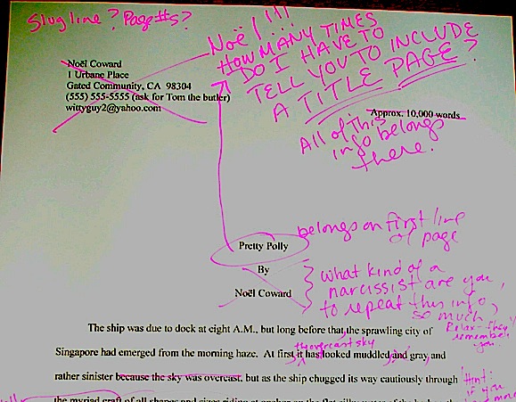
Manuscript formatting 101, part VII: God bless the Millicents, every one

For the last few days, I’ve been pursuing the dual goals of trying to show you just how obvious it is to a professional reader when a submission ISN’T in standard manuscript format (as opposed to being set up to ape the format of published books) and to drum up a little holiday sympathy for Millicent, everybody’s favorite agency screener.

Wipe that smirk off your face, please. Even if you aren’t in the habit of empathizing with people who reject writers for a living, there’s a good self-interested reason you should care about her state of mind: even with the best will in the world, grumpy, over-burdened, and/or rushed readers tend to be harder to please than cheerful, well-treated, well-rested ones.

Millicent is the Tiny Tim of the literary world, you know; at least the Bob Cratchits a little higher up on the office totem pole uniformly get paid, but our Millie sometimes doesn’t, or gets a paycheck that’s more an honorarium than a living wage. A phenomenon that one might expect to become increasingly common in the months to come: the worse a bad economy gets, the better an unpaid intern is going to look to a cash-conscious agency.

Even if she’s not an intern, she’s still unlikely to be paid very much, at least relative to the costs of living in the cities where the major publishers dwell. Her hours are typically long, and quite a lot of what she reads in the course of her day is, let’s face it, God-awful.

Not to mention poorly formatted. But I digress.

Millicent’s job, in short, is not the glamorous, power-wielding potentate position that those who have not yet passed the Rubicon of signing with an agency often assume it to be. Nor, ideally, will she be occupying the position of first screener long: rejecting queries and manuscripts by the score on-the-job training for a fledgling agent, in much the same way as an editorial assistant’s screening manuscripts at a publishing houses is the stepping-stone to becoming an editor.

You didn’t think determining a manuscript’s literary merits after just a few lines of text was a skill that came naturally to those who lead their lives right and got As in English, did you?

The aspiring writer’s learning curve is often not dissimilar to Millicent’s, actually: no one tumbles out of the womb already familiar with the rules of manuscript formatting. (Okay, so I practically was, growing up around so many authors, but I’m a rare exception.) Like Millicent, most of us learn the ropes only through reading a great deal.

She has the advantage over us, though: she gets to read books in manuscript form, and most aspiring writers, especially at the beginning of their journeys to publication, read books. The format is, as I believe that I have pointed out, oh, several hundred times before in this very forum, quite different.

So what writers tend to produce in their early submissions are essentially imitations of books. The problem is, there are many reasons that a manuscript in book format would be hard for an agent or editor to handle — and not merely because the individual pages would appear unprofessional to Millicent.

For starters, published books are printed on both sides of the page, manuscripts on one. Why the difference, in these days of declining tree populations and editors huffily informing writers at conferences that paper is expensive?

Simple: it’s easier to edit that way. Which is why, even in these days of widely available word processors, scads of professional editing is still done by hand.

Why? Well, it’s a mite hard to give trenchant feedback while traveling in a crowded subway car if you have to maneuver a laptop, and many agencies remain far too virus-fearful to allow their employees solicit attachments from writers who aren’t already clients. (Those who do generally have a policy that forbids the opening of unsolicited attachments.) Even in agencies that have caved in to new technology sufficiently to send their member agents on long airplane flights to writers’ conferences armed with a Kindle with 17 manuscripts on it, hand-written marginalia is still the norm, even if it means scanning hand-proofed pages and e-mailing them back to the author.

Ultimately, most editors edit in hard copy because they prefer it. The human eye is, of course, to blame for this: reading comprehension drops by about 70% when the material is presented on a computer screen; the eye tends to skim.

Which is why — you can hear this coming, can’t you? — a wise writer always reads her ENTIRE manuscript IN HARD COPY before submitting it to anyone even vaguely affiliated with the publishing industry. It’s much, much easier to catch typos and logic problems that way.

While you’ve got your hymnals out, long-time readers, let’s continue with the liturgy: manuscripts should also be typed (don’t laugh; it’s not unheard-of for diagrams to be hand-drawn in submissions, or for late-caught typos to be corrected in pen), double-spaced, and have 1-inch margins all the way around.

Time to see why, from an editing point of view.

Thought I’d gone too far afield to get back to the topic at hand, didn’t you? Not a chance. Let’s call upon our old friend Dickens again to see what a page of a manuscript should look like:

Nice and easy to read, isn’t it? (If it’s too small to read easily on your browser, try double-clicking on the image.)

To give you some idea of just how difficult — or even impossible — it would be to hand-edit a manuscript that was NOT double-spaced or had smaller margins, take a gander at this little monstrosity:

I believe the proper term for this is reader-hostile. Even an unusually patient and literature-loving Millicent would reject a submission like this immediately, without reading so much as a word.

Were there a few eggnog spit-takes out there during that last sentence? “My goodness, Anne,” those of you who are wiping the grog off your incredulous faces sputter, “why is it THAT serious an offense?”

Well, think about it: even with nice, empty page backs upon which to scrawl copy edits, trying to cram spelling or grammatical changes between those lines would be well-nigh impossible. Knowing that, Millicent would never dream of passing such a manuscript along to the agent who employs her; to do so would be to invite a stern and probably lengthy lecture on the vicissitudes of the editorial life.

She wasn’t born yesterday, you know. She’s SMART.

Don’t tempt her just to reject it unread — and don’t, I beg you, provide the same temptation to a contest judge. Given the sheer volume of submissions the average Millicent reads, she’s not all that likely to resist.

Even if the sum total of the provocation consists of a manuscript that’s shrunk to, say, 95% of the usual size.

You know what I’m talking about, don’t you, past contest entrants and submitters who wanted to squeeze in a particularly exciting scene before the end of those requested 50 pages?

No? Let me fill you in on a much-deplored practice, then: faced with a hard-and-fast page limit for submission, some wily writers will shrink the font or the margins, to shoehorn a few more words onto each page. After all, who is going to notice a tenth of an inch sliced off a left or right margin, or notice that the typeface is a trifle smaller than usual?

Millicent will notice, that’s who, and practically instantly. As will any reasonably experienced contest judge; after hours on end of reading 12-point type within 1-inch margins, a reader develops a visceral sense of when something is off.

Don’t believe me? Go back and study today’s first example, the correctly formatted average page. Then take a look at this:

I shaved only one-tenth of an inch off each margin and shrunk the text by 5% — far less than most fudgers attempt, incidentally. Yet admit it: you can tell it’s different, can’t you, even without whipping out a ruler?

So could a professional reader. And let me tell you, neither the Millicents of this world nor the contest judges tend to appreciate attempts to trick them into extraneous reading. Next!

The same principle applies, incidentally, to query letters: often, aspiring writers, despairing of fitting a coherent summary of their books within the standard single page, will shrink the margins or typeface.

Trust me, someone who reads queries all day, every day, will be able to tell. (And if you would like to see precisely why, please check out the posts under the QUERY LETTERS ILLUSTRATED category on the list at right.)

The other commonly-fudged spacing technique involves skipping only one space after periods and colons, rather than the grammatically-requisite two spaces. Frequently, writers won’t even realize that this IS fudging: as readers have pointed out in the comments whenever I have talked about this in the past, ever since published books began omitting these spaces in order to save paper, I’ve seen a theory propounded all over the Internet (and sometimes even in writing classes, where the teachers should know better) insisting that skipping the extra space is obsolete. Frequently, the proponents will insist that manuscripts that include the space look old-fashioned to agents and editors.

And I’m not going to lie to you here: to the agents who prefer this format, it is going to look old-fashioned. Sorry.

But guess what: standard manuscript format IS old-fashioned, by definition; that fact doesn’t seem to stop most of the currently-published authors of the English-speaking world from using it. In fact, in all of my years writing and editing, I have never — not once — seen a manuscript rejected or even criticized for including the two spaces that English prose requires after a period or colon.

I have, however, heard endless complaint from professional readers — myself included — about those second spaces being omitted. Care to guess why?

Reward yourself with a virtual candy cane if you said that cutting those spaces throws off word count estimation; the industry estimates assume those doubled spaces. And give yourself twelve reindeer if you also suggested that omitting them renders a manuscript harder to hand-edit.

We all know the lecture Millicent is likely to get if she forgets about that, right?

Again, a pro isn’t going to have to look very hard at a space-deprived page to catch on that there’s something fishy going on. Since Dickens was so fond of half-page sentences, the examples I’ve been using above won’t illustrate this point very well, so (reaching blindly into the depths of the bookshelf next to my computer), let’s take a random page out of Elizabeth Von Arnim’s VERA:

There are 310 words on this page; I wasn’t kidding the other day about how far off the standard word count estimations were, obviously. Now cast your eye over the same text improperly formatted:

Doesn’t look much different to the naked eye, does it? The word count is only slightly lower on this version of this page — 295 words — but enough to make quite a difference over the course of an entire manuscript.

So I see some hands shooting up out there? “But Anne,” I hear some sharp-eyed readers exclaim, “wasn’t the word count lower because there was an entire line missing from the second version?”

Well spotted, criers-out: the natural tendency of omitting the second spaces would be to include MORE words per page, not less. But not spacing properly between sentences was not the only deviation from standard format here; Millicent, I assure you, would have caught two others.

I tossed a curve ball in here, to make sure you were reading as closely as she was. Wild guesses? Anyone? Anyone?

The error that chopped the word count was a pretty innocent one, almost always done unconsciously: the writer did not turn off the widow/orphan control, found in Word under FORMAT/PARAGRAPH/LINE AND PAGE BREAKS. This insidious little function, the default unless one changes it, prevents single lines of multi-line paragraphs from getting stranded on either the bottom of one page of the top of the next.

As you may see, keeping this function operational results in an uneven number of lines per page. Which, over the course of an entire manuscript, is going to do some serious damage to the word count.

The other problem — and frankly, the one that would have irritated a contest judge far more than Millicent — was on the last line of the page: using an emdash (“But—”) instead of a doubled dash. Here again, we see that the standards that apply to printed books are not proper for manuscripts.

Which brings me back to today’s moral: just because a particular piece of formatting looks right to those of us who have been reading books since we were three doesn’t mean that it is correct in a MANUSCRIPT.

Millicent reads manuscripts all day; contest judges read entries for hours at a time. After a while, a formatting issue that might well not even catch a lay reader’s attention can begin to seem gargantuan.

As I have perhaps pointed out once or twice throughout this series, if the writing is good, it deserves to be free of distracting formatting choices. You want agents, editors, and contest judges to be muttering, “Wow, this is good,” over your manuscript, not “Oh, God, he doesn’t know the rules about dashes,” don’t you?

Spare Millicent the chagrin, please; both you and she will be the happier for it. Believe me, she could use a brilliantly-written, impeccably-formatted submission to brighten her Dickensian day.

More show-and-tell follows next time. Keep up the good work!
Manuscript formatting 101, part VI: but published authors do it all the time, or, taking the time to keep those fingers intact

Did everyone have a jolly, merry, or otherwise acceptable Thanksgiving? I ended up cooking two dinners for different sets of people (don’t ask), so I’m not sure that I ever actually managed to eat anything.

I was thinking of you, though, during the extended prep process. My SO and I both came from families that cooked a good deal, so naturally, we were each taught wildly different knife techniques. A couple chopping under entirely disparate philosophies seems completely normal to me, because while my father favored the French cordon bleu technique, my mother was equally adamant about a method she had picked up from an issue of Gourmet sometime in the mid-1950s. Depending upon which parent happened to be supervising, then, I was expected to produce one of two techniques perfectly.

They had different philosophies about how best to hand-wash wine glasses, too. My childhood was an exercise in adaptation to rules, as those of you following the standard format series may have figured out by now. However, my parents did teach me well, and after all, a big part of the point of learning to chop properly is to keep one’s fingers intact, right?

Come to think of it, that’s a big part of the point of learning to hand-wash stemware correctly, too. A soapy glass can be very slippery.

Evidently, preserving one’s offspring’s fingers from harm is not a universal motivation amongst knife-technique teachers of the parental variety. Or so I gather from the results of the method my SO appears to have been instructed was the ONLY way to chop.

Let’s put it this way: after two days of prep work, my fingers remain pristine. His, on the other hand (other two hands, actually) are missing half a fingernail, gashed deeply on another finger, and generally covered with Band-Aids.

I don’t mention this to gloat, or to praise my parents’ techniques over his — although admittedly, since the folks who taught him theirs were sitting at our table yesterday, it was most tempting to ask what on earth they had been thinking. No, I bring this up because knowing how to chop vegetables without cutting one’s fingers, even if one is in a terrible hurry, is not all that conceptually dissimilar to learning to format a manuscript correctly, even when one is writing or revising on a deadline.

Yes, it’s a nit-picky pain to learn how to do it right — but your precious parts are more likely to be in one piece at the end of it. With a submission, the piece in question is the writerly ego.

I just mention.

For the last week or so I’ve been talking about how to format a manuscript professionally, and I’m beginning to fear that in my eagerness and vim, I may have scared some of you a little. My vehemence is kindly-motivated, I assure you: contrary to popular opinion amongst aspiring writers, how a submission is presented can indeed make a very great difference in how it’s received.

Yes, yes, I hear you, those of you who have been running around to writers’ conferences this season: you can hardly throw a piece of bread at an agent or editor’s forum without hitting a pro saying, “It all depends upon the writing.” They do indeed tend to spout this aphorism for a reason — it is in fact true.

But that doesn’t mean that the quality of the writing is the ONLY criterion agents, editors, contest judges, or any of the rest of us who read manuscripts for a living use when deciding whether to read beyond the first page of a submission. Professional presentation weighs in, as do marketability, a story’s probability of appealing to its target audience (not exactly the same thing), what happens to be the surprise bestseller of the moment — and yes, that whole slew of intangibles that make up personal taste.

There is, in short, no such thing as a foolproof formula for producing the perfect manuscript for submission.

As I’ve been arguing throughout this series on formatting, however, agents, editors, contest judges, screeners, and other professional readers develop an almost visceral sense of when a manuscript is properly formatted. So rather than screening submissions with a list of don’t by their sides, they more or less automatically discount pages that are cosmetically incorrect.

This is most emphatically not the same thing, though, as rejecting such pages on the spot because, say, an aspiring writer underlined a foreign-language word on page 1 instead of italicizing it.

Much as a reader with impeccable grammar will not necessarily throw down a book that misuses semicolons, most professional readers will not instantly reject an improperly-formatted submission without SOME further provocation. But believe me, the writer in both cases is going to have to work a whole lot harder to impress the reader as literate.

Unfortunately, the prevailing standards for printed books – which, as we have seen, differ in many significant respects from standard format for manuscripts – often lead innocent writers astray. Case in point: including a table of contents in a manuscript.

That seems as if it would be helpful, doesn’t it? In fiction, including it would enable an agent to go back and re-read the submission easily; in nonfiction, it would permit an editor to skip ahead to a chapter of particular interest.

And heck, if the manuscript fell upon the floor, a well-organized table of contents might make it a trifle easier to reassemble, right?

Wrong. In a published book, a table of contents, like an index, is a courtesy to bookstore browsers trying to get a feel for the contents and buyers who do not necessarily want to read the entire book. Why, runs the industry’s logic, would an agent or editor be interested in acquiring a book if he doesn’t like it well enough to read it all?

So really, a table of contents in a manuscript is just a wasted page. Do not include it in a submission, any more than you would include an index or those boxes around text that magazines are so fond of printing. To professional eyes, it looks unprofessional, especially in fiction.

It’s also an inconvenience – and it’s never a good idea to fritter away the energies of people you want to do you great big favors like representing your book, is it?

Why inconvenient? Well, think about our time-strapped friend Millicent the agency screener for a moment: when she turns over the title page, she expects to find the first page of text there waiting for her, all ready to be judged in a flash. Instead, she finds a table of contents, something she would only find helpful if she were to read the entire manuscript. Given that she tends to reject submissions somewhere between paragraph 1 and page 5, the information that Chapter 8 begins on page 112 will most likely strike her as at best gratuitous – and at worst presumptuous.

“What gives?” she’ll say, taking an extra sip of her too-hot latte as she impatiently gets the table of contents out of her way. “Doesn’t this writer know the difference between a manuscript and a book?”

‘Nuff said, I think.

Or maybe not — do I hear some aspiring nonfiction writers out there? “But Anne,” these excellent souls point out, “a book proposal is supposed to include a table of contents for the planned book!”

Ah, I’m glad that you brought this up, because this is a very common misconception amongst first-time proposers, who tend to cram precisely the table of contents they expect to see in their eventually-published books into their proposals. They look a little something like this:

Anyone out there see problems with this as a marketing document?

Actually, I’m sure that some of your hands shot into the air even before I showed this example, in your eagerness to take issue with the notion that a submission should resemble a published book in the first place. Well caught, eager wavers. Spot any other problems?

If you said that the example above doesn’t include information that could possibly be either accurate or useful, give yourself a gold star for the day. Obviously, it would be impossible for a proposer to state with certainty where the chapter breaks would fall in the proposed book when published; all the information s/he could reasonably offer in this sort of table of contents, then, would be educated guesses about how long each chapter might be. Or perhaps a list of where those breaks fall in the draft manuscript.

But that’s not the information nonfiction agents and editors want to see in the book proposal. The information they do want to see in the annotated table of contents is a brief description of the CONTENTS of each chapter.

The word annotated should have been a clue, I guess.

And like so many other differences between professional formatting and, well, everything else they see in submissions, it’s really, really obvious at first glance to someone who has seen a book proposal before whether the submitter du jour has followed the rules. Compare what the first page of a correctly put-together annotated table of contents looks like with the truncated version above:

See the difference? I assure you, Millicent will. From ten paces away.

I don’t feel I may leave this topic without addressing the other EXTREMELY common opening-of-text decoration: epigraphs, those nifty little quotes from other sources that we writers so adore.

Nobody else likes them much, but we writers think they’re great, don’t we? There is something powerfully ritualistic about typing the words of a favorite author at the beginning of our manuscripts; it’s a way that we can not only show that we are literate, but that by writing a book, we are joining some pretty exalted company.

Feeling that way about the little dears, I truly hate to mention this, but here goes: it’s a waste of ink to include them in a submission. 99.9998% of the time, they will not be read at all.

Stop glaring at me that way; it’s not my fault.

It’s true, alas: I’ve literally never met a professional reader who doesn’t just skip ‘em in a first read — or (brace yourselves, italics-lovers) any other italicized paragraph or two at the very beginning of a manuscript. They just assume, often not entirely without justification, that if it’s in italics, it doesn’t really have much to do with the story at hand, which (they conclude, not always wrongly) begins with the first line of plain text.

There’s another reason that they tend to skip ‘em: the sad fact is, at the submission stage of the game, no one cares who a writer’s favorite authors are.

The official justification for this — yes, there is one — is quite interesting: even the busiest person at an agency or publishing house picks up a manuscript in order to read ITS author’s writing, not someone else’s.

Kinda hard to fault them for feeling that way, isn’t it, since we all want them to notice the individual brilliance of our respective work?

Sentiment aside, let’s look at what including an epigraph achieves on a practical level. Instead of startling Millicent with your erudition in picking such a great quote, the epigraph will to prompt her to start skimming BEFORE she gets to the first line of your text – AND you will have made her wonder agaub if you realized that manuscript format and book format are not the same.

Good idea? Or the worst marketing idea since New Coke?

If that all that hasn’t convinced you, try this on for size: while individual readers are free to transcribe extracts to their hearts’ contents, the issue of reproducing words published elsewhere is significantly more problematic for a publishing house. While imitation may be the sincerest form of flattery, reproduction of published text without the author’s permission is known in the biz by another, less flattering name: copyright infringement.

If the quote is from a book that is not in the public domain, the publisher will need to obtain explicit permission to use any quote longer than fifty words. Ditto for ANY quote from a song that isn’t in the public domain, even if it is just a line or two.

So effectively, most epigraphs in manuscripts are signposts shouting to an editor: “Here is extra work for you, buddy, if you buy this book! You’re welcome!”

I’m sensing some disgruntlement out there, amn’t I? “But Anne,” I hear some epigraph-huggers cry,
“the material I’m quoting at the opening of the book is absolutely vital to include! The book simply isn’t comprehensible without it!”

Okay, if you insist, I’ll run through the right and wrong ways to slip an epigraph into a manuscript — but bear in mind that I can’t promise that even the snazziest presentation will cajole Millicent into doing anything but skipping that quote you love so much. Agreed?

Regardless of while title page format you choose, do not, under any circumstances, include a quote on the title page as an epigraph — which is what submitters are most likely to do, alas. Let’s take a gander at what their title pages tend to look like:

How likely is Millicent to notice the quote at all? Well, this was what she was expecting to see:

Actually, that wasn’t precisely what she expected — did you catch the vital piece of information he left off his title page?

If you said that Eeyore neglected to include the book category on the second example, give yourself a pile of thistles. (Hey, that’s what he would have given you.) My point is, the quote in the first example is going to stand out to Millicent like the nail in a certain critter’s tail.

Other submitters choose to eschew the title page route in order to place an epigraph on the first page of text. The result is immensely cluttered, by anyone’s standards — especially if the submitter has made the very common mistake I mentioned in my discussion of title pages last time, omitting the title page altogether and cramming all of its information onto page 1:

Where did all of our lovely white space from yesterday and the day before go? Into quoting, partially.

The last popular but ill-advised way to include an introductory epigraph is to place it on a page all by itself, as it might appear in a published book:

What’s wrong with this, other than the fact that Poe died before our author wrote Sons and Lovers? Chant it with me now, everyone: A MANUSCRIPT IS NOT SUPPOSED TO RESEMBLE A PUBLISHED BOOK.

At best, Millicent is likely to huffily turn past this page unread. At worst, she’s going to think, “Oh, no, not another writer who doesn’t know how to format a manuscript properly. I’ll bet that when I turn to page one, it’s going to be rife with terrible errors.”

Does either outcome sound desirable to you? I thought not.

So what SHOULD an epigraph-insistent submitter do? Leave it out, of course — weren’t you listening before?

But if it must be there, our pal Mssr. Poe actually wasn’t all that far off: all he really did wrong here was include a slug line. The best way to include an introductory epigraph is on an unnumbered page PRIOR to page 1. On that unnumbered page, it should begin 12 lines down and be centered.

But I’m not going to show you an example of that. Why? Because I really, truly don’t think you should be including an epigraph at all at the submission stage.

Just in case I hadn’t made that clear.

That doesn’t mean you should abandon the idea of epigraphs altogether, however. Squirrel all of those marvelous quotes away until after you’ve sold the book to a publisher — then wow your editor with your erudition and taste.

Or, if you can’t wait that long, land an agent first and wow her with your erudition and taste. But don’t be surprised if she strongly advises you to keep those quotation marks to yourself for the time being.

If you are submitting directly to a publisher, do be aware that most publishing houses now place the responsibility for obtaining the necessary rights squarely upon the author. If you include epigraphs, many editors at these houses will simply assume that you have ALREADY obtained permission to use them. Ditto with self-publishing presses.

This expectation covers, incidentally, quotes from song lyrics, regardless of length.

I’m quite serious about this. If you want to use a lyric from a song that is not yet in the public domain, it is generally the author’s responsibility to get permission to use it — and while for other writing, a quote of less than 50 consecutive words is considered fair use, ANY excerpt from an owned song usually requires specific permission, at least in North America. Contact the American Society of Composers, Authors, and Publishers (ASCAP) for assistance in making such requests. (For a very funny first-hand view of just what a nightmare this process can be, please see FAAB Joel Derfner’s guest post on the subject.)

Have I talked you out of including an epigraph yet? I hope so.

Remember, just because you do not include your cherished quotes in your submission does not mean that they cannot be in the book as it is ultimately published. Contrary to what 99% of aspiring writers believe, a manuscript is a DRAFT, not a finished work. In actuality, nothing in a manuscript is unchangeable until the book is actually printed — and folks in the industry make editing requests accordingly.

In other words, you can always negotiate with your editor after the book is sold about including epigraphs. After you have worked out the permissions issue, of course.

Keep up the good work!