How to format a book manuscript properly, part II: you got chocolate in Millicent’s peanut butter!

peanut-butter-cups
Welcome back to my refresher course on standard format for manuscripts — or, to put it another way, the basic how-to for anyone planning to submit an entry to the First Periodic Author! Author! Awards for Expressive Excellence. That’s right, folks: I’m so serious about my readers knowing how to present their work professionally that I’m now actually offering prizes for it.

That, and for writing something fabulously insightful on the subject of our periodic series, subtle censorship. (To take a gander at the rules — and the prizes — click here.)

Of course, the information in this series might also prove rather useful to those of you who are scrambling like crazy after yesterday’s post because you hadn’t realized until then that there WAS a standard format for book manuscript submissions. Even those of you who are already confident in your manuscript formatting might want to sit in on this series, just to be sure.

If you’re not willing to do it for your own sake, do it for mine. It breaks my heart to see good writers, even great ones, making the same formatting mistakes year in and year out, getting rejected for reasons that are apparent to professional readers from halfway across the room.

And no, Virginia, I’m not kidding about the halfway across the room part.

Although it pains me to have to point it out (on average, 2-3 times per year), how a manuscript looks can have an IMMENSE impact upon how an agent, editor, contest judge, or even a book doctor like me will respond to it. Writing talent, style, and originality count, of course, but in order to notice any of those, a reader has to approach the page with a willingness to be wowed.

That willingness can wilt rapidly in the face of incorrect formatting — which isn’t, in response to what half of you just thought, the result of mere market-minded shallowness on the part of the reader. Reading manuscripts for a living makes deviations from standard format leap out at one. As do spelling and grammatical errors, phrase repetition, clichés, and all of the many notorious agents’ pet peeves. (If you think I’m exaggerating, check out some of the lulus under the FIRST PAGES AGENTS DISLIKE and AGENCY SCREENERS’ PET PEEVES OF THE NOTORIOUS VARIETY categories on the list at right.)

The sheer repetition of mistakes across manuscripts means that professional readers tend to focus on technical details when scanning the work of a new writer; don’t fall prey to the fallacy that the little details just don’t matter. In practice, the little things I’m talking about in this series matter for a very solid reason: because all professional manuscripts are formatted identically, it’s INCREDIBLY obvious when one isn’t.

This is a really, really good thing to know BEFORE you submit to an agent or editor: even if 99.9% of the format is right, that .1% deviation actually will distract a professional reader from even the most beautiful writing.

And that’s not merely a matter of being obsessive-compulsive (although truth compels me to say that in this line of work, OCD is hardly an occupational drawback; for editing, it’s a positive boon) — as I shall be showing you later on in this series, to someone who reads manuscripts for a living, deviations from standard format might as well be printed in blood-red ink.

So while it may seem tedious, annoying, or just a whole lot of work to go through your submissions with the proverbial fine-toothed comb in order to weed out this kind of distraction.

I hear those of you who have spent years slaving over your craft groaning out there — believe me, I sympathize. For those of you who have not already started composing your first drafts in standard format (which will save you a LOT of time in the long run), I fully realize that many of the tiny-but-pervasive changes I am about to suggest that you make to your manuscript are going to be irksome to implement. Reformatting a manuscript is time-consuming and tedious, and I would be the first to admit that at first, some of these rules can seem arbitrary.

At least on their faces, that is.

Speaking as someone who reads manuscripts for a living, I can let you in on a little secret: quite a few of these restrictions remain beloved of the industry even in the age of electronic submissions because they render a manuscript a heck of a lot easier to edit in hard copy — still the norm, incidentally. As I will show later in this series, a lot of these rules exist for completely practical purposes — designed, for instance, to maximize white space in which the editor may scrawl trenchant comments like, “Wait, wasn’t the protagonist’s sister named Maeve in the last chapter? Why is she Belinda here?”

Again, this is one line of work where a touch of compulsiveness is extremely helpful. Treat this brain pattern with the respect it deserves — and treat your own writing with the respect it deserves by taking the time to present it professionally.

Obviously, competition to land an agent and get published is very intense, but if you’re going to get rejected, wouldn’t you rather it be because an agent or editor legitimately disagreed with your writing choices, instead of because you didn’t follow the rules? Or, as is more often the case, because you weren’t aware of them?

Frankly, it’s bad for writers everywhere that these rules are not more widely known. Okay, so it keeps freelance editors like me in business, but it has created a submission environment where poor formatting is generally considered a warning sign of poor WRITING to come.

By Millicent the agency screener, her cousin Maury the editorial assistant, and their aunt Mehitabel the contest judge, in any case.

And that drives conscientious aspiring writers, the ones who — like you, perhaps — have invested considerable time and sweat in learning something about the trade, completely batty. Because, like so much generalized criticism, the fine folks who take the advice most seriously tend to be the ones who need it least, I know that there are thousands of you out there who stay up nights, compulsively going over their manuscripts for the 147th time, trying to ferret out that one last bit of less-than-professional presentation.

Bless your heart, if you’re one of those. You’re helping raise aspiring writers’ collective reputation within the industry. On behalf of all of us who know enough agents, editors, and contest judges to be just a little tired of hearing them complain about how few writers seem to do their homework, I thank you.

One quick caveat before we get started today: the standard format restrictions I’m listing here are for BOOK submissions, not for short stories, poetry, journalistic articles, academic articles, or indeed any other form of writing. For the guidelines for these, you may — and should — seek elsewhere.

Allow me repeat that, because it’s important: the guidelines in this series are for BOOK manuscripts and proposals, and thus should not be applied to other kinds of writing. Similarly, the standards applicable to magazine articles, short stories, dissertations, etc. should not be applied to book proposals and manuscripts.

Which is a gentle way of saying that the formatting and grammatical choices you see in newspapers will not necessarily work in manuscripts. AP style is different from standard format in several important respects, not the least being that in standard format (as in other formal presentations in the English language), the first letter of the first word after a colon should NOT be capitalized, since technically, it’s not the beginning of a new sentence.

I don’t know who introduced the convention of post-colon capitalization, but believe me, those of us who read the submissions of aspiring book writers for a living have mentally consigned that language subversive to a pit of hell that would make even Dante avert his eyes in horror.

Everyone clear on that? Good, because — are you sitting down, lovers of newspapers? — embracing journalistic conventions like the post-colon capital and writing out only numbers under ten (see below) will just look like mistakes to Millicent and her ilk on the submission page.

And no, there is no court of appeal for such decisions. So if you were planning to cry out, “But that’s the way USA TODAY does it!” save your breath.

Unfortunately, although my aforementioned heart aches for those of you who intended to protest, “But how on earth is an aspiring writer to KNOW that the standards are different?” this is a cry that is going to fall on deaf ears as well.

Which annoys me, frankly. The sad fact is, submitters rejected for purely technical reasons are almost never aware of it. With few exceptions, the rejecters will not even take the time to scrawl, “Take a formatting class!” or “Next time, spell-check!” on the returned manuscript. If a writer is truly talented, they figure, she’ll mend her ways and try again.

Perhaps I’m a bleeding-heart editor, but I’d like to speed up that learning curve. I think that the way-mending might go a TRIFLE faster if the writer knew that the manuscript was broken

It’s not as though the strictures of standard format are state secrets, after all. To recap from yesterday:

(1) All manuscripts should be printed or typed in black ink and double-spaced, with one-inch margins around all edges of the page, on 20-lb or better white paper.

(2) All manuscripts should be printed on ONE side of the page and unbound in any way.

(3) The text should be left-justified, NOT block-justified. By definition, manuscripts should NOT resemble published books in this respect.

(4) The preferred typefaces are 12-point Times, Times New Roman, Courier, or Courier New — unless you’re writing screenplays, in which case you may only use Courier. For book manuscripts, pick one (and ONLY one) and use it consistently throughout your entire submission packet.

Everyone clear on those? PLEASE pipe up with questions, if not. In the meantime, let’s move on.

(5) The ENTIRE manuscript should be in the same font and size. Industry standard is 12-point.

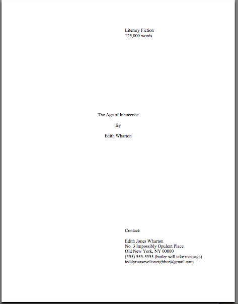
No exceptions. I hate to be the one to break it to you, but there’s a term in the industry for title pages with 24-point fonts, fancy typefaces, and illustrations.

It’s high school book report. Need I say more?

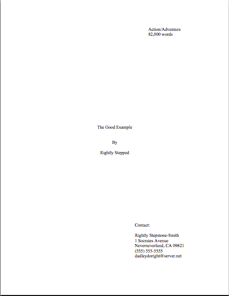
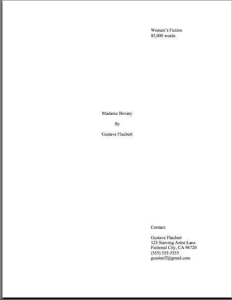
The font rule also applies to your title page, incidentally, where almost everyone gets a little wacky the first time out. No matter how cool your desired typeface looks, or how great the title page looks with 14-point type.

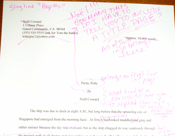
No pictures or symbols here, either, please. Just the facts. (If you don’t know how to format a title page professionally, please see the TITLE PAGE category on the list at right.)

(6) Do NOT use boldface anywhere in the manuscript BUT on the title page — and not even there, necessarily.

Yes, you read that correctly: you may place your title in boldface on the title page, if you like, but that’s it. Nothing else in the manuscript should be bolded. (Unless it’s a section heading in a nonfiction proposal or manuscript — but don’t worry about that for now; I’ll be showing you how to format a section break later on in this series, I promise.)

The no-bolding rule is a throwback to the old typewriter days, where only very fancy machines indeed could darken selected type. Historically, using bold in-text is considered a bit tacky for the same reason that wearing white shoes before Memorial Day is in certain circles: it’s a subtle display of wealth.

You didn’t think all of those white shoes the Victorians wore cleaned themselves, did you? Shiny white shoes equaled scads of busily-polishing staff.

(7) EVERY page in the manuscript should be numbered EXCEPT the title page.

Violating this rule will result in instantaneous rejection virtually everywhere. Number those pages if it’s the last thing you do.

Few non-felonious offenses irk the professional manuscript reader (including yours truly, if I’m honest about it) more than an unnumbered submission — it ranks right up there on their rudeness scale with assault, arson, and beginning a query letter with, “Dear Agent.”

Why? Gravity, my friends, gravity. What goes up tends to come down — and if the object in question happens to be an unbound stack of paper…

Did that seem like an abstract metaphor? Not at all. Picture, if you will, two manuscript-bearing interns colliding in an agency hallway.

You may giggle, but anyone who has ever worked with submissions has first-hand experience of this, as well as what comes next: after the blizzard of flying papers dies down, and the two combatants rehash that old Reese’s Peanut Butter Cup commercial’s dialogue (“You got romance novel in my literary fiction!” “You got literary fiction in my romance novel!”), what needs to happen?

Yup. Some luckless soul has to put all of those pages back in the proper order. Put yourself in Millicent’s moccasins for a moment: just how much more irksome is that task going to be if the pages are not numbered?

Number your pages. Trust me, it is far, far, FAR easier for Millicent to toss the entire thing into the reject pile than to spend the hours required to guess which bite-sized piece of storyline belongs before which.

FYI, the first page of the text proper is page 1 of the text, not the title page, and should be numbered as such. If your opus has an introduction or preface, the first page of THAT is page 1, not the first page of chapter 1.

Why, you ask? Long-time readers, pull out your hymnals: BECAUSE A MANUSCRIPT SHOULD NOT LOOK IDENTICAL TO A PUBLISHED BOOK.

To run over the other most popular choices for pages to mislabel as page 1: manuscripts do not contain tables of contents, so there should be no question of pagination for that. Also, epigraphs — those quotations from other authors’ books so dear to the hearts of writers everywhere — should not appear on their own page in a manuscript, as they sometimes do in published books; if you feel you must include one (considering that 99.9999% of the time, Millicent will just skip over it), include it between the chapter title and text on page 1.

If that last sentence left your head in a whirl, don’t worry — I’ll show you how to format epigraphs properly later in this series. (Yes, including some discussion of that cryptic comment about Millicent. All in the fullness of time, my friends.)

(8) Each page of the manuscript (other than the title page) should have a standard slug line in the header. The page number should appear in the slug line, not anywhere else on the page.

Most writing handbooks and courses tend to be a trifle vague about this particular requirement, so allow me to define the relevant terms: a well-constructed slug line includes the author’s last name, book title, and page number, to deal with that intern-collision problem I mentioned earlier. (The slug line allows the aforementioned luckless individual to tell the romance novel from the literary fiction.) And the header, for those of you who have not yet surrendered to Microsoft Word’s lexicon, is the 1-inch margin at the top of each page.

Including the slug line means that every page of the manuscript has the author’s name on it — a great idea, should you, say, want an agent or editor to be able to contact you after s/he’s fallen in love with it.

The slug line should appear in the upper left-hand margin (although no one will sue you if you put it in the upper right-hand margin, left is the time-honored location) of every page of the text EXCEPT the title page (which should have nothing in the header or footer at all).

Traditionally, the slug line appears all in capital letters, but it’s not strictly necessary. Being something of a traditionalist, the third page of my memoir has a slug line that looks like this:

MINI/A FAMILY DARKLY/3

Since the ONLY place a page number should appear on a page of text is in the slug line, if you are in the habit of placing numbers wacky places like the middle of the footer, do be aware that it does not look strictly professional to, well, professionals. Double-check that your word processing program is not automatically adding extraneous page markers.

Do not, I beg of you, yield like so many aspiring writers to the insidious temptation add little stylistic bells and whistles to the slug line, to tart it up. Page numbers should not have dashes on either side of them, be in italics or bold, or be preceded by the word “page.”

If that news strikes you as a disappointing barrier to your self-expression, remember, professional readers do not regard formatting choices as conveyers of personal style. The point here is not to make your slug line stand out for its innovative style, but for your manuscript’s pages to look exactly like every other professional writer’s.

And yes, I AM going to keep making that point over and over until you are murmuring it in your sleep. Why do you ask?

If you have a subtitle, don’t include it in the slug line — and if you have a very long title, feel free to abbreviate, to keep the slug line from running all the way across the top of the page. The goal here is to identify the manuscript at a glance, not to reproduce the entire book jacket.

Why not? Well, technically, a slug line should be 30 spaces or less, but there’s no need to stress about that in the computer age. A slug, you see, is the old-fashioned printer’s term for a pre-set chunk of, you guessed it, 30 spaces of type.)

Keep it brief. For instance. my agent is currently circulating a novel of mine entitled THE BUDDHA IN THE HOT TUB — 26 characters, counting spaces. Since my last name is quite short, I could get away with putting it all in the slug line, to look like this:

MINI/THE BUDDHA IN THE HOT TUB/1

If, however, my last name were something more complicated, such as Montenegro-Copperfield — 22 characters all by itself, including dash — I might well feel compelled to abbreviate:

MONTENEGRO-COPPERFIELD/BUDDHA/1

Incidentally, should anyone out there come up with a bright idea for a category heading on the archive list for this issue other than slug line — a category that already exists, but is unlikely to be found by anyone not already familiar with the term — I’m open to suggestions. I’ve called it a slug line ever since I first clapped eyes on a professional manuscript (an event that took place so long ago my response to the sight was not, “What’s that at the top of the page, Daddy?” but “Goo!”), so I’m not coming up with a good alternative. Thanks.

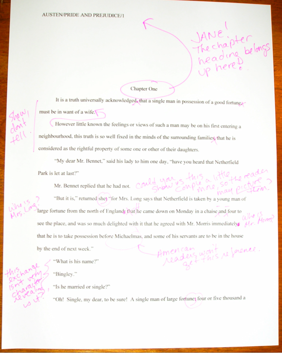
(9) The first page of each chapter should begin a third of the way down the page, with the chapter title appearing on the FIRST line of the page, NOT on the line immediately above where the text begins.

That’s twelve single-spaced lines, incidentally. The chapter name (or merely “Chapter One”) may appear on the FIRST line of the first page — not on the last line before the text, as so many writers mistakenly do. The chapter title or number should be centered, and it should NOT be in boldface or underlined.

Don’t panic if you’re having trouble visualizing this — I’ll be giving concrete examples of what the first page of a chapter should look like later in this series.

Why shouldn’t the title appear immediately above the text, as one so often sees? Because that’s where the title of a SHORT STORY lives, not a book’s.

Very frequently, agents, editors and contest judges are presented with improperly-formatted first pages that include the title of the book, “by Author’s Name,” and/or the writer’s contact information in the space above the text. This is classic rookie mistake. To professional eyes, a manuscript that includes any of this information on the first page of the manuscript (other than in the slug line, of course) seems term paper-ish.

So where does all of that necessary contact information go, you ask? Read on.

(10) Contact information for the author belongs on the title page, NOT on page 1.

This is one of the main differences between a short story submission (say, to a literary journal) and a novel submission. To submit a manuscript — or contest entry, for that matter — with this information on page 1 is roughly the equivalent of taking a great big red marker and scrawling, “I don’t know much about the business of publishing,” across it.

Just don’t do it.

“But wait,” I hear some of you out there murmuring, “I need a title page? Since when?”

Funny you should mention that, because…

(11) Every submission should include a title page, even partial manuscripts.

This one seems to come as a surprise to a LOT of aspiring writers. You should ALWAYS include a title page with ANY submission of ANY length, including contest entries and the chapters you send after the agent has fallen in love with your first 50 pages.

Why, you ask? Because it is genuinely unheard-of for a professional manuscript not to have a title page: literally every manuscript that any agent in North America sends to any editor will include one. Yet, astonishingly, 95% of writers submitting to agencies seem to be unaware that including it is industry standard.

On the bright side, this means that if you are industry-savvy enough to include a professionally-formatted title page with your work, your submission automatically looks like a top percentile ranker to professional eyes from the moment it’s pulled out of the envelope. It’s never too early to make a good first impression, right?

If you do not know how to format a proper title page — and yes, Virginia, there IS a special format for it, too — please see the TITLE PAGE category at right. Or wait a few days until I cover it later in this series. It’s entirely up to you.

Before anyone who currently has a submission languishing at an agency begins to panic: omitting a title page is too common a mistake to be an automatic deal-breaker for most Millicents; she’s almost certainly not going to toss out a submission ONLY because it has a properly-formatted title page or none at all. And yes, one does occasionally run into an agent at a conference or one blogging online who says she doesn’t care one way or the other about whether a submission has a title page resting on top at all.

Bully for them for being so open-minded, but as I point out roughly 127,342 times per year in this forum, how can you be sure that the person deciding whether to pass your submission upstairs or reject it ISN’T a stickler for professionalism?

I sense some shoulders sagging at the very notion of all the work it’s going to be to alter your pages before you send them out. Please believe me when I tell you that, as tedious as it is to change these things in your manuscript now, by the time you’re on your third or fourth book, it will be second nature to you.

Why, I’ll bet that the next time you sit down to begin a new writing project, you will automatically format it correctly. Think of all of the time THAT will save you down the line. (Hey, in this business, you learn to take joy in the small victories.)

More importantly, if you embrace these standards, any submissions you might happen to send out in the near future will look like the work of a pro. Again, call me zany, but I would rather see an agent or editor evaluate your book on the basis of your writing and your story, not your formatting knowledge.

I’m funny that way.

Next time, I’m going to finish going through the rules, so we may move on swiftly to concrete examples of what all of this formatting looks like in practice. Start working on those contest entries, everybody, and keep up the good work!

Now that the contest has gotten you thinking about it, let’s revisit how to format a book manuscript properly

star-magnolia

See the nice, pretty star magnolia flowers? Aren’t they soothing to behold? Don’t they help lower the blood pressure of those of you who have been reading this blog for a while, the ones who tensed up at the very notion of going through the rigors of standard format for manuscripts again?

Yes, it’s stressful, enough so that each time I go over it (on average, 2-3 times per year), I ask myself at least thrice why I’m putting myself — and the rest of you — through it. Delving into the nitty-gritty of the logic behind those pesky rules is no fun by anyone’s standards. And every time I have broached the subject formally, those who have heard rumors elsewhere that something has changed leap upon my well-intentioned little gazelles of advice with the ferocity of hungry lions, demanding that I either recant my not at all heretical beliefs or forcibly compel literally every other writing advice-giver in North America to agree to abide by precisely the same rules.

To dispel any illusions up front: neither of those things is going to happen.

Why? Well, in my professional experience, these are the rules: I have sold books adhering to them; my editing clients have sold books using them. So I feel entirely comfortable assuring you that although naturally, some agents out there will harbor their own personal preferences, manuscripts formatted in the manner I am about to describe over the course of this series will look professional to those who handle manuscripts for a living.

So there.

Before I launch into the sundry excellent reasons that an aspiring writer might conceivably want his manuscripts to resemble those produced by, say, every published author currently on the US bestseller lists, allow me to share a small reasons that I have chosen to revisit these strictures now. First, we’ve just finished a series on HOW DO MANUSCRIPTS GET PUBLISHED, ANYWAY? (conveniently grouped together, for those of you who may have missed it, under that title under the archive list at right), a set of posts intended to introduce those absolutely new to trying to get their writing published to the often-counterintuitive world of querying and submission. I think it’s a safe bet to assume that it will come as a surprise to at least some of those neophytes that there IS a standard format for book manuscripts.

Call me zany, but I’d like them to find out what the rules are before they sink too much time and effort into submitting their work, because it’s just a fact that a manuscript that looks professional tends to be taken more seriously at agencies, publishing houses, and even in contests than one that doesn’t, even if the writing is equally good.

The second reason is practical: as I mentioned in the rules for the First Periodic Author! Author! Awards for Expressive Excellenceonly entries in standard format will be considered for awards. Since I’ve committed myself to being draconian on this point, it seemed only fair to run over what standard format means.

(And may I point out that if any of you who have been through several iterations of this standard format series find yourself still unsure if you’re doing it right, entering the contest might be an excellent means of finding out for sure?)

My third reason, and I’m not ashamed to admit it, is that I’m getting ready to go on a spring writing retreat. Why is that relevant, you ask? Well, let me ask you this: which would it take you longer to write 7-12 pages in standard format from scratch, or to punch up an earlier draft of the same length.

I thought so; me, too. I’ll drop in enough new material to keep it interesting for those of you who have been over these concepts before, I promise. However, if I’m a trifle slow in answering questions left in the comments throughout the series to come, I’m sure you’ll understand.

So much for the reasons that relate directly to me or to you. On to the reason that should carry the most weight with everyone concerned: submitting the way professional authors do gives an aspiring writer a competitive advantage in submission.

Why? Because the majority of submissions are not professionally formatted. They either resemble published books (which is not correct for a manuscript submission), short stories (ditto), or just whatever the submitter happens to think looks nice on the page (extrapolate the answer from the previous two).

And that worries me, frankly. I’ve been hearing recently from a lot of closet writers for whom writing a book has always been plan B — and with the economy in its current state, many folks seem to be pulling partially-finished manuscripts out of desk drawers these days. (Well, okay, off their hard disks, but it amounts to the same thing.) It would be a dandy idea for these returning writers to start formatting their manuscripts correctly, so they do not need to revise them again for format down the line.

Which leads me to the third reason that embracing standard format is an exceptionally good strategy right now: because of the aforementioned books coming out of drawers, agencies and small publishing houses are seeing more queries than usual right now. The timing’s a tad unfortunate, since this is also a period where publishing houses have been laying off editors and other staff.

Translation: you know how fierce the competition to get picked up by an agent already was? Well, prepare yourself for it to become even tougher.

While those of you who have been at it awhile are reeling from the implications of that last statement, let me slip a few hard facts under the noses of those who have yet to submit:

(1) There exists a standard format for manuscripts to which US-based agents and editors expect submissions to adhere, regardless of whether those manuscripts are produced by seasoned pros with many book sales under their belts or those brand-new to the biz, and thus

(2) using fancy typefaces, including cover artwork, printing manuscript pages on colored paper, and/or any other deviations from standard format in one’s submission will NOT be regarded as interesting expressions of the author’s individual point of view, but rather as evidence that the author doesn’t know about (1). As a result,

(3) manuscripts submitted in standard format tend to be treated with SUBSTANTIALLY more respect by agency screeners, editorial assistants, contest judges, and pretty much everyone who happens to read unpublished prose for a living. Despite this fact,

(4) one does occasionally hear agents and editors ask for deviations from standard format; one should definitely give them precisely what they ask to see. However, it’s never advisable to generalize what one individual says s/he wants into a brand-new trend sweeping the industry. Nor is it a good idea to ape the formatting choices one sees in a published book, because

(5) professionally-formatted manuscripts do not resemble published books in many important respects, and for many excellent, practical reasons. That being the case, those who screen manuscripts for a living tend to draw unfavorable conclusions about submissions that do aspire to book formatting, much as they do when aspiring writers are not aware that

(6) standard format for book-length manuscripts is NOT business format, either, and just using what you learned about short stories won’t do, either. Nor is it necessarily identical to what your word processor’s grammar checker will ask you to do, or even the AP style one sees in newspapers and magazines. None of these will look correct to an agent or editor who deals with book manuscripts, because the norms there are very specific. This may seem nit-picky and irrelevant to the quality of the writing in question, but think about it:

(7) if a host asks you to a formal dinner, it’s only polite to wear formal attire; a guest who shows up in flip-flops and a Hawaiian shirt is going to stand out like the proverbial sore thumb. (If it’s not clear to you why, review point 2.) Similarly, when placed side-by-side with professional manuscripts, as a successful submission inevitably will, a wackily put-together manuscript will stand out as unprofessional, a phenomenon that all too often leads to

(8) the average manuscript submission getting rejected on page 1. Not always because it deviates from standard format — although the vast majority of submissions do — but because an unprofessionally-formatted manuscript already has one strike against it, and who needs that? Ultimately,

(9) it’s just not worth your while to try to fudge your way out of these standards, since the price of a submission’s annoying a professional reader can be so high. And as I mentioned above, no matter how many times my readers, students, and editing clients ask me if agents, editors, and contest judges are REALLY serious about them, I’m not going to give you permission to ignore any single one of the standard format strictures. No way. Stop asking, already.

Why might knowing all this — and, more importantly, acting upon this knowledge — translate into higher acceptance rates, typically? Well, the aspiring writer who acts upon this information conscientiously is probably producing submissions within the top 5% of what crosses Millicent the agency screener’s desk on any given day.

Yes, really. So if any of the information on the list above came as a surprise to you in any way, it’s incredibly important that you should join me on a tiptoe through the intricacies of standard format.

One final word of preamble, then I shall launch into the meat of the matter (see? I already have retreat on the brain): I implore those of you who have been through this material with me before: don’t just skip these posts on standard format. I see manuscripts all the time by experienced writers that contain standard format violations; heck, they occasionally turn up in the work of published writers, if the complaints their agents and editors make in those bars that are never more than a hundred yards from any writers’ conference in North America are to be believed.

Seriously, all of us could use a review from time to time. Because, you see, I am far from the only professional reader who takes umbrage, when manuscripts deviate from certain time-honored restrictions. Millicent started twitching at the very sight of them before she’d had her job three weeks.

Yes, even if the formatting in question would be perfectly legitimate in other writing environments. (See points 2, 3, 5, and 6, for instance.) And yes, yes, oh, yes, even if the deviation is precisely what some agent, editor, writing guru, or darned fool writing expert like me has suddenly announced to the world is the new norm.

Trust me, Millicent didn’t get that memo.

Think about it: why would she, unless she happens to work for the agent-who-blogs or editor-who-is-trying-to-be-helpful who promulgated the new advice? Indeed, why would anyone who works with manuscripts for a living go out looking to see what folks outside the industry — or, at minimum, outside her agency’s office — are demanding of writers these days, when the basics of standard format have actually changed very little for decades?

Actually, it would be very much against her self-interest to go trolling for such information, because — brace yourselves, those of you going through this logic for the first time — it’s so much easier just to regard submissions that don’t adhere to standard format as inherently unprofessional, and thus (by implication) less likely to contain writing destined to take the publishing world by storm.

To put it bluntly, it would slow her per-submission rejection time.

I hope no one out there fainted, because this is a vital fact for any submitting writer to understand: the folks who read submissions (and queries) in order to decide who gets a break and who doesn’t are in a HURRY. Reportedly, the average agency receives 800-1200 queries per week; that’s a whole lot of reading.

And those are the statistics from when the economy was good, before all of those lapsed writers started dusting off the half-finished manuscripts in their bottom desk drawers and saying, “Hey, this is my Plan B.”

As we saw in our series on how manuscripts get published, in the face of that many pieces of paper to plow through, even the reading of submissions tends to be awfully rushed: the goal becomes to weed out as many as possible as quickly as possible, rather than seeking out gems. Once a professional reader like Millicent has been at it for a while, s/he will usually develop a knack for coming to a conclusion about a piece of writing within the first paragraph or two.

Sometimes even within the first line or two. (For a fairly frightening run-down of the common first-page rejection reasons, you might want to check out the REJECTION ON PAGE 1 category on the list at right.)

What does this trigger-happiness mean for aspiring writers who scoff at standard format, or just don’t know about it? Well, it’s not good: agency screeners, agents, editors, and contest judges tend to regard submissions formatted in any other way as either unpolished (if they’re feeling generous) or unprofessional (if they’re not).

And unfortunately for writers unaware of the rules, a non-standard manuscript is child’s play to spot from the moment a professional reader lays eyes upon it. That can be an extremely serious problem for a submission, because being identified as not professionally formatted renders it FAR more likely to be rejected.

Why? Shout it with me now: agencies and publishing houses get so many submissions that a screener’s PRIMARY goal is to weed out the one she is reading at the moment.

The faster she can do that, the better, to move through that mountain of paper on her desk. So a first page that cries out the moment Millicent lays eyes on it, “This writer is brand-new to the game and will require quite a bit of your boss’ time to coach into being able to produce a manuscript that an agent would be comfortable submitting to an editor!” is a downright gift to her: she can feel completely comfortable rejecting it at the very first typo, cliché, or word choice she doesn’t happen to like..

Heck, she might not even wait to spot any of the above.

That’s not all bad news, however. By logical extension, the more professional your manuscript looks, the more likely it is to be read with interest by a screener in a hurry.

See now why aspiring writers cognizant of points (1) – (9) enjoy a considerable competitive advantage at submission time?

I don’t know about you, but I’m all for anything that helps a good writer’s work get taken more seriously, especially in the current super-tight submission environment, which is more rejection-happy than I’ve ever seen it — and I’ve been listening to writers, agents, and editors complain about the state of the literary market since I was in my cradle. Literally.

Right now, Harry Houdini himself would have extreme difficulty sneaking a non-standard manuscript past an agency screener, even though he undoubtedly has the world’s best platform to write a book on extricating oneself from tight situations. (And if that last quip didn’t make you groan, if not chuckle, it’s time to brush up on your industry-speak.)

So to help give you that competitive edge, here are the rules of standard format — and no, NONE of them are negotiable.

(1) All manuscripts should be printed or typed in black ink and double-spaced, with one-inch margins around all edges of the page, on 20-lb or better white paper.

No exceptions, unless someone in the industry (or a contest’s rules) SPECIFICALLY asks you to do otherwise. And I’m dead serious about using ONLY white paper: ecru paper, no off-white, no Dr. Seuss-type stripes.

Yes, yes, buff or parchment can look very nice, but there’s a strategic reason to use bright white paper: very sharp black-white contrast is strongly preferred by virtually every professional reader out there, probably as a legacy of having read so many dim photocopies over the course of their lifetimes.

The ONLY colored paper that should ever go anywhere near a manuscript is the single sheet that separates one copy of a submission or book proposal from the next, so it is easy for an agent to see where to break the stack. (But you don’t need to know about that until your agent asks you to send 15 copies of your book for submitting to editors. Put it out of your mind for now.)

Nice, clear, dark print is optimal here, so do spring for a new printer cartridge. You’d be amazed (at least, I hope you would) at how poor the printing quality is on some submissions; it’s as though the author dunked in a swiftly-flowing river several times before popping it in the mail. Which is sad, because submissions with poor print quality are almost never read.

Speaking of never, never, ever, eversubmit a dim photocopy; print out an original, every time, You’d be amazed (at least, I hope you would) at how poor the printing quality is on some submissions; it’s as though the author dunked in a swiftly-flowing river several times before popping it in the mail. Oh, you may chuckle at the notion of sending out a grainy photocopy, but believe me, any contest judge has seen many, many entries submitted that way.

(2) All manuscripts should be printed on ONE side of the page and unbound in any way (again, unless you are specifically asked to do otherwise)

Yes, this IS criminally wasteful of paper, especially when you consider the literally millions of pages of submissions that go flying into the agencies and publishing houses every month. Most agencies do not even recycle; as I mentioned last week, the vast majority of agencies did not even consider accepting e-mailed queries at all until the anthrax-in-envelopes scare.

I assure you, if I ran the universe, paper conservation would be the norm, and recycling mandatory. Also, writers would all be granted an extra month a year in which to write, excellent and inexpensive child care while writing, a cedar-lined cabin on the shores of Lake Michigan in which to do it, and a pineapple upside-down cake on Kurt Vonnegut’s birthday. Perhaps some hard candies on Agatha Christie’s birthday as well, in affluent years, and dancing on Mme. de Staël’s.

But since the unhappy reality is that I do NOT run the universe (see disclaimer above), we shall all have to live with the status quo.

Which is to say: the publishing industry is one vast paper-wasting enterprise. Sorry.

Unbound means precisely what it says: no binding of any kind. You’d be surprised at how often writers violate the thou-shalt-not-bind rule, including paper clips, rubber bands, or even binders with their submissions. Since agents always circulate manuscripts without any sort of binding, these doohickies just scream, “I’m unfamiliar with the industry.”

SASE, open wide: here comes a returned manuscript.

The ONLY exception to this rule is a nonfiction book proposal — not the manuscript, just the proposal — which is typically presented UNBOUND in a black folder, the kind with horizontal pockets. (For tips on how a book proposal should be presented, please see the aptly-titled BOOK PROPOSALS category on the list at right.)

Which doesn’t mean that you aren’t perfectly welcome to print double-sided or bind copies for your own purposes; just don’t show your work to the pros that way. As Author! Author!’s very first commenter Dave usually chimes in when I bring this up, if you wish to make double-sided, 3-hole-punched, be-bindered drafts for circulating to your first readers for ease of toting around, be my guest. But NEVER submit in that manner to a professional reader unless s/he has asked you to do so.

(3) The text should be left-justified, NOT block-justified, as published books, e-mails, business letters, and online writing tend to be.

Many fledgling writers find (3) nearly impossible to accept, because it is one of the most visually obvious ways in which a professional manuscript differs from a printed book. They believe, wrongly, that anything that makes their submission look more like what’s on the shelves at Barnes & Noble is inherently professional.

In practice, quite the opposite is true.

Yes, books feature text that runs in straight vertical lines along both side margins, and yes, your word processing program can replicate that practically effortlessly, if you ask it nicely to do so. Bully for it.

But don’t take advantage of that pleasing capacity, I beg you: the straight margin should be the left one; the right should be ragged, as if you had produced the manuscript on a typewriter.

Fear not if you’re having trouble picturing this: I shall be showing you concrete examples later in this series.) For now, you’re just going to have to trust me when I tell you that block-justifying your submission is going to appeal to your garden-variety Millicent about as much as a slap in the face.

Speaking of things I’m going to demonstrate in the days to come, NEVER format a query or cover letter to someone in the industry in business format: indent those paragraphs. (And yes, now that you bring it up, I do intend to show you why. Hold your proverbial horses, already.)

(4) The preferred typefaces are 12-point Times, Times New Roman, Courier, or Courier New; pick one and use it consistently throughout your entire submission packet. Even if you have a strong preference for the lettering in your book when it is published, use one of these typefaces for submission purposes.

Personally, I would never dream of allowing a client of mine to submit a manuscript in anything but Times New Roman, nor would I ever submit any of my work in anything else. It is the standard typeface of the publishing industry, just as Courier is the norm of screenwriting.

A tad silly, you say? Perhaps, but it’s one of the bizarre facts of publishing life that manuscripts in these fonts tend to be taken far more seriously, and with good reason: these are the typefaces upon which the most commonly-used word count estimations are based. (Psst: if you don’t know why you should be estimating the length of your manuscript rather than using actual word count, please see the WORD COUNT category at right.)

To forestall the usual question someone brings up at this point: yes, most published books ARE in typefaces other than Times or Courier, but typeface decisions for published books are made by the publishing house, not the author. Submission time is not the appropriate period for making your preferences known.

Why? Chant it with me now, understanders of point (5) at the top of this post — MANUSCRIPTS AND PUBLISHED BOOKS AREN’T SUPPOSED TO LOOK THE SAME.

If you’re very nice down the line, after a publishing house has acquired your book, they may listen to your suggestions. They might giggle a little, but they might listen. Ditto with the cover and the title, which are — brace yourselves — almost never under the author’s control.

Why? Because these are considered matters of packaging and marketing, not content.

All of which begs the question, of course: why do word processing programs tempt us so many typefaces from which to choose, if we’re not supposed to use them?

Answer: because the people who make word processing programs are not the same people who decide what books get published in North America. Which is why, in case you’re wondering, what Microsoft Word means by word count and what the average agent or editor does are not typically the same thing.

Again, so there.

There are a few agents out there who have their own font preferences (usually Courier, and usually because they also represent screenplays) so do check their websites and/or listings in the standard agency guides. As ever, the golden rule of dealing with an agent you want to represent you is GIVE ‘EM PRECISELY WHAT THEY ASK TO SEE, not what you would like them to see.

Fair warning: if you are a writer who likes to have different voices presented in different typefaces, or who chooses boldface for emphasis, a submission is not a forum where you can express those preferences freely. Yes, one sees this in a published book occasionally, but I assure you, the choice to indulge in these formatting differences was the editor’s, not the author’s.

Sorry. (See my earlier disclaimer about proprietorship of the universe.)

I’m still sensing some skepticism out there on the font issue, but that may be a hangover from reader reactions to previous series on standard format. Almost invariably, around the time that I bring up Rule #4, someone posts a comment informing me huffily that website X advises something different, that this agent said at a conference she doesn’t care what typeface you use, that a certain manual said that standards have changed from the traditional guidelines I set out here, or some other observation presumably intended to make me rend my garments and cry, “Finally, I see the error of my ways! I guess I’ll disregard the fact that I’ve never seen the change you mention actually in use in a professional manuscript and declare it to be the new norm!”

To save you the trouble and sound like a broken record at the same time: it’s not gonna happen.

I have no doubt that all of these comments are indeed pointing out legitimate differences in advice, but it is not my purpose here to police the net for standardization of advice. If you like guidelines you find elsewhere better, by all means follow them.

All I claim for these rules — and it is not an insubstantial claim — is that nothing I advise here will EVER strike an agent or editor as unprofessional. Adhering to them will mean that your writing is going to be judged on your writing, not your formatting.

And that, my friends, is nothing at which to sneeze.

More rules follow next time, of course. In the meantime, keep up the good work!

Synopsis-writing 101, part IV: the technicalities, or, what, you think I’m MADE of mushrooms?

Okay, so the joke in the title would have been funnier if I had in fact been posting on consecutive days, as I had originally planned. But as the illustrious comic Stephen Wright is fond of pointing out — you can’t have everything; where would you put it?

For the last couple of posts, I’ve been showing you examples of good and not-so-good 1-page synopses, so we could talk about (read: so I could conduct a monologue about) the overarching strategies that rendered them more or less effective. Since I haven’t exactly been overwhelmed with howls of protest on the subject — really? The prospect of constructing a 1-page synopsis for a 400-page novel of a complexity that would make Tolstoy weep annoys nobody? — I’m going to assume that we’re all pretty comfortable with the strategic part.

Before I move on to the ins and outs of writing the longer synopsis, I feel I should respond to some of the whimpers of confusion from the more structurally-minded of my readers. “But Anne,” I have heard some of you pointing out, “you’ve shown us a couple of visual examples of properly-formatted synopses — a sort of SYNOPSES ILLUSTRATED, if you will. Any chance that you might go over the various rather odd-looking formatting choices you’ve used in them before, say, we need to send out our own?”

Oh, certainly. Let’s take another example at the good 1-page synopsis for PRIDE AND PREJUDICE:

For veterans of any of my extended forays into the joys and terrors of standard format for manuscripts, nothing here should be too surprising. By and large, standard format for a synopsis is the same as for a page of manuscript: double-spaced, 1-inch margins all around, indented paragraphs, Times, Times New Roman, or Courier, the works. (If you’re unfamiliar with the rules of standard format, you will find them conveniently summarized in the HOW TO FORMAT A MANUSCRIPT and STANDARD FORMAT ILLUSTRATED categories on the list at right.

Please notice that, as with the first page of a manuscript, the author’s contact information does not appear on the first page of the synopsis. Unlike the first page of a manuscript, however, the title of the book should appear on the first page of a synopsis, along with the information that it IS a synopsis.

Why the latter? Because the synopsis and the manuscript it accompanies — to say nothing of the synopsis and query that often arrive in the same envelope — often become separated during the reading and evaluation process. It never pays to assume, then, that the reader of one will automatically know things about the other.

The title, for instance.

A second (or third, or fifth; extrapolate) page should also look very similar to any other page of standard-formatted manuscript, with one vital exception: the slug line for a synopsis should, as I mentioned in the previous sentence, SAY that the page it decorates is from a synopsis, not a manuscript, in addition to displaying the author’s last name, the title of the book, and the page number. (If you don’t know what a slug line is, why anyone would use it, or, indeed, why anyone would name something on a pretty page of text after a slimy creature, please see the SLUG LINE category on the list at right.)

Why include a slug line here? Because pages do occasionally go astray, and because synopses, like manuscripts, should never be bound in any way — unless a contest’s rules specifically state otherwise, of course.

Do I hear some nervous shifting in chairs out there? “But Anne,” I hear some of you cry out, “aren’t you ignoring the elephant in the room — or, in this case, on the page? You seem to have given some of the character names in all capital letters. Why?”

I’m glad you asked. It’s not absolutely necessary, technically speaking, but most professional fiction synopses CAPITALIZE THE ENTIRE NAME of each major character the first time it appears. Not every time, mind you; just the first.

Why only the first? To alert a skimming agent or editor to the fact that — wait for it — a new character has just walked into the story.

Because Millicent might, you know, miss ’em otherwise.

It is also considered pretty darned nifty (and word-count thrifty) to include the character’s age in parentheses immediately after the first time the name appears, resulting in synopses that look something like this:

ST. THERESA OF AVILA (26) has a problem. Ever since she started dating multi-millionaire GEORGE ARMSTRONG CUSTER (82), all of her friends have unaccountably decided that she is mercenary and hates Native Americans. Apart from JEANNE D’ARC (30), her wacky landlady-cum-bowling-partner, who uses every opportunity to pump Theresa for man-landing tips, none of the residents of Theresa’s swanky Upper East Side co-op are even speaking to her — at least until they start desperately vying for invitations to her exclusive wedding extravaganza, a lavish event to be held onstage at the Oscars, with THE REVEREND DOCTOR OWEN WILSON (44 if he’s a day, I would guess; Author! Author! hopes he feels better soon) officiating. How will Theresa find a maid of honor — and if she does, what will her jealous old boyfriend GOD (∞) do?

Should any of you out there think you’re up to rounding out the plot above into some measure of coherence and submitting it, please, be my guest. Really. I’d love to read it.

For the rest of you, please note what I have done here: in preparing a synopsis for a comedy, I have produced a — wait for it! — humorous treatment of the material.

And if I were creating a synopsis for a steamy romance novel with the same premise (although I tremble to think what a sex romp with that particular cast of characters would entail), you can bet your last wooden nickel [that] I would take some writerly steps to make my reader’s mouth go dry and his breath become short while perusing it.

Would I do this because I’m wacky? No, because — those of you who have been following this series, chant it with me now — the synopsis, like the first 50 pages, is a writing sample.

Oh, had I mentioned that before? Well, it cannot be said too often, in my opinion. The sensible writer’s primary goal in producing it is to demonstrate not only that it is a good (or at least marketable) story, an attention-grabbing yarn peopled with fascinating characters, but that the writer is a terrific storyteller.

Don’t worry — in the days to come, I shall be talking about ways in which you can tweak your synopsis in order to convey that lovely impression.

For the nonce, let’s take a quick field trip back to yesterday’s examples of a not-so-hot 1-page synopsis. Do you notice any formatting problems here?

If you immediately leapt to your feet, screaming, “It doesn’t have a slug line! It doesn’t have a slug line!” give yourself a gold star for the day. Further points if you bellowed that it doesn’t say anywhere on the page that it is a synopsis.

Extra credit if you noticed that the pages are not numbered — a major no-no in any submission, ever, yet one of the more common ones. And yes, you should number it, even for a one-page synopsis — and no, you should not number it consecutively with the manuscript, unless a contest rule’s SPECIFICALLY tell you to do so. The first page of a synopsis is always page 1.

Top yourself with a halo if you also discovered that Aunt Jane made the rookie mistake of adding her name to the synopsis anywhere but in the slug line. For book-length works, the first page of text — regardless of whether it is in the manuscript, the synopsis, or any other requested materials — is not a title page.

Don’t treat it as if it were one; it looks unprofessional to the pros.

Everyone happy with his or her score on that quiz? Let’s take on the other negative example:

Where do we even begin? Millicent the screener would almost certainly not even read this one — in fact, she might burst into laughter from several paces away.

Let’s go over why. It stars too far down on the page, for one thing, falling into the same title-page error as the previous example. It’s the over-the-top typeface, though, and the fact that the page uses more than one of them, that would set Millicent giggling and showing it to her coworkers.

Oh, and it doesn’t contain a slug line or numbering. But I doubt Millicent would even notice that over her guffaws.

It makes one other error for a fiction synopsis, a subtler one — any guesses what?

This one may surprise some of you: it mentions the title of the book IN the text of the synopsis. Why is this a problem? Well, it’s considered stylistically weak, a sign that the synopsis is talking ABOUT the book instead of getting the reader involved in the story. Or, to put it another way, and a bit more bluntly: a fiction synopsis is supposed to tell the story of the book; one that pulls the reader out of the story by talking about it at a distance tends not to do that well.

And anyway, the title is already both at the top of the page (and SHOULD be in the slug line): why, Millicent wonders impatiently, cradling her too-hot latte until it cools — she’s learning, she’s learning — would the writer WANT to waste the space and her time by repeating the information?

“Wait just a minute, Anne,” I hear some of my former questioners call from the rear of the auditorium. “You’re talking about the cosmetic aspects of the synopsis as though it were going to be judged as pitilessly as the manuscript I submit. Surely, that’s not the case? The synopsis is just a technical requirement, right?”

Um, no — as I said, it’s considered a WRITING SAMPLE. So yes, it does tend to be judged — and dismissed — just as readily as problematic text anywhere else in the submission packet.

Sorry to be the one to break that to you. But isn’t it better that you hear it from me than surmise it from a form-letter rejection? Or, as is more often the case, NOT surmise if from a form-letter rejection and keep submitting problematic synopses?

Something worth mulling over, I think.

Next time, we’ll leave technicalities behind and delve into the wonderful world of storytelling on the fly. Keep up the good work!

See for yourself, part VI: but wait, there’s more!

I was all set to clamber onto my moral high horse again and dispense more of yesterday’s philosophy, honest — but then sharp-eyed long-time reader Janet caught, as is her wont, the missing puzzle piece in my illustrated romp through standard format. So I’m sliding elevated ethical questions to the back burner for the nonce and diving right back into practicalities.

As Janet so rightly pointed out, I completely skipped over one of the more common first-page-of-chapter controversies (and yes, in my world, there are many from which to choose), whether to place the title and/or chapter designation at the top of the page, or just above the text.

To place the options before you, should the first page of a chapter look like this:

/snapshot-2007-12-19-20-40-58.tiff

Or like this?

/snapshot-2007-12-19-20-42-20.tiff

Now, I had been under the impression that I had waxed long and eloquent about the side I took in this burning debate, and that quite recently, but apparently, my eloquence has been confined to posts more than a year old, exchanges in the comments (which are not, alas, searchable, but still very worth reading), and my own fevered brain.

So let me clear up my position on the matter: the first version is in standard format; the second is not. No way, no how. And why do they prefer the first?

Chant it with me now: BECAUSE IT LOOKS RIGHT TO THEM.

Yet, if anything, agents and contest judges see more examples of version #2 than #1. Many, many more.

Admittedly, anyone who screens manuscripts is likely to notice that a much higher percentage of them are incorrectly formatted than presented properly, this particular formatting oddity often appears in otherwise perfectly presented manuscripts.

And that fact sets Millicent the agency screener’s little head in a spin. As, I must admit, it does mine and virtually every other professional reader’s. Because at least in my case — and I don’t THINK I’m revealing a trade secret here — I have literally never seen an agent submit a manuscript to a publishing house with format #2. And I have literally never even heard of an agent, editor, or anyone else in the publishing industry’s asking for a chapter heading to be moved from the top of the page to just above the text.

Oh, I’ve heard some pretty strange requests from agents and editors in my time, believe me; I’m not easily shocked anymore. But to hear a pro insist upon placing the chapter heading where you have to skip down a third of a page to read it…well, that would have me reaching for my smelling salts. (Do they even make those anymore?)

But clearly, somebody out there is preaching otherwise, because agents, editors, and contest judges are simply inundated with examples of this formatting anomaly. We see bushels of ’em. Hordes of aspiring writers are apparently absolutely convinced that the sky will fall in if that chapter heading is located anywhere but immediately above the text.

In fact, it’s not all that uncommon for an editor to find that after she has left a couple of subtle hints that the writer should change the formatting…

/snapshot-2007-12-19-20-56-36.tiff

…the subsequent drafts remain unchanged. The writer will have simply ignored the advice.

(Off the record: editors HATE that. So do agents. Contest judges probably wouldn’t be all that fond of it, either, but blind submissions mean that a writer must submit the same chapter two years running to the same contest, have the entry land in the same judge’s pile — in itself rather rare — AND the judge would have to remember having given that feedback.)

This may seem like a rather silly controversy — after all, why should it matter if the white space is above or below the title? — but sheer repetition and writerly tenacity in clinging to version #2 have turned it from a difference of opinion into a vitriol-stained professional reader pet peeve. (See earlier comment about how we tend to react to our advice being ignored; it isn’t pretty.)

Which, unfortunately, tends to mean that in discussions of the issue at conferences degenerate into writing-teacher-says-X, editor-at-Random-House-says-Y: lots of passion demonstrated, but very little rationale beyond each side’s insisting that the other’s way just looks wrong.

However, there is a pretty good reason that moving the chapter heading information to just above the text looks wrong to someone who edits book manuscripts for a living: it’s a formatting tidbit borrowed from short stories, whose first pages look quite different:

/snapshot-2007-12-19-20-58-59.tiff

There, as you may see for yourself, is a mighty fine reason to list the title just above the text: a heck of a lot of information has to come first. But that would not be proper in a book-length manuscript, would it? Let’s see what Noêl’s editor has to say, viewing this as the first page of a book:

/snapshot-2007-12-19-21-02-21.tiff

Ouch. (That last bit would have been funnier if the entire page were readable, by the way, but my camera batteries were running low.) But as Millicent and that angry mob of pitchfork-wielding ignored editors would be only too happy to tell you, short stories don’t HAVE chapters, so who on earth are they to be telling those of us in the book world how to format our manuscripts?

Stick with version #1.

While I’ve got the camera all warmed up, this would probably be a good time to show another ubiquitous agent and editor pet peeve, the bound manuscript. As with other ploys to make a manuscript appear identical to a published book, binding the loose pages of a manuscript for submission will NOT win you friends in the publishing world.

Why? Not only does this not look right (I spared you the chanting this time), but it seems so wrong that Millicent will be positively flabbergasted to see a submitter to do it.

Seriously, this is one of those things that is so engrained in the professional reader’s mind that it seldom even occurs to authors, agents, or editors to mention it as a no-no at writers’ conferences. Heck, I’m not sure that I’ve mentioned it once within the last six months — and by anyone’s standards, I’m unusually communicative about how manuscripts should be presented.

So pay attention, because you’re not going to hear this very often: by definition, manuscripts should NEVER be bound in any way.

Not staples, not spiral binding, not perfect binding. There’s an exceedingly simple reason for this: binding renders it impossible (or at least a major pain in the fingertips) to pull out a chapter, stuff it in one’s bag, and read it on the subway.

Hey, paper is heavy. Would YOU want to lug home ten manuscripts every night on the off chance you’ll read them?

In practice, I’m sorry to report, a bound manuscript will seldom survive long enough in the screening process for the chapter-separation dilemma to arise, because — and it pains me to be the one to break this to those of you who’ve been submitting bound manuscripts, but if I don’t tell you, who will? — those pretty covers tend never to be opened.

Remember that immense pile of submissions Millicent has to screen before going home for the day — and it’s already 6:30? Well, when she slits open an envelope that reads REQUESTED MATERIALS on the outside, she fully expects to see something like this lurking between the cover letter and the SASE tucked underneath:

/snapshot-2007-12-11-01-28-43.tiff

But in the case of the bound manuscript, she instead sees something like this:

/snapshot-2007-12-19-21-05-59.tiff

Kind of hard to miss the difference, isn’t it? And unfortunately, nine times out of ten, the next sound a bystander would hear would be all of that nice, expensive binding grating against the inside of the SASE.

Honestly, it’s not that she is too lazy to flip open the cover; she just doesn’t see why she should. Her logic may not be fair or open-minded, but it’s a fairly common argument throughout the industry: if this submitter does not know this very basic rule of manuscripts, how likely is she to know the rules of standard format? And if she does not know either, how likely is she to be producing polished prose?

Yes, this logic often does not hold water when it comes down to an individual case. But from her perspective, that matters less than we writers would like — because, as unpleasant as it is for aspiring writers to realize, her agency is going to see enough technically perfect submissions this week to afford to be able to leap to unwarranted conclusions about this one.

Don’t waste your money on binding.

Now that I have depressed you all into a stupor, let me add a final note about learning to conform to these seemingly arbitrary preconditions for getting your book read: any game has rules. If you saw a batter smack a baseball, then dash for third base instead of first on his way around the diamond, would you expect his home run to count? Would an archer who hit the bulls-eye in her neighbor’s target instead of her own win the grand prize? If you refused to pay the rent on Park Place because you didn’t like the color on the board, would you win the Monopoly game?

I can go on like this for days, you know.

My point is, submitting art to the marketplace has rules, too, and while your fourth-grade P.E. teacher probably did not impart them to you (as, if I ran the universe, s/he would have), you’re still going to be a whole lot better at playing the game if you embrace those rules, rather than fight them.

You’ll also, in the long run, enjoy playing the game more.

And remember, you’re playing this game by choice: you could, after all, make your own rules and publish your book yourself. Weigh the possibilities, and keep up the good work!

Entr’acte: please DON’T just take my word for it

After yesterday’s post, a reader wrote in to take issue with my stand about the burning issue of whether the language has, without the intervention of the English professors of the world, spontaneously changed to require only one space between sentences and after colons, rather than two. And, as you may perhaps be able to tell from that last sentence, it’s a topic upon which, as an editor, I have some fairly strong feelings.

After I was well into my fourth page of response, it occurred to me that the comment sections aren’t subject-searchable. So I’m going to put off the next installment in my series on how and why standard format is so easily recognizable to professional readers in order to devote an entire post to the issue, where future readers will be able to track it down.

Fasten your seatbelts; I’m about to go to town.

Every time I do a post on standard format, readers write in to tell me that the rules have changed, on this point or on others. And frankly, they SHOULD be commenting, if they believe I have misspoken, or even if they feel a particular point requires further elucidation: false modesty aside, quite a few people do read this blog on a regular basis, and the last thing that I want to do is lead anyone astray inadvertently.

So please, folks, keep sending in those constructive comments.

Apart from the community-support reason to ask follow-up questions, there is another, more self-interested reason that you should consider giving a shout if you think I’ve just told a real whopper: no writer, aspiring or otherwise, should apply a rule to her book without understanding WHY its application is a good idea.

Yes, even with something as basic as standard format. If a particular suggestion doesn’t make sense to you, PLEASE don’t do it just because I say so. Do it because you have thought about it and decided that trying it might help you market your writing.

I know, I know: life would be a whole lot easier if it came with a foolproof set of directions, and nowhere it that more true than in one’s first approaches to the publishing industry. It’s definitely confusing to a newcomer, fraught with unspoken expectations and counterintuitive requirements. As someone who has spent a lifetime around it, I could just give you a list of standard format requirements, dust off my hands, and traipse off to finish my holiday shopping.

That’s not my style, however. I like to take the time to explain the rules, both to render submission less of a big, ugly mystery and to give my readers a chance to make up their minds for themselves. Call me wacky, but in the long run, I think my way helps people more than pronouncements from on high.

Speaking of pronouncements from on high, my correspondent began, charmingly, by quoting one of mine:

“In fact, in all of my years writing and editing, I have never — not once — seen a manuscript rejected or even criticized for including the two spaces that English prose requires after a period or colon. ”

Have you heard of a manuscript being rejected for using only ONE space between sentences? Within the past five years or so?

Isn’t that a trenchant question? Isn’t it about time I stopped yammering about the desirability of discussion and got around to answering it?

Here’s the short answer: rejected SOLELY upon that basis, no; criticized as unprofessional, yes, often. Knocked out of finalist consideration as contest entries, absolutely. And I’ve certainly heard it listed among several equally subtle points that led to rejection at agencies; basically, like the other minor restrictions of standard format, it’s contributes to the sense that a writer just doesn’t know the ropes.

The irony, of course, is that the sources that claim the language HAS changed — and permanently, at that — tend to insist that skipping the second space after a period or colon, as our dear old white-headed English teachers taught us to do, automatically stamps a manuscript old-fashioned, obsolete, and generally silly.

How do they justify this? The logic, as I understand it, runs thus: since printed books, magazines, newspapers, and to a great extent the Internet have been omitting these spaces in recent years, the language must therefore have changed. So much so that not only is leaving out the second space now permissible — which it definitely was not until very recently; Paula’s estimate of the last five years is pretty accurate — omitting it is now REQUIRED.

That sounds very serious, doesn’t it? Scary, even. The problem is, if it is required, why isn’t the industry enforcing it in the ways that formatting restrictions are generally enforced, by agents and editors asking writers to change their submissions accordingly?

I’m not being flippant about this: while this rather radical formatting rule change has been popping up in a lot of fora that give advice to aspiring writers over the past five years, the actual practices of the industry have seemed to be the engine behind the change. I have literally never seen (or heard) an argument in favor of omitting the second space made by anyone who works within the publishing industry.

At least not about MANUSCRIPTS.

Printed books, yes — and here, I think, is where the confusion lies, because many publishers have made this change in their newer releases. Essentially, the proponents of eliminating the second space between sentences are arguing that what one sees in print is what one should reproduce on the manuscript page.

As I pointed out yesterday, publishers have made this shift in order to save paper. Which, as those of you who followed this summer’s Book Marketing 101 series already know, is most emphatically NOT the goal of manuscript format, which aims toward ease of reading and hand-editing.

Omitting that second space does, as I mentioned yesterday, render it considerably harder to write corrections on hard copy. It may not seem like a lot of room, but believe me, when you’re trying to make four grammatical changes within a single sentence legibly, any extra bit of white space is a boon.

Hey, carrots are room-consuming. So are scrawls that read confusingexpand this, or Aristotle who?, all of which editors have bestowed upon my manuscripts at one time or another.

I suspect that the underlying assumption of the second-space elimination movement is that editing on hard copy has gone the way of the dinosaur (it hasn’t), just because it is now feasible to send and edit manuscripts electronically. But just because it is technically POSSIBLE to eliminate paper from the process doesn’t mean that it occurs in practice all the time, or even very often.

Remember when Internet-based shopping first became popular, and technology enthusiasts assured us all confidently that the supermarket and shopping mall would be obsolete within a decade? Turns out that a lot of people still wanted to squeeze melons and try on clothes before they bought them. Who knew?

Also, for the argument that the extra spaces are obsolete to makes sense on a practical level — or, at minimum, to generate the levels of resentment amongst agents and editors that its proponents predict — the industry would have to expect that every submission would be camera-ready. In other words, in EXACTLY the format that it would appear in the finished book.

Seeing a problem here?

As those of you who have been following the current See For Yourself series are already aware, standard format for MANUSCRIPTS has little to do with how BOOKS are formatted. As I have been demonstrating for the past few days, manuscripts differ in many important respects from the format the Chicago Manual tells us to expect in a published book, or that AP style urges us to produce in a magazine or newspaper.

Which prompts me to ask: is it really so astonishing that spacing would also differ? And why would a change in publishing practice necessarily alter what professional readers expect to see in a manuscript — especially when that alteration would unquestionably make their jobs harder?

And that, in case you were interested, is why I don’t embrace the practice of eliminating the second space between sentences in manuscripts. Until I see strong evidence that agents, editors, and contest judges frown upon the extra space, I’m going to continue to recommend it.

So there.

I can certainly understand why aspiring writers who had gone the single-space route would be miffed at this juncture, though; changing that fundamental an aspect of a text could eat up a LOT of time. As, indeed, my insightful correspondent pointed out:

It took a lot of effort to train myself to STOP using the two spaces. It’s one of those grammatical rules that seems to have all but disappeared (much like the rather perplexing fad to omit the comma before the word “too”). If it’s necessary, I suppose there’s an easy “find and replace” way to correct my manuscript to add an additional space between sentences?

I’m very glad that the commenter brought up the comma elimination fad, because it provides a perfect parallel to what has happened with the spaces. Just because a rule of grammar’s relaxation becomes common doesn’t mean that the rule itself has disappeared; it just means that breaking the rule has become marginally more acceptable.

For instance, these days, few people other than my mother would stop a conversation in order to correct a speaker who referred to “everyone and their beliefs,” but technically, it remains incorrect. To preserve subject-object agreement, it should be “everyone and his beliefs” or “everyone and her beliefs.” The reason for this shift is primarily sociological, I suspect: when American businesses (and television writers) began to take active steps to make language more friendly to women, the incorrect version sounded less sexist, and thus became widely accepted.

Does that mean that “everyone and their beliefs” magically became grammatically correct overnight? Not on your life. And the better-educated the intended reader- or listenership for the sentence, the more likely that the error will raise hackles.

Had I mentioned that Millicent, along with pretty much everyone who works in her agency, was probably an English major? Heck, she probably wrote her senior thesis on this kind of colloquial speech.

The fact is, the grammatical rule about the requisite number of spaces between sentences and after colons HASN’T changed — the PRACTICE has in many published works; in manuscripts, academic work (almost always the last to accept any sea change in the language), and private writing, the rule most emphatically has not.

And, as with splitting infinitives or ending sentences with prepositions, while most people won’t care, the ones who DO care feel very strongly about it indeed. To them, it’s more serious than formatting: it’s a matter of literacy.

That may seem harsh, given that most of the aspiring writers who have embraced this practice report that they are doing it because some apparently authoritative source told them to make the switch — but tellingly, those sources’ certainty on the matter didn’t stop howls of protest from the professional reading community when Miss Snark (among others) suddenly started advising aspiring writers to leave it out. The result was pretty dramatic: mysteriously, half the submissions agents received were harder to read, and the change happened more or less overnight — and since most agents don’t read even the major writing blogs, it seemed to come out of nowhere.

How loud were those howls, you ask? Suffice it to say that the grumbles continue to this day. No one who edits text for a living would vote for this particular change. To professional eyes, it just looks wrong.

To get return to my correspondent’s last comment, I don’t know of an easy way to make the change universally, alas; Word’s grammar checker currently accepts both single and double spaces between sentences as correct, treating it as a stylistic choice rather than a grammatical one. (If the language had actually changed to require only a single space, presumably Word would follow, eventually.) Like most of the population, the good folks at Microsoft seem perplexed by the dual standard.

Yes, it’s a pain for the writer — but as you have probably already noticed, the industry is not exactly set up to minimize effort for writers. Sorry. If I ran the universe…well, you know the rest.

If anyone reading this HAS figured out a simple way to make the change universally throughout a document, PLEASE write in and share it with the rest of us. Aspiring writers the world over will bless your name, and who wouldn’t want that?

A wiser person would probably sign off now, but I’m going to bite the bullet and bring up the question that is probably on many, many minds at this juncture: barring a flash of insight from a reader or a well-timed act of celestial intervention, could you get away with retaining the single-space convention in a document already written?

As you may have gathered, I would not advise it, especially in a contest submission. However, it really is up to the individual writer. As much as writers would LIKE for there to be a single standard upon which every single person in the industry agreed, it just doesn’t happen. There are exceptions in what individual agents and editors want; you might strike lucky.

If you DO decide to go the single-space route (picture me rending my garments here), make absolutely certain that your manuscript has NO other problems that might trigger Millicent’s ire. Also, be prepared for an agent to ask to make the change before the manuscript is submitted to editors — and, if asked, do it cheerfully and without explaining at length why you originally embraced the single-space practice.

Not that YOU would do such a thing, of course, but for those who don’t know better: agents and editors tend not to be amused when writers of first books lecture them on how the industry has changed, and they should change with it.

And this is definitely an instance where folks outside the industry have been making pronouncements about how the industry should operate for quite a while. Even if you are completely polite in how you express it, chances are that the last writer who made the case to Millicent’s boss was not.

The word Luddite may actually have been uttered.

One more caveat before I sign off: I would caution any aspiring writer against assuming that any single problem, formatting or otherwise, was the ONLY reason a manuscript was getting rejected. Most of the time, it’s quite a few reasons working in tandem– which is why, unfortunately, it’s not all that uncommon for Millicent and her cohorts to come to believe that an obviously improperly-formatted manuscript is unlikely to be well-written. So changing the spaces between sentences alone probably isn’t going to be the magic bullet that results in instant acceptance.

Whatever course you decide to pursue, though, make it YOUR decision — and stick to it. Don’t leap to make every change you hear rumored to be an agent’s pet peeve unless you are relatively certain in your heart of hearts that implementing it will make your manuscript a better book.

Yes, even if the suggestion in question came from yours truly. It’s your manuscript, not mine.

Thanks for the great question, Paula, and everybody, keep up the good work!

Book marketing 101: a professional-looking title page, part III

Well, so much for predicting how tired I would be: the very day after I said I didn’t want to abandon you all in mid-title page, I found myself too wiped out to do my promised next post on title pages. Mea culpa — but I think I shall be taking the next few days off from posting, until I figure out how to integrate it with the masses of sleep I seem to need at the moment.

Let me move on to the second style of title page quickly, though, while I am fresh from a nap.

Last time, I mentioned that there were two formats commonly used in professional title pages. The one I showed you last time, what I like to call the Me First, is actually rather more common in submissions to agents than submissions from agents to editors, but it is certainly acceptable.

While the Me First format is perfectly fine, the other standard format, which I like to call the Ultra-professional, more closely replicates what most agents want their authors’ ultimate manuscript title pages to look like. Take a gander:

snapshot-of-ultra-pro-title.tiff

Elegant, isn’t it? And yet very market-oriented, because all of the requisite information is so very easy to find. Here is a downloadable version of the same, for those of you who would prefer to have it on hand.

I probably don’t need to walk through how to construct this little gem, but as my long-term readers know, I’m a great believer in making directions as straightforward as possible. I like them to be easy to follow in the ten minutes after an agent has said, “My God, I love your premise! Provide me with the manuscript instantly!” Call me zany, but on that happy day, I suspect that you’re going to have a lot on your mind.

So here’s how to put this little gem together. Set up a page with the usual standard format for manuscripts defaults — 1-inch margins all around, 12-point Times, Times New Roman, or Courier — then type in the upper right-hand corner:

Book category (If you’re unclear on what this is, are tempted to vacillate between several, or resent having to categorize your complex book at all, believe me, I sympathize — but please see the BOOK CATEGORIES category at right with all possible speed.)

Estimated word count (If you’re unclear on the hows and whys of estimation, please see the WORD COUNT category at right.)

Skip down 12 lines, then add, centered on the page:
Your title
(Skip a line)
By
(Skip a line)
Your name (or your nom de plume)

Skip down 12 more lines, then add in the lower right corner:

Your real name
Line 1 of your address
Line 2 of your address
Your telephone number
Your e-mail address

As you may see from the example, it looks nifty if the information in the top section and the information in the bottom one share the same left margin. Since some addresses are longer than others, using this format results in that left margin’s being set at different points on the page for different manuscripts. While Flaubert’s address is short, Edith Wharton’s is not, producing a cosmetically altered title page:

snapshot-edith-wharton-title.tiff

Again, there should be NO other information on the title page, just lots and lots of pretty, pretty white space. After you sign with an agency, your agent’s contact information will appear where your contact information does.

That’s it, my friends – the two primary options you have, if you want your title page to look like the bigwigs’ do. And believe me, you do. Try formatting yours accordingly, and see if your work is not treated with greater respect!

After my last post, forward-thinking reader Christa anticipated my next point, so I have already covered the issue of whether you should include a title page in an e-mailed submission. Since the comments are less easily searched than the text of my posts, I’m going to go over the logic a bit here as well.

The answer, in case you were wondering, is yes — it is an excellent idea to include a title page with an e-submission. It’s an even better idea to include it as PART of the manuscript attachment, rather than as a separate attachment.

A bit perplexed? You’re not alone. Let me deal with the whys first, then the hows.

As Christa rightly points out, an agent who sends you an e-mail to ask for a full or partial manuscript, like one who calls after reading your first 50 pages to ask for the rest of the book, obviously has your contact information already. So why repeat it by sending a title page?

The first reason — and not the least significant, in an industry that values uniformity of format — is that every professional title page includes this information. It’s what agents and editors expect to see, and believe me, any agent who accepts e-queries receives enough e-mail in a day to render the prospect of scrolling through those received a few weeks ago a Herculean task. Make it easy for her to contact you, and she’s more likely to do it.

Second, even if the agent or screener scrupulously noted all of your contact information from your query AND filed away your e-mail address for future reference, agencies are very busy places. Haven’t you ever accidentally deleted an e-mail you intended to save?

I tremble to mention this, but most of the agents of my acquaintance who’ve been in the game for a while have at least one horror story about reading a terrific piece of writing, jumping up to show it to someone else in the office — and when they’ve returned, not being able to find the mystery author’s contact information.

Don’t let them tell a story like this about you: Millicent is unlikely to scroll through 700 e-mails to track down even the most captivating author’s contact information. And even if an agent asks for an e-mailed submission, he will not necessarily read all of it on screen — once it’s printed out, it’s as far from the e-mail that sent it as if it had come by regular mail.

Besides, do you really want to begin your relationship with the agent of your dreams (or editor of your passions) by deviating from standard format, even virtually? As every successful civil disobedient knows, you are generally better off politely meeting expectations in matters of little moment, so you may save your deviations for the things that really matter.

As Flaubert famously advised writers, “Be regular and orderly in your life, so that you may be violent and original in your work.”

Okay, so he wasn’t talking about title pages. But the same principle applies here: a title page — or lack thereof — does make a strong statement about the professionalism of the manuscript, regardless of context.

I wouldn’t advise sending the title page as a separate attachment, though: because viruses can be spread through attachments, folks in the industry tend not to open attachments they did not specifically ask to see. Instead, insert the title page at the beginning of your manuscript file.

Do I see a raised hand or twelve out there? “But Anne,” I hear some quick-on-the-draw readers cry, “won’t including it in the document make the title page look wrong? Won’t it automatically have a slug line, and won’t including it mess up my pagination?”

Good questions, all, but these outcomes are relatively easy to avoid in Word. To prevent a slug line’s appearing on the title page, insert the title page into the document, then go to the Format menu and select Document, then Layout. There should be an option there called “Different First Page.” If you select that, you can enter a different header and footer for the first page of the document, without disturbing the slug line you will want to appear on every other page.

Don’t include a slug line (AUTHOR’S LAST NAME/TITLE/#) on the title page, or a page number. Just leave the header and footer blank.

To ensure that the first page of text (which will be page 2 of the document, right?) is numbered as page 1, you will need to designate the title page as 0. In Word, you do this by going to the View menu, selecting Header and Footer, then Page Number Format.

While I’m on the subject of formatting, and now that I know how to insert snapshots of pages into this blog, I think that next time, I shall take reader Dave’s excellent suggestion and show you what a page of text in standard format looks like. I have long been yearning to show how to format the first page of a chapter correctly.

And that’s the kind of longing I have when I’m NOT feverish; there’s no accounting for taste, eh? Speaking of which, my couch is calling me again, so I am signing off for today. Keep up the good work!

Book marketing 101: a professional-looking title page, part II, or, lots of lovely, lovely white space

Yesterday, I waxed long, if not precisely eloquent, about what a difference a professional-looking title page can make to a submission or contest entry. I hit this point pretty hard, because I know from experience as both a freelance editor and a contest judge that many, many talented aspiring writers simply assume that they don’t need a title page — a misconception that definitely costs them presentation points.

So where do these sterling souls tend to place the title page information, such as contact information and the book’s title? On page 1 of the text, where one might expect to find it in a short story submitted to a literary magazine.

Trust me, this is not where a professional reader is going to expect to find this information in a manuscript — and in many contests, including requested information such as genre and target audience on the first page of the text, rather than on a title page, can actually get an entry disqualified.

(To address the most common reason contest entrants misplace this information: don’t worry about the title page’s adding to your page count; it is not included in the page total. In every type of manuscript, pagination begins on the first page of TEXT, not on the title page.)

In a submission to an agency or publishing house, a professional reader will expect to see pieces of information on the title page: title, author’s name (or nom de plume), book category, word count (estimated), and contact information. If an author has an agent, the agent’s contact information will appear on the title page, but for your garden-variety submission, the contact info will be the writer’s.

As I mentioned yesterday, it really is to your advantage to arrange your contact information precisely where an agent or editor expects to find it. You want to make it as easy as humanly possible for them to say yes to you, right?

That being said, as in so many aspects of the publishing industry, there is actually more than one way to structure a title page. Two formats are equally acceptable from an unagented writer. (After you sign with an agent, trust me, your agent will tell you which one she prefers.)

I like to call Format #1 the Me First, because it renders it as easy as possible for an agent to contact you after falling in love with your work. It’s the less common of the two at agencies, and it’s a trifle spare, compared to most title pages. Lots and lots of blank page space, which is catnip to writers. We long to fill it. But resist that urge:

snapshot-of-me-first-title.tiff

For those who would like to have their very own copies, to see the formatting up close, here is a downloadable version. (Many thanks to clever reader Chris for suggesting this, and brilliant webmaster Brian for teaching me how.)

And here are the step-by-step directions. Standard format restrictions apply, so 1-inch margins, please, as well as 12-point type, and do use the same typeface as you used in your manuscript. However, unlike every other page of the text, the title page should neither have a slug line nor be numbered. As I mentioned above, it is not included in either the page or the word count.

In the upper left-hand corner, list:

Your name
Your address
Your phone number
Your e-mail address.

In the upper right-hand corner, list:

The book category (see how important it is to be up front about it? It’s the very top of the title page!)
Estimated word count.

Skip down 10 lines, then add, centered on the page:

Your title
(Skip a line)
By
(Skip a line)
Your name (or your nom de plume)

There should be NO other information on the title page in Format #1. Luxuriate in all of that lovely, lovely white space.

Why, you may be wondering, does the author’s name appear twice on the page? For two reasons: first, in case you are writing under a name other than your own, as many writers choose to do. It’s quite common for writers to use only their pseudonyms in submissions — which can cause some real confusion when a fictional person’s name appears on under the signature line on a contract.

Standard format eliminates any possible confusion by clearly delineating between the name the writer wishes to use on the title page (which appears, straightforwardly enough, under the title) and the one the writer would like to see on royalty checks (listed under the contact information).

(And no, for those of you who have been asking about it, Anne Mini is not a nom de plume, but the name on my birth certificate, believe it or not. My parents were so literarily-oriented that my father demanded to be led to a typewriter before they settled on a name, to see how each of the top contenders would look in print. The better to grace future dust jackets, my dear. And yes, there is a nonplused nurse out there somewhere who can swear that this is true.)

The second reason that the writer’s name appears twice on the title page is, as I mentioned above, to make it as easy as possible for the agent or editor to acquire the book. And that, in case you were wondering, is one reason that it is so very easy for the major US publishing houses to enforce their no-unsolicited-submissions-from-unagented-writers rule: the merest glance at the contact information will tell an editorial assistant instantly whether there is an agent involved.

Do not, under any circumstances, include a quote on the title page — and I wouldn’t recommend doing it on the first page of your manuscript, either. Many authors do this, because they have seen so many published authors use quotes at the openings of their books, to situate themselves amongst the pantheon of the published — and because, let’s face it, most of us read widely enough that we’ve collected a few pithy sayings along the way.

Trust me, the aptness of your quote selection isn’t going to wow the pros, for the very simple reason that 99.8% of them will just skip over it. They ask for submissions to read your writing, after all, not other people’s.

If you must use a quote at the opening of the book, center it on an unnumbered separate page that follows the title page. Or, better still, wait until after the book has been acquired by an editor, then have a heart-to-heart about it.

And remember, if you want to use a lyric from a song that is not yet in the public domain, it is generally the author’s responsibility to get permission to use it — and while for other writing, a quote of less than 50 consecutive words is considered fair use, ANY excerpt from an owned song usually requires specific permission, at least in North America. Contact the American Society of Composers, Authors, and Publishers (ASCAP) for assistance in making such requests.

Tomorrow, I shall go through the other title page style, which is my preferred method, the Ultra-Professional.

On a personal note, my posts will probably be shorter than usual in the weeks to come, and I may not be posting as often: I’ve recently found out that I have come down with mono, a rather nasty condition that apparently requires sleeping about twice as much as I usually do. The recovery time is rather lengthy — but I wasn’t about to abandon you all in mid-title page, was I?

So bear with me, please, if my responses are a bit slower than usual in the near future — and keep up the good work!

Book marketing 101: a professional-looking title page

My, this has been a long series, hasn’t it? A lot of ground to cover. Before I move on to topics more closely related to the writing in your book, rather than the writing in your marketing materials — specifically, I would like to spend a substantial chunk of the next couple of months going over the most common writing problems agents and editors see in submissions — I want to spend today talking about the very first thing an agent or editor will see IN your submission: the title page.

And yes, Virginia, EVERY submission needs one, as does every contest entry. Even if you are sending chapters 2-38 after an agent has pronounced herself delighted with chapter 1, you should send a title page with every hunk of writing you submit.

I know, I know: pretty much nobody ASKS you to include one (although contests sometimes require it), but a manuscript, even a partial one, that is not topped by one looks undressed to folks in the publishing industry. So much so that it would be completely out of the question for an agent to submit a book to a publishing house without one.

Why? Because, contrary to popular belief amongst writers, it is not just a billboard for your book’s title and your chosen pen name. It’s the only page of the manuscript that contains your contact information, book category, and word count.

In words, it is both the proper place to announce how you may best be reached and a fairly sure indicator of how much experience you have dealing with the publishing industry. Why the latter? Because aspiring writers so often either omit it entirely or include the wrong information on it.

You, however, are going to do it right — and that is going to make your submission look very good by comparison.

There is information that should be on the title page, and information that shouldn’t; speaking with my professional editing hat on for a moment, virtually every manuscript I see has a non-standard title page, so it is literally the first thing I, or any editor, will correct in a manuscript.

I find this trend sad, because for every ms. I can correct before they are sent to agents and editors, there must be hundreds of thousands that make similar mistakes. Even sadder, the writers who make mistakes are their title pages are very seldom TOLD what those mistakes are. Their manuscripts are merely rejected on the grounds of unprofessionalism, usually without any comment at all.

I do not consider this completely fair to aspiring writers — but once again, I do not, alas, run the universe, nor do I make the rules that I report to you. If I set up the industry’s norms, I would decree that every improperly-formatted title page would be greeted with a very kind letter, explaining precisely what was done wrong, saying that it just doesn’t count this time, and inviting the writer to revise and resubmit.

Perhaps, in the worst cases, the letter could be sent along with a coupon for free ice cream. Chances are, the poor writer is going to be shocked to learn that the title page of which he is so proud is incorrectly formatted.

But I digress.

The single most common mistake: a title page that is not in the same font and point size as the rest of the manuscript.

Since the rise of the personal computer and decent, inexpensive home printers, it has become VERY common for writers to use immense type and fancy typefaces for title pages, or even photographs, designs, or other visually appealing whatsits.

From a creative point of view, the tendency is completely understandable: if you have 50 or 100 fonts at your disposal, why not use the prettiest? And while you’re at it, why not use a typeface that’s visible from five feet away?

For one extremely simple reason: professional title pages are noteworthy for only two things, their visual spareness and the consequent ease of finding information upon them.

It’s rare, in fact, that any major US agency would allow its clients to send out a title page in anything BUT 12-point Times, Times New Roman, or Courier for a submission, since these are the standards for the industry.

Why these fonts? The logic is complicated here, but in essence, it boils down to an affection for the bygone days of the typewriter: Times is the equivalent of the old elite typeface; Courier is pica. (I know, I know: there are other explanations floating around the Internet, but as this is what people in the industry have actually said when asked about it for the last 25 years, I’m going to continue to report it here.)

More to the point, agents and editors are used to estimating word counts as 250 words/page for the Times family and 200/page for the Courier family. When a submitting writer uses other fonts, it throws off calculations considerably.

Mind you, in almost every instance, an actual word count will reveal that these estimates are woefully inadequate, sometimes resulting in discrepancies of tens of thousands of words over the course of a manuscript. But if you check the stated word counts of published books from the major houses, you’ll almost always find that the publisher has relied upon the estimated word count, not the actual.

Unless an agency or publishing house SPECIFICALLY states a preference for actual word count, then, you’re usually better off sticking to estimation.

I wish that this were more often made clear at literary conferences; it would save masses of writerly chagrin. When an agent or editor at conference makes everyone in the room groan by announcing that she would have a hard time selling a novel longer than 100,000 words, she is generally referring not to a book precisely 100,012 words long, but a 400-page manuscript.

Is that hoopla I hear out there the rejoicing of those of you who tend to run a mite long? Or perhaps those who just realized that unless an edit cuts or adds an entire page to the manuscript, it isn’t going to affect the estimated word count? These are not insignificant benefits for following industry norms, are they?

So let’s take it as given that your title page should be in 12-point Times, Times New Roman, or Courier. All of it, even the title. No exceptions — and no pictures, designs, or other bits of whimsy. You may place the title in boldface, if you like, or in all capitals, but that’s as elaborate as it is safe to get.

DEFINITELY do not make the title larger than the rest of the text. It may look cool to you, but to professional eyes — I hate to tell you this, but better you find out from me — it looks rather like a child’s picture book.

Do I hear disgruntled voices out there? “Oh, come on,” I hear some of you saying, “the FONT matters that much? What about the content of the book? What about my platform? What about my brilliant writing? Surely, the typeface choice pales in comparison to these crucial elements?”

You’re right, of course — it does, PROVIDED you can get an agent or editor to sit down and read your entire submission.

Which happens far less often than aspiring writers tend to think. Ask any agent — it’s not at all uncommon for a submission to be rejected on page 1. So isn’t it better if the submission hasn’t already struck the screener as unprofessional prior to page 1?

Unfortunately, this is a business of snap decisions, especially in the early stages of the road to publication, where impressions are often formed, well, within seconds. If the cosmetic elements of your manuscript imply a lack of knowledge of industry norms, your manuscript is entering its first professional once-over with one strike against it.

It seem be silly — in fact, I would go so far as to say that it IS silly — but it’s true, nevertheless.

Even queries in the proper typefaces tend to be better received. If you are feeling adventurous, go ahead and experiment, sending out one set of queries in Times New Roman and one in Helvetica, and see which gets a better response.

As any agency screener will tell you after you have bought him a few drinks (hey, I try to leave no stone left unturned in my quest to find out what these people want to see in submissions, so I may pass it along to you), the Times New Roman queries are more likely to strike agents (and agents’ assistants, once they sober up again) as coming from a well-prepared writer, one who will not need to be walked through every nuance of the publication process to come.

Yes, I know — it seems shallow. But think of conforming to title page requirements in the same light as following a restaurant’s dress code. No one, not even the snottiest maitre d’, seriously believes that forcing a leather-clad punk to don a dinner jacket or a tie will fundamentally alter the disposition of the wearer for the duration of the meal. But it does guarantee a certain visual predictability to the dining room, at least insofar as one overlooks facial piercings, tattoos, and other non-sartorial statements of individuality.

And, frankly, setting such standards gives the maitre d’ an easy excuse to refuse entry on an impartial basis, rather than by such mushy standards as his gut instinct that the lady in the polyester pantsuit may be consorting with demons in her off time. Much less confrontational to ask her to put on a skirt or leave.

Sending your submission into an agency or publishing house properly dressed minimizes the chances of a similar knee-jerk negative reaction. It’s not common that a submission is rejected on its title page alone (although I have heard of its happening), but an unprofessional title page — or none at all — does automatically lower expectations.

Or, to put it another way, Millicent the screener is going to be watching the guy with the tie a whole lot less critically than the guy with the studded leather dog collar and 27 visible piercings, and is far less likely to dun the former for using the wrong fork for his salad.

Tomorrow, I am going to go over the two most common formats for a professional title page — and, if my newly-learned computer trick works, give you some concrete examples. In the meantime, keep up the good work!