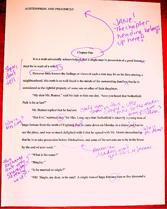
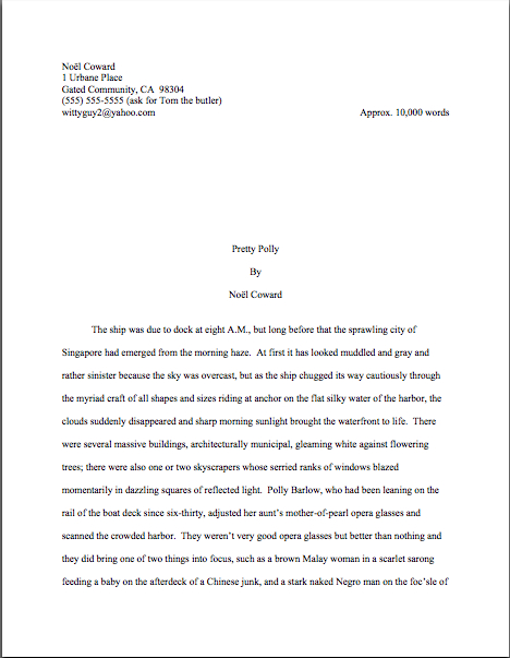
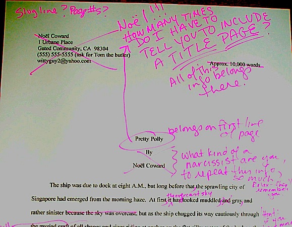
How to format a book manuscript properly, part X: I’m gonna sit right down and write myself a letter/and make believe it came from you…

gaudi-door

What? No Fats Waller fans out there?

I would bet a nickel that those of you who have been reading this blog for a year or more have been thinking for the last couple of weeks, My, but Anne revisits the topic of standard format frequently. She must really feel passionate about a properly put-together manuscript! And I hope that the more charitable among you at least considered adding mentally, Although that might not be an altogether common passion, I consistently find Anne’s rather peculiar taste in subject matter interesting/helpful/not very annoying yet.

I am passionate about it — as I am about any skill that helps good aspiring writers get their work the positive attention it deserves. Also, I don’t want any of you to feel that I didn’t prepare you properly for the First Periodic Author! Author! Awards for Expressive Excellence, a competition for which adherence to standard format is the sina qua non of success.

Not to nag you, but were you aware that the deadline is Monday, May 18 (at midnight wherever you are), and that there are fabulous prizes involved, not to mention undying glory and a semi-permanent place in my good graces? For another gander at the rules (or your first, if you haven’t yet begun to contemplate your entry), please click here.

To be completely honest, though, I have had an ulterior motive for indulging this particular passion over this particular period, the best possible ulterior motive for a writer: to finagle myself some extra time to immerse myself in my current novel.

That’s right, boys and girls: it’s writing retreat time again.

And this time around, it’s somewhere pretty incredible: a tiny, magical artists’ space in a medieval village in the Montaigne Noir of southwestern France. Four writers, two painters, one nice dog, a whole lot of quiet — just what I need to plunge into a flurry of revision. So while you fine folks have been reading in daily installments about the joys of standard format and hearing weekly from guest posters, I have been wending my way up Spain’s Costa Brava on my way to the Langedoc.

I know — even I get jealous when I think about it.

So I’ll be signing off for the next few weeks. Best of luck on your submissions, and I’ll post again when I get back!

May I kid myself that at least a small handful of you believed that for a few consecutive seconds? Enough of you, say, to form an intramural softball league where the Credulous could pitch to the Easily Duped?

No? How about enough to play on a single team? Or to pull off a really good game of chess?

Okay, so my reputation for posting early, often, and long is evidently well-established. Besides, we still have some formatting business on our collective plate, a series on subtle censorship to pursue, and a contest to run here, people.

Not to mention the fact that I have scores of nifty pictures that I’m just dying to post. (That’s a side view of Gaudì’s cathedral door, in case you were wondering.)

I also have a sneaking suspicion that at least enough of you to form a truly sizzling mah johnng tournament are curious enough about how a hardcore, write-your-way-in artists’ retreat works that blogging about it while I’m actually here would be a worthwhile experiment. So in the weeks to come, I shall be talking about how a formal, intensive, artists colony-type retreat works, how to apply for such a thing (fellowships and/or work exchanges are often be available if one knows in advance that they exist), and how one prepares to go into hiding with one’s work, never fear.

Step one, in my case: hit up interesting authors to write guest posts. (We’ve got a lulu coming up on Friday, incidentally, so don’t forget to tune in this weekend to check it out.) Step two: spend a month revising posts on a well-beloved topic so I may post them later, while I’m on the road.

Because, let’s face it, I’m probably not going to be in the mood to think seriously about manuscript formatting just after staring at a street musician in Carcassonne reproduce Me and Bobby McGee phonetically, am I? (Freedom’s just another word for napping in Toulouse, apparently.)

Step three: steal a few spare moments whilst on the road to address some excellent questions from readers that honestly do deserve posts of their own — or, in this case, a shared post written while I was waiting in a train station in Figueres for an car rental clerk whose advertised 30-minute lunch break lasted a good two and a half hours.

So if what follows seems a trifle giddy at times, blame the train fumes and the concept of the siesta.

Instead of fuming, let’s turn our attention to a great formatting question inveterate commenter Dave posted some time back:

While I have your attention, it seems that some time ago you were going to mention something about manuscript format. To be exact, I think you were going to tell us how to format longer passages that a character is voicing or reading, those that in published form are often printed with wider margins, in italics, or even with a different font. As a more concrete example, I’m thinking of a letter the protagonist might receive that is presented to the reader in its entirety. To be direct, do you intend to post anything about that in the near future?

As I told Dave when he first asked this, sometime back in the Paleolithic era before I knew that I would be going on retreat, I did indeed intend to post something on the subject. In fact, I’ve been intending it for quite some time. (Hey, my to-blog list is of epic length — I get scads of provocative questions.) The time will never be riper than now, however, to address this particular question, because we’re already talking about formatting issues.

The short answer is, as it so often is in this game, it depends.

Upon what, you ask? Well, upon the length of the letter one wants to include, for one thing — but of that, more follows later. Also, if we want to get technical about it (and the masses cry, We do! We do!), it depends upon whether the manuscript in question is an academic work or not — or is a nonfiction work of the type often produced by academics.

Why on earth would it make a difference whether a professor — or someone else who aspired to that level of expertise — wrote the darned thing? Sure that you really want to know?

Okay, you asked for it: because a university press would expect any quotation longer than 3 lines of text to be offset, devoid of quotation marks, and single-spaced, PROVIDED that the quote in question is not longer than a page; quotes less than three full lines long are simply placed within quotation marks. Offsetting, for the benefit of those intrepid readers who did not automatically skip the rest of this paragraph immediately after the words university press, is achieved by skipping a line, then indenting the quoted material five spaces (or half an inch, in Word) on both the left and right margins. After the quote comes another blank line, then the text resumes normally.

In practice, then, a page featuring quotations in an academic manuscript might look a little something like this:
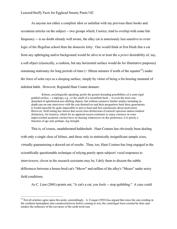
academic-sample2

Why mark quotes from other works so VERY well? That way, there can be absolutely no question about when a professor is borrowing material from somebody else’s published or unpublished work. (There tends to be a lot of unpublished work floating around the average university.)

“That’s all very well and good,” enough of you to get together and raise a barn are probably muttering, “but this doesn’t really address Dave’s question, does it? Or are we to conclude that a letter in a novel manuscript should be treated like a quote one academic lifted from another and stuffed wholesale into her dissertation?

Not exactly — but again, it depends.

If the letter in question is short (or the excerpt being reproduced in the narrative is), there’s no need to treat it as anything BUT a quote:
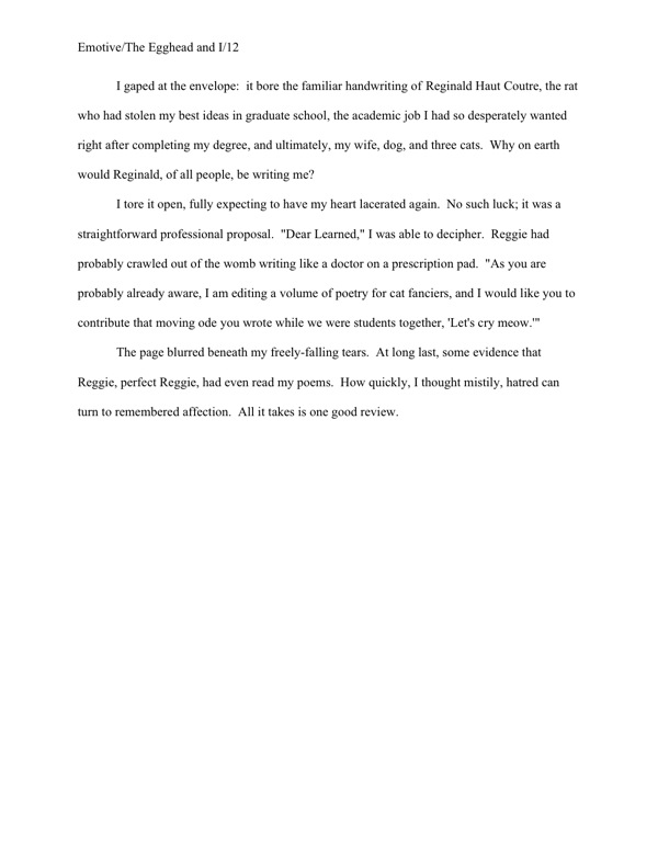
novel-letter-example1

Perfectly obvious what’s going on here, isn’t it?

Some writers prefer to use italics for short letters (probably because, as Dave pointed out, they’ve seen them used that way in books), but frankly, I wouldn’t recommend it; it implies an ignorance of the fact that the editor, not the author, is ALWAYS the one who makes decisions about how text will appear in a published version. However, since some of you are undoubtedly not going to listen to me on this one, here is how to use italics properly in this context:
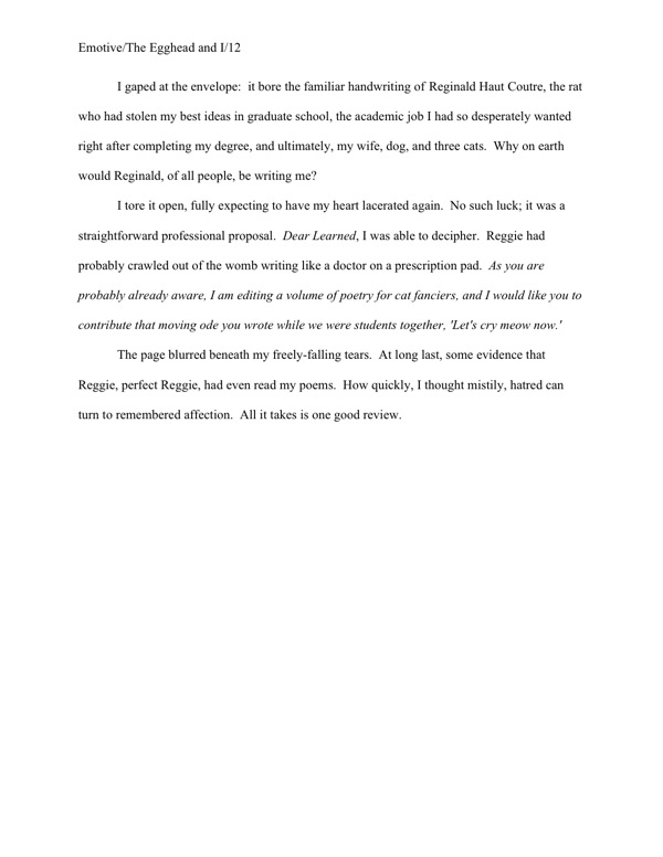
novel-letter-example2

I sense some of you shaking your heads. “But Anne,” note-lovers everywhere cry in protest, “that doesn’t LOOK like a letter. I like a letter to look like a letter on the page; that’s part of its charm. So how do I convey that without seeming as though I’m usurping editorial authority?”

I had a feeling I would be hearing from you folks: there’s no shortage of writers who feel very strongly that every single syllable of every note passed between characters MUST be reproduced faithfully in the text, as if the reader had never seen a letter before and thus could not even begin to imagine what one might look like. Frankly, it’s seldom actually necessary to a plot to include the parts of a letter that would be hard to squeeze within the strictures of standard format: the letterhead, if any; the date; the salutation; the signature.

But you head-shakers are not convinced by that, are you? And I’m not going to be able to convince you that the 15-page letter starting on pg. 82 might work better simply broken off into its own chapter entitled The Letter, am I?

Okay, here are the two acceptable ways of formatting a letter like a letter in a manuscript — which, not entirely coincidentally, will also work beautifully for letters that go on for pages and pages. First, unsurprisingly, it may be presented like dialogue, within quotes:
novel-letter-example-long

As with any other multi-paragraph quote, quotation marks do not appear at the end of a paragraph if the opening of the next paragraph is still part of the letter. They do, however, show up at the beginning of each paragraph within the letter, to alert the reader that this is not normal text.

The other option — and this will work with long quotes in nonfiction as well — is to offset the letter text, as one would with a long quote in an academic work. In a non-academic manuscript, however, the offset quote should be double-spaced, like the rest of the text:
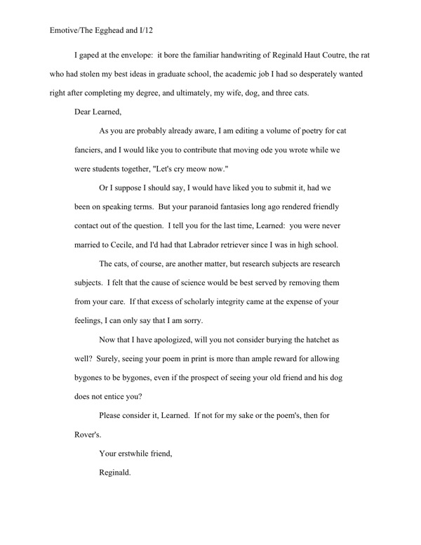
novel-letter-example-long2

Although this last format does work well for long quotes, I’m not a huge fan for letters. Frankly, I don’t think it’s as distinctive, and there’s always the off chance that a rapidly-skimming reader (like, say, Millicent) might not realize that the salutation is the opening of an offset section.

But it’s really up to you. Do bear in mind, though, that the goal here is not to reproduce the letter exactly as it appeared in the story, or as you would like to see it in the published book — it’s to make it absolutely clear when the text is an excerpt from a letter and when it is not.

Like academic publishers, Millicents don’t like to leave such things open for interpretation. Don’t make her guess where a letter — or any other long quote — begins or ends.

The tardy car clerk did eventually return, you’ll be happy to hear, but she was not able to handle the necessary paperwork to exchange the faulty GPS system. Her supervisor, she said, would be able to handle that when he came back from lunch.

Keep up the good work!

How to format a book manuscript properly, part IX: ladies and gentlemen, I am delighted to present a brand-new chapter, brought to you in part by readers’ excellent questions

purple-tulipspurple-tulips

One of the bizarre side effects of this year’s unusually cold winter in Seattle is that the bulbs that usually come up in mid-March suddenly popped up a couple of weeks ago, along with all of the ones that were supposed to be blooming now. I’m hoping that it’s a good omen for the economy, especially the part of it that affects how many books publishers decide it’s prudent to acquire in the near future and thus how many new clients agents see fit to take on.

See why I was so adamant in the recent HOW DO MANUSCRIPTS GET PUBLISHED, ANYWAY? series (conveniently gathered under that very name on the category list on the lower right-hand side of this page) that aspiring writers be aware of how the publishing industry actually works? It’s cyclical; it’s harder to break into the biz at some points than others. If a writer believes — as so many seem to do — that the only issue determining whether an agent chooses to represent a particular manuscript, or whether a publishing house elects to publish it is the quality of the writing, frustration is practically inevitable. The response is different for every writer, of course, but let’s just say that it’s pretty easy for someone querying and submitting like crazy during a period like this that his writing just isn’t very good.

Which is sad if the actual culprit is the economy, right?

All of which is to say: this is a tremendous time to hunker down and revise. Or to write something new — when your first book lands an agent, I can guarantee that you will be astonished at just how short a time passes before she’s bugging you for your next work. Or even to add some ECQLC to your writing résumé — that’s eye-catching query letter candy, for those of you new to this blog — by entering the running for First Periodic Author! Author! Awards for Expressive Excellence.

Oh, you thought I was going to allow a day to pass without plugging it? When the deadline is as close as midnight on May 18?

Since the rules specify that only entries submitted in standard format can win some pretty fabulous prizes, let’s move swiftly to cover the last few rules of standard format left in this series. Before you start dancing in the streets accordingly, I want to make sure that I’ve covered the basics clearly enough so that you can all spot correct and incorrect format in the wild, outside of this laboratory environment. Before I institute a pop quiz, I want to go over how to format the opening to a new chapter, whether or not it’s also the first page of your manuscript.

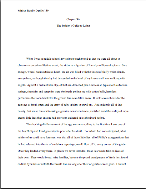
To get the discussion ball rolling, let’s take a gander at a properly-formatted chapter opening. Here is the first page of Chapter Six of my memoir:

Every chapter of a manuscript should begin like this: on a fresh page, 12 single lines (or 6 double-spaced) from the top. (For those of you who do not know how to insert a hard page break into a Word document, it’s located under the INSERT menu. Select BREAK, then PAGE BREAK.)

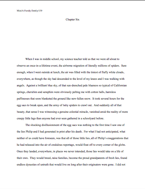
Notice how both the chapter number and the chapter title appear, centered, within these parameters. If there were no chapter title in this instance, the first page of Chapter 6 would look like this:

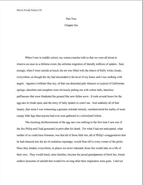
Since sharp-eyed reader Allison asked so very nicely, here’s what it would look like if Chapter 6 were the beginning of Part II of the book (it isn’t, but we aim to please here at Author! Author!):

And since inveterate question-asker Ken inquired about how one might identify a narrator-du-chapter in a multiple POV novel, let’s pretend this is fiction (which it isn’t) and place the narrator’s name in the traditional spot:

a-memoir-title-with-narrator-name

That’s the way one might do it in a manuscript like Barbara Kingsolver’s THE POISONWOOD BIBLE, where the narrator changes with the chapter. If there were also a chapter title (perhaps not advisable in this case, as there’s already significant information at the top of that page for the reader to absorb), it would go between the chapter heading and the narrator identifier. (I would show you an example of that, but it’s late, I’m tired, and I’m positive that you can extrapolate.)

Thinking that there must be an easier way to format the first page of a chapter than to memorize the way it should look and reproduce it from scratch each time? You’re not alone, if so; even seasoned authors worry that someday they will forget to hit return one of the necessary times, so that Chapter 5 will begin ten lines from the top, while Chapter 1-4 and 6 on will begin twelve lines down.

Why, curious reader David asked not all that long ago about how to get that formatting to stick, so to speak: “The chapter line will appear at the top of each page,” quoth he, “so I leave five doublespaced blank lines so the first paragraph starts six lines down? Is there something I can do in Microsoft Word so it will stay that way?”

Standard format templates do exist, of course, but frankly, Word is already equipped with two perfectly dandy features for reproducing formatting exactly in more than one place in a document: COPY and PASTE.

Or, to put it another way, the easiest way I know to make sure each chapter opening is identical is to create your own template. Copy from “Chapter One” down through the first line of text, then paste it on the first page of chapter 2, 3, etc. Once the format is in place, it’s a snap to fill in the information appropriate to the new chapter.

Does that make sense to everyone? Excellent.

Now I want to talk a bit about pagination — don’t groan; it’s an important issue. Let’s take another gander at our first example:

This time, I would like you to notice that in each of these examples, the only reference to the author’s name or the title should appear in the slug line, located in the upper left-hand margin. This is as proper on page 139 of a book manuscript as on page one. While you’re going around noticing things, notice that the page number belongs within the slug line, rather than anywhere else on the page.

The slug line confuses a lot of aspiring writers; until you have seen piles and piles of professional manuscripts, it looks kind of funny. And when you’ve been told over and over again that a manuscript should have a 1-inch margin on all sides, it can seem counterintuitive to add a line of text, even such a short one, IN that margin.

But I assure you, it’s always been done that way. And why? Followers of this series, chant it with me now: BECAUSE IT LOOKS RIGHT.

Yes, that logic IS tautological, now that you mention it. If you have a problem with that, I would suggest taking it up with the powers that rule the universe. As I believe the fact that my memoir has been in the hands of a reputable publisher for years and still has yet to be released (due to lawsuit threats concerning who owns my memories, believe it or not) makes abundantly clear, I apparently do not rule the universe.

If I did, Microsoft Word would be set up to create documents in standard format automatically, Word for Mac and Word for Windows would be set up so those using one could easily give formatting advice to those using the other, air pollution would be merely a thing of distant memory, and ice cream cones would be free on Fridays.

As none of these things seems to be true, let’s get back to business: how does one create that pesky slug line, anyway?

Back in the days when typewriters roamed the earth, it was perfectly easy to add a slug line to every page: all a writer had to do was insert it a half-inch down from the top of the page, left-justified, floating within the 1-inch-deep top margin. For word-processed documents, it’s a trifle more complicated.

The slug line still belongs in the same place, .5 inches from the top of the paper, but instead of laboriously typing it on each page individually as writers did in the bad old days, one simply inserts it in the header. In most versions of Word (I can’t speak for all of them), the header may be found under the VIEW menu.

Before the Luddites out there trot out their usual grumble about tracking down the bells and whistles in Word, think about this: placing the slug line in the header (located in Word under the VIEW menu) also enables the writer to take advantage of one of the true boons of the advent of word processing, pages that number themselves. Every so often, I will receive a manuscript where the author has, with obviously monumental effort, typed a slug line onto the first line of TEXT of each page, so it looks like this:

See how pulling the slug line down into the text messes with the spacing of the page? An entire line of text is sacrificed to it — and let me tell you, that line is not going to go quietly.

Why not? Well, what’s going to happen if new writing is inserted on a page formatted this way? That’s right: the author is going to have to go back and move each and every one of those slug lines to match the NEW pagination.

I’d show you a picture of this, but it’s just too ugly to contemplate. Trust me, it would be a heck of a lot of work, and writers who do it are likely to end up beating their heads against their studio walls.

But wait a minute — I promised you a pop quiz, didn’t I? Okay, try this on for size: see any other problems with this last example?

How about the fact that the slug line includes the word PAGE? Shouldn’t be there; just the numbers will suffice.

Did I just hear some huffs of indignation out there? “But Anne,” I hear the formatting-ambitious cry, “it looks kind of nifty to include PAGE before the page number, isn’t it? If it’s just a matter of personal style, who could possibly be hurt by including it, if I like the way it looks?”

Well, you, for starters. And why? (Chanters, ready your lungs.) BECAUSE IT JUST WOULD NOT LOOK RIGHT TO A PROFESSIONAL READER.

I’m quite serious about this; I’ve seen screeners get quite indignant about this one. “Does this writer think I’m STUPID?” Millicent is prone to huff. (Don’t bother to answer that question; it’s rhetorical.) “Does she think I DON’T know that the numeral that appears on every page refers to the number of pages? Does she think I’m going to go nuts and suddenly decide that it is a statistic, or part of the title?”

Don’t bait her; the lady has a hard life. Do it the approved way.

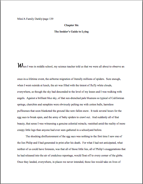
Okay, did you spot any other problems? What about the fact that the first paragraph of the chapter is not indented, and the first character is in a different typeface?

The odd typeface for the first letter, in imitation of the illuminated texts hand-written by monks in the Middle Ages, doesn’t turn up all that often in manuscripts other than fantasy and YA, for one simple reason: books in that category are more likely to feature this it’s-a-new-chapter signal than others. But once again, what an editor may decide, rightly or wrongly, is appropriate for a published book has no bearing upon what Millicent expects to see in a manuscript.

Save the manuscript illumination s for someone who will appreciate it. Hop in your time machine and track down a medieval monk to admire your handiwork, if you like, but in this timeframe, keep the entire manuscript in the same typeface and size.

The non-indented first paragraph of a chapter is fairly common in mystery submissions, I have noticed, and starting to become more prevalent in other kinds of fiction as well of late. (For an interesting discussion about why, please see the comments on this post and this one..) In fact, I’ve been told by many mystery writers — and rather tersely, too — that this is an homage to the great early writers in the genre, an echo of their style, so who is yours truly to try to talk them out of that gesture of respect?

Well, someone familiar with what Millicent expects to see on a page — as well as someone who is aware that almost without exception, in Edgar Allan Poe’s time all the way down to our own, the EDITOR has determined the formatting that appeared on any given printed page, not the author.

To professional eyes, especially peevish ones like Millicent’s, a manuscript that implicitly appropriates this sort of decision as authorial might as well be the first step to the writer’s marching into Random House, yanking off a well-worn riding glove, and striking the editor-in-chief with it. It’s just not a good idea for someone brand-new to the biz to do.

Yes, you read that correctly: it’s sometimes seen as a challenge to editorial authority. And while we could speculate for the next week about the level of insecurity that would prompt regarding a minor formatting choice as a harbinger of incipient insurrection, is the manuscript of your first book REALLY the right place to engender that discussion?

Exactly. Save the formatting suggestions for a long, intimate discussion over coffee with your editor AFTER he acquires the book. You’ll probably lose any disagreement on the subject, but at least you will have made your preferences known.

Until that happy, caffeine-enhanced day, just accept that the industry prefers to see every paragraph in a manuscript indented the regulation five spaces. It just looks right that way.

While we’re at it, how about the bolded chapter number and title? Nothing in a manuscript should be in boldface. Nothing, I tell you. Uh-uh. Not ever.

Well, there is an exception, a single one, but I’ll be getting to that tomorrow. And I have seen authors get away with the title itself on the tile page, but frankly, I wouldn’t chance it on a first book.

Nor should anything be underlined — not even names of books or song titles. Instead, they should be italicized, as should words in foreign tongues that are not proper nouns.

I heard that gigantic intake of breath out there from those of you who remember constructing manuscripts on typewriters: yes, Virginia, back in the day, underlining WAS the norm, for the simple reason that most typewriters did not have italic keys.

If you consult an older list of formatting restrictions or one intended solely for short story formatting — both of which seem to be circulating at an unprecedented rate on the web of late, pretty much always billed as universally-applicable rules for any type of writing, anywhere, anyhow, a phenomenon which simply does not exist — you might conceivably be told that publications, song titles, and/or foreign words (sacre bleu!) should be underlined. But trust me on this one: any agent is going to tell you to get rid of the underlining, pronto.

And why? All together now: because IT JUST DOESN’T LOOK RIGHT THAT WAY.

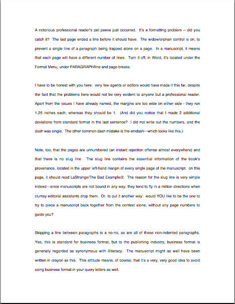
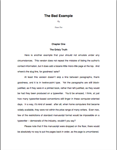
All right, campers, do you feel ready to fly solo? Here are two pages of text, studded with standard format violations for your ferreting-out pleasure. (I wrote these pages, too, in case anyone is thinking about suing me over it. Hey, stranger things have happened. To my memoir, even.)

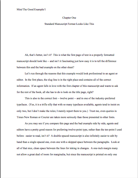
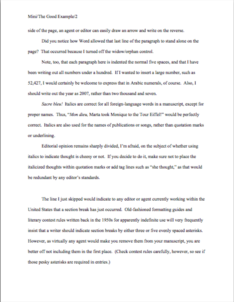
How did you do? Are those problems just leaping off the page at you now? To reward you for so much hard work, here are a couple of correctly-formatted pages, to soothe your tired eyes:

Whenever you start finding yourself chafing at the rules of standard format, come back and take a side-by-side gander at these last sets of examples — because, I assure you, after a professional reader like Millicent has been at it even a fairly short time, every time she sees the bad example, mentally, she’s picturing the good example right next to it.

And you know what? Manuscripts that look right get taken more seriously than those that don’t. And regardless of how you may feel about Millicent’s literary tastes, isn’t a serious read from her what you want for your book?

We’re in the home stretch of going over the formatting rules, everyone. Hang in there, and as always, keep up the good work!

How to format a book manuscript properly, part VIII: yet another cosmic mystery solved — sort of

I hope that those of you who were alarmed by the lost Ms on my keyboard at the end of last Friday’s post will be delighted to see them fully functional today. Unfortunately, that doesn’t mean that my laptop survived its brush with a fellow airline passenger’s spilled drink — he said it was club soda, but my keyboard still smells strongly of gin; perhaps that explains the wedge of lime he sent flying into my lap –entirely unscathed, alas. My poor baby is going to have to go into the shop.

What it does mean is that compulsive worriers like yours truly are right to hang onto the paraphernalia of long-retired computers. Turns out that my old Mac’s keyboard plugs right into the M-less laptop, and on we go. Hurrah!

In a not entirely unrelated note, when’s the last time you backed up your writing files? Naturally, I wish your computer well in its travels, but somehow, I suspect that the clumsy gin-swiller next to me is not the only threat to the health and welfare of all the laptops traveling around out there.

Better safe than sorry, I always say. (As proof of that: for those of you who don’t know what your backing-up options are, you’ll find a slew o’ advice on the subject under the BACK-UP COPIES category on the archive list at right.)

Back to business, Ms and all. The lovely lady above is Nike, the winged goddess of victory, bringing a laurel wreath for reader ACD, who will be famed in song and story forevermore for the comment she posted on an earlier formatting blog. Why? Because she, clever soul, wrote in with a method for using Word’s Find and Replace feature to change single spaces between sentences into double spaces within sentences.

Actually, ACD was kind enough to share this information quite some time ago, but if that’s not a piece of generosity worthy of a laurel leaf or two in perpetuity, I should like to know what is.

If ACD’s contribution to human knowledge isn’t enough to meet whatever standard you may be cherishing for what constitutes a reason to initiate dancing in the streets, long-time reader Chris gone far above and beyond the call of duty and written an entire blog post on the subject.

Retrospective and perpetual thanks to Chris, ACD, and everyone who participated in the genuinely useful discussions on the subject here and here. Laurel leaves all around!

For the last couple of weeks, I have been running through the strictures of standard manuscript format and some common deviations from it, to demonstrate just how clearly our old pal, Millicent the agency screener, discerns the differences between a professionally-formatted manuscript and, well, everything else. At the end of a long day’s reading, they definitely jump out at her, and with good reason: once a professional reader gets used to seeing the similarities that pretty much all professional manuscripts share, submissions formatted in other ways might as well have UNPROFESSIONAL stamped on them in bright red ink.

And while Millicent may strive valiantly NOT to allow that impression to color her reading of the submission itself, it’s just not a good idea to assume that it won’t. She’s only human, after all.

It’s an even worse idea to assume a charitable reading for a contest entry, by the way. If anything, contest judges tend to be even more sensitive to the beauty of standard format than Millicent, for the simple reason that they’ve usually been reading a whole lot longer.

The agency gig may well be Millie’s first job out of college, but the judge handed your entry may well have just retired from a long and fruitful career teaching English composition. Her fingers positively ache for the red pen of correction.

This is not accidental — most well-respected contests require some professional credentials from their judges, either as writers, editors, or teachers. Which means, in practice, that judges have often been writing in standard format themselves for years or bludgeoning other writers into compliance with its requirements. Translation: other kinds of formatting won’t look right to them, either.

By now, you’re probably having a similar reaction, aren’t you?

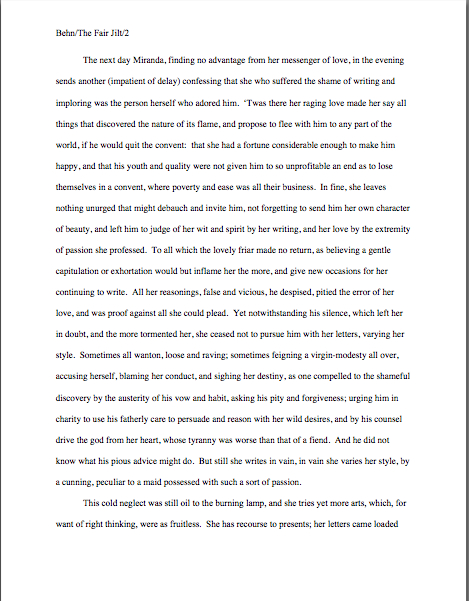
Don’t think you’re developing professional eyes? Or don’t want to believe you could conceivably share any traits with Millicent? Let’s test the proposition by trying a little Aphra Behn on for size.

If you don’t know her work, you should, at least historically: as far as we know, she was the first woman paid for writing in English — which, as Virginia Woolf pointed out, means that every female writer who earns so much as a sou from it now should be laying wreaths on her grave in gratitude.

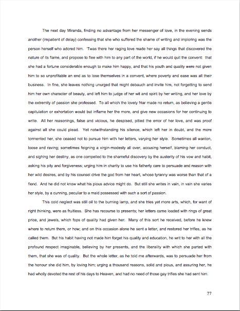
She’s also hilarious.) Here is a page from THE FAIR JILT (1688):

You clever souls could tell instantly that there was something wrong here, couldn’t you, and not just because Miranda’s trying to seduce her priest? (For convent, read monastery.) Set aside her practically Dickensian affection for semicolons for the moment — which would tend to turn off a modern Millicent pretty quickly — and try to tote up in your mind all of the deviations from standard format.

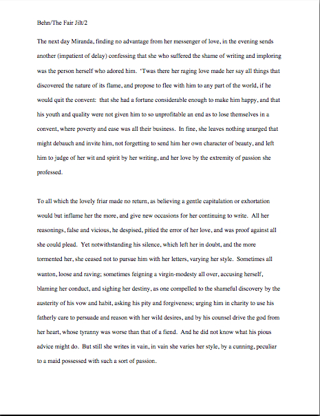
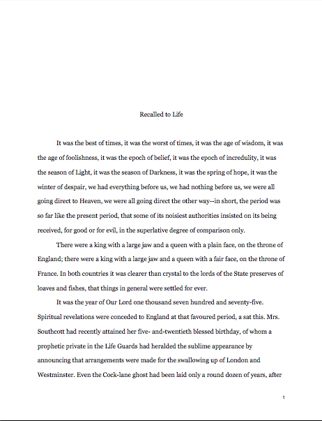
To refresh your memory and gladden your now-sharpened eyes, here’s what it should have looked like in standard format:

Let’s take the problems on the first version from the top of the page: the incorrect version does not have a proper slug line. (For those of you who aren’t already aware of it, a slug line is AUTHOR’S LAST NAME/TITLE/PAGE #, repeated in the header of every page of the text; it’s how professional manuscripts are numbered.)

Seeing this lone page out of context, it’s quite obvious why a slug line is a dandy idea, isn’t it? Without it, how would it be even remotely possible to return this wandering page back into the manuscript from whence it came.

“Who wrote this?” Millicent cries in ire, glaring around her cubicle at the 47 manuscripts lying there. “This stray piece of paper could be from any of these!”

At least Ms. Behn thought to number the pages of Example #1 — but did you catch the problem with how she did it? The page number is in the bottom right-hand margin, rather than in the slug line, where it belongs.

Did you catch any other problems that might register on Millicent’s umbrage meter??

What about the 10-point type, which will strain Millicent’s already overworked eyes? Or the Ariel typeface? There is nothing inherently wrong with either, but when she’s used to see practically every manuscript that heads out of the agency to publishing houses in 12-point Times New Roman, it (chant it with me here) just doesn’t look right.

Anything else? What about that right margin? Mighty straight, isn’t it? That look proper to you?

What’s going on here is called block-justification, and it’s another problem that can be laid squarely at the feet of those who insist that a manuscript and a published book should be identical. The text in many published books, and certainly in many magazines and newspapers, is spaced so that each line begins at exactly the same distance from the left-hand edge of the page and ends (unless it’s the last line of a paragraph) at exactly the same distance from the right-hand edge of the page.

Which, to let you in on why this type of neatness bugs professional readers, renders skimming quite a bit more difficult.

Why? Well, as you may see for yourself, block formatting provides fewer landmarks, as it were; to the glancing eye, practically every line of narrative text resembles every other. To those of us used to the ragged right margins and even letter spacing of standard format, it’s actually kind of hard to read.

So there’s quite a bit in Example #1 that’s distracting from the actual writing, isn’t there? Doesn’t help sell the text, does it?

Okay, all of these rhetorical questions in a row are beginning to make me dizzy, so I’m going to wind down for the day. But before I do, let’s take one more look at Example #2, the one Millicent and a contest judge would like:

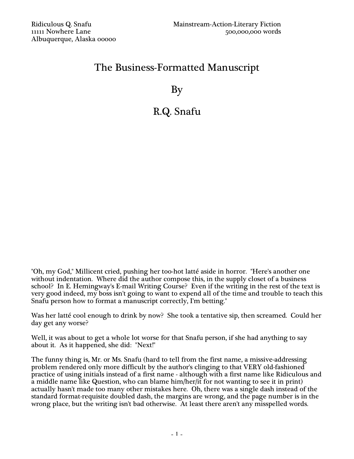
Now, let’s take a gander at the same page in — ugh — business format:

Startlingly different, isn’t it, considering that I made only two formatting changes? Did you catch them on your skim through?

All I did was I eliminate the indentations at the beginning of each paragraph and skipped a line between paragraphs to produce the norm for business correspondence, as well as for most of the text currently posted on the Internet.

Including this blog, unfortunately. As a professional writer and reader of manuscripts, it drives me NUTS that my blogging program won’t allow me to indent paragraphs.

Why? Because it just doesn’t look right. So much so that in a contest entry, as in a submission, business formatting is often grounds all by itself for knocking a manuscript out of finalist consideration.

Finding yourself asking why again? Well, technically, indented paragraphs are grammatically requisite, so to a judge, non-indented paragraphs may well seem as great a violation of everything we hold dear as frequent misspellings or use of the wrong form of there, their, and they’re.

Fortunately for judges and Millicents who care deeply about the health of the language, errors seldom come singly in entries and submissions. Like spelling errors, formatting mistakes are apparently social: they like to travel in packs, roving all over a manuscript like Visigoths sacking Rome.

Nike was apparently out of town that day. Visiting the ancient Greeks, perhaps.

As a result of this phenomenon, a manuscript that contains errors within the first few lines (or on the first page) is easy for a professional reader to dismiss; statistically speaking, it’s a pretty good bet that if Millicent kept reading after a technically flawed opening, she would find more causes for — you guessed it — umbrage.

Given how many submissions she has to screen between now and lunch, do you think she is going to (a) press on in the hope that the first error was a fluke, or (b) leap to the (perhaps unwarranted) assumption that there is more of the same to come and reject it right away?

I leave that one to your fine critical faculties to answer. Let’s just say that her umbrage-taking threshold tends to be on the low side.

Why am I bringing this up in the middle of a discussion of the perils of business format, you ask? Because — are you sitting down, dislikers of indentation? — one hears rumors that there are Millicents out there (and agents, editors, and contest judges as well) who will leap directly from noticing a lack of indentation and unwarranted spaces between paragraphs to our friend, option (b): if the submitter is not aware of how to format a paragraph of English prose properly, she reasons, aren’t there inevitably more snafus to come?

Not every Millicent — or agent, judge, etc. — will have this knee-jerk reaction, of course. But do you really want to take the chance that she’s not going to seize the opportunity to save herself a little time?

The specter of illiteracy is not the only reason using business format is likely to cost you, either. To a professional reader, the differences between the last two examples would be more than visually jarring — they’d be downright confusing. In standard format, the only reason for a skipped line between paragraphs would be a section break, so Millicent would be expecting the second paragraph to be about something new.

Okay, so a misconception like that might distract her attention for only few consecutive seconds, but let’s not kid ourselves: your garden-variety Millicent is spending less than a minute on most of the submissions she rejects — it’s actually not all that uncommon for her not to make into the second or third paragraph before reaching for the SASE and a copy of that annoying form rejection letter.

Take a moment for the implications of that to sink in fully. Don’t worry; I’ll wait.

While those of you new to the speed with which rejection typically occurs are already in shock, let me add for the sake of anyone who doesn’t already know: those who regard business format as a symptom of creeping illiteracy — hey, I just report the news; I don’t dictate it — are likely to frown upon it just as much in a query letter or synopsis as in a manuscript submission.

Time loss is not the only reason she might take umbrage at momentary confusion. Let me let you in on a little secret: professional readers, especially those who inhabit agencies and publishing houses, tend not to be overly fond of having their mental image of the story they are reading at the moment jarred.

How do I know this? Well, for one thing, they commonly refer to it as being tricked. As in, “I hate being tricked by a first paragraph that is about someone other than the protagonist.”

There’s a practical basis to this dislike, of course, but it’s kind of complicated. I wrote a couple of fairly extensive posts on the subject a while back (here’s a link to the first, and here’s a link to the second, in case you’re interested), but I’ll run over the thumbnail version now.

Is everybody comfortably seated? My thumbnails are a tad long. (Just try to get THAT image out of your head anytime soon.)

To get through all of those manuscripts she’s assigned to screen each week, Millicent has to read quite quickly, right? If she doesn’t, she’ll get buried in paper, as basically, she’s got to make it through WAR AND PEACE several times over in a week.

That’s a whole lot of material to remember, by anyone’s standards — and remembering actually is important here. If she decides to allow a manuscript to make it to the next level of consideration, she is going to need to be able to tell her boss what the book is about: who the protagonist is, what the conflict is, why that conflict is important enough to the protagonist for the reader to be drawn into it, and so forth.

In essence, she’s going to need to be able to pitch it to the higher-ups at the agency, just as the agent is going to have to do in order to sell the book to an editor, and an editor is going to have to do in order to convince HIS higher-ups that the publishing house should acquire the book.

And, often, as first-round contest judges will need to do on an evaluation form in order to pass an entry onto the next round.

Okay, brace yourself, because explaining what comes next involves delving into one of the great cosmic mysteries that has long perplexed aspiring writers the world over. It’s not for the faint of heart.

Remember earlier in thus series, when I mentioned that agents and editors don’t read like other people? Well, one of the primary differences is that from line one of page one, they’re already imagining how they’re going to pitch this book. So if paragraph 2 or 3 (or page 2 or 3) suddenly informs them that their mental patter has been about the wrong character, they feel as if they’ve been backing the wrong horse.

And while there may have been any number of perfectly reasonable narrative reasons for the text to concentrate upon an alternate character for the opening, unless the writing AND the story have already really wowed Millicent, her resentment about being trickedwrong about the identity of the protagonist is often sufficient to make her reach for that SASE and form letter.

Feel free to go scream into the nearest pillow over that last piece of convoluted logic; you don’t want to keep that kind of existential cri de coeur pent up inside. I’ll wait until it’s out of your system.

Feel better? Good.

Before you go rushing off to see if your opening paragraphs might possibly be open to an interpretation of trickery — because, for instance, you might have taken the bold authorial step of noticing that there is more than one human being in the world, and reported a piece of action accordingly — let’s return to the formatting issue that prompted my little segue into the psychology of resentment. Can we extrapolate any practical lesson about business format from it?

You bet your boots we can: it’s not a good idea to give the impression of a section break where there isn’t one. And when producing pages for people who read all day, you might want to stick to the rules governing written English and indent your paragraphs.

Still a bit confused? Don’t worry: the show-and-tell is far from over. Hang in there for the rest of this series, and keep up the good work!

PS: Hey, I know a great way to distract yourself from confusion and potentially rack up some pretty great ECQLC (eye-catching query letter candy) at the same time) — why not work on your entry to the First Periodic Author! Author! Awards for Expressive Excellence? The deadline is midnight on May 18; don’t say I didn’t warn you.

How to format a book manuscript properly, part VII: what would we do without Millicent? Or, why spilled liquids are sometimes worth crying over

spilledmilk
How have you been enjoying our latest imaginative foray into the wonderful world of formatting book manuscripts? If you’re at a loss for words to describe the experience, how about gee, this is complicated, but it’s thrilling to know at last that I’m doing it right? Or I’d been doing it right, I see, but how fascinating to know the logic behind it?

Heck, I’d even settle for well, it’s kind of a slog, but at least now I know that my entry won’t be disqualified from the First Periodic Author! Author! Awards for Expressive Excellence when I enter on or before May 18, 2009. Phew!

Okay, so standard may not be the most scintillating subject in the world, but since it actually is sometimes the difference between a well-written manuscript that strikes Millicent, everybody’s favorite agency screener, as well-written enough to keep reading beyond the first page or two and one that makes her exclaim, “Oh, too bad — this writer isn’t ready yet. Next!” I do feel better if we run over the basics two or three times per year.

As those of you who have been reading this blog for a while have undoubtedly noticed. Hey, at least you were already prepared to enter the contest; nothing at which you should be sneezing.

Another non-sneeze-worthy achievement: after you’ve been through the rules a couple of times, the difference between a professionally formatted manuscript and one whose writer just thought it looked nice that way should be almost instantaneously apparent. As, indeed, it is to anyone who reads manuscripts for a living.

Like, say, Millicent. Pity her; she has the unenviable task of trying to see past all of those weird formatting (and spelling, and grammar) choices in order to try to discover fabulous new talent.

Wipe that smirk off your face. Even if you aren’t in the habit of empathizing with people who reject writers for a living, there’s a good self-interested reason you should care about her state of mind: even with the best will in the world, grumpy, over-burdened, and/or rushed readers tend to be harder to please than cheerful, well-treated, well-rested ones.

Millicent is the Tiny Tim of the literary world, you know; at least the Bob Cratchits a little higher up on the office totem pole uniformly get paid, but our Millie sometimes doesn’t, or gets a paycheck that’s more an honorarium than a living wage. A phenomenon that one might expect to become increasingly common, by the way: the worse a bad economy gets, the better an unpaid intern is going to look to a cash-conscious agency.

Or, heaven help us, a worried publishing house that’s been laying off editors.

Even if Millie’s not an intern, she’s still unlikely to be paid very much, at least relative to the costs of living in the cities where the major publishers dwell. Her hours are typically long, and quite a lot of what she reads in the course of her day is, let’s face it, God-awful.

Not to mention poorly formatted. But that should be obvious to you by now, right?

Millicent’s job, in short, is not the glamorous, power-wielding potentate position that those who have not yet passed the Rubicon of signing with an agency often assume it to be. Nor, ideally, will she be occupying the position of first screener long: rejecting queries and manuscripts by the score on-the-job training for a fledgling agent, in much the same way as an editorial assistant’s screening manuscripts at a publishing houses is the stepping-stone to becoming an editor.

You didn’t think determining a manuscript’s literary merits after just a few lines of text was a skill that came naturally to those who lead their lives right and got As in English, did you? Agents and editors have to learn to spot professional writing in the wild — which means, in part (out comes the broken record again) having to recognize what a properly-formatted manuscript should look like.

Actually, the aspiring writer’s learning curve is often not dissimilar to Millicent’s: no one tumbles out of the womb already familiar with the rules of manuscript formatting. (Okay, so I practically was, growing up around so many authors, but I’m a rare exception.) Like Millicent, most of us learn the ropes only through reading a great deal.

She has the advantage over us, though: she gets to read books in manuscript form, and most aspiring writers, especially at the beginning of their journeys to publication, read only books. So what writers tend to produce in their early submissions are essentially imitations of books.

The problem is, the format of the two is, as I believe that I have pointed out, oh, several hundred times before in this very forum, quite different — and not, as some of you may have been muttering in the darkness of your solitary studios throughout this series, merely because esoteric rules render it more difficult for new writers to break into the biz.

As a matter of fact, there are many reasons that a manuscript in book format would be hard for an agent or editor to handle. For starters, published books are printed on both sides of the page, manuscripts on one.

Why the difference, in these days of declining tree populations and editors huffily informing writers at conferences that paper is expensive? Simple: it’s easier to edit that way.

Which is why, even in these days of widely available word processors, scads of professional editing is still done by hand.

Again, why? Well, it’s a mite hard to give trenchant feedback while traveling in a crowded subway car if you have to maneuver a laptop (or, as I can tell you from personal experience this very minute, while squished between burly, restless fellow passengers on a plane).

Also, many agencies remain far too virus-fearful to allow their employees solicit attachments from writers who aren’t already clients. (Those who do generally have a policy that forbids the opening of unsolicited attachments, FYI.) Even in agencies that have caved in to new technology sufficiently to send their member agents on long airplane flights to writers’ conferences armed with a Kindle with 17 manuscripts on it, hand-written marginalia is still the norm, even if it means scanning hand-proofed pages and e-mailing them back to the author.

Ultimately, most editors edit in hard copy because they prefer it. The human eye is, of course, to blame for this: reading comprehension drops by about 70% when the material is presented on a computer screen; the eye tends to skim.

Which is why — you can hear this coming, can’t you? — a wise writer always reads her ENTIRE manuscript IN HARD COPY before submitting it to anyone even vaguely affiliated with the publishing industry. It’s much, much easier to catch typos and logic problems that way.

While you’ve got your hymnals out, long-time readers, let’s continue with the liturgy: manuscripts should also be typed (don’t laugh; it’s not unheard-of for diagrams to be hand-drawn, hand-number, or for late-caught typos to be corrected in pen), double-spaced, and have 1-inch margins all the way around.

Time to see why, from an editing point of view.

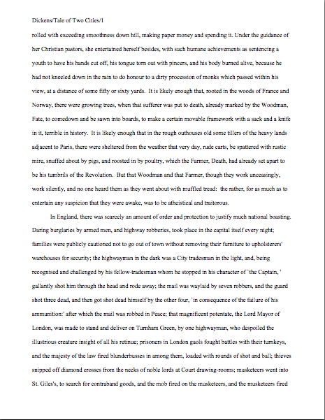
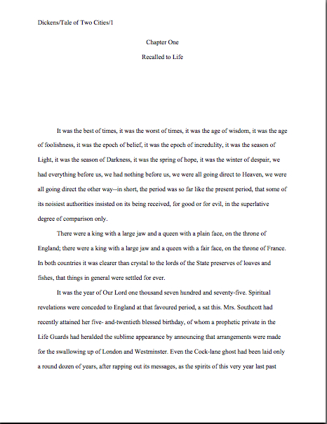
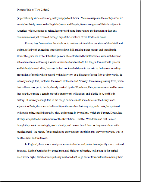
You had hoped that I’d gone too far afield to get back to the topic at hand, didn’t you? Not a chance. Let’s call upon our old friend Charles Dickens again to see what a page of a manuscript should look like:

Nice and easy to read, isn’t it? (If it’s too small to read easily on your browser, try double-clicking on the image.)

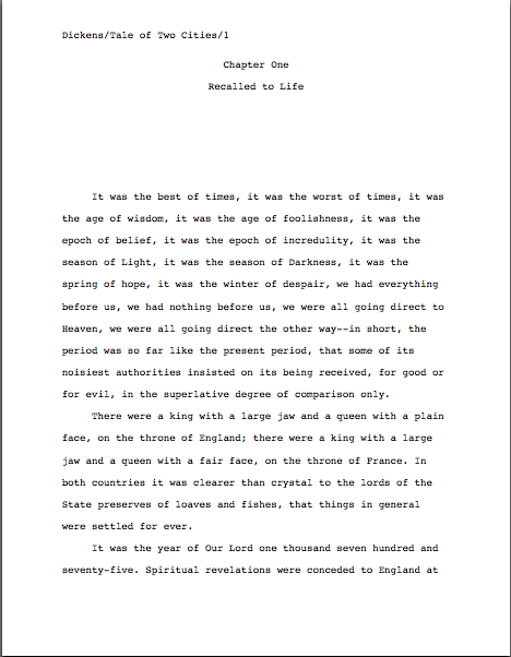
To give you some idea of just how difficult — or even impossible — it would be to hand-edit a manuscript that was NOT double-spaced or had smaller margins, take a gander at this little monstrosity:

I believe the proper term for this is reader-hostile. Even an unusually patient and literature-loving Millicent would reject a submission like this immediately, without reading so much as a word.

Were there a few spit-takes out there during that last sentence? “My goodness, Anne,” those of you who are wiping coffee, tea, or the beverage of your choice off your incredulous faces sputter, “why would any sane person consider it THAT serious an offense? It is, after all, precisely the same writing.”

Well, think about it: even with nice, empty page backs upon which to scrawl copy edits, trying to cram spelling or grammatical changes between those lines would be well-nigh impossible. Knowing that, Millicent would never dream of passing such a manuscript along to the agent who employs her; to do so would be to invite a stern and probably lengthy lecture on the vicissitudes of the editorial life.

She wasn’t born yesterday, you know. She’s SMART.

Don’t tempt her just to reject it unread — and don’t even consider, I beg of you, providing the same temptation to a contest judge. Given the sheer volume of submissions the average Millicent reads, she’s not all that likely to resist — and the contest judge will be specifically instructed not to resist at all.

Yes, really. Even if the sum total of the provocation consists of a manuscript that’s shrunk to, say, 95% of the usual size, it’s likely to get knocked out of the running on sight.

Some of you are blushing, aren’t you? Perhaps some past contest entrants and submitters who wanted to squeeze in a particularly exciting scene before the end of those requested 50 pages?

No? Let me fill you in on a much-deplored practice, then: faced with a hard-and-fast page limit for submission, some wily writers will shrink the font or the margins, to shoehorn a few more words onto each page. After all, the logic runs, who is going to notice a tenth of an inch sliced off a left or right margin, or notice that the typeface is a trifle smaller than usual?

Millicent will notice, that’s who, and practically instantly. As will any reasonably experienced contest judge; after hours on end of reading 12-point type within 1-inch margins, a reader develops a visceral sense of when something is off.

Don’t believe me? Go back and study today’s first example, the correctly formatted average page. Then take a gander at this:

I shaved only one-tenth of an inch off each margin and shrunk the text by 5% — far, far less than most fudgers attempt. Admit it: you can tell it’s different, can’t you, even without whipping out a ruler?

So could a professional reader. And let me tell you, neither the Millicents of this world nor the contest judges tend to appreciate attempts to trick them into extraneous reading. Next!

The same principle applies, incidentally, to query letters: often, aspiring writers, despairing of fitting a coherent summary of their books within the standard single page, will shrink the margins or typeface.

Trust me, someone who reads queries all day, every day, will be able to tell. (And if you would like to see precisely why, please check out the posts under the QUERY LETTERS ILLUSTRATED category on the list at right.)

The other commonly-fudged spacing technique involves skipping only one space after periods and colons, rather than the grammatically-requisite two spaces. Frequently, writers won’t even realize that this IS fudging: as readers have pointed out VEHEMENTLY in the comments whenever I have talked about this in the past, ever since published books began omitting these spaces in order to save paper, there are plenty of folks out there who insist that skipping the extra space in manuscripts is obsolete. Frequently, the proponents will insist that manuscripts that include the space look old-fashioned to agents and editors.

And I’m not going to lie to you here: to the agents who prefer this format, it is going to look old-fashioned. Sorry. Fortunately, however, the relatively few (and usually younger) agents who prefer the single-space option are usually exceedingly vocal about it, so aspiring writers seeking to submit to them usually don’t have a particularly hard time finding out about their preference.

How can you spot such an agent in the wild? She’s usually the one on the conference dais insisting that absolutely NOBODY accepts manuscripts with two spaces after periods and colons anymore.

Which just isn’t true; the language hasn’t actually changed, and the old-fashioned agents and editors who are aware of that tend to feel rather strongly about their preference, too. And those are the ones who will actually make the writers who work with them go through their manuscripts and add back that second space.

Yes, really — and yes, recently. One doesn’t hear of it happening the other way around.If the agent you have set your heart upon has not gone on the record about it, then, it is generally safer to go with the 2-space option.

I sense a bit of dissention out there, do I not? Perhaps a few faint whispers about how this view is old-fashioned, and is likely to be looked down upon as such?

Well, guess what, cookie — standard manuscript format IS old-fashioned, by definition; that fact doesn’t seem to stop most of the currently-published authors of the English-speaking world from using it. In fact, in all of my years writing and editing, I have never — not once — seen an already agented manuscript rejected or even criticized for including the two spaces that English prose requires after a period or colon.

I have, however, heard endless complaint from professional readers — myself included — about those second spaces being omitted. Care to guess why?

Reward yourself with a virtual candy cane if you said that cutting those spaces throws off word count estimation; the industry estimates assume those doubled spaces. (If you don’t know how and why word count is tallied, please see the WORD COUNT category on the archive list at right.)

And give yourself twelve reindeer if you also suggested that omitting them renders a manuscript harder to hand-edit. We all know the lecture Millicent is likely to get if she forgets about that, right?

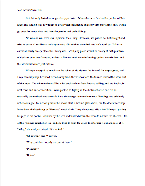
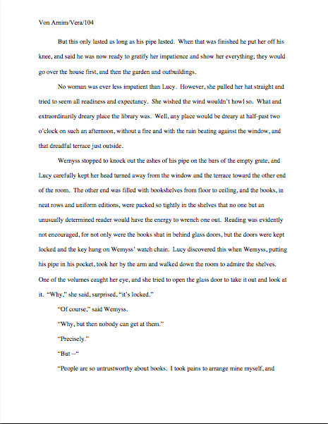
Again, a pro isn’t going to have to look very hard at a space-deprived page to catch on that there’s something fishy going on. Since Dickens was so fond of half-page sentences, the examples I’ve been using above won’t illustrate this point very well, so (reaching blindly into the depths of the bookshelf next to my computer), let’s take a random page out of Elizabeth Von Arnim’s VERA:

There are 310 words on this page; I wasn’t kidding the other day about how far off the standard word count estimations were, obviously. Now cast your eye over the same text improperly formatted:

Doesn’t look much different to the naked eye, does it? The word count is only slightly lower on this version of this page — 295 words — but enough to make quite a difference over the course of an entire manuscript.

So I see some hands shooting up out there? “But Anne,” I hear some sharp-eyed readers exclaim, “wasn’t the word count lower because there was an ENTIRE LINE missing from the second version?”

Well spotted, criers-out: the natural tendency of omitting the second spaces would be to include MORE words per page, not less. But not spacing properly between sentences was not the only deviation from standard format here; Millicent, I assure you, would have caught two others.

I tossed a curve ball in here, to make sure you were reading as closely as she was. Wild guesses? Anyone? Anyone?

The error that chopped the word count was a pretty innocent one, almost always done unconsciously: the writer did not turn off the widow/orphan control, found in Word under FORMAT/PARAGRAPH/LINE AND PAGE BREAKS. This insidious little function, the default unless one changes it, prevents single lines of multi-line paragraphs from getting stranded on either the bottom of one page of the top of the next.

As you may see, keeping this function operational results in an uneven number of lines per page. Which, over the course of an entire manuscript, is going to do some serious damage to the word count.

The other problem — and frankly, the one that would have irritated a contest judge far more than Millicent — was on the last line of the page: using an emdash (“But—”) instead of a doubled dash. Here again, we see that the standards that apply to printed books are not proper for manuscripts.

Which brings me back to today’s moral: just because a particular piece of formatting looks right to those of us who have been reading books since we were three doesn’t mean that it is correct in a MANUSCRIPT.

Millicent reads manuscripts all day; contest judges read entries for hours at a time. After a while, a formatting issue that might well not even catch a lay reader’s attention can begin to seem gargantuan.

As I have perhaps pointed out once or twice throughout this series, if the writing is good, it deserves to be free of distracting formatting choices. You want agents, editors, and contest judges to be muttering, “Wow, this is good,” over your manuscript, not “Oh, God, he doesn’t know the rules about dashes,” don’t you?

Spare Millicent the chagrin, please; both you and she will be the happier for it. Believe me, she could use a brilliantly-written, impeccably-formatted submission to brighten her Dickensian day.

I shall have to sign off now, because the fellow sitting next to yours truly spilled his glass of water onto the keyboard, and I now do not appear to be able to use either the letter that follows L in the alphabet or the se()icolon. If I can get ()y co()puter fixed on the road, ()ore show-and-tell follows next time. If not, well, it was ti()e for another guest post on subtle censorship, anyway, right?

Think good thoughts for ()y ()issing letters() swift return — oh, God, the U now needs to be hit three ti()es in order to show up on the screen –and, of course, keep up the good work!

How to format a book manuscript properly, part VI: quotation is not necessarily the sincerest form of flattery

daffodils-and-rose-thorns
For the last week or so I’ve been talking about how to format a manuscript professionally, and I’m beginning to fear that in my eagerness and vim, I may have scared some of you a little. Or a whole lot.

My vehemence is kindly-motivated, I assure you: contrary to popular opinion amongst aspiring writers, how a submission is presented can indeed make a very great difference in how it’s received.

Yes, yes, I hear you, those of you who have been running around to writers’ conferences in recent years: you can hardly throw a piece of bread at an agent or editor’s forum without hitting a pro saying, “It all depends upon the writing.” They tend to spout this aphorism for a very good reason — it is in fact true.

But as we discussed last time, that doesn’t mean that the quality of the writing is the ONLY criterion agents, editors, contest judges, or any of the rest of us who read manuscripts for a living use when deciding whether to read beyond the first page of a submission. Professional presentation weighs in, as do marketability, a story’s probability of appealing to its target audience (not exactly the same thing), what happens to be the surprise bestseller of the moment — and yes, that whole slew of intangibles that make up personal taste.

There is, in short, no such thing as a foolproof formula for producing the perfect manuscript for submission.

As I’ve been arguing throughout this series on formatting, however, agents, editors, contest judges, screeners, and other professional readers develop an almost visceral sense of when a manuscript is properly formatted. So rather than screening submissions with a list of don’t by their sides, they more or less automatically discount pages that are cosmetically incorrect.

This is most emphatically not the same thing, though, as rejecting such pages on the spot because, say, an aspiring writer underlined a foreign-language word on page 1 instead of italicizing it. (Sacre bleu!)

Much as a reader with impeccable grammar will not necessarily throw down a book that misuses semicolons, most professional readers will not instantly reject an improperly-formatted submission without SOME further provocation. But believe me, the writer in both cases is going to have to work a whole lot harder to impress the reader as literate.

Unfortunately, the prevailing standards for printed books — which, as we have seen, differ in many significant respects from manuscripts — often lead innocent writers astray. Case in point: including a table of contents in a manuscript.

That seems as if it would be helpful, doesn’t it? In fiction, including it would enable an agent to go back and re-read the submission easily; in nonfiction, it would permit an editor to skip ahead to a chapter of particular interest.

And heck, if the manuscript fell upon the floor in the kind of you got chocolate in my peanut butter!/you got peanut butter in my chocolate! we witnessed with horror last week, a well-organized table of contents might render it a trifle easier to reassemble, right?

Wrong: this is a notorious rookie mistake. In a published book, a table of contents, like an index, is a courtesy to bookstore browsers trying to get a feel for the contents and buyers who do not necessarily want to read the entire book. Why, runs the industry’s logic, would an agent or editor be interested in acquiring a book if he doesn’t like it well enough to read it in its entirety?

So really, a table of contents in a manuscript is just a wasted page. Do not include it in a manuscript submission, any more than you would include an index or those boxes around text that magazines are so fond of printing. To professional eyes, it looks unprofessional, especially in fiction.

It’s also an inconvenience — and it’s never a good idea to fritter away the energies of people you want to do you great big favors like offering to represent your book, is it?

Why inconvenient? Well, think about our time-strapped friend Millicent the agency screener for a moment: when she turns over the title page, she expects to find the first page of text there waiting for her, all ready to be judged in a flash. If instead she finds a table of contents, something she would only find helpful if she were to read the entire manuscript, she may well be a trifle miffed. Given that she tends to reject submissions somewhere between paragraph 1 and page 5, the information that Chapter 8 begins on page 112 will most likely strike her as at best gratuitous — and at worst presumptuous.

“What gives?” she’ll say, taking an extra sip of her too-hot latte as she impatiently gets the table of contents out of her way. “Doesn’t this writer know the difference between a manuscript and a book?”

‘Nuff said, I think.

Or maybe not — do I hear some aspiring nonfiction writers clamoring for my attention? “But Anne,” these excellent souls point out, “a book proposal is supposed to include a table of contents for the planned book!”

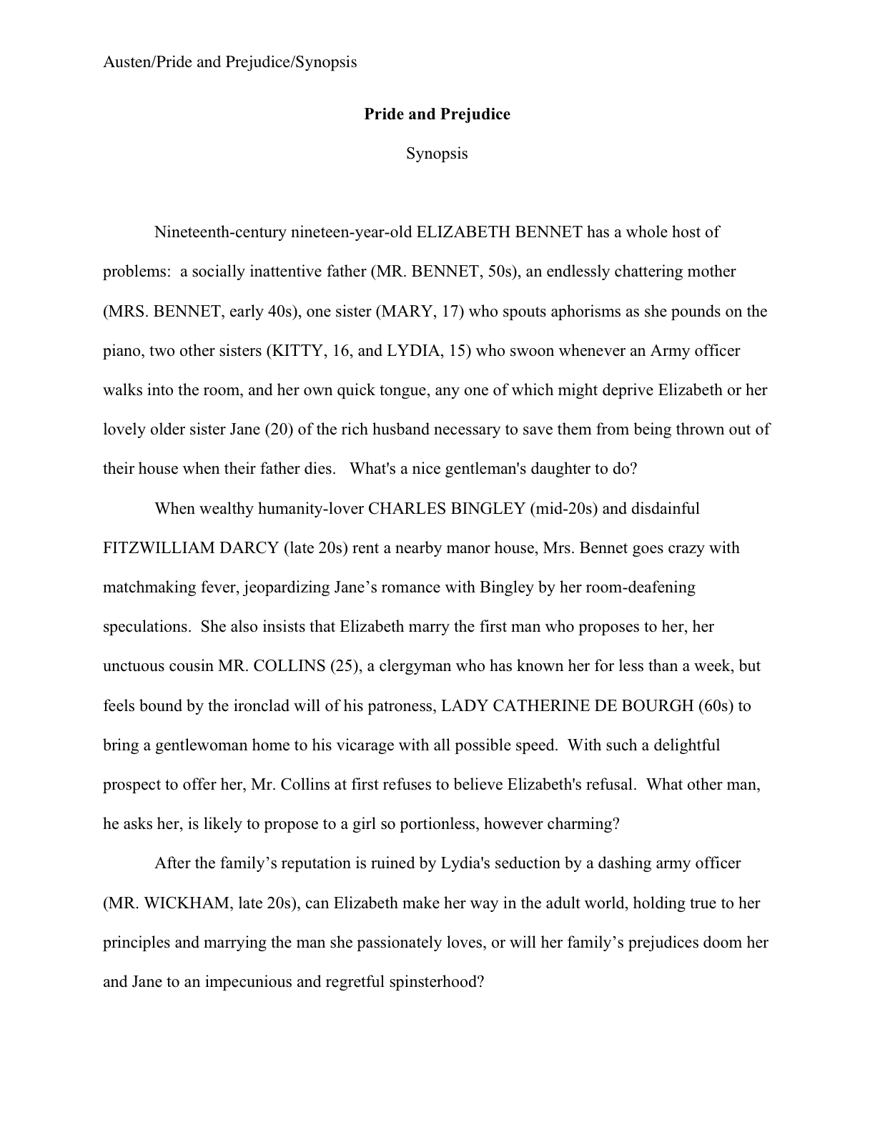
Ah, I’m glad that you brought this up, because this is a very common misconception amongst first-time proposers, who tend to cram precisely the table of contents they expect to see in their eventually-published books into their proposals. They look a little something like this:

See any problems with this as a marketing document?

Actually, I’m sure that some of your hands shot into the air even before I showed this example, in your eagerness to take issue with the notion that a submission should resemble a published book in the first place — and thus that the kind of table of contents one might expect to see in a nonfiction book would clearly be out of place in a submission. Well caught, eager wavers.

Spot any other problems?

If you said that the example above doesn’t include information that could possibly be either accurate or useful, give yourself a gold star for the day. Obviously, it would be impossible for a proposer to state with certainty where the chapter breaks would fall in the proposed book when published; all the information s/he could reasonably offer in this sort of table of contents, then, would be educated guesses about how long each chapter might be. Or perhaps a list of where those breaks fall in the draft manuscript.

But that’s not the information nonfiction agents and editors want to see in the book proposal. The information they do want to see in the annotated table of contents is a brief description of the CONTENTS of each chapter.

The word annotated should have been a clue, I guess.

And like so many other differences between professional formatting and, well, everything else they see in submissions, it’s really, really obvious at first glance to someone who has seen a book proposal before whether the submitter du jour has followed the rules. Compare what the first page of a correctly put-together annotated table of contents looks like with the truncated version above:

See the difference? I assure you, Millicent will. From ten paces away.

I don’t feel I may leave this topic without addressing the other EXTREMELY common opening-of-text decoration: epigraphs, those nifty little quotes from other sources that we writers so adore.

Nobody else likes them much, but we writers think they’re great, don’t we? There is something powerfully ritualistic about typing the words of a favorite author at the beginning of our manuscripts; it’s a way that we can not only show that we are literate, but that by writing a book, we are joining some pretty exalted company.

Feeling that way about the little dears, I truly hate to mention this, but here goes: it’s a waste of ink to include them in a submission. 99.9998% of the time, they will not be read at all.

Stop glaring at me that way; it’s not my fault. I don’t stand over Millicent with a riding crop, forcing her to treat each submission with respect (although admittedly, it’s an interesting idea).

It’s true, alas: I’ve literally never met a professional reader who doesn’t just skip epigraphs in a first read — or (brace yourselves, italics-lovers) any other italicized paragraph or two at the very beginning of a manuscript.

They just assume, often not entirely without justification, that if it’s in italics, it doesn’t really have much to do with the story at hand, which (they conclude, not always wrongly) begins with the first line of plain text. And there’s another reason that they tend to skip ‘em: the sad fact is, at the submission stage of the game, no one cares who a writer’s favorite authors are.

The official justification for this — yes, there is one — is quite interesting: even the busiest person at an agency or publishing house picks up a manuscript in order to read ITS author’s writing, not someone else’s.

Kinda hard to fault them for feeling that way, isn’t it, since we all want them to notice the individual brilliance of our respective work?

Sentiment aside, let’s look at what including an epigraph achieves on a practical level. Instead of startling Millicent with your erudition in picking such a great quote, the epigraph will to prompt her to start skimming BEFORE she gets to the first line of your text — AND you will have made her wonder if you realized that manuscript format and book format are not the same.

Good idea? Or the worst marketing idea since New Coke?

If that all that hasn’t convinced you, try this on for size: while individual readers are free to transcribe extracts to their hearts’ contents, the issue of reproducing words published elsewhere is significantly more problematic for a publishing house. While imitation may be the sincerest form of flattery, reproduction of published text without the author’s permission is known in the biz by another, less flattering name: copyright infringement.

If the quote is from a book that is not in the public domain, the publisher will need to obtain explicit permission to use any quote longer than fifty words. Ditto for ANY quote from a song that isn’t in the public domain, even if it is just a line or two.

So effectively, most epigraphs in manuscripts are signposts shouting to an editor: “Here is extra work for you, buddy, if you buy this book! You’re welcome!”

I’m sensing some disgruntlement out there, amn’t I? “But Anne,” I hear some epigraph-huggers cry,
“the material I’m quoting at the opening of the book is absolutely vital to include! The book simply isn’t comprehensible without it!”

Okay, if you insist, I’ll run through the right and wrong ways to slip an epigraph into a manuscript — but bear in mind that I can’t promise that even the snazziest presentation will cajole Millicent into doing anything but skipping that quote you love so much. Agreed?

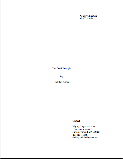
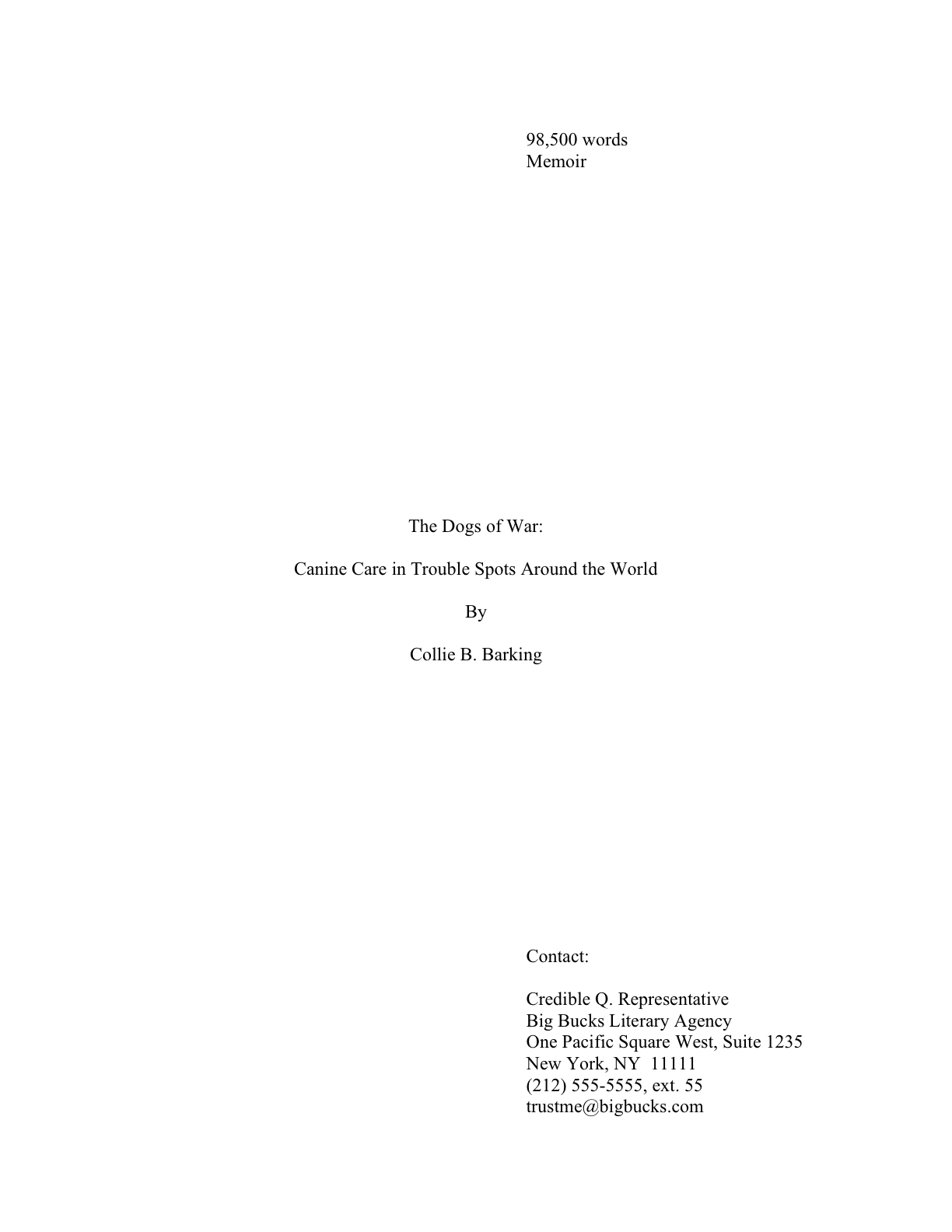
Regardless of while title page format you choose, do not, under any circumstances, include a quote on the title page as an epigraph — which is what submitters are most likely to do, alas. Let’s take a gander at what their title pages tend to look like:

How likely is Millicent to notice the quote at all? Well, this was what she was expecting to see:

Actually, that wasn’t precisely what she expected — did you catch the vital piece of information he left off his title page?

If you said that Eeyore neglected to include the book category on the second example, give yourself a pile of thistles. (Hey, that’s what he would have given you.) My point is, the quote in the first example is going to stand out to Millicent like the nail in a certain critter’s tail.

Other submitters choose to eschew the title page route in order to place an epigraph on the first page of text. The result is immensely cluttered, by anyone’s standards — especially if the submitter has made the very common mistake I mentioned in my discussion of title pages last time, omitting the title page altogether and cramming all of its information onto page 1:

Where did all of our lovely white space from yesterday and the day before go? Into quoting, partially.

The last popular but ill-advised way to include an introductory epigraph is to place it on a page all by itself, as it might appear in a published book:

What’s wrong with this, other than the fact that Poe died before our author wrote Sons and Lovers? Chant it with me now, everyone: A MANUSCRIPT IS NOT SUPPOSED TO RESEMBLE A PUBLISHED BOOK.

At best, Millicent is likely to huffily turn past this page unread. At worst, she’s going to think, “Oh, no, not another writer who doesn’t know how to format a manuscript properly. I’ll bet that when I turn to page one, it’s going to be rife with terrible errors.”

Does either outcome sound desirable to you? I thought not.

So what SHOULD an epigraph-insistent submitter do? Leave it out, of course — weren’t you listening before?

But if it is absolutely artistically necessary to include it, our pal Mssr. Poe actually wasn’t all that far off: all he really did wrong here was include a slug line. The best way to include an introductory epigraph is on an unnumbered page PRIOR to page 1. On that unnumbered page, it should begin 12 lines down and be centered.

But I’m not going to show you an example of that. Why? Because I really, truly don’t think you should be including an epigraph at all at the submission stage.

Just in case I hadn’t made that clear.

That doesn’t mean you should abandon the idea of epigraphs altogether, however. Squirrel all of those marvelous quotes away until after you’ve sold the book to a publisher — then wow your editor with your erudition and taste. “My,” the editor will say, “this writer has spent a whole lot of time scribbling down other authors’ words.”

Or, if you can’t wait that long, land an agent first and wow her with your erudition and taste. But don’t be surprised if she strongly advises you to keep those quotation marks to yourself for the time being.

If you are submitting directly to a publisher, do be aware that most publishing houses now place the responsibility for obtaining the necessary rights squarely upon the author. If you include epigraphs, many editors at these houses will simply assume that you have ALREADY obtained permission to use them. Ditto with self-publishing presses.

This expectation covers, incidentally, quotes from song lyrics, regardless of length.

I’m quite serious about this. If you want to use a lyric from a song that is not yet in the public domain, it is generally the author’s responsibility to get permission to use it — and while for other writing, a quote of less than 50 consecutive words is considered fair use, ANY excerpt from an owned song usually requires specific permission, at least in North America. Contact the American Society of Composers, Authors, and Publishers (ASCAP) for assistance in making such requests. (For a very funny first-hand view of just what a nightmare this process can be, please see FAAB Joel Derfner’s guest post on the subject.)

Have I talked you out of including an epigraph yet? I hope so.

Remember, just because you do not include your cherished quotes in your submission does not mean that they cannot be in the book as it is ultimately published. Contrary to what 99% of aspiring writers believe, a manuscript is a DRAFT, not a finished work. In actuality, nothing in a manuscript is unchangeable until the book is actually printed — and folks in the industry make editing requests accordingly.

In other words, you can always negotiate with your editor after the book is sold about including epigraphs. After you have worked out the permissions issue, of course.

There’s nothing like a good practical example to clarify things, is there? More follow next time. Keep up the good work!

How to format a book manuscript properly, part IV: some things just look better printed on a page than others

shakespeare-first-folio
Hey, do you know what today is? It’s the one-week anniversary of the announcement of my blog’s entrée into the serious award-granting stage of its career, First Periodic Author! Author! Awards for Expressive Excellence. Not only is that a prize win that would look awfully pretty on a query letter or in an author bio — hey, I worry about the progress of your writing career, you know — but it’s a chance for those of you who feel strongly about the subject of our ongoing series on censorship, subtle and otherwise, to get your work published side-by-side with some pretty impressive published authors.

Oh, and there are some more tangible prizes as well. You’ll find the rules here. Chief among them: in order to win or place, an entry must be in standard manuscript format.

Why, what a remarkable coincidence: we seem to be in the midst of a series on standard format! The universe sure works in mysterious ways, doesn’t it?

Which means, of course, that it’s time to get back to work. Has everyone recovered from the last few days’ worth of inoculation with professional formatting know-how?

Yes, that was a whole lot of information to absorb at once, and it may have left a bit of a sore place, but much better a one-time quick sting than engendering years of rejection without knowing why, I always say. Once you’ve gotten exposed to the correct way to format a book manuscript, chances are that you’ll be immune to formatting problems in the future.

Why, yes, I have run that metaphor right into the ground. How kind of you to notice.

There’s a reason I’m hammering on it so hard, however: one of the great fringe benefits of inoculation is that, as unpleasant as it may have been at the sticking-point, so to speak, the stuck usually doesn’t have to think all that much about smallpox or whooping cough for quite a long time afterward.

So too with standard format for book manuscripts — once a writer gets used to how a professional submission is supposed to look, everything else is going to look wacky.

No, really. As I have been threatening begging you to believe against all evidence promising you repeatedly every few minutes while running through the standard format strictures, once you get used to how a professional manuscript is put together, any other formatting is going to feel downright uncomfortable.

And to prove it to you, I’m going to spend the rest of this series let you see precisely HOW different standard format and non-standard format appears to the pros.

But first, the usual caveats: what I’m about to show you is for BOOKS and BOOK PROPOSALS only, folks. At the risk of repeating myself (and repeating myself and repeating myself), I’ve been talking for the last few days ONLY about how books and book proposals should be formatted, not about short stories, screenplays, poetry, magazine and newspaper articles, or anything else; if you’re looking for formatting tips for any of the latter, run, don’t walk, to consult with those knowledgeable souls who deal with that kind of writing on a day-to-day basis.

Translation: first, if the agent or editor of your dreams (or the agent or editor with whom you are currently signed, if they don’t happen to be the same person) has expressed a strong preference for his clients formatting in a manner opposed to what you see here, run with that — but only for submission to that particular agent.

Yes, major deviations from this format are genuinely uncommon — among manuscripts that agents are currently submitting to editors at major US publishing houses, at least — but let’s face it, you’re not going to get anywhere telling an established agent that no one else’s clients are using 18-point Copperplate Gothic Bold if he happens to have an unnatural affection for it. Part of working with an agent entails trusting that he knows more about marketing books than you do. If he doesn’t, you wouldn’t WANT to be working with him, right?

I must have misheard all of the query-weary submitters out there. The proper answer is YES.

And before my last statement sends anyone out there into that time-honored writerly I’ve just signed with an agency but what if I chose the wrong one? panic, remember this: if you’ve done your homework before you signed, and thus are certain that he has a solid recent track record selling books in your category, you have every reason to have faith in your representative.

Or so I keep telling myself when I can’t sleep at night. Handing one’s hopes and dreams to someone else to market is hard.

Second, please recognize that not everything that falls under the general rubric writing should be formatted identically. So if your favorite source — other than yours truly, of course — tells you to do something diametrically opposed to what I’m showing you here, may I suggest double-checking that the other source is indeed talking about book manuscripts and not, say, submissions to a magazine that accepts short stories?

I hate to burst anyone’s bubble, but contrary to popular belief, submission standards differ by type of publication.

Yet surprisingly often, those giving practical to aspiring writers will conflate the format for, say, short stories, one with that for book manuscripts, resulting in a first page that will look incorrect to either. (Although, generally speaking, such guidelines tend to stick closer to the short story format than to the book.)

Don’t worry; I’ll be showing you the first pages of both very soon. In the spirit of that old chestnut, SHOW, DON’T TELL, I shall demonstrate just how different a manuscript that follows the rules looks from one that doesn’t.

But not before I give you just one more reason to study these examples very, very carefully if you are planning to submit book-length work to a North American agent or editor anytime soon: writers often overlook odd formatting as a possible reason that an otherwise well-written manuscript might have been rejected.

Oh, not all by itself, generally speaking, unless the violation was truly egregious by industry standards, something along the lines of submitting unnumbered pages or not indenting paragraphs, for instance. But in a garden-variety well-written manuscript that combines non-standard format with even just a couple of the common agents’ pet peeves — a cliché on page 1, for instance, or several misspellings in the first paragraph — the result is generally fatal.

Certainly, other rejection reasons get a lot more airplay, particularly at writers’ conferences. If you want to take a long, hard look at some of the better-discussed reasons, I would urge you to gird your loins and plunge into the REJECTION ON PAGE ONE category at right. (For those of you who missed it this past January, I went over list of instant-response rejection reasons given by a group of agents going over a stack of actual submissions at a conference, one by painful one. Pretty horrifying.)

Yet surprisingly little conference time seems to be devoted to deviations from standard format for manuscripts. Why shouldn’t conference speakers take thirty seconds of their speaking gigs to pointing out, for instance, that the ways in which a professional manuscript does not resemble a published book — ways that are unfortunately quite obvious to an agent, editor, contest judge, etc., from practically the moment their eyes light upon a submission?

Why is it so very apparent, you ask? Because much of the time, submitting writers will work overtime to make it apparent.

Seriously, many aspiring writers clearly go out of their way to format their submissions to resemble published books, in the mistaken belief that this will make their work seem more professional. As we’ve already discussed in this series, the opposite is generally true — and often, it’s apparent in a professional reader’s first glance at the first page of a submission.

If the implications of that last assertion made you dizzy — if, for instance, you found yourself picturing our old pal Millicent the agency screener pulling a submitted manuscript out of its envelope, casting a critical eye over the first page, hooting, and stuffing the whole thing into the handy SASE along with a photocopied rejection letter — try placing your head between your knees and breathing slowly.

Go ahead. I’ll wait until you recover.

And then follow up with a hard truth that may get those of you new to the game hyperventilating again: the VAST majority of submissions are rejected not only on page 1, but within the first few lines of page 1. Heck, a harried Millicent will derive a negative impression of a manuscript even PRIOR to page 1.

Keep taking nice, deep breaths. That dizziness will pass shortly.

Ah, some of you have found your breaths again, haven’t you? “Oh, come on, Anne,” I hear some hard-boiled submission veterans scoff, “she makes up her mind prior to page 1? How is that even possible?”

Well, the most common trigger is the absence of any title page whatsoever. Many submitters, for reasons best known to themselves, omit the title page altogether — often, I suspect, because they are unaware that a professional book-length manuscript ALWAYS has a title page.

Why? Long-time readers (or even those who have been paying attention over the last several days), chant it with me now: a properly-formatted title page tells an agent PRECISELY how to contact the brilliant author who wrote it — and tells an editor PRECISELY how to contact the agent who represents her.

To set the minds of those of you who have title page-free submissions circulating at the moment, relax: forgetting to include a title page almost certainly won’t prevent Millicent from reading your submission at all; she tends to read even the most bizarrely-formatted submissions for at least a line or two (although often no more than that). But that initial impression of an author’s lack of professionalism — or, to call it by a kinder name, of having a lot to learn about how the publishing industry works — does often translate into a rather jaundiced reading eye for what comes next.

Why? Well, let’s take a peek through her reading glasses, shall we? The first thing Millicent sees when she opens the average requested materials package is something like this:

Or like this:

Or, heaven help us, like this:

So tell me: why might Millicent take one look at these and conclude that their respective submitters could use a good class on manuscript formatting — and thus would be time-consuming clients for her boss to sign?

I see all of you long-term blog readers out there with your hands in the air, jumping up and down, eager to tell everyone what’s wrong with this as a first page of text — and you’re absolutely right, of course. We’re going to be talking about precisely those points in the days to come.

For now, however, I want you to concentrate upon how this example has failed as both a title page and a first page of text: by not including the information that Millicent would expect to see on either.

What makes me so sure she would find this discovery disappointing, at best? Because what she (or her boss agent, or an editor, or a contest judge) would have expected to see on top of that pile of paper was this:

This is a standard manuscript title page for the same book — rather different, isn’t it? Visibly different, in fact, from several paces away, even if Millicent isn’t wearing her reading glasses.

Again, submitting the earlier examples rather than that last would not necessarily be instantly and automatically fatal to a manuscript’s chances, of course. Most of the time, Millicent will go ahead and plunge into that first paragraph of text anyway.

However, human nature and her blistering reading schedule being what they are (for those of you new to this screener’s always-rushed ways, she has a stack of manuscripts up to her chin to screen — and that’s at the end of a long day of screening queries; manuscript submission is in addition to that), if she has already decided that a submission is flawed, just how charitable an eye do you think she is likely to cast upon the NEXT problem on the page?

To use her favorite word: next!

To be fair to Millicent, while it may well be uncharitable of her to leap to the conclusion that Faux Pas’ or Ridiculous’ manuscript is likely to be unpolished because they did not include a proper title page, agencies do have a vested interest in signing writers who present themselves professionally. For one thing, they’re cheaper to represent, in practical terms: the agent doesn’t have to spend as much time working with them, getting their manuscripts ready to submit to editors.

And no agent in his right mind would send out a manuscript that didn’t include a standard title page. It serves a number of important — nay, vital — marketing functions.

To understand why, let’s take another look at the professional version. So you don’t have to keep scrolling up and down the page, here it is again:

Did you take a nice, long look? Good. While we’re at it, let’s also take a gander at a proper title page for a book with a subtitle (I haven’t forgotten your question, Harvey!):

Those formats firmly in your mind? Excellent. Now for a pop quiz: how precisely do Rightly and Collie’s first sheets of paper promote their respective books than Faux Pas or Ridiculous’ first pages?

Well, right off the bat, the good examples tell a prospective agent or editor what kind of book it is, as well as its approximate length. (If you do not know how to estimate the number of words in a manuscript, or why you should use an estimate rather than relying upon your word processor’s count, please see the WORD COUNT category at right.) Both of these are pieces of information that will tell Millicent instantly whether the submission in her hand would meet the requirements of the editors to whom her agency tends to sell.

Oh, yes, that’s important in a submission, whether to an agency or a publishing house. Really, really important.

Why? Well, think about it: if Millicent’s boss had decided not to represent Action/Adventure anymore, or if editors at the major houses had started saying that they were only interested in seeing Action/Adventure books longer than 90,000 words, Rightly Stepped would be out of luck.

But then, being a savvy submitter, ol’ Rightly would also want his work to be represented by an agent who just ADORES very long Action/Adventure novels — and regularly goes to lunch with scads and scads of editors who feel precisely the same way, right?

As I MAY have mentioned seven or eight hundred times before (in this post, it feels like), the standard title page also tells Millicent precisely how to contact the author to offer representation — and that’s a very, very good thing for everyone concerned. If I’ve said it once, I’ve said it a thousand times: it’s ALWAYS in an aspiring writer’s interest to make it easy for an agent to help her.

I might be wrong, of course, but I suspect that NOT forcing Millicent to forage through the mountain of paper on her desk to find a misplaced cover letter with your phone number on it MIGHT be a good start toward being easily helpable.

By contrast, Faux Pas’ first page doesn’t really do anything but announce the title of the book and leap right into the story. That’s one underachieving piece of paper.

Some writers attempt to consolidate the proper functions of the title page and first page of text into a single sheet of paper. This format is particularly common for contest entries, for some reason. Let’s take another look at Ridiculous and Faux Pas’ submissions:

While such a top page does indeed include the requisite information Millicent or her boss would need to contact the author (although Faux Pas’ does it better, by including more means of contact), cramming it onto the first page of text doesn’t really achieve anything but saving a piece of paper. It doesn’t even shorten the manuscript or contest entry, technically speaking: the title page is never included in a page count; that’s why pagination begins on the first page of text.

I shall go into what DOES belong on the first page of text tomorrow, with accompanying visual aids. For today, let’s keep our focus simple: all I ask is that you would look at the proper title and the unprofessional examples side by side.

Go back and look again. I’ve got some time to kill.

Got all of those images indelibly burned into your cranium? Good. Now weigh the probability that someone who reads as many manuscripts per day as Millicent — or her boss, or the editor to whom her boss likes to sell books — would NOT notice a fairly substantial difference in the presentation. Assess the probability of that perception’s coloring any subsequent reading of the manuscript in question.

The answer’s kind of obvious once you know the difference, isn’t it?

Before I sign off for today — and while you’ve got R.Q. Snafu’s example still in the front of your mind — let me briefly address the still surprisingly common writerly belief that the agents and editors will automatically take a submission by a woman more seriously if the author submits it under her initials, rather than under her given first name.

J.K. Rowling aside, this just isn’t true, at least in fiction circles.

So unless you have always hated your parents for christening you Susan, you won’t really gain anything professionally by using initials in your nom de plume instead. And even if you did, why not publish under a name you actually like instead?

That’ll show your Susan-loving parents.

I just ruffled a few feathers out there, didn’t I? “But Anne,” I hear an initialed purist exclaim, “I don’t want to be judged as a FEMALE writer — I want to be judged as a WRITER. What’s wrong with removing gender markers altogether?”

Well, there’s nothing wrong with it per se, Susan, except that these days, it almost invariably results in Millicent’s seeing such initials and thinking, “Oh, this is a female writer who doesn’t want to be identified as one,” rather than “Gee, I wonder who this mystery person without a first name is. I’m just going to leap right into this manuscript with no gender-based expectations at all.”

Why will Millie have this reaction, you ask? Because female writers — and with a few notable exceptions, almost exclusively female writers — have been submitting this way for a couple of hundred years now. It’s not all that hard a code to crack.

Historically, the hide-my-sex-for-success strategy has been used far, far less by male authors — except, of course, that hugely prolific and apparently immortal author, Anonymous, and the reputedly male writers of such ostensibly female-penned classics of wantonness (avert your eyes, children) as THE HAPPY HOOKER and COFFEE, TEA, OR ME?. Even during periods when the most popular and respected novelists have been women (and there have been quite a few in the history of English prose, contrary to what your high school English textbook probably implied), when someone named Stanley Smith wrote a novel, the title page has generally said so.

Because, you see, even back then, readers would have assumed S. Smith the novelist was a nice lady named Susan. It’s probably where your parents got the idea to christen you that.

Something else for initial-favoring fiction writers to consider: in North America, women buy the overwhelming majority of novels — and not just women’s fiction, either. Literary fiction readers (and agents, and editors) tend to have two X chromosomes — and some of them have been known to prefer reading books by Susans rather than Roberts.

I just mention.

All that being said, the choice to initial or not is entirely up to you — or, more accurately, to you and your agent. Some sets of initials look cool in print, just as some names look better than others on book jackets.

Or so claimed my father, the intrepid fellow who demanded that the maternity ward nurse convey him to a typewriter to see how my name looked in print before committing to filling out my birth certificate. You know, to see how if it would look good on a book jacket. So for those of you who have wondered: Anne Mini IS in fact my given name; it just happens to look great in print, thanks to a little forethought.

Keep your chin up, Susan — you have some say in what the literary critics will call you. And keep up the good work!

Manuscript formatting 101, part IX: introducing a brand new chapter!

We have only few rules of standard format left to cover in this series, and before you start dancing in the streets accordingly, I want to make sure that I’ve covered the basics clearly enough so that you can all spot correct and incorrect format in the wild, outside of this laboratory environment. Before I institute a pop quiz, I want to go over how to format the opening to a new chapter, whether or not it’s also the first page of your manuscript.

To get the discussion ball rolling, let’s take a gander at a properly-formatted chapter opening. Here is the first page of Chapter Six of my memoir:

Every chapter of a manuscript should begin like this: on a fresh page, 12 single lines (or 6 double-spaced) from the top. (For those of you who do not know how to insert a hard page break into a Word document, it’s located under the INSERT menu. Select BREAK, then PAGE BREAK.)

Notice how both the chapter number and the chapter title appear, centered, within these parameters. If there were no chapter title in this instance, the first page of Chapter 6 would look like this:

And since sharp-eyed reader Allison asked so very nicely, here’s what it would look like if Chapter 6 were the beginning of Part II of the book (it isn’t, but we aim to please here at Author! Author!):

Thinking that there must be an easier way to format the first page of a chapter than to memorize the way it should look and reproduce it from scratch each time? You’re not alone, if so; even seasoned authors worry that someday they will forget to hit return one of the necessary times, so that Chapter 5 will begin ten lines from the top, while Chapter 1-4 and 6 on will begin twelve lines down.

Why, curious reader David asked just the other day about how to get that formatting to stick, so to speak: “The chapter line will appear at the top of each page – so I leave five doublespaced blank lines so the first paragraph starts six lines down? Is there something I can do in Microsoft Word so it will stay that way?”

Standard format templates do exist, of course, but frankly, Word is already equipped with two perfectly dandy features for reproducing formatting exactly in more than one place in a document: COPY and PASTE.

Or, to put it another way, the easiest way I know to make sure each chapter opening is identical is to create your own template. Copy from “Chapter One” down through the first line of text, then paste it on the first page of chapter 2, 3, etc. Once the format is in place, it’s a snap to fill in the information appropriate to the new chapter.

Does that make sense to everyone? Excellent. Let’s take another gander at our first example:

This time, I would like you to notice that in each of these examples, the only reference to the author’s name or the title should appear in the slug line, located in the upper left-hand margin. This is as proper on page 139 of a book manuscript as on page one. While you’re going around noticing things, notice that the page number belongs within the slug line, rather than anywhere else on the page.

The slug line confuses a lot of aspiring writers; until you have seen piles and piles of professional manuscripts, it looks kind of funny, doesn’t it? And when you’ve been told over and over again that a manuscript should have a 1-inch margin on all sides, it can seem counterintuitive to add a line of text, even such a short one, IN that margin.

But I assure you, it’s always been done that way. And why? Followers of this series, chant it with me now: BECAUSE IT LOOKS RIGHT.

Yes, that logic IS tautological, now that you mention it. If you have a problem with that, I would suggest taking it up with the powers that rule the universe. As I believe the fact that my memoir has been in the hands of a reputable publisher for years and has yet to be release makes abundantly clear, I apparently do not rule the universe.

If I did, Microsoft Word would be set up to create documents in standard format automatically, Word for Mac and Word for Windows would be set up so those using one could easily give formatting advice to those using the other, and ice cream cones would be free on Fridays.

As none of these things seems to be true, let’s get back to business: how does one create that pesky slug line, anyway?

Back in the days when typewriters roamed the earth, it was perfectly easy to add a slug line to every page: all a writer had to do was insert it a half-inch down from the top of the page, left-justified, floating within the 1-inch-deep top margin. For word-processed documents, it’s a trifle more complicated.

The slug line still belongs in the same place, .5 inches from the top of the paper, but instead of laboriously typing it on each page individually as writers did in the bad old days, one simply inserts it in the header. In most versions of Word (I can’t speak for all of them), the header may be found under the VIEW menu.

Before the Luddites out there trot out their usual grumble about tracking down the bells and whistles in Word, think about this: placing the slug line in the header (located in Word under the VIEW menu) also enables the writer to take advantage of one of the true boons of the advent of word processing, pages that number themselves. Every so often, I will receive a manuscript where the author has, with obviously monumental effort, typed a slug line onto the first line of TEXT of each page, so it looks like this:

See how pulling the slug line down into the text messes with the spacing of the page? An entire line of text is sacrificed to it — and let me tell you, that line is not going to go quietly.

Why not? Well, what’s going to happen if new writing is inserted on a page formatted this way? That’s right: the author is going to have to go back and move each and every one of those slug lines to match the NEW pagination.

I’d show you a picture of this, but it’s just too ugly to contemplate. Trust me, it would be a heck of a lot of work.

Hey, I promised you a pop quiz, didn’t I? See any other problems with this last example?

How about the fact that the slug line includes the word PAGE? Shouldn’t be there; just the numbers will suffice.

Did I just hear some huffs of indignation out there? “But Anne,” I hear the formatting-ambitious cry, “it’s kind of stylish to include PAGE before the page number, isn’t it? It’s just a matter of personal style — who could be hurt by including it, if I like the way it looks?”

Well, you, for starters. And why? (Chanters, ready your lungs.) BECAUSE IT JUST WOULD NOT LOOK RIGHT TO A PROFESSIONAL READER.

I’m quite serious about this; I’ve seen screeners get quite indignant about this one. “Does this writer think I’m STUPID?” Millicent is prone to huff. (Don’t answer that question; it’s rhetorical.) “Does she think I DON’T know that the numeral that appears on every page refers to the number of pages? Does she think I’m going to go nuts and suddenly decide that it is a statistic, or part of the title?”

Don’t bait her; the lady has a hard life. Do it the standard way.

Okay, did you spot any other problems? What about the fact that the first paragraph of the chapter is not indented, and the first character is in a different typeface?

The odd typeface for the first letter, in imitation of the illuminated texts hand-written by monks in the Middle Ages, doesn’t turn up all that often in manuscripts other than fantasy and YA, for one simple reason: books in that category are more likely to feature this it’s-a-new-chapter signal than others. But once again, what an editor may decide, rightly or wrongly, is appropriate for a published book has no bearing upon what Millicent expects to see in a manuscript.

Save the manuscript illumination s for someone who will appreciate it. Hop in your time machine and track down a medieval monk to admire your handiwork, if you like, but in this timeframe, keep the entire manuscript in the same typeface and size.

The non-indented first paragraph of a chapter is fairly common in mystery submissions, I have noticed. I’ve been told by many mystery writers that this is an homage to the great early writers in the genre, an echo of their style.

But you know what? Almost without exception, in Edgar Allan Poe’s time all the way down to our own, the EDITOR has determined the formatting that appeared on any given printed page, not the author. To professional eyes, especially peevish ones like Millicent’s, a manuscript that implicitly appropriates this sort of decision as authorial might as well be the first step to the writer’s marching into Random House, yanking off a well-worn riding glove, and striking the editor-in-chief with it.

Yes, you read that correctly: it’s sometimes seen as a challenge to editorial authority. And while we could speculate for the next week about the level of insecurity that would prompt regarding a minor formatting choice as a harbinger of incipient insurrection, is the manuscript of your first book REALLY the right place to engender that discussion?

Exactly.

If you want to make Millicent and her bosses happy — or, at any rate, to keep them reading calmly — indent every paragraph of the text should the expected five spaces. It just looks right that way.

While we’re at it, how about the bolded chapter number and title? Nothing in a manuscript should be in boldface. Nothing, I tell you. Uh-uh. Not ever.

Well, you could get away with the title itself on the tile page, but frankly, I wouldn’t chance it.

Nor should anything be underlined — not even names of books or song titles. Instead, they should be italicized, as should words in foreign tongues that are not proper nouns.

I heard that gigantic intake of breath out there from those of you who remember constructing manuscripts on typewriters: yes, Virginia, back in the day, underlining WAS the norm, for the simple reason that most typewriters did not have italic keys.

If you consult an older list of formatting restrictions, you might conceivably be told that publications, song titles, and/or foreign words (sacre bleu!) should be underlined. But trust me on this one: any agent would tell you to get rid of the underlining, pronto.

And why? All together now: because IT JUST DOESN’T LOOK RIGHT THAT WAY.

All right, campers, do you feel ready to fly solo? Here are two pages of text, studded with standard format violations for your ferreting-out pleasure. (I wrote these pages, too, in case anyone is worried about copyright violation or is thinking about suing me over it. Hey, stranger things have happened.)

How did you do? Are those problems just leaping off the page at you now? To reward you for so much hard work, here are a couple of correctly-formatted pages, to soothe your tired eyes:

Whenever you start finding yourself chafing at the rules of standard format, come back and take a side-by-side gander at these last sets of examples — because, I assure you, after a professional reader like Millicent has been at it even a fairly short time, every time she sees the bad example, mentally, she’s picturing the good example right next to it.

And you know what? Manuscripts that look right get taken more seriously than those that don’t. And regardless of how you may feel about Millicent’s literary tastes, isn’t a serious read from her what you want for your book?

We’re in the home stretch of going over the formatting rules, everyone. Keep up the good work!
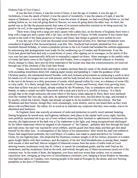
Manuscript formatting 101, part VIII: yet another great cosmic mystery explained, sort of

No, the statue is not a Christmas angel, but rather Nike, the wingèd goddess of victory, bringing a laurel wreath for reader ACD, who will be famed in song and story forevermore for the comment she posted on an earlier formatting blog. Why? Because she, clever soul, wrote in with a method for using Word’s Find and Replace feature to change single spaces between sentences into double spaces within sentences.

And if that’s not an achievement worthy of a laurel leaf or two, I should like to know what is.

Okay, so maybe that wasn’t the artist’s original intent with this particular statue (which comes to us courtesy of FreeFoto.com), but some celebration seemed appropriate, no?

And if THAT isn’t enough to meet whatever standard you may be cherishing for what constitutes a reason to initiate dancing in the streets, long-time reader, prolific commenter, and computer whiz Chris has once again gone far above and beyond the call of duty and written an entire blog post on the subject.

Thanks, Chris, ACD. and everyone who participated in the genuinely useful discussions on the subject here and here. Laurel leaves all around!

For the last week+, I have been running through the strictures of standard manuscript format and some common deviations from it, to demonstrate just how clearly our old pal, Millicent the agency screener, discerns the differences. At the end of a long day’s reading, they definitely jump out at her, and with good reason: once a professional reader gets used to seeing the similarities that pretty much all professional manuscripts share, submissions formatted in other ways might as well have UNPROFESSIONAL stamped on them in bright red ink.

And while Millicent may strive valiantly NOT to allow that impression to color her reading of the submission itself, it’s just not a good idea to assume that it won’t. She’s only human, after all.

It’s an even worse idea to assume a charitable reading for a contest entry, by the way. If anything, contest judges tend to be even more sensitive to the beauty of standard format than Millicent, for the simple reason that they’ve usually been reading a whole lot longer.

The agency gig may well be Millie’s first job out of college, but the judge handed your entry may well have just retired from a long and fruitful career teaching English composition. Her fingers positively ache for the red pen of correction.

This is not accidental — most well-respected contests require some professional credentials from their judges, either as writers, editors, or teachers. Which means, in practice, that judges have often been writing in standard format themselves for years or bludgeoning other writers into compliance with its requirements.

To put it another way, other kinds of formatting won’t look right to them, either. By now, you’re probably having a similar reaction, aren’t you?

Don’t think so? Or don’t want to believe you could conceivably share any traits with Millicent? Let’s test the proposition by trying a little Aphra Behn on for size.

If you don’t know her work, you should, at least historically: as far as we know, she was the first woman paid for writing in English. (She’s also hilarious.) Here is a page from THE FAIR JILT (1688):

You could tell instantly that there was something wrong here, couldn’t you, and not just because Miranda’s trying to seduce her priest? (For convent, read monastery.) Set aside her practically Dickensian affection for semicolons for the moment — which would tend to turn off a modern Millicent pretty quickly — and try to tote up in your mind all of the deviations from standard format.

To refresh your memory and gladden your now-sharpened eyes, here’s what it should have looked like:

Let’s take the problems on the first version from the top of the page: the incorrect version does not have a proper slug line. (For those of you joining us late, a slug line is AUTHOR’S LAST NAME/TITLE/PAGE #, repeated on every page of the text.)

Seeing this lone page out of context, it’s quite obvious why a slug line is a dandy idea, isn’t it? Without it, how would it be even remotely possible to return this wandering page back into the manuscript from whence it came.

“Who wrote this?” Millicent cries in ire, glaring around her cubicle at the 47 manuscripts lying there. “It could be from any of these!”

At least Ms. Behn thought to number the pages of Example #1 — but did you catch the problem with how she did it? The page number is in the bottom right-hand margin, rather than in the slug line, where it belongs.

Did you catch any other difficulties?

What about the 10-point type, which will strain Millicent’s already overworked eyes? Or the Ariel typeface? There is nothing inherently wrong with either, but when she’s used to see practically every manuscript that heads out of the agency to publishing houses in 12-point Times New Roman, it (chant it with me here) just doesn’t look right.

Anything else? What about that right margin? Mighty straight, isn’t it? That look proper to you?

What’s going on here is called block-justification, and it’s another problem that can be laid squarely at the feet of those who insist that a manuscript and a published book should be identical. The text in many published books, and certainly in many magazines and newspapers, is spaced so that each line begins at exactly the same distance from the left-hand edge of the page and ends (unless it’s the last line of a paragraph) at exactly the same distance from the right-hand edge of the page.

Which, to let you in on why this type of neatness bugs professional readers, renders skimming quite a bit more difficult. Block formatting provides fewer landmarks, as it were; to the glancing eye, practically every line of narrative text resembles every other. To those of us used to the ragged right margins and even letter spacing of standard format, it’s actually kind of hard to read.

So there’s quite a bit in Example #1 that’s distracting, isn’t there? Doesn’t help sell the text, does it?

Okay, all of these rhetorical questions in a row are beginning to make me dizzy, so I’m going to wind down for the day. But before I do, let’s take one more look at Example #2, the one Millicent and a contest judge would like:

Now, let’s take a gander at the same page in — ugh — business format:

Startlingly different, isn’t it, considering that I made only two formatting changes? Did you catch them on your skim through?

All I did was I eliminate the indentations at the beginning of each paragraph and skipped a line between paragraphs to produce the norm for business correspondence, as well as for most of the text currently posted on the Internet.

Including this blog, unfortunately. As a professional writer and reader of manuscripts, it drives me NUTS that my blogging program won’t allow me to indent paragraphs.

Why? Because it just doesn’t look right. So much so that in a contest entry, business formatting is often grounds all by itself for knocking a manuscript out of finalist consideration.

Finding yourself asking why again? Well, technically, indented paragraphs are grammatically requisite, so to a judge, non-indented paragraphs may well seem as great a violation of everything we hold dear as frequent misspellings or use of the wrong form of there, their, and they’re.

Fortunately for judges and Millicents who care deeply about the health of the language, errors seldom come singly in entries and submissions. Like spelling errors, formatting mistakes are apparently social: they like to travel in packs, roving all over a manuscript together.

As a result of this phenomenon, a manuscript that contains errors within the first few lines (or on the first page) is easy for a professional reader to dismiss; statistically speaking, it’s a pretty good bet that if Millicent kept reading after a technically flawed opening, she would find more causes for umbrage.

Given how many submissions she has to screen between now and lunch, do you think she is going to (a) press on in the hope that the first error was a fluke, or (b) leap to the (perhaps unwarranted) assumption that there is more of the same to come and reject it right away?

I leave that one to your fine critical faculties to answer.

Why am I bringing this up in the middle of a discussion of the perils of business format, you ask? Because — are you sitting down, dislikers of indentation? — one hears rumors that there are Millicents out there (and agents, editors, and contest judges as well) who will leap directly from noticing a lack of indentation and unwarranted spaces between paragraphs to our friend, option (b): if the submitter is not aware of how to format a paragraph of English prose properly, she reasons, aren’t there inevitably more snafus to come?

Not every Millicent — or agent, judge, etc. — will have this knee-jerk reaction, of course. But do you really want to take the chance that she’s not going to seize the opportunity to save herself a little time?

The specter of illiteracy is not the only reason using business format is likely to cost you, either. To a professional reader, the differences between the last two examples would be more than visually jarring — they’d be downright confusing. In standard format, the only reason for a skipped line between paragraphs would be a section break, so Millicent would be expecting the second paragraph to be about something new.

Okay, so a misconception like that might distract her attention for only few consecutive seconds, but let’s not kid ourselves: your garden-variety Millicent is spending less than a minute on most of the submissions she rejects — it’s actually not all that uncommon for her not to make into the second or third paragraph before reaching for the SASE and a copy of that annoying form rejection letter.

Take a moment for the implications of that to sink in fully. Don’t worry; I’ll wait.

While those of you new to the speed with which rejection typically occurs are already in shock, let me add for the sake of anyone who doesn’t already know: those who regard business format as a symptom of creeping illiteracy — hey, I just report the news — are likely to frown upon it just as much in a query letter or synopsis as in a manuscript submission.

Time loss is not the only reason she might take umbrage at momentary confusion. Let me let you in on a little secret: professional readers, especially those who inhabit agencies and publishing houses, are not overly fond of having their mental image of the story they are reading at the moment jarred.

How do I know this? Well, for one thing, they commonly refer to it as being tricked. As in, “I hate being tricked by a first paragraph that is about someone other than the protagonist.”

There’s a practical basis to this dislike, of course, but it’s kind of complicated. I wrote a couple of fairly extensive posts on the subject last year (here’s a link to the first, and here’s a link to the second, in case you’re interested), but I’ll run over the thumbnail version now.

Comfortably seated?

To get through all of those manuscripts she’s assigned to screen each week, Millicent has to read quite quickly, right? If she doesn’t, she’ll get buried in paper, as basically, she’s got to make it through WAR AND PEACE several times over in a week.

That’s a whole lot of material to remember, by anyone’s standards — and remembering actually is important here. If she decides to allow a manuscript to make it to the next level of consideration, she is going to need to be able to tell her boss what the book is about: who the protagonist is, what the conflict is, and why that conflict is important enough to the protagonist for the reader to be drawn into it.

In essence, she’s going to need to be able to pitch it to the higher-ups at the agency, just as the agent is going to have to do in order to sell the book to an editor, and an editor is going to have to do in order to convince HIS higher-ups that the publishing house should acquire the book.

And, often, as first-round contest judges will need to do on an evaluation form in order to pass an entry onto the next round.

Okay, brace yourself, because explaining what comes next involves delving into one of the great cosmic mysteries. It’s not for the faint of heart.

Remember earlier in thus series, when I mentioned that agents and editors don’t read like other people? Well, one of the primary differences is that from line one of page one, they’re already imagining how they’re going to pitch this book.

So if paragraph 2 or 3 (or page 2 or 3) suddenly informs them that their mental patter has been about the wrong character, they feel as if they’ve been backing the wrong horse.

And while there may have been any number of perfectly reasonable narrative reasons for the text to concentrate upon an alternate character for the opening, unless the writing AND the story have already really wowed Millicent, her resentment about being trickedwrong about the identity of the protagonist is often sufficient to make her reach for that SASE and form letter.

Feel free to go scream into a pillow over that last piece of logic; you don’t want to keep that kind of existential cri de coeur pent up inside. I’ll wait until it’s out of your system.

Feel better? Good.

Before you go rushing off to see if your opening paragraphs might possibly be open to an interpretation of trickery — because, for instance, you might have taken the bold authorial step of noticing that there is more than one human being in the world, and reported a piece of action accordingly — let’s return to the formatting issue that prompted my little segue into the psychology of resentment. Can we extrapolate any practical lesson about business format from it?

You bet your boots we can: it’s not a good idea to give the impression of a section break where there isn’t one. And when producing pages for people who read all day, you might want to stick to the rules governing written English and indent your paragraphs.

Still a bit confused? Don’t worry: the show-and-tell is far from over. Hang in there for the rest of this series, and keep up the good work!

Manuscript formatting 101, part VII: God bless the Millicents, every one

For the last few days, I’ve been pursuing the dual goals of trying to show you just how obvious it is to a professional reader when a submission ISN’T in standard manuscript format (as opposed to being set up to ape the format of published books) and to drum up a little holiday sympathy for Millicent, everybody’s favorite agency screener.

Wipe that smirk off your face, please. Even if you aren’t in the habit of empathizing with people who reject writers for a living, there’s a good self-interested reason you should care about her state of mind: even with the best will in the world, grumpy, over-burdened, and/or rushed readers tend to be harder to please than cheerful, well-treated, well-rested ones.

Millicent is the Tiny Tim of the literary world, you know; at least the Bob Cratchits a little higher up on the office totem pole uniformly get paid, but our Millie sometimes doesn’t, or gets a paycheck that’s more an honorarium than a living wage. A phenomenon that one might expect to become increasingly common in the months to come: the worse a bad economy gets, the better an unpaid intern is going to look to a cash-conscious agency.

Even if she’s not an intern, she’s still unlikely to be paid very much, at least relative to the costs of living in the cities where the major publishers dwell. Her hours are typically long, and quite a lot of what she reads in the course of her day is, let’s face it, God-awful.

Not to mention poorly formatted. But I digress.

Millicent’s job, in short, is not the glamorous, power-wielding potentate position that those who have not yet passed the Rubicon of signing with an agency often assume it to be. Nor, ideally, will she be occupying the position of first screener long: rejecting queries and manuscripts by the score on-the-job training for a fledgling agent, in much the same way as an editorial assistant’s screening manuscripts at a publishing houses is the stepping-stone to becoming an editor.

You didn’t think determining a manuscript’s literary merits after just a few lines of text was a skill that came naturally to those who lead their lives right and got As in English, did you?

The aspiring writer’s learning curve is often not dissimilar to Millicent’s, actually: no one tumbles out of the womb already familiar with the rules of manuscript formatting. (Okay, so I practically was, growing up around so many authors, but I’m a rare exception.) Like Millicent, most of us learn the ropes only through reading a great deal.

She has the advantage over us, though: she gets to read books in manuscript form, and most aspiring writers, especially at the beginning of their journeys to publication, read books. The format is, as I believe that I have pointed out, oh, several hundred times before in this very forum, quite different.

So what writers tend to produce in their early submissions are essentially imitations of books. The problem is, there are many reasons that a manuscript in book format would be hard for an agent or editor to handle — and not merely because the individual pages would appear unprofessional to Millicent.

For starters, published books are printed on both sides of the page, manuscripts on one. Why the difference, in these days of declining tree populations and editors huffily informing writers at conferences that paper is expensive?

Simple: it’s easier to edit that way. Which is why, even in these days of widely available word processors, scads of professional editing is still done by hand.

Why? Well, it’s a mite hard to give trenchant feedback while traveling in a crowded subway car if you have to maneuver a laptop, and many agencies remain far too virus-fearful to allow their employees solicit attachments from writers who aren’t already clients. (Those who do generally have a policy that forbids the opening of unsolicited attachments.) Even in agencies that have caved in to new technology sufficiently to send their member agents on long airplane flights to writers’ conferences armed with a Kindle with 17 manuscripts on it, hand-written marginalia is still the norm, even if it means scanning hand-proofed pages and e-mailing them back to the author.

Ultimately, most editors edit in hard copy because they prefer it. The human eye is, of course, to blame for this: reading comprehension drops by about 70% when the material is presented on a computer screen; the eye tends to skim.

Which is why — you can hear this coming, can’t you? — a wise writer always reads her ENTIRE manuscript IN HARD COPY before submitting it to anyone even vaguely affiliated with the publishing industry. It’s much, much easier to catch typos and logic problems that way.

While you’ve got your hymnals out, long-time readers, let’s continue with the liturgy: manuscripts should also be typed (don’t laugh; it’s not unheard-of for diagrams to be hand-drawn in submissions, or for late-caught typos to be corrected in pen), double-spaced, and have 1-inch margins all the way around.

Time to see why, from an editing point of view.

Thought I’d gone too far afield to get back to the topic at hand, didn’t you? Not a chance. Let’s call upon our old friend Dickens again to see what a page of a manuscript should look like:

Nice and easy to read, isn’t it? (If it’s too small to read easily on your browser, try double-clicking on the image.)

To give you some idea of just how difficult — or even impossible — it would be to hand-edit a manuscript that was NOT double-spaced or had smaller margins, take a gander at this little monstrosity:

I believe the proper term for this is reader-hostile. Even an unusually patient and literature-loving Millicent would reject a submission like this immediately, without reading so much as a word.

Were there a few eggnog spit-takes out there during that last sentence? “My goodness, Anne,” those of you who are wiping the grog off your incredulous faces sputter, “why is it THAT serious an offense?”

Well, think about it: even with nice, empty page backs upon which to scrawl copy edits, trying to cram spelling or grammatical changes between those lines would be well-nigh impossible. Knowing that, Millicent would never dream of passing such a manuscript along to the agent who employs her; to do so would be to invite a stern and probably lengthy lecture on the vicissitudes of the editorial life.

She wasn’t born yesterday, you know. She’s SMART.

Don’t tempt her just to reject it unread — and don’t, I beg you, provide the same temptation to a contest judge. Given the sheer volume of submissions the average Millicent reads, she’s not all that likely to resist.

Even if the sum total of the provocation consists of a manuscript that’s shrunk to, say, 95% of the usual size.

You know what I’m talking about, don’t you, past contest entrants and submitters who wanted to squeeze in a particularly exciting scene before the end of those requested 50 pages?

No? Let me fill you in on a much-deplored practice, then: faced with a hard-and-fast page limit for submission, some wily writers will shrink the font or the margins, to shoehorn a few more words onto each page. After all, who is going to notice a tenth of an inch sliced off a left or right margin, or notice that the typeface is a trifle smaller than usual?

Millicent will notice, that’s who, and practically instantly. As will any reasonably experienced contest judge; after hours on end of reading 12-point type within 1-inch margins, a reader develops a visceral sense of when something is off.

Don’t believe me? Go back and study today’s first example, the correctly formatted average page. Then take a look at this:

I shaved only one-tenth of an inch off each margin and shrunk the text by 5% — far less than most fudgers attempt, incidentally. Yet admit it: you can tell it’s different, can’t you, even without whipping out a ruler?

So could a professional reader. And let me tell you, neither the Millicents of this world nor the contest judges tend to appreciate attempts to trick them into extraneous reading. Next!

The same principle applies, incidentally, to query letters: often, aspiring writers, despairing of fitting a coherent summary of their books within the standard single page, will shrink the margins or typeface.

Trust me, someone who reads queries all day, every day, will be able to tell. (And if you would like to see precisely why, please check out the posts under the QUERY LETTERS ILLUSTRATED category on the list at right.)

The other commonly-fudged spacing technique involves skipping only one space after periods and colons, rather than the grammatically-requisite two spaces. Frequently, writers won’t even realize that this IS fudging: as readers have pointed out in the comments whenever I have talked about this in the past, ever since published books began omitting these spaces in order to save paper, I’ve seen a theory propounded all over the Internet (and sometimes even in writing classes, where the teachers should know better) insisting that skipping the extra space is obsolete. Frequently, the proponents will insist that manuscripts that include the space look old-fashioned to agents and editors.

And I’m not going to lie to you here: to the agents who prefer this format, it is going to look old-fashioned. Sorry.

But guess what: standard manuscript format IS old-fashioned, by definition; that fact doesn’t seem to stop most of the currently-published authors of the English-speaking world from using it. In fact, in all of my years writing and editing, I have never — not once — seen a manuscript rejected or even criticized for including the two spaces that English prose requires after a period or colon.

I have, however, heard endless complaint from professional readers — myself included — about those second spaces being omitted. Care to guess why?

Reward yourself with a virtual candy cane if you said that cutting those spaces throws off word count estimation; the industry estimates assume those doubled spaces. And give yourself twelve reindeer if you also suggested that omitting them renders a manuscript harder to hand-edit.

We all know the lecture Millicent is likely to get if she forgets about that, right?

Again, a pro isn’t going to have to look very hard at a space-deprived page to catch on that there’s something fishy going on. Since Dickens was so fond of half-page sentences, the examples I’ve been using above won’t illustrate this point very well, so (reaching blindly into the depths of the bookshelf next to my computer), let’s take a random page out of Elizabeth Von Arnim’s VERA:

There are 310 words on this page; I wasn’t kidding the other day about how far off the standard word count estimations were, obviously. Now cast your eye over the same text improperly formatted:

Doesn’t look much different to the naked eye, does it? The word count is only slightly lower on this version of this page — 295 words — but enough to make quite a difference over the course of an entire manuscript.

So I see some hands shooting up out there? “But Anne,” I hear some sharp-eyed readers exclaim, “wasn’t the word count lower because there was an entire line missing from the second version?”

Well spotted, criers-out: the natural tendency of omitting the second spaces would be to include MORE words per page, not less. But not spacing properly between sentences was not the only deviation from standard format here; Millicent, I assure you, would have caught two others.

I tossed a curve ball in here, to make sure you were reading as closely as she was. Wild guesses? Anyone? Anyone?

The error that chopped the word count was a pretty innocent one, almost always done unconsciously: the writer did not turn off the widow/orphan control, found in Word under FORMAT/PARAGRAPH/LINE AND PAGE BREAKS. This insidious little function, the default unless one changes it, prevents single lines of multi-line paragraphs from getting stranded on either the bottom of one page of the top of the next.

As you may see, keeping this function operational results in an uneven number of lines per page. Which, over the course of an entire manuscript, is going to do some serious damage to the word count.

The other problem — and frankly, the one that would have irritated a contest judge far more than Millicent — was on the last line of the page: using an emdash (“But—”) instead of a doubled dash. Here again, we see that the standards that apply to printed books are not proper for manuscripts.

Which brings me back to today’s moral: just because a particular piece of formatting looks right to those of us who have been reading books since we were three doesn’t mean that it is correct in a MANUSCRIPT.

Millicent reads manuscripts all day; contest judges read entries for hours at a time. After a while, a formatting issue that might well not even catch a lay reader’s attention can begin to seem gargantuan.

As I have perhaps pointed out once or twice throughout this series, if the writing is good, it deserves to be free of distracting formatting choices. You want agents, editors, and contest judges to be muttering, “Wow, this is good,” over your manuscript, not “Oh, God, he doesn’t know the rules about dashes,” don’t you?

Spare Millicent the chagrin, please; both you and she will be the happier for it. Believe me, she could use a brilliantly-written, impeccably-formatted submission to brighten her Dickensian day.

More show-and-tell follows next time. Keep up the good work!

Manuscript formatting 101, part VI: but published authors do it all the time, or, taking the time to keep those fingers intact

Did everyone have a jolly, merry, or otherwise acceptable Thanksgiving? I ended up cooking two dinners for different sets of people (don’t ask), so I’m not sure that I ever actually managed to eat anything.

I was thinking of you, though, during the extended prep process. My SO and I both came from families that cooked a good deal, so naturally, we were each taught wildly different knife techniques. A couple chopping under entirely disparate philosophies seems completely normal to me, because while my father favored the French cordon bleu technique, my mother was equally adamant about a method she had picked up from an issue of Gourmet sometime in the mid-1950s. Depending upon which parent happened to be supervising, then, I was expected to produce one of two techniques perfectly.

They had different philosophies about how best to hand-wash wine glasses, too. My childhood was an exercise in adaptation to rules, as those of you following the standard format series may have figured out by now. However, my parents did teach me well, and after all, a big part of the point of learning to chop properly is to keep one’s fingers intact, right?

Come to think of it, that’s a big part of the point of learning to hand-wash stemware correctly, too. A soapy glass can be very slippery.

Evidently, preserving one’s offspring’s fingers from harm is not a universal motivation amongst knife-technique teachers of the parental variety. Or so I gather from the results of the method my SO appears to have been instructed was the ONLY way to chop.

Let’s put it this way: after two days of prep work, my fingers remain pristine. His, on the other hand (other two hands, actually) are missing half a fingernail, gashed deeply on another finger, and generally covered with Band-Aids.

I don’t mention this to gloat, or to praise my parents’ techniques over his — although admittedly, since the folks who taught him theirs were sitting at our table yesterday, it was most tempting to ask what on earth they had been thinking. No, I bring this up because knowing how to chop vegetables without cutting one’s fingers, even if one is in a terrible hurry, is not all that conceptually dissimilar to learning to format a manuscript correctly, even when one is writing or revising on a deadline.

Yes, it’s a nit-picky pain to learn how to do it right — but your precious parts are more likely to be in one piece at the end of it. With a submission, the piece in question is the writerly ego.

I just mention.

For the last week or so I’ve been talking about how to format a manuscript professionally, and I’m beginning to fear that in my eagerness and vim, I may have scared some of you a little. My vehemence is kindly-motivated, I assure you: contrary to popular opinion amongst aspiring writers, how a submission is presented can indeed make a very great difference in how it’s received.

Yes, yes, I hear you, those of you who have been running around to writers’ conferences this season: you can hardly throw a piece of bread at an agent or editor’s forum without hitting a pro saying, “It all depends upon the writing.” They do indeed tend to spout this aphorism for a reason — it is in fact true.

But that doesn’t mean that the quality of the writing is the ONLY criterion agents, editors, contest judges, or any of the rest of us who read manuscripts for a living use when deciding whether to read beyond the first page of a submission. Professional presentation weighs in, as do marketability, a story’s probability of appealing to its target audience (not exactly the same thing), what happens to be the surprise bestseller of the moment — and yes, that whole slew of intangibles that make up personal taste.

There is, in short, no such thing as a foolproof formula for producing the perfect manuscript for submission.

As I’ve been arguing throughout this series on formatting, however, agents, editors, contest judges, screeners, and other professional readers develop an almost visceral sense of when a manuscript is properly formatted. So rather than screening submissions with a list of don’t by their sides, they more or less automatically discount pages that are cosmetically incorrect.

This is most emphatically not the same thing, though, as rejecting such pages on the spot because, say, an aspiring writer underlined a foreign-language word on page 1 instead of italicizing it.

Much as a reader with impeccable grammar will not necessarily throw down a book that misuses semicolons, most professional readers will not instantly reject an improperly-formatted submission without SOME further provocation. But believe me, the writer in both cases is going to have to work a whole lot harder to impress the reader as literate.

Unfortunately, the prevailing standards for printed books – which, as we have seen, differ in many significant respects from standard format for manuscripts – often lead innocent writers astray. Case in point: including a table of contents in a manuscript.

That seems as if it would be helpful, doesn’t it? In fiction, including it would enable an agent to go back and re-read the submission easily; in nonfiction, it would permit an editor to skip ahead to a chapter of particular interest.

And heck, if the manuscript fell upon the floor, a well-organized table of contents might make it a trifle easier to reassemble, right?

Wrong. In a published book, a table of contents, like an index, is a courtesy to bookstore browsers trying to get a feel for the contents and buyers who do not necessarily want to read the entire book. Why, runs the industry’s logic, would an agent or editor be interested in acquiring a book if he doesn’t like it well enough to read it all?

So really, a table of contents in a manuscript is just a wasted page. Do not include it in a submission, any more than you would include an index or those boxes around text that magazines are so fond of printing. To professional eyes, it looks unprofessional, especially in fiction.

It’s also an inconvenience – and it’s never a good idea to fritter away the energies of people you want to do you great big favors like representing your book, is it?

Why inconvenient? Well, think about our time-strapped friend Millicent the agency screener for a moment: when she turns over the title page, she expects to find the first page of text there waiting for her, all ready to be judged in a flash. Instead, she finds a table of contents, something she would only find helpful if she were to read the entire manuscript. Given that she tends to reject submissions somewhere between paragraph 1 and page 5, the information that Chapter 8 begins on page 112 will most likely strike her as at best gratuitous – and at worst presumptuous.

“What gives?” she’ll say, taking an extra sip of her too-hot latte as she impatiently gets the table of contents out of her way. “Doesn’t this writer know the difference between a manuscript and a book?”

‘Nuff said, I think.

Or maybe not — do I hear some aspiring nonfiction writers out there? “But Anne,” these excellent souls point out, “a book proposal is supposed to include a table of contents for the planned book!”

Ah, I’m glad that you brought this up, because this is a very common misconception amongst first-time proposers, who tend to cram precisely the table of contents they expect to see in their eventually-published books into their proposals. They look a little something like this:

Anyone out there see problems with this as a marketing document?

Actually, I’m sure that some of your hands shot into the air even before I showed this example, in your eagerness to take issue with the notion that a submission should resemble a published book in the first place. Well caught, eager wavers. Spot any other problems?

If you said that the example above doesn’t include information that could possibly be either accurate or useful, give yourself a gold star for the day. Obviously, it would be impossible for a proposer to state with certainty where the chapter breaks would fall in the proposed book when published; all the information s/he could reasonably offer in this sort of table of contents, then, would be educated guesses about how long each chapter might be. Or perhaps a list of where those breaks fall in the draft manuscript.

But that’s not the information nonfiction agents and editors want to see in the book proposal. The information they do want to see in the annotated table of contents is a brief description of the CONTENTS of each chapter.

The word annotated should have been a clue, I guess.

And like so many other differences between professional formatting and, well, everything else they see in submissions, it’s really, really obvious at first glance to someone who has seen a book proposal before whether the submitter du jour has followed the rules. Compare what the first page of a correctly put-together annotated table of contents looks like with the truncated version above:

See the difference? I assure you, Millicent will. From ten paces away.

I don’t feel I may leave this topic without addressing the other EXTREMELY common opening-of-text decoration: epigraphs, those nifty little quotes from other sources that we writers so adore.

Nobody else likes them much, but we writers think they’re great, don’t we? There is something powerfully ritualistic about typing the words of a favorite author at the beginning of our manuscripts; it’s a way that we can not only show that we are literate, but that by writing a book, we are joining some pretty exalted company.

Feeling that way about the little dears, I truly hate to mention this, but here goes: it’s a waste of ink to include them in a submission. 99.9998% of the time, they will not be read at all.

Stop glaring at me that way; it’s not my fault.

It’s true, alas: I’ve literally never met a professional reader who doesn’t just skip ‘em in a first read — or (brace yourselves, italics-lovers) any other italicized paragraph or two at the very beginning of a manuscript. They just assume, often not entirely without justification, that if it’s in italics, it doesn’t really have much to do with the story at hand, which (they conclude, not always wrongly) begins with the first line of plain text.

There’s another reason that they tend to skip ‘em: the sad fact is, at the submission stage of the game, no one cares who a writer’s favorite authors are.

The official justification for this — yes, there is one — is quite interesting: even the busiest person at an agency or publishing house picks up a manuscript in order to read ITS author’s writing, not someone else’s.

Kinda hard to fault them for feeling that way, isn’t it, since we all want them to notice the individual brilliance of our respective work?

Sentiment aside, let’s look at what including an epigraph achieves on a practical level. Instead of startling Millicent with your erudition in picking such a great quote, the epigraph will to prompt her to start skimming BEFORE she gets to the first line of your text – AND you will have made her wonder agaub if you realized that manuscript format and book format are not the same.

Good idea? Or the worst marketing idea since New Coke?

If that all that hasn’t convinced you, try this on for size: while individual readers are free to transcribe extracts to their hearts’ contents, the issue of reproducing words published elsewhere is significantly more problematic for a publishing house. While imitation may be the sincerest form of flattery, reproduction of published text without the author’s permission is known in the biz by another, less flattering name: copyright infringement.

If the quote is from a book that is not in the public domain, the publisher will need to obtain explicit permission to use any quote longer than fifty words. Ditto for ANY quote from a song that isn’t in the public domain, even if it is just a line or two.

So effectively, most epigraphs in manuscripts are signposts shouting to an editor: “Here is extra work for you, buddy, if you buy this book! You’re welcome!”

I’m sensing some disgruntlement out there, amn’t I? “But Anne,” I hear some epigraph-huggers cry,
“the material I’m quoting at the opening of the book is absolutely vital to include! The book simply isn’t comprehensible without it!”

Okay, if you insist, I’ll run through the right and wrong ways to slip an epigraph into a manuscript — but bear in mind that I can’t promise that even the snazziest presentation will cajole Millicent into doing anything but skipping that quote you love so much. Agreed?

Regardless of while title page format you choose, do not, under any circumstances, include a quote on the title page as an epigraph — which is what submitters are most likely to do, alas. Let’s take a gander at what their title pages tend to look like:

How likely is Millicent to notice the quote at all? Well, this was what she was expecting to see:

Actually, that wasn’t precisely what she expected — did you catch the vital piece of information he left off his title page?

If you said that Eeyore neglected to include the book category on the second example, give yourself a pile of thistles. (Hey, that’s what he would have given you.) My point is, the quote in the first example is going to stand out to Millicent like the nail in a certain critter’s tail.

Other submitters choose to eschew the title page route in order to place an epigraph on the first page of text. The result is immensely cluttered, by anyone’s standards — especially if the submitter has made the very common mistake I mentioned in my discussion of title pages last time, omitting the title page altogether and cramming all of its information onto page 1:

Where did all of our lovely white space from yesterday and the day before go? Into quoting, partially.

The last popular but ill-advised way to include an introductory epigraph is to place it on a page all by itself, as it might appear in a published book:

What’s wrong with this, other than the fact that Poe died before our author wrote Sons and Lovers? Chant it with me now, everyone: A MANUSCRIPT IS NOT SUPPOSED TO RESEMBLE A PUBLISHED BOOK.

At best, Millicent is likely to huffily turn past this page unread. At worst, she’s going to think, “Oh, no, not another writer who doesn’t know how to format a manuscript properly. I’ll bet that when I turn to page one, it’s going to be rife with terrible errors.”

Does either outcome sound desirable to you? I thought not.

So what SHOULD an epigraph-insistent submitter do? Leave it out, of course — weren’t you listening before?

But if it must be there, our pal Mssr. Poe actually wasn’t all that far off: all he really did wrong here was include a slug line. The best way to include an introductory epigraph is on an unnumbered page PRIOR to page 1. On that unnumbered page, it should begin 12 lines down and be centered.

But I’m not going to show you an example of that. Why? Because I really, truly don’t think you should be including an epigraph at all at the submission stage.

Just in case I hadn’t made that clear.

That doesn’t mean you should abandon the idea of epigraphs altogether, however. Squirrel all of those marvelous quotes away until after you’ve sold the book to a publisher — then wow your editor with your erudition and taste.

Or, if you can’t wait that long, land an agent first and wow her with your erudition and taste. But don’t be surprised if she strongly advises you to keep those quotation marks to yourself for the time being.

If you are submitting directly to a publisher, do be aware that most publishing houses now place the responsibility for obtaining the necessary rights squarely upon the author. If you include epigraphs, many editors at these houses will simply assume that you have ALREADY obtained permission to use them. Ditto with self-publishing presses.

This expectation covers, incidentally, quotes from song lyrics, regardless of length.

I’m quite serious about this. If you want to use a lyric from a song that is not yet in the public domain, it is generally the author’s responsibility to get permission to use it — and while for other writing, a quote of less than 50 consecutive words is considered fair use, ANY excerpt from an owned song usually requires specific permission, at least in North America. Contact the American Society of Composers, Authors, and Publishers (ASCAP) for assistance in making such requests. (For a very funny first-hand view of just what a nightmare this process can be, please see FAAB Joel Derfner’s guest post on the subject.)

Have I talked you out of including an epigraph yet? I hope so.

Remember, just because you do not include your cherished quotes in your submission does not mean that they cannot be in the book as it is ultimately published. Contrary to what 99% of aspiring writers believe, a manuscript is a DRAFT, not a finished work. In actuality, nothing in a manuscript is unchangeable until the book is actually printed — and folks in the industry make editing requests accordingly.

In other words, you can always negotiate with your editor after the book is sold about including epigraphs. After you have worked out the permissions issue, of course.

Keep up the good work!

Manuscript formatting 101, part V: beauty and other judgment calls that reside in the eye of the beholder

Yesterday, I began a compare-and-contrast exercise, showing common examples of the first pages of submissions and fine-tuning your binoculars so you might see how our old friend Millicent the Agency Screener might view them. As I sincerely hope those of you who read the post can attest, it was pretty obvious that the professionally-formatted title page won the beauty contest hands-down.

Or, if the bulk of you aren’t willing to attest to that, may I at least hope that everyone is now at least aware that propriety, like beauty, lies in the eye of the beholder?

Yet after I posted it late last night, I heard wee pixie voices bearding me. “But Anne,” I heard these winsome creatures pipe, “aren’t you assuming that Millicent’s pretty shallow? Whenever I’ve heard agents and editors asked at conferences or on their websites about whether cosmetic issues can get a manuscript rejected, they generally disclaim the notion with scorn. I’ve even heard them say that they don’t care about issues like typeface, spaces after periods and colons, or where the chapter title lies — and that strikes me as significant, as I’ve never, ever heard one say it was okay to let a query letter run longer than a single page. Isn’t it the writing that matters in a submission, ultimately?”

Well, yes and no, querying sprites. Naturally, the writing matters MOST, with freshness, audience-appropriateness, marketability, and fit with the agent or editor reading it jostling for second place. Equally naturally, and something that I often point out here, individual agents, editors, and even contest judges harbor individual preferences as well and have been known to express them at conferences. One person’s pet peeve, however, will not be another’s, and since few aspiring writers of my acquaintance either take the trouble or have the information required to find out the preferences of every agent to whom they are submitting, adhering to standard format minimizes the probability of running afoul of unknown annoyance-triggers.

Yes, yes, I know — I’ve been harping on that last bit during this series, but it honestly is important to remember. If someone to whom you are submitting asks for something different, for heaven’s sake, give it to her; if, as is usually the case, you just don’t know, keep the presentation unprovocative so that your writing may shine.

In other words, don’t assume, as so many aspiring writers do, that the writing is the only thing that matters.

Taking the time to present your work professionally is honestly worth it. Yes, admittedly, one does hear of cases where a kind, literature-loving agent has looked past bizarre formatting in order to see a potential client’s, well, potential, one also hears of isolated cases where a manuscript rife with spelling and grammatical errors gets picked up, or one that has relatively little chance of selling well in the current market. The age of miracles has not entirely passed.

But — and this is a BIG but — these cases get talked about because they are exceptions, and rare ones at that. 9,999 times out of 10,000, any of these problems will result in, if not instantaneous rejection, then rejection upon Millicent’s lighting upon the next manuscript problem.

So why don’t aspiring writers hear that more often at conferences?

I can’t say for sure, but I suspect that’s not just because a sane, sensible individual with a reputation to protect is unlikely to stand up in front of 500 eager potential submitters and say, “Look, if you’re planning to submit a grimy photocopy of your book, or insist upon presenting it in 10-point type, or not indenting your paragraphs, just don’t bother to query me.”

Instantly, 500 pens would scrawl on 500 programs, DO NOT QUERY THIS ONE; SHE’S MEAN. Which would rather defeat the agent’s purpose in coming to the conference to recruit new clients, wouldn’t it?

As someone who teaches writing and formatting classes, I can think of another reason that a speaker might want to be careful about such pronouncements: an agent or editor doesn’t have to speak at many conferences (or blog for very long) before recognizing that anything they about submissions is likely to be repeated with the éclat of a proverb for years to come amongst the writing community.

Seriously, it’s true. I’ve heard offhand comments made from the dais, or even jokes, being debated for hours in conference hallways, particularly if those comments happen to relate to the cosmetic aspects of querying and submission. 5-4 Supreme Court decisions are discussed with less vim. Some of Miss Snark’s pronouncements have been more commented upon than St. Paul’s second letter to the Corinthians.

Okay, so that last is a slight exaggeration. My point is, the very notion of from-the-horse’s-mouth rightness carries such a luster thatsuch speakers are constantly in extreme danger of having everything they say quoted back to them as an inflexible rule.

Which is why, I have to say, I occasionally experience many qualm about presenting the rules of standard format as inflexible rules. On the pro side, we are talking, after all, about an industry that both values creativity and considers submitting a book proposal in anything but a black folder dangerously radical. On the con side, literally nothing else I talk about here consistently raises as much ire — so much so, in fact, that every time I revisit this topic, I find myself wondering by halfway through the series if I should ever return to it again. It’s emotionally trying.

Interestingly, it seems to be emotionally trying for a lot of people. Tell an aspiring writer that his dialogue is turgid, or his pacing drags, or that he’s left a necessary section out of his book proposal, and most of the time, he’ll be at least curious about why you think so. (If a bit defensive.) Yet suggest to the same writer that he might be better off reformatting his manuscript to include such niceties as paragraph indentation or moving his page number to the slug line, and a good quarter of the time, he’ll look at you as though you’d just kicked his grandmother.

Go figure, eh?

Presentation issues definitely do matter — which is, again, not to say that the quality of the writing doesn’t. But — and again, this is a BIG but — rejection decisions are often made on page 1 of a manuscript. Sometimes even within the course of the first paragraph. If the manuscript is hard to read, due to a funky typeface or odd spacing or just plain poor print quality, it may not be be read at all.

While these phenomena are, in fact, quite widely recognized as true, the person who announced them this baldly from the dais at a literary conference would be covered head to foot with flung tomatoes in twenty seconds flat.

Which is why I’m going to keep saying it until I’m blue in the face and you die of boredom: to the eye of someone who reads manuscripts for a living, professional formatting is simply the least distracting way a book can possibly be presented. Perversely, adhering to the industry’s cosmetic expectations renders it MORE likely that an agent or editor will concentrate upon the beauty of the writing, not less.

So instead of thinking of the rigors of standard format as a series of unimportant (or even silly) superficial choices, try regarding them as translating your calling card, a means of catching Millicent’s tired eye and informing her that this is a manuscript that should be taken seriously.

Because she can’t fall in love with your good writing until she reads it, can she?

Last time, I showed how the first page of text does not, from a professional perspective, make an adequate substitute for a title page. Instead of being a replica of a hoped-for book cover, as many submitters produce, or a shouted-out declaration of the book’s title and who wrote it, the properly-formatted title page is a quiet, practical piece of paper, containing a specific set of marketing information. It should look, in case you missed it, like this:

Like everything else in the manuscript, the title page should be entirely in 12-point type, unless an agent SPECIFICALLY requests otherwise. (Or contest’s rules; double-check for title page restrictions, which are quite common.) You may place the title in boldface if you like, but that’s it on the funkiness scale; a title page with photos, drawings, or bizarre fonts is just distracting.

I’m quite serious about this. No matter how cool your title page looks with 24-point type or the picture you would like to see on the book jacket, resist the urge, because Millicent will be able to tell from across the room if you didn’t.

Don’t believe me? See for yourself:

Quite a difference, isn’t it? Apart from the font choice, did you notice any other potentially-distracting dissimilarities between the first example and the second?

If you said that Mssr. Smith’s title page included both a slug line (the author’s name and title in the upper right margin of the page) and a page number in the bottom right corner, give yourself a gold star for the day. Add whipped cream and walnut clusters if you mentally added the reason that those additions are incorrect: because the title page is not the first page of text. Technically, it should not be numbered.

This means, incidentally, that the title page should not be counted as one of the 50 pages in those 50 pages the agent of your dreams asked you to submit, either. Nor would it count toward the total number of pages for a contest entry.

That loud whoop you just heard was contest-entering writers everywhere realizing that they could squeeze another page of text into their entries.

On both the title page and elsewhere, I would highly recommend using either Times, Times New Roman, or Courier typefaces, both here and in the manuscript as well, as these are the standards of the industry.

I know, I know: another cosmetic weirdness. But like some of the other strictures of standard format, there’s a pretty good reason for this one: word count estimation is predicated upon these typefaces. The Times family is estimated at 250 words/page; Courier at 200. So a 400-page manuscript in Times New Roman is estimated to be roughly 100,000 words. (To make the math clear, 400 x 250 = 100,000; for further explanation, please see the WORD COUNT category on this list at right.)

Now, in actual fact, it’s probably closer to 115,000 words; as any writer who has compared the estimated word count for her book with the total her word processing program so kindly provides, they tend to differ wildly. But word count, like beauty, is in the eye of the beholder: a novelist whose title page reported, accurately, that her 400–age novel was 115,000 words might well see it rejected out of hand on the grounds that it was too long.

Why? Well, math may not have been Millicent’s best subject (as one might expect, the inmates of agencies tend overwhelmingly English majors), but she can do third-grade multiplication in her head: 115,000 words at 250 words/page would equal a 460-page manuscript.

That’s quite a bit longer than editors tend to expect first novels in most genres to be. In other words, next!

“But Anne,” I hear you cry, “why is Millicent estimating at all? If she wants to know how long it is, why doesn’t she just flip to the last page and check the page number?”

Arguably, she might, but I wouldn’t bet upon it. I could give you a long song and dance about how much her wrists hurt from opening all those query envelopes all day, or how her secret midnight e-mail orgies have rendered pinching a torture, but in practice, the answer is far less personal: because the word count is right there on the title page. Why should she doubt it?

Also, how exactly could she manage to turn to page 400 of a manuscript, when her boss requested that the writer send only the first 50, without resorting to some pretty impressive maneuvering through time and space?

Let’s turn to the first page of the submission, to see how much of a difference font and typeface make at first glance. Here’s a correctly-formatted page 1 in Times New Roman:

Pretty spiffy, eh? And definitely not how this opening would appear in a published book, right?

Just for giggles, let’s take a peek at the same page, also correctly formatted, in Courier. Note how many fewer words per page it allows:

Got both of those firmly imbedded in your brainpan? Good. Now format your first pages that way for the rest of your natural life.

Well, my work here is obviously done.

Okay, okay — you want to see why it’s a good idea, don’t you? Take a gander at the SAME first page, not in standard manuscript format. See how many differences you can spot:

Interesting how just a few small formatting changes can alter the presentation, isn’t it? It’s exactly the same WRITING — but it just doesn’t look as professional.

To Millicent, who reads hundreds of pages per day, the differences between the last three examples could not be clearer.

And yet, if we’re going to be honest about it, there were really very few deviations from standard format in the last example. For those of you playing at home, the typeface is Georgia; the chapter title is in the wrong place, and there isn’t a slug line. Also, the page is numbered in the wrong place — the default setting, incidentally, in many word processing programs.

Again, none of these infractions against the rules of standard format are serious enough to cause Millicent to toss a submission aside as soon as she notices them. But when poor formatting is combined with literary experimentation — like, say, that paragraph-long first sentence ol’ Charles managed to cough up — which do you think she is going to conclude, that Dickens is a writer who took the time to polish his craft, or that he just doesn’t know what he’s doing?

Yup. Don’t tempt her to draw the wrong conclusion.

Of course, there is the occasional exception — if you answered that it all depends upon whether Millicent reading it before Dickens is a household name or after, give yourself yet another gold star for the day. Unless you happen to be famous, I wouldn’t advise taking the risk.

And if you do happen to be famous, could I interest you in writing a back jacket blurb?

At the risk of hatching an axiom, it’s worth a writer’s while pay attention to the little details. The longer you remain in the business, the more those little things will strike you as just, well, matters of right and wrong. As, fortunately or not, they do Millicent and her ilk.

Come to think of it, that sense of fitness may well be the reason that discussions of formatting tend to become so vitriol-stained: we all like to be right, and after all, propriety is in the eye of the beholder.

More show-and-tell follows next time. Keep up the good work!

Manuscript formatting 101, part IV: let’s see what this looks like in practice

Has everyone recovered from this weekend’s inoculation of professional formatting know-how? Yes, that was a whole lot of information to absorb at once, and it may have left a bit of a sore place, but much better a one-time quick sting than engendering years of rejection without knowing why, I always say. Once you’ve gotten exposed to the correct way to format a book manuscript, chances are that you’ll be immune to formatting problems in the future.

Why, yes, I have run that metaphor right into the ground. How kind of you to notice. But there’s a reason I’m hammering on it so hard: one of the great fringe benefits of inoculation is that, as unpleasant as it may have been at the sticking-point, so to speak, the stuck usually doesn’t have to think all that much about smallpox or whooping cough for quite a long time afterward.

So too with standard format for book manuscripts — once a writer gets used to how a professional submission is supposed to look, everything else is going to look wacky.

No, really. As I have been threatening promising you repeatedly every few minutes while running through the standard format strictures, once you get used to how a professional manuscript is put together, any other formatting is going to feel downright uncomfortable. And to prove it to you, I’m going to spend the rest of this series let you see precisely HOW different standard format and non-standard format appears to the pros.

The usual caveats: what I’m about to show you is for BOOKS and BOOK PROPOSALS, folks. At the risk of repeating myself (and repeating myself and repeating myself), I’ve been talking for the last few days ONLY about how books and book proposals should be formatted, not about short stories, screenplays, poetry, magazine and newspaper articles, or anything else; if you’re looking for formatting tips for any of the latter, run, don’t walk, to consult with those knowledgeable souls who deal with that kind of writing on a day-to-day basis.

Translation: first, if the agent or editor of your dreams (or the agent or editor with whom you are currently signed, if they don’t happen to be the same person) has expressed a strong preference for his clients formatting in a manner opposed to what you see here, run with that — but only for submission to that particular agent.

Yes, major deviations from this format are genuinely uncommon — among manuscripts that agents are currently submitting to editors at major US publishing houses, at least — but let’s face it, you’re not going to get anywhere telling an established agent that no one else’s clients are using 18-point Copperplate Gothic Bold if he happens to have an unnatural affection for it. Part of working with an agent entails trusting that he knows more about marketing books than you do. If he doesn’t, you wouldn’t WANT to be working with him, right?

I must have misheard all of the query-weary submitters out there. The proper answer is YES.

And before my last statement sends anyone out there into that time-honored writerly I’ve just signed with an agency but what if I chose the wrong one? panic, remember this: if you’ve done your homework before you signed, and thus are certain that he has a solid recent track record selling books in your category, you have every reason to have faith in your representative.

Or so I keep telling myself when I can’t sleep at night. Handing one’s hopes and dreams to someone else to market is hard.

Second, please recognize that not everything that falls under the general rubric writing should be formatted identically. So if your favorite source — other than yours truly, of course — tells you to do something diametrically opposed to what I’m showing you here, may I suggest double-checking that the other source is indeed talking about book manuscripts and not, say, submissions to a magazine that accepts short stories?

Contrary to popular belief, standards differ by type of publication. Yet surprisingly often, those giving practical to aspiring writers will conflate the format for, say, short stories, one with that for book manuscripts, resulting in a first page that will look incorrect to either. (Although, generally speaking, such guidelines tend to stick closer to the short story format than to the book.)

Don’t worry; I’ll be showing you the first pages of both very soon. In the spirit of that old chestnut, SHOW, DON’T TELL, I shall demonstrate just how different a manuscript that follows the rules looks from one that doesn’t.

But not before I give you just one more reason to study these examples very, very carefully if you are planning to submit book-length work to a North American agent or editor anytime soon: writers often overlook odd formatting as a reason that an otherwise well-written manuscript might have been rejected.

Certainly, other reasons get a lot more airplay, particularly at writers’ conferences. If you want to take a long, hard look at some of the better-discussed reasons, I would urge you to gird your loins and plunge into the FIRST PAGES AGENTS DISLIKE category at right. (For those of you who missed it, a couple of falls ago, I went over list of instant-response rejection reasons given by a group of agents going over a stack of actual submissions at a conference, one by painful one. Pretty horrifying.)

Yet surprisingly little conference time seems to be devoted to deviations from standard format for manuscripts. Why shouldn’t conference speakers take thirty seconds of their speaking gigs to pointing out, for instance, that the ways in which a professional manuscript does not resemble a published book — ways that are unfortunately quite obvious to an agent, editor, contest judge, etc., from practically the moment their eyes light upon a submission?

Why is it so very apparent, you ask? Because much of the time, submitting writers will work overtime to make it apparent.

Seriously, many aspiring writers clearly go out of their way to format their submissions to resemble published books, in the mistaken belief that this will make their work seem more professional. The opposite is generally true — and often, it’s apparent in a professional reader’s first glance at the first page of a submission.

If the implications of that last assertion made you dizzy — if, for instance, you found yourself picturing our old pal Millicent the agency screener pulling a submitted manuscript out of its envelope, casting a critical eye over the first page, hooting, and stuffing the whole thing into the handy SASE along with a photocopied rejection letter — try placing your head between your knees and breathing slowly. I’ll wait until you recover.

And then follow up with a hard truth: the VAST majority of submissions are rejected not only on page 1, but within the first few lines of page 1. And often, a harried Millicent will derive a negative impression of a manuscript even PRIOR to page 1.

Keep taking nice, deep breaths. That dizziness will pass shortly.

Ah, some of you have found your breaths again, haven’t you? “Oh, come on, Anne,” I hear some hard-boiled submission veterans scoff, “she makes up her mind prior to page 1? How is that even possible?”

Well, the most common trigger is the absence of any title page whatsoever. Many submitters, for reasons best known to themselves, omit the title page altogether — often, I suspect, because they are unaware that a professional book-length manuscript ALWAYS has a title page.

Why? Long-time readers (or even those who have been paying attention over the last several days), chant it with me now: a properly-formatted title page tells an agent PRECISELY how to contact the brilliant author who wrote it — and tells an editor PRECISELY how to contact the agent who represents her.

To set the minds of those of you who have title page-free submissions circulating at the moment, relax: forgetting to include a title page almost certainly won’t prevent Millicent from reading your submission at all; she tends to read even the most bizarrely-formatted submissions for at least a line or two (although often no more than that). But that initial impression of an author’s lack of professionalism — or, to call it by a kinder name, of having a lot to learn about how the publishing industry works — does often translate into a rather jaundiced reading eye for what comes next.

Why? Well, let’s take a peek through her reading glasses, shall we? The first thing Millicent sees when she opens the average requested materials package is something like this:

Or like this:

Or, heaven help us, like this:

So tell me: why might Millicent take one look at these and conclude that their respective submitters could use a good class on manuscript formatting — and thus would be time-consuming clients for her boss to sign?

I see all of you long-term blog readers out there with your hands in the air, jumping up and down, eager to tell everyone what’s wrong with this as a first page of text — and you’re absolutely right, of course. We’re going to be talking about precisely those points in the days to come.

For now, however, I want you to concentrate upon how this example has failed as both a title page and a first page of text: by not including the information that Millicent would expect to see on either.

What makes me so sure she would find this discovery, at best, disappointing? Because what she (or her boss agent, or an editor, or a contest judge) would have expected to see on top of that pile of paper was this:

This is a standard manuscript title page for the same book — rather different, isn’t it? Visibly different, in fact, from several paces away, even if Millicent isn’t wearing her reading glasses.

Again, submitting the first example rather than the second would not necessarily be instantly and automatically fatal to a manuscript’s chances, of course. Most of the time, Millicent will go ahead and plunge into that first paragraph of text anyway.

However, human nature and her blistering reading schedule being what they are (for those of you new to this screener’s always-rushed ways, she has a stack of manuscripts up to her chin to screen — and that’s at the end of a long day of screening queries; manuscript submission is in addition to that), if she has already decided that a submission is flawed, just how charitable an eye do you think she is likely to cast upon the NEXT problem on the page?

Uh-huh. To use her favorite word: next!

To be fair to Millicent, while it may well be uncharitable of her to leap to the conclusion that Faux Pas’ or Ridiculous’ manuscript is likely to be unpolished because they did not include a proper title page, agencies do have a vested interest in signing writers who present themselves professionally. For one thing, they’re cheaper to represent, in practical terms: the agent doesn’t have to spend as much time working with them, getting their manuscripts ready to submit to editors.

And no agent in his right mind would send out a manuscript that didn’t include a standard title page. It serves a number of important — nay, vital — marketing functions.

Let’s take another look at the professional version, shall we? So you don’t have to keep scrolling up and down the page, here it is again:

Did you take a nice, long look? Good. While we’re at it, let’s also take a gander at a proper title page for a book with a subtitle (I haven’t forgotten your question, Harvey!):

Those formats firmly in your mind? Excellent. Now for a pop quiz: how precisely do Rightly and Collie’s first sheets of paper promote their respective books than Faux Pas or Ridiculous’ first pages?

Well, right off the bat, the good examples tell a prospective agent or editor what kind of book it is, as well as its approximate length. (If you do not know how to estimate the number of words in a manuscript, or why you should use an estimate rather than relying upon your word processor’s count, please see the WORD COUNT category at right.) Both of these are pieces of information that will tell Millicent instantly whether the submission in her hand would meet the requirements of the editors to whom her agency tends to sell.

Oh, yes, that’s important in a submission, whether to an agency or a publishing house. Really, really important.

Why? Well, think about it: if Millicent’s boss had decided not to represent Action/Adventure anymore, or if editors at the major houses had started saying that they were only interested in seeing Action/Adventure books longer than 90,000 words, Rightly Stepped would be out of luck.

But then, being a savvy submitter, ol’ Rightly would also want his work to be represented by an agent who just ADORES very long Action/Adventure novels — and regularly goes to lunch with scads and scads of editors who feel precisely the same way, right?

As I MAY have mentioned seven or eight hundred times before (in this post, it feels like), the standard title page also tells Millicent precisely how to contact the author to offer representation — and that’s a very, very good thing for everyone concerned. If I’ve said it once, I’ve said it a thousand times: it’s ALWAYS in an aspiring writer’s interest to make it easy for an agent to help her.

I might be wrong, of course, but I suspect that NOT forcing Millicent to forage through the mountain of paper on her desk to find a misplaced cover letter with your phone number on it MIGHT be a good start toward being easily helpable.

By contrast, Faux Pas’ first page doesn’t really do anything but announce the title of the book and leap right into the story. That’s one underachieving piece of paper.

Some writers attempt to consolidate the proper functions of the title page and first page of text into a single sheet of paper. This format is particularly common for contest entries, for some reason. Let’s take another look at Ridiculous and Faux Pas’ submissions:

While such a top page does indeed include the requisite information Millicent or her boss would need to contact the author (although Faux Pas’ does it better, by including more means of contact), cramming it onto the first page of text doesn’t really achieve anything but saving a piece of paper. It doesn’t even shorten the manuscript or contest entry, technically speaking: the title page is never included in a page count; that’s why pagination begins on the first page of text.

I shall go into what DOES belong on the first page of text tomorrow, with accompanying visual aids. For today, let’s keep our focus simple: all I ask is that you would look at the proper title and the unprofessional examples side by side.

Go back and look again. I’ve got some time to kill.

Got all of those images burned into your cranium? Good. Now weigh the probability that someone who reads as many manuscripts per day as Millicent — or her boss, or the editor to whom her boss likes to sell books — would NOT notice a fairly substantial difference in the presentation. Assess the probability of that perception’s coloring any subsequent reading of the manuscript in question.

Kind of obvious, once you know the difference, isn’t it?

Before I sign off for today, and while you’ve got R.Q. Snafu’ sexample still in the front of your mind, let me briefly address the still surprisingly common writerly belief that the agents and editors will automatically take a submission by a woman more seriously if the author submits it under her initials, rather than under her given first name. J.K. Rowling aside, this just isn’t true, at least in fiction circles.

So unless you have always hated your parents for christening you Susan, you won’t really gain anything professionally by using initials in your nom de plume instead. And even if you did, why not publish under a name you actually like instead?

That’ll show your Susan-loving parents.

I just ruffled a few feathers out there, didn’t I? “But Anne,” I hear an initialed purist exclaim, “I don’t want to be judged as a FEMALE writer — I want to be judged as a WRITER. What’s wrong with removing gender markers altogether?”

Well, there’s nothing wrong with it per se, Susan, except that these days, it almost invariably results in Millicent’s seeing such initials and thinking, “Oh, this is a female writer who doesn’t want to be identified as one,” rather than “Gee, I wonder who this mystery person without a first name is. I’m just going to leap right into this manuscript with no gender-based expectations at all.”

Why will Millie have this reaction, you ask? Because female writers — and with a few notable exceptions, almost exclusively, female writers — have been submitting this way for a couple of hundred years now. It’s not all that hard a code to crack.

Historically, the hide-my-sex-for-success strategy has been used far, far less by male authors — except, of course, that hugely prolific and apparently immortal author, Anonymous, and the reputedly male writers of such ostensibly female-penned classics of wantonness (avert your eyes, children) as THE HAPPY HOOKER and COFFEE, TEA, OR ME?. Even during periods when the most popular and respected novelists have been women (and there have been quite a few in the history of English prose, contrary to what your high school English textbook probably implied), when someone named Stanley Smith wrote a novel, the title page has generally said so.

Because, you see, even back then, readers would have assumed S. Smith the novelist was a nice lady named Susan.

Something else for initial-favoring fiction writers to consider: in North America, women buy the overwhelming majority of novels — and not just women’s fiction, either. Literary fiction readers (and agents, and editors) tend to have two X chromosomes — and some of them have been known to prefer reading books by Susans rather than Roberts.

I just mention.

All that being said, the choice to initial or not is entirely up to you — or, more accurately, to you and your agent. Some sets of initials look cool in print, just as some names look better than others on book jackets. Or so claimed my father, the intrepid fellow who demanded that the maternity ward nurse convey him to a typewriter to see how my name looked in print before committing to filling out my birth certificate. (And yes, for those of you who have wondered Anne Mini IS in fact my given name; it just happens to look great in print, thanks to a little forethought.)

Keep up the good work!

Synopsis-writing 101, part IV: the technicalities, or, what, you think I’m MADE of mushrooms?

Okay, so the joke in the title would have been funnier if I had in fact been posting on consecutive days, as I had originally planned. But as the illustrious comic Stephen Wright is fond of pointing out — you can’t have everything; where would you put it?

For the last couple of posts, I’ve been showing you examples of good and not-so-good 1-page synopses, so we could talk about (read: so I could conduct a monologue about) the overarching strategies that rendered them more or less effective. Since I haven’t exactly been overwhelmed with howls of protest on the subject — really? The prospect of constructing a 1-page synopsis for a 400-page novel of a complexity that would make Tolstoy weep annoys nobody? — I’m going to assume that we’re all pretty comfortable with the strategic part.

Before I move on to the ins and outs of writing the longer synopsis, I feel I should respond to some of the whimpers of confusion from the more structurally-minded of my readers. “But Anne,” I have heard some of you pointing out, “you’ve shown us a couple of visual examples of properly-formatted synopses — a sort of SYNOPSES ILLUSTRATED, if you will. Any chance that you might go over the various rather odd-looking formatting choices you’ve used in them before, say, we need to send out our own?”

Oh, certainly. Let’s take another example at the good 1-page synopsis for PRIDE AND PREJUDICE:

For veterans of any of my extended forays into the joys and terrors of standard format for manuscripts, nothing here should be too surprising. By and large, standard format for a synopsis is the same as for a page of manuscript: double-spaced, 1-inch margins all around, indented paragraphs, Times, Times New Roman, or Courier, the works. (If you’re unfamiliar with the rules of standard format, you will find them conveniently summarized in the HOW TO FORMAT A MANUSCRIPT and STANDARD FORMAT ILLUSTRATED categories on the list at right.

Please notice that, as with the first page of a manuscript, the author’s contact information does not appear on the first page of the synopsis. Unlike the first page of a manuscript, however, the title of the book should appear on the first page of a synopsis, along with the information that it IS a synopsis.

Why the latter? Because the synopsis and the manuscript it accompanies — to say nothing of the synopsis and query that often arrive in the same envelope — often become separated during the reading and evaluation process. It never pays to assume, then, that the reader of one will automatically know things about the other.

The title, for instance.

A second (or third, or fifth; extrapolate) page should also look very similar to any other page of standard-formatted manuscript, with one vital exception: the slug line for a synopsis should, as I mentioned in the previous sentence, SAY that the page it decorates is from a synopsis, not a manuscript, in addition to displaying the author’s last name, the title of the book, and the page number. (If you don’t know what a slug line is, why anyone would use it, or, indeed, why anyone would name something on a pretty page of text after a slimy creature, please see the SLUG LINE category on the list at right.)

Why include a slug line here? Because pages do occasionally go astray, and because synopses, like manuscripts, should never be bound in any way — unless a contest’s rules specifically state otherwise, of course.

Do I hear some nervous shifting in chairs out there? “But Anne,” I hear some of you cry out, “aren’t you ignoring the elephant in the room — or, in this case, on the page? You seem to have given some of the character names in all capital letters. Why?”

I’m glad you asked. It’s not absolutely necessary, technically speaking, but most professional fiction synopses CAPITALIZE THE ENTIRE NAME of each major character the first time it appears. Not every time, mind you; just the first.

Why only the first? To alert a skimming agent or editor to the fact that — wait for it — a new character has just walked into the story.

Because Millicent might, you know, miss ’em otherwise.

It is also considered pretty darned nifty (and word-count thrifty) to include the character’s age in parentheses immediately after the first time the name appears, resulting in synopses that look something like this:

ST. THERESA OF AVILA (26) has a problem. Ever since she started dating multi-millionaire GEORGE ARMSTRONG CUSTER (82), all of her friends have unaccountably decided that she is mercenary and hates Native Americans. Apart from JEANNE D’ARC (30), her wacky landlady-cum-bowling-partner, who uses every opportunity to pump Theresa for man-landing tips, none of the residents of Theresa’s swanky Upper East Side co-op are even speaking to her — at least until they start desperately vying for invitations to her exclusive wedding extravaganza, a lavish event to be held onstage at the Oscars, with THE REVEREND DOCTOR OWEN WILSON (44 if he’s a day, I would guess; Author! Author! hopes he feels better soon) officiating. How will Theresa find a maid of honor — and if she does, what will her jealous old boyfriend GOD (∞) do?

Should any of you out there think you’re up to rounding out the plot above into some measure of coherence and submitting it, please, be my guest. Really. I’d love to read it.

For the rest of you, please note what I have done here: in preparing a synopsis for a comedy, I have produced a — wait for it! — humorous treatment of the material.

And if I were creating a synopsis for a steamy romance novel with the same premise (although I tremble to think what a sex romp with that particular cast of characters would entail), you can bet your last wooden nickel [that] I would take some writerly steps to make my reader’s mouth go dry and his breath become short while perusing it.

Would I do this because I’m wacky? No, because — those of you who have been following this series, chant it with me now — the synopsis, like the first 50 pages, is a writing sample.

Oh, had I mentioned that before? Well, it cannot be said too often, in my opinion. The sensible writer’s primary goal in producing it is to demonstrate not only that it is a good (or at least marketable) story, an attention-grabbing yarn peopled with fascinating characters, but that the writer is a terrific storyteller.

Don’t worry — in the days to come, I shall be talking about ways in which you can tweak your synopsis in order to convey that lovely impression.

For the nonce, let’s take a quick field trip back to yesterday’s examples of a not-so-hot 1-page synopsis. Do you notice any formatting problems here?

If you immediately leapt to your feet, screaming, “It doesn’t have a slug line! It doesn’t have a slug line!” give yourself a gold star for the day. Further points if you bellowed that it doesn’t say anywhere on the page that it is a synopsis.

Extra credit if you noticed that the pages are not numbered — a major no-no in any submission, ever, yet one of the more common ones. And yes, you should number it, even for a one-page synopsis — and no, you should not number it consecutively with the manuscript, unless a contest rule’s SPECIFICALLY tell you to do so. The first page of a synopsis is always page 1.

Top yourself with a halo if you also discovered that Aunt Jane made the rookie mistake of adding her name to the synopsis anywhere but in the slug line. For book-length works, the first page of text — regardless of whether it is in the manuscript, the synopsis, or any other requested materials — is not a title page.

Don’t treat it as if it were one; it looks unprofessional to the pros.

Everyone happy with his or her score on that quiz? Let’s take on the other negative example:

Where do we even begin? Millicent the screener would almost certainly not even read this one — in fact, she might burst into laughter from several paces away.

Let’s go over why. It stars too far down on the page, for one thing, falling into the same title-page error as the previous example. It’s the over-the-top typeface, though, and the fact that the page uses more than one of them, that would set Millicent giggling and showing it to her coworkers.

Oh, and it doesn’t contain a slug line or numbering. But I doubt Millicent would even notice that over her guffaws.

It makes one other error for a fiction synopsis, a subtler one — any guesses what?

This one may surprise some of you: it mentions the title of the book IN the text of the synopsis. Why is this a problem? Well, it’s considered stylistically weak, a sign that the synopsis is talking ABOUT the book instead of getting the reader involved in the story. Or, to put it another way, and a bit more bluntly: a fiction synopsis is supposed to tell the story of the book; one that pulls the reader out of the story by talking about it at a distance tends not to do that well.

And anyway, the title is already both at the top of the page (and SHOULD be in the slug line): why, Millicent wonders impatiently, cradling her too-hot latte until it cools — she’s learning, she’s learning — would the writer WANT to waste the space and her time by repeating the information?

“Wait just a minute, Anne,” I hear some of my former questioners call from the rear of the auditorium. “You’re talking about the cosmetic aspects of the synopsis as though it were going to be judged as pitilessly as the manuscript I submit. Surely, that’s not the case? The synopsis is just a technical requirement, right?”

Um, no — as I said, it’s considered a WRITING SAMPLE. So yes, it does tend to be judged — and dismissed — just as readily as problematic text anywhere else in the submission packet.

Sorry to be the one to break that to you. But isn’t it better that you hear it from me than surmise it from a form-letter rejection? Or, as is more often the case, NOT surmise if from a form-letter rejection and keep submitting problematic synopses?

Something worth mulling over, I think.

Next time, we’ll leave technicalities behind and delve into the wonderful world of storytelling on the fly. Keep up the good work!
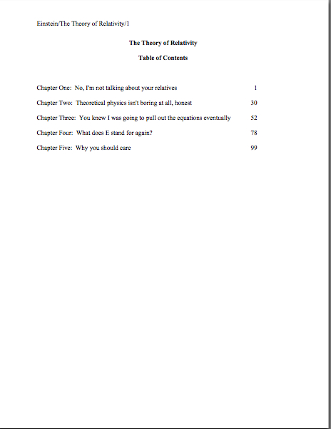
What does standard format look like, anyway? Part VIII: taking your fate into your own hands, or, you go, princess!

Hello, campers —

Well, I am feeling a bit better after my weekend off, due in part to taking a break to go see Seattle Opera’s surprisingly powerful production of AIDA. I may have an odd sense of humor, but few things cheer me up like observing a character bellowing her deepest secrets at the top of her (well-developed) lungs for minutes at a time, only to have her antagonist, who is standing all of three feet away, observe to the audience, “Aha! Her reaction has betrayed her!” as if all the the soprano had done was frown fleetingly.

Why was I surprised by the production, you ask? From an editor’s point of view, the story of Aida is kind of a nightmare — predictable, repetitious, and quite, quite downbeat. The protagonist is almost completely passive (unless you count the aforementioned secret-bellowing); her love interest is quite possibly the least ethically flexible human being ever to have trod the planet, and the moment that the latter changes his mind even a little, Aida’s father pops out from behind a 30-foot statue of Anubis or somebody and tells Dumbo that he’s just betrayed his country.

ANY editor would have told Verdi to have the father use the information to set up the ambush of the Pharaoh’s army FIRST and gloat about it later. That’s just a basic application of the old Show, don’t tellrule.

This production violated this precept even more than most by moving the big trial scene in Act II offstage entirely, so the audience only hears it. Actually, this turned out to be quite a clever way of staging it, since all the audience had to watch throughout was the reaction of Stephanie Blythe, the perfectly marvelous mezzo playing Aida’s rival, Amneris, instead of the usual 50+ supernumeraries wearing King Tut headdresses. In fact, switching the perspective here and in a number of small ways throughout might have made an audience member new to the storyline wonder why the opera was called AIDA, not AMNERIS.

I’m bringing this up not only because I enjoyed the production, of course: this isn’t a bad strategy for perking up a story centered around a passive protagonist.

A I’ve mentioned before, readers tend to lose interest in passive protagonists’ dilemmas rather quickly, and with good reason: characters who sit around and think about their problems, or let events happen all around them without at least trying to change the status quo, become predictable after the third or fourth scene. A character who surprises the reader by taking the occasional risk is inherently suspense-generating — what, the reader wonders, will that feisty protagonist do next?

Now, to be fair, Aida has some pretty great excuses for being passive: she’s Amneris’ slave; she’s in love with Amneris’ fiancé, who also happens to be the commander of the army fighting with her own father’s troops; pretty much everyone she loves has been or is about to be slaughtered, and Amneris is a savvy enough expression-watcher that she’s understood those shouted asides about how deeply Aida and the general are in love. About all she can manage to do is determine the method of her own death — which is, you guessed it, slow and passive.

Hey, it’s an opera: you expected it NOT to be tragic?

Emphasizing Amneris’ perspective was a great choice — not only is she far, far more active in the story than Aida (whose best aria is about not the storyline per se, but how much she misses her homeland), but she experiences genuine moral dilemmas, a broad range of easily shouted-about emotions, AND has both the courage and the resources to act upon her decisions. While Aida stands around and suffers tunefully, Amneris gets to do cool things like have her boyfriend dragged off by guards, offer him his life in exchange for renouncing his love, and curse the priests who bury him alive.

As we editors like to say, she experiences a growth curve throughout the narrative. Since Aida is primarily an observer of her own tragedy, her mindset doesn’t change a whole lot.

Not that I blame her. I wouldn’t like to be walled up in a tomb, either.

Which is not to say that a narrative always benefits by concentrating on the more powerful players — anyone with a decently-stocked fiction collection could point out many novels that prove quite the opposite.

However, concentrating on a character who fights against fate, growing and changing in the process, rather than one who merely suffers the slings and arrows of outrageous fortune, usually produces a more sympathetic protagonist. Counter-intuitive, isn’t it, that the pure victim might excite less empathy than her feistier foe?

None of which, I notice, has a great deal to do with the post I am re-running today. Except this: presentation choices do affect the emotional impact of art. Even, as in today’s examples, when those choices are purely cosmetic.

Enjoy!

I was all set to clamber onto my moral high horse again and dispense more of yesterday’s philosophy, honest — but then sharp-eyed long-time reader Janet caught, as is her wont, the missing puzzle piece in my illustrated romp through standard format. So I’m sliding elevated ethical questions onto the back burner for the nonce and diving right back into practicalities.

As Janet so rightly pointed out, I had completely skipped over one of the more common first-page-of-chapter controversies (and yes, in my world, there are indeed many from which to choose), whether to place the title and/or chapter designation at the top of the page, or just above the text.

To place the options before you, should the first page of a chapter look like this:

Or like this?

Now, I had been under the impression that I had waxed long and eloquent about the side I took in this burning debate, and that quite recently, but apparently, my eloquence has been confined to posts more than a year old, exchanges in the comments (which are not, alas, searchable, but still very worth reading), and my own fevered brain.

So let me clear up my position on the matter: the first version is in standard format; the second is not. No way, no how. And why might a professional reader prefer the first?

Chant it with me now: BECAUSE IT LOOKS RIGHT TO THEM.

Yet, if anything, agents and contest judges see more examples of version #2 than #1. Many, many more.

Admittedly, anyone who screens manuscripts is likely to notice that a much higher percentage of them are incorrectly formatted than presented properly, this particular formatting oddity often appears in otherwise perfectly presented manuscripts.

And that fact sets Millicent the agency screener’s little head in a spin. As, I must admit, it does mine and virtually every other professional reader’s. Because at least in my case — and I don’t THINK I’m revealing a trade secret here — I have literally never seen an agent submit a manuscript to a publishing house with format #2. And I have literally never even heard of an agent, editor, or anyone else in the publishing industry’s ASKING for a chapter heading to be moved from the top of the page to just above the text.

Oh, I’ve heard some pretty strange requests from agents and editors in my time, believe me; I’m not easily shocked anymore. But to hear a pro insist upon placing the chapter heading where you have to skip down a third of a page to read it…well, that would have me reaching for my smelling salts. (Do they even make those anymore?)

But clearly, somebody out there is preaching otherwise, because agents, editors, and contest judges are simply inundated with examples of this formatting anomaly. We see bushels of ‘em. Hordes of aspiring writers are apparently absolutely convinced that the sky will fall in if that chapter heading is located anywhere but immediately above the text.

In fact, it’s not all that uncommon for an editor to find that after she has left a couple of subtle hints that the writer should change the formatting…

…the subsequent drafts remain unchanged. The writer will have simply ignored the advice.

(Off the record: editors HATE it when their advice is ignored. So do agents. Contest judges probably wouldn’t be all that fond of it, either, but blind submissions mean that a writer must submit the same chapter two years running to the same contest, have the entry land in the same judge’s pile — in itself rather rare — AND the judge would have to remember having given that feedback.)

This may seem like a rather silly controversy — after all, why should it matter if the white space is above or below the title? — but sheer repetition and writerly tenacity in clinging to version #2 have turned it from a difference of opinion into a vitriol-stained professional reader pet peeve. (See earlier comment about how we tend to react to our advice being ignored; it isn’t pretty.)

Which, unfortunately, tends to mean that in discussions of the issue at conferences degenerate into writing-teacher-says-X, editor-at-Random-House-says-Y: lots of passion demonstrated, but very little rationale beyond each side’s insisting that the other’s way just looks wrong.

However, there is a pretty good reason that moving the chapter heading information to just above the text looks wrong to someone who edits book manuscripts for a living: it’s a formatting tidbit borrowed from short stories, whose first pages look quite different:

There, as you may see for yourself, is a mighty fine reason to list the title just above the text: a heck of a lot of information has to come first. But that would not be proper in a book-length manuscript, would it?

Let’s see what Noël’s editor has to say, viewing his submission as the first page of a book:

Ouch. (That last bit would have been funnier if the entire page were readable, by the way, but my camera batteries were running low.) But as Millicent and that angry mob of pitchfork-wielding ignored editors would be only too happy to tell you, short stories don’t HAVE chapters, so who on earth are they to be telling those of us in the book world how to format our manuscripts?

Stick with version #1.

Which is not to say, of course, that this particular small deviation will automatically and invariably result in instantaneous rejection. Chances are it won’t, even in the latté-stained hands of the most format-sensitive Millicent. (See, she spilled coffee on her hands after she took a sip while it was still too hot — and if you didn’t get that joke, you probably haven’t been reading this blog for very long.) If a submission is beautifully written AND technically correct in every other respect, she might only shake her head over the location of the chapter heading, making a mental note to tell you to change it between when her boss, the agent, signs the writer and when they will be submitting the manuscript to editors at publishing houses.

But if you don’t mind my saying so, that’s a mighty hefty set of ifs.

While I’ve got the camera all warmed up, this would probably be a good time to show another ubiquitous agent and editor pet peeve, the bound manuscript – and this one IS generally an automatic-rejection offense. As with other ploys to make a manuscript appear identical to a published book, binding the loose pages of a manuscript for submission will NOT win you friends in the publishing world.

Why? Not only does this not look right (I spared you the chanting this time), but it seems so wrong that Millicent will be positively flabbergasted to see a submitter to do it.

Seriously, this is one of those things that is so engrained in the professional reader’s mind that it seldom even occurs to authors, agents, or editors to mention it as a no-no at writers’ conferences. Heck, I’m not sure that I’ve mentioned it once within the last six months — and by anyone’s standards, I’m unusually communicative about how manuscripts should be presented.

So pay attention, because you’re not going to hear this very often: by definition, manuscripts should NEVER be bound in any way.

Not staples, not spiral binding, not perfect binding. There’s an exceedingly simple reason for this: binding renders it impossible (or at least a major pain in the fingertips) to pull out a chapter, stuff it in one’s bag, and read it on the subway.

Hey, paper is heavy. Would YOU want to lug home ten manuscripts every night on the off chance you’ll read them?

In practice, I’m sorry to report, a bound manuscript will seldom survive long enough in the screening process for the chapter-separation dilemma to arise, because — and it pains me to be the one to break this to those of you who’ve been submitting bound manuscripts, but if I don’t tell you, who will? — those pretty covers tend never to be opened.

Remember that immense pile of submissions Millicent has to screen before going home for the day — and it’s already 6:30? Well, when she slits open an envelope that reads REQUESTED MATERIALS on the outside, she fully expects to see something like this lurking between the cover letter and the SASE tucked underneath:

But in the case of the bound manuscript, she instead sees something like this:

Kind of hard to miss the difference, isn’t it? And unfortunately, nine times out of ten, the next sound a bystander would hear would be all of that nice, expensive binding grating against the inside of the SASE.

Honestly, it’s not that she is too lazy to flip open the cover; she just doesn’t see why she should. Her logic may not be fair or open-minded, but it’s a fairly common argument throughout the industry: if this submitter does not know this very basic rule of manuscripts, how likely is she to know the rules of standard format?

And if she does not know either, how likely is she to be producing polished prose?

Yes, this logic often does not hold water when it comes down to an individual case. But from her perspective, that matters less than we writers would like — because, as unpleasant as it is for aspiring writers to realize, her agency is going to see enough technically perfect submissions this week to afford to be able to leap to unwarranted conclusions about this one.

Don’t waste your money on binding.

Now that I have depressed you all into a stupor, let me add a final note about learning to conform to these seemingly arbitrary preconditions for getting your book read: any game has rules.

If you saw a batter smack a baseball, then dash for third base instead of first on his way around the diamond, would you expect his home run to count? Would an archer who hit the bulls-eye in her neighbor’s target instead of her own win the grand prize? If you refused to pay the rent on Park Place because you didn’t like the color on the board, would you win the Monopoly game?

I can go on like this for days, you know.

My point is, submitting art to the marketplace has rules, too, and while your fourth-grade P.E. teacher probably did not impart them to you (as, if I ran the universe, s/he would have), you’re still going to be a whole lot better at playing the game if you embrace those rules, rather than fight them.

You’ll also, in the long run, enjoy playing the game more.

And remember, you’re playing this game by choice: you could, after all, make your own rules and publish your book yourself. Weigh the possibilities, and keep up the good work!
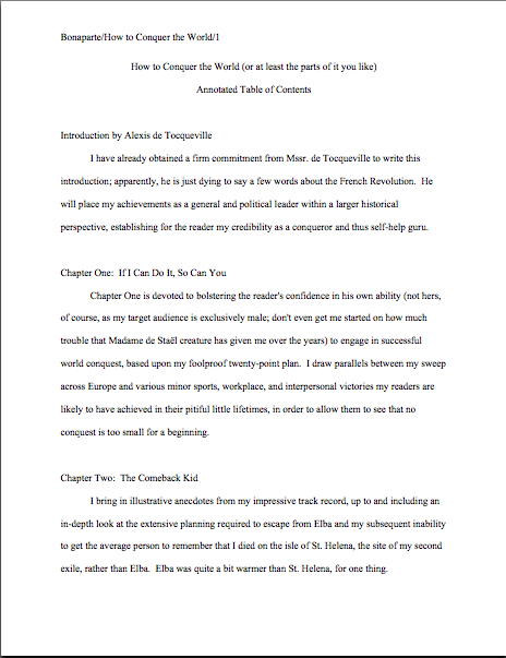
What does standard format look like, anyway? Part VII: my memoir is WHAT?

Hello, campers –

Okay, I am officially annoyed: someone has had the temerity to write a bad Amazon review of my memoir, A FAMILY DARKLY: LOVE, LOSS, AND THE FINAL PASSIONS OF PHILIP K. DICK. Which would be a little less odd if the book had ever been released, but as far as I know, not even review copies were ever available.

And I certainly never sent this person a copy of any draft of my manuscript. So what can she possibly be reviewing? The blurb on the Amazon page — which, like pretty much every marketing blurb, was written not by the book’s author, but by the publisher’s marketing department?

Yes, yes, I know: Amazon lists my book as being out of print — limited ability, not as still to be released, which implies that there are a few copies running around out there. Their assertion is technically true, because it was never IN print, but factually inaccurate.

So how did it end up with a listing on Amazon at all? Well, as long-time readers of this blog already know, Carroll & Graf was supposed to publish it in February, 2006 — then May, 2006, then September, 2006 — before the project was permanently put on ice, due to a series of nebulous threats from the Dick estate. Although to the best of my knowledge, they never asked my publisher to make any changes in the book whatsoever, the figure two million dollars was bandied about menacingly.

A right about the same time as the A MILLION LITTLE PIECES scandal broke. That the publisher would balk was inevitable.

I’ve come to peace with all that, mostly: I have faith that the book will eventually come out, even if I have to outlive the naysayers to do it; it’s not as though the audience for it is going to disappear. I know that my memoir is honest; someday, a larger audience will see the story.

In the meantime, I have a life to live and books to write.

Still, it rankles me that someone who apparently hasn’t read the book should review it — and that the review should have come (evidently) from one of Philip’s ex-wives — to be precise, the one three wives after my mother. I don’t even understand why Amazon would ALLOW her to review it, when for over two years now, it apparently hasn’t permitted others who HAVE read drafts of the book to post reviews.

You HAVE already lined up fellow writers to tap out Amazon reviews for you when your first book comes out, right?

What makes me think that this review didn’t filch a stray draft copy to pass judgment upon, you ask? Because her sole stated objection to the book is that I couldn’t possibly have spoken with Philip on the telephone, because, she claims — brace yourselves, because I think this is going to come as a shocker to those hoping to make a career writing science fiction — she and Philip were too poor to afford a phone during their very brief marriage.

Interesting claim. She is presumably referring to the early 70s, when Philip had been publishing his writing successfully for over 15 years, including a little number called THE MAN IN THE HIGH CASTLE. It won a Hugo Award in 1963, not an achievement typically associated with a writer’s book sales declining to the point of penury, especially one as prolific as Philip was throughout the 1960s.

But even he had been reduced to living in a treehouse in a public park, my memoir isn’t ABOUT the early 70s, as those happy few who have read the manuscript could tell you. It takes place mostly in the late 70s and early 80s, when Philip and I were indeed talking on the phone a great deal (as were others, some of whom seem to recall having picked up the phone a few years earlier and calling…well, never mind), and the 1950s, when Philip and my mother were married. (The same period when, not entirely coincidentally, he was working with my father, my science fiction-writer uncle was giving him marketing advice, and my godfather was dropping by to play chess…well, you get the picture.)

In other words, I’ve been writing what I know.

In fact, for this critique to be remotely apt, my entire memoir would have to have been devoted to ages 5 to 8 — years which, if memory serves, take up only a small handful of pages in the manuscript at all. Why? Well, I was a precocious child, certainly, but if I was slandering anyone mid-elementary school, it’s news to me.

Even if there were an honest difference of recollection here (which I don’t think is the case), why this review should wait to bring this up until more than two years after the book in question was supposed to be released mystifies me. Unless she’s planning to write a book of her own?

And don’t even get me started on the irony of someone who has ever been married to an SF/fantasy writer using the term fantasy as an insult about a piece of writing.

Okay — deep breath. I don’t need to get upset over this. But I have to tell you, it did give me a turn to be accused of slander on an Amazon discussion board. (In an apparent effort to leave no stone unturned in discrediting me, the reviewer evidently started a discussion thread. Thorough of her, no?)

Now, to set all of you memoirists’ minds at ease, this is a pretty empty accusation — the dead have no reputations, my lawyer tells me, and thus cannot be libeled. Also, rumor has it that truth is an absolute defense against both libel and slander, and so far, no one who has objected to the book’s publication has shown me — or, to the best of my knowledge, my publisher — any evidence whatseverthat my memories are not grounded in fact. It’s all just been assertions of different points of view.

Which, strange to say, has been hard to get the relevant parties to understand. Contrary to criticisms leveled at some popular memoirists lately, few people’s lives are documented down to the last second. How would you, for instance, prove that everything that happened on your first date actually occurred, in the absence of the other party?

You couldn’t, of course. Welcome to the dilemma of the present-day memoirist.

I can’t even begin to tell you how tired I am of all this — I’ve been defending this book for over three years now, without anyone ever having produced a single tangible reason it shouldn’t be published. Yet until today, as far as I knew, no one had ever even implied that anything about my memoir had broken the law.

Prior to this review, the issues of alternate points of view and who owns personal memories, if not the person herself — both subjects upon which Philip Dick wrote frequently, as it happens — dominated the discussion of my memoir. Now, it seems as though my very memories are being called libelous.

I can’t explain it.

In fact, I wouldn’t be bringing it up at all, except the only reason I found out about this puzzling review at all was that I was double-checking a link in the post below, a little gem on standard format from last December. To be precise, I originally posted it on Philip’s birthday.

Don’t ever say I didn’t do anything for you people; I may never double-check a link again. Enjoy the post.

Many thanks to all of you sweet souls who forwarded me links to the many literary and SF sites out there that commemorated what would have been my good old friend Philip K. Dick’s 79th birthday. This was the first year that I received a whole boatload of these messages, so it was great fun — rather like receiving a flotilla of birthday cards in the mail.

I needed the cheering up, I’m afraid, as usually, I throw a little dinner party on this particular day. Not only out of respect for my first serious writing teacher, but also as a birthday shindig for some of the other great artists born today: Beethoven, Sir Noël Coward, Sir Arthur C. Clarke (of 2001 and CHILDHOOD’S END fame), and of course, Author! Author!’s own beloved, wise auntie, Jane Austen.

You could do worse than to raise a glass to that crowd. But this year, I’ve just been too wiped out to allow anyone but the postman to drop by — and some days, I’m not even up to seeing him.

Thus, no dinner party this year, more’s the pity. I did a little too much last week, so this weekend, all I did was sleep and make groggy suggestions about how to maneuver the Christmas tree in order to make it stand up straight. (Which actually is necessary in our household: due to a truly spectacular bracken-and-cat interaction a few years back, we now tie the top of the tree to a ring firmly attached to the ceiling, so the tree does not need to be completely vertical in order to keep from toppling over.)

But enough about me; let’s talk about you.

While I was incapacitated, a group of my wonderful readers was holding down the fort here, trading tips on how to deal with that pesky problem, how to add a second space between sentences if a writer had mistakenly typed the whole thing thinking there should only be one. If you have even a passing interest in this topic, I implore you, check out the comments on the last two days’ posts; it’s well worth it. (Here’s a link to the first and here’s one to the second.)

We have only few rules of standard format left to cover in this series, so my first instinct was to use the text of one of Philip’s short stories for the examples. (Seemed appropriate, given that he used to mark deviations from standard format on stories I wrote for school and send them back to me for correction. What 11-year-old girl wouldn’t have loved THAT?) But since fair use permits only 50 consecutive words in a quote without explicit permission from the copyright holder, and the copyright holders in his case have a nasty habit of waving $2 million lawsuits in my general direction (and my quondam publisher’s) every time I so much as breathe his name, that didn’t seem entirely wise.

So I thought, in honor of the day, I would use a little something that I am undoubtedly entitled to reproduce here. Here is the first page of Chapter Six of my memoir:

Every chapter should begin like this: on a fresh page, 12 single lines (or 6 double-spaced) from the top.

As with the first page of text, the only reference to the author’s name or the title should appear in the slug line, located in the upper left-hand margin. (And in answer to reader Janet’s intelligent question: the slug line should appear .5 inches from the top of the paper, floating within the 1-inch-deep top margin. I can’t believe I never mentioned that before.) The page number belongs within it, rather than anywhere else on the page.

The slug line confuses a lot of aspiring writers; until you have seen piles and piles of professional manuscripts, it looks kind of funny, doesn’t it? And when you’ve been told over and over again that a manuscript should have a 1-inch margin on all sides, it can seem counterintuitive to add a line of text, even such a short one, IN that margin.

But I assure you, it’s always been done that way. And why? Followers of this series, chant it with me now: BECAUSE IT LOOKS RIGHT.

Yes, that logic IS tautological, now that you mention it. If you have a problem with that, I would suggest taking it up with the powers that rule the universe. I, as I believe the reference above to my memoir’s troubled path makes abundantly clear, apparently do not rule the universe.

If I did, today would be a holiday for every writer on the planet. Especially the ones who are having trouble getting their work published, like, oh, Philip K. Dick, Arthur C. Clarke, and Jane Austen all did at the beginning of their fiction careers.

I just mention.

Back to business. Placing the slug line in the header (located in Word under the VIEW menu) also enables the writer to take advantage of one of the true boons of the advent of word processing, pages that number themselves. Every so often, I will receive a manuscript where the author has, with obviously monumental effort, typed a slug line onto the first line of TEXT of each page, so it looks like this:

See how pulling the slug line down into the text messes with the spacing of the page? An entire line of text is sacrificed to it — and let me tell you, that line is not going to go quietly.

Why not? Well, what’s going to happen if new writing is inserted on a page formatted this way? That’s right: the author is going to have to go back and move each and every one of those slug lines to match the NEW pagination.

I’d show you a picture of this, but it’s just too ugly to contemplate. Trust me, it would be a heck of a lot of work.

See any other problems with this page? How about the fact that the slug line includes the word PAGE? Shouldn’t be there; just the numbers will suffice.

Did I just hear some huffs of indignation out there? “But Anne,” I hear the formatting-ambitious cry, “it’s kind of stylish to include PAGE before the page number, isn’t it? It’s just a matter of personal style — who could be hurt by including it, if I like the way it looks?”

Well, you, for starters. And why? (Chanters, ready your lungs.) BECAUSE IT JUST WOULD NOT LOOK RIGHT TO A PROFESSIONAL READER.

I’m quite serious about this; I’ve seen screeners get quite huffy about this one. “Does this writer think I’m STUPID?” Millicent is prone to huff. (Don’t answer that question; it’s rhetorical.) “Does she think I DON’T know that the numeral that appears on every page refers to the number of pages? Does she think I’m going to go nuts and suddenly decide that it is a statistic, or part of the title?”

Don’t bait her. Do it the standard way.

Okay, did you spot any other problems? What about the fact that the first paragraph of the chapter is not indented, and the first character is in a different typeface?

The odd typeface for the first letter, in imitation of the illuminated texts hand-written by monks in the Middle Ages, doesn’t turn up all that often in manuscripts other than fantasy and YA, for one simple reason: books in that category are more likely to feature this it’s-a-new-chapter signal than others. But once again, what an editor may decide, rightly or wrongly, is appropriate for a published book has no bearing upon what Millicent expects to see in a manuscript.

Save the bells and whistles for someone who will appreciate them. Hop in your time machine and track down a medieval monk to admire your handiwork, if you like, but in this timeframe, keep the entire manuscript in the same typeface and size.

The non-indented first paragraph of a chapter is fairly common in mystery submissions, I have noticed. I’ve been told by many mystery writers that this is an homage to the great early writers in the genre, an echo of their style.

But you know what? Almost without exception, in Edgar Allan Poe’s time all the way down to our own, the EDITOR has determined the formatting that appeared on any given printed page, not the author. To professional eyes, especially peevish ones like Millicent’s, a manuscript that implicitly appropriates this sort of decision as authorial might as well be the first step to the writer’s marching into Random House, yanking off a well-worn riding glove, and striking the editor-in-chief with it.

Yes, you read that correctly: it’s sometimes seen as a challenge to editorial authority. And while we could speculate for the next week about the level of insecurity that would prompt regarding a minor formatting choice as a harbinger of incipient insurrection, is the manuscript of your first book REALLY the right place to engender that discussion?

Exactly.

If you want to make Millicent and her bosses happy — or, at any rate, to keep them reading calmly — indent every paragraph of the text should the expected five spaces. It just looks right that way.

While we’re at it, how about the bolded chapter number and title? Nothing in a manuscript should be in boldface. Nothing, I tell you. Uh-uh. Not ever.

Well, you could get away with the title itself on the tile page, but frankly, I wouldn’t chance it.

Nor should anything be underlined — not even names of books or song titles. Instead, they should be italicized, as should words in foreign tongues that are not proper nouns.

I heard that gigantic intake of breath out there from those of you who remember constructing manuscripts on typewriters: yes, Virginia, back in the day, underlining WAS the norm, for the simple reason that most typewriters did not have italic keys.

If you consult an older list of formatting restrictions, you might conceivably be told that publications, song titles, and/or foreign words (sacre bleu!) should be underlined. But trust me on this one: any agent would tell you to get rid of the underlining, pronto.

And why? All together now: because IT JUST DOESN’T LOOK RIGHT THAT WAY.

All right, campers, do you feel ready to fly solo? Here are two pages of text, studded with standard format violations for your ferreting-out pleasure. (I wrote these pages, too, in case anyone is worried about copyright violation or is thinking about suing me over it. Hey, stranger things have happened.)

How did you do? Are those problems just leaping off the page at you now? To reward you for so much hard work, here are a couple of correctly-formatted pages, to soothe your tired eyes:

good example

Whenever you start finding yourself chafing at the rules of standard format, come back and take a side-by-side gander at these last sets of examples — because, I assure you, after a professional reader like Millicent has been at it even a fairly short time, every time she sees the bad example, mentally, she’s picturing the good example right next to it.

And you know what? Manuscripts that look right get taken more seriously than those that don’t. And regardless of how you may feel about Millicent’s literary tastes, isn’t a serious read from her what you want for your book?

Keep up the good work!
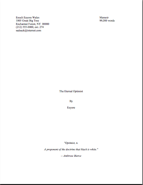
What does standard format look like, anyway? Part VI: yet another great cosmic mystery explained, sort of

Hello, campers –

Well, I’m feeling a little better today, you’ll be happy to hear (or at least I hope you will be), enough so to spend half an hour reading my local newspaper. And what should I see but that Arleen Williams, memoirist and long-time reader of this blog, is going to be reading at Third Place Books in Lake Forest Park, WA tonight at 7 pm!

What a treat. I think I’m going to try to make this my first evening out in weeks. I know that it’s short notice, but if you happen to be in the area, why not join me there?

For those of you who missed my gushing about The Thirty-Ninth Vicitim when it came out last spring, I can do no better than to quote my Amazon review (not a place I post reviews very often):

Oh, my, what a disturbing memoir this is. Not solely because of the murder of the author’s sister by the infamous Green River Killer — which would be plenty creepy enough for any true crime book, or even murder mystery — but because Arleen Williams presents us with an achingly honest look at absence, longing, and denial within a family waiting years for what the media dismissively calls closure.

What struck me most about this story is that, unlike so many books about particularly horrific crimes, the victim here comes alive on the page. Not as yet another in an almost unimaginably long list of murdered women (so long, in fact, that it sparked the nationwide Take Back the Night rallies) or as merely an object to be acted upon with violence, but as a vibrant light abruptly, inconceivably snuffed. And as part of a family so deeply attached to its own self-image as normal that not even a daughter’s disappearance is allowed to disrupt it.

Powerful stuff. Chilling. (And yes, for you fans of close-up crime recreations, there was one scene that I’m quite positive is going to give me nightmares for years to come.)

In light of my upcoming unwonted (lately, at least) energy expenditure, I’m going to conserve my resources and post today’s re-run as much as is as I can. Enjoy!

No, the statue is not a Christmas angel, but rather Nike, the winged goddess of victory, bringing a laurel wreath for reader ACD, who will be famed in song and story forevermore for the comment she posted on yesterday’s blog. Why? Because she, clever soul, wrote in with a method for using Word’s Find and Replace feature to change single spaces between sentences into double spaces within sentences. And if that’s not an achievement worthy of a laurel leaf or two, I should like to know what is.

Okay, so maybe that wasn’t the artist’s original intent with this particular statue (which comes to us courtesy of FreeFoto.com), but some celebration seemed appropriate, no?

And if THAT isn’t enough to meet whatever standard you may be cherishing for what constitutes a reason to initiate dancing in the streets, long-time reader, prolific commenter, and computer whiz Chris has once again gone far above and beyond the call of duty and written an entire blog post on the subject.

Thanks, Chris and ACD. Laurel leaves all around!

All week, I have been running through the strictures of standard manuscript format and some common deviations from it, to demonstrate just how clearly our old pal, Millicent the agency screener, discerns the differences. And let me tell you, at the end of a long day’s reading, they definitely jump out at her, and with good reason: once a professional reader gets used to seeing the similarities that pretty much all professional manuscripts share, submissions formatted in other ways might as well have UNPROFESSIONAL stamped on them in bright red ink.

And while Millicent may strive valiantly NOT to allow that impression to color her reading of the submission itself, it’s just not a good idea to assume that it won’t. She’s only human, after all.

It’s an even worse idea to assume a charitable reading for a contest entry, by the way. If anything, contest judges tend to be even more sensitive to the beauty of standard format than Millicent, for the simple reason that they’ve usually been reading a whole lot longer. The agency gig may well be Millie’s first job out of college, but the judge handed your entry may well have just retired from a long and fruitful career teaching English composition. Her fingers ache for the red pen of correction.

Then, too, most well-respected contests require some professional credentials from their judges, either as writers, editors, or teachers. Which means, in practice, that judges have often been writing in standard format themselves for years or bludgeoning other writers into compliance with its requirements.

To put it another way, other kinds of formatting won’t look right to them, either. By now, you’re probably having a similar reaction, aren’t you?

Don’t think so? Or don’t want to believe you could conceivably share any traits with Millicent? Let’s test the proposition by trying a little Aphra Behn on for size.

If you don’t know her work, you should, at least historically: as far as we know, she was the first woman paid for writing in English. (She’s also hilarious.) Here is a page from THE FAIR JILT (1688):

You could tell instantly that there was something wrong here, couldn’t you, and not just because Miranda’s trying to seduce her priest? (For convent, read monastery.) Set aside her practically Dickensian affection for semicolons for the moment — which would tend to turn off a modern Millicent pretty quickly — and try to tote up in your mind all of the deviations from standard format.

To refresh your memory and gladden your now-sharpened eyes, here’s what it should have looked like:

Got your list of problems in hand? Let’s take the problems on the first version from the top of the page: the incorrect version does not have a proper slug line. (For those of you joining us late, a slug line is AUTHOR’S LAST NAME/TITLE/PAGE #, repeated on every page of the text.)

Seeing this lone page out of context, it’s quite obvious why a slug line is a dandy idea, isn’t it? Without a slug line, it would be virtually impossible to return this wandering page back into the manuscript from whence it came. “Who wrote this?” Millicent cries in ire, glaring around her cubicle at the 47 manuscripts lying there. “It could be from any of these!”

At least Ms. Behn thought to number the pages of Example #1 — but did you catch the problem with how she did it? The page number is in the bottom right-hand margin, not in the slug line, where it belongs.

Did you catch any other difficulties? What about the 10-point type, which will strain Millicent’s already overworked eyes? Or the Ariel typeface? There is nothing inherently wrong with either, but when she’s used to see practically every manuscript that heads out of the agency to publishing houses in 12-point Times New Roman, it (chant it with me here) just doesn’t look right.

Anything else? What about that right margins? Mighty straight, isn’t it? That look proper to you?

It’s called block-justification, and it’s another problem that can be laid squarely at the feet of those who insist that a manuscript and a published book should be identical. The text in many published books, and certainly in many magazines and newspapers, is spaced so that each line begins at exactly the same distance from the left-hand edge of the page and ends (unless it’s the last line of a paragraph) at exactly the same distance from the right-hand edge of the page.

Which, to let you in on why this type of neatness bugs professional readers, renders skimming quite a bit more difficult. Fewer landmarks, as it were; to the glancing eye, practically every line of narrative text resembles every other. To those of us used to the ragged right margins and even letter spacing of standard format, it’s actually kind of hard to read.

So there’s quite a bit in Example #1 that’s distracting, isn’t there? Doesn’t help sell the text, does it?

Okay, all of these rhetorical questions are beginning to make me dizzy, so I’m going to wind down for the day. But before I do, let’s take one more look at Example #2, the one Millicent and a contest judge would like:

Now, let’s take a gander at the same page in — ugh — business format:

Startlingly different, isn’t it, considering that I made only two formatting changes? (In case you missed one or the other, all I did was I eliminate the indentations at the beginning of each paragraph and skipped a line between paragraphs.) This, of course, is the norm for business correspondence, as well as for most of the text currently posted on the Internet.

Including this blog. As a professional writer and reader of manuscripts, it drives me NUTS that my blogging program won’t allow me to indent paragraphs.

Why? Because it just doesn’t look right. So much so that in a contest entry, business formatting is often grounds all by itself for knocking a manuscript out of finalist consideration.

Finding yourself asking why again? Well, to a professional reader, the differences between the last two examples would be more than visually jarring — they’d be downright confusing. In standard format, the only reason for a skipped line between paragraphs would be a section break, so Millicent would be expecting the second paragraph to be about something new.

Okay, so a misconception like that might distract her attention for only few consecutive seconds, but let’s not kid ourselves: Millicent is spending less than a minute on most of the submissions she rejects — it’s actually not all that uncommon for her not to make into the second or third paragraph before reaching for the SASE and a copy of that annoying form rejection letter.

Take a moment for the implications of that to sink in fully. Don’t worry; I’ll wait.

Time loss is not the only reason she might take umbrage at momentary confusion. Let me let you in on a little secret: professional readers, especially those who inhabit agencies and publishing houses, are not overly fond of having their mental image of the story they are reading at the moment jarred.

How do I know this? Well, for one thing, they commonly refer to it as being tricked. As in, “I hate being tricked by a first paragraph that is about someone other than the protagonist.”

There’s a practical basis to this dislike, of course, but it’s kind of complicated. I wrote a couple of fairly extensive posts on the subject last year (here’s a link to the first, and here’s a link to the second, in case you’re interested), but I’ll run over the thumbnail version now.

Comfortably seated?

To get through all of those manuscripts she’s assigned to screen each week, Millicent has to read quite quickly. If she decides to pass a manuscript on to the next level, she is going to need to be able to tell her boss what the book is about: who the protagonist is, what the conflict is, and why that conflict is important enough to the protagonist for the reader to be drawn into it.

Basically, she’s going to need to be able to pitch it to the higher-ups at the agency, just as the agent is going to have to do in order to sell the book to an editor, and an editor is going to have to do in order to convince HIS higher-ups that the publishing house should acquire the book. And, often, as first-round contest judges will need to do on an evaluation form in order to pass an entry onto the next round.

Okay, brace yourself, because explaining what comes next involves delving into one of the great cosmic mysteries. It’s not for the faint of heart.

Remember earlier in the week, when I mentioned that agents and editors don’t read like other people? Well, one of the primary differences is that from line one of page one, they’re already imagining how they’re going to pitch this book.

So if paragraph 2 or 3 (or page 2 or 3) suddenly informs them that their mental patter has been about the wrong character, they feel as if they’ve been backing the wrong horse.

And while there may have been any number of perfectly reasonable narrative reasons for the text to concentrate upon an alternate character for the opening, unless the writing AND the story have already really wowed Millicent, her resentment about being trickedwrong about the identity of the protagonist is often sufficient to make her reach for that SASE and form letter.

Feel free to go scream into a pillow over that last piece of logic; you don’t want to keep that kind of existential cri de coeur pent up inside. I’ll wait until it’s out of your system.

Feel better? Good.

Before you go rushing off to see if your opening paragraphs might possibly be open to an interpretation of trickery — because, for instance, you might have taken the bold authorial step of noticing that there is more than one human being in the world, and reported a piece of action accordingly — let’s return to the formatting issue that prompted my little segue into the psychology of resentment. Can we extrapolate any practical lesson about business format from it?

You bet your boots we can: it’s not a good idea to give the impression of a section break where there isn’t one.

There’s a lot more psychodrama than one might think involved with these formatting choices, isn’t there? I’ll wrap up this series next time, to spare us further emotional toll. Keep up the good work!
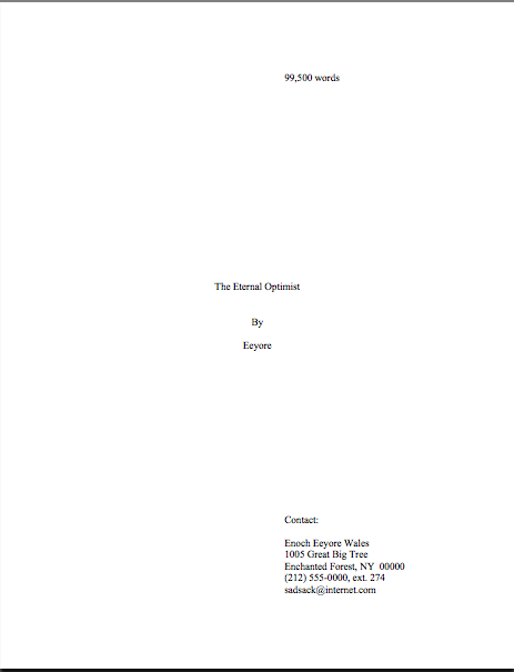
What does standard format look like, anyway? Part V: God bless the Millicents, every one

Hello, campers –

I’m still under the weather (which, in a Seattle summer, could mean being oppressed by either sunny heat or chilly grayness, sometimes within the same day), but since my sniffles have been providing me with a dandy excuse to re-run some extremely practical posts on how to format a manuscript professionally. Even if you are a long-time Author! Author! reader, and thus have seen me run over these points before or do not anticipate being ready to submit anytime this year, PLEASE do not just skip these posts — everyone could use a refresher from time to time.

Trust me, your future agent will be really, really glad that you did, because literally every page s/he will be submitting to the editor of your dreams — be it manuscript, book proposal, or synopsis — will need to be in standard format.

Or, to put it another way: of the pieces of paper you might be conceivably be sending an agent or editor, only query letters and e-mails AREN’T expected to be in standard format. (Don’t worry; I’ll be showing you how to format a query letter next week.) So it really will save you time in the long run if you just write everything from first draft to final revision in standard format.

As you may gather from the Yuletide references throughout, I originally wrote this as Christmastime, but actually, the Cratchit family analogy works surprisingly well for this time of year, too: since most of the NYC-based publishing industry goes on vacation about this time of year (basically, from now through Labor Day), the Millicent who gets left behind to mind the store in muggy midtown might well feel Scrooge-oppressed just now.

Think she’s grumpy to be left alone with all of those piles of paper? Or, if she’s one of the lucky most scurrying out of the office right about now, imagine her state of mind upon returning September 2 to find her desk buried in enough submissions to wallpaper her entire floor — and enough piled-up query letters to build a cabin larger than her Brooklyn apartment.

Not a pretty picture, is it?

Even if you aren’t in the habit of empathizing with people who reject writers for a living, there’s a good self-interested reason you should care about her state of mind right about now: even with the best will in the world, grumpy and/or rushed readers tend to be harder to please than cheerful, well-rested ones.

Not a bad excuse to hold off on sending her anything, be it query letter or requested materials, until after Labor Day, is it?

For the last couple of days, I’ve been pursuing the dual goals of trying to show you just how obvious it is to a professional reader when a submission ISN’T in standard manuscript format (as opposed to being set up to ape the format of published books) and to drum up a little holiday sympathy for Millicent, everybody’s favorite agency screener.

She’s the Tiny Tim of the literary world, you know; at least the Bob Cratchits a little higher up on the office totem pole get paid, but our Millie often doesn’t. Even if she’s not an intern, she’s still unlikely to be paid very much. Her hours are typically long, and quite a lot of what she reads in the course of her day is, let’s face it, God-awful.

Yes, that thought that suddenly sprang into your mind is precisely right: rejecting queries and manuscripts by the score IS considered on-the-job training for a fledgling agent, in much the same way as an editorial assistant’s screening manuscripts at a publishing houses is the stepping-stone to becoming an editor.

You didn’t think determining a manuscript’s literary merits after just a few lines of text was a skill that came naturally, did you?

The aspiring writer’s learning curve is often not dissimilar to Millicent’s, actually: no one is born knowing the rules of manuscript formatting. (Okay, so I practically was, growing up around so many writers, but I’ma rare exception.) Like Millicent, most of us learn the ropes only through reading a great deal.

She has the advantage over us, though: she gets to read books in manuscript form, and most aspiring writers, especially at the beginning of their journeys to publication, read mostly books. The format is, as I believe that I have pointed out, oh, several hundred times before in this very forum, quite different.

So what writers tend to produce in their early submissions are essentially imitations of books. The problem is, there are many reasons that a manuscript in book format would be hard for an agent or editor to handle — and not merely because the individual pages would appear unprofessional to Millicent.

For starters, published books are printed on both sides of the page, manuscripts on one. Why the difference, in these days of declining tree populations and editors huffily informing writers at conferences that paper is expensive?

Simple: it’s easier to edit that way.

Believe it or not, even in these days of widely available word processors, most professional editing is still done by hand. Why? Well, it’s hard to give trenchant feedback while traveling in a crowded subway car if you have to maneuver a laptop, and many agencies remain far too virus-fearful to allow their employees solicit attachments from writers who aren’t already clients. (Those who do generally have a policy that forbids the opening of unsolicited attachments.) Even in agencies that have caved in to new technology sufficiently to send their member agents on long airplane flights to writers’ conferences armed with a Kindle with 17 manuscripts on it, hand-commenting is still the norm, even if it means scanning hand-proofed pages and e-mailing them back to the author.

Ultimately, most editors edit in hard copy because they prefer it. The human eye is, of course, to blame for this: reading comprehension drops by about 70% when the material is presented on a computer screen; the eye tends to skim.

Which is why — you can hear this coming, can’t you? — a wise writer always reads her ENTIRE manuscript IN HARD COPY before submitting it to anyone even vaguely affiliated with the publishing industry. It’s much, much easier to catch typos and logic problems that way.

In case anyone has missed the last two weeks’ worth of posts,manuscripts should also be typed (don’t laugh; it’s not unheard-of for diagrams to be hand-drawn in submissions, or for late-caught typos to be corrected in pen), double-spaced, and have 1-inch margins all the way around.

Time to see why, from an editing point of view. To call upon our old friend Dickens again, a page of a manuscript should look like this:

To give you some idea of just how difficult — or even impossible — it would be to hand-edit a manuscript that was NOT double-spaced or had smaller margins, take a gander at this little monstrosity:

Reader-hostile, isn’t it? Millicent would reject a submission like this immediately, without reading so much as a word.

Why? Well, even with nice, empty page backs upon which to scrawl copy edits, trying to cram spelling or grammatical changes between those lines would be well-nigh impossible. Knowing that, Millicent would never dream of passing such a manuscript along to the agent who employs her; to do so would be to invite a stern and probably lengthy lecture on the vicissitudes of the editorial life.

Don’t tempt her just to reject it unread — and don’t, I beg you, provide the same temptation to a contest judge. Given the sheer volume of submissions they read, they’re not all that likely to resist.

Even if the sum total of the provocation consists of a manuscript that’s shrunk to, say, 95% of the usual size.

You know what I’m talking about, don’t you, past contest entrants and submitters who wanted to squeeze in a particularly exciting scene before the end of those requested 50 pages? Faced with a hard-and-fast page limit for submission, some wily writers will shrink the font or the margins, to shoehorn a few more words onto each page. After all, who is going to notice a tenth of an inch sliced off a left or right margin, or notice that the typeface is a trifle smaller than usual?

Millicent will notice, that’s who, and practically instantly. As will any reasonably experienced contest judge; after hours on end of reading 12-point type within 1-inch margins, a reader develops a visceral sense of when something is off.

Don’t believe me? Go back and study today’s first example, the correctly formatted average page. Then take a look at this:

I shaved only one-tenth of an inch off each margin and shrunk the text by 5% — far less than most fudgers attempt. Yet admit it — you can tell it’s different, can’t you, even without whipping out a ruler?

So could a professional reader. And let me tell you, neither the Millicents of this world nor the contest judges tend to appreciate attempts to trick them into extraneous reading. Next!

The same principle applies, incidentally, to query letters: often, aspiring writers, despairing of fitting a coherent summary of their books within the standard single page, will shrink the margins or typeface.

Trust me, someone who reads queries all day, every day, will be able to tell.

The other commonly-fudged spacing technique involves skipping only one space after periods and colons, rather than the grammatically-requisite two spaces. Frequently, writers won’t even realize that this IS fudging: ever since published books began omitting these spaces in order to save paper, I’ve seen a theory propounded all over the Internet (and sometimes even in writing classes, where the teachers should know better) claiming that skipping the extra space is obsolete. Frequently, the proponents will insist that manuscripts that include the space look old-fashioned to agents and editors.

Well, guess what: standard manuscript format IS old-fashioned, by definition; that fact doesn’t seem to stop anyone in the industry for using it. In fact, in all of my years writing and editing, I have never — not once — seen a manuscript rejected or even criticized for including the two spaces that English prose requires after a period or colon.

I have, however, heard endless complaint from professional readers — myself included — about those second spaces being omitted. Care to guess why?

Reward yourself with a virtual candy cane if you said that cutting those spaces throws off word count estimation; the industry estimates assume those doubled spaces. And give yourself twelve reindeer if you also suggested that omitting them renders a manuscript harder to hand-edit.

We all know the lecture Millicent is likely to get if she forgets about that, right?

Again, a pro isn’t going to have to look very hard at a space-deprived page to catch on that there’s something fishy going on. Since Dickens was so fond of half-page sentences, the examples I’ve been using above won’t illustrate this point very well, so (reaching blindly into the depths of the bookshelf next to my computer), let’s take a random page out of Elizabeth Von Arnim’s VERA:

There are 310 words on this page; I wasn’t kidding the other day about how far off the standard word count estimations were, obviously. Now cast your eye over the same text improperly formatted:

Doesn’t look much different to the naked eye, does it? The word count is only slightly lower on this version of this page — 295 words — but enough to make quite a difference over the course of an entire manuscript.

So I see some hands shooting up out there? “But Anne,” I hear some sharp-eyed readers cry, “wasn’t the word count lower because there was an entire line missing from the second version?”

Well spotted, criers-out: the natural tendency of omitting the second spaces would be to include MORE words per page, not less. But not spacing properly between sentences was not the only deviation from standard format here; Millicent, I assure you, would have caught two others.

I tossed a curve ball in here, to make sure you were reading as closely as she was. Wild guesses? Anyone? Anyone?

The error that chopped the word count was a pretty innocent one, almost always done unconsciously: the writer did not turn off the widow/orphan control, found in Word under FORMAT/PARAGRAPH/LINE AND PAGE BREAKS. This insidious little function, the default unless one changes it, prevents single lines of multi-line paragraphs from getting stranded on either the bottom of one page of the top of the next.

As you may see, keeping this function operational results in an uneven number of lines per page. Which, over the course of an entire manuscript, is going to do some serious damage to the word count.

The other problem — and frankly, the one that would have irritated a contest judge far more, but probably Millicent slightly less — was on the last line of the page: using an emdash (“But—“) instead of a doubled dash. Here again, we see that the standards that apply to printed books are not proper for manuscripts.

Which brings me back to today’s moral: just because a particular piece of formatting looks right to those of us who have been reading books since we were three doesn’t mean that it is correct in a MANUSCRIPT.

Millicent reads manuscripts all day; contest judges read entries for hours at a time. After a while, a formatting issue that might well not even catch a lay reader’s attention can begin to seem gargantuan.

As I pointed out yesterday, if the writing is good, it deserves to be free of distracting formatting choices. You want agents, editors, and contest judges to be muttering, “Wow, this is good,” over your manuscript, not “Oh, God, he doesn’t know the rules about dashes,” don’t you?

Spare Millicent the chagrin, please; both you and she will be the happier for it. Keep up the good work!
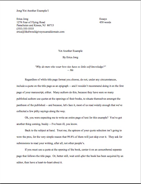
What standard format looks like, part IV: but published authors do it all the time!

For the last couple of weeks — all month, if I’m honest about it — I’ve been talking about how to format a manuscript professionally, and I’m beginning to fear that in my eagerness and vim, I may have scared some of you a little. My vehemence is kindly-motivated, I assure you: contrary to popular opinion amongst aspiring writers, how a submission is presented can indeed make a very great difference in how it’s received.

Yes, yes, I hear you, those of you who have been running around to writers’ conferences this season: you can hardly throw a piece of bread at an agent or editor’s forum without hitting a pro saying, “It all depends upon the writing.” They do indeed tend to spout this aphorism for a reason — it is in fact true.

But that doesn’t mean that the quality of the writing is the ONLY criterion agents, editors, contest judges, or any of the rest of us who read manuscripts for a living use when deciding whether to read beyond the first page of a submission. Professional presentation weighs in, as do marketability, a story’s probability of appealing to its target audience (not exactly the same thing), what happens to be the surprise bestseller of the moment — and yes, that whole slew of intangibles that make up personal taste.

There is, in short, no such thing as a foolproof formula for producing the perfect manuscript for submission.

As I’ve been arguing throughout this series on formatting, however, agents, editors, contest judges, screeners, and other professional readers develop an almost visceral sense of when a manuscript is properly formatted. So rather than screening submissions with a list of don’t by their sides, they more or less automatically discount pages that are cosmetically incorrect.

This is most emphatically not the same thing, though, as rejecting such pages on the spot because, say, an aspiring writer underlined a foreign-language word on page 1 instead of italicizing it.

Much as a reader with impeccable grammar will not necessarily throw down a book that misuses semicolons, most professional readers will not instantly reject an improperly-formatted submission without SOME further provocation. But believe me, the writer in both cases is going to have to work a whole lot harder to impress the reader as literate.

Unfortunately, the prevailing standards for printed books – which, as we have seen, differ in many significant respects from standard format for manuscripts – often lead innocent writers astray. Case in point: including a table of contents in a manuscript.

That seems as if it would be helpful, doesn’t it? In fiction, including it would enable an agent to go back and re-read the submission easily; in nonfiction, it would permit an editor to skip ahead to a chapter of particular interest.

And heck, if the manuscript fell upon the floor, a well-organized table of contents might make it a trifle easier to reassemble, right?

Wrong. To the pros, a table of contents, like an index, is a courtesy to bookstore browsers trying to get a feel for the contents and buyers who do not necessarily want to read the entire book. Why, runs the industry’s logic, would an agent or editor be interested in acquiring a book if he doesn’t like it well enough to read it all?

So really, a table of contents in a manuscript is just a wasted page. Do not include it in a submission, any more than you would include an index or those boxes around text that magazines are so fond of printing. To professional eyes, it looks unprofessional, especially in fiction.

It’s also an inconvenience – and it’s never a good idea to fritter away the energies of people you want to do you great big favors like representing your book, is it?

Why inconvenient? Well, think about our time-strapped friend Millicent the agency screener for a moment: when she turns over the title page, she expects to find the first page of text there waiting for her, all ready to be judged in a flash. Instead, she finds a table of contents, something she would only find helpful if she were to read the entire manuscript. Given that she tends to reject submissions somewhere between paragraph 1 and page 5, the information that Chapter 8 begins on page 112 will most likely strike her as at best gratuitous – and at worst presumptuous.

“What gives?” she’ll say, taking an extra sip of her too-hot latte as she impatiently gets the table of contents out of her way. “Doesn’t this writer know the difference between a manuscript and a book?”

‘Nuff said, I think.

Or maybe not — do I hear some aspiring nonfiction writers out there? “But Anne,” these excellent souls point out, “a book proposal is supposed to include a table of contents for the planned book!”

Ah, I’m glad that you brought this up, because this is a very common misconception amongst first-time proposers, who tend to cram precisely the table of contents they expect to see in their eventually-published books into their proposals. They look a little something like this:

Anyone out there see problems with this as a marketing document?

Actually, I’m sure that some of your hands shot into the air even before I showed this example, in your eagerness to take issue with the notion that a submission should resemble a published book in the first place. Well caught, eager wavers. Spot any other problems?

If you said that the example above doesn’t include information that could possibly be either accurate or useful, give yourself a gold star for the day. Obviously, it would be impossible for a proposer to state with certainty where the chapter breaks would fall in the proposed book when published; all the information s/he could reasonably offer in this sort of table of contents, then, would be educated guesses about how long each chapter might be. Or perhaps a list of where those breaks fall in the draft manuscript.

But that’s not the information nonfiction agents and editors want to see in the book proposal. The information they do want to see in the annotated table of contents is a brief description of the CONTENTS of each chapter.

The word annotated should have been a clue, I guess.

And like so many other differences between professional formating and, well, everything else they see in submissions, it’s really, really obvious at first glance to someone who has seen a book proposal before whether the submitter du jour has followed the rules. Compare what the first page of a correctly put-together annotated table of contents looks like with the truncated version above:

See the difference? I assure you, Millicent will. From ten paces away.

I don’t feel I may leave this topic without addressing the other EXTREMELY common opening-of-text decoration: epigraphs, those nifty little quotes from other sources that we writers so adore.

Nobody else likes them much, but we writers think they’re great, don’t we? There is something powerfully ritualistic about typing the words of a favorite author at the beginning of our manuscripts; it’s a way that we can not only show that we are literate, but that by writing a book, we are joining some pretty exalted company.

Feeling that way about the little dears, I truly hate to mention this, but here goes: it’s a waste of ink to include them in a submission. 99.9998% of the time, they will not be read at all.

Stop glaring at me that way; it’s not my fault.

It’s true, alas: I’ve literally never met a professional reader who doesn’t just skip ‘em in a first read — or (brace yourselves, italics-lovers) any other italicized paragraph or two at the very beginning of a manuscript. They just assume, often not entirely without justification, that if it’s in italics, it doesn’t really have much to do with the story at hand, which (they conclude, not always wrongly) begins with the first line of plain text.

There’s another reason that they tend to skip ‘em: the sad fact is, at the submission stage of the game, no one cares who a writer’s favorite authors are.

The official justification for this — yes, there is one — is quite interesting: even the busiest person at an agency or publishing house picks up a manuscript in order to read ITS author’s writing, not someone else’s.

Kinda hard to fault them for feeling that way, isn’t it, since we all want them to notice the individual brilliance of our respective work?

Sentiment aside, let’s look at what including an epigraph achieves on a practical level. Instead of startling Millicent with your erudition in picking such a great quote, the epigraph will to prompt her to start skimming BEFORE she gets to the first line of your text – AND you will have made her wonder agaub if you realized that manuscript format and book format are not the same.

Good idea? Or the worst marketing idea since New Coke?

If that all that hasn’t convinced you, try this on for size: while individual readers are free to transcribe extracts to their hearts’ contents, the issue of reproducing words published elsewhere is significantly more problematic for a publishing house. While imitation may be the sincerest form of flattery, reproduction of published text without the author’s permission is known in the biz by another, less flattering name: copyright infringement.

If the quote is from a book that is not in the public domain, the publisher will need to obtain explicit permission to use any quote longer than fifty words. Ditto for ANY quote from a song that isn’t in the public domain, even if it is just a line or two.

So effectively, most epigraphs in manuscripts are signposts shouting to an editor: “Here is extra work for you, buddy, if you buy this book! You’re welcome!”

I’m sensing some disgruntlement out there, amn’t I? “But Anne,” I hear some epigraph-huggers cry,
“the material I’m quoting at the opening of the book is absolutely vital to include! The book simply isn’t comprehensible without it!”

Okay, if you insist, I’ll run through the right and wrong ways to slip an epigraph into a manuscript — but bear in mind that I can’t promise that even the snazziest presentation will cajole Millicent into doing anything but skipping that quote you love so much. Agreed?

Regardless of while title page format you choose, do not, under any circumstances, include a quote on the title page as an epigraph — which is what submitters are most likely to do, alas. Let’s take a gander at what their title pages tend to look like:

How likely is Millicent to notice the quote at all? Well, this was what she was expecting to see:

Actually, that wasn’t precisely what she expected — did you catch the vital piece of information he left off his title page?

If you said that Eeyore neglected to include the book category on the second example, give yourself a pile of thistles. (Hey, that’s what he would have given you.) My point is, the quote in the first example is going to stand out to Millicent like the nail in a certain critter’s tail.

Other submitters choose to eschew the title page route in order to place an epigraph on the first page of text. The result is immensely cluttered, by anyone’s standards — especially if the submitter has made the very common mistake I mentioned in my discussion of title pages last time, omitting the title page altogether and cramming all of its information onto page 1:

Where did all of our lovely white space from yesterday and the day before go? Into quoting, partially.

The last popular but ill-advised way to include an introductory epigraph is to place it on a page all by itself, as it might appear in a published book:

What’s wrong with this, other than the fact that Poe died before our author wrote Sons and Lovers? Chant it with me now, everyone: A MANUSCRIPT IS NOT SUPPOSED TO RESEMBLE A PUBLISHED BOOK.

At best, Millicent is going to huffily turn past this page unread. At worst, she’s going to think, “Oh, no, not another writer who doesn’t know how to format a manuscript properly. I’ll bet that when I turn to page one, it’s going to be rife with terrible errors.”

Does either outcome sound desirable to you? I thought not.

So what SHOULD an epigraph-insistent submitter do? Leave it out, of course — weren’t you listening before?

But if it must be there, our pal Mssr. Poe actually wasn’t all that far off: all he really did wrong here was include a slug line. The best way to include an introductory epigraph is on an unnumbered page PRIOR to page 1. On that unnumbered page, it should begin 12 lines down and be centered.

But I’m not going to show you an example of that. Why? Because I really, truly don’t think you should be including an epigraph at all at the submission stage.

Just in case I hadn’t made that clear.

That doesn’t mean you should abandon the idea of epigraphs altogether, however. Squirrel all of those marvelous quotes away until after you’ve sold the book to a publisher — then wow your editor with your erudition and taste.

Or, if you can’t wait that long, land an agent first and wow her with your erudition and taste. But don’t be surprised if she strongly advises you to keep those quotation marks to yourself for the time being.

If you are submitting directly to a publisher, do be aware that most publishing houses now place the responsibility for obtaining the necessary rights squarely upon the author. If you include epigraphs, many editors at these houses will simply assume that you have ALREADY obtained permission to use them. Ditto with self-publishing presses.

This expectation covers, incidentally, quotes from song lyrics, regardless of length.

I’m quite serious about this. If you want to use a lyric from a song that is not yet in the public domain, it is generally the author’s responsibility to get permission to use it — and while for other writing, a quote of less than 50 consecutive words is considered fair use, ANY excerpt from an owned song usually requires specific permission, at least in North America. Contact the American Society of Composers, Authors, and Publishers (ASCAP) for assistance in making such requests. (For a very funny first-hand view of just what a nightmare this process can be, please see FAAB Joel Derfner’s guest post on the subject.)

Have I talked you out of including an epigraph yet? I hope so.

Remember, just because you do not include your cherished quotes in your submission does not mean that they cannot be in the book as it is ultimately published. Contrary to what 99% of aspiring writers believe, a manuscript is a DRAFT, not a finished work. In actuality, nothing in a manuscript is unchangeable until the book is actually printed — and folks in the industry make editing requests accordingly.

In other words, you can always negotiate with your editor after the book is sold about including epigraphs. After you have worked out the permissions issue, of course.

Keep up the good work!

What does standard format look like, anyway? Part II, or, ’tis a far, far better thing I do than I have ever done before

Hello, campers —

Still coughing up a storm on my end, so I’m going to keep today’s intro short, if not precisely sweet: here, for your comparing pleasure, are examples of properly-formatted title and first pages of manuscripts. Please take a good, hard look at ‘em, so you may gain a sense of just how obvious the differences are to Millicent (of whom more follows below) and her submission-scanning cronies.

Why am I showing both, rather than merely positive examples? Because until a writer has seen many, many professionally-formatted book manuscripts, he may not grasp how something as small and seemingly insignificant as a font choice might make a HUGE cosmetic difference. What may seem like a miniscule deviation from standard format to you honestly will leap off the page at Millicent.

Allow me to repeat that, because it’s important: because professional book manuscripts all look the same way, Millicent is not going to have to strain at all to pick up on ways in which the submission in front of her differs. She can spot formatting problems from several paces away.

Don’t believe me? Read on.

Yesterday, I began a compare-and-contrast exercise, showing common examples of the first pages of submissions and fine-tuning your binoculars so you might see how our old friend Millicent the Agency Screener might view them. As I sincerely hope those of you who read the post can attest, it was pretty obvious that the professionally-formatted title page won the beauty contest hands-down.

Yet after I posted it late last night, I heard wee pixie voices bearding me. “But Anne,” I heard these winsome creatures pipe, “aren’t you assuming that Millicent’s pretty shallow? Whenever I’ve heard agents and editors asked at conferences or on their websites about whether cosmetic issues can get a manuscript rejected, they always disclaim the notion with scorn. Isn’t it the writing that matters, ultimately?”

Well, yes and no, querying sprites. Naturally, the writing matters MOST — but it is not, as many aspiring writers assume, the ONLY issue in how a professional reader will perceive the polish of a manuscript.

It is, however, generally the one that colors a first reading most. Although one does hear of cases where a kind, literature-loving agent has looked past bizarre formatting in order to see a potential client’s, well, potential, one also hears of isolated cases where a manuscript rife with spelling and grammatical errors gets picked up, or one that has relatively little chance of selling well in the current market. The age of miracles has not entirely passed.

But — and this is a BIG but — these cases are talked about because they are exceptions, and rare ones at that. 999 times out of 1000, any of these problems will result in, if not instantaneous rejection, then rejection upon Millicent’s lighting upon the next manuscript problem.

So why don’t aspiring writers hear that more often at conferences?

I suspect that’s not just because a sane, sensible individual with a reputation to protect is unlikely to stand up in front of 500 eager potential submitters and say, “Look, if you’re planning to submit a grimy photocopy of your book, or insist upon presenting it in 10-point type, or not indenting your paragraphs, just don’t bother to query me.” Instantly, 500 pens would scrawl on 500 programs, DO NOT QUERY THIS ONE; SHE’S MEAN.

Which would rather defeat the agent’s purpose in coming to the conference to recruit new clients, wouldn’t it?

There’s another reason that they tend be careful: an agent or editor doesn’t have to speak at many conferences (or blog for very long) before recognizing that anything they about submissions is likely to be repeated with the éclat of a proverb for years to come amongst the writing community. I’ve heard offhand comments made from the dais, or even jokes, being debated for hours in conference hallways, and some of Miss Snark’s pronouncements have been more commented upon than St. Paul’s second letter to the Corinthians.

Okay, so that last is a slight exaggeration. My point is, such speakers are in extreme danger of having everything they say quoted back to them as an inflexible rule.

Which is why, I have to say, I don’t feel too many qualms about presenting the rules of standard format as inflexible rules. We are talking, after all, about an industry that both values creativity and considers submitting a book proposal in anything but a black folder dangerously radical.

Presentation issues definitely do matter — which is, again, not to say that the quality of the writing doesn’t. But — and this is a BIG but — rejection decisions are often made on page 1 of a manuscript. Sometimes even within the course of the first paragraph. If the manuscript is hard to read, due to a funky typeface or odd spacing or just plain poor print quality, it may not be read at all.

While these facts are indisputable, the person who announced them this baldly from the dais at a literary conference would be covered head to foot with flung tomatoes in twenty seconds flat.

Again, to the eye of someone who reads manuscripts for a living, professional formatting is simply the least distracting way a book can possibly be presented. Perversely, adhering to the industry’s cosmetic expectations renders it MORE likely that an agent or editor will concentrate upon the beauty of the writing, not less.

So instead of thinking of the rigors of standard format as a series of unimportant (or even silly) superficial choices, try regarding them as translating your calling card, a means of catching Millicent’s tired eye and informing her that this is a manuscript that should be taken seriously.

Because she can’t fall in love with your good writing until she reads it, can she?

Last time, I showed how the first page of text does not, from a professional perspective, make an adequate substitute for a title page. Instead of being a replica of a hoped-for book cover, as many submitters produce, or a shouted-out declaration of the book’s title and who wrote it, the properly-formatted title page is a quiet, practical piece of paper, containing a specific set of marketing information. It should look, in case you missed it, like this:

Like everything else in the manuscript, the title page should be entirely in 12-point type, unless an agent or contest SPECIFICALLY requests otherwise. I’m quite serious about this. No matter how cool your title page looks with 24-point type, resist the urge, because Millicent will be able to tell from across the room if you didn’t:

Take a look at the first example again, then the second. Notice any other dissimilarities?

If you said that Mssr. Smith’s title page included both a slug line (the author’s name and title in the upper right margin of the page) and a page number in the bottom right corner, give yourself a gold star for the day. Add whipped cream and walnut clusters if you mentally added the reason that those additions are incorrect: because the title page is not the first page of text. Technically, it should not be numbered.

This means, incidentally, that the title page should not be counted as one of the 50 pages in those 50 pages the agent of your dreams asked you to submit, either. Nor would it count toward the total number of pages for a contest entry.

On both the title page and elsewhere, I would highly recommend using either Times, Times New Roman, or Courier typefaces, both here and in the manuscript as well, as these are the standards of the industry.

I know, I know: another cosmetic weirdness. But like some of the other strictures of standard format, there’s a pretty good reason for this one: word count estimation is predicated upon these typefaces. The Times family is estimated at 250 words/page; Courier at 200. So a 400-page manuscript in Times New Roman is assumed to be roughly 100,000 words. (To make the math clear, 400 x 250 = 100,000; for further explanation, please see the WORD COUNT category on this list at right.)

Now, in actual fact, it’s probably closer to 115,000 words; as any writer who has compared the estimated word count for her book with the total her word processing program provides, they tend to differ wildly. But word count, like beauty, is in the eye of the beholder: a novelist whose title page reported, accurately, that her 400–age novel was 115,000 words might well see it rejected out of hand on the grounds that it was too long.

Why? Well, math may not have been Millicent’s best subject (the inmates of agencies were overwhelmingly English majors), but she can do third-grade math in her head: 115,000 words at 250 words/page would equal a 460-page manuscript.

That’s quite a bit longer than editors tend to expect first novels in most genres to be. In other words, next!

“But Anne,” I hear you cry, “why is Millicent estimating at all? If she wants to know how long it is, why doesn’t she just flip to the last page and check the page number?”

I could give you a long song and dance about how much her wrists hurt from opening all those query envelopes all day, or how her secret midnight e-mail orgies have rendered pinching a torture, but in practice, the answer is far less personal: because the industry doesn’t work that way.

Also, how exactly could she manage to turn to page 400 of a manuscript, when her boss requested that the writer send only the first 50?

Let’s turn to the first page of the submission, to see how much of a difference font and typeface make at first glance. Here’s a correctly-formatted page 1 in Times New Roman:

Pretty spiffy, eh? And definitely not how this opening would appear in a published book, right?

Just for giggles, let’s take a peek at the same page, also correctly formatted, in Courier. Note how many fewer words per page it allows:

Got both of those firmly imbedded in your brainpan? Good. Now format your first pages that way for the rest of your natural life.

Well, my work here is obviously done.

Okay, okay — you want to see why it’s a good idea, don’t you. Take a gander at the SAME first page, not in standard manuscript format. See how many differences you can spot:

Interesting how just a few small formatting changes can alter the presentation, isn’t it? It’s exactly the same WRITING — but it just doesn’t look as professional.

To Millicent, who reads hundreds of pages per day, the differences between the three could not be clearer.

And yet, if we’re going to be honest about it, there were really very few deviations from standard format in the last example. For those of you playing at home, the typeface is Georgia; the chapter title is in the wrong place, and there isn’t a slug line. Also, the page is numbered in the wrong place — the default setting, incidentally, in many word processing programs.

Again, none of these infractions against the rules of standard format are serious enough to cause Millicent to toss a submission aside as soon as she notices them. But when poor formatting is combined with literary experimentation — like, say, that paragraph-long first sentence ol’ Charles managed to cough up — which do you think she is going to conclude, that Dickens is a writer who took the time to polish his craft, or that he just doesn’t know what he’s doing?

Yup. Don’t tempt her to draw the wrong conclusion.

Of course, there is the occasional exception — if you answered that it all depends upon whether Millicent reading it before Dickens is a household name or after, give yourself a gold star for the day. Unless you happen to be famous, I wouldn’t advise taking the risk.

And that, my friends, is why you should pay attention to the little details. The longer you remain in the business, the more those little things will strike you as just, well, matters of right and wrong. As, fortunately or not, they do Millicent and her ilk.

More show-and-tell follows tomorrow. Keep up the good work!

So what does standard format look like, anyway?

Hello, campers –

Has everyone recovered from this weekend’s inoculation of professional formatting? It may have left a bit of a sore place, but much better a quick sting than engendering years of rejection without knowing why, I always say. Once you’ve gotten exposed to the correct way to format a book manuscript, chances are that you’ll be immune to formatting problems in the future.

In fact, once you get used to how a professional manuscript looks, any other formatting is going to look downright strange to you.

Stop laughing — I’m quite serious about this. And to prove it to you, I’m going to spend the next few days re-running a series of posts designed to let you see precisely HOW different standard format appears to the pros.

The usual caveats: if the agent of your dreams (or the agent with whom you are currently signed, if they don’t happen to be the same person) has expressed a strong preference for his clients formatting in a manner opposed to what you see here, run with that — but only for submission to that particular agent. Yes, deviations from this format are uncommon, but you’re not going to get anywhere telling an established agent that no one else’s clients are using 18-point Copperplate Gothic Bold, I assure you, and part of working with an agent entails trusting that he knows more about marketing books than you do.

If he doesn’t, you wouldn’t WANT to be working with him, right?

And before my last statement sends anyone out there into that time-honored I’ve-just-signed-but-what-if-I-chose-the-wrong-one? panic, remember this: if you’ve done your homework before you signed, and thus are certain that he has a solid recent track record selling books in your category, you have every reason to have faith in your representative.

The other caveat — and it’s a big one — is that the format I am showing here is for BOOK manuscripts, not articles or short stories. All too often, advice-givers to aspiring writers will conflate the format for one with the other, resulting in a first page that will look incorrect to either. (Although, generally speaking, such guidelines tend to stick closer to the short story format than to the book.)

Let’s hear it for visual aids! Enjoy!
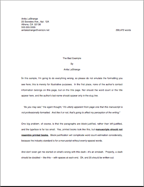
As you may have noticed, I’ve been quiet for the last few days, having recently returned from giving a completely different talk: a species of my favorite class to teach to writers, a blow-by-blow on how VERY different a professional manuscript looks from, well, any other stack of paper an agent or editor might receive in the mail. I love teaching it.

Admittedly, it’s a trifle depressing to watch the inevitable cloud of gloom descend upon my students as they begin to realize just how many small mistakes there are that can result in a manuscript’s getting rejected — but it’s a pure joy to watch those brows unfurrow and those shoulders unclench as their owners learn that there is something they can DO about improving their books’ chances of success.

Over the next few days, I am going to attempt a similar trick at a distance and, like the Flying Wallendas, without a safety net. Drum roll, please: in the spirit of that old chestnut, SHOW, DON’T TELL, I shall demonstrate just how different a manuscript that follows the rules looks from one that doesn’t.

Hold on tight.

Writers often overlook odd formatting as a reason that a manuscript might have been rejected. Certainly, other reasons get a lot more airplay, particularly at writers’ conferences. If you want to take a long, hard look at some of the better-discussed reasons, I would urge you to gird your loins and plunge into the FIRST PAGES AGENTS DISLIKE category at right. For those of you who missed it, last autumn, I went over list of instant-response rejection reasons given by a group of agents going over a stack of actual submissions at a conference, one by painful one.

Yet surprisingly little conference time seems to be devoted to the most common mistakes of them all, deviations from standard format for manuscripts.

Not to be confused with what is correct for published books.

In answer to all of the cries of “Huh?” that elicited from readers new to this site, a professional manuscript SHOULD differ from the published version of the same book in a number of subtle but important ways. All too few aspiring writers realize this, a fact that is unfortunately quite obvious to an agent, editor, contest judge, etc., from practically the moment their eyes light upon a submission.

Why is it so very apparent? Because much of the time, writers new to the business clearly go out of their way to format their submissions to resemble published books, in the mistaken belief that this will make their work seem more professional.

The opposite is generally true — and often, it’s apparent in a professional reader’s first glance at the first page of a submission.

(If the implications of that last assertion made you dizzy — if, for instance, you found yourself picturing our old pal Millicent the agency screener pulling a submitted manuscript out of its envelope, casting a critical eye over the first page, hooting, and stuffing the whole thing into the handy SASE — try placing your head between your knees and breathing deeply. I’ll wait until you recover.)

And then follow up with a hard truth: the VAST majority of submissions are rejected not only on page 1, but within the first few lines of page 1. Clearly, Millicent arrives at her conclusions rather quickly.

How can she? Because, unfortunately, aspiring writers so often render rejection very, very easy by submitting manuscripts that simply scream out, “Here’s someone who would benefit from a better knowledge of how publishing works.”

The most common initial signal is the absence of any title page whatsoever. Many submitters, for reasons best known to themselves, omit the title page altogether — often, I suspect, because they are unaware that a professional book-length manuscript ALWAYS has a title page.

For one very, very simple reason: a properly-formatted title page tells an agent PRECISELY how to contact the brilliant author who wrote it — and tells an editor PRECISELY how to contact the agent who represents her. But of that, more below.

To set your minds at ease, forgetting to include a title page almost certainly won’t prevent Millicent from reading your submission at all; she tends to read even the most bizarrely-formatted submissions for at least a line or two. But that initial impression of an author’s lack of professionalism — or, to call it by a kinder name, of having a lot to learn about how the publishing industry works — does often translate into a rather jaundiced reading eye for what comes next.

Why? Well, let’s take a peek through her reading glasses, shall we? The first thing Millicent sees when she opens the average requested materials package is something like this:

Or like this:

Or, heaven help us, like this:

So tell me: why might Millicent take one look at these and conclude that their respective submitters could use a good class on manuscript formatting?

I see all of you long-term blog readers out there with your hands in the air, jumping up and down, eager to tell everyone what’s wrong with this as a first page of text — and you’re absolutely right, of course. We’re going to be talking about precisely those points in the days to come.

For now, however, I want you to concentrate upon how this example has failed as both a title page and a first page of text: by not including the information that Millicent would expect to see on either.

What makes me so sure she would find this discovery, at best, disappointing? Because what she (or her boss agent, or an editor, or a contest judge) would have expected to see on top of that pile of paper was this:

This is a standard manuscript title page for the same book — rather different, isn’t it? Visibly different, in fact, from several paces away, even if Millicent isn’t wearing her reading glasses.

Again, submitting the first example rather than the second would not necessarily be instantly and automatically fatal to a manuscript’s chances, of course. Most of the time, Millicent will go ahead and plunge into that first paragraph of text anyway.

However, human nature and her blistering reading schedule being what they are (for those of you new to this screener’s always-rushed ways, she has a stack of manuscripts up to her chin to screen — and that’s at the end of a long day of screening queries; manuscript submission is in addition to that), if she has already decided that a submission is flawed, just how charitable an eye do you think she is likely to cast upon the NEXT problem on the page?

Uh-huh. To use her favorite word: next!

To be fair to Millicent, while it may well be uncharitable of her to leap to the conclusion that Faux Pas’ or Ridiculous’ manuscript is likely to be unpolished because they did not include a proper title page, agencies do have a vested interest in signing writers who present themselves professionally. For one thing, they’re cheaper to represent, in practical terms: the agent doesn’t have to spend as much time working with them, getting their manuscripts ready to submit to editors.

And no agent in his right mind would send out a manuscript that didn’t include a standard title page. It serves a number of important — nay, vital — marketing functions.

Let’s take another look at the professional version, shall we? So you don’t have to keep scrolling up and down the page, here it is again:

How is this sheet of paper a better piece of marketing material than Faux Pas or Ridiculous’ first page?

Well, right off the bat, it tells a prospective agent or editor what kind of book it is, as well as its approximate length. (If you do not know how to estimate the number of words in a manuscript, or why you should use an estimate rather than relying upon your word processor’s count, please see the WORD COUNT category at right.) Both of these are pieces of information that will tell Millicent instantly whether the submission in her hand would meet the requirements of the editors to whom her agency tends to sell.

For instance, if her boss had decided not to represent Action/Adventure anymore, or if editors at the major houses had started saying that they were only interested in seeing Action/Adventure books longer than 90,000 words, Rightly Stepped would be out of luck.

But then, being a savvy submitter, ol’ Rightly would also want his work to be represented by an agent who just ADORES very long Action/Adventure novels — and regularly goes to lunch with scads and scads of editors who feel precisely the same way, right?

The standard title page also tells Millicent precisely how to contact the author to offer representation — and that’s a very, very good thing for everyone concerned. If I’ve said it once, I’ve said it a thousand times: it’s ALWAYS in an aspiring writer’s interest to make it easy for an agent to help her.

I might be wrong, of course, but I suspect that NOT forcing Millicent to forage through the mountain of paper on her desk to find a misplaced cover letter with your phone number on it MIGHT be a good start.

By contrast, Faux Pas’ first page doesn’t really do anything but announce the title of the book and leap right into the story. That’s one underachieving piece of paper.

Some writers attempt to consolidate the proper functions of the title page and first page of text into a single sheet of paper. This format is particularly common for contest entries, for some reason. Let’s take another look at Ridiculous and Faux Pas’ submissions:


While such a top page does indeed include the requisite information Millicent or her boss would need to contact the author (although Faux Pas’ does it better, by including more means of contact), cramming it onto the first page of text doesn’t really achieve anything but saving a piece of paper. It doesn’t even shorten the manuscript or contest entry, technically speaking: the title page is never included in a page count; that’s why pagination begins on the first page of text.

I shall go into what DOES belong on the first page of text tomorrow, with accompanying visual aids. For today, let’s keep it simple: all I ask is that you would look at the proper title and the unprofessional examples side by side.

Got all of those images firmly in your mind? Good. Now weigh the probability that someone who reads as many manuscripts per day as Millicent — or her boss, or the editor to whom her boss likes to sell books — would NOT notice a fairly substantial difference in the presentation. Assess the probability of that perception’s coloring any subsequent reading of the manuscript in question.

Kind of obvious, once you know the difference, isn’t it?

Before I sign off for today, and while you’ve got R.Q. Snafu’ sexample still in the front of your mind, let me briefly address the still surprisingly common writerly belief that the industry will automatically take a submission by a woman more seriously if the author submits it under her initials, rather than under her given first name. J.K. Rowling aside, this just isn’t true, at least in fiction circles.

So unless you have always hated your parents for christening you Susan, you won’t really gain anything professionally by using initials in your nom de plume instead. And even if you did, why not publish under a name you actually like instead?

That’ll show your Susan-loving parents.

I just ruffled a few feathers out there, didn’t I? “But Anne,” I hear an initialed purist exclaim, “I don’t want to be judged as a FEMALE writer — I want to be judged as a WRITER. What’s wrong with removing gender markers altogether?”

Well, there’s nothing wrong with it per se, Susan, except that these days, it almost invariably results in Millicent’s seeing such initials and thinking, “Oh, this is a female writer who doesn’t want to be identified as one,” rather than “Gee, I wonder who this mystery person without a first name is. I’m just going to leap right into this manuscript with no gender-based expectations at all.”

Why will Millie have this reaction, you ask? Because female writers — and only female writers — have been submitting this way for a couple of hundred years now. It’s not all that hard a code to crack.

Also, it’s logic that historically, male authors have virtually never used — except, of course, that hugely prolific and apparently immortal author, Anonymous. Even during periods when the most popular and respected novelists have been women (and there have been quite a few in the history of English prose, contrary to what your high school English textbook probably implied), when someone named Stanley Smith wrote a novel, the title page has generally said so.

Because, you see, even back then, readers would have assumed S. Smith the novelist was a nice lady named Susan.

Something else for initial-favoring fiction writers to consider: in North America, women buy the overwhelming majority of novels — and not just women’s fiction, either. Literary fiction readers (and agents, and editors) tend to have two X chromosomes — and some of them have been known to prefer reading books by Susans rather than Roberts. I just mention.

All that being said, the choice to initial or not is entirely up to you — or, more accurately, to you and your agent. Some sets of initials look cool in print, just as some names look better than others on book jackets. Or so claimed my father, the intrepid fellow who demanded that the maternity ward nurse convey him to a typewriter to see how my name looked in print before committing to filling out my birth certificate. (And yes, for those of you who have wondered Anne Mini IS in fact my given name; it just happens to look great in print, thanks to a little forethought.)

Keep up the good work!