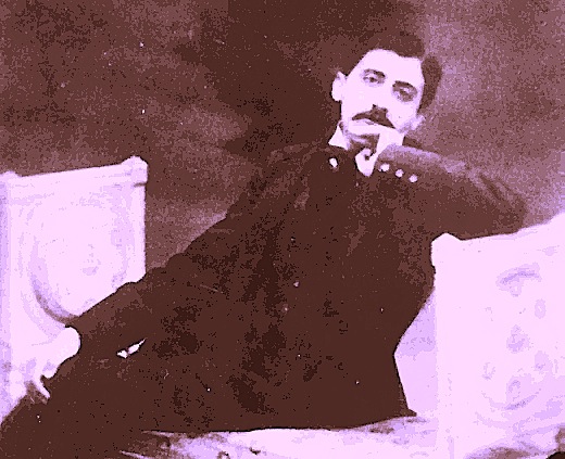
I begin with some exciting news today, campers: remember how, back in the heady days of Querypalooza, some readers just couldn’t get enough of my concrete examples? “We want more of your patented prototypes,” they clamored. “Specifically, I would like one for an imaginary book not only in my chosen book category, but so close to mine that I could just copy borrow freely use it to inform how I constructed mine. Better yet, why don’t I just send you mine, and you could deconstruct it on the blog, so I might learn how to improve it?”
Actually, those examples were copyrighted, but that’s a quibble. As those of you who followed that quite lengthy series may recall, I am no fan of boilerplate queries: I am a tireless advocate of every good aspiring writer’s constructing his own. Yet while I am always overjoyed to help readers deal with their query-writing difficulties at a theoretical level, so everyone who cares to read along might benefit, I have historically (5 years of history, anyway) been reluctant to have readers just submit their queries for public critique. When I first began blogging, Miss Snark was in her heyday, and while my critique style is certainly kinder and gentler than hers — as, I believe, was Attila the Hun’s — it seemed redundant to offer similar query evaluations here.
I did hear all of that clamoring, however. That’s why I am delighted to report that I shall be performing live query critique at the always-lively Words & Music conference, November 17-21 in New Orleans. So I invite all of you to pack up your queries in your old kit bag and join me there.
I ply my analytical and teaching skills at many a conference across this great land of ours, but Words & Music has been near and dear to my heart for many years. Run by the Pirate’s Alley Faulkner Society, the conference is more ambitious than your usual craft-and-marketing fest. Yes, there is always abundant discussion of craft and marketing, along with opportunities to meet agents and editors, but there are also wonderfully arty discussions of literature, art, and music within larger contexts — this year, the offerings include a whole sub-series entitled The Literature of War and Collateral Damage.
And did I mention that it all takes place smack dab in the middle of the French Quarter, home to some of the best food and jazz in the world? Rather than withdrawing from the surrounding community, as most conferences do, the Words & Music folks embrace it, holding literary lunches at fine local restaurants, staging poetry readings in art galleries, and even hosting concerts and film events. I always return from Words and Music feeling replete and benevolent, humming with fresh ideas from good conversations with genuinely interesting writers.
Is it quirkier than most writers’ conferences? Well, let me put it this way: Marcel Proust would have felt at home there.
All right, back to the business at hand. Ever since my last post, I could have sworn I heard the muffled cries of my readers from afar, small as the mews of freshly-born kittens. “But Anne,” these wee voices called after me, “you didn’t tell us how to format an author bio…and you ALWAYS tell us how to format things…things…echo…echo…echo…”
At least, I think that’s what they were saying; wafting ghostly voices are notoriously inarticulate. It’s also possible that they were merely reading Proust’s À La Recherche du Temps Perdu as we like to do here at Author! Author!, IN ITS ENTIRETY, IN HARD COPY, and OUT LOUD.
That’s my readership: so devoted to learning the ropes of the writing and publishing biz that its members remembered that no savvy querier should send out an author bio — or, indeed, any other part of a query or submission packet — without proofing it à la Author! Author! Even with a document as short as a bio (typically in the neighborhood of 250 words, although one does sometimes receive requests for bios as short as 100 or even 50), it’s simply too easy to miss a typo or missed word when proofing on a backlit screen.
How glad I am not to have to repeat that. Let’s talk formatting — or, if we want to start from the bird’s-eye level and work our way down to Millicent the agency screener’s typical level of scrutiny, placement in the query or submission packet.
That’s an easy one: it should always come last. In a novel or memoir submission, the author bio should be placed at the end of the pages you’re submitting, regardless of whether you have been asked to send a full or a partial manuscript. Ditto with a book proposal: it should come just after the final page of the sample chapter. (If you are including clippings, they should follow the bio, but often, the author bio is the last page in the packet.)
On to formatting. The author bio should always be in the same typeface and font as the rest of the manuscript or book proposal. No exceptions, regardless of how much you like that fancy script that looks like a signature. Times New Roman or Courier are what Millicent will expect to see. (If you’re unfamiliar with the typefaces the publishing industry tends to prefer, or even that such preferences exist, you might want to consider consulting the STANDARD FORMAT ILLUSTRATED category on the list at right with all deliberate speed.)
The bio should never be more than a single page — unless, of course, the agent of your dreams asks for something longer, in which case give it to her, for heaven’s sake. It should neither be numbered nor include a slug line.
UNLESS it is part of a book proposal, that is. If it is the last page of a proposal, the bio should contain the same slug line as the rest of the proposal, continuing its numbering.
Everyone clear on that? No? Okay, let’s take a gander at a couple of my famous concrete examples. While an author bio tucked into a query packet or attached to the end of a requested manuscript might look like this:
Obviously, this header would not be appropriate in a book proposal. Instead, it would appear thus:
“But Anne,” I hear some of you eagle-eyed readers pipe up in that winsome way of yours, “I couldn’t help but notice another subtle difference between these two pages. Is it me, or does the first have an author photo while the second does not?”
Ah, there’s no slipping anything past you, readers. Apart from the proposal/non-proposal slug difference, there are two acceptable formats for an author bio.
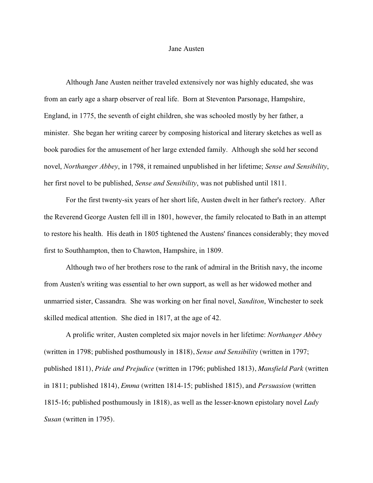
The second example above is the more common: a single page, double-spaced, in standard manuscript format. (If that last term was a mystery to you, I can only reiterate my suggestion that you visit the STANDARD FORMAT ILLUSTRATED category on the list at right. Improperly-formatted manuscripts are far, far more likely to be rejected than ones that look professional. Trust me on that one.)
As you no doubt already noted in Proust #2, the author’s name should be centered on the top of the page. Let’s see that again with a bio that actually might serve as role model for content, shall we? (As always, if you are having trouble reading these, try holding down the COMMAND key while striking the + key to enlarge the image.)
Some literal souls (the type who would vastly prefer the non-Shakespearean translation of the title of Proust’s masterwork, no doubt) would argue that the text should be additionally decorated by either the first line of the page or the first line under the author’s name reading — wait for it — Author Bio.
Not a startlingly original title, it’s true, but you must admit that it’s descriptive.
This used to be fairly common, but I do not advise embracing this tactic, for the simple reason that a significant and apparently growing segment of the agent population now seems to prefer that their clients dispense with this little piece of self-evident labeling. Or so I surmise, from all of the agented writers I keep meeting whose agents have more or less ordered them to skip it. Most bio-writers are only too glad to omit it, as it permits an extra line of text in what is, let’s face it, a rather brief space into which to cram one’s charms.
Personally, I use the other type of bio format, the kind that includes a photo: half a page, single-spaced, with a 4×6 photograph (or a roughly similar size; perfection doesn’t matter here) centered 1 inch from the top of the page, above the text. In between the photo and the text, the author’s name appears, also centered.
I can feel some of you stressing out about the size of the photo, but relax: Millicent is not going to attack your bio with a ruler. This is one of the few situations in the publishing world where close enough really is good enough.
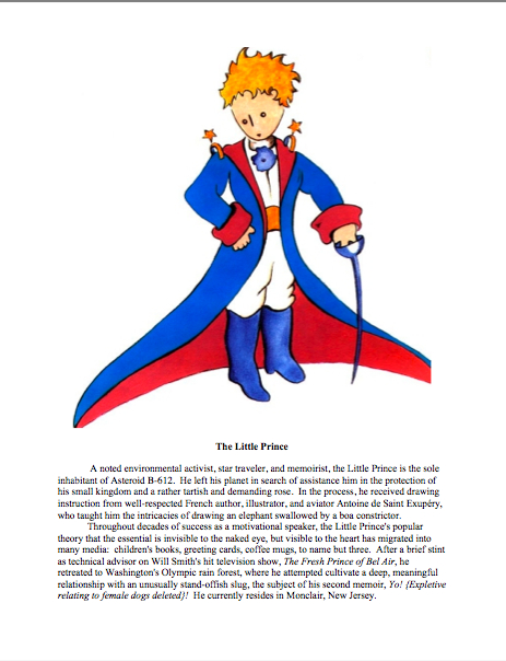
Thus, while Proust’s mug in the first example is a trifle on the small side by current author photo standards, it would be perfectly acceptable. So would an error in the other direction, as in this bio by the hero of Antoine de Saint Exupéry’s Le Petit Prince. (Hey, I’m on a French kick today.)
Admittedly, the LP’s picture is a trifle larger in this example than I would advise using — ideally, the photo should take up between a third and half of the page, and here, LP has opted to allow the visuals to extend considerably lower, as some less animated authors also choose to do. It’s a legitimate choice, certainly, but anybody out there notice the down side?
If you said, “By gum, that looks a whole lot like 157 words, rather than the 250 or so I was hoping to include on my bio,” give yourself a gold star for the day. Heck, give yourself two; they’re small.
Want to see a photo-including one that’s roughly the same length as Aunt Jane’s example above? While we’re at it, let’s assume that it’s the last page of a book proposal, so you may see the requisite slug line in action again:
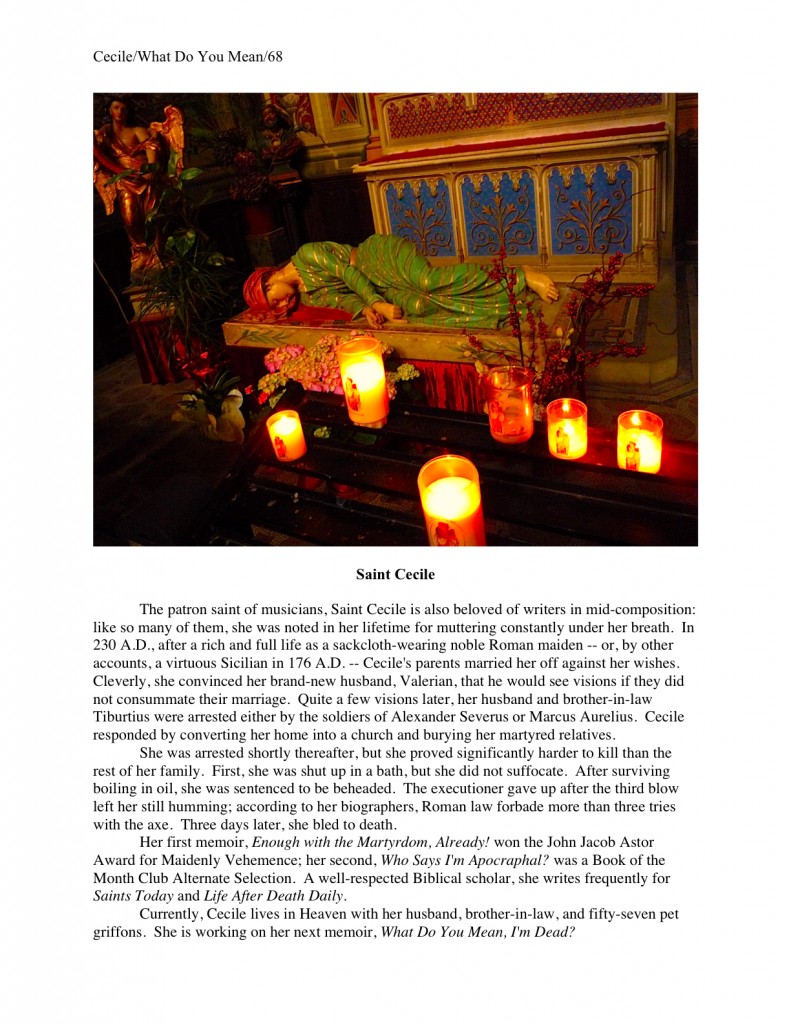
A pretty great photo for establishing Cecile’s credibility to tell her particular story, isn’t it? Not a whole lot of doubt that we’ve got a virgin martyr here. Yet this picture suffers from a rather serious problem that the Little Prince’s did not — any guesses?
If you said that you couldn’t make out Cecile’s face well enough to pick her out of a crowd — or, more to the point, to be able to pick her out of a crowd at an airport in order to get her to her book signing on time — award yourself a medal. The author is easily recognizable in a good author photo, so avoid shots from thirty feet away. Your face should be clearly visible.
Cecile would be much better off with this bio, even at the expense of a little textual rearrangement to make it fit:
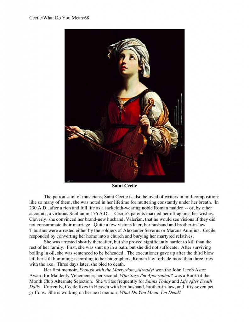
The different photo shape is fine here — what’s important in this context is that the picture is recognizably Cecile. Why? Not only will this help her future agent pick her out of a police line-up recognize her when they meet at writers’ conferences, but Cecile’s future publishers are going to want to see what she looks like; photogenic authors are only slightly more common than telegenic ones.
So how do you slap that image onto your bio? The same way I did to produce these examples — and the only way, if you intend to e-mail your bio without first running the hard copy through a scanner. Get a friend with a digital camera take a picture that you like, save it to your hard disk, then use copy and paste the image into your author bio document.
If this sounds like far, far too close an intimacy with technology for you, take the photo to a copy center and ask the nice folks behind the counter to arrange a color copy so that the picture and the text are on the same page, so you may pop it into your query or submission packet. For a small fee, they will probably be delighted to produce a stack of snail mail-able hard copies for you.
At the risk of repeating myself, do NOT wait until you need an author photo to have your picture taken. Many, many aspiring writers hold off, assuming (usually wrongly) that their future publishing houses will take care of — and pay for — this detail for them. A last-minute scramble to blandish a talented friend with a camera ensues.
As a direct result, these well-meaning souls almost invariably end up unhappy with the author photos on their respective dust jackets. Or with snapshots taken from thirty feet away. In any case, the results seldom make anyone concerned, even the author, squeal with delight.
Why, the camera-shy gasp? Well, it often takes many tries to obtain a photograph that you like enough to want to see mass-produced — or one that will look good in the school photo-size viable for most book jackets. It’s a bit easier now than it was prior to digital photography, of course; now, even an amateur can afford to take 500 snapshots in an endeavor to find the perfect pose.
Yet when dear self is making the decision — and when a poor choice is going to haunt one for the rest of one’s literary life, smirking back at one from jackets, websites, the publishers’ catalogue, and, if you’re lucky, next to you at a packed signing in a major bookstore — believe me, dear self is going to want some time to equivocate.
Seriously, published authors wrestle with this one all the time. That’s one reason that you don’t always recognize your favorite authors at book signings; established authors’ photos are often a decade or more out of date. It’s not merely out of vanity, in order to appear more youthful to their readers (although I could name some names here), but because the photo-selecting process can be tedious and expensive.
Another excellent reason not to leave the construction of your author bio to the last minute, eh?
I’ve been sensing some tentative hand-raising for several paragraphs now. “Um, Anne,” some of you pipe up, “could you explain a bit more about why the reasoning about the publisher’s taking care of the photo is wrong? I always thought they just kept a bunch of professional photographers on staff to handle this sort of thing.”
Oh, honey, no: publishers that have been laying off editorial assistants who worked for the proverbial peanuts seldom have the budget to keep professional photographers on staff. In fact, few publishers ever did. Posed, studio-taken photographs used to be more common on book jackets than they are today, but even those earlier photos were usually not produced in-house. At best, a publisher in the bad old days might cough up the dosh to have a pro snap some pictures, which made perfect sense: since this photo is usually also reproduced in the publisher’s catalogue, too, they were the clear beneficiaries.
But in recent years, that practice has become rare, especially for first-time authors. So guess who usually ends up paying for the professional photos you do see?
Uh-huh.
I speak with aspiring writers all the time who are shocked — shocked! — to learn that the author is responsible for obtaining the photograph that graces the dust jacket. Now, the author’s photo is often posted on his website as well, but chances are that that the publisher is still not going to pay anyone to take a picture of you until you are very well established indeed.
Yes, you’re right: this is yet another expense that the publishing world has shifted onto writers, along with quite a bit of book promotion, website construction, and, in some cases, copyediting. Sorry. But if you get your talented friends snapping now, you might just end up with a stellar photo you love at a fraction of the cost of a professional shoot by the time you need it.
I just mention.
All of this, of course, begs the question: even that it can be expensive in terms of both time and money to come up with a photo to accompany your author bio, is it really worth your while to use format #2? As is so often the case with strategic decisions, be they literary, military, or just plain office politics, the answer is: it depends.
If you happen to be outstandingly attractive, yes, it is pretty much always going to be worth your while — and not just because Millicent is shallow. (She isn’t, typically.) These days, the marketing departments at publishing houses actually do want to know if an author is photogenic — and telegenic — if a book is expected to be a big seller.
If you tend to find potential agents and editors by accosting them at conferences and/or classes, it is worth your while to shell out for the small additional expense of producing an author bio with a photo of you on it to stuff into your post-conference submission packets. The reason for this is simple: it makes it easier for agents and editors to remember having spoken to you.
Not in a “My, but that’s an attractive writer!” sort of way, but in a “Hey, I have a distinct recollection of having had a rather pleasant conversation a month ago with that person” manner.
Please do not take the fact that a nudge to the memory is sometimes necessary as a reflection upon either your book’s market chances, the quality of your writing, or your inherent memorability as a human being. The average agent speaks to somewhere between 50 and 200 eager writers at a conference. The chances of his remembering your name in retrospect are rather low, even if you and your book are genuinely scintillating.
This can be true, perversely, even if the agent in question appeared to be foaming at the mouth with greed when you pitched your project. Post-pitch enthusiasm has a nasty habit of fading on the way back to NYC; it must have something to do with the coffee served on the flight back.
Again, sorry. Let’s get back to practicalities.
It is less important to look pretty in your author photo than to look interesting, generally speaking — and here, the standard posed, gently-smiling-under-indirect-light professional shot may actually work against you. So unless your book’s subject matter is very serious indeed, try not to make your bio picture look like a standard, posed publicity shot.
Why? For the same reason that when you flip back through your yearbook, half of the senior pictures seem more or less interchangeable: just looking nice tends not to be memorable.
You may laugh, but it is amazing how many author photos look like senior class pictures, devoid of personality. Don’t believe me? Okay, which has more character, the shot at the top of this post or Proust’s static head shot on our first example?
The moral: try to not to look as though you were voted Most Likely to Write a Book.
But unless you are writing something pretty sizzling, you might not want to look as though you were voted Most Likely to Grace a Street Corner, either, if you catch my drift. Glamour shots became kind of popular in the mid-1990s, especially for female authors, but at this point, lenses that seem to have been bedewed with Vaseline make a picture seem dated.
And yes, Virginia, you should worry about what your author photo says about you — and not just because you don’t want your dear old white-headed mother to pick up your novel years from now in Barnes & Noble, clutch her chest, and keel over, wailing over your boudoir shot, “I can’t believe my baby let someone PHOTOGRAPH her like that!”
The author photo is another opportunity to express your personality – which, lest we forget, is part of what you are selling when you pitch a book, like it or not, especially if you are marketing a memoir.
Here’s a radical idea, evidently endorsed by Saint Cecile: why not strive to make the tone of the picture match the tone of the book, or have the environment echo the subject matter? You might want to surround yourself with objects associated with your book’s topic for the photo, but avoid making the picture too busy.
You want the viewer to focus on your charming face, after all. How else is the president of your fan club going to be able to pick you up at the airport?
One of the best author photos I ever saw was of an arson investigator. Far from being airbrushed and neat, his face was barely visible: he was covered in soot, crouched in front of the ashes of a burned-down building out of which he had apparently recently crawled. Did it make him look attractive? No, unless the observer happened to be turned on by smoke stains. Did I believe instantly and absolutely that he knew his subject upside-down and backwards? You bet.
I know that pulling this all together seems daunting, but trust me, the more successful you become, the more you will bless my name for urging you to put together a killer bio, with or without photo, in advance. Once you start getting published, even articles in relatively small venues or on websites, people in the industry will start asking for your author bio and photo.
At that point, when editors are clamoring to hear your — yes, YOUR — magical words, I can absolutely guarantee that the last thing you will want to be doing is sitting hunched over your keyboard, trying to summarize your entire life in 250 words. Instead of, say, seven volumes.
Okay, not the very last thing: the very last thing you will want to be doing is scrambling through your bottom desk drawer, searching for a picture of yourself that would not make you cringe ten years hence. Keep up the good work!
*sigh* I’m supposed to go pick up a disc today from a photographer friend who gave me a free shoot last weekend; she kindly offered so I would have a shot for my blog and cards. She already posted some of her shots on a social media site. I’m hoping I look better in some of the ones on the disc. I had no idea I was so d**n ugly. 😛
That might not be someone else’s opinion, Elizabeth! I shot about 200 photos of my mother last spring, some of them real beauties (if I do say so myself), and her response to even the best of them was to natter about how she looked. I suspect we all tend to focus on the flaws, where dear self is concerned.