Have you been enjoying our in-depth guided tour of the manuscript from the top down? Not gone tumbling down any parapets, have we>
No, that’s not just some clumsy publishing-world metaphor. So far, we’ve talked about the piece of paper on top of the submission stack, the title page; we’ve talked about the next sheet of paper, the first page of text and how it differs from both the title page and the pages that come after it; we’ve extrapolated from that first page to standards for the first page of each chapter and any titled section breaks.
Now, it’s time to talk about all of those pages in the middle Perhaps, while we’re at it, we could engage in some more of those nifty compare-and-contrast exercises we engaged in so fruitfully last time.
Hard to contain your enthusiasm within reasonable boundaries, isn’t it?
Okay, so it’s not a particularly sexy topic, but it’s a really, really good idea for an aspiring writer to devote some serious time to comparing properly and improperly formatted manuscripts. Writing time is precious for all of us — and scarce for most of us — and school compare-and-contrast exercises left most graduates with but think of it as an investment in your writing career: once you’re learned to spot formatting problems easily, you’ll be a much, much more effective proofreader. Not to mention being able to format your manuscripts correctly from the get-go.
Oh, that doesn’t sound like much of a door prize to you? Just wait until you’re trying madly to pull a submission packet together overnight in response to a request for materials, or frantically constructing a contest entry four hours before it needs to be postmarked. Or, even more stressfully marvelous, responding to a last-minute revision request from the editor who had originally told you that manuscript had been accepted as complete.
Believe me, when any of those stressful-but-happy days come, you’ll be very grateful then for every nanosecond that you don’t have to squander on wondering if your margins are consistent.
Because they had better be: believe me, our old pal, Millicent the agency screener, is very quick to discern the difference between a professionally-formatted manuscript and, well, everything else. At the end of a long day’s reading, they definitely jump out at her, and with good reason: once a professional reader gets used to seeing the similarities that pretty much all professional manuscripts share, submissions formatted in other ways might as well have UNPROFESSIONAL stamped on them in bright red ink.
And while Millicent, bless her literature-loving soul. may strive valiantly not to allow that impression to color her reading of the submission itself, it’s just not a good idea to assume that it won’t. She’s only human, after all.
It’s an even worse idea to assume a charitable reading for a contest entry, by the way. If anything, contest judges tend to be even more sensitive to the beauty of standard format than Millicent, for the simple reason that they’ve usually been reading a whole lot longer. The agency gig may well be Millie’s first job out of college, but the judge handed your entry may well have just retired from a long and fruitful career teaching English composition.
I don’t want to frighten any of you out of entering literary contests, but her fingers positively ache for the red pen of correction.
This is not entirely accidental — most well-respected contests require some professional credentials from their judges, either as writers, editors, or teachers. Which means, in practice, that judges have often been writing in standard format themselves for years or bludgeoning other writers into compliance with its requirements.
Translation: non-standard formatting won’t look right to them, either. By now, you’re having a similar reaction, aren’t you?
Don’t think you’ve been developing professional eyes throughout this autumn of ‘Paloozas? Or don’t want to believe you could conceivably share any traits with Millicent? Let’s test the proposition by trying a little Aphra Behn on for size.
If you don’t know her work, you should, at least historically: as far as we know, she was the first woman paid for writing in English — which, as Virginia Woolf pointed out, means that every female writer who earns so much as a sou from it now should be laying wreaths on her grave in gratitude.
Our girl Aphra’s also hilarious — and if you think it’s easy for a joke written in 1688 to remain funny today, well, I look forward to reading your comedic stylings in the year 2332.
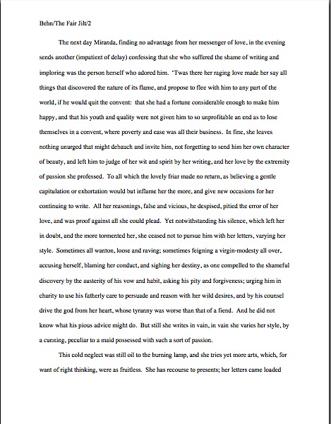
Don’t believe me? Slip your tootsies into Millicent’s moccasins and consider the following page from THE FAIR JILT. (As always, if you’re having trouble reading the small writing, enlarge the image by holding down the COMMAND key and pressing +.) I defy you not to be too distracted by the story to notice how the page is put together.
Seriously, try not to think at all about the fact that Millicent probably would not even start to read this version. Don’t worry your pretty little head over why.

You clever souls could tell instantly that there was something wrong here, couldn’t you, and not just because Miranda’s trying to seduce her priest? (For convent, read monastery.) Set aside Aphra’s practically Dickensian affection for semicolons for the moment — which would tend to turn off a modern Millicent pretty quickly — and let’s ponder why this page almost certainly would not get a fair reading in a present-day agency.
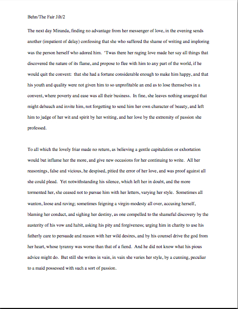
Before you commit yourself irrevocably, here’s what it should have looked like in standard format:

Quick, tell me: what’s the reason our Millie would not bother to start reading the first page 10, but would read the second?
If you flung your hand into the air and shouted, “The 10-point type, Anne! It will strain her already overworked eyes,” pat yourself on the back 47 times. If you also added, “And the Ariel typeface probably didn’t help here, either,” make that 48.
Why is the first in particular almost always a deal-breaker? She’s used to seeing every manuscript heading out of the agency to publishing houses in 12-point Times New Roman, so that first example — feel free to chant it with me here, ‘Palooza followers — it just doesn’t look right.
And why should she waste her time with that tiny type? She absolutely could not forward it to her boss that way; agents are susceptible to eye strain, too.
But those unfortunate cosmetic choices are not the only problems with the first version, are they? Let’s turn our magnifying glasses to the top of the page: the incorrect version does not have a proper slug line. Seeing this lone page out of context, it’s quite obvious why a slug line is a dandy idea, isn’t it? Without it, how would it be even remotely possible to return this wandering page back into the manuscript from whence it came.
“Who wrote this?” Millicent cries in ire, glaring around her cubicle at the 47 manuscripts lying there. “This stray piece of paper could be from any of these!”
At least Ms. Behn thought to number the pages of Example #1 — but did you catch the problem with how she did it? The page number is in the bottom right-hand margin, rather than in the slug line, where it belongs. And it’s so far down in the footer that the number got caught off halfway during printing.
Did you catch any other problems that might register on Millicent’s umbrage meter? What about that right margin? Mighty straight, isn’t it? That look proper to you?
What’s going on here is called block-justification, another problem that can be laid squarely at the feet of those who insist that a manuscript and a published book should be identical. The text in many published books, and certainly in many magazines and newspapers, is spaced so that each line begins at exactly the same distance from the left-hand edge of the page and ends (unless it’s the last line of a paragraph) at exactly the same distance from the right-hand edge of the page.
Why would this species of neatness bug the heck out of professional readers? A very practical reason indeed: it renders skimming quite a bit more difficult.
Why? Well, block formatting provides fewer landmarks, as it were, to the glancing eye, As you may see for yourself, Practically every line of narrative text resembles every other. To those of us used to the ragged right margins and even letter spacing of standard format, it’s actually kind of hard to read.
So there’s quite a bit in Example #1 that’s distracting from the actual writing, isn’t there? Doesn’t help sell the text, does it?
Okay, all of these rhetorical questions in a row are beginning to make me dizzy, so let’s move on to Example #2, the one Millicent and a contest judge would like. To save your weary fingertips a modicum of scrolling (hey, I do what I can), here it is again:

Now, let’s take a gander at the same page in — ugh — business format; if you don’t know why it’s ugh-worthy, you might want to revisit my earlier post on the immense value of indentation.
Startlingly different, isn’t it, considering that I made a grand total of two formatting changes?
You did catch both of them on your skim through, right? All I did was I eliminate the indentations at the beginning of each paragraph and skipped a line between paragraphs to produce the norm for business correspondence, as well as for most of the text currently posted on the Internet. (Including this blog, unfortunately. As a professional writer and reader of manuscripts, it drives me nuts that my blogging program won’t allow me to indent paragraphs like a literate human being.)
Again, why is Millicent unlikely even to start reading that last rendition of page 10? Because — wait for it — it just doesn’t look right.
In fact, in both submissions and contest entries, business format is often grounds all by itself for knocking a manuscript out of finalist consideration. Finding yourself asking why again? Well, technically, indented paragraphs are grammatically requisite, so to a judge, non-indented paragraphs may well seem as great a violation of everything we hold dear as frequent misspellings or use of the wrong form of there, their, and they’re.
(Since not all of you laughed, allow me to beg you nervously: please tell me that some English teacher took the time to teach you the rules governing there, their, and they’re. We all see them used incorrectly so often nowadays that I shall not rest easy until I am positive that each and every one of you is aware that there refers to a place, their means belonging to them, and they’re is a contraction for they are. While I’m at it, I’d also like to point out that that it’s is a contraction for it is, whereas its means belonging to it. Thank you for humoring me; time to get back to the post already in progress.)
Fortunately for judges and Millicents who care deeply about the health of the language, errors seldom come singly in entries and submissions. Like spelling errors, formatting mistakes are apparently social: they like to travel in packs, roving all over a manuscript like Visigoths sacking Rome.
As a result of this convenient submission phenomenon, a manuscript that contains errors within the first few lines (or on the first page) is easy for a professional reader to dismiss; statistically speaking, it’s a pretty good bet that if Millicent kept reading the pages following a technically flawed opening, she would find more causes for umbrage.
Given how many submissions she has to screen between now and lunch, do you think she is going to (a) press on in the hope that the first error was a fluke, or (b) leap to the (perhaps unwarranted) assumption that there is more of the same to come and reject it right away?
I leave that one to your fine critical faculties to answer. Let’s just say that her umbrage-taking threshold tends to be on the low side, especially immediately after she has taken a sip from that too-hot latte that always seems to be by her side when we are watching her in action. (Let it cool next time, okay, Millie?)
Why am I bringing this up in the middle of a discussion of the perils of business format? Well, for starters, an ever-increasing number of agents are not only accepting e-mailed queries (a genuine rarity until quite recently), including some who ask queriers to include the opening pages, a synopsis, and/or other writing samples with their queries. Since few agents open attachments from writers with whom they’ve had no previous contact, many request that those opening pages be included in the body of the e-mail, pasted just below the letter.
Sense a potential problem barreling in our general direction? That’s right: most e-mail programs are not set up for easy tabbing; consequently, business format is the norm for e-mail communications. But that doesn’t mean that the Millicent assigned to screen those queries won’t turn up her nose at non-indented paragraphs in those pages.
Again, why? Are you sitting down, dislikers of indentation?
I hate to be the one to break this to you, but there are Millicents out there — and agents, editors, contest judges, and literate people everywhere — who will leap directly from noting a lack of indentation and unwarranted spaces between paragraphs to our old friend, option (b): if the submitter is not aware of how to format a paragraph of English prose properly, she reasons, aren’t there inevitably more snafus to come?
Now, not every Millicent — or agent, judge, etc. — will have this knee-jerk reaction, of course. But do you really want to take the chance that she’s not going to seize the opportunity to save herself a little time?
The specter of illiteracy is not the only reason using business format is likely to cost you, either. To a professional reader, the differences between the last two examples would be more than visually jarring — they’d be downright confusing. In standard format, the only reason for a skipped line between paragraphs would be a section break, so Millicent would be expecting the second paragraph to be about something new.
Okay, so a misconception like that might distract her attention for only few consecutive seconds, but let’s not kid ourselves: your garden-variety Millicent is spending less than a minute on most of the submissions she rejects — it’s actually not all that uncommon for her not to make into the second or third paragraph before reaching for the SASE and a copy of that annoying form rejection letter.
Take a moment for the implications to sink fully into your overtaxed brainpan. Don’t worry; I’ll wait.
While those of you new to the speed with which rejection typically occurs are already in shock, let me add for the sake of anyone who doesn’t already know: those who regard business format as a symptom of creeping illiteracy — hey, I just report the news; I don’t dictate it — are every bit as likely to frown upon it just as much in a query letter or synopsis as in a manuscript submission.
Time loss is not the only reason she might take umbrage at momentary confusion. Let me let you in on a little secret: professional readers, especially those who inhabit agencies and publishing houses, tend not to be overly fond of having their mental image of the story they are reading at the moment jarred.
How do I know this? Well, for one thing, they commonly refer to it as being tricked. As in, “I hate being tricked by a first paragraph that is about someone other than the protagonist.”
There’s a practical basis to this dislike, but it’s kind of complicated. I wrote a couple of fairly extensive posts on the subject a while back (here’s a link to the first, and here’s a link to the second, in case you’re interested), but I’ll run over the thumbnail version now.
Is everybody comfortably seated? My thumbnails are a tad long. (Just try to get THAT image out of your head anytime soon.)
To get through all of the submissions she’s assigned to screen each week, Millicent has to read quite quickly, right? If she doesn’t, she’ll get buried in paper, as basically, she’s got to make it through WAR AND PEACE several times over before she toddles wearily homeward on Friday afternoon.
That’s a whole lot of material to remember, by anyone’s standards — and remembering actually is important here. If she decides to allow a manuscript to make it to the next level of consideration, she is going to need to be able to tell her boss what the book is about: who the protagonist is, what the conflict is, why that conflict is important enough to the protagonist for the reader to be drawn into it, and so forth.
In essence, she’s going to need to be able to pitch it to the higher-ups at the agency, just as the agent is going to have to do in order to sell the book to an editor, and an editor is going to have to do in order to convince his higher-ups that the publishing house should acquire the book.
And, often, as first-round contest judges will need to do on an evaluation form in order to pass an entry onto the next round.
Okay, brace yourself, because explaining what comes next involves delving into one of the great cosmic mysteries that has long perplexed aspiring writers the world over. It’s not for the faint of heart.
Remember earlier in thus series, when I mentioned that agents and editors don’t read like other people? Well, one of the primary differences is that from line one of page one, they’re already imagining how they’re going to pitch this book. So if paragraph 2 or 3 (or page 2 or 3) suddenly informs them that their mental patter has been about the wrong character, they feel as if they’ve been backing the wrong horse.
And while there may have been any number of perfectly reasonable narrative reasons for the text to concentrate upon an alternate character for the opening, unless the writing and the story have already really wowed Millicent, her resentment about being tricked actively misled mistaken about the identity of the protagonist is often sufficient to make her reach for that SASE and form letter.
Feel free to go scream into the nearest pillow over that last piece of convoluted logic; you don’t want to keep that kind of existential cri de coeur pent up inside. I’ll wait until it’s out of your system.
Feel better? Good.
Before you go rushing off to see if your opening paragraphs might possibly be laying you open to a charge of trickery — because, for instance, you might have taken the bold authorial step of noticing that there is more than one human being in the world, and written about an interpersonal relationship accordingly — let’s return to the formatting issue that prompted my little segue into the psychology of resentment. Can we extrapolate any practical lesson about business format from it?
You bet your boots we can: it’s not a good idea to give the impression of a section break where there isn’t one. And when producing pages for people who read all day, you might want to stick to the rules governing written English and indent your paragraphs.
Starting to feel more at home with standard format? Excellent; my evil plan plot for world domination teaching strategy is working. Keep up the good work!

Anne,
Are you testing us? The “good example” appears to be justified on both left and right margins.
Dave
Ah, you caught it, Dave! Good eye. Now I can change it.
Just checking to see that people were paying attention…with so much information, it can just start to wash over people.
A bit off-topic, but Aphra Behn, I bow to thee. I just found out I GOT A PAID ONLINE GIG! I’ll be contributing to wiseGEEK.com. For actual coinage!
*dance of joy*
I’ll be writing so many posts in blog format that I’ll have to internalize this palooza when I work on WIPs. Then it will become a knee-jerk reaction to indent, etc.
That’s 100% fabulous, Elizabeth! What will you be writing about?
It’s informational–answering questions in an encyclopedic style. I pick from a list of articles like “How Do I Choose the Best Net Curtains?” (really!) and answer it in 400 words or more. I had to test for it, but they paid me for the test articles. So my writing actually paid for some Christmas presents. Maybe now my family will take me seriously. (Naah, probably not.)
It’s not novel writing, but it’s a bit of extra money. Which I need. Since no one wants my police procedural. Poo on them. 😛
Well, if it’s any comfort, even if you did sell your police procedural right away, advances are not typically paid entirely up front. A third upon signing, a third upon manuscript approval (i.e., after you’ve made all of those requested changes, and a third upon publication is usual, although half upon signing and half upon publication is also fairly common. And then after that, royalties are typically paid only twice per year.
As I am undoubtedly not the first to say, novel-writing is not a very sensible avocation to pursue for the money. And unfortunately, most relatives have to see some cash before they start regarding it as more than just your little hobby, alas.
But this is still tremendous, no matter what the relatives think!