
I begin today’s post in this season of concord with a commentary on disunity: “In all matters of opinion,” Mark Twain told us many, many years ago, “our adversaries are insane.”
Nowhere in modern life is this axiom more apt than in the vicious battleground that is airline seating. In recent years, most airlines have opted to make the space between rows of passengers smaller; in order to cram more seats per plane, many have also quietly made the window seats and even the seatbelts on window seats slightly smaller as well. (Try comparing sometime with the belt in the middle seat.)
The result for anyone who, like your humble correspondent, enjoys glancing out a window from time to time, is a seat tray rammed directly into one’s solar plexus if one happens to be trying to, say, use a laptop in flight. And that’s if the window-lover in the row ahead of me decides not to recline his seat.
On the last airline flight during which I tried to compose a blog in mid-air, the last condition did not, alas, apply. A honeymoon couple — he awash in some pepper-based cologne, she beamingly bouncing her ring upon every row she passed, so all might see it glimmer in the light — evidently mistook their seats for two single beds. Not only were their activities in them not, as my grandmother would have said, appropriate for every audience, but they seemed disappointed — nay, convinced — that their seats would not recline into a completely flat position, presumably so they could (ahem) elevate their performance art piece to the next level.
After the first time the lady in question caused my laptop to emit a loud crack of protest, I politely explained through the crack in the seats (now about five inches from my face) that the nearness of the rows rendered their desired level of reclining impossible. Even if I had not needed to be working on my computer throughout the flight — an absolute necessity, I assured them, due to the standard formatting educational needs of all of you fine people waiting who were at that very moment waiting impatiently for me to land — the only way I could possibly accommodate the angle they desired would involve my balancing my in-flight meal on the bride’s forehead as it hovered a few inches above my lap.
Apart from the meal part, the honeymoon couple thought that would be just fine. How nice of me to suggest it.
The hard-argued subsequent compromise involved my turning sideways, twisting one of my legs underneath me while resting, if it could be called that, my back against the window-side armrest. If I gingerly balanced my laptop on the tray table of the seat to my left, I could barely manage to type. My left hip and elbow swiftly fell asleep, and the position required my staring fixedly at the profile of the guy in 23C (whose wife, you will be astonished to hear, apparently doesn’t understand him), but that was a small price to pay for the approximately 19 degree incline my gymnastics permitted the honeymooners.
At least for the first twenty minutes or so. After that, they kept trying to recline their seats farther. Apparently, I was being unreasonable to expect enough personal space to keep my laptop open the 90 degrees recommended by the manufacturer for optimal screen visibility. I can now tell you from personal experience that while it’s still possible to read the screen down to roughly 49 degrees, the lower the lid, the less accurate the typing.
Also, the lower the lid, the more one is tempted to draw conclusions about the fundamental difference between content producers and content consumers. To the recliners, the notion that I would so need to express myself on any subject that it could not wait until after we had landed was, I gathered, completely incomprehensible.
Oh, wasn’t I done yet? They’d like to lean back and enjoy themselves properly.
As much as I would like to blame the honeymooners’ frankly not-very-neighborly attitude upon either a poor set of upbringings (raised by airline-phobic wolves, perhaps?) or some bizarre wedding-induced solipsism that made them sincerely believe that no other human happiness was important compared to theirs, I suspect something very simple was happening here: all three of us were basing our expectations of personal space not upon the current lay-out of the airplane, but our sense memories of what air travel had been in the past.
My body remembers fondly being able to operate a laptop in comfort on an airplane, and not all that long ago. And I can only assume that somewhere deep in the honeymooners’ musculature, their forms remembered equally well being able to flop backward with impunity, without violating anyone else’s space bubble.
Either that, or they were appallingly brought up. Either way, nobody was happy with the outcome.
A similar failure to communicate often characterizes the initial interactions between an aspiring writer and those he hopes will help his work get into print: agents, editors, contest judges, freelance editors, and of course, our old pal, Millicent the agency screener. From the new writer’s point of view, many of the hoops through which she’s expected to jump seem arbitrary, if not actively hostile to his progress. Yet from the other side of the divide, it’s practically incomprehensible that any serious writer would not be aware of prevailing standards.
Each side, in short, typically expects something different from the other than what the other believes he is expected to provide. If the communication gap is severe enough, each may even begin to suspect the other of violating expectations on purpose, just to be annoying.
But that’s very seldom the case, on either end. The expectations are simply different, as often as not because each side has in mind some mythical period when perfect communication was the norm, rather than the exception. Millicent sighs for the mythical days when the truly gifted tumbled out of the womb with a complete understanding of both standard format and changing market conditions; the aspiring writer longs for the fantastic era when every submission was read in its entirety, every time, and editors took the time to work with promising new authors on every promising sentence.
Both sides are perfectly at liberty to sigh nostalgically, of course. But the fact is, none of these conditions ever prevailed on a large scale.
Oh, well-advertised submission standards used to render looking professional a trifle easier, admittedly; back when the slush pile still existed at major publishers, a new author could occasionally leap-frog over a few levels of testing. And undoubtedly, editors formerly had more time to work with writers. Things change. But contrary to what many an aspiring writer would like to think, there’s never been a point in publishing history when mainstream publishers were purely non-profit enterprises, devoted solely to bringing new voices to the admiring masses, nor have the bulk of submissions ever been completely professional and market-oriented.
Those seats never reclined as fully as you remember them doing, either. Those tray tables have never been particularly spacious. And those minuscule bags of nuts and/or pretzels? Always chintzy.
All of which, I devoutly hope, will place you in the right frame of mind for confronting what seems to be a perennial controversy amongst aspiring writers: whether to place a chapter title (or just “Chapter One”) on the first line of a page or twelve lines below that, on the line just above where the text proper starts.
Don’t laugh, those of you who are new to this particular debate: this one has generated quite a body count over the years. Former comrades in arms, veterans of the writing trenches, have ceased speaking altogether over this issue; even judges within the same literary contest have been known to differ sharply on the subject.
Which is a trifle puzzling to those of us who deal with professional manuscripts for a living, frankly, because there actually isn’t a debate on our end. Nor do the Millicents gather over steaming lattes to debate the niceties of labeling a chapter. One way looks right to us for a book manuscript, period: the first page of a chapter should be formatted precisely the same way as the first page of a manuscript.
What does that mean in practice? Glad you asked.
The chapter title belongs at the top of the page (centered) if the manuscript is a book; as with the first page of a manuscript, the title appears at the top, with the text beginning twelve lines below. In a short story or article, by contrast, the title belongs twelve lines from the top of the page, on the double-spaced line above the text.
So yes, the spacing honestly does matter to the pros. As always, it’s to an aspiring writer’s advantage to use the format appropriate to the type of writing, if only because it will look right to the Millicent screening it.
The answer really is as simple as that. Why, then, the rampant confusion? And why, given that the difference is a relatively small one not necessarily reflective of the quality of the writing involved, might a professional reader like Millicent or Mehitabel the contest judge particularly care if a talented aspiring writer chose the wrong version?
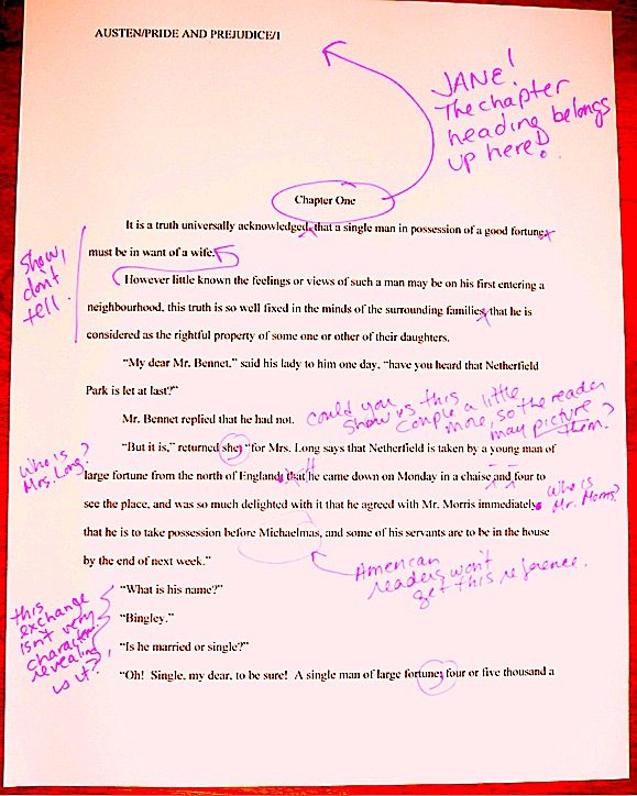
As is my wont, I shall let you see for yourselves. To place the two vitriol-stained possibilities before you in all of their lush magnificence, the question here is should the first page of a book chapter look like this:
Or like this:
Quite a visceral difference, no? The first version is in standard format for a book manuscript; the second is for a short story or article. Although, as we have discussed earlier in this series, the first page of a short story, it would also include contact information for the author. Which means, in essence, that aspiring book writers who place the chapter heading immediately above the text are formatting it incorrectly for either a manuscript or a short story.
But let’s set that aside for the moment. The fact is, every week, Millicent sees huge numbers of submissions with chapter headings like the second example — and that makes her sigh. “Do they do this on purpose?” she mutters. “Just to annoy me?”
Seem like an overreaction? Not really: Millicents, the agents who employ them, and contest judges see far, far more examples of version #2 than #1 in book submissions. Many, many times more. So much so that — prepare to rejoice, because I haven’t said this very often throughout this series — although an agent would almost certainly make you move a low chapter title aloft, at this point in publishing history, you could probably get away with either chapter heading in a book submission.
If, of course, you didn’t care about making Millicent sigh.
I hasten to add, though, that I would be reluctant to buy into the astonishingly pervasive theory that if masses and masses of people do something, it automatically becomes correct. No matter how many times all of us see apostrophe + s used to make a noun plural, it’s just not proper — unless, of course, we’re talking about the Oakland A’s, where the erroneous apostrophe is actually part of the proper name.
Ditto with manuscript submissions: as anyone who screens manuscripts for a living would tell you (probably accompanied by a gigantic sigh), a much higher percentage of them are incorrectly formatted than presented properly. But that doesn’t make improper formatting right, does it? Nor does it render it reasonable to expect that Millicent will be pleased to see a chapter title lolling about just above the text.
As everyone’s mother was wont to say (at least on the West Coast), if everybody else jumped off the Golden Gate Bridge, would you, too?
I was delighted to discover when I moved to the East Coast for college that the moms out there were prone to asking the same question with reference to the Empire State Building. There must be something about that particular period of architecture (the GGB was built in 1933-37, the ESB in 1930-31) that promotes suicidal ideation.
Speaking of body counts. Back to the matter at hand.
The weird thing about this particular formatting oddity — I’m back to talking about chapter titles now, not suicide attempts, in case you found that last segue a mite confusing — is how often the incorrect version appears in otherwise perfectly presented manuscripts. That fact sets Millicent’s little head in a spin. As, I must admit, it does mine, as well as the brainpan of virtually every other professional reader I know.
Why is it so very puzzling to us, you ask? Because at least in my case — and I don’t think I’m revealing a trade secret here — although I have literally never seen an agent submit a manuscript to a publishing house with format #2, I’m constantly meeting aspiring writers who insist that writing teachers and even contest judges have told them that #2 is the only acceptable version. That’s just weird to me, as I have never even heard of an agent, editor, or anyone else in the publishing industry’s asking for a chapter heading to be moved from the top of the page to just above the text. Although as I said, I do know agents who routinely ask for the shift in the other direction; mine, to name but one.
And believe me, I’ve heard some pretty strange requests from agents and editors in my time; I’m not easily shocked anymore. At this point in publishing history, to hear a professional reader insist upon placing the chapter heading where you have to skip down a third of a page to read it would have me reaching for my smelling salts.
(Do they even make smelling salts anymore? And if everyone else jumped off the Golden Gate Bridge clutching them, would I?)
Clearly, somebody out there is preaching the place-it-just-above-the-text gospel, because agents, editors, and contest judges are simply inundated with examples of this formatting anomaly. We see bushels of ‘em. Hordes of aspiring writers are absolutely convinced that the sky will fall in if that chapter heading is located anywhere but immediately above the text. Sometimes, when those die-hard advocates become contest judges, they even dock correctly-formatted first pages for having the title in the right place.
In fact, many aspiring writers are so convinced of the rightness of the drooping title heading that it’s not all that uncommon for an editor to find that after she has left a couple of subtle hints like this that the writer should change the formatting…
…the subsequent drafts remain unchanged. The writer will have simply ignored the advice.
(A word to the wise: editors universally hate it when their advice is ignored. So do agents. Contest judges probably wouldn’t be all that fond of it, either, but blind submissions mean that in order to get dunned for brushing off a judge’s feedback, a writer would have to submit the same chapter two years running to the same contest, have the entry land in the same judge’s pile — in itself rather rare — and the judge would have to remember having given that feedback. Oh, and for the entrant to hear about it, the contest would have to be one of the few that gives editorial feedback.)
The up v. down debate may seem like a rather silly controversy — after all, in the cosmic scheme of things, why should it matter if the white space is above or below the title? — but sheer repetition and writerly tenacity in clinging to version #2 have turned it from a difference of opinion into a vitriol-stained professional reader pet peeve.
See earlier comment about how we tend to react to our advice being ignored; it’s seldom pretty.
Which, unfortunately, tends to mean that in discussions of the issue at conferences degenerate into writing-teacher-says-X, editor-at-Random-House-says-Y: lots of passion demonstrated, but very little rationale produced, beyond each side’s insisting that the other’s way just looks wrong.
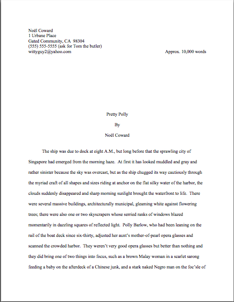
However, there is a pretty good reason that moving the chapter heading information to just above the text looks wrong to someone who edits book manuscripts for a living: short stories’ first pages are supposedto look quite, quite different from those belonging to book manuscripts or proposals. Take a gander:
As you may see, for a short story like this one, there’s a mighty fine reason to list the title just above the text: a heck of a lot of information has to come first on the page, because short stories, unlike book manuscripts, are not submitted with a title page.
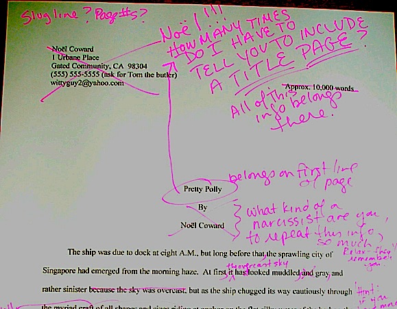
But that would not be proper in a book-length manuscript, would it? Let’s see what Noël’s editor might have said upon viewing this as the first page of a book:
Ouch. (That last bit would have been funnier if the entire page were readable, by the way, but my camera batteries were running low. Sorry about that.) Yet you must admit that at some level, the editor’s ire would have been justified: as Millicent and that angry mob of pitchfork-wielding ignored editors would be only too happy to tell you, short stories don’t HAVE chapters, so who on earth are they to be telling those of us in the book world how to format our manuscripts?
So I say it again: for a book manuscript, stick with version #1.
Which is not to say, of course, that this particular small deviation will automatically and invariably result in instantaneous rejection. It won’t, even in the latté-stained hands of the most format-sensitive Millicent. (See, she spilled coffee on her hands after she took a sip while it was still too hot — and if you didn’t get that joke, you probably haven’t been reading this blog for very long.) If a submission is beautifully written and technically correct in every other respect, she might only shake her head over the location of the chapter heading, making a mental note to tell you to change it between when her boss, the agent, signs the writer and when they will be submitting the manuscript to editors at publishing houses.
But if you don’t mind my saying so, that’s a mighty hefty set of ifs.
While I’m on the topic of common submitters’ misconceptions, this would probably be a good time to illustrate another ubiquitous agent and editor pet peeve, the bound manuscript — and you’re going to want to pay very close attention to this one, as it is almost universally an automatic-rejection offense.
Manuscript submissions, and I don’t care who hears me say it, should not be bound in any way. Ditto with book proposals. There’s an exceedingly simple reason for this: binding renders it impossible (or at least a major pain in the fingertips) to pull out a chapter, stuff it in one’s bag, and read it on the subway.
Hey, paper is heavy. Would you want to lug home ten manuscripts every night on the off chance you’ll read them? (And now that you’re pondering that one, are you still surprised at how many agents now routinely screen submissions on their Kindles?)
As with other ploys to make a manuscript appear identical to a published book, binding the loose pages of a manuscript for submission will not win you friends in the publishing world. Not only does this not look right (I spared you the chanting this time), but it seems so wrong that Millicent will be positively flabbergasted to see a submitter to do it.
She might, for instance, forget that her latte is still too hot to drink, take a sip, and scald her tongue. It’s been known to happen.
Seriously, the unbound manuscript is one of those rules so engrained in the professional reader’s mind that it seldom even occurs to authors, agents, or editors to mention it as a no-no at writers’ conferences. Heck, I’m not sure that I’ve mentioned it once within the first two years I was writing this blog — and by anyone’s standards, I’m unusually communicative about how manuscripts should be presented.
Talk about it all day, I will.
So I’m going to repeat myself, because you’re not going to hear this very often: by definition, book manuscripts should NEVER be bound in any way. Not staples, not spiral binding, not perfect binding. If you take nothing else away from this series, binding-lovers, I implore you to remember this.
Why am I making you swear to follow my advice this time around? Well, in practice, I’m sorry to report, a bound manuscript will seldom survive long enough in the screening process for the chapter-separation dilemma to arise, because — and it pains me to be the one to break this to those of you who’ve been submitting bound manuscripts, but if I don’t tell you, who will? — those pretty covers tend never to be opened at all.
Did you just exclaim, “Ye gods, WHY?” again? I can’t say as I blame you, but try for a moment to envision what a bound manuscript might look like from Millicent’s perspective.
To ramp up your stress levels to the proper level to understand her, envision a desk simply smothered with an immense pile of submissions to screen before going home for the day. Envision further that it’s already 6:30 PM, and eyeballs already dry as dust from a long, hard day of rejecting query letters.
Just lost your sympathy, didn’t she? Try, try again to place yourself in her desk chair.
Picturing that immense pile of envelopes clearly again? Okay, now slit open an envelope that reads REQUESTED MATERIALS on the outside. (You do know that you should always scrawl that in two-inch letters in the lower left-hand corner of a submission envelope, don’t you, so your requested materials don’t get buried in the slush pile?)
If you’re Millicent — and right now, you are, singed tongue and all — you fully expect to see something like this lurking between the cover letter and the SASE tucked underneath:
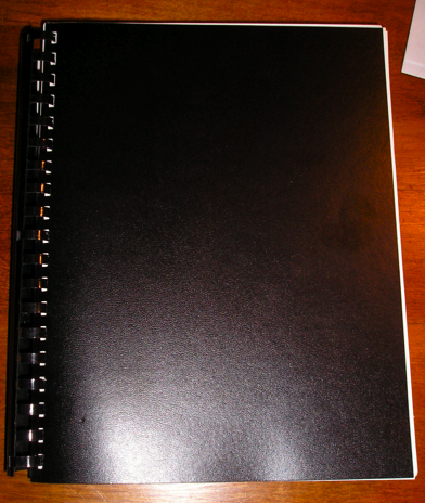
But in the case of the bound manuscript, you would instead encounter something like this:
Kind of hard to miss the difference, isn’t it? Unfortunately, 999 times out of 1000, the next sound a bystander would hear would be all of that nice, expensive binding grating against the inside of the SASE, just before Millicent tucks a photocopied form rejection letter on top of it.
Honestly, it’s not that she is too lazy to flip open the cover; she just doesn’t see why she should. Clearly, this submitter has not done his homework.
That last phrase should sound familiar to those of you who have been following this autumn’s run of ‘Paloozas: it’s a standard euphemism for this writer would be difficult to work with, because he hasn’t bothered to learn what professional expectations for manuscripts/query letters/synopses/author bios are. Sigh…
This logic may not seen particularly open-minded, from a writerly perspective, but it’s a fairly common argument throughout the industry: if this binding-happy submitter does not know this very basic rule of manuscripts, how likely is he to know the rules of standard format? And if he does not know either, how likely is he to be producing polished prose? If he hasn’t taken the time to polish his prose, is this manuscript really finished?
And if it isn’t finished, why should I (you’re still Millicent, remember?) bother to invest my time in reading it before it is? (Again: sigh.)
I know, I know — this might not be a fair assessment in any individual case. Despite my best efforts over the last few years, there are plenty of good writers out there who happen to be clueless about the rules of standard format.
But even if they all jump off the Golden Gate Bridge, you shouldn’t.
This is yet another expectation-differential problem. From Millicent’s perspective, the fact that good writers aren’t necessarily born aware of the norms of the industry matters less than we writers would like — because, as unpleasant as it is for aspiring writers to realize, her agency is going to see enough technically perfect submissions this week to afford to be able to leap to unwarranted conclusions about this one.
The moral: don’t waste your money on binding.
Seem arbitrary? From a professional reader’s point of view, it isn’t — the enforcement of standard formatting isn’t actually any more complicated than the simple axiom that any game has rules, and you will play better if you take the time to learn them.
Think about it: if you saw a batter smack a baseball, then dash for third base instead of first on his way around the diamond, would you expect his home run to count? Would an archer who hit the bulls-eye in her neighbor’s target instead of her own win the grand prize? If you refused to pay the rent on Park Place because you didn’t like the color on the board, would you win the Monopoly game?
I can go on like this for days, you know. Please, I beg you, say that you are getting the parallels, so I may move on.
Submitting art to the marketplace has rules, too, and while your fourth-grade teacher probably did not impart them to you (as, if I ran the universe, s/he would have), you’re still going to be a whole lot better at playing the game if you embrace those rules, rather than fight them.
You’ll also, in the long run, enjoy playing the game more. It may not seem that way the first time one is struggling to change an already-written manuscript into standard format, but trust me, it will be much more fun when you finish your next manuscript and realize that there’s nothing that needs to be changed.
Let all of those other folks jump off the Golden Gate Bridge without you, I say. Remember, you’re playing this game by choice: you could, after all, make your own rules and publish your book yourself. If you want to play with the big kids, you’re going to need to abide by their rules.
At least at the submission stage.
Until you know the expectations of the lovely folks seated in the row behind you, don’t assume you can recline all the way back into their laps. Everyone on the plane is trying to get to the same place, after all. By following the rules, you can make it a more enjoyable trip for all concerned.
Next time, I shall tackle a less-common but still virulent misconception. Keep up the good work!
Binders might not work for submissions (and I wouldn’t dream of NOT printing out a clean copy for Millicent in any case), but they sure do make editing a breeze. I even have a pencil case with all my highlighters in mine. 😀 They make it easy for first readers, too.
For the most part, Elizabeth, your comment is one I might (and probably) have made.
Dave