My, the metaphorical halls of Author! Author! grew quiet while we were considering the winning entries in the Author! Author! Rings True literary competition. Was that because everyone was so impressed by the high quality of the writing — or so astonished to see what I looked like on film? Or did those of you who stop by regularly for self-editing and marketing tips merely take a pass on checking out posts about other readers’ work?
I hope not, because actually, quite a bit of my commentary on the winning entries concerned precisely the sort of professional readers’ pet peeve that we have been discussing throughout this series. No matter how creative my examples are (and I do try to make them a tad unexpected, as a door prize for those of you dedicated enough to read through my page shots), there’s no better way to see what kinds of gaffes make our old pal, Millicent the agency screener, sigh over submissions than to take a gander at good writing that’s not perfectly presented.
I think we can glean three overarching lessons from this. First, no matter how beautifully-written or genre-appropriate a text may be, professional readers will respond to it better if it adheres to the rules of standard format for book manuscripts. There’s a reason I go over standard format a couple of times per year on the blog, people: to Millicent, anything else simply looks wrong. Formatting is not a matter of style, at least at the submission stage; any effort a creative-minded aspiring writer puts into making his manuscript resemble a published book is not only wasted, but a signpost to Millie that he hasn’t done his homework about how the publishing industry works.
Harsh? Perhaps? True? Undoubtedly.
So if you are not familiar with the rigors of standard format, please invest an hour or two in going over the posts in the aptly-named HOW TO FORMAT A BOOK MANUSCRIPT category on the archive list at right. Even if you think you know the rules, but have never actually beheld a professionally-formatted manuscript, please consider a quick review. And if you still have questions about what your work should look like on the page, please ask.
Yes, it honestly is that important. As we saw in the winning entries, even a small formatting problem can prove very distracting from good writing. I would much, much rather that you post a question in the comments than for you to risk annoying Millicent in a submission.
Second, and closely associated to the first lesson, no matter how lovely the turn of phrase, typos, punctuation problems, and the missing words that so often result from multiple revisions will render prose less effective. It’s significantly harder to catch such faux pas on a computer screen than on the page. There’s just no substitute for proofreading before submission, preferably — feel free to shout it along with me, long-term readers — IN THE TEXT’S ENTIRETY, IN HARD COPY, and OUT LOUD.
Third, since formatting and proofreading oversights are the norm, not the exception, in even very good submissions, producing a clean manuscript will give an aspiring writer the advantage of novelty at submission or contest entry time. Believe me, after seeing the same gaffes over and over again, in page 1 after page 1, a properly-formatted manuscript devoid of typos is a genuine relief. The old screeners’ adage that most manuscripts reject themselves honestly is true — and the sad part is that most of those mistakes are 100% avoidable.
Hey, there’s a reason that the pros don’t have qualms about rejecting a manuscript that’s only a quick polish away from being marketable. They assume that aspiring writers capable of creating such pages will be serious enough about their craft to revise, reformat, and try again.
Seriously, it often comes as a surprise to them to hear that a talented writer they’ve rejected has given up — or even moved on to working on her next book. To a professional reader, a rejected project is not dead; it may merely be not ready for the big time yet.
A surprisingly common indicator that a submitter still has a bit to learn: a manuscript that’s formatted like a published book. I’m not just talking about deviations from the norms of standard format or selecting a funky typeface, either — I’m talking about a style choice so common in published fiction that it never occurs to most of the aspiring writers who copy it that it might be problematic in a submission.
I’m talking, in short, of opening a manuscript with a short section in italics.
Was that giant “Huh?” that just shook the trees outside my studio window an indication of surprise or disbelief? “But Anne,” italics-lovers all over the English-speaking world protest, “I see this done in published books all the time.”
Precisely: you also see published books that are single-spaced, printed in wacky typefaces, and have bindings. None of these things are true of properly-formatted manuscripts, for the exceedingly simple reason that professionally-formatted book manuscripts do not resemble published books in many important respects. That’s why, in case you had been wondering, people who deal with manuscripts for a living tend to start yawning when aspiring writers try to drag them into the pseudo-debate about whether it’s obsolete to hit the space bar twice after a period or colon when typing a manuscript. Invariably, the primary piece of evidence offered is that many published books now omit the second space.
At the risk of being overly prolix in my response, so what?
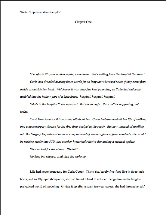
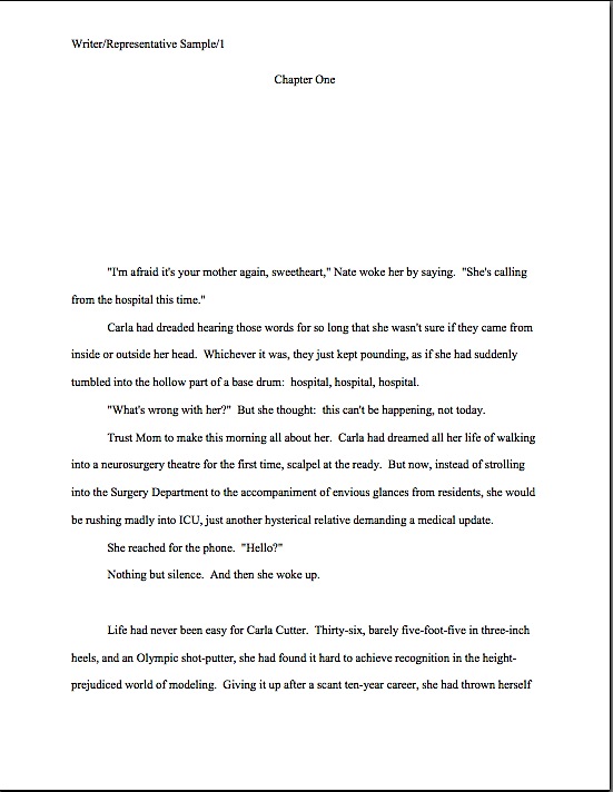
I can sense that some of you still cling to the belief that what appears in print will necessarily fly in a submission. Okay, let’s take a gander at a representative sample of the kind of italicized opening that lands on Millicent’s desk two or three times per day: italics intended to alert the reader to the fact that the paragraphs in the funny type aren’t in the time, place, and/or mindset of the actual opening scene that follows immediately thereafter.
I didn’t fool you that time, did I? “Okay, Anne,” those of you who followed both this series and the recent prize posts chortle, “I know how this game is played. You’ve been trying to train us to catch Millicent’s pet peeves, so I kept my eye peeled not only for how italics are used here, but for other presentation problems that might have irked her.”
Well reasoned, chortlers. How many of them did you catch? For those of you who did not notice all 10 gaffes, here is the same page with all of the purely formatting problems corrected. (For your comparing-and-contrasting pleasure, I’ve touched nothing else.)
Seeing more of them now? If some of these differences jumped out at you, considering that Millicent stares at manuscript pages all day, every day, how many of them do you think she would spot within the first couple of seconds?
Just to make sure that we’re all on the same page with her, so to speak, let’s go over the purely cosmetic problems FIRST. In the order they appear on the page:
1. The slug line is in different typeface than the text. The slug line is in Arial, the body in Times New Roman.
2. The incorrectly formatted slug line includes author’s first name and middle initial, instead of just the last.
3. The incorrectly formatted slug line has a space between the forward slash and the title. The spacing in a slug line should be continuous: Name/Title/#
4. The incorrectly formatted slug line does not include the page number.
5. The page number is in wrong place on the page. It belongs in the slug line, not on the other side of the page.
6. The page number includes the word page. Although many aspiring writers think this looks nifty, a professionally-formatted manuscript would never include the word.
7. There’s an extra space before first word of paragraph 2. Yes, Virginia, most Millicents would catch that in either a hard or soft copy submission.
8. There’s only a single space between each period and beginning of the next sentence, while there are two after every other period. This kind of inconsistency is a common result of confusion over the great one space/two space debate. There is no single right answer here: some agents prefer a single space, although the industry standard is still two; check each agency’s submission guidelines before you submit. If they do not mention preferring the single space, use two. Whichever you pick, however, be 100% consistent about spacing throughout the manuscript.
9. At the beginning of the last paragraph, a number under 100 is expressed as a numeral, rather than being written out as a word.
10. In the final line of the page, there are two spaces between thrown and herself. To a professional reader, this is a dead giveaway that the submitter did not proofread in hard copy.
Quite a lot of eyebrow-raisers for such an innocent-looking page of text, isn’t it? That’s how closely agency screeners read — and we haven’t even begun to talk about the writing itself, you will notice. Take heart, though: unless Millicent is having a spectacularly bad day, none of these problems by itself, or even all of them together, will necessarily result in an on-the-spot cry of “Next!”
Why not? Well, believe it or not, the first version might be one of the more professional-looking first pages Millicent sees today. Most of the elements of standard format are in fact done correctly here, and it’s relatively free of misspellings and grammatical problems. So an optimistic aspiring writer often can — and does — get away with submitting a first page like the former.
Most professional readers, including agents, contest judges, and Millicents, are willing to overlook a small cosmetic error or two, just as they tend to discount the occasional typo, provided that it is not repeated in the manuscript. (The prevailing logic: the first misspelling of a word might legitimately be a slip of a finger; the second indicates that the writer just doesn’t know how to spell the word in question.)
It doesn’t take too many tiny problems, however, to render a pro much less sympathetic than she might otherwise have been to a larger problem like an awkward sentence or the appearance of a cliché. And that’s on a good day — do you really want to take the chance that Millicent won’t just have burned her lip on a too-hot latte just before turning to your first page?
I see a forest of hands waving in my general direction. “But Anne,” some of you point out, and rightly, “I’m finding this rather depressing. Taken individually, the deviations from standard format we’re talking about are all quite small; I just don’t want to believe that good writing could ever fall prey to what, frankly, looks at first glance like a pretty respectable formatting job. I’m not discounting Millicent’s ability to reject the submission that happens to be in front of her when she scalds herself, but surely nobody concerned really wants aspiring writers to believe that their work could be rejected based on anything but the writing.”
It depends upon whom you ask, actually. I’ve met plenty of screeners — as well as agents, editors, and contest judges, come to think of it — who regard writers that, as they tend to put it, “haven’t taken the time to learn the business,” just aren’t as ready to be published as those who have. (Hmm, haven’t I heard that someplace?) Part of working with an agent involves learning how to follow certain rules. It’s not as though any agent worth his salt would submit the first version above to an editor at a publishing house, after all; that would just be self-defeating.
Besides, these days, most good agents see so many cosmetically perfect submissions that they don’t lose too much sleep over rejecting those that are not. Or over Millicent’s having been more critical in the hour after she scalded her lip than on a normal day. They just figure that if a writer has real talent, s/he’ll go away, get better at presentation, and get picked up somewhere else.
That’s why, in case you’d been wondering, there’s no appeal for Millicent’s decisions: it’s not as though most agencies will run submissions past a second screener if the first did not like it, after all. Good writers are expected to be tenacious — and to take the time to learn how the publishing industry expects manuscripts to be presented.
So instead of regarding presentation as a secondary issue, try to think of paying attention to the cosmetic details as being polite to the person conducting the interview for a job you really, really want. Even if you have good reason to believe that some of the other interviewees are getting away with taking a few liberties, it honestly is in your best interest to be polite enough to show her your writing in the manner that Millicent is accustomed to seeing the best work in your chosen book category presented.
All that being said, did you spot the non-superficial reason this page might engender a knee-jerk rejection, even after just a superficial first glance?
If you flung your hand into the air and cried, “The second line of dialogue merely repeats the first, and thus adds nothing new to the scene,” good guess. This would indeed annoy most Millicents, particularly if this oh-so-common piece of redundancy appeared on page 1. Yes, people repeat what’s just been said to them all the time, usually as a means to indicate that they don’t understand the previous speaker’s last statement, but that doesn’t mean the repetition isn’t dull on the page.
But that’s a style issue. Any other guesses?
I can see the smoke rising from your thinking caps. “Well, what about the fact that the first line of dialogue is spoken by an unidentified speaker? There’s no legitimate reason to withhold that information from the reader, either at the outset or in this scene in general.”
Another excellent suggestion — the unidentified opening speech is indeed a very common professional readers’ pet peeve. However, the red flag I have in mind is a marketing issue. Hint: those of you who followed the contest winners’ posts carefully should already know what it is.
Need another hint? Okay, let me ask you the deceptively simple question that’s never far from Millicent’s thoughts while she is screening: based on this first page alone, in what book category does this manuscript belong?
It’s not readily apparent, is it? Depending upon the intended category, that could or could not be a problem. If this manuscript were, say, women’s fiction, this first page might not raise Millicent’s overactive eyebrows, but were it a mystery, the lack of species markings might well make her wonder when the mystery’s going to start. If it’s a paranormal, where are the supernatural creepy-crawlies? And don’t even get me started on what is missing if this were Action/Adventure, Western, any stripe of romance…
Well, you get the picture. Millicent needs to be able to tell if a submission falls into a category that her boss represents — and she likes to be able to tell by the bottom of page 1.
Seem strange that she would want to make up her mind on the subject so quickly? Her reason is very practical, I assure you: since every book category has its own particular style — language choices, conventions, stock characters, etc. — and no agent represents every book category, it can save Millie’s boss a heck of a lot of time in the long run if her loyal assistant weeds out manuscripts that don’t fit comfortably into the category. While many writers legitimately find this professional desire to place their work in a box a trifle maddening, it must be admitted that it’s usually far, far easier for an agent to sell a book if he knows which shelf it might occupy at Barnes & Noble. If any.
Why not wait until, say, page 50 before making that determination? Do you have any idea how many submissions Millicent has to get through this month? This week? Today?
It’s her job to narrow the field as quickly as possible. With that in mind, which Millicent do you think is most likely to reject the example above: one whose boss represents mainstream fiction, or one who represents primarily science fiction? Or, to put it another way, would you or would you not be surprised to learn that the page above is the opening to a fantasy novel?
Oh, you thought that Carla was going to be operating on humans, rather than refugees from the civil war on Planet Targ? Millicent would have leapt to the same conclusion. So wouldn’t Fledgling A. Writer have been better off, if not flinging the reader directly into an operating room stuffed to the gills with alien body parts, at least including a few recognizably fantastic elements on page 1?
Let’s go ahead and state the answer to that question as a general rule for revision: if a reader who knows nothing about your book cannot tell by the bottom of page 1 what type of manuscript it is, it’s very much in your interest to revise with an eye toward making the category more obvious from the get-go.
Don’t those of you who write exciting stories that begin in the everyday, mundane world, then leap into fast-paced action, wish you had heard that salient little piece of advice before you submitted for the first time? Yet I’m not sure how you would have known it — while it’s something that any agented writer could probably have told you, it’s one of those things that it’s just assumed every serious writer already knows.
“But Anne,” those of you not depressed into a stupor by that last statement point out, and rightly, “since we began this little foray into the joys of intensive nit-picking with a brief reference to italicized text, am I correct in assuming that even if ol’ Fledgling corrected every single problem we have discussed so far, and made it apparent from the first paragraph that this is a fantasy, the italicized part would still raise most Millicents’ eyebrows, if not red flags over the manuscript?”
In a word, yes — but perhaps not for the reasons you might expect.
Let’s face it: many aspiring writers radically overuse italics in their texts: emphasizing every word in dialogue that might conceivably deserve vocal stress, for instance, or using it to indicate irony, foreign words, and song titles. Each of these uses is fine on its own, but cumulatively, it can add up to quite a lot of squiggly text. And chant it with me now, campers: like any other writing device, the more italics are used for emphasis in a manuscript, the less effective each use will be.
So unless it’s absolutely necessary, a big block of italicized text tends to look out of place in a manuscript — and that’s potentially a problem. Why? Well, as I may have mentioned at some point in the dim, unrecorded past, manuscripts are not supposed to look like published books; they differ in many significant respects. Unfortunately, many, if not most, aspiring writers are not aware of those differences when they submit. Because of the sheer volume of incorrectly-formatted submissions, instead of treating deviations from expected formatting as an intriguing authorial choice, Millicent usually just regards it as (a) a mistake, (b) an indicator of the submitter’s lack of familiarity with the publication process, (c) carte blanche to take the submission less seriously, or (d) all of the above.
So when Millie spots an italicized opening paragraph or two, she tends not to exclaim, “Oh, here is a suggestion to the editor about what the formatting of the published book should look like,” as italics-loving submitters expect. Instead, she says, “Oh, here’s another one who doesn’t know that italicization choices are the province of a book’s editor, not the author.”
Besides, in many instances — as in, not entirely coincidentally, today’s example — the italics don’t actually change the meaning, or even the implication, of the opening. Italicized or not, this opening simply a fragment of a scene that is not directly connected to the section that follows — a differentiation made abundantly clear by the section break. The italics are not actually necessary.
So why not just take them out, since they might irritate Millicent? Here’s that same page again, with the squiggly type gone.
Come on, admit it — it doesn’t make much of a difference in meaning. It simply looks more like a normal manuscript page. That’s not a very high price to pay for removing the implication that Fledgling has not done his homework well enough to be aware that the decision to italicize an opening would ultimately be the acquiring editor’s call, not the author’s.
But did you notice that in fleeing from one pet peeve, poor Fledgling stumbled right into another? Technically,
But she thought: this can’t be happening, not today.
is redundant. Why? Well, while indicating thought by either using italics or saying she thought is acceptable in many book categories (but not all; taking the time to learn the conventions of your chosen book type will serve you well at submission time), it’s never considered right to use both simultaneously.
In other words, while Millicent would never consider the version above correct, depending upon the book category, she would be perfectly happy with either:
“She’s in the hospital?” she repeated. But she thought: this can’t be happening, not today.
or:
“She’s in the hospital?” she repeated. This can’t be happening, not today.
As we saw above with spaces after periods and colons, the trick is to pick one method of indicating thought and stick to it consistently throughout the manuscript — ideally, the method utilized in the current bestsellers in your chosen book category. If a conscientious flip through recent releases of your type of book does not reveal a category convention, don’t stress out about it; just use the method that appeals most to you.
When in doubt, I would lean toward losing the italics. There are quite a few professional readers out there — including a hefty minority of Millicents — who simply don’t like italicized thought on general principle. “Humph!” they say, wrinkling their noses over type dancing across the page. “Is this honestly necessary? Shouldn’t a good writer be able to make it clear that a character is thinking something, or indicate inflection, without resorting to funny type?”
I have to admit, as a reader, I’m seldom inclined to argue with them on this point, particularly if the manuscript in question also uses italics (correctly) for emphasis (“I’m talking to you, Bertrand!”), to indicate foreign words (“You left off the requisite accent grave, Marie.”), or includes a lot of song or book titles (“I know — let’s play Rubber Band Man while reading My Life as a Contortionist by I.M. Bendy!”). Used rarely, there’s nothing inherently wrong with italics, but in a manuscript with a lot of italicized words, the skimming eye can easily become confused, even to the point of skipping lines.
I just heard you italics-huggers gulping. “Um, Anne,” lovers of italicized openings whisper fearfully. “You’re not about to tell me that a Millicent in a hurry — and when is she not, given how much she has to read in a day? — might simply skip that nice italicized opening, are you? Please tell me that I’ve simply grown paranoid from too much close textual analysis in a single sitting.”
Oh, dear. Are you sitting down?
If Millicent happens to work for an agent who has a pet peeve against this type of opening — as many, many agents do, I tremble to report — she will simply glide over it, treating the first normal line after it as the opening sentence of the manuscript. So she would see Fledgling’s page 1 like this:
“Why on earth,” italics-lovers the world over croak in aghast unison, “would any literature-loving human do such a thing? At the risk of getting redundant with my outrage, published books open all the time with italicized bits!”
A fair question — but actually, there’s a pretty fair answer. Most Millicents just assume, often not entirely without justification, that if it’s in italics, it doesn’t really have much to do with the story at hand, which, they conclude (and not always wrongly), begins with the first line of plain text. In their experience, that’s where the action usually begins.
In other words, they’re apt to skip the italicized bits to save themselves some time.
Which is, as some of you may have noticed, the justification for many, many of the instant rejection norms that plague the nightmares of submitters. Millicent’s workday moves along at quite a clip, after all.
To distract you from any well-justified artistic seething you might be tempted to do over that last observation, take another look at that formerly-italicized section. Can you spot any other problems our pal Millie might have with it?
Any luck? Would it help if I mentioned that the remaining red flag has historically been a deus ex machina favored by everyone from Victorian novelists to middle school short story writers?
That’s right: and then she woke up. The problem here isn’t merely because in narrative prose, if Sentence B follows Sentence A in the text, the action in Sentence B is assumed to have come after the action in Sentence A; therefore, and then is actually redundant in this instance. No, it’s that so darned many exciting openings have tricked Millicent into being drawn into what she thought was the story — but later turns out to be just another dream.
Do literally thousands of interesting novels open this way? You bet. Does it mean that Millicent won’t feel duped when it happens in Novel #10,001? Do you really want to take that chance?
If you’d had your heart set on a bait-and-switch opening that ended with your hero/ine waking up, do not despair. It’s possible to pull off this device well — as long as you are aware that (a) it’s a very, very time-worn device, (b) Millicent sees hundreds of such openings every year, so (c) you’d better do something with it that she’s never seen before.
And if that’s not a creative challenge, I should like to know what is. Keep up the good work!

