
Okay, you caught me: that’s not ice cream; it’s tiramisù. What do you want from me? The ice cream truck does not start circulating my neighborhood until summer starts.
But enough frivolity: I’m worried about your recovery from yesterday’s magnum opus on contest entry formatting. Surprisingly stressful, isn’t it, to go over contest rules that closely? That never palls, for some reason; I judge contests, and I still found writing last night’s post a trifle nerve-wracking.
Why, other than my habitual deep and abiding empathy for the writer just starting out? I guess it’s because writing contests are in some ways the last bastion of what aspiring writers everywhere would so like to believe the literary world to be: many, if not most, actually are devoted to rewarding good writing first and foremost.
If that’s not the only criterion, well, it’s hard to blame anyone concerned: style is quite a bit more complex to judge than most contest entrants suppose, and it’s only human nature to want their winners to go on to get published. Of course, the market-readiness of the text is legitimate to judge. So is aptness of subject matter, and vocabulary vis-à-vis intended audience. And realistically, how can the first- and second-round contest judges not give some thought to how an entry in a book-length category is likely to fare in the current book market, when the opinions and tastes of the agent, editor, or established author judging the finalist round have been formed (or at any rate informed) by market trends?
“Whoa!” some of you purists shout indignantly. “This is beginning to sound an awful lot like how our old nemesis, Millicent the agency screener, looks at submissions. Next, you’ll be telling me that if my contest entry does not conform to some specific cosmetic standard, it won’t make the finalist round, no matter how well-written it is.”
Oh, didn’t you read yesterday’s post? It’s rare that a literary contest doesn’t require entries to conform to at least a few specific cosmetic standards of presentation. That’s why I always urge serious contest entrants to go over every syllable of contest entry literature with a magnifying glass, bloodhound, and possibly a psychic, to make sure that you are aware of every tiny little rule that might be lurking in the small print.
Try not to think of such strictures as extraneous to the question of writing quality. Try to think of it as evidence of Mehitabel the contest judge’s being so committed to evaluating writing style that she does not want any mere presentation concerns to get in the way of that laudable endeavor.
How so? Just as submitting a manuscript in standard format minimizes the probability that Millicent will be concentrating on anything but your writing, following contest rules to the letter is a writer’s best bet for assuring the judge the freedom to focus on the words on the page. That’s what you want, isn’t it, purists?
What’s that you say? You hadn’t been thinking of deviations from contest rules as distractions from your good writing? How could they not be, to someone who reads entry after entry in the same format?
I must caution you, though, that not every writing contest embraces the same format — and not every category within a contest might call for the same formatting. Read the rules carefully every single time.
Yes, even if you have entered the contest in question before; contests change their rules all the time. Don’t assume that what was required the last time you entered a contest will be what’s required next time.
What kind of things might change, you ask with fear and trembling? Well, the last time I wrote a series on this topic, a local writers’ contest of my acquaintance stated very clearly in its entry guidelines: Have the title of the submission and page numbers located in the upper right hand corner of each page.
Other than the grammatical problem with that sentence, do you see any problems it might raise, in light of what we discussed yesterday? Why, the slug line for this contest is on the opposite side of the page from what’s expected in standard format for books! And it’s also on the opposite side of the page from where this same contest dictated the slug line should be the previous year!
Followed much woe and uproar, as you might imagine, as well as much speculation amongst repeat contest entrants. “Are the organizers trying to place those of us familiar with standard format at a disadvantage?” entirely theoretical potential entrants came to me in private to complain, as if I were still affiliated with the organization sponsoring the contest. “Or are they just attempting to discourage those of us who have been entering this contest every year since space travel was only a pipe dream?”
Who do I look like, the Amazing Kreskin? I have no idea what was going on in the rule-changers’ minds. Having served often as a contest judge, however, I can engage in some wild speculation about why it might be to the organizers’ advantage to change the rules from time to time on issues like this.
Okay, on with the unsubstantiated guesswork: it would render weeding out entries in the first round quite a bit quicker. How? By making it instantly apparent to Mehitabel which entrants had read the rules carefully and those who simply took their names out of the slug lines of the manuscripts they were already submitting to agents, printed up the requisite number of pages, and submitted them as they were to the contest.
And I do mean instantly apparent. Specifying an odd location for the slug line may not seem as though it would change the entry much, but actually, it would be one of the easiest rule violations possible to spot, other than using the wrong typeface or not indenting paragraphs. Take another look at our example from earlier in this series — and, to make it interesting, I’m using one that adheres to another of the Unnamed Local Contest’s rather oddball requirements, asterisks to designate section breaks.
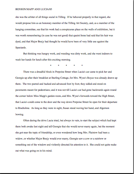
Now, that page would make pretty much any Millicent in the land happy, in terms of formatting, right? The asterisk line is a bit old-fashioned (translation: Millicent’s boss is going to make you take it out if she signs you), but still, it’s basically in standard format otherwise. And it would been considered perfectly acceptable in a ULC submission at any point between, say, Apollo I and the advent of the space shuttle.
But see how different the same page looks with the slug line as the ULC’s rule change directed a few years back:
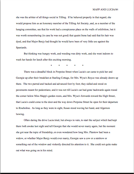
Don’t need the aforementioned bloodhound or magnifying glass to spot that difference, do you? Neither would Mehitabel.
I’m not saying, of course, that ease of first-round disqualification was the actual motive behind the rule change; as I said, I’m engaging in irresponsible speculation here. I’m saying that this year, the ULC’s contest guidelines specified that All pages of the submission must have the category number, manuscript title, and page number listed in the upper right-hand corner.
Which means, of course, that both our first and second examples would be, if not actually disqualified, then at least had enough points subtracted to render making it to the finalist round particularly likely. And all for a change that, while it would leap off the page at Mehitabel, might not even be noticed by a reader unfamiliar with manuscript format — and that would drive those of us accustomed to properly-formatted book manuscripts nuts.
The space shuttle has been grounded, and time has moved on. Take a gander:

“But Anne,” the eagle-eyed among you will no doubt exclaim, “that’s not the only difference between this example and the previous two. Earlier, there were five asterisks indicating the section break; here, there are only three. What gives?”
What gives, ladies and gentlemen, is yet another change in long-standing contest rules. This year, the wording changed at the bottom of the rule page: Indicate scene breaks (such as: POV/Location/Time change) by three spaced asterisks.
The moral of the story is — let’s all shout it together, shall we? — always, always, ALWAYS go over the contest rules more than once and follow them to the letter. Don’t assume that you know what they say after only a cursory glance, and for heaven’s sake, don’t blindly follow the advice of any given yahoo with a website who happens to give advice to writers.
Yes, including yours truly. Heck, I WON that contest once, and if I hadn’t combed the new rules, I would not have been aware of either of these newfangled requirements.
That being said, let’s move on to another element many contest entrants overlook: the title page for your contest entry.
Already, I hear dissension in the ranks. “But Anne,” I hear those of you planning to enter next year’s version of the ULC, “I realize that the contest you were discussing yesterday did require a title page, but if I’m reading the rules correctly, the contest I’m entering doesn’t ask for one. I’m afraid of breaking the rules — do I really need to add it?”
I understand your fear, cringing pre-entrants, but in my opinion, yes, you do need one, for precisely the same reason that a professional writer always includes a title page with any book-length manuscript or excerpt therefrom she plans to submit to an agent or editor. It’s just the way the pros do things.
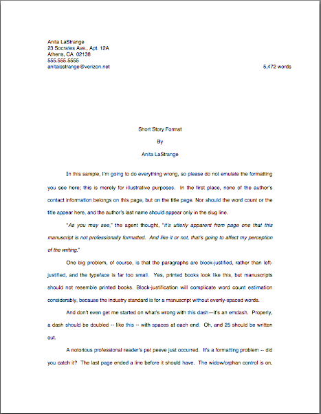
Not to mention that a title page in standard format is stuffed to the proverbial gills with all kinds of information that’s highly useful to folks in the industry. Look at what Millicent would expect to see topping a manuscript:

See? A great many of the basic facts an agent would need to know to acquire and sell a book are right there at her fingertips: what kind of book it is, how long it is, the title, the author — and, most importantly from our point of view, how to get ahold of that gifted author in order to proffer a representation contract. (For more of the hows and whys of a standard format title page, please see the aptly-named HOW TO FORMAT A TITLE PAGE category on the archive list at right.)
For a contest, however, these are not the relevant facts Mehitabel needs to know — in fact, the mention of a couple of ‘em might well get you disqualified. But almost without exception, contest rules will specify that an entrant must provide certain additional information — and the logical place to do that is on a title page.
Let’s take, for instance, the ULC’s entry guidelines — or are these the guidelines from a few years ago. Do check. At one time, at least, its rules demanded that, in addition to filling out an entry form, the entrant should include other information:
*The Contest Category name and number (e.g. Category 3: Romance Genre) must be printed on the first page of the submission and on the mailing envelope.
*All pages of the submission (chapters and synopsis) must have the title of the manuscript.
*Do not type your name on any page of the submission. It should appear only on your registration form and return envelope.
And, from elsewhere in the rules, our old friend:
*Have the title of the submission and page numbers located in the upper right hand corner of each page.
We dealt with quite a few of these criteria yesterday and earlier today, right? Even though the rules do not invoke the magical words slug line, we’ve all had enough experience now with manuscripts to know that is what they’re talking about, right? So no worries here.
Except for that pesky requirement to name the category. Sure, it says to place it on the first page of the submission, but does that mean on a title page or on the first page of text?
Most contest entrants go for the latter. Technically, there is nothing wrong with this — except for the fact that including information other than the chapter name and number on the first page of text makes it look to anyone familiar with standard manuscript format as though the writer just doesn’t know the difference between short story format.
Oh, you’re not familiar with the latter? It looks like this:
And the proper format for the first page of a book-length manuscript, which looks like this:
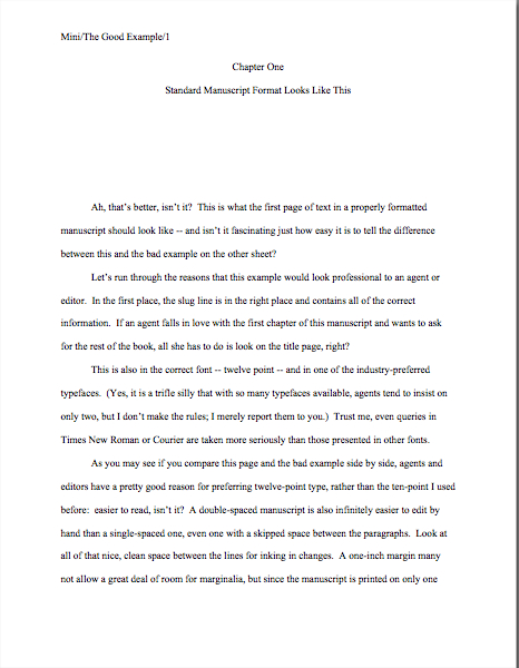
I ask you once again: did you require either a magnifying glass or a bloodhound, or even a psychic, to ferret out the difference between those two pages? I’m hoping not, but if you did, you might consider consulting a qualified eye specialist.
So while you could comply with the rules (if they are for the right year) by shoving the title, category, and genre onto the first page of text, it’s not going to look very market-ready to trained eyes. And we all know by now how your garden-variety contest judge feels about marketability, don’t we?
Before you stress out too much about this seeming Catch-22, your fairy godmother is here to make it all better. I’ve got a simple, elegant solution that will both satisfy the rule-huggers and make your entry look spotlessly professional.
You guessed it: by adding a title page.
Don’t worry about its adding length to your entry: as I mentioned in passing yesterday, in neither contests nor manuscripts are title pages either numbered or counted in page counts. What might it look like otherwise, you ask? Well, obviously, it would vary slightly from contest to contest, depending upon what the rules called upon the writer to provide, but were our pal Gus entering the ULC, I might advise him to make his entry’s title page look a little something like this:

Admittedly, there have been more exciting title pages in the history of the world, but this one offends no one, adheres to the contest’s stated guidelines, and gives the necessary information. Everybody wins, so to speak.
Note, too, that just like a title page in standard format, the contest entry title page is in the same font and typeface as the rest of the manuscript. Resist the temptation to add bells and whistles such as boldfacing, larger type, or (heaven preserve us) designs. This is not the place to show your creativity: it’s the place to show your professionalism.
Show your creativity in the text you submit.
Resist, too, the astonishingly common impulse to include an epigraph of any sort on either the title page or the first page of your entry. You know what I’m talking about, right? Those little quotations and/or excerpts of poetry that authors so love to tack on to the front of their work, presumably to demonstrate that they are well-read, the source of their inspiration for the book to follow, or a subtle announcement that this work is ready to join the community of well-loved published writing.
I have to admit, I like ‘em, too, but do you know what they start to look like to professional readers after only a year or two of seeing them emblazoned on title pages, first pages, or pages of their own in manuscripts? Like little picket signs reading, I’m just as good as the writer I’m quoting — take my word for it.
To which the professional reader is likely to respond, after being confronted with the 1500th manuscript this year similarly picketed, “Oh, yeah? You’ve just raised the bar to prove it, baby. You’d better write like Gustave Flaubert!”
Just don’t do it in a contest entry, no matter how integral to the plot that opening poem may be, even if you wrote it yourself. Even if one of the characters wrote it. The judges show to assess your writing, not those of the people you like to quote.
I sense some of you scratching your heads. “But Anne,” deep thinkers everywhere ask, and who could blame them? “I don’t get it. Oh, I get why a contest’s organizers might want to render it this tricky to follow its rules. They’re entitled to test which entrants are paying attention. What I don’t get is why, if they’re going to do it that way, they don’t just post the rules for standard format.
That’s a good question, thinkers. I suspect that if you asked most contest organizers and judges, they would be flabbergasted at the suggestion that writers who haven’t been submitting their work fairly regularly to agents, editors, and magazines would be entering their contest at all. “So wouldn’t,” Millicent muses, “their writing already be in standard format?”
If you doubt this, take a gander at most literary contests’ rules: most of the time, specific expectations are compressed under terse statements such as, submit in industry standard format.
That should make those of you who have been hanging out on this site for a while feel pretty darned good about yourselves — because, believe me, having some idea what standard format should look like, or even that such a thing exists, places you several furlongs in front of aspiring writers who do not. (If you fall into the latter category, you might want to hie yourself hence to the HOW TO FORMAT A BOOK MANUSCRIPT category at right.) Because — correct me if your experience contradicts this — this is an industry that tends to conflate lack of professional knowledge with lack of artistic seriousness.
That is as true for contest entries as for submissions to agents. That’s why, in case you have been wondering, I harp on standard format so much here. No one is born aware of how the industry expects to see writing presented, but the rules are seldom shared with those new to the game — and almost never explained in much detail.
Certainly not on your garden-variety contest entry guideline page. Admittedly, sometimes one sees the rules asserted in an aggressive do this or fail! tone, but it’s pretty difficult to apply a rule unless you know what it’s for and how it should be implemented.
That’s my feeling about it, anyway. Call me zany, but I would rather see all of you judged on the quality of your WRITING than on whether your manuscript or contest entry adheres to a set of esoteric rules. But unless it does conform to those (often unspoken) rules, it’s just not going to look professional to someone who is used to reading top-of-the-line work.
So try to think of quadruple-checking those rules as the necessary prerequisite to getting a fair reading for your writing — and bear in mind that most judges will expect the author of that winning entry to have been hanging around the industry for a good long time.
The two categories where this expectation is most evident are screenwriting and poetry. Almost any contest that accepts screenplays will use the same draconian standard that the average script agent does: if it’s not in positively the right format (and in the standard typeface for screenplays, Courier), it will be rejected on sight.
Now, I’m going to be honest with you here: I am not a screenwriter. So if you are looking for guidance on how to prep a screenplay entry, I have only one piece of advice for you: GO ASK SOMEONE WHO DOES IT FOR A LIVING.
Sorry to be so blunt, but I don’t want any of my readers to be laboring under the false impression that this is the place to pick up screenplay formatting tips. Happily, there are both many, many websites out there just packed with expert advice on the subject, and good screenplay formatting software is easily and cheaply available. I would urge those of you with cinema burning in your secret souls to rush toward both with all possible dispatch.
I can speak with some authority about poetry formatting, however. Remember how I mentioned yesterday that where contest rules are silent, their organizers generally assume that writers will adhere to standard format — which is to say, the form that folks who publish that kind of writing expect submitters to embrace? Well, that’s true for poetry as well.
So what does standard format for poetry look like? Quite a bit as you’d expect, I’d expect:
* Single-spaced lines within a stanza
* A skipped line between stanzas
* Left-justified text, with a ragged right margin
* Centered title on the first line of the page
* 1″ margins on all sides of the page
* 12-point typeface on white paper, printed on only one side of the page.
In other words, it shouldn’t be formatted the way you might see it in a book, where the left margin might be a few inches in, or on a greeting card, where the text floats somewhere closer to the center of a page. Basically, the average poetry submission looks like…well, let me go ahead and borrow a manuscript page from a favorite poet of mine, Wallace Stevens:
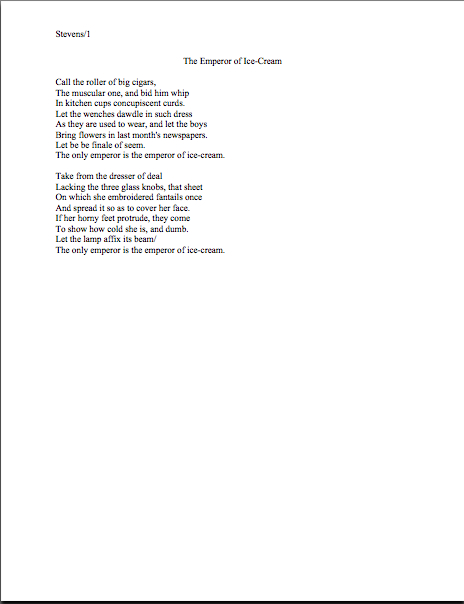
Pretty straightforward, eh? Now let’s see what how a contest rules might call for something slightly different. To pick one set at random, let’s take a random year’s worth of the ULC’s:
* Submit three complete poems.
* Single-space within stanza, double-space between stanzas.
* Maximum length of collection: 3 pgs.
* Use 12pt Times New Roman or Times (Mac).
At the point I checked — today? Last year? Fifteen years ago? — there were all of the category-specific guidelines listed. By scrolling to a different part of the ULC’s entry guidelines page, I found others:
* One-sided 8 1/2 x 11 standard WHITE paper.
* 1” margins all around.
* Have the title of the submission and page numbers located in the upper right hand corner of each page.
* Each submission MUST show the name of the category to which it is submitted.
Okay, what can we learn from this, other than that it’s always a good idea to read the contest’s entry guidelines in its entirety, rather than merely the section on one’s chosen category? Any occasion for our pal Wallace to panic about the breadth of necessary changes to his already-formatted poem?
Not really. Oh, the rules seem pretty hostile to the notion that any worthwhile poem could possibly be longer than a single page (take that, Lord Byron!), as well as unaware that Word for Mac does in fact feature the Times New Roman font — and has for many years. But otherwise, there’s not a lot here that ol’ Wallace is going to have to change.
Except, of course, for taking his name out of the slug line and moving it to the other side of the page, along with the category number.
Do I hear some confused muttering out there? “But Anne,” I hear some of you point out, and who could blame you? “What about needing to place the title in the slug line? Each of the three less-than-page-long poems will have a different title, won’t it?”
Great question, unseen mutterers. I’ll complicate it further: in the ULC’s rules for book-length works, there’s an additional regulation that may apply here:
* The Contest Category name and number (e.g. Category 3: Romance Genre) on the first page of the submission and on the mailing envelope.
Yes, yes, this bit does appear in the section of the rules that apply to categories other than poetry. But tell me: do you want your entry to be the one that tests whether the ULC’s organizers don’t think this rule should apply to the poetry category?
I didn’t think so. If I were a poet, I certainly would not omit scrawling Category 9: Poetry on the outside of my entry envelope.
You, of course, are free to do as you wish. But remember how I demonstrated earlier in this post that adding a title page can help smooth over quite a few little logistical problems? Look what happens to the opening of our pal Wallace’s entry if he takes that advice to heart:
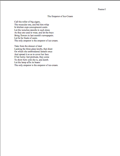
Both of these pages are in Times New Roman, incidentally, created on a Mac. (Hey, I couldn’t resist.) But, in case you didn’t notice, they adhere to the 2008 rules, and it is now 2012.
Oh, Wally. Haven’t you been listening?
It’s a shame, too, because by the ULC’s standards of 2008, Wally would have neatly avoided any rule violations. Oh, he could have given his collection of poetry (if a mere three poems can legitimately be called a collection; if he were a collector of, say, teapots, he would be considered merely a hobbyist collector if he had only three) a more exciting overarching title, but this gets the job done. It also satisfies the contest’s rule requiring that the title be in the slug line, along with the page number.
What’s not to like? Other than the fact that he was operating off a 4-year-old list of rules, that is.
Amazing what a lot of explanation — and a lot of stress — a seemingly simple set of rules can engender, isn’t it? Next time, we shall depart the barren landscape of nitpickery for the fertile valleys of style. Keep up the good work!
As no one has commented, I’ll throw in my six and a half cents worth ( figuring inflation and exchange rate). It makes perfect sense to me to include a title page with a contest entry, properly formatted and composed, or course. Yet upon entering a contest some years ago, my entry was returned due to a technical problem. I was asked to resubmit, but to exclude the title page. Nothing was mentioned in the rules about not submitting a title page, so this might fall under the heading of “what they want or don’t want, and don’t tell you.” And no, it was not the ULC discussed within this post.
Dave
That’s interesting, Dave; I shall have to ask around about that. Contests are as subject to fashion as anything else, so I like to try to keep track of any new trend like this!