The one text every literary contest entrant absolutely MUST read — and no, it’s not this blog post (but thanks for asking)

Wouldn’t you know it? I spend days and days of blog time on how to do a synopsis for a contest entry, and I leave out the answer to one of the most basic possible questions: how does one number the pages?

That does it — today’s post is going to be on formatting contest entries.

Let me begin by answering the synopsis question before any of us get even a single minute older: it varies from contest to contest.

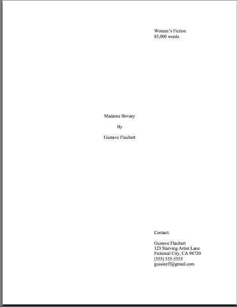
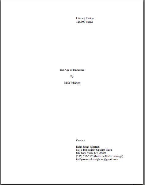
Most of the time, contests will simply specify that all pages of the entry should be numbered; some request that the synopsis or other support materials be numbered separately. If the rules say to number the synopsis sequentially with the rest of manuscript, by all means do so: if an entry consists of (in the order they appear) a title page, 24 pages of text, and a 3-page synopsis, the title page would be neither numbered nor counted, the text would be pp. 1-24, and the synopsis would be pp. 25-28. If they call for separate numbering, the title page and text would be the same, but the synopsis would start over at page 1.

Yes, you read that first part of the answer correctly: there is no standard answer to this, nor is there any substitute for going over the contest’s rules with the proverbial fine-toothed comb. In fact, I would HIGHLY recommend going through them with a fine-toothed comb, a nit-pick — and then making a checklist of ALL of the requirements, so you may check them off as you fulfill them.

Actually, if it were my entry, I would go a few steps farther: making the list, checking it twice for accuracy (à la the Furtive Non-Denominational Gift-Giver) — then photocopying it a couple of times, and not only checking off each item as you complete it on List #1, but going back just before sealing the envelope with List #2, to make sure that you didn’t miss anything in the rush to get the entry envelope-ready.

And perhaps — this was clever reader Tad’s excellent suggestion from a while back — handing List #3 to your significant other, flat mate, tennis partner, or some other sharp-eyed soul who either loves you enough to do you an unpleasantly tedious favor or is otherwise too polite to say no, and ask him/her/them/it to go through and check your entry for required elements.

I’m not just talking about making sure that you actually INCLUDE that synopsis you slaved over for so long, either. I’m also referring to adhering to formatting requirements.

So if you were entering a contest that required a synopsis, your first stop should be to consult the rules, to see if there are special ways they would like to see it formatted. If they do, follow them to the letter.

Do this even if what they are asking is silly, unheard-of, or downright obsolete. Like, for instance, the Organization-That-Shall-Not-Be-Named’s yearly insistence that section breaks should be denoted by at least three centered asterisks, like this:

asterisk.jpg

Now, those asterisks are not entirely without reason: back in the days of typewriters, they were indeed how a writer alerted the manual typesetter to a section break. Now that publishing houses expect writers to turn manuscripts over to them after contract signing in both hard and soft copy, the asterisked section break has gone the way of the horse and buggy: it’s still POSSIBLE to get around that way, but folks on the highway are going to get a might annoyed with you.

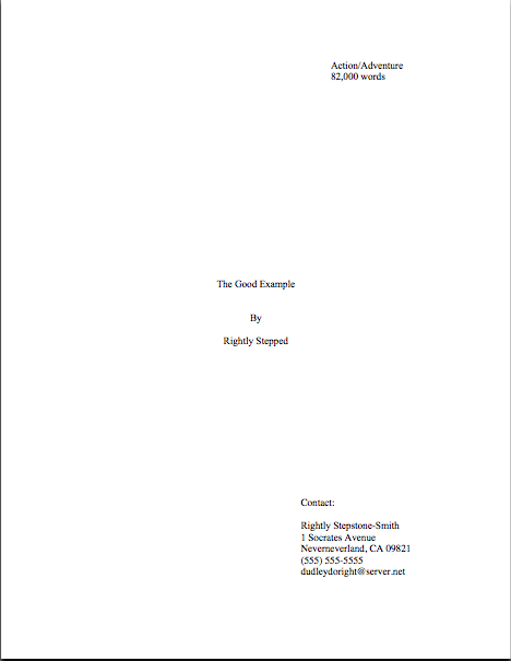
So if you were submitting the same page to an agent or editor, you would be best served by its looking like this:

non-asterisk.jpg

Which only goes to reiterate the point that I keep banging upon, drum-like, every time I bring up the topic of contest entries: contrary to popular belief amongst writers, the sheets of paper you submit to a contest and to an agent or editor should not necessarily be identical.

Yes, you’re going to want to adhere to standard manuscript format, where the rules do not specifically call for something different; since standard format is in fact industry standard (thus the name), contest judges expect to see it. In fact, if an entry is NOT in standard format (other than the little tweaks the contest’s organizers have amused themselves by adding to the rules), it usually loses either presentation or marketability points.

Remember, the judges want the finalists’ work to be market-ready — which means in the format that agents and editors prefer.

Do I hear some disgruntled shifting of feet out there? “But Anne,” I hear some of you mutter, “if they’re so hot on marketability, why don’t they just set up the rules so they’re identical with standard format and call it good?”

Ooh, good question, disgusted mutterers. If contest rules were set afresh every year, or even every decade, that would make abundant sense. Because, you see, contest organizers will frequently insist (in feedback, anyway) that the contest’s rules ARE standard format, even when — as in the case of the asterisks — that’s no longer true.

But the fact is, contest rules are NOT revised every year, generally speaking: in the vast majority of cases, the same rules have been used since the contest began, with additions as contest organizers thought of them, entrants objected, logical problems were noticed, and so forth. This is often true, incidentally, even of organizations who update their websites frequently.

I single out no PARTICULAR contest here, of course — but suffice it to say that if I were again entering a Contest-That-Shall-Not-Be-Named whose deadline is next week (on the 22nd, to be precise), I would not only go over the Rules and Guidelines section of their website with the proverbial fine-toothed comb, but also double-check the Category Definitions for EVERY category you intend to enter AND the entry form for minute differences.

I’m not saying that there’s a problem THIS year, of course. But still, it would be an excellent idea to triple-check, as there’s one less judge hanging around those parts who is aware of the problem to point it out to the others, if you catch my drift.

Because, realistically, if a contest judge duns you for not following a regulation that was not prominently displayed in the official rules, there’s not much you can do about it in retrospect. Think of it as the difference between the laws on the books and how a judge interprets them from the bench: you may be right in your interpretation, but the judge is the person in the room with the power to throw others in jail for contempt.

For all practical purposes, while you’re in his courtroom, his interpretation IS the law. This is why we have appellate courts.

Literary contests, however, do not have a Supreme Court to which writers may appeal. (Although it’s an interesting idea.) Unless a contest gives entrants feedback, it’s unlikely that you’d even find out what the particular charges against your entry were.

So read the rules (and all other relevant documents) CAREFULLY, follow them to the letter, and follow standard format where the rules do not specifically tell you what to do. (If you need a refresher on how manuscripts should be formatted, please see the rule-based STANDARD FORMAT BASICS and the more visually-based STANDARD FORMAT ILLUSTRATED categories at right. And please, if you have questions, ask — I’d much rather that you bring it up here than lose points on an entry.)

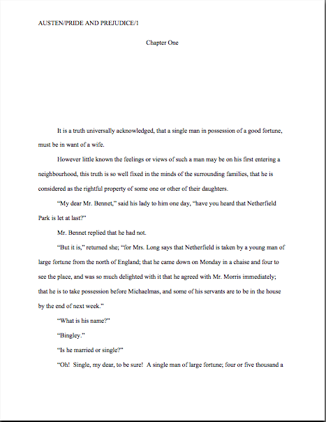
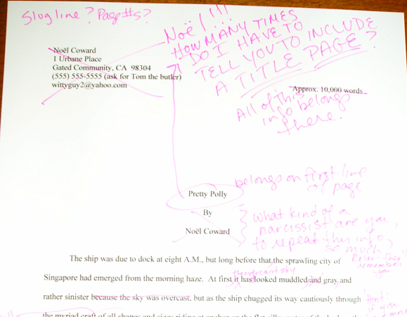
For those of you who are more conversant with standard format, let’s play a little game to show how differently an author, a regular reader, and a contest judge might view the same page of text. Here’s that first contest entry page again, an excerpt from EF Benson’s Mapp & Lucia: what’s wrong with it, from a judge’s point of view?

asterisk.jpg

Spot anything? Spot many things? (If you’re having trouble seeing the details of the text, try right-clicking on the image and saving it to your desktop.)

This is quite hard; I’ve set a multi-level test for you here. A few hints:

1) There’s an error that would be a disqualification-level offense for almost any contest,

2) a fairly universal pet peeve,

3) a common causer of knee-jerk reactions,

4) a couple of matters of style that would probably have lost Benson a crucial point or two, and

5) a more subtle problem that almost any professional reader would have caught, but most writers would not unless they were reading their own work out loud.

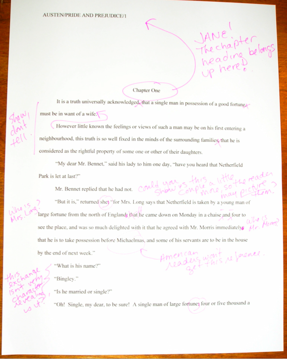
Here’s what the page would look like to a contest judge. The colored bits are the problems, one color per gaffe; I’ve backed up in the text a little, to make the more elusive problem clearer, so now it’s on two pages. (All the better to see standard format in action, my dear.) The one that would get the entry booted is in red.

page-one-jpeg.jpg

page-2-jpeg.jpg

See ‘em more clearly now? Let’s go through the problems one by one:

1) In an entry, ANY reproduction of the author’s name usually results in instant disqualification. (Yes, even in a memoir.) So quadruple-check that slug line.

2) As the notes in orange point out, these paragraphs are pretty long, and do not necessarily break where the underlying thought does. Also, some of these sentences are pretty lengthy — okay, let’s just go ahead and use that dreaded term from English class, run-on sentence.

Contrary to popular opinion, run-on sentences do NOT make a narrative seem more conversational in tone, at least to your garden-variety contest judge: most of the time, they just look LONG. As do paragraphs more than half a page long. The average contest judge’s heart sinks at the first glimpse of either.

3) Notice the underlined bits in teal — there, the text has fallen into passive constructions. Like many Millicents, most contest judges respond to the passive voice with a negativity that most people reserve for rattlesnake bites, fender-benders, and telemarketing calls. In their minds, the passive voice is pretty much synonymous with poor writing.

It’s not fair, of course; plenty of good writers use the passive voice occasionally, because it can be darned useful. But that’s not an argument you’re going to win in a contest entry. Purge the passivity.

4) If you’re going to use semicolons (pink), make sure that you are using them correctly. In English, ; and is technically redundant, because a semicolon is an abbreviated form of comma + and. So a list should read: Jessamyn gathered armfuls of lavender; bushels of poppies; two thousand puppies, and a bottle of Spray-and-Wash.

Were you surprised to see then show up in color? Most contest entries overuse this word — which isn’t hard to do, as in print, if action A appears in the text prior to action B, it is always assumed that B followed A, unless the text gives some specific reason to believe otherwise. So then is almost always unnecessary, particularly in a list of actions.

5) See all of that blue? It looks like a sapphire inkwell came here to die — and that’s precisely what that much repetition of and looks like to a contest judge. It’s annoying to read, because it is so easy for the eye to stray accidentally from one line to the next. (For an explanation of why this phenomenon is so tiring to the eye, please see my former post on the subject.)

It’s not a bad idea to go through your contest entry with a highlighter, marking all of the ands, for where more than one appears per sentence, you will usually find run-ons. Had I mentioned that people who sign up to judge contests are usually sticklers for grammar?

I know, I know: people do use connective ands instead of periods in spoken English. That doesn’t mean it will work on the page. Trust me on this one — it DOES bug most professional readers and contest judges.

Did that vicious little run-down make you want to shove your contest entry back into the drawer to hide from human eyes? That would be understandable, but I choose rather to view this little exercise as empowering for a writer: your chances of polishing your work to contest-winning shininess is much, much higher if you know BEFORE you seal that envelope just how close a scrutiny the judges are likely to give it.

Is it shallow of me to like it when my readers win, place, and make the finals in contests? Possibly. But if judges react so strongly to textual problems like #2-5, how much more negatively are they likely to respond to an entry that breaks one of the contest’s rules?

Do not assume that your entry will be read by the laid-back, in other words. Read the rules, reread the rules, and FOLLOW THE RULES as if your life depended upon it. If you don’t find yourself waking in the night, muttering that under your breath, the night before you’re planning to drop your entry in the nearest mailbox, I can only advise that your first action the next morning should be to go back and DOUBLE-CHECK THAT YOU HAVE FOLLOWED THE RULES.

And then read the whole darned thing out loud, to weed out possible knee-jerk reaction-triggers. Like, for instance, the first two words of the previous sentence.

More tips to follow, of course. But a quick reminder to those of you who are planning to enter that contest with a deadline next week: my ruminations on entries will in fact be going on past that deadline, as I’m trying not to promote any individual contest this year. All of my trenchant observations on that particular contest from last year, when I was writing directly about it, are still available for your perusal under the CONTEST ENTRY PREP category at right.

Keep up the good work!

See for yourself, part VI: but wait, there’s more!

I was all set to clamber onto my moral high horse again and dispense more of yesterday’s philosophy, honest — but then sharp-eyed long-time reader Janet caught, as is her wont, the missing puzzle piece in my illustrated romp through standard format. So I’m sliding elevated ethical questions to the back burner for the nonce and diving right back into practicalities.

As Janet so rightly pointed out, I completely skipped over one of the more common first-page-of-chapter controversies (and yes, in my world, there are many from which to choose), whether to place the title and/or chapter designation at the top of the page, or just above the text.

To place the options before you, should the first page of a chapter look like this:

/snapshot-2007-12-19-20-40-58.tiff

Or like this?

/snapshot-2007-12-19-20-42-20.tiff

Now, I had been under the impression that I had waxed long and eloquent about the side I took in this burning debate, and that quite recently, but apparently, my eloquence has been confined to posts more than a year old, exchanges in the comments (which are not, alas, searchable, but still very worth reading), and my own fevered brain.

So let me clear up my position on the matter: the first version is in standard format; the second is not. No way, no how. And why do they prefer the first?

Chant it with me now: BECAUSE IT LOOKS RIGHT TO THEM.

Yet, if anything, agents and contest judges see more examples of version #2 than #1. Many, many more.

Admittedly, anyone who screens manuscripts is likely to notice that a much higher percentage of them are incorrectly formatted than presented properly, this particular formatting oddity often appears in otherwise perfectly presented manuscripts.

And that fact sets Millicent the agency screener’s little head in a spin. As, I must admit, it does mine and virtually every other professional reader’s. Because at least in my case — and I don’t THINK I’m revealing a trade secret here — I have literally never seen an agent submit a manuscript to a publishing house with format #2. And I have literally never even heard of an agent, editor, or anyone else in the publishing industry’s asking for a chapter heading to be moved from the top of the page to just above the text.

Oh, I’ve heard some pretty strange requests from agents and editors in my time, believe me; I’m not easily shocked anymore. But to hear a pro insist upon placing the chapter heading where you have to skip down a third of a page to read it…well, that would have me reaching for my smelling salts. (Do they even make those anymore?)

But clearly, somebody out there is preaching otherwise, because agents, editors, and contest judges are simply inundated with examples of this formatting anomaly. We see bushels of ’em. Hordes of aspiring writers are apparently absolutely convinced that the sky will fall in if that chapter heading is located anywhere but immediately above the text.

In fact, it’s not all that uncommon for an editor to find that after she has left a couple of subtle hints that the writer should change the formatting…

/snapshot-2007-12-19-20-56-36.tiff

…the subsequent drafts remain unchanged. The writer will have simply ignored the advice.

(Off the record: editors HATE that. So do agents. Contest judges probably wouldn’t be all that fond of it, either, but blind submissions mean that a writer must submit the same chapter two years running to the same contest, have the entry land in the same judge’s pile — in itself rather rare — AND the judge would have to remember having given that feedback.)

This may seem like a rather silly controversy — after all, why should it matter if the white space is above or below the title? — but sheer repetition and writerly tenacity in clinging to version #2 have turned it from a difference of opinion into a vitriol-stained professional reader pet peeve. (See earlier comment about how we tend to react to our advice being ignored; it isn’t pretty.)

Which, unfortunately, tends to mean that in discussions of the issue at conferences degenerate into writing-teacher-says-X, editor-at-Random-House-says-Y: lots of passion demonstrated, but very little rationale beyond each side’s insisting that the other’s way just looks wrong.

However, there is a pretty good reason that moving the chapter heading information to just above the text looks wrong to someone who edits book manuscripts for a living: it’s a formatting tidbit borrowed from short stories, whose first pages look quite different:

/snapshot-2007-12-19-20-58-59.tiff

There, as you may see for yourself, is a mighty fine reason to list the title just above the text: a heck of a lot of information has to come first. But that would not be proper in a book-length manuscript, would it? Let’s see what Noêl’s editor has to say, viewing this as the first page of a book:

/snapshot-2007-12-19-21-02-21.tiff

Ouch. (That last bit would have been funnier if the entire page were readable, by the way, but my camera batteries were running low.) But as Millicent and that angry mob of pitchfork-wielding ignored editors would be only too happy to tell you, short stories don’t HAVE chapters, so who on earth are they to be telling those of us in the book world how to format our manuscripts?

Stick with version #1.

While I’ve got the camera all warmed up, this would probably be a good time to show another ubiquitous agent and editor pet peeve, the bound manuscript. As with other ploys to make a manuscript appear identical to a published book, binding the loose pages of a manuscript for submission will NOT win you friends in the publishing world.

Why? Not only does this not look right (I spared you the chanting this time), but it seems so wrong that Millicent will be positively flabbergasted to see a submitter to do it.

Seriously, this is one of those things that is so engrained in the professional reader’s mind that it seldom even occurs to authors, agents, or editors to mention it as a no-no at writers’ conferences. Heck, I’m not sure that I’ve mentioned it once within the last six months — and by anyone’s standards, I’m unusually communicative about how manuscripts should be presented.

So pay attention, because you’re not going to hear this very often: by definition, manuscripts should NEVER be bound in any way.

Not staples, not spiral binding, not perfect binding. There’s an exceedingly simple reason for this: binding renders it impossible (or at least a major pain in the fingertips) to pull out a chapter, stuff it in one’s bag, and read it on the subway.

Hey, paper is heavy. Would YOU want to lug home ten manuscripts every night on the off chance you’ll read them?

In practice, I’m sorry to report, a bound manuscript will seldom survive long enough in the screening process for the chapter-separation dilemma to arise, because — and it pains me to be the one to break this to those of you who’ve been submitting bound manuscripts, but if I don’t tell you, who will? — those pretty covers tend never to be opened.

Remember that immense pile of submissions Millicent has to screen before going home for the day — and it’s already 6:30? Well, when she slits open an envelope that reads REQUESTED MATERIALS on the outside, she fully expects to see something like this lurking between the cover letter and the SASE tucked underneath:

/snapshot-2007-12-11-01-28-43.tiff

But in the case of the bound manuscript, she instead sees something like this:

/snapshot-2007-12-19-21-05-59.tiff

Kind of hard to miss the difference, isn’t it? And unfortunately, nine times out of ten, the next sound a bystander would hear would be all of that nice, expensive binding grating against the inside of the SASE.

Honestly, it’s not that she is too lazy to flip open the cover; she just doesn’t see why she should. Her logic may not be fair or open-minded, but it’s a fairly common argument throughout the industry: if this submitter does not know this very basic rule of manuscripts, how likely is she to know the rules of standard format? And if she does not know either, how likely is she to be producing polished prose?

Yes, this logic often does not hold water when it comes down to an individual case. But from her perspective, that matters less than we writers would like — because, as unpleasant as it is for aspiring writers to realize, her agency is going to see enough technically perfect submissions this week to afford to be able to leap to unwarranted conclusions about this one.

Don’t waste your money on binding.

Now that I have depressed you all into a stupor, let me add a final note about learning to conform to these seemingly arbitrary preconditions for getting your book read: any game has rules. If you saw a batter smack a baseball, then dash for third base instead of first on his way around the diamond, would you expect his home run to count? Would an archer who hit the bulls-eye in her neighbor’s target instead of her own win the grand prize? If you refused to pay the rent on Park Place because you didn’t like the color on the board, would you win the Monopoly game?

I can go on like this for days, you know.

My point is, submitting art to the marketplace has rules, too, and while your fourth-grade P.E. teacher probably did not impart them to you (as, if I ran the universe, s/he would have), you’re still going to be a whole lot better at playing the game if you embrace those rules, rather than fight them.

You’ll also, in the long run, enjoy playing the game more.

And remember, you’re playing this game by choice: you could, after all, make your own rules and publish your book yourself. Weigh the possibilities, and keep up the good work!

See for yourself, part V: appearances for appearances’ sake — and happy birthday, Philip!

Many thanks to all of you sweet souls who forwarded me links to the many literary and SF sites out there that commemorated what would have been my good old friend Philip K. Dick’s 79th birthday. This was the first year that I received a whole boatload of these messages, so it was great fun — rather like receiving a flotilla of birthday cards in the mail.

I needed the cheering up, I’m afraid, as usually, I throw a little dinner party on this particular day. Not only out of respect for my first serious writing teacher, but also as a birthday shindig for some of the other great artists born today: Beethoven, Sir Noël Coward, Sir Arthur C. Clarke (of 2001 and CHILDHOOD’S END fame), and of course, Author! Author!’s own beloved, wise auntie, Jane Austen.

You could do worse than to raise a glass to that crowd. But this year, I’ve just been too wiped out to allow anyone but the postman to drop by — and some days, I’m not even up to seeing him.

Thus, no dinner party this year, more’s the pity. I did a little too much last week, so this weekend, all I did was sleep and make groggy suggestions about how to maneuver the Christmas tree in order to make it stand up straight. (Which actually is necessary in our household: due to a truly spectacular bracken-and-cat interaction a few years back, we now tie the top of the tree to a ring firmly attached to the ceiling, so the tree does not need to be completely vertical in order to keep from toppling over.)

But enough about me; let’s talk about you.

While I was incapacitated, a group of my wonderful readers was holding down the fort here, trading tips on how to deal with that pesky problem, how to add a second space between sentences if a writer had mistakenly typed the whole thing thinking there should only be one. If you have even a passing interest in this topic, I implore you, check out the comments on the last two days’ posts; it’s well worth it.

We have only few rules of standard format left to cover in this series, so my first instinct was to use the text of one of Philip’s short stories for the examples. (Seemed appropriate, given that he used to mark deviations from standard format on stories I wrote for school and send them back to me for correction. What 11-year-old girl wouldn’t have loved THAT?) But since fair use permits only 50 consecutive words in a quote without explicit permission from the copyright holder, and the copyright holders in his case have a nasty habit of waving $2 million lawsuits in my general direction (and my quondam publisher’s) every time I so much as breathe his name, that didn’t seem entirely wise.

So I thought, in honor of the day, I would use a little something that I am undoubtedly entitled to reproduce here. Here is the first page of Chapter Six of my memoir:

snapshot-2007-12-17-21-59-42.tiff

Every chapter should begin like this: on a fresh page, 12 single lines (or 6 double-spaced) from the top. As with the first page of text, the only reference to the author’s name or the title should appear in the slug line, located in the upper left-hand margin. (And in answer to reader Janet’s intelligent question: the slug line should appear .5 inches from the top of the paper, floating within the 1-inch-deep top margin. I can’t believe I never mentioned that before.) The page number belongs within it, rather than anywhere else on the page.

The slug line confuses a lot of aspiring writers; until you have seen piles and piles of professional manuscripts, it looks kind of funny, doesn’t it? And when you’ve been told over and over again that a manuscript should have a 1-inch margin on all sides, it can seem counterintuitive to add a line of text, even such a short one, IN that margin.

But I assure you, it’s always been done that way. And why? Followers of this series, chant it with me now: BECAUSE IT LOOKS RIGHT.

Yes, that logic IS tautological, now that you mention it. If you have a problem with that, I would suggest taking it up with the powers that rule the universe. I, as I believe the reference above to my memoir’s troubled path makes abundantly clear, apparently do not rule the universe.

If I did, today would be a holiday for every writer on the planet. Especially the ones who are having trouble getting their work published, like, oh, Philip K. Dick, Arthur C. Clarke, and Jane Austen all did at the beginning of their fiction careers. (I just mention.)

Back to business. Placing the slug line in the header (located in Word under the VIEW menu) also enables the writer to take advantage of one of the true boons of the advent of word processing, pages that number themselves. Every so often, I will receive a manuscript where the author has, with obviously monumental effort, HAND-numbered each page, so it looks like this:

snapshot-2007-12-17-22-04-43.tiff

See how pulling the slug line down into the text messes with the spacing of the page? An entire line of text is sacrificed to it — and let me tell you, that line is not going to go quietly.

Why not? Well, what’s going to happen if new writing is inserted on a page formatted this way? That’s right — the author is going to have to go back and move each and every one of those slug lines to match the NEW pagination.

I’d show you a picture of this, but it’s just too ugly to contemplate. Trust me, it would be a heck of a lot of work.

See any other problems with this page? How about the fact that the slug line includes the word PAGE? Shouldn’t be there; just the numbers will suffice.

Did I just hear some huffs of indignation out there? “But Anne,” I hear the formatting-ambitious cry, “it’s kind of stylish to include PAGE before the page number, isn’t it? It’s just a matter of personal style — who could be hurt by including it, if I like the way it looks?”

Well, you, for starters. And why? (Chanters, ready your lungs.) BECAUSE IT JUST WOULD NOT LOOK RIGHT TO A PROFESSIONAL READER.

I’m quite serious about this; I’ve seen screeners get quite huffy about this one. :Does this writer think I’m STUPID?” Millicent is prone to huff. (Don’t answer that first question; it’s rhetorical.) “Does she think I DON’T know that the numeral that appears on every page refers to the number of pages? Does she think I’m going to go nuts and suddenly decide that it is a statistic, or part of the title?”

Don’t bait her. Do it the standard way.

Okay, do you spot any other problems? What about the fact that the first paragraph of the chapter is not indented, and the first character is in a different typeface?

The odd typeface for the first letter, in imitation of the illuminated texts hand-written by monks in the Middle Ages, doesn’t turn up all that often in manuscripts other than fantasy and YA, for one simple reason: books in that category are more likely to feature this it’s-a-new-chapter signal than others. But once again, what an editor may decide, rightly or wrongly, is appropriate for a published book has no bearing upon what Millicent expects to see in a manuscript.

Save the bells and whistles for someone who will appreciate them. Hop in your time machine and track down a medieval monk to admire your handiwork, if you like, but in this timeframe, keep the entire manuscript in the same typeface and size.

The non-indented first paragraph of a chapter is fairly common in mystery submissions, I have noticed; I’ve been told by many mystery writers that this is an homage to the great early writers in the genre, an echo of their style.

But you know what? Almost without exception, in Edgar Allan Poe’s time all the way down to our own, the EDITOR has determined the formatting that appeared on any given printed page, not the author. To professional eyes, especially peevish ones like Millicent’s, a manuscript that implicitly appropriates this sort of decision as authorial might as well be the first step to the writer’s marching into Random House, yanking off a well-worn riding glove, and striking the editor-in-chief with it.

Yes, you read that correctly: it’s sometimes seen as a challenge to editorial authority. And while we could speculate for the next week about the level of insecurity that would prompt regarding a minor formatting choice as a harbinger of incipient insurrection, is the manuscript of your first book REALLY the right place to engender that discussion?

Exactly.

If you want to make Millicent and her bosses happy — or, at any rate, to keep them reading calmly — indent every paragraph of the text should the expected five spaces. It just looks right that way.

While we’re at it, how about the bolded chapter number and title? Nothing in a manuscript should be in boldface. Nothing, I tell you. Uh-uh. Not ever.

Well, you could get away with the title itself on the tile page, but frankly, I wouldn’t chance it.

Nor should anything be underlined — not even names of books or song titles. Instead, they should be italicized, as should words in foreign tongues that are not proper nouns.

I heard that gigantic intake of breath out there from those of you who remember constructing manuscripts on typewriters: yes, Virginia, back in the day, underlining WAS the norm, for the simple reason that most typewriters did not have italic keys.

If you consult an older list of formatting restrictions, you might conceivably be told that publications, song titles, and/or foreign words (sacre bleu!) should be underlined. But trust me on this one: any agent would tell you to get rid of the underlining, pronto.

And why? All together now: because IT JUST DOESN’T LOOK RIGHT THAT WAY.

All right, campers, do you feel ready to solo? Here are two pages of text, studded with standard format violations for your ferreting-out pleasure. (I wrote these pages, too, in case anyone is worried about copyright violation or is thinking about suing me over it. Hey, stranger things have happened.)

snapshot-2007-12-17-22-11-51.tiff

snapshot-2007-12-17-22-13-22.tiff

How did you do? Are those problems just leaping off the page at you now? To reward you for so much hard work, here are a couple of correctly-formatted pages, to soothe your tired eyes:

snapshot-2007-12-17-22-14-23.tiff

snapshot-2007-12-17-22-15-34.tiff

Whenever you start finding yourself chafing at the rules of standard format, come back and take a side-by-side gander at these last sets of examples — because, I assure you, after a professional reader like Millicent has been at it even a fairly short time, every time she sees the bad example, mentally, she’s picturing the good example right next to it.

And you know what? Manuscripts that look right get taken more seriously than those that don’t. And regardless of how you may feel about Millicent’s literary tastes, isn’t a serious read from her what you want for your book?

Keep up the good work!

Entr’acte: please DON’T just take my word for it

After yesterday’s post, a reader wrote in to take issue with my stand about the burning issue of whether the language has, without the intervention of the English professors of the world, spontaneously changed to require only one space between sentences and after colons, rather than two. And, as you may perhaps be able to tell from that last sentence, it’s a topic upon which, as an editor, I have some fairly strong feelings.

After I was well into my fourth page of response, it occurred to me that the comment sections aren’t subject-searchable. So I’m going to put off the next installment in my series on how and why standard format is so easily recognizable to professional readers in order to devote an entire post to the issue, where future readers will be able to track it down.

Fasten your seatbelts; I’m about to go to town.

Every time I do a post on standard format, readers write in to tell me that the rules have changed, on this point or on others. And frankly, they SHOULD be commenting, if they believe I have misspoken, or even if they feel a particular point requires further elucidation: false modesty aside, quite a few people do read this blog on a regular basis, and the last thing that I want to do is lead anyone astray inadvertently.

So please, folks, keep sending in those constructive comments.

Apart from the community-support reason to ask follow-up questions, there is another, more self-interested reason that you should consider giving a shout if you think I’ve just told a real whopper: no writer, aspiring or otherwise, should apply a rule to her book without understanding WHY its application is a good idea.

Yes, even with something as basic as standard format. If a particular suggestion doesn’t make sense to you, PLEASE don’t do it just because I say so. Do it because you have thought about it and decided that trying it might help you market your writing.

I know, I know: life would be a whole lot easier if it came with a foolproof set of directions, and nowhere it that more true than in one’s first approaches to the publishing industry. It’s definitely confusing to a newcomer, fraught with unspoken expectations and counterintuitive requirements. As someone who has spent a lifetime around it, I could just give you a list of standard format requirements, dust off my hands, and traipse off to finish my holiday shopping.

That’s not my style, however. I like to take the time to explain the rules, both to render submission less of a big, ugly mystery and to give my readers a chance to make up their minds for themselves. Call me wacky, but in the long run, I think my way helps people more than pronouncements from on high.

Speaking of pronouncements from on high, my correspondent began, charmingly, by quoting one of mine:

“In fact, in all of my years writing and editing, I have never — not once — seen a manuscript rejected or even criticized for including the two spaces that English prose requires after a period or colon. ”

Have you heard of a manuscript being rejected for using only ONE space between sentences? Within the past five years or so?

Isn’t that a trenchant question? Isn’t it about time I stopped yammering about the desirability of discussion and got around to answering it?

Here’s the short answer: rejected SOLELY upon that basis, no; criticized as unprofessional, yes, often. Knocked out of finalist consideration as contest entries, absolutely. And I’ve certainly heard it listed among several equally subtle points that led to rejection at agencies; basically, like the other minor restrictions of standard format, it’s contributes to the sense that a writer just doesn’t know the ropes.

The irony, of course, is that the sources that claim the language HAS changed — and permanently, at that — tend to insist that skipping the second space after a period or colon, as our dear old white-headed English teachers taught us to do, automatically stamps a manuscript old-fashioned, obsolete, and generally silly.

How do they justify this? The logic, as I understand it, runs thus: since printed books, magazines, newspapers, and to a great extent the Internet have been omitting these spaces in recent years, the language must therefore have changed. So much so that not only is leaving out the second space now permissible — which it definitely was not until very recently; Paula’s estimate of the last five years is pretty accurate — omitting it is now REQUIRED.

That sounds very serious, doesn’t it? Scary, even. The problem is, if it is required, why isn’t the industry enforcing it in the ways that formatting restrictions are generally enforced, by agents and editors asking writers to change their submissions accordingly?

I’m not being flippant about this: while this rather radical formatting rule change has been popping up in a lot of fora that give advice to aspiring writers over the past five years, the actual practices of the industry have seemed to be the engine behind the change. I have literally never seen (or heard) an argument in favor of omitting the second space made by anyone who works within the publishing industry.

At least not about MANUSCRIPTS.

Printed books, yes — and here, I think, is where the confusion lies, because many publishers have made this change in their newer releases. Essentially, the proponents of eliminating the second space between sentences are arguing that what one sees in print is what one should reproduce on the manuscript page.

As I pointed out yesterday, publishers have made this shift in order to save paper. Which, as those of you who followed this summer’s Book Marketing 101 series already know, is most emphatically NOT the goal of manuscript format, which aims toward ease of reading and hand-editing.

Omitting that second space does, as I mentioned yesterday, render it considerably harder to write corrections on hard copy. It may not seem like a lot of room, but believe me, when you’re trying to make four grammatical changes within a single sentence legibly, any extra bit of white space is a boon.

Hey, carrots are room-consuming. So are scrawls that read confusingexpand this, or Aristotle who?, all of which editors have bestowed upon my manuscripts at one time or another.

I suspect that the underlying assumption of the second-space elimination movement is that editing on hard copy has gone the way of the dinosaur (it hasn’t), just because it is now feasible to send and edit manuscripts electronically. But just because it is technically POSSIBLE to eliminate paper from the process doesn’t mean that it occurs in practice all the time, or even very often.

Remember when Internet-based shopping first became popular, and technology enthusiasts assured us all confidently that the supermarket and shopping mall would be obsolete within a decade? Turns out that a lot of people still wanted to squeeze melons and try on clothes before they bought them. Who knew?

Also, for the argument that the extra spaces are obsolete to makes sense on a practical level — or, at minimum, to generate the levels of resentment amongst agents and editors that its proponents predict — the industry would have to expect that every submission would be camera-ready. In other words, in EXACTLY the format that it would appear in the finished book.

Seeing a problem here?

As those of you who have been following the current See For Yourself series are already aware, standard format for MANUSCRIPTS has little to do with how BOOKS are formatted. As I have been demonstrating for the past few days, manuscripts differ in many important respects from the format the Chicago Manual tells us to expect in a published book, or that AP style urges us to produce in a magazine or newspaper.

Which prompts me to ask: is it really so astonishing that spacing would also differ? And why would a change in publishing practice necessarily alter what professional readers expect to see in a manuscript — especially when that alteration would unquestionably make their jobs harder?

And that, in case you were interested, is why I don’t embrace the practice of eliminating the second space between sentences in manuscripts. Until I see strong evidence that agents, editors, and contest judges frown upon the extra space, I’m going to continue to recommend it.

So there.

I can certainly understand why aspiring writers who had gone the single-space route would be miffed at this juncture, though; changing that fundamental an aspect of a text could eat up a LOT of time. As, indeed, my insightful correspondent pointed out:

It took a lot of effort to train myself to STOP using the two spaces. It’s one of those grammatical rules that seems to have all but disappeared (much like the rather perplexing fad to omit the comma before the word “too”). If it’s necessary, I suppose there’s an easy “find and replace” way to correct my manuscript to add an additional space between sentences?

I’m very glad that the commenter brought up the comma elimination fad, because it provides a perfect parallel to what has happened with the spaces. Just because a rule of grammar’s relaxation becomes common doesn’t mean that the rule itself has disappeared; it just means that breaking the rule has become marginally more acceptable.

For instance, these days, few people other than my mother would stop a conversation in order to correct a speaker who referred to “everyone and their beliefs,” but technically, it remains incorrect. To preserve subject-object agreement, it should be “everyone and his beliefs” or “everyone and her beliefs.” The reason for this shift is primarily sociological, I suspect: when American businesses (and television writers) began to take active steps to make language more friendly to women, the incorrect version sounded less sexist, and thus became widely accepted.

Does that mean that “everyone and their beliefs” magically became grammatically correct overnight? Not on your life. And the better-educated the intended reader- or listenership for the sentence, the more likely that the error will raise hackles.

Had I mentioned that Millicent, along with pretty much everyone who works in her agency, was probably an English major? Heck, she probably wrote her senior thesis on this kind of colloquial speech.

The fact is, the grammatical rule about the requisite number of spaces between sentences and after colons HASN’T changed — the PRACTICE has in many published works; in manuscripts, academic work (almost always the last to accept any sea change in the language), and private writing, the rule most emphatically has not.

And, as with splitting infinitives or ending sentences with prepositions, while most people won’t care, the ones who DO care feel very strongly about it indeed. To them, it’s more serious than formatting: it’s a matter of literacy.

That may seem harsh, given that most of the aspiring writers who have embraced this practice report that they are doing it because some apparently authoritative source told them to make the switch — but tellingly, those sources’ certainty on the matter didn’t stop howls of protest from the professional reading community when Miss Snark (among others) suddenly started advising aspiring writers to leave it out. The result was pretty dramatic: mysteriously, half the submissions agents received were harder to read, and the change happened more or less overnight — and since most agents don’t read even the major writing blogs, it seemed to come out of nowhere.

How loud were those howls, you ask? Suffice it to say that the grumbles continue to this day. No one who edits text for a living would vote for this particular change. To professional eyes, it just looks wrong.

To get return to my correspondent’s last comment, I don’t know of an easy way to make the change universally, alas; Word’s grammar checker currently accepts both single and double spaces between sentences as correct, treating it as a stylistic choice rather than a grammatical one. (If the language had actually changed to require only a single space, presumably Word would follow, eventually.) Like most of the population, the good folks at Microsoft seem perplexed by the dual standard.

Yes, it’s a pain for the writer — but as you have probably already noticed, the industry is not exactly set up to minimize effort for writers. Sorry. If I ran the universe…well, you know the rest.

If anyone reading this HAS figured out a simple way to make the change universally throughout a document, PLEASE write in and share it with the rest of us. Aspiring writers the world over will bless your name, and who wouldn’t want that?

A wiser person would probably sign off now, but I’m going to bite the bullet and bring up the question that is probably on many, many minds at this juncture: barring a flash of insight from a reader or a well-timed act of celestial intervention, could you get away with retaining the single-space convention in a document already written?

As you may have gathered, I would not advise it, especially in a contest submission. However, it really is up to the individual writer. As much as writers would LIKE for there to be a single standard upon which every single person in the industry agreed, it just doesn’t happen. There are exceptions in what individual agents and editors want; you might strike lucky.

If you DO decide to go the single-space route (picture me rending my garments here), make absolutely certain that your manuscript has NO other problems that might trigger Millicent’s ire. Also, be prepared for an agent to ask to make the change before the manuscript is submitted to editors — and, if asked, do it cheerfully and without explaining at length why you originally embraced the single-space practice.

Not that YOU would do such a thing, of course, but for those who don’t know better: agents and editors tend not to be amused when writers of first books lecture them on how the industry has changed, and they should change with it.

And this is definitely an instance where folks outside the industry have been making pronouncements about how the industry should operate for quite a while. Even if you are completely polite in how you express it, chances are that the last writer who made the case to Millicent’s boss was not.

The word Luddite may actually have been uttered.

One more caveat before I sign off: I would caution any aspiring writer against assuming that any single problem, formatting or otherwise, was the ONLY reason a manuscript was getting rejected. Most of the time, it’s quite a few reasons working in tandem– which is why, unfortunately, it’s not all that uncommon for Millicent and her cohorts to come to believe that an obviously improperly-formatted manuscript is unlikely to be well-written. So changing the spaces between sentences alone probably isn’t going to be the magic bullet that results in instant acceptance.

Whatever course you decide to pursue, though, make it YOUR decision — and stick to it. Don’t leap to make every change you hear rumored to be an agent’s pet peeve unless you are relatively certain in your heart of hearts that implementing it will make your manuscript a better book.

Yes, even if the suggestion in question came from yours truly. It’s your manuscript, not mine.

Thanks for the great question, Paula, and everybody, keep up the good work!

See for yourself, part III: God bless the Millicents, every one

For the last couple of days, I’ve been pursuing the dual goals of trying to show you just how obvious it is to a professional reader when a submission ISN’T in standard manuscript format (as opposed to being set up to ape the format of published books) and to drum up a little holiday sympathy for Millicent, everybody’s favorite agency screener.

She’s the Tiny Tim of the literary world, you know; at least the Bob Cratchits a little higher up on the office totem pole get paid, but our Millie often doesn’t. Even if she’s not an intern, she’s still unlikely to be paid very much. Her hours are typically long, and quite a lot of what she reads in the course of her day is, let’s face it, God-awful.

Yes, that thought that suddenly sprang into your mind is precisely right: rejecting queries and manuscripts by the score IS considered on-the-job training for a fledgling agent, in much the same way as an editorial assistant’s screening manuscripts at a publishing houses is the stepping-stone to becoming an editor.

You didn’t think determining a manuscript’s literary merits after just a few lines of text was a skill that came naturally, did you?

The aspiring writer’s learning curve is often not dissimilar to Millicent’s, actually: no one is born knowing the rules of manuscript formatting. (Okay, so I practically was, growing up around so many writers, but that’s a rare exception.) Like Millicent, most of us learn the ropes only through reading a great deal.

She has the advantage over us, though: she gets to read books in manuscript form, and most aspiring writers, especially at the beginning of their journeys to publication, read mostly books. The format is, as I believe that I have pointed out, oh, several hundred times before in this very forum, quite different.

So what writers tend to produce in their early submissions are essentially imitations of books. The problem is, there are many reasons that a manuscript in book format would be hard for an agent or editor to handle — and not merely because the individual pages would appear unprofessional to Millicent.

For starters, published books are printed on both sides of the page, manuscripts on one. Why the difference, in these days of declining tree populations and editors huffily informing writers at conferences that paper is expensive?

Simple: it’s easier to edit that way.

Believe it or not, even in these days of widely available word processors, most professional editing is still done by hand. It’s hard to give trenchant feedback while traveling in a crowded subway car if you have to maneuver a laptop, and many agencies remain far too virus-fearful to allow their employees solicit attachments from writers who aren’t already clients. (Even those who do generally have a policy that forbids the opening of unsolicited attachments.)

But ultimately, most editors edit in hard copy because they prefer it. The human eye is, of course, to blame for this: reading comprehension drops by about 70% when the material is presented on a computer screen; the eye tends to skim.

Which is why — you can hear this coming, can’t you? — a wise writer always reads her ENTIRE manuscript IN HARD COPY before submitting it to anyone even vaguely affiliated with the publishing industry. It’s much, much easier to catch typos and logic problems that way.

Manuscripts should also be typed (don’t laugh; it’s not unheard-of for diagrams to be hand-drawn in submissions, or for late-caught typos to be corrected in pen), double-spaced, and have 1-inch margins all the way around. To call upon our old friend Dickens again, an average page of a manuscript should look like this:

snapshot-2007-12-13-00-09-57.tiff

(If you’re having trouble seeing specifics, or just aren’t seeing an image at all, try right-clicking on the image and saving it to your hard disk.)

To give you some idea of just how difficult — or even impossible — it would be to hand-edit a manuscript that was NOT double-spaced or had smaller margins, take a gander at this little monstrosity:

snapshot-2007-12-13-00-11-28.tiff

Reader-hostile, isn’t it? Even with nice, empty back pages upon which to scrawl copy edits, trying to cram spelling or grammatical changes between those lines would be well-nigh impossible. Knowing that, Millicent would never dream of passing such a manuscript along to the agent who employs her; to do so would be to invite a lecture on the vicissitudes of the editorial life.

Don’t tempt her just to reject it unread — and don’t, I beg you, provide the same temptation to a contest judge.

You know what I’m talking about, don’t you, past contest entrants and submitters who wanted to squeeze in a particularly exciting scene before the end of those requested 50 pages? Faced with a hard-and-fast page limit for submission, some wily writers will shrink the font or the margins, to shoehorn a few more words onto each page. After all, who is going to notice a tenth of an inch sliced off a left or right margin, or notice that the typeface is a trifle smaller than usual?

Millicent will notice, that’s who, and practically instantly. As will any reasonably experienced contest judge; after hours on end of reading 12-point type within 1-inch margins, a reader develops a visceral sense of when something is off.

Don’t believe me? Go back and study today’s first example, the correctly formatted average page. Then take a look at this:

snapshot-2007-12-13-00-13-48.tiff

I shaved only one-tenth of an inch off each margin and shrunk the text by 5% — far less than most fudgers attempt. Yet admit it — you can tell it’s different, can’t you, even without whipping out a ruler?

So could a professional reader. And let me tell you, neither the Millicents of this world nor the contest judges tend to appreciate attempts to trick them into extraneous reading. Next!

The same principle applies, incidentally, to query letters: often, aspiring writers, despairing of fitting a coherent summary of their books within the standard single page, will shrink the margins or typeface. Trust me, someone who reads queries all day, every day, will be able to tell.

The other commonly-fudged spacing technique involves skipping only one space after periods and colons, rather than the grammatically-requisite two spaces. Frequently, writers won’t even realize that this IS fudging: ever since published books began omitting these spaces in order to save paper, I’ve seen a theory propounded all over the Internet (and sometimes even in writing classes, where the teachers should know better) claiming that skipping the extra space is obsolete. Frequently, the proponents will insist that manuscripts that include the space look old-fashioned to agents and editors.

Well, guess what: standard manuscript format IS old-fashioned, by definition; that fact doesn’t seem to stop anyone in the industry for using it. In fact, in all of my years writing and editing, I have never — not once — seen a manuscript rejected or even criticized for including the two spaces that English prose requires after a period or colon.

I have, however, heard endless complaint from professional readers — myself included — about those second spaces being omitted. Care to guess why?

Reward yourself with a virtual candy cane if you said that cutting those spaces throws off word count estimation; the industry estimates assume those doubled spaces. And give yourself twelve reindeer if you also suggested that omitting them renders a manuscript harder to hand-edit.

We all know the lecture Millicent is likely to get if she forgets about that, right?

Again, a pro isn’t going to have to look very hard at a space-deprived page to catch on that there’s something fishy going on. Since Dickens was so fond of half-page sentences, the examples I’ve been using above won’t illustrate this point very well, so (reaching blindly into the depths of the bookshelf next to my computer), let’s take a random page out of Elizabeth Von Arnim’s VERA:

snapshot-2007-12-13-00-16-24.tiff

There are 310 words on this page; I wasn’t kidding the other day about how far off the standard word count estimations were, obviously. Now cast your eye over the same text improperly formatted:

snapshot-2007-12-13-00-18-09.tiff

Doesn’t look much different to the naked eye, does it? The word count is only slightly lower on this version of this page — 295 words — but enough to make quite a difference over the course of an entire manuscript.

So I see some hands shooting up out there? “But Anne,” I hear some sharp-eyed readers cry, “wasn’t the word count lower because there was an entire line missing from the second version?”

Well spotted, criers-out: the natural tendency of omitting the second spaces would be to include MORE words per page, not less. But not spacing properly between sentences was not the only deviation from standard format here; Millicent, I assure you, would have caught two others.I tossed a curve ball in here, to make sure you were reading as closely as she was.

Wild guesses? Anyone? Anyone?

The error that chopped the word count was a pretty innocent one, almost always done unconsciously: the writer did not turn off the widow/orphan control, found in Word under FORMAT/PARAGRAPH/LINE AND PAGE BREAKS. This insidious little function, the default unless one changes it, prevents single lines of multi-line paragraphs from getting stranded on either the bottom of one page of the top of the next.

As you may see, keeping this function operational results in an uneven number of lines per page. Which, over the course of an entire manuscript, is going to do some serious damage to the word count.

The other problem — and frankly, the one that would have irritated a contest judge far more, but probably Millicent slightly less — was on the last line of the page: using an emdash (“But—”) instead of a doubled dash. Here again, we see that the standards that apply to printed books are not proper for manuscripts.

Which brings me back to today’s moral: just because a particular piece of formatting looks right to those of us who have been reading books since we were three doesn’t mean that it is correct in a MANUSCRIPT. Millicent reads manuscripts all day; contest judges read entries for hours at a time. After a while, a formatting issue that might well not even catch a lay reader’s attention can begin to seem gargantuan.

As I pointed out yesterday, if the writing is good, it deserves to be free of distracting formatting choices. You want agents, editors, and contest judges to be muttering, “Wow, this is good,” over your manuscript, not “Oh, God, he doesn’t know the rules about dashes,” don’t you?

Spare Millicent the chagrin, please; both you and she will be the happier for it. Keep up the good work!

See for yourself, part II: the little things matter, honest

Yesterday, I began a compare-and-contrast exercise, showing common examples of the first pages of submissions and fine-tuning your binoculars so you might see how our old friend Millicent the Agency Screener might view them. And as those of you who read the post can attest, it was pretty obvious that the professionally-formatted title page won the beauty contest hands-down.

After I posted it late last night, I heard wee pixie voices bearding me. “But Anne,” I heard these winsome creatures pipe, “aren’t you assuming that Millicent’s pretty shallow? Whenever I’ve heard agents and editors asked at conferences or on their websites about whether cosmetic issues can get a manuscript rejected, they always reject the notion with scorn. Isn’t it the writing that matters, ultimately?”

Well, yes and no, querying sprites. Naturally, the writing matters MOST — but it is not, as many aspiring writers assume, the only issue in how a professional reader will perceive the polish of a manuscript.

But that doesn’t stop folks from talking about it as though it were the only issue, does it?

And I suspect that’s not just because a sane, sensible individual with a reputation to protect is unlikely to stand up in front of 500 eager potential submitters and say, “Look, if you’re planning to submit a grimy photocopy of your book, or insist upon presenting it in 10-point type, or not indenting your paragraphs, just don’t bother to query me.” Instantly, 500 pens would scrawl on 500 programs, DO NOT QUERY THIS ONE.

Which would rather defeat the purpose of the agents coming to the conference to recruit new clients, wouldn’t it?

They learn to be careful: an agent or editor doesn’t have to speak at many conferences (or blog for very long) before recognizing that anything they about submissions is likely to be repeated with the éclat of a proverb for years to come amongst the writing community. I’ve heard offhand comments made from the dais, or even jokes, being debated for hours in conference hallways, and some of Miss Snark’s pronouncements have been more commented upon than St. Paul’s second letter to the Corinthians.

Okay, so that’s a slight exaggeration. My point is, such speakers are in extreme danger of having everything they say quoted back to them as an inflexible rule.

Which is why, I have to say, I don’t feel too many qualms about presenting the rules of standard format as inflexible rules. We are talking, after all, about an industry that both values creativity and considers submitting a book proposal in anything but a black folder dangerously radical.

Presentation issues definitely do matter — which is, again, not to say that the quality of the writing doesn’t. But — and this is a BIG but — rejection decisions are often made on page 1 of a manuscript. Sometimes even within the course of the first paragraph. And if the manuscript is hard to read, due to a funky typeface or odd spacing or just plain poor print quality, it may not be read at all.

And the person who announced that from the dais at a literary conference would be covered head to foot with flung tomatoes in twenty seconds flat.

To the eye of someone who reads manuscripts for a living, professional formatting is simply the least distracting way a book can possibly be presented. Perversely, adhering to the industry’s cosmetic expectations renders it MORE likely that an agent or editor will concentrate upon the beauty of the writing, not less.

So instead of thinking of the rigors of standard format as a series of unimportant (or even silly) superficial choices, try regarding them as translating your calling card, a means of catching Millicent’s tired eye and informing her that this is a manuscript that should be taken seriously.

Because she can’t fall in love with your good writing until she reads it, can she?

My, that was a long preamble, wasn’t it? Let’s get back to the nitty-gritty.

Yesterday, I showed how the first page of text does not, from a professional perspective, make an adequate substitute for a title page. Instead of being a replica of a hoped-for book cover, as many submitters produce, or a shouted-out declaration of the book’s title and who wrote it, the properly-formatted title page is a quiet, practical piece of paper, containing a specific set of marketing information. It should look, in case you missed it, like this:

snapshot-of-ultra-pro-title.tiff

Like everything else in the manuscript, the title page should be entirely in 12-point type. No matter how cool your title page looks with 24-point type, resist the urge, because Millicent will be able to tell from across the room if you didn’t:

snapshot-2007-12-11-22-18-42.tiff

Take a look at the first example again, then the second. Notice any other dissimilarities?

If you said that Mssr. Smith’s title page included both a slug line (the author’s name and title in the upper right margin of the page) and a page number in the bottom right corner, give yourself a gold star for the day. Add whipped cream and walnut clusters if you mentally added the reason that those additions are incorrect: because the title page is not the first page of text. Technically, it should not be numbered.

This means, incidentally, that the title page should not be counted as one of the 50 pages in those 50 pages the agent of your dreams asked you to submit, either. Nor would it count toward the total number of pages for a contest entry.

On both the title page and elsewhere, I would highly recommend using either Times, Times New Roman, or Courier typefaces, both here and in the manuscript as well, as these are the standards of the industry.

I know, I know: another cosmetic weirdness. But like some of the other strictures of standard format, there’s a pretty good reason for this one: word count estimation is predicated upon these typefaces. The Times family is estimated at 250 words/page; Courier at 200. So a 400-page manuscript in Times New Roman is assumed to be roughly 100,000 words. (To make the math clear, 400 x 250 = 100,000.)

Now, in actual fact, it’s probably closer to 115,000 words; as any writer who has compared the estimated word count for her book with the total her word processing program provides, they tend to differ wildly. But word count, like beauty, is in the eye of the beholder: a novelist whose title page reported, accurately, that her 400–age novel was 115,000 words might well see it rejected out of hand on the grounds that it was too long.

Why? Well, math may not have been Millicent’s best subject (the inmates of agencies were overwhelmingly English majors), but she can do third-grade math in her head: 115,000 words at 250 words/page would equal a 460-page manuscript. That’s quite a bit longer than editors tend to expect first novels in most genres to be.

In other words, next!

“But Anne,” I hear you cry, “why is Millicent estimating at all? If she wants to know how long it is, why doesn’t she just flip to the last page and check the page number?”

I could give you a long song and dance about how much her wrists hurt from opening all those query envelopes all day, or how her secret midnight e-mail orgies have rendered pinching a torture, but in practice, the answer is far less personal: because the industry doesn’t work that way.

Also, how exactly could she manage to turn to page 400 of a requested 50-page submission?

Let’s turn to the first page of the submission, to see how much of a difference font and typeface make at first glance. Here’s a correctly-formatted page 1 in Times New Roman:

snapshot-2007-12-11-22-20-23.tiff

Pretty spiffy, eh? But definitely not how it would appear in a published book.

Here is the same page, also correctly formatted, in Courier. Note how many fewer words per page it allows:

snapshot-2007-12-11-22-22-42.tiff

Got both of those firmly imbedded in your brainpan? Good. Now format your first pages that way for the rest of your natural life.

Wanna see why it’s a good idea? Take a gander at the SAME first page, but not in standard manuscript format. See how many deviations you can spot:

snapshot-2007-12-11-22-23-50.tiff

Interesting what a difference a few small formatting changes can make, isn’t it? It’s exactly the same WRITING — but it just doesn’t look as professional. To Millicent, who reads hundreds of pages per day, the differences between the three could not be clearer.

And yet there were really very few deviations from standard format here. For those of you playing at home, the typeface is Georgia; the chapter title is in the wrong place, and there isn’t a slug line. Also, the page is numbered in the wrong place — the default setting, incidentally, in many word processing programs.

Again, none of these infractions against the rules of standard format are serious enough to cause Millicent to throw up her hands as soon as she notices them, giving up on the last manuscript. But when poor formatting is combined with literary experimentation — like, say, that paragraph-long first sentence — which do you think she is going to conclude, that Dickens is a writer who took the time to polish his craft, or that he just doesn’t know what he’s doing?

And that, my friends, is why you should pay attention to the little details. The longer you remain in the business, the more those little things will strike you as just, well, matters of right and wrong. As, fortunately or not, they do Millicent and her ilk.

More show-and-tell follows tomorrow. Keep up the good work!

See for yourself, or, Millicent may have a point this time

snapshot-2007-12-11-01-22-46.tiff
First things first: Boston-area readers, mark your calendars, because next month, I’m going to be giving a talk, The Multiple Myths of Philip K. Dick, at Harvard next month. Saturday, January 26th, to be precise, from 10 am to noon. I shall be joined by the excellent David Gill of Total DickHead fame. Advance registration is strongly encouraged, and I would love to see some of you there!

And in answer to that huge question mark hanging in the air above the heads of those of you who have been following my memoir’s saga faithfully for the last 2+ years: yes, I shall be speaking on precisely what you think I couldn’t possibly be. Not all the beans will be spilled, naturally, but I anticipate a fair number escaping the sack.

It’s all part of the festivities at Vericon, the Harvard/Radcliffe Science Fiction Association’s annual convention. I am especially pleased by the invitation to speak, for back in the dim days of antiquity, I was one of the founding members of HRSFA — where, if memory serves, I was known there as “the girl,” to give you a rough indication of how many of us there were. It seems odd in retrospect, but then, nice Ivy Leaguers pretended that they didn’t read SF, by and large; we had a hard time getting Harvard even to recognize the association. Now, it’s one of the largest clubs on campus.

As Kurt Vonnegut would have told us all: and some people say there’s no such thing as progress.

Back to work. As you may have noticed, I’ve been quiet for the last few days, having recently returned from giving a completely different talk: a species of my favorite class to teach to writers, a blow-by-blow on how VERY different a professional manuscript looks from, well, any other stack of paper an agent or editor might receive in the mail. I love teaching it.

Admittedly, it’s a trifle depressing to watch the inevitable cloud of gloom descend upon my students as they begin to realize just how many small mistakes there are that can result in a manuscript’s getting rejected — but it’s a pure joy to watch those brows unfurrow and those shoulders unclench as their owners learn that there is something they can DO about improving their books’ chances of success.

Over the next few days, I am going to attempt a similar trick at a distance and, like the Flying Wallendas, without a safety net. Drum roll, please: in the spirit of that old chestnut, SHOW, DON’T TELL, I shall demonstrate just how different a manuscript that follows the rules looks from one that doesn’t.

Hold on tight.

Writers often overlook odd formatting as a reason that a manuscript might have been rejected. Certainly, other reasons get a lot more airplay, particularly at writers’ conferences.

If you want to take a long, hard look at some of the better-discussed reasons, I would urge you to gird your loins and plunge into the FIRST PAGES AGENTS DISLIKE category at right. For those of you who missed it, last autumn, I went over list of knee-jerk rejection reasons given by a group of agents going over a stack of actual submissions at a conference, one by painful one. Because so many of the reasons caused writerly blood to boil and learned eyebrows to hit ceilings, I was sorely tempted to re-run that series while I was ill this fall, but in 2006, it took up more than three weeks’ worth of posts to cover the topic. Of late, I have had other proverbial fish to fry.

As we are heading into the long, dark days of winter, however, while agents and editors are cuddled up all snug in their offices, reading the manuscripts they hadn’t gotten to over the previous eleven months, it seemed like a good time to revisit the most common mistakes of them all, deviations from standard format for manuscripts.

Not to be confused with what is correct for published books.

In answer to all of the cries of “Huh?” that elicited from readers new to this site, a professional manuscript SHOULD differ from the published version of the same book in a number of subtle but important ways. All too few aspiring writers realize this, a fact that is unfortunately quite obvious to an agent, editor, contest judge, etc., from practically the moment their eyes light upon a submission.

Why is it so very apparent? Because much of the time, writers new to the business clearly go out of their way to format their submissions to resemble published books, in the mistaken belief that this will make their work seem more professional.

The opposite is generally true — and often, it’s apparent as early as the title page.

(If the implications of that last assertion made you dizzy — if, for instance, you found yourself picturing our old pal Millicent the agency screener pulling a submitted manuscript out of its envelope, casting a critical eye over the first page, hooting, and stuffing the whole thing into the handy SASE — try placing your head between your knees and breathing deeply. I’ll wait until you recover.)

The most common initial signal is the absence of any title page whatsoever. Many submitters, for reasons best known to themselves, omit the title page altogether — often, I suspect, because they are unaware that a professional book-length manuscript ALWAYS has a title page.

To set your minds at ease, forgetting to include a title page almost certainly won’t prevent Millicent from reading your manuscript; she tends to read even the most bizarrely-formatted submissions for at least a line or two. But that initial impression of an author’s lack of professionalism — or, to call it by a kinder name, of having a lot to learn about how the publishing industry works — does often translate into a rather jaundiced reading eye for what comes next.

Why? Well, let’s take a peek through her reading glasses, shall we? The first thing Millicent sees when she opens the average requested materials package is something like this:

snapshot-2007-12-11-01-25-34.tiff

(Note to those of you Windows users who have been having problems viewing posted pictures: helpful reader Chris wrote in to say that you can view them in Windows Picture Viewer by right-clicking on the images and saving them to your hard disk. Thanks, Chris!)

I see all of you long-term blog readers out there with your hands in the air, jumping up and down, eager to tell everyone what’s wrong with this as a first page of text — and you’re absolutely right, of course. We’re going to be talking about precisely those points in the days to come.

For now, however, I want you to concentrate upon how this example has failed as both a title page and a first page of text, by not including the information that Millicent would expect to see on either.

What makes me so sure she would find this discovery, at best, disappointing? Because what she (or her boss agent, or an editor, or a contest judge) would have expected to see on top of that pile of paper was this:

snapshot-2007-12-11-01-28-43.tiff

This is a standard manuscript title page for the same book — rather different, isn’t it? Visibly different, in fact, from several paces away, even if Millicent isn’t wearing her reading glasses.

Again, submitting the first example rather than the second would not necessarily be instantly and automatically fatal to a manuscript’s chances, of course. Most of the time, Millicent will go ahead and plunge into that first paragraph of text anyway.

However, human nature and her blistering reading schedule being what they are (for those of you new to this screener’s always-rushed ways, she has a stack of manuscripts up to her chin to screen — and that’s at the end of a long day of screening queries), if she has already decided that a submission is flawed, just how charitable an eye do you think she is likely to cast upon the NEXT problem on the page?

Uh-huh. To use her favorite word: next!

To be fair to Millicent, while it may well be uncharitable of her to leap to the conclusion that Faux Pas’ manuscript is likely to be unpolished because he did not include a proper title page, agencies do have a vested interest in signing writers who present themselves professionally. For one thing, they’re cheaper to represent, in practical terms: the agent doesn’t have to spend as much time working with them, getting their manuscripts ready to submit to editors.

And no agent in his right mind would send out a manuscript that didn’t include a standard title page. It serves a number of important — nay, vital — marketing functions.

Let’s take another look at the professional version, shall we? So you don’t have to keep scrolling up and down the page, here it is again:

snapshot-2007-12-11-01-28-43.tiff

How is this sheet of paper a better piece of marketing material than Faux Pas’ first page?

Well, right off the bat, it tells a prospective agent or editor what kind of book it is, as well as its approximate length. (If you do not know how to estimate the number of words in a manuscript, or why you should use an estimate rather than relying upon your word processor’s count, please see the WORD COUNT category at right.) Both of these are pieces of information that will tell Millicent instantly whether the submission in her hand would meet the requirements of the editors to whom her agency tends to sell.

For instance, if her boss had decided not to represent Action/Adventure anymore, or if editors at the major houses had started saying that they were only interested in seeing Action/Adventure books longer than 90,000 words, Rightly Stepped would be out of luck.

The standard title page also tells Millicent precisely how to contact the author to offer representation — and that’s a very, very good thing for everyone concerned. If I’ve said it once, I’ve said it a thousand times: it’s ALWAYS in an aspiring writer’s interest to make it easy for an agent to help her.

I might be wrong, of course, but I suspect that NOT forcing Millicent to forage through the mountain of paper on her desk to find a misplaced cover letter with your phone number on it MIGHT be a good start.

By contrast, Faux Pas’ first page doesn’t really do anything but announce the title of the book and leap right into the story. That’s one underachieving piece of paper.

Some writers attempt to consolidate the proper functions of the title page and first page of text into a single sheet of paper. This format is particularly common for contest entries, for some reason:

snapshot-2007-12-11-01-32-39.tiff

While such a top page does indeed include the requisite information Millicent or her boss would need to contact the author, cramming it onto the first page of text doesn’t really achieve anything but saving a piece of paper. It doesn’t even shorten the manuscript or contest entry, technically speaking: the title page is never included in a page count; that’s why pagination begins on the first page of text.

I shall go into what DOES belong on the first page of text tomorrow, with accompanying exercises. For today, let’s keep it simple: all I ask is that you would look at the proper title and the unprofessional examples side by side.

Got all of those images firmly in your mind? Good. Now weigh the probability that someone who reads as many manuscripts as Millicent — or her boss, or the editor to whom her boss likes to sell books — would NOT notice a fairly substantial difference in the presentation. And assess the probability of that perception’s coloring any subsequent reading of the manuscript in question.

Kind of obvious, once you know the difference, isn’t it? Keep up the good work!

Book marketing 101: a professional-looking title page, part III

Well, so much for predicting how tired I would be: the very day after I said I didn’t want to abandon you all in mid-title page, I found myself too wiped out to do my promised next post on title pages. Mea culpa — but I think I shall be taking the next few days off from posting, until I figure out how to integrate it with the masses of sleep I seem to need at the moment.

Let me move on to the second style of title page quickly, though, while I am fresh from a nap.

Last time, I mentioned that there were two formats commonly used in professional title pages. The one I showed you last time, what I like to call the Me First, is actually rather more common in submissions to agents than submissions from agents to editors, but it is certainly acceptable.

While the Me First format is perfectly fine, the other standard format, which I like to call the Ultra-professional, more closely replicates what most agents want their authors’ ultimate manuscript title pages to look like. Take a gander:

snapshot-of-ultra-pro-title.tiff

Elegant, isn’t it? And yet very market-oriented, because all of the requisite information is so very easy to find. Here is a downloadable version of the same, for those of you who would prefer to have it on hand.

I probably don’t need to walk through how to construct this little gem, but as my long-term readers know, I’m a great believer in making directions as straightforward as possible. I like them to be easy to follow in the ten minutes after an agent has said, “My God, I love your premise! Provide me with the manuscript instantly!” Call me zany, but on that happy day, I suspect that you’re going to have a lot on your mind.

So here’s how to put this little gem together. Set up a page with the usual standard format for manuscripts defaults — 1-inch margins all around, 12-point Times, Times New Roman, or Courier — then type in the upper right-hand corner:

Book category (If you’re unclear on what this is, are tempted to vacillate between several, or resent having to categorize your complex book at all, believe me, I sympathize — but please see the BOOK CATEGORIES category at right with all possible speed.)

Estimated word count (If you’re unclear on the hows and whys of estimation, please see the WORD COUNT category at right.)

Skip down 12 lines, then add, centered on the page:
Your title
(Skip a line)
By
(Skip a line)
Your name (or your nom de plume)

Skip down 12 more lines, then add in the lower right corner:

Your real name
Line 1 of your address
Line 2 of your address
Your telephone number
Your e-mail address

As you may see from the example, it looks nifty if the information in the top section and the information in the bottom one share the same left margin. Since some addresses are longer than others, using this format results in that left margin’s being set at different points on the page for different manuscripts. While Flaubert’s address is short, Edith Wharton’s is not, producing a cosmetically altered title page:

snapshot-edith-wharton-title.tiff

Again, there should be NO other information on the title page, just lots and lots of pretty, pretty white space. After you sign with an agency, your agent’s contact information will appear where your contact information does.

That’s it, my friends – the two primary options you have, if you want your title page to look like the bigwigs’ do. And believe me, you do. Try formatting yours accordingly, and see if your work is not treated with greater respect!

After my last post, forward-thinking reader Christa anticipated my next point, so I have already covered the issue of whether you should include a title page in an e-mailed submission. Since the comments are less easily searched than the text of my posts, I’m going to go over the logic a bit here as well.

The answer, in case you were wondering, is yes — it is an excellent idea to include a title page with an e-submission. It’s an even better idea to include it as PART of the manuscript attachment, rather than as a separate attachment.

A bit perplexed? You’re not alone. Let me deal with the whys first, then the hows.

As Christa rightly points out, an agent who sends you an e-mail to ask for a full or partial manuscript, like one who calls after reading your first 50 pages to ask for the rest of the book, obviously has your contact information already. So why repeat it by sending a title page?

The first reason — and not the least significant, in an industry that values uniformity of format — is that every professional title page includes this information. It’s what agents and editors expect to see, and believe me, any agent who accepts e-queries receives enough e-mail in a day to render the prospect of scrolling through those received a few weeks ago a Herculean task. Make it easy for her to contact you, and she’s more likely to do it.

Second, even if the agent or screener scrupulously noted all of your contact information from your query AND filed away your e-mail address for future reference, agencies are very busy places. Haven’t you ever accidentally deleted an e-mail you intended to save?

I tremble to mention this, but most of the agents of my acquaintance who’ve been in the game for a while have at least one horror story about reading a terrific piece of writing, jumping up to show it to someone else in the office — and when they’ve returned, not being able to find the mystery author’s contact information.

Don’t let them tell a story like this about you: Millicent is unlikely to scroll through 700 e-mails to track down even the most captivating author’s contact information. And even if an agent asks for an e-mailed submission, he will not necessarily read all of it on screen — once it’s printed out, it’s as far from the e-mail that sent it as if it had come by regular mail.

Besides, do you really want to begin your relationship with the agent of your dreams (or editor of your passions) by deviating from standard format, even virtually? As every successful civil disobedient knows, you are generally better off politely meeting expectations in matters of little moment, so you may save your deviations for the things that really matter.

As Flaubert famously advised writers, “Be regular and orderly in your life, so that you may be violent and original in your work.”

Okay, so he wasn’t talking about title pages. But the same principle applies here: a title page — or lack thereof — does make a strong statement about the professionalism of the manuscript, regardless of context.

I wouldn’t advise sending the title page as a separate attachment, though: because viruses can be spread through attachments, folks in the industry tend not to open attachments they did not specifically ask to see. Instead, insert the title page at the beginning of your manuscript file.

Do I see a raised hand or twelve out there? “But Anne,” I hear some quick-on-the-draw readers cry, “won’t including it in the document make the title page look wrong? Won’t it automatically have a slug line, and won’t including it mess up my pagination?”

Good questions, all, but these outcomes are relatively easy to avoid in Word. To prevent a slug line’s appearing on the title page, insert the title page into the document, then go to the Format menu and select Document, then Layout. There should be an option there called “Different First Page.” If you select that, you can enter a different header and footer for the first page of the document, without disturbing the slug line you will want to appear on every other page.

Don’t include a slug line (AUTHOR’S LAST NAME/TITLE/#) on the title page, or a page number. Just leave the header and footer blank.

To ensure that the first page of text (which will be page 2 of the document, right?) is numbered as page 1, you will need to designate the title page as 0. In Word, you do this by going to the View menu, selecting Header and Footer, then Page Number Format.

While I’m on the subject of formatting, and now that I know how to insert snapshots of pages into this blog, I think that next time, I shall take reader Dave’s excellent suggestion and show you what a page of text in standard format looks like. I have long been yearning to show how to format the first page of a chapter correctly.

And that’s the kind of longing I have when I’m NOT feverish; there’s no accounting for taste, eh? Speaking of which, my couch is calling me again, so I am signing off for today. Keep up the good work!

Book marketing 101: a professional-looking title page, part II, or, lots of lovely, lovely white space

Yesterday, I waxed long, if not precisely eloquent, about what a difference a professional-looking title page can make to a submission or contest entry. I hit this point pretty hard, because I know from experience as both a freelance editor and a contest judge that many, many talented aspiring writers simply assume that they don’t need a title page — a misconception that definitely costs them presentation points.

So where do these sterling souls tend to place the title page information, such as contact information and the book’s title? On page 1 of the text, where one might expect to find it in a short story submitted to a literary magazine.

Trust me, this is not where a professional reader is going to expect to find this information in a manuscript — and in many contests, including requested information such as genre and target audience on the first page of the text, rather than on a title page, can actually get an entry disqualified.

(To address the most common reason contest entrants misplace this information: don’t worry about the title page’s adding to your page count; it is not included in the page total. In every type of manuscript, pagination begins on the first page of TEXT, not on the title page.)

In a submission to an agency or publishing house, a professional reader will expect to see pieces of information on the title page: title, author’s name (or nom de plume), book category, word count (estimated), and contact information. If an author has an agent, the agent’s contact information will appear on the title page, but for your garden-variety submission, the contact info will be the writer’s.

As I mentioned yesterday, it really is to your advantage to arrange your contact information precisely where an agent or editor expects to find it. You want to make it as easy as humanly possible for them to say yes to you, right?

That being said, as in so many aspects of the publishing industry, there is actually more than one way to structure a title page. Two formats are equally acceptable from an unagented writer. (After you sign with an agent, trust me, your agent will tell you which one she prefers.)

I like to call Format #1 the Me First, because it renders it as easy as possible for an agent to contact you after falling in love with your work. It’s the less common of the two at agencies, and it’s a trifle spare, compared to most title pages. Lots and lots of blank page space, which is catnip to writers. We long to fill it. But resist that urge:

snapshot-of-me-first-title.tiff

For those who would like to have their very own copies, to see the formatting up close, here is a downloadable version. (Many thanks to clever reader Chris for suggesting this, and brilliant webmaster Brian for teaching me how.)

And here are the step-by-step directions. Standard format restrictions apply, so 1-inch margins, please, as well as 12-point type, and do use the same typeface as you used in your manuscript. However, unlike every other page of the text, the title page should neither have a slug line nor be numbered. As I mentioned above, it is not included in either the page or the word count.

In the upper left-hand corner, list:

Your name
Your address
Your phone number
Your e-mail address.

In the upper right-hand corner, list:

The book category (see how important it is to be up front about it? It’s the very top of the title page!)
Estimated word count.

Skip down 10 lines, then add, centered on the page:

Your title
(Skip a line)
By
(Skip a line)
Your name (or your nom de plume)

There should be NO other information on the title page in Format #1. Luxuriate in all of that lovely, lovely white space.

Why, you may be wondering, does the author’s name appear twice on the page? For two reasons: first, in case you are writing under a name other than your own, as many writers choose to do. It’s quite common for writers to use only their pseudonyms in submissions — which can cause some real confusion when a fictional person’s name appears on under the signature line on a contract.

Standard format eliminates any possible confusion by clearly delineating between the name the writer wishes to use on the title page (which appears, straightforwardly enough, under the title) and the one the writer would like to see on royalty checks (listed under the contact information).

(And no, for those of you who have been asking about it, Anne Mini is not a nom de plume, but the name on my birth certificate, believe it or not. My parents were so literarily-oriented that my father demanded to be led to a typewriter before they settled on a name, to see how each of the top contenders would look in print. The better to grace future dust jackets, my dear. And yes, there is a nonplused nurse out there somewhere who can swear that this is true.)

The second reason that the writer’s name appears twice on the title page is, as I mentioned above, to make it as easy as possible for the agent or editor to acquire the book. And that, in case you were wondering, is one reason that it is so very easy for the major US publishing houses to enforce their no-unsolicited-submissions-from-unagented-writers rule: the merest glance at the contact information will tell an editorial assistant instantly whether there is an agent involved.

Do not, under any circumstances, include a quote on the title page — and I wouldn’t recommend doing it on the first page of your manuscript, either. Many authors do this, because they have seen so many published authors use quotes at the openings of their books, to situate themselves amongst the pantheon of the published — and because, let’s face it, most of us read widely enough that we’ve collected a few pithy sayings along the way.

Trust me, the aptness of your quote selection isn’t going to wow the pros, for the very simple reason that 99.8% of them will just skip over it. They ask for submissions to read your writing, after all, not other people’s.

If you must use a quote at the opening of the book, center it on an unnumbered separate page that follows the title page. Or, better still, wait until after the book has been acquired by an editor, then have a heart-to-heart about it.

And remember, if you want to use a lyric from a song that is not yet in the public domain, it is generally the author’s responsibility to get permission to use it — and while for other writing, a quote of less than 50 consecutive words is considered fair use, ANY excerpt from an owned song usually requires specific permission, at least in North America. Contact the American Society of Composers, Authors, and Publishers (ASCAP) for assistance in making such requests.

Tomorrow, I shall go through the other title page style, which is my preferred method, the Ultra-Professional.

On a personal note, my posts will probably be shorter than usual in the weeks to come, and I may not be posting as often: I’ve recently found out that I have come down with mono, a rather nasty condition that apparently requires sleeping about twice as much as I usually do. The recovery time is rather lengthy — but I wasn’t about to abandon you all in mid-title page, was I?

So bear with me, please, if my responses are a bit slower than usual in the near future — and keep up the good work!

Book marketing 101: a professional-looking title page

My, this has been a long series, hasn’t it? A lot of ground to cover. Before I move on to topics more closely related to the writing in your book, rather than the writing in your marketing materials — specifically, I would like to spend a substantial chunk of the next couple of months going over the most common writing problems agents and editors see in submissions — I want to spend today talking about the very first thing an agent or editor will see IN your submission: the title page.

And yes, Virginia, EVERY submission needs one, as does every contest entry. Even if you are sending chapters 2-38 after an agent has pronounced herself delighted with chapter 1, you should send a title page with every hunk of writing you submit.

I know, I know: pretty much nobody ASKS you to include one (although contests sometimes require it), but a manuscript, even a partial one, that is not topped by one looks undressed to folks in the publishing industry. So much so that it would be completely out of the question for an agent to submit a book to a publishing house without one.

Why? Because, contrary to popular belief amongst writers, it is not just a billboard for your book’s title and your chosen pen name. It’s the only page of the manuscript that contains your contact information, book category, and word count.

In words, it is both the proper place to announce how you may best be reached and a fairly sure indicator of how much experience you have dealing with the publishing industry. Why the latter? Because aspiring writers so often either omit it entirely or include the wrong information on it.

You, however, are going to do it right — and that is going to make your submission look very good by comparison.

There is information that should be on the title page, and information that shouldn’t; speaking with my professional editing hat on for a moment, virtually every manuscript I see has a non-standard title page, so it is literally the first thing I, or any editor, will correct in a manuscript.

I find this trend sad, because for every ms. I can correct before they are sent to agents and editors, there must be hundreds of thousands that make similar mistakes. Even sadder, the writers who make mistakes are their title pages are very seldom TOLD what those mistakes are. Their manuscripts are merely rejected on the grounds of unprofessionalism, usually without any comment at all.

I do not consider this completely fair to aspiring writers — but once again, I do not, alas, run the universe, nor do I make the rules that I report to you. If I set up the industry’s norms, I would decree that every improperly-formatted title page would be greeted with a very kind letter, explaining precisely what was done wrong, saying that it just doesn’t count this time, and inviting the writer to revise and resubmit.

Perhaps, in the worst cases, the letter could be sent along with a coupon for free ice cream. Chances are, the poor writer is going to be shocked to learn that the title page of which he is so proud is incorrectly formatted.

But I digress.

The single most common mistake: a title page that is not in the same font and point size as the rest of the manuscript.

Since the rise of the personal computer and decent, inexpensive home printers, it has become VERY common for writers to use immense type and fancy typefaces for title pages, or even photographs, designs, or other visually appealing whatsits.

From a creative point of view, the tendency is completely understandable: if you have 50 or 100 fonts at your disposal, why not use the prettiest? And while you’re at it, why not use a typeface that’s visible from five feet away?

For one extremely simple reason: professional title pages are noteworthy for only two things, their visual spareness and the consequent ease of finding information upon them.

It’s rare, in fact, that any major US agency would allow its clients to send out a title page in anything BUT 12-point Times, Times New Roman, or Courier for a submission, since these are the standards for the industry.

Why these fonts? The logic is complicated here, but in essence, it boils down to an affection for the bygone days of the typewriter: Times is the equivalent of the old elite typeface; Courier is pica. (I know, I know: there are other explanations floating around the Internet, but as this is what people in the industry have actually said when asked about it for the last 25 years, I’m going to continue to report it here.)

More to the point, agents and editors are used to estimating word counts as 250 words/page for the Times family and 200/page for the Courier family. When a submitting writer uses other fonts, it throws off calculations considerably.

Mind you, in almost every instance, an actual word count will reveal that these estimates are woefully inadequate, sometimes resulting in discrepancies of tens of thousands of words over the course of a manuscript. But if you check the stated word counts of published books from the major houses, you’ll almost always find that the publisher has relied upon the estimated word count, not the actual.

Unless an agency or publishing house SPECIFICALLY states a preference for actual word count, then, you’re usually better off sticking to estimation.

I wish that this were more often made clear at literary conferences; it would save masses of writerly chagrin. When an agent or editor at conference makes everyone in the room groan by announcing that she would have a hard time selling a novel longer than 100,000 words, she is generally referring not to a book precisely 100,012 words long, but a 400-page manuscript.

Is that hoopla I hear out there the rejoicing of those of you who tend to run a mite long? Or perhaps those who just realized that unless an edit cuts or adds an entire page to the manuscript, it isn’t going to affect the estimated word count? These are not insignificant benefits for following industry norms, are they?

So let’s take it as given that your title page should be in 12-point Times, Times New Roman, or Courier. All of it, even the title. No exceptions — and no pictures, designs, or other bits of whimsy. You may place the title in boldface, if you like, or in all capitals, but that’s as elaborate as it is safe to get.

DEFINITELY do not make the title larger than the rest of the text. It may look cool to you, but to professional eyes — I hate to tell you this, but better you find out from me — it looks rather like a child’s picture book.

Do I hear disgruntled voices out there? “Oh, come on,” I hear some of you saying, “the FONT matters that much? What about the content of the book? What about my platform? What about my brilliant writing? Surely, the typeface choice pales in comparison to these crucial elements?”

You’re right, of course — it does, PROVIDED you can get an agent or editor to sit down and read your entire submission.

Which happens far less often than aspiring writers tend to think. Ask any agent — it’s not at all uncommon for a submission to be rejected on page 1. So isn’t it better if the submission hasn’t already struck the screener as unprofessional prior to page 1?

Unfortunately, this is a business of snap decisions, especially in the early stages of the road to publication, where impressions are often formed, well, within seconds. If the cosmetic elements of your manuscript imply a lack of knowledge of industry norms, your manuscript is entering its first professional once-over with one strike against it.

It seem be silly — in fact, I would go so far as to say that it IS silly — but it’s true, nevertheless.

Even queries in the proper typefaces tend to be better received. If you are feeling adventurous, go ahead and experiment, sending out one set of queries in Times New Roman and one in Helvetica, and see which gets a better response.

As any agency screener will tell you after you have bought him a few drinks (hey, I try to leave no stone left unturned in my quest to find out what these people want to see in submissions, so I may pass it along to you), the Times New Roman queries are more likely to strike agents (and agents’ assistants, once they sober up again) as coming from a well-prepared writer, one who will not need to be walked through every nuance of the publication process to come.

Yes, I know — it seems shallow. But think of conforming to title page requirements in the same light as following a restaurant’s dress code. No one, not even the snottiest maitre d’, seriously believes that forcing a leather-clad punk to don a dinner jacket or a tie will fundamentally alter the disposition of the wearer for the duration of the meal. But it does guarantee a certain visual predictability to the dining room, at least insofar as one overlooks facial piercings, tattoos, and other non-sartorial statements of individuality.

And, frankly, setting such standards gives the maitre d’ an easy excuse to refuse entry on an impartial basis, rather than by such mushy standards as his gut instinct that the lady in the polyester pantsuit may be consorting with demons in her off time. Much less confrontational to ask her to put on a skirt or leave.

Sending your submission into an agency or publishing house properly dressed minimizes the chances of a similar knee-jerk negative reaction. It’s not common that a submission is rejected on its title page alone (although I have heard of its happening), but an unprofessional title page — or none at all — does automatically lower expectations.

Or, to put it another way, Millicent the screener is going to be watching the guy with the tie a whole lot less critically than the guy with the studded leather dog collar and 27 visible piercings, and is far less likely to dun the former for using the wrong fork for his salad.

Tomorrow, I am going to go over the two most common formats for a professional title page — and, if my newly-learned computer trick works, give you some concrete examples. In the meantime, keep up the good work!

Book marketing 101: at long last, the end of the synopsis trail!

I am plagued with a nasty cough today, my friends, but I am determined nonetheless: I am going to wrap up my synopsis-writing series today, so we may move on to other matters. How to format a title page, for instance, and how to come up with a hefty list of agents to query between now and Thanksgiving. And I notice that it’s been a while since I’ve gone through a list of common submission problems.

So this is no time to be hacking up a storm. Back to my list of questions to ask yourself after you have completed a solid draft of your synopsis:

(5) Are its pages numbered?

Even after years of reading synopses intended for submission, I remain perennially shocked at how few of them identify either themselves or the author, due no doubt to a faith in the filing systems of literary agencies that borders on the childlike.

Why do I attribute this to faith? Well, like everything else in a manuscript or book proposal, the synopsis should not be bound in any way; like pretty much everything else on earth, paper responds to gravity.

Translation: things fall; pages get separated, and some luckless soul (generally, the person under Millicent the screener on the agency’s totem pole, if you can picture that) is charged with the task of reordering the tumbled pages.

Place yourself in that unhappy intern’s Doc Martens for a moment: given the choice between laboriously guessing which page follows which by perusing content, and pitching the whole thing (into what we devoutly hope is the recycling bin, but is probably merely the overloaded wastepaper basket) and moving on to the next task, which would YOU choose?

Okay, so maybe you’re ultra-virtuous. What if you were Millicent, and had 20 other submissions to screen before lunch?

Don’t rely upon the kindness of strangers. Especially busy ones who have been trained to believe that unnumbered pages are unprofessional in a submission. Make it easy to put the pages back in the proper order.

(6) Does the first page of the synopsis SAY that it’s a synopsis? Does it also list the title of the book, or does it just begin abruptly? And does every page of the synopsis contain the slug line AUTHOR’S LAST NAME/TITLE/SYNOPSIS/#?

Standard format for a synopsis dictates that the title (either all in caps or bolded) is centered at the top of the first page of the synopsis, with “Synopsis” on the line below it. Then skip one double-spaced line, and begin the text of the synopsis.

And if it seems a bit silly to tell the nice people who asked you to send a synopsis that what they’ve got in their trembling hands is in fact a synopsis, remember that in a largish agency, the person who requests a submission is often not the person who subsequently reads it. (Not the first person, anyway.) Even if it were, from the envelope-opener’s perspective, being expected to recall one request for further materials from — how long? Perhaps a month? — before is tantamount to being asked to guess how many fingers the author is holding up.

In Nebraska. Don’t make ‘em guess.

(7) Is the synopsis absolutely free of errors of any kind? Not just what your word processing software tells you is an error, but an actual error?

Naturally, you should both spell-check and read the ENTIRETY of your synopsis IN HARD COPY, ALOUD, before you send it anywhere. Period. No excuses.

95% of writers — and 99% of non-writers — fall into the trap of thinking that if a document passes muster with their computers’ spelling and grammar checkers, it must therefore be spelled correctly and grammatically sound. That is, alas, generally not true.

Word processing programs’ dictionaries are NOTORIOUSLY inaccurate — and often suprisingly outdated. I am fascinated by the fact that mine evidently does not contain any words that relate to the Internet or computer operations. Should I really have had to introduce “blogger” into its vocabulary, for instance?

And don’t even get a professional editor started on the chronic inadequacies of most word processing programs’ grammar checkers. Mine disapproves of gerunds and semicolons, apparently on general principle, strips necessary accent marks off French words, leaving them obscenely naked, and regularly advises me to use the wrong form of THERE. (If anybody working at Microsoft does not know the ABSOLUTELY IMMUTABLE rules governing when to use THERE, THEIR, AND THEY’RE, I beg you, drop me an e-mail, and I shall make everything clear.) Once, when I was not looking, it incorrectly changed a word in this very blog from “here” to “hear.”

Grammar checkers also typically butcher dialogue, especially if it contains necessary slang. Suffice it to say, most standard word processing spelling and grammar checkers would condemn the entirety of Mark Twain’s opus outright.

My point is, like a therapist who doesn’t listen well enough to give good advice, a poor grammar checker cannot be sufficiently disregarded. Even in the unlikely event that your grammar checker was put together by someone remotely familiar with the English language as she is spoke, you should NEVER rely solely upon what it tells you to do.

Read the manuscript for yourself.

And if you’re in doubt on a particular point, look it up. In a well-regarded dictionary, not on the Internet: contrary to popular opinion, most search engines will list both the proper spelling of a word and the most common misspellings. There is no gigantic cosmic English teacher monitoring proper spelling and grammar on the web. So get up, walk across the room, and pick up a physical dictionary. After so much time spent sitting in front of a monitor, the walk will do you good.

(8) Are all of the proper nouns spelled correctly?

Triple-check all character and place names — believe it or not, misplaced cities, states, and even character names are rife in synopses.

Why? Because these are words that are generally omitted from standard spell-checkers — or are entered with a number of possible variations. So unless you have inserted all of the proper nouns in your work into your spell-checker’s memory, it will often overlook the difference between your elegant heroine, Sandy, and that trollop who wandered into your synopsis unbidden, Sandie.

(9) Does the synopsis read as though I am genuinely excited about this book and eager to market it, or does it read as though I am deeply and justifiably angry that I had to write it at all?

Yes, I’ve talked about this one before, and recently, but this is a subtlety, a matter of tone rather than of content, so it bears repeating. It’s often not as visible to the author as it is to a third party.

As I mentioned earlier in this series, writerly resentment shows up BEAUTIFULLY against the backdrop of a synopsis, even ones that do not breathe an overt word about marketing. The VAST majority of synopses (particularly for novels) simply scream that their authors regarded the writing of them as tiresome busywork instituted by the industry to satisfy some sick, sadistic whim prevalent amongst agents, a hoop through which they enjoy seeing all of the doggies jump.

If you have even the vaguest suspicion that your synopsis — or, indeed, any of your marketing materials — may give off a whiff of that attitude, hand it to someone you trust for a second opinion.

Made it through all of the questions above? After you have tinkered with the synopsis until you are happy with all of your answers, set your synopsis aside. Stop fooling with it. Seriously — there is such a thing as too much editing.

Then, just before you send it out, read it again (IN HARD COPY and OUT LOUD, naturally), and ask yourself a final question:

(10) Does my synopsis support the image of the book I want the requesting agent or editor to see? Would it be worth my while to modify it slightly in order to match more closely to what I told this sterling individual my book was about?

“Wait!” I hear some sharp readers out there cry. “Is Anne saying that it’s sometimes a good idea to tailor the synopsis to the particular agent or editor?”

Well caught, those of you who thought that. If you heard an agent or editor expresses a strong personal preference for a particular theme or style in her speech at an agents’ and editors’ forum or during a pitch meeting, isn’t it just common sense to tweak your already-existing synopsis so it will appeal to those specific likes? If your dream agent let slip in your meeting that she was really intrigued by a particular aspect of your story, doesn’t it make sense to play that part up a little in the synopsis?

A word of warning about pursuing this route: do NOT attempt it unless you have already written a general synopsis with which you are pleased AND have saved it as a separate document. Save your modified synopsis as its own document, and think very carefully before you send it out to anyone BUT the agent or editor who expressed the opinions in question.

Why? Well, as I have been pointing out for over two years now in this very forum, agents and editors are not a monolithic entity with a single collective opinion on what is good and what is bad writing. They are individuals, with individual tastes that vary wildly, sometimes even moment to moment — and certainly over the course of a career.

Think about it: was your favorite book when you were 13 also your favorite book when you were 30? Neither was any given agent’s.

And isn’t your literary opinion rather different on the day you learned that you were being promoted at work and the day that your cat died? Or even the moment after someone complimented your shirt (it brings out your eyes, you know, and have you lost a little weight?), as opposed to the moment after you spilled half a cup of scalding coffee on it?

Again, what’s true for you is true for any given agent, editor, or screener: a LOT of factors can play into whether they like the pages sitting in front of them — or the pitch they are hearing — right now.

Bear this in mind when you are incorporating feedback into your synopsis — or, indeed, any of your work. Just because one agent has given you feedback to tweak your story this way or that, it doesn’t necessarily mean everyone in the industry will greet that tweak rapturously.

Use your judgment: it’s your book, after all. But by all means, if you can modify your synopsis for eyes of the individual who expressed the particular opinion in question, do it with my blessings.

Keep up the good work!

The plague of passivity

Before I get started on today’s self-editing extravaganza, my friends, let’s all hear it for new reader Kerry, who very generously posted a comment over the weekend about how to deal with that pesky Autoformat feature in Word that insists upon changing all of our standard format-mandated doubled dashes into emdashes, those long, word-to-word lines that we writers know better than to include in our manuscripts. Quoth Kerry:

On the Mac, you go to Tools, then Autocorrect…, then AutoFormat As You Type. You can then uncheck the “Symbol characters…” under “Replace as you type.”

You can do it on the PC, too, but it’s not in exactly the same place. On the PC (I’m using Word 2002), here’s what you do: Go to Tools, AutoCorrect Options…, AutoFormat As You Type, and unclick “Hyphens (–) with dash (emdash).”

Doesn’t the very notion of NOT having to swear under your breath while watching your computer undo your hard work lighten your spirits and make your little toes begin to tap? It certainly does mine. Thanks, Kerry!

After the sentence-level self-editing tips of the last week or so, the kind that had your eyeballs glued to your manuscripts, I thought it might be something of a relief to sit back for some conceptual editing. Today, I want to talk about editing to make your characters more active, both to improve your manuscript’s pacing and to make your protagonist more likeable.

We’ve all read books starring the passive protagonist, right? He’s the main character who is primarily an observer of the plot, rather than an active participant in it. Things happen to the passive protagonist as the plot put-puts along, rather than his internal drives moving the plot along.

Let me share a secret: any screener, agent, editor, editorial assistant, and/or contest judge who has been at it more than a week automatically rolls his/her/its eyes when such a protagonist lumbers his way across the pages of yet another manuscript. Because, you see, a similar malaise plagues the lead in, oh, 85% of the manuscripts they see. At least in a scene or two.

So tell me: how are they usually going to treat to a submission whose first chapter features a passive protagonist? Or whose first five pages does?

Starting to sense an overall pattern here? Folks in the biz see positive oceans of submissions with problems, so the more common a manuscript problem is, the more likely they are to have a knee-jerk response to it.

How knee-jerk, you ask? A very famous agent told me a few years ago that he automatically stops reading a submission the moment the protagonist sits down in a car or begins to drink coffee, tea, or any other non-alcoholic beverage in the company of another character. At that point, he says, the action almost invariably is put on hold.

Translation: a protagonist does not need to be passive for very long to be diagnosed as such. (Or even particularly passive.)

Over and above notoriously low thresholds of agent boredom, this phenomenon presents a genuine obstacle to the creation of a compelling narrative. It’s hard for a reader to sympathize with someone who is purely acted-upon without pushing back, at least in some miniscule way.

It’s no accident that early screenwriter Elinor Glyn advised those who would create screenplays never to allow their heroes to feel sorry for themselves for more than a minute on film.

She meant a literal minute, by the way, not a figurative one, but her advice easily translates into a page for our purposes here. If there’s an ongoing plot problem — and there should be more or less constantly throughout a story, to keep the pacing tight — audience members and readers alike prefer to see the protagonist DOING something about it. Even if that something is completely misguided.

Perhaps ESPECIALLY if it is completely misguided; poor life choices for a character are often great fun for the reader, right? One of the quickest ways to add complexity to a two-dimensional character is to have her act out of character at some point early in the book.

To be fair, the vast majority of protagonists are not uniformly passive (and for good reason: it’s a challenge to construct a storyline around a static character). In most manuscripts, the hero lapses only occasionally into total observation mode.

Unfortunately, they often do so during those interview scenes I was discussing a few weeks back. You know the ones: our guy Jerry is on the trail of a secret that could bring down City Hall while his brother, Arnold, is sitting on death row, accused of a murder he didn’t commit that was — mirabile dictu! — actually committed by someone at the bottom of THAT VERY SECRET. Jerry has been rushing all over town, dodging bullets, in order to seek out answers, yet anytime he bumps into someone who might be able to shed light on the matter, he just sits there while the source spills his proverbial guts.

Even, amazingly, when the source has just spent the last 50 years in excruciating emotional pain, keeping that particular portion of his guts inside. Go figure.

Frequently, Jerry doesn’t even have to ask a single question beyond, “What do you know about it, old timer?” to provoke this innard exposure. (Passive protagonists’ skin apparently secretes some sort of truth serum.)

As I mentioned before, TV and movies have inured most of us to this kind of spontaneous truth-telling; it has seeped into our collective consciousness to the point that it seems almost normal.

Why, just last night, I was tapping away on my computer while my SO Rick was watching the season finale of one of the five million LAW & ORDER franchises. By the time I had finished my post and sat down next to him, there were only ten minutes left. A harried-looking woman was on the witness stand, being grilled about a long-ago rape. Apparently, she’d kept the identity of her rapist a secret for the past 26 years.

I got up to fix myself a sandwich.

“How can you leave at such an exciting point?” Rick asked.

I yawned. “Because she’s about to blurt out that she was raped by her father. Are you hungry?”

THAT’s how common this kind of interview scene has become: the instant we in the audience learn that a character is hoarding a great big secret, we EXPECT the whole truth to pop out of her mouth within minutes.

So hard, in fact, that it’s not uncommon for agency screeners to be told to use the protagonist’s passivity for more than a page as a reason to reject a submission.

Yes, you read that correctly: more than a PAGE. And in the opening scenes of a novel, often even less than that.

You can see your assignment coming, can’t you? Don’t worry; it’s not going to be as bad as you think.

Go through your manuscript, scene by scene. No need to read for specifics; the general sense will do. If your protagonist is not the primary actor in any given scene, mark it, as well as any scene where she is observing action around her rather than participating in it.

Employ different kinds of markers for these two types of scenes; top and bottom folded page corners or Post-It™flags will do. If you really want to be thorough, you can make a list of scenes as you go, marking them accordingly.

After you’ve rated the scenes, go back and revisit those where the protagonist is not the main mover and shaker. Could adding a line or two here or there beef up her presence in the scene? Could she ask some of the questions currently in the mouth of a third party, for instance, or take a more aggressive stand against a villain? Or against her mother?

Could you, in short, inject some conflict into every page of the scene? How about every half-page?

Now turn to the scenes where the protagonist is watching what is going on. This one is going to sting a little: ask yourself honestly, without weighing in the balance how much you like the writing, whether this scene is actually essential to the book. If not, could you cut it?

I know, I know: some of my favorite scenes are quiet, too. But it’s often apparent to an outside observer (like, say, an editor) that a protagonist is merely observing a scene because it’s not central to the plot or to her character’s development. And when a scene adds to neither, it’s a prime candidate for trimming.

Tomorrow, I shall delve into the nitty-gritty of ferreting out protagonist passivity. In the meantime, enjoy shutting off that annoying Autoformat feature, and keep up the good work!

Increasing your chances: the niceties

Okay, we’re heading into the home stretch of the contest-entry process. I hope that all of you eager contest-entrants have improved your entries – and I hope that those of you who have no interest in entering any contest at all have not been bored to death. I don’t feel too guilty about the latter group, actually: most of these presentation tips work beautifully with query letters and manuscript submission, too.

Today’s installment should please both sides of the aisle: deals with the fun stuff, the last-minute touches that can give your entry an edge.

Do I see the bleary-eyed contest entrants out there waving feebly to get my attention? “Whoa there,” they say, “you’ve just spent weeks on end telling us about restrictions on what doesn’t work in a contest entry. How much fun stuff could there possibly be?

Well, okay, you have a point there: when you first read through contest rules, it may not seem as though they allow a great deal of leeway in how you package your work, but often, there is some wiggle room. Proportion, for instance, can make a difference in how your work is received. And I’m not just talking about how your text looks on a page.

Although while I’m at it, allow me to reiterate two points that sharp-eyed readers have asked me to clarify in comments: no matter what anyone tells you about how skipping two spaces after a period or colon makes your manuscript look “dated,” DO NOT LISTEN TO THEM. Printing standards have indeed changed on this point; standard format has not. Technically, periods and colons should have two spaces after them, not one. (If you’ve already sent in an entry with only one, you’re likely to elicit a nasty comment about it on your feedback form, but you’re unlikely to be docked points. Make sure to have those spaces doubled before you send those chapters out to agencies, though.)

Also, another point that had slipped my mind earlier: turn off your widow and orphan control (in Word, this is located under FORMAT/PARAGRAPH/LINE AND PAGE BREAKS. This is the annoying little feature that automatically hijacks a single line of a paragraph at the bottom of a page and sticks it on the next, with the rest of the paragraph. The result: uneven numbers of lines on pages.

Turn it off. In standard format, every page of full text is SUPPOSED to have the same number of lines. (A fringe benefit for those of you who, like me, are wordy: this will result in your being able to cram more words into your contest entry. Yippee!)

Okay, back to other proportionality issues. Take a look at your entry: does the synopsis seem disproportionately long? Is there good writing that you would be able to squeeze into the chapter if it were shorter?

If your synopsis runneth over its assigned page limit, try this trick o’ the trade: minimize the amount of space you devote to the book’s premise and the actions that occur in Chapter 1.

Yes, you will need this information to appear prominently in a synopsis you would show an editor or agent, but you have different goals here. If you are submitting Chapter 1 (or even beyond) as part of your contest entry, and if you place the chapter BEFORE the synopsis in your entry packet, the judges will already be familiar with both the initial premise AND the basic characters AND what occurs at the beginning in the book. So why be repetitious?

In the average novel synopsis, over a quarter of the text deals with premise and character introduction. Trim this down to just a few sentences and move on to the rest of the plot.

Allow me to use a practical example – and because I KNOW you don’t have time to read anything between now and the contest deadline, I’ll pick a storyline you probably already know. Let’s say that you were Jane Austen, and you were submitting the first 25 pages of SENSE AND SENSIBILITY to a literary contest. (You should be so lucky!) For submission to an agent, your query synopsis might look something like this:

ELINOR (19) and MARIANNE DASHWOOD (17) are in a pitiable position: due to the whimsical will of their great-uncle, the family estate passes at the death of their wealthy father into the hands of their greedy half-brother, JOHN DASHWOOD (early 30s). Their affectionate but impractical mother (MRS. DASHWOOD, 40), soon offended at John’s wife’s (FANNY FERRARS DASHWOOD, late 20s) domineering ways and lack of true hospitality, wishes to move her daughters from Norland, the only home they have ever known, but comparative poverty and the fact that Elinor is rapidly falling in love with her sister-in-law’s brother, EDWARD FERRARS (mid-20s), render any decision on where to go beyond the reach of her highly romantic speculations. Yet when John and his wife talk themselves out of providing any financial assistance to the female Dashwoods at all, Mrs. Dashwood accepts the offer of her cousin, SIR JOHN MIDDLETON (middle aged) to move her family to Barton Park, hundreds of miles away. Once settled there, the Dashwoods find themselves rushed into an almost daily intimacy with Sir John and his wife, LADY MIDDLETON (late 20s) at the great house. There, they meet COLONEL BRANDON (early 40s), Sir John’s melancholy friend, who seems struck by Marianne’s musical ability – and beauty. But does his sad face conceal a secret?

Now, all of this does in fact occur in the first 25 pages of SENSE AND SENSIBILITY, as the contest entry would clearly show. But after all this, you don’t have much room to go through the rest of the plot, do you? So, being a wise Aunt Jane, you would streamline the contest synopsis so it looked a bit more like this:

At the death of their wealthy father, ELINOR (19) and MARIANNE DASHWOOD (17) and their affectionate but impractical mother (MRS. DASHWOOD, 40) are forced to leave their life-long home and move halfway across England, to live near relatives they have never seen, far away from Elinor’s beloved EDWARD FERRARS (mid-20s). At the home of their cousins SIR JOHN (middle aged) and LADY MIDDLETON (late 20s), melancholy COLONEL BRANDON (early 40s), seems struck by Marianne’s musical ability – and beauty. But does his sad face conceal a secret?

Less than half the length, but enough of the point to show the judges how the submitted chapters feed into the rest of the book. Well done, Jane!

Placing character names in capital letters and indicating ages (as I have done above), is no longer absolutely standard for querying synopses – but not all contest judges seem to be aware of that. To old-fashioned eyes, a synopsis simply isn’t professional unless the first time each major character is named (and only the first time), HIS NAME APPEARS IN ALL CAPS (age).

You would be perfectly within your rights not to adhere to this quaint practice, but if your work happens to fall into the hands of a judge who thinks it’s mandatory, you’ll be far better off if you stuck to old-fashioned structure.

And naturally, you should read the ENTIRETY of your entry IN HARD COPY, ALOUD, before you send it anywhere at all. As regular readers of this blog are already aware, my professional editor hat gets all in a twist at the notion of any writer’s proofreading solely on a computer screen.

And don’t even get me started again on the chronic inadequacies of most word processing programs’ grammar checkers! Mine disapproves of gerunds, apparently on general principle, strips accent marks off French words, and regularly advises me to use the wrong form of THERE. (If anybody working at Microsoft does not know the ABSOLUTELY IMMUTABLE rules governing when to use THERE, THEIR, AND THEY’RE, I beg of you: drop me a comment, and I shall make everything clear.)

Like a bad therapist, a poor grammar checker cannot be sufficiently disregarded, but even in the unlikely event that your grammar checker was put together by someone remotely familiar with the English language as she is spoke, you should NEVER rely solely upon what it tells you to do. If you’re in doubt, look it up.

There is an especially good reason to read the synopsis out loud: to make sure it stands alone as a story. Since part of the point of the synopsis is to demonstrate what a good storyteller you are, flow is obviously important. If you have even the tiniest reservations about whether you have achieved this goal, read your synopsis out loud to someone unfamiliar with your project – and then ask your listener to tell the basis story back to you. If there are holes in your account, this method will make them leap out at you.

Insofar as a hole can leap.

Once you have perfected your entry, print it on nice paper. This may seem silly, but it sometimes does make a difference, believe it or not.

By nice paper, I’m not talking about hot pink sheets or pages that you have hand-calligraphed with gold leaf and Celtic designs. Either of those would get your entry disqualified on sight. No, I mean high-quality white paper, the kind of stuff you might print your resume on if you REALLY wanted the job. Back in my contest-winning days, I favored bright white 24-lb. cotton.

Yes, it’s a little more expensive than ordinary printer paper; live a little. Using good paper will make your entry stand out amongst the others. If this seems extravagant to you, ask yourself: have I ever walked into an interview wanting the job as much as I want to have my book published?

Nice paper is a pleasure to hold, but frankly, there’s more to this strategy than giving your judges visceral pleasure. The vast majority of contest entries are printed on very low-quality paper – and with printer cartridges that have seen better days. When multiple copies are required for submission, they generally show up on the flimsy paper so often found in copy shop photocopiers. It tears easily. It wrinkles as it travels through the mail. It’s dingy-looking.

Spring for something nicer, and your entry will automatically come across as more professional to the judges. It may not be fair, but it’s true, so it’s very worth your while to invest a few extra bucks in a decent ream. 20-pound paper or heavier will not wrinkle in transit unless the envelope is actually folded, and bright white paper gives the impression of being crisper.

Avoid anything in the cream range – this is the time for brilliant white.

For what it’s worth, I have observed over time that agents and editors, too, seem to treat manuscripts printed in Times New Roman on bright, heavy white paper with more respect than other manuscripts. The only drawback – and it was a significant one, I don’t deny it – was that when I printed up a draft of my memoir for my editor on lovely cotton 24-pound paper, it came back to me smelling like an ashtray. Turns out cotton paper soaks up ambient smoke like a sponge. My cats shied away from my desk for weeks afterward.

I’ve told this story before, so for the sake of those of you who have, ahem, already had the opportunity to laugh at the joke, I went back and sniffed the manuscript box again. (Ah, the things that I do to amuse my readers!) And you know what? More than 15 months later, the damned thing STILL smells like a smokers’ lounge.

And before you seal the envelope, GO BACK AND REREAD THE CONTEST RULES. Have you met each and every requirement? Have you included every needed element? Are your margins precisely what the contest specified?

It may seem anal-retentive to re-check this often, but as I have been telling you all throughout this series, judges are often looking for reasons to disqualify you. It is absolutely imperative, then, that you follow every rule to the letter. And in the average contest, a good 5% of entries show up with something really basic missing, like the check or a second title page.

Good luck with your entries. And everybody, keep up the good work!

Increasing your chances: in a contest title page, pretty is as pretty does

As sharp-eyed longtime reader Serenissima pointed out, I have been talking blithely all throughout this extended series on contest entries about what you should and should not put on your entry’s title page. This implies that every entry in every contest SHOULD include a title page to contain all of this information, no?

So why, you may have wondered, do most contest rules, including the PNWA’s, contain no mention of a title page? Is this just my clever, underhanded way of placing the Author! Author! stamp upon each and every one of my readers’ entries?

No. It’s my clever, underhanded way of helping you make your entries look more professional to contest judges — and since professional presentation is one of the factors being weighed, that can only help your entry’s chances.

For those of you just tuning in, here’s why: no agent in North America would even consider submitting a manuscript to an editor without a title page; for one thing, it’s the only place in a manuscript that the agent’s contact information appears. (Of which, more below.) But it is also yet another of those small signals that a writer should be taken seriously — it’s a bow to the conventions of the industry.

And yes, even though we have all been told since we were in diapers not to judge a book by its cover, people in the industry routinely judge manuscripts at least in part by their title pages.

“Wait just a paper-wasting minute,” I hear some of you out there saying. “What’s there to judge about a title page? They’re pretty straightforward, right? Surely, if there is an area where a writer new to submissions may safely proceed on simple common sense, it is the title page…”

Wrong. Like everything else in a manuscript, there is a standard format for it. (And don’t you wish you had known THAT before the first time you sent pages to an agent?)

The title page of a manuscript tells agents and editors quite a bit about both the book itself and the experience level of the writer. Not including it at all, the most common mistake, naturally sends up flares indicating someone new to the biz. So do the typeface and font choices displayed there. There is information that should be on the title page, and information that shouldn’t, and all this sends messages about how seriously folks in the industry should take the manuscript before them.

Yes, of course this unfair; of course, it discriminates against writers new to the business.

If it makes you feel better, there are a LOT of aspiring writers in the same boat. Speaking with my professional editing hat on for a moment, virtually every rough draft I see has a non-standard title page, so it is literally the first thing I will correct in a manuscript. I can only assume that for every ms. I can correct before they are sent to agents and editors, there must be hundreds of thousands that make similar mistakes.

Here again is an area where I feel that writers are under-informed — and where keeping those new to the game in the dark is beneficial to nobody. Writers who make mistakes are their title pages are very seldom TOLD what those mistakes are. Their manuscripts are merely rejected on the grounds of unprofessionalism, usually without any comment at all. I do not consider this fair to aspiring writers, but as I have been bemoaning, well, since I started writing this blog, I do not make the rules, alas, nor do I rule the universe.

So now you know: anytime you are submitting a manuscript, even a partial one, it would behoove you to include a title page, to show that you are hip to the standards of professional format. Your future agent is going to make you come up with one eventually, anyway. And honestly, after you’ve agonized for months over the perfect title, don’t you want to showcase it?

On the bright side, properly-formatted title pages are rare enough that a good one will make your manuscript (or your excerpt, if an agent asks to see the first chapter or two) shine preeminently competent, like the sole shined piece of silver amidst an otherwise tarnished display.

Besides being professional-looking and a nice touch, there’s another very, very good reason to include a title page with your contest entry: it minimizes the possibility of your entry’s being mixed up with the one directly on top of it in the stack. Need I even say that I’ve seen this happen? A lot?

But, again, not just any title page will do: you need a professional-looking one. To maximize the usefulness of this post, I’m going to go through what the industry’s basic title page looks like first, then show you how to narrow it down for a contest entry.

In the first place, the title page should be in the same font and point size as the rest of the manuscript — which, as I have pointed out before, should be in 12-point Times, Times New Roman, or Courier.

So, say it with me now, class: EVERY word on your title page should be in 12-point Times, Times New Roman, or Courier.

No exceptions, and DEFINITELY do not make the title larger than the rest of the text, as virtually every writer does. It may look cool to you, but to professional eyes, it looks rather like a child’s picture book. You may use boldface, if you wish, but that is as fancy as you may legitimately get.

“Oh, come on,” I hear some of you saying, “the FONT matters that much? What about the content of the book? What about my platform? What about my brilliant writing? Surely, the typeface pales in comparison to these crucial elements?”

You’re right — it does, PROVIDED you can get an agent or editor to sit down and read your entire submission. Or, in the case of a contest, provided that your entry is not disqualified on sight for using a different typeface than the one specified in the rules.

Unfortunately, this is a business of snap decisions, where impressions are formed very quickly. In a contest, just as in an agency, if the cosmetic elements of your manuscript imply a lack of knowledge of industry norms, your manuscript is entering its first professional once-over with one strike against it. It may be silly — okay, it IS silly — but it’s true.

Most of my clients do not believe me about this until they after they switch, incidentally. Even queries in the proper typefaces tend to be better received. Go ahead and experiment, if you like, sending out one set of queries in Times New Roman and one in Helvetica. (But for heaven’s sake, don’t perform this experiment with your PNWA contest submission, which specifies Times New Roman!) Any insider will tell you that the Times New Roman queries are more likely to strike agents (and agency screeners, and contest judges) as coming from a well-prepared writer, one who will not need to be walked through every nuance of the publication process to come.

Yet, after all this, as with so many aspects of the mysterious publishing industry, there is actually more than one way to structure a title page. Two formats are equally acceptable from an unagented writer. (After you sign with an agent, trust me, she will tell you how she wants you to format your title page toute de suite.) The unfortunate technical restrictions of a blog render it impossible for me to show it to you exactly as it should be, but here is the closest approximation my structural limitations will allow:

Format one, which I like to call the Me First, because it renders it as easy as possible for an agent to contact you after falling in love with your work:

Upper right-hand corner:
Book category
Word count (approximate)

Upper left-hand corner:
Your name (your real name, not your pen name: the one to whom you would like your checks to be made out)
First line of your address
Second line of your address
Your phone number
Your e-mail address

(Skip down 10 lines, then add, centered on the page:)
Your title
(skip a line)
By
(skip a line)
Your name (or your nom de plume)

There should be NO other information on the title page. Title pages are NEVER numbered, nor are they EVER included in the page count.

Why, you may be wondering, does the author’s name appear twice on the page in this format? For two reasons: first, in case you are writing under a name other than your own, as many writers choose to do, and second, because the information in the top-left corner is the contact information that permits an agent or editor to acquire the book. Clean, easy, and standard.

If you are in doubt about which category best describes your book, you’re not alone — the categories change all the time, in a way that’s both bewildering to writers and doesn’t seem to inform where the book will actually sit in Barnes and Noble. Where biographies and memoirs, for instance, generally occupy the same shelf. I’ve developed some rough guidelines to help you, under BOOK CATEGORIES at right.

Word count can be approximate — in fact, as I have mentioned before, it looks a bit more professional if it is. This is one of the advantages of working in Times New Roman: in 12-point type, everyone estimates a double-spaced page with one-inch margins in the business at 250 words. If you use this as a guideline, you can’t go wrong.

Never mind that 250 words/page RADICALLY underestimates actual word count. It’s just the way it’s done in the industry. Go figure.

Do not, under ANY circumstances, include a quote on the title page — or, in a contest entry, on the first page. Many authors do this, because they have seen so many published authors use quotes at the openings of their books. Trust me: putting your favorite quote on the title page will not make your work look good; it will merely advertise that you are unfamiliar with the difference between manuscript format and book format.

While the Me First format is perfectly fine, the other standard format, which I like to call the Ultra-professional, is more common in the industry. It most closely replicates what most agents want their authors’ ultimate manuscript title pages to look like:

Upper right corner:
Book category
Word count

(Skip down 12 lines, then add, centered:)
Title
(skip a line)
By
(skip a line)
Your name (or your nom de plume)

(Skip down 12 lines, then add in the lower right corner:)
Your real name
Line 1 of your address
Line 2 of your address
Your telephone number
Your e-mail address

Again, there should be NO other information, just lots of pretty, pretty white space. After you sign with an agency, your agent’s contact information will appear where your contact information does — because the last thing your agent will want will be an interested editor’s being able to contact you directly.

Obviously, such a wealth of information is not desirable for a contest title page; in fact, it might actually get your entry disqualified. The trick is to put all of the information the contest rules require you on the title page, and leave out the rest. That way, your first page of text looks like a professional first page of text in a manuscript.

Such niceties make judges smile at the end of a hard day’s reading, I promise you.

For instance, the PNWA contest’s rules specify that each entry should be clearly labeled with the category and category number in which it is being entered. For the genre categories, you are also asked to list genre; for the nonfiction categories, market and readership. Piece o’ cake.

Let’s say you are entering a Futuristic Fantasy novel into the Adult Genre Novel category in this year’s contest. Your title page should look like this, centered on the page in Times New Roman 12-point:

TITLE
(skip a line)
(Futuristic Fantasy)
(skip 3 lines)
An entry in the Category 2: Adult Genre Category of the 2007 PNWA Literary Contest

That’s it. Leave the rest of the page absolutely white. For an entry where you also need to list market and readership, it might look something like this:

TITLE
(skip a line)
A How-to book aimed at Gen X Mothers-To-Be
(skip 3 lines)
An entry in the Category 7: Nonfiction Book/Memoir

I said this last week, but allow me to reiterate: entry purposes, your title page would not count toward the 28-page limit on entries. The first page of text is page one, which they specify should not be numbered at all (so the slug line should just read TITLE), and the second page of text should be numbered as page 2 (slug line = TITLE/2).

Yes, I know it’s simple, and even a little boring. As I said, if I ran the universe, things would be QUITE different. But this format invariably looks professional — and as those of you who have been following this series already know, professionalism is the first criterion contest judges tend to note.

Good luck, everybody. And keep up the good work!

Increasing your chances, part III: keep your wig on, Rapunzel!

I have been thinking all day about the story of Rapunzel, and how it relates to the writer’s life. The past couple of years has been rather fairy tale-ish for me and my work — not in the Disneyfied sense of some man one has never seen before showing up and improving current conditions by taking one away from them, but in the older, darker fairy tale sense. Wicked Stepsisters trying to prevent my memoir from going to the ball where it might be recognized; a frightened monarch locking my book up in a dungeon, far from the sight of day, in the superstitious belief that it might start a war; incorporating an editor’s feedback is very much a case of spinning straw into gold, and as a freelance editor, I’m often called in like Rumplestiltskin to ease the process heck, I’ve even been working on a proposal of a NF book about a lone woman fighting to save a bunch of miners from the machinations of a foreign power into which Snow White could step with only a slight change of make-up.

But in thinking about contests and querying, Rapunzel is our girl. See if this sounds familiar to any of you: a well-meaning person, due to conditions that prevailed before she was born, finds herself locked in a tower. (History does not record whether she was locked in there with a computer or not, but let’s assume for the moment that she was.) Her only hope of getting out is for someone to notice her, so she grows her hair as long and as shiny as possible, to be seen as far away as, to take a random example, an NYC-based agency or publishing house. When the prince is intrigued by her querying locks, she is overjoyed, more hopeful than she has been in a long time.

And then what happens? A nasty old witch tosses the prince out of the tower window and shears off all of Rapunzel’s beautiful hair. Cast into despair again, all poor Rapunzel can think to do is grow another few stories’ worth of hair.

So it is all too often with the hopeful contest entrant and the contest judge. The entrant toils in solitude, trying to produce something prince-attracting, and sends it off to the contest that promises fame and glory. (Well, actually, all it technically promises is a nice ribbon, boasting rights on future query letters, and perhaps a small check, but work with me here.) The judge grasps the entry — but if there is anything in it that disturbs his sensibilities about what is and isn’t professional-level writing, out the tower window it goes. And the poor writer’s ego shares the fate of Rapunzel’s hair, lopped off until such time as the writer can regrow it.

Well, so much for my pep talk du jour. On to other matters…

No, but seriously, folks, I talk to many, many writers in the course of an average month, and the most common complaint is that the publishing world is hostile to their respective books, as evidenced by not making it to the finalist round in contests and query rejections. And literally every individual writer believes that this is a personal problem, that there is either something so good or so bad about his book that the judges, agents, and editors of the world are in unprecedented agreement that it should be given a chance.

In the first place, poppycock: judges, agents, and editors tend to conform to certain basic expectations of format and presentation, but taste is and has always been individual. Long-time readers of this blog, chant it with me now: a rejection by ANY single person, be it agent, editor, or contest judge, is just that, a rejection from a single person. No matter how universally folks in the industry describe their opinions (“No one is buying books on horse raising anymore.”), it just doesn’t make sense to regard their opinions about your work as identical to those of the industry until you have a whole lot of evidence that it’s accurate.

As in, for instance, 100 letters of rejection.

However — and this is a BIG however — there are plenty of non-writing problems that can get work rejected in agency and contest alike. I cannot stress enough the importance of maintaining in your mind a clear distinction between the TECHNICAL problems that might get a contest entry disqualified — improper margins, odd spacing, not using the kind of binding specified in contest rules, etc. — CONTENT problems that might keep it out of the finalist’s round, and STYLE issues. Until you have ruled out the first two levels of problem, you cannot legitimately conclude that your work isn’t winning contests or attracting agents because of a lack of talent.

Obviously, all three factors need to be in fighting trim for an entry to make it to the finalist round. But the VAST majority of the time, writing style — what almost every writer sees as the ONLY thing being judged in a literary contest — is not what knocks an entry out of the running.

So really, Rapunzel, do you need to grow a new batch of hair between contest entries, or do you just need to wash and style it differently?

How can you find out which is applicable to your work? As I mentioned earlier, contests that give entrants written feedback, regardless of where their entries place, can be a real boon for the aspiring writer. Sometimes, they give great advice — and actually, the cost of the average entry fee is often less than what a professional editor would charge to give feedback on the average-length entry. So if you get a conscientious judge, you can glean a great deal of practical advice.

If you get a grumpy judge, however, or one who disqualifies your entry on technical grounds, getting feedback can be a real ego-saver. If the judge missed the point of your piece (it’s been known to happen, alas; remember, until the final round of judging, the vast majority of readers are volunteers, and as such, their reading skills vary), it will be very, very apparent from his feedback. And if you got a judge who simply did not like the typeface you used (again, it has been known to happen), it is far more useful to you to learn for certain that the typeface — and not, say, the quality of your writing — scuttled your chances.

Yes, I did just say that I have seen good writing disqualified for reasons as minor as typeface selection — and in contests where the entry requirements did not specify the use of a particular font. I have seen good writing tossed aside for reasons as arbitrary as the first-round judge not liking semicolons much. And in a contest where the entrant doesn’t receive feedback, the writer would never know it.

You see now why I’m so adamant that Rapunzel should keep her hair on until she’s sure what’s going on?

To be successful, your entry needs to speak to readers with the broadest possible array of prejudices about what is and is not good writing. Effectively, your work is not just being read by the judges, but by the spectre of every writing teacher they have ever had — and their own interactions with the publishing world.

So when you submit your work to be judged in a contest, you are expected to adhere to not only the contest requirements (see yesterday’s blog for guidance on that all-important insight) but also to the contest judges’ conception of how a professional manuscript should be presented. As a result, it is VERY much in your interest to make your entry look as close to a submission to a top-flight agent as the contest rules permit.

You should make sure, in short, that your work is in standard format.

I can hear my long-time readers groan: yes, I am harping on standard format AGAIN, and with good reason. It adds significantly to the prestige of a contest if its winners go on to have their work published; to obtain this wholly delightful result, contest judges tend to screen entries not just for quality, but for marketability as well.

So if your entry contains the type of non-standard formatting that the judge believes would cause the average agent or small-press editor to cast it aside, it’s not going to make it to the next round. (Particularly in those contests where final-round judging is performed by agents, editors, and/or celebrity writers; the screeners want a very clean set of manuscripts to send to them.)

Trust me on this one: the exact same entry, if you entered it once in standard formatting and once in more eccentric format, would almost invariably place at different levels in any writing competition held in North America. I have judged contests where formatting counted for as much as a quarter of the final score. If you are serious about making it to the finalist round, use standard format.

You can save yourself SIGNIFICANT bundles of time during contest entry season if you just go ahead and adhere to standard format from the FIRST day you start working on a project, of course. Sending out queries will be swifter, and you will definitely be in better shape on that great day when an agent or editor asks to read your first 50 pages. Think of it as having your interview suit all pressed and ready, so you can leap into it the second you get the call from your dream job.

Since I went over the strictures of standard format as recently as early December, I shall not go over them again. (Pleasantly surprised, long-term readers?) If you missed my last diatribe about it, feel free to peruse the FORMATTING MANUSCRIPTS category at right.

However, for the benefit of those of you planning to enter the upcoming PNWA contest, I wanted to give you a heads-up about one of its rule peculiarities that deviates from standard format. The rules specify that the first page of the entry should not contain a page number in its slug line, which has never been a provision of standard format.

So what does this mean, in actual practice? Not numbering the title page? If you begin with a synopsis, should you not number that?

I’m anticipating myself a little here, but I ALWAYS advise including a professional title page in a contest entry: it looks more polished, and it renders it a snap to include the information pretty much every contest asks entrants to include somewhere in the entry. However, title pages are never numbered, under any circumstances, nor they are never included in the page count. (0r word count, for that matter, for submissions to agents and editors.)

Perhaps more importantly, nor do title pages count toward the contest’s page limit.

What the PNWA is asking to see is no page number on the first page of TEXT in the entry — because, although they do not say so, they are assuming that page 1 of your entry will be the first page of text proper, rather than the synopsis. If you choose to place your synopsis first in the packet, go ahead and leave the page number off that page.

Do be aware, though, that old school judges tend to prefer a synopsis to come at the end of an entry, for much the same reason that it should come at the end of a submission to an agent: that way, the reader is encouraged to judge the writing first and book’s premise second. Not a bad idea. If you decide to do it in this order, DO number the synopsis’ first page, just like the rest of the entry, rather than providing the synopsis with its own title page.

Phew! That was a long one, wasn’t it? Keep an eye on those technicalities, everybody, and remember, your ego should be tied up with the beauties of your writing style, not whether you remembered to double dashes in your manuscript. By removing any technical reasons that even the grumpiest judge could dun your entry, you increase your chances of your gorgeous prose being appreciated a thousandfold.

Keep up the good work!

Increasing your chances of winning that contest!

In my just-completed (and oddly non-consecutive) series on picking the right literary contest for you, I suggested a number questions you should ask before you invest the time in entering a contest. Entering every contest for which your work is remotely qualified is a surprisingly common practice amongst aspiring writers, and can cost the unwary entrant hundreds of dollars per year in entry fees alone, not to mention the significant expenditure of time, postage, and anxiety.

Like the costs of querying, it adds up. So paring back to only those contests that are most likely to serve you is definitely a smart move. Once you’ve picked your contest, though, it all comes down to the writing, right? The best writing invariably wins, doesn’t it?

Well, not always. As I mentioned in my last post, many contests are structured to disqualify as many entries as quickly as possible, to streamline the judging process. To narrow the field down to potential finalists, he first screeners in almost any contest are specifically looking for reasons to disqualify any given entry. But, to be fair, the majority of entries do rush to disqualify themselves within the first couple of pages. As both a veteran contest-enterer (and winner) and an experienced contest judge, I’m going to tell you how to avoid the most common pitfalls.

If you are going to enter contests, the first premise you need to accept is that it is an inherently nit-picky business – and it’s your job to make sure you have followed every nit-picky rule set out by the contest requirements. Impeccably, and to the letter.

No matter – how shall I put this delicately? – how miniscule, unprofessional, or even downright harmful to all the principles of good writing those requirements actually are in practice. Because if you do not, no matter how excellent your reasons, you don’t really stand a chance of winning.

Naturally, this means you should proofread your entry within an inch of its life: this is not a forum where good-enough is going to fly. Ever, unless you happen to be the final judge’s nephew or favorite bridge partner. Even the best conceivable writing is not going to stand a chance if it is not technically perfect. The competition is not amongst all entries, but amongst those who have first passed the technical bar.

Within the context of a contest, technical perfection is measured by two standards: adherence to what the individual judge reading your entry believes to be standard industry format for the genre (I shall discuss tomorrow where their notions often deviate from the actual règles du jeu), up to and including an absolute absence of typos, and WHAT THE CONTEST RULES HAVE ASKED ENTRANTS TO DO.

Of the two, the latter is far and away the most important. How important, you ask? Well, do you remember how the Catholic Church felt about folks who ate meat on Friday prior to Vatican II?

Pay attention now, because I’m only going to say this once: THE SINGLE BEST THING YOU CAN DO TO IMPROVE YOUR CHANCES OF WINNING OR PLACING IN A CONTEST IS TO FOLLOW THE STATED RULES TO THE LETTER. Even the ones that seem arbitrary, or even stupid, because (as I mentioned yesterday) the more senseless the requirement, the more likely it is to be used to disqualify entries.

This is just common sense, if you’re trying to maximize disqualifications: almost every writer who has ever taken a writing class or read a writers’ publication knows work should be double-spaced, for instance, but no one spontaneously places his first chapter and a synopsis in a bright blue folder, having first made the left-hand margin 1.5 inches to accommodate the brad, and makes sure that the name of the work, page number, and name of the contest is in the upper right margin in 10-point type.

That’s a real set of contest requirements, incidentally.

Such an array of demands is brilliant, from a weeding-out point of view: the first-round judges don’t even have to open a folder that is, say, purple or navy, nor do they have to take the time to read entries with 1-inch left margins.

Is that rumbling noise I’m hearing out there the sound of everyone who has ever entered a contest with such requirements leaping to his feet and crying, “Wait – you mean they might not have READ my entry? After they cashed my $50 check?”

It is very, very possible, alas. Obviously, it would be generous-hearted of contest organizers and judges everywhere to gloss over, say, the odd typo or the entrant who feels it artistically necessary to print some portion of the entry manuscript single-spaced, if the quality of writing is high. But think about it: if you have been handed fifty entries to read in your spare time (screeners and first-round judges are almost invariably volunteers), and you could toss aside twenty-eight of them after a page or two, wouldn’t you start disqualifying entries on technical grounds?

I’ll take your murmured “yes” as given.

Again, try to clear your mind of the notion that this is just a matter of personal nastiness in the readers. Most of the time, even the most liberal-minded contest judge will be REQUIRED to reduce the rating of an entry that violates even one of the basic rules as stated in the entry requirements.

Which means, in practical terms, that whether you read the rules carefully can mean the difference between making the finals and not, even if you are the most gifted writer since Sappho first put pen to parchment. Here are the most common rule violations:

1. Neglecting to add a slug line (the title of the work and page number, located in the top left-hand corner) on EVERY page – or adding a slug line to the first page if the contest rules forbid it.

2. Shrinking the typeface so that the submission fits within the stated page limits. (Oh, come on – you didn’t think they’d notice that your submission was shrunk to 91%, when it is surrounded by 150 other submissions printed in 12-point type?)

3. Not numbering the pages (VERY common)

4. Non-standard margins.

If you have ever even considered committing any of these sins in a contest entry, you can raise your chances of making it to the finalist round exponentially through one simple act: never make any of these mistakes again.

Go forth, my child, and never sin again.

These missteps are, of course, violations against the rules of standard format, too, so their perpetrators are probably not receiving too warm a reception at agencies and publishing houses, either. (Long-time readers, chant it with me now: the proper format for manuscripts is NOT identical to what one sees in published books!) So in enforcing these strictures, contest judges actually are, in their own twisted way, conforming to the standards of the industry. And trying to urge you, if with the subtlety of an anvil dropped upon a foot, to do the same.

Kinda sweet, isn’t it?

Tomorrow, I shall talk a bit about how contest entrants inadvertently violate the more esoteric rules. In the meantime, keep up the good work!

Details, details, Part II: avoiding a fulsome fate

“God is in the details,” architect Mies van der Rohe allegedly wrote.

I’m not a big fan of his buildings, to tell you the truth, but I do think that this aphorism applies to writing in spades. It’s quite clear to us as readers, usually — walk into any crowd of writers, and you’re sure to find at least one on-going discussion of So-and-So’s stylistic choices. There are writers whose use of semicolons makes me swoon, thank you very much, and as brilliant Peruvian novelist Mario Vargas Llosa has pointed out, for most of us writers, there are fictional characters who have affected us more than most flesh-and-blood human beings.

But for the vast majority of aspiring writers who write in isolation, without significant contact with other people who speak the creative language, keeping sight of the huge weight small touches carry in their own work is harder. And this is a pity, because the little, unique details are often what catches an agent’s eye — and the misbegotten details definitely catch agency screeners’.

It pays to pay attention to the little things, therefore. Yet time and again, I hear submitting writers speak of the submission process as though the little things — spelling all of the words correctly, for instance, or formatting pages in accordance with standard format — don’t matter. It’s the overall writing, these fine folks argue, that will make or break one’s chances with an agent or editor.

Well, yes and no. If the writing is absolutely beautiful, but the formatting is all akimbo and the spelling is lousy, there’s an outside chance that someone at an agency might be in a saintly enough mood to overlook the problems and take a chance on the writer. However, virtually all of the time, an agent, editor, contest judge, or screener’s first reaction to such a manuscript is the same as to one that is dull but technically perfect: rejection. And with few exceptions, the rejectors will not even take the time to scrawl, “Take a formatting class!” or “Next time, spell-check!” on the returned manuscript.

Why can they afford to be so caviler? Long-time readers, chant along with me now: because they receive enough technically perfect AND well-written manuscripts that they don’t need to worry about the rest. If a writer is truly talented, they figure, she’ll mend her ways and try again.

All that being said, let’s return to yesterday’s list of standard formatting restrictions, shall we?

(9) The first page of a chapter should begin a third of the way down the page.
That’s twelve single-spaced lines, incidentally. The chapter name (or merely “Chapter One”) may appear on the first line of the first page, but then nothing else should appear until a third of the way down.

This means that the title of the book, “by Author’s Name,” and/or your contact information do NOT belong on this page — all variations of a classic rookie mistake. Including any of this information on this page (other than in the slug line) will simply make the submission appear unprofessional.

But of that, see the next entry.

(10) Contact information for the author belongs on the title page, NOT on page 1.
Yes, you should ALWAYS include a title page with ANY submission of ANY length, including contest entries and the chapters you send after the agent has fallen in love with your first 50 pages. Even when a contest does not specify that you should (and no, it doesn’t count toward page count; the first page of the first chapter is page 1).

Literally every manuscript that any agent in North America sends to any editor will include a title page, yet around 92%) seem to be unaware that including it is industry standard. On the bright side, this means that if you are industry-savvy enough to include a professionally-formatted title page with your work, your submission automatically looks like a top percentile ranker to professional eyes from the moment it’s pulled out of the envelope.

It’s never too early to make a good first impression.

If you do not know how to format a proper title page (and yes, Virginia, there IS a special format for manuscripts), please see the Your Title Page category at right.

(11) The beginning of each paragraph should be indented five spaces — no exceptions — and nothing you send to anyone in the industry should EVER be in block-style business format.

To publishing types, any document with no indentations, skipping a line between paragraphs, and the whole shebang left-justified carries the stigma of (ugh) business correspondence, which is to say that they regard it as a symptom of creeping illiteracy.

Just don’t do it.

Yes, yes, I know: published books — particularly mysteries, I notice — often begin chapters and sections without indentation. Trust me, that lack of indentation was the editor’s choice, not the author’s, and copying the style here might get your work knocked out of consideration. At minimum, you won’t get any points for style.

Pop quiz: which do you think is going to strike format-minded industry professionals as more literate, a query letter in business format or one in correspondence format (indented paragraphs, date and signature halfway across the page)?

Uh-huh. Don’t you wish that someone had told you THAT before you sent out your first query letter?

(12) Don’t skip an extra line between paragraphs, except to indicate a section break.
This one is for all of you bloggers and business letter-writers out there. The whole darned manuscript should be double-spaced, and paragraphs are all indented, so there is no need to skip a line to indicate a paragraph break.

The ONLY exception is that you may skip an extra line to indicate a section break in the text.

(13) Words in foreign languages should be italicized.
The logic here is very straightforward: don’t want the agent of your dreams to think you’ve made a typo, do you?

You may also use italics for emphasis, book titles, song titles, etc. — and just so you know, anyone who follows AP style will tell you to underline these. DO NOT LISTEN TO THESE TEMPTERS: AP style is for journalism, not book publishing. They are different fields, and have different standards.

In a submission for the book publishing industry, NOTHING should be underlined. Why? The reason is actually very practical: underlining uses more ink than italics in the book production process. Thus, italics are cheaper.

(14) All numbers (except for dates) under 100 should be written out in full: twenty-five, not 25.

I’m surprised how often otherwise industry-savvy writers are unaware of this one, but the instinct to correct it in a submission is universal in the industry.

Here is how charmingly archaic the industry is: this formatting rule was originally for the benefit of the manual typesetters. When numbers are entered as numbers, a single slip of a finger can result in an error, whereas when numbers are written out, the error has to be in the inputer’s mind.

Again, be warned, those of you who have been taught by teachers schooled in the AP style: they will tell you to write out only numbers under 10. Yes, this is true for newspaper articles, where space is at a premium, but it is WRONG, WRONG, WRONG in a manuscript.

Did I mention it was wrong? And that my aged eyes have actually seen contest entries knocked out of finalist consideration over this particular issue?

(15) Dashes should be doubled — rather than using an emdash, with a space at either end. Hyphens are single and are not given extra spaces, as in self-congratulatory.
Yes, I know: my blogging software will not allow me to insert a doubled dash here, and any Microsoft product will automatically change a doubled dash to the longer emdash.

Change it back. Seriously, any agent would make you do this before agreeing to submit your manuscript to an editor, so you might as well get into this salutary habit as soon as possible.

Microsoft may actually have a point here: I fully admit that doubling the dashes is a monumental pain, and the practice is archaic. Books no longer preserve these spaces, for reasons of printing economy; many writing teachers tell their students just to go ahead and eliminate them. An AP-trained teacher will tell you to use the longer emdash, as will the Chicago Manual of Style.

In this, however, they are wrong. Standard format for manuscripts is invariable upon this point.

And heck, MS Word’s grammar checker has more than once told me to replace the correct form of there, their, or they’re with an incorrect one. Who are you gonna believe, me or Bill Gates?

(16) The use of ANY brand name should be accompanied by the trademark symbol, as in Kleenex™.
If you catch an agent under the age of 30, or one who doesn’t have a graduate degree, you may get away without including the trademark symbol, but legally, you are not allowed to use a trademarked name without it. Writers — yes, and publishing houses, too — have actually been sued over this within the last few years, so be careful about it.

There you have it: the rules. Literally every page of text you submit to an agent, editor, or literary contest (yes, including the synopsis) should be in standard format. Oh, and it’s a good idea to make sure everything is spelled correctly, too.

Yes, these are all small details, but this is an industry that thrives on details. There’s a reason, after all, that the term “nit-picker” is more or less synonymous with “editor.” Not only should you read your ENTIRE submission IN HARD COPY and OUT LOUD before you even think of popping it in the mail — you should give serious thought to allowing some trusty soul to proofread it for you.

Why is another pair of eyes a good idea? Because not all manuscript errors are typos. Here’s an illustrative anecdote, to show you why.

When I was in grad school, I was a teaching assistant for a professor who longed beyond all things to be an inspiration to her students. You know, the kind who spur their students to the kind of DEAD POETS SOCIETY minor free thinking that’s not particularly dangerous to the status quo/

And how did she choose to inform her students of this fact? Frequently, during undergraduate lectures, she would soften her habitual chiding of a narrow-minded student by throwing her arms wide and exclaiming, “Be as intellectually wide-ranging as possible! I want all of you to lead fulsome lives!”

Every time she did it, we teaching assistants arrayed at the back of the room would have a terrible time keeping straight faces. Because, you see, the professor had made a very common mistake: she believed fulsome was a synonym for full. She had, she said, heard many people use it this way. But just because a usage is common doesn’t mean it is correct.

Fulsome means noxious, noisome, loathsome. So, inadvertently, she was urging all of her students to have perfectly hideous lives.

God is in the details; sometimes all of us need an extra pair of eyes to remind us of that.  Keep up the good work.

Details, details…

There’s nothing like trying to write on somebody else’s computer set-up to make you understand the value of ergonomics, is there?  While my beloved laptop is in the shop, I’m working on the system of a kind soul who is 6’2″, and boy, does his workstation reflect it.  I’m not tiny, certainly, but women whose genes hail from small Mediterranean islands inhabited primarily by goats and basil are not infinitely stretchable, after all.

No matter what your cheapskate boss has been telling you:  it’s bad for the human body to type in a workstation designed for a much larger body.  Or a much smaller one.  If you have to look down to see your computer screen, for instance, rather than straight ahead, it is absolutely predictable that your neck is going to start taking exception to it after a while.

Fortunately, I know a good chiropractor, one who deals often with writers and other computer-users stuck in ergonomically trying situations.  (Yet another potentially tax-deductable business expense for those who file Schedule Cs as writers; ask your tax advisor about it.  You see, I’m already thinking ahead to April for you.)  It would, however, probably be a better investment (and equally tax-deductable) for a serious writer to hire an ergonomics expert for an hour or two to personalize the workstation, to eliminate problems before they start.

Maybe, if you ask nicely, Santa will stick an ergonomist in your stocking this year.  I’ve certainly asked Santa for stranger things.

I seldom plug products here (in fact, I think this may be the first time I’ve done it), but if you use a laptop, or even a computer with a detachable keyboard, and you think Santa might be, well, persuadable, Levenger carries a floating keyboard/laptop desk that’s adjustable to absolutely the perfect height for anyone.  This desk positively saved my wrists when I had repetitive strain injuries — I rely upon it so heavily that I once had it shipped to an artists’ colony where I was shortly to be in residence, because I couldn’t imagine writing for a whole month without it.  (For those with less blandishable Santas, Levenger also carries good, not-very-expensive lapdesks, for those who prefer to work on their laptops in easy chairs.)

Enough about furniture.  On to gloating:  one of my dissertation editing clients just passed her doctoral exams today.  Congratulations, Pam!

Writing a dissertation is a tremendous exercise in rule-following:  every margin, every footnote has to conform with an absolutely inflexible set of formatting rules.  (Sound familiar?)  And, to make the process more exciting, dissertators are frequently not TOLD what these rules ARE until after they’ve already taken their books through several professor-reviewed drafts — and sometimes not until after the final draft has been approved.  It is not unheard-of, for instance, for a dissertation to be rejected at the last minute because its maps were on the wrong kind of paper, or its bibliography was in the wrong format.

Admit it:  doesn’t it make you feel just the teensiest bit better to hear that there are luckless souls out there whose pages are given even tighter scrutiny than agency screeners give yours?

If it does, then the final stage of the disseration process should make you feel downright lucky.  Picture this:  after jumping through every other hurdle to earn a doctorate (and there are plenty, believe me), the dissertation-writer is forced to sit in a room with a fiend incarnate who flips through the dissertation in front of the writer, searching for minute formatting flaws.  If even a single one is found, BOOM, back it goes to the writer for revisions.  Diplomas have been known to mold, or even crumble into dust, during such revisions.

You, however, do not have to be in the room when minions of nit-picky powers pore over your manuscripts, looking to find reasons to reject them: you merely have to live with the results.  And because you do, and because PLENTY of good manuscripts, like well-argued dissertations, get rejected on technicalities, I am going to walk you once again through the rigors of standard manuscript format.

Stop groaning, long-term readers; I know I did it only a couple of months ago.  But contest-entry season will shortly be upon us, and since the publishing industry is more or less shut down until after New Year’s, anyway, what better time to make sure YOUR work does not suffer from these common maladies?

So, for those of you who do not already know: standard manuscript for manuscripts is NOT the same as standard format for books, and agency screeners, agents, editors, and contest judges tend to regard submissions formatted in any other way as either unpolished (if they’re feeling generous) or unprofessional (if they’re not). In either case, an improperly-formatted manuscript seldom gets a fair reading by the aforementioned cabal of literary power.  In fact, improperly-formatted manuscripts are often not read at all.

Why? Long-time readers, pull out your hymnals and sing along: because agencies and publishing houses get so many submissions that their PRIMARY goal is to weed out the one they are reading at the moment. The faster they can do that, the better for them.

Don’t give ‘em half a chance. The more professional your manuscript looks, the more likely it is to be taken seriously by people within the industry. Period.

Don’t be surprised if not all of these rules are familiar to you:  my extended family has been writing professionally since the 1930s, and there were a couple of them that were news to me when I first started submitting.  I, for one, don’t think it’s fair to judge writers by standards that are not widely known, any more than it’s fair to judge a dissertation’s success by the width of its margins.  But I, as I believe I have mentioned once or twice before, do not run the universe, and thus do not make the rules.

Those of you who have lived through my harping on them before, please do not skip over the rest of this post.  I promise, you will learn something new this time around.  These restrictions honestly do need to sink into your blood, so you won’t make a mistake someday when you’re in a hurry.

A word to the wise:  the more successful you are as a writer, the more often you will be in a hurry, generally speaking.  No one has more last-minute deadlines than a writer with a book contract.

Here are the rules of standard format — and no, NONE of them are negotiable.  Santa Claus himself would have extreme difficulty sneaking a non-standard manuscript past an agency screener, even though he undoubtedly has the world’s best platform to write a book on flying reindeer.  (If that last quip didn’t make you groan, if not chuckle, it’s time to brush up on your agent-speak.)

(1) All manuscripts must be typed in black ink and double-spaced, with at least one-inch margins around all edges of the page, on 20-lb or better white paper.

No exceptions, unless someone in the industry (or a contest’s rules) SPECIFICALLY ask you to do otherwise. No ecru paper, no off-white.  Yes, it can look very nice, but there’s a strategic reason that bright white paper tends to be taken more seriously:  very sharp black-white contrast is strongly preferred by virtually every professional reader, probably as a legacy of having read so many dim photocopies over the course of their lifetimes.  You’d be amazed at how poor the printing quality is on some submissions.

So make sure your printer cartridge is relatively full, okay?

Why the heavier paper? Well, they won’t reject you outright for this, but it’s prudent.  A submission often passes through three or four hands in the course of its road to acceptance — often more, at a large agency or publishing house. Lower-quality paper will wilt after a reading or two; 20-lb or better will not.

(2) All manuscripts are printed on ONE side of the page (unless you are specifically asked to do otherwise).
Yes, this IS criminally wasteful of paper, especially when you consider the millions of pages of submissions that run through the agencies and publishing houses every month. Most agencies do not even recycle; the only reason agencies started accepting e-mailed queries at all was because of the anthrax-in-envelopes scare. (I swear I’m not making that up.)

I assure you, if I ran the universe, paper conservation would be the norm, and recycling mandatory. Also, writers would all be given seven hours each week more than other mortals, free domestic help, and a freshly-baked pie on Truman Capote’s birthday every year. But since the unhappy reality is that I do NOT run the universe, we all just have to live with the status quo.

The entire publishing industry is one vast paper-wasting enterprise. Sorry.

(3) The text should be left-justified ONLY.
A lot of writers squirm about this one. They want to believe that a professional manuscript looks exactly like a printed book, but the fact is, it shouldn’t. Yes, books feature text that runs in straight vertical lines along both side margins, and yes, your word processing program will replicate that, if you ask it nicely. But don’t: the straight margin should be the left one.

(4) The preferred typefaces are 12-point Times, Times New Roman, Courier, or Courier New.  These are not mandatory, but experience has shown that manuscripts in these fonts tend to be taken far more seriously.
Translation:  a manuscript in one of these typefaces looks more professional to agents and editors than the same manuscript in other typefaces.

The industry’s affection for these plain, not-too-pretty fonts, as those of you who have been reading this blog for a while already know, is a throwback to the reign of the typewriter, which came in only two typefaces, pica (a Courier equivalent, 10 letters per inch) and elite (Times; 12 letters per inch).

If you write screenplays, you may ONLY use Courier. Most screenplay agents will not read even the first page of a script in another typeface — which means that most contest judges will follow suit.

If you are a writer who likes to have different voices presented in different typefaces, or who chooses boldface for emphasis, a submission is not a forum where you can express those preferences freely. Sorry. (See my earlier disclaimer about proprietorship of the universe.)

If you want a specific font for your finished book, you should NOT use it in your manuscript, even if you found a very cool way to make your Elvin characters’ dialogue show up in Runic. The typeface ultimately used in the published book is a matter of discussion between you and your future editor — or, even more frequently, a decision made by the publishing house without the author’s input at all. If you try to illustrate the fabulousness of your desired typeface now, you run the risk of your manuscript being dismissed as unprofessional.

Don’t run that risk.

(5) No matter how cool your desired typeface looks, or how great the title page looks with 14-point type, keep the ENTIRE manuscript in the same font and size.

Industry standard is 12-point. Again, no exceptions, INCLUDING YOUR TITLE PAGE.  I hate to be the one to break it to you, but there’s a term in the industry for title pages with 24-point fonts and fancy typefaces.

It’s “high school book report.”

(6) Do not use boldface anywhere but on the title page.
You may place your title in boldface, if you like, but that’s it. Nothing else in the manuscript should be in bold.

(7) EVERY page in the manuscript should be numbered EXCEPT the title page.  The first page of the first chapter is page 1.
Few non-felonious offenses irk the professional manuscript reader (including yours truly, if I’m honest about it) more than an unnumbered submission — it ranks right up there on their rudeness scale with assault, arson, and beginning a query letter with, “Dear Agent.” It is generally an automatic rejection offense, in fact.

Why do they hate it so much? Gravity, my friends, gravity. Because manuscripts are not bound, and they have been known to get dropped from time to time.  Trust me, no one currently working within any aspect of the publishing industry is going to be willing to waste twenty minutes figuring out from context which unnumbered page you wanted to follow which.

The standard way to paginate is in the slug line, not anywhere else on the page…about which, see point 8.

(8) Each page of the manuscript (other than the title page) should a standard slug line in the header, listing AUTHOR’S LAST NAME/ABBREVIATED TITLE/page #.

Colorful term, isn’t it?  But it doesn’t have anything to do with the beasties wiggling around in your flower beds: in typesetter jargon, a slug is a 30-character collection of type, bound together for multiple uses. (See?  I told those of you who had gone through this list before that you’d learn something new.)

If you have a very long title, feel free to abbreviate, to keep it to that 30-character limit (yes, I know, printing isn’t done this way anymore, but we’re talking about a very tradition-bound industry here).  For example, my latest novel is entitled THE BUDDHA IN THE HOT TUB — 26 characters, counting spaces.  Since my last name is short, I could get away with putting it all in the slug line, to look like this:

MINI/THE BUDDHA IN THE HOT TUB/1

If, however, my last name were something more complicated, such as Montenegro-Copperfield — 22 characters, including dash, I might well feel compelled to abbreviate:

MONTENEGRO-COPPERFIELD/BUDDHA/1
Most professional slug lines are left-justified (i.e., in the upper-left margin), but you can get away with right-justifying it as well. Just make sure that it is not much longer than 30 characters in length, and the header, for those of you who don’t know (hey, I’m trying to cram as much information into this as possible), is the 1-inch margin at the top of the page.

Whoa, I got so carried away trying to cram new and interesting information into this list that this post is becoming positively Dickensian in length.  More rules of standard format follow tomorrow.

Keep up the good work!

How to insert the trademark symbol

Since I posted the standard format refresher a couple of weeks ago, I’ve been getting a lot of technical questions about how to do certain things in word processing programs. The header, for instance, or the page number. Since most of these questions have been coming in via e-mail, rather than posted as comments on the blog — a choice which usually indicates the asker’s desire for privacy — I’m beginning to suspect that people are a trifle embarrassed to admit that that they aren’t completely familiar with their word processing programs.

Please don’t be — it isn’t as though these technical matters are something anyone is born knowing. I want this space to be as helpful to aspiring writers as possible, so please do feel free to post questions like this anonymously, if you prefer.

Please do post them as questions on the blog, however, rather than sending them via e-mail, though, so that everyone can have the benefit of the answer. Chances are that if you have been confused about something, so have dozens of other readers, so go ahead and ask. How do I know about the one-to-dozens ratio, you ask? By checking my inbox. It really is substantially more efficient if I can answer the questions for everyone, rather than on a one-on-one basis. Not to mention the distinct possibility that e-mails might be mistaken for spam by my e-mail program. (It’s been going a little nuts with the deletions lately, what with all of those stock offers bombarding us all in recent weeks. And whoever keeps trying to post links to Italian porn sites here, CUT IT OUT.)

Also, if I can answer the questions here, the solutions will be easily found by future askers by pulling up the FORMATTING MANUSCRIPTS list at right. Clever, eh?

On a totally unrelated matter, some psychic little bird told me that the advice to include the trademark symbol™ after trademarked names in submissions may be presenting some of my readers with a technical problem: short of laboriously changing the type to superscript, to hoist those two letter into the air, how does one insert the symbol into the text?

Since the industry runs, with few exceptions, on Microsoft Word, here are a few ways to insert the trademark symbol in that program. The most straightforward way is to go to the INSERT menu and select SYMBOL… The normal text options includes the TM mark.

On a Mac, you can also just press OPTION and the 2 key simultaneously, but I don’t know if that works on a PC. (Anyone? Anyone?) What I do know works on both is to type ™; the Autoformat will change that to the trademark symbol.

I’ve never tried to insert a trademark in Wordperfect, though, so you’re on your own there. Unless some kind soul out there knows, and is willing to share?

A major milestone, and the return of the Point-of-View Nazis!

I have two reasons to celebrate today: first, my major novel revision is in the mail, on the way to my agent (and they said a year’s worth of revisions couldn’t be done in a month!); second, this is my hundredth post on my new blog site! Hooray!

For those of you new to my ramblings, this might be a touch confusing, seeing the 1600 pages or so (figured in standard format, naturally) of material on this website. Until mid-July, I was the Resident Writer for the Pacific Northwest Writers’ Association, dispensing advice on their website, before I struck out on my own. So while there are obviously more than hundred posts archived here, only the last hundred were written for here.

I’d like to ask two favors to mark the occasion. First, please do tell your writing friends that this blog is here; since it switched locations rather suddenly last summer (and the PNWA’s new Resident Writer would not allow me to post a goodbye message, or even my new URL, for quite some time), some readers got lost in the transition.

Second, if you have been reading for a while but have never posted a comment, please consider chiming in. Start a discussion; join a discussion; ask a question. The more I know about my readers, the better I can tailor the blog to fit their needs. I know a LOT of folks in the industry; if I don’t know the answer to your question, chances are good that I know someone who does.

Back to the day’s business. For the last few posts, I have been tossing around the term “Point-of-View Nazi” in passing, while discussing the differences between what is a hard-and-fast rule in the industry (like, say, 1-inch margins all around) and what is a matter of style (like, for instance, whether to put character thought in italics). As I’ve mentioned over the last few days, not every writing guru makes a sharp distinction between the two. Nor, typically, do agents and editors speaking at conferences make a point of telling listeners which of their rejection criteria are widely-regarded bloopers, and which merely their personal pet peeves.

And that can be very confusing to those on the querying trail, can’t it? We’re all left wondering if that agent’s diatribe about how swiftly she rejects submissions written in the first person plural means that:

(a) every agent in the industry feels the same way,
(b) the agent in question just tends to market to editors who prefer another type of narrative voice,
(c) the agent in question was in an MFA program with some really annoying writer who insisted upon writing in NOTHING but the second person plural, and she never wants to hear it again as long as she lives,
(d) a wandering Greek chorus attacked the agent when she was a child, so first person plural brings back all kinds of bad memories, or
(e) the agent just didn’t like THE VIRGIN SUICIDES much.

Unfortunately for us all, every single one of these options is equally plausible. The moral: choose your dogmas with care.

Which brings me to the garden variety Point-of-View Nazi, a fellow with whom long-time readers of the blog are already familiar. Typically, he’s the most strident voice in any “only an amateur would do THAT” crowd.

No, I did not invent the term: it’s fairly widely-known industry jargon for any self-styled writing expert who will tell you — and anyone else who will listen — that his particular stylistic preferences are the only ones any sane writer could possibly pick. And, contrary to the experience of anyone who has actually spent any time leafing through volumes in the fiction section of a relatively well-stocked bookstore, a Point-of-View Nazis will often, like the disparager of italics, insist that any manuscript that does not follow his dictates has the proverbial snowball in Hades’ chances of being published.

Sound familiar yet?

Allow me to define the term more specifically. A Point-of-View Nazi (POVN) is a reader — often a teacher, critic, agent, editor, or other person with authority over writers — who believes firmly that the ONLY way to write third-person-narrated fiction is to pick a single character in the book or scene (generally the protagonist) and report ONLY his or her (usually his) thoughts and sensations throughout the piece. Like first-person narration, this conveys only the internal experience of a single character, rather than several or all of the characters in the scene or book.

Now, of course, there is absolutely nothing wrong with this style of narration, inherently: it combines the advantages of a dispassionate narrator with the plotting and pacing plusses of a single perspective. It permits the author to sink deeply (or not) into the consciousness of a chosen character without losing the emotional distance of an omniscient narrator. Since no one else’s POV is depicted, it can render the later actions of other characters more surprising to the reader, which can in turn help build suspense and conflict on the page.

It is not, however, the only third-person narrative possibility — a fact that drives your garden-variety POVN mad with rage.

All of us have our own particular favorite narrative styles, naturally, and many of us have been known to lobby for their use. What distinguishes a POVN from a mere POV enthusiast is his active campaign to dissuade all other writers from EVER considering the inclusion of more than one POV in a third-person narrative.

Just ask one — trust me, he would be more than glad to tell you so. He would like multiple-consciousness narratives to be wiped from the face of the earth with all possible speed. He has been known to tell his students — or members of his writing group, or his clients, or the writers whom he edits or represents — that multiple POV narration in the third person is, to put it politely, terrible writing. It should be stamped out, by statute, if necessary. Feh.

So much for most of the fiction currently being published in the English-speaking world, I guess. And so much for Jane Austen and most of the illustrious third-person narrative-writers of the 18th and 19th centuries, who used multiple perspectives to great effect.

I bring up our forebears advisedly, because one of the reasons that POVNs are so common is that in the post-World War II era, the prose stylings of the 18th and 19th centuries tended to be rejected as old-fashioned (and therefore bad) by writing teachers. “Downright Dickensian,” many a POVN has cried, covering her students’ first forays into fiction with gallons of red ink. “How can we possibly follow the story, with so many characters’ perspectives?”

I should stop here and make a distinction between the POVN and a good reader or editor who objects when a narrative that HAS been sticking to a single POV suddenly wanders into another character’s head. That can be genuinely confusing to any reader, regardless of preexisting belief systems. If a book has been looking out of the protagonist’s eyes, so to speak, for 147 pages, it is a little jarring for the reader to be abruptly introduced to another character’s thoughts. The implication is that the protagonist has magically become psychic, and should be benefiting, along with the reader, from hearing the thoughts of others.

A POVN, however, is not merely the kind of well-meaning soul who will point out this type of slip to aspiring writers. No, a POVN will jump upon ANY instance of multiple perspective, castigating it as inherently unacceptable, even unpublishable writing — and will rather smugly inform the author that she has broken an ironclad writing rule by doing it. They believe it, too. Many of today’s more adamant POVNs are merely transmitting the lessons they were taught in their first good writing classes: for years, many English professors set it down as a general rule that multiple POVs were inherently distracting in a third-person narrative.

Take that, CATCH-22.

Pop quiz, all of you who have read my posts over the last few days: is the POVN’s view on perspective a matter of format, and thus a rule to be observed religiously, or is this a matter of style, to be weighed over thoughtfully while deciding what narrative voice would tell your story best? (Hint: the POVNs will tell you it is one, and I will tell you it is the other.)

Personally, I think the focus of the narrative voice is a stylistic choice, up to the writer, rather than something that can be imposed like the Code of Hammurabi on every novel wavering on human fingertips, waiting to be written. I like to read an author’s work and consider whether her individual writing choices serve her story well, rather than rejecting it outright because of a preconceived notion of what is and isn’t possible.

To be fair, though, as an inveterate reader of literary fiction, I have a special affection for authors whose talent is so vast that they can pull off breaking a major writing commandment from time to time. Alice Walker’s use of punctuation alone in THE COLOR PURPLE would have caused many rigid rule-huggers to dismiss her writing on page 1, but the result is, I think, brilliant. (Fortunately, she already had an agent when she wrote it.)

Similarly, I had always been told that it is a serious mistake to let a protagonist feel sorry for himself for very long, as self-pity quickly becomes boring, but Annie Proulx showed us both a protagonist AND a love interest who feel sorry for themselves for virtually the entirety of THE SHIPPING NEWS (and BROKEBACK MOUNTAIN, come to think of it), with great success.

And so on. I love to discover a writer so skilled at her craft that she can afford to bend a rule or two. Heaven forfend that every writer’s voice should start to sound alike — or that writing should all start to sound as though it dropped from a single pen.

Which is precisely what hard-and-fast rules of narrative style tend to produce, across a writing population. One effect of the reign of the POVNs — whose views go through periods of being very popular indeed, then fall into disuse, only to rise anew — has been the production of vast quantities of stories and novels where the protagonist’s POV and the narrator’s are astonishingly similar.

(And, wouldn’t you know it, those POVs are overwhelmingly upper-middle class, college-educated thinkers rather than doers. The kind of people who might, say, have the time and resources to go through a low-residency MFA program. Astonishing coincidence, eh? Couldn’t possibly have anything to do with the fact that the POVN’s teachers were also the ones who kept barking, “Write what you know!” could it?)

The POVNs have also given us a whole slew of books where the other characters are EXACTLY as they appear to the protagonist: no more, no less. The rise of television and movies, where the camera is usually an impersonal narrator of the visibly obvious, has also contributed to this kind of “What you see is what you get” characterization, if you’ll forgive my quoting the late great Flip Wilson in this context.

The result: often, I find myself asking while reading a manuscript, “Why wasn’t this book just written in the first person, if we’re not going to gain any significant insight into the other characters?”

I suspect that I am not the only reader who addresses such questions to an unhearing universe in the dead of night, but for a POVN, the answer is abundantly obvious. The piece in question focused upon a single POV because there is no other way to write a third-person scene.

Tomorrow, I shall, I suspect, take issue with this. Keep up the good work!