Manuscript formatting 101, part IX: introducing a brand new chapter!

We have only few rules of standard format left to cover in this series, and before you start dancing in the streets accordingly, I want to make sure that I’ve covered the basics clearly enough so that you can all spot correct and incorrect format in the wild, outside of this laboratory environment. Before I institute a pop quiz, I want to go over how to format the opening to a new chapter, whether or not it’s also the first page of your manuscript.

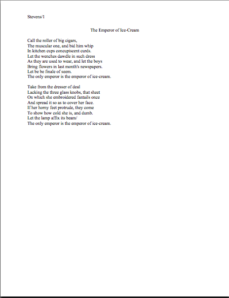
To get the discussion ball rolling, let’s take a gander at a properly-formatted chapter opening. Here is the first page of Chapter Six of my memoir:

Every chapter of a manuscript should begin like this: on a fresh page, 12 single lines (or 6 double-spaced) from the top. (For those of you who do not know how to insert a hard page break into a Word document, it’s located under the INSERT menu. Select BREAK, then PAGE BREAK.)

Notice how both the chapter number and the chapter title appear, centered, within these parameters. If there were no chapter title in this instance, the first page of Chapter 6 would look like this:

And since sharp-eyed reader Allison asked so very nicely, here’s what it would look like if Chapter 6 were the beginning of Part II of the book (it isn’t, but we aim to please here at Author! Author!):

Thinking that there must be an easier way to format the first page of a chapter than to memorize the way it should look and reproduce it from scratch each time? You’re not alone, if so; even seasoned authors worry that someday they will forget to hit return one of the necessary times, so that Chapter 5 will begin ten lines from the top, while Chapter 1-4 and 6 on will begin twelve lines down.

Why, curious reader David asked just the other day about how to get that formatting to stick, so to speak: “The chapter line will appear at the top of each page – so I leave five doublespaced blank lines so the first paragraph starts six lines down? Is there something I can do in Microsoft Word so it will stay that way?”

Standard format templates do exist, of course, but frankly, Word is already equipped with two perfectly dandy features for reproducing formatting exactly in more than one place in a document: COPY and PASTE.

Or, to put it another way, the easiest way I know to make sure each chapter opening is identical is to create your own template. Copy from “Chapter One” down through the first line of text, then paste it on the first page of chapter 2, 3, etc. Once the format is in place, it’s a snap to fill in the information appropriate to the new chapter.

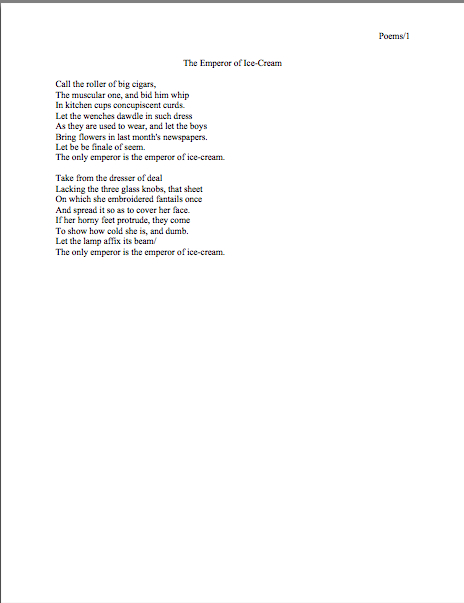
Does that make sense to everyone? Excellent. Let’s take another gander at our first example:

This time, I would like you to notice that in each of these examples, the only reference to the author’s name or the title should appear in the slug line, located in the upper left-hand margin. This is as proper on page 139 of a book manuscript as on page one. While you’re going around noticing things, notice that the page number belongs within the slug line, rather than anywhere else on the page.

The slug line confuses a lot of aspiring writers; until you have seen piles and piles of professional manuscripts, it looks kind of funny, doesn’t it? And when you’ve been told over and over again that a manuscript should have a 1-inch margin on all sides, it can seem counterintuitive to add a line of text, even such a short one, IN that margin.

But I assure you, it’s always been done that way. And why? Followers of this series, chant it with me now: BECAUSE IT LOOKS RIGHT.

Yes, that logic IS tautological, now that you mention it. If you have a problem with that, I would suggest taking it up with the powers that rule the universe. As I believe the fact that my memoir has been in the hands of a reputable publisher for years and has yet to be release makes abundantly clear, I apparently do not rule the universe.

If I did, Microsoft Word would be set up to create documents in standard format automatically, Word for Mac and Word for Windows would be set up so those using one could easily give formatting advice to those using the other, and ice cream cones would be free on Fridays.

As none of these things seems to be true, let’s get back to business: how does one create that pesky slug line, anyway?

Back in the days when typewriters roamed the earth, it was perfectly easy to add a slug line to every page: all a writer had to do was insert it a half-inch down from the top of the page, left-justified, floating within the 1-inch-deep top margin. For word-processed documents, it’s a trifle more complicated.

The slug line still belongs in the same place, .5 inches from the top of the paper, but instead of laboriously typing it on each page individually as writers did in the bad old days, one simply inserts it in the header. In most versions of Word (I can’t speak for all of them), the header may be found under the VIEW menu.

Before the Luddites out there trot out their usual grumble about tracking down the bells and whistles in Word, think about this: placing the slug line in the header (located in Word under the VIEW menu) also enables the writer to take advantage of one of the true boons of the advent of word processing, pages that number themselves. Every so often, I will receive a manuscript where the author has, with obviously monumental effort, typed a slug line onto the first line of TEXT of each page, so it looks like this:

See how pulling the slug line down into the text messes with the spacing of the page? An entire line of text is sacrificed to it — and let me tell you, that line is not going to go quietly.

Why not? Well, what’s going to happen if new writing is inserted on a page formatted this way? That’s right: the author is going to have to go back and move each and every one of those slug lines to match the NEW pagination.

I’d show you a picture of this, but it’s just too ugly to contemplate. Trust me, it would be a heck of a lot of work.

Hey, I promised you a pop quiz, didn’t I? See any other problems with this last example?

How about the fact that the slug line includes the word PAGE? Shouldn’t be there; just the numbers will suffice.

Did I just hear some huffs of indignation out there? “But Anne,” I hear the formatting-ambitious cry, “it’s kind of stylish to include PAGE before the page number, isn’t it? It’s just a matter of personal style — who could be hurt by including it, if I like the way it looks?”

Well, you, for starters. And why? (Chanters, ready your lungs.) BECAUSE IT JUST WOULD NOT LOOK RIGHT TO A PROFESSIONAL READER.

I’m quite serious about this; I’ve seen screeners get quite indignant about this one. “Does this writer think I’m STUPID?” Millicent is prone to huff. (Don’t answer that question; it’s rhetorical.) “Does she think I DON’T know that the numeral that appears on every page refers to the number of pages? Does she think I’m going to go nuts and suddenly decide that it is a statistic, or part of the title?”

Don’t bait her; the lady has a hard life. Do it the standard way.

Okay, did you spot any other problems? What about the fact that the first paragraph of the chapter is not indented, and the first character is in a different typeface?

The odd typeface for the first letter, in imitation of the illuminated texts hand-written by monks in the Middle Ages, doesn’t turn up all that often in manuscripts other than fantasy and YA, for one simple reason: books in that category are more likely to feature this it’s-a-new-chapter signal than others. But once again, what an editor may decide, rightly or wrongly, is appropriate for a published book has no bearing upon what Millicent expects to see in a manuscript.

Save the manuscript illumination s for someone who will appreciate it. Hop in your time machine and track down a medieval monk to admire your handiwork, if you like, but in this timeframe, keep the entire manuscript in the same typeface and size.

The non-indented first paragraph of a chapter is fairly common in mystery submissions, I have noticed. I’ve been told by many mystery writers that this is an homage to the great early writers in the genre, an echo of their style.

But you know what? Almost without exception, in Edgar Allan Poe’s time all the way down to our own, the EDITOR has determined the formatting that appeared on any given printed page, not the author. To professional eyes, especially peevish ones like Millicent’s, a manuscript that implicitly appropriates this sort of decision as authorial might as well be the first step to the writer’s marching into Random House, yanking off a well-worn riding glove, and striking the editor-in-chief with it.

Yes, you read that correctly: it’s sometimes seen as a challenge to editorial authority. And while we could speculate for the next week about the level of insecurity that would prompt regarding a minor formatting choice as a harbinger of incipient insurrection, is the manuscript of your first book REALLY the right place to engender that discussion?

Exactly.

If you want to make Millicent and her bosses happy — or, at any rate, to keep them reading calmly — indent every paragraph of the text should the expected five spaces. It just looks right that way.

While we’re at it, how about the bolded chapter number and title? Nothing in a manuscript should be in boldface. Nothing, I tell you. Uh-uh. Not ever.

Well, you could get away with the title itself on the tile page, but frankly, I wouldn’t chance it.

Nor should anything be underlined — not even names of books or song titles. Instead, they should be italicized, as should words in foreign tongues that are not proper nouns.

I heard that gigantic intake of breath out there from those of you who remember constructing manuscripts on typewriters: yes, Virginia, back in the day, underlining WAS the norm, for the simple reason that most typewriters did not have italic keys.

If you consult an older list of formatting restrictions, you might conceivably be told that publications, song titles, and/or foreign words (sacre bleu!) should be underlined. But trust me on this one: any agent would tell you to get rid of the underlining, pronto.

And why? All together now: because IT JUST DOESN’T LOOK RIGHT THAT WAY.

All right, campers, do you feel ready to fly solo? Here are two pages of text, studded with standard format violations for your ferreting-out pleasure. (I wrote these pages, too, in case anyone is worried about copyright violation or is thinking about suing me over it. Hey, stranger things have happened.)

How did you do? Are those problems just leaping off the page at you now? To reward you for so much hard work, here are a couple of correctly-formatted pages, to soothe your tired eyes:

Whenever you start finding yourself chafing at the rules of standard format, come back and take a side-by-side gander at these last sets of examples — because, I assure you, after a professional reader like Millicent has been at it even a fairly short time, every time she sees the bad example, mentally, she’s picturing the good example right next to it.

And you know what? Manuscripts that look right get taken more seriously than those that don’t. And regardless of how you may feel about Millicent’s literary tastes, isn’t a serious read from her what you want for your book?

We’re in the home stretch of going over the formatting rules, everyone. Keep up the good work!

Manuscript formatting 101, part VIII: yet another great cosmic mystery explained, sort of

No, the statue is not a Christmas angel, but rather Nike, the wingèd goddess of victory, bringing a laurel wreath for reader ACD, who will be famed in song and story forevermore for the comment she posted on an earlier formatting blog. Why? Because she, clever soul, wrote in with a method for using Word’s Find and Replace feature to change single spaces between sentences into double spaces within sentences.

And if that’s not an achievement worthy of a laurel leaf or two, I should like to know what is.

Okay, so maybe that wasn’t the artist’s original intent with this particular statue (which comes to us courtesy of FreeFoto.com), but some celebration seemed appropriate, no?

And if THAT isn’t enough to meet whatever standard you may be cherishing for what constitutes a reason to initiate dancing in the streets, long-time reader, prolific commenter, and computer whiz Chris has once again gone far above and beyond the call of duty and written an entire blog post on the subject.

Thanks, Chris, ACD. and everyone who participated in the genuinely useful discussions on the subject here and here. Laurel leaves all around!

For the last week+, I have been running through the strictures of standard manuscript format and some common deviations from it, to demonstrate just how clearly our old pal, Millicent the agency screener, discerns the differences. At the end of a long day’s reading, they definitely jump out at her, and with good reason: once a professional reader gets used to seeing the similarities that pretty much all professional manuscripts share, submissions formatted in other ways might as well have UNPROFESSIONAL stamped on them in bright red ink.

And while Millicent may strive valiantly NOT to allow that impression to color her reading of the submission itself, it’s just not a good idea to assume that it won’t. She’s only human, after all.

It’s an even worse idea to assume a charitable reading for a contest entry, by the way. If anything, contest judges tend to be even more sensitive to the beauty of standard format than Millicent, for the simple reason that they’ve usually been reading a whole lot longer.

The agency gig may well be Millie’s first job out of college, but the judge handed your entry may well have just retired from a long and fruitful career teaching English composition. Her fingers positively ache for the red pen of correction.

This is not accidental — most well-respected contests require some professional credentials from their judges, either as writers, editors, or teachers. Which means, in practice, that judges have often been writing in standard format themselves for years or bludgeoning other writers into compliance with its requirements.

To put it another way, other kinds of formatting won’t look right to them, either. By now, you’re probably having a similar reaction, aren’t you?

Don’t think so? Or don’t want to believe you could conceivably share any traits with Millicent? Let’s test the proposition by trying a little Aphra Behn on for size.

If you don’t know her work, you should, at least historically: as far as we know, she was the first woman paid for writing in English. (She’s also hilarious.) Here is a page from THE FAIR JILT (1688):

You could tell instantly that there was something wrong here, couldn’t you, and not just because Miranda’s trying to seduce her priest? (For convent, read monastery.) Set aside her practically Dickensian affection for semicolons for the moment — which would tend to turn off a modern Millicent pretty quickly — and try to tote up in your mind all of the deviations from standard format.

To refresh your memory and gladden your now-sharpened eyes, here’s what it should have looked like:

Let’s take the problems on the first version from the top of the page: the incorrect version does not have a proper slug line. (For those of you joining us late, a slug line is AUTHOR’S LAST NAME/TITLE/PAGE #, repeated on every page of the text.)

Seeing this lone page out of context, it’s quite obvious why a slug line is a dandy idea, isn’t it? Without it, how would it be even remotely possible to return this wandering page back into the manuscript from whence it came.

“Who wrote this?” Millicent cries in ire, glaring around her cubicle at the 47 manuscripts lying there. “It could be from any of these!”

At least Ms. Behn thought to number the pages of Example #1 — but did you catch the problem with how she did it? The page number is in the bottom right-hand margin, rather than in the slug line, where it belongs.

Did you catch any other difficulties?

What about the 10-point type, which will strain Millicent’s already overworked eyes? Or the Ariel typeface? There is nothing inherently wrong with either, but when she’s used to see practically every manuscript that heads out of the agency to publishing houses in 12-point Times New Roman, it (chant it with me here) just doesn’t look right.

Anything else? What about that right margin? Mighty straight, isn’t it? That look proper to you?

What’s going on here is called block-justification, and it’s another problem that can be laid squarely at the feet of those who insist that a manuscript and a published book should be identical. The text in many published books, and certainly in many magazines and newspapers, is spaced so that each line begins at exactly the same distance from the left-hand edge of the page and ends (unless it’s the last line of a paragraph) at exactly the same distance from the right-hand edge of the page.

Which, to let you in on why this type of neatness bugs professional readers, renders skimming quite a bit more difficult. Block formatting provides fewer landmarks, as it were; to the glancing eye, practically every line of narrative text resembles every other. To those of us used to the ragged right margins and even letter spacing of standard format, it’s actually kind of hard to read.

So there’s quite a bit in Example #1 that’s distracting, isn’t there? Doesn’t help sell the text, does it?

Okay, all of these rhetorical questions in a row are beginning to make me dizzy, so I’m going to wind down for the day. But before I do, let’s take one more look at Example #2, the one Millicent and a contest judge would like:

Now, let’s take a gander at the same page in — ugh — business format:

Startlingly different, isn’t it, considering that I made only two formatting changes? Did you catch them on your skim through?

All I did was I eliminate the indentations at the beginning of each paragraph and skipped a line between paragraphs to produce the norm for business correspondence, as well as for most of the text currently posted on the Internet.

Including this blog, unfortunately. As a professional writer and reader of manuscripts, it drives me NUTS that my blogging program won’t allow me to indent paragraphs.

Why? Because it just doesn’t look right. So much so that in a contest entry, business formatting is often grounds all by itself for knocking a manuscript out of finalist consideration.

Finding yourself asking why again? Well, technically, indented paragraphs are grammatically requisite, so to a judge, non-indented paragraphs may well seem as great a violation of everything we hold dear as frequent misspellings or use of the wrong form of there, their, and they’re.

Fortunately for judges and Millicents who care deeply about the health of the language, errors seldom come singly in entries and submissions. Like spelling errors, formatting mistakes are apparently social: they like to travel in packs, roving all over a manuscript together.

As a result of this phenomenon, a manuscript that contains errors within the first few lines (or on the first page) is easy for a professional reader to dismiss; statistically speaking, it’s a pretty good bet that if Millicent kept reading after a technically flawed opening, she would find more causes for umbrage.

Given how many submissions she has to screen between now and lunch, do you think she is going to (a) press on in the hope that the first error was a fluke, or (b) leap to the (perhaps unwarranted) assumption that there is more of the same to come and reject it right away?

I leave that one to your fine critical faculties to answer.

Why am I bringing this up in the middle of a discussion of the perils of business format, you ask? Because — are you sitting down, dislikers of indentation? — one hears rumors that there are Millicents out there (and agents, editors, and contest judges as well) who will leap directly from noticing a lack of indentation and unwarranted spaces between paragraphs to our friend, option (b): if the submitter is not aware of how to format a paragraph of English prose properly, she reasons, aren’t there inevitably more snafus to come?

Not every Millicent — or agent, judge, etc. — will have this knee-jerk reaction, of course. But do you really want to take the chance that she’s not going to seize the opportunity to save herself a little time?

The specter of illiteracy is not the only reason using business format is likely to cost you, either. To a professional reader, the differences between the last two examples would be more than visually jarring — they’d be downright confusing. In standard format, the only reason for a skipped line between paragraphs would be a section break, so Millicent would be expecting the second paragraph to be about something new.

Okay, so a misconception like that might distract her attention for only few consecutive seconds, but let’s not kid ourselves: your garden-variety Millicent is spending less than a minute on most of the submissions she rejects — it’s actually not all that uncommon for her not to make into the second or third paragraph before reaching for the SASE and a copy of that annoying form rejection letter.

Take a moment for the implications of that to sink in fully. Don’t worry; I’ll wait.

While those of you new to the speed with which rejection typically occurs are already in shock, let me add for the sake of anyone who doesn’t already know: those who regard business format as a symptom of creeping illiteracy — hey, I just report the news — are likely to frown upon it just as much in a query letter or synopsis as in a manuscript submission.

Time loss is not the only reason she might take umbrage at momentary confusion. Let me let you in on a little secret: professional readers, especially those who inhabit agencies and publishing houses, are not overly fond of having their mental image of the story they are reading at the moment jarred.

How do I know this? Well, for one thing, they commonly refer to it as being tricked. As in, “I hate being tricked by a first paragraph that is about someone other than the protagonist.”

There’s a practical basis to this dislike, of course, but it’s kind of complicated. I wrote a couple of fairly extensive posts on the subject last year (here’s a link to the first, and here’s a link to the second, in case you’re interested), but I’ll run over the thumbnail version now.

Comfortably seated?

To get through all of those manuscripts she’s assigned to screen each week, Millicent has to read quite quickly, right? If she doesn’t, she’ll get buried in paper, as basically, she’s got to make it through WAR AND PEACE several times over in a week.

That’s a whole lot of material to remember, by anyone’s standards — and remembering actually is important here. If she decides to allow a manuscript to make it to the next level of consideration, she is going to need to be able to tell her boss what the book is about: who the protagonist is, what the conflict is, and why that conflict is important enough to the protagonist for the reader to be drawn into it.

In essence, she’s going to need to be able to pitch it to the higher-ups at the agency, just as the agent is going to have to do in order to sell the book to an editor, and an editor is going to have to do in order to convince HIS higher-ups that the publishing house should acquire the book.

And, often, as first-round contest judges will need to do on an evaluation form in order to pass an entry onto the next round.

Okay, brace yourself, because explaining what comes next involves delving into one of the great cosmic mysteries. It’s not for the faint of heart.

Remember earlier in thus series, when I mentioned that agents and editors don’t read like other people? Well, one of the primary differences is that from line one of page one, they’re already imagining how they’re going to pitch this book.

So if paragraph 2 or 3 (or page 2 or 3) suddenly informs them that their mental patter has been about the wrong character, they feel as if they’ve been backing the wrong horse.

And while there may have been any number of perfectly reasonable narrative reasons for the text to concentrate upon an alternate character for the opening, unless the writing AND the story have already really wowed Millicent, her resentment about being trickedwrong about the identity of the protagonist is often sufficient to make her reach for that SASE and form letter.

Feel free to go scream into a pillow over that last piece of logic; you don’t want to keep that kind of existential cri de coeur pent up inside. I’ll wait until it’s out of your system.

Feel better? Good.

Before you go rushing off to see if your opening paragraphs might possibly be open to an interpretation of trickery — because, for instance, you might have taken the bold authorial step of noticing that there is more than one human being in the world, and reported a piece of action accordingly — let’s return to the formatting issue that prompted my little segue into the psychology of resentment. Can we extrapolate any practical lesson about business format from it?

You bet your boots we can: it’s not a good idea to give the impression of a section break where there isn’t one. And when producing pages for people who read all day, you might want to stick to the rules governing written English and indent your paragraphs.

Still a bit confused? Don’t worry: the show-and-tell is far from over. Hang in there for the rest of this series, and keep up the good work!

Manuscript formatting 101, part VII: God bless the Millicents, every one

For the last few days, I’ve been pursuing the dual goals of trying to show you just how obvious it is to a professional reader when a submission ISN’T in standard manuscript format (as opposed to being set up to ape the format of published books) and to drum up a little holiday sympathy for Millicent, everybody’s favorite agency screener.

Wipe that smirk off your face, please. Even if you aren’t in the habit of empathizing with people who reject writers for a living, there’s a good self-interested reason you should care about her state of mind: even with the best will in the world, grumpy, over-burdened, and/or rushed readers tend to be harder to please than cheerful, well-treated, well-rested ones.

Millicent is the Tiny Tim of the literary world, you know; at least the Bob Cratchits a little higher up on the office totem pole uniformly get paid, but our Millie sometimes doesn’t, or gets a paycheck that’s more an honorarium than a living wage. A phenomenon that one might expect to become increasingly common in the months to come: the worse a bad economy gets, the better an unpaid intern is going to look to a cash-conscious agency.

Even if she’s not an intern, she’s still unlikely to be paid very much, at least relative to the costs of living in the cities where the major publishers dwell. Her hours are typically long, and quite a lot of what she reads in the course of her day is, let’s face it, God-awful.

Not to mention poorly formatted. But I digress.

Millicent’s job, in short, is not the glamorous, power-wielding potentate position that those who have not yet passed the Rubicon of signing with an agency often assume it to be. Nor, ideally, will she be occupying the position of first screener long: rejecting queries and manuscripts by the score on-the-job training for a fledgling agent, in much the same way as an editorial assistant’s screening manuscripts at a publishing houses is the stepping-stone to becoming an editor.

You didn’t think determining a manuscript’s literary merits after just a few lines of text was a skill that came naturally to those who lead their lives right and got As in English, did you?

The aspiring writer’s learning curve is often not dissimilar to Millicent’s, actually: no one tumbles out of the womb already familiar with the rules of manuscript formatting. (Okay, so I practically was, growing up around so many authors, but I’m a rare exception.) Like Millicent, most of us learn the ropes only through reading a great deal.

She has the advantage over us, though: she gets to read books in manuscript form, and most aspiring writers, especially at the beginning of their journeys to publication, read books. The format is, as I believe that I have pointed out, oh, several hundred times before in this very forum, quite different.

So what writers tend to produce in their early submissions are essentially imitations of books. The problem is, there are many reasons that a manuscript in book format would be hard for an agent or editor to handle — and not merely because the individual pages would appear unprofessional to Millicent.

For starters, published books are printed on both sides of the page, manuscripts on one. Why the difference, in these days of declining tree populations and editors huffily informing writers at conferences that paper is expensive?

Simple: it’s easier to edit that way. Which is why, even in these days of widely available word processors, scads of professional editing is still done by hand.

Why? Well, it’s a mite hard to give trenchant feedback while traveling in a crowded subway car if you have to maneuver a laptop, and many agencies remain far too virus-fearful to allow their employees solicit attachments from writers who aren’t already clients. (Those who do generally have a policy that forbids the opening of unsolicited attachments.) Even in agencies that have caved in to new technology sufficiently to send their member agents on long airplane flights to writers’ conferences armed with a Kindle with 17 manuscripts on it, hand-written marginalia is still the norm, even if it means scanning hand-proofed pages and e-mailing them back to the author.

Ultimately, most editors edit in hard copy because they prefer it. The human eye is, of course, to blame for this: reading comprehension drops by about 70% when the material is presented on a computer screen; the eye tends to skim.

Which is why — you can hear this coming, can’t you? — a wise writer always reads her ENTIRE manuscript IN HARD COPY before submitting it to anyone even vaguely affiliated with the publishing industry. It’s much, much easier to catch typos and logic problems that way.

While you’ve got your hymnals out, long-time readers, let’s continue with the liturgy: manuscripts should also be typed (don’t laugh; it’s not unheard-of for diagrams to be hand-drawn in submissions, or for late-caught typos to be corrected in pen), double-spaced, and have 1-inch margins all the way around.

Time to see why, from an editing point of view.

Thought I’d gone too far afield to get back to the topic at hand, didn’t you? Not a chance. Let’s call upon our old friend Dickens again to see what a page of a manuscript should look like:

Nice and easy to read, isn’t it? (If it’s too small to read easily on your browser, try double-clicking on the image.)

To give you some idea of just how difficult — or even impossible — it would be to hand-edit a manuscript that was NOT double-spaced or had smaller margins, take a gander at this little monstrosity:

I believe the proper term for this is reader-hostile. Even an unusually patient and literature-loving Millicent would reject a submission like this immediately, without reading so much as a word.

Were there a few eggnog spit-takes out there during that last sentence? “My goodness, Anne,” those of you who are wiping the grog off your incredulous faces sputter, “why is it THAT serious an offense?”

Well, think about it: even with nice, empty page backs upon which to scrawl copy edits, trying to cram spelling or grammatical changes between those lines would be well-nigh impossible. Knowing that, Millicent would never dream of passing such a manuscript along to the agent who employs her; to do so would be to invite a stern and probably lengthy lecture on the vicissitudes of the editorial life.

She wasn’t born yesterday, you know. She’s SMART.

Don’t tempt her just to reject it unread — and don’t, I beg you, provide the same temptation to a contest judge. Given the sheer volume of submissions the average Millicent reads, she’s not all that likely to resist.

Even if the sum total of the provocation consists of a manuscript that’s shrunk to, say, 95% of the usual size.

You know what I’m talking about, don’t you, past contest entrants and submitters who wanted to squeeze in a particularly exciting scene before the end of those requested 50 pages?

No? Let me fill you in on a much-deplored practice, then: faced with a hard-and-fast page limit for submission, some wily writers will shrink the font or the margins, to shoehorn a few more words onto each page. After all, who is going to notice a tenth of an inch sliced off a left or right margin, or notice that the typeface is a trifle smaller than usual?

Millicent will notice, that’s who, and practically instantly. As will any reasonably experienced contest judge; after hours on end of reading 12-point type within 1-inch margins, a reader develops a visceral sense of when something is off.

Don’t believe me? Go back and study today’s first example, the correctly formatted average page. Then take a look at this:

I shaved only one-tenth of an inch off each margin and shrunk the text by 5% — far less than most fudgers attempt, incidentally. Yet admit it: you can tell it’s different, can’t you, even without whipping out a ruler?

So could a professional reader. And let me tell you, neither the Millicents of this world nor the contest judges tend to appreciate attempts to trick them into extraneous reading. Next!

The same principle applies, incidentally, to query letters: often, aspiring writers, despairing of fitting a coherent summary of their books within the standard single page, will shrink the margins or typeface.

Trust me, someone who reads queries all day, every day, will be able to tell. (And if you would like to see precisely why, please check out the posts under the QUERY LETTERS ILLUSTRATED category on the list at right.)

The other commonly-fudged spacing technique involves skipping only one space after periods and colons, rather than the grammatically-requisite two spaces. Frequently, writers won’t even realize that this IS fudging: as readers have pointed out in the comments whenever I have talked about this in the past, ever since published books began omitting these spaces in order to save paper, I’ve seen a theory propounded all over the Internet (and sometimes even in writing classes, where the teachers should know better) insisting that skipping the extra space is obsolete. Frequently, the proponents will insist that manuscripts that include the space look old-fashioned to agents and editors.

And I’m not going to lie to you here: to the agents who prefer this format, it is going to look old-fashioned. Sorry.

But guess what: standard manuscript format IS old-fashioned, by definition; that fact doesn’t seem to stop most of the currently-published authors of the English-speaking world from using it. In fact, in all of my years writing and editing, I have never — not once — seen a manuscript rejected or even criticized for including the two spaces that English prose requires after a period or colon.

I have, however, heard endless complaint from professional readers — myself included — about those second spaces being omitted. Care to guess why?

Reward yourself with a virtual candy cane if you said that cutting those spaces throws off word count estimation; the industry estimates assume those doubled spaces. And give yourself twelve reindeer if you also suggested that omitting them renders a manuscript harder to hand-edit.

We all know the lecture Millicent is likely to get if she forgets about that, right?

Again, a pro isn’t going to have to look very hard at a space-deprived page to catch on that there’s something fishy going on. Since Dickens was so fond of half-page sentences, the examples I’ve been using above won’t illustrate this point very well, so (reaching blindly into the depths of the bookshelf next to my computer), let’s take a random page out of Elizabeth Von Arnim’s VERA:

There are 310 words on this page; I wasn’t kidding the other day about how far off the standard word count estimations were, obviously. Now cast your eye over the same text improperly formatted:

Doesn’t look much different to the naked eye, does it? The word count is only slightly lower on this version of this page — 295 words — but enough to make quite a difference over the course of an entire manuscript.

So I see some hands shooting up out there? “But Anne,” I hear some sharp-eyed readers exclaim, “wasn’t the word count lower because there was an entire line missing from the second version?”

Well spotted, criers-out: the natural tendency of omitting the second spaces would be to include MORE words per page, not less. But not spacing properly between sentences was not the only deviation from standard format here; Millicent, I assure you, would have caught two others.

I tossed a curve ball in here, to make sure you were reading as closely as she was. Wild guesses? Anyone? Anyone?

The error that chopped the word count was a pretty innocent one, almost always done unconsciously: the writer did not turn off the widow/orphan control, found in Word under FORMAT/PARAGRAPH/LINE AND PAGE BREAKS. This insidious little function, the default unless one changes it, prevents single lines of multi-line paragraphs from getting stranded on either the bottom of one page of the top of the next.

As you may see, keeping this function operational results in an uneven number of lines per page. Which, over the course of an entire manuscript, is going to do some serious damage to the word count.

The other problem — and frankly, the one that would have irritated a contest judge far more than Millicent — was on the last line of the page: using an emdash (“But—”) instead of a doubled dash. Here again, we see that the standards that apply to printed books are not proper for manuscripts.

Which brings me back to today’s moral: just because a particular piece of formatting looks right to those of us who have been reading books since we were three doesn’t mean that it is correct in a MANUSCRIPT.

Millicent reads manuscripts all day; contest judges read entries for hours at a time. After a while, a formatting issue that might well not even catch a lay reader’s attention can begin to seem gargantuan.

As I have perhaps pointed out once or twice throughout this series, if the writing is good, it deserves to be free of distracting formatting choices. You want agents, editors, and contest judges to be muttering, “Wow, this is good,” over your manuscript, not “Oh, God, he doesn’t know the rules about dashes,” don’t you?

Spare Millicent the chagrin, please; both you and she will be the happier for it. Believe me, she could use a brilliantly-written, impeccably-formatted submission to brighten her Dickensian day.

More show-and-tell follows next time. Keep up the good work!

Manuscript formatting 101, part II: presenting your writing nicely framed

Welcome back to my refresher course on standard format for manuscripts. Since I know that many of you are scrambling like crazy, trying to get submissions out the door before the dreaded holiday publishing world malaise sets in, or scrambling like crazy to get submissions in shape in anticipation of the moment that the agent of your dreams answers affirmatively to the query letter that you are sending out before the annual malaise, or are scrambling like crazy after yesterday’s post, since you hadn’t realized that there WAS a standard format for manuscript submissions, I wanted to take another run at it.

My apologies for revisiting this to those of you who are already formatting your manuscripts perfectly — but unless you are ABSOLUTELY POSITIVE that you are, you might want to sit in on this series, too.

If you’re not willing to do it for your own sake, do it for mine. It breaks my heart to see good writers, even great ones, making the same formatting mistakes year in and year out, getting rejected for reasons that are apparent to professional readers from halfway across the room.

And no, Virginia, I’m not kidding about the halfway across the room part.

Although it pains me to confess it, how a manuscript looks can have an IMMENSE impact upon how an agent, editor, contest judge, or even a book doctor like me will respond to it. Talent, style, and originality count, of course, but in order to notice any of those, a reader has to approach the page with a willingness to be wowed.

That willingness can wilt rapidly in the face of incorrect formatting — which isn’t, in response to what half of you just thought, the result of mere market-minded shallowness on the part of the reader. Reading manuscripts for a living makes deviations from standard format leap out at one. As do spelling and grammatical errors, phrase repetition, clichés, and all of the many notorious agents’ pet peeves. (If you think I’m exaggerating, check out some of the lulus under the FIRST PAGES AGENTS DISLIKE and AGENCY SCREENERS’ PET PEEVES OF THE NOTORIOUS VARIETY categories on the list at right.)

The sheer repetition of mistakes across manuscripts means that professional readers tend to focus on technical details when scanning the work of a new writer. Because all professional manuscripts are formatted identically, it’s INCREDIBLY obvious when one isn’t.

This is a really, really good thing to know BEFORE you submit to an agent or editor: even if 99.9% of the format is right, that .1% deviation actually will distract a professional reader from even the most beautiful writing.

And that’s not merely a matter of being obsessive-compulsive (although truth compels me to say that in this line of work, OCD is hardly an occupational drawback) — as I shall be showing you later on in this series, to someone who reads manuscripts for a living, deviations from standard format might as well be printed in blood-red ink.

So while it may seem tedious, annoying, or just a whole lot of work to go through your submissions with the proverbial fine-toothed comb in order to weed out this kind of distraction.

I hear those of you who have spent years slaving over your craft groaning out there — believe me, I sympathize. I fully realize that many of the tiny-but-pervasive changes I am about to suggest that you make to your manuscript are going to be irksome to implement. Reformatting a manuscript is time-consuming and tedious – and I would be the first to admit that at first, some of these rules can seem arbitrary.

At least on their faces, that is.

Speaking as someone who reads manuscripts for a living, I can let you in on a little secret: quite a few of these restrictions remain beloved of the industry even in the age of electronic submissions because they render a manuscript a heck of a lot easier to edit in hard copy — still the norm, incidentally. As I will show later in this series, a lot of these rules exist for completely practical purposes — designed, for instance, to maximize white space in which the editor may scrawl trenchant comments like, “Wait, wasn’t the protagonist’s sister named Maeve in the last chapter? Why is she Belinda here?”

As I said above, this is one line of work where a touch of compulsiveness is a positive boon. Treat this brain pattern with the respect it deserves.

And treat your own writing with the respect it deserves by taking the time to present it professionally. Obviously, competition to land an agent and get published is very intense, but if you’re going to get rejected, wouldn’t you rather it be because an agent or editor legitimately disagreed with your writing choices, instead of because you didn’t follow the rules?

Or, more commonly, because you weren’t aware of them?

Frankly, it’s bad for writers everywhere that these rules are not more widely known. Okay, so it keeps freelance editors like me in business, but it has created a submission environment where poor formatting is generally considered a warning sign of poor WRITING to come.

By Millicent the agency screener, her cousin Maury the editorial assistant, and their aunt Mehitabel the contest judge, in any case.

And that drives conscientious aspiring writers, the ones who — like you, perhaps — have invested considerable time and sweat in learning something about the trade, completely batty. Because, like so much generalized criticism, the fine folks who take the advice most seriously tend to be the ones who need it least, I know that there are thousands of you out there who stay up nights, compulsively going over their manuscripts for the 147th time, trying to ferret out that one last bit of less-than-professional presentation.

Bless your heart, if you’re one of those. You’re helping raise aspiring writers’ collective reputation within the industry.

One quick caveat before we get started today: the standard format restrictions I’m listing here are for BOOK submissions, not for short stories, poetry, journalistic articles, academic articles, or indeed any other form of writing. For the guidelines for these, you may — and should — seek elsewhere.

Let me repeat that, because it’s important: the guidelines in this series are for BOOK manuscripts and proposals, and thus should not be applied to other kinds of writing. Similarly, the standards applicable to magazine articles, short stories, dissertations, etc. should not be applied to book proposals and manuscripts.

Which is a gentle way of saying that the formatting and grammatical choices you see in newspapers will not necessarily work in manuscripts. AP style is different from standard format in several important respects, not the least being that in standard format (as in other formal presentations in the English language), the first letter of the first word after a colon should NOT be capitalized, since technically, it’s not the beginning of a new sentence.

I don’t know who introduced the convention of post-colon capitalization, but believe me, those of us who read the submissions of aspiring book writers for a living have mentally consigned that language subversive to a pit of hell that would make even Dante avert his eyes in horror.

Everyone clear on that? Good, because — are you sitting down, lovers of newspapers? — embracing journalistic conventions like the post-colon capital and writing out only numbers under ten (see below) will just look like mistakes to Millicent and her ilk on the submission page.

And no, there is no court of appeal for such decisions. So if you were planning to cry out, “But that’s the way USA TODAY does it!” save your breath.

Unfortunately, although my aforementioned heart aches for those of you who intended to protest, “But how on earth is an aspiring writer to KNOW that the standards are different?” this is a cry that is going to fall on deaf ears as well. Which annoys me, frankly.

The sad fact is, submitters rejected for purely technical reasosn are almost never aware of it. With few exceptions, the rejecters will not even take the time to scrawl, “Take a formatting class!” or “Next time, spell-check!” on the returned manuscript. If a writer is truly talented, they figure, she’ll mend her ways and try again.

Call me zany, but I’d like to speed up that learning curve. I think that the way-mending might go a TRIFLE faster if the writer knew that the manuscript was broken

It’s not as though the strictures of standard format are state secrets, after all. To recap from yesterday:

(1) All manuscripts should be printed or typed in black ink and double-spaced, with one-inch margins around all edges of the page, on 20-lb or better white paper.

(2) All manuscripts should be printed on ONE side of the page and unbound in any way.

(3) The text should be left-justified, NOT block-justified. By definition, manuscripts should NOT resemble published books in this respect.

(4) The preferred typefaces are 12-point Times, Times New Roman, Courier, or Courier New — unless you’re writing screenplays, in which case you may only use Courier. For book manuscripts, pick one (and ONLY one) and use it consistently throughout your entire submission packet.

Everyone clear on those? PLEASE pipe up with questions, if not. In the meantime, let’s move on.

(5) The ENTIRE manuscript should be in the same font and size. Industry standard is 12-point.

No exceptions. I hate to be the one to break it to you, but there’s a term in the industry for title pages with 24-point fonts, fancy typefaces, and illustrations.

It’s “high school book report.” Need I say more?

The font rule also applies to your title page, incidentally, where almost everyone gets a little wacky the first time out. No matter how cool your desired typeface looks, or how great the title page looks with 14-point type.

No pictures or symbols here, either, please. Just the facts. (If you don’t know how to format a title page professionally, please see the TITLE PAGE category on the list at right.)

(6) Do NOT use boldface anywhere in the manuscript BUT on the title page — and not even there, necessarily.

Yes, you read that correctly: you may place your title in boldface on the title page, if you like, but that’s it. Nothing else in the manuscript should be bolded.

This rule is a throwback to the old typewriter days, where only very fancy machines indeed could darken selected type. Historically, using bold in-text is considered a bit tacky for the same reason that wearing white shoes before Memorial Day is in certain circles: it’s a subtle display of wealth.

(You didn’t think all of those white shoes the Victorians wore cleaned themselves, did you? Shiny white shoes equaled scads of busily-polishing staff.)

(7) EVERY page in the manuscript should be numbered EXCEPT the title page.

Violating this rule will result in instantaneous rejection virtually everywhere. Number those pages if it’s the last thing you do.

Few non-felonious offenses irk the professional manuscript reader (including yours truly, if I’m honest about it) more than an unnumbered submission — it ranks right up there on their rudeness scale with assault, arson, and beginning a query letter with, “Dear Agent.”

Why? Gravity, my friends, gravity. What goes up tends to come down — and if the object in question happens to be an unbound stack of paper…

Did that seem like an abstract metaphor? Not at all. Picture, if you will, two manuscript-bearing interns colliding in an agency hallway.

You may giggle, but anyone who has ever worked with submissions has first-hand experience of this, as well as what comes next: after the blizzard of flying papers dies down, and the two combatants rehash that old Reese’s Peanut Butter Cup commercial’s dialogue (“You got romance novel in my literary fiction!” “You got literary fiction in my romance novel!”), what needs to happen?

Yup. Some luckless soul has to put all of those pages back in the proper order. Think about it: just how much more irksome is that task going to be if the pages are not numbered?

Number your pages. Trust me, it is far, far, FAR easier to toss the entire thing into the reject pile than to spend the hours required to guess which bite-sized piece of storyline belongs before which.

FYI, the first page of the text proper is page 1 of the text, not the title page, and should be numbered as such. If your opus has an introduction or preface, the first page of THAT is page 1, not the first page of chapter 1.

Why, you ask? Long-time readers, pull out your hymnals: BECAUSE A MANUSCRIPT SHOULD NOT LOOK IDENTICAL TO A PUBLISHED BOOK.

To run over the other most popular choices for pages to mislabel as page 1: manuscripts do not contain tables of contents, so there should be no question of pagination for that. Also, epigraphs — those quotations from other authors’ books so dear to the hearts of writers everywhere — should not appear on their own page in a manuscript, as they sometimes do in published books; if you feel you must include one (considering that 99.9999% of the time, Millicent will just skip over it), include it between the chapter title and text on page 1.

If that last sentence left your head in a whirl, don’t worry — I’ll show you how to format epigraphs properly later in this series. (Yes, including some discussion of that cryptic comment about Millicent.)

(8) Each page of the manuscript (other than the title page) should have a standard slug line in the header. The page number should appear in the slug line, not anywhere else on the page.

Most writing handbooks and courses tend to be a trifle vague about this particular requirement, so allow me to define the relevant terms: a well-constructed slug line includes the author’s last name, book title, and page number, to deal with that intern-collision problem I mentioned earlier. (The slug line allows the aforementioned luckless individual to tell the romance novel from the literary fiction.) And the header, for those of you who have not yet surrendered to Microsoft Word’s lexicon, is the 1-inch margin at the top of each page.

Including the slug line means that every page of the manuscript has the author’s name on it — a great idea, should you, say, want an agent or editor to be able to contact you after s/he’s fallen in love with it.

The slug line should appear in the upper left-hand margin (although no one will sue you if you put it in the upper right-hand margin, left is the time-honored location) of every page of the text EXCEPT the title page (which should have nothing in the header or footer at all).

Traditionally, the slug line appears all in capital letters, but it’s not strictly necessary. Being something of a traditionalist, the third page of my memoir has a slug line that looks like this:

MINI/A FAMILY DARKLY/3

Since the ONLY place a page number should appear on a page of text is in the slug line, if you are in the habit of placing numbers wacky places like the middle of the footer, do be aware that it does not look strictly professional to, well, professionals. Double-check that your word processing program is not automatically adding extraneous page markers.

Do not, I beg of you, yield like so many aspiring writers to the insidious temptation add little stylistic bells and whistles to the slug line, to tart it up. Page numbers should not have dashes on either side of them, be in italics or bold, or be preceded by the word “page.”

If that news strikes you as a disappointing barrier to your self-expression, remember, professional readers do not regard formatting choices as conveyers of personal style. The point here is not to make your slug line stand out for its innovative style, but for your manuscript’s pages to look exactly like every other professional writer’s.

And yes, I AM going to keep making that point over and over until you are murmuring it in your sleep. Why do you ask?

If you have a subtitle, don’t include it in the slug line — and if you have a very long title, feel free to abbreviate, to keep the slug line from running all the way across the top of the page. The goal here is to identify the manuscript at a glance, not to reproduce the entire book jacket.

Why not? Well, technically, a slug line should be 30 spaces or less, but there’s no need to stress about that in the computer age. A slug, you see, is the old-fashioned printer’s term for a pre-set chunk of, you guessed it, 30 spaces of type.)

Keep it brief. For instance. my agent is currently circulating a novel of mine entitled THE BUDDHA IN THE HOT TUB — 26 characters, counting spaces. Since my last name is quite short, I could get away with putting it all in the slug line, to look like this:

MINI/THE BUDDHA IN THE HOT TUB/1

If, however, my last name were something more complicated, such as Montenegro-Copperfield — 22 characters all by itself, including dash — I might well feel compelled to abbreviate:

MONTENEGRO-COPPERFIELD/BUDDHA/1

(9) The first page of each chapter should begin a third of the way down the page, with the chapter title appearing on the FIRST line of the page, NOT on the line immediately above where the text begins.

That’s twelve single-spaced lines, incidentally. The chapter name (or merely “Chapter One”) may appear on the FIRST line of the first page — not on the last line before the text, as so many writers mistakenly do. The chapter title or number should be centered, and it should NOT be in boldface or underlined.

Don’t panic if you’re having trouble visualizing this — I’ll be giving concrete examples of what the first page of a chapter should look like later in this series.

Why shouldn’t the title appear immediately above the text, as one so often sees? Because that’s where the title of a SHORT STORY lives, not a book’s.

Very frequently, agents, editors and contest judges are presented with improperly-formatted first pages that include the title of the book, “by Author’s Name,” and/or the writer’s contact information in the space above the text. This is classic rookie mistake. To professional eyes, a manuscript that includes any of this information on the first page of the manuscript (other than in the slug line, of course) seems term paper-ish.

So where does all of that necessary contact information go, you ask? Read on.

(10) Contact information for the author belongs on the title page, NOT on page 1.

This is one of the main differences between a short story submission (say, to a literary journal) and a novel submission. To submit a manuscript — or contest entry, for that matter — with this information on page 1 is roughly the equivalent of taking a great big red marker and scrawling, “I don’t know much about the business of publishing,” across it.

Just don’t do it.

“But wait,” I hear some of you out there murmuring, “I need a title page? Since when?”

Funny you should mention that, because…

(11) Every submission should include a title page, even partial manuscripts.

This one seems to come as a surprise to a LOT of aspiring writers. You should ALWAYS include a title page with ANY submission of ANY length, including contest entries and the chapters you send after the agent has fallen in love with your first 50 pages.

Why, you ask? Because it is genuinely unheard-of for a professional manuscript not to have a title page: literally every manuscript that any agent in North America sends to any editor will include one. Yet, astonishingly, 95% of writers submitting to agencies seem to be unaware that including it is industry standard.

On the bright side, this means that if you are industry-savvy enough to include a professionally-formatted title page with your work, your submission automatically looks like a top percentile ranker to professional eyes from the moment it’s pulled out of the envelope. It’s never too early to make a good first impression, right?

If you do not know how to format a proper title page (and yes, Virginia, there IS a special format for it, too), please see the TITLE PAGE category at right. Or wait a few days until I cover it later in this series. It’s entirely up to you.

Before anyone asks: omitting a title page is too common a mistake to be an automatic deal-breaker for most Millicents; she’s almost certainly not going to toss out a submission ONLY because it has a properly-formatted title page or none at all. And yes, one does occasionally run into an agent at a conference or one blogging online who says she doesn’t care one way or the other about whether a submission has a title page resting on top at all.

Bully for them for being so open-minded, but as I point out roughly 127,342 times per year in this forum, how can you be sure that the person deciding whether to pass your submission upstairs or reject it ISN’T a stickler for professionalism?

I sense some shoulders sagging at the very notion of all the work it’s going to be to alter your pages before you send them out. Please believe me when I tell you that, as tedious as it is to change these things in your manuscript now, by the time you’re on your third or fourth book, it will be second nature to you.

Why, I’ll bet that the next time you sit down to begin a new writing project, you will automatically format it correctly. Think of all of the time THAT will save you down the line.

More importantly, if you embrace these standards, any submissions you might happen to send out in the near future will look like the work of a pro. Again, call me zany, but I would rather see an agent or editor evaluate your book on the basis of your writing and your story, not your formatting knowledge.

I’m funny that way.

Next time, I’m going to finish going through the rules, so we may move on swiftly to concrete examples of what all of this formatting looks like in practice. Keep up the good work!

The single best thing you can do to help your submission’s chances, or, the monster always returns

Those of you who gasped as soon as you saw the title, “Oh, heavens above, can it really be time to go over standard format for manuscripts AGAIN?” give yourselves a gold star for the day. Heck, go ahead and give yourself two or even three, because an aspiring writer who knows, accepts, and embraces the following unpleasant truths enjoys a considerable competitive advantage in submission:

(a) that there exists a standard format for manuscripts to which US-based agents and editors expect submissions to adhere, regardless of whether those manuscripts are produced by seasoned pros with many book sales under their belts or those brand-new to the biz, and thus

(b) using fancy typefaces, including cover artwork, printing manuscript pages on colored paper, and/or any other deviations from standard format in one’s submission will NOT be regarded as interesting expressions of the author’s individual point of view, but rather as evidence that the author doesn’t know about (a). As a result,

(c) manuscripts submitted in standard format tend to be treated with SUBSTANTIALLY more respect by agency screeners, editorial assistants, contest judges, and pretty much everyone who happens to read unpublished prose for a living. Despite this fact,

(d) one does occasionally hear agents and editors ask for deviations from standard format; one should definitely give them precisely what they ask to see. However, it’s never advisable to generalize what one individual says s/he wants into a brand-new trend sweeping the industry. Nor is it a good idea to ape the formatting choices one sees in a published book, because

(e) professionally-formatted manuscripts do not resemble published books in many important respects, and for many excellent, practical reasons. That being the case, those who screen manuscripts for a living tend to draw unfavorable conclusions about submissions that do aspire to book formatting, much as they do when aspiring writers are not aware that

(f) standard format for book-length manuscripts is NOT business format, either, and just using what you learned about short stories won’t do, either. Nor is it necessarily identical to what your word processor’s grammar checker will ask you to do, or even the AP style one sees in newspapers and magazines. None of these will look correct to an agent or editor who deals with book manuscripts, because the norms there are very specific. This may seem nit-picky and irrelevant to the quality of the writing in question, but think about it:

(g) if a host asks you to a formal dinner, it’s only polite to wear formal attire; a guest who shows up in flip-flops and a Hawaiian shirt is going to stand out like the proverbial sore thumb. (See point b.) Similarly, when placed side-by-side with professional manuscripts, as a successful submission inevitably will, a wackily put-together manuscript will stand out as unprofessional, a phenomenon that all too often leads to

(h) the average manuscript submission gets rejected on page 1. Not always because it deviates from standard format — although the vast majority of submissions do — but because an unprofessionally-formatted manuscript already has one strike against it, and who needs that? Ultimately,

(i) it’s just not worth your while to try to fudge your way out of these standards, since the price of a submission’s annoying a professional reader can be so hight. And as I mentioned in yesterday’s post, no matter how many times my readers, students, and editing clients ask me if agents, editors, and contest judges are REALLY serious about them, I’m not going to give you permission to ignore any single one of the standard format strictures. No way. Stop asking, already.

Why does knowing all this — and, more importantly, acting upon this knowledge — translate into higher acceptance rates, typically? Well, the aspiring writer who acts upon this information conscientiously is probably producing submissions within the top 5% of what crosses Millicent the agency screener’s desk on any given day.

Yes, really. So if any of the information on the list above came as a surprise to you in any way, it’s incredibly important that you should join me on a walk through the intricacies of standard format.

It’s the rest of you, the ones who have been hanging around Author! Author! long enough to have survived my previous jaunts through the rigors of standard format, who have the right to inquire why I am running through it again right now. “Hey, wait a minute,” these sterling souls protest. “Weren’t you writing about all this at the beginning of August? And haven’t you been promising months of discussion of craft for quite some time now?

“And is the photograph above a representation of snooty people scowling at me, or is that just a bunch of wet sand onto which I am projecting my paranoid fantasies?”

Legitimate questions, all. But listen: Thanksgiving (that’s next Thursday, for those of you reading this outside the United States) traditionally marks the beginning of the annual publishing world slow-down. With so many different religions and cultures cramming so many different holidays into the next month and a half, it’s genuinely hard to get an entire editorial committee into a room long enough to consider acquiring a book. Desks are piled high with the unread manuscripts from the previous year.

Besides, everyone has shopping to do.

The result: turn-around times for submissions and queries typically slow to a crawl between Thanksgiving and the New Year. And as I BELIEVE I have mentioned once or twice (or eighty or ninety) times before, half the writers of the English-speaking world seem to make a New Year’s resolution to get that raft of queries in the mail or get that long tinkered-with manuscript out the door to the agent who requested it last summer, turn-around times don’t really start to speed up again until after the Martin Luther King, Jr., long weekend.

That’s the third weekend of January, for those of you reading outside the US. We like to hold inaugurations around then.

Since my readers tend to be pretty industry-savvy — go ahead and pat yourselves on the back — then, I’m assuming that many of you are frantically running around now, trying to get those submissions ship-shape to beat the proverbial Christmas rush.

And lo! in the west, there appeared a serious discussion of standard format. What timing, eh?

I may be wrong about this, but you must admit that it would explain the downright avalanche of formatting questions posted as comments in the archives lately, not to mention those turning up in my e-mail. (Which I discourage, as a general rule: answering questions one by one is incredibly time-consuming, whereas answers to questions posted here may be read, enjoyed, and commented-upon by many, a much more efficient use of my volunteer question-answering time.)

And, frankly, the weekend before Thanksgiving just didn’t seem like the best time to start a brand-new topic from scratch — and not only because I’m expecting 28 people to crowd around my dinner table on Thursday. Since most of my audience (at least those who comment regularly) seem to be US-based themselves, and those of us in the States are going to be spending the next week juggling the demands of relatives, over-large birds, competing sporting events, and, often, post-election political discussions with those with whom one does not necessarily see eye-to-eye, I may not have everyone’s full attention right now, anyway.

Hey, agents and editors aren’t the only ones who are busy during the holidays. As I write this, my SO is in the kitchen, creating his famous gluten-free stuffing to take to the first of the pre-Thanksgiving Thanksgiving dinners of our holiday season, scheduled for TOMORROW.

And let’s not even mention the three books of my own — one already sold, one not yet sold but in my agent’s hands, and one that I’m trying to finish ASAP in response to at least alleged editorial interest — that seem to be requiring virtually daily attention from me at the moment. Each and every one of these projects would shout hallelujah in unison if I didn’t start a brand-new topic from scratch right now.

Oh, and you don’t serve leftovers occasionally when you’re working on a deadline?

One final word of preamble, then I shall launch into the meat of the matter (see? I already have turkey on the brain): I implore those of you who have been through this material with me before: don’t just skip these posts on standard format. I see manuscripts all the time by experienced writers that contain standard format violations. Until a writer has worked closely with an editor or agent long enough for these rules to become second nature, it’s just too easy to let an exception or two slip by.

Seriously, all of us could use a review from time to time. Because, you see, I am far from the only professional reader who takes umbrage, when manuscripts deviate from certain time-honored restrictions. Millicent started twitching at the very sight of them before she’d had her job three weeks.

Yes, even if the formatting in question would be perfectly legitimate in other writing environments. (See points b, c, e, and f, for instance.) And yes, yes, oh, yes, even if the deviation is precisely what some agent, editor, writing guru, or darned fool writing expert like me has suddenly announced to the world is the new norm.

Trust me, Millicent didn’t get that memo.

Think about it: why would she, unless she happens to work for the agent-who-blogs or editor-who-is-trying-to-be-helpful who promulgated the new advice? Indeed, why would anyone who works with manuscripts for a living go out looking to see what folks outside the industry — or, at minimum, outside her agency’s office — are demanding of writers these days, when the basics of standard format have actually changed very little for decades?

Actually, it would be very much against her self-interest to go trolling for such information, because — brace yourselves, those of you going through this logic for the first time — it’s so much easier just to regard submissions that don’t adhere to standard format as inherently unprofessional, and thus (by implication) less likely to contain writing destined to take the publishing world by storm.

To put it bluntly, it would slow her per-submission rejection time.

I hope no one out there fainted, because this is a vital fact for any submitting writer to understand: the folks who read submissions (and queries) in order to decide who gets a break and who doesn’t are in a HURRY. Reportedly, the average agency receives 800-1200 queries per week; that’s a whole lot of reading.

And those are the statistics from when the economy was good, before all of those hobbyist writers started dusting off the half-finished manuscripts in their bottom desk drawers and saying, “Hey, this is my Plan B.”

In the face of that many pieces of paper to plow through, even the reading of submissions tends to be awfully rushed: the goal becomes to weed out as many as possible as quickly as possible, rather than seeking out gems. Once a professional reader like Millicent has been at it for a while, s/he will usually develop a knack for coming to a conclusion about a piece of writing within the first paragraph or two.

Sometimes even within the first line or two.

What does this mean for aspiring writers who scoff at standard format, or just don’t know about it? Well, it’s not good: agency screeners, agents, editors, and contest judges tend to regard submissions formatted in any other way as either unpolished (if they’re feeling generous) or unprofessional (if they’re not).

And unfortunately for writers unaware of the rules, a non-standard manuscript is child’s play to spot from the moment a professional reader lays eyes upon it. That’s can be an extremely serious problem for a submission, because being identified as not professionally formatted renders it FAR more likely to be rejected than any writing-related problem.

Why? Shout it with me now: agencies and publishing houses get so many submissions that a screener’s PRIMARY goal is to weed out the one she is reading at the moment. The faster she can do that, the better, to move through that mountain of paper on her desk. So a first page that cries out the moment Millicent lays eyes on it, “This writer is brand-new to the game and will require quite a bit of your boss’ time to coach into being able to produce a manuscript that an agent would be comfortable submitting to an editor!” is a downright gift to her: she can feel completely comfortable rejecting it at the very first typo, cliché, or word choice she doesn’t happen to like..

Heck, she might not even wait to spot any of the above.

That’s not all bad news, however. By logical extension, the more professional your manuscript looks, the more likely it is to be read with interest by a screener in a hurry.

See now why aspiring writers cognizant of points (a) -(i) enjoy a considerable competitive advantage at submission time?

I don’t know about you, but I’m all for anything that helps a good writer’s work get taken more seriously, especially in the current super-tight submission environment, which is more rejection happy than I’ve ever seen it — and I’ve been listening to writers, agents, and editors complain about the state of the literary market since I was in my cradle. Right now, Harry Houdini himself would have extreme difficulty sneaking a non-standard manuscript past an agency screener, even though he undoubtedly has the world’s best platform to write a book on extricating oneself from tight situations.

If that last quip didn’t make you groan, if not chuckle, it’s time to brush up on your agent-speak.

So to help give you that competitive edge, here are the rules of standard format — and no, NONE of them are negotiable.

(1) All manuscripts should be printed or typed in black ink and double-spaced, with one-inch margins around all edges of the page, on 20-lb or better white paper.

No exceptions, unless someone in the industry (or a contest’s rules) SPECIFICALLY asks you to do otherwise. And I’m dead serious about using ONLY white paper: ecru paper, no off-white, no Dr. Seuss-type stripes.

Yes, yes, buff or parchment can look very nice, but there’s a strategic reason to use bright white paper: very sharp black-white contrast is strongly preferred by virtually every professional reader out there, probably as a legacy of having read so many dim photocopies over the course of their lifetimes.

The ONLY colored paper that should ever go anywhere near a manuscript is the single sheet that separates one copy of a submission or book proposal from the next, so it is easy for an agent to see where to break the stack. (But you don’t need to know about that until your agent asks you to send 15 copies of your book for submitting to editors. Put it out of your mind for now.)

And do spring for a new printer cartridge, and skip the trip to the copy center. Submissions with poor print quality are almost never read. You’d be amazed (at least, I hope you would) at how poor the printing quality is on some submissions; it’s as though the author dunked in a swiftly-flowing river several times before popping it in the mail.

Speaking of never, never, ever submit a dim photocopy; print out an original, every time, and make sure the ink is nice and dark on every page. Oh, you may chuckle at the notion of sending out a grainy photocopy, but believe me, any contest judge has seen many, many entries submitted that way.

(2) All manuscripts should be printed on ONE side of the page and unbound in any way (again, unless you are specifically asked to do otherwise).

Yes, this IS criminally wasteful of paper, especially when you consider the literally millions of pages of submissions that go flying into the agencies and publishing houses every month. Most agencies do not even recycle; the vast majority of agencies did not even consider accepting e-mailed queries at all until the anthrax-in-envelopes scare.

I swear I’m not making that up.

I assure you, if I ran the universe, paper conservation would be the norm, and recycling mandatory. Also, writers would all be granted an extra month a year in which to write, excellent and inexpensive child care while writing, a cedar-lined cabin on the shores of Lake Michigan in which to do it, and a pineapple upside-down cake on Kurt Vonnegut’s birthday. Perhaps some hard candies on Agatha Christie’s birthday as well, in affluent years, and dancing on Mme. de Staël’s.

But since the unhappy reality is that I do NOT run the universe (see disclaimer above), we shall all have to live with the status quo.

Which is to say: the publishing industry is one vast paper-wasting enterprise. Sorry.

Unbound means precisely what it says: no binding of any kind. You’d be surprised at how often writers violate the thou-shalt-not-bind rule, including paper clips, rubber bands, or even binders with their submissions. Since agents always circulate manuscripts without any sort of binding, these doohickies just scream, “I’m unfamiliar with the industry.”

SASE, here we come.

The ONLY exception to this rule is a nonfiction book proposal — not the manuscript, just the proposal — which is typically presented UNBOUND in a black folder, the kind with horizontal pockets. (For tips on how a book proposal should be presented, please see the aptly-titled BOOK PROPOSALS category on the list at right.)

To forestall the comment beloved reader Dave usually posts when I bring this up, if you wish to make double-sided, 3-hole-punched, be-bindered drafts for circulating to your first readers for ease of toting around, be my guest. But NEVER submit in that manner to a professional reader unless s/he has asked you to do so.

(3) The text should be left-justified, NOT block-justified, as published books, e-mails, business letters, and online writing tend to be.

Yes, books feature text that runs in straight vertical lines along both side margins, and yes, your word processing program can replicate that practically effortlessly, if you ask it nicely to do so.

But don’t: the straight margin should be the left one; the right should be ragged, as if you had produced the manuscript on a typewriter.

Many writers find this one nearly impossible to accept, because it is one of the most visually obvious ways in which a professional manuscript differs from a printed book. They believe, wrongly, that anything that makes their submission look more like what’s on the shelves at Barnes & Noble is inherently professional.

Quite the opposite is true. In a few days, I’m going to show you a practical demonstration of why, but for now, you’re just going to have to trust me when I tell you that block-justifying your submission is going to appeal to your garden-variety Millicent about as much as a punch the jaw.

Speaking of things I’m going to demonstrate in the days to come, NEVER format a query or cover letter to someone in the industry in business format: indent those paragraphs.

(4) The preferred typefaces are 12-point Times, Times New Roman, Courier, or Courier New; pick one and use it consistently throughout your entire submission packet. Even if you have a strong preference for the lettering in your book when it is published, use one of these typefaces for submission purposes.

Personally, I would never dream of allowing a client of mine to submit a manuscript in anything but Times New Roman, nor would I ever submit any of my work in anything else. It is the standard typeface of the industry.

It’s one of the bizarre facts of publishing life that manuscripts in these fonts tend to be taken far more seriously, and with good reason: these are the typefaces upon which the most commonly-used word count estimations are based. (Psst: if you don’t know why you should be estimating the length of your manuscript rather than using actual word count, please see the WORD COUNT category at right.)

There are advocates of Courier, too, so you may use it, but I implore you, do not get any wackier than that. If you write screenplays, you may ONLY use Courier. Most screenplay agents will not read even the first page of a script in another typeface — which means that most contest judges will follow suit.

There are a few agents out there who have their own font preferences, so do check their websites and/or listings in the standard agency guides. As ever, the golden rule of dealing with an agent you want to represent you is GIVE ‘EM PRECISELY WHAT THEY ASK TO SEE, not what you would like them to see.

If you are a writer who likes to have different voices presented in different typefaces, or who chooses boldface for emphasis, a submission is not a forum where you can express those preferences freely. Yes, one sees this in a published book occasionally, but I assure you, the choice to indulge in these formatting differences was the editor’s, not the author’s.

Sorry. (See my earlier disclaimer about proprietorship of the universe.)

To forestall the usual question someone brings up at this point: yes, most published books ARE in typefaces other than Times or Courier, but typeface decisions for published books are made by the publishing house, not the author. Submission time is not the appropriate period for making your preferences known.

Why? Chant it with me now, understanders of point (e) at the top of this post — MANUSCRIPTS AND PUBLISHED BOOKS AREN’T SUPPOSED TO LOOK THE SAME.

If you’re very nice down the line, after a publishing house has acquired your book, they may listen to your suggestions. They might giggle a little, but they might listen. Ditto with the cover and the title, which are — brace yourselves — almost never under the author’s control.

Why? Because these are considered matters of packaging and marketing, not content.

All of which begs the question, of course: why do word processing programs tempt us so many typefaces from which to choose, if we’re not supposed to use them?

Answer: because the people who make word processing programs are not the same people who decide what books get published in North America. Which is why, in case you’re wondering, what Microsoft Word means by word count and what the average agent or editor does are not typically the same thing.

So there.

I’m still sensing some skepticism out there on the font issue, but that may be a hangover from reader reactions to previous series on standard format. Almost invariably, around the time that I bring up Rule #4, someone posts a comment informing me huffily that website X advises something different, that this agent said at a conference she doesn’t care what typeface you use, that a certain manual said that standards have changed from the traditional guidelines I set out here, or some other observation presumably intended to make me rend my garments and cry, “Finally, I see the error of my ways! I guess I’ll disregard the fact that I’ve never seen the change you mention actually in use in a professional manuscript and declare it to be the new norm!”

To save you the trouble: it’s not gonna happen.

I have no doubt that all of these comments are indeed pointing out legitimate differences in advice, but it is not my purpose here to police the net for standardization of advice. If you like guidelines you find elsewhere better, by all means follow them.

All I claim for these rules — and it is not an insubstantial claim — is that nothing I advise here will EVER strike an agent or editor as unprofessional. Adhering to them will mean that your writing is going to be judged on your writing, not your formatting.

And that, my friends, is nothing at which to sneeze.

More rules follow next time, of course. In the meantime, keep up the good work!

Author bios, part VIII: and then there are those pesky loose ends

Is everyone feeling relatively happy about her author bio draft? Has writing yours made you feel genuinely fascinating — and eager to show the publishing world (notoriously crammed with fascinating people, at least on the creative side of the biz) just how interesting you are? Or have you been storing these how-to tips away like the proverbial squirrel with a stray nut or two, saving them for the day you will need ‘em?

Since this is my last post in this series — presuming that no one posts a great follow-up question as a comment over the next few days, hint, hint — I’m going to seize the opportunity to say this just one more time, for the benefit of all you procrastinators out there: please, I implore you, do NOT put off writing at least a viable first draft of your bio until the day after an agent or editor has actually asked you to provide one.

On that happy day, you will be a much, much happier human being in every way if you already have at least the beginnings of a great bio sitting on your hard drive. Trust me on this one.

And may I suggest that those of you involved in writers’ groups — critique-based or support; in either case, good for you — devote part of a meeting to brainstorming about and giving feedback on one another’s bios? (Or query letters, for that matter? And what about synopses?)

Even very market-oriented groups seldom set aside time for mutual bio critique — which is a trifle mystifying to me, as a session devoted to it can be a whole lot of fun, as well as very useful indeed. Besides, how much do you really know about that sharp-eyed person who keeps telling you to show, not tell?

Speaking of great questions (yes, I know; I was speaking of it several paragraphs ago, but humor me), readers past and present have posted requests for clarification on a couple of points. Since not everyone reads the comment strings — especially, I notice, whilst perusing the archives — I want to devote the rest of today’s blog to dealing with some of those pesky loose ends that I may have left dangling from my previous post on the subject.

Let’s begin with a thought-provoking question from long-time reader Gordon:

I’m not sure how to word this, but I’ll try – should an author bio written by an unpublished (in any media) writer include what you call “promotional parts”? Meaning life connections with the novel’s subject matter. As a youngster in his seventies there have been many twists and turns in my life. Should one’s bio chronologically hit the high points or mainly focus on the ones pertinent to the novel being submitted?


You did fine, Gordon. The short answer is yes, on both counts.

Well, glad to have cleared THAT up. Moving along…

I didn’t really fool you there, did I? Especially since those of you who have been following the comments on this series closely undoubtedly immediately cried, “Wait, Gordon asked this toward the beginning of the series, and Anne sort of dealt with this later on. Perhaps she is trying, albeit clumsily, to drive home the point that good questions from readers help to expand the range of her posts.”

Well, I like to think so. However, looking back on the ways in which I wove the spirit of this question into this series, I’m not entirely positive that I ever answered its letter, so to speak. Now, I’m going to tackle it directly.

The direct answer: it depends.

To be specific, which way one should fall on the choice between devoting one’s bio to a chronological account of the highlights of one’s life as, say, an obituary might tell it (sorry, but it’s the obvious analogy) vs. creating the impression that every significant event in one’s life was leading inevitably to the writing of this book and no other depends largely upon several factors, including:

a) whether there are events in one’s life that are legitimately related to the subject matter of the book in question without too many logical leaps. If mentioning a particular life experience would tend to make you a more credible source, it’s usually to your advantage to include it in your bio, to differentiate yourself from any other yahoo who might just have been guessing what that particular experience was like.

Hint: “Writerly Q. Author visited the Statue of Liberty once,” when his protagonist passes through Ellis Island briefly in Chapter Two is a stretch; “Writerly Q. Author spent twenty years as a merchant marine,” when his entire plotline takes place on a pirate ship is not.

b) whether one has genuinely lead a life that would produce a couple of entertaining paragraphs, regardless of connection to the book. It never hurts to sound darned interesting in your bio.

However — and this is a big however in practice — writers of purely chronological bios often…how shall I put this delicately…overestimate the detail in which a rushed industry type might want to hear the life story of someone s/he has never met. Remember, Millicent reads a LOT of bios; keep yours snappy.

If you’re in doubt whether yours is leaning toward overkill, hand your bio to someone who doesn’t know you particularly well (having asked politely for his assistance first, of course; don’t just accost a stranger) and have him read it through twice. Buy the cooperative soul a cup of coffee, and around the time that your cup begins to seem light in your hand, ask your guinea pig to tell your life story back to you uninterrupted.

The points that he can’t reproduce without prompting are probably less memorable than the others.

c) in the lucky instance where both (a) and (b) are genuinely true, whether the wealth of interesting biographical detail threatens to render the connections to the book less memorable. When in doubt, lean toward the directly applicable; it’s more important information for the marketing department.

Everyone comfortable with that? Remember, the point of an author bio is not to tell your life story — that’s what post-publication interviews and memoirs are for, right? — nor to include all of the things that you would like total strangers who pick up volumes in a future bookstore to know about you. The goal in a submission bio is to make the case that you are an interesting person well qualified to have written the book in question.

Or, in the case of nonfiction, to write the book being proposed.

Everyone clear on the relevant distinctions? Good. Let’s move on to another question. Another long-term reader, Cerredwyn, wrote in to ask,

Does an author photo need to be a head shot?


No, it doesn’t — as long as you are identifiable (“That’s she, officer. That’s the author of the book!“) and the background isn’t too busy, you can certainly use a broader shot.

In fact, as our friend Elinor Glyn’s author photo for IT above shows, a head-and-torso shot is actually a bit more common on jacket flaps. However, 1/2, 3/4, and even full standing shots are not unheard-of. John Irving’s early works tended to have particularly hunky-looking shots from the waist up, for instance.

Not that I noticed as a teenager or anything. I was reading his books for the writing and the stories, I tell you.

If you’re having trouble deciding between different ranges of shot, spend some time in a well-stocked bookstore, taking a gander at the author photos published in books in your chosen book category within the last few years. If you notice an overall trend in styles, you’re not going to offend anyone by submitting something similar.

Oh, and speaking of styles, unless you have written something ultra-hip or happen to be a magazine writer (whose material by definition changes constantly), it’s usually not a great idea to dress in the latest fashion for your author photo — and it’s DEFINITELY not the time to sport a hairstyle that’s not likely to be around a decade hence.

Don’t believe me? Ask any 80s author who embraced a mohawk. Or Elinor Glyn, a decade after the photo above was taken.

Remember, if your book is successful, it will be gracing shelves in private homes, libraries, and book exchanges for even longer than it will be hanging out in Barnes & Noble. A too-trendy style will date the photo.

So as a general rule of thumb, adorning yourself for your photo with the expectation that the resulting photo will dog you for the rest of your natural life is a good plan.

A reader too shy to be comfortable with identification sent me an e-mail (which I generally discourage as a means of asking me follow-up questions on blog posts; leaving them as comments here means that everyone benefits from the answers) to ask:

“I’m all excited about my next book, but I’m marketing my first. Would it be completely tacky to mention what I’m working on now in my bio? What if the books are in different genres?”


It’s far from being tacky, Anonymous One; in fact, it’s downright common for a submission bio to end with a brief paragraph along the lines of:

Lincoln lives in Springfield, Illinois with his wife, eight sons, and golden retriever, Manifest Destiny. He is currently working on his second book, Hey! Where Are You Taking Half of My Country?, a comic memoir covering the Civil War years.

I sense some disbelief out there, don’t I? “Yeah, right, Anne,” I hear some of you scoff. “Stop pulling our collective legs. I’ve never seen an author bio that covers future work, or even unpublished work. Bios are always backward-looking, aren’t they?”

Actually, jacket bios that mentioned future projects used to be fairly standard; in the mid-70s, the last line of most bios was some flavor of Smith lives in Connecticut, where he is working on his next novel. Gradually, this has been falling out of fashion, perhaps because it implies some faith on the publisher’s part that Smith’s current release will sell well enough that they will WANT him to bring out another. (It’s probably not entirely a coincidence that this particular last sentence fell out of fashion at approximately the same time as multi-book contracts for first-time novelists.)

However, the author bio that an aspiring writer tucks into a submission packet and the one that ends up on a dust jacket are not the same thing — they are intended for the eyes of two different audiences, to create two different impressions. The dust jacket bio is promotional copy aimed at the reader, designed to pique interest and answer basic questions like why should I believe this guy’s NF account of life on the moon? The submission bio, by contrast, is designed to impress agents, editors, and their respective Millicents with the author’s claim to be an interesting person well qualified to have written the book in question.

Is there an echo in here? I could have sworn that I’ve heard that last bit somewhere before.

Because the submission bio is geared for industry-savvy eyes, mentioning completed book projects in categories other than the one to which the currently-submitted manuscript belongs (try saying THAT three times fast), as the Anonymous Questioner suggested, is a perfectly legitimate use of space. No need to hawk the other projects; simply mention the book category within the course of a single-sentence description that describes the project as still in progress. As in:

Now nicely recovered from his contretemps with an assassin, Garfield lives in retirement, working on his next book projects, a YA baseball romance and a historical retrospective of his own brief presidency.

Why would Pres. Garfield speak of his completed YA book as a work-in-progress? Strategy, my dears, strategy: it neatly sidesteps the question why isn’t it published?

Finally, reader Rose inquired some time ago:

I’m at a whole single-spaced page, no photo. I have a pro photo, recently taken, that looks great. Would it be better to reduce the bio and add the photo?

I’m querying for a novel, btw, and I’d been under the impression that you shouldn’t submit an author photo when trying to pitch one.

Contrary to the impression Rose has, by her own admission, picked up she knows not where, there is no hard-and-fast rule about whether a fiction writer’s submission bio should to include a photo. No Millicent who has found a submission engaging enough to read all the way to the last page, where the author bio lurks, is going to cast her latte aside in a petulant fit at the sight of a photo, screaming, “Oh, darn — now I have to reject it. I liked that manuscript, too.”

Not going to happen.

The reason photos are often not included in novelists’ bios is not because they’re unwelcome, but because the burden for gathering marketing materials prior to selling a novel has historically been significantly lower than for a NF book. (If any of you novelists doubt this, take a gander at a NF book proposal sometime; its many, many pages of marketing material will make you feel much, much better about writing only a query letter and a synopsis.)

If your photo is pretty ravishing, Rose, I say go ahead and include it. A nice photo does make the bio look a touch more professional, after all, and it’s never a BAD thing for an agent or editor to think, “Hey, this author is photogenic”

Even without the picture, though, it sounds as though Rose’s bio is a bit long for professional purposes: it’s usually one DOUBLE-spaced page, or 1/2 – 2/3 page single-spaced under a photo. Yes, one does occasionally hear agents these days mentioning that they’ve been seeing more single-spaced bios lately — but as I’ve virtually always heard this pronounced with a gnashing of teeth, I’m inclined to regard such statements as complaints.

Call me zany.

I’d stick to a more standard length. As with a query letter, when in doubt, err on the side of brevity. Believe me, if your bio is too short, the agent of your dreams will be only to happy to tell you so –after she signs you.

(Oh, she’s going to want you to change a lot of things after she signs you, no matter how much she initially loved your book or book proposal. Don’t say I didn’t warn you.)

One last thought on the subject before I sign off for the day: If, over the years I’ve been a book doctor and particularly over the 3+ years I’ve been answering questions online, someone had given me a nickel for every time an aspiring writer asked me whether the spacing or length of the bio — or query, or synopsis — REALLY mattered, I would have been able to build my own publishing house. I don’t mean that I would have been able to buy one — I mean that I would have been able to construct the necessary buildings and offices entirely out of coins.

Would it surprise you to hear that even after that many repetitions of the same question, my answer has never changed, no matter how much aspiring writers might have wished them to do so? Or that if I could wave my magic wand and remove all formatting requirements, I probably wouldn’t do it?

Why, I hear you gasp? Because when an author bio — or query letter, or synopsis, or manuscript — is properly formatted, the only bases for judging it have to do with the quality of the writing, the premise’s marketability, whether the professional reader likes it, and so forth.

You know, the bases upon which aspiring writers WANT to be judged.

So yes, agents really tend to hold aspiring writers to the standards of the industry, just as they hold their clients to them. (See earlier comment about one’s dream agent making demands upon one.)
As I’ve explained many, many times on this forum, they don’t do this to be mean; it’s just that when someone — like, say, Millicent the agency screener — spends hour after hour, day after day, month after month staring at manuscripts, she’s unlikely NOT to notice if one is formatted differently than the norm.

As in, for instance, an author bio that doesn’t look like the ones I showed you yesterday. Even if a single-spaced bio DOES indeed fit onto the requisite single page, thus meeting the bare minimum standard for professionalism, it’s not going to resemble the bios Millicent’s boss is sending out with her clients’ submissions.

Or at least, it probably will not. Naturally, as with any group of human beings, some agents have individual preferences that deviate from the industry standard — the source, I suspect, of Rose’s impression of unspecified origin — and if you can find out what these quirky desires are, you should definitely adhere to them in your submissions to that particular agent. It seldom pays, however, to assume that any one such preference is universal to the industry.

My point is, as annoying as it may be to bring your bios — and queries, synopses, and manuscripts — into line with the most common professional standards is so that Millicent may ignore the formatting and concentrate on what you are SAYING. Because, after all, your aim in your submission bio is not to cram as many facts as you can onto a single page, but to make the case that you are an interesting person well qualified to have written the book in question.

Yes, you have heard that somewhere before. See, I don’t recommend sticking to the general standards just to be mean, either.

Keep up the good work!

Author bios, part VII: a picture is allegedly worth a thousand words, but in a bio, you seldom get to use that many

All throughout my lovely long weekend (hey, even bloggers occasionally like a day off), I could have sworn I heard the muffled cries of my readers from afar, small as the mews of freshly-born kittens. “But Anne,” these wee voices called after me, “you didn’t tell us how to format an author bio…and you ALWAYS tell us how to format things…”

At least, I think that’s what they were saying; it’s also possible that they were merely reading a particularly bad translation of Antoine de Saint Exupéry’s Le Petit Prince very, very slowly. Wafting ghostly voices are notoriously inarticulate.

Assuming that my first interpretation was indeed correct, let’s talk format.

The bio is always the last page in a submission packet, but unless a bio is part of a book proposal, it should neither be numbered nor include a slug line. In a novel submission, it should be placed at the end of the pages you’re submitting, regardless of whether you have been asked to send a full or a partial manuscript.

It should always be in the same typeface and font as the rest of the manuscript or book proposal. No exceptions. (And if you’re unfamiliar with the typefaces the publishing industry tends to prefer, or even that such preferences exist, you might want to consider consulting the STANDARD FORMAT ILLUSTRATED category on the list at right with all deliberate speed.)

Beyond those limitations, there are two standard formats for an author bio. The first is very straightforward: a single page, double-spaced, in standard manuscript format. (If that last term was a mystery to you, I can only reiterate my suggestion that you visit the STANDARD FORMAT ILLUSTRATED category on the list at right. Improperly-formatted manuscripts are far, far more likely to be rejected than ones that look professional.)

The author’s name should be centered on the top of the page, resulting in a document that looks little something like this:

Some would argue (including me, if memory serves, the last time I tackled this topic here) that the text should be additionally decorated by either the first line of the page or the first line under the author’s name reading, “Author bio.” Not a startlingly original title, it’s true, but you must admit that it’s descriptive.

I no longer advise this, for the simple reason that a significant and apparently growing segment of the agent population now seems to prefer that their clients dispense with this little piece of self-evident labeling. Most of the bio-writers I know are only too glad to omit it, as it permits an extra line of text in what is, let’s face it, a rather brief space into which to cram one’s charms.

Personally, I use the other type of bio format, the kind that includes a photo: half a page, single-spaced, with a 4×6 photograph centered 1 inch from the top of the page, above the text. In between the photo and the text, the author’s name appears, also centered.

The end result looks a little something like this:

Admittedly, the LP’s picture is a trifle larger in this example than I would advise using — ideally, the photo should take up only the top third of the page, and here, LP has opted to allow the visuals to extend considerably lower, as some less animated authors also choose to do. It’s a legitimate choice, certainly, but anybody out there notice the down side?

If you said, “By gum, that looks a whole lot like 157 words, rather than the 250 or so I was hoping to include on my bio,” give yourself a gold star for the day. Heck, give yourself two; they’re small.

The easiest way to get that photo onto the page — and the only way, if you intend to e-mail your bio without first running the hard copy through a scanner — is to get a friend with a digital camera take a picture that you like, then use the image as clip art to be inserted on your author bio page.

If this sounds like far, far too close an intimacy with technology for you, take the photo to a copy center and ask the nice folks behind the counter to arrange a color copy so that the picture and the text are on the same page. For a small fee, they will probably be delighted to produce a stack of snail mail-able hard copies for you.

I can tell you from experience, though: do NOT wait until you need an author photo to have your picture taken. Many, many aspiring writers hold off, assuming (usually wrongly) that their future publishing houses will take care of — and pay for — this detail for them.

These well-meaning souls almost invariably end up unhappy with the author photos on their respective dust jackets.

Why, the camera-shy gasp? Well, it often takes many tries to obtain a photograph that you like enough to want to see mass-produced — or one that will look good in the school photo-size viable for most book jackets. It’s a bit easier now than it was prior to digital photography, of course; now, even an amateur can take 500 snapshots in an endeavor to find the perfect pose.

Yet when dear self is making the decision — and when a poor choice is going to haunt one for the rest of one’s literary life, smirking back at one from jackets, websites, the publishers’ catalogue, and, if you’re lucky, next to you at a packed signing in a major bookstore — believe me, dear self is going to want some time to equivocate.

Seriously, published authors wrestle with this one all the time.

That’s one reason that you don’t always recognize your favorite authors at book signings, incidentally; established authors’ photos are often a decade or more out of date. It’s not merely out of vanity, in order to appear more youthful to their readers (although I could name some names here), but because the photo-selecting process can be tedious and expensive.

Another excellent reason not to leave the construction of your author bio to the last minute, eh?

I’ve been sensing some tentative hand-raising for several paragraphs now. “Um, Anne,” some of you pipe up, “could you explain a bit more about why the reasoning about the publisher’s taking care of the photo is wrong? I always thought they just kept a bunch of professional photographers on staff to handle this sort of thing.”

Um, no. Posed, professional studio-taken photographs used to be more common on book jackets than they are today, but those photos were not in-house. At best, a publisher in the bad old days might cough up the dosh to have a pro snap some pictures, which made perfect sense: since this photo is usually also reproduced in the publisher’s catalogue, too, they were the clear beneficiaries.

But in recent years, that practice has become rare, especially for first-time authors. So guess who usually ends up paying for the professional photos you DO see?

Uh-huh.

I speak with aspiring writers all the time who are shocked — shocked! — to learn that the author is responsible for obtaining the photograph that graces the dust jacket. Now, the author’s photo is often posted on his website as well, but chances are that that the publisher is still not going to pay anyone to take a picture of you until you are very well established indeed.

Yes, you’re right: this is yet another expense that the publishing world has shifted onto writers. Sorry. But if you get your talented friends snapping now, you might just end up with a stellar photo you love at a fraction of the cost of a professional shoot by the time you need it.

I just mention.

All of this, of course, begs the question: even that it can be expensive in terms of both time and money to come up with a photo to accompany your author bio, is it really worth your while to use format #2?

As is so often the case with strategic decisions, be they literary, military, or just plain office politics, the answer is: it depends.

If you happen to be outstandingly attractive, yes, it is pretty much always going to be worth your while, and not just because Millicent is shallow. (She isn’t, typically.) These days, the marketing departments at publishing houses actually do want to know if an author is photogenic — and telegenic — if a book is expected to be a big seller.

If you tend to find potential agents and editors by accosting them at conferences and/or classes, it is worth your while to shell out for the small additional expense of producing an author bio with a photo of you on it. The reason for this is simple: it makes it easier for agents and editors to remember having spoken to you.

Not in a “My, but that’s an attractive writer!” sort of way, but in a “Hey, I have a distinct recollection of having had a rather pleasant conversation a month ago with that person” manner.

PLEASE do not take the fact that a nudge to the memory is sometimes necessary as a reflection upon either your book’s market chances, the quality of your writing, or your inherent memorability as a human being. As I mentioned earlier in this series, the average agent speaks to somewhere between 50 and 200 eager writers at a conference. The chances of his remembering your name in retrospect are rather low, even if you and your book are genuinely scintillating.

This can be true, perversely, even if the agent in question appeared to be foaming at the mouth with greed when you pitched your project. Post-pitch enthusiasm has a nasty habit of fading on the way back to NYC; it must have something to do with the coffee served on the flight back.

Again, sorry. Let’s get back to practicalities.

It is less important to look pretty in your author photo than to look interesting, generally speaking — and here, the standard posed, gently-smiling-under-indirect-light professional shot may actually work against you. So unless your book’s subject matter is very serious indeed, try not to make your bio picture look like a standard, posed publicity shot.

Why? For the same reason that when you flip back through your yearbook, half of the senior pictures seem more or less interchangeable: just looking nice tends not to be memorable.

You may laugh, but it is amazing how many author photos look like senior class pictures, devoid of personality. Try to not to look as though you were voted Most Likely to Write a Book.

But unless you are writing something pretty sizzling, you might not want to look as though you were voted Most Likely to Grace a Street Corner, either, if you catch my drift. Glamour shots became kind of popular in the mid-1990s, especially for female authors, but at this point, lenses that seem to have been bedewed with Vaseline make a picture seem dated.

And yes, Virginia, you SHOULD worry about what your author photo says about you — and not just because you don’t want your dear old white-headed mother to pick up your novel years from now in Barnes & Noble, clutch her chest, and keel over, crying over your boudoir shot, “I can’t believe my baby let someone PHOTOGRAPH her like that!”

The author photo is another opportunity to express your personality – which, lest we forget, is part of what you are selling when you pitch a book, like it or not, especially if you are marketing a memoir.

Here’s a radical idea: why not strive to make the tone of the picture match the tone of the book, or have the environment echo the subject matter? You might want to surround yourself with objects associated with your book’s topic for the photo, but avoid making the picture too busy. You want the viewer to focus on your charming face, after all.

One of the best author photos I ever saw was of an arson investigator. Far from being airbrushed and neat, his face was barely visible: he was covered in soot, crouched in front of the ashes of a burned-down building out of which he had apparently recently crawled.

Did it make him look attractive? No, unless the observer happened to be turned on by smoke stains. Did I believe instantly and absolutely that he knew his subject upside-down and backwards? You bet.

I know that pulling this all together seems daunting, but trust me, the more successful you become, the more you will bless my name for urging you to put together a killer bio, with or without photo, in advance. Once you start getting published, even articles in relatively small venues or on websites, people in the industry will start asking for your author bio and photo.

At that point, when editors are clamoring to hear your — yes, YOUR — magical words, I can absolutely guarantee that the last thing you will want to be doing is sitting hunched over your keyboard, trying to summarize your entire life in 250 words.

Okay, not the very last thing: the very last thing you will want to be doing is scrambling through your bottom desk drawer, searching for a picture of yourself that would not make you cringe ten years hence.

Now that I’ve thoroughly terrified you, I shall sign off for the day. Next time, I shall tie up a few last loose ends regarding bios, photos, and their production. In the meantime, keep up the good work!

What does standard format look like, anyway? Part IX: why you SHOULDN’T take all writing advice as Gospel (yes, even mine), or, why does Cookie Monster have a tummy ache?

Hello, campers –

Every so often, I like to make a quick tour of blogs that have linked to mine, just to see if we here at Author! Author! have sparked interesting discussions or raised new questions elsewhere. I’ve gotten many ideas for new posts this way. Today, I was doing a spot of surfing and came upon a very engaging manuscript-reviser’s cri de coeur at Thoughts in Yellowwood Forest, appropriately entitled “arrgggrrrrggggggggggggggggggggggggggggg.” In it, the author mentioned having applied some archived advice of mine, then observed,

I’ve just got to stop doing research about writing. It’s driving me nuts. I want this to be the very best it can be, but trying to follow all of everyone’s rules is driving me nuts.

I find this excellent, a truly healthy attitude toward revision: there is so much advice out there, and so much of it conflicting, that I can easily imagine that an attempt to avoid every possible decried pitfall — or even to try to form a single, coherent plan based upon all the advice floating around out there — could eat up years of an aspiring writer’s time.

In fact, hardly a week passes here at Author! Author! when I don’t hear from some frantic soul who has, bless his or her heart, been gobbling up online writing and marketing advice like Cookie Monster in a well-intentioned attempt to understand the publishing industry — only to find her/himself stymied by two or more of us writing gurus decreeing opposite modes of approach.

In defense of my tribe, it is honestly quite difficult to give generalized writing advice at all, especially based upon reader questions, which are seldom accompanied by actual examples. As they like to say in the industry, it all depends on the writing. So without actually seeing the manuscript itself, it can be very difficult to give a helpful answer — and impossible to formulate one that is applicable to every similar case.

Yet what often seems to happen is that one of us will post an answer to a reader’s specific question, and violà, through the magic of the Internet, that innocent piece of advice suddenly turns up all over the place as a general axiom, to be applied everywhere, every time. Sometimes, too, the advice gets mutated a bit through repetition, as in the children’s game of Telephone, until the version being shared between participants at writers’ conferences bears little resemblance to the original advice.

And don’t even get me started on all of the many areas where experts legitimately differ, matters of individual literary taste, and competing schools of thought. Gobbling all of that up together, no wonder Cookie Monster sometimes finds himself with a tummy ache!

Do bear this in mind the next time you discover conflicting advice — as you inevitably will, if you are looking online for it, attending conferences, and/or taking a lot of writing classes. Not every piece of writing advice out there is necessarily applicable to YOUR manuscript — and not every self-proclaimed rule being bandied about is universally accepted, even amongst the pros.

Good writing requires far more complex alchemy than that, after all. Use your judgment, and when what any advice-giver says doesn’t make sense to you, track down the original source and start asking questions BEFORE you accept what any of us say as Gospel.

Yes, even if I’m the one who gave the advice. As far as I’m concerned, the object of this exercise is to help you improve your submissions, not to bend the masses to my will. (The latter will have to wait until my ongoing plot to rule the universe finally comes to fruition. I’ll keep you posted.)

That being said, do I think it’s worthwhile for EVERY writer to take the time learn what the most common rejection reasons are? Yes, because constantly submitting a manuscript containing easily-rectified problems can also suck up years of an aspiring writer’s time. Ditto with the rules of standard format, basic principles of pacing, characterization, marketing, etc. Doing one’s homework can ultimately save quite a bit of time.

But please, don’t make tracking down and following advice your life’s work. If you’re a writer, you already have an avocation, the grandest there is.

In this spirit, I’m re-running a post from last December, one I wrote in response to a reader’s expressed grumpiness (and who could blame her?) about the prospect of changing her manuscript from one space after each period and colon to two, as I had advised and indeed the vast majority of the industry prefers. But I’m not going to lie to you: even amongst agents, preferences do differ on this particular subject; although I’ve literally never heard of an agent’s asking a client to remove that second space, not every agent will tell his Millicent to take umbrage at its not being there.

So here, for your perusing pleasure, is my take on one of those areas where advice does legitimately differ. Enjoy!

After yesterday’s post, an intrepid reader Paula wrote in to take issue with my stand about the burning issue of whether the language has, without the intervention of the English professors of the world, spontaneously changed to require only one space between sentences and after colons, rather than two. And, as you may perhaps be able to tell from that last sentence, it’s a topic upon which, as an editor, I have some fairly strong feelings.

After I was well into my fourth page of response, it occurred to me that the comment sections aren’t subject-searchable. So I’m going to put off the next installment in my series on how and why standard format is so easily recognizable to professional readers in order to devote an entire post to the issue, where future readers will be able to track it down.

Fasten your seatbelts; I’m about to go to town.

Every time I do a post on standard format, readers write in to tell me that the rules have changed, on this point or on others. And frankly, they SHOULD be commenting, if they believe I have misspoken, or even if they feel a particular point requires further elucidation: false modesty aside, quite a few people do read this blog on a regular basis, and the last thing that I want to do is lead anyone astray inadvertently.

So please, folks, keep sending in those constructive comments.

Apart from the community-support reason to ask follow-up questions, there is another, more self-interested reason that you should consider giving a shout if you think I’ve just told a real whopper: no writer, aspiring or otherwise, should apply a rule to her book without understanding WHY its application is a good idea.

Yes, even with something as basic as standard format. If a particular suggestion doesn’t make sense to you, PLEASE don’t do it just because I say so. Do it because you have thought about it and decided that trying it might help you market your writing.

I know, I know: life would be a whole lot easier if it came with a foolproof set of directions, and nowhere is that more true than in one’s first approaches to the publishing industry. It’s definitely confusing to a newcomer, fraught with unspoken expectations and counterintuitive requirements. As someone who has spent a lifetime around it, I could just give you a list of standard format requirements, dust off my hands, and traipse off to finish my holiday shopping.

That’s not my style, however. I like to take the time to explain the rules, both to render submission less of a big, ugly mystery and to give my readers a chance to make up their minds for themselves. Call me wacky, but in the long run, I think my way helps people more than pronouncements from on high.

Speaking of pronouncements from on high, my correspondent began, charmingly, by quoting one of mine:

“In fact, in all of my years writing and editing, I have never — not once — seen a manuscript rejected or even criticized for including the two spaces that English prose requires after a period or colon. ”

Have you heard of a manuscript being rejected for using only ONE space between sentences? Within the past five years or so?

Isn’t that a trenchant question? Isn’t it about time I stopped yammering about the desirability of discussion and got around to answering it?

Here’s the short answer: rejected SOLELY upon that basis, no; criticized as unprofessional, yes, often. Knocked out of finalist consideration as contest entries, absolutely. And I’ve certainly heard it listed among several equally subtle points that led to rejection at agencies; basically, like the other minor restrictions of standard format, it’s contributes to the sense that a writer just doesn’t know the ropes.

The irony, of course, is that the sources that claim the language HAS changed — and permanently, at that — tend to insist that skipping the second space after a period or colon, as our dear old white-headed English teachers taught us to do, automatically stamps a manuscript old-fashioned, obsolete, and generally silly.

How do they justify this? The logic, as I understand it, runs thus: since printed books, magazines, newspapers, and to a great extent the Internet have been omitting these spaces in recent years, the language must therefore have changed. So much so that not only is leaving out the second space now permissible — which it definitely was not until very recently; Paula’s estimate of the last five years is pretty accurate — omitting it is now REQUIRED.

That sounds very serious, doesn’t it? Scary, even. The problem is, if it is required, why isn’t the industry enforcing it in the ways that formatting restrictions are generally enforced, by agents and editors asking writers to change their submissions accordingly?

I’m not being flippant about this: while this rather radical formatting rule change has been popping up in a lot of fora that give advice to aspiring writers over the past five years, the actual practices of the industry have not seemed to be the engine behind the change. I have literally never seen (or heard) an argument in favor of omitting the second space made by anyone who works within the publishing industry — although I have chatted with a number of agents (including my own), who don’t mind the single space omission.

So it’s safe to say that the doubled space is still the norm — as long as we’re talking about MANUSCRIPTS.

Printed books, well, those are a different story — and here, I think, is where the confusion lies, because many publishers have made this change in their newer releases. Essentially, the proponents of eliminating the second space between sentences are arguing that what one sees in print is what one should reproduce on the manuscript page.

As I pointed out yesterday, publishers have made this shift in order to save paper. Which, as those of you who followed this summer’s Book Marketing 101 series already know, is most emphatically NOT the goal of manuscript format, which aims toward ease of reading and hand-editing.

Omitting that second space does, as I mentioned yesterday, render it considerably harder to write corrections on hard copy. It may not seem like a lot of room, but believe me, when you’re trying to make four grammatical changes within a single sentence legibly, any extra bit of white space is a boon.

Hey, carrots are room-consuming. So are scrawls that read confusing, expand this, or Aristotle who?, all of which editors have bestowed upon my manuscripts at one time or another.

I suspect that the underlying assumption of the second-space elimination movement is that editing on hard copy has gone the way of the dinosaur (it hasn’t), just because it is now feasible to send and edit manuscripts electronically. But just because it is technically POSSIBLE to eliminate paper from the process doesn’t mean that it occurs in practice all the time, or even very often.

Remember when Internet-based shopping first became popular, and technology enthusiasts assured us all confidently that the supermarket and shopping mall would be obsolete within a decade? Turns out that a lot of people still wanted to squeeze melons and try on clothes before they bought them.

Who knew?

Also, for the argument that the extra spaces are obsolete to makes sense on a practical level — or, at minimum, to generate the levels of resentment amongst agents and editors that its proponents predict — the industry would have to expect that every submission would be camera-ready by the time it hits a prospective agent’s desk.

In other words, in EXACTLY the format that it would appear in the finished book. Anybody seeing a problem here?

As those of you who have been following the current See For Yourself series are already aware, standard format for MANUSCRIPTS has little to do with how BOOKS are formatted. As I have been demonstrating for the past few days, manuscripts differ in many important respects from the format the Chicago Manual tells us to expect in a published book, or that AP style urges us to produce in a magazine or newspaper.

Which prompts me to ask: is it really so astonishing that spacing would also differ? And why would a change in publishing practice necessarily alter what professional readers expect to see in a manuscript — especially when that alteration would unquestionably make their jobs harder?

And that, in case you were interested, is why I don’t embrace the practice of eliminating the second space between sentences in manuscripts. Until I see strong evidence that agents, editors, and contest judges have begun to FROWN upon the extra space, I’m going to continue to recommend it.

So there.

I can certainly understand why aspiring writers who had gone the single-space route would be miffed at this juncture, though; changing that fundamental an aspect of a text could eat up a LOT of time. As, indeed, my insightful correspondent pointed out:

It took a lot of effort to train myself to STOP using the two spaces. It’s one of those grammatical rules that seems to have all but disappeared (much like the rather perplexing fad to omit the comma before the word “too”). If it’s necessary, I suppose there’s an easy “find and replace” way to correct my manuscript to add an additional space between sentences?

I’m very glad that the commenter brought up the comma elimination fad, because it provides a perfect parallel to what has happened with the spaces. Just because a rule of grammar’s relaxation becomes common doesn’t mean that the rule itself has disappeared; it just means that breaking the rule has become marginally more acceptable.

For instance, these days, few people other than my mother would stop a conversation in order to correct a speaker who referred to “everyone and their beliefs,” but technically, it remains incorrect. To preserve subject-object agreement, it should be “everyone and his beliefs” or “everyone and her beliefs.” The reason for this shift is primarily sociological, I suspect: when American businesses (and television writers) began to take active steps to make language more friendly to women, the incorrect version sounded less sexist, and thus became widely accepted.

Does that mean that “everyone and their beliefs” magically became grammatically correct overnight? Not on your life. And the better-educated the intended reader- or listenership for the sentence, the more likely that the error will raise hackles.

Had I mentioned that Millicent, along with pretty much everyone who works in her agency, was probably an English major? Heck, she probably wrote her senior thesis on this kind of colloquial speech.

The fact is, the grammatical rule about the requisite number of spaces between sentences and after colons HASN’T changed — the PRACTICE has in many published works; in manuscripts, academic work (almost always the last to accept any sea change in the language), and private writing, the rule most emphatically has not.

And, as with splitting infinitives or ending sentences with prepositions, while most people won’t care, the ones who DO care feel very strongly about it indeed. To them, it’s more serious than formatting: it’s a matter of literacy.

Don’t believe me? The next time you’re at a book signing by a Grand Old Literary Figure, walk up to him or her and speak a sentence ending with a preposition. (“Which college did you go to?” would suffice, for experimental purposes.) Then count the number of seconds of wincing before the GOLF can compose his or her features enough to respond to you with the courtesy due a long-time fan.

That may seem surprising, given that most of the aspiring writers who have embraced the practice of eliminating the second space report that they are doing it because some apparently authoritative source told them to make the switch — but tellingly, those sources’ certainty on the matter didn’t stop howls of protest from the professional reading community when Miss Snark (among others) suddenly started advising aspiring writers to leave it out.

Props to Miss S, the result was pretty dramatic: mysteriously, half the submissions agents received were harder to read, and the change happened more or less overnight — and since most agents don’t read even the major writing blogs, it seemed to come out of nowhere.

How loud were those howls, you ask? Suffice it to say that the grumbles continue to this day. No one who edits text for a living would vote for this particular change. To most professional eyes, it still just looks wrong.

To get return to my correspondent’s last comment, I don’t know of an easy way to make the change universally, alas; Word’s grammar checker currently accepts both single and double spaces between sentences as correct, treating it as a stylistic choice rather than a grammatical one. (If the language had actually changed to require only a single space, presumably Word would follow, eventually.) Like most of the population, the good folks at Microsoft seem perplexed by the dual standard.

Yes, it’s a pain for the writer — but as you have probably already noticed, the industry is not exactly set up to minimize effort for writers. Sorry. If I ran the universe…well, you know the rest.

If anyone reading this HAS figured out a simple way to make the change universally throughout a document, PLEASE write in and share it with the rest of us. Aspiring writers the world over will bless your name, and who wouldn’t want that?

A wiser person would probably sign off now, but I’m going to bite the bullet and bring up the question that is probably on many, many minds at this juncture: barring a flash of insight from a reader or a well-timed act of celestial intervention, could you get away with retaining the single-space convention in a document already written?

As you may have gathered, I would not advise it, especially in a contest submission. However, it really is up to the individual writer. As much as writers would LIKE for there to be a single standard upon which every single person in the industry agreed, it just doesn’t happen. There are exceptions in what individual agents and editors want; you might strike lucky.

If you DO decide to go the single-space route (picture me rending my garments here), make absolutely certain that your manuscript has NO other problems that might trigger Millicent’s ire. Also, be prepared for an agent to ask to make the change before the manuscript is submitted to editors — and, if asked, do it cheerfully and without explaining at length why you originally embraced the single-space practice.

Not that YOU would do such a thing, of course, but for those who don’t know better: agents and editors tend not to be amused when writers of first books lecture them on how the industry has changed.

And this is definitely an instance where folks outside the industry have been making pronouncements about how the industry should operate for quite a while. Even if you are completely polite in how you express it, chances are that the last writer who made the case to Millicent’s boss was not.

The word Luddite may actually have been uttered.

One more caveat before I sign off: I would caution any aspiring writer against assuming that any single problem, formatting or otherwise, was the ONLY reason a manuscript was getting rejected. Most of the time, it’s quite a few reasons working in tandem — which is why, unfortunately, it’s not all that uncommon for Millicent and her cohorts to come to believe that an obviously improperly-formatted manuscript is unlikely to be well-written. So changing the spaces between sentences alone probably isn’t going to be the magic bullet that results in instant acceptance.

Whatever course you decide to pursue, though, make it YOUR decision — and stick to it. Don’t leap to make every change you hear rumored to be an agent’s pet peeve unless you are relatively certain in your heart of hearts that implementing it will make your manuscript a better book.

Yes, even if the suggestion in question came from yours truly. It’s your manuscript, not mine.

Thanks for the great question, Paula, and everybody, keep up the good work!

What does standard format look like, anyway? Part VIII: taking your fate into your own hands, or, you go, princess!

Hello, campers —

Well, I am feeling a bit better after my weekend off, due in part to taking a break to go see Seattle Opera’s surprisingly powerful production of AIDA. I may have an odd sense of humor, but few things cheer me up like observing a character bellowing her deepest secrets at the top of her (well-developed) lungs for minutes at a time, only to have her antagonist, who is standing all of three feet away, observe to the audience, “Aha! Her reaction has betrayed her!” as if all the the soprano had done was frown fleetingly.

Why was I surprised by the production, you ask? From an editor’s point of view, the story of Aida is kind of a nightmare — predictable, repetitious, and quite, quite downbeat. The protagonist is almost completely passive (unless you count the aforementioned secret-bellowing); her love interest is quite possibly the least ethically flexible human being ever to have trod the planet, and the moment that the latter changes his mind even a little, Aida’s father pops out from behind a 30-foot statue of Anubis or somebody and tells Dumbo that he’s just betrayed his country.

ANY editor would have told Verdi to have the father use the information to set up the ambush of the Pharaoh’s army FIRST and gloat about it later. That’s just a basic application of the old Show, don’t tellrule.

This production violated this precept even more than most by moving the big trial scene in Act II offstage entirely, so the audience only hears it. Actually, this turned out to be quite a clever way of staging it, since all the audience had to watch throughout was the reaction of Stephanie Blythe, the perfectly marvelous mezzo playing Aida’s rival, Amneris, instead of the usual 50+ supernumeraries wearing King Tut headdresses. In fact, switching the perspective here and in a number of small ways throughout might have made an audience member new to the storyline wonder why the opera was called AIDA, not AMNERIS.

I’m bringing this up not only because I enjoyed the production, of course: this isn’t a bad strategy for perking up a story centered around a passive protagonist.

A I’ve mentioned before, readers tend to lose interest in passive protagonists’ dilemmas rather quickly, and with good reason: characters who sit around and think about their problems, or let events happen all around them without at least trying to change the status quo, become predictable after the third or fourth scene. A character who surprises the reader by taking the occasional risk is inherently suspense-generating — what, the reader wonders, will that feisty protagonist do next?

Now, to be fair, Aida has some pretty great excuses for being passive: she’s Amneris’ slave; she’s in love with Amneris’ fiancé, who also happens to be the commander of the army fighting with her own father’s troops; pretty much everyone she loves has been or is about to be slaughtered, and Amneris is a savvy enough expression-watcher that she’s understood those shouted asides about how deeply Aida and the general are in love. About all she can manage to do is determine the method of her own death — which is, you guessed it, slow and passive.

Hey, it’s an opera: you expected it NOT to be tragic?

Emphasizing Amneris’ perspective was a great choice — not only is she far, far more active in the story than Aida (whose best aria is about not the storyline per se, but how much she misses her homeland), but she experiences genuine moral dilemmas, a broad range of easily shouted-about emotions, AND has both the courage and the resources to act upon her decisions. While Aida stands around and suffers tunefully, Amneris gets to do cool things like have her boyfriend dragged off by guards, offer him his life in exchange for renouncing his love, and curse the priests who bury him alive.

As we editors like to say, she experiences a growth curve throughout the narrative. Since Aida is primarily an observer of her own tragedy, her mindset doesn’t change a whole lot.

Not that I blame her. I wouldn’t like to be walled up in a tomb, either.

Which is not to say that a narrative always benefits by concentrating on the more powerful players — anyone with a decently-stocked fiction collection could point out many novels that prove quite the opposite.

However, concentrating on a character who fights against fate, growing and changing in the process, rather than one who merely suffers the slings and arrows of outrageous fortune, usually produces a more sympathetic protagonist. Counter-intuitive, isn’t it, that the pure victim might excite less empathy than her feistier foe?

None of which, I notice, has a great deal to do with the post I am re-running today. Except this: presentation choices do affect the emotional impact of art. Even, as in today’s examples, when those choices are purely cosmetic.

Enjoy!

I was all set to clamber onto my moral high horse again and dispense more of yesterday’s philosophy, honest — but then sharp-eyed long-time reader Janet caught, as is her wont, the missing puzzle piece in my illustrated romp through standard format. So I’m sliding elevated ethical questions onto the back burner for the nonce and diving right back into practicalities.

As Janet so rightly pointed out, I had completely skipped over one of the more common first-page-of-chapter controversies (and yes, in my world, there are indeed many from which to choose), whether to place the title and/or chapter designation at the top of the page, or just above the text.

To place the options before you, should the first page of a chapter look like this:

Or like this?

Now, I had been under the impression that I had waxed long and eloquent about the side I took in this burning debate, and that quite recently, but apparently, my eloquence has been confined to posts more than a year old, exchanges in the comments (which are not, alas, searchable, but still very worth reading), and my own fevered brain.

So let me clear up my position on the matter: the first version is in standard format; the second is not. No way, no how. And why might a professional reader prefer the first?

Chant it with me now: BECAUSE IT LOOKS RIGHT TO THEM.

Yet, if anything, agents and contest judges see more examples of version #2 than #1. Many, many more.

Admittedly, anyone who screens manuscripts is likely to notice that a much higher percentage of them are incorrectly formatted than presented properly, this particular formatting oddity often appears in otherwise perfectly presented manuscripts.

And that fact sets Millicent the agency screener’s little head in a spin. As, I must admit, it does mine and virtually every other professional reader’s. Because at least in my case — and I don’t THINK I’m revealing a trade secret here — I have literally never seen an agent submit a manuscript to a publishing house with format #2. And I have literally never even heard of an agent, editor, or anyone else in the publishing industry’s ASKING for a chapter heading to be moved from the top of the page to just above the text.

Oh, I’ve heard some pretty strange requests from agents and editors in my time, believe me; I’m not easily shocked anymore. But to hear a pro insist upon placing the chapter heading where you have to skip down a third of a page to read it…well, that would have me reaching for my smelling salts. (Do they even make those anymore?)

But clearly, somebody out there is preaching otherwise, because agents, editors, and contest judges are simply inundated with examples of this formatting anomaly. We see bushels of ‘em. Hordes of aspiring writers are apparently absolutely convinced that the sky will fall in if that chapter heading is located anywhere but immediately above the text.

In fact, it’s not all that uncommon for an editor to find that after she has left a couple of subtle hints that the writer should change the formatting…

…the subsequent drafts remain unchanged. The writer will have simply ignored the advice.

(Off the record: editors HATE it when their advice is ignored. So do agents. Contest judges probably wouldn’t be all that fond of it, either, but blind submissions mean that a writer must submit the same chapter two years running to the same contest, have the entry land in the same judge’s pile — in itself rather rare — AND the judge would have to remember having given that feedback.)

This may seem like a rather silly controversy — after all, why should it matter if the white space is above or below the title? — but sheer repetition and writerly tenacity in clinging to version #2 have turned it from a difference of opinion into a vitriol-stained professional reader pet peeve. (See earlier comment about how we tend to react to our advice being ignored; it isn’t pretty.)

Which, unfortunately, tends to mean that in discussions of the issue at conferences degenerate into writing-teacher-says-X, editor-at-Random-House-says-Y: lots of passion demonstrated, but very little rationale beyond each side’s insisting that the other’s way just looks wrong.

However, there is a pretty good reason that moving the chapter heading information to just above the text looks wrong to someone who edits book manuscripts for a living: it’s a formatting tidbit borrowed from short stories, whose first pages look quite different:

There, as you may see for yourself, is a mighty fine reason to list the title just above the text: a heck of a lot of information has to come first. But that would not be proper in a book-length manuscript, would it?

Let’s see what Noël’s editor has to say, viewing his submission as the first page of a book:

Ouch. (That last bit would have been funnier if the entire page were readable, by the way, but my camera batteries were running low.) But as Millicent and that angry mob of pitchfork-wielding ignored editors would be only too happy to tell you, short stories don’t HAVE chapters, so who on earth are they to be telling those of us in the book world how to format our manuscripts?

Stick with version #1.

Which is not to say, of course, that this particular small deviation will automatically and invariably result in instantaneous rejection. Chances are it won’t, even in the latté-stained hands of the most format-sensitive Millicent. (See, she spilled coffee on her hands after she took a sip while it was still too hot — and if you didn’t get that joke, you probably haven’t been reading this blog for very long.) If a submission is beautifully written AND technically correct in every other respect, she might only shake her head over the location of the chapter heading, making a mental note to tell you to change it between when her boss, the agent, signs the writer and when they will be submitting the manuscript to editors at publishing houses.

But if you don’t mind my saying so, that’s a mighty hefty set of ifs.

While I’ve got the camera all warmed up, this would probably be a good time to show another ubiquitous agent and editor pet peeve, the bound manuscript – and this one IS generally an automatic-rejection offense. As with other ploys to make a manuscript appear identical to a published book, binding the loose pages of a manuscript for submission will NOT win you friends in the publishing world.

Why? Not only does this not look right (I spared you the chanting this time), but it seems so wrong that Millicent will be positively flabbergasted to see a submitter to do it.

Seriously, this is one of those things that is so engrained in the professional reader’s mind that it seldom even occurs to authors, agents, or editors to mention it as a no-no at writers’ conferences. Heck, I’m not sure that I’ve mentioned it once within the last six months — and by anyone’s standards, I’m unusually communicative about how manuscripts should be presented.

So pay attention, because you’re not going to hear this very often: by definition, manuscripts should NEVER be bound in any way.

Not staples, not spiral binding, not perfect binding. There’s an exceedingly simple reason for this: binding renders it impossible (or at least a major pain in the fingertips) to pull out a chapter, stuff it in one’s bag, and read it on the subway.

Hey, paper is heavy. Would YOU want to lug home ten manuscripts every night on the off chance you’ll read them?

In practice, I’m sorry to report, a bound manuscript will seldom survive long enough in the screening process for the chapter-separation dilemma to arise, because — and it pains me to be the one to break this to those of you who’ve been submitting bound manuscripts, but if I don’t tell you, who will? — those pretty covers tend never to be opened.

Remember that immense pile of submissions Millicent has to screen before going home for the day — and it’s already 6:30? Well, when she slits open an envelope that reads REQUESTED MATERIALS on the outside, she fully expects to see something like this lurking between the cover letter and the SASE tucked underneath:

But in the case of the bound manuscript, she instead sees something like this:

Kind of hard to miss the difference, isn’t it? And unfortunately, nine times out of ten, the next sound a bystander would hear would be all of that nice, expensive binding grating against the inside of the SASE.

Honestly, it’s not that she is too lazy to flip open the cover; she just doesn’t see why she should. Her logic may not be fair or open-minded, but it’s a fairly common argument throughout the industry: if this submitter does not know this very basic rule of manuscripts, how likely is she to know the rules of standard format?

And if she does not know either, how likely is she to be producing polished prose?

Yes, this logic often does not hold water when it comes down to an individual case. But from her perspective, that matters less than we writers would like — because, as unpleasant as it is for aspiring writers to realize, her agency is going to see enough technically perfect submissions this week to afford to be able to leap to unwarranted conclusions about this one.

Don’t waste your money on binding.

Now that I have depressed you all into a stupor, let me add a final note about learning to conform to these seemingly arbitrary preconditions for getting your book read: any game has rules.

If you saw a batter smack a baseball, then dash for third base instead of first on his way around the diamond, would you expect his home run to count? Would an archer who hit the bulls-eye in her neighbor’s target instead of her own win the grand prize? If you refused to pay the rent on Park Place because you didn’t like the color on the board, would you win the Monopoly game?

I can go on like this for days, you know.

My point is, submitting art to the marketplace has rules, too, and while your fourth-grade P.E. teacher probably did not impart them to you (as, if I ran the universe, s/he would have), you’re still going to be a whole lot better at playing the game if you embrace those rules, rather than fight them.

You’ll also, in the long run, enjoy playing the game more.

And remember, you’re playing this game by choice: you could, after all, make your own rules and publish your book yourself. Weigh the possibilities, and keep up the good work!

What does standard format look like, anyway? Part VII: my memoir is WHAT?

Hello, campers –

Okay, I am officially annoyed: someone has had the temerity to write a bad Amazon review of my memoir, A FAMILY DARKLY: LOVE, LOSS, AND THE FINAL PASSIONS OF PHILIP K. DICK. Which would be a little less odd if the book had ever been released, but as far as I know, not even review copies were ever available.

And I certainly never sent this person a copy of any draft of my manuscript. So what can she possibly be reviewing? The blurb on the Amazon page — which, like pretty much every marketing blurb, was written not by the book’s author, but by the publisher’s marketing department?

Yes, yes, I know: Amazon lists my book as being out of print — limited ability, not as still to be released, which implies that there are a few copies running around out there. Their assertion is technically true, because it was never IN print, but factually inaccurate.

So how did it end up with a listing on Amazon at all? Well, as long-time readers of this blog already know, Carroll & Graf was supposed to publish it in February, 2006 — then May, 2006, then September, 2006 — before the project was permanently put on ice, due to a series of nebulous threats from the Dick estate. Although to the best of my knowledge, they never asked my publisher to make any changes in the book whatsoever, the figure two million dollars was bandied about menacingly.

A right about the same time as the A MILLION LITTLE PIECES scandal broke. That the publisher would balk was inevitable.

I’ve come to peace with all that, mostly: I have faith that the book will eventually come out, even if I have to outlive the naysayers to do it; it’s not as though the audience for it is going to disappear. I know that my memoir is honest; someday, a larger audience will see the story.

In the meantime, I have a life to live and books to write.

Still, it rankles me that someone who apparently hasn’t read the book should review it — and that the review should have come (evidently) from one of Philip’s ex-wives — to be precise, the one three wives after my mother. I don’t even understand why Amazon would ALLOW her to review it, when for over two years now, it apparently hasn’t permitted others who HAVE read drafts of the book to post reviews.

You HAVE already lined up fellow writers to tap out Amazon reviews for you when your first book comes out, right?

What makes me think that this review didn’t filch a stray draft copy to pass judgment upon, you ask? Because her sole stated objection to the book is that I couldn’t possibly have spoken with Philip on the telephone, because, she claims — brace yourselves, because I think this is going to come as a shocker to those hoping to make a career writing science fiction — she and Philip were too poor to afford a phone during their very brief marriage.

Interesting claim. She is presumably referring to the early 70s, when Philip had been publishing his writing successfully for over 15 years, including a little number called THE MAN IN THE HIGH CASTLE. It won a Hugo Award in 1963, not an achievement typically associated with a writer’s book sales declining to the point of penury, especially one as prolific as Philip was throughout the 1960s.

But even he had been reduced to living in a treehouse in a public park, my memoir isn’t ABOUT the early 70s, as those happy few who have read the manuscript could tell you. It takes place mostly in the late 70s and early 80s, when Philip and I were indeed talking on the phone a great deal (as were others, some of whom seem to recall having picked up the phone a few years earlier and calling…well, never mind), and the 1950s, when Philip and my mother were married. (The same period when, not entirely coincidentally, he was working with my father, my science fiction-writer uncle was giving him marketing advice, and my godfather was dropping by to play chess…well, you get the picture.)

In other words, I’ve been writing what I know.

In fact, for this critique to be remotely apt, my entire memoir would have to have been devoted to ages 5 to 8 — years which, if memory serves, take up only a small handful of pages in the manuscript at all. Why? Well, I was a precocious child, certainly, but if I was slandering anyone mid-elementary school, it’s news to me.

Even if there were an honest difference of recollection here (which I don’t think is the case), why this review should wait to bring this up until more than two years after the book in question was supposed to be released mystifies me. Unless she’s planning to write a book of her own?

And don’t even get me started on the irony of someone who has ever been married to an SF/fantasy writer using the term fantasy as an insult about a piece of writing.

Okay — deep breath. I don’t need to get upset over this. But I have to tell you, it did give me a turn to be accused of slander on an Amazon discussion board. (In an apparent effort to leave no stone unturned in discrediting me, the reviewer evidently started a discussion thread. Thorough of her, no?)

Now, to set all of you memoirists’ minds at ease, this is a pretty empty accusation — the dead have no reputations, my lawyer tells me, and thus cannot be libeled. Also, rumor has it that truth is an absolute defense against both libel and slander, and so far, no one who has objected to the book’s publication has shown me — or, to the best of my knowledge, my publisher — any evidence whatseverthat my memories are not grounded in fact. It’s all just been assertions of different points of view.

Which, strange to say, has been hard to get the relevant parties to understand. Contrary to criticisms leveled at some popular memoirists lately, few people’s lives are documented down to the last second. How would you, for instance, prove that everything that happened on your first date actually occurred, in the absence of the other party?

You couldn’t, of course. Welcome to the dilemma of the present-day memoirist.

I can’t even begin to tell you how tired I am of all this — I’ve been defending this book for over three years now, without anyone ever having produced a single tangible reason it shouldn’t be published. Yet until today, as far as I knew, no one had ever even implied that anything about my memoir had broken the law.

Prior to this review, the issues of alternate points of view and who owns personal memories, if not the person herself — both subjects upon which Philip Dick wrote frequently, as it happens — dominated the discussion of my memoir. Now, it seems as though my very memories are being called libelous.

I can’t explain it.

In fact, I wouldn’t be bringing it up at all, except the only reason I found out about this puzzling review at all was that I was double-checking a link in the post below, a little gem on standard format from last December. To be precise, I originally posted it on Philip’s birthday.

Don’t ever say I didn’t do anything for you people; I may never double-check a link again. Enjoy the post.

Many thanks to all of you sweet souls who forwarded me links to the many literary and SF sites out there that commemorated what would have been my good old friend Philip K. Dick’s 79th birthday. This was the first year that I received a whole boatload of these messages, so it was great fun — rather like receiving a flotilla of birthday cards in the mail.

I needed the cheering up, I’m afraid, as usually, I throw a little dinner party on this particular day. Not only out of respect for my first serious writing teacher, but also as a birthday shindig for some of the other great artists born today: Beethoven, Sir Noël Coward, Sir Arthur C. Clarke (of 2001 and CHILDHOOD’S END fame), and of course, Author! Author!’s own beloved, wise auntie, Jane Austen.

You could do worse than to raise a glass to that crowd. But this year, I’ve just been too wiped out to allow anyone but the postman to drop by — and some days, I’m not even up to seeing him.

Thus, no dinner party this year, more’s the pity. I did a little too much last week, so this weekend, all I did was sleep and make groggy suggestions about how to maneuver the Christmas tree in order to make it stand up straight. (Which actually is necessary in our household: due to a truly spectacular bracken-and-cat interaction a few years back, we now tie the top of the tree to a ring firmly attached to the ceiling, so the tree does not need to be completely vertical in order to keep from toppling over.)

But enough about me; let’s talk about you.

While I was incapacitated, a group of my wonderful readers was holding down the fort here, trading tips on how to deal with that pesky problem, how to add a second space between sentences if a writer had mistakenly typed the whole thing thinking there should only be one. If you have even a passing interest in this topic, I implore you, check out the comments on the last two days’ posts; it’s well worth it. (Here’s a link to the first and here’s one to the second.)

We have only few rules of standard format left to cover in this series, so my first instinct was to use the text of one of Philip’s short stories for the examples. (Seemed appropriate, given that he used to mark deviations from standard format on stories I wrote for school and send them back to me for correction. What 11-year-old girl wouldn’t have loved THAT?) But since fair use permits only 50 consecutive words in a quote without explicit permission from the copyright holder, and the copyright holders in his case have a nasty habit of waving $2 million lawsuits in my general direction (and my quondam publisher’s) every time I so much as breathe his name, that didn’t seem entirely wise.

So I thought, in honor of the day, I would use a little something that I am undoubtedly entitled to reproduce here. Here is the first page of Chapter Six of my memoir:

Every chapter should begin like this: on a fresh page, 12 single lines (or 6 double-spaced) from the top.

As with the first page of text, the only reference to the author’s name or the title should appear in the slug line, located in the upper left-hand margin. (And in answer to reader Janet’s intelligent question: the slug line should appear .5 inches from the top of the paper, floating within the 1-inch-deep top margin. I can’t believe I never mentioned that before.) The page number belongs within it, rather than anywhere else on the page.

The slug line confuses a lot of aspiring writers; until you have seen piles and piles of professional manuscripts, it looks kind of funny, doesn’t it? And when you’ve been told over and over again that a manuscript should have a 1-inch margin on all sides, it can seem counterintuitive to add a line of text, even such a short one, IN that margin.

But I assure you, it’s always been done that way. And why? Followers of this series, chant it with me now: BECAUSE IT LOOKS RIGHT.

Yes, that logic IS tautological, now that you mention it. If you have a problem with that, I would suggest taking it up with the powers that rule the universe. I, as I believe the reference above to my memoir’s troubled path makes abundantly clear, apparently do not rule the universe.

If I did, today would be a holiday for every writer on the planet. Especially the ones who are having trouble getting their work published, like, oh, Philip K. Dick, Arthur C. Clarke, and Jane Austen all did at the beginning of their fiction careers.

I just mention.

Back to business. Placing the slug line in the header (located in Word under the VIEW menu) also enables the writer to take advantage of one of the true boons of the advent of word processing, pages that number themselves. Every so often, I will receive a manuscript where the author has, with obviously monumental effort, typed a slug line onto the first line of TEXT of each page, so it looks like this:

See how pulling the slug line down into the text messes with the spacing of the page? An entire line of text is sacrificed to it — and let me tell you, that line is not going to go quietly.

Why not? Well, what’s going to happen if new writing is inserted on a page formatted this way? That’s right: the author is going to have to go back and move each and every one of those slug lines to match the NEW pagination.

I’d show you a picture of this, but it’s just too ugly to contemplate. Trust me, it would be a heck of a lot of work.

See any other problems with this page? How about the fact that the slug line includes the word PAGE? Shouldn’t be there; just the numbers will suffice.

Did I just hear some huffs of indignation out there? “But Anne,” I hear the formatting-ambitious cry, “it’s kind of stylish to include PAGE before the page number, isn’t it? It’s just a matter of personal style — who could be hurt by including it, if I like the way it looks?”

Well, you, for starters. And why? (Chanters, ready your lungs.) BECAUSE IT JUST WOULD NOT LOOK RIGHT TO A PROFESSIONAL READER.

I’m quite serious about this; I’ve seen screeners get quite huffy about this one. “Does this writer think I’m STUPID?” Millicent is prone to huff. (Don’t answer that question; it’s rhetorical.) “Does she think I DON’T know that the numeral that appears on every page refers to the number of pages? Does she think I’m going to go nuts and suddenly decide that it is a statistic, or part of the title?”

Don’t bait her. Do it the standard way.

Okay, did you spot any other problems? What about the fact that the first paragraph of the chapter is not indented, and the first character is in a different typeface?

The odd typeface for the first letter, in imitation of the illuminated texts hand-written by monks in the Middle Ages, doesn’t turn up all that often in manuscripts other than fantasy and YA, for one simple reason: books in that category are more likely to feature this it’s-a-new-chapter signal than others. But once again, what an editor may decide, rightly or wrongly, is appropriate for a published book has no bearing upon what Millicent expects to see in a manuscript.

Save the bells and whistles for someone who will appreciate them. Hop in your time machine and track down a medieval monk to admire your handiwork, if you like, but in this timeframe, keep the entire manuscript in the same typeface and size.

The non-indented first paragraph of a chapter is fairly common in mystery submissions, I have noticed. I’ve been told by many mystery writers that this is an homage to the great early writers in the genre, an echo of their style.

But you know what? Almost without exception, in Edgar Allan Poe’s time all the way down to our own, the EDITOR has determined the formatting that appeared on any given printed page, not the author. To professional eyes, especially peevish ones like Millicent’s, a manuscript that implicitly appropriates this sort of decision as authorial might as well be the first step to the writer’s marching into Random House, yanking off a well-worn riding glove, and striking the editor-in-chief with it.

Yes, you read that correctly: it’s sometimes seen as a challenge to editorial authority. And while we could speculate for the next week about the level of insecurity that would prompt regarding a minor formatting choice as a harbinger of incipient insurrection, is the manuscript of your first book REALLY the right place to engender that discussion?

Exactly.

If you want to make Millicent and her bosses happy — or, at any rate, to keep them reading calmly — indent every paragraph of the text should the expected five spaces. It just looks right that way.

While we’re at it, how about the bolded chapter number and title? Nothing in a manuscript should be in boldface. Nothing, I tell you. Uh-uh. Not ever.

Well, you could get away with the title itself on the tile page, but frankly, I wouldn’t chance it.

Nor should anything be underlined — not even names of books or song titles. Instead, they should be italicized, as should words in foreign tongues that are not proper nouns.

I heard that gigantic intake of breath out there from those of you who remember constructing manuscripts on typewriters: yes, Virginia, back in the day, underlining WAS the norm, for the simple reason that most typewriters did not have italic keys.

If you consult an older list of formatting restrictions, you might conceivably be told that publications, song titles, and/or foreign words (sacre bleu!) should be underlined. But trust me on this one: any agent would tell you to get rid of the underlining, pronto.

And why? All together now: because IT JUST DOESN’T LOOK RIGHT THAT WAY.

All right, campers, do you feel ready to fly solo? Here are two pages of text, studded with standard format violations for your ferreting-out pleasure. (I wrote these pages, too, in case anyone is worried about copyright violation or is thinking about suing me over it. Hey, stranger things have happened.)

How did you do? Are those problems just leaping off the page at you now? To reward you for so much hard work, here are a couple of correctly-formatted pages, to soothe your tired eyes:

good example

Whenever you start finding yourself chafing at the rules of standard format, come back and take a side-by-side gander at these last sets of examples — because, I assure you, after a professional reader like Millicent has been at it even a fairly short time, every time she sees the bad example, mentally, she’s picturing the good example right next to it.

And you know what? Manuscripts that look right get taken more seriously than those that don’t. And regardless of how you may feel about Millicent’s literary tastes, isn’t a serious read from her what you want for your book?

Keep up the good work!

What does standard format look like, anyway? Part VI: yet another great cosmic mystery explained, sort of

Hello, campers –

Well, I’m feeling a little better today, you’ll be happy to hear (or at least I hope you will be), enough so to spend half an hour reading my local newspaper. And what should I see but that Arleen Williams, memoirist and long-time reader of this blog, is going to be reading at Third Place Books in Lake Forest Park, WA tonight at 7 pm!

What a treat. I think I’m going to try to make this my first evening out in weeks. I know that it’s short notice, but if you happen to be in the area, why not join me there?

For those of you who missed my gushing about The Thirty-Ninth Vicitim when it came out last spring, I can do no better than to quote my Amazon review (not a place I post reviews very often):

Oh, my, what a disturbing memoir this is. Not solely because of the murder of the author’s sister by the infamous Green River Killer — which would be plenty creepy enough for any true crime book, or even murder mystery — but because Arleen Williams presents us with an achingly honest look at absence, longing, and denial within a family waiting years for what the media dismissively calls closure.

What struck me most about this story is that, unlike so many books about particularly horrific crimes, the victim here comes alive on the page. Not as yet another in an almost unimaginably long list of murdered women (so long, in fact, that it sparked the nationwide Take Back the Night rallies) or as merely an object to be acted upon with violence, but as a vibrant light abruptly, inconceivably snuffed. And as part of a family so deeply attached to its own self-image as normal that not even a daughter’s disappearance is allowed to disrupt it.

Powerful stuff. Chilling. (And yes, for you fans of close-up crime recreations, there was one scene that I’m quite positive is going to give me nightmares for years to come.)

In light of my upcoming unwonted (lately, at least) energy expenditure, I’m going to conserve my resources and post today’s re-run as much as is as I can. Enjoy!

No, the statue is not a Christmas angel, but rather Nike, the winged goddess of victory, bringing a laurel wreath for reader ACD, who will be famed in song and story forevermore for the comment she posted on yesterday’s blog. Why? Because she, clever soul, wrote in with a method for using Word’s Find and Replace feature to change single spaces between sentences into double spaces within sentences. And if that’s not an achievement worthy of a laurel leaf or two, I should like to know what is.

Okay, so maybe that wasn’t the artist’s original intent with this particular statue (which comes to us courtesy of FreeFoto.com), but some celebration seemed appropriate, no?

And if THAT isn’t enough to meet whatever standard you may be cherishing for what constitutes a reason to initiate dancing in the streets, long-time reader, prolific commenter, and computer whiz Chris has once again gone far above and beyond the call of duty and written an entire blog post on the subject.

Thanks, Chris and ACD. Laurel leaves all around!

All week, I have been running through the strictures of standard manuscript format and some common deviations from it, to demonstrate just how clearly our old pal, Millicent the agency screener, discerns the differences. And let me tell you, at the end of a long day’s reading, they definitely jump out at her, and with good reason: once a professional reader gets used to seeing the similarities that pretty much all professional manuscripts share, submissions formatted in other ways might as well have UNPROFESSIONAL stamped on them in bright red ink.

And while Millicent may strive valiantly NOT to allow that impression to color her reading of the submission itself, it’s just not a good idea to assume that it won’t. She’s only human, after all.

It’s an even worse idea to assume a charitable reading for a contest entry, by the way. If anything, contest judges tend to be even more sensitive to the beauty of standard format than Millicent, for the simple reason that they’ve usually been reading a whole lot longer. The agency gig may well be Millie’s first job out of college, but the judge handed your entry may well have just retired from a long and fruitful career teaching English composition. Her fingers ache for the red pen of correction.

Then, too, most well-respected contests require some professional credentials from their judges, either as writers, editors, or teachers. Which means, in practice, that judges have often been writing in standard format themselves for years or bludgeoning other writers into compliance with its requirements.

To put it another way, other kinds of formatting won’t look right to them, either. By now, you’re probably having a similar reaction, aren’t you?

Don’t think so? Or don’t want to believe you could conceivably share any traits with Millicent? Let’s test the proposition by trying a little Aphra Behn on for size.

If you don’t know her work, you should, at least historically: as far as we know, she was the first woman paid for writing in English. (She’s also hilarious.) Here is a page from THE FAIR JILT (1688):

You could tell instantly that there was something wrong here, couldn’t you, and not just because Miranda’s trying to seduce her priest? (For convent, read monastery.) Set aside her practically Dickensian affection for semicolons for the moment — which would tend to turn off a modern Millicent pretty quickly — and try to tote up in your mind all of the deviations from standard format.

To refresh your memory and gladden your now-sharpened eyes, here’s what it should have looked like:

Got your list of problems in hand? Let’s take the problems on the first version from the top of the page: the incorrect version does not have a proper slug line. (For those of you joining us late, a slug line is AUTHOR’S LAST NAME/TITLE/PAGE #, repeated on every page of the text.)

Seeing this lone page out of context, it’s quite obvious why a slug line is a dandy idea, isn’t it? Without a slug line, it would be virtually impossible to return this wandering page back into the manuscript from whence it came. “Who wrote this?” Millicent cries in ire, glaring around her cubicle at the 47 manuscripts lying there. “It could be from any of these!”

At least Ms. Behn thought to number the pages of Example #1 — but did you catch the problem with how she did it? The page number is in the bottom right-hand margin, not in the slug line, where it belongs.

Did you catch any other difficulties? What about the 10-point type, which will strain Millicent’s already overworked eyes? Or the Ariel typeface? There is nothing inherently wrong with either, but when she’s used to see practically every manuscript that heads out of the agency to publishing houses in 12-point Times New Roman, it (chant it with me here) just doesn’t look right.

Anything else? What about that right margins? Mighty straight, isn’t it? That look proper to you?

It’s called block-justification, and it’s another problem that can be laid squarely at the feet of those who insist that a manuscript and a published book should be identical. The text in many published books, and certainly in many magazines and newspapers, is spaced so that each line begins at exactly the same distance from the left-hand edge of the page and ends (unless it’s the last line of a paragraph) at exactly the same distance from the right-hand edge of the page.

Which, to let you in on why this type of neatness bugs professional readers, renders skimming quite a bit more difficult. Fewer landmarks, as it were; to the glancing eye, practically every line of narrative text resembles every other. To those of us used to the ragged right margins and even letter spacing of standard format, it’s actually kind of hard to read.

So there’s quite a bit in Example #1 that’s distracting, isn’t there? Doesn’t help sell the text, does it?

Okay, all of these rhetorical questions are beginning to make me dizzy, so I’m going to wind down for the day. But before I do, let’s take one more look at Example #2, the one Millicent and a contest judge would like:

Now, let’s take a gander at the same page in — ugh — business format:

Startlingly different, isn’t it, considering that I made only two formatting changes? (In case you missed one or the other, all I did was I eliminate the indentations at the beginning of each paragraph and skipped a line between paragraphs.) This, of course, is the norm for business correspondence, as well as for most of the text currently posted on the Internet.

Including this blog. As a professional writer and reader of manuscripts, it drives me NUTS that my blogging program won’t allow me to indent paragraphs.

Why? Because it just doesn’t look right. So much so that in a contest entry, business formatting is often grounds all by itself for knocking a manuscript out of finalist consideration.

Finding yourself asking why again? Well, to a professional reader, the differences between the last two examples would be more than visually jarring — they’d be downright confusing. In standard format, the only reason for a skipped line between paragraphs would be a section break, so Millicent would be expecting the second paragraph to be about something new.

Okay, so a misconception like that might distract her attention for only few consecutive seconds, but let’s not kid ourselves: Millicent is spending less than a minute on most of the submissions she rejects — it’s actually not all that uncommon for her not to make into the second or third paragraph before reaching for the SASE and a copy of that annoying form rejection letter.

Take a moment for the implications of that to sink in fully. Don’t worry; I’ll wait.

Time loss is not the only reason she might take umbrage at momentary confusion. Let me let you in on a little secret: professional readers, especially those who inhabit agencies and publishing houses, are not overly fond of having their mental image of the story they are reading at the moment jarred.

How do I know this? Well, for one thing, they commonly refer to it as being tricked. As in, “I hate being tricked by a first paragraph that is about someone other than the protagonist.”

There’s a practical basis to this dislike, of course, but it’s kind of complicated. I wrote a couple of fairly extensive posts on the subject last year (here’s a link to the first, and here’s a link to the second, in case you’re interested), but I’ll run over the thumbnail version now.

Comfortably seated?

To get through all of those manuscripts she’s assigned to screen each week, Millicent has to read quite quickly. If she decides to pass a manuscript on to the next level, she is going to need to be able to tell her boss what the book is about: who the protagonist is, what the conflict is, and why that conflict is important enough to the protagonist for the reader to be drawn into it.

Basically, she’s going to need to be able to pitch it to the higher-ups at the agency, just as the agent is going to have to do in order to sell the book to an editor, and an editor is going to have to do in order to convince HIS higher-ups that the publishing house should acquire the book. And, often, as first-round contest judges will need to do on an evaluation form in order to pass an entry onto the next round.

Okay, brace yourself, because explaining what comes next involves delving into one of the great cosmic mysteries. It’s not for the faint of heart.

Remember earlier in the week, when I mentioned that agents and editors don’t read like other people? Well, one of the primary differences is that from line one of page one, they’re already imagining how they’re going to pitch this book.

So if paragraph 2 or 3 (or page 2 or 3) suddenly informs them that their mental patter has been about the wrong character, they feel as if they’ve been backing the wrong horse.

And while there may have been any number of perfectly reasonable narrative reasons for the text to concentrate upon an alternate character for the opening, unless the writing AND the story have already really wowed Millicent, her resentment about being trickedwrong about the identity of the protagonist is often sufficient to make her reach for that SASE and form letter.

Feel free to go scream into a pillow over that last piece of logic; you don’t want to keep that kind of existential cri de coeur pent up inside. I’ll wait until it’s out of your system.

Feel better? Good.

Before you go rushing off to see if your opening paragraphs might possibly be open to an interpretation of trickery — because, for instance, you might have taken the bold authorial step of noticing that there is more than one human being in the world, and reported a piece of action accordingly — let’s return to the formatting issue that prompted my little segue into the psychology of resentment. Can we extrapolate any practical lesson about business format from it?

You bet your boots we can: it’s not a good idea to give the impression of a section break where there isn’t one.

There’s a lot more psychodrama than one might think involved with these formatting choices, isn’t there? I’ll wrap up this series next time, to spare us further emotional toll. Keep up the good work!

What does standard format look like, anyway? Part V: God bless the Millicents, every one

Hello, campers –

I’m still under the weather (which, in a Seattle summer, could mean being oppressed by either sunny heat or chilly grayness, sometimes within the same day), but since my sniffles have been providing me with a dandy excuse to re-run some extremely practical posts on how to format a manuscript professionally. Even if you are a long-time Author! Author! reader, and thus have seen me run over these points before or do not anticipate being ready to submit anytime this year, PLEASE do not just skip these posts — everyone could use a refresher from time to time.

Trust me, your future agent will be really, really glad that you did, because literally every page s/he will be submitting to the editor of your dreams — be it manuscript, book proposal, or synopsis — will need to be in standard format.

Or, to put it another way: of the pieces of paper you might be conceivably be sending an agent or editor, only query letters and e-mails AREN’T expected to be in standard format. (Don’t worry; I’ll be showing you how to format a query letter next week.) So it really will save you time in the long run if you just write everything from first draft to final revision in standard format.

As you may gather from the Yuletide references throughout, I originally wrote this as Christmastime, but actually, the Cratchit family analogy works surprisingly well for this time of year, too: since most of the NYC-based publishing industry goes on vacation about this time of year (basically, from now through Labor Day), the Millicent who gets left behind to mind the store in muggy midtown might well feel Scrooge-oppressed just now.

Think she’s grumpy to be left alone with all of those piles of paper? Or, if she’s one of the lucky most scurrying out of the office right about now, imagine her state of mind upon returning September 2 to find her desk buried in enough submissions to wallpaper her entire floor — and enough piled-up query letters to build a cabin larger than her Brooklyn apartment.

Not a pretty picture, is it?

Even if you aren’t in the habit of empathizing with people who reject writers for a living, there’s a good self-interested reason you should care about her state of mind right about now: even with the best will in the world, grumpy and/or rushed readers tend to be harder to please than cheerful, well-rested ones.

Not a bad excuse to hold off on sending her anything, be it query letter or requested materials, until after Labor Day, is it?

For the last couple of days, I’ve been pursuing the dual goals of trying to show you just how obvious it is to a professional reader when a submission ISN’T in standard manuscript format (as opposed to being set up to ape the format of published books) and to drum up a little holiday sympathy for Millicent, everybody’s favorite agency screener.

She’s the Tiny Tim of the literary world, you know; at least the Bob Cratchits a little higher up on the office totem pole get paid, but our Millie often doesn’t. Even if she’s not an intern, she’s still unlikely to be paid very much. Her hours are typically long, and quite a lot of what she reads in the course of her day is, let’s face it, God-awful.

Yes, that thought that suddenly sprang into your mind is precisely right: rejecting queries and manuscripts by the score IS considered on-the-job training for a fledgling agent, in much the same way as an editorial assistant’s screening manuscripts at a publishing houses is the stepping-stone to becoming an editor.

You didn’t think determining a manuscript’s literary merits after just a few lines of text was a skill that came naturally, did you?

The aspiring writer’s learning curve is often not dissimilar to Millicent’s, actually: no one is born knowing the rules of manuscript formatting. (Okay, so I practically was, growing up around so many writers, but I’ma rare exception.) Like Millicent, most of us learn the ropes only through reading a great deal.

She has the advantage over us, though: she gets to read books in manuscript form, and most aspiring writers, especially at the beginning of their journeys to publication, read mostly books. The format is, as I believe that I have pointed out, oh, several hundred times before in this very forum, quite different.

So what writers tend to produce in their early submissions are essentially imitations of books. The problem is, there are many reasons that a manuscript in book format would be hard for an agent or editor to handle — and not merely because the individual pages would appear unprofessional to Millicent.

For starters, published books are printed on both sides of the page, manuscripts on one. Why the difference, in these days of declining tree populations and editors huffily informing writers at conferences that paper is expensive?

Simple: it’s easier to edit that way.

Believe it or not, even in these days of widely available word processors, most professional editing is still done by hand. Why? Well, it’s hard to give trenchant feedback while traveling in a crowded subway car if you have to maneuver a laptop, and many agencies remain far too virus-fearful to allow their employees solicit attachments from writers who aren’t already clients. (Those who do generally have a policy that forbids the opening of unsolicited attachments.) Even in agencies that have caved in to new technology sufficiently to send their member agents on long airplane flights to writers’ conferences armed with a Kindle with 17 manuscripts on it, hand-commenting is still the norm, even if it means scanning hand-proofed pages and e-mailing them back to the author.

Ultimately, most editors edit in hard copy because they prefer it. The human eye is, of course, to blame for this: reading comprehension drops by about 70% when the material is presented on a computer screen; the eye tends to skim.

Which is why — you can hear this coming, can’t you? — a wise writer always reads her ENTIRE manuscript IN HARD COPY before submitting it to anyone even vaguely affiliated with the publishing industry. It’s much, much easier to catch typos and logic problems that way.

In case anyone has missed the last two weeks’ worth of posts,manuscripts should also be typed (don’t laugh; it’s not unheard-of for diagrams to be hand-drawn in submissions, or for late-caught typos to be corrected in pen), double-spaced, and have 1-inch margins all the way around.

Time to see why, from an editing point of view. To call upon our old friend Dickens again, a page of a manuscript should look like this:

To give you some idea of just how difficult — or even impossible — it would be to hand-edit a manuscript that was NOT double-spaced or had smaller margins, take a gander at this little monstrosity:

Reader-hostile, isn’t it? Millicent would reject a submission like this immediately, without reading so much as a word.

Why? Well, even with nice, empty page backs upon which to scrawl copy edits, trying to cram spelling or grammatical changes between those lines would be well-nigh impossible. Knowing that, Millicent would never dream of passing such a manuscript along to the agent who employs her; to do so would be to invite a stern and probably lengthy lecture on the vicissitudes of the editorial life.

Don’t tempt her just to reject it unread — and don’t, I beg you, provide the same temptation to a contest judge. Given the sheer volume of submissions they read, they’re not all that likely to resist.

Even if the sum total of the provocation consists of a manuscript that’s shrunk to, say, 95% of the usual size.

You know what I’m talking about, don’t you, past contest entrants and submitters who wanted to squeeze in a particularly exciting scene before the end of those requested 50 pages? Faced with a hard-and-fast page limit for submission, some wily writers will shrink the font or the margins, to shoehorn a few more words onto each page. After all, who is going to notice a tenth of an inch sliced off a left or right margin, or notice that the typeface is a trifle smaller than usual?

Millicent will notice, that’s who, and practically instantly. As will any reasonably experienced contest judge; after hours on end of reading 12-point type within 1-inch margins, a reader develops a visceral sense of when something is off.

Don’t believe me? Go back and study today’s first example, the correctly formatted average page. Then take a look at this:

I shaved only one-tenth of an inch off each margin and shrunk the text by 5% — far less than most fudgers attempt. Yet admit it — you can tell it’s different, can’t you, even without whipping out a ruler?

So could a professional reader. And let me tell you, neither the Millicents of this world nor the contest judges tend to appreciate attempts to trick them into extraneous reading. Next!

The same principle applies, incidentally, to query letters: often, aspiring writers, despairing of fitting a coherent summary of their books within the standard single page, will shrink the margins or typeface.

Trust me, someone who reads queries all day, every day, will be able to tell.

The other commonly-fudged spacing technique involves skipping only one space after periods and colons, rather than the grammatically-requisite two spaces. Frequently, writers won’t even realize that this IS fudging: ever since published books began omitting these spaces in order to save paper, I’ve seen a theory propounded all over the Internet (and sometimes even in writing classes, where the teachers should know better) claiming that skipping the extra space is obsolete. Frequently, the proponents will insist that manuscripts that include the space look old-fashioned to agents and editors.

Well, guess what: standard manuscript format IS old-fashioned, by definition; that fact doesn’t seem to stop anyone in the industry for using it. In fact, in all of my years writing and editing, I have never — not once — seen a manuscript rejected or even criticized for including the two spaces that English prose requires after a period or colon.

I have, however, heard endless complaint from professional readers — myself included — about those second spaces being omitted. Care to guess why?

Reward yourself with a virtual candy cane if you said that cutting those spaces throws off word count estimation; the industry estimates assume those doubled spaces. And give yourself twelve reindeer if you also suggested that omitting them renders a manuscript harder to hand-edit.

We all know the lecture Millicent is likely to get if she forgets about that, right?

Again, a pro isn’t going to have to look very hard at a space-deprived page to catch on that there’s something fishy going on. Since Dickens was so fond of half-page sentences, the examples I’ve been using above won’t illustrate this point very well, so (reaching blindly into the depths of the bookshelf next to my computer), let’s take a random page out of Elizabeth Von Arnim’s VERA:

There are 310 words on this page; I wasn’t kidding the other day about how far off the standard word count estimations were, obviously. Now cast your eye over the same text improperly formatted:

Doesn’t look much different to the naked eye, does it? The word count is only slightly lower on this version of this page — 295 words — but enough to make quite a difference over the course of an entire manuscript.

So I see some hands shooting up out there? “But Anne,” I hear some sharp-eyed readers cry, “wasn’t the word count lower because there was an entire line missing from the second version?”

Well spotted, criers-out: the natural tendency of omitting the second spaces would be to include MORE words per page, not less. But not spacing properly between sentences was not the only deviation from standard format here; Millicent, I assure you, would have caught two others.

I tossed a curve ball in here, to make sure you were reading as closely as she was. Wild guesses? Anyone? Anyone?

The error that chopped the word count was a pretty innocent one, almost always done unconsciously: the writer did not turn off the widow/orphan control, found in Word under FORMAT/PARAGRAPH/LINE AND PAGE BREAKS. This insidious little function, the default unless one changes it, prevents single lines of multi-line paragraphs from getting stranded on either the bottom of one page of the top of the next.

As you may see, keeping this function operational results in an uneven number of lines per page. Which, over the course of an entire manuscript, is going to do some serious damage to the word count.

The other problem — and frankly, the one that would have irritated a contest judge far more, but probably Millicent slightly less — was on the last line of the page: using an emdash (“But—“) instead of a doubled dash. Here again, we see that the standards that apply to printed books are not proper for manuscripts.

Which brings me back to today’s moral: just because a particular piece of formatting looks right to those of us who have been reading books since we were three doesn’t mean that it is correct in a MANUSCRIPT.

Millicent reads manuscripts all day; contest judges read entries for hours at a time. After a while, a formatting issue that might well not even catch a lay reader’s attention can begin to seem gargantuan.

As I pointed out yesterday, if the writing is good, it deserves to be free of distracting formatting choices. You want agents, editors, and contest judges to be muttering, “Wow, this is good,” over your manuscript, not “Oh, God, he doesn’t know the rules about dashes,” don’t you?

Spare Millicent the chagrin, please; both you and she will be the happier for it. Keep up the good work!

What standard format looks like, part IV: but published authors do it all the time!

For the last couple of weeks — all month, if I’m honest about it — I’ve been talking about how to format a manuscript professionally, and I’m beginning to fear that in my eagerness and vim, I may have scared some of you a little. My vehemence is kindly-motivated, I assure you: contrary to popular opinion amongst aspiring writers, how a submission is presented can indeed make a very great difference in how it’s received.

Yes, yes, I hear you, those of you who have been running around to writers’ conferences this season: you can hardly throw a piece of bread at an agent or editor’s forum without hitting a pro saying, “It all depends upon the writing.” They do indeed tend to spout this aphorism for a reason — it is in fact true.

But that doesn’t mean that the quality of the writing is the ONLY criterion agents, editors, contest judges, or any of the rest of us who read manuscripts for a living use when deciding whether to read beyond the first page of a submission. Professional presentation weighs in, as do marketability, a story’s probability of appealing to its target audience (not exactly the same thing), what happens to be the surprise bestseller of the moment — and yes, that whole slew of intangibles that make up personal taste.

There is, in short, no such thing as a foolproof formula for producing the perfect manuscript for submission.

As I’ve been arguing throughout this series on formatting, however, agents, editors, contest judges, screeners, and other professional readers develop an almost visceral sense of when a manuscript is properly formatted. So rather than screening submissions with a list of don’t by their sides, they more or less automatically discount pages that are cosmetically incorrect.

This is most emphatically not the same thing, though, as rejecting such pages on the spot because, say, an aspiring writer underlined a foreign-language word on page 1 instead of italicizing it.

Much as a reader with impeccable grammar will not necessarily throw down a book that misuses semicolons, most professional readers will not instantly reject an improperly-formatted submission without SOME further provocation. But believe me, the writer in both cases is going to have to work a whole lot harder to impress the reader as literate.

Unfortunately, the prevailing standards for printed books – which, as we have seen, differ in many significant respects from standard format for manuscripts – often lead innocent writers astray. Case in point: including a table of contents in a manuscript.

That seems as if it would be helpful, doesn’t it? In fiction, including it would enable an agent to go back and re-read the submission easily; in nonfiction, it would permit an editor to skip ahead to a chapter of particular interest.

And heck, if the manuscript fell upon the floor, a well-organized table of contents might make it a trifle easier to reassemble, right?

Wrong. To the pros, a table of contents, like an index, is a courtesy to bookstore browsers trying to get a feel for the contents and buyers who do not necessarily want to read the entire book. Why, runs the industry’s logic, would an agent or editor be interested in acquiring a book if he doesn’t like it well enough to read it all?

So really, a table of contents in a manuscript is just a wasted page. Do not include it in a submission, any more than you would include an index or those boxes around text that magazines are so fond of printing. To professional eyes, it looks unprofessional, especially in fiction.

It’s also an inconvenience – and it’s never a good idea to fritter away the energies of people you want to do you great big favors like representing your book, is it?

Why inconvenient? Well, think about our time-strapped friend Millicent the agency screener for a moment: when she turns over the title page, she expects to find the first page of text there waiting for her, all ready to be judged in a flash. Instead, she finds a table of contents, something she would only find helpful if she were to read the entire manuscript. Given that she tends to reject submissions somewhere between paragraph 1 and page 5, the information that Chapter 8 begins on page 112 will most likely strike her as at best gratuitous – and at worst presumptuous.

“What gives?” she’ll say, taking an extra sip of her too-hot latte as she impatiently gets the table of contents out of her way. “Doesn’t this writer know the difference between a manuscript and a book?”

‘Nuff said, I think.

Or maybe not — do I hear some aspiring nonfiction writers out there? “But Anne,” these excellent souls point out, “a book proposal is supposed to include a table of contents for the planned book!”

Ah, I’m glad that you brought this up, because this is a very common misconception amongst first-time proposers, who tend to cram precisely the table of contents they expect to see in their eventually-published books into their proposals. They look a little something like this:

Anyone out there see problems with this as a marketing document?

Actually, I’m sure that some of your hands shot into the air even before I showed this example, in your eagerness to take issue with the notion that a submission should resemble a published book in the first place. Well caught, eager wavers. Spot any other problems?

If you said that the example above doesn’t include information that could possibly be either accurate or useful, give yourself a gold star for the day. Obviously, it would be impossible for a proposer to state with certainty where the chapter breaks would fall in the proposed book when published; all the information s/he could reasonably offer in this sort of table of contents, then, would be educated guesses about how long each chapter might be. Or perhaps a list of where those breaks fall in the draft manuscript.

But that’s not the information nonfiction agents and editors want to see in the book proposal. The information they do want to see in the annotated table of contents is a brief description of the CONTENTS of each chapter.

The word annotated should have been a clue, I guess.

And like so many other differences between professional formating and, well, everything else they see in submissions, it’s really, really obvious at first glance to someone who has seen a book proposal before whether the submitter du jour has followed the rules. Compare what the first page of a correctly put-together annotated table of contents looks like with the truncated version above:

See the difference? I assure you, Millicent will. From ten paces away.

I don’t feel I may leave this topic without addressing the other EXTREMELY common opening-of-text decoration: epigraphs, those nifty little quotes from other sources that we writers so adore.

Nobody else likes them much, but we writers think they’re great, don’t we? There is something powerfully ritualistic about typing the words of a favorite author at the beginning of our manuscripts; it’s a way that we can not only show that we are literate, but that by writing a book, we are joining some pretty exalted company.

Feeling that way about the little dears, I truly hate to mention this, but here goes: it’s a waste of ink to include them in a submission. 99.9998% of the time, they will not be read at all.

Stop glaring at me that way; it’s not my fault.

It’s true, alas: I’ve literally never met a professional reader who doesn’t just skip ‘em in a first read — or (brace yourselves, italics-lovers) any other italicized paragraph or two at the very beginning of a manuscript. They just assume, often not entirely without justification, that if it’s in italics, it doesn’t really have much to do with the story at hand, which (they conclude, not always wrongly) begins with the first line of plain text.

There’s another reason that they tend to skip ‘em: the sad fact is, at the submission stage of the game, no one cares who a writer’s favorite authors are.

The official justification for this — yes, there is one — is quite interesting: even the busiest person at an agency or publishing house picks up a manuscript in order to read ITS author’s writing, not someone else’s.

Kinda hard to fault them for feeling that way, isn’t it, since we all want them to notice the individual brilliance of our respective work?

Sentiment aside, let’s look at what including an epigraph achieves on a practical level. Instead of startling Millicent with your erudition in picking such a great quote, the epigraph will to prompt her to start skimming BEFORE she gets to the first line of your text – AND you will have made her wonder agaub if you realized that manuscript format and book format are not the same.

Good idea? Or the worst marketing idea since New Coke?

If that all that hasn’t convinced you, try this on for size: while individual readers are free to transcribe extracts to their hearts’ contents, the issue of reproducing words published elsewhere is significantly more problematic for a publishing house. While imitation may be the sincerest form of flattery, reproduction of published text without the author’s permission is known in the biz by another, less flattering name: copyright infringement.

If the quote is from a book that is not in the public domain, the publisher will need to obtain explicit permission to use any quote longer than fifty words. Ditto for ANY quote from a song that isn’t in the public domain, even if it is just a line or two.

So effectively, most epigraphs in manuscripts are signposts shouting to an editor: “Here is extra work for you, buddy, if you buy this book! You’re welcome!”

I’m sensing some disgruntlement out there, amn’t I? “But Anne,” I hear some epigraph-huggers cry,
“the material I’m quoting at the opening of the book is absolutely vital to include! The book simply isn’t comprehensible without it!”

Okay, if you insist, I’ll run through the right and wrong ways to slip an epigraph into a manuscript — but bear in mind that I can’t promise that even the snazziest presentation will cajole Millicent into doing anything but skipping that quote you love so much. Agreed?

Regardless of while title page format you choose, do not, under any circumstances, include a quote on the title page as an epigraph — which is what submitters are most likely to do, alas. Let’s take a gander at what their title pages tend to look like:

How likely is Millicent to notice the quote at all? Well, this was what she was expecting to see:

Actually, that wasn’t precisely what she expected — did you catch the vital piece of information he left off his title page?

If you said that Eeyore neglected to include the book category on the second example, give yourself a pile of thistles. (Hey, that’s what he would have given you.) My point is, the quote in the first example is going to stand out to Millicent like the nail in a certain critter’s tail.

Other submitters choose to eschew the title page route in order to place an epigraph on the first page of text. The result is immensely cluttered, by anyone’s standards — especially if the submitter has made the very common mistake I mentioned in my discussion of title pages last time, omitting the title page altogether and cramming all of its information onto page 1:

Where did all of our lovely white space from yesterday and the day before go? Into quoting, partially.

The last popular but ill-advised way to include an introductory epigraph is to place it on a page all by itself, as it might appear in a published book:

What’s wrong with this, other than the fact that Poe died before our author wrote Sons and Lovers? Chant it with me now, everyone: A MANUSCRIPT IS NOT SUPPOSED TO RESEMBLE A PUBLISHED BOOK.

At best, Millicent is going to huffily turn past this page unread. At worst, she’s going to think, “Oh, no, not another writer who doesn’t know how to format a manuscript properly. I’ll bet that when I turn to page one, it’s going to be rife with terrible errors.”

Does either outcome sound desirable to you? I thought not.

So what SHOULD an epigraph-insistent submitter do? Leave it out, of course — weren’t you listening before?

But if it must be there, our pal Mssr. Poe actually wasn’t all that far off: all he really did wrong here was include a slug line. The best way to include an introductory epigraph is on an unnumbered page PRIOR to page 1. On that unnumbered page, it should begin 12 lines down and be centered.

But I’m not going to show you an example of that. Why? Because I really, truly don’t think you should be including an epigraph at all at the submission stage.

Just in case I hadn’t made that clear.

That doesn’t mean you should abandon the idea of epigraphs altogether, however. Squirrel all of those marvelous quotes away until after you’ve sold the book to a publisher — then wow your editor with your erudition and taste.

Or, if you can’t wait that long, land an agent first and wow her with your erudition and taste. But don’t be surprised if she strongly advises you to keep those quotation marks to yourself for the time being.

If you are submitting directly to a publisher, do be aware that most publishing houses now place the responsibility for obtaining the necessary rights squarely upon the author. If you include epigraphs, many editors at these houses will simply assume that you have ALREADY obtained permission to use them. Ditto with self-publishing presses.

This expectation covers, incidentally, quotes from song lyrics, regardless of length.

I’m quite serious about this. If you want to use a lyric from a song that is not yet in the public domain, it is generally the author’s responsibility to get permission to use it — and while for other writing, a quote of less than 50 consecutive words is considered fair use, ANY excerpt from an owned song usually requires specific permission, at least in North America. Contact the American Society of Composers, Authors, and Publishers (ASCAP) for assistance in making such requests. (For a very funny first-hand view of just what a nightmare this process can be, please see FAAB Joel Derfner’s guest post on the subject.)

Have I talked you out of including an epigraph yet? I hope so.

Remember, just because you do not include your cherished quotes in your submission does not mean that they cannot be in the book as it is ultimately published. Contrary to what 99% of aspiring writers believe, a manuscript is a DRAFT, not a finished work. In actuality, nothing in a manuscript is unchangeable until the book is actually printed — and folks in the industry make editing requests accordingly.

In other words, you can always negotiate with your editor after the book is sold about including epigraphs. After you have worked out the permissions issue, of course.

Keep up the good work!

What a professional title page looks like, part III, or, just look at all that lovely, lovely open space

Hello again, campers –

After my long, long introduction yesterday on the advisability of writing what you know — or at least the desirability of NOT writing what you DON’T know — I’m going to cut to the chase quickly today.

For those of you joining us mid-series, I’m combining some of my earlier blog posts to create a new series on what precisely a submission packet should look like in order to be treated with the respect accorded professional writing. To that end, I’ve been running through the rigors of standard manuscript format (which does not, contrary to what many aspiring writers seem to have heard, resemble the formatting of a published book much at all) and its invariable first sheet: the title page. Which, again, should not resemble the title page of a published book.

So what SHOULD it look like and why? Read on.

Yesterday, I waxed long, if not precisely eloquent, about what a difference a professional-looking title page can make to a submission or contest entry. I hit this point pretty hard, because I know from experience as both a freelance editor and a contest judge that many, many talented aspiring writers simply assume that they don’t need a title page — a misconception that definitely costs them presentation points.

So where do these sterling souls tend to place the title page information, such as contact information and the book’s title? On page 1 of the text, where one might expect to find it in a short story submitted to a literary magazine.

Trust me, this is not where a professional reader is going to expect to find this information in a manuscript — and in many contests, including requested information such as genre and target audience on the first page of the text, rather than on a title page, can actually get an entry disqualified.

(To address the most common reason contest entrants misplace this information: don’t worry about the title page’s adding to your page count; it is not included in the page total. In every type of manuscript, pagination begins on the first page of TEXT, not on the title page.)

In a submission to an agency or publishing house, a professional reader will expect to see pieces of information on the title page: title, author’s name (and nom de plume, if s/he’s using one), book category, word count (estimated), and contact information. If an author has an agent, the agent’s contact information will appear on the title page, but for your garden-variety submission, the contact info will be the writer’s.

As I mentioned yesterday, it really is to your advantage to arrange your contact information precisely where an agent or editor expects to find it. You want to make it as easy as humanly possible for them to say yes to you, right?

That being said, as in so many aspects of the publishing industry, there is actually more than one way to structure a title page. Two formats are equally acceptable from an unagented writer. (After you sign with an agent, trust me, your agent will tell you which one she prefers.)

I like to call Format #1 the Me First, because it renders it as easy as possible for an agent to contact you after falling in love with your work. It’s the less common of the two at agencies, and it’s a trifle spare, compared to most title pages. Lots and lots of blank page space, which is catnip to writers. We long to fill it.

But resist that urge, because the experienced submitter’s title page is a festival of whiteness. Lookee:

And here are the step-by-step directions. Standard format restrictions apply, so 1-inch margins, please, as well as 12-point type, and do use the same typeface as you used in your manuscript. However, unlike every other page of the text, the title page should neither have a slug line nor be numbered. As I mentioned above, it is not included in either the page or the word count.

In the upper left-hand corner, list:

Your name
Your address
Your phone number
Your e-mail address.

That’s your REAL name, by the way, the one to which you would eventually like to see on royalty checks. If you are using a nom de plume, it should appear elsewhere on the page, not with your contact information.

If the manuscript is represented by an agent, the agent’s information will appear here, rather than the author’s. (However, as most agents prefer the second title page format I’m going to introduce below, one rather seldom sees represented work presented in this manner.)

And that, in case you were wondering, is one reason that it is so very easy for the major US publishing houses to enforce their no-unsolicited-submissions-from-unagented-writers rule: the merest glance at the contact information will tell an editorial assistant instantly whether there is an agent involved.

Back to formatting. Don’t include a slug line (AUTHOR’S LAST NAME/TITLE/#) on the title page, or a page number. Just leave the header and footer blank.

In the upper right-hand corner, list:

The book category (see how important it is to be up front about it? It’s the very top of the title page!)
Estimated word count.

Skip down 10-12 lines (personal preferences differ), then add, centered on the page:

Your title
(Skip a line)
By
(Skip a line)
Your name (here’s where you should put your nom de plume, if you’re using one)

There should be NO other information on the title page in Format #1. Luxuriate in all of that lovely, lovely white space.

Why, you may be wondering, does the author’s name appear twice on the page? For two reasons: first, as I mentioned above, in case you are writing under a name other than your own, as many writers choose to do. It’s quite common for writers to use only their pseudonyms in submissions — which can cause some real confusion when a fictional person’s name appears on under the signature line on a contract.

Standard format eliminates any possible confusion by clearly delineating between the name the writer wishes to use on the title page (which appears, straightforwardly enough, under the title) and the one the writer would like to see on royalty checks (listed under the contact information).

The second reason that the writer’s name appears twice on the title page is to make it as easy as possible for the agent or editor to acquire the book. That should sound familiar by now, right?

The other title page style, the Ultra-Professional, is my preferred method — a preference shared by most professional authors, in fact. While the Me First format is perfectly fine, the Ultra-professional, more closely replicates what most agents want their authors’ ultimate manuscript title pages to look like. Take a gander:

Elegant, isn’t it? And yet very market-oriented, too, because all of the requisite information is so very easy to find.

I probably don’t need to walk through how to construct this little gem, but as my long-term readers know, I’m a great believer in making directions as straightforward as possible. Or, to put it even more bluntly, I like them to be easy to follow in the ten minutes after an agent has said, “My God, I love your premise! Provide me with the manuscript instantly!”

Call me zany, but on that happy day, I suspect that you’re going to have a lot on your mind.

So here’s how to put this little number together. Set up a page with the usual standard format for manuscripts defaults — 1-inch margins all around, 12-point Times, Times New Roman, or Courier — then type in the upper right-hand corner:

Book category (If you’re unclear on what this is, are tempted to vacillate between several, or resent having to categorize your complex book at all, believe me, I sympathize — but please see the BOOK CATEGORIES category at right with all possible speed.)

Estimated word count (if you’re unclear on the hows and whys of estimation, please see the WORD COUNT category at right.)

Skip down 12 lines, then add, centered on the page:
Your title
(Skip a line)
By
(Skip a line)
Your name (or your nom de plume)

Skip down 12-14 more lines (depending upon typeface; the goal here is to have the last line of what comes next come on the last line of the page), then add in the lower right corner:

Your real name
Line 1 of your address
Line 2 of your address, if any
Your telephone number
Your e-mail address

Again, there should be NO other information on the title page, just lots and lots of pretty, pretty white space. Again, don’t include a slug line or page number.

As you may see from the example, it looks nifty if the information in the top section and the information in the bottom one share the same left margin. That’s not absolutely necessary, though; some agents prefer it to be slightly farther over, like this:

Since some addresses are longer than others, using this format results in that left margin’s being set at different points on the page for different manuscripts. While Flaubert’s address is short, Edith Wharton’s is not, producing a cosmetically altered title page:

That’s it, my friends – the two primary options you have, if you want your title page to look like the bigwigs’ do. And believe me, you do. Try formatting yours accordingly, and see if your work is not treated with greater respect!

I sense some raised hands out there. “But Anne,” I hear some of the more electronically-oriented of you cry, “the agent that I met at a conference last month asked me to send my my first 50 pages as an e-mail attachment. For hard copy submissions, I’ve been just having my title page be a separate document, so I don’t need to worry about a slug line appearing on it. Should I just leave the title page out of my e-submission, or should I send it as a separate attachment?”

It is just as excellent an idea to include a title page with an e-submission as with a hard-copy submission. This may seem counter-intuitive, since an agent who sends you an e-mail to ask for a full or partial manuscript, like one who calls after reading your first 50 pages to ask for the rest of the book, obviously has your contact information already. So why repeat it by sending a title page?

The first reason — and not the least significant, in an industry that values uniformity of format — is that every professional title page includes this information. It’s what agents and editors expect to see, and believe me, any agent who accepts e-queries receives enough e-mail in a day to render the prospect of scrolling through those received a few weeks ago a Herculean task.

Make it easy for her to contact you, and she’s more likely to do it.

Second, even if the agent or screener scrupulously noted all of your contact information from your query AND filed away your e-mail address for future reference, agencies are very busy places. Haven’t you ever accidentally deleted an e-mail you intended to save?

I tremble to mention this, but most of the agents of my acquaintance who’ve been in the game for a while have at least one horror story about reading a terrific piece of writing, jumping up to show it to someone else in the office — and when they’ve returned, not being able to find the mystery author’s contact information.

Don’t let them tell a story like this about you: Millicent is unlikely to scroll through 700 e-mails to track down even the most captivating author’s contact information. And even if an agent asks for an e-mailed submission, he will not necessarily read all of it on screen — once it’s printed out, it’s as far from the e-mail that sent it as if it had come by regular mail.

Besides, do you really want to begin your relationship with the agent of your dreams (or editor of your passions) by deviating from standard format, even virtually? As every successful civil disobedient knows, you are generally better off politely meeting expectations in matters of little moment, so you may save your deviations for the things that really matter.

As Flaubert famously advised writers, “Be regular and orderly in your life, so that you may be violent and original in your work.”

Okay, so he wasn’t talking about title pages, or even standard format, but the same principle applies: a title page — or lack thereof — does make a strong statement about the professionalism of the manuscript, regardless of context.

I wouldn’t advise sending the title page as a separate attachment, though: because viruses can be spread through attachments, folks in the industry tend not to open attachments they did not specifically ask to see. Instead, insert the title page at the beginning of your manuscript file.

Do I see a few more raised hands out there? “But Anne,” I hear some quick-on-the-draw readers cry, “won’t including it in the document make the title page look wrong? Won’t it automatically have a slug line, and won’t including it mess up my pagination?”

Good questions, all, but these outcomes are relatively easy to avoid in Word. To prevent a slug line’s appearing on the title page, insert the title page into the document, then go to the Format menu and select Document, then Layout. There should be an option there called “Different First Page.” If you select that, you can enter a different header and footer for the first page of the document, without disturbing the slug line you will want to appear on every other page.

To ensure that the first page of text (which will be page 2 of the document, right?) is numbered as page 1, you will need to designate the title page as 0. In Word, you do this by going to the View menu, selecting Header and Footer, then Page Number Format.

Regardless of while title page format you choose, do not, under any circumstances, include a quote on the title page as an epigraph. It’s the wrong place for it, as is a page inserted between the title page and the first page of text.

Where SHOULD you put it? Ah, that’s a topic for another day.

Keep up the good work!

A double-take to reexamine title pages — and a brief detour into why WRITE WHAT YOU KNOW still isn’t a bad idea

Before I launch into the intro to today’s topic — and yes, I’m aware that a preamble to a prologue intended to introduce a re-run post is a tad confusing on the temporal front, especially in a medium as couched in the now as a blog — I can’t resist doing something that I very rarely do here: reviewing a movie. Since presumably you, dear readers, presumably visit this blog (and, I hope, revisit often) to peruse my observations on writing, submission, and the author’s life, I tend to assume, perhaps wrongly, that you’re not necessarily interested in my opinions of, say, every movie I see or play I attend. And even if you did, it’s seldom that I feel compelled to comment on a first-release movie, even if, as in this case, I saw in a film festival a couple of months prior to its release.

Bottle Shock, however, happens to be set in the Napa Valley, where I grew up — to be precise, it’s set about ten miles from the Zinfandel vineyard that surrounded my house. It’s about winemaking, my father’s profession. Heck, it’s largely set in a winery where he used to work, and ostensibly, at least, about people who used to cheer at my 4th-grade softball games.

So I don’t feel entirely unqualified to point out that this may well be the least-accurate story ever made about winemaking, from a technical perspective — including, believe it or not, the episode of Falcon Crest featured winery owners rushing out into the vineyards in $200 designer jeans to pick grapes (which leave permanent stains). Or the howls of laughter at A Walk in the Clouds, where winery owners rushed out into the vineyards to waft warm air onto grapes that were almost ready to pick, exclaiming that the crop would be ruined. (As it might have, if the frost in the film had occurred two seasons before, when the vines were in bud.)

So why, in the face of such robust competition, does Bottle Shock win my vote for worst of all time? Well, let me put it this way: the gaffes in the other stories were merely improbable; characters did things in Bottle Shock that would not only have ruined the wine that (spoiler alert) was destined to make the winery in question famous — they broke laws that would have brought the Bureau of Alcohol, Tobacco, and Firearms running into the cellar, warrants a-blazing.

Seriously, the filmmakers seemed to be unaware that wine is ever aged in bottles, or that grapes need to ripen before being harvested. Neither, to the best of my knowledge, are state secrets, even in California.

As it that weren’t enough, someone had apparently told most of the actors that the purpose of tasting wine was to have it in one’s mouth for as short a time as humanly possible and never smell it at all — which made the always-excellent Alan Rickman and genuinely talented Freddie Rodriguez, who evidently took the time to learn how the experts they’re playing actually DO taste wine, just look ridiculous. Poor Mssr. Rodriguez (whose casting is, as nearly as I can tell, the film’s sole acknowledgment that most of the actual physical labor involved in winemaking is not done by blonds) is even at one point forced to syphon a bottle’s worth of red wine from a barrel STORED IN DIRECT SUNLIGHT (as opposed to the deep, dark, cool cellars those in the trade favor) directly into an ALREADY-LABELED BOTTLE that already has a capsule on it, carry it about 20 paces away, and pour it into a pair of glasses, as if he had no idea what a cork is for.

And he’s supposed to be the film’s GOOD winemaker. I sincerely hope your next role treats you better, sir.

Actually, I think that novelists who set their books in glamorous-but-unfamiliar settings can learn quite a lot from this movie — and not merely that the old saw write what you know is darned good advice.

Technical gaffes like this are NOTORIOUSLY common in submissions: accountants don’t seem to know much about tax law; policemen parrot the Miranda warnings then proceed to violate them by interrogating suspects who have invoked their rights to remain silent and/or speak to an attorney; senators and presidents don’t even have an eighth-grader’s understanding of how the Constitution defines their offices.

I’m not saying that only working surgeons or nurses should write books set in hospitals, of course. But if you’re writing about a profession with which you are unfamiliar, your manuscript is much, much less likely to provoke bad laughter if you do a spot of research before you write.

People who work in wineries tend to be friendly, you know; they’d probably answer a question or two, if a screenwriter or director asked politely.

Another good rule of thumb, as often violated on the page as on the screen, is to make sure that your characters honor the rules of the profession and environment in which you’ve placed them — especially if you’re going to have a character or the narrative tell the reader what those rules are.

Seriously, storytellers violate this precept all the time. In Bottle Shock — to pick an example out of thin air — the viewer is told frequently (and correctly) that it will harm fine wine to shake it, but that doesn’t seem to stop several of the characters from doing it. In fact, in a scene during which the reliably talented Mssr. Rickman gives an impassioned speech to a crowd of onlookers about the vital importance of handling bottles gently, another character who AGREES with him makes his point while, you guessed it, waving a bottle of wine destined for competitive tasting wildly in the air while he pleads.

I swear that I’m not making that up.

Inconsistencies like this can cost a storyline more than the occasional guffaw from an expert — they can knock the reader out of the story. “Wait just a second,” Millicent is likely to say, hastily flipping back fifteen pages, “didn’t Horatio mention in the last chapter that the building would explode if he did what I’ve just seen him do without consequence on page 45?”

Sounds like another great reason to READ YOUR ENTIRE MANUSCRIPT IN HARD COPY and OUT LOUD, doesn’t it?

Okay, I think I’ve hammered on the consistency anvil enough for one day. Let’s move on to the topic at hand.

For the last couple of days, I have been showing examples of title pages, as part of my ongoing series on standard format for manuscripts. After I posted yesterdays exemplars, I realized that it had been quite a few months since I had explained the logic behind the professional title page. It seemed, then, like a good time to run through it again.

Don’t worry — this doesn’t mean that I’ve abandoned the What Does Standard Format Look Like, Anyway? series; it will be back a few days hence, I assure you.

In the meantime, enjoy!

I want to spend today talking about the very first thing an agent or editor will see IN your submission: the title page.

Yes, Virginia, EVERY submission needs one, as does every contest entry. Even if you are sending chapters 2-38 after an agent has pronounced herself delighted with chapter 1, you should send a title page with every hunk of writing you submit.

I know, I know: pretty much nobody ASKS you to include one (although contests sometimes include it explicitly in the rules), but a manuscript, even a partial one, that is not topped by one looks undressed to folks in the publishing industry. So much so that it would be completely out of the question for an agent to submit a book to a publishing house without one.

Why? Because, contrary to popular belief amongst writers, it is not just a billboard for your book’s title and your chosen pen name. It’s the only page of the manuscript that contains your contact information, book category, and word count.

In words, it is both the proper place to announce how you may best be reached and a fairly sure indicator of how much experience you have dealing with the publishing industry.

Why the latter? Because aspiring writers so often either omit it entirely or include the wrong information on it. You, however, are going to do it right — and that is going to make your submission look very good by comparison.

You’re welcome.

There is information that should be on the title page, and information that shouldn’t; speaking with my professional editing hat on for a moment, virtually every manuscript I see has a non-standard title page, so it is literally the first thing I, or any editor, will correct in a manuscript.

I find this trend sad, because for every ms. I can correct before they are sent to agents and editors, there must be hundreds of thousands that make similar mistakes. Even sadder, the writers who make mistakes are their title pages are very seldom TOLD what those mistakes are. Their manuscripts are merely rejected on the grounds of unprofessionalism, usually without any comment at all.

I do not consider this fair to aspiring writers — but once again, I do not, alas, run the universe, nor do I make the rules that I report to you. If I set up the industry’s norms, I would decree that every improperly-formatted title page would be greeted with a very kind letter, explaining precisely what was done wrong, saying that it just doesn’t count this time, and inviting the writer to revise and resubmit.

Perhaps, in the worst cases, the letter could be sent along with a coupon for free ice cream. Chances are, the poor writer is going to be shocked to learn that the title page of which he is so proud is incorrectly formatted.

But I digress.

The single most common mistake: a title page that is not in the same font and point size as the rest of the manuscript.

Since the rise of the personal computer and decent, inexpensive home printers, it has become VERY common for writers to use immense type and fancy typefaces for title pages, or even photographs, designs, or other visually appealing whatsits.

From a creative point of view, the tendency is completely understandable: if you have 50 or 100 fonts at your disposal, why not use the prettiest? And while you’re at it, why not use a typeface that’s visible from five feet away?

For one extremely simple reason: professional title pages are noteworthy for only two things, their visual spareness and the consequent ease of finding information upon them.

It’s rare, in fact, that any major US agency would allow its clients to send out a title page in anything BUT 12-point Times, Times New Roman, or Courier for a submission, since these are the standards for the industry.

Why these fonts? The logic is complicated here, but in essence, it boils down to an affection for the bygone days of the typewriter: Times is the equivalent of the old elite typeface; Courier is pica. (I know, I know: there are other explanations floating around the Internet, but as this is what people in the industry have actually said when asked about it for the last 25 years, I’m going to continue to report it here.)

More to the point, agents and editors are used to estimating word counts as 250 words/page for the Times family and 200/page for the Courier family. When a submitting writer uses other fonts, it throws off calculations considerably.

Mind you, in almost every instance, an actual word count will reveal that these estimates are woefully inaccurate, sometimes resulting in discrepancies of tens of thousands of words over the course of a manuscript. But if you check the stated word counts of published books from the major houses, you’ll almost always find that the publisher has relied upon the estimated word count, not the actual.

Unless an agency or publishing house SPECIFICALLY states a preference for actual word count, then, you’re usually better off sticking to estimation. Trust me, everyone concerned is already aware that the estimates are a reflection of length on the page, rather than the total you would have reached had you been making a hash mark every time you typed a word.

I wish that this were more often made clear at literary conferences; it would save masses of writerly chagrin. When an agent or editor at conference makes everyone in the room groan by announcing that she would have a hard time selling a novel longer than 100,000 words, she is generally referring not to a book precisely 100,012 words long, but a 400-page manuscript.

Is that hoopla I hear out there the rejoicing of those of you who tend to run a mite long? Or perhaps those who just realized that unless an edit cuts or adds an entire page to the manuscript, it isn’t going to affect the estimated word count? These are not insignificant benefits for following industry norms, are they?

So let’s take it as given that your title page should be in 12-point Times, Times New Roman, or Courier. All of it, even the title. No exceptions — and no pictures, designs, or other bits of whimsy. You may place the title in boldface, if you like, or in all capitals, but that’s as elaborate as it is safe to get.

DEFINITELY do not make the title larger than the rest of the text. It may look cool to you, but to professional eyes — I hate to tell you this, but better you find out from me — it looks rather like a child’s picture book.

Do I hear disgruntled voices out there? “Oh, come on,” I hear some of you saying, “the FONT matters that much? What about the content of the book? What about my platform? What about my brilliant writing? Surely, the typeface choice pales in comparison to these crucial elements?”

You’re right, of course — it does, PROVIDED you can get an agent or editor to sit down and read your entire submission.

Which happens far less often than aspiring writers tend to think. Ask any agent — it’s not at all uncommon for a submission to be rejected on page 1. So isn’t it better if the submission hasn’t already struck the screener as unprofessional prior to page 1?

Unfortunately, this is a business of snap decisions, especially in the early stages of the road to publication, where impressions are often formed, well, within seconds. If the cosmetic elements of your manuscript imply a lack of knowledge of industry norms, your manuscript is entering its first professional once-over with one strike against it.

It seem be silly — in fact, I would go so far as to say that it IS silly — but it’s true, nevertheless.

Even queries in the proper typefaces tend to be better received. If you are feeling adventurous, go ahead and experiment, sending out one set of queries in Times New Roman and one in Helvetica, and see which gets a better response.

As any agency screener will tell you after you have bought him a few drinks (hey, I try to leave no stone left unturned in my quest to find out what these people want to see in submissions, so I may pass it along to you), the Times New Roman queries are more likely to strike agents (and agents’ assistants, once they sober up again) as coming from a well-prepared writer, one who will not need to be walked through every nuance of the publication process to come.

Yes, I know — it seems shallow. But think of conforming to title page requirements in the same light as following a restaurant’s dress code. No one, not even the snottiest maitre d’, seriously believes that forcing a leather-clad punk to don a dinner jacket or a tie will fundamentally alter the disposition of the wearer for the duration of the meal. But it does guarantee a certain visual predictability to the dining room, at least insofar as one overlooks facial piercings, tattoos, and other non-sartorial statements of individuality.

And, frankly, setting such standards gives the maitre d’ an easy excuse to refuse entry on an impartial basis, rather than by such mushy standards as his gut instinct that the lady in the polyester pantsuit may be consorting with demons in her off time. Much less confrontational to ask her to put on a skirt or leave.

Sending your submission into an agency or publishing house properly dressed minimizes the chances of a similar knee-jerk negative reaction. It’s not common that a submission is rejected on its title page alone (although I have heard of its happening), but an unprofessional title page — or none at all — does automatically lower expectations.

Or, to put it another way, Millicent the screener is going to be watching the guy with the tie a whole lot less critically than the guy with the studded leather dog collar and 27 visible piercings, and is far less likely to dun the former for using the wrong fork for his salad.

Tomorrow, I am going to go over the two most common formats for a professional title page — and, if my newly-learned computer trick works, give you some concrete examples. In the meantime, keep up the good work!

Standard format, part III: RIP, Aleksandr Isaevich.

Hello, campers –

Yes, I’m still dictating my posts — or, to be precise, my commentaries on my posts — and my poor, loyal volunteer typist du jour has been listening to me complain about the press coverage of Nobel laureate Alexander Solzhenitsyn’s recent death. My primary criticism: if you weren’t already familiar with his work, I don’t think most of the obituaries out there would give you much incentive to start reading him. Which honestly is a shame; he was an intriguing writer.

Think I’m over-reacting? Okay, here’s a test: read, watch, or listen to any of the standard obits out today, and tell me if they give you enough information to answer the truly basic question Did this man write fiction or nonfiction?

Actually, this issue has dogged his work since THE GULAG ARCHIPELAGO first came out: it’s a novel, clearly billed as such, yet reviewers, readers, and even academic Sovietologists have a fascinating tendency to respond to the book as if it were a memoir.

Fascinating, considering how much ACTUAL nonfiction he published on the subject.

Think I’m over-reacting again? Check out all of those obituaries that simply describe this truly remarkable book as the story of Solzhenitsyn’s struggle to stay alive during his eight years in a prison camp. Which it is based upon, of course — but if memory serves, a heck of a lot of the novel follows other characters, often on the other side of a rather large country.

So how are we to account for all of those academic articles and books that cite THE GULAG ARCHIPELAGO as the NONFICTION source of, say, private conversations between Stalin and his cronies, chats that historically took place (if they took place) when the author was by all accounts firmly locked up over a thousand miles away?

As both a memoirist and a novelist, it fascinates me how frequently readers seem to want to believe that books written as fiction are in fact true stories and books written as memoir are false — a desire that historically dates back practically to the advent of the novel as an art form. Mary Wollstonecraft Shelley, for instance, was ROUTINELY asked after the publication of FRANKENSTEIN whether her late husband and Lord Byron REALLY raised a corpse from the dead, and one has only to look at the current hyper-critical memoir market to see the great suspicion with which real-life accounts are treated in the post-A MILLION LITTLE PIECES world.

How much of Solzhenitsyn’s novels were autobiographical? Only he can answer that, of course, and now, he’s probably past caring much about his press. But now that we can’t ask him directly, shouldn’t we respect the labels that he placed upon his own work, rather than simply overruling him now that he’s not around to defend his choices?

Enough social criticism. Back to practicalities.

I’ve been revisiting the strictures of standard format for manuscripts, and like many visits from old cronies from childhood, it’s been going on BIT too long. Oh, yes, I said childhood: picture me as a ten-year-old, saying, “But WHY do I have to type my book report when no one else does? And who cares if the margins are precisely 1-inch?” Or as a junior high schooler, shaking my head over a short story upon which my teacher had simply written “Good!” but whose margins were now filled with professional advice from kith and kin how to render it publishable in The New Yorker.

Years of therapy, of course, but I do I ever know how to format a manuscript!

Because I love you people, I’m not going to share just how young I was when my father started urging me to read THE GULAG ARCHIPELAGO. Years of therapy, indeed.

After a while, the impulse to conform to the rules of standard format becomes second nature, you’ll be happy to hear, a learned instinct quite useful once one begins writing on deadline. To a writer for whom proper formatting has become second nature, there is no last-minute scramble to change the text. It came into the world correct – which, in turn, saves time.

Believe me, there will be times in your career when you don’t have the time to proofread as closely as you would like, when that half an hour it would take to reformat is the difference between making and missing your deadline. The more successful you are as a writer – ANY kind of writer — the more often you will be in a hurry, generally speaking. No one has more last-minute deadlines than a writer with a book contract.

The down side, though, is that once people — like, say, the average agent, editor, or Millicent — have spent enough time staring at professionally-formatted manuscripts, anything else starts to look, well, unprofessional. From that view, it’s a short hop to the industry’s pervasive belief that heck, every writer knows that printed books and manuscripts are supposed to look different.

Although how an aspiring writer who reads a lot but has never seen a professional manuscript is supposed to find that out, I do not know.

So back to the rules. To recap from the last two days:

(1) All manuscripts should be printed or typed in black ink and double-spaced, with one-inch margins around all edges of the page, on 20-lb or better white paper.

(2) All manuscripts should be printed on ONE side of the page and unbound in any way.

(3) The text should be left-justified, NOT block-justified. By definition, manuscripts should NOT resemble published books in this respect.

(4) The preferred typefaces are 12-point Times, Times New Roman, Courier, or Courier New — unless you’re writing screenplays, in which case you may only use Courier.

(5) No matter how cool your desired typeface looks, or how great the title page looks with 14-point type, keep the ENTIRE manuscript in the same font and size.

(6) Do NOT use boldface anywhere in the manuscript BUT on the title page — and not even there, necessarily.

(7) EVERY page in the manuscript should be numbered EXCEPT the title page.

(8) Each page of the manuscript (other than the title page) should have a standard slug line in the header. The page number should appear in the slug line, not anywhere else on the page.

(9) The first page of each chapter should begin a third of the way down the page, with the chapter title appearing on the FIRST line of the page, NOT on the line immediately above where the text begins.

(10) Contact information for the author belongs on the title page, NOT on page 1.

(11) Every submission should include a title page, even partial manuscripts.

Everyone clear on all that? Good. Let’s move on.

(12) The beginning of EVERY paragraph should be indented five spaces. No exceptions, EVER.

To put it another way: NOTHING you send to anyone in the industry should EVER be in block-style business format. I hate to be the one to break it to you, but if you have been submitting manuscripts with block-formatted paragraphs, they probably have been being rejected unread.

I know: maddening. I also know that I mentioned this in passing a couple of days ago, so I suspect that you’re not entirely shocked by this development. Here’s a bit more explanation of this odd phenomenon.

To publishing types, any document with no indentations, skipping a line between paragraphs, and the whole shebang left-justified carries the stigma of (ugh) business correspondence — and that’s definitely not good. Despite the fact that everyone from CEOs to the proverbial little old lady from Pasadena have been known to use block format from time to time(and blogs are set up to use nothing else), technically, non-indented paragraphs are not proper for English prose.

Do you really want the person you’re trying to impress with your literary genius to wonder about your literacy? I thought not.

And which do you think is going to strike format-minded industry professionals as more literate, a query letter in business format or one in correspondence format (indented paragraphs, date and signature halfway across the page, no skipped line between paragraphs)?

Uh-huh. And don’t you wish that someone had told you THAT before you sent out your first query letter?

Trust me on this one: indent your paragraphs in any document that’s ever going to pass under the nose of anyone even remotely affiliated with the publishing industry.

Including the first paragraph of every chapter. Yes, published books — particularly mysteries, I notice — often begin chapters and sections without indentation. But again, that lack of indentation was the editor’s choice, not the author’s, and copying it in a submission, no matter to whom it is intended as an homage, might get your work knocked out of consideration.

(13) Don’t skip an extra line between paragraphs, except to indicate a section break.

The ONLY exception: you may skip an extra line to indicate a section break in the text. The * * * section break is more or less obsolete; no one will fault you for using it, but still, it’s no longer necessary in a submission to an agency or publishing house. (But do check contest rules carefully, because many competitions still require them.)

Really, this rule is just common sense — so it’s a continual surprise to professional readers how often we see manuscripts that are single-spaced with a line skipped between paragraphs (much like blog format, seen here).

Why surprising? Well, since the entire manuscript should be double-spaced with indented paragraphs, there is no need to skip a line to indicate a paragraph break. (Which is, in case you were not aware of it, what a skipped line between paragraph means in a single-spaced or non-indented document.) In a double-spaced document, a skipped line means a section break, period.

Also — and this is far from insignificant, from a professional reader’s point of view — it’s COMPLETELY impossible to edit a single-spaced document, either in hard copy or on screen. The eye skips between lines too easily, and in hard copy, there’s nowhere to scrawl comments like Mr. Dickens, was it the best of times or was it the worst of times? It could hardly have been both!

So why do aspiring writers so often blithely send off manuscripts with skipped lines, single-spaced or otherwise? My guess would be for one of two reasons: either they think business format is proper English formatting (which it isn’t) or they’re used to seeing skipped lines in print. Magazine articles, mostly.

But — feel free to shout it along with me now; you know the words — A MANUSCRIPT SHOULD NOT RESEMBLE A PUBLISHED PIECE OF WRITING.

(14) NOTHING in a manuscript should be underlined. Titles of songs and publications, as well as words in foreign languages and those you wish to emphasize, should be italicized.

Fair warning: if you consult an old style manual (or a website that is relying upon an old style manual), you may be urged to underline these words. And just so you know, anyone who follows AP style will tell you to underline these. DO NOT LISTEN TO THESE TEMPTERS: AP style is for journalism, not book publishing. They are different fields, and have different standards.

Again, DO NOT BE TEMPTED. In a submission for the book industry, NOTHING should be underlined.

Professional readers are AMAZED at how often otherwise perfectly-formatted manuscripts get this backwards — seriously, we’ve been known to sit around and talk about it at the bar that’s never more than 100 years from any writers’ conference in North America. An aspiring writer would have to be consulting a very, very outdated list of formatting restrictions to believe that underlining is ever acceptable.

At this point in submission history, it just isn’t for book submissions. Since your future agent is going to make you change all of that underlining to italics anyway, you might as well get out of the habit of underlining now.

Italics are one of the few concessions manuscript format has made to the computer age – again, for practical reasons: underlining uses more ink than italics in the book production process. Thus, italics are cheaper.

The logic behind italicizing foreign words is very straightforward: you don’t want the agent of your dreams to think you’ve made a typo, do you?

Some authors like to use italics to indicate thought, and others for emphasis. There is no hard-and-fast rule on this, but do be aware that many agents and editors dislike this practice. (Their logic: a good writer should be able to make it clear that a character is thinking something, or indicate inflection, without resorting to funny type.)

However, there are many other agents and editors who think it is perfectly fine – but you are unlikely to learn which is which until after you have sent in your manuscript, alas. You submit your work, you take your chances.

There is no fail-safe for this choice. Sorry.

(15) All numbers (except for dates) under 100 should be written out in full: twenty-five, not 25. But numbers over 100 should be written as numbers: 1,243, not one thousand, two hundred and forty-three.

I’m surprised how often otherwise industry-savvy writers are unaware of this one, but the instinct to correct it in a submission is universal in professional readers.

Translation: not doing it will not help you win friends and influence people at agencies and publishing houses.

Like pointing out foreign-language words with special formatting, this formatting rule was originally for the benefit of the manual typesetters. When numbers are entered as numbers, a single slip of a finger can result in an error, whereas when numbers are written out, the error has to be in the inputer’s mind.

Again, be warned, those of you who have been taught by teachers who adhere in the AP style: they will tell you to write out only numbers under 10.

Yes, this is true for newspaper articles, where space is at a premium, but it is WRONG, WRONG, WRONG in a manuscript.

Did I mention it was wrong? And that my aged eyes have actually seen contest entries knocked out of finalist consideration over this particular issue? More than once?

(16) Dashes should be doubled — rather than using an emdash — with a space at either end. Hyphens are single and are not given extra spaces at either end, as in self-congratulatory.

Yes, I know: your word-processing program probably changes this automatically, but change it back. Any agent would make you do this before agreeing to submit your manuscript to an editor, so you might as well get into this salutary habit as soon as possible.

Microsoft may actually have a point here: doubling the dashes is a monumental pain (thanks in large part to their auto formatter’s preferences), and the practice IS archaic. Books no longer preserve these spaces, for reasons of printing economy; many writing teachers tell their students just to go ahead and eliminate them. An AP-trained teacher will tell you to use the longer emdash, as will the Chicago Manual of Style.

In this, however, they are wrong, at least as far as manuscripts are concerned. Standard format is invariable upon this point. And yes, it is a common enough pet peeve that the pros will complain to one another about how often submitters do it.

And heck, MS Word’s grammar checker has more than once told me to replace the correct form of there, their, or they’re with an incorrect one, and it won’t commit to whether to capitalize the first word after a colon (as journalists now do) or not (as book writers do, with the notable exception of JK Rowling).

So who are you gonna believe, me or Bill Gates?

(17) Adhere to the standard rules of punctuation, not what it being done in newspapers, magazines, books, or on the Internet. Especially the rule calling for TWO spaces after every period and colon.

In other words, do as Strunk & White say, not what others do.

I haven’t mentioned this one before, but in recent months, I’ve seen enough deviations from standard punctuation (I’m looking at YOU, JKR!) to believe this rule deserves inclusion on the list.

The primary deviation I’ve been seeing in the last couple of years is leaving only one space, rather than the standard two, after a period. Yes, printed books often do this, to save paper (the fewer the spaces on a page, the more words can be crammed onto it, right?). A number of writing-advice websites, I notice, and even some writing teachers have been telling people that this is the wave of the future — and that adhering to the two-space norm makes a manuscript look obsolete.

At the risk of sounding harsh (and, apparently, contradicting Miss Snark), poppycock.

There is a very, very practical reason to preserve that extra space after each sentence: ease of reading and thus editing. As anyone who has ever edited a long piece of writing can tell you, the white space on the page is where the comments — grammatical changes, pointing out flow problems, asking, “Does the brother really need to die here?” — go. Less white space, less room to comment.

Translation: until everyone in the industry makes the transition editing in soft copy — which is, as I have noted before, both harder and less efficient — the two-space rule is highly unlikely to change.

There you have it: the rules. Practice them until they are imbedded into your very bones, my friends: literally every page of text you submit to an agent, editor, or literary contest (yes, including the synopsis) for the rest of your professional life should be in standard format.

Oh, and it’s a good idea to make sure everything is spelled correctly, too, and turn off the widow/orphan control; it makes pages be an uneven number of lines. Keep up the good work!

PS: if you’re having trouble visualizing how some of these rules might look on the printed page, don’t worry — I’m going to be giving you visual aids in my next few posts.

A topic that just can’t wait, or, I can’t believe that it’s been almost a year since I last went over this

Hello, campers –

Thanks to everyone who wrote in with good wishes after my last post — I’m feeling a touch better, thanks. I’m still coughing up a storm, but I couldn’t stand another minute of not filling you in on standard format. Because — and I can hardly believe this myself — it’s been ALMOST A YEAR since I last went over the rules point by point.

I know: time flies when you’re having fun, eh?

Admittedly, my nearest and dearest/medical practitioners/pretty much everyone sane to whom I have spoken about it have suggested that I might want to wait until my temperature normalizes a bit more before I get back to full-tilt blogging again. They are probably right. They also probably didn’t realize that having suggested this renders them prime candidates for being dictation victims indentured servants unpaid labor kind volunteers until my chipper fingers are up to speed again.

In order to render surrogate blogger duty as painless as possible, I’m going to be re-running some older posts on standard format with (I hope) italicized new comments interspersed. Today, I’m starting with a post that not only goes over the hows and whys of professional manuscript format, but does so in a context that illustrates why people like me professional readers tend to focus so very much on technical details when scanning the work of a new writer: evidently, our brains are wired differently than other people’s.

This is a really, really good thing to know BEFORE you submit to an agent or editor: 99.9% of the format isn’t right, it WILL distract any professional reader from even the most beautiful writing.

And that’s not merely a matter of being obsessive-compulsive (although truth compels me to say that in this line of work, OCD is hardly an occupational drawback) — as I shall be showing you later on in this series, to someone who reads manuscripts for a living, deviations from standard format might as well be printed in blood-red ink. Because all professional manuscripts are formatted identically, it’s INCREDIBLY obvious when one isn’t.

So while it may seem tedious, annoying, or just a whole lot of work to go through your submissions with the proverbial fine-toothed comb in order to weed out this kind of distraction.

Remember, too, that IF AN AGENT OR EDITOR REQUESTED YOU TO SEND PAGES, S/HE IS EXPECTING THEM TO BE IN STANDARD FORMAT, unless s/he SPECIFICALLY tells you otherwise.

Indeed, it’s so much assumed that s/he probably won’t even mention it, because most agents and editors believe that these rules are already part of every serious book-writer’s MO. So much so, in fact, that agents who’ve read my blog sometimes ask me why I go over these rules so often. Doesn’t everyone already know them? Isn’t this information already widely available?

I’ll leave you to answer those for yourselves. Suffice it to say that our old pal Millicent the agency screener believes the answers to be: because I like it, yes, and yes.

And please, those of you who have been through this material with me before: don’t just skip these posts, I beg of you. I see manuscripts all the time by experienced writers that contain standard format violations. Until a writer has worked closely with an editor or agent long enough for these rules to become second nature, it’s just too easy to let an exception or two slip by.

My patient dictation-taker du jour is scowling at me, so I’m going to let us get on with the show. Keep up the good work!

I’ve been typing WAY too much lately — not a particularly good idea, for someone who spent nearly two years of the late 1990s doctor-banned from a keyboard. (And trust me, voice-recognition programs at the time were not designed for first sopranos.) The first sign of overuse: lack of grip strength.

After first a water glass, then a teacup shattered on the floor, I betook myself to the safely unbreakable couch to curl up with the equally shatter-proof new Harry Potter for half a day. I’d been saving my copy until all the hype died down, so I could form an unfettered opinion, but I had made a point of paying full price for it, rather than getting it at Costco, because typically, the author’s royalty percentage is lower in a bulk market.

Call me zany, but even if an author can afford a different tiara for every day of the week (“Should I go with the emerald today? Or the star sapphire with ruby clusters?”), I believe it’s important to buy the works of living writers in order to create a world where — brace yourselves — there’s a market for the work of living writers.

I know in my heart of hearts that it’s wrong to give away a book’s big secret before people have had a chance to read it, but spoiler alert: apparently, no one, but no one, proofed the galleys for this book.

Where are all the commas that should inhabit Harry’s world? Did Voldemort wave a wand and spirit them all away? Did the Ministry of Magic legalize run-on sentences? Are sentences featuring colons the new black? Or does JK Rowling have enough money now to buy off the world’s English professors to the extent of changing the rule about the first word after those ubiquitous colons NOT being capitalized?

Naturally, this didn’t stop me from staying up all night to finish the book; she’s an amazing pacer and plotter. But it’s evil magic, indeed, when Scholastic teaches our children that there are four periods in an ellipse, rather than three.

Branded with the Dark Mark, indeed.

My editorial peevishness is well-timed, because yesterday, I threatened — no, make that promised — to revisit the rules of standard format for submissions. Because, you see, I am far from the only professional reader who takes umbrage (not Dolores Umbridge-style umbrage, but close), when manuscripts deviate from certain time-honored restrictions.

To put it bluntly, improperly-formatted manuscripts are often shoved into the reject pile on sight.

Which means that while, yes, this may well be most spectacularly unsexy topic of them all, and perhaps the single most necessary for any aspiring writer to know. At least for anyone who ever intends to submit a manuscript — a group that I have some reason to suspect includes one or two of you.

To begin with the basics: for those of you who do not already know. standard format for manuscripts is NOT the same as standard format for published books. I asked to make this sentence bold this time around, because I’m constantly meeting aspiring writers who are not aware of this fact. Heck, my dictation-taker du jour apparently was not aware of this fact until she read this paragraph.

Nor is it identical to what your word processor’s grammar checker will ask you to do – nor, heaven help us, business format. None of these will look correct to an agent or editor.

It is VERY much to your advantage to be aware of this salient fact.

Why? Well, Since standard manuscript format differs in a number of significant ways from ALL of the above, agency screeners, agents, editors, and contest judges tend to regard submissions formatted in any other way as either unpolished (if they’re feeling generous) or unprofessional (if they’re not). And unfortunately for writers unaware of the rules, a non-standard manuscript is child’s play to spot from the moment a professional reader lays eyes upon it.

Spoiler alert: being identified as not professionally formatted renders a submission FAR more likely to be rejected than any writing-related problem.

Why? Long-time readers, shout it with me now: agencies and publishing houses get so many submissions that a screener’s PRIMARY goal is to weed out the one he is reading at the moment. The faster he can do that, the better, to move through that mountain of paper on his desk.

By logical extension, the more professional your manuscript looks, the more likely it is to be read with interest by a screener in a hurry.

Period. And I don’t know about you, but I’m all for anything that helps a good writer’s work get taken more seriously, especially in the current super-tight submission environment, which is more rejection happy than I’ve ever seen it — and I’ve been listening to writers, agents, and editors complain about the state of the literary market since I was in my cradle.

A couple of disclaimers before I begin. I fully realize that many of the tiny-but-pervasive changes I am about to suggest that you make to your manuscript are going to be irksome to implement. Reformatting a manuscript is time-consuming and tedious – and I would be the first to admit that some of these rules are pretty absurd.

At least on their faces, that is. Speaking as someone who reads manuscripts for a living, I can let you in on a little secret: quite a few of these restrictions remain beloved of the industry even in the age of electronic submissions because they render a manuscript a heck of a lot easier to edit in hard copy — still the norm, incidentally. As I will show later in this series, a lot of these rules are designed to maximize white space in which the editor may scrawl trenchant comments like, “Wait, wasn’t the protagonist’s sister named Maeve in the last chapter? Why is she Belinda here?”

As I said above, this is one line of work where a touch of compulsiveness is a positive boon. Treat it with the respect it deserves.

As I believe I may have mentioned once or twice before, I do not run the universe, and thus do not make the rules. Sorry. No matter how much I would like to absolve you from some of them, it is outside my power.

Take it up with the fairy godmother who neglected to endow me with that gift at birth.

Also, every time I run a series of posts on standard format, I am inundated with comments pointing out that website X advises something different, that this agent said at a conference she doesn’t care what typeface you use, or that a certain manual said that standards have changed from the traditional guidelines I set out here.

I have no doubt that all of these comments are indeed pointing out legitimate differences in advice, but it is not my purpose here to police the net for standardization of advice. If you like guidelines you find elsewhere better, by all means follow them.

All I claim for these rules – and it is not an insubstantial claim – is that nothing I advise here will EVER strike an agent or editor as unprofessional. Adhering to them will mean that your writing is going to be judged on your writing, not your formatting.

And that, my friends, is nothing at which to sneeze. Or cough, although I seem to be managing it.

Here are the rules of standard format — and no, NONE of them are negotiable. Harry Houdini himself would have extreme difficulty sneaking a non-standard manuscript past an agency screener, even though he undoubtedly has the world’s best platform to write a book on extricating oneself from tight situations.

If that last quip didn’t make you groan, if not chuckle, it’s time to brush up on your agent-speak. On to the rules:

(1) All manuscripts should be printed or typed in black ink and double-spaced, with one-inch margins around all edges of the page, on 20-lb or better white paper.

No exceptions, unless someone in the industry (or a contest’s rules) SPECIFICALLY asks you to do otherwise.

No ecru paper, no off-white, no Dr. Seuss-type stripes. Yes, buff or parchment can look very nice, but there’s a strategic reason to use bright white paper: very sharp black-white contrast is strongly preferred by virtually every professional reader out there, probably as a legacy of having read so many dim photocopies over the course of their lifetimes.

The ONLY colored paper that should ever go anywhere near a manuscript is the single sheet that separates one copy of a submission or book proposal from the next, so it is easy for an agent to see where to break the stack. (But you don’t need to know about that until your agent asks you to send 15 copies of your book for submitting to editors. Put it out of your mind for now.)

And do spring for a new printer cartridge, and skip the trip to the copy center. Badly-photocopied work is almost never read. Actually, you’d be amazed (at least, I hope you would) at how poor the printing quality is on some submissions; it’s as though the author dunked in a swiftly-flowing river several times before popping it in the mail.

(2) All manuscripts should be printed on ONE side of the page and unbound in any way (again, unless you are specifically asked to do otherwise).

Yes, this IS criminally wasteful of paper, especially when you consider the literally millions of pages of submissions that go flying into the agencies and publishing houses every month. Most agencies do not even recycle; the vast majority of agencies did not even consider accepting e-mailed queries at all until the anthrax-in-envelopes scare. (I swear I’m not making that up.)

I assure you, if I ran the universe, paper conservation would be the norm, and recycling mandatory. Also, writers would all be granted an extra month a year in which to write, excellent and inexpensive child care while writing, a cedar-lined cabin on the shores of Lake Michigan in which to do it, and a pineapple upside-down cake on Kurt Vonnegut’s birthday. Perhaps some hard candies on Agatha Christie’s birthday as well, in affluent years, and dancing on Mme. de Staël’s.

But since the unhappy reality is that I do NOT run the universe (see disclaimer above), we shall all have to live with the status quo.

Which is to say: the publishing industry is one vast paper-wasting enterprise. Sorry.

You’d be surprised at how often writers violate the thou-shalt-not-bind rule, including paper clips, rubber bands, or even binders with their submissions. Since agents always circulate manuscripts without any sort of binding, these doohickies just scream, “I’m unfamiliar with the industry.” SASE, here we come.

The ONLY exception to this rule is a nonfiction book proposal — not the manuscript, just the proposal — which is typically presented UNBOUND in a black folder, the kind with horizontal pockets. (For tips on how a book proposal should be presented, please see the aptly-titled BOOK PROPOSALS category on the list at right.)

To forestall the comment beloved reader Dave usually posts when I bring this up, if you wish to make double-sided, 3-hole-punched, be-bindered drafts for circulating to your first readers for ease of toting around, be my guest. But NEVER submit in that manner to a professional reader.

I’m serious about this. Don’t make me crawl out of this bed to stop you.

(3) The text should be left-justified, NOT block-justified, as published books, e-mails, business letters, and online writing tend to be.

Yes, books feature text that runs in straight vertical lines along both side margins, and yes, your word processing program can replicate that practically effortlessly, if you ask it nicely to do so.

But don’t: the straight margin should be the left one; the right should be ragged, as if you had produced the manuscript on a typewriter.

Many writers find this one nearly impossible to accept, because it is one of the most visually obvious ways in which a professional manuscript differs from a printed book. They believe, wrongly, that anything that makes their submission look more like what’s on the shelves at Barnes & Noble is inherently professional.

Trust me, quite the opposite is true.

And NEVER format a query or cover letter to someone in the industry in business format: indent those paragraphs. More on that later in this series.

(4) The preferred typefaces are 12-point Times, Times New Roman, Courier, or Courier New.

Personally, I would never dream of allowing a client of mine to submit a manuscript in anything but Times New Roman, nor would I ever submit any of my work in anything else. It is the standard typeface of the industry.

It’s one of the bizarre facts of publishing life that manuscripts in these fonts tend to be taken far more seriously, and with good reason: these are the typefaces upon which the most commonly-used word count estimations are based. (Psst: if you don’t know why you should be estimating the length of your manuscript rather than using actual word count, please see the WORD COUNT category at right.)

There are advocates of Courier, too, so you may use it, but I implore you, do not get any wackier than that. If you write screenplays, you may ONLY use Courier. Most screenplay agents will not read even the first page of a script in another typeface — which means that most contest judges will follow suit.

There are a few agents out there who have their own font preferences, so do check their websites and/or listings in the standard agency guides. As ever, the golden rule of dealing with an agent you want to represent you is GIVE ‘EM PRECISELY WHAT THEY ASK TO SEE, not what you would like them to see.

If you are a writer who likes to have different voices presented in different typefaces, or who chooses boldface for emphasis, a submission is not a forum where you can express those preferences freely. Yes, one sees this in a published book occasionally, but I assure you, the choice to indulge in these formatting differences was the editor’s, not the author’s.

Sorry. (See my earlier disclaimer about proprietorship of the universe.)

To forestall the usual question someone brings up at this point: yes, most published books ARE in typefaces other than Times or Courier, but at the risk of repeating myself, MANUSCRIPTS AND PUBLISHED BOOKS AREN’T SUPPOSED TO LOOK THE SAME. Typeface decisions for published books are made by the publishing house, not the author.

Although if you’re very nice, they may listen to your suggestions. They might giggle a little, but they might listen. Ditto with the cover and the title, which are — brace yourselves — almost never under the author’s control.

Why? Good question — because these are considered matters of packaging and marketing, not content.

All of which begs the question, of course: why do they give us so many typefaces from which to choose, if we’re not supposed to use them? Answer: because the people who make word processing programs are not the same people who decide what books get published in North America. Which is why, in case you’re wondering, what Microsoft Word means by word count and what the average agent or editor does are not typically the same thing.

All right, I’ve run very long indeed today, so I’m going to stop here for the nonce. More rules follow tomorrow or whenever I can next blandish someone to take my dictation. In the meantime, keep up the good work!

The hard-and-fast rules about hard-and-fast rules

We begin today with a quiz: what does this photograph depict? More to the point, if you had to describe it in a manuscript, how would you do it?

Why, yes, now that you mention it, those are two rather different questions: the first has a single, fact-based answer, the second no uniquely right answer.

And yes, that IS an excellent parallel for many aspects of the revision process. How clever of you to spot that. Pat yourself on the back immediately.

I have been on retreat for the past couple of days, meditating in a remote mountain cave and living off sips of purest dew while I wrestled with the knotty problem of creating the Platonic blog post on showing, rather than telling — because, as I’m sure some of you have noticed, I’ve been spending the last week or so dancing around various aspects of incisive reader Shelley’s delightfully straightforward request that I address what the oft-repeated writing axiom actually MEANS.

There’s a short answer, of course, which I snuck unobtrusively into an earlier post: telling is when the narrative simply states what is going on and what it means, whereas showing is when the narrative allows the reader to be the primary drawer of conclusions based upon what the various characters do, say, and think.

The longer answer involves, as we’ve seen recently, a whole plethora of very specific writing strategies and techniques. I could keep us occupied for a good month on them, if I really put my mind to it. And I certainly intend to focus on a few of my favorites in the days to come.

But that prospect didn’t relieve me of the feeling that I really owed it to posterity to write the definitive single post on the matter, I must confess. If I crafted my notions persuasively enough, I figured, if I made the case for show, don’t tell so convincing that no reasonable creature could possibly ever disagree with it, if I made the very idea of telling rather than showing sound so unappealing that each and every one of you would feel faint at the very idea of doing the former, I could rest again at night.

I would also be a benefactor of humankind deserving of being carried through the streets of the nearest metropolis by an admiring throng — nay, of every metropolis in the English-reading world, if not actually meriting having my profile appear on future coinage, stamps, and Wheaties boxes.

If I could manage to make it funny as well, someone might even name a dessert of some sort after me, like Napoléon or Pavlova.

In short, I made the task so gigantic in my mind that there was absolutely no possibility of my ever posting on the subject again. Evidently, I was doomed to spend the rest of my natural life in that cave, being fed by those cartoon birds that are always fluttering around Snow White.

What knocked me out of my self-imposed procrastinative funk, you ask? My neighbor, Sarra, made me a mocha that was a work of art, complete with a beautiful top layer of foam patterned like an exotic cat’s pelt.

The subject of the photograph above, in short.

In the proverbial flash, the answer to my dilemma came to me: like so many of the so-called hard-and-fast rules of good writing, show, don’t tell should NOT be applied blindly to a manuscript, but with discretion — and with style.

Let’s face it — it’s not the clearest piece of advice anyone has ever given a writer. In some ways, show, don’t tell is a bit vague; show, don’t summarize is probably clearer advice. At least for the interesting bits that you want to stick in the reader’s mind forever and a day.

Obviously, though, any writer is going to need to summarize certain events from time to time: if every book set during wartime, for instance, had to describe every battle down to the last drop of blood hitting the ground, there wouldn’t be a whole lot of room for character development, would there?

Want a concrete example, do you? Okay, think about the photograph above for a moment. Factually, it’s a picture of a cup of coffee. Narratively, I would have been perfectly within my rights to tell you so from the get-go, correct?

But that simple empirical description wouldn’t have conveyed a whole lot about either the odd, animal-print beauty of the foam on top or how it got there, would it? Or why Sarra, a barista of local repute, might have gone to the trouble of creating such an intricate pattern, would it?

My guess is that she likes me — but that’s an example of the narrator’s drawing a conclusion that the reader might have drawn unassisted from the narrative so far, right?

I could, of course, have just come out and tell you that the foam was gorgeous, but gorgeous is a pretty non-specific descriptor, one that could conceivably apply to each and every one of the beautiful objects and people in a full and lovely universe.

Herd a hundred intelligent, observant people into a room and ask them to define the term, and you’ll end up with a hundred equally valid answers. Possibly more, if some of those hundred happen to be both indecisive and verbose.

By contrast, chestnut brown lushness alternated in chevrons with airy cream foam is awfully darned specific, isn’t it? Given the choice between that description and the foam was gorgeous, which do you think conveys a more vivid impression of what I actually saw?

The former is showing; the latter is telling.

Notice, however, that I did not describe the cup containing the drink of beauty in equal detail, nor the countertop upon which it rested briefly, nor the room in which Sarra and I were standing at the moment I first beheld her artistry.

Had I taken the axiom show, don’t tell very literally, I might have engaged in equally detailed descriptions of all of these — in addition to regaling you with meticulous accounts of the sky visible through a nearby window, the grunt of approval my SO emitted when I showed him my prize coffee, and every article of clothing I happened to be wearing today.

Why didn’t I do that? Because we’d all be here until Doomsday.

Also, these factors were extraneous to the story. Including them would have watered down the intense visual image that I was attempting to impress upon my readers’ brainpans.

Let me repeat that, because it’s vitally important: including too much detail can distract the reader from the main point of a description, scene, or narrative paragraph.

Show, by all means, but not indiscriminately. Apply the technique where it will have the greatest effect.

Dare I say it? Yes, I shall: use your judgment.

I’m sensing some uncomfortable shifting out there at the very notion, amn’t I? “But Anne,” I hear some of you murmur, “isn’t the point of a hard-and-fast rule that we should apply it in EVERY instance? Relying upon one’s individual judgment implies a bit more wiggle room than I am used to hearing about in rule application.”

Great question, anonymous murmurers — but doesn’t the answer depend very much upon what KIND of rule you’re thinking of applying?

Matters of grammar or standard format, for instance, are the stripe of rules that one might want to take literally every time. A semicolon may only be used in a certain limited number of ways, after all, and it would be pretty hard to argue that a 1″ left margin meant anything but that the text should begin one inch from the left-hand side of the page.

Other rules are not so clear-cut.

A very powerful agent who specializes in genre fiction used to tell roomfuls of conference-goers that he ALWAYS stopped reading a submitted novel as soon as he encountered a scene in which characters were drinking coffee, tea, or any other non-alcoholic beverage.

Why? Because he had found over years of scanning submissions that such scenes almost always involve the characters sitting around and talking about what was going on in the plot, rather than going out and doing something about it. Much like scenes where the protagonist sulks in his tent, thinking, these scenes provide analysis of what has already happened, rather making something new happen.

To him, such scenes were the kiss of death: they indicated, he said, that the author did not know how to maintain tension consistently throughout a book.

Now, speaking generally, he probably had a point: it’s not all that uncommon for characters to get together to discuss what the reader has just seen happen, mulling the implications without doing much to change the situation and thus move the plot along.

(Phone conversations are also prone to this tendency — especially, for some reason, when the chat is between the protagonist and his or her mother. Happy Mother’s Day.)

But the rule the agent proposed was not take a good look at any scene where your characters sit around and talk instead of acting, was it? I might go along with that, but no, his advice was very specifically beverage-related: implicitly, he was telling those roomfuls of aspiring writers to cut ANY scene where the protagonist was drinking coffee, tea, or any other quaffable liquid under 50 proof, on pain of getting their manuscripts rejected.

Sure sounds like a hard-and-fast rule, doesn’t it?

But it isn’t — and couldn’t be, in every instance, any more than it would be safe to declare that every scene that takes place in a bar is inherently action-packed.

Especially in my neck of the proverbial woods. Since I edit for many Seattle-based writers, if I advised them to skip every possible coffee-drinking opportunity in their works, I would essentially be telling them to ignore a fairly significant part of local community culture. Their poor characters would wander the streets in the omnipresent drizzle, mournfully wondering where their hang-outs had gone.

I do, however, routinely suggest that aspiring writers flag any lengthy let’s-talk-it-over scenes — no matter what kind of beverage happens to be bouncing about in the protagonist’s digestive system at the time — then go back and read the entire manuscript with those scenes omitted. Nine times out of ten, the pacing of the book will be substantially improved, with little significant loss of vital information.

The moral: pacing is HUGELY important to professional readers; if a discussion scene slows the book down without advancing the plot, consider trimming it or cutting it altogether. Ditto with pages at a time of uninterrupted thought.

What the moral isn’t: the mere mention of potable liquid kills narrative tension. Unless, of course, that liquid can be poured over a plum pudding and set aflame.

If you have ever found yourself wondering why I explain the logic behind my writing and marketing advice so extensively here — even for the rules of standard format, which aren’t negotiable (and if you aren’t sure why, or were not aware that there were professional standards for submitted manuscripts, please see the STANDARD FORMAT BASICS category at right) — this is why.

Yes, some rules of writing are pretty set in stone — but a great many are in fact matters of style, taste, and/or marketing strategy.

For those, you will need to use your own judgment, unavoidably. All I’m trying to do here is give you enough information about why certain stylistic choices and marketing strategies might behoove you to embrace.

Ultimately, though, it’s up to you whether to give ‘em a big old hug.

So if you asked me if it was all right to use business format for a query letter, I might instantly shout, “In heaven’s name, NO!” but that wouldn’t stop me from explaining at great length why I would do everything in my power to discourage you from making that TERRIBLE, TERRIBLE MISTAKE.

(If that last paragraph didn’t tempt you to chortle knowingly, you might want to take a gander at the HOW TO WRITE A QUERY LETTER category in the list at right before you send off your next. I just mention.)

In that spirit, I’ve saved the best possible argument for showing, not telling until after I’ve urged you to weigh the pros and cons of a writing axiom before you apply it. Everyone sitting comfortably? Here goes:

Based upon my description of the cup of coffee Sarra made for me, what do you think she’s like? What kind of a relationship do you think she and I have?

I’m not going to tell you. I’m going to let the details speak for themselves. You’re a good reader; draw your own conclusions.

And that, my friends, is an example of a narrative’s showing, not telling.

More specific strategies follow in the days to come, naturally. In the meantime, keep up the good work!

When what you see ISN’T what you get

images.jpeg

Hey, guess what I realized during my couple of days off? You know how I’ve been yammering for weeks — nay, years — about the advisability of reading every syllable of a contest entry or submission IN HARD COPY and OUT LOUD to catch various textual problems that would be extremely difficult to spot on a computer screen?

(Don’t tell me that you have a screen the size of Montana, so this axiom does not apply to you: I could bed down a litter of puppies very happily on my monitor, and I STILL read everything in hard copy before a stamp gets anywhere near it. So there.)

Well, after all that hypnotic advice-repetition, I sat down with a prospective client’s manuscript the other day — and saw instantly that I had over the last two and a half years neglected to mention the single most important reason to scan your work in hard copy, rather than trusting that what appears on the screen is going to be what the page will look like.

Stand back, please. This is so important that it deserves a paragraph of its own:

Because that way, you notice when your word processing program has lied to you about something as fundamental as whether your bottom margin is at least an inch, or whether page 62 is one-and-a-half spaced when you thought the entire document was double-spaced.

The shock of this particular electronic betrayal is probably more familiar to those of you who have a long history of Word for the PC than those who either work on a Mac or favor WordPerfect. That’s no reflection upon the computer-savvy of the average PC user, either: until the makers of Word self-consciously tried to make the PC and Mac versions similar, to ease the transition between them for users, the PC version was not designed to be WYSIWYG.

No, I didn’t suddenly start speaking Urdu: it’s a legitimate acronym. Living in Seattle, in the environs and long political shadow of Microsoft, even the common folk speak this mystic word, programmer-speak for What You See Is What You Get.

As in how a document appears on the computer screen being a reliable guide to what will appear on the printed page.

I’ve always rather liked the term WYSIWYG (pronounced whizzy-wig, in case you’re curious), not only because it’s a downright useful trait for a word processing program to have, but because it reminds me of the catchphrase of one of my favorite TV characters from my toddlerhood, the brazenly marvelous Geraldine on the late lamented Flip Wilson’s variety show.

Hands up, everyone who remembers her. Oh, she was a wonder to behold: perfect hair, perfect outfits, moving through life with verve and grace, so sure of herself in the face of (constant) opposition that when she drew a line in the sand, the waves would be afraid to wash it away.

Not ringing a bell? Would it help jog your memory if I mentioned that she was played by a man, by the great Mssr. Wilson himself, in fact?

This last fact renders Geraldine a trifle hard to explain to those who were never lucky enough to experience her directly — and, as with that pink brontosaurus I was convinced lived in my back yard when I was a tot, I have occasionally found myself wondering in the intervening decades if she wasn’t a figment of my preschool imagination. In retrospect, how was it even possible that an African-American drag queen (whose never-seen boyfriend was named Killer, no less) was accepted on network television in the early 70s — on the second most popular show of 1972, believe it or not — and still less likely, was genuinely funny?

Her secret was, I suspect, that Geraldine honestly believed that she was, as they say, all that and a bag of chips. Several bags of chips, in fact. But what elevated her beyond a stereotype is that she didn’t question her self-worth, ever. She also absolutely demanded that everyone she met treat her with respect — unusual enough behavior at the time (or now, for that matter) that hilarity generally ensued.

Her self-confidence was so immense that when she triumphed (as she invariably did), she would engage in a movement that we would all later see echoed in Nelson Mandela’s fall-of-apartheid victory jig and announce to anyone who happened to be listening, “What you see is what you get!”

You had to be there, I guess. (And isn’t THAT a beautiful illustration of why references to long-gone pop icons tend not to work in print?)

But I digress. We were talking about word processing programs, weren’t we?

Macs have from their inception been WYSIWYG, which has historically made it easier for those of us who use them to adhere to standard format. And WordPerfect has tended to make it clearer to its users what was and was not WYSIWYG. The result is that there’s just less guesswork involved in the transition from document to page.

PCs, however, are not really designed to be WYSIWYG, so unless a user is unusually committed to checking the Print Preview option for every single page, there can be surprises at printing time. If the user happens to be a writer frantically trying to get requested materials out the door, or to meet a deadline, or to get a contest entry postmarked on time, these surprises often go overlooked.

Now you might expect, if you happened to be aware that most US-based agencies and publishing houses have used some version of Word for the PC for years, and, like the rest of us, usually don’t have in-house tech support to walk them through its mysteries, that your garden-variety agency screener and editorial assistant might be somewhat sympathetic to the resulting problems on the printed page.

An innocent soul might, for instance, assume that they would look at a fluke such as a line of text’s abruptly having decided to be in 11-point type as the kind of insignificant glitch that might happen to anyone. Don’t give it another thought; it can easily be fixed before the book goes to print.

Yet, amazingly, that is not the most common response. What is, you ask? Some stripe of, “Oh, darn, this writer didn’t bother to proofread.”

Give or take an adjective or two that an awareness that underage writers do frequent this site prevents me from sharing.

Literally the only way to catch problems on the printed page that did not turn up on the computer screen is to read the ENTIRE thing in hard copy. (If only someone would nag writers about doing that, eh?)

And I do mean EVERY page; it’s not all that unusual for a glitch to occur mid-manuscript. Or for a printer (or photocopier) to misprint a page, skip it, or add a blank piece of paper for the heck of it.

Yes, it’s annoying to have to do, but not doing it implies a faith — not always justified — that just because a machine is designed to perform a function that it will always perform it correctly.

Or that it will understand that when you told it to place the entire manuscript in 12-point Times New Roman, you actually meant it AND expected that order to apply to the slug line, too.

But let’s be honest here, long-time computer users: has it really been your experience that they always function perfectly? Or that when you first figure out how to use a function — like, say, inserting pagination and a slug line in the header of a document — the results are always what you expected, given what turned up on the screen.

And who would you rather have discover that an experiment in formatting went awry, Millicent or yourself?

Hint: which of you is more likely to forgive a worthy writer an inadvertent mistake, and which of you sees so many manuscripts in any given workday that even the smallest deviation from standard format leaps off the page as if a bobcat were chasing it?

There’s a moral to be derived from all of this, of course: any writer who plans on submitting her work for professional scrutiny needs to be aware of precisely which functions in her word processing program are and are not WYSIWYG. And guess how most of us end up figuring it out?

Uh-huh. In hard copy. Preferably out loud.

I think you can extrapolate a larger principle here, too: what you see is what you get is not at all a bad motto for any submitting writer to embrace. If it’s NOT on the page — be it necessary punctuation, gorgeous verbiage, or character development thought through but never actually worked into the manuscript — it just doesn’t count, from a professional reader’s point of view.

All too often, submitters to agencies, publishing houses, and contests seem to forget this salient fact, or perhaps have never been aware of it. Their pages — in odd typefaces, with non-indented paragraphs, opened with large blocks of italicized text or epigraphs that most Millicents will simply skip — seem to cry out: read me with a generous eye. Don’t pay attention to the typos here; you can always correct them later. Concentrate instead upon the story I’m telling, the way I use words, the talent that’s lurking under the surface of a pond clouded by handfuls or even bucketfuls of technical problems.

I’m here to tell you: this is not a situation where it pays to rely upon the kindness of strangers.

I know that it seems unfair, but a new writer’s work is judged on its appearance — and virtually never read charitably by the pros. To get the kind of respectful, I’m-ready-to-be-wowed reading that all of us long for our work to receive, a manuscript needs to be impeccably put together, just like Geraldine.

Its hair needs to be perfectly coiffed, its nails done, its wardrobe, if not currently in fashion, at least tailored so that those who appreciate trendiness can see that it is stylish — and all of that talent displayed in a way that showcases it. Not just on the screen, but on the printed page as well.

That, my friends, is a manuscript that demands respect.

If you can scan your manuscript or contest submission from top to toe and say with Geraldine-like confidence, “What you see is what you get — my unique voice and my best writing,” you will not necessarily win over every professional reader, naturally — but your submission will have a fighting chance to be judged on its literary merits, not on its word processor’s technical flukes.

Incidentally, remember that pink brontosaurus I had imagined living in my back yard in the days when I spent a lot of time in the sandbox under its massive noggin? A few years ago, going through some family photos, I found a picture of it. A sculptor friend of my parents’ stored it at our house until the children’s zoo for which he had created it was ready for it to be installed near the slide.

Sometimes, what you see really is what you get. Keep up the good work!

Contest entry formatting, continued: three cheers for the emperor of ice cream!

ice-cream-blue.jpgice-cream-yellow.jpgice-cream-purple.jpgice-cream-green.jpgice-cream-deep-blue.jpg
ice-cream-yellow.jpgice-cream-purple.jpgice-cream-green.jpgice-cream-deep-blue.jpgice-cream-blue.jpg
ice-cream-purple.jpgice-cream-green.jpgice-cream-deep-blue.jpgice-cream-blue.jpgice-cream-yellow.jpg

I’ve been yammering all week about the importance of reading contest entry requirements as if the fate of the Western world depended upon your following each and every one, but the fact is, in many contests, the rules are far from clear. And no, this is not usually because contest rule designers are just itching to trip you up.

Really. Honest.

In practice, a contest that has been around for a while has probably modified its rules over time — and since in the U.S., the reputable literary contests tend to be run by volunteer organizations, it’s not unheard-of for one board member to add a new rule in response to a specific situation that arose in last year’s contest, another to have inserted two the year before…without anyone concerned realizing that someone needs to go through every so often and make sure that the new collection of rules makes sense.

Which, to their credit, the Contest-That-Shall-Not-Be-Named seems to have done between last year and this. It’s almost as though someone posted a fairly extensive online critique last year — and they responded to it. Entrants everywhere should be happy about this, I think. (But they may be less happy about the fact that this organization has reduced the number of finalists in every category by two from last year.)

But even with the best intentions, contest rules are seldom written so clearly that someone who has absolutely no experience with how the industry likes to see manuscripts could figure out the rules with certainty on the first read-through. In fact, I suspect that if you asked most contest organizers and judges, they would be flabbergasted at the suggestion that writers who haven’t been submitting their work fairly regularly to agents, editors, and magazines would be entering their contest at all.

If you doubt this, take a gander at most literary contests’ rules: most of the time, specific expectations are compressed under terse statements such as, “Submit in industry standard format.”

That should make those of you who have been hanging out on this site for a while feel pretty darned good about yourselves — because, believe me, having some idea what standard format should look like, or even that such a thing exists, places you several furlongs in front of aspiring writers who do not. (If you fall into the latter category, run, don’t walk to the STANDARD FORMAT BASICS category at right.) Because — correct me if your experience contradicts this — this is an industry that tends to conflate lack of professional knowledge with lack of artistic talent.

And that is as true for contest entries as for submissions to agents.

That’s why, in case you have been wondering, I harp on standard format so much here. No one is born aware of how the industry expects to see writing presented, but the rules are seldom shared with those new to the game — and almost never explained in much detail. Admittedly, sometimes one sees the rules asserted in an aggressive do this or fail! tone, but it’s pretty difficult to apply a rule unless you know what it’s for and how it should be implemented.

That’s my feeling about it, anyway. Call me zany, but I would rather see all of you judged on the quality of your WRITING than on whether your manuscript or contest entry adheres to a set of esoteric rules. But unless it does conform to those (often unspoken) rules, it’s just not going to look professional to someone who is used to reading top-of-the-line work.

So try to think of quadruple-checking those rules as the necessary prerequisite to getting a fair reading for your writing — and bear in mind that most judges will expect the author of that winning entry to have been hanging around the industry for a good long time.

The two categories where this expectation is most evident are screenwriting and poetry. Almost any contest that accepts screenplays will use the same draconian standard that the average script agent does: if it’s not in positively the right format (and in the standard typeface for screenplays, Courier), it will be rejected on sight.

Now, I’m going to be honest with you here: I am not a screenwriter; I’m just thrilled that the WGA strike was settled. So if you are looking for guidance on how to prep a screenplay entry, I have only one piece of advice for you:

GO ASK SOMEONE WHO DOES IT FOR A LIVING.

Sorry to be so blunt, but I don’t want any of my readers to be laboring under the false impression that this is the place to pick up screenplay formatting tips. Happily, there are both many, many websites out there just packed with expert advice on the subject, and good screenwriting software is easily and cheaply available. I would urge those of you with cinema burning in your secret souls to rush toward both with all possible dispatch.

I can speak with some authority about poetry formatting, however.

Remember how I mentioned yesterday that where contest rules are silent, their organizers generally assume that writers will adhere to standard format — which is to say, the form that folks who publish that kind of writing expect submitters to embrace? Well, that’s true for poetry as well.

So what does standard format for poetry look like? Quite a bit as you’d expect, I’d expect:

* Single-spaced lines within a stanza

* A skipped line between stanzas

* Left-justified text, with a ragged right margin

* Centered title on the first line of the page

* 1″ margins on all sides of the page

* 12-point typeface on white paper, printed on only one side of the page

In other words, it shouldn’t be formatted the way you might see it in a book, where the left margin might be a few inches in, or on a greeting card, where the text floats somewhere closer to the center of a page. Basically, the average poetry submission looks like this, to borrow a manuscript page from a favorite poet of mine, Wallace Stevens:

emperor-jpeg.jpg

Pretty straightforward, eh? (I love that poem, by the way. I almost named my memoir about my relationship with Philip K. Dick THE EMPEROR OF ICE CREAM. Makes more sense than the title my erstwhile publisher picked, doesn’t it?)

Now let’s see what how a contest rules might call for something slightly different. To pick one set at random, let’s take that nameless contest whose deadline is next week:

* Submit three complete poems.

* Single-space within stanza, double-space between stanzas.

* Maximum length of collection: 3 pgs.

* Use 12pt Times New Roman or Times (Mac).

Those are all of the category-specific rules listed. Elsewhere, however, others pop up, some from rather far afield:

* One-sided 8 1/2 x 11 standard WHITE paper.

* 1” margins all around.

* Have the title of the submission and page numbers located in the upper right hand corner of each page.

* Each submission MUST show the name of the category to which it is submitted.

Okay, what can we learn from this? Any occasion for our pal Wallace to panic about the breadth of necessary changes to his already-formatted poem?

Not really. Oh, the rules seem pretty hostile to the notion that any worthwhile poem could possibly be longer than a single page (take that, Lord Byron!), as well as unaware that Word for Mac does in fact feature the Times New Roman font — and has for many years. But otherwise, there’s not a lot here that ol’ Wallace is going to have to change.

EXCEPT, of course, for taking his name out of the slug line and moving it to the other side of the page.

Do I hear some confused muttering out there? “But Anne,” I hear some of you point out, and who could blame you? “What about needing to place the title in the slug line? Each of the three less-than-page-long poems will have a different title, won’t it?”

Great question, unseen mutterers. I’ll complicate it further: in the rules for book-length works, there’s an additional regulation that may apply here:

* The Contest Category name and number (e.g. Category 3: Romance Genre) on the first page of the submission and on the mailing envelope.

Yes, yes, it DOES appear in the section of the rules that apply to categories other than poetry — but tell me, do you want YOUR entry to be the one that tests whether the Contest-That-Shall-Not-Be-Named’s organizers don’t think this rule should apply to the poetry category?

I didn’t think so. If I were a poet, I certainly would not omit scrawling Category 9: Poetry on the outside of my entry envelope.

You, of course, are free to do as you wish. But remember how I demonstrated yesterday that adding a title page can help smooth over quite a few little logistical problems? Look what happens to the opening of our pal Wallace’s entry if he takes that advice to heart:

p-title-jpeg.jpg

poempage-jpeg.jpg

Both of these pages are in Times New Roman, incidentally, created on a Mac. (Hey, I couldn’t resist.)

More to the point, ol’ Wallace has now neatly avoided any rule violations. Oh, he could have given his collection of poetry (if a mere three poems can legitimately be called a collection; if he were a collector of, say, teapots, he would be considered merely a hobbyist collector if he had only three) a more exciting overarching title, but this gets the job done.

It also satisfies the contest’s rule requiring that the title be in the slug line, along with the page number. What’s not to like?

Amazing what a lot of explanation a seemingly simple set of rules can engender, isn’t it? Keep combing through those contest rules, potential entrants, and everybody, keep up the good work!