Hello, campers –
Has everyone recovered from this weekend’s inoculation of professional formatting? It may have left a bit of a sore place, but much better a quick sting than engendering years of rejection without knowing why, I always say. Once you’ve gotten exposed to the correct way to format a book manuscript, chances are that you’ll be immune to formatting problems in the future.
In fact, once you get used to how a professional manuscript looks, any other formatting is going to look downright strange to you.
Stop laughing — I’m quite serious about this. And to prove it to you, I’m going to spend the next few days re-running a series of posts designed to let you see precisely HOW different standard format appears to the pros.
The usual caveats: if the agent of your dreams (or the agent with whom you are currently signed, if they don’t happen to be the same person) has expressed a strong preference for his clients formatting in a manner opposed to what you see here, run with that — but only for submission to that particular agent. Yes, deviations from this format are uncommon, but you’re not going to get anywhere telling an established agent that no one else’s clients are using 18-point Copperplate Gothic Bold, I assure you, and part of working with an agent entails trusting that he knows more about marketing books than you do.
If he doesn’t, you wouldn’t WANT to be working with him, right?
And before my last statement sends anyone out there into that time-honored I’ve-just-signed-but-what-if-I-chose-the-wrong-one? panic, remember this: if you’ve done your homework before you signed, and thus are certain that he has a solid recent track record selling books in your category, you have every reason to have faith in your representative.
The other caveat — and it’s a big one — is that the format I am showing here is for BOOK manuscripts, not articles or short stories. All too often, advice-givers to aspiring writers will conflate the format for one with the other, resulting in a first page that will look incorrect to either. (Although, generally speaking, such guidelines tend to stick closer to the short story format than to the book.)
Let’s hear it for visual aids! Enjoy!
As you may have noticed, I’ve been quiet for the last few days, having recently returned from giving a completely different talk: a species of my favorite class to teach to writers, a blow-by-blow on how VERY different a professional manuscript looks from, well, any other stack of paper an agent or editor might receive in the mail. I love teaching it.
Admittedly, it’s a trifle depressing to watch the inevitable cloud of gloom descend upon my students as they begin to realize just how many small mistakes there are that can result in a manuscript’s getting rejected — but it’s a pure joy to watch those brows unfurrow and those shoulders unclench as their owners learn that there is something they can DO about improving their books’ chances of success.
Over the next few days, I am going to attempt a similar trick at a distance and, like the Flying Wallendas, without a safety net. Drum roll, please: in the spirit of that old chestnut, SHOW, DON’T TELL, I shall demonstrate just how different a manuscript that follows the rules looks from one that doesn’t.
Hold on tight.
Writers often overlook odd formatting as a reason that a manuscript might have been rejected. Certainly, other reasons get a lot more airplay, particularly at writers’ conferences. If you want to take a long, hard look at some of the better-discussed reasons, I would urge you to gird your loins and plunge into the FIRST PAGES AGENTS DISLIKE category at right. For those of you who missed it, last autumn, I went over list of instant-response rejection reasons given by a group of agents going over a stack of actual submissions at a conference, one by painful one.
Yet surprisingly little conference time seems to be devoted to the most common mistakes of them all, deviations from standard format for manuscripts.
Not to be confused with what is correct for published books.
In answer to all of the cries of “Huh?” that elicited from readers new to this site, a professional manuscript SHOULD differ from the published version of the same book in a number of subtle but important ways. All too few aspiring writers realize this, a fact that is unfortunately quite obvious to an agent, editor, contest judge, etc., from practically the moment their eyes light upon a submission.
Why is it so very apparent? Because much of the time, writers new to the business clearly go out of their way to format their submissions to resemble published books, in the mistaken belief that this will make their work seem more professional.
The opposite is generally true — and often, it’s apparent in a professional reader’s first glance at the first page of a submission.
(If the implications of that last assertion made you dizzy — if, for instance, you found yourself picturing our old pal Millicent the agency screener pulling a submitted manuscript out of its envelope, casting a critical eye over the first page, hooting, and stuffing the whole thing into the handy SASE — try placing your head between your knees and breathing deeply. I’ll wait until you recover.)
And then follow up with a hard truth: the VAST majority of submissions are rejected not only on page 1, but within the first few lines of page 1. Clearly, Millicent arrives at her conclusions rather quickly.
How can she? Because, unfortunately, aspiring writers so often render rejection very, very easy by submitting manuscripts that simply scream out, “Here’s someone who would benefit from a better knowledge of how publishing works.”
The most common initial signal is the absence of any title page whatsoever. Many submitters, for reasons best known to themselves, omit the title page altogether — often, I suspect, because they are unaware that a professional book-length manuscript ALWAYS has a title page.
For one very, very simple reason: a properly-formatted title page tells an agent PRECISELY how to contact the brilliant author who wrote it — and tells an editor PRECISELY how to contact the agent who represents her. But of that, more below.
To set your minds at ease, forgetting to include a title page almost certainly won’t prevent Millicent from reading your submission at all; she tends to read even the most bizarrely-formatted submissions for at least a line or two. But that initial impression of an author’s lack of professionalism — or, to call it by a kinder name, of having a lot to learn about how the publishing industry works — does often translate into a rather jaundiced reading eye for what comes next.
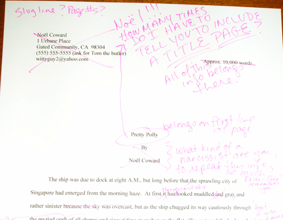
Why? Well, let’s take a peek through her reading glasses, shall we? The first thing Millicent sees when she opens the average requested materials package is something like this:

Or like this:
Or, heaven help us, like this:

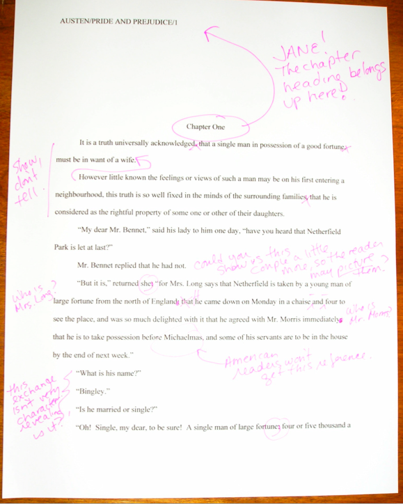
So tell me: why might Millicent take one look at these and conclude that their respective submitters could use a good class on manuscript formatting?
I see all of you long-term blog readers out there with your hands in the air, jumping up and down, eager to tell everyone what’s wrong with this as a first page of text — and you’re absolutely right, of course. We’re going to be talking about precisely those points in the days to come.
For now, however, I want you to concentrate upon how this example has failed as both a title page and a first page of text: by not including the information that Millicent would expect to see on either.
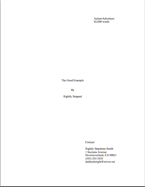
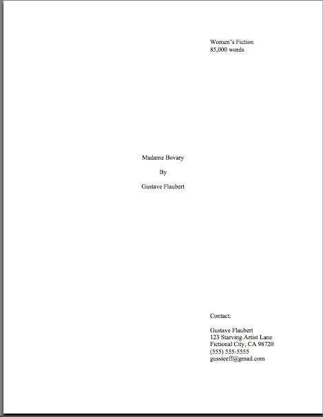
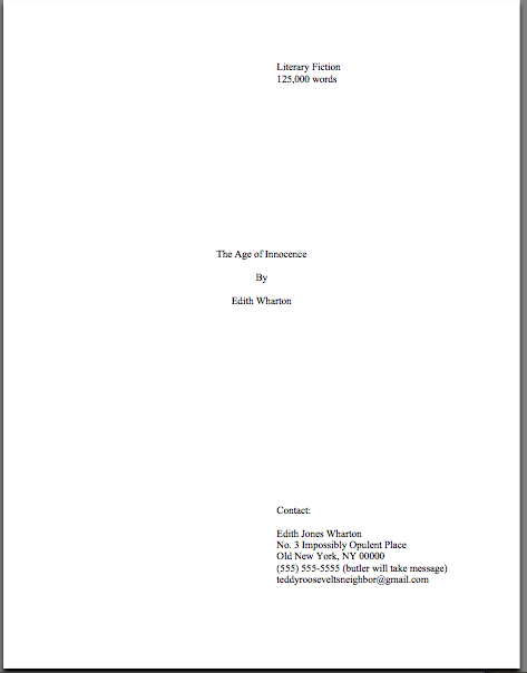
What makes me so sure she would find this discovery, at best, disappointing? Because what she (or her boss agent, or an editor, or a contest judge) would have expected to see on top of that pile of paper was this:

This is a standard manuscript title page for the same book — rather different, isn’t it? Visibly different, in fact, from several paces away, even if Millicent isn’t wearing her reading glasses.
Again, submitting the first example rather than the second would not necessarily be instantly and automatically fatal to a manuscript’s chances, of course. Most of the time, Millicent will go ahead and plunge into that first paragraph of text anyway.
However, human nature and her blistering reading schedule being what they are (for those of you new to this screener’s always-rushed ways, she has a stack of manuscripts up to her chin to screen — and that’s at the end of a long day of screening queries; manuscript submission is in addition to that), if she has already decided that a submission is flawed, just how charitable an eye do you think she is likely to cast upon the NEXT problem on the page?
Uh-huh. To use her favorite word: next!
To be fair to Millicent, while it may well be uncharitable of her to leap to the conclusion that Faux Pas’ or Ridiculous’ manuscript is likely to be unpolished because they did not include a proper title page, agencies do have a vested interest in signing writers who present themselves professionally. For one thing, they’re cheaper to represent, in practical terms: the agent doesn’t have to spend as much time working with them, getting their manuscripts ready to submit to editors.
And no agent in his right mind would send out a manuscript that didn’t include a standard title page. It serves a number of important — nay, vital — marketing functions.
Let’s take another look at the professional version, shall we? So you don’t have to keep scrolling up and down the page, here it is again:
How is this sheet of paper a better piece of marketing material than Faux Pas or Ridiculous’ first page?
Well, right off the bat, it tells a prospective agent or editor what kind of book it is, as well as its approximate length. (If you do not know how to estimate the number of words in a manuscript, or why you should use an estimate rather than relying upon your word processor’s count, please see the WORD COUNT category at right.) Both of these are pieces of information that will tell Millicent instantly whether the submission in her hand would meet the requirements of the editors to whom her agency tends to sell.
For instance, if her boss had decided not to represent Action/Adventure anymore, or if editors at the major houses had started saying that they were only interested in seeing Action/Adventure books longer than 90,000 words, Rightly Stepped would be out of luck.
But then, being a savvy submitter, ol’ Rightly would also want his work to be represented by an agent who just ADORES very long Action/Adventure novels — and regularly goes to lunch with scads and scads of editors who feel precisely the same way, right?
The standard title page also tells Millicent precisely how to contact the author to offer representation — and that’s a very, very good thing for everyone concerned. If I’ve said it once, I’ve said it a thousand times: it’s ALWAYS in an aspiring writer’s interest to make it easy for an agent to help her.
I might be wrong, of course, but I suspect that NOT forcing Millicent to forage through the mountain of paper on her desk to find a misplaced cover letter with your phone number on it MIGHT be a good start.
By contrast, Faux Pas’ first page doesn’t really do anything but announce the title of the book and leap right into the story. That’s one underachieving piece of paper.
Some writers attempt to consolidate the proper functions of the title page and first page of text into a single sheet of paper. This format is particularly common for contest entries, for some reason. Let’s take another look at Ridiculous and Faux Pas’ submissions:
While such a top page does indeed include the requisite information Millicent or her boss would need to contact the author (although Faux Pas’ does it better, by including more means of contact), cramming it onto the first page of text doesn’t really achieve anything but saving a piece of paper. It doesn’t even shorten the manuscript or contest entry, technically speaking: the title page is never included in a page count; that’s why pagination begins on the first page of text.
I shall go into what DOES belong on the first page of text tomorrow, with accompanying visual aids. For today, let’s keep it simple: all I ask is that you would look at the proper title and the unprofessional examples side by side.
Got all of those images firmly in your mind? Good. Now weigh the probability that someone who reads as many manuscripts per day as Millicent — or her boss, or the editor to whom her boss likes to sell books — would NOT notice a fairly substantial difference in the presentation. Assess the probability of that perception’s coloring any subsequent reading of the manuscript in question.
Kind of obvious, once you know the difference, isn’t it?
Before I sign off for today, and while you’ve got R.Q. Snafu’ sexample still in the front of your mind, let me briefly address the still surprisingly common writerly belief that the industry will automatically take a submission by a woman more seriously if the author submits it under her initials, rather than under her given first name. J.K. Rowling aside, this just isn’t true, at least in fiction circles.
So unless you have always hated your parents for christening you Susan, you won’t really gain anything professionally by using initials in your nom de plume instead. And even if you did, why not publish under a name you actually like instead?
That’ll show your Susan-loving parents.
I just ruffled a few feathers out there, didn’t I? “But Anne,” I hear an initialed purist exclaim, “I don’t want to be judged as a FEMALE writer — I want to be judged as a WRITER. What’s wrong with removing gender markers altogether?”
Well, there’s nothing wrong with it per se, Susan, except that these days, it almost invariably results in Millicent’s seeing such initials and thinking, “Oh, this is a female writer who doesn’t want to be identified as one,” rather than “Gee, I wonder who this mystery person without a first name is. I’m just going to leap right into this manuscript with no gender-based expectations at all.”
Why will Millie have this reaction, you ask? Because female writers — and only female writers — have been submitting this way for a couple of hundred years now. It’s not all that hard a code to crack.
Also, it’s logic that historically, male authors have virtually never used — except, of course, that hugely prolific and apparently immortal author, Anonymous. Even during periods when the most popular and respected novelists have been women (and there have been quite a few in the history of English prose, contrary to what your high school English textbook probably implied), when someone named Stanley Smith wrote a novel, the title page has generally said so.
Because, you see, even back then, readers would have assumed S. Smith the novelist was a nice lady named Susan.
Something else for initial-favoring fiction writers to consider: in North America, women buy the overwhelming majority of novels — and not just women’s fiction, either. Literary fiction readers (and agents, and editors) tend to have two X chromosomes — and some of them have been known to prefer reading books by Susans rather than Roberts. I just mention.
All that being said, the choice to initial or not is entirely up to you — or, more accurately, to you and your agent. Some sets of initials look cool in print, just as some names look better than others on book jackets. Or so claimed my father, the intrepid fellow who demanded that the maternity ward nurse convey him to a typewriter to see how my name looked in print before committing to filling out my birth certificate. (And yes, for those of you who have wondered Anne Mini IS in fact my given name; it just happens to look great in print, thanks to a little forethought.)
Keep up the good work!