Sorry that your promised reward for virtue is coming a couple of days late, campers — I was following the inviolate rule chez Mini that migraines and blogging do not mix. A wacky standard, true, but mine own.
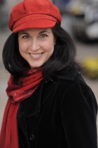
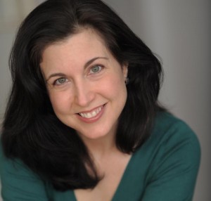
Fortunately, the treat is, in my humble opinion, well worth the wait: the final winner in the YA category of the Author! Author! Great First Pages Made Even Better Contest, Gayton Gomez’ delightful BOOK WORMS. That’s the lady herself, depicted twice above.
Is she her own identical twin? No, merely kind enough to afford me an opportunity to discourse on the always-burning subject of author photos.
Remember back in the heady days of Authorbiopalooza, when I mentioned that it’s an excellent idea for an aspiring writer to start early to try to come up with a great author photo, because for most of us, finding one we like is a rather protracted process? At the time, you probably muttered, “Oh, yeah, Anne, it might take me months — nay, years — to find a photo that is both flattering and appropriate to my book’s subject matter. Because, alas, I do not have a professional photographer following me around on a daily basis, and I have never so far in the long and fascinating course of my life stumbled upon a non-professional shot of myself that I like, I am inclined to believe you when you say it is going to be a struggle.”
Well, yes, both of those are pretty common reasons that authors have a hard time coming up with an author photo on that happy day when the editor of their dreams says, “Oh, and we’ll need a photo for the jacket by Tuesday. You already have one, right?”
And the author, trooper that she is, does violence to her initial impulse to blurt out that she had been laboring under the widely-held misconception that publishing houses maintained in-house battalions of shutterbugs for this very purpose. Instead, she replies brightly, “Tuesday? No problem. Would you like a hard copy, or should I mail you a jpeg version?” Then she hands up the phone — and dissolves into a little pool of deadline panic.
At the risk of repeating myself: start asking either your friends or a pro to get snapping now. You will be infinitely happier once you have a book contract in hand — or once the agent of your dreams wants to start submitting your work to editors accompanied by a bio graced with your smiling mug.
Gayton has been savvy enough start grinning early at those shutters, and has ended up with the other species of author photo dilemma: how does one choose between two awfully good pictures?
I know, I know: we should all be lucky (and photogenic) enough to have this problem, but actually, it’s a serious one. Looking good is not the only criterion for judging an author photo, after all: one also wants to look smart, interesting, approachable, and, well, authorial, right?
Yet from a professional perspective, what authorial looks like would necessarily vary depending upon the book itself. And that often comes as a great big surprise to first-time authors, used to those 1970s-80s glamour shots that made every inside back dust flap seem more or less identical.
The photo on the right falls very firmly into this category: it is more or less precisely what most of us have in mind when we think author photo, isn’t it? It’s attractive, polished, filmy of background, and conveys seriousness of purpose. This, it says, is an intellect to take seriously.
But does this photo also say that this is someone who writes genuinely funny YA? Or does the one on the left convey that spirit better?
A forest of hands has sprouted up all across the English-writing world. “But Anne,” the visually-oriented cry, “how can I know which of these is a better photo of today’s winner? And surely, that eye-catching red would not be appropriate for every book jacket. Isn’t this an instance where playing safe is the better bet?”
Not necessarily, hand-raisers, but you are quite right that Gayton’s future (and lucky) publisher’s marketing department might well want to weigh in on the bright red issue. (Although generally speaking, book covers with red on them sell better than those sporting other colors, probably because the eye is attracted to red faster than any other color in the spectrum. Rumor has it that when Cary Grant first started making color pictures, he used to wander around the set, grabbing every red object and carting it out of shot. Too distracting from his handsome mug, he believed.)
Let’s assume for the sake of argument, however, that this photo is intended not for a book jacket — at least not right away — but for the top of an author bio to be tucked into a submission packet. Yes, credibility is important in a bio photo, but so is personality and book-appropriateness. After all, this rather intense shot of Elinor Glyn was perfect for her classic of romantic introspection, IT:
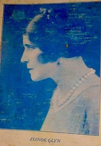
Not to be confused, of course, with Stephen King’s horror classic, IT. Here’s what his author photo looks like these days:

Not exactly a 1980s glamour shot, is it? But you cannot deny that it is appropriately menacing for his chosen genre — that’s horror lighting if I have ever seen it. By the same token, Marcel Proust’s author photo just screams ravishing sensibilities.
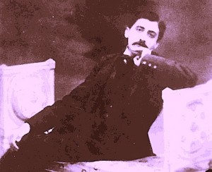
What constitutes an appropriate visual clue to ravishing sensibilities changes over time, naturally. When Truman Capote’s first novel, OTHER VOICES, OTHER ROOMS, was released, its publishers shocked the literary world with this author photo:
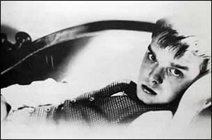
Quick, those of you who have never read this lovely debut: based upon the photo alone, what was the novel about? (Hint: this photo was an impeccable choice.)
What does all of this mean for Gayton’s photo choice? Well, you tell me. Let’s take a gander at some of her writing and see which you think would be a more appropriate match.
Here is the winning first page of BOOK WORMS — and, as always, if you are having trouble catching the details, try enlarging the image by holding down the COMMAND key and pressing + until it is big enough to read.
Quite the grabber, eh? Actually, Gayton piqued the judges’ interest with her answer to what her book would add to her chosen book category:
Cassandra Wainwright is the first teenage protagonist in the Young Adult genre to use a magical bookpass to jump into the plots of classic novels. She’s the first heroine of any genre to foil a Ponzi scheme run by Heathcliff of Wuthering Heights, who is dating Cassandra’s unsuspecting older sister.
While there was a fair amount of debate about whether that first sentence is empirically true — several of us had dim recollections of having read something like this as children, but none could recall an actual book title — the second is almost certainly true. (Which just goes to show you, campers: book descriptions are not the best places for superlatives or claims to be the first writer to do anything. You can never be absolutely certain that (a) some Victorian spinster didn’t write a book with a similar premise that’s been out of print since Henry Ford invented the assembly line and (b) some agent, editor, or contest judge won’t have read the last extant copy as a preadolescent. Literary types find their way into all kinds of archives.)
All that is quibbling, however. Just look how charming the fleshed-out premise is:
Before we move on, I would just like to applaud Gayton for writing a really solid 1-page synopsis — which, as those of you brave souls who worked your way through Synopsispalooza can attest, is no mean feat. As a quick review, what makes this such a good example?
If you immediately cried out, “I was blown away by the fact that Gayton managed to present not just the premise, main characters, and central conflict, but some indication of how that conflict is resolved,” give yourself an A for the day. That’s a lot to pull off in a single page of text without making it real like a laundry list — well done, Gayton!
If you also shouted, “There are unique, telling details here!” go ahead and move to the top of the class for the entire weekend. Gayton has made the very smart move of including specifics in her synopsis, rather than the more common generalities — and done so in a light-hearted manner. I defy Millicent not to smile at the very sight of the phrase catches Cassandra and Eugene red-handed in Romeo and Juliet.
But all of you are getting impatient for the close textual analysis for which these prize posts are famous, are you not? Okay, here is that first page again, decorated with Millicent the agency screener’s patented scrawl.
Surprised that such a grabber of an opening — and one that so perfectly captures the ambient mood of Ann Radcliffe’s Gothic thriller, THE MYSTERIES OF UDOLPHO, too — would attract this much editorial ink? Actually, there’s a red flag in that first sentence that would, unfortunately, prevent quite a few Millicents from reading beyond it. Can anyone tell me what it is?
If you are jumping up and down, shrieking, “It’s in the passive voice! It’s in the passive voice!” take yourself out for ice cream. It was constructions, while both traditional in fairy tales and more accepted in YA than in adult fiction, tend to be eschewed in professional writing, for the very simply reason that most Millicents (and their bosses, as well as the editors to whom they sell manuscripts) have been specifically trained to regard it as low-quality writing. While generally speaking, it’s a good idea to avoid the passive voice anywhere in a submission, the first line of the first page is a particularly fine place to excise it.
And why is that, ‘Palooza followers? Chant it with me now: professional readers do not read like other people. Instead of scanning an entire scene, page, or even paragraph before deciding whether they find the writing engaging, they read a single sentence at a time. If they like it, they move on; if they do not, they will usually just stop reading.
Or, as Millicent likes to put it: “Next!”
Gayton’s first page is a textbook example of a submission that might well charm a reader who picked it up in a bookstore, yet get rejected without comment by many pros. And that’s a real pity, for if Millicent would just keep reading, she would find a great premise here.
The tension is also very well established by the end of the page (speaking of sentences in the passive voice), but I have a couple of suggestions to heighten it even more. First — and I don’t know why writing teachers don’t bring this one up more — having the sentences get shorter and choppier as soon as Cassandra gets scared would automatically crank up the suspense.
Why? Well, think about it: a switch to shorter, pithier sentences conveys the impression of panting. Subconsciously, that seems scarier: a frightened person would tend to speak in shorter, breathier bursts than one relaxing on a couch like Uncle Truman above; her heart would pound, and she would look around quickly. While it would certainly be possible to describe all of that in long, luxurious sentences (as, indeed, I just did), why not allow the narrative structure to help draw the reader into the mood of the piece?
Another means of keeping that tension high, at least from Millicent’s point of view, is not to have the yes/no question in paragraph 4 answered with a no. This is not a bad general rule for any first page — or indeed, any dialogue: answering a yes/no question with yes or no is almost invariably the least interesting response, and most of the time not even necessary. Frequently, as here, the very next sentence or phrase will answer the question more fully than the binary choice.
There’s also a more conceptual reason that no tends to be a pet peeve for professional readers: it cuts off possibilities in a way that a less categorical response will not. While this tends to be more true in dialogue than in narration, we can see quite plainly in paragraph 4 how completely no prevents our heroine from exploring one of her previously viable options.
A third way that this page cuts tension is through describing the unfamiliar room in mostly negative terms, rendering it harder for the reader to picture than a more fleshed-out description would allow. Since the reader has not yet seen Cassandra’s normal bedroom, it’s simply not as startling to see it disappear than if we had seen it before. Even a couple of familiar details in the first paragraph would help establish a firm image of her reading in her cozy bed, all set to be shattered in the next paragraph.
The judges and I would also have liked to see the room in which she finds herself in more detail, particularly in terms of sensual specifics. Was the new room the same temperature as her bedroom, for instance? Did it smell the same? Was she alerted to the change by an abrupt shift from electric light to candlelight?
And so forth. YA is known for its lush and detailed physical descriptions, so it would be hard to go overboard here. The goal would be to immerse the reader in a completely unfamiliar space, to make her feel as though she, too, has been suddenly transported into another realm.
Which just goes to show you: even a grabber of an opening can often be improved. With just a little bit more polishing, Gayton’s hook could provide more alluring bait for Millicent.
I’m genuinely pleased that this protracted series on winning first pages has illustrated that point so beautifully. Often, aspiring writers think of their opening hooks purely in terms of premise (Godzilla meets the Nazis — who will win?), opening with conflict (His medals melted from the Godzilla’s breath, the Nazi drew his pistol…), or just plain pretty writing (Flames spurted lazily across the tar macadam, a modern-day Wotan surrounding his wayward daughter Brünnhilde with protective fire…). In practice, a true grabber incorporates all three, and does so in a manner so appropriate for the book’s chosen category that Millicent knows immediately precisely where it would sit on a shelf in Barnes & Noble.
A tall order? You bet. Doable for a good writer? Absolutely.
Have you reached a decision about which author photo fits the voice and story best? Personally, I would go for the more adventurous one — it comes across as both more dynamic and a trifle younger. The blurred traffic in the background gives the impression that she’s going places, just as Cassandra is in the book.
That being said, were this author to be writing across several book categories (am I remembering correctly that you do some travel writing, Gayton?), I would opt for the other photo for a general author bio. It’s a lovely example of a particular type of professional photo: as we discussed above, it does just scream this is an author.
That’s something I suspect no one who reads your manuscript will ever doubt, Gayton. Great job, and I’m sure all of us here at Author! Author! are looking forward to reading the rest of the book!
Refreshed from our little foray into close textual analysis? Excellent. Next time, we’ll be diving right back into the mysteries of standard format. Keep up the good work!
This reads like a great book. I would have read it in high school (and would now) even though I hated, hated HATED Wuthering Heights then and Heathcliff especially. Casting him as a villain in a way that’s true to his character is brilliant. Reminds me a bit of Alan Moore’s League of Extraordinary Gentlemen — a fun read for the casual reader, but brilliant if you’re up on your 19th-century literature.
Anne,
Thank you so much for the fantastic feedback (and, of course, for selecting my entry)! Since entering the contest, I’ve made a few tweaks to my first page, and — hurray! — they are all in keeping with your comments. I’m glad to know my instincts are on target.
By the way, I do know that “bookworms” is one word. However, I was using “Book Worms” to refer to the ruthless villains mentioned in my synopsis — the Worms who pillage books for their own profit. Of course, I also intend it to apply to Cassandra and her friends in the traditional sense (i.e., book lovers). Do you think my title might make Millicent think I’m illiterate? I’d played with the idea of calling the book “Cassandra Wainwright and the Magic Pendant,” but that sounded too Harry Potter-esque to me.
David — You’d probably like what I did with Heathcliff. He’s pretty sinister, but I also get some fun out of his tendency to howl and bash his head against trees and walls. I’m hoping kids will get a kick out of that (I’m pretty sure my former English professors will). Actually, I’ve had a few kids read my manuscript (a nine-year old and three twelve-year-olds), just to make sure my references to classic literature didn’t confuse or bore them. So far, so good — one of the twelve-year-olds told me she now really wants to read Wuthering Heights. The nine-year-old made it through all 65,000 words in a single day, and wrote a book report on it for school! It’s the cutest thing you ever saw. I pasted it up over my desk so I’ll have something to smile about when I get form rejection letters.
I like Book Worms as a title, actually — but with my pedantic Millicent chapeau on, I was incapable of not noting it. It’s more unexpected this way.
I was thinking about Book Worms today: someone asked me for a recommendation for a 10-year-old adventure lover, and while I was able to whip out my classic recommendation (William Pene Dubois’ The Twenty-One Balloons), I did say, “You know, one of the disadvantages of being an editor is that the first books that pop to mind aren’t yet published.”
Although my taste in reading does not normally accomodate YA, I think this would be a great read.
Dave
I would totally read this. I love YA. Can’t delude myself into thinking I could actually write it, but I LOVE to read it. This sounds like fun!
I like the pun on the title. Book WORMS, ha ha!
Having worked with libraries for just about 20 years this looks like EXACTLY the kind of material the new generation of Young Adult librarians is looking for. It sounds like it’s a “springboard” to the classics – it gets the kids intrigued in reading the books referenced in the plot.
I completely agree, John. My mother was a junior high school librarian, and she had the same reaction.
Sounds like just the right mixture of whimsy/literature/new info/humor.
Something to attract new readers as well as being appealing to more sophisticated young (and probably older) adults.
Looking forward to seeing more.