I was all set to clamber onto my moral high horse again and dispense more of yesterday’s philosophy, honest — but then sharp-eyed long-time reader Janet caught, as is her wont, the missing puzzle piece in my illustrated romp through standard format. So I’m sliding elevated ethical questions to the back burner for the nonce and diving right back into practicalities.
As Janet so rightly pointed out, I completely skipped over one of the more common first-page-of-chapter controversies (and yes, in my world, there are many from which to choose), whether to place the title and/or chapter designation at the top of the page, or just above the text.
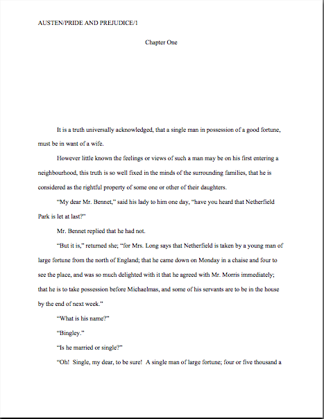
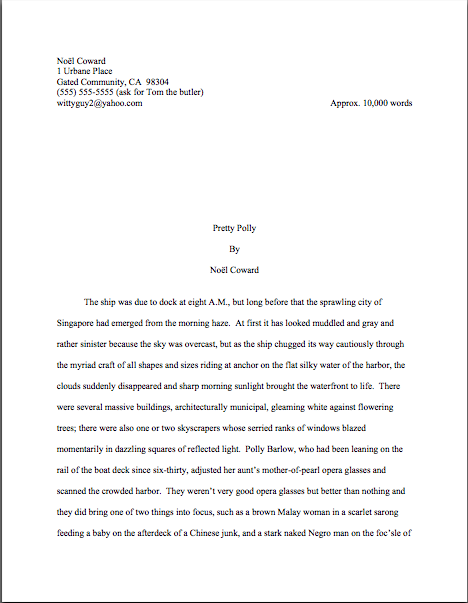
To place the options before you, should the first page of a chapter look like this:
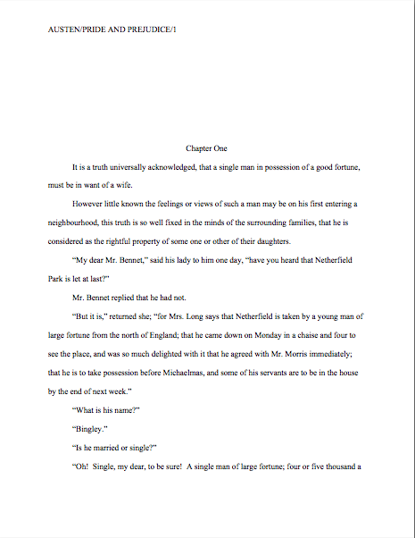
Or like this?
Now, I had been under the impression that I had waxed long and eloquent about the side I took in this burning debate, and that quite recently, but apparently, my eloquence has been confined to posts more than a year old, exchanges in the comments (which are not, alas, searchable, but still very worth reading), and my own fevered brain.
So let me clear up my position on the matter: the first version is in standard format; the second is not. No way, no how. And why do they prefer the first?
Chant it with me now: BECAUSE IT LOOKS RIGHT TO THEM.
Yet, if anything, agents and contest judges see more examples of version #2 than #1. Many, many more.
Admittedly, anyone who screens manuscripts is likely to notice that a much higher percentage of them are incorrectly formatted than presented properly, this particular formatting oddity often appears in otherwise perfectly presented manuscripts.
And that fact sets Millicent the agency screener’s little head in a spin. As, I must admit, it does mine and virtually every other professional reader’s. Because at least in my case — and I don’t THINK I’m revealing a trade secret here — I have literally never seen an agent submit a manuscript to a publishing house with format #2. And I have literally never even heard of an agent, editor, or anyone else in the publishing industry’s asking for a chapter heading to be moved from the top of the page to just above the text.
Oh, I’ve heard some pretty strange requests from agents and editors in my time, believe me; I’m not easily shocked anymore. But to hear a pro insist upon placing the chapter heading where you have to skip down a third of a page to read it…well, that would have me reaching for my smelling salts. (Do they even make those anymore?)
But clearly, somebody out there is preaching otherwise, because agents, editors, and contest judges are simply inundated with examples of this formatting anomaly. We see bushels of ’em. Hordes of aspiring writers are apparently absolutely convinced that the sky will fall in if that chapter heading is located anywhere but immediately above the text.
In fact, it’s not all that uncommon for an editor to find that after she has left a couple of subtle hints that the writer should change the formatting…
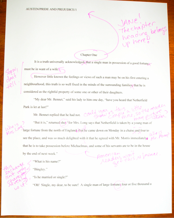
…the subsequent drafts remain unchanged. The writer will have simply ignored the advice.
(Off the record: editors HATE that. So do agents. Contest judges probably wouldn’t be all that fond of it, either, but blind submissions mean that a writer must submit the same chapter two years running to the same contest, have the entry land in the same judge’s pile — in itself rather rare — AND the judge would have to remember having given that feedback.)
This may seem like a rather silly controversy — after all, why should it matter if the white space is above or below the title? — but sheer repetition and writerly tenacity in clinging to version #2 have turned it from a difference of opinion into a vitriol-stained professional reader pet peeve. (See earlier comment about how we tend to react to our advice being ignored; it isn’t pretty.)
Which, unfortunately, tends to mean that in discussions of the issue at conferences degenerate into writing-teacher-says-X, editor-at-Random-House-says-Y: lots of passion demonstrated, but very little rationale beyond each side’s insisting that the other’s way just looks wrong.
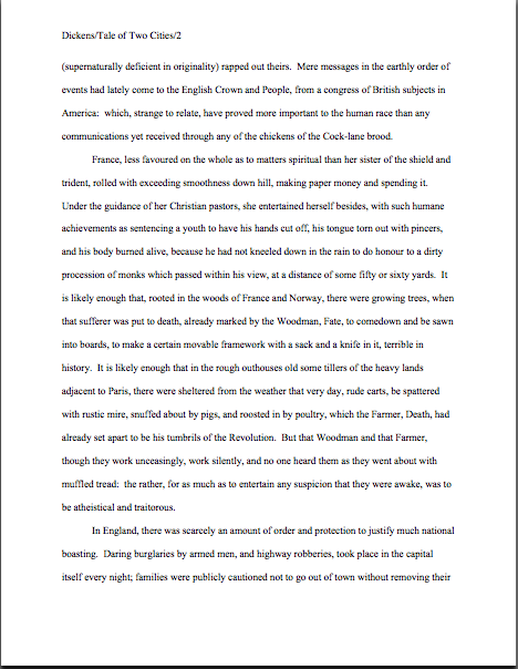
However, there is a pretty good reason that moving the chapter heading information to just above the text looks wrong to someone who edits book manuscripts for a living: it’s a formatting tidbit borrowed from short stories, whose first pages look quite different:
There, as you may see for yourself, is a mighty fine reason to list the title just above the text: a heck of a lot of information has to come first. But that would not be proper in a book-length manuscript, would it? Let’s see what Noêl’s editor has to say, viewing this as the first page of a book:
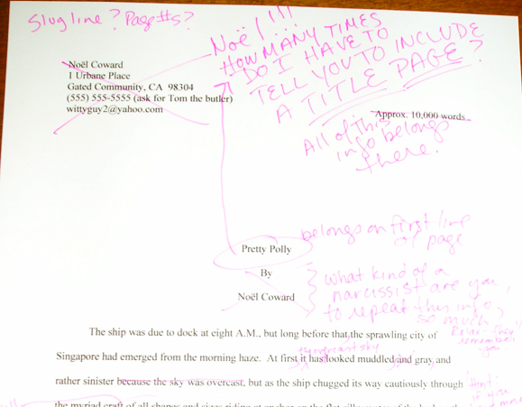
Ouch. (That last bit would have been funnier if the entire page were readable, by the way, but my camera batteries were running low.) But as Millicent and that angry mob of pitchfork-wielding ignored editors would be only too happy to tell you, short stories don’t HAVE chapters, so who on earth are they to be telling those of us in the book world how to format our manuscripts?
Stick with version #1.
While I’ve got the camera all warmed up, this would probably be a good time to show another ubiquitous agent and editor pet peeve, the bound manuscript. As with other ploys to make a manuscript appear identical to a published book, binding the loose pages of a manuscript for submission will NOT win you friends in the publishing world.
Why? Not only does this not look right (I spared you the chanting this time), but it seems so wrong that Millicent will be positively flabbergasted to see a submitter to do it.
Seriously, this is one of those things that is so engrained in the professional reader’s mind that it seldom even occurs to authors, agents, or editors to mention it as a no-no at writers’ conferences. Heck, I’m not sure that I’ve mentioned it once within the last six months — and by anyone’s standards, I’m unusually communicative about how manuscripts should be presented.
So pay attention, because you’re not going to hear this very often: by definition, manuscripts should NEVER be bound in any way.
Not staples, not spiral binding, not perfect binding. There’s an exceedingly simple reason for this: binding renders it impossible (or at least a major pain in the fingertips) to pull out a chapter, stuff it in one’s bag, and read it on the subway.
Hey, paper is heavy. Would YOU want to lug home ten manuscripts every night on the off chance you’ll read them?
In practice, I’m sorry to report, a bound manuscript will seldom survive long enough in the screening process for the chapter-separation dilemma to arise, because — and it pains me to be the one to break this to those of you who’ve been submitting bound manuscripts, but if I don’t tell you, who will? — those pretty covers tend never to be opened.
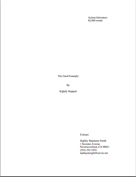
Remember that immense pile of submissions Millicent has to screen before going home for the day — and it’s already 6:30? Well, when she slits open an envelope that reads REQUESTED MATERIALS on the outside, she fully expects to see something like this lurking between the cover letter and the SASE tucked underneath:
But in the case of the bound manuscript, she instead sees something like this:
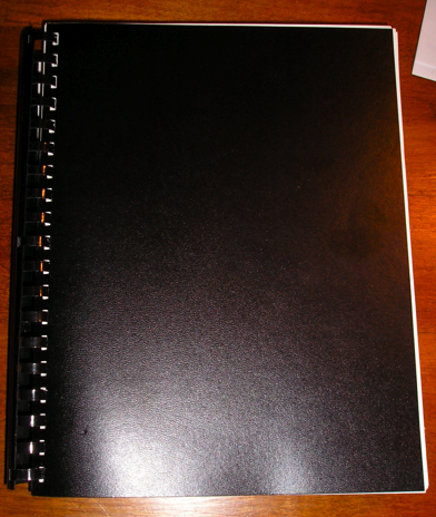
Kind of hard to miss the difference, isn’t it? And unfortunately, nine times out of ten, the next sound a bystander would hear would be all of that nice, expensive binding grating against the inside of the SASE.
Honestly, it’s not that she is too lazy to flip open the cover; she just doesn’t see why she should. Her logic may not be fair or open-minded, but it’s a fairly common argument throughout the industry: if this submitter does not know this very basic rule of manuscripts, how likely is she to know the rules of standard format? And if she does not know either, how likely is she to be producing polished prose?
Yes, this logic often does not hold water when it comes down to an individual case. But from her perspective, that matters less than we writers would like — because, as unpleasant as it is for aspiring writers to realize, her agency is going to see enough technically perfect submissions this week to afford to be able to leap to unwarranted conclusions about this one.
Don’t waste your money on binding.
Now that I have depressed you all into a stupor, let me add a final note about learning to conform to these seemingly arbitrary preconditions for getting your book read: any game has rules. If you saw a batter smack a baseball, then dash for third base instead of first on his way around the diamond, would you expect his home run to count? Would an archer who hit the bulls-eye in her neighbor’s target instead of her own win the grand prize? If you refused to pay the rent on Park Place because you didn’t like the color on the board, would you win the Monopoly game?
I can go on like this for days, you know.
My point is, submitting art to the marketplace has rules, too, and while your fourth-grade P.E. teacher probably did not impart them to you (as, if I ran the universe, s/he would have), you’re still going to be a whole lot better at playing the game if you embrace those rules, rather than fight them.
You’ll also, in the long run, enjoy playing the game more.
And remember, you’re playing this game by choice: you could, after all, make your own rules and publish your book yourself. Weigh the possibilities, and keep up the good work!